Hello! For our 2D’s second and final project, we were each assigned to a random neighbourhood in Singapore and afterwards present a zine about it (:
Aaaand the neighbourhood that I got is.. Marine Parade! To be honest, the ‘bubble’ that I live in mainly revolves around the MRT’s purple north-east line and I had zero idea about what does Marine Parade look like. Just the week before Mimi picked the neighbourhood for me, I was talking to my hall friend, Evelyn. Our conversation went something along the lines of:
Great start to the project. However I was quite pumped up as this meant exploring a side of Singapore that I was unfamiliar with! I had no idea of where to go and what to expect, and it was really interesting to discover the unique sides of Marine Parade in my recce trips.
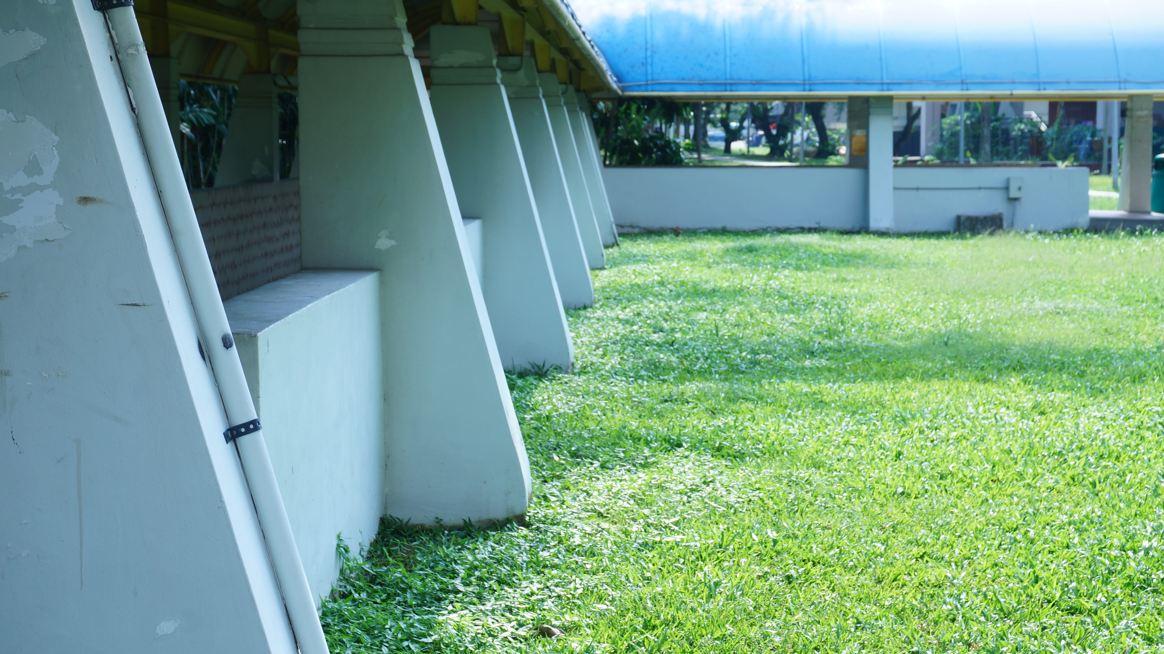
It was really quite inconvenient to visit via MRT but lucky for me, I had a direct bus from my house, bus 43! (But it was really super far when I went from hall…) During my first visit, I went during the evening as it had been raining for the previous few days. The findings were not much. I only covered the Marine Drive area.
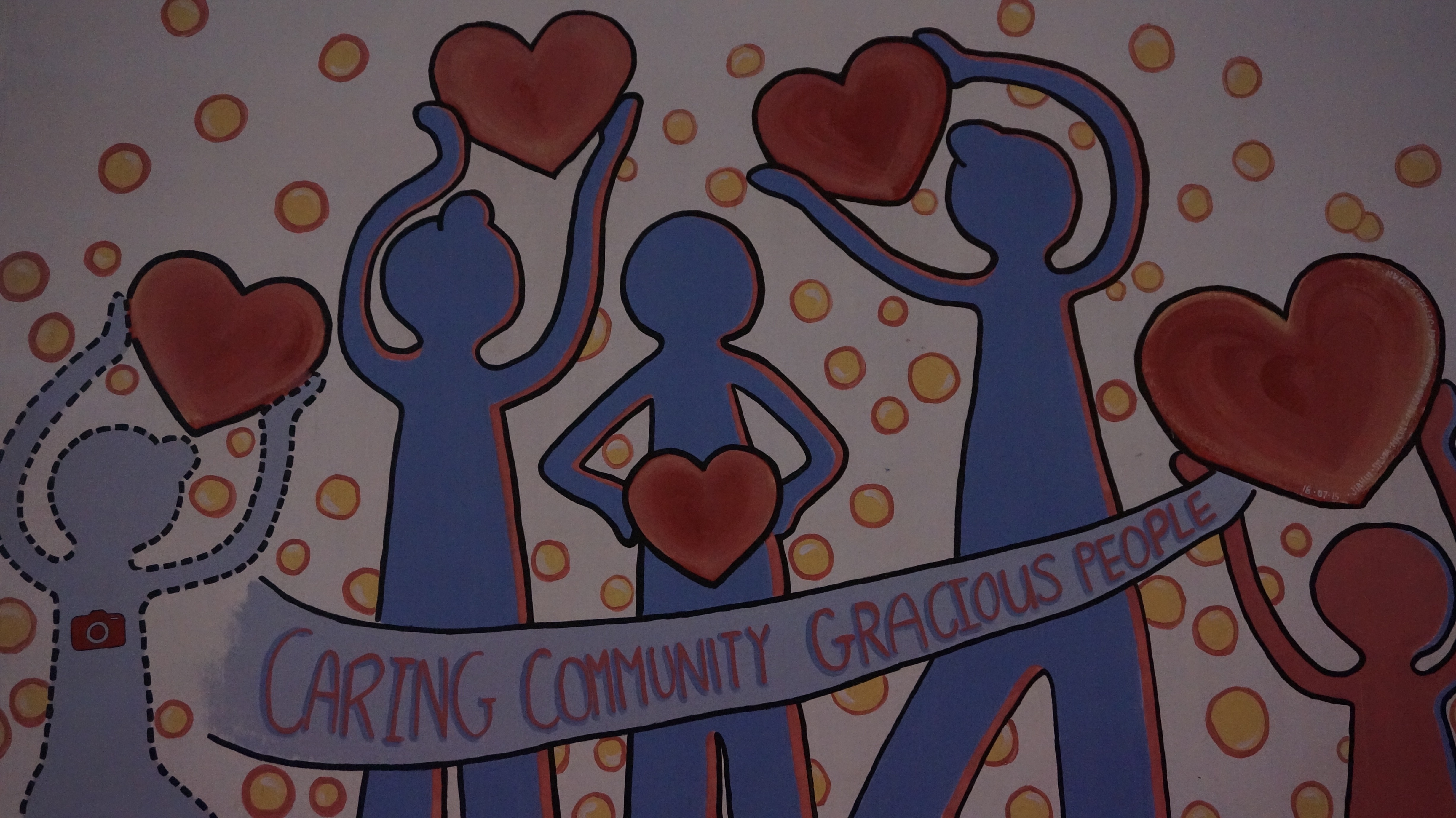
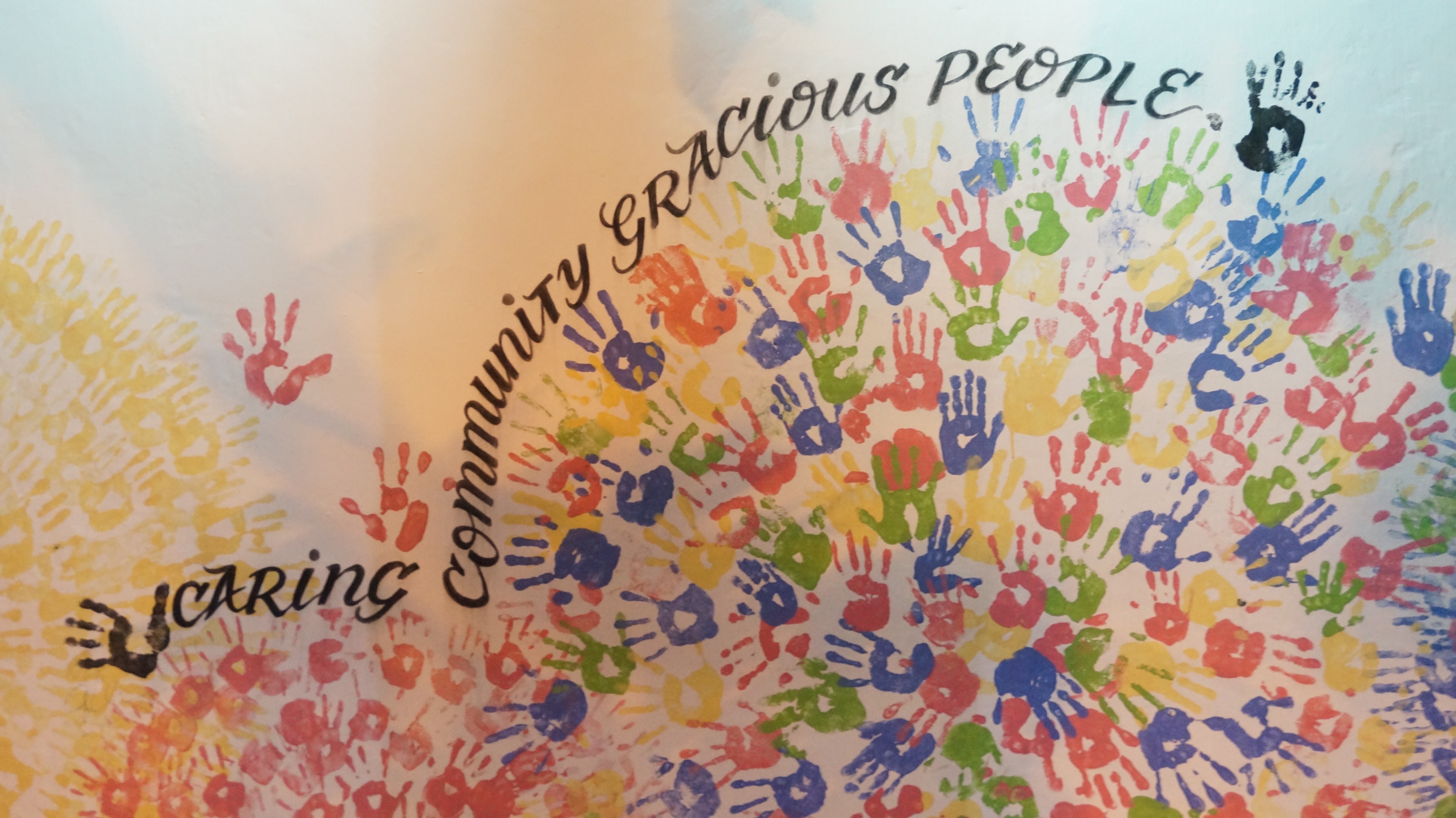
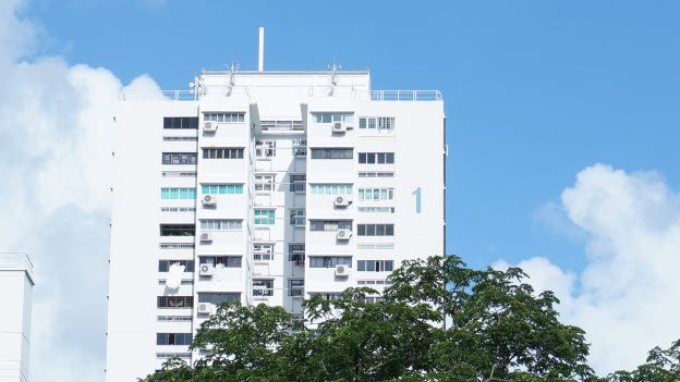
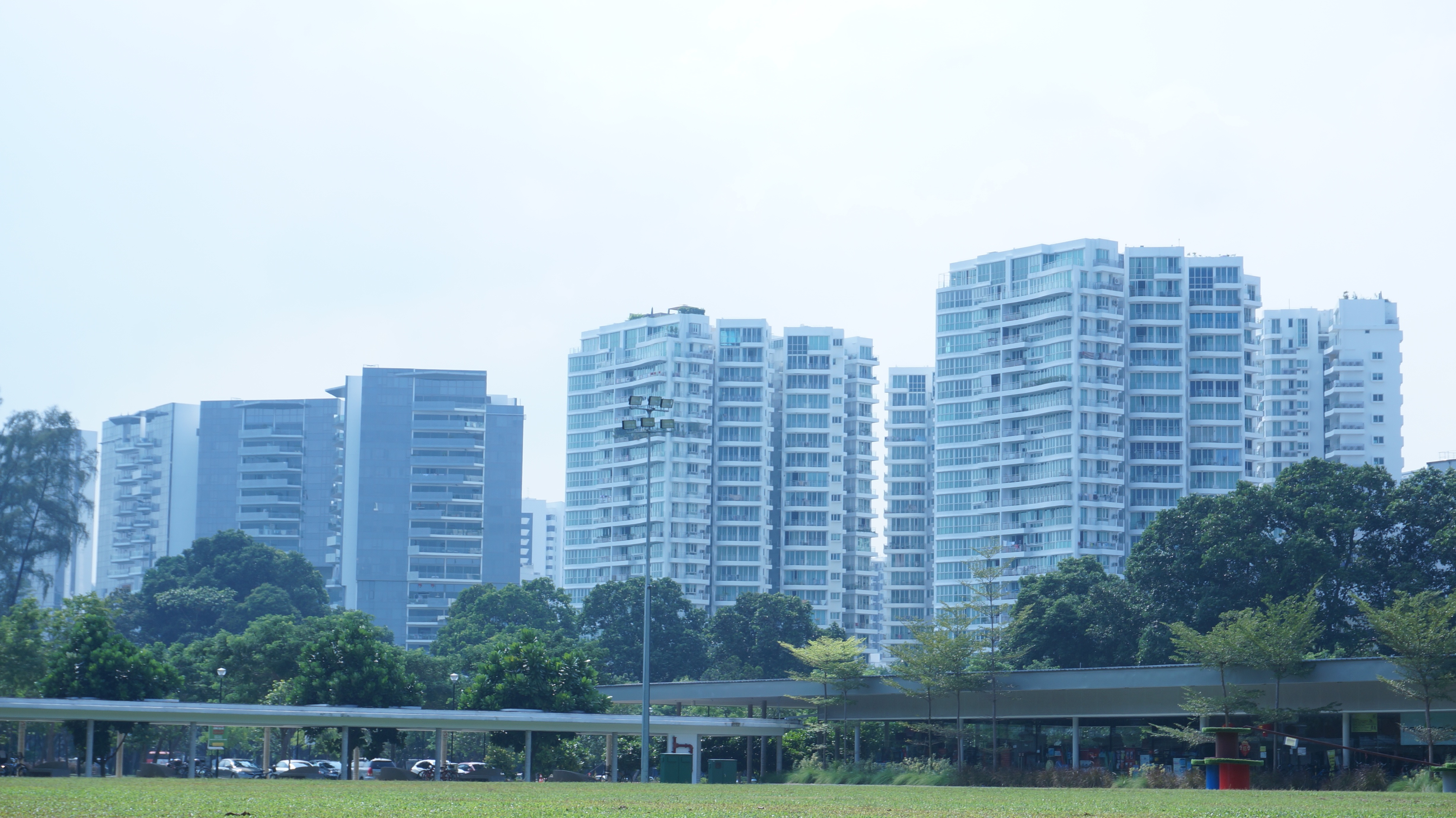
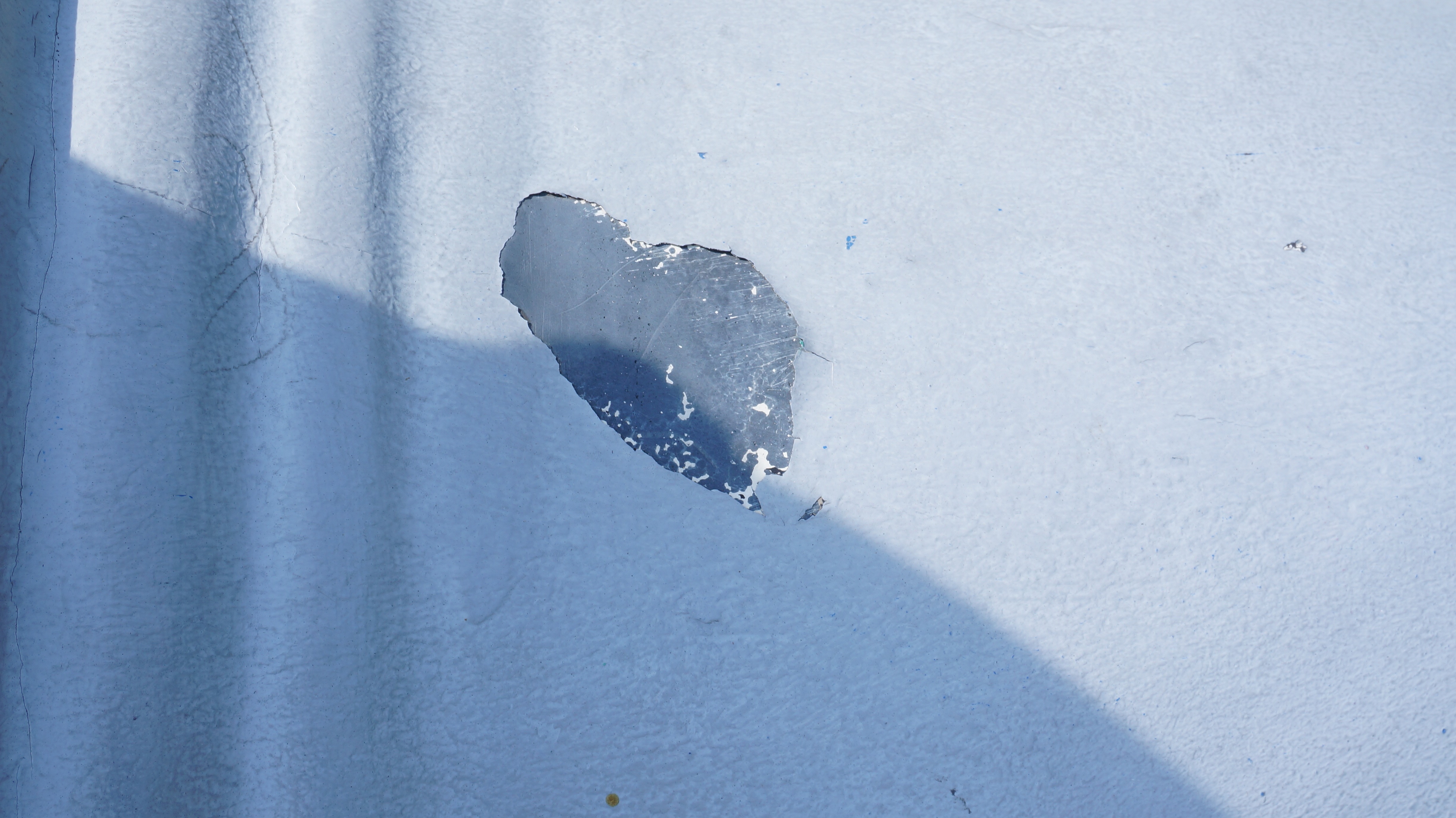
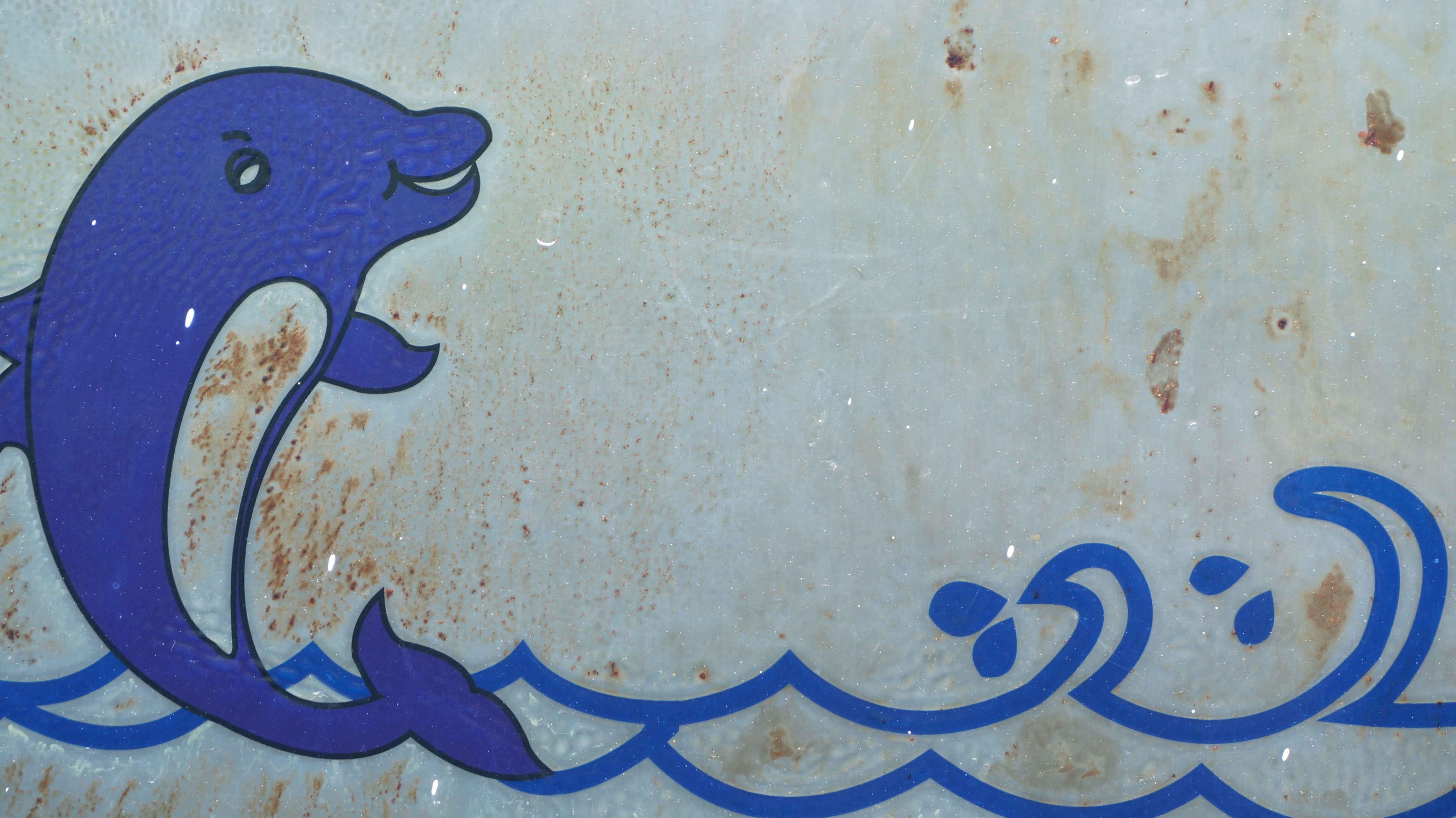
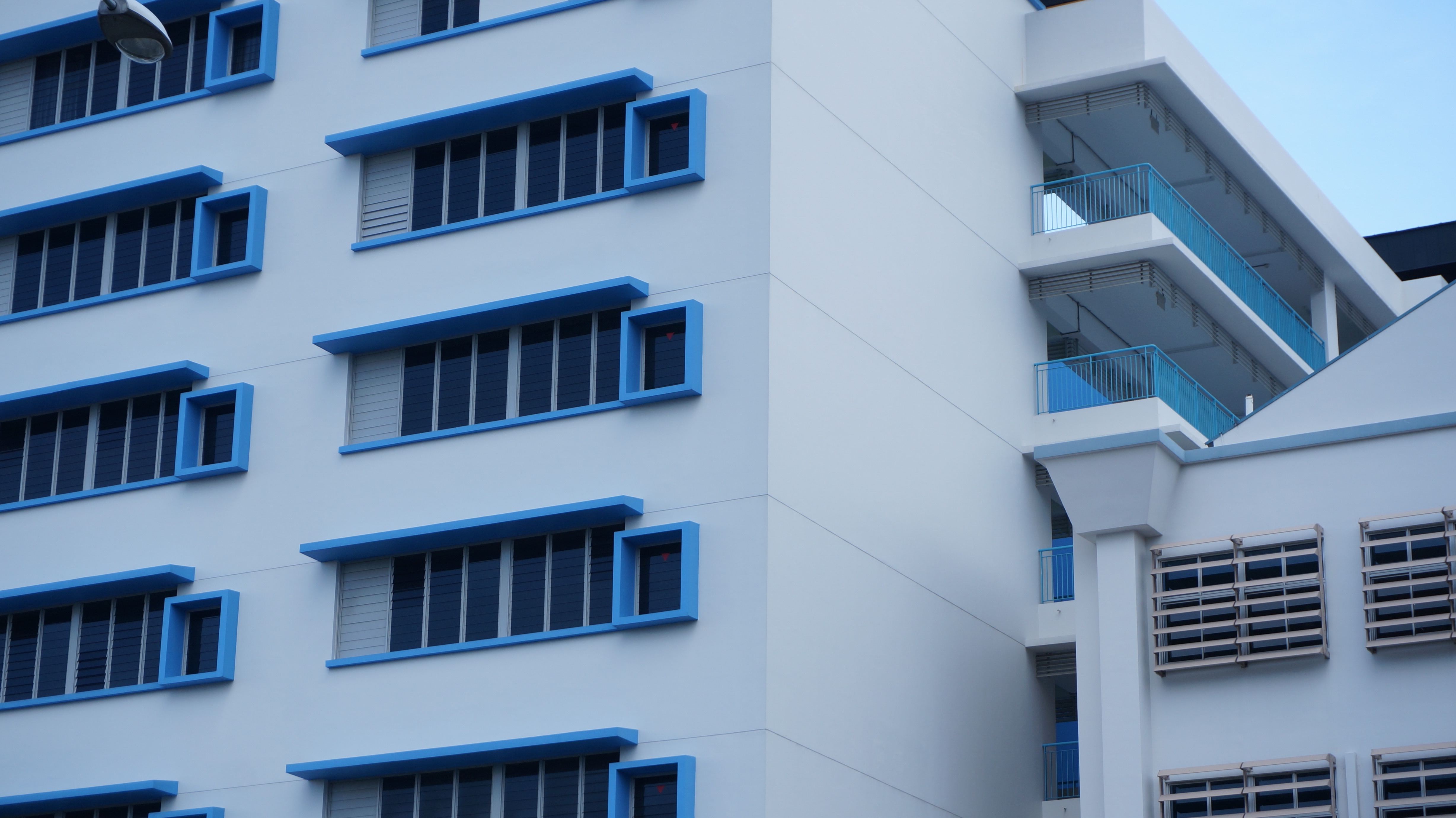
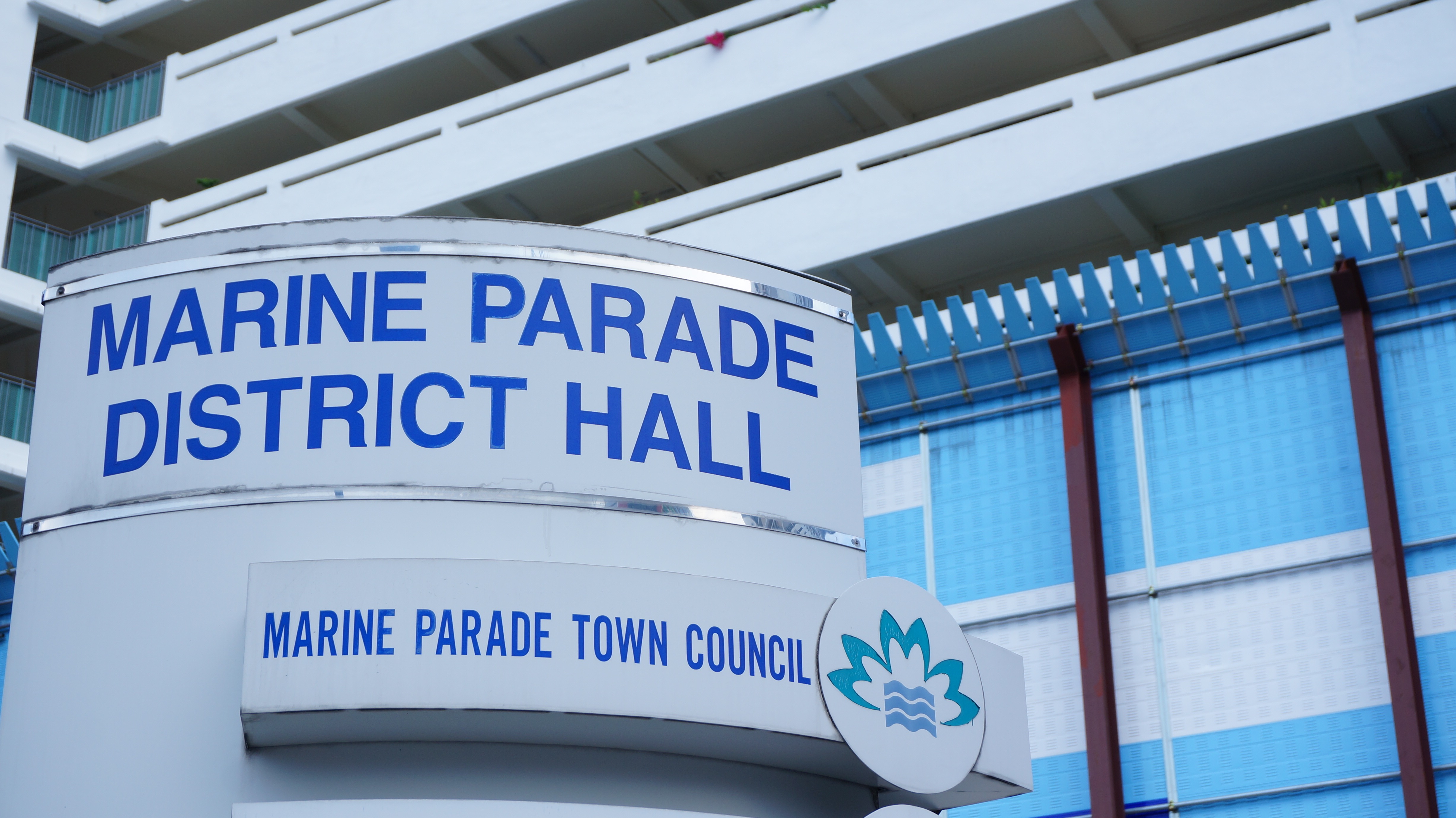
There some nice mural paintings about community care (for the elderly). And I noticed that most of the HDB flats were white with some blue accents.
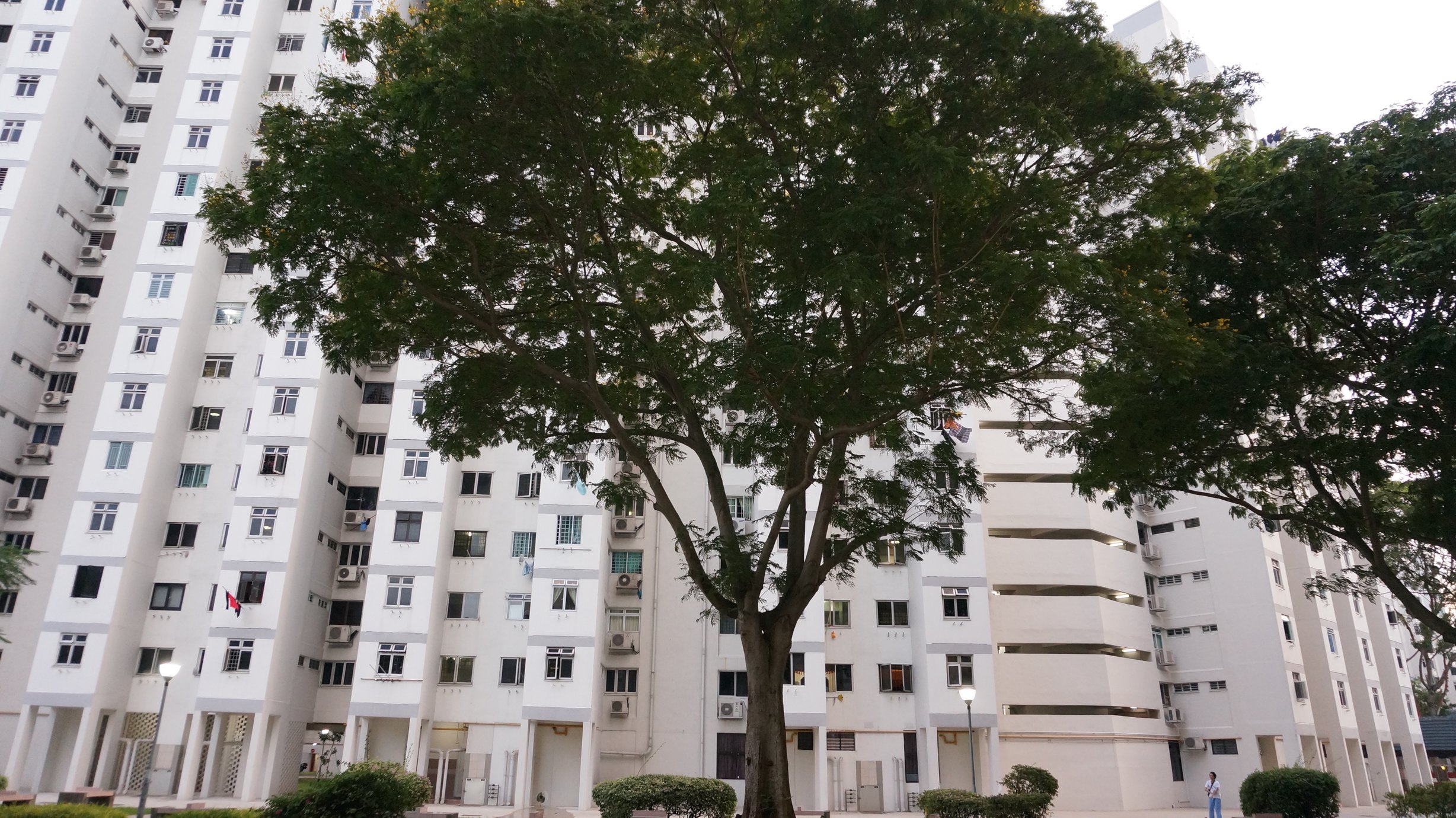
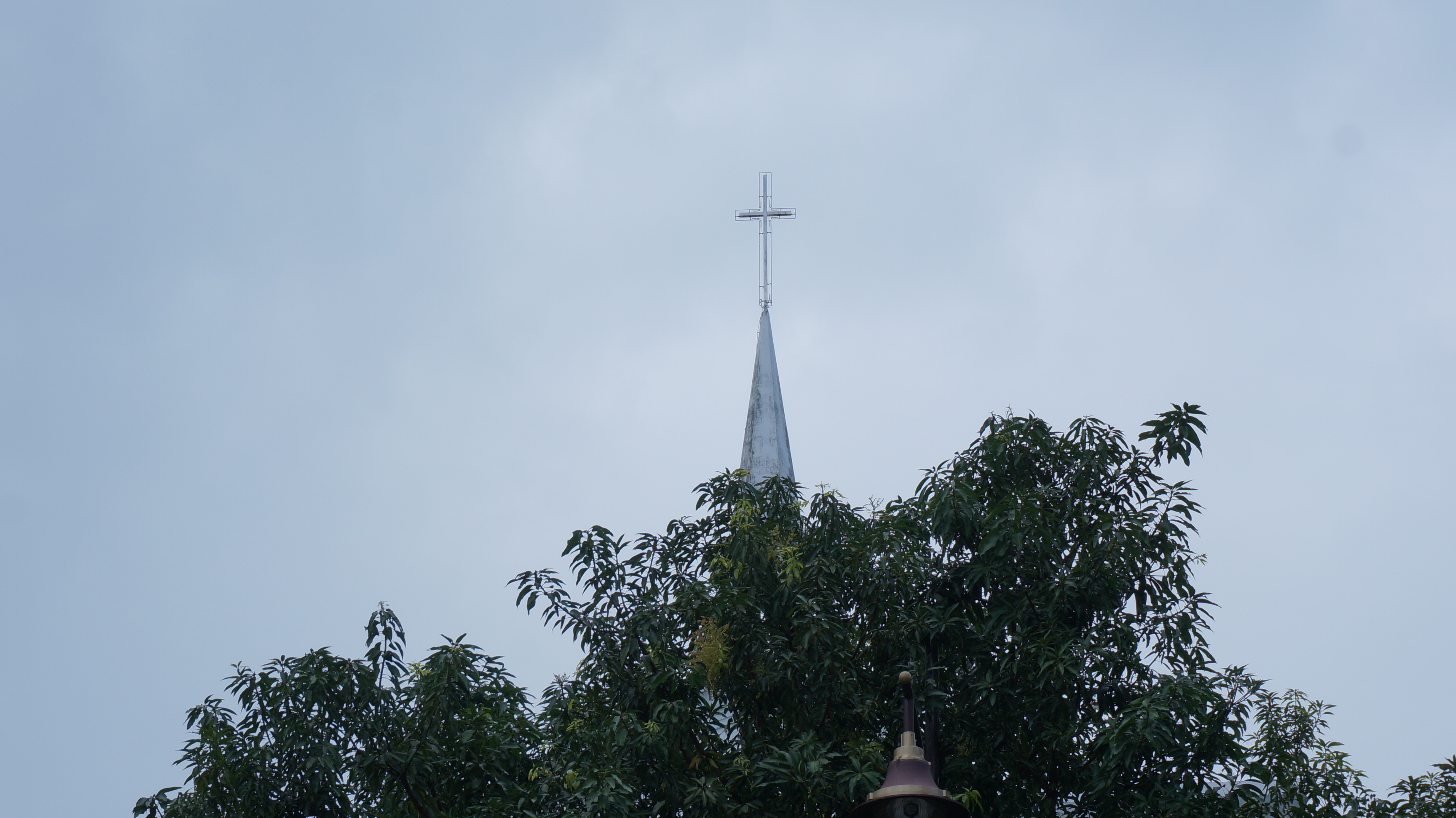
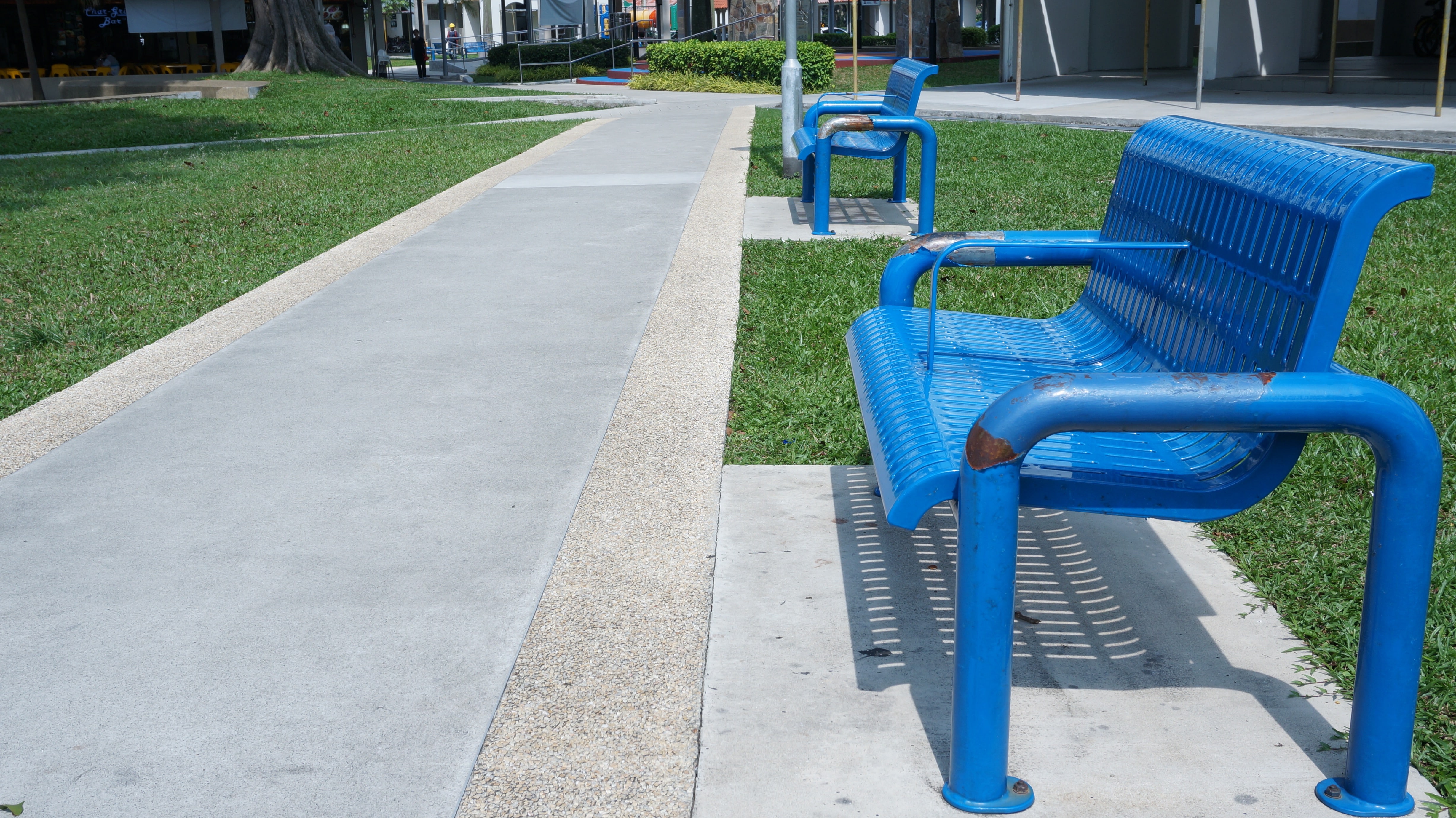
After some of my classmates did a presentation on colour theory, I got inspired to have colour theme so that my photos can look more consistent. Which was why on my second recce trips, I focused on sceneries/objects that were white & blue (with some green)!
Here’s what I found!
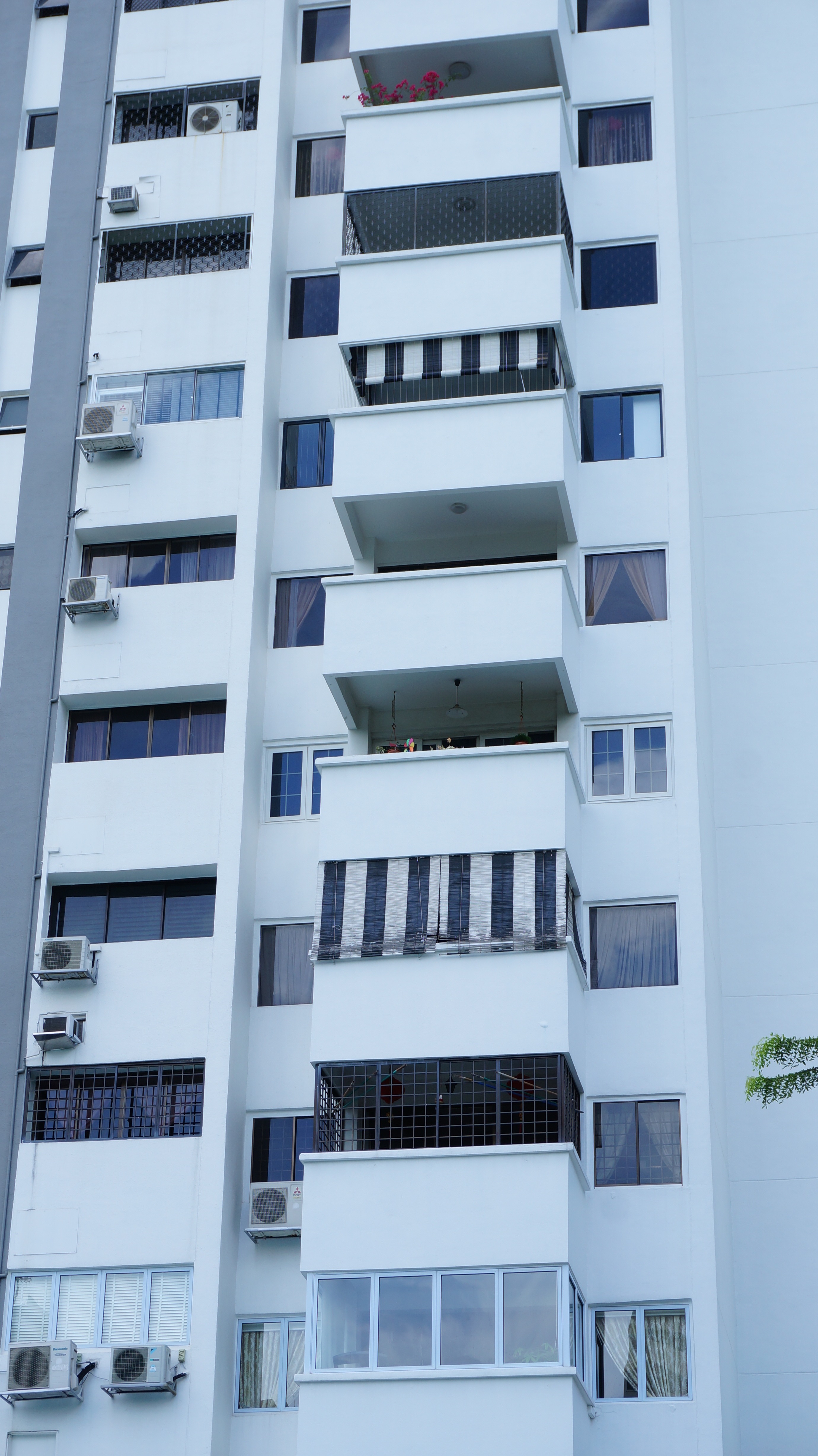
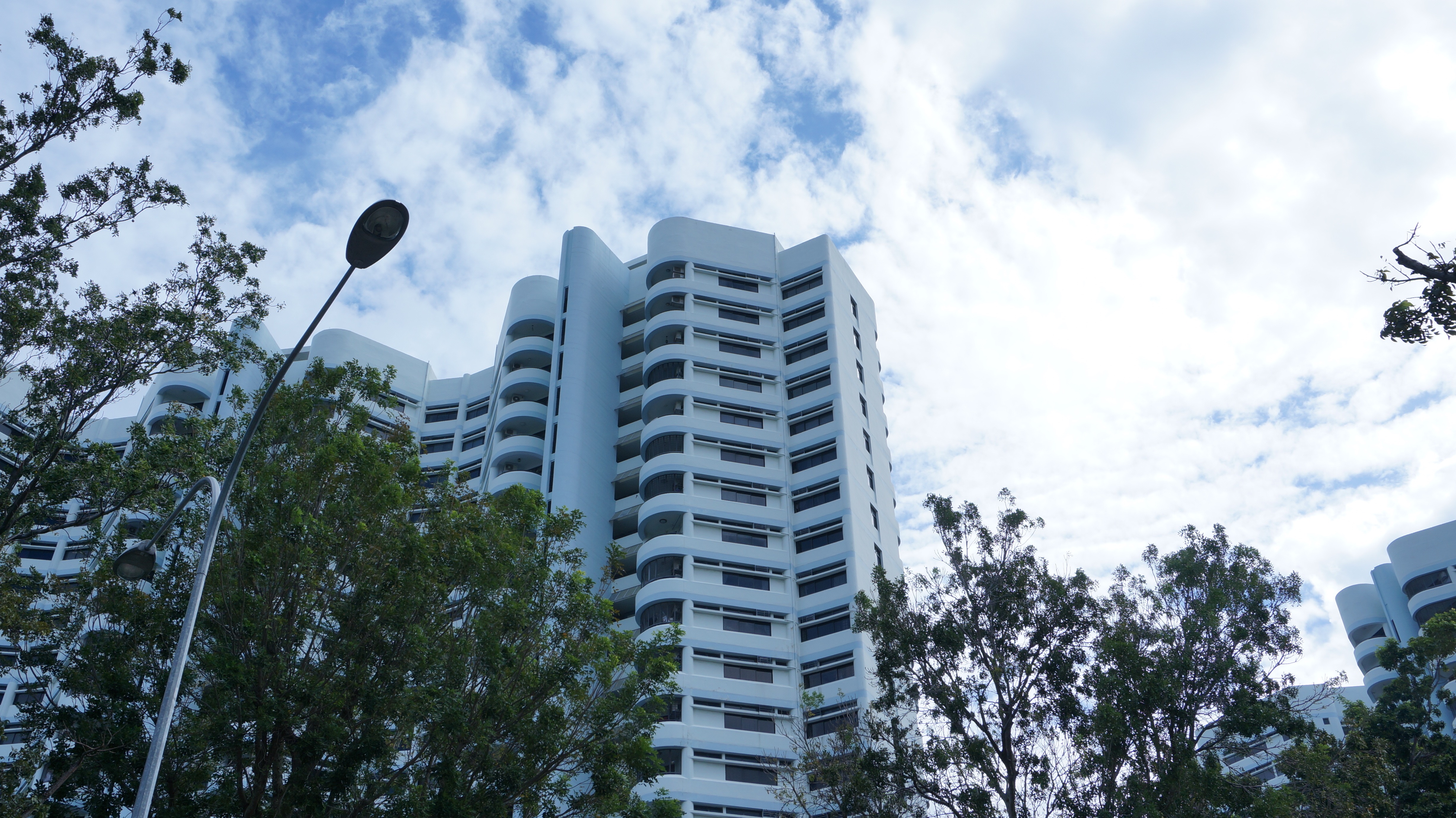
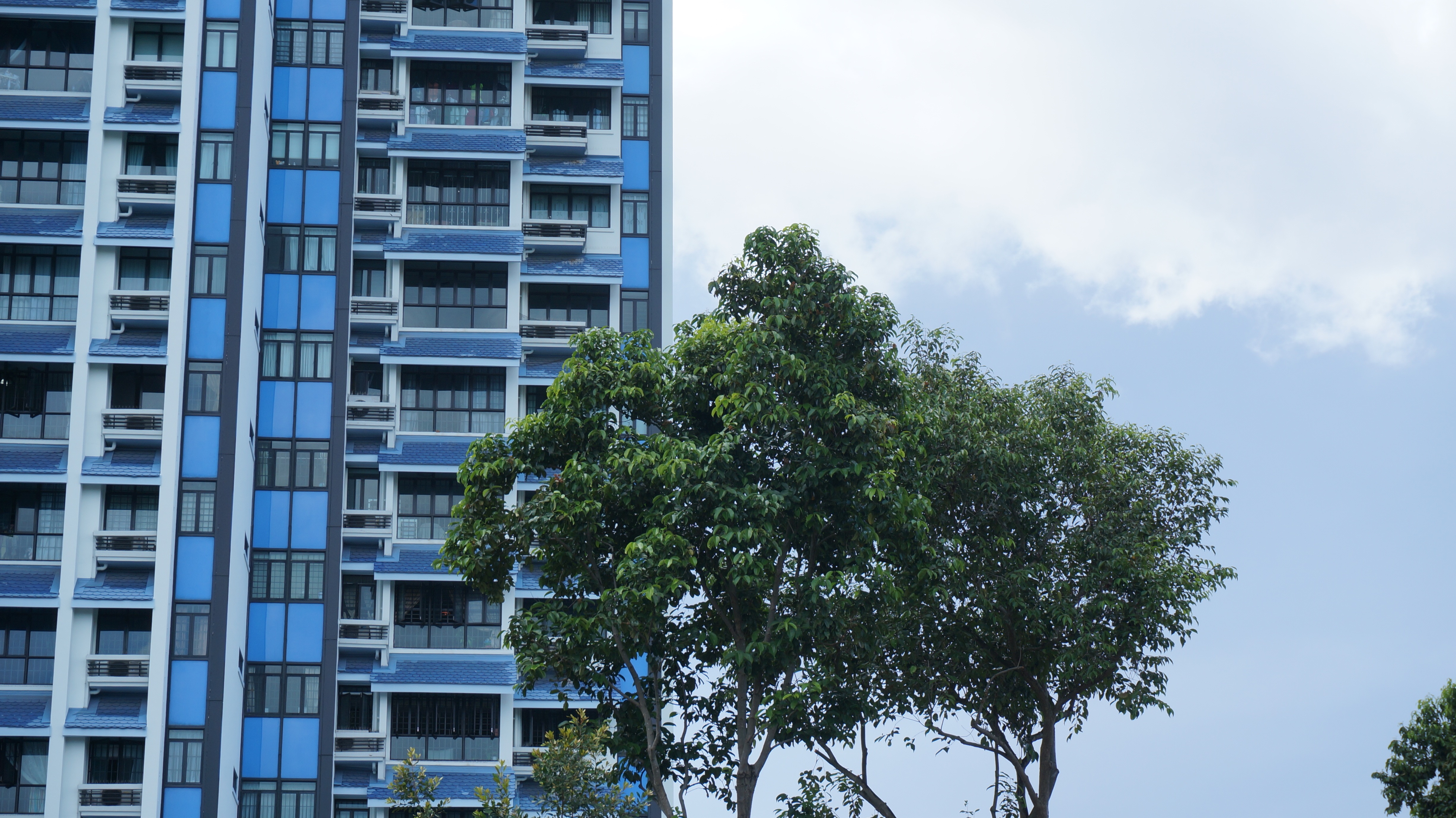

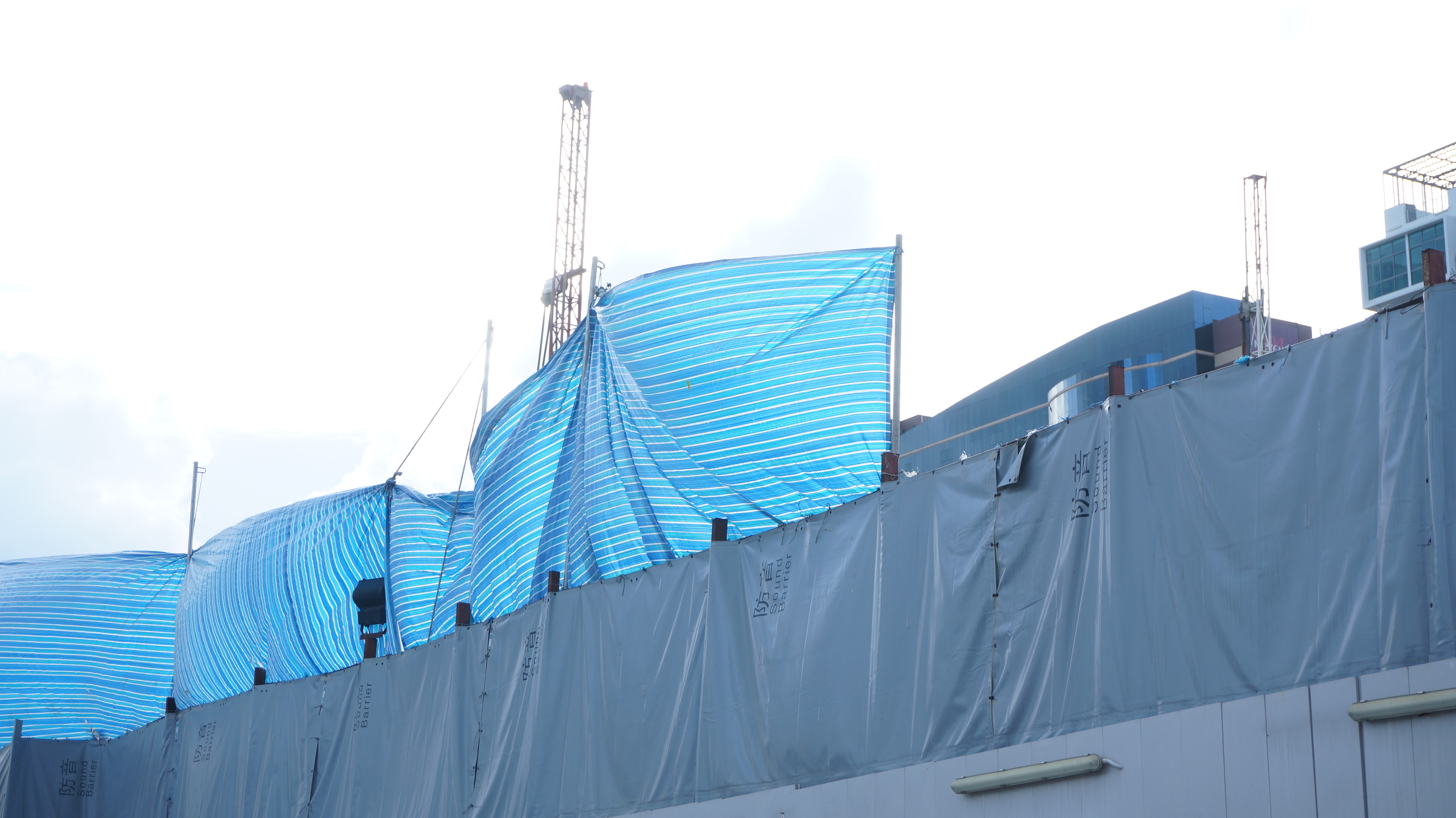

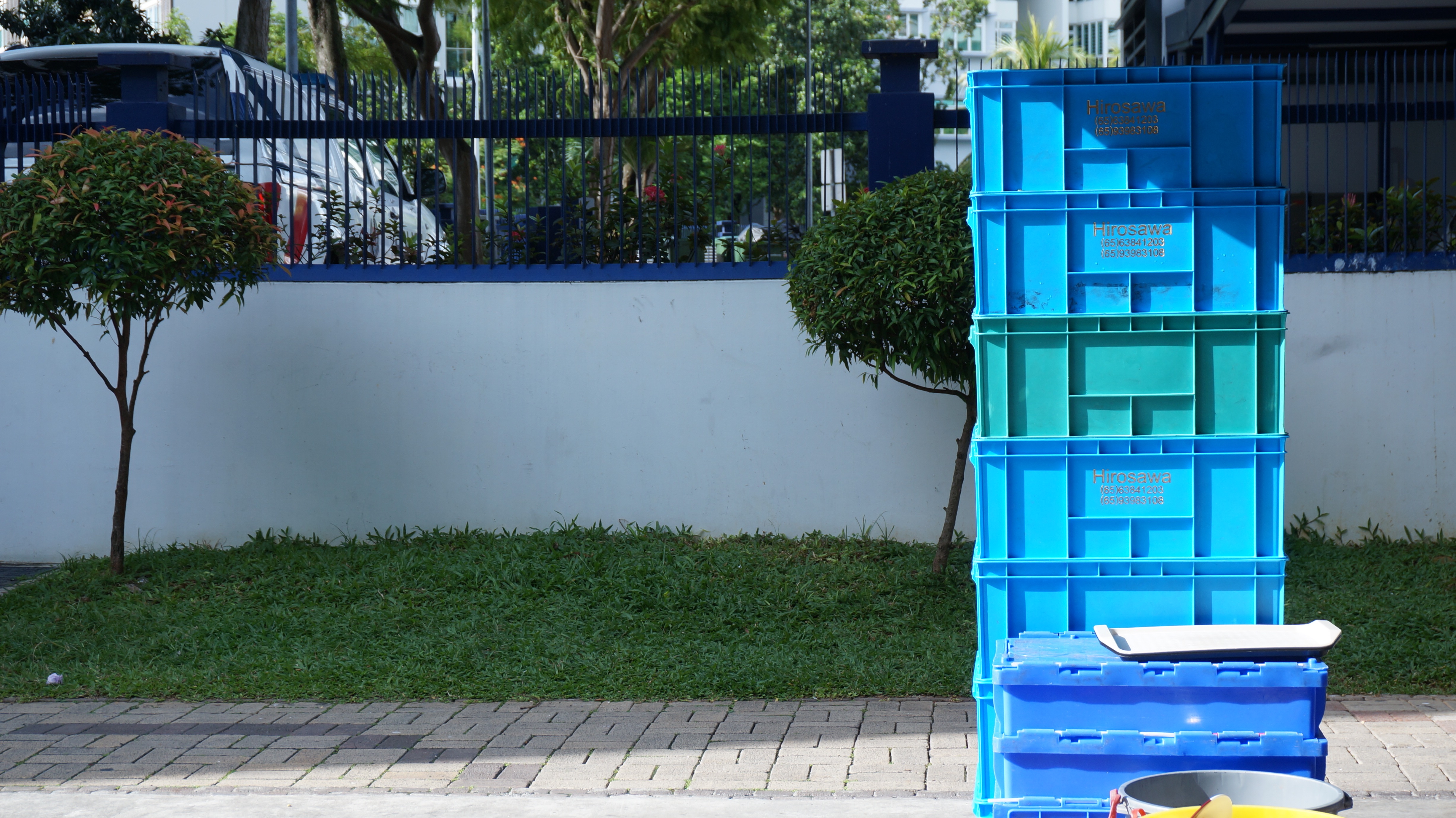
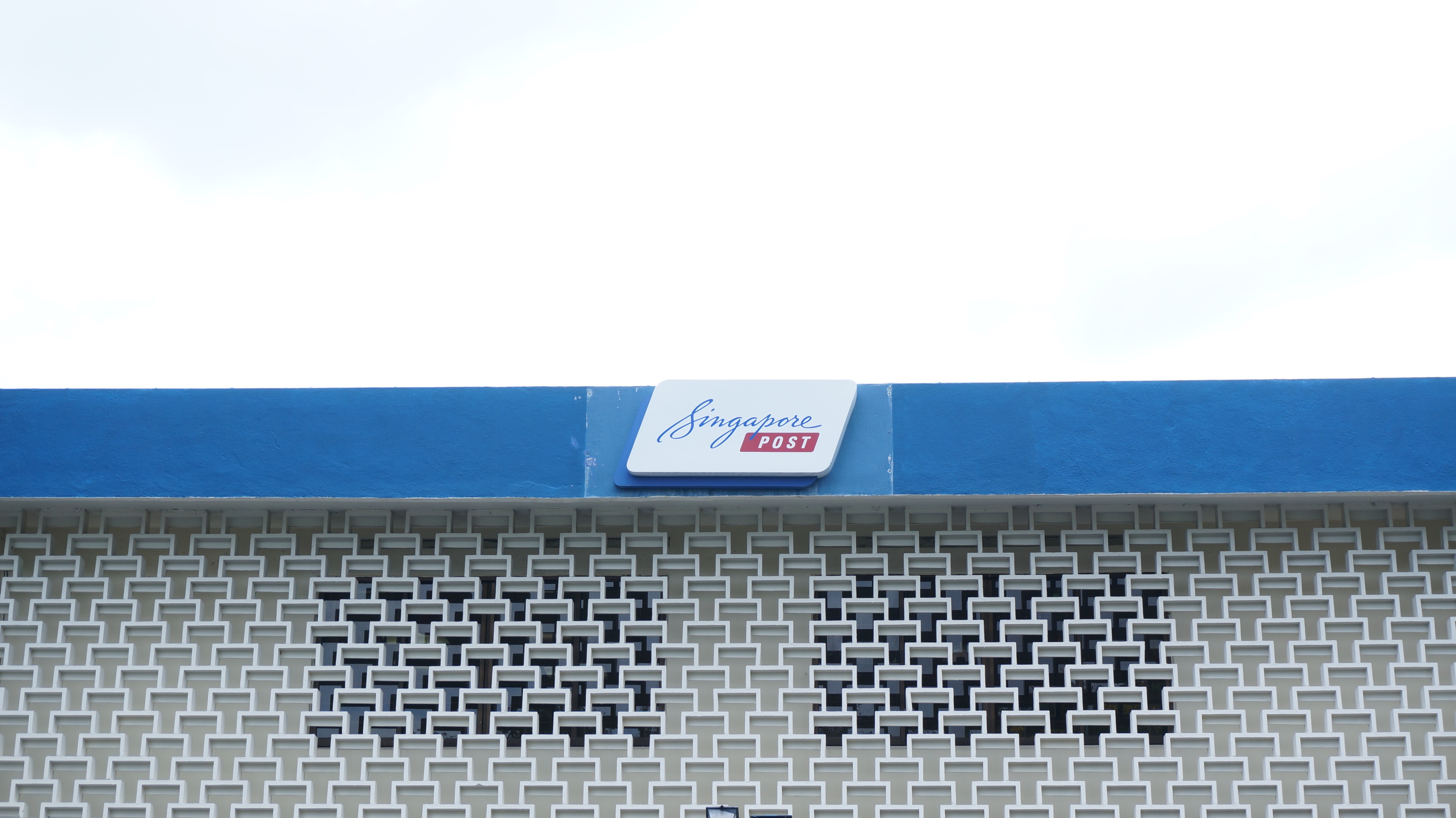


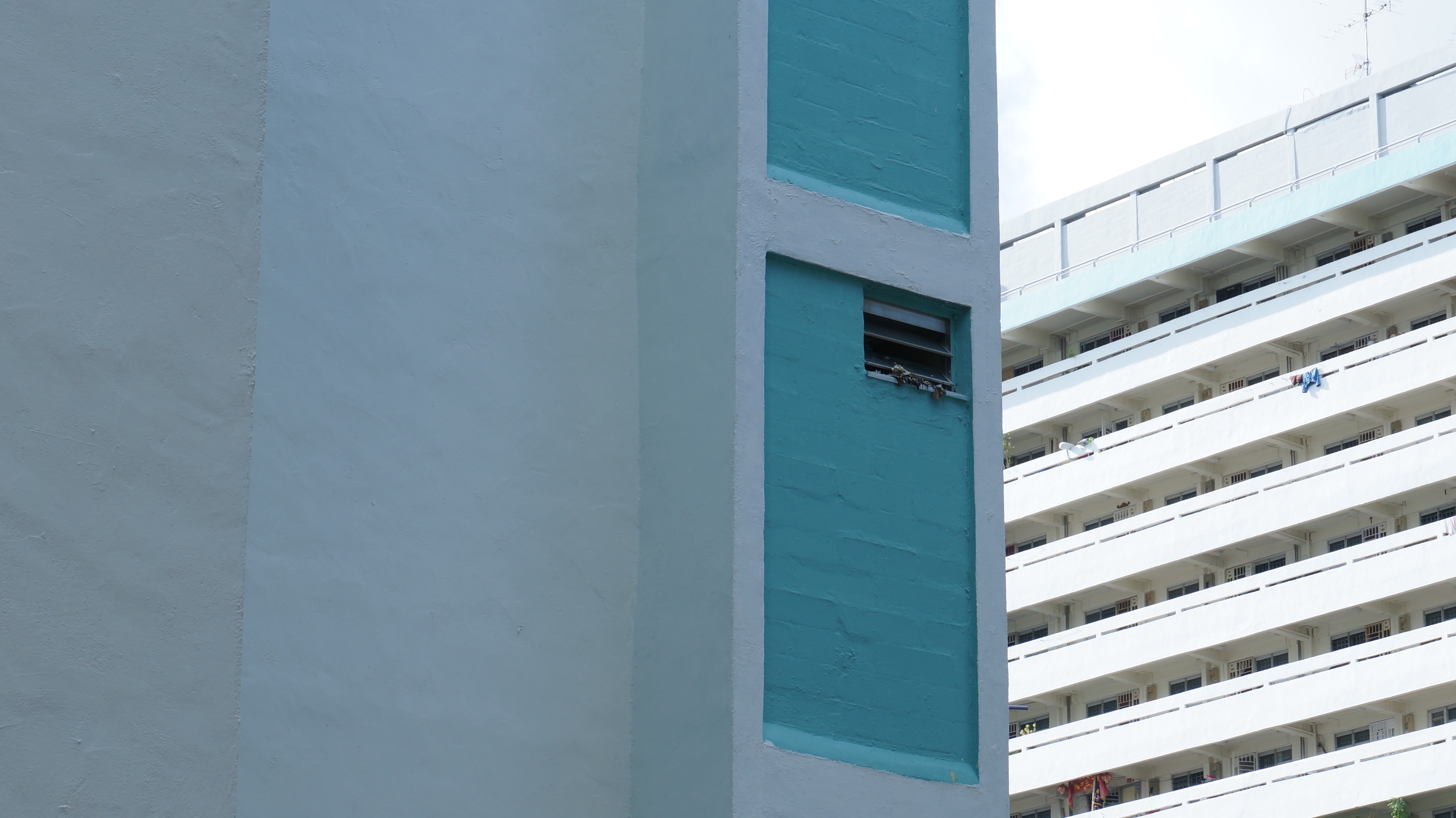
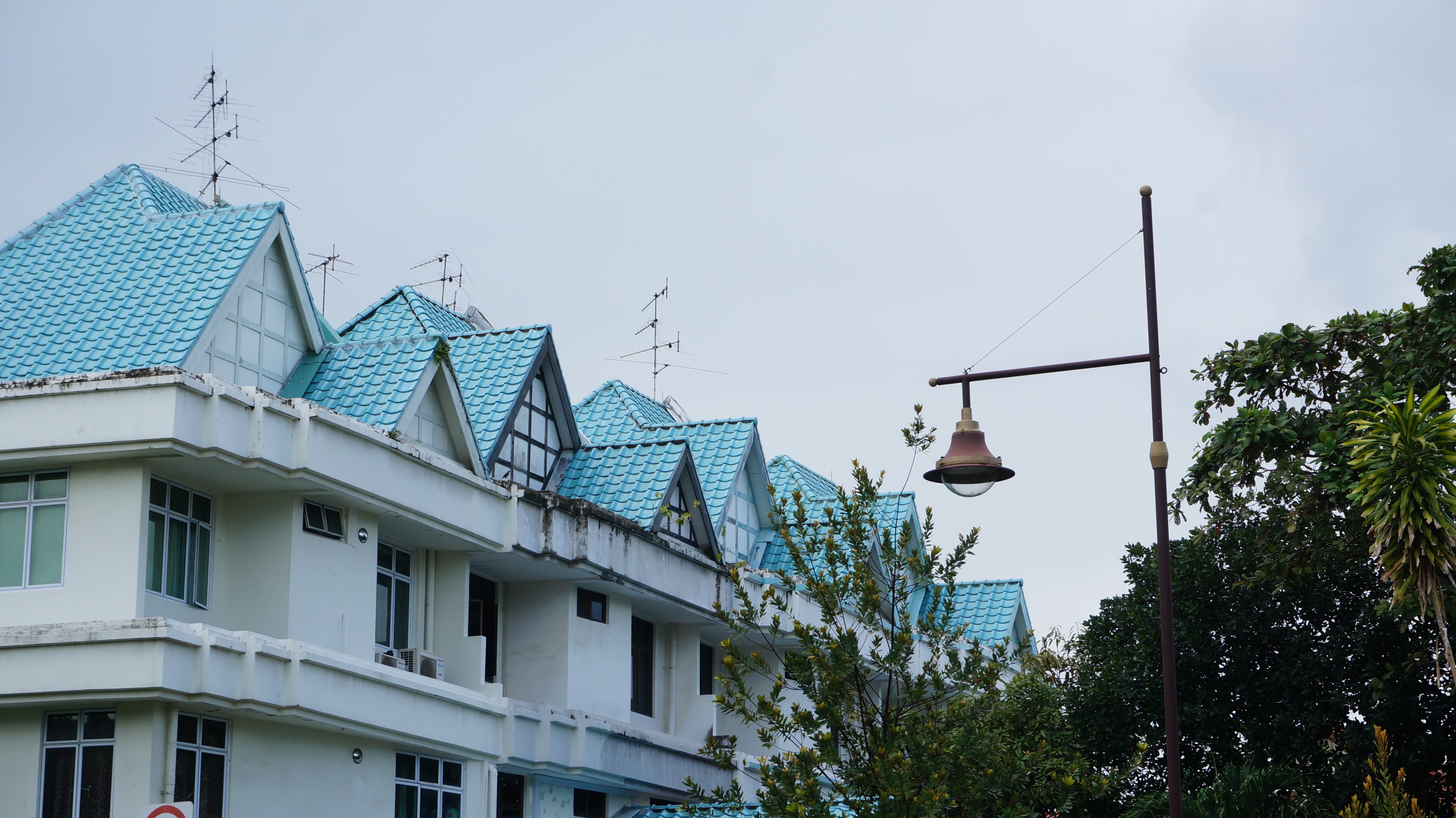
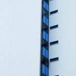


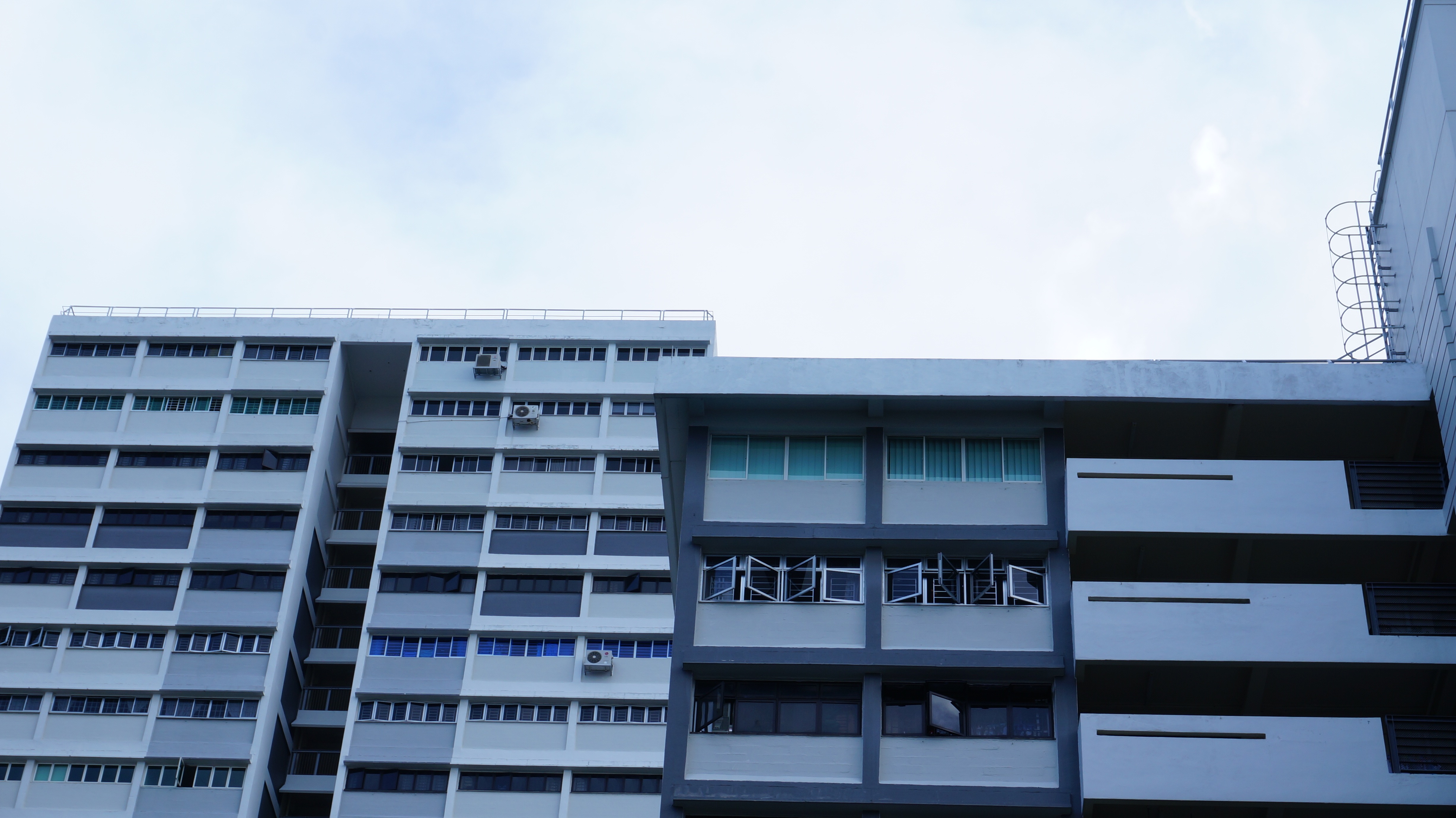
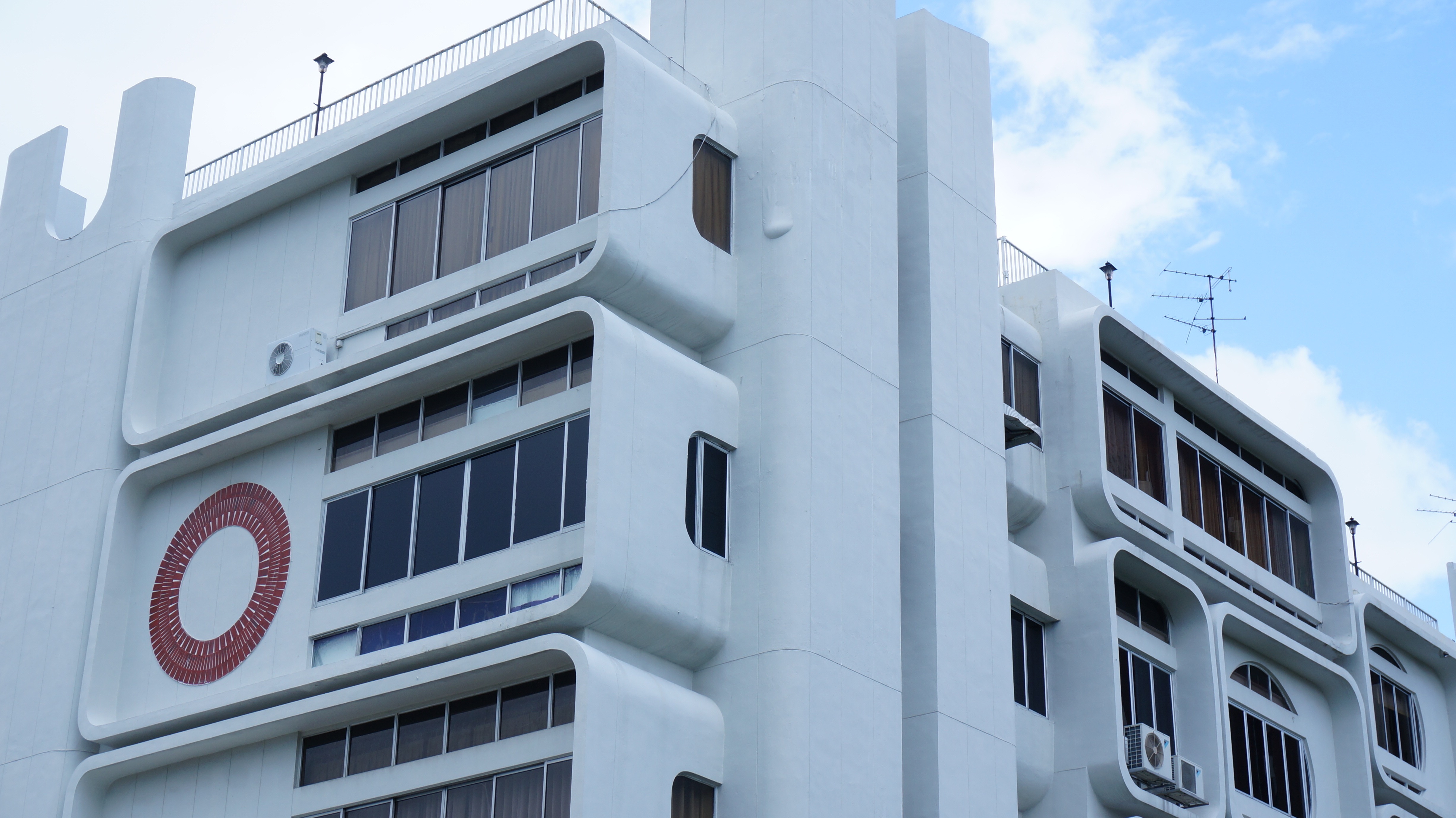
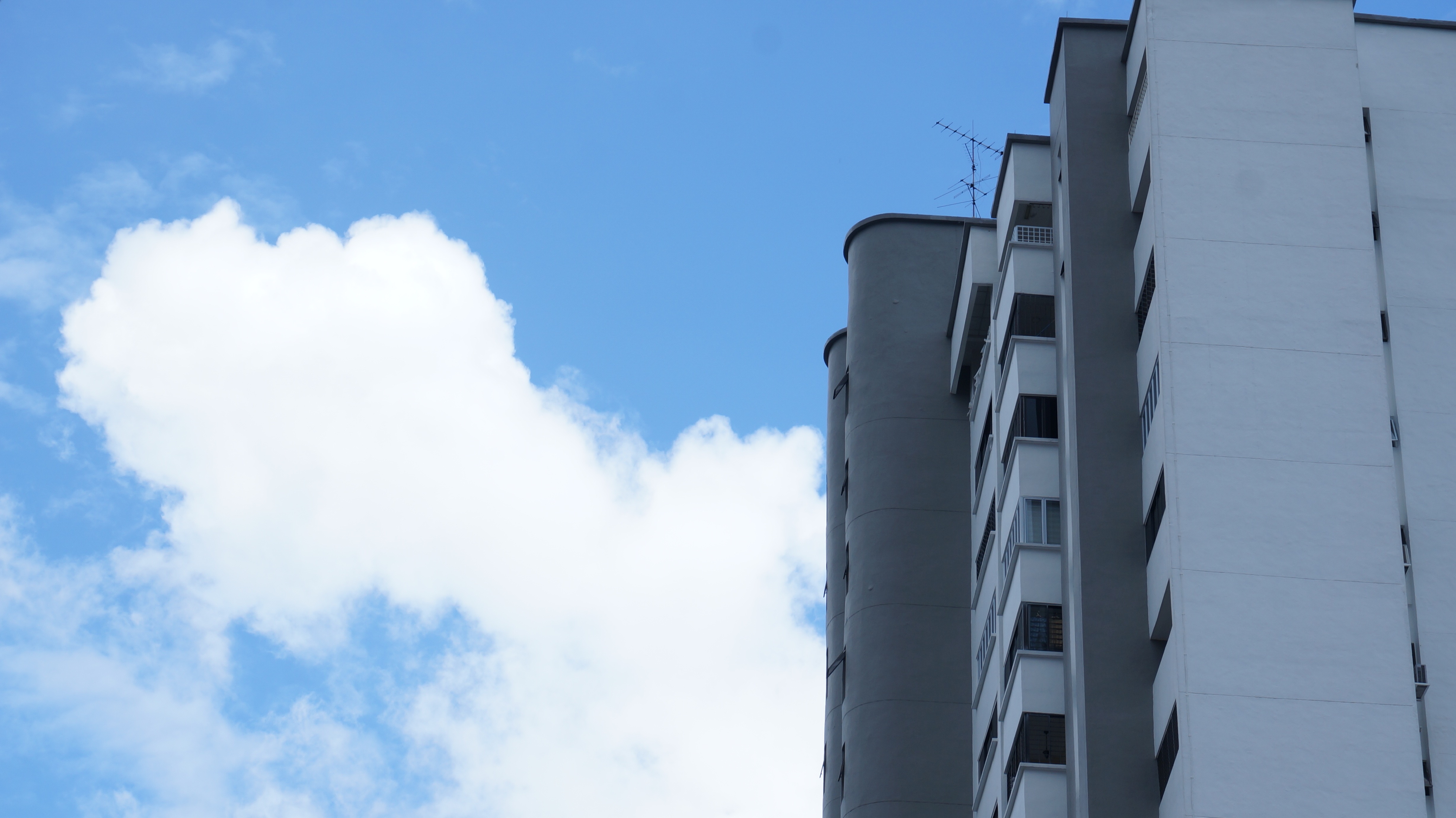
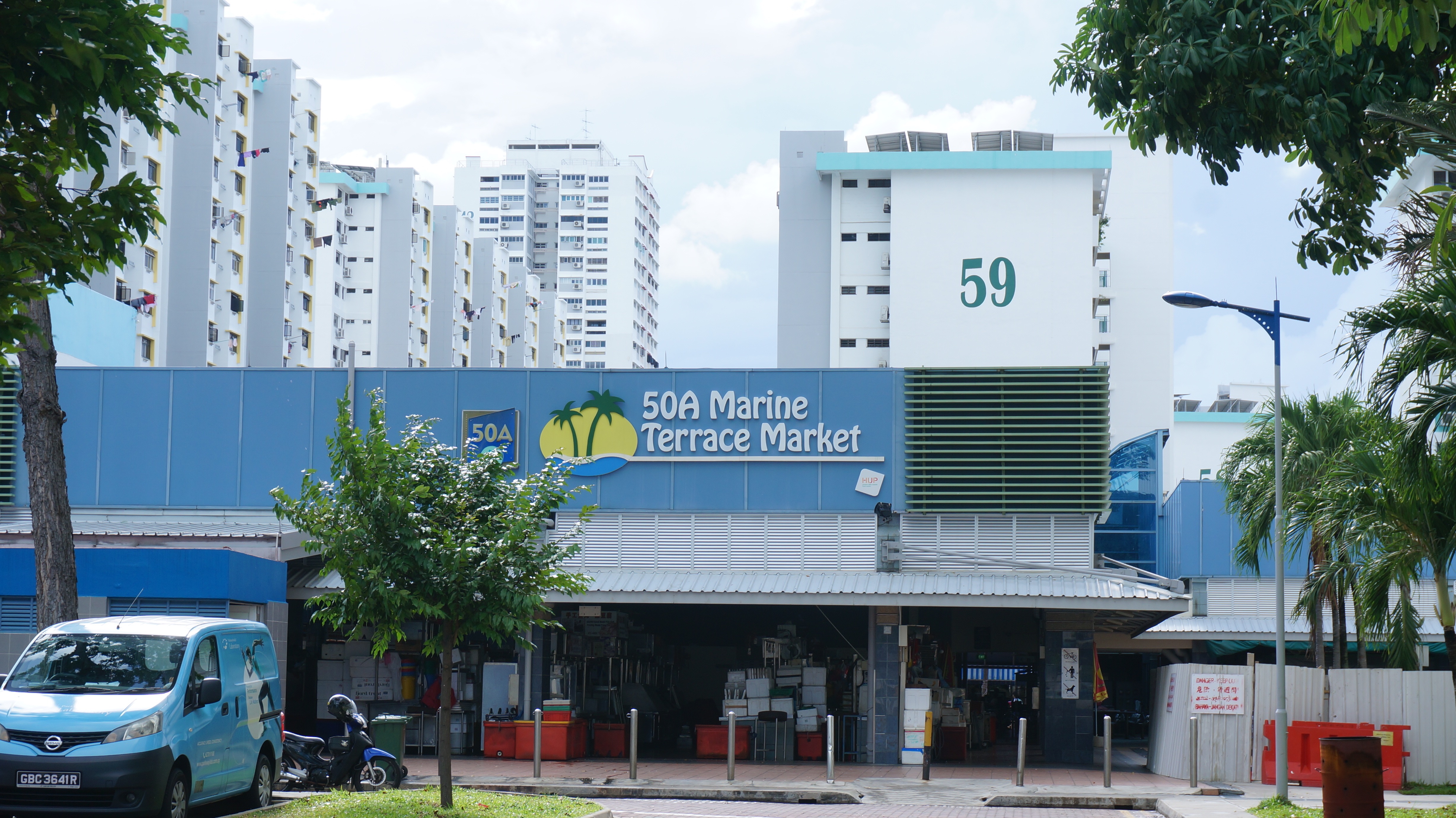
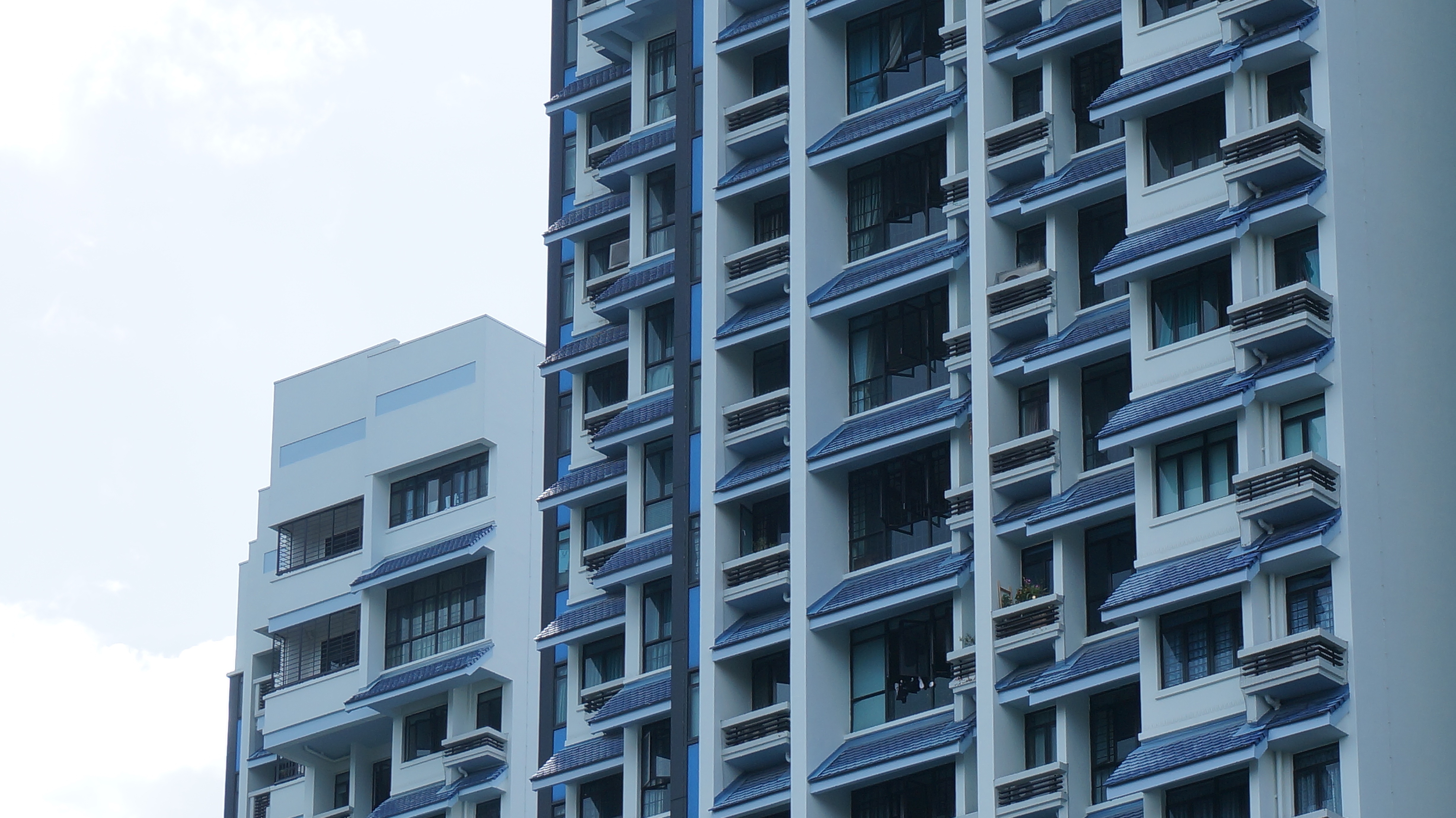
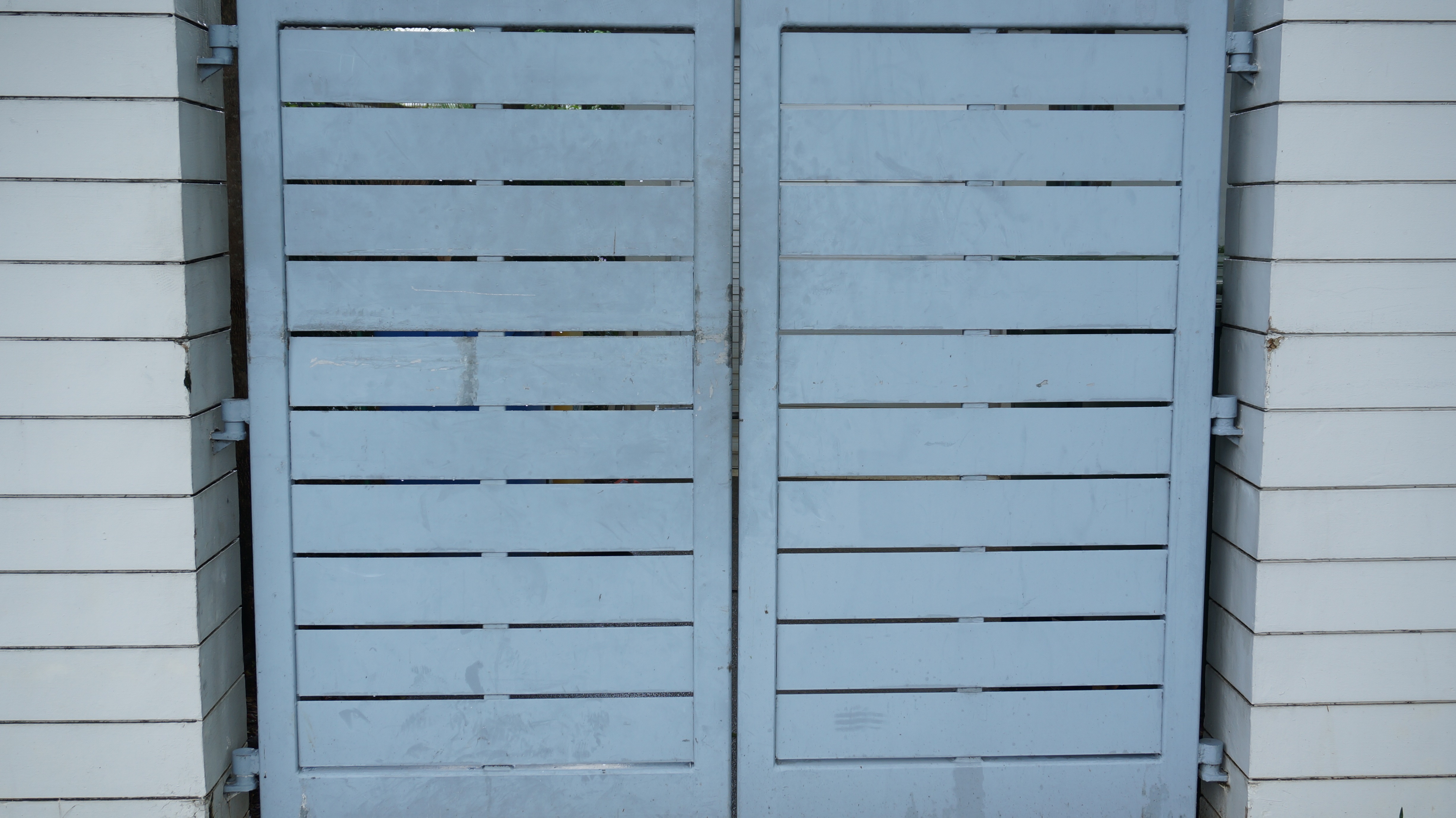
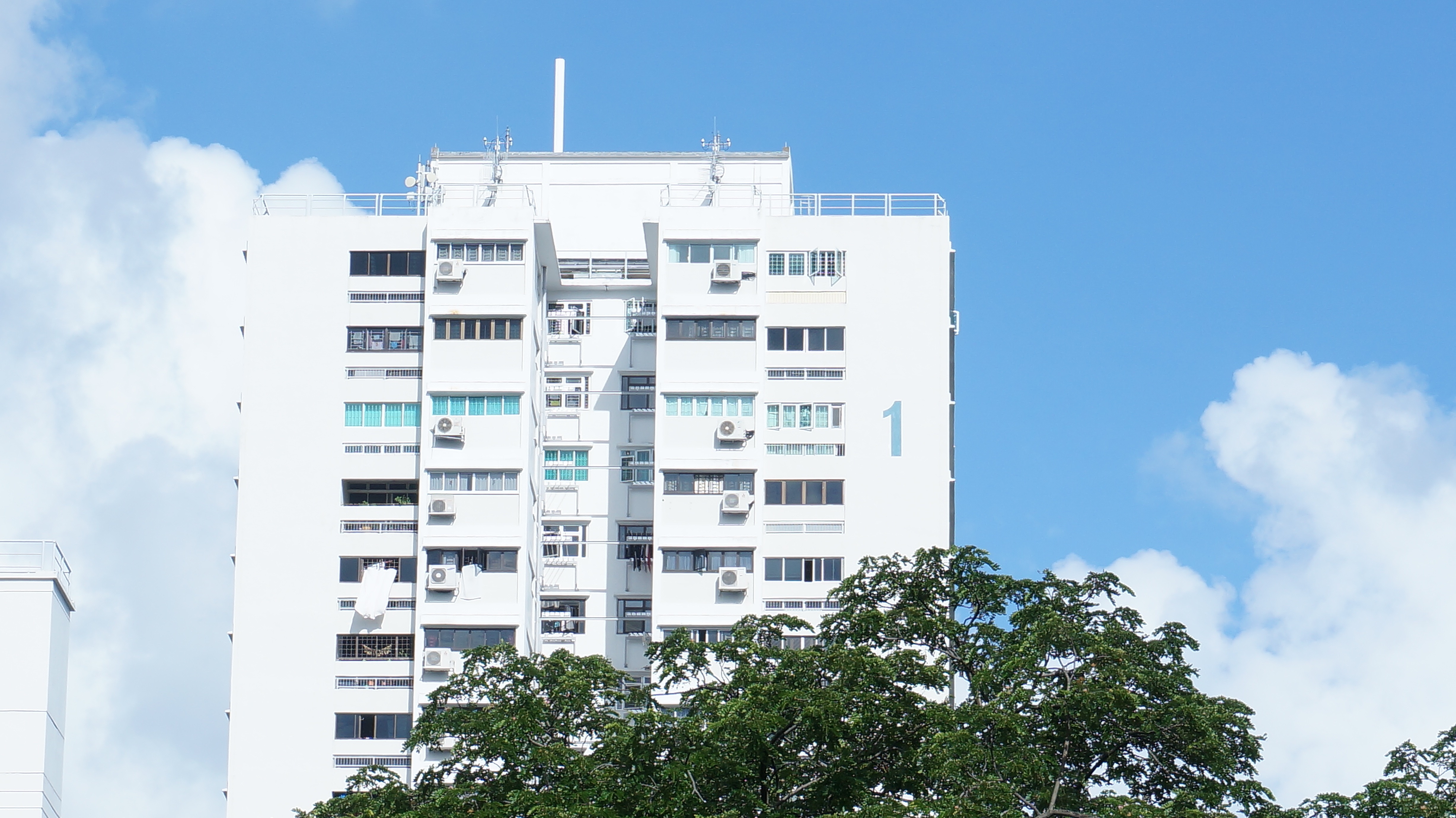
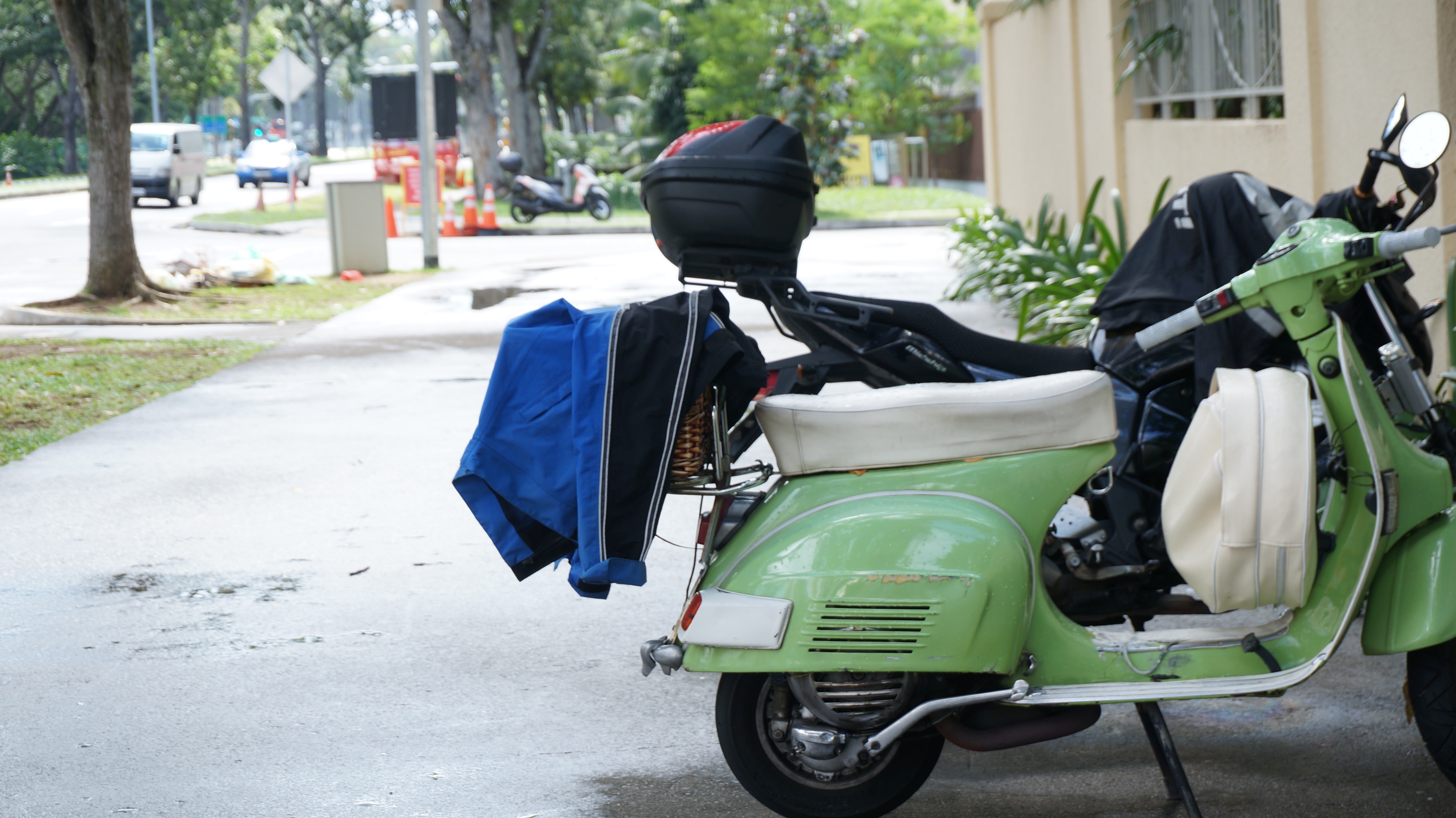
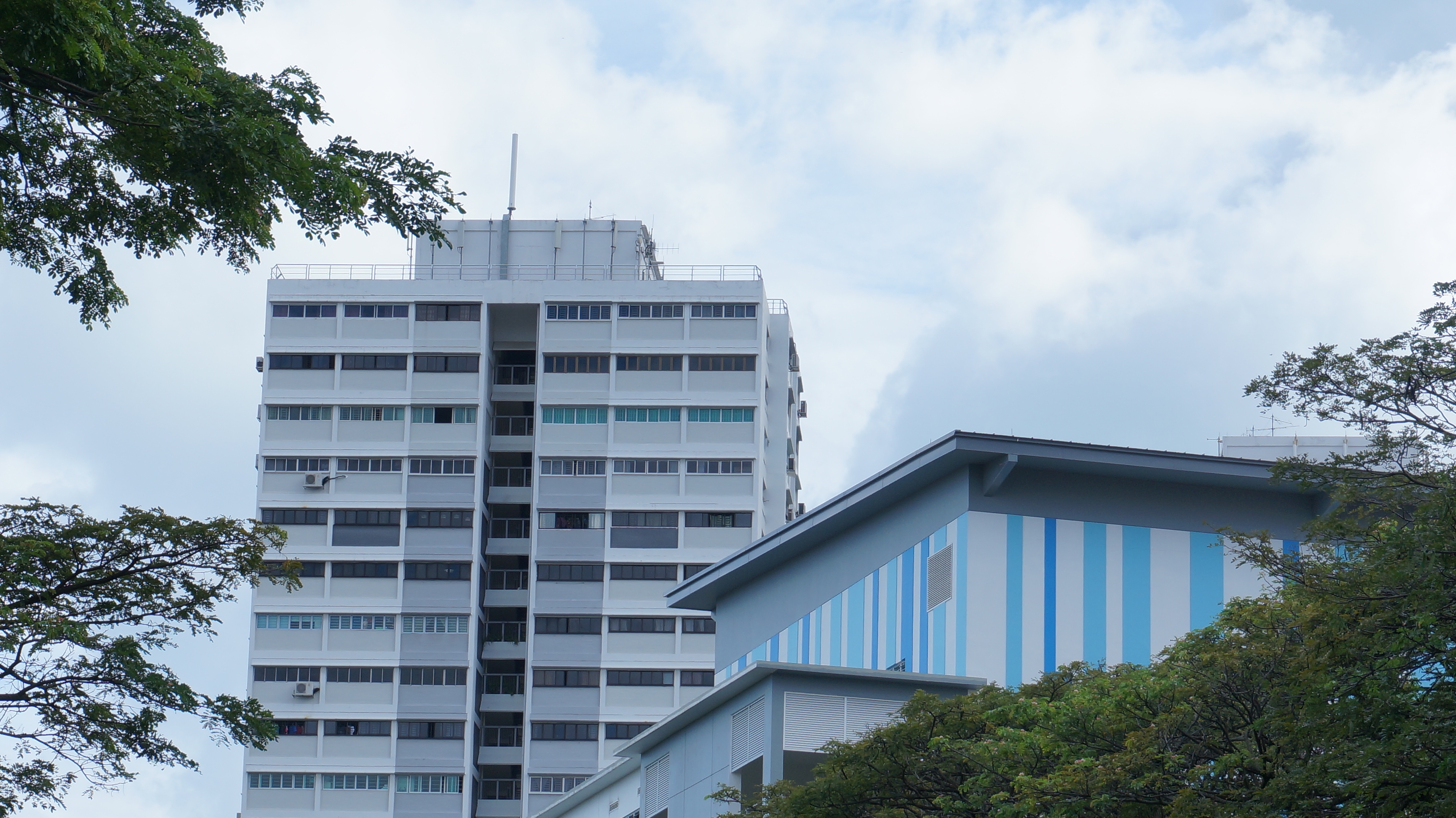
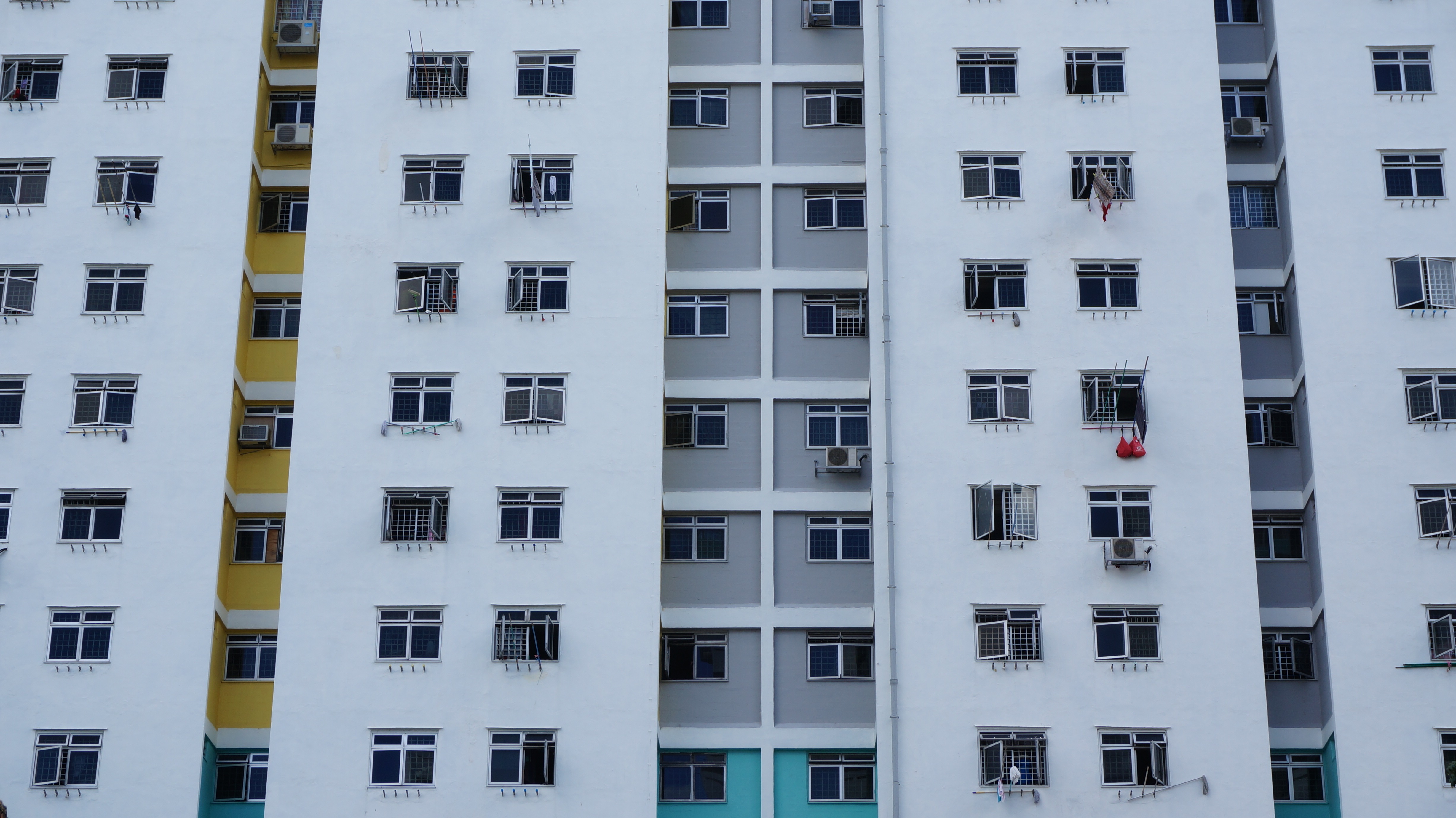
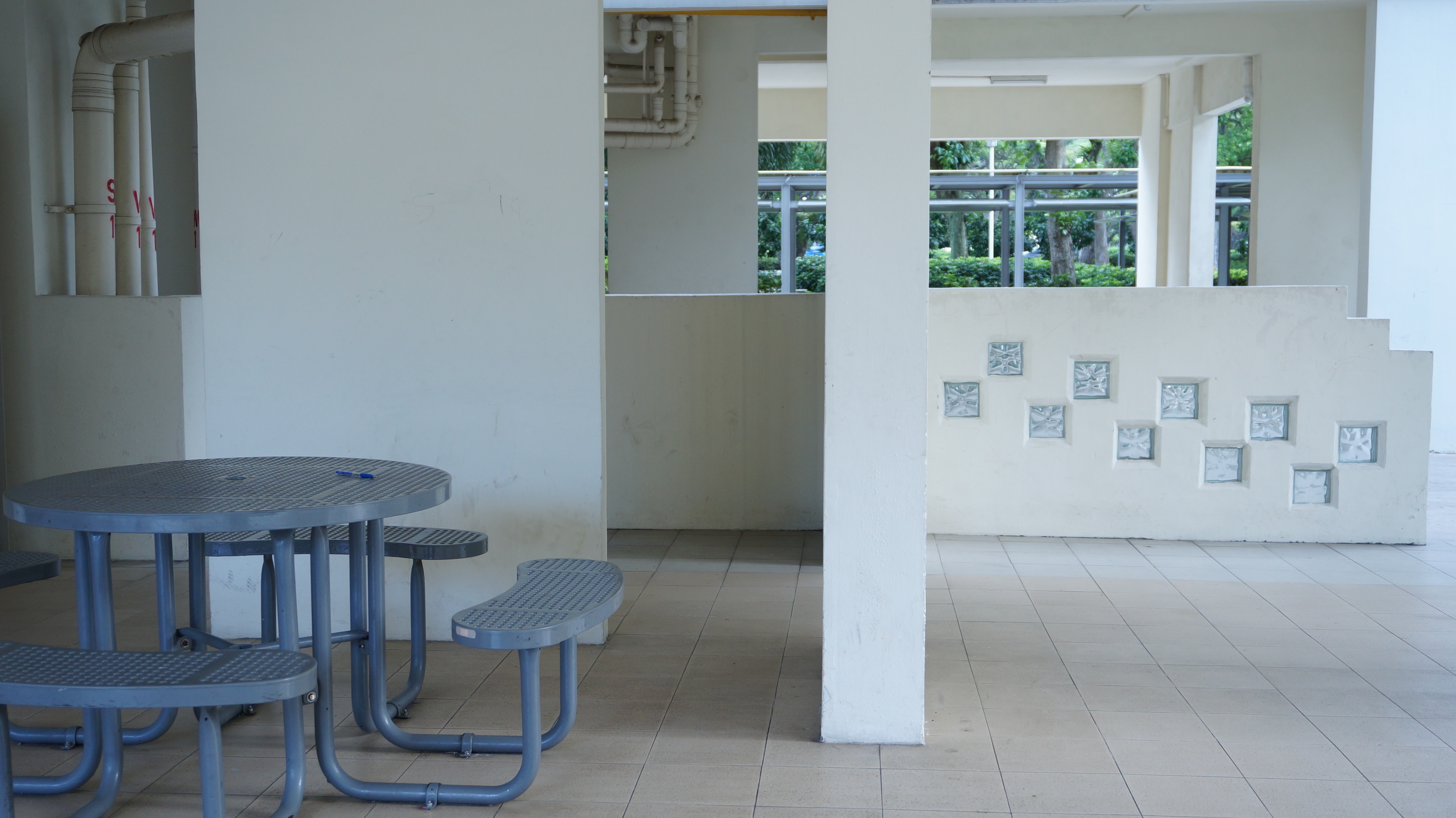
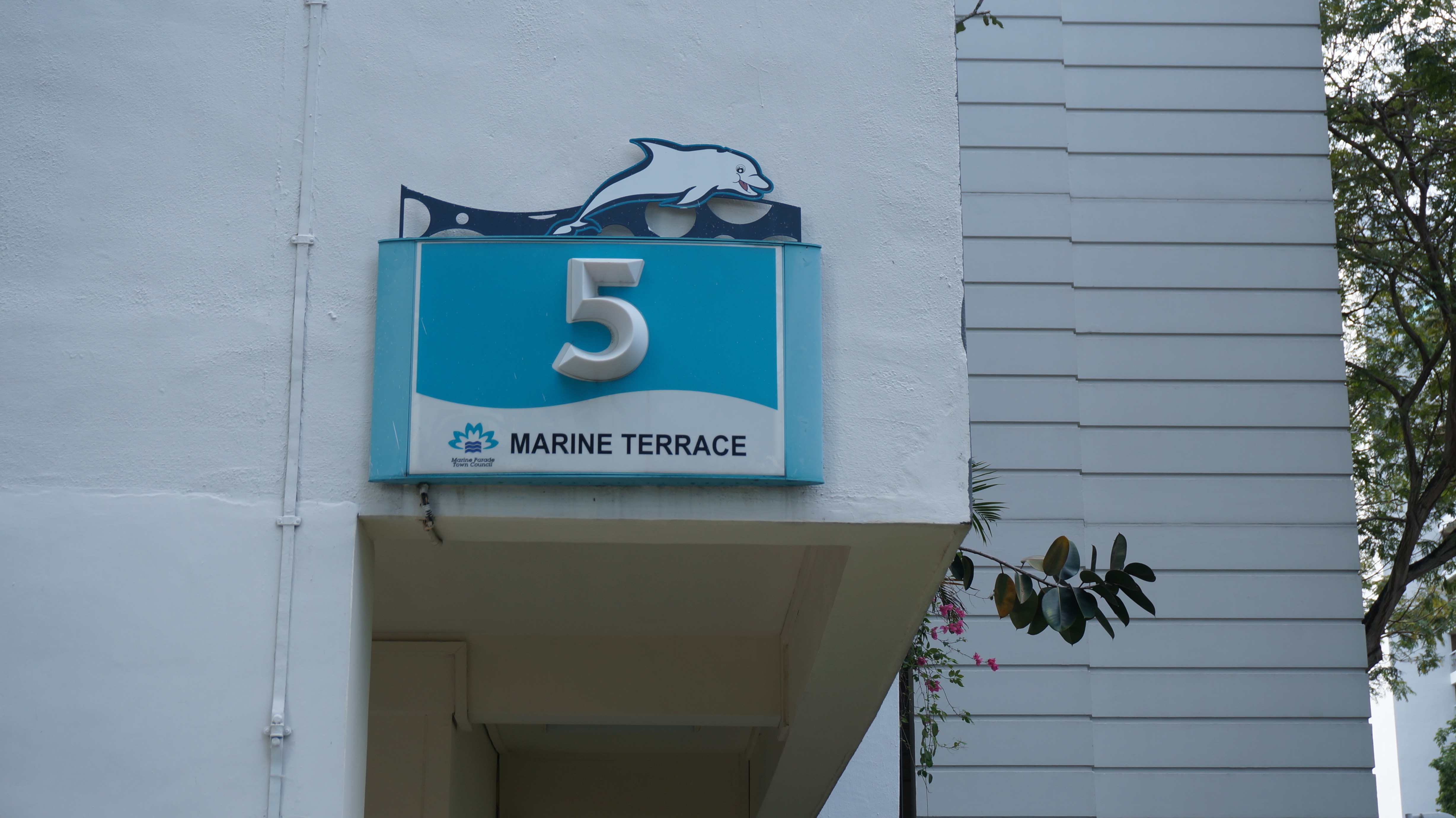
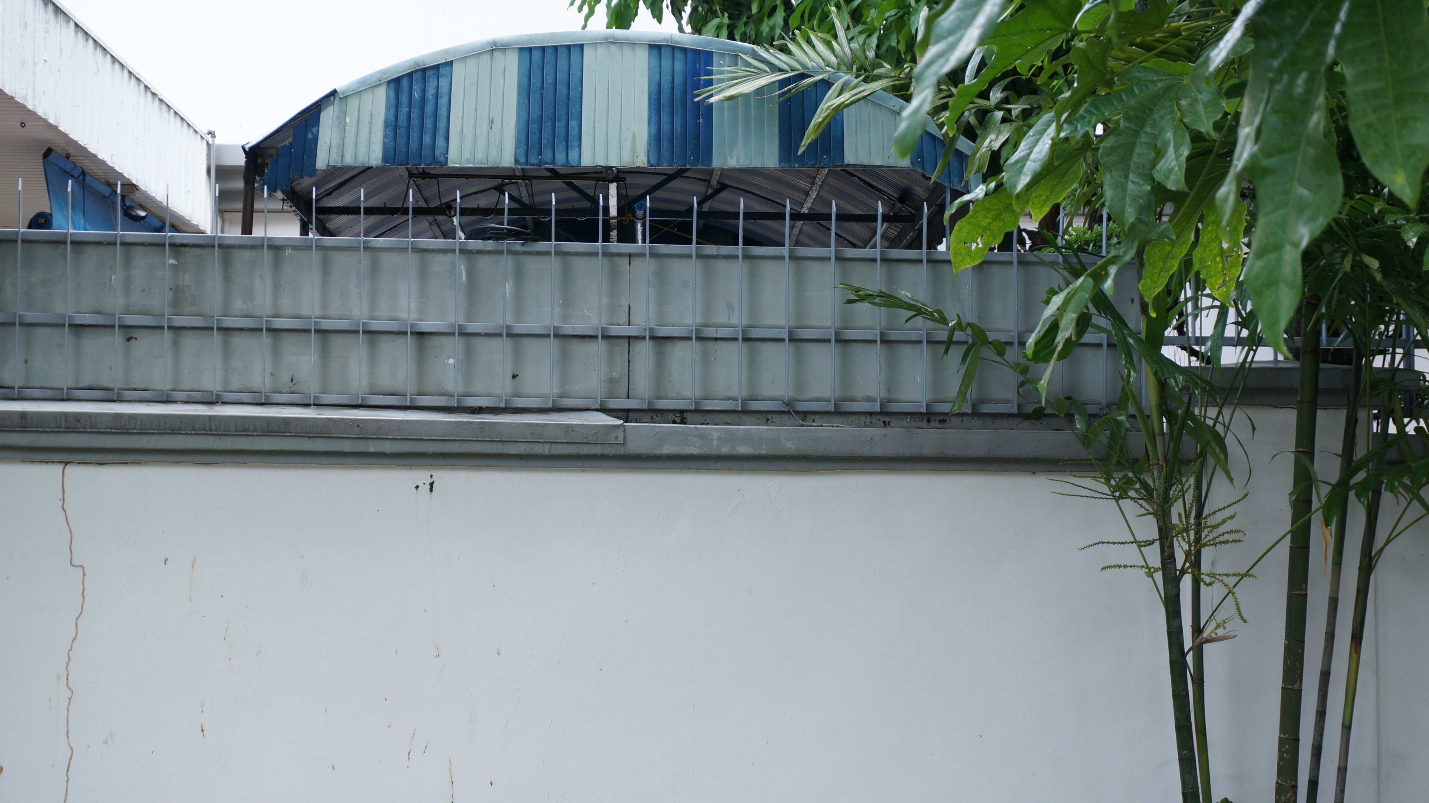

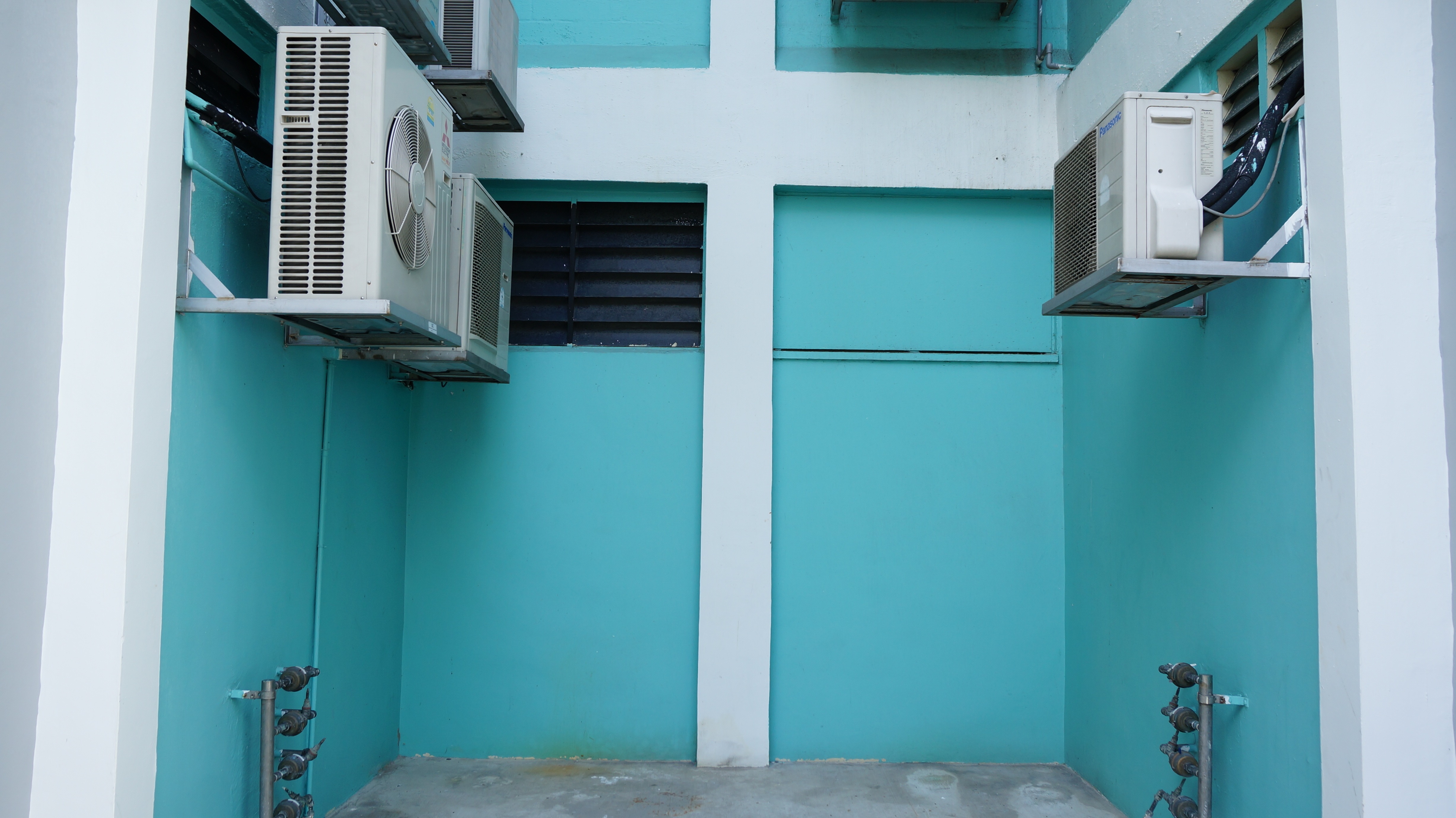
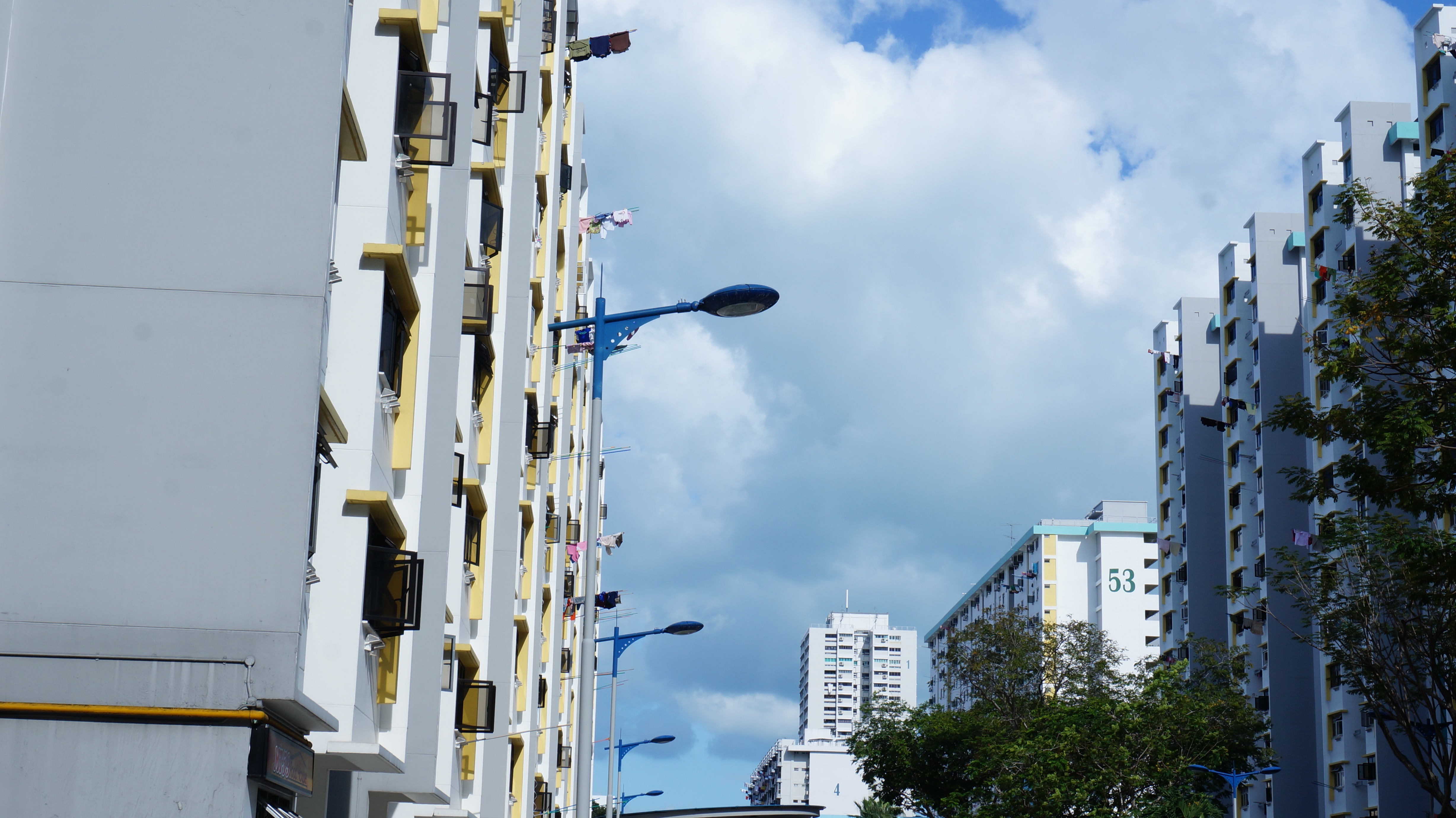
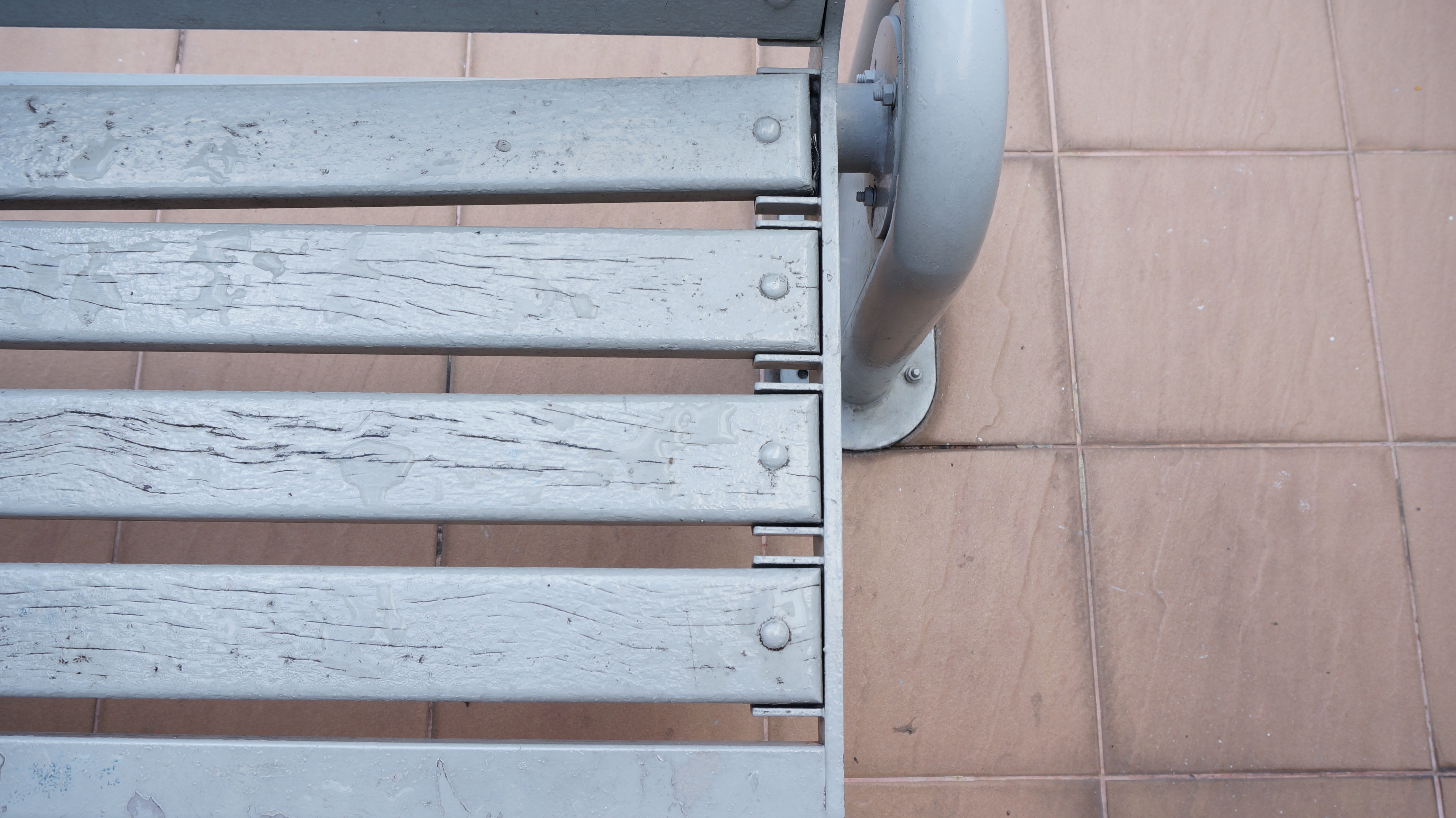

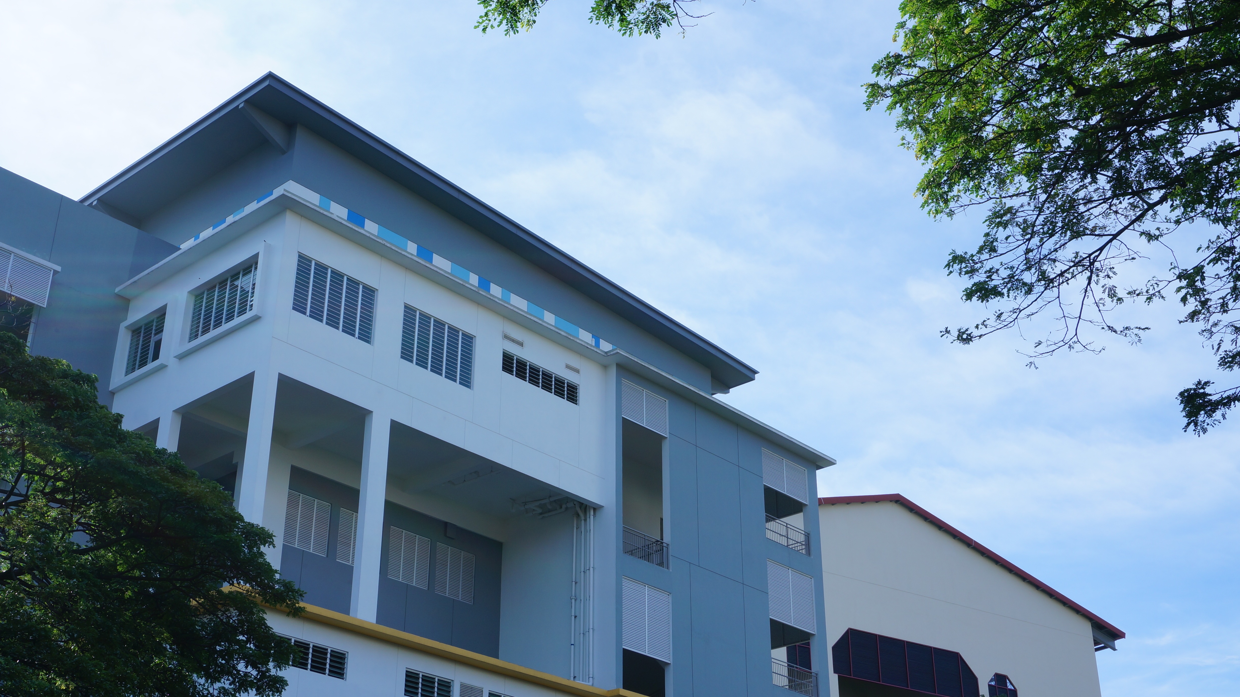
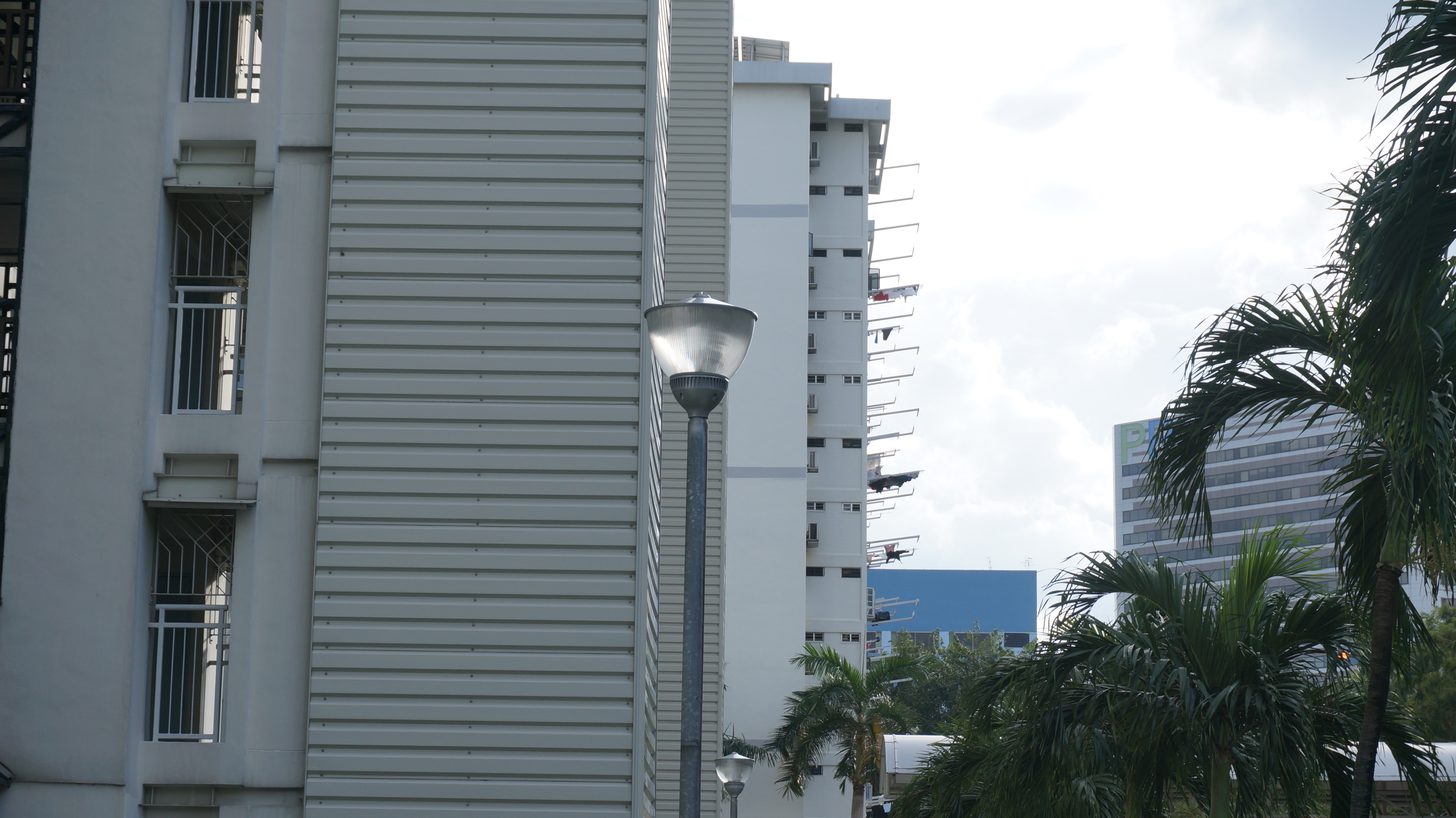
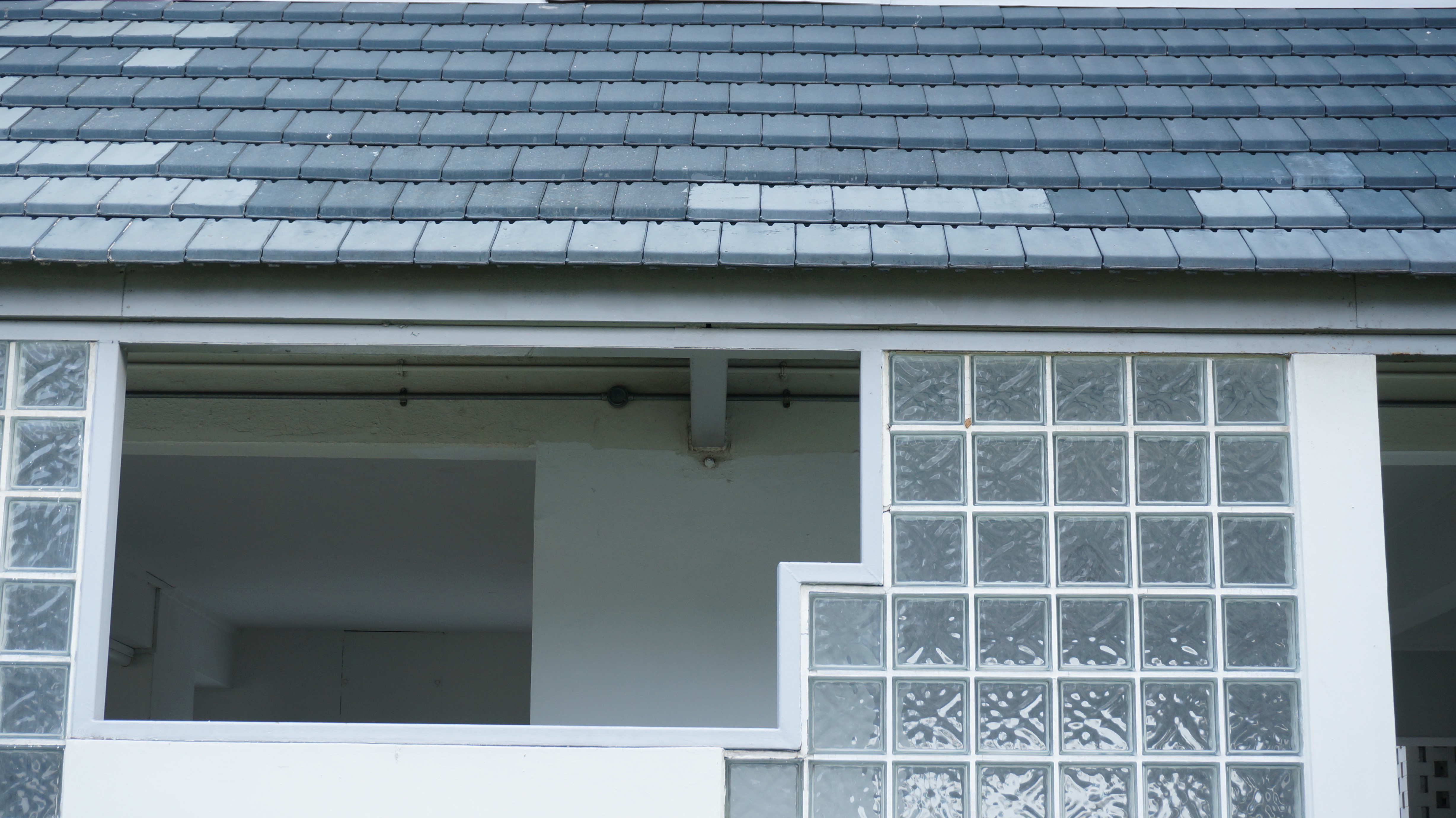
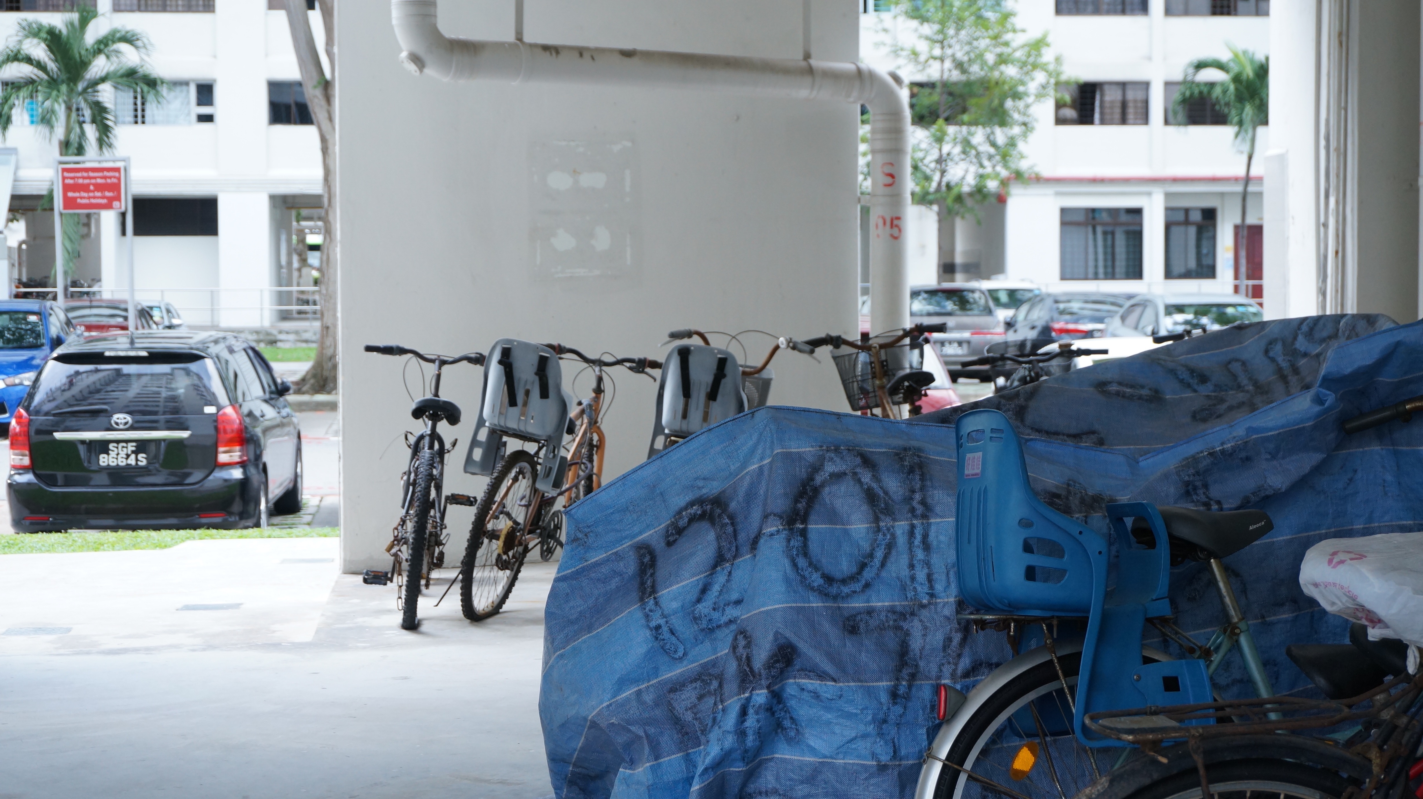
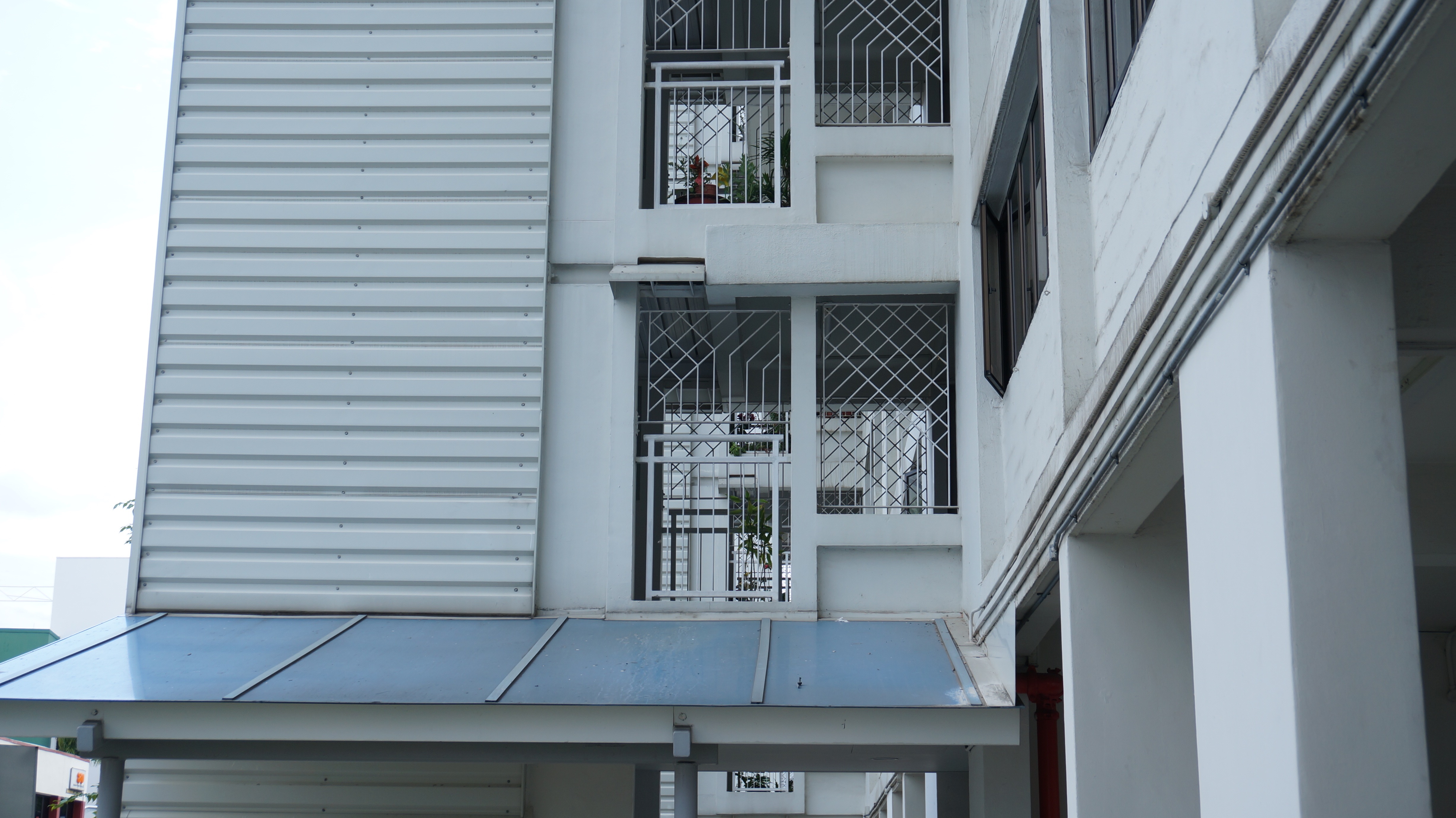
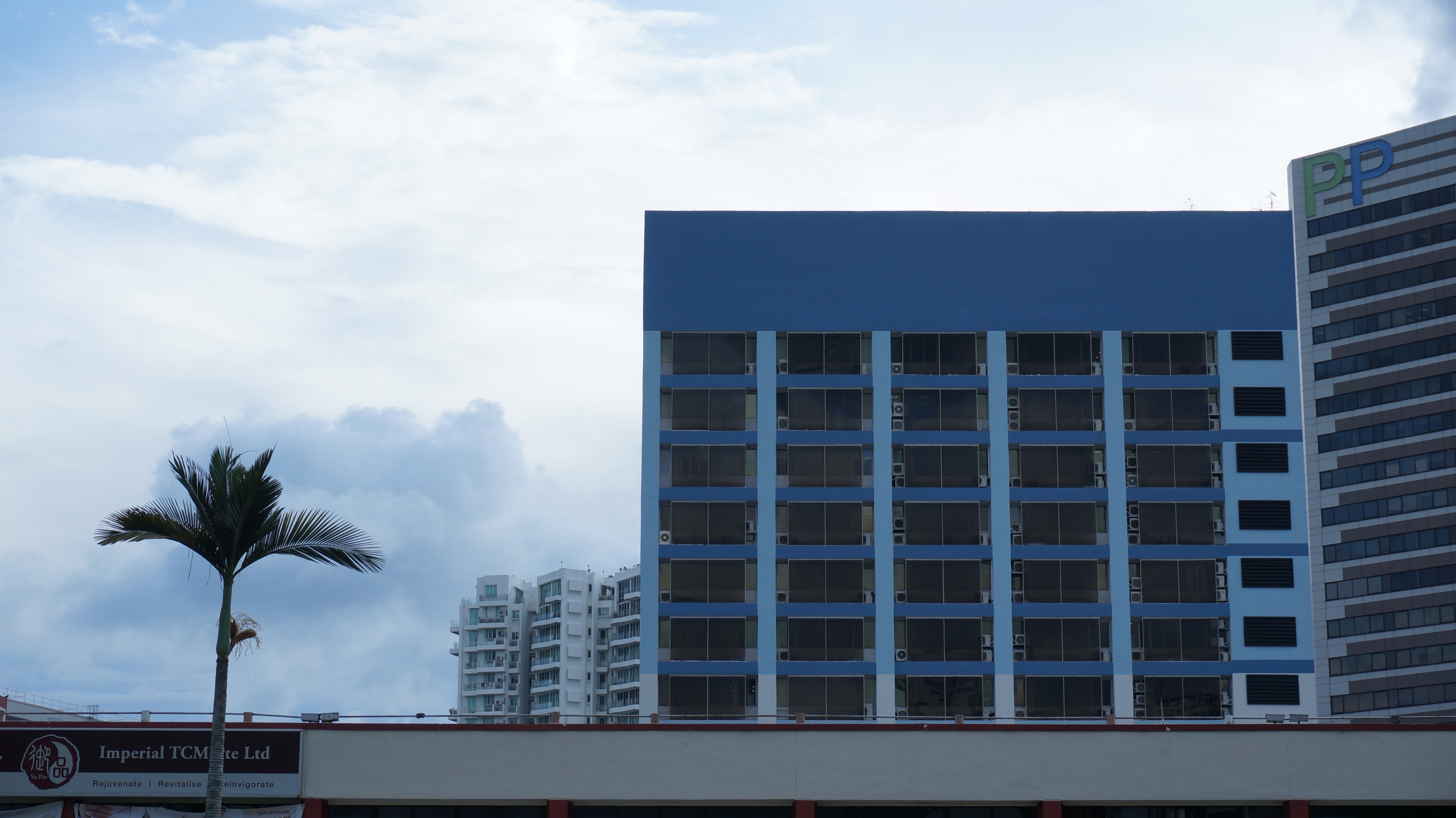
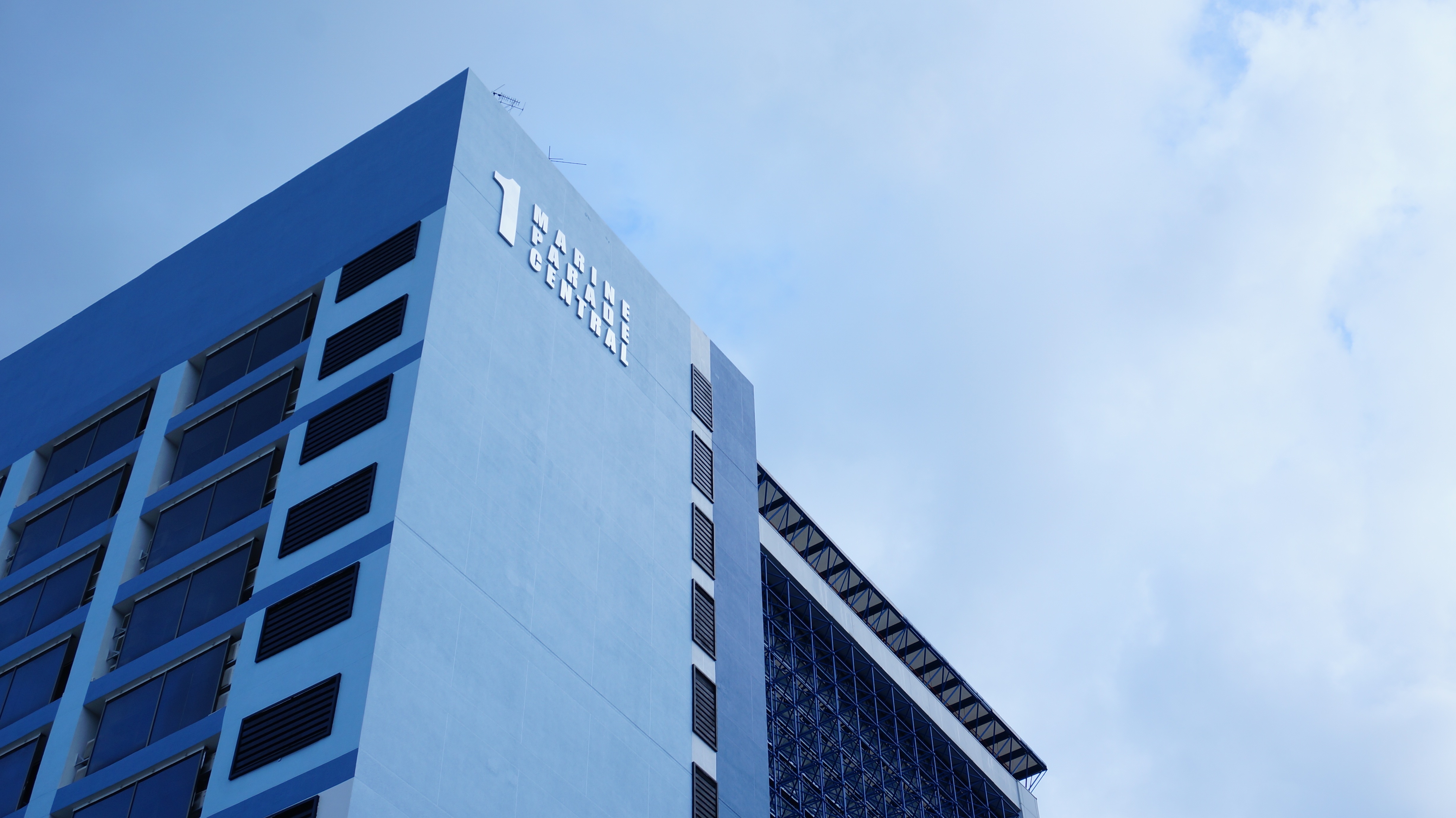
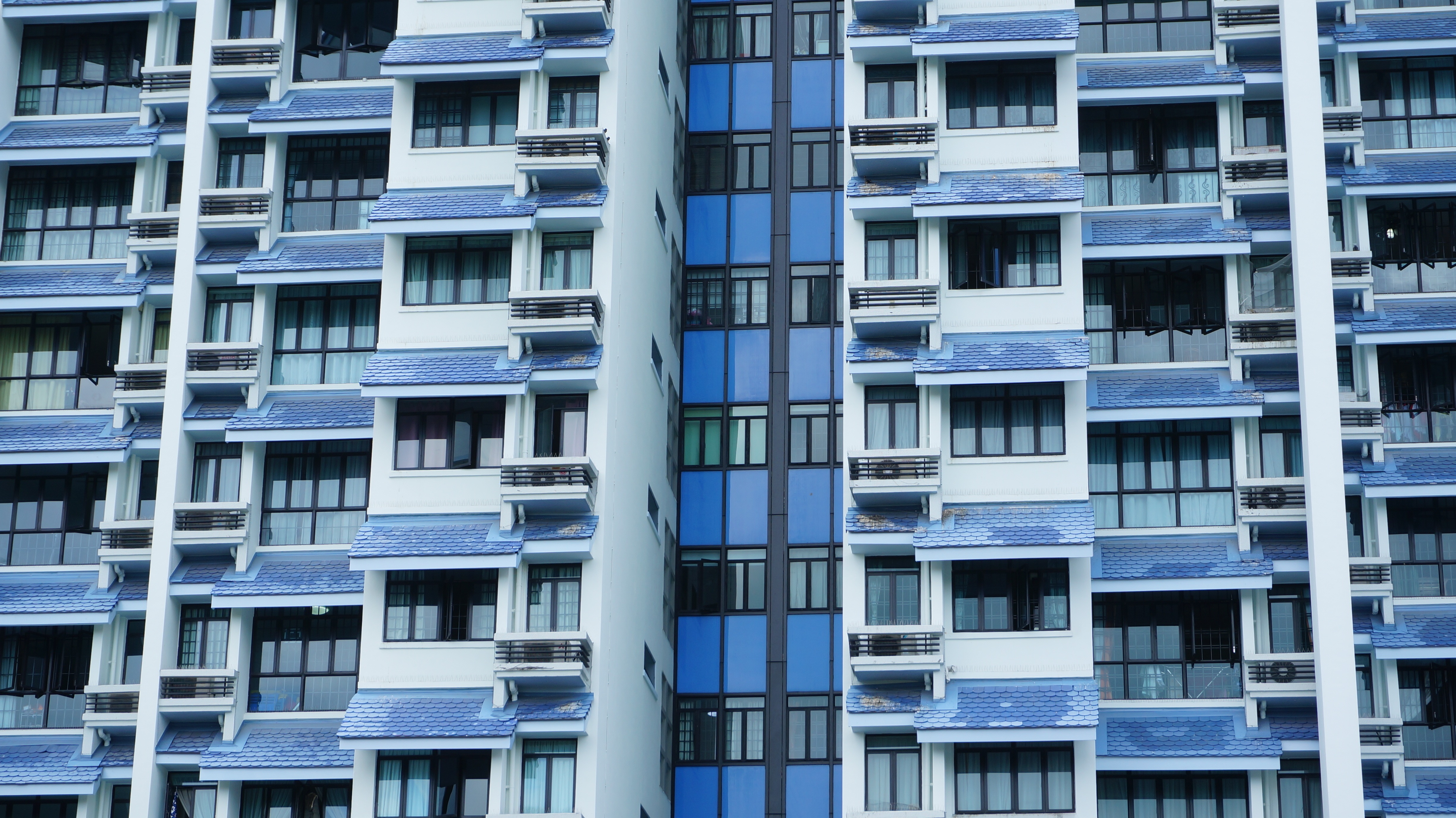

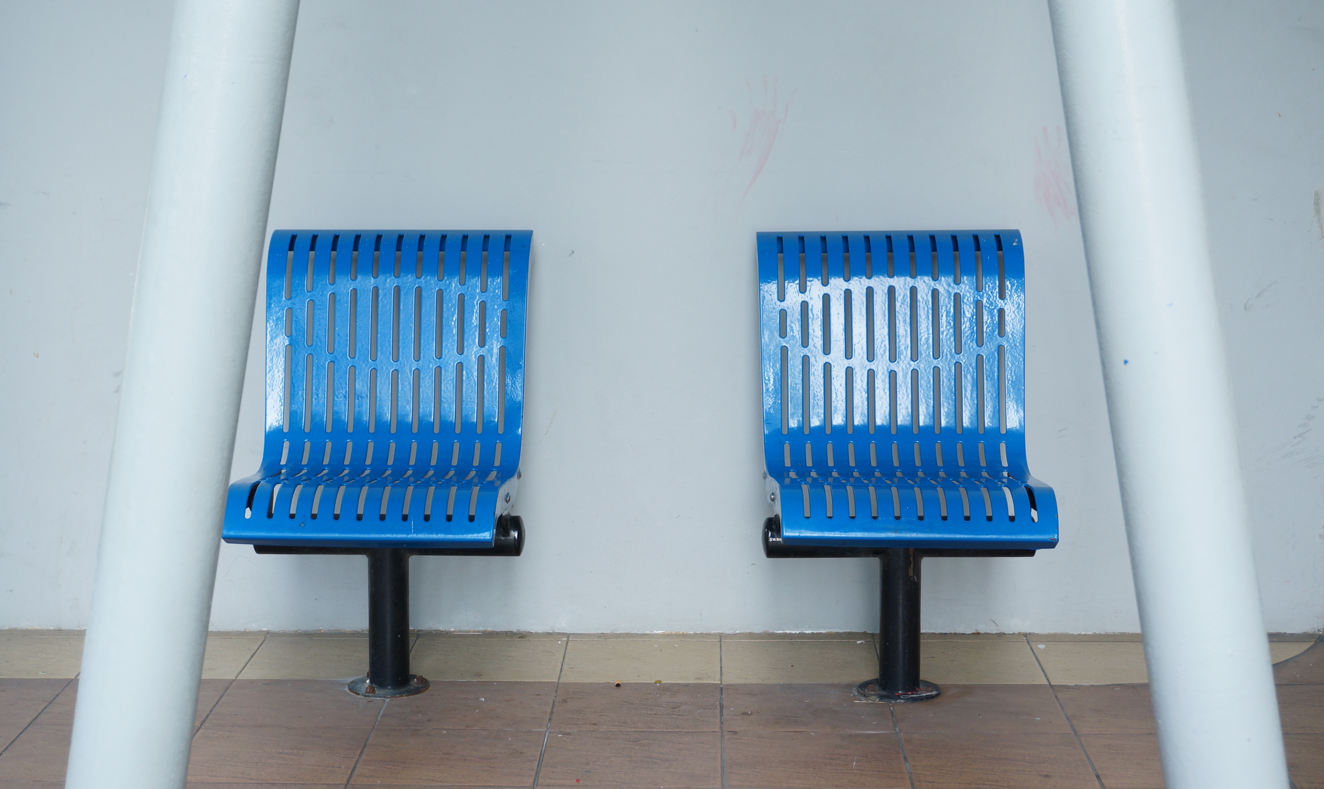

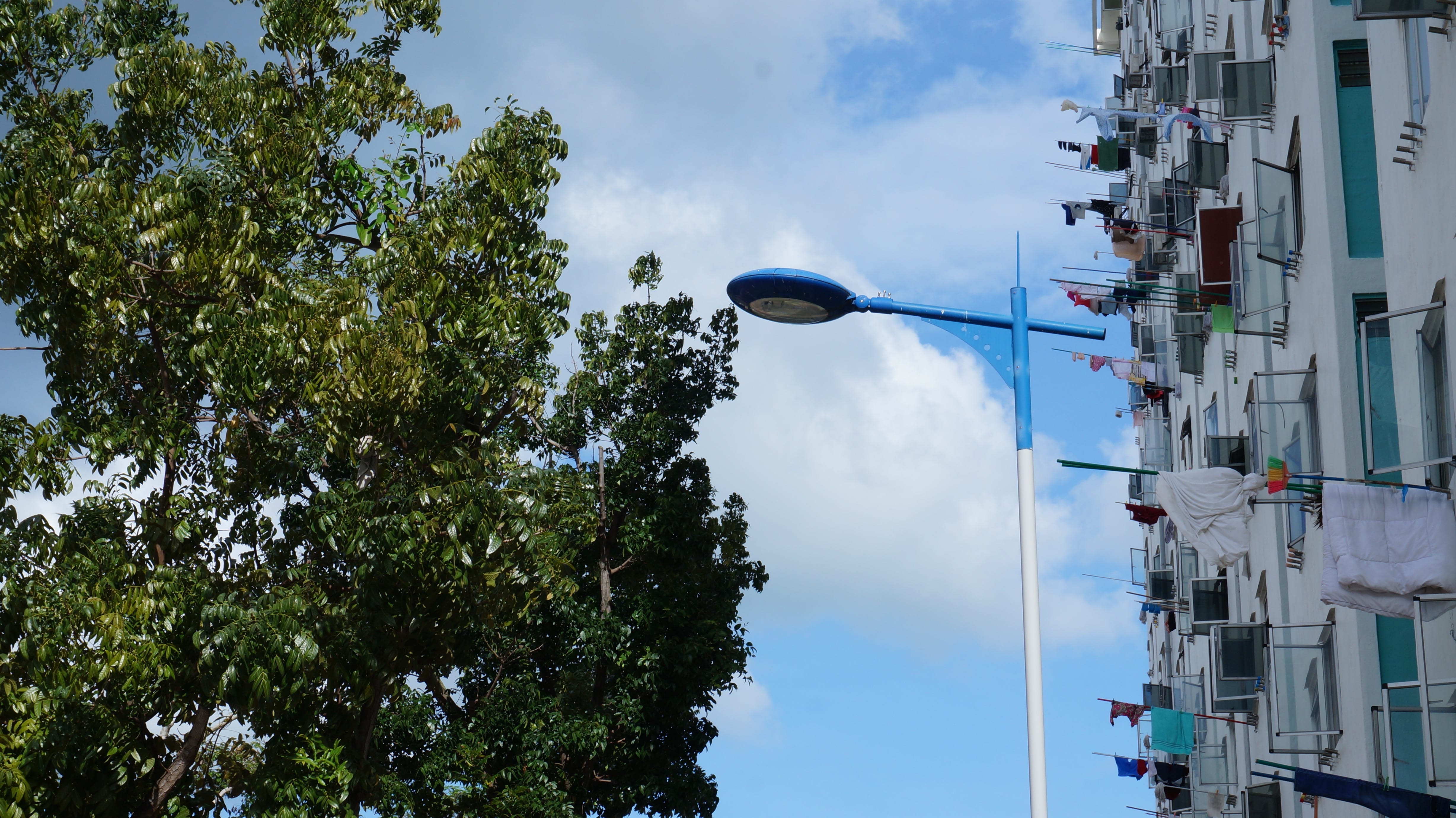
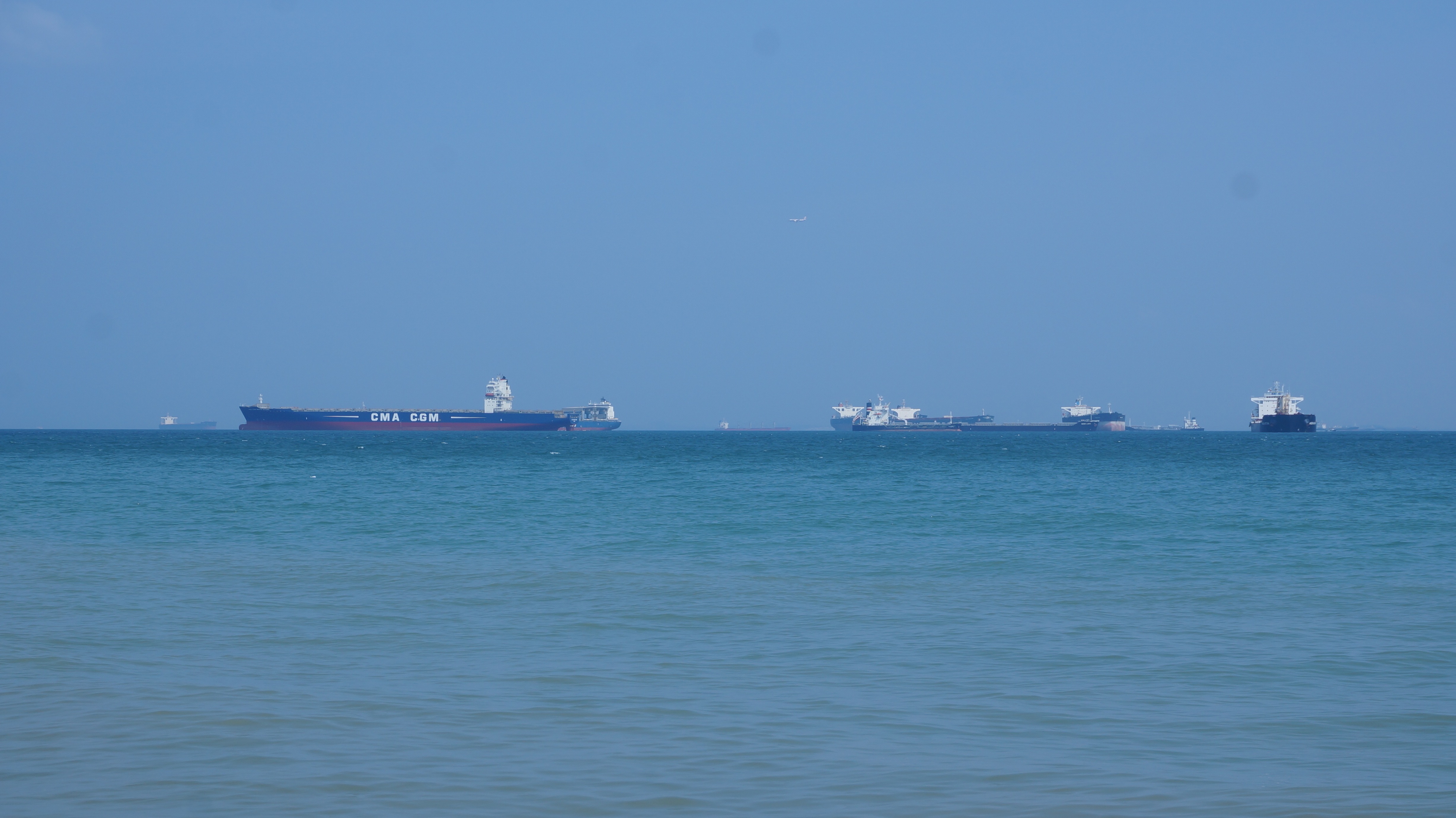
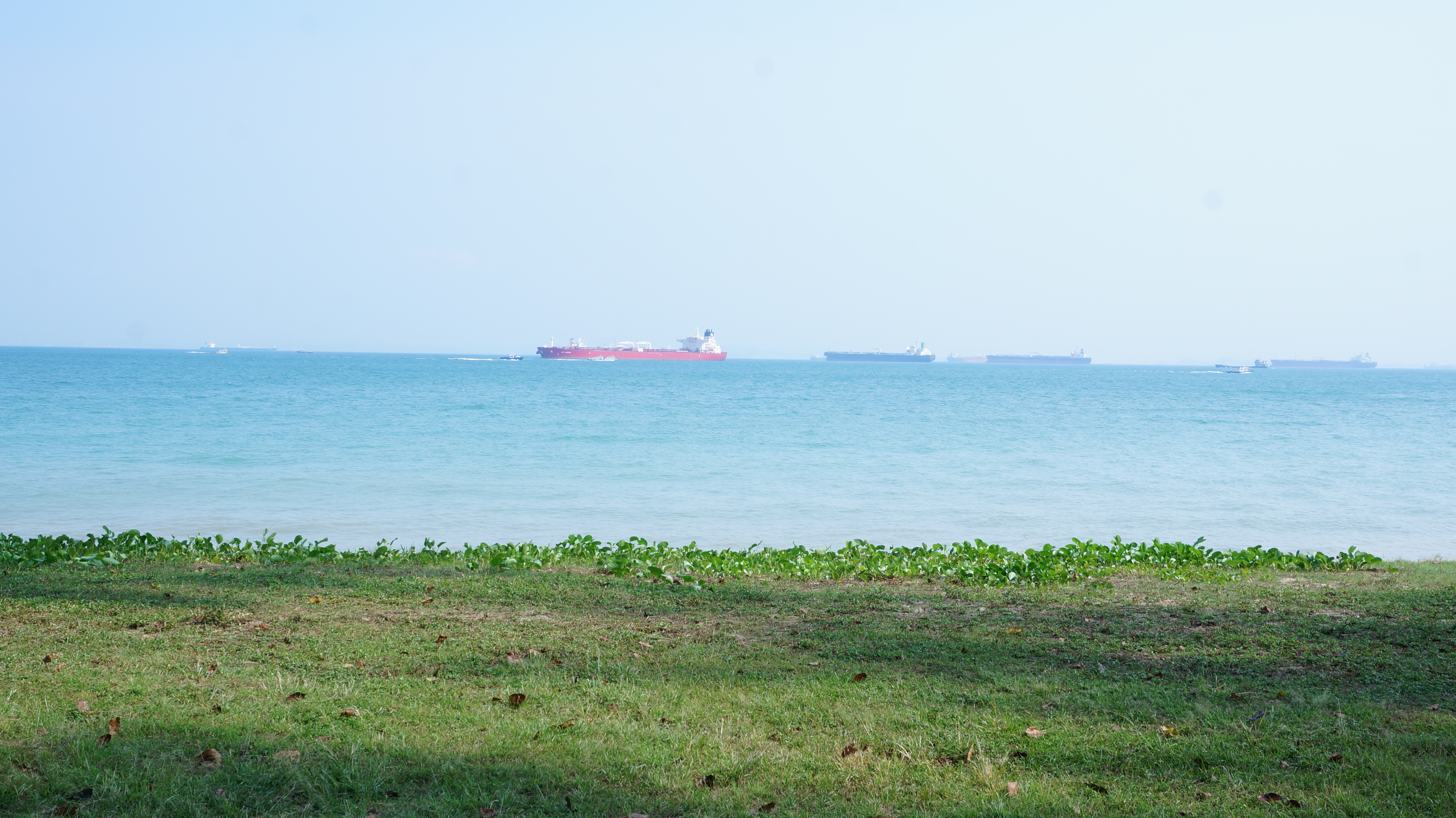
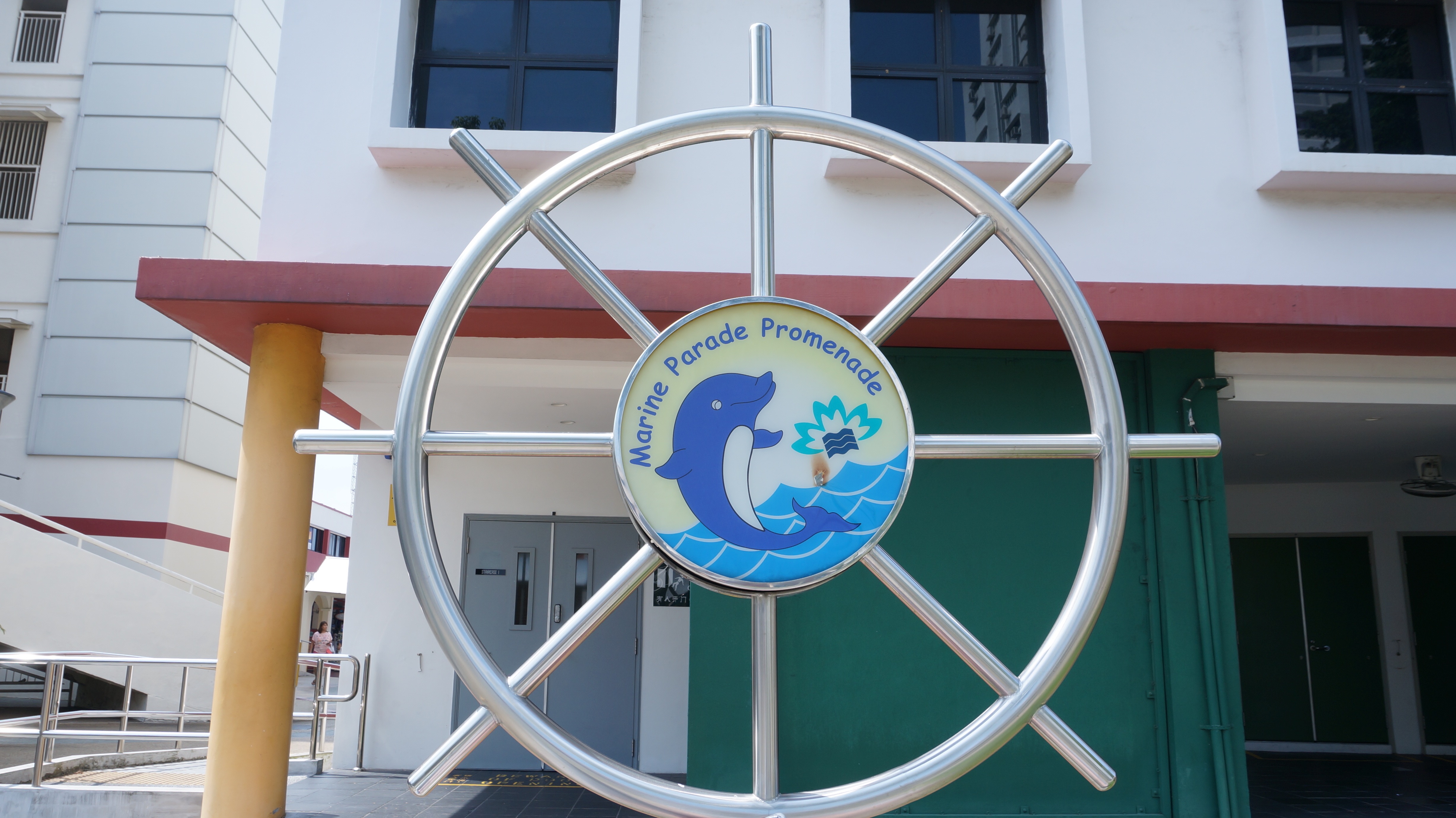
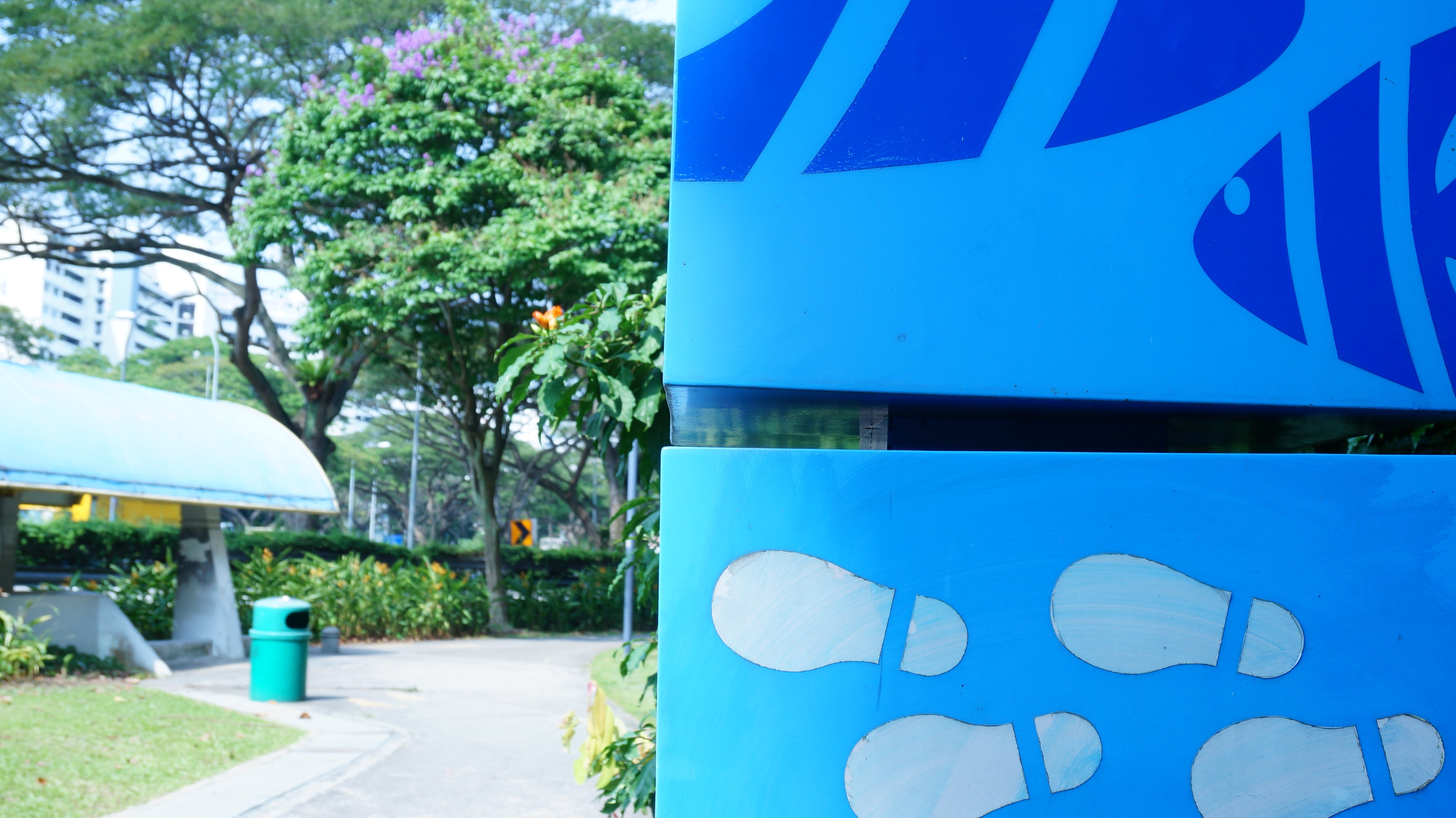
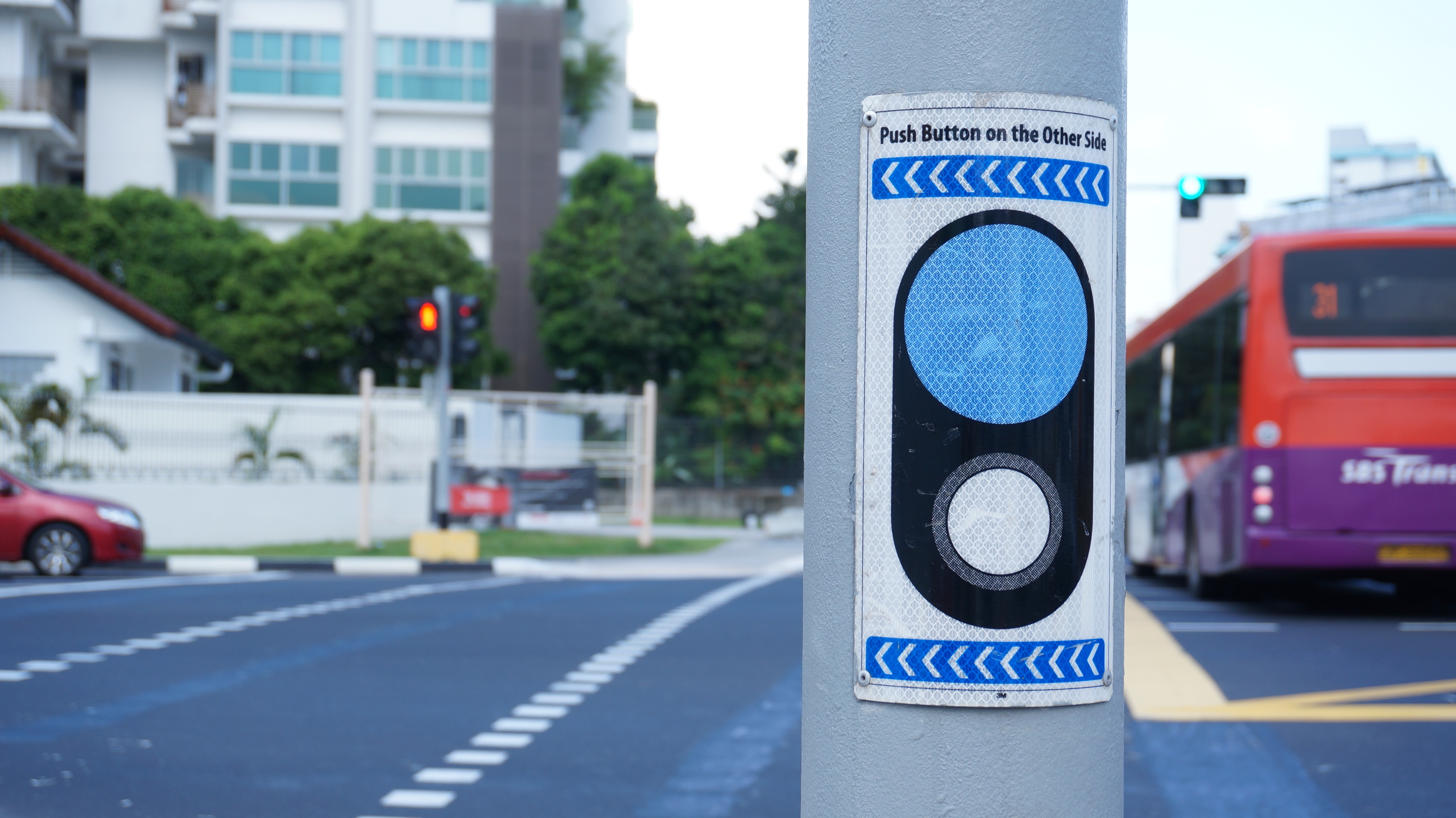
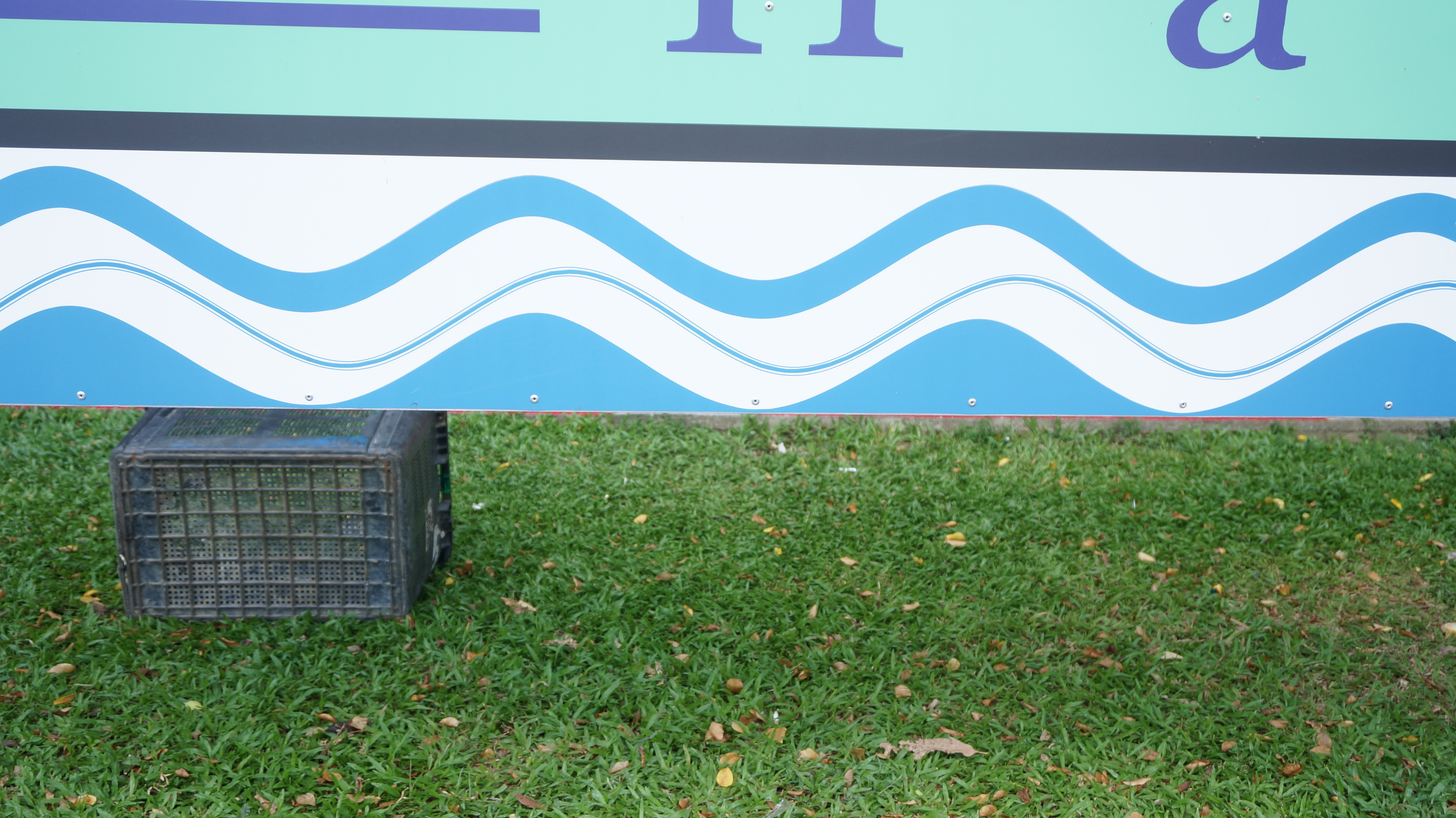
I walked from Parkway Parade to the estate areas, covering basically the whole Marine Parade Road: Marine Drive, Marine Terrace, Marine Crescent. It was really fun photographing the colours aspects of the neighbourhood, there were a lot! I guess it was because there was an effort to integrate a nautical theme since it was built on waters (which I will elaborate on in a later part). From HDB flats to condominiums to even the landed properties, most of them were a mixture of blue & white. Along the way I also spotted objects that were blue & white too, such as the chairs, market shops’ banner and decorations.
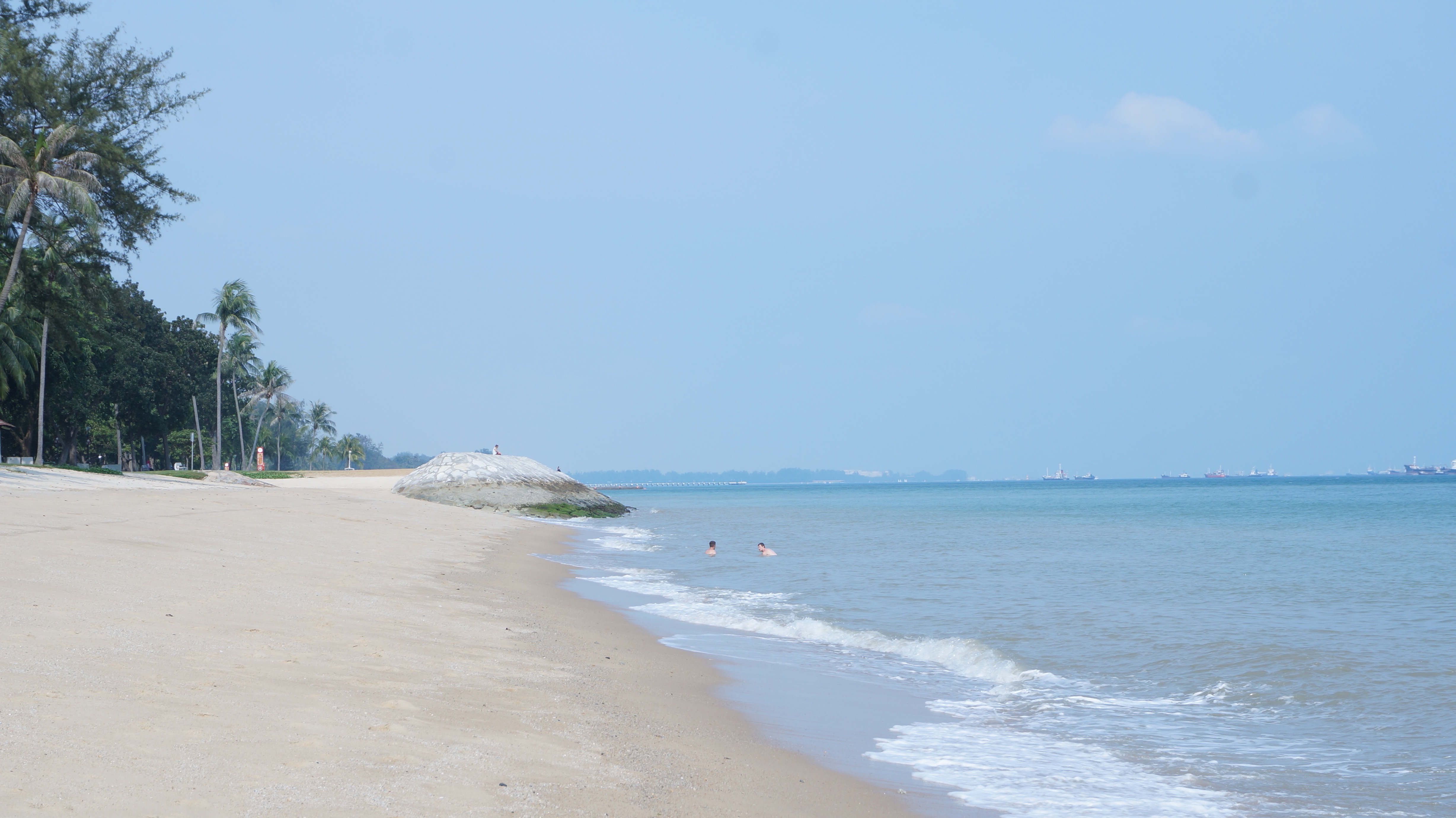
Also it was then that I realised that East Coast Park was part of Marine Parade….. Which was embarrassing because every Singaporean had been to ECP at least once in their life. Which was even worse when I told people I have not been to Marine Parade before when I frequent ECP often when I was young (¬_¬;) ohmy
These were the photos that I took and which that I used to present my findings.
ANYWAYS! I did some research on my own too.
Background Information of Marine Parade:
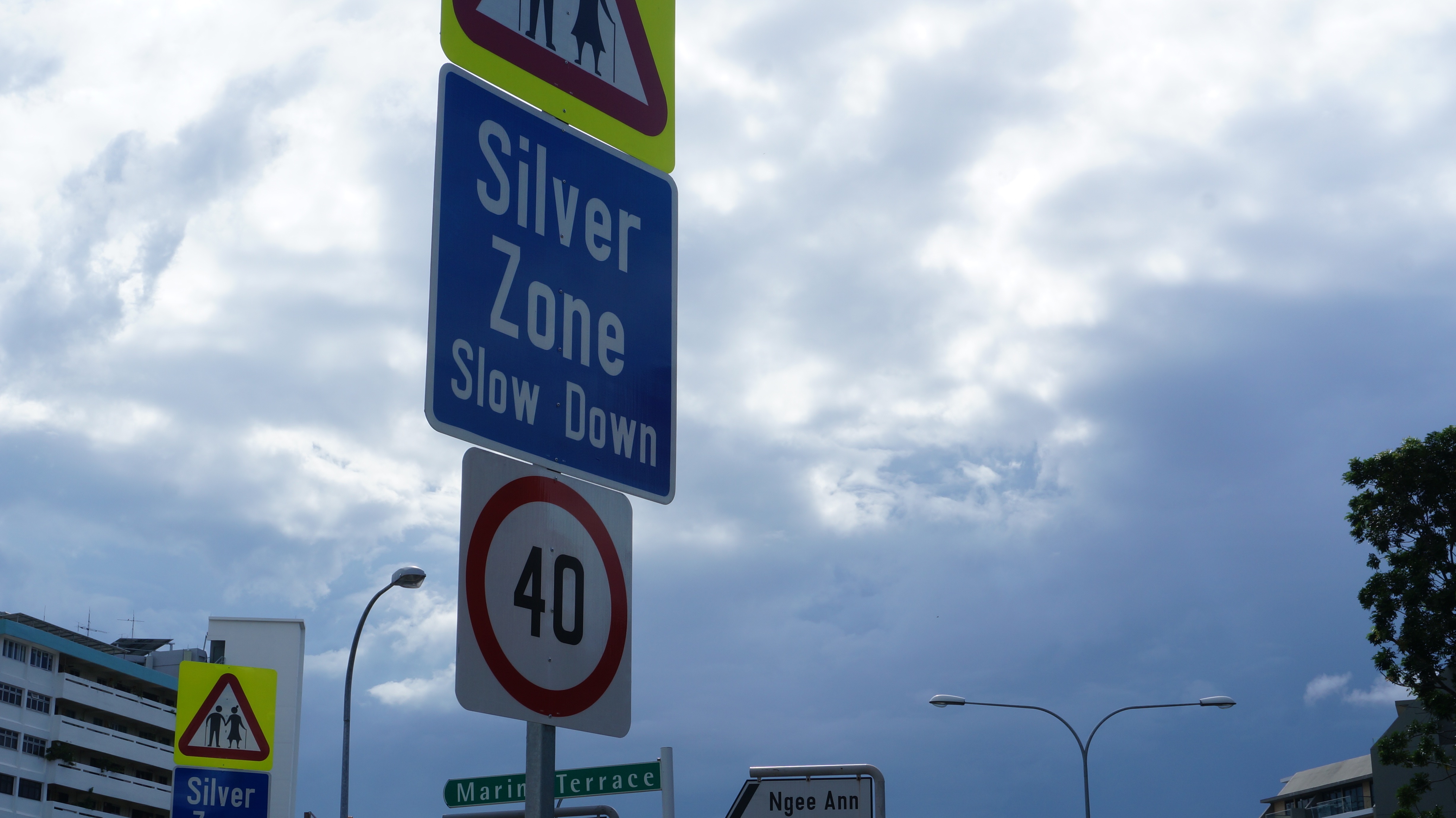
Marine Parade is a reclaimed land, being part of Singapore’s multi-phase project. Works started at 1966. Being one of the first few housing estates on reclaimed land, it was popular in demand of that time. Which was why in recent times, it had regraded as one of the silver zones in Singapore.
I thought that the fact that Marine Parade is a reclaimed land was really cool, and I wanted to incorporate this information into my zine’s idea.
Reclaimed land is the mad-made process of stacking and packing layers of sand on sea waters. Because there are layers of the whole land, I thought of translating that into my zine.
Whereby the pages of the zine are the layers that form up Marine Parade, e.g. the sea waters on the last page. And architecture, people, culture are the layers stacking on top (the upper pages). I proposed a rough idea to Mimi but she felt that the idea had to be more concise.
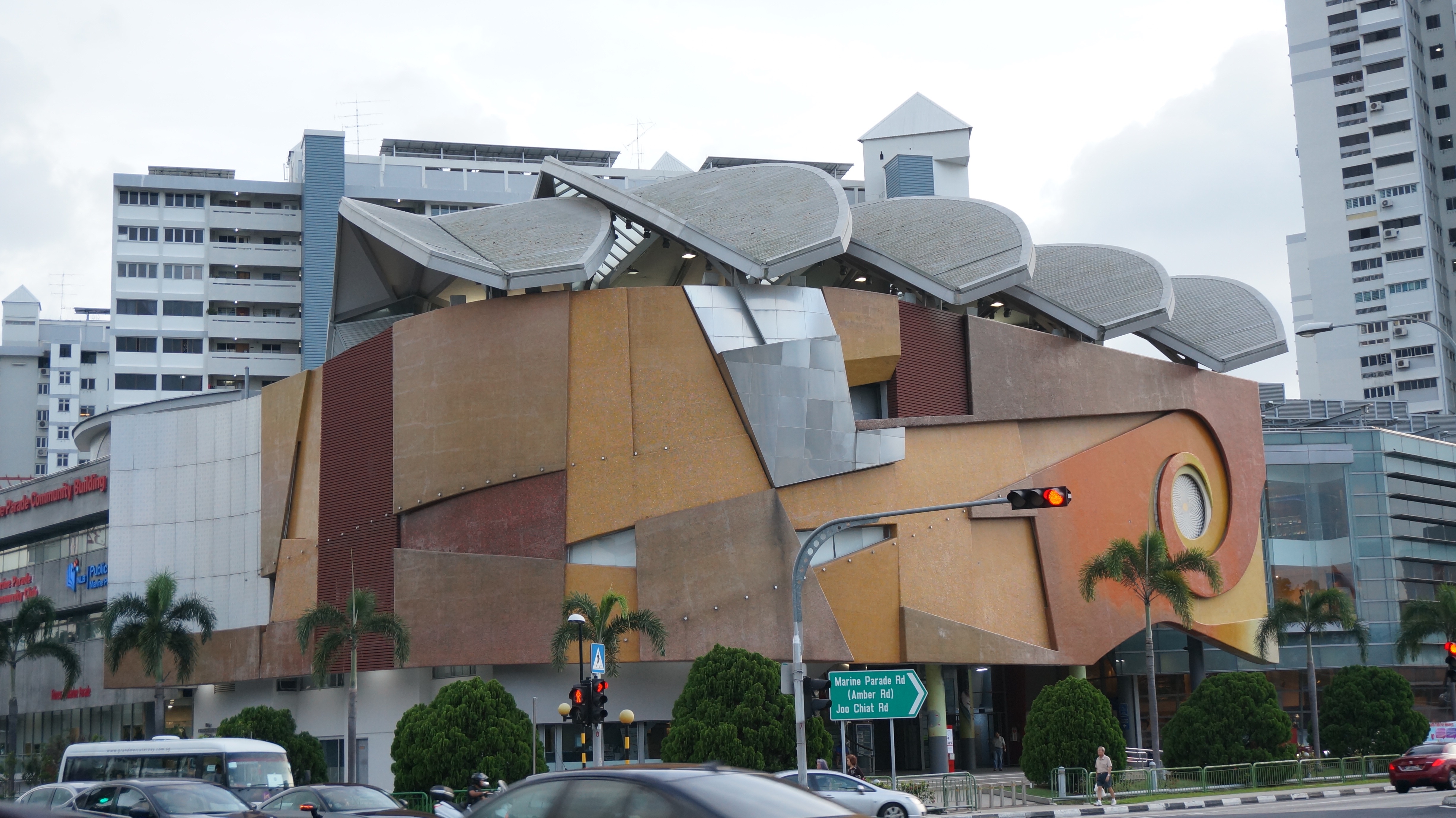
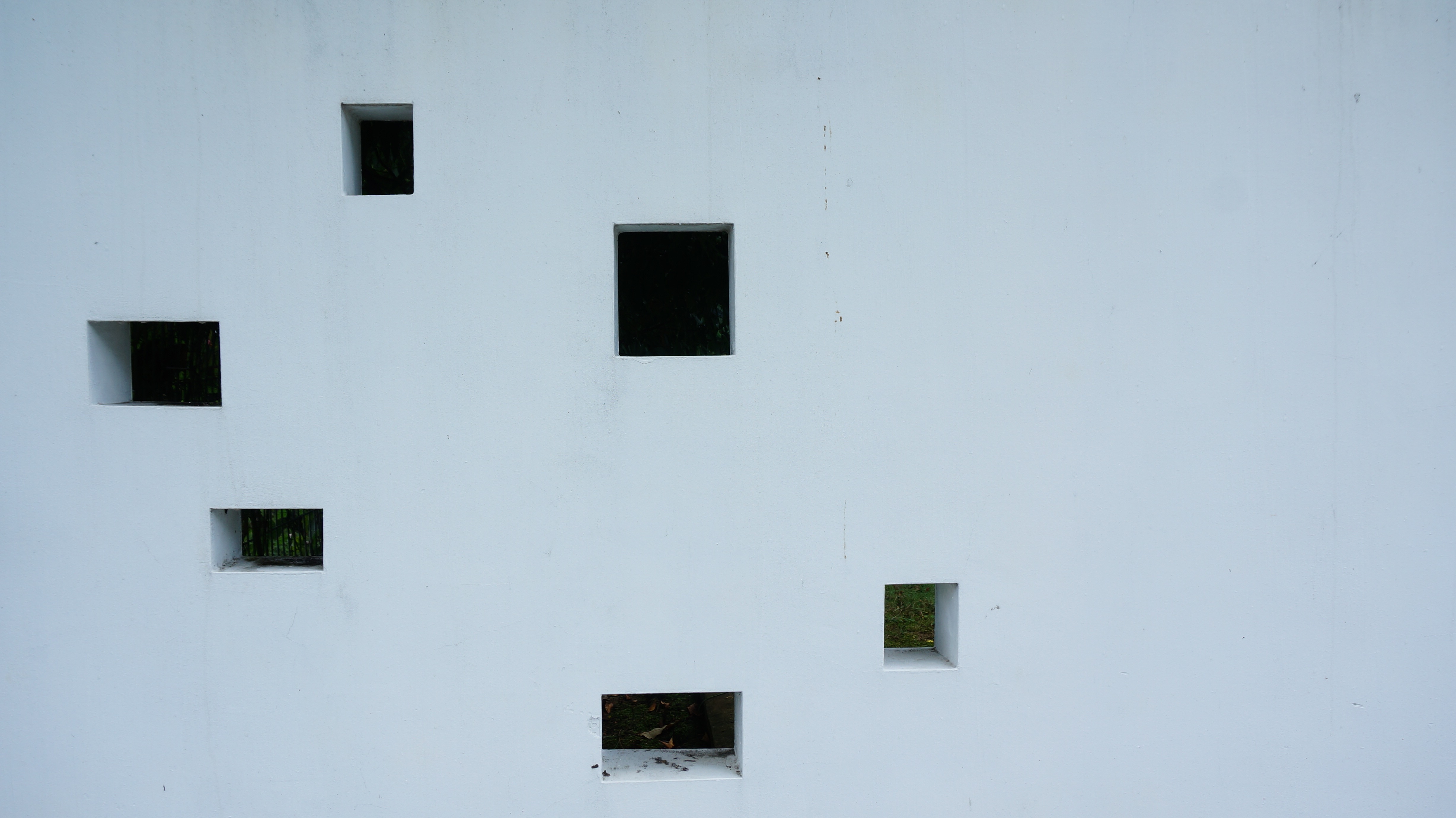
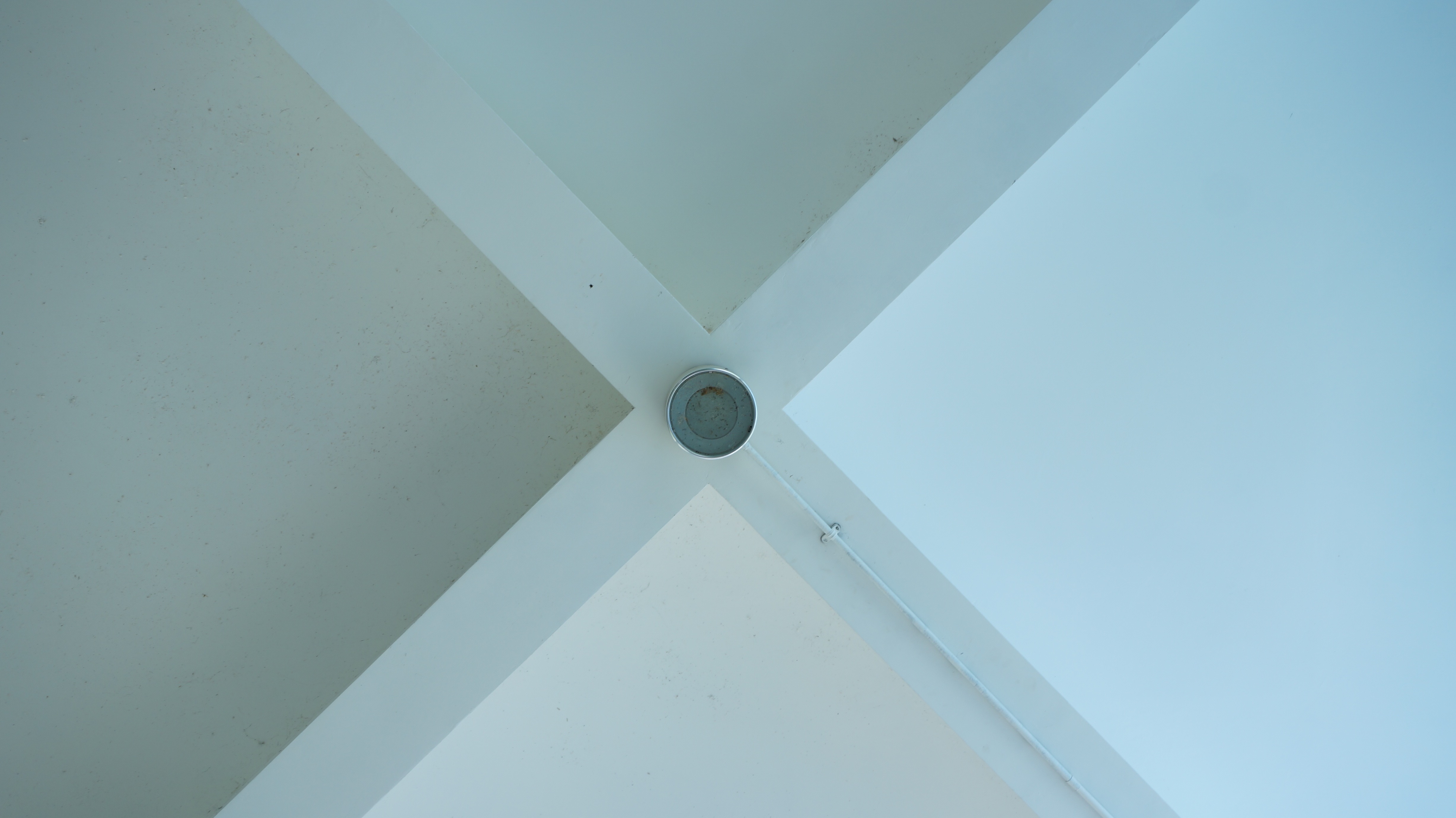
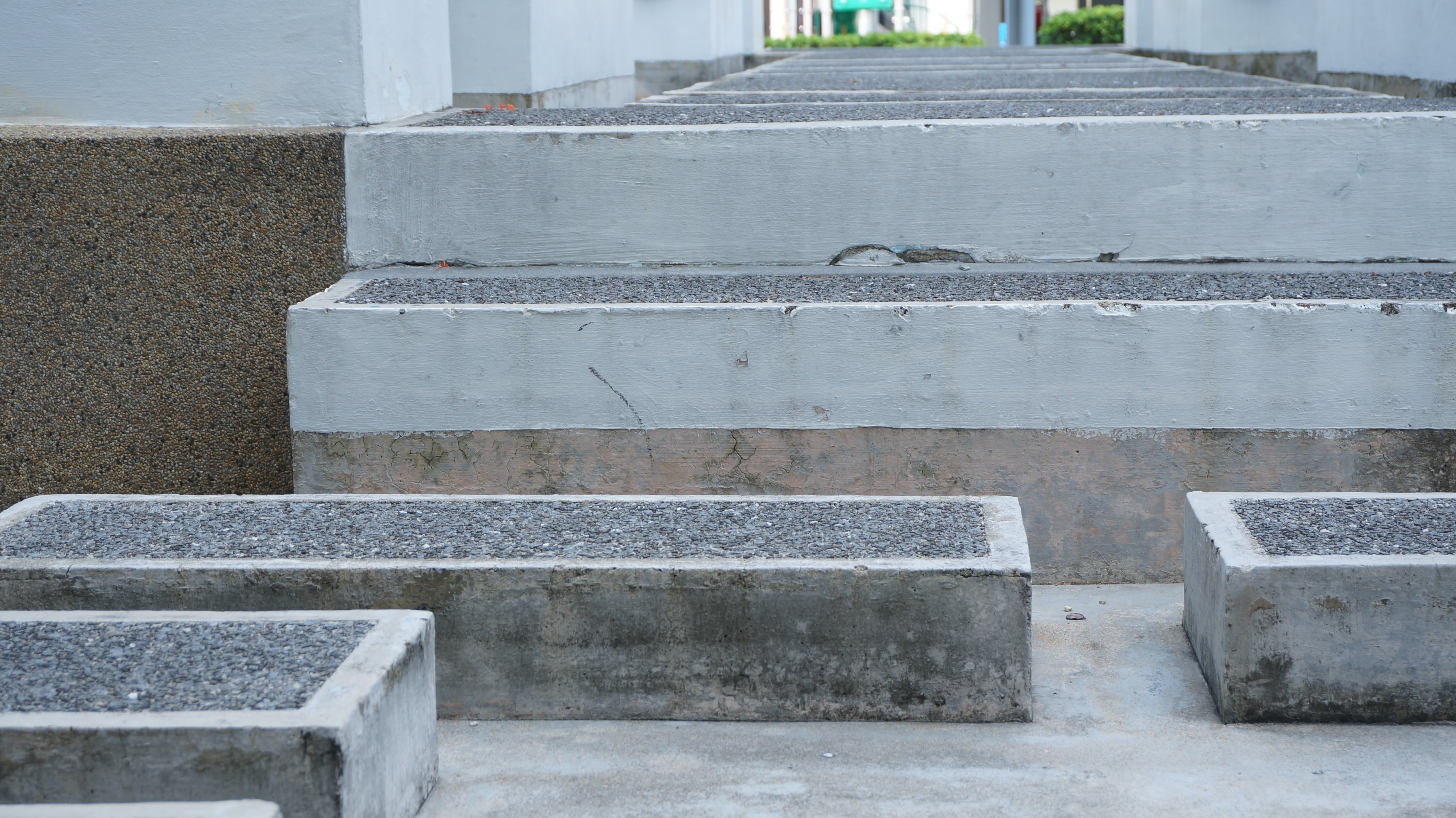
An idea then popped in my mind. The concept of these layers are also associated with their ‘textures’, e.g. Smooth waters vs rough sandy lands vs angled layers of buildings. From my photos, I noticed that there were also many intriguing-looking shapes and patterns from the buildings.
Basically, I wanted to work with textures and shapes of Marine Parade, exploring the ‘layers’ of the land, while being in the theme of blue & white.

I wanted to my audience to focus more on the visuals on the zine which was why I decided to include only photos and edits in it, showcasing the textures of each layer.
I went to look up for inspirations on how I could make the layouts of my photographs more interesting.
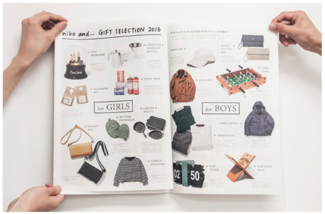
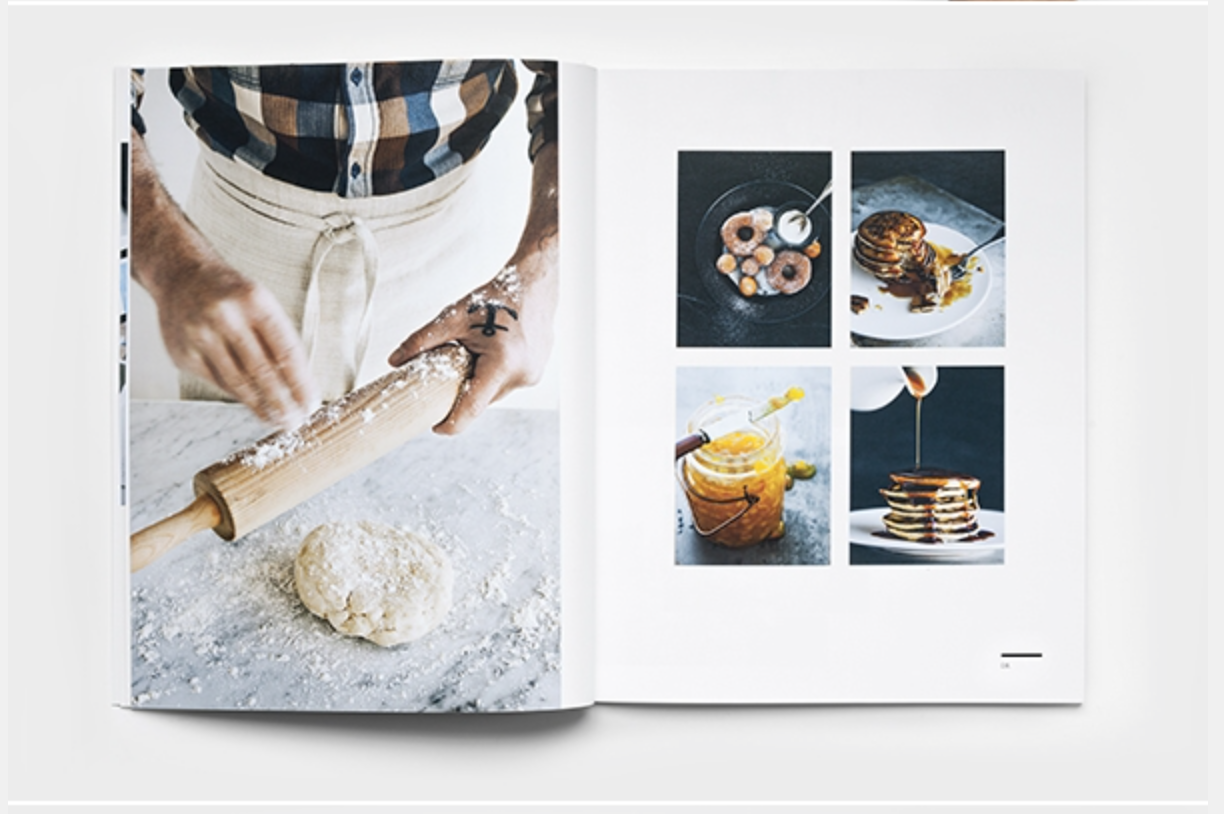
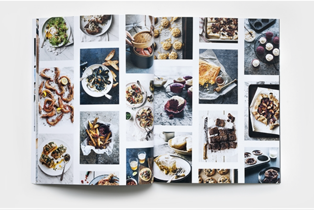

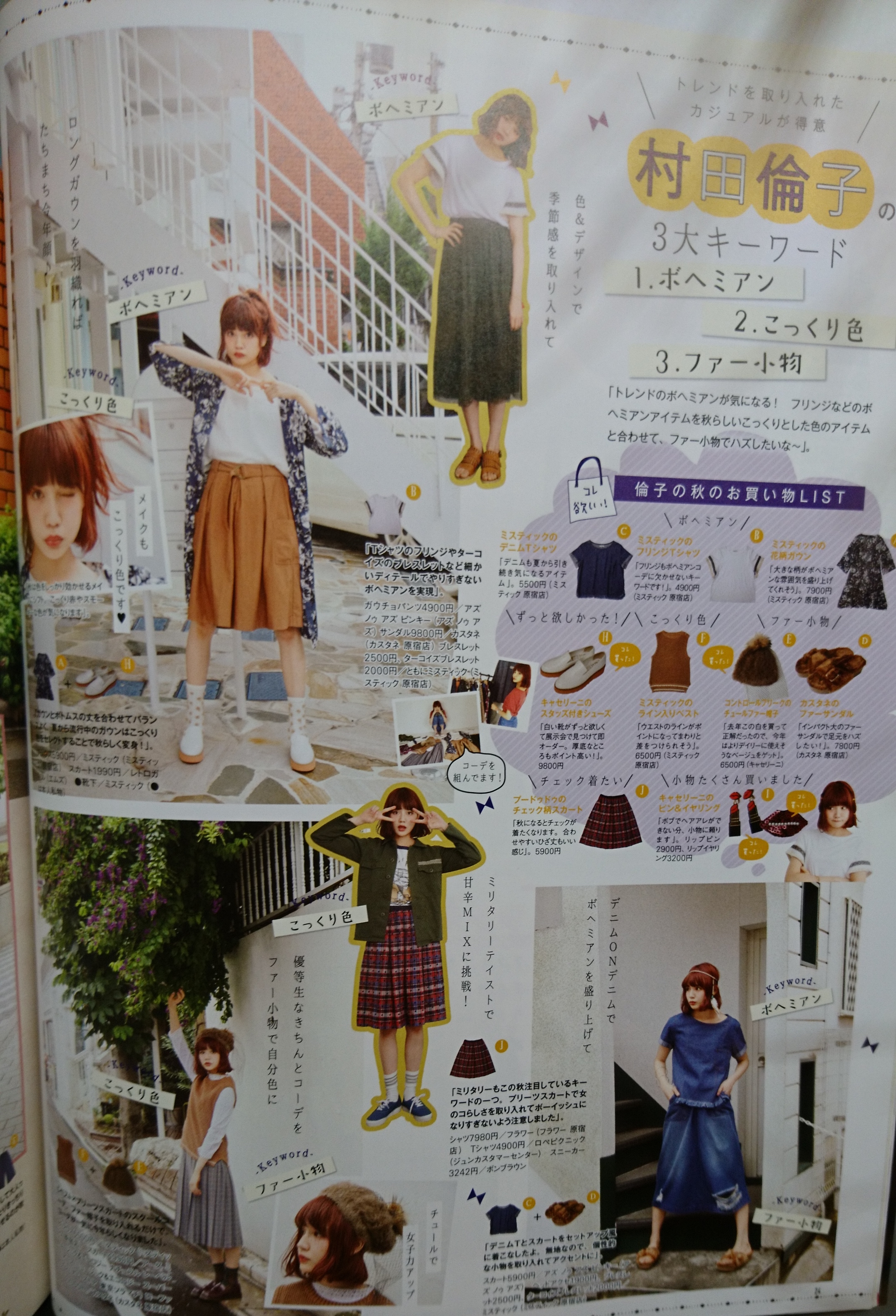
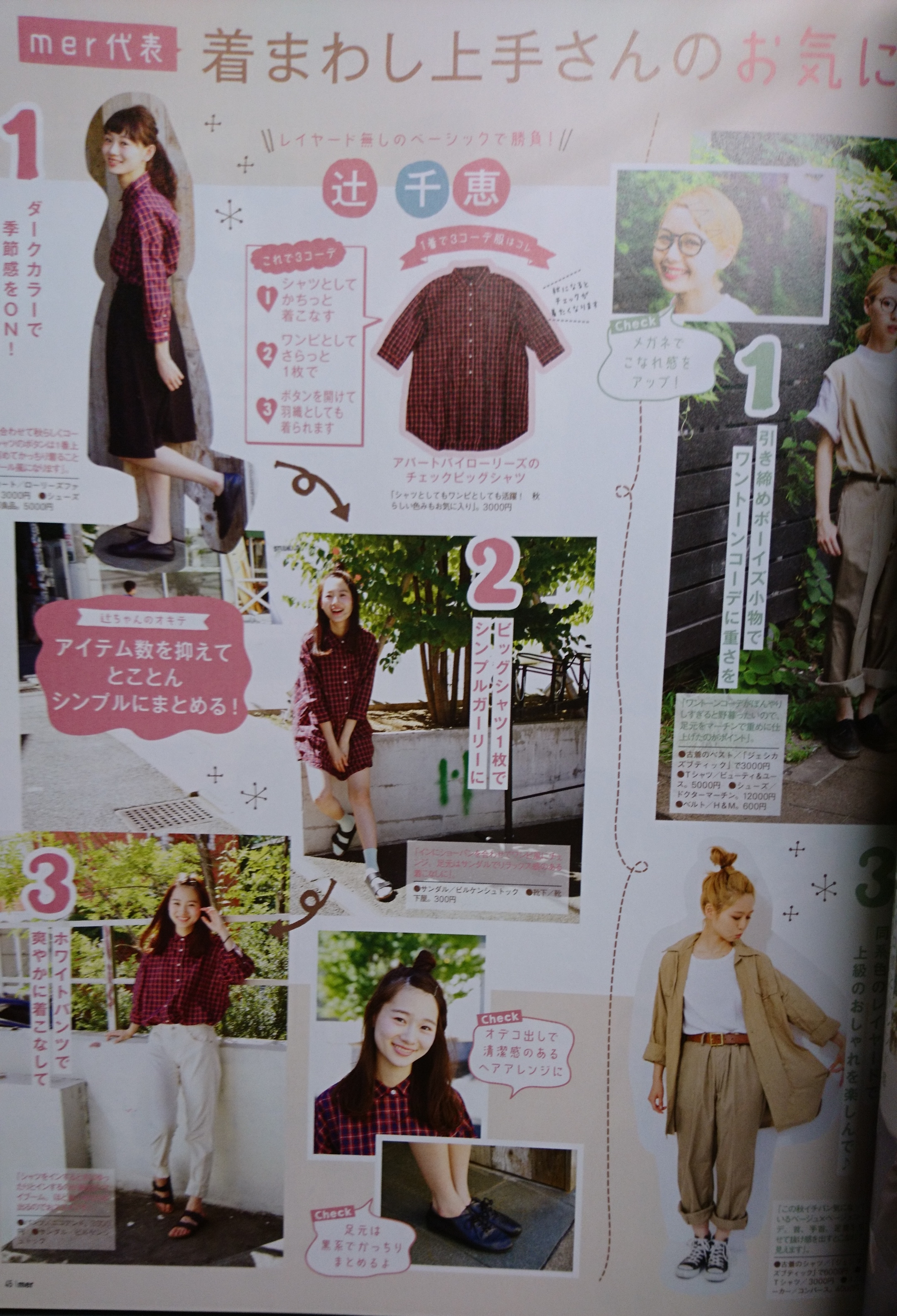
I wanted to do more the scrapbook style similar to those of Japanese magazines, where they played around with patterns and photo to make their editorials more appealing.
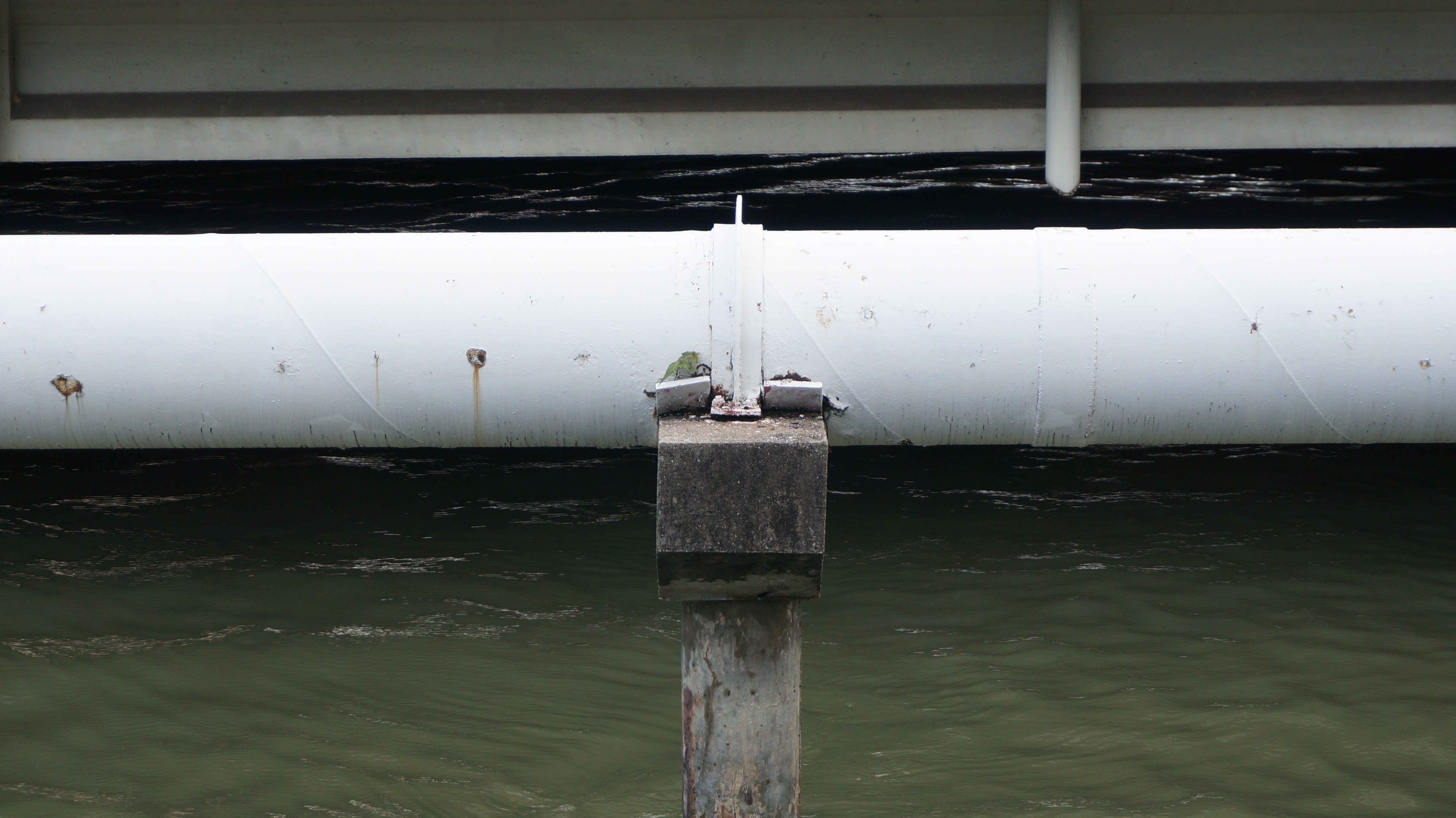
In order to gather more finds about the textures, I went back for a third and fourth recce. This time I explored near the ECP area and got these photos.
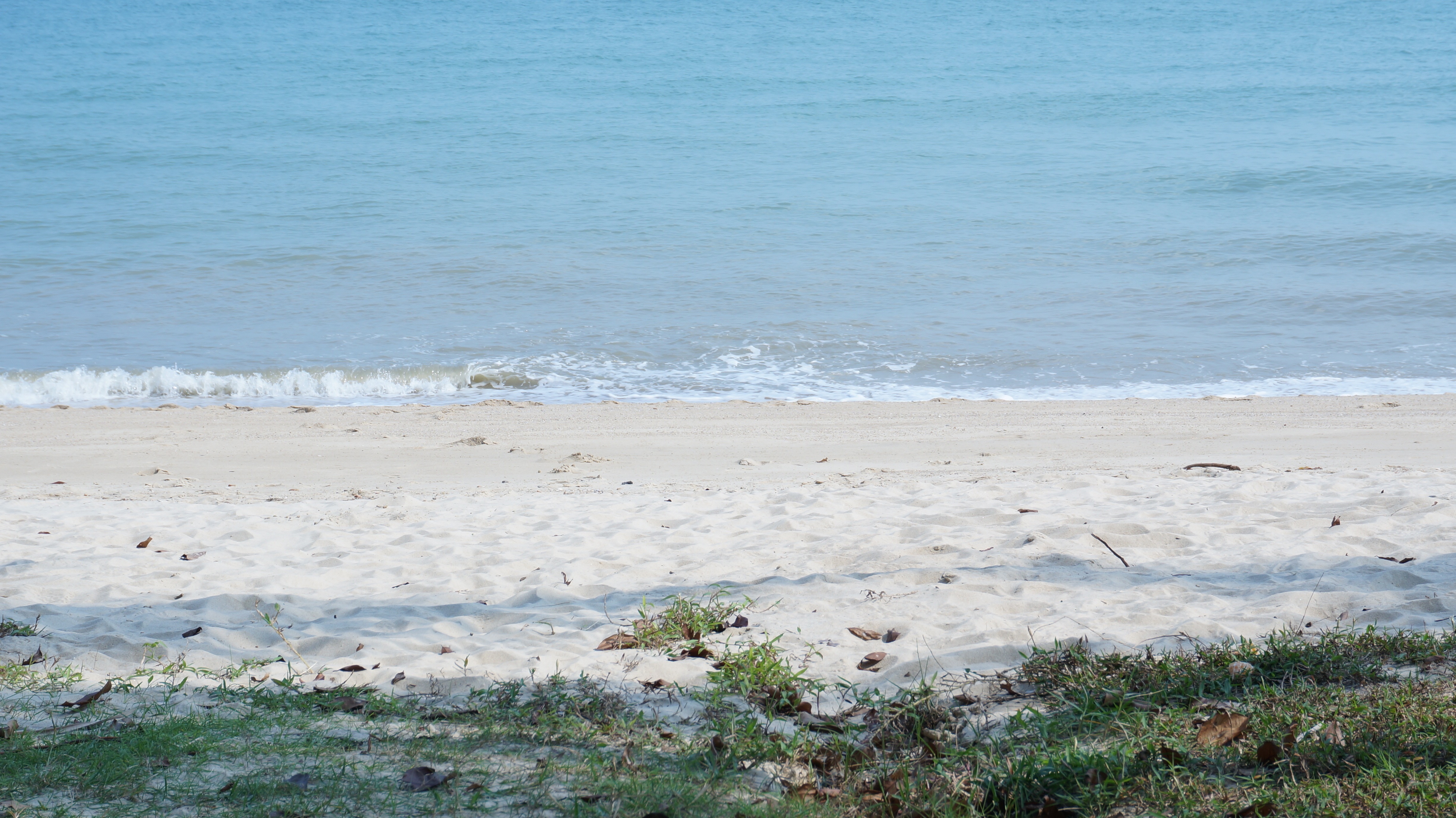


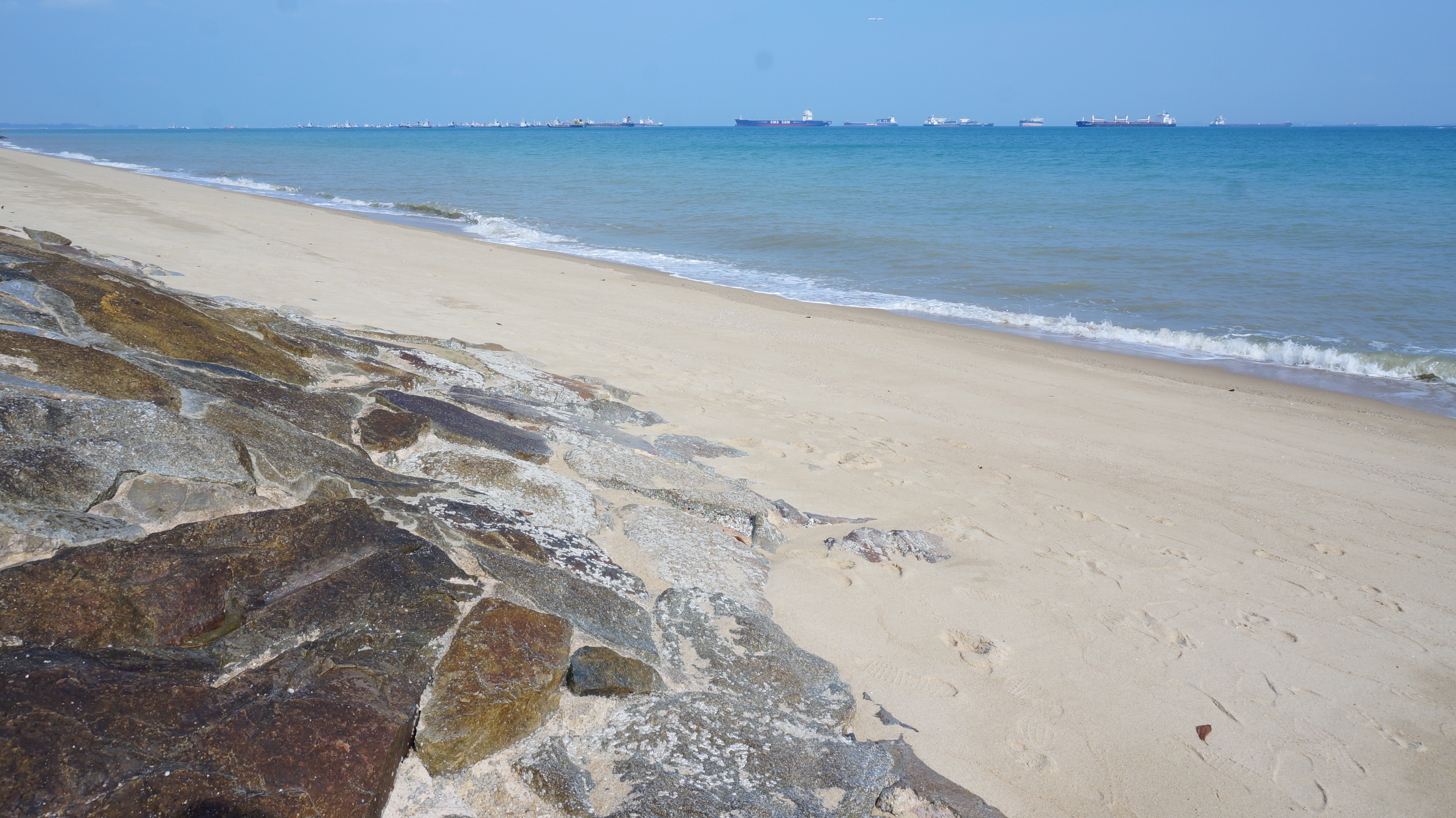
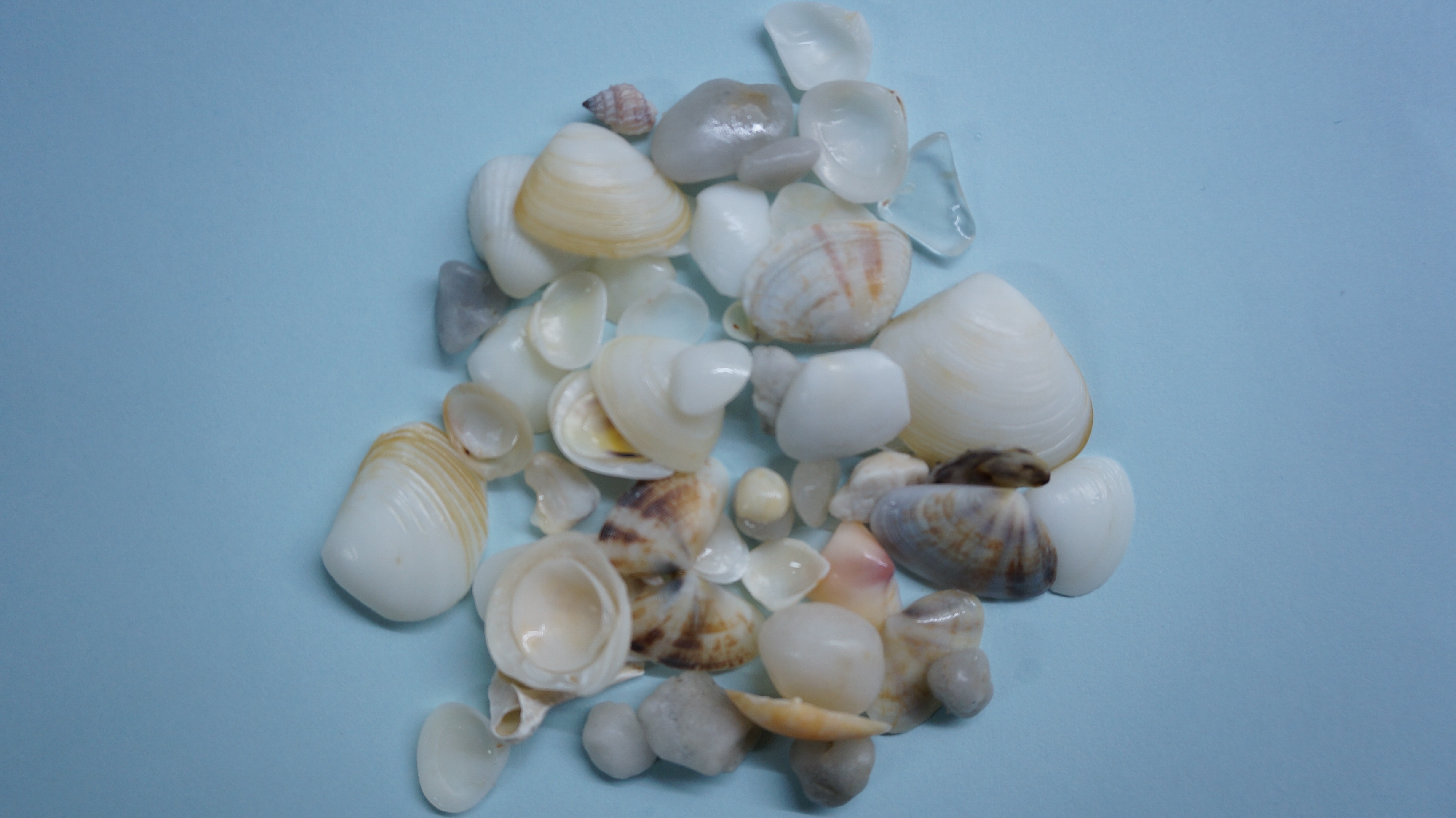
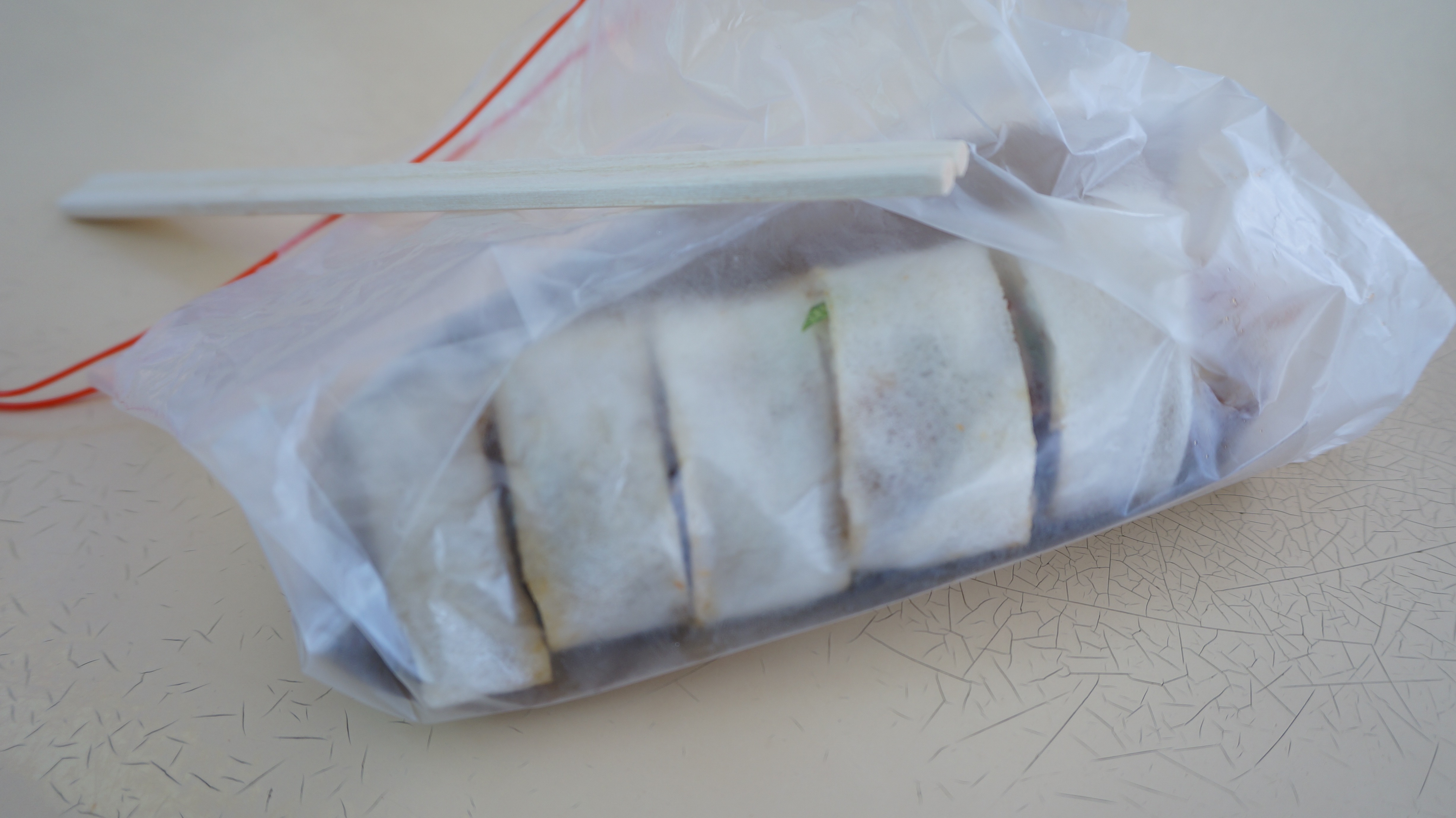
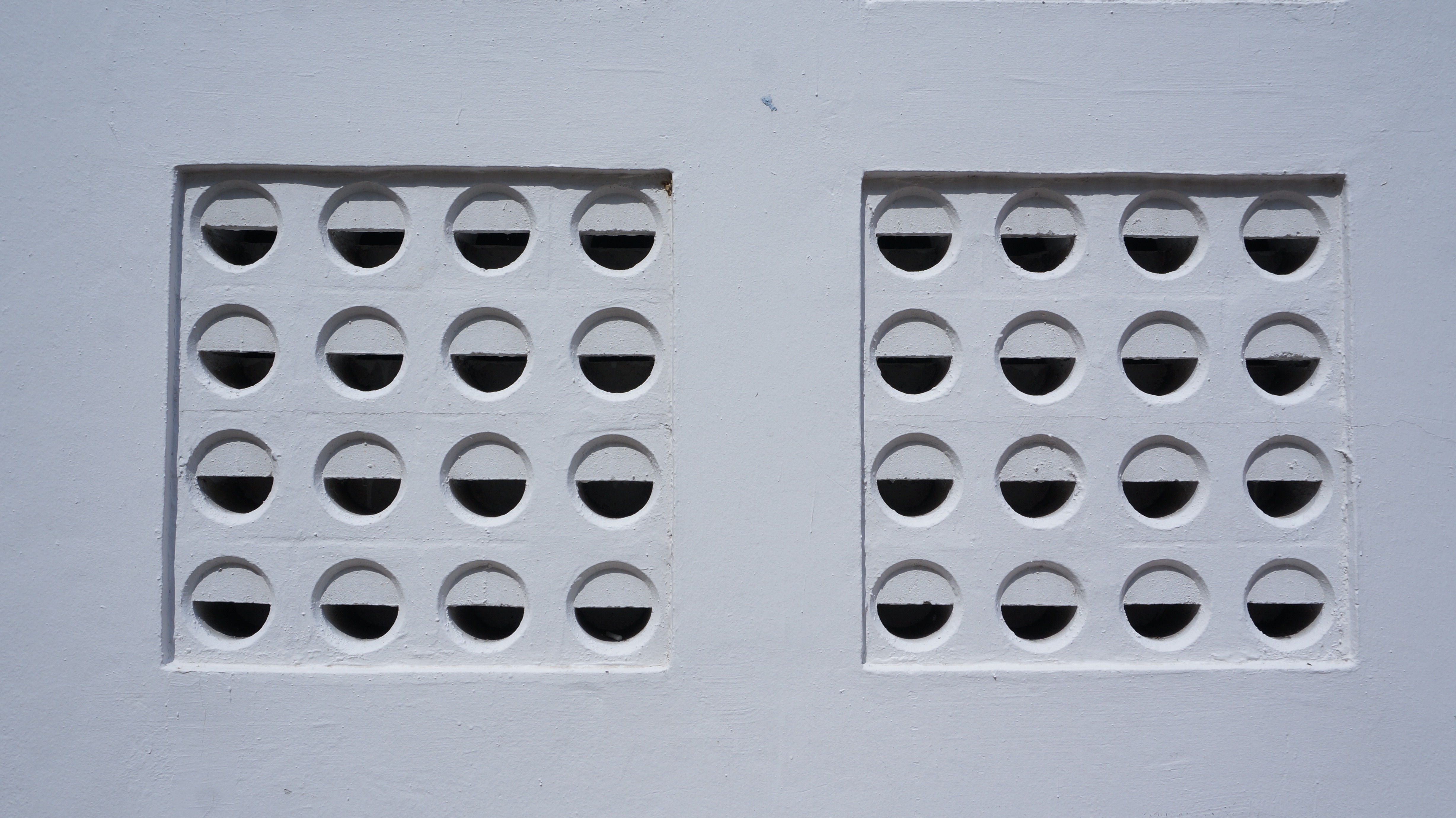
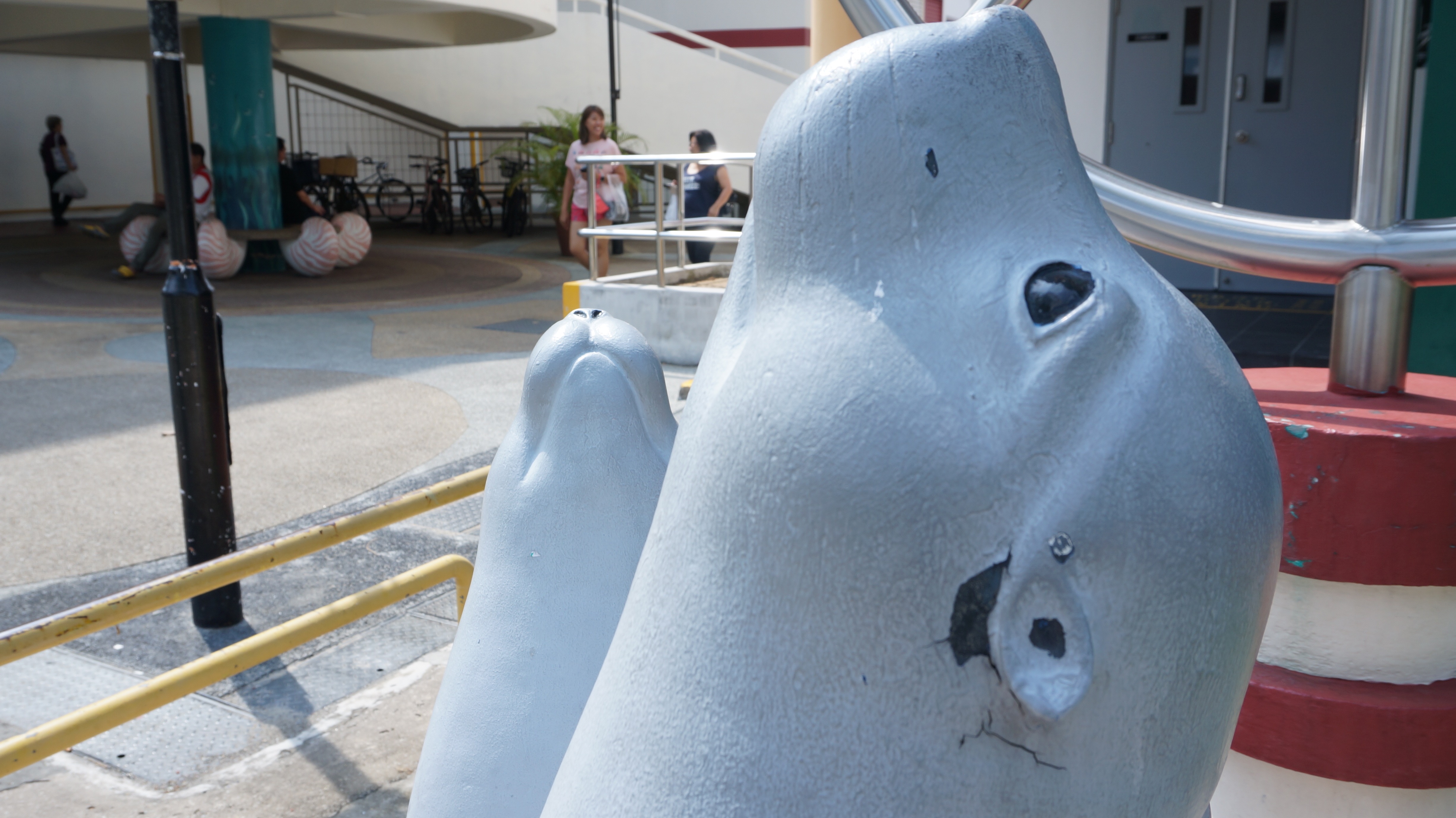


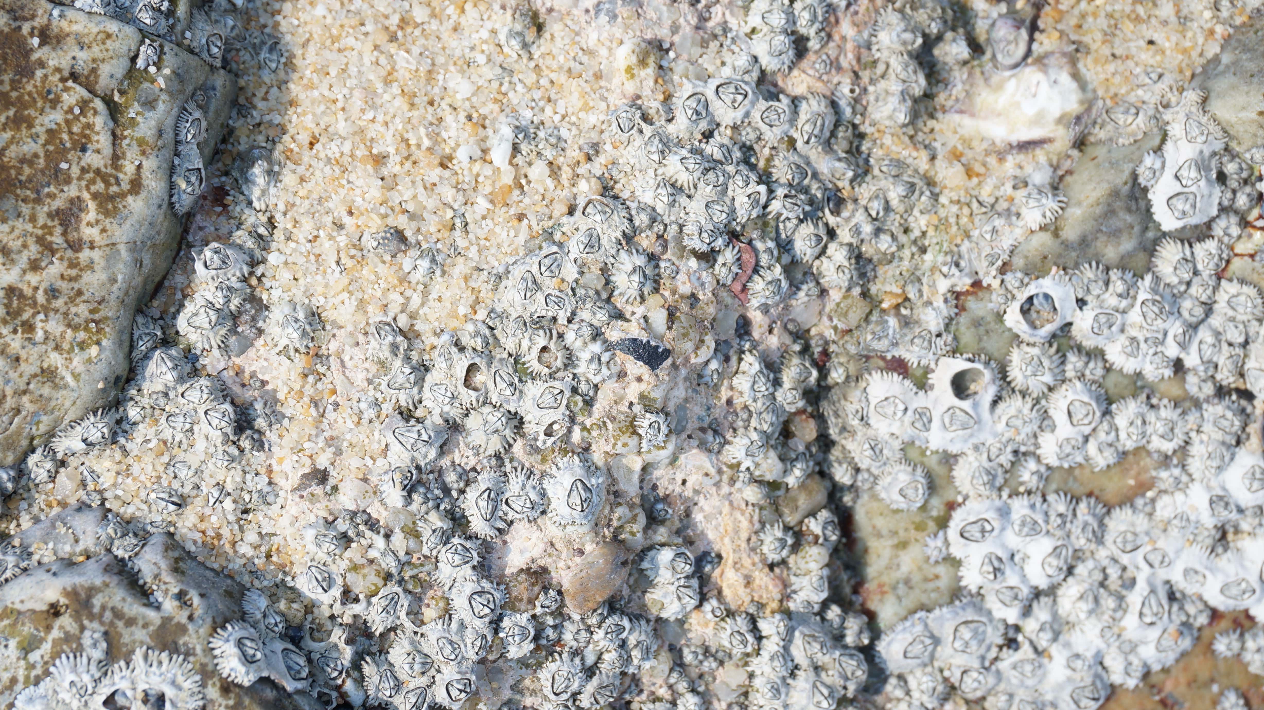
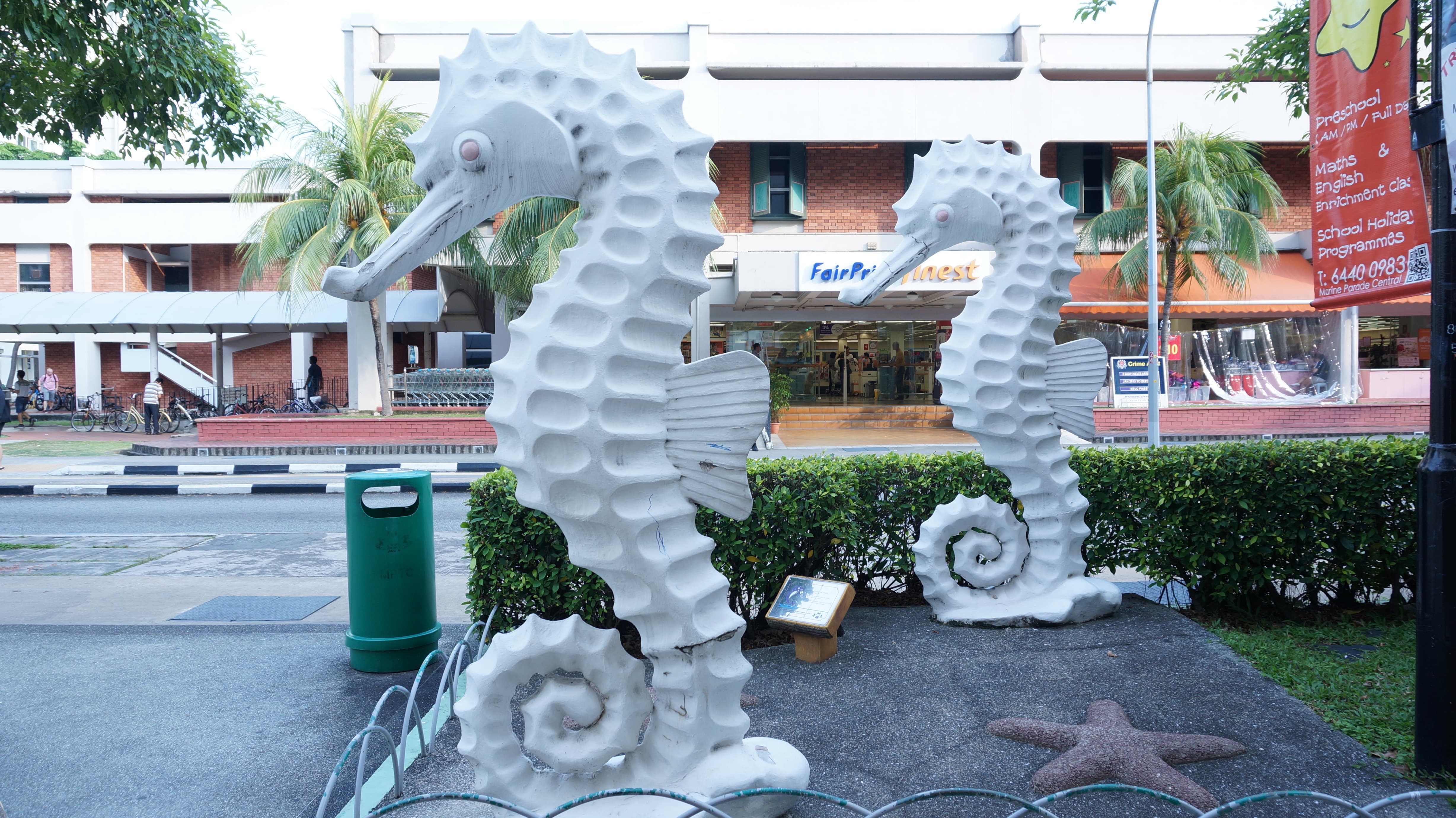

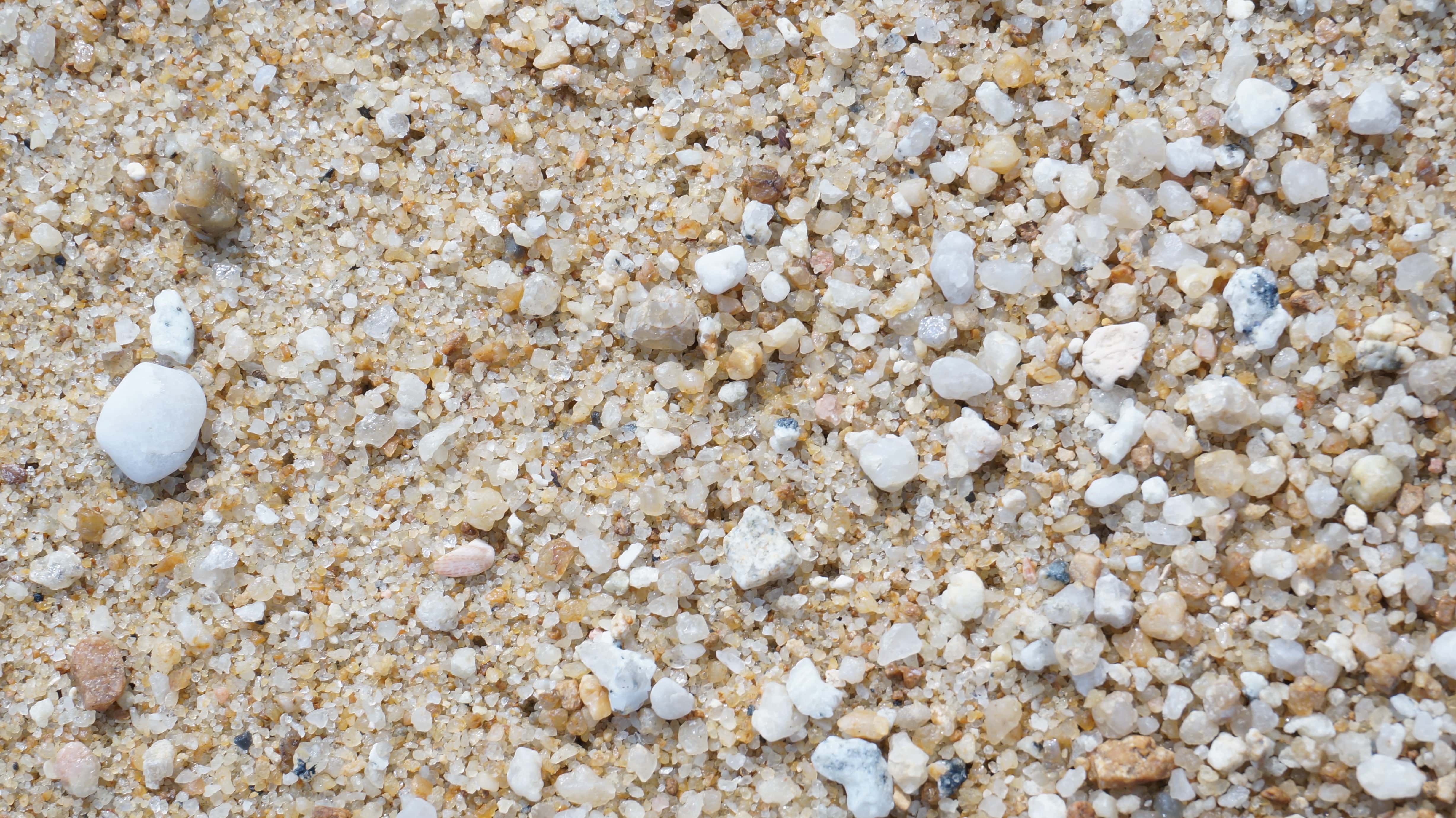
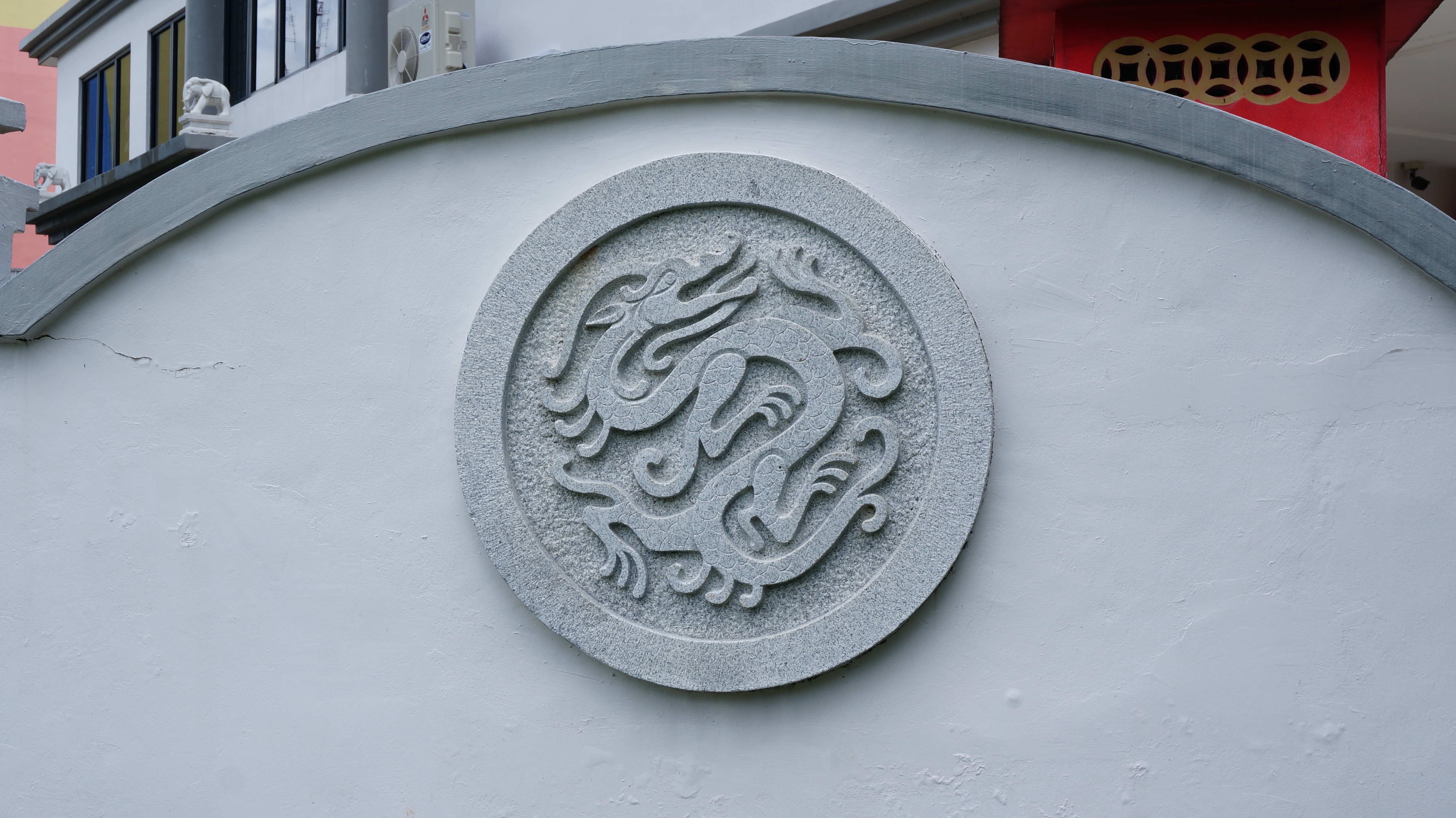
Once again I found new textures to work such as the wall designs, sand particles, sea waves. Also! There were a lot of cute sea animals statues aww. And bonus popiah photo since it was my lunch @ marine parade central’s hawker centre + it’s sort of white colour haha.
I think I was more or less settled with these photographs at that point. I did went back two more times because I wanted gather some thoughts and opinions people had of marine parade as I felt that texts can make my zine look more entertaining to read and convey my message better.
Refer to my next post for the making of the zine’s pages! (: