Applied Illustration – A Gooey Gooed Time (research and process)

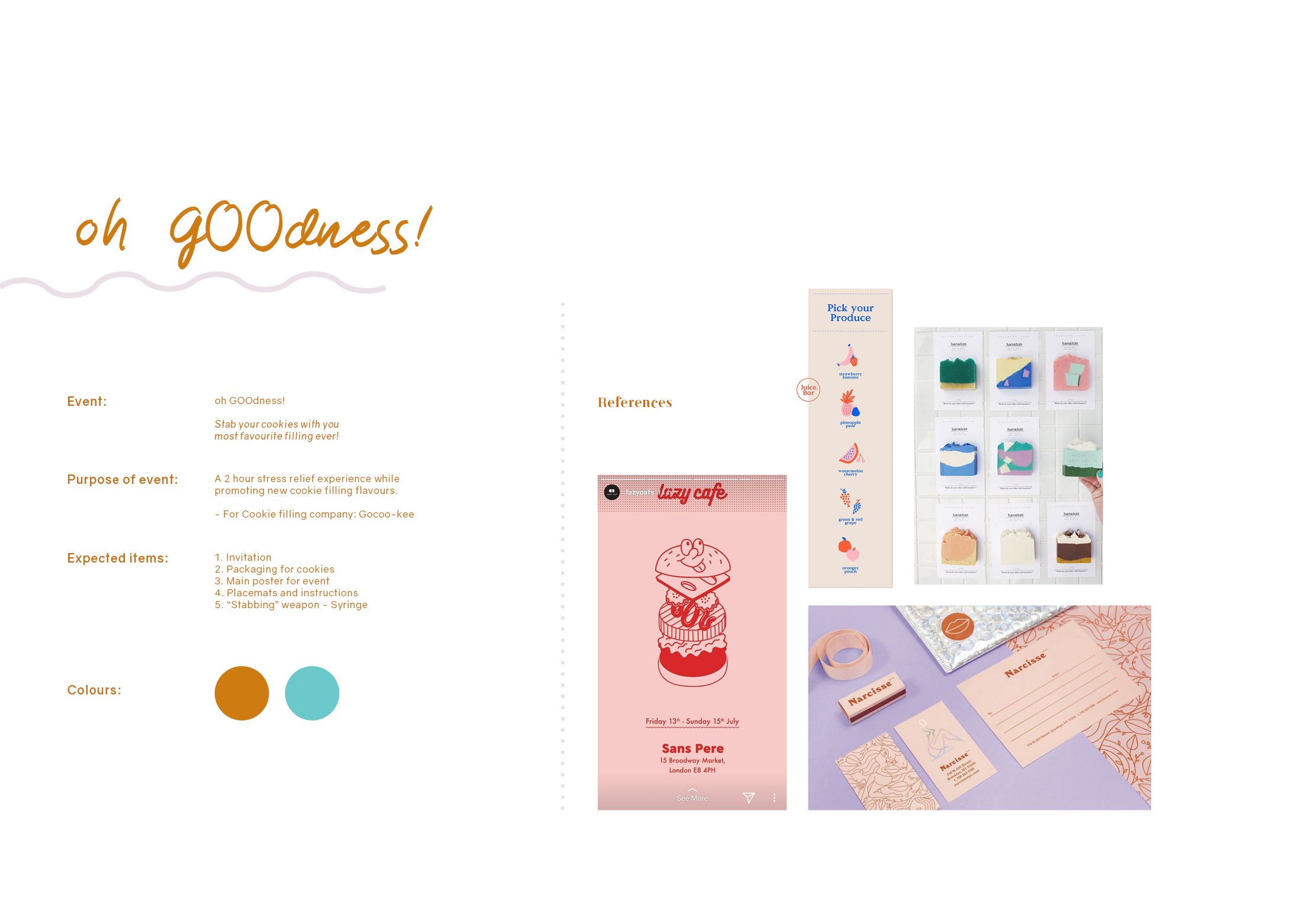
For this final project, we were given the freedom to decide on any event we want and it can be as bizarre or as simple as possible, entirely up to us! The deliverables required are 5 items related to our event and at least one of them has to be 3D. 

ideation

Since there are endless of possibilities, I had a hard time narrowing it down to just one idea. However, after much consideration and feeling hungry while brainstorming, I decided to go with a product launch event for cookie fillings. 

WHAT ARE COOKIE FILLINGS? 

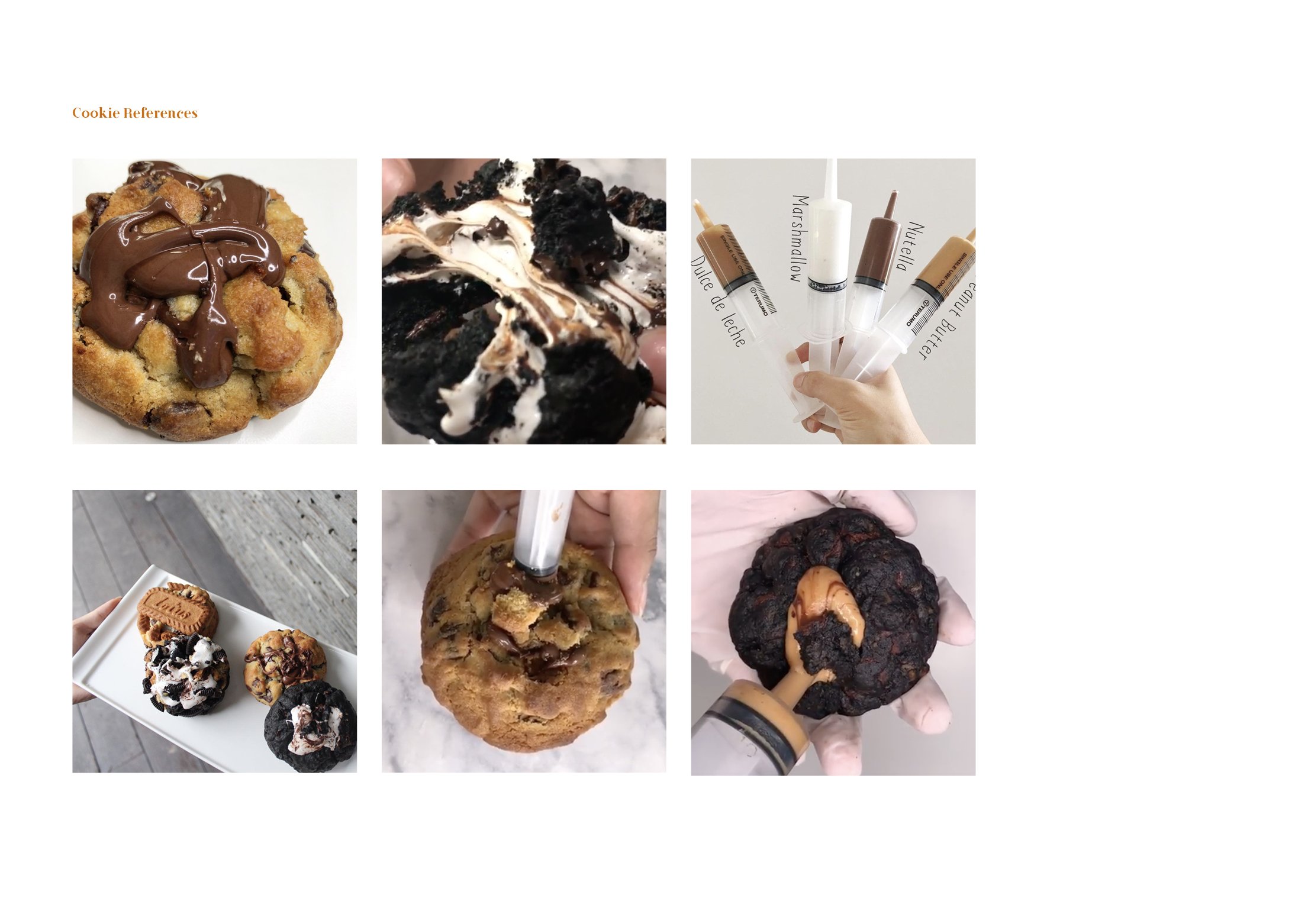
I’m sure once in your life you’ve had a gooey dessert, whether it’s a cookie or not, I really hope you have tried them because they are AMAZING (at least I think so) !!!! Recently, I chanced upon a local cookie shop called, “Nasty Cookie”.  Nasty cookie’s best selling point is basically they’re nasty gooey fillings in their fat cookies!

A little treat for your eyes

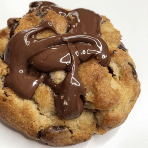
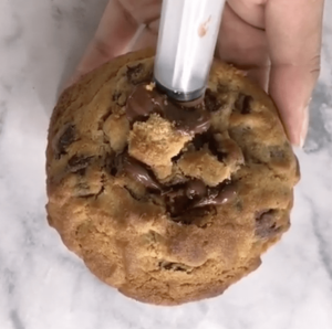
But the thing that intrigued me the most was how they inserted these gooey fillings. I always thought the bakers inserted a solidified chunk in the middle of the dough and then the chunk melts and becomes goo.

BUT actually! They insert the goo via a syringe and what makes it satisfying is it has a crispy ASMR of the cookie crack.

Inserting the goo
what if these bakers sold their fillings?

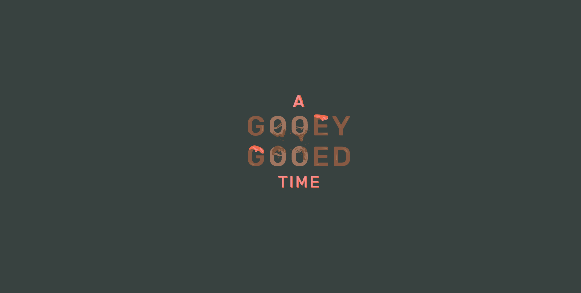
I decided to recreate a brand and have this brand market and sell their fillings. Thus, the event that I have decided on is  Gooeyooey’s first ever event and product launch that will also help people to destress by “stabbing” the cookie.

Thus the name of my event is, “A Gooey Gooed Time”

A GOOEY GOOED TIME

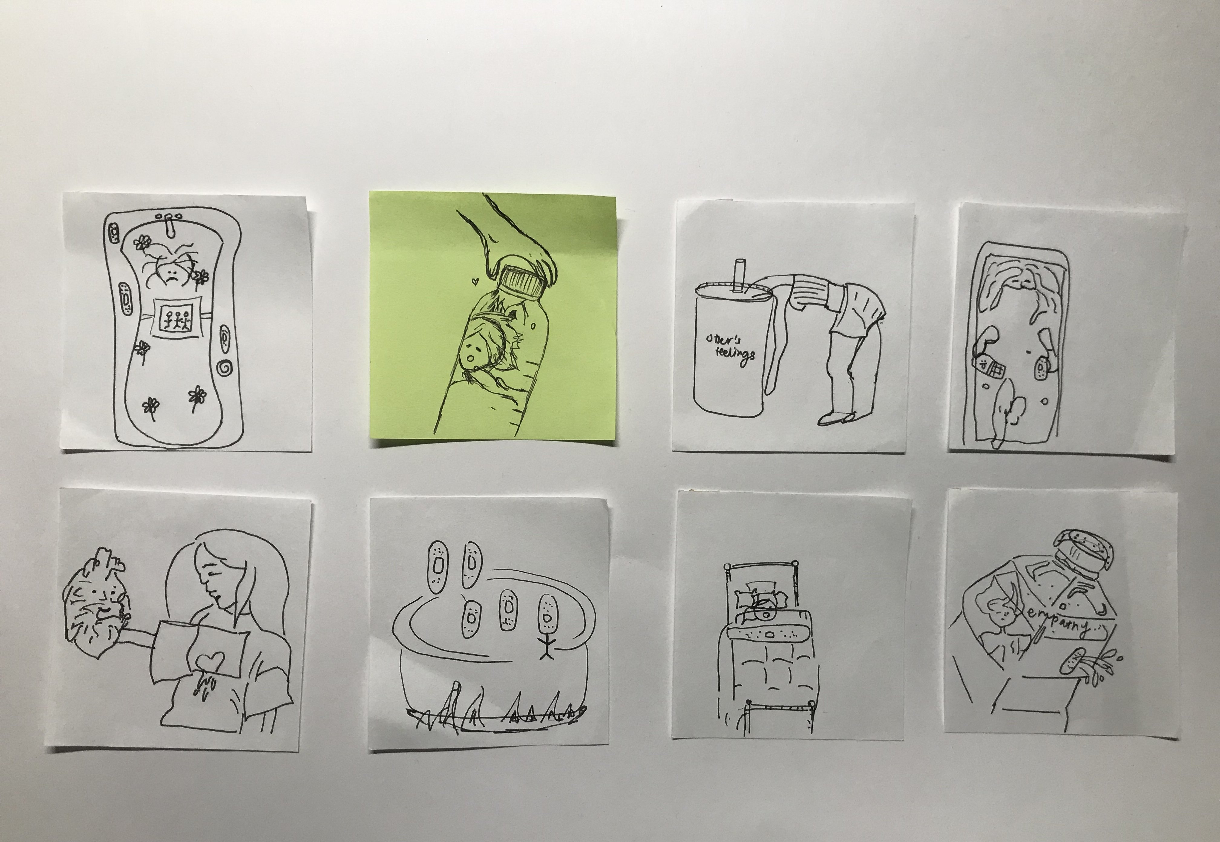
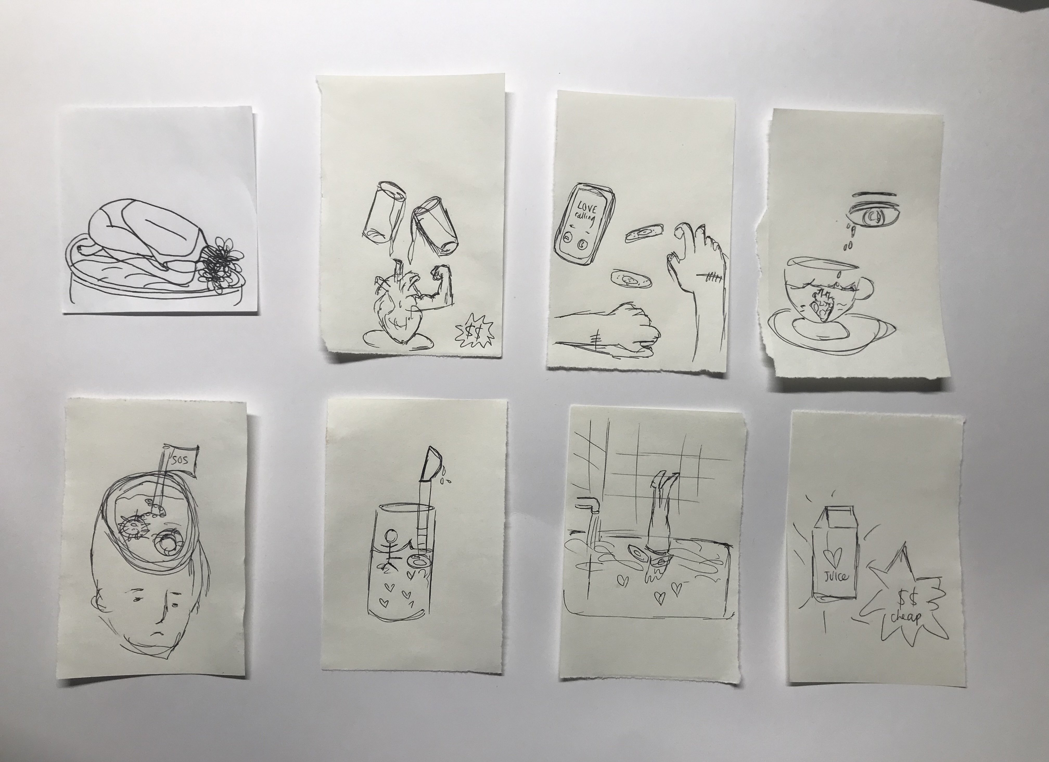
Initially, I named the event, Oh Gooedness! Here is my initial research and inspiration,

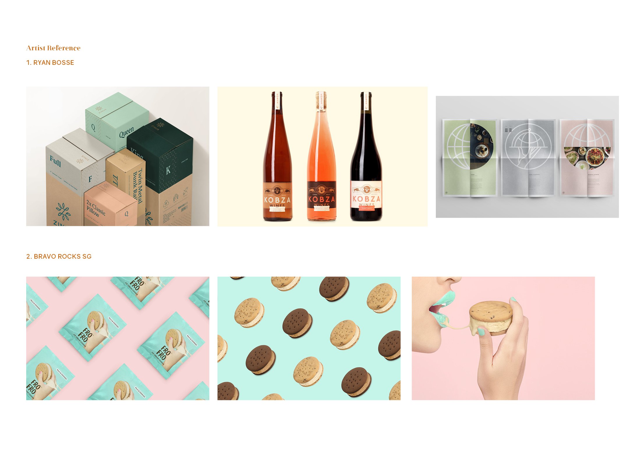
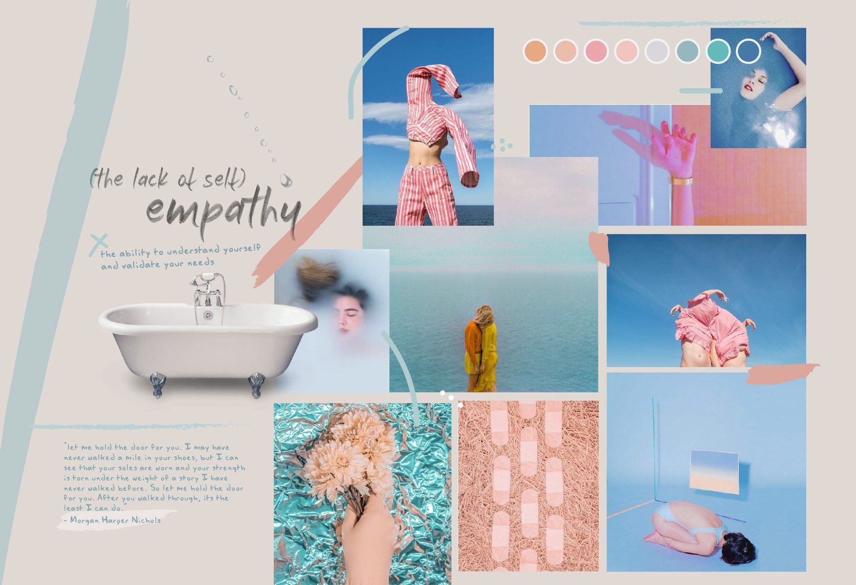
While thinking about my colour scheme, I thought that I wanted to do something more fun and not so related to typical dessert colours like brown.

My initial five items are:
  1. Poster
  2. Invitation
  3. Table placemat (later taken out as only 4 items are required)
  4. Packaging
  5. Syringe (for goo)
creative process

LOGO

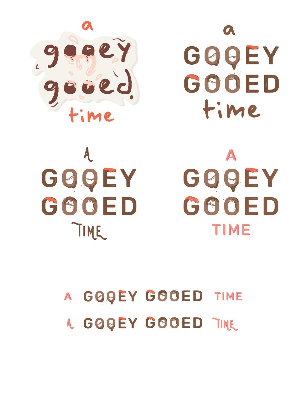
Initially, I designed the logo to look more playful and fun. However, I did not want the entire event to look too childish as my intended target audience are working adults. Thus, I decided to go with this.

INVITATION

first draft

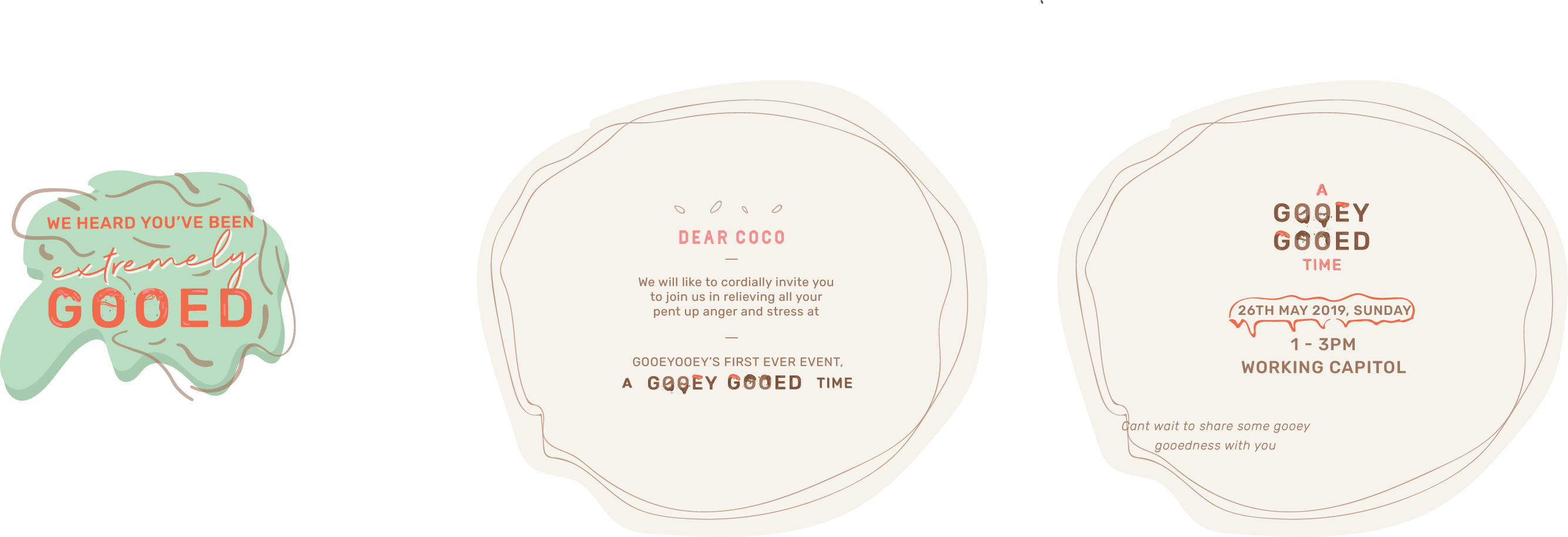
I was thinking of an odd shaped invitation at first. But later i realised it doesnt will make sense or look good, so I changed it to a more simple design. However, I received feedback that it looked to corporate and does not go with the other deliverables.

For the other 3 deliverables I adapted the same style throughout but do not have huge changes from edition to edition and so I will talk about them more in my next post.

Read more about my final deliverables here.


Varoom Illustration – Research & Process

empathy

Amongst the 2 other themes, Style and Obsession, I decided to choose Empathy as I thought the illustrations I could come up with might be more personal and relatable. I also wanted to push myself to explore this theme beyond its usual connotations. Thus, my choice of theme is, emapthy.

Research

I started my research by just listing out several things that first come to mind when I thought of the word empathy.

Words: Love, others, understanding, care, sensitivity, 
relationships, friendships, emotions, pain, suffering, 
priorities, damage, media, human.

From there I picked out those words that spoke to me more.

human, priorities, others, love, suffering

After which I realised that I thought there was a little problem with empathy at times. I feel that many people around me fail to put themselves first. They are always empathising with others, but they forget to empathise themselves. In other words they lack of self empathy.

inspiration

I did further research on articles and found a particular one titled, “How to Avoid the Empathy Trap”

This article spoke to me as I realised that this issue is indeed prevalent in society today. As such, I was excited to start sketching.

sketches (ideation)
USER PERSONA

I created a persona that my illustration will speak to and is meant for.

moodboard

Initial moodboard –

After which, I had to revise the colour scheme slightly to match certain objects in my illustration.

pencil sketches
Left: This illustration will address the issue of the lack of self-empathy and the idea of being stuck in it. In a bathroom setting, where people can spend “me time” on reflection, I placed upside down feet as if the person is drowning in the water. The water has bathbomb and pretty things that are actually harmful for humans. This conveys the idea of an empathy trap where people are so quick to put others before themselves. Middle: This illustration also address the lack of self-empathy. The scene is a cut open head. The head is where we think and make decisions, in this case, the head seems to not be functioning as usual as the hand sticking out conveys the need for help and it is also holding a flag to surrender. Right: This is something alittle different and not so much self-empathy but rather how empathy isn’t genuine anymore. It is now fake and people show it just to gain popularity or make friends. Thus portrayed in a form of an advertisement, “empathy for sale”


Revised and finalised sketch

This is a revised version of the first composition seen above. I revised it after gathering feedback from the class. Instead of a human leg sticking out, the human is now submerged in the bathtub. The water in the bathtub expands to a underwater ocean scene, with fishes, etc. The girl’s hair is weighed down or rather entangled with a anchor that represents empathy and the heart. Her hands reaching out to a lifebuoy as she needs help. There is also an angular fish which is dangerous and uses the alluring and trick method, as much as empathy is like. 

Read next post for process towards my final work.