EGO: Process & Final Work


Explore your personalities, Explore your alter ego

not gonna lie, this project got me feeling excited to list down some of my personalities since I think I react differently in different situations and I tend to think I am pretty different with different people and contexts

Brief:

  • Touch a truth in oneself
  • Think deeply about colours
  • Deliverables – 12 squares printable on A4
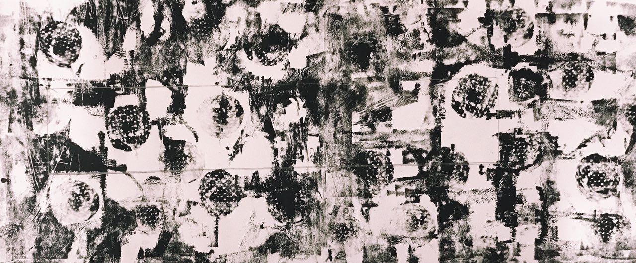
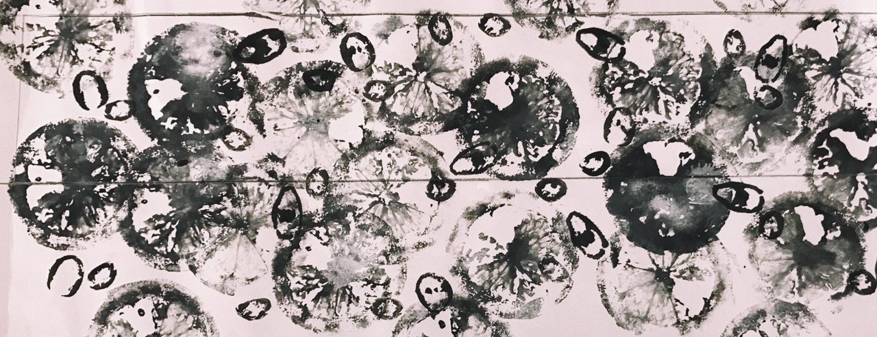
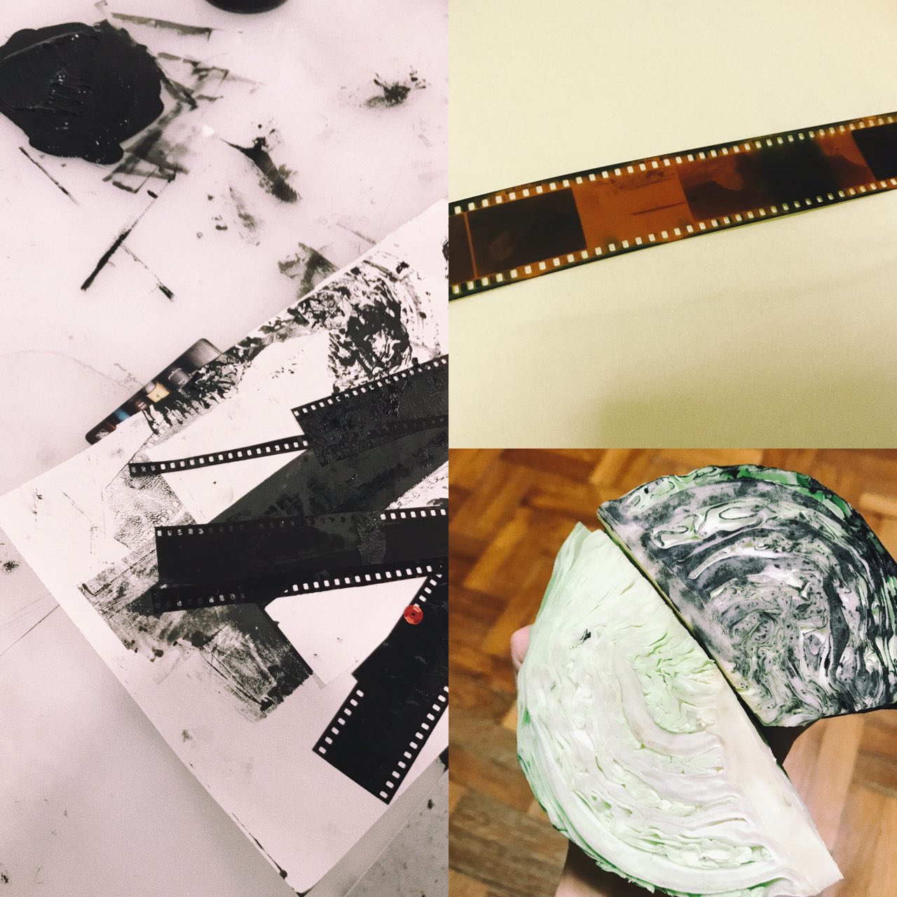
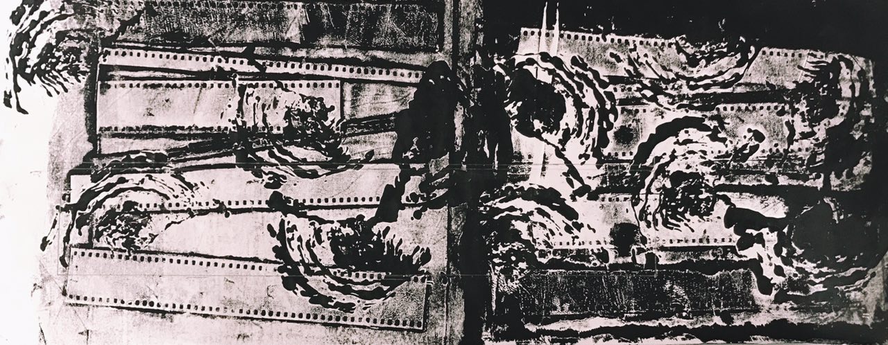
initial thoughts/brainstorming

The first thought that came to my mind when I heard the words, ego and everyone’s personalities, I thought about “How to be a Human Being?”

While growing up, we tend to get slightly more self conscious as we understand and know more things! Because of that, we find ourselves lost and unsure at certain situations,  not knowing what is the best kind of reaction or what we should do in order not to screw up.

(we don’t wanna lose an important opportunity, make a weird first impression, unintentionally offend someone, etc)

Because of that I thought of Guides to living life! 

Although this concept isn’t supposed to be well planned out to be a cheat sheet for everyone out there, it is instead a personal guide based on my own personalities and settings that I tend to struggle with or find myself having a lot of questions to ask.

CONCEPT

“How to Adult?”  – in really simple words, this is exactly what my concept is. Many people around me find themselves in situations where they have no idea whats best to do. Questions like, “should I say hi?” “isn’t small talk bad?” “how do I reply him?” “what if she gets more annoyed after reading this?”. The questions never stop.

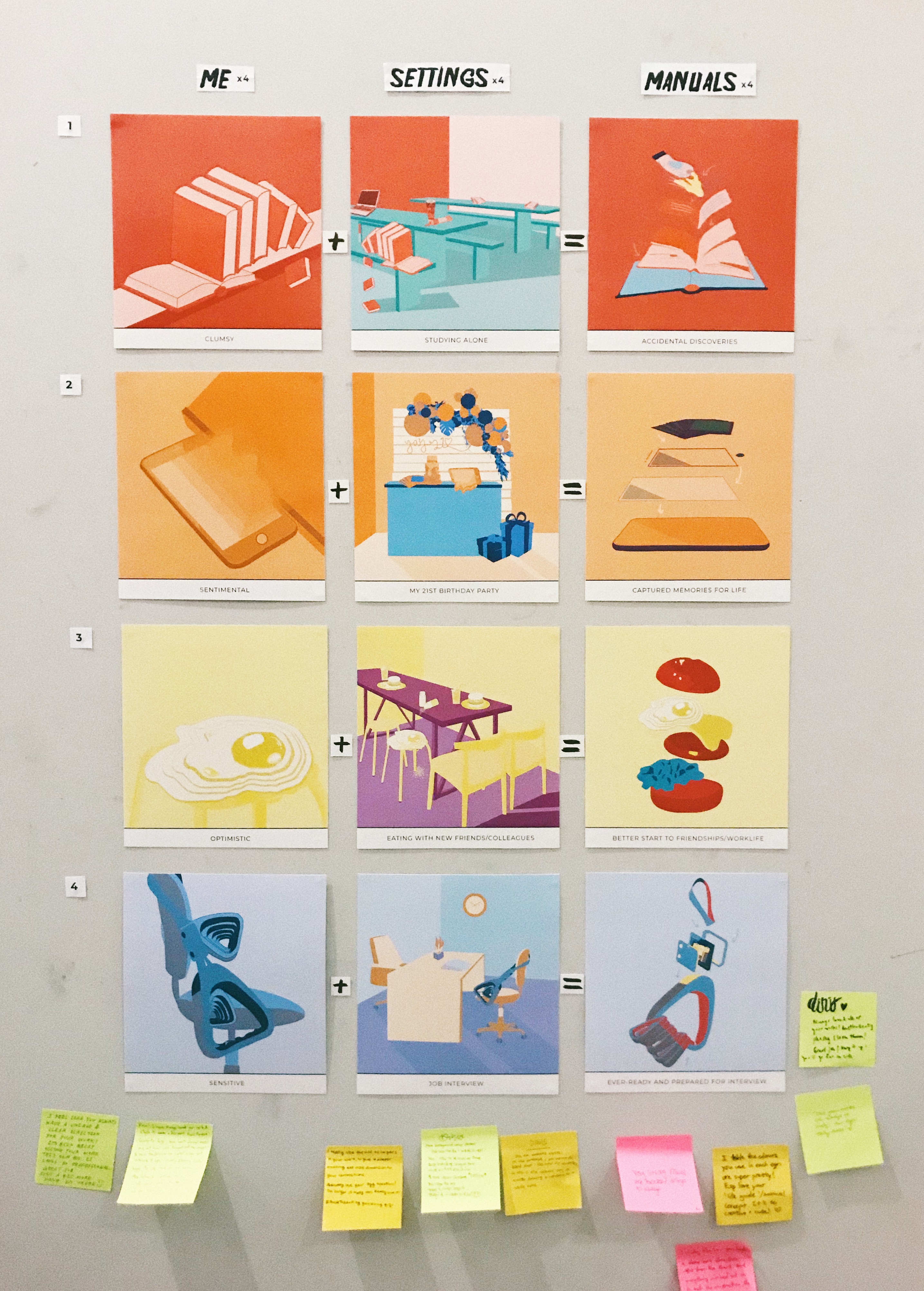
Since we are required to create equations, I decided to split my boxes into this standard equation throughout the 4 rows and columns of boxes. 

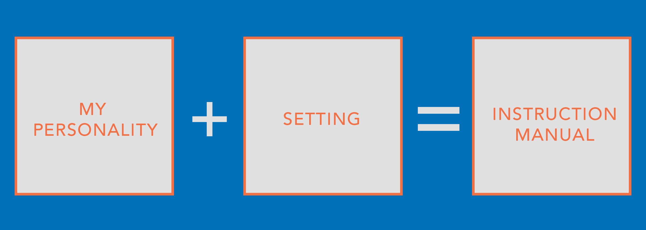
The first box is “my personality”. I just narrowed down some of my more prominent personalities and fit them into the equations.

The second box is “setting” which I interpreted it to be situations where I’m alone, or is awkward or I have to deal with people or its just a situation where I don’t really know whats the right way to react.

The third box is “instruction manual”. This instruction manual, is a result of combination of my first and second boxes, creating a guide on how to adult. To make it really look like an instruction manual I will be adding arrows between dissected objects that appeared in either of the 2 boxes before so that it seems like its giving instructions on how to put these small parts together to form a proper functioning object which represents my life. 
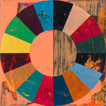
colour theories

For this project, we were required to explore colour theories and use them to represent the different composition in our boxes. We were not limited to any colours at all and were really allowed to just experiment with them.

After forming my standard equation above, I also decided that I want to standardise the use of colour theories throughout my 4 columns and rows.

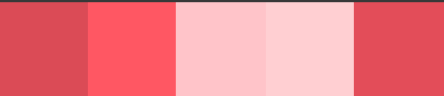
| Monochromatic | Complementary | Triadic |

I decided on these three harmonies for my equations.

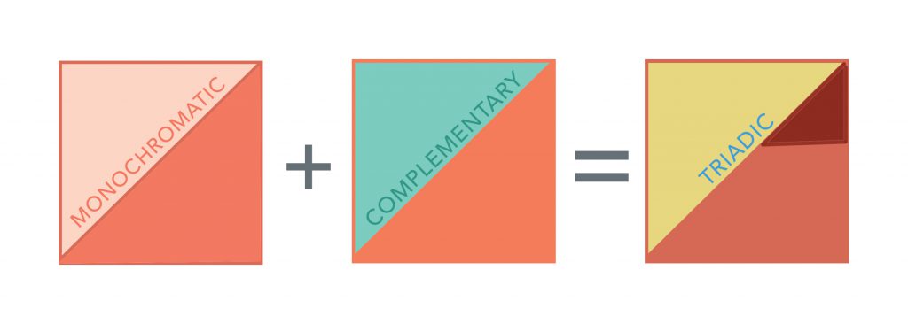
The first column of my personalities will be monochromatic because they are the closest to me and they aren’t anything surprising or new. Monochromatic uses shades and tints of the same colour and so it doesn’t make it too striking yet at the same time it feels simple and easy to take in.

The second column of settings will be complementary as some of them are awkward and tensed situations where I just don’t really know how exactly to react. Complementary colours or opposite colours on the colour wheel and although they go together quite well they also give off some kind of tension and awkward vibe which is what I would like to portray exactly in my compositions.

The third column of instruction manuals will be triadic because its when the problem is solved, like there’s finally a solution. Triadic colours tend to come together quite harmoniously, giving the composition a complete feel. A guide to being a human being, should feel that way as it should be something that one can trust and depend on.

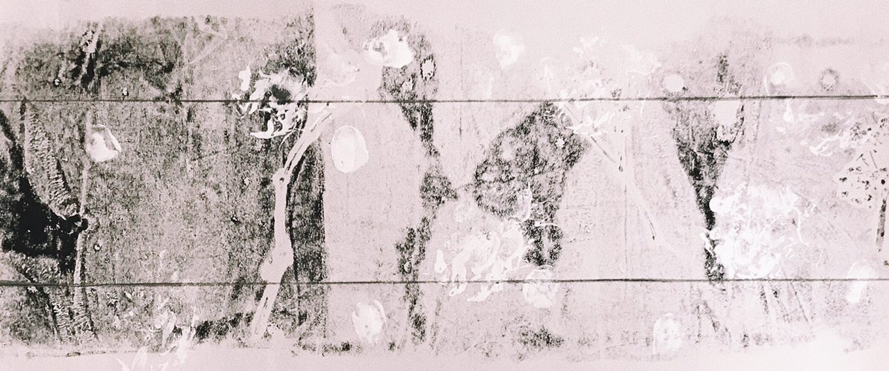
compositions/illustrations

I wanted to keep my illustrations simple with nothing too complicated. However, I would like them to intrigue the viewers and make them question why I chose to put certain objects that way. My illustrations will be slightly abstract but still relatable with the use of daily objects or just common objects that people are familiar with.

In addition, I will like my illustrations to follow the same art direction and thought process esp within each column. 

so going back to this,

MY PERSONALITY

I will be using a “guide to life” to represent a certain personality of mine. As such I have narrowed down 4 different “guides” that I feel are essential to survive in today’s world.

GUIDES:

  1. Food ?
  2. Books ?
  3. Smart Phone ?
  4. Transportation ?

The 4 personalities that I picked are: optimistic, clumsy, sentimental, sensitive. I combined a “guide” and “personality” together almost as if I  gave the object a character.

Optimistic ☺️ Food ?
Clumsy ? Books ?
Sentimental ? Smart Phone ?
Sensitive ? Transportation ?
SETTING

I picked 4 settings that involves more than one person. Some of them are slightly awkward, filled with tension or simply just setting that make one unsure of how to react

SITUATIONS:

  1. Eating with a new group of friends/colleagues
  2. Doing work alone in public areas
  3. My own 21st birthday party
  4. Jon interview

I wanted to make these settings a little less simple by placing “myself” which in this case are my “guides + personality” into the setting itself.

INSTRUCTION MANUAL

The instruction manuals will be a combination of the first and second boxes to create something that will eventually become an abstract manual on “How to Adult?” or rather “How Does Dinis Adult?”
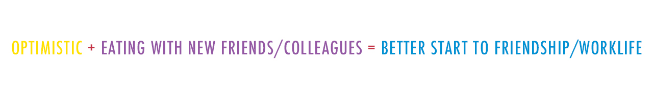
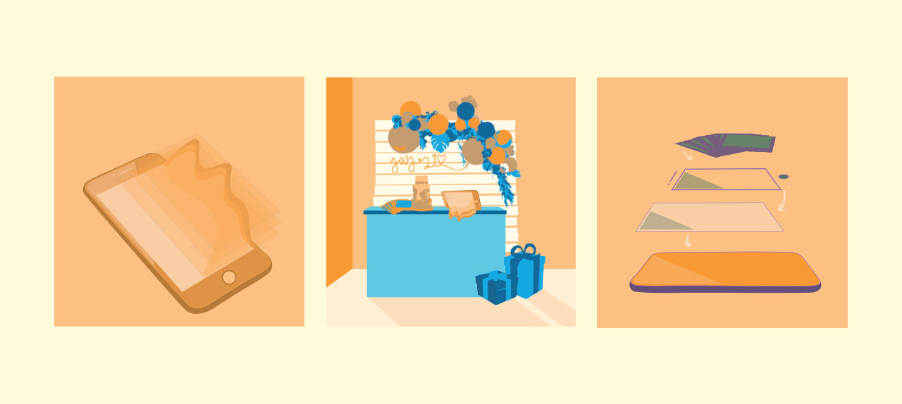
Optimistic Eating with a new group of friends/colleagues A better start to new friendships/work life
Clumsy Doing work alone in public New discoveries by my clumsiness and art projects
Sentimental My 21st birthday party  More memories created and captured forever
Sensitive Job Interview Well-prepared and ready for the interview

The bolded words in the table are the ideas behind the compositions of the instruction manuals.

EQN 1:


Process/Drafts

Final

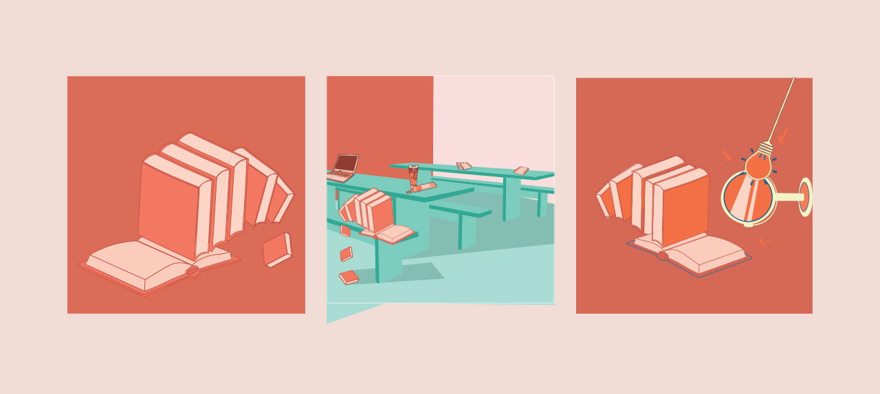
I arranged the books so that it will look like its falling off, mimic-ing clumsiness. The books now represent me and are seated on the chair alone and just doing its own stuff. Unlike the people around it, the book isn’t using a laptop or a notebook but is using paint, this represents me when I’m out alone because I’m an art student. The instruction manual shows paint getting onto the pages of a book and this is a result of my clumsiness that led to a new and accidental discovery.

eqn 2:


Process/Drafts

Final

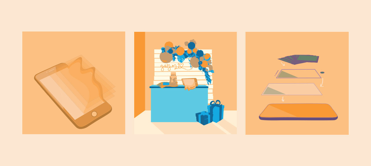
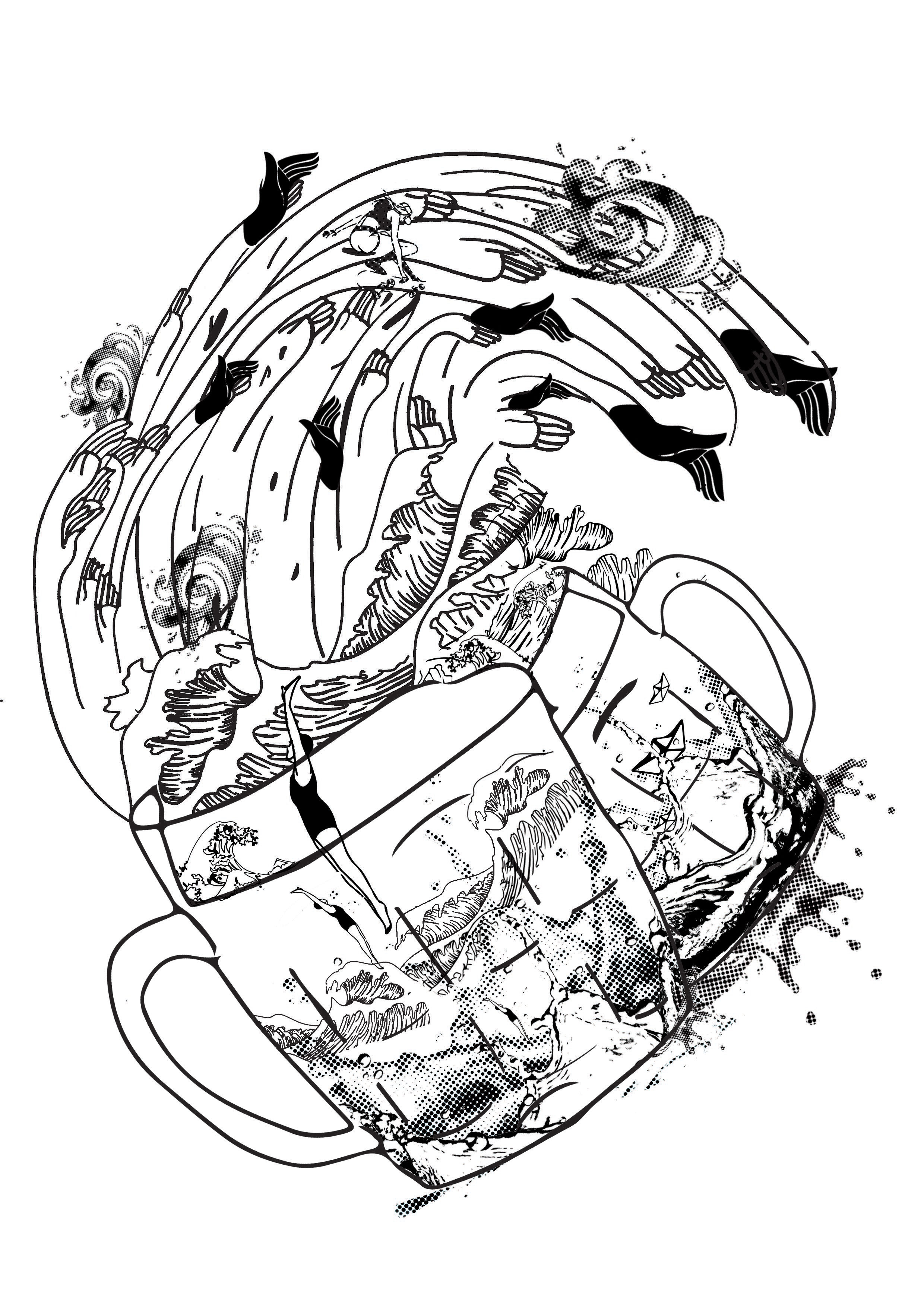
It is very hard for me to let go of moments and I tend to always reminisce past memories. The phone seems like its leaking substance together with multiple screens melting with it. This represents me overflowing with sentiments and feeling hard for me to close to chapter and start a new one. The phone now represents me and is laid on the dessert table of my 21st birthday party. The dessert table is where everyone takes pictures of the birthday girl and will probably be the fondest memory of the birthday party. The instruction manual shows a dissected phone and an additional layer of Polaroid photos on the top showing that memories have been captured and I have nothing to feel sad about.

EQN 3:


Process/Drafts

Final

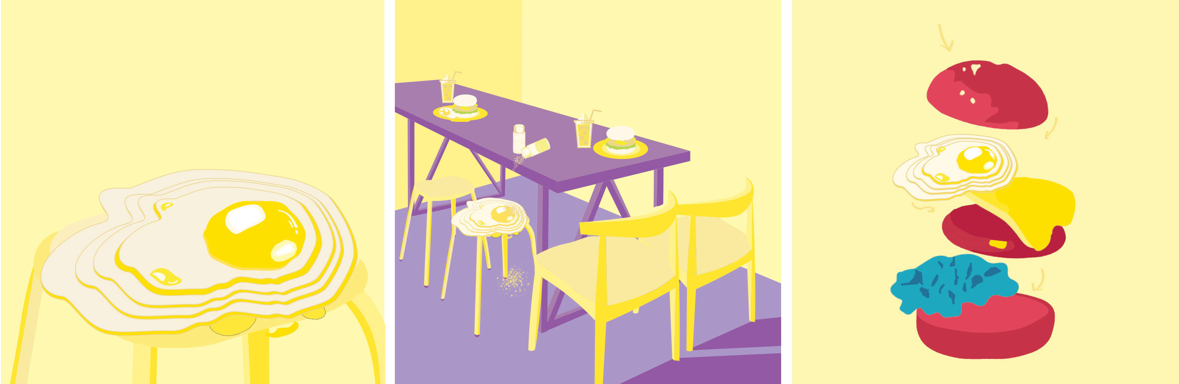
I chose an egg to represent optimism because I like eggs. The sunny side up has layers to it because to me optimism is growing and climbing higher. I placed the egg on a stool where it seems like people around it are having scrumptious meals while the egg is awkwardly having some salt and pepper. Some of the pepper even got on the floor! This represents me feeling awkward with a new group of people and unsure of how to break the ice over a meal. The final box shows a dissected burger but instead of the burger seen in the second box, this burger now has an egg. This shows me slotting myself in into a new group of people and having a good start to new friendships.

EQN 4:


Process/Drafts

Final

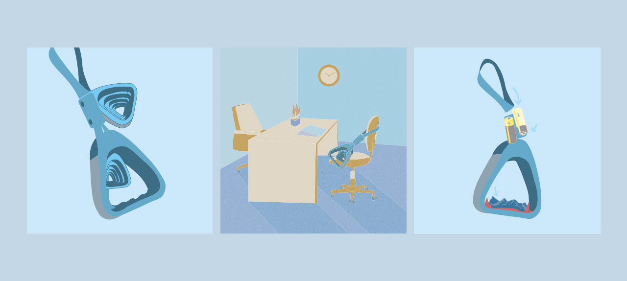
I used a recognisable bus handle to represent transportation that is essential for anyone to get anywhere. The bus handles seem like they are multiplying and have many layers. This represents my sensitivity as when a person is sensitive he/she tends to over think and uncover unnecessary layers. I placed myself on a chair like one would for a job interview. The table is almost empty just with a few pieces of paper to portray the formalness of an interview. The final box shows a dissected bus handle with the bottom part of the handle now replaced with many smaller bus handles which represents how sensitive I am. In the middle, there are also batteries which show how prepared I am for an interview because I’m so sensitive to details and making sure I’m well equipped before it.
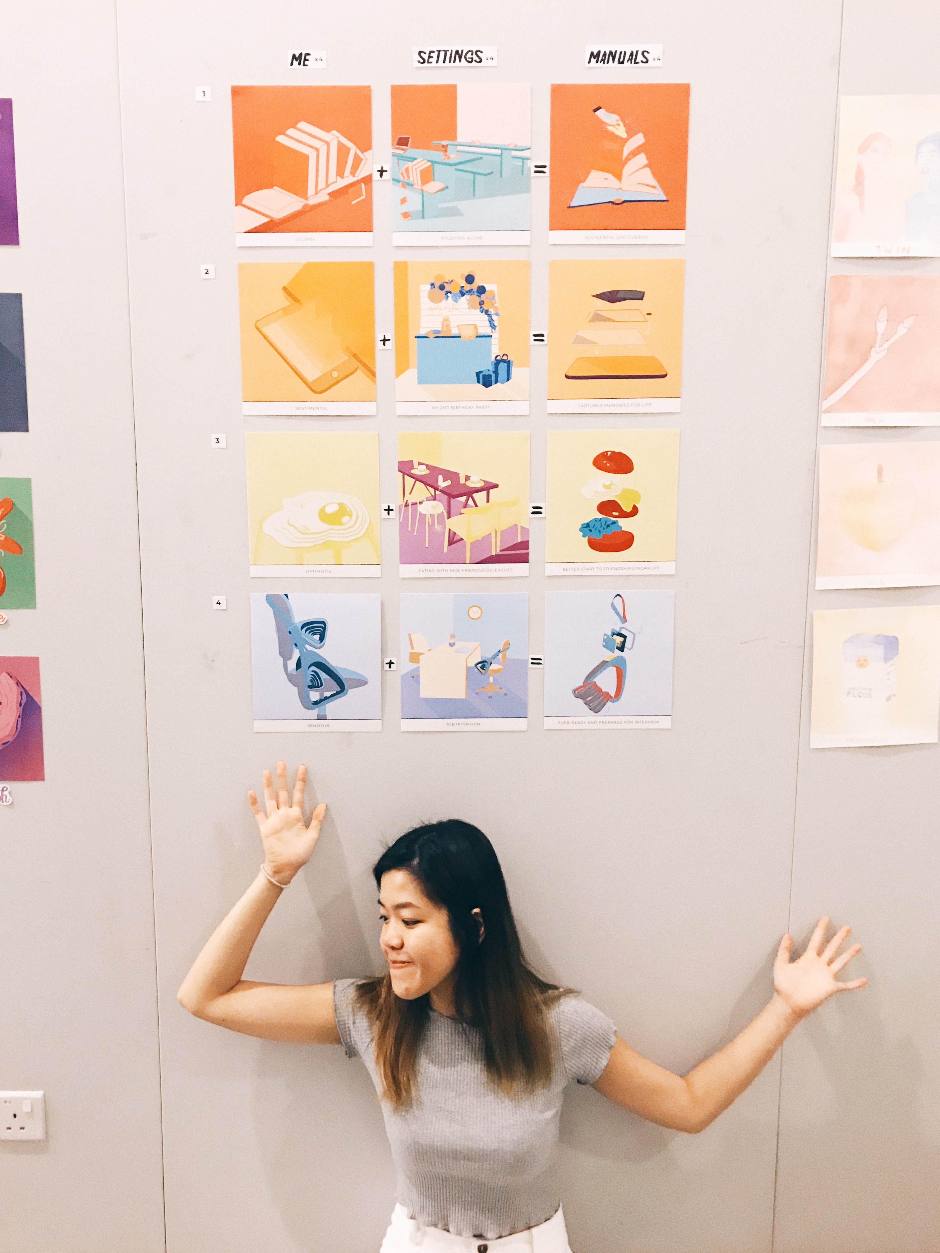
FINAL WORK

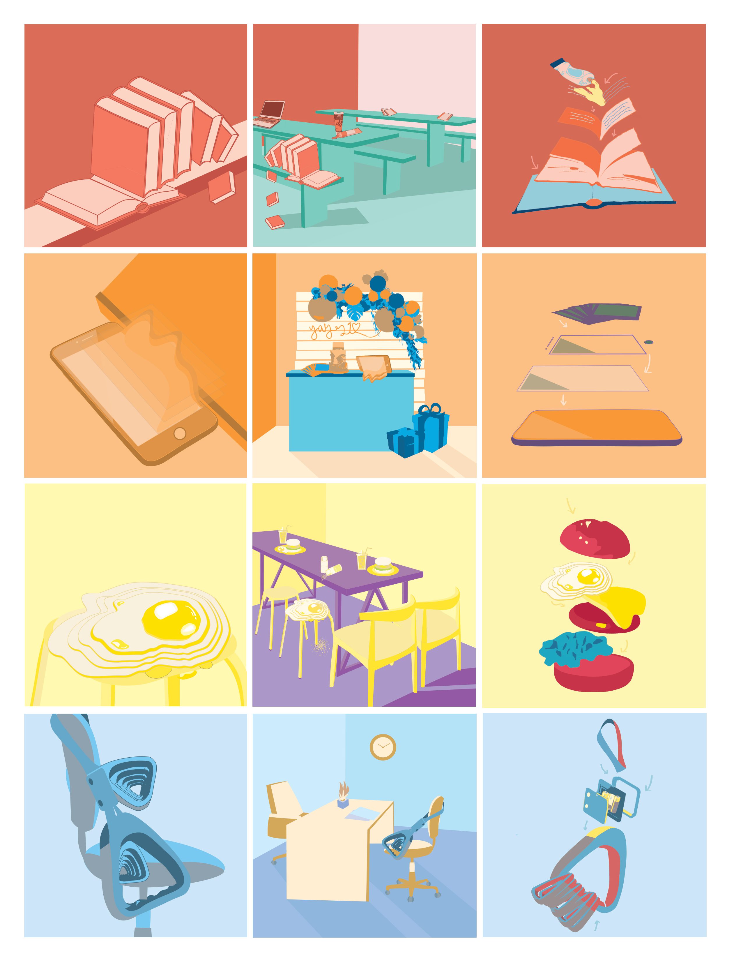
“GUIDE TO BEING A HUMAN BEING”

Overall, I really enjoyed myself throughout the process of this project. I learnt so much more about colour theories that I never understood before and got to explore creating illustrations which is a style I have always wanted to experiment with. After this project, I think I’ve become a lot more sensitive to colour and understanding what colours go together better than others. It has been really fun finding out more about my own personalities through the equations.

Though this process was enjoyable, I also encountered several setbacks, one of which was production and printing. Even though my test prints came out fine, my final prints were not showing up as well as they were supposed to 🙁 I was a little disappointed because I had to re-print some of the prints and they still didn’t come out the way I wanted it to. However, I decided not to re-print them anymore as they were costly. Part of me wished that I had printed all my compositions out during my test print so that I could have presented those instead.

This taught me to be more sensitive to be colour and never be complacent even if the first time was good. Printing is very unpredictable and I hope that in my future printing assignments to come, I’ll have better luck! Besides my production, I received positive feedback during my critique and it has given me the motivation to work harder and do better next time 🙂

Critique Time!
Me with my ego equations!
READ MORE ABOUT MY RESEARCH FOR EGO HERE!

Forest Gump: Process

l THE PROCESS l

After going through the brief, various thoughts and ideas came to my head. However, I was not sure of how exactly I wanted to come up with and portray my compositions.

I immediately started off by going through quotes that are closely related to life and human feelings. I drowned myself in a sea of emotions and feelings from movies that I closely relate to or have been inspired by.

4MOVIES
Chungking Express (1994)
Artist Impression of Chungking Express (1994)
Chungking Express Scene (1994)
Boyhood (2014)
Boyhood (2014)
Boyhood Scene (2014)
Her (2013)
Her (2013)
Her Scene (2013)
The Imitation Game (2014)
The Imitation Game Scene (2014)

4MOVIE QUOTES

I settled on these 4 quotes as I felt that they spoke to me in a certain way and had the potential to explore various compositions.

l THE APPROACH l

“think about the quote in a different perspective” / “dig out a different meaning” / “link quote to various objects in life” / “be unconventional, don’t be literal”

These thoughts replayed in my head as I tried to come up with a concept/overarching idea for my compositions. I took to staring at objects around me and tried to create a connection between them and the movie quotes.

Deeply inspired by surrealism, I wanted to make use of everyday objects to tell a story about my quotes, almost as if the compositions/interpretations of these quotes are from a different world of its own, where everything works differently.

— S Y M B O L I S M —
the art or practice of using symbols especially by investing things with a symbolic meaning or by expressing the invisible or intangible by means of visible or sensuous representations: such as
a :artistic imitation or invention that is a method of revealing or suggesting immaterial, ideal, or otherwise intangible truth or states
b :the use of conventional or traditional signs in the representation of divine beings and spirits

There were certain similar elements in the quotes that were chosen.

  • Personal/Life
  • Repeating words
  • Moments/Feelings

Thus, by using everyday objects it better symbolises life and feelings of a human rather than any random object.

INSPIRATION

I came across various artworks and was inspired to create compelling compositions of my own.

KEY WORD SEARCH:

ILLUSTRATION, EVERYDAY, HUMAN, MOMENTS, GALAXY

RESULTS:

Night Passage from the Desert, 2013
@Ginakielillustration, 9 May 2017
Read all about you, Henn Kim
Sleepy Head, @Mattblease, 19 November 2015
ARTIST REFERENCE

In addition to the initial research done on Dadaism and Surrealism artists, I also narrowed down the artist references for my compositions.

SURREALISM

1. Salvador Dali

Salvador Dali
The Persistence of Memory, Salvador Dalí (Spanish, 1904–1989)

Dali’s works are compelling, making one want to stare at it longer to uncover what different meanings each element in the painting portrays. In this piece, Dali portrayed the theme of time with an objective of discarding the world of reality. He did this by distorting (melting) the clocks and creatures with a perfectly normal background. It is clear this art piece was a result of his interpretation and imagination.

2. Vladimir Kush

A surrealist artist greatly inspired by Salvador Dali. His works portrays fascinating stories and imagination with the use of everyday objects such as food, and shoes.

Butterfly Apple, 1978
Treasure Island

3. Henn Kim  l  @henn_kim

Henn Kim is an illustrator from South Korea who evokes theme of, “beautiful dark twisted fantasy” in her art works. Her works are compelling and are always in black & white. Her art style and work were my main form of inspiration for my 4 compositions.

Drenched through my mind
Sleep Forever
IDEAS & SKETCHES
Chungking Express first sketch
Boyhood first sketch
Her first sketch
The Imitation Game first sketch

These sketches received generally okay feedback on the first round of consultation but were given feedback for improvements. Since the use of the hand motif is strong, I decided to use that as a common element in my compositions to make them look more consistent. It was also suggested to maybe also use cups across all my compositions to suggest the same meaning of life in each of them.

REVISED SKETCHES

– Included use of hands and cups in all 4 compositions –

digital drafts

Chungking Express

Chungking Express Draft 1

Feedback: Cup and sardine seem to be clashing, girl looks like she is about to crash into cup, fish fin can be tilted slightly upwards to have a better direction flow.

Boyhood

Boyhood Draft 1

Feedback: Looks alot more messy and complicated compared to Chungking Express composition, there is no focal point, not sure where to look at, maybe you can have one thing that is prominent, similar to Chungking Express one where the cup and the sardine sort os stands out the most, play with more halftones in the composition

Her

Her Draft 1

Feedback: Interesting use of toilet paper roll (at least some thought so), humans on the composition are a little disconnected/doesn’t make a lot of sense, can flow better, replace with something similar to other compositions.

The Imitation Game

The Imitation Game Draft 1

Feedback: Looks abit more plain compared to rest of compositions, can make cup tilt little so that the cup looks unstable almost like the rest of the cups in other compositions, add more water droplets, traffic light currently doesn’t look like a stirrer, tilt traffic light a little to show that it is in motion.


Read more about the ideas and meanings behind each composition in my final Forest Gump post!
NEXT: FINAL WORK FOR SUBMISSION

‘My Line is Emo’ | Process & Research |

Thoughts, ideas, objects flooded my head as I read the brief.

This was going to be my first 2D assignment.

Initial thoughts: I thought that this brief was actually pretty interesting and allowed us to basically have fun. I immediately started looking into Pinterest for various mark making techniques hoping it would eventually spark an idea in me

I liked the simplicity of the various marks put together
These cute round cut-out patterns caught my eyes even with its simple elements – brush strokes, dots, blotches
Even daily objects we have at home can create unique expressions and art

Emotions are pretty subjective, they mean different things and feel different to each human. I felt that this topic was rather broad and actually had no clue where to began. After which, I decided that exploration and experimenting might narrow my train of thoughts and help me to eventually settle with something I am most comfortable with or am happy about.

“Your emotions are the slaves to your thoughts, and you are the slave to your emotions.” – Elizabeth Gilbert

early stage exploration
In the midst of my explored mark making papers

Played with objects I found at home.  I chose these objects as they connect with me on a deeper level.

OBJECTS USED:

  • Film Roll
  • Dried Baby’s Breath Flowers
  • Sequins
  • Sponge
  • Old Necklace

here are some of my favourite outcomes,

Left to Right: Sequins, Dried Flowers, Film Roll

|  I liked how the marks formed had some form of contrast to them. Especially from the sequins, I expected the white parts to be circular but it resulted in unexpected organic shapes kind of resembling mood swings, unpredictable and in batches.

||  The dried flowers formed sort of an outline leaving the inside of the stalk white in contrast to the background. They formed random long lines, sort of giving direction to the piece. Some blotches of white were created, giving a mystical yet mysterious effect.

|||  The film strip mark was made using the remaining ink after printing it a few times. Thus, the background was quite faint and a lot lighter compared to the other two. I liked how the outline of the film strip turned out to be darker than the rest, making the strip pop up a little more. Also, one strip turned out to be darker than the other showing some sort of progression in that piece.

IDEATION AND NARROWING IDEAS

I think that I feel a range of emotions in a span of a day. From being sad to feeling slightly happier to being grouchy and then feeling loved like my heart is warm and full. I am actually not too sure how healthy that is? but generally I am a person who just feels a lot.

“How could you possibly act decisively, or even act at all, if you’re of two minds—or rather, feelings—about something?” 

As such, I thought why not incorporate this fact into my project and make my daily emotions come to life. I feel that my emotions vary a lot depending on daily situations and  I am sure that it is the same for others as well, but I think on the whole, some of my emotions stay consistent on a day to day basis unless affected by a huge factor.

Since I feel so many emotions at once, my emotions are actually being felt concurrently. This to me, translates into layers in art form.

LAYERS

Using layers to convey concurrent emotions —

Searched ‘Art Layers’ on Pinterest
I like how the layers used bring out the colour and emotion of the art piece
ARTIST REFERENCES

Ed Moses

Ed Moses can be described as an abstract expressionist. He is known for experimenting with layers using basic shapes to create depth. His art works comprises of layers of different mediums.

Ed Moses, Untitled, 1975-77, Acrylic, ink, and tape on foamcore
Ed Moses, Cubist Drawing #11, 1977-78 Charcoal, acrylic, india ink and masking tape on board

His use of layers are intriguing, though pretty simple, it still manages to draw me in. I liked how he manages to create depth through his use of layers, making the art piece pop little more.


Bernd Ribbeck

Bernd Ribbeck is described as a spiritualist, using spiritual ideas to inspire his works. He is influenced by artists such as Hilma Af Klint and Emma Kunz. His work is process-orientated, making use of layers and scrapping surfaces to achieve the desired effect.

http://normamangione.com/en/opera-bernd-ribbeck-15/
Bernd Rebbick, Untitled, 2014, acrylics, ballpointpen, pigmented marker on mdf
https://frieze.com/article/dear-painter-…
Bernd Ribbeck, Ohne Titel (Untitled), 2010, acrylic and pigment marker on MDF

Through the use of geometric shapes, Bernd Ribbeck manages to create artworks that look quite pleasing to the eye. With the different use of textures and layers, he manages to add life to his works, making me want to stare at it longer.

Julie Mehretu

Julie Mehretu is an abstract artist known for her use of layers throughout her works. She layers mediums, images, marks and even makes use of figurative layering. Her work from a far looks creates a whole picture but when seen unclose, it breaks down to smaller bits and suddenly there are many different narratives happening at the same time. Some mediums she use include, acrylic, pen, pencil and ink.

Julie Mehretu, Mogamma Part 1, 2012, Ink and Acrylic on canvas
Julie Mehretu, Invisible Line, 2010-2011, Ink and Acrylic on canvas

After doing some research on layers, I experimented layering marks one on top of another. Initially, I thought that layering would be a breeze, but I was proven wrong by my own actions. In the process of layering, instead of immediately seeing the final results of the mark made, I had to plan what looks better as the top layer or vice versa. In addition, I had to wait for the ink to dry before attempting the second layer. This took up extra time and effort but it was definitely worth it all!! 

I felt that layering helped in bringing out more contrast in the lines and more obviously showed empty space. The values of the lines were also more varied due to the different ink pressures from different layers.

Some pretty decent outcomes –

Left to Right: Watercolour (bottom) Charcoal mask (top), Lace (2 layers)

I was quite happy with the results produced through layering. By layering, it helped add depth to my emotions and gave some room for space and different textures. As seen in the left picture, the first layer is a lot softer than the lines made by the charcoal mask. The lines added made the emotion feel more confusing and highlighted the dark tone of the whole piece.

|| The right picture was an outcome after 2 layers of opposite lace was stacked one of top another. Although it seems like there is only one layer from far, when looked in detail, you can see some of the flower patterns overlapping each other adding a blur effect to the whole piece. The layering also made some parts darker than the other, bringing out some contrast.

ENROUTE TO FINAL ‘EMO LINES’
6 different emotions

Since I feel a set of emotions daily, my lines are a representation of my day according to how I feel. After much thought and analysis, I have arranged the various emotions along a span of a day.

Sadness > Fear > Anger > Surprise > Joy > Love

S A D N E S S

As depressing as it sounds, I am generally sad when I wake up (with the exception of days where there is something exciting to look forward to). The second the alarm on my phone rings, I am awake. Sometimes, I really hate being a light sleeper just so that I can sleep just a teeny weeny bit longer…

In my layers, I hope to stick through the idea of putting together a use of a daily object and a movement to express the emotion.

Object: Pimple Cream (applied with cotton bud) Movement: Draggy, dreadful


Top: Watercolour
Bottom: Results of dragged out watercolour using a card

Final outcome with added use of dots and horizontal drips of charcoal mask
F E A R

I will definitely never use the word, “brave” to describe myself as unpredictable and new situations tend to be pretty intimidating to me. I feel the emotion, fear, more in the beginning of the day because I don’t quite know what the day ahead will be like for me (good or bad). Thus, I tend to overthink and fear for things that have not happened.

Object: Rubber bands and empty skincare box Movement: Circles, repeated, never ending & haunting
Left two pics: Rubber bands on empty skincare Top right: Nail polish used to create circles and never ending effect
Bottom right: effect produced with DIY mark making tool


Final outcome
A N G E R

During the day, when things get little wonky and don’t go according to plans, I tend to get a little frustrated and irritated because interruptions to any kind of plans irritate me. Of course, mood swings can also be a reason for a more moody Dinis, once every time of the month.

Object: Eggshells sequins, pads Movement: Clear marks made with strength from negative energy
Left two pics: Pads used to represent grouchiness
Right: Eggshells and sequins as mark making tools
Final outcome. Pad effect on top layer.
S U R P R I S E

Any sudden unplanned situation/event would be considered a surprise to me. Seeing a sudden familiar face, or eating something with an unexpected taste are some things that will definitely surprise me. Being surprised means I will never know when its going to happen, however, I feel that in the middle of my day, there are generally more opportunities for me to be surprised. E.g. running into a friend outside.

Object: Lemons, Chili Movement: Sprayed marks using dry shampoo (conveys impromptu and sudden movements)
Top two pics: Chili and lemon used as mark making tools
Bottom pic: Using dry shampoo to produced “sprayed” movement onto paper
Final outcome. Dry shampoo effect on top layer.
J O Y

Happiness is the simple things in life. I am usually pretty simple-minded and even little things can excite me. I guess I feel generally blissful and content with what I have in life. Some things that make me happy include eating (especially with family or friends) and exploring new places. Joy comes at different times of the day but for me, I feel most happy and content at almost the end of a long day because it means finally some time to rest and also to be grateful for the day that has just past.

Object: Cabbage and film strips Movement: Simple, straightforward, easy
Left pic: Inked Film Strip
Bottom right: Inked Cabbage that represents my joy for food
Final outcome. Cabbage marks on bottom layer, film strip marks on top layer.
L O V E

And finally the day ends with love! Love is kind, compassionate and it makes my heart warm & full. Cringy, but love is really the best reward at the end of a long day. Family and close friends make me feel loved and makes me want to share my love with those that are important to me. Things like flowers also remind me of the beauty in life which often relate back to my loved ones.

Object: Dried flowers Movement: Dog paw prints and thumbprints of my family members (using face paint)
Top right pic: Dried Baby’s Breath Flowers
Bottom pic: My dog laying next to print before putting in his paw print
Final outcome. Simple and light. Flowers print on bottom layer and paw print/thumbprints on top layer.


NEXT: FINAL WORK FOR SUBMISSION