The second part of this project is to create a zine.
After my visual presentation, I received positive feedback about my site’s unique feature :
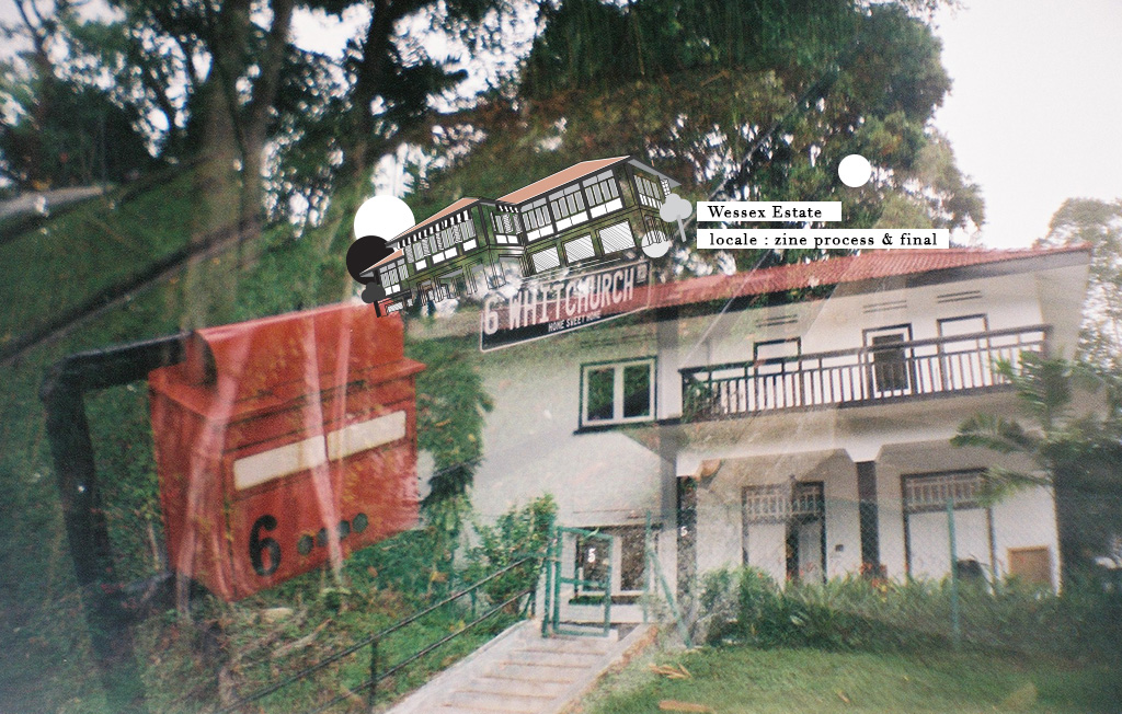
The only colonial estate in Singapore that has an art community living amongst a residential and not for commercial purposes.
THOUGHT PROCESS
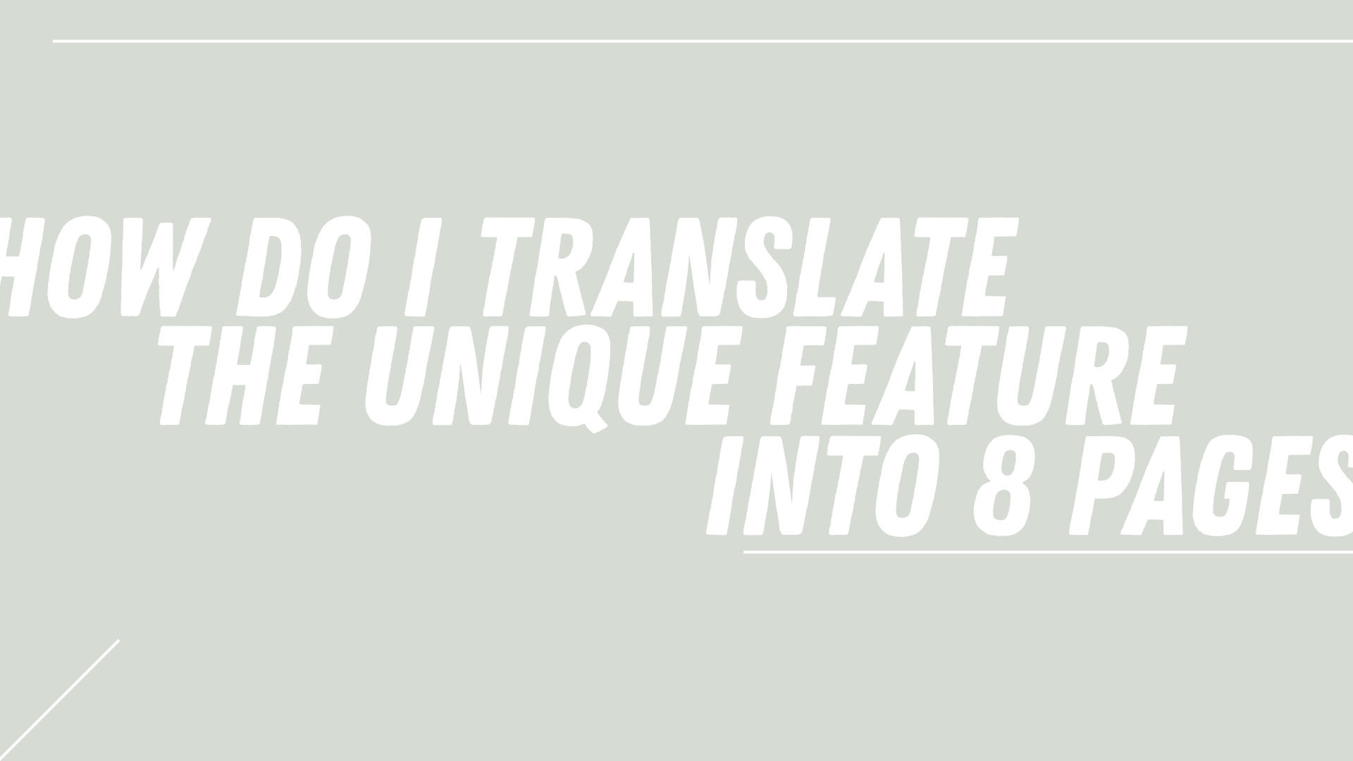
Initially, I had difficulties coming up with a concept that will have enough content to spread across an eight-page zine. I was worried that my concept will be too simple, too predictable or nothing special.
concept
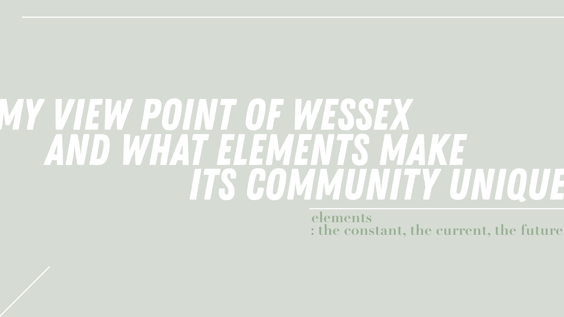
Based on my experience at Wessex estate and what I’ve gathered about the community, I really think that the community is special because of elements such as the B&W colonial buildings, the friendly people, the growing art community and the serenity of the entire estate.
flow of zine
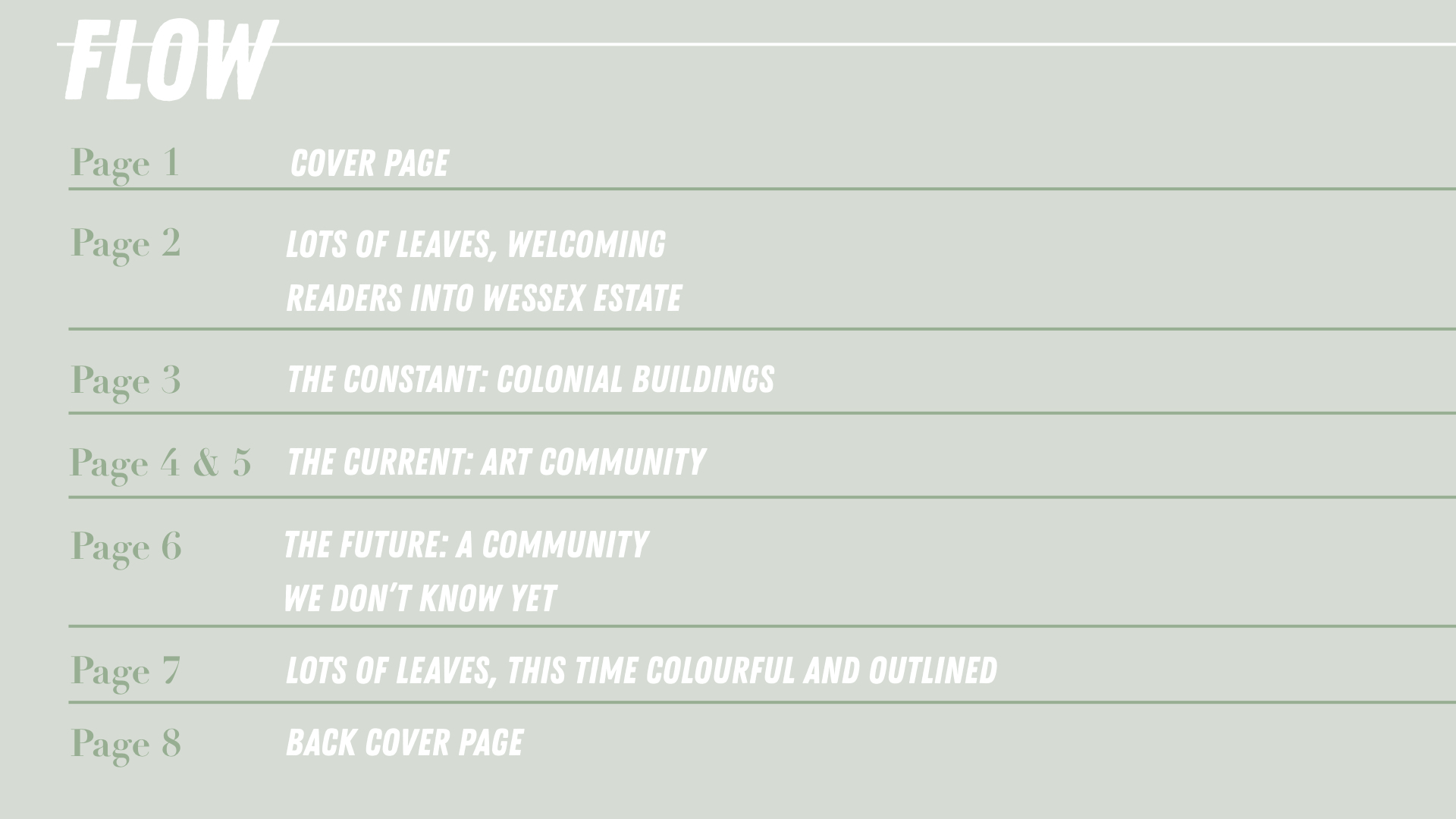
The zine sort of takes readers into the estate and view the different elements that make the community in Wessex and then takes them out of it but now taking away a little something knowing that it is a estate that is still growing.
mark-making
In addition to my concept explained above, I also wanted to include mark-making or items from the wessex into my zine. Mark-making will sort of allow a co-creation between the the physical site, the humans at the estate and myself. This further highlights the creative community of Wessex.
For my mark-making, I was thought that using leaves will be a good way to represent the estate as some interviewees said that the trees and the greenery is what makes the estate special to them (and they can also be found easily hahaha).
According to the flow of the zine state above, my zine is almost split into 3 sections. Thus, I will be treating the leaves that I have picked from the floor at Wessex Estate in 3 different ways – each way to reflect the same meaning as the page it is on.
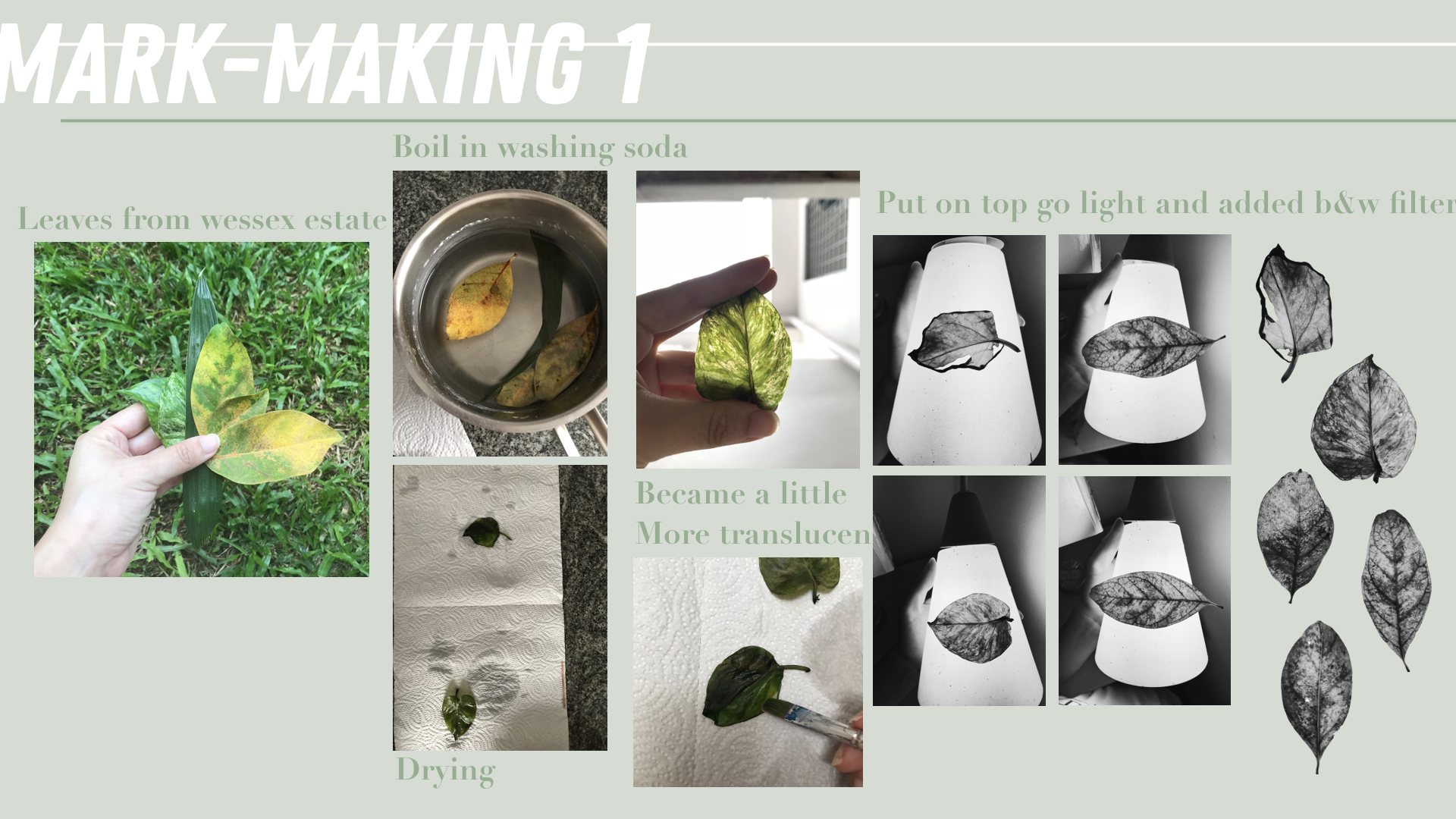
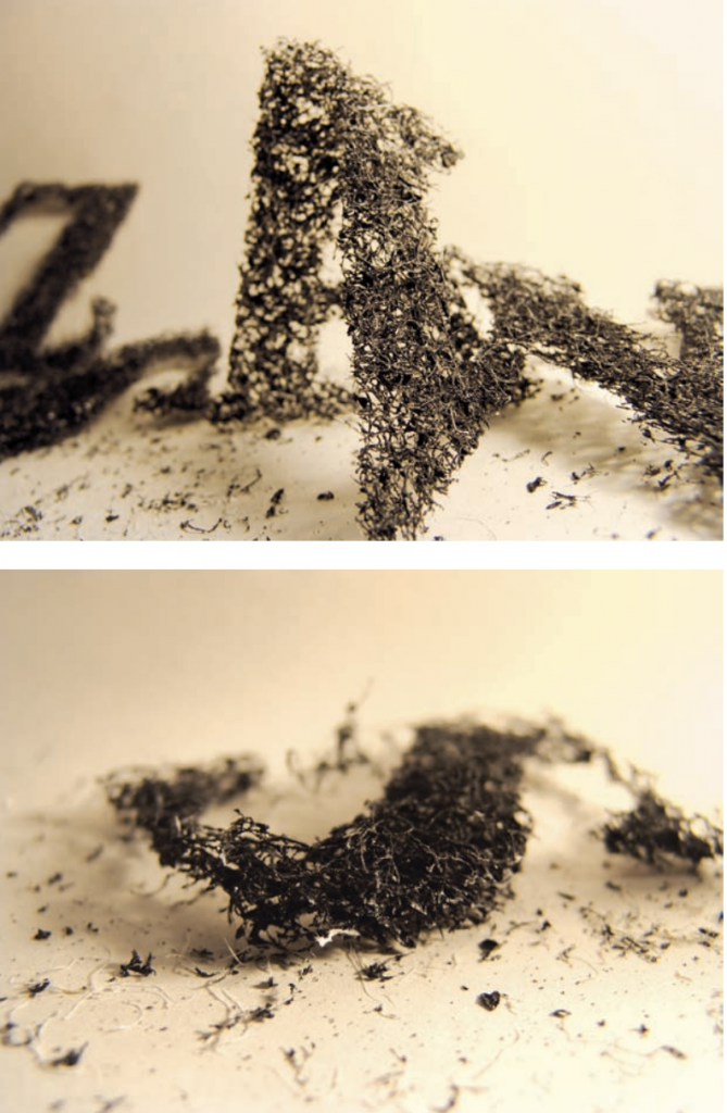
I wanted this mark-making to reflect the the constant and thus, what I initially wanted was the get the skeleton of the leaves. However, that didn’t work out despite soaking the leaves in washing soda for more than 2 hours. But it did still make the leaves more translucent. So to get a more x-ray effect on these leaves, I placed them on a lamp so that light will can be seen through it.
Afterwards, I added a B&W filter to make it go more in line with the colour of the colonial buildings.
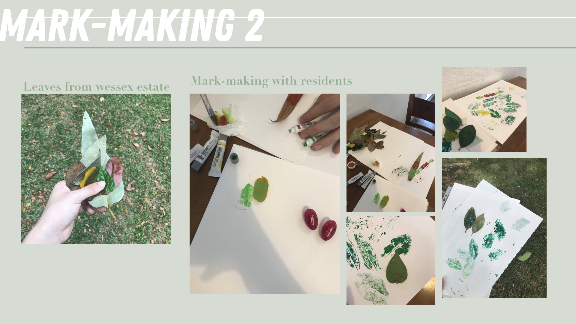
The second mark-making is supposed to reflect the art and creative community of Wessex. I picked fallen leaves from around the estate and walked around and approached people to help me imprint the leaves wherever they like on a piece of A3 size paper. Some things I asked them to think about when imprinting are the community, the environment in wessex and how it makes them feel.
This was honestly such a tough task as I was afraid of being rejected by people. This definitely pushed me out of my comfort zone as I did get rejected a few times and I’m definitely not the most extroverted person. However, I’m glad I plucked up my courage and did this because it also helped me realise how those that helped me also had a thing for arts and they were more than happy to help me with this. Some even commented that they like doing arts and crafts at home too! This just shows how this estate is really growing into a creative community 🙂
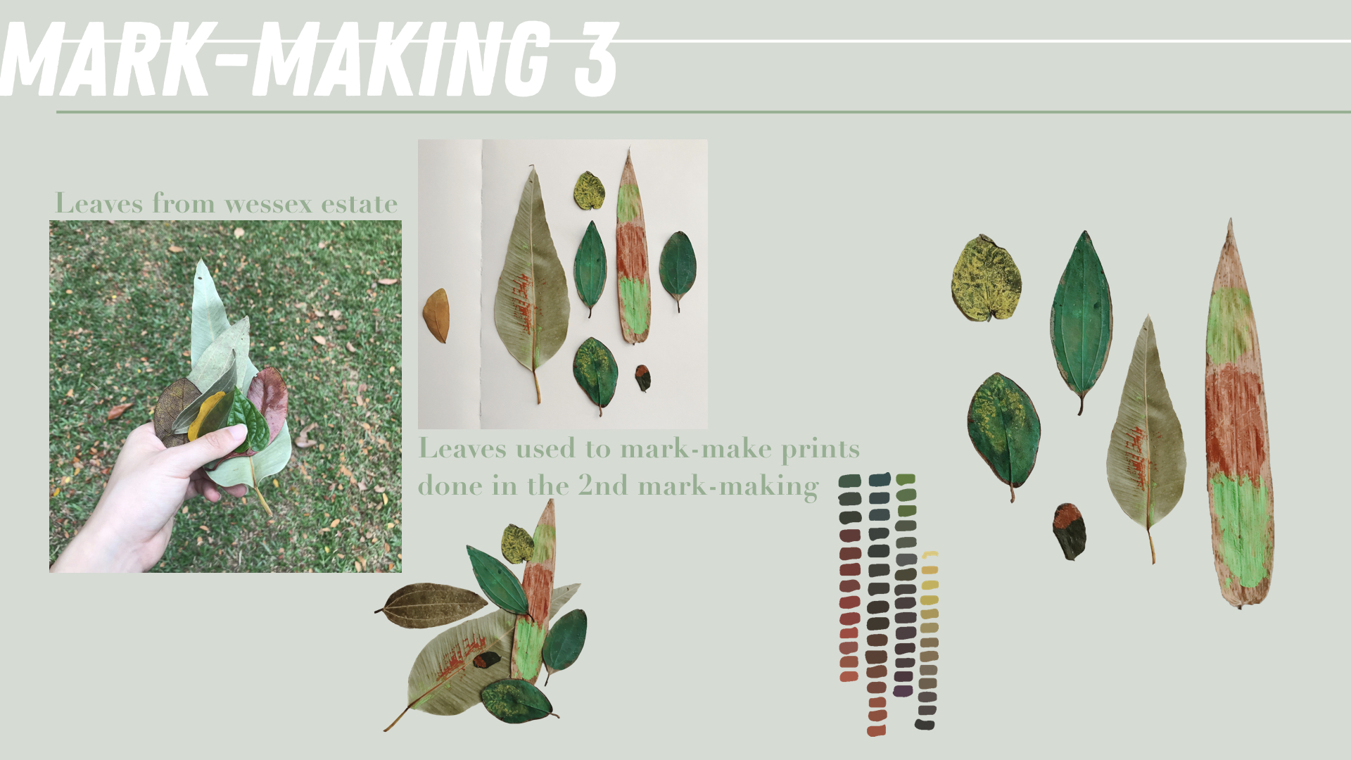
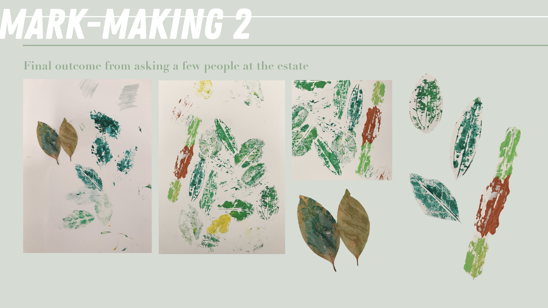
For the third mark-making, I gathered the leaves used to imprint and took photos of them so that I can crop them out digitally. These painted leaves also became an art piece on their own. I also picked up the some painted colour that I found in one of the artist studio that I visited. I hoped for these leaves to reflect the future of the estate and how vibrant the estate is with its growing arts enclave within a residential area. There is so much room for this estate to grow despite the long history it already has.
process
I started with the inside spreads before designing the covers. These pages went through many rounds of shifting and amendments before finally reaching the final outcome.
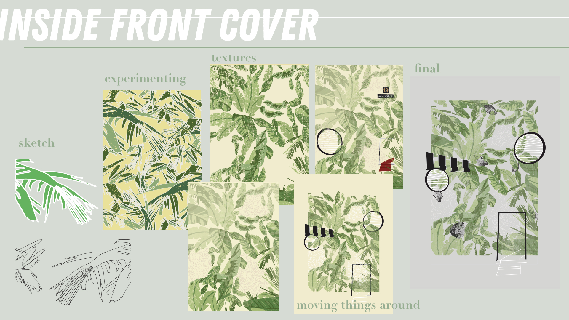
*Incorporated mark-making 1.
I wanted the inside front cover to sort of illustrate how I felt when I travel to Wessex. A long road is covered in abundance of leaves and you suddenly realise there are much tall buildings around you unlike other parts of SG. After a few bus stops, a few colonial buildings start to appear, their iconic B&W really catching your eyes and attention. For me the 3 most iconic elements of the colonial buildings at Wessex are the B&W blinds, the round windows and the doors of the apartment blocks. I figured that I will use this three elements as motifs to represent the three main points in my zine.
Thus, I placed them amongst the leaves in this page showing how the trail of leaves reveal the colonial houses at Wessex estate.
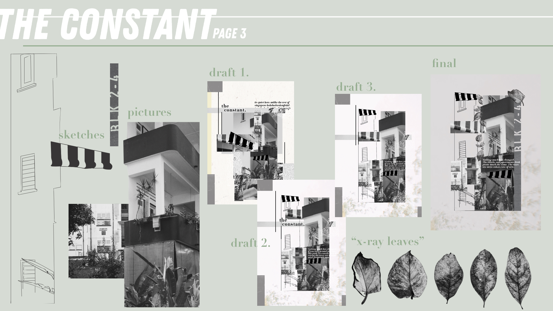
*Incorporated mark-making 1.
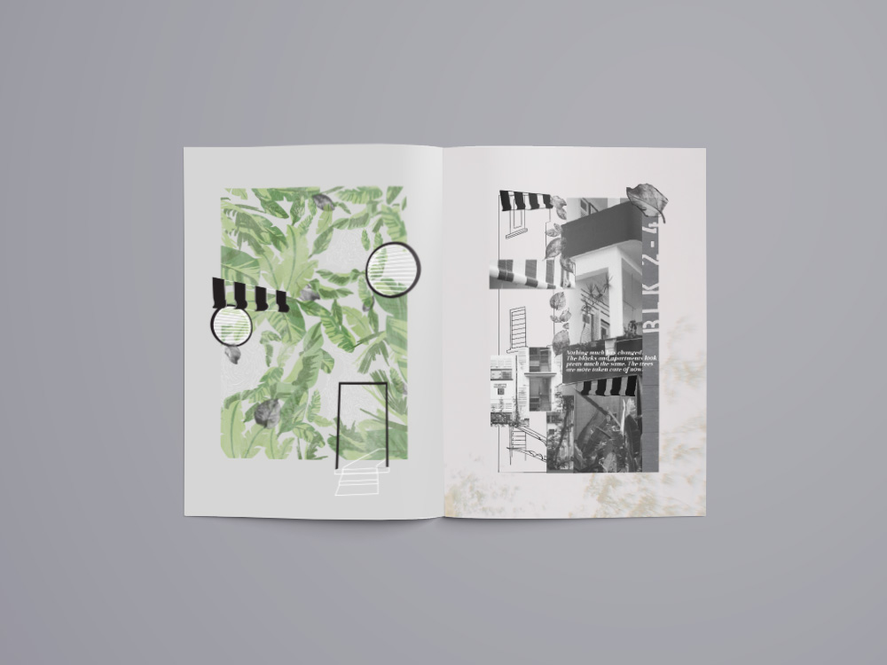
For the page next to the inside front cover, I decided to share about “the constant” here. “The Constant” (represented by the blinds) of Wessex is really the buildings as they haven’t changed. This is probably one of the reasons why this place has a charm and its because it has houses that most other parts of Singapore doesn’t. This is an element that contributes to its unique feature. For the pages in my zine, I’ve decided to go with a mixed collage and line drawing with the pictures taken by me. In this page I’ve also included the “x-ray” leaves to convey the roots of this estate.
Every section also has an extract from the interviews I had with some people at the estate and this one reads, “Nothing much has changed. The blocks and apartments look pretty much the same. The trees are more taken care of now.”
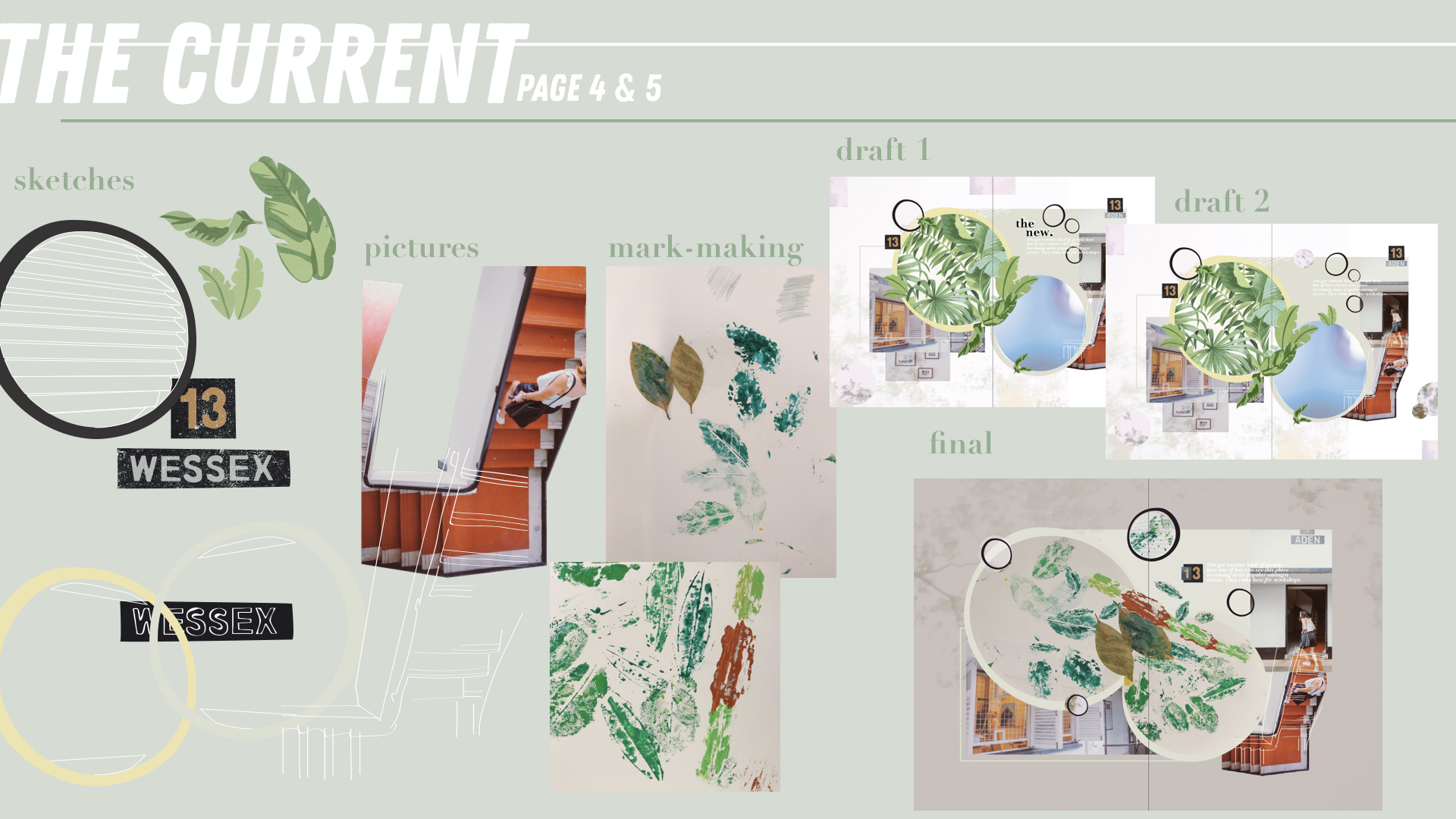
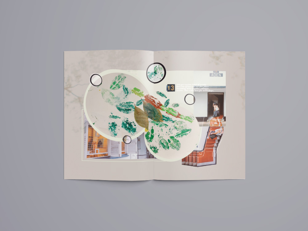
*Incorporated mark-making 2.
“The Current” (represented by the round windows) conveys the arts enclave that Wessex currently has. There are a few art studios amongst the houses in the Estate and the idea of some artists leaving within their own space is really special and interesting. These artists live simply and conduct workshops from time to time right at their houses. The imprinted mar-making leaves are put into two circles that are actually in the shape of the round windows. The staircase at the side is unique to me as even though the buildings are B&W, there is suddenly this painted red walkway that sort of brings out that artsy side of the whole building.
The extract here reads, “You get various kind of people here but of late you see this place becoming more popular amongst artists. They come here for workshops.”
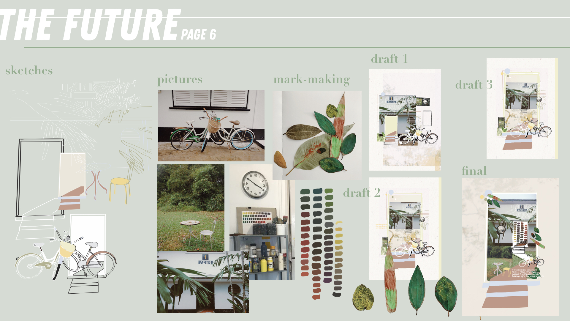
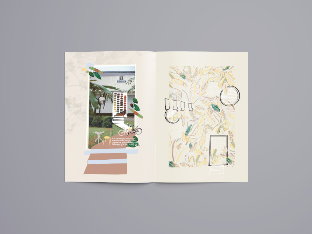
*Incorporated mark-making 3.
“The Future” (represented by the doors) conveys the future of Wessex and what community it will grow and blossom into. With the arts enclave and creative community even amongst residents, this place has so much potential to grow despite its already rich history. The painted leaves are placed in this page as they represent the fruit of the mark-making made in the last page. This page is a little more colourful than the others as I wanted to bring out the colour in this estate. That despite it being mostly B&W, its community is colourful and its definitely still growing. Some kine drawings of the bikes and the table and chairs are some things that I found interesting while walking around the estate.
The extract here reads, “It is an unique space and there is room for progress definitely not removing the heritage of it but adding on to it.”
*Incorporated mark-making 3.
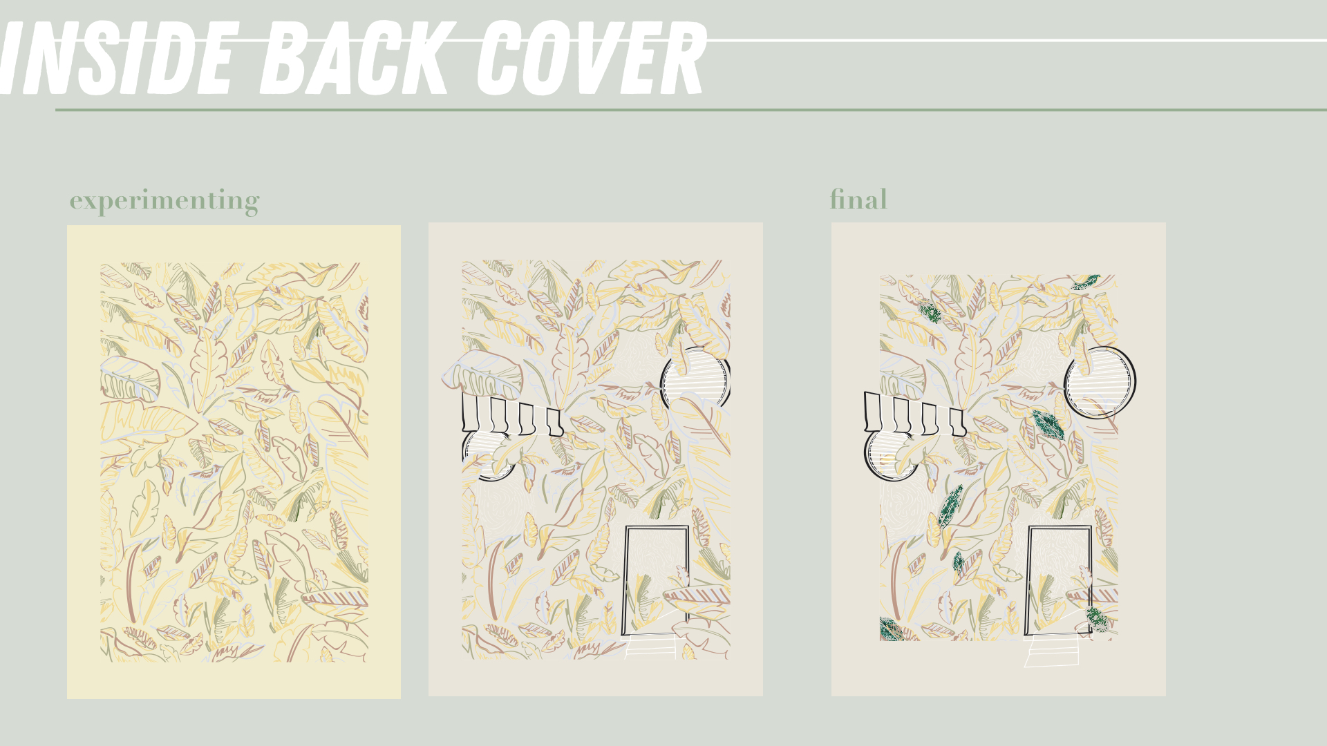
The inside back cover is actually the same as the inside front cover except that it is now filled with outlined leaves and the leaves are now colourful. This is to portray how this place is still growing and not filled up yet. The community is colourful and always opens its doors to the public to visit.
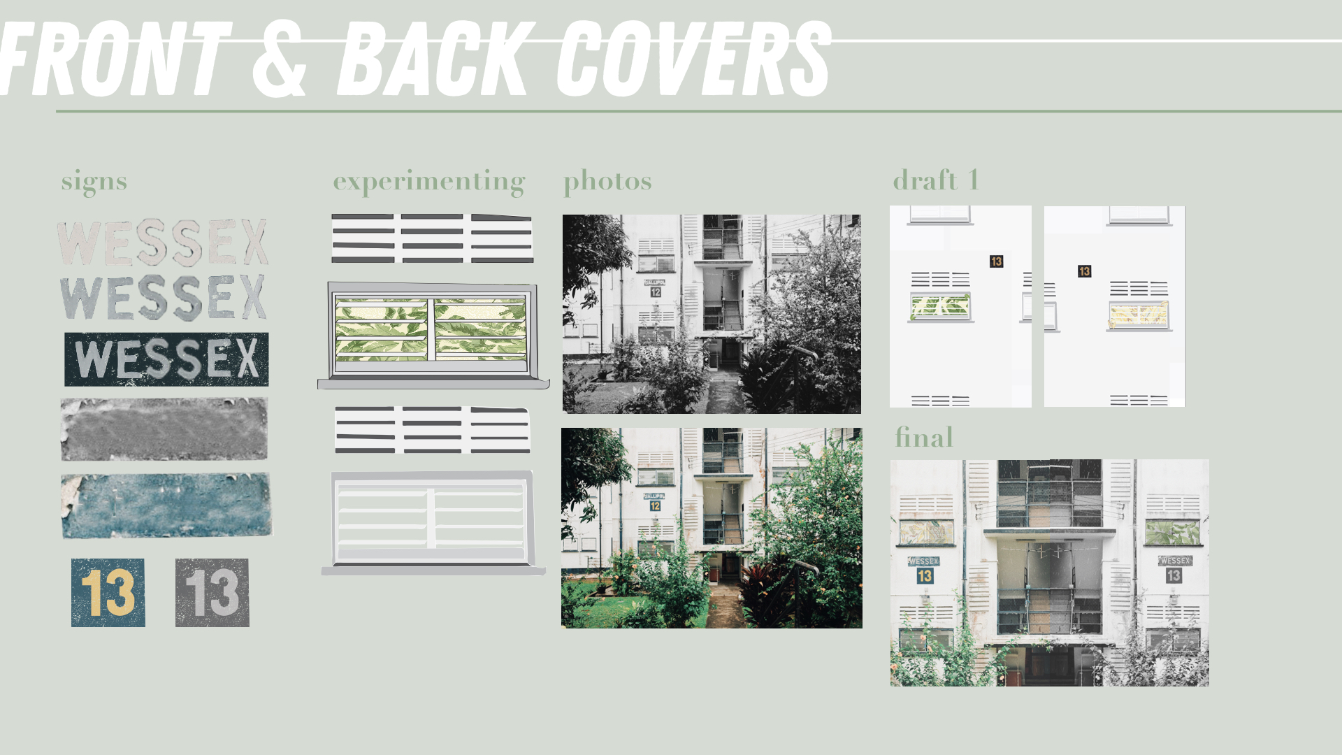
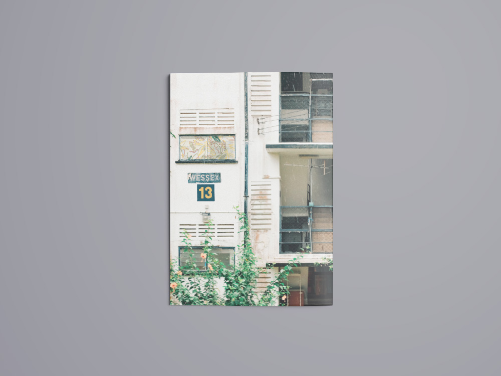
The covers are a zoomed in picture I took of the apartment buildings in Wessex. The number 13 is replicated from the block numbers on every apartment building and I chose the number 13 because in that area all the postal codes start with 13. Usually the sign “WESSEX” will be the name of the block. However, there was no block called wessex and thus, I took the various letters from the different blocks and put them together to form “WESSEX”. The window in the picture is replaced with a snippet of either the IFC or IBC which is what readers will see when they flip to the next page.
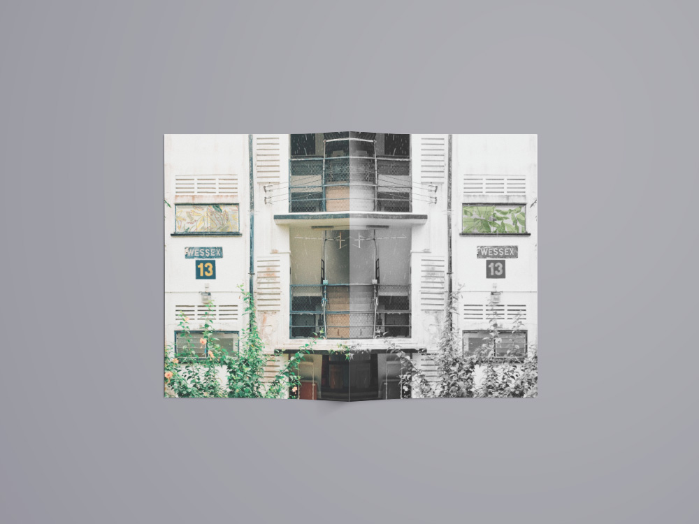
The front cover is B&W because the zine still hasn’t shared about the art community. However, the back cover because coloured because now readers know that the community of Wessex is colourful and alive!
When you open the booklet, the covers align up to each other showcasing a full apartment building at Wessex Estate!
final

rEFLECTION
I really enjoyed this project even though it really pushed me out of my comfort zone especially when I had to interview people and ask them to use leaves and paint to create marks. It has opened my eyes to an estate in SG that I didn’t know about until I had to work on this project. I struggled with the concept of the zine at the beginning and the arrangement of my marks, pictures and words. I was afraid that everything won’t be abstract enough.
Thankfully, my zine was well-received in the end and it all came together. I’ve gotten to meet new people along the way and made friends with the workers at the cafe in Wessex Estate! I hope that my friends and classmates have also learnt more about this estate in Singapore and will check the place out on their own 🙂
Thanks for reading!
Read my research and view my visual presentation as well!


 Prior to choosing Wessex Estate, I also considered other locations such as Balestier and Whampoa as they had unique characteristics. However after much field research, I decided to go with Wessex Estate due to where its located, the people I met there and the serenity of the whole estate itself –