Response to reading from CH 1 Donald A. Norman, The Design of Everyday Things (1988)
The first time I read the text, I frowned. Firstly, I did not use the older type of telephone that much when I was young. I held my mother’s mobile phone already when I was in elementary school. Hence, I had a hard time imagining the example of complicated telephones. Secondly, I am not a good technical drawing reader. Again, I had difficulty deciphering the refrigerator’s conceptual model.
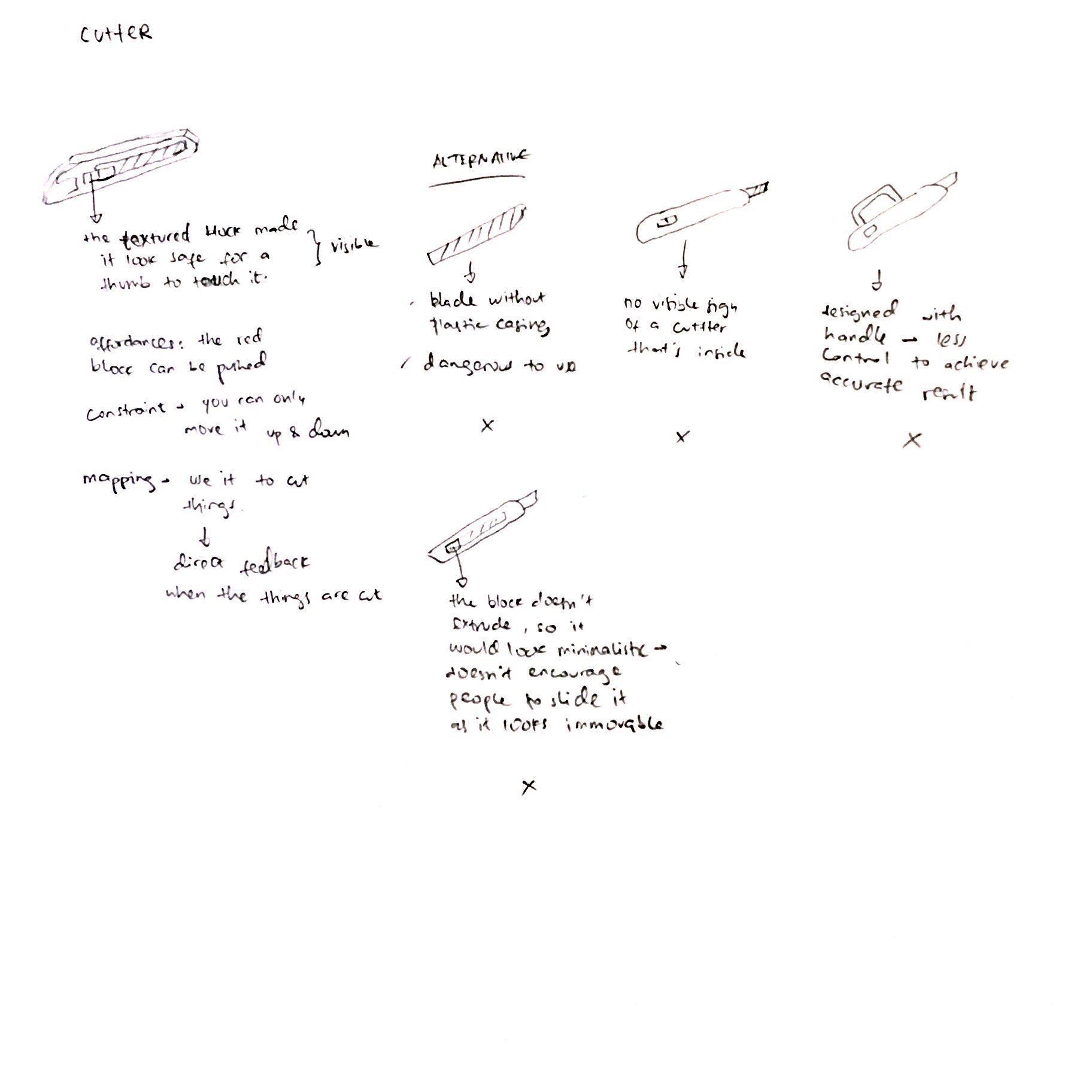
These experiences actually help me to understand the frustration of being faced with undecipherable instructions or non user-friendly products. A good design should have good visibility of certain feature. The person using the product should know how to interact with the feature naturally without having to read the manual book. In addition, the product should also give back a clear feedback whether the product has been used correctly or not.
My questions about this readings are:
1. Can the answer to homework assignment on page 31-33 be a smartphone? Would my answer be counted as a lazy answer?
2. There is a statement on page 29 that says “it takes five to six tries to get an idea right, … and if a newly introduced product doesn’t catch on in the first two or three times, it is dead.”
Would the recent emergence of online crowdfunding platform be a remedy to the problem? The crowdfunding platform usually provides the visual of the product and the use in context. The project will only kick off if enough number of people support the project and enough funds are raised. This crowdfunding platform is good to see how people react to the product, and prevent the loss of money producing non user-friendly products.


