Group members: Alfred, Darren, Gladys, Jo Inng, Valerie, Ziyu
- Programme Purpose/Objective
The main purpose of this installation is to allow participants the chance to take a step back to evaluate their lives so far. The installation aims to evoke recognition of the fast-paced lifestyle Singaporeans have in general. It also allows participants to reflect on the qualities of their life experiences and authentic connection they have with the things that truly matter in life. It also questions them on the meaning of their lives so far – if they were to die in this instant, what sort of legacy would they have left behind, and would it be something they could be satisfied with?
- Programme Rationale
Singapore is a fast-paced society and there is rarely any time for people to slow down and truly appreciate life. We thus felt it was necessary to remind participants to take a breather and rethink the value of their lives.
- Programme Details
The installation comprises 2 rooms, both of which are expected to work independently as well as together. The first room is a narrative recreation of Singapore’s fast paced life, and will end in the ‘death’ of the participant. This is followed by the second room which allows for the participant to do a self reflection of his/her death.
Artistic Direction
Life experiences differ from person to person, and we wanted to be as inclusive as possible to whoever that would be viewing it. The installation thus has a mixture of both literal and abstract elements. This allowed us to create a more poetic narrative that was more flexible, allowing participants to slip into the character portrayed.
We will be making use of sound, videos, voice overs and props to create the desired atmosphere. To ensure that participants are able to understand the installation, we decided to make only the voice over explicit while the rest of the mediums will be kept abstract.
Room 1
As mentioned earlier, the first room is a narrative re-enactment of Singapore’s fast-paced lifestyle. The room is set up with 3 projected screens adjacent to one another.
In this room we use the metaphorical representation of water as life and merge it together with scenes of the protagonist’s life. The protagonist is never explicitly shown, allowing participants to insert themselves into the narrative and relate the events with their own lives.
The three screens are played in sequence and document the growth of the character from a toddler to a teenager to a young adult respectively. Interlaced with the scenes of the character’s growth are scenes of coloured water droplets being dropped into a tank full of water. The water represents life, and the different coloured droplets represent the memories, experience and feelings associated with each growth stage.
The first screen narrates the toddler stage. The tank of water starts of transparent to represent the character’s innocence and purity. Her first memories, which are represented by yellow droplets are seen penetrating the surface of the water before spreading outwards. The screen then shows clips of a young kid playing with toys and having fun in the playground. The screen then fades back to the now yellow water in the tank.
The second screen starts playing as the first screen continues showing the yellow colours fusing with the water. Red droplets are added into the yellowed water, and is then overlapped with scenes of the character’s slow submission to teenage pressure and rebellion. She is stressed from studying and is too absorbed by commitments which result in negligence of her family. The screen fades back to the water, which is not a mixture of yellow and red. The water is now turning darker and murkier, symbolising the chaos and impurity in her life.
The final screen starts playing as the second screen continues showing the yellow and red tainting the water. This is overlapped with scenes of the character descending into a downward spiral in her life. She starts smoking, and is increasingly distant with her family. She is then seen fainting as the fast pace of her life has finally caught up with her and her health. She dies, and only realises the important things in her life during her last moments, when it’s already too late for her to change anything.
The screen turns black. Black is an irreversible colour, which means that the addition of other colours will not change it. Her life is over, and there is no turning back.
Room 2
While Room 1 focuses heavily on using videos, Room 2 shifts towards the usage of props and performance to create a reflective mood for the participants. In this room, a mock ritual for the dead has been set up.
The room is darkened as much as possible, and a table is setup at the end of the room. On the table lays different objects that are related to death. They include red string, candles and flowers commonly used for offering. In the center of the table lies a dirtied glass bowl. This is a connecting element for the 1st and 2nd room, and is representative of an empty life vessel. Life, symbolized by water, has been drained out, and only the ugly stains of the black contaminated life has been left behind. Behind the table stand a mirror that reflects the face of those who enter the room, and is meant to prompt participants to look at themselves and self-reflect.
As participants enter the room, a short performance is also put up. A male and female stands on either side of the table. They have a short dialogue about the character in the previous room.
Dialogue:
Ziyu | She didn’t have to die this way.
Alfred | But at least she was doing what she loved
Ziyu | But what does that amount to?
Alfred | Have YOU lived a fulfilling life?
Ziyu | Or are you just chasing after happiness that is only temporary?
After this short dialogue, an usher will come in to encourage participants to have a silent self-reflection for a duration of 1 minute. The narrative her is kept short as the main highlight here is the participants’ own involvement in the room.
- Target Audience
Students of the School of Art, Design and Media and NTU aged 19-30.
- Location scouting / Logistics checklist
| Filming Location | Foundation Drawing Room 1 Foundation 2D Art Room Foundation 3D Room Crit Room B1-14 Product Design Spraying corner Gladys’ House Hall 15 NTU’s playground Presbyterians High School Starbucks NTU North Spine |
| Things we borrowed | Projector Bamboo sticks Black cloth Speaker x2 Laptop x3 Long Mirror x1 Fish tank Tables and Chairs Ladder |
| Things we purchased | Black cloth White cloth Fake candles Tea candles Batteries Bell Fresh flowers Dried flowers Secondary school textbook Black garbage bags Food colourings |
For this project, we aimed to tackle and address the issue of leading a fulfilling lifestyle in a modern context. We observed that many youths face the similar issue of being overwhelmed by school work and other commitments, and often had little quality time with things in life that truly mattered. (BBC, 2007)
In our research, we came across one particular trend that had a huge impact on our artistic direction.
Due to high societal pressure and escalating suicide rates, the ‘Near Death’ movement has become increasingly popular in South Korea. This movement aims to address this issue by giving participants the chance to detach themselves from their fast paced lifestyle to reflect on their lives. As such, multiple ‘Fake Funeral’ services have been conducted across the country. In this particular one, they are lectured by a philosophical guru and invited to write out their own eulogy. After that, they will be placed in a coffin for 30 mins to experience death. The act of being enclosed creates a deafening space of endless darkness, and the atmosphere allows the participant to evaluate their lives from a objective and detached point of view. A lack of self reflection usually leads to people feeling lost and depressed, and this death meditation in the enclosed space forces them to look within themselves for answers that they have been seeking, but thought they didn’t have.
Another work we came across was Christian Boltanski’s The Heart Archive. Occupying a space in a museum on the uninhabited island of Teshima in Japan, this artwork collects heartbeat sounds from all around the world. Participants are invited into a room where they listen to the sounds of their own heartbeats through a headset. After that, their heartbeats recordings are saved and used in subsequent set ups of the art piece. The heartbeats are immortalized, and remain as fragile remains of their existence on earth.The work makes one contemplate on bereavement and what we remember during our existence on earth. As you take part in the installation, it evokes a sense of uncanniness which acts as a mirror of what lies ahead and our future and our nonexistence in it. The artwork questions the impact left behind by each individual whose heartbeat sounds have been recorded, and we believe the fragile and faint nature of the recordings makes one ponder on the meaning of their lives, and how many people they have impacted. It also relied heavily on symbolism and non-literal ways of portraying the theme, which we found interesting.
We believe these two artworks were greatly valuable and conveyed an important message. We thus decided to reference these two particular artworks/movements in terms of artistic style and content.
Bibliography
Life in the fast lane ‘speeds up’. BBC. BBC News, 2 May 2007. Web. 4 May 2007.
“Fake Funerals in South Korea.” Vice. Vice Japan, n.d. Web. 21 Apr 2016. Demetriou, Danielle. “Boltanski’s hearts don’t skip a beat.” The Japan Times. The Japan Times, 6 Aug 2010. Web. 4 July 2013.
Waters, Florence. “Christian Boltanski: The Heart Archive, Serpentine Gallery, review.” Telegraph. Telegraph, 12 Jul 2010. Web. 6 Aug 2010.
Click here to view individual Artist Statement from previous post!
Group Artist Statement
Sheng-Si (Life-Death) is an immersive video installation aimed at the everyday individual. Playing with both literal and abstract representations projected on three screens surrounding the audience, this exhibit seeks to invoke thoughts on the bigger picture in life. Drawing reference from the fake funeral trend in South Korea, it ultimately aims for people to diverge into deep thought and contemplate on their purpose in life.
 Throughout this project, we have been taking turns to film some behind the scenes (BTS) and the process of this entire installation. From the clips we have, I edited them into a video-log style BTS to allow viewers to understand our project from the very beginning till the installation day.
We also asked our classmate (Thanks Tiffany ^^) to help us hold the camera while visiting our installation during critique.
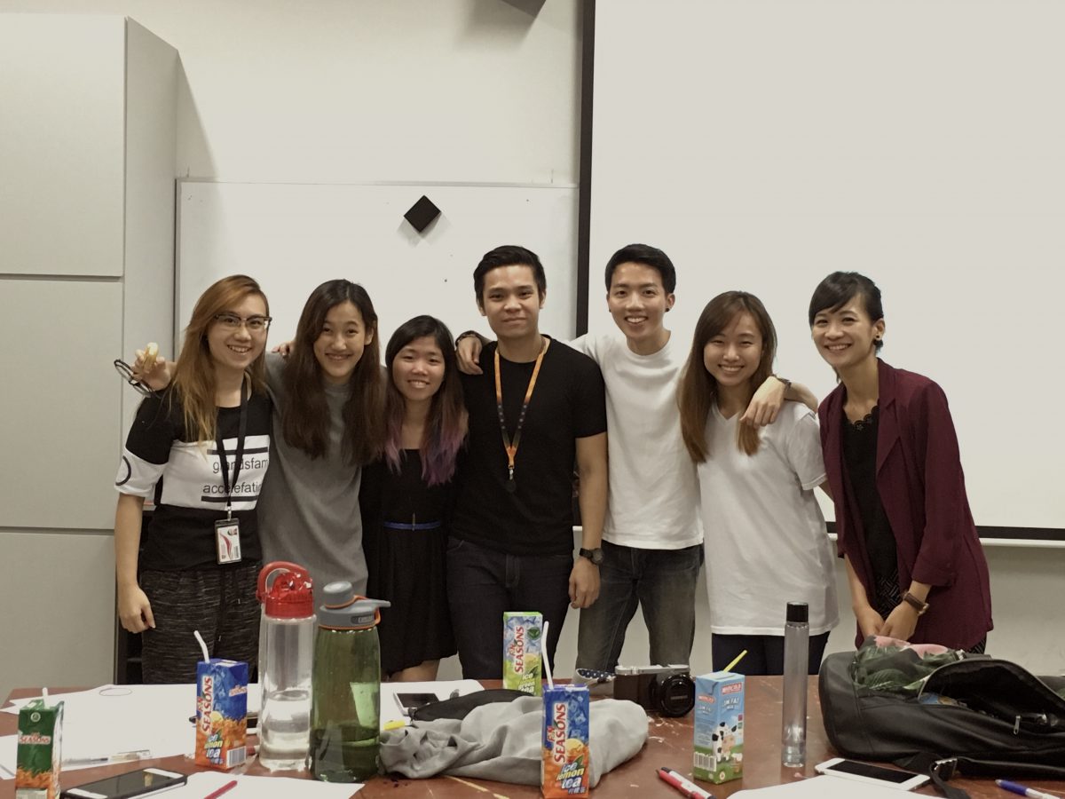
Our group consist of 6 people, the biggest group amongst our classmates, and that is because our plan was to make the project like a sequel in such a way that the narratives are connected for 2 different rooms. In the initial stage, the 6 of us came together and planned everything from the storyline, to the visuals and art direction; then we proceeded on to filming. Next, we somehow divided ourselves into different main roles, while also helping one another in our respective roles.
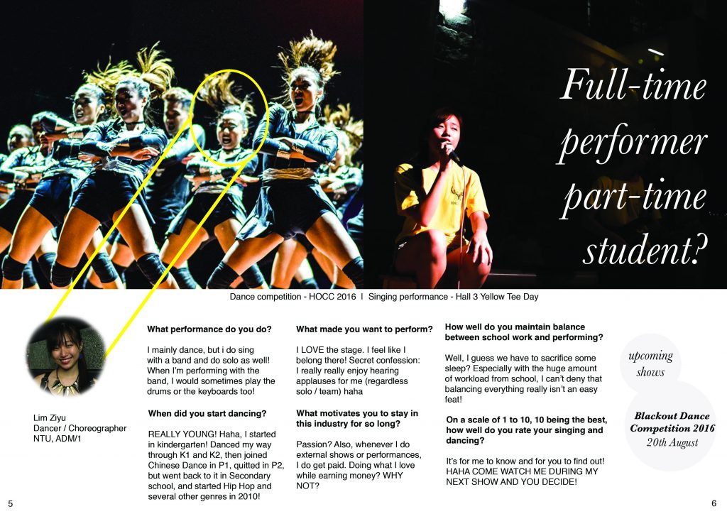
Jo and Val were mostly doing the writings and enhancing our existing conceptualization; Darren and Gladys were the film team, including execution and post production; while Alfred and I handled the planning of room layout, props, all the technical aspects as well as me volunteering to do the BTS video! Through the BTS video, you can actually see that we don’t just stick to what we have to do, but instead, help each other every where as and when we could.
In the beginning of filming, we tried out the ink dropping into water and almost resorted to using stock videos, but we managed to make it work! To make the screen’s timing work, we had to plan it in such a way that the duration of 3 different video is timed very accurately.
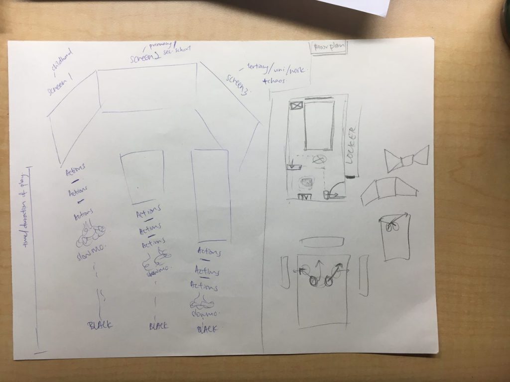
& Gladys managed to work her math and made this happen!!!
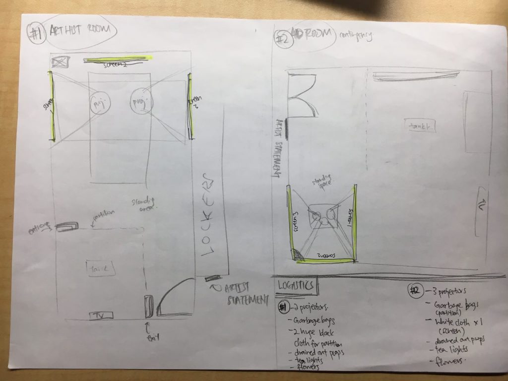
Next, I drew up 2 different floor plans because we were not sure if we will get to book our ideal location or not.
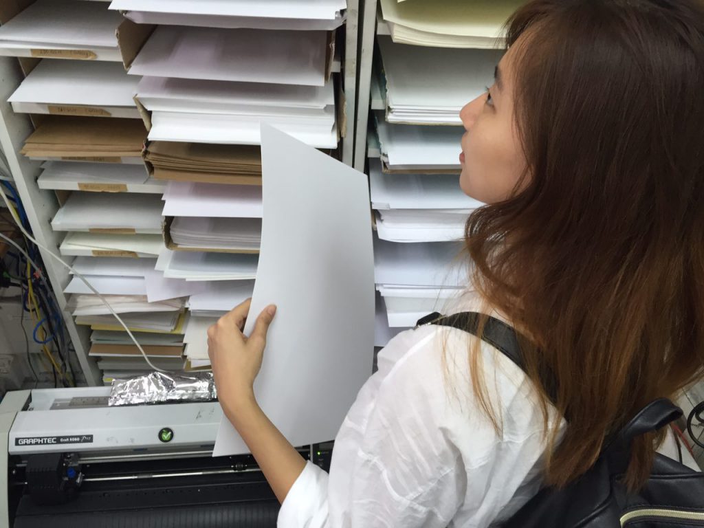
After deciding on logistics and required props, we headed out of school to purchase everything we needed and prepared for set-up. As I have worked with event companies before, I’ve had prior experiences to setting up a venue and installation and it really came in handy!
All in all, I felt really glad that I managed to combine what I have learnt previously in my polytechnic days, during my gap year, and also what was covered in 4D I and 4D II in adm into this installation! Through this project, I have learnt a lot about how much an environment could affect the narrative and the impact it can create on the viewers.
Also, the narrative we plotted is really relatable to me; and I believe it is to many of my fellow classmates too. We all have a lot of commitments in and out of school, and this installation aims to allow viewers to really relate and think about what they have done so far. I really hope viewers can relate to this as much as I do, and that everyone will do what they wanted to do and live with no regrets!
Also, I am so happy I got to work with all my close friends and that we worked in such a cohesive manner; it really helped us pull through all the late nights that lasted till 3am or 4am :’)
AND THANK YOU 4D CLASS AND THANK YOU RUYI! 
