Category: History of Design – G3
Product Design: written report
Modernism was a movement generally based on idealism and realism. As a result, it tended to carry an utopian vision on human life and society. So rather than focusing on subjects, the modernist artists focused on experimenting with form, technique, and process. As a whole, Modernism can be recognized by its clarity and simplicity in design. However, the Modernism triggered other movements that were against it.
Mainly, there is Postmodernism that originated around the 1970s in Italy. The movement arose after World War 2 as a reaction to the failings of modernism. They questioned the emphasis that modernists placed on logic, simplicity, and order. The movement itself was a reaction against the ideas and values of Modernism. Unlike Modernism which was optimistic and ideal, Postmodernism was associated with skepticism and irony. They also refused to recognize a single definition of art. Thus, it can be seen being mixed with various art styles and media. It is said that Postmodernism may have urged on the start of pop art in the 1960s and embrace styles including conceptual art, neo-expressionism, and feminist art. In a way, Postmodernism broke the established rules about style and brought about the sense that “anything goes”.
The Postmodernism style can be characterized with the following. First, it was limited to the elite only. As it rejected the industrial process or in other words, mass production, the Postmodernism designs were often costly. Second, it was stylistically diverse. In addition to the want of refusing to limit itself to one definition of art that led to its being mixed with various styles, Postmodernism was a representation of the societies in the 1980s. To adapt it had to become more stylistically diverse. Third, individual interpretation and experience was valued. As Postmodernism challenged the idea of certainty and truth, it helped overturn the perception that there is one inherent meaning to a work of art. Consequently, viewers were an important determiner of the art work’s meaning and in some cases even encourage to take part in the pieces.
The influences of Postmodernism expands to architecture as well. Robert Venturi’s “Complexity and Contradiction in Architecture (1966)” can be said to be start of Postmodernism. The writing advocates that “Design should not speak in one voice. It should be in historical layers and vivid juxtapositions.” An example of this is “The Neue Staatsgalerie” by James Stirling. His work was in fact an addition to an existing historical museum. The architecture became a combination of the building’s earlier structure and high tech metalwork. This exemplifies Robert Venturi’s idea on how design should be a juxtaposition.
In addition to Postmodernism, the Anti-Design that started in the 1960s was spurred as a reaction against Modernism. Although, the movements Anti-Design and Postmodernism overlap, Anti-Design is said to have started first and set the hallmark characteristics for Postmodernism. Originating in Italy, the movement emphasized uniqueness, striking colors, scale distortion, irony, and kitsch. In addition, they believed the function of the object was to subvert the way a viewer perceives it. For instance, they created a lamp made up of tubes. The form of the lamp could be chosen by the user as they manipulated the tubes.
After the occurence of Postmodernism and Anti-Design, the Memphis movement started in the 1980s. The movement originated in Milan, Italy by the Memphis group by Ettore Sottsass. Their key features were to create design that was radical, funny, and outrageous. The Memphis was influenced by the geometric figures of Art Deco, the color palette of Pop Art, and the 1950s kitsch.
The Memphis movement can be defined by the following characteristics. First, their usage of laminate and terrazzo materials. Usually, these materials are used for floorings. However, the Memphis incorporated it into tables and lamps. Second, Memphis is known for the bacterio print designed by Ettore Sottsass. Lastly, the Memphis designs largely consist of bright multi color objects with the rejection of typical shapes. For example for the leg of a chair, they would use a triangle or a circle rather than the typical rectangle.
One of the most well known piece from the Memphis is the Carlton Bookcase designed by Ettore Sottsass. It was part of their first collection. As a whole, it uses brightly colored laminates for its pieces. The furniture piece can be considered as a new approach to break apart from the previous restrictions of functionalism. This is because at a first glance, it is difficult for the viewer to determine what the function of the form is. Thus, it can be said that the Carlton Bookcase is an appropriate example of going against the Modernism motto “Form follows function”. In addition, it allows the user to decide the function of the piece. It can be used as a bookcase, room divider, and dresser.
The Deconstruction movement began in the 1980s, after the negative reacts towards Modernism was expressed through movements such as Anti-Design, Postmodernism, and Memphis. Deconstruction can be defined by its tendency to discover, recognize, and understand the underlying implicit assumptions of art works. This movement had a profound impact on many writers and conceptual artists.
Deconstruction was initially a form of criticism initiated by a French philosopher, Jacques Derrida. He asserted that there is no single meaning in a work. Rather, there are many meanings that could even contradict each other. Furthermore, he believed that established ‘constructions’ needed to exist in order for a ‘deconstruction’ to be created and highlighted. Thus, the role of ‘deconstruction’ is to overturn such oppositions.
Deconstructivism is an artistic movement that started in architecture around the 1980s as the equivalent of Deconstruction. Characteristics of the movement includes the breaking down or demolishing of a constructed structure. This opened up infinite possibilities of playing around with forms and volumes. Deconstructivism was influenced by both Russian Constructivism and Modernism. The idea of fragmenting a building and exploring asymmetry of geometry was inspired by Russian Constructivism while it maintained functionality of the space as inspired by Modernism.
The defining characteristics of Deconstructivism is as follows. It removes the essence of architecture and moves toward the extraordinary and innovative. Manipulation of the building’s surfaces through creation of non-rectilinear shapes, fold, and twists are commonly observable. In addition, diagonals, curves, and pointed corners are frequent elements. As the architectures lack symmetry, there is also a deficiency in the harmony and continuity of the structure.
One of the notable key figures of Deconstruction is Frank O. Gehry. An American architect, he was the pioneer of Deconstructivist architecture. Through the use of rough industrial material, he was able to portray the characteristics of Deconstruction with sweeping curves, fragmented forms, and non-rectilinear forms. One of his notable works is “Neuer Zollhof”. Metal slabs were overlaid in a curvilinear matter on a concrete slab.
Another architect is Zaha Hadid. She pioneered in the potential usage of digital technology in architecture. Her architectures were usually highly expressive with sweeping fluid forms that were often abstract and free form geometry. An example of her work is the “Vitra Fire Station”. Obliquely intersecting concrete planes were puncture, tilted, or folded to be put together. Despite being visually and conceptually simple, the planes created crisp abstract lines.
As a whole, it can be learnt that the designs of both Postmodernism and Deconstruction have its roots in the expression of artistic freedom. Such characteristics can be still observed in the present implicitly and explicitly in areas such as but not limited to design.
(Word count: 1261)
Bauhaus Design
Bauhaus Shapes & Colors
Bauhaus Wassily Kandinsky assigned primary colors red, yellow, and blue to the shapes squares, triangles, and circles respectively. I kept the colors for the squares and triangles but switched the color for the circles from blue to green. This is because I felt like circles are a harmonious shape and green is a good soothing color to represent this.
When I was creating this, I had the ‘Build To Order (BTO)’ policy of Singapore in mind. I found it unusual and unsettling that the citizens would have to decide a future with a partner 5 years before it happens. I felt like a life changing decision like this should be given more freedom. In addition, I am concerned that at a certain age, some people will be more focused on finding a person to share a BTO with rather than their life. Some people would end up settling down with someone even if they do not match.
The red box made by squares represents the person or their personal boundaries. The green circles represent who they are as a person. The yellow triangle represent them putting up a persona or their best self to find a partner. It also represents wariness. The yellow background helps exaggerate the wariness of a person seeking someone to share a BTO.
Art Nouveau Design
Art Nouveau Design
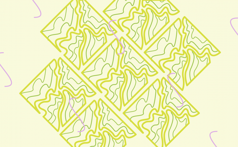
Out of the two assignment choices, I chose option (A) which was to create a Art Nouveau style abstract pattern inspired by a nature photograph. I chose to do this because I was intrigued by the ornamental decorations of Art Nouveau. Although it uses organic shapes and curves, it manages to maintain a structure and pattern.
Inspiration

This photo was taken when I visited Gangneung with my family. We stopped by the road to see the ocean. The voluminous curves of the cloud and the diagonal line that the cloud and seagulls create caught my attention.
Sketches
I wanted to incorporate both the clouds and seagulls.
For the clouds, I wanted to focus on:
1) organic shape and curves
2) how it forms straight horizontal lines
3) the diagonal line it creates as it becomes bigger in the photograph
For the seagulls, I liked their random repeated placements.
I felt like these factors could come together to encompass the ornamental characteristics of Art Nouveau that combines both geometric and organic shapes.

From an expat’s point of view, Singapore seems to have a mixture of traditional and modern factors in addition to so many different cultures and religions. For instance, I would see a modern space pod hotel right next to a Hindu temple. So I wanted my Art Nouveau reinterpretation to be a mixture of traditional, modern, and cultures like Singapore as well.
For the shape of the clouds, I was inspired by the traditional East Asian representation. I brought the clouds together to form a diamond. The diamond shape is inspired by the Indonesian tiles along the road especially near shop houses in areas like Tiong Bahru. Furthermore, I find the nature in Singapore to be organized and planned out. The nature I see seems to be carefully placed in a specific location to fit the structure of the whole city. Thus, I used green for the organic shapes to represent the nature and greenery as well as place them in a tile format to represent structure.
In addition, I randomly placed S curves in my design to represent the element of chance and seagulls. I chose pink for this curves to show the funky side of Singapore where different elements will come together to create something new.
Final Product

Rebus Design
My Name is Minjee

Minnie Mouse – nie (knee) – mouse = Min
zebra (jeebra) – bra = jee
Attribution
The Noun Project
Minnie mouse by Josue Gil from the Noun Project
knee by PJ Witt from the Noun Project
Mouse by Iconic from the Noun Project
Zebra by sachan from the Noun Project
Bra by Ian Porrat from the Noun Project

IM Hyperessay
Hyperessay: Yuri Suzuki “Looks Like Music”

Yuri Suzuki is a sound artist, designer, and electronic musician who explores the relationship between sounds and people. His art installations looks into how sound and music affect people and their everyday lives. In addition, his installations often require interaction. The viewers are required to be part of the piece by either taking part in creating the noises or manipulating it.

The artwork this essay will be focusing on is “Looks Like Music”.
Suzuki was invited by the Mudam’s Public Department come up with the audiovisual installation piece; “Looks Like Music.”
The concept for the art installation was inspired by Suzuki’s own experience with being dyslexic. Suzuki says
“I am dyslexic and I cannot read musical scores. However, I have a passion to play and create new music and I always dream to create new notation of music.”
Thus, knowing the struggle of dyslexics, Suzuki created the installation to “create new notation of music.” In other words, this piece focuses on visualizing music through the combination of art, technology, and audience participation.

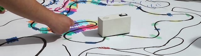
A large scale art piece is co-created by the viewers when they draw a circuit with black markers. This circuit is interspersed with colored reference points that are drawn by the audience with markers of various colors. According to Suzuki,
“The black line explains the length of the song and then the color is directly translated into sound. It’s a very simple method to express music.”
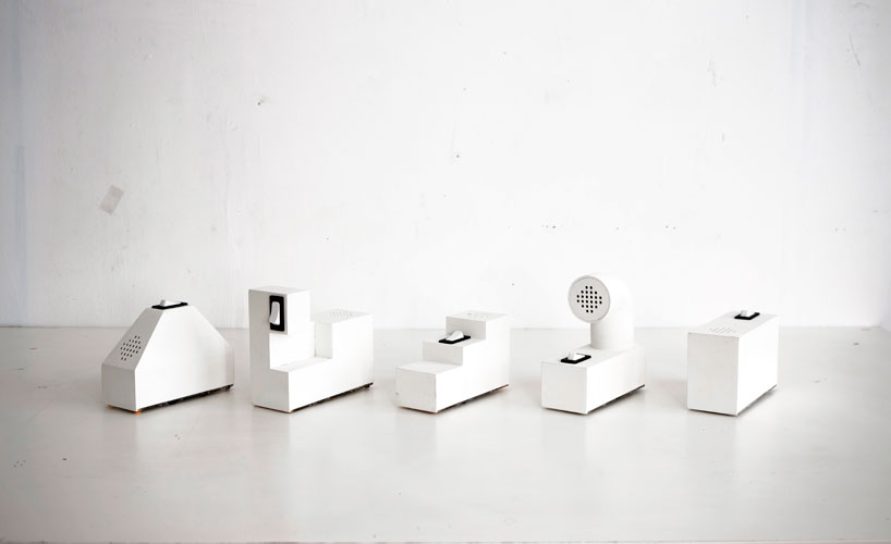
In addition, the viewers are able to create a collectively composed music piece as Color Chasers run down the lines. The Color Chaser is the technology aspect incorporated in the art piece. They are five little robots trace the route laid down by the visitors and respond by emitting specific sounds.

Each Color Chaser emits different noises that range from from drum, electronic noise, bass, melodies, and arpeggio sounds. The form of each Color Chaser has been designed with a purpose in mind. The form of each robot is a variation of a white box shape. Each adjustment intends to visually deliver the different noises each Color Chaser emits. For instance, by looking at the sharp staircase form, the viewers can anticipate sharp arpeggio sounds. Thus, visualization of sound is achieved not only through the device emitting noises as it follows the line drawn by the audience but also through the various forms the Color Chaser takes to represent the noise it emits. As Suzuki places it,
“The drum robot has a triangular body to represent the sound wave of a drum and the electronic piece has a computer-like grid shape,” and “There is a physical presence to express the content to help people imagine the sound of music.”
The coming together of art and technology in this installation required collaboration between different sectors. For the art aspect, Suzuki was in charge of coming up with the concept. For the technology aspect, the robots were produced by a London technology firm Dentaku. This firm was co-founded by Suzuki and his acquaintance sound programmer Mark McKeague. The installation as a whole was curated by Nadine Erpelding. It can be inferred that the art installation encouraged and required the collaboration of people from different backgrounds to fuse together art and technology.
Out of the three main components; interactivity, hypermedia, and immersion, in the interactive media history, “Looks Like Music” is most related to interactivity. It comes under interactivity because the artwork cannot exist without its viewers. The installation’s performance cannot exist
In “Behavioural Art and the Cybernatic Vision”, Roy Ascott defines what sets apart art from the past and modern art. One of the differences is creative participation. In the past, art was in charge of creating equilibrium. Art was perceived as an object of perfection. It was also based on a one way communication. The artist could not receive direct feedback from the viewers nor could the viewers manipulate or influence the artwork. Modern art, on the other hand, is an agent of change. It is supposed to trigger dialogue and encourage the participation of the audience. As a result, according to Ascott, Suzuki’s artwork “Looks Like Music” will fall under the sector of modern art.
In addition, it can be said that “Looks Like Music” is behavioral art because its outcomes are not fixed. The wide scale circuit as well as the harmony of sounds created by the Color Chasers moving along the lines can always change depending on the actions of the viewer. It also requires the input of a viewer and is responsive to it.
One question I have is whether this art work can be considered as “Cybernated Art”. Cybernated Art is when the art piece embraces the technologies of an information society such as a television.
While the Color Chasers are not an actual information technology that people use in their daily lives, in some ways it could be considered a new form of information technology that is simply not widespread as of yet. It can be considered a information technology because it visualizes music and helps inform the user (especially dyslexic users like Suzuki). Furthermore, Suzuki’s intention has to be considered. From the quotes mentioned above regarding his dyslexic discomfort, it can be inferred that he aimed to create a new form of communication technology that helps dyslexic people understand music. Thus, Color Chasers could be considered a new type of information technology and in turn perhaps Cybernated Art.
When I first learnt about “Looks Like Music”, I was reminded of “Soundings (1968)” by Robert Rasuchenberg that was introduced to us in Interactive Media Design History course. In this installation, different sets of lights will be triggered when the viewers emit different vocal sounds.
I was reminded of Suzuki’s work because both pieces allow the audience to be an active participant not only in forming the art piece but also creating musical harmony. The art works does not force the viewers to be a passive recipient and they allow a two way communication. They can also be considered behavioral art as they can modify the outcome of the artwork and the artist has no control over it.

Suzuki is an artist always ready to challenge the boundaries between technology, design, sound, and the role of viewers. His art installations that often encourage the participation of the audience is a good example of interactivity. Whether his Color Chasers can be considered as a new communication technology and Cybernatic art is up to the future to decide.

IM Key Work Selection: Looks Like Music
Yuri Suzuki: Looks Like Music
Description
Yuri Suzuki was invited by Mudam’s Public Department to create an audiovisual installation; “Looks Like Music”. This was an attempt to visualize sound. This installation was based on his work Color Chasers.
In this installation, the public is invited to create a circuit by drawing a black line with a marker. This black line is interspersed with colored reference points that the Color Chaser will pick up and translate into noise.
As a result, not only does the audience get the opportunity to participate in creating a large scale artwork but they also create a collectively composed music piece.
 ↑ Color Chasers
Each Color Chaser emits a different noise ranging from drum, electronic noise, bass, melodies, and arpeggio sounds. The form of each robot is a variation of a white box shape. Each adjustment intends to deliver the different noises each Color Chaser emits. Thus, visualization of sound is achieved not only through the noises a Color Chaser emits as it follows a line drawn by the audience but also through the various forms the Color Chaser takes to represent the noise it emits.

Suzuki explains his intentions behind the robot as, “The drum robot has a triangular body to represent the sound wave of a drum and the electronic piece has a computer-like grid shape.” and “There is a physical presence to express the content to help people imagine the sound of music.”
Relevant Concepts | Readings | Artworks
One of the relevant concepts from our History of Design course regarding “Looks Like Music” is interactivity.
The art work cannot exist without the participation of the audience and the artist cannot foresee or control how the art piece will be shaped. In other words, it thrives on interactivity.
In addition, it can be said that “Looks Like Music” is behavioral art because its outcomes are not fixed. The wide scale circuit as well as the harmony of sounds created by the Color Chasers moving along the lines can always change depending on the actions of the viewer. It also requires the input of a viewer and is responsive to it.
One question I have is whether this art work can be considered as “Cybernated Art”. Cybernated Art is when the art piece embraces the technologies of an information society such as a television.
While the Color Chasers are not a norm of information technology, in some ways it could be considered a new form of information technology. This is because it visualizes music and in a way helps inform the user. In addition, Suzuki’s intention has to be considered. From the quote, “I’m dyslexic and am very interested in what is needed for people to understand music. The black line explains the length of the song and then the color is directly translated into sound. It’s a very simple method to express music,” we can learn the Suzuki intended to create a new form of technology that helps dyslexic people understand music. In a sense this means Color Chasers could be considered a new type of information technology and in turn perhaps Cybernated Art.
One relevant artwork I was reminded of when I first learnt about “Looks Like Music” is “Soundings (1968)” by Robert Rasuchenberg that was introduced to us in the course. In this piece, the different vocal sounds of the viewers would emit a different set of lights.
I found it similar to Suzuki’s work because both allows the audience to be active participant in forming the art piece as well as creating musical harmony. The audience are not passive recipients of the art work.
Reference
http://yurisuzuki.com/artist/looks-like-music
https://www.disegnodaily.com/article/looks-like-music-by-yuri-suzuki
https://www.designboom.com/technology/yuri-suzuki-looks-like-music-audiovisual-installation-at-mudam/
https://oss.adm.ntu.edu.sg/18s1-dd3016-tut-g03/syllabus/im-lesson-1-interactivity/

IM Artist Selection: Yuri Suzuki
Yuri Suzuki
Brief Overview
Yuri Suzuki is a sound artist, designer, and electronic musician who explores sounds and its effects on viewers through his pieces.
He was always interested in ambient noise and thus is challenging whether it is possible to ‘re-design’ man made sounds we hear in our day to day life. For instance, Suzuki would want to re-design the noise of public transport or construction in cities. Most of his art pieces require people to be part of it by either experiencing it in person or playing around with it.
“OTOTO” is a musical kit that allows user to connect it to any everyday object ranging from a banana to a sweater to create music. “Furniture Music” is an attempt in re-designing everyday appliances like kettles and washing machines to to turn to noise into sound. If a pleasant sound is emitted, it will help enhance the harmony and peace for our surroundings.
Rationale
One of the reasons I enjoy Yuri Suzuki’s works is because he has an appreciation and understanding for sounds in everyday life. For example, his piece “Furniture Music”, evaluates how to create blaring noises from appliances like the washing machine and blender enjoyable. In addition, “The Sound of Waves” brings together the sound of waves from different locations all over the world. By tracking data regarding the speed and height of the waves, motorized cylinders with beads inside to tilts and emulates the soothing sounds.
Furthermore, he is interested in connecting people with sounds. For instance, “OTOTO” lets anyone create sound from everyday objects.
As such, I enjoy his viewpoint where he incorporates his art pieces into everyday life and allows the audience to play with and interact with his pieces.
References
http://yurisuzuki.com/
https://www.engadget.com/2018/03/14/yuri-suzuki-sound-waves-art-installation/
https://www.dezeen.com/2018/05/12/yuri-suzuki-musical-appliances-furniture-designed-enhance-mood/