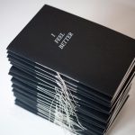
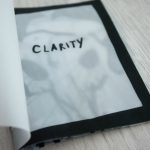
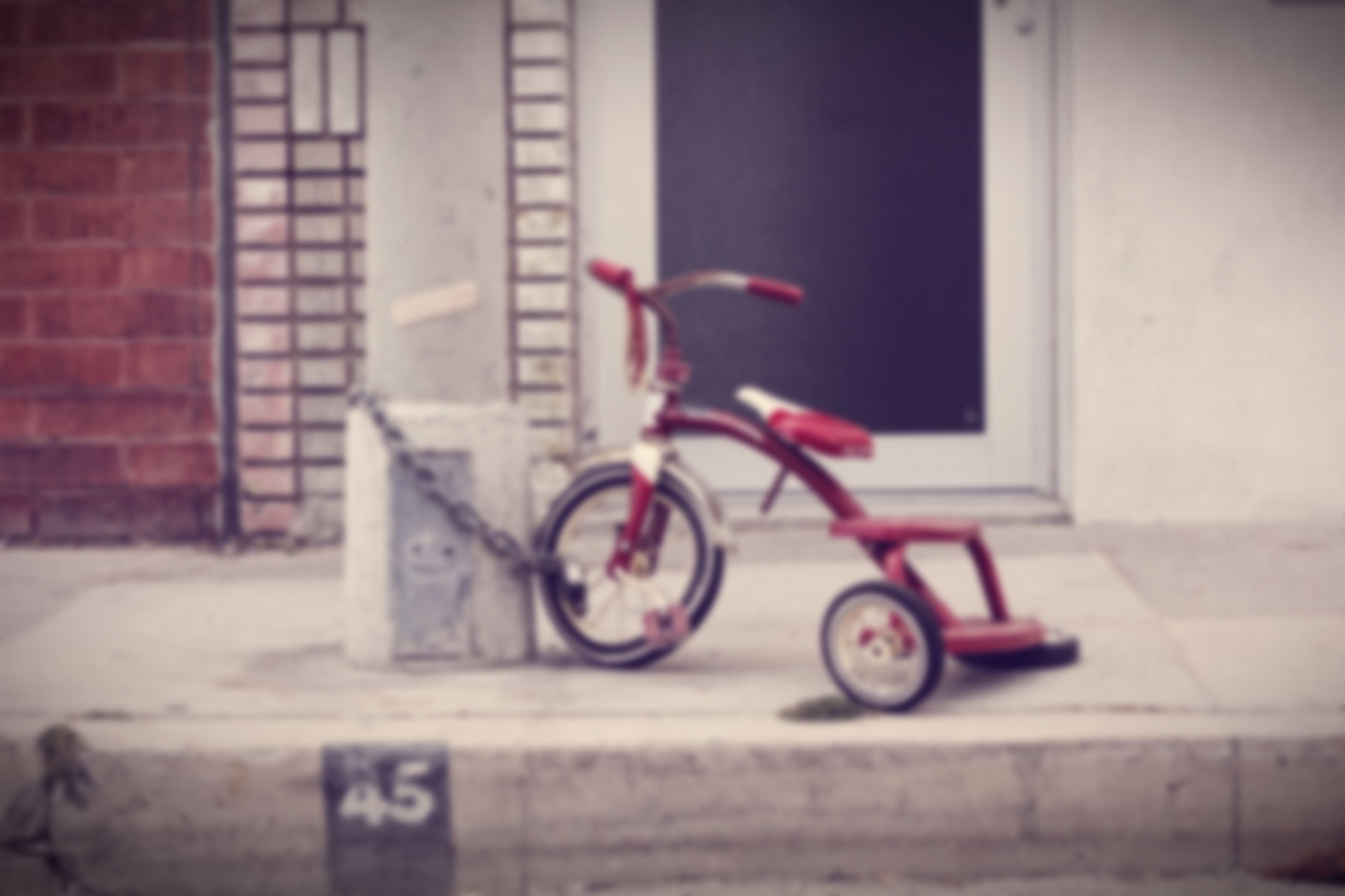
The following images are pages from my finalised zine. Overall I had fun doing this project and I liked it a lot! I really like my zine and maybe an improvement is that there could actually be real paper cut outs in the zine. Thank you Ina for your help and encouragement throughout this whole semester.… Read more →
Category: 2D Foundation II – G1
Zine: Process
I have now decided that my zine should have elements of tracing paper as well as Korean words. I will now be elaborating on how I tend to showcase the 3 different traits about myself that was previously mentioned in my zine. Greed 욕심. I came up with a poem to be placed beside the text saying: How much… Read more →
Zine: Research
Hi, for this project I want to incorporate elements from all the past projects that I did this semester. I decided to title my zine “Hello” which is also the first ever project that we did in Ina’s class this semester. Having the title Hello, I want the 8 pages zine to talk about myself and my traits. I chose… Read more →
POV: Process
At a later stage in the project, I wanted a splash of Korean words to further emphasise my main subject which are K-Pop idols. This is an example of how my pieces would look like. I want to use Korean to describe the photo instead of English. This is another example of how I would like my A5 pictures… Read more →
POV: Research
When I first got to know about this project, I wanted to talk about K-Pop idols. They may seem very glamorous and perfect on the outside but is that really what is happening behind the scenes? There are many articles online that show the ugly side of being a K-Pop idol. It is a very competitive and definitely… Read more →
POV: K-Pop Idols
The following images are my final pieces for this project. 1. POV from entertainment company (The entertainment often view idols as money making machines and do not really care about their views. Idols have no say in which shows they want to do or not and are blinded by the entertainment company’s direction.) 2. POV from other idols… Read more →
Typographic Portrait: Final
For my final submission i used the theme “Paper Cranes” because cranes in Asian culture are used to symbolise happiness and eternal youth. The first piece shows that I am youthful. Cranes fly in a V-formation and I wanted to show a flock of birds flying with energy and youthfulness. It describes me because I don’t like to work… Read more →
Typographic Portrait Problem: Process
After gathering all the research, I have embarked on creating the first designs for the project. The first design I created was this, I wanted it to have a flowing sensation like a waterfall. Extending out of the A5 paper. I took inspiration from a lamp, which is on the right. After consultation I realise that this idea could not… Read more →
Typographic Portrait Problem: Research
For this project, I wanted it to have a more 3D feel to it as I am more product designing inclined. I wanted my artwork to have pop-ups and could be interactive. The first idea I had was to do paper origami. From past experiences I have folded many different types of shapes and design and I think it could… Read more →
“Hello my name is _ _ _ _ _ _ _”
Hello! So this is an introduction project where we had to create typographic name tags on our first lesson. This project is an opportunity to be inventive in different genres. It expands one’s creative problem solving abilities to view a subject from different perspectives. We had to create 3 name tags. 1. Typography For this name tag I drew… Read more →