Astral Fantasy

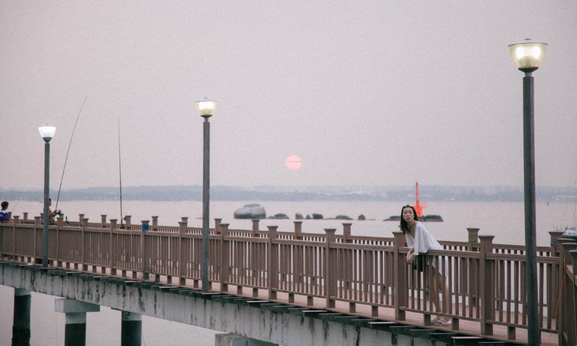
Astral Fantasy depicts a realm of fantasy of a girl named Ethera, who manifests herself as a mythical mermaid, or Siren, known as Serena. The banner pays tribute to the out-of-body experience known as astral projection experienced by Ethera, and through the imagery we are able to better visualise the inner fantasy world that Serena explores that includes elements of air and sea creatures. The idea of astral projection derives from a mystery tradition of esotericism and I added my own little twist of fantasy by incorporating elements of dreams and fairytales and folklore to really bring out the mythical mood of the universe that Ethera travels to.

Medium: Procreate | Watercolour and gouache brush


F I N A L   B A N N E R


M E D I A   W A L L

P A T T E R N    S W A T C H E S

A P P L I C A T I O N  


FINAL PROJECT – MUSEUM GUIDE

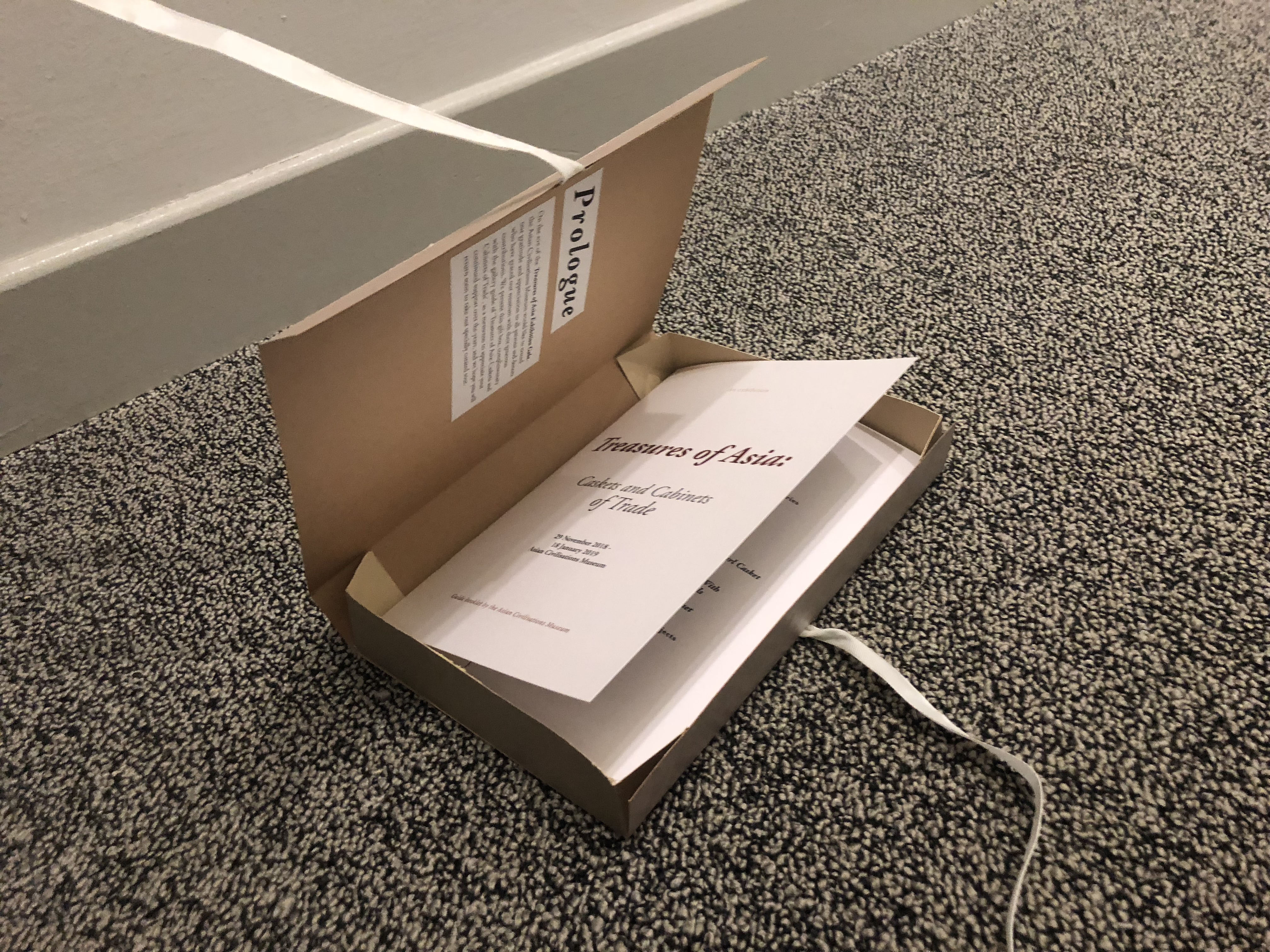
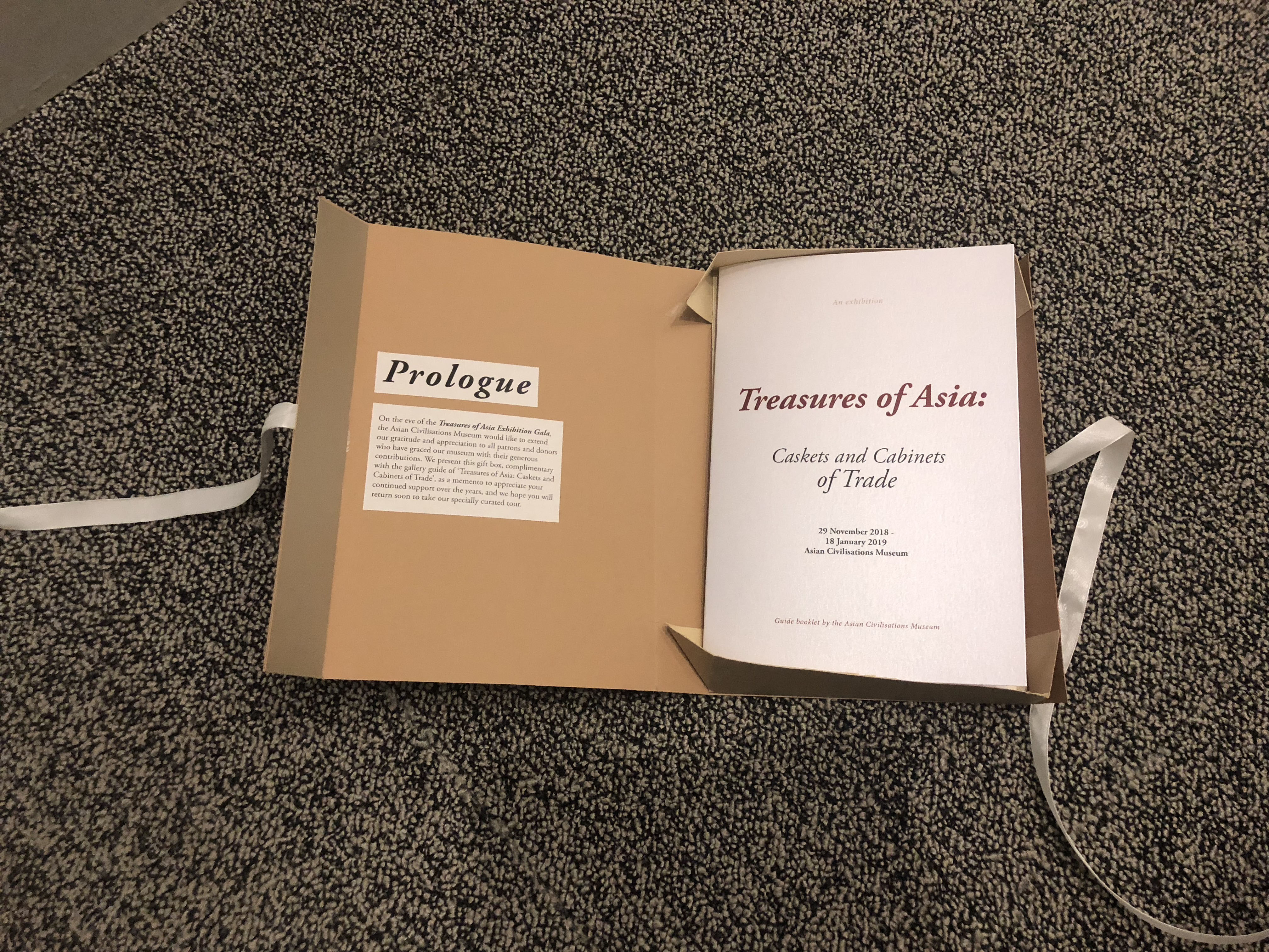
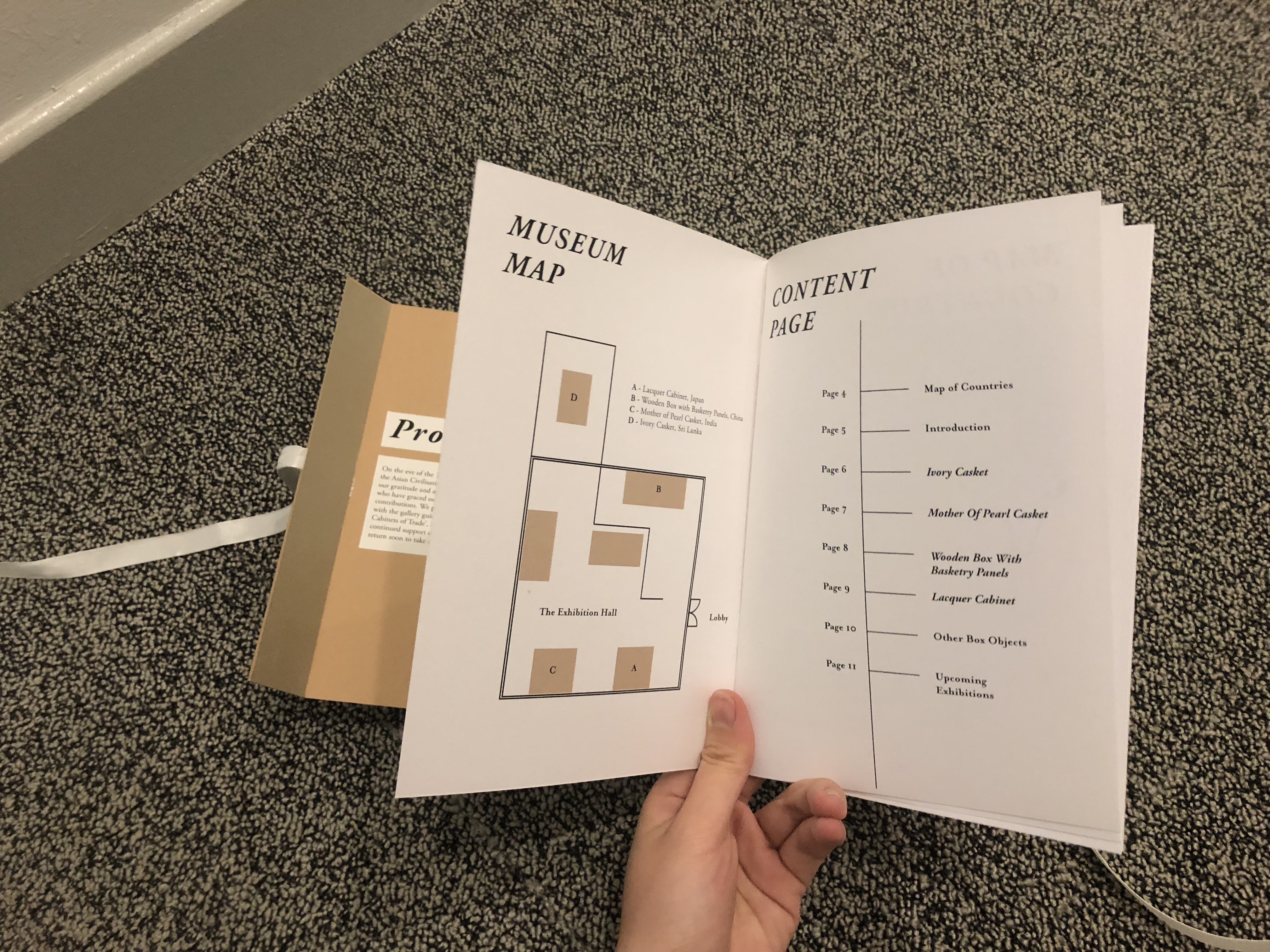
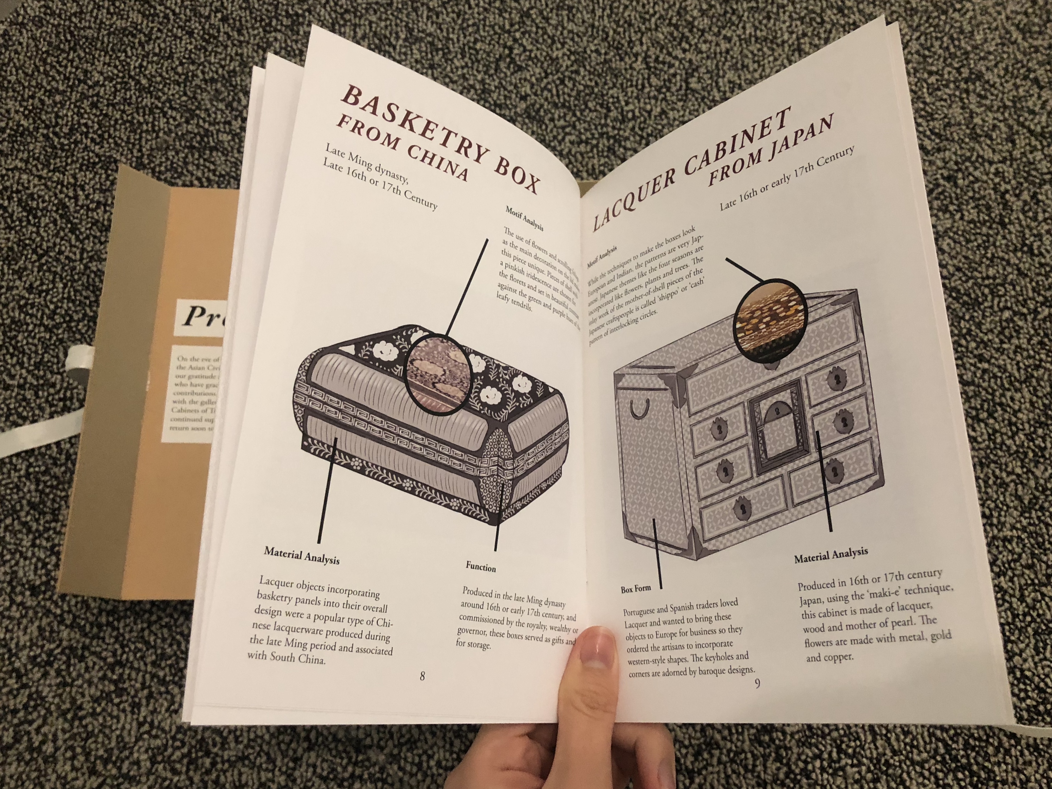
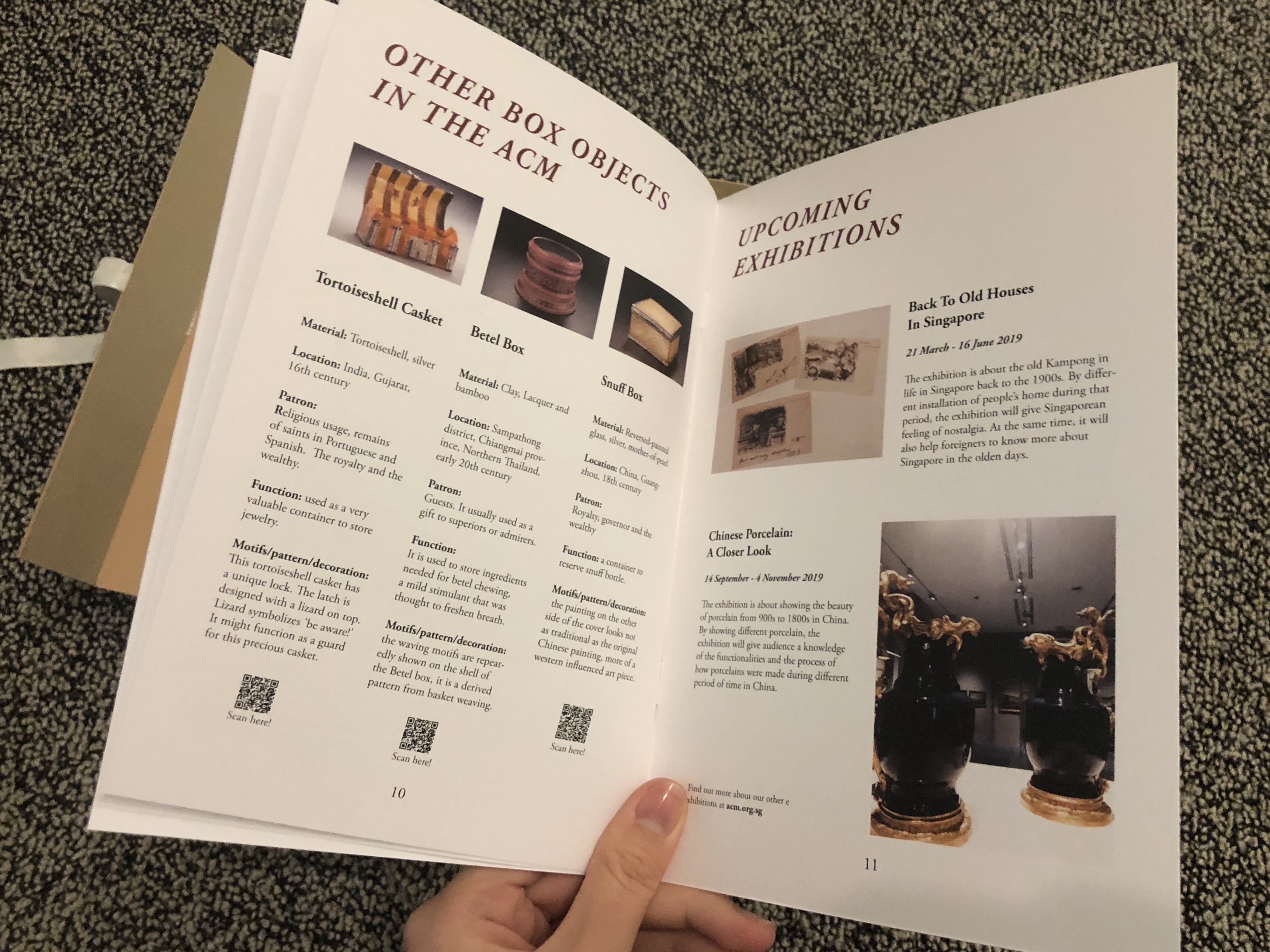
PR Kit for ACM Museum’s Latest Exhibition: Treasures of Asia, Caskets and Cabinets of Trade.

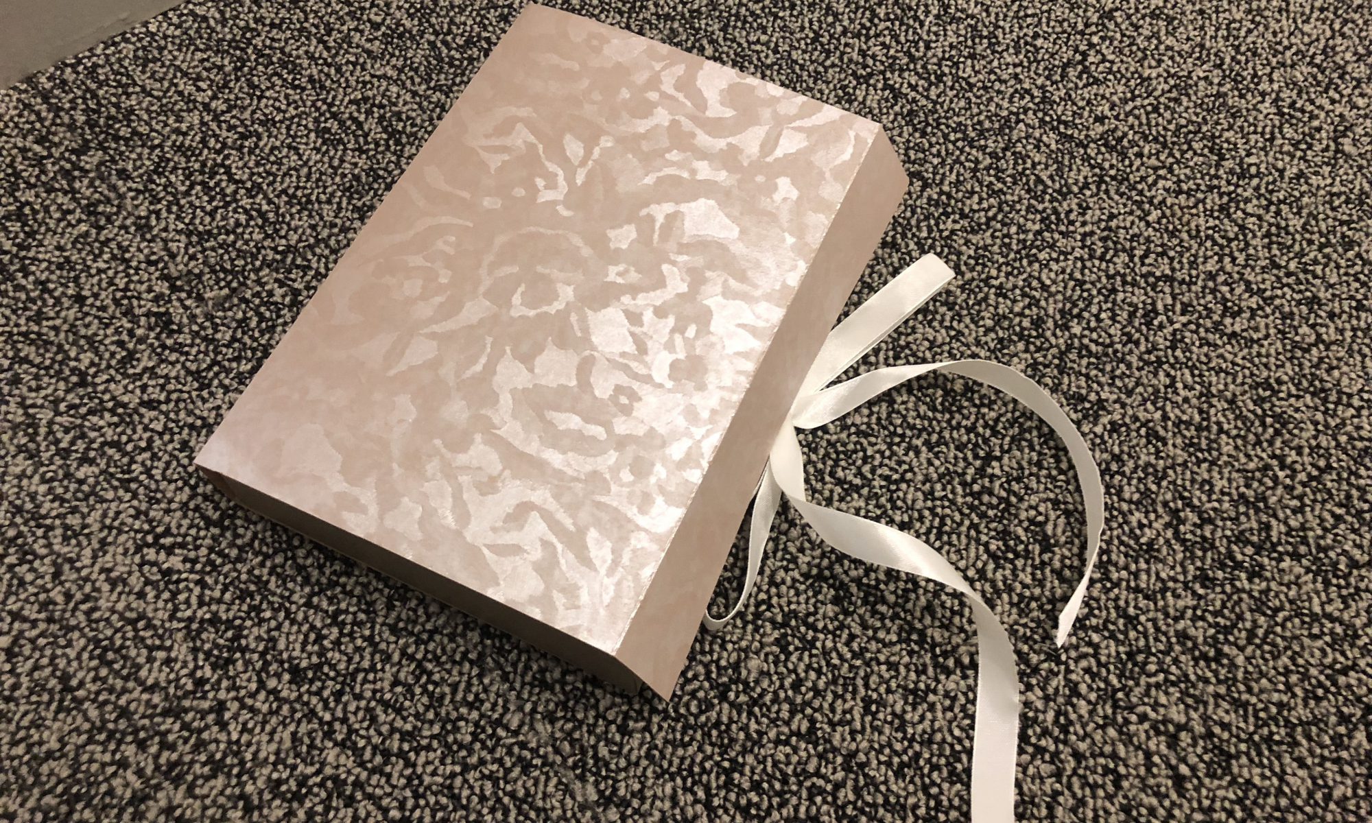
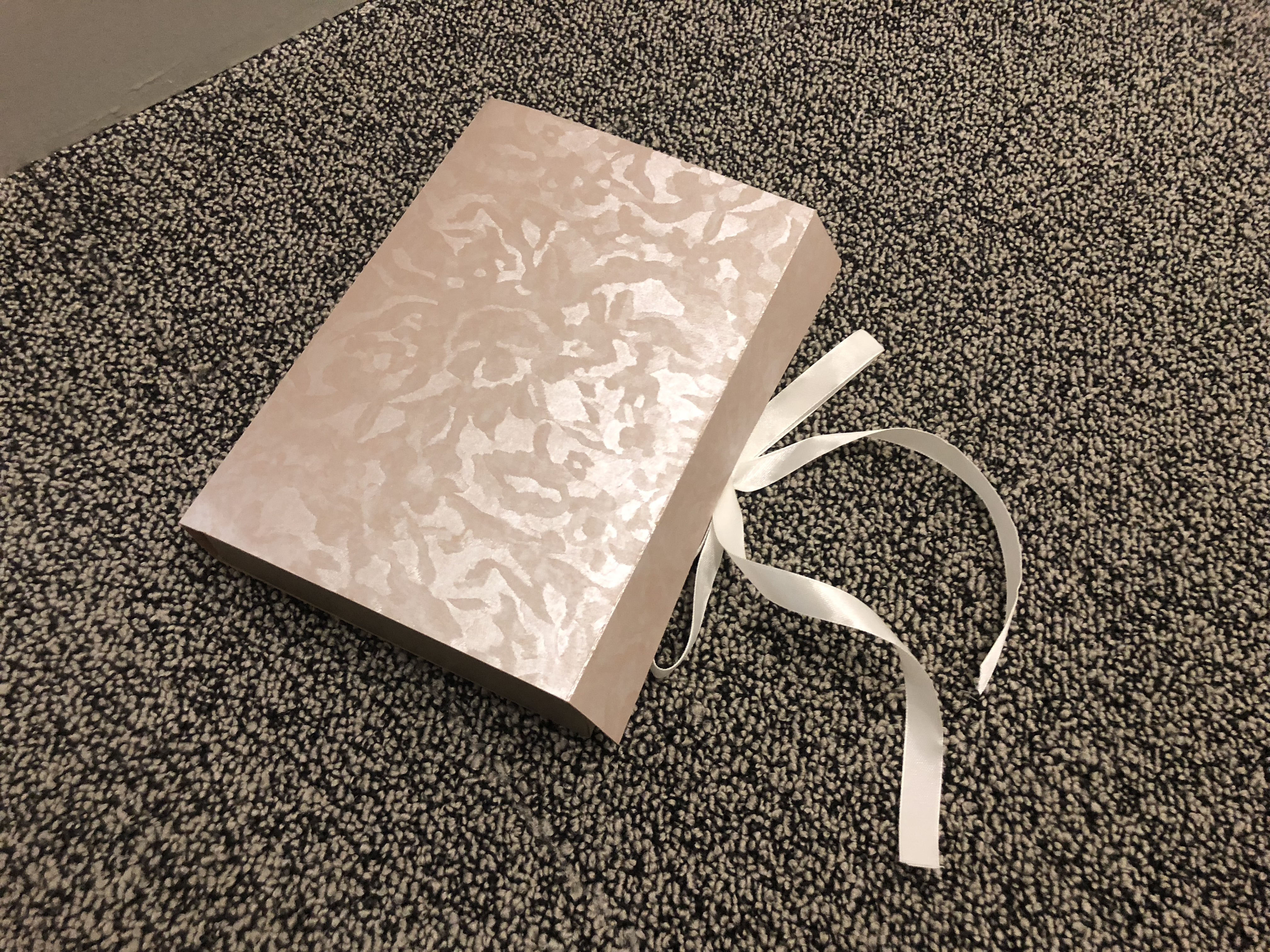
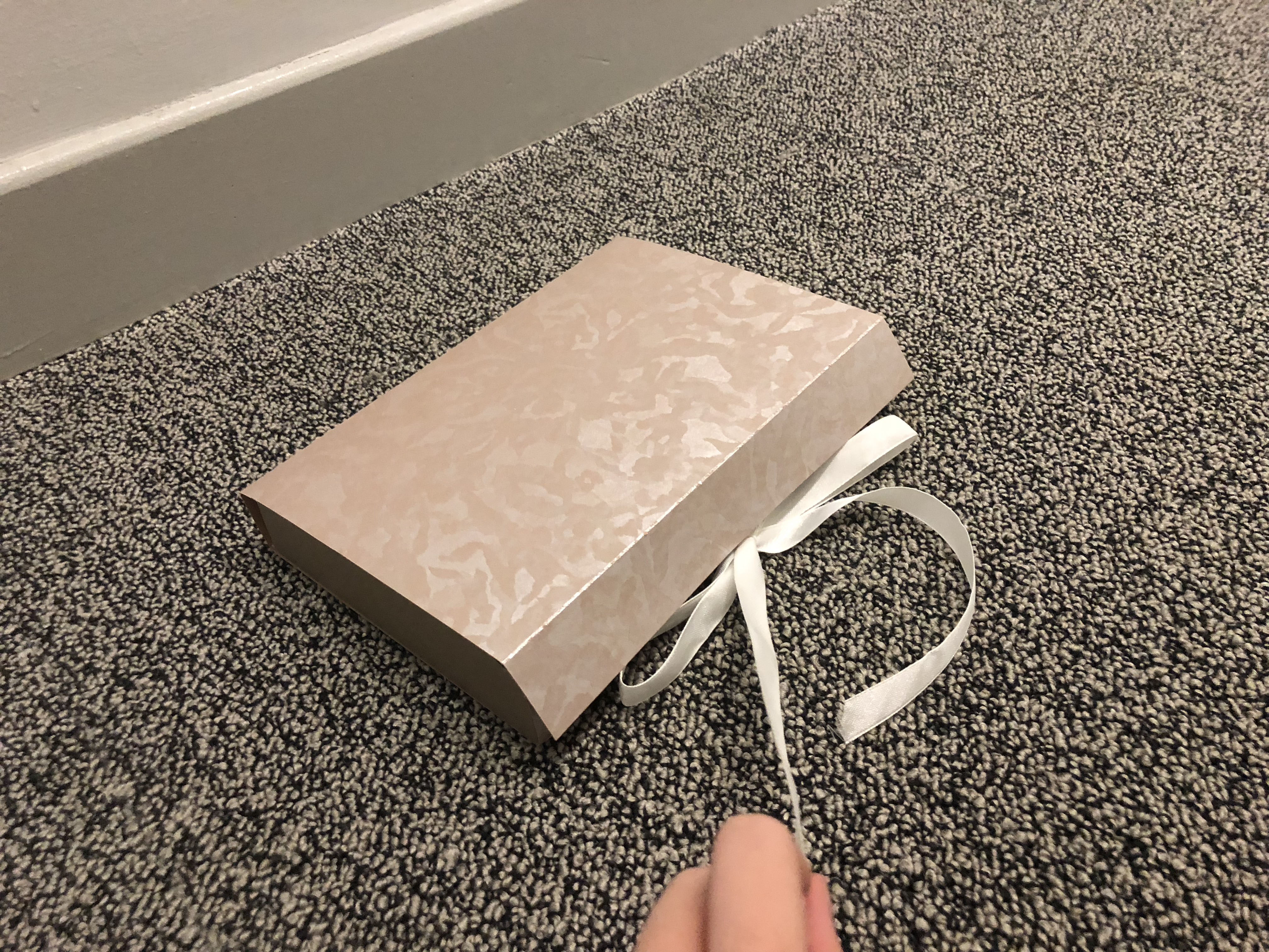
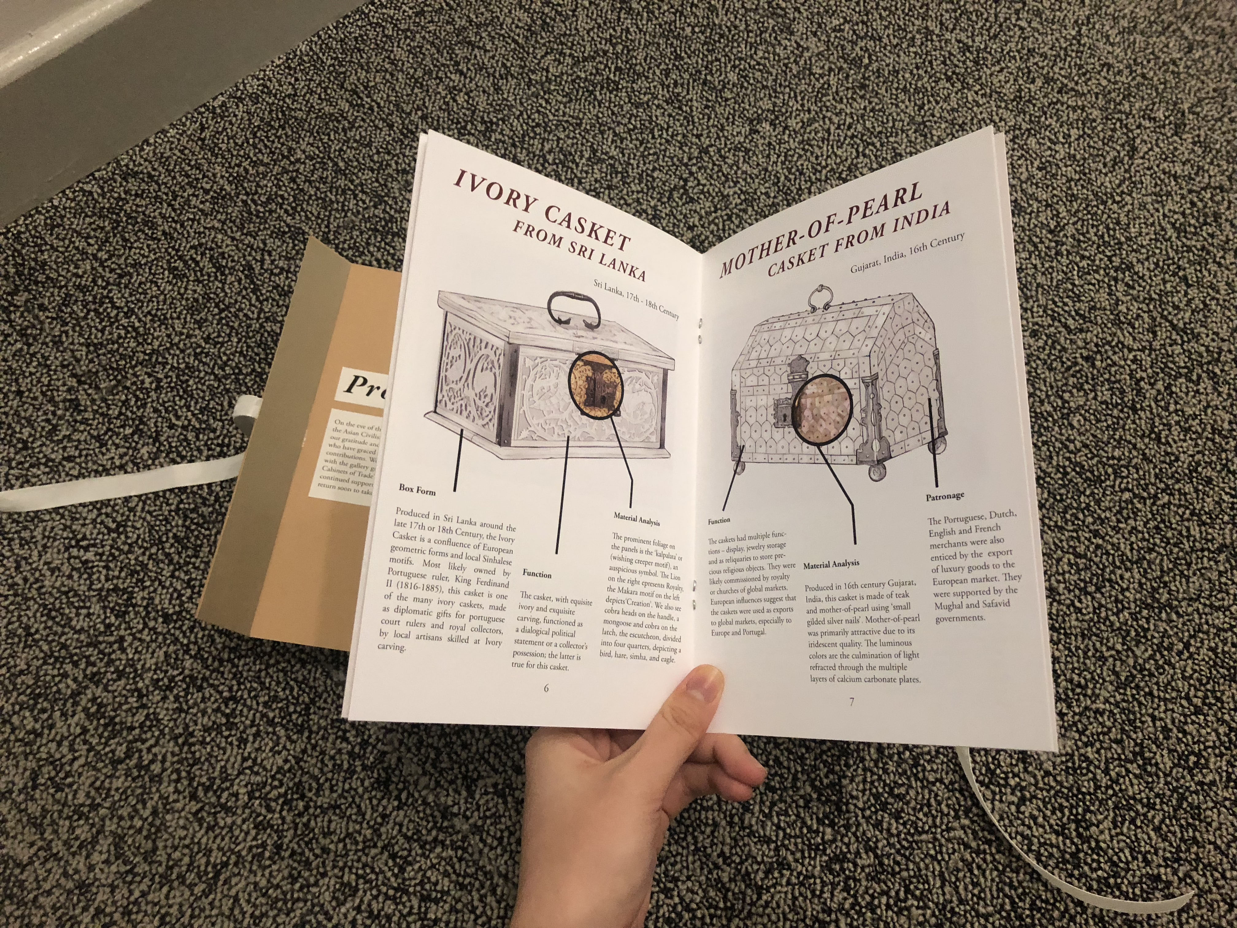
This project allowed for us to create something that was very new and exciting for the museum that was a Press Release kit or Event door gift for the rich patrons invited to the Exhibition Opening. We wanted to mimic the idea of how the rich patrons in the past would have received these caskets and cabinets of trade as gifts. Hence the PR kit came in a decorated motif box form that carried the “treasure” of the Museum Guide curated for the exhibition.

Reflection:

Overall, I felt that this final project was such a refreshing take on Art History and I have truly enjoyed the process of creating it. Instead of having to write thousand word essays, we could truly put what we are learning in art school and use it as a means to convey what we have learnt and researched about in Art History class to more purposeful use. In this case, we made a museum guide for our chosen target audience.

The collaborative work with my schoolmates from other majors were also very helpful as I could not have managed certain aspects without them. Such as the detailed illustrations, which took for my group mate in Animation to draw out. It turned out even better than I could have imagined so I was very appreciative for this chance for collaborative effort. It also gave an insight to how future collaborative works in a working environment would be like and I thought this final project really was unique in terms of how it made that possible.

This project is the epitome of Art History made fun (and practical as well)!

Week 10 Contextual Analysis Of Chosen Object

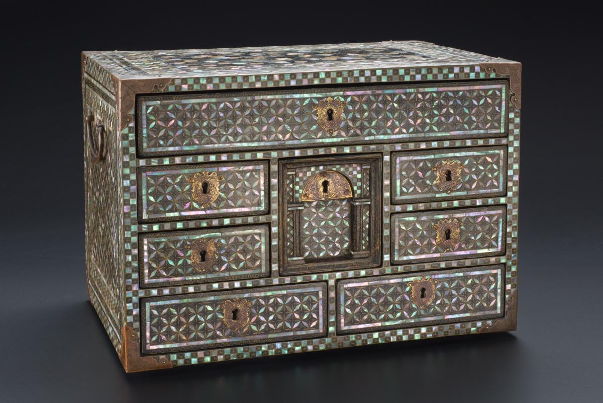
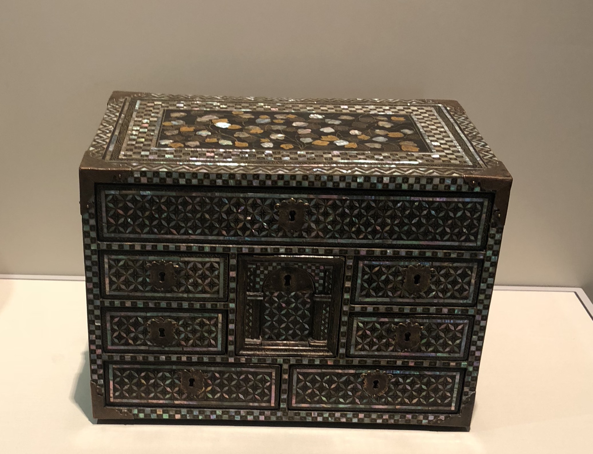
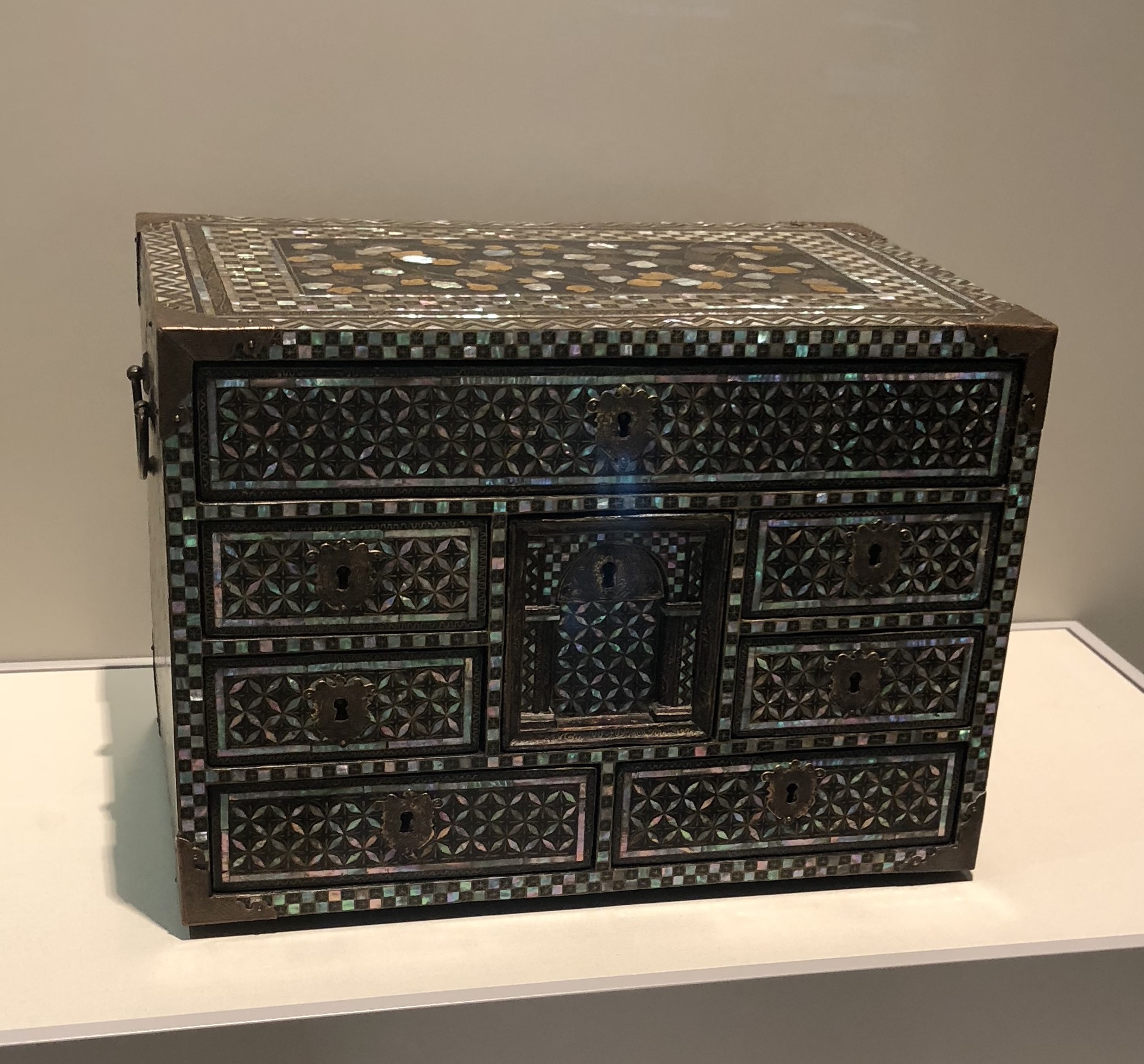
Cabinet. Japan, late 16th or 17th century. Wood, lacquer, gold, copper, mother-of-pearl. 2014-00941


Contextual Analysis

“Lacquered furniture was produced in Japan for Europe and European ports in Asia. It was decorated in the so-called namban (“barbarians” from the south) style. In the late 16th and 17th centuries, the word namban was applied to all foreigners except Chinese and Koreans. The style is associated with depictions of foreigners, or objects made in European shapes.”

– Extract from ACM Website


What is lacquer?

Lacquer is the gummy sap of the Japanese tree Urushi, otherwise known as Rhu Verniciflua, which is of a milky gray colour. This sap is usually painted onto wood as it dries down to a shiny, durable, and binding finish that allows for the item to last over long periods of time. Dried lacquer is liquid-resistant, so not only does it make furniture shine, it also preserves fragile materials.


Maki-e Technique

This lacquered cabinet is made using the technique ‘Maki-e’. What it essentially translates to is ‘sprinkled pictures’. Usually, these maki-e decorations are painted with lacquer on the surface of the item and then sprinkled with gold or other metallic dust. This created a beautiful effect that captivated the attention of missionaries who commissioned to use the technique for items such as picture frames and bible stands for churches.

This shows there was a link between the religion Christianity and lacquered Japanese homewares, which was definitely there during the Momoyama Period in Japan (early 16th century) where Catholic missionaries and traders came to Japan.


European traders

This cabinet however is not a native design by the Japanese. The Portuguese were exceptionally dominant in the trade in early 16th century, and they had many ships departing all over the world by the 17th century. It is no wonder that the beauty of lacquered furniture enchanted the attention of Portuguese traders and also the Spanish traders.  They wanted to bring back these exotic objects back to Europe for business. Hence, they also introduced these Western-style shapes by ordering them, and this lacquered cabinet is a good example of them. Another was the coffee cup even though the Japanese did not drink coffee at that time period.


Introduction of mother-of-pearl to lacquered objects were also not native to the Japanese traditional lacquered items, but the Spanish and Portuguese wanted their objects to be more luxurious. Hence, they requested craftspeople to lay mother-of-pearl on the maki-e objects and also mark up the prices of the objects in Europe. This technique is known as raden in Japanese.


However, this raden method was not original to Europe either. As the Portuguese have many trade routes within Asia, they probably picked up this style from India where this use of mother-of-pearl technique was particularly common especially in Gujarat.


These foreign styled objects were soon known to the Japanese as ‘namban’ style, which translates to ‘Southern Barbarian’, which was a term used to refer to these ‘foreigners’ from Europe. While the techniques used in the making of these lacquered cabinets and boxes were adopted from Europe and India, the patterns found atop this cabinet were very much by the Japanese craftsmen. The pictures depict some flowers made with precious materials like metal, gold and copper. This particular motif on the top of the cabinet is very much Japanese as they enjoyed incorporating themes such as the four season which often included flowers, plants and trees in their designs. The inlay work of the mother-of-shell pieces are also commonly used by Japanese craftspeople and it is the ‘shippo’ or ‘cash’ pattern of interlocking circles.


However, if you zoom into the details of the intricate keyholes and metal corners of the cabinet, you’d notice the baroque designs that was probably a European motif that was requested to have been put onto the object.


Revised Final Project Proposal – Team 2

Link to our revised proposal!

PROPOSAL


Bibliography:

Ayesha:

Biedermann, Zoltan. ‘Diplomatic Ivories: Sri Lankan Caskets and the Portuguese-Asian Exchange in the
Sixteenth Century,’ in Global Gifts: The Material Culture of Diplomacy in Early Modern Eurasia, ed.
Zoltán Biedermann, Anne Gerritsen and Giorgio Riello. New York: Cambridge University Press,
Forthcoming. Accessed 10 October 2018. https://books.google.com.sg/books?id=KJNADwAAQBAJ&pg=PA88&lpg=PA88&dq=biederman+zoltan+ivories&source=bl&ots=va01sK_GWW&sig=mo0WlYm_tPkau77_HW06ZPdXYg8&hl=en&sa=X&ved=2ahUKEwi6o6HyzYTeAhUIqY8KHYdoCoYQ6AEwA3oECAcQAQ#v=onepage&q=biederman%20zoltan%20ivories&f=false

Strathern, Alan. “Theoretical Approaches to Sri Lankan History and the Early Portuguese Period.” Modern Asian Studies 38, no. 1 (2004): 191-226. Accessed 10 October 2018. http://www.jstor.org.ezlibproxy1.ntu.edu.sg/stable/3876500.

Meegama, Sujatha Arundathi. “The Local and the Global: The Multiple Visual Worlds of Ivory Carvers in Early Modern Sri Lanka.” In Sri Lanka at the Crossroads of History, edited by Biedermann Zoltán and Strathern Alan, 113-40. London: UCL Press, 2017. Accessed 10 October 2018. http://www.jstor.org.ezlibproxy1.ntu.edu.sg/stable/j.ctt1qnw8bs.11.

Chong, Alan. “Sri Lankan Ivories for the Dutch and Portuguese,” JHNA 5:2 (Summer 2013),
DOI:10.5092/jhna.2013.5.2.16. Accessed 10 October 2018.
https://jhna.org/articles/sri-lankan-ivories-for-dutch-portuguese/

Silva, K. M. de, Howard A. Wilson, S. U. Deraniyagala, Senake Bandaranayake, Roland Silva, Nimal de Silva, Ismeth Raheem, Diran Kavork Dohanian, Albert Dharmasiri, Raja de Silva, Siri Gunasinghe, Robert Elgood, R. C. C. Fynes, Brendan Lynch, Bob Simpson, Sirinimal Lakdusinghe, K. Hemantha Jayatilleke, L. K. Karunaratne, and W. Thelma T. P. Gunawardane. 2003 “Sri Lanka.” Grove Art Online. Accessed 10 October 2018.  http:////www.oxfordartonline.com/groveart/view/10.1093/gao/9781884446054.001.0001/oao-9781884446054-e-7000080711.


Lydia:

Roots. Mother-of-Pearl Casket.
Accessed 19 October 2018.

https://roots.sg/learn/collections/listing/1064555

J.M. Rogers, The Arts of Islam. Masterpieces from the Khalili Collection, London 2010, cat.361, p.304.
Accessed 19 October 2018.
https://www.khalilicollections.org/collections/islamic-art/khalili-collection-islamic-art-mother-of-pearl-inlaid-casket-mxd255/

Truong, Alain R. A rare Indian mother-of-pearl and red lac casket, 17th Century, Gujarat, India.
Accessed 19 October 2018.
http://www.alaintruong.com/archives/2017/07/29/35517873.html

Finch and Co.: Antiques & Works of Art. Mughal Indian Gujarati Mother-of-Pearl Casket.
Accessed 19 October 2018.
http://www.finch-and-co.co.uk/archive/antiquities/d/mughal-indian-gujarati-mother-of-pearl-casket/310847

V&A. Casket.
Accessed 19 October 2018.
http://collections.vam.ac.uk/item/O17094/casket-unknown/


Naomi:

Japanese Lacquer, 1600-1900: Selections from the Charles A. Greenfield Collection

By Andrew Pekarik, Metropolitan Museum of Art (New York, N.Y.)

https://books.google.com.sg/books?id=Frw1vEmyHSMC&printsec=frontcover&dq=japanese+lacquer&hl=en&sa=X&ved=0ahUKEwiT_42Cj_zdAhUJuY8KHdY6BPgQ6AEIKDAA#v=onepage&q=japanese%20lacquer&f=false

Japanese Studio Crafts: Tradition and the Avant-garde

By Rupert Faulkner

https://books.google.com.sg/books?id=zdLJ0NZpd74C&pg=PA109&dq=japanese+lacquer&hl=en&sa=X&ved=0ahUKEwihncjKkfzdAhXKtI8KHbjMAEQ4ChDoAQg_MAQ#v=onepage&q=japanese%20lacquer&f=false

Japanese Lacquer by N. H. N. Mody

Japanese Lacquer-Ware Source: The Art Journal (1875-1887), New Series, Vol. 3 (1877), p. 200


Zhang Xuan (Vincent):

https://www.lrhsd.org/domain/31

East Asian Lacquer. (n.d.). Retrieved from

http://www.kaikodo.com/index.php/past_exhibition/detail/the_immortal_past/518

https://roots.sg/Roots/learn/collections/listing/1276421

Garner, H. (2011, September 7). A Group of Chinese Lacquers with Basketry Panels. Retrieved October 19, 2018, from

https://www.jstor.org/stable/20110978?seq=1#page_scan_tab_contents

Watt, J. C., & Ford, B. B. (1991). East Asian lacquer: The Florence and Herbert Irving collection. New York: The Metropolitan Museum of Art.

https://books.google.com.sg/books?id=RXOrZUlF_OoC&pg=PA140&lpg=PA140&dq=Lacquer+box+with+mother-of-pearl+inlay+and+basketry+panels&source=bl&ots=xINzDQZI6o&sig=TS0IjodqVn_pHGgY5K46GeH17fM&hl=en&sa=X&ved=2ahUKEwjC5oWWn5LeAhXTEHIKHUiGBkQQ6AEwCnoECAEQAQ#v=onepage&q=Lacquer%20box%20with%20mother-of-pearl%20inlay%20and%20basketry%20panels&f=false


Week 9: Free Writing Of Chosen Object

Cabinet. Japan, late 16th or 17th century. Wood, lacquer, gold, copper, mother-of-pearl. 2014-00941

Lacquered furniture was produced in Japan for Europe and European ports in Asia. It was decorated in the so-called namban (“barbarians” from the south) style. In the late 16th and 17th centuries, the word namban was applied to all foreigners except Chinese and Koreans. The style is associated with depictions of foreigners, or objects made in European shapes.


Visual Analysis:

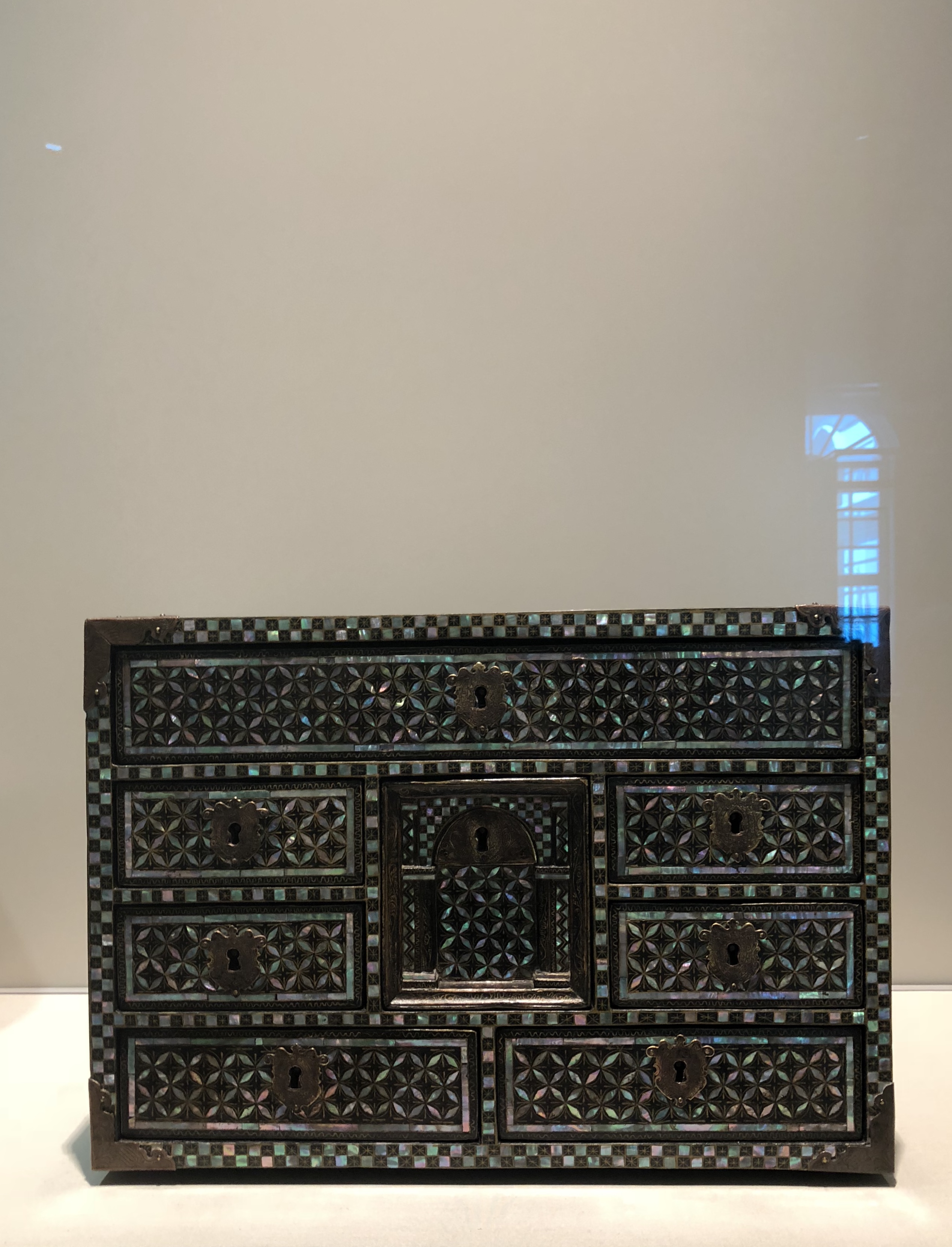
The object that is displayed is a wooden cabinet, from Japan. It is a medium sized box, with eight drawers or compartments, and it seems easily handled and carried by one man. What is special about this cabinet is the reflective coating known as lacquer that gives the wood its shine. Lacquer is a material that is renowned to Japan, back in those days. Lacquered furniture was one of the most prized Japanese exports to Europe. The cabinet is very geometric in shape, from its cubic form, its rectangular drawers, and decorative patterns all over. This pattern could be an indication of an adopted style and could give us a hint as to the merchant countries who imported these furniture items. As we know that lacquered furniture exported from Japan are very popular and precious in Europe, we can speculate that these would be cabinets for wealthy and royal families.

The cabinet is also embellished with other materials as well, such as gold, copper and mother-of-pearl ­– giving another dimension to its shine and reflective details. This provides the patterns of the cabinets as well, which are repetitive decorative four petal flowers, as well as a checkered trim around the edges. The top of the box has a middle frame that is more ornate, seemingly with organically shaped flowers of gold, copper and mother-of-pearl. The materials used are evidently very precious and expensive, which goes to show the value of the item. As it is handmade, the precision it takes to cut out the individual pieces of mother-of-pearl pieces and place them on the box in such an organised manner is no easy feat. This goes to prove the painstaking efforts it takes to embellish this box, adding to the exquisiteness of the item. This would go to also hint that perhaps it was used as gifts from one royal family to another, or as diplomatic presents. It also suggests that these were probably not really mass produced for just anyone to own but made exclusively when an “order” is made.

There are copper metal corners and handles around the cabinet as well, making the box very sturdy. The metal also forms the keyholes of the eight compartments of the cabinets. Upon closer inspection, the details on these metal features are particularly ornamented, with minute carvings and the keyholes are carved in the shape of a crest (with exception to the one right in the middle). The crest could be a family crest that the cabinet was built for. The drawers of the cabinet are relatively shallow and of different sizes. It reminds me of a storage organiser for jewelry, with the different drawer sizes used to store various types of jewelry such as necklaces, rings, bangles and bracelets. The drawer that stands out to me the most is the one in the middle, as it is the one that is the most unique out of all of them. The keyhole is also different as it is not in the shape of the crest, but rather a semicircle. The way the wood is carved underneath the metal plate is also special, with two “pillars” framing a deeper carved area in the middle. It is reminiscent of a doorway arch, and perhaps that is what it is meant to symbolise and possibly the origins of the design. It could indicate the style of doorways in the European counties that it was exported to as well.

What intrigues me are the compartments in this cabinet, as the drawers lies perfectly flat against the surface of the box, there is no way of one opening the box with just their fingers alone. A key would always be needed to open each drawer, and hence to close them up properly would also require the key to be turned to lock it up. This means that the drawers would not be able to be opened both or three or more at once. I would deduce that what this cabinet holds in each compartment must be of extreme high value, such as exquisite jewelry, heirlooms, or perhaps even family secrets and treasures. This gives us an insight to exactly how important and wealthy and regal the user of this cabinet is. The metal handles on the side of the cabinet also suggests that it is an item that is portable and transportable.


Many facets of this object certainly goes to prove the value and worth of it and it proposes the patrons who uses this object as well. More importantly, it also goes to prove the craftsmanship of the Japanese back in the days due to the intricacy of the details and decadent materials used.

WEEK 1 “Why you don’t like Art History” RESPONSE

Highlighted in the video was a statement:

There’s a tendency in Art History to tell the story of influence moving in one direction.

In many cases, that’s how I feel it has always been. Influence moving from West to East. But that phrase in the video really made me think about whether it was true. Which is why I feel that this Art History class is very pertinent to recognise the influences that are many-way streets, spreading all over the world. I think the video brings a great impact as to why sometimes we might not enjoy Art History classes due to the way it’s been taught – more often than not – biased-ly.

TYPOGRAPHY PROJECT IV: EXPRESSIVE TYPOGRAPHY

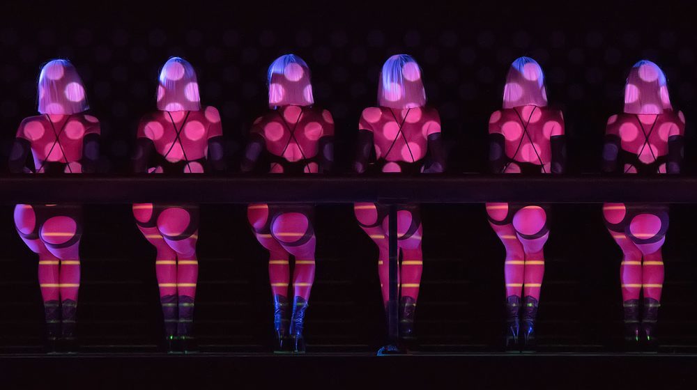
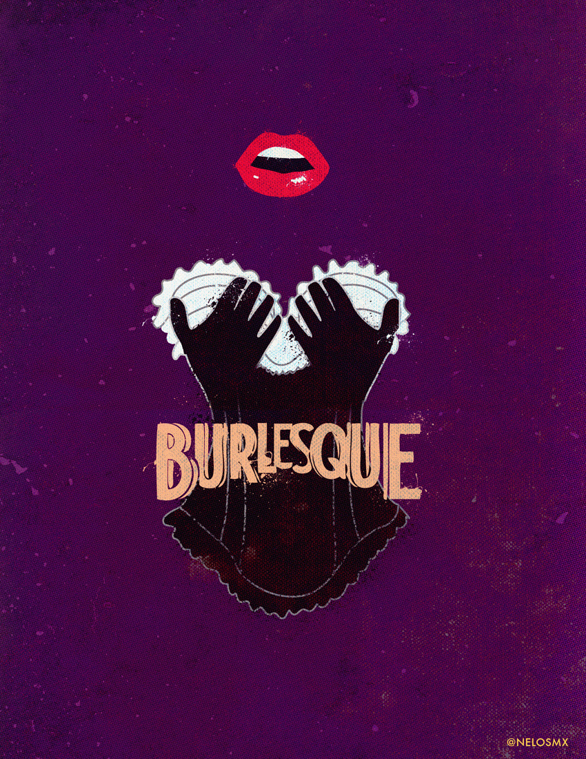
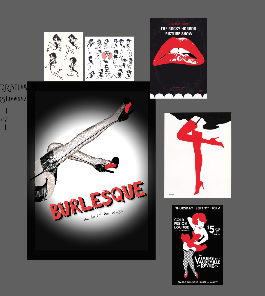
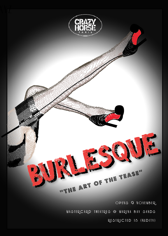
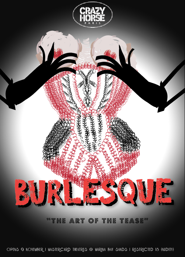
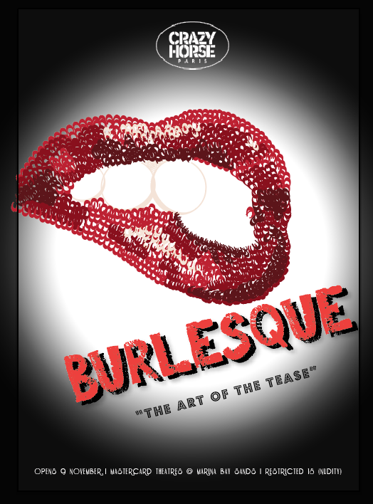
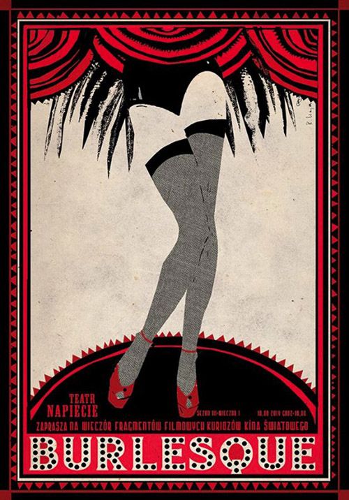
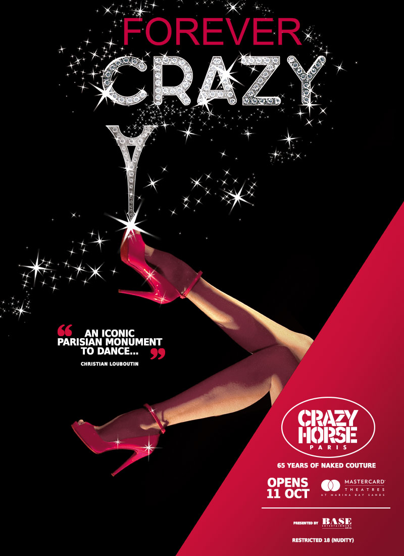
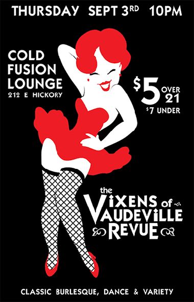
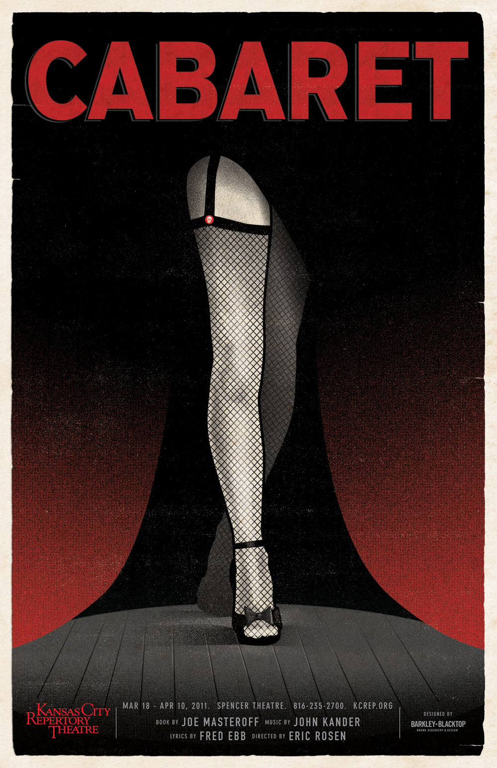
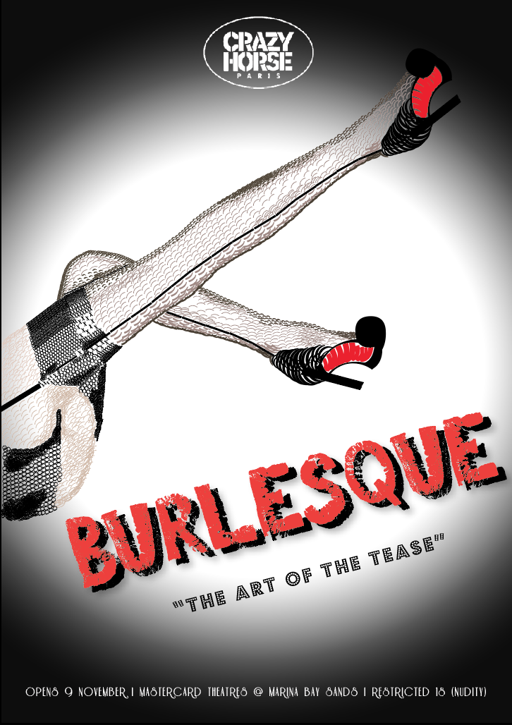
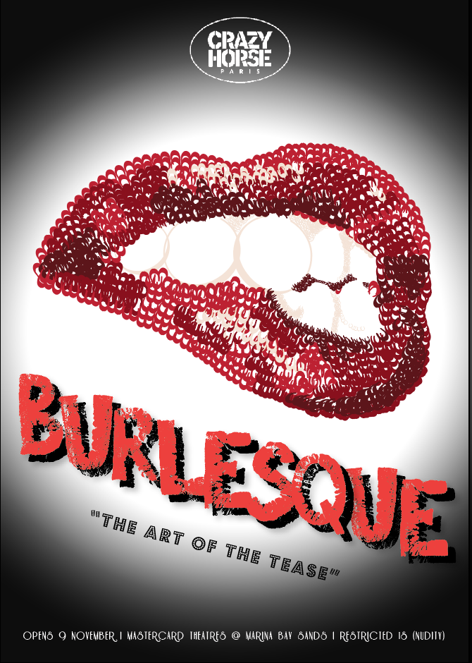
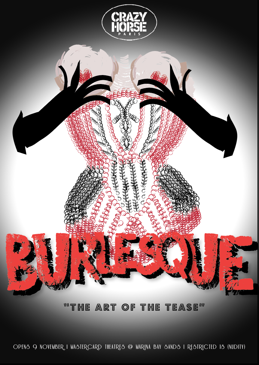
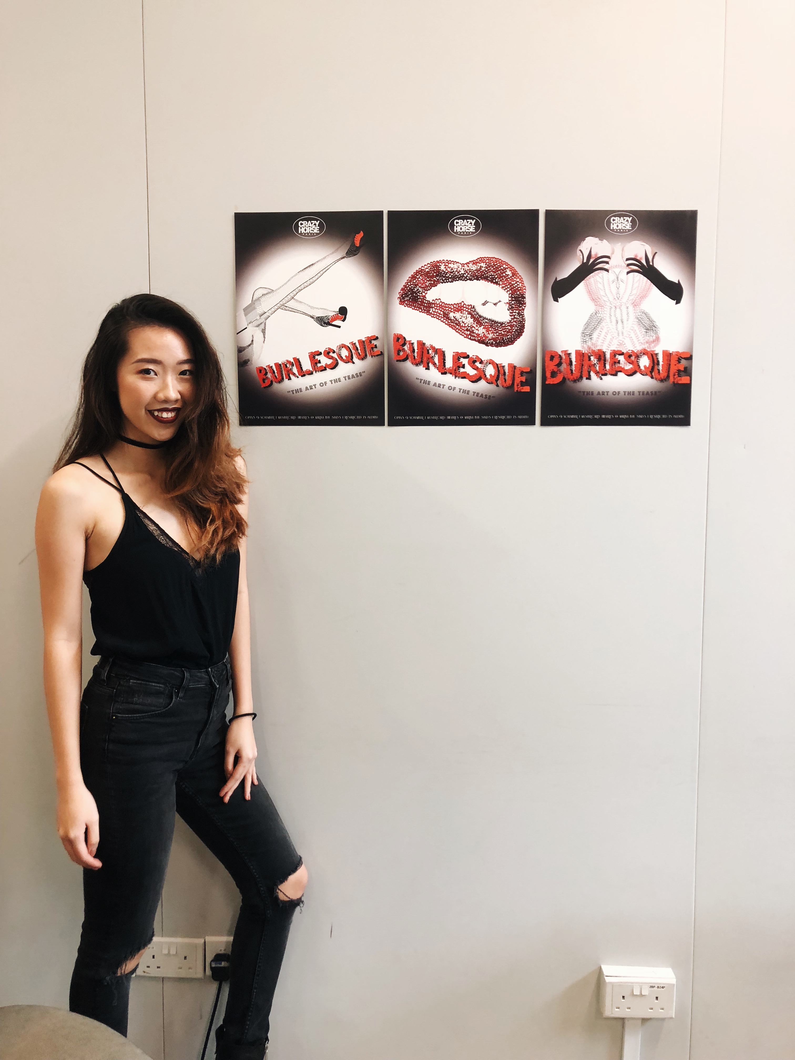
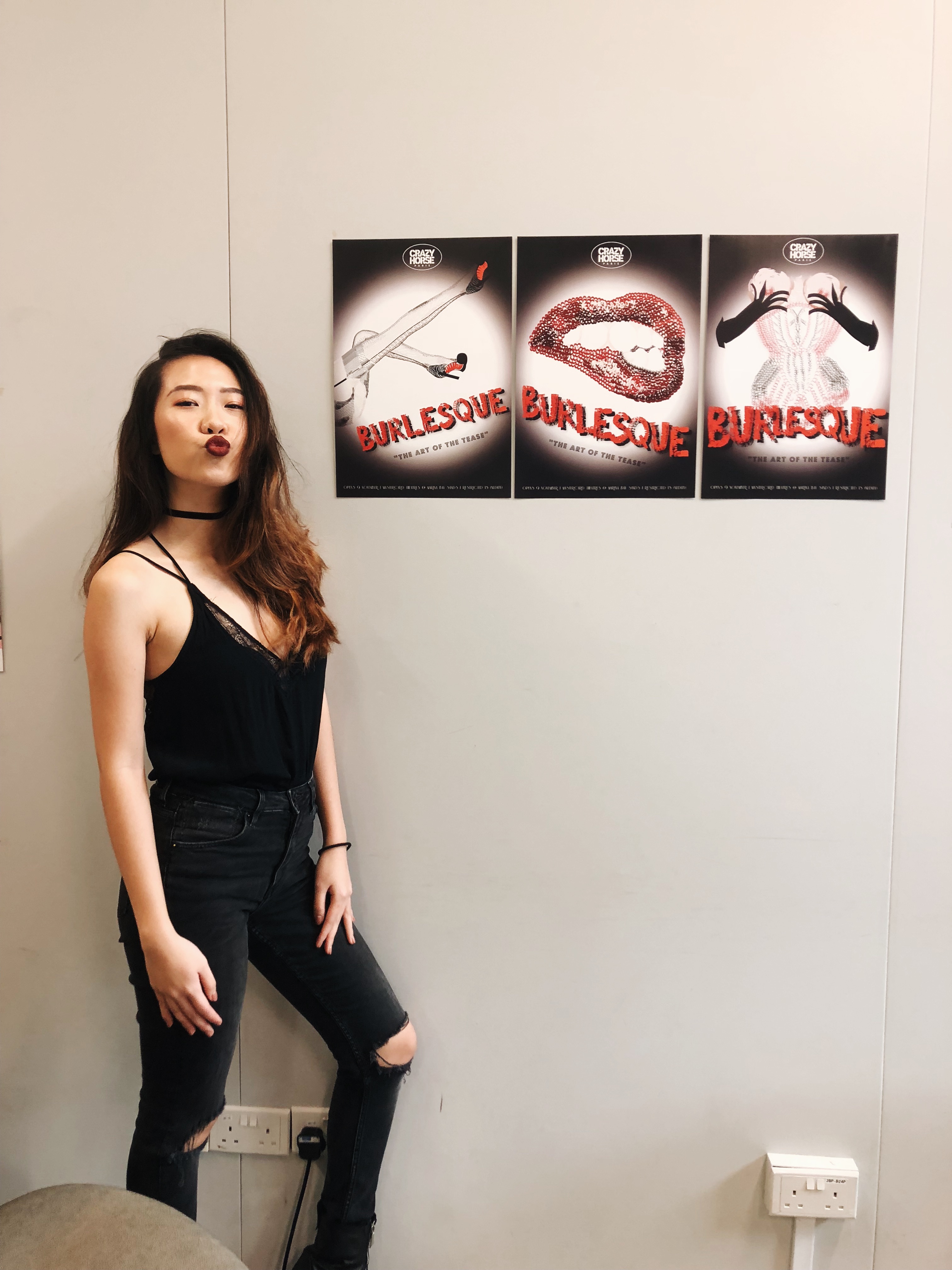
I had just recently gone for the Crazy Horse Paris show at MBS and was really inspired by the visuals so when I created these burlesque images in Project “Type as Image”, I was very excited to continue them for my last typo project.

At first I wanted to do a poster of a “upcoming” Burlesque show and a brochure one would get at a show with instructions on how to dance beginner burlesque – all using type as image but Shirley advised against it and instead recommended to use Gestalt law instead. So basically use elements of the show in conveying the message of the show.

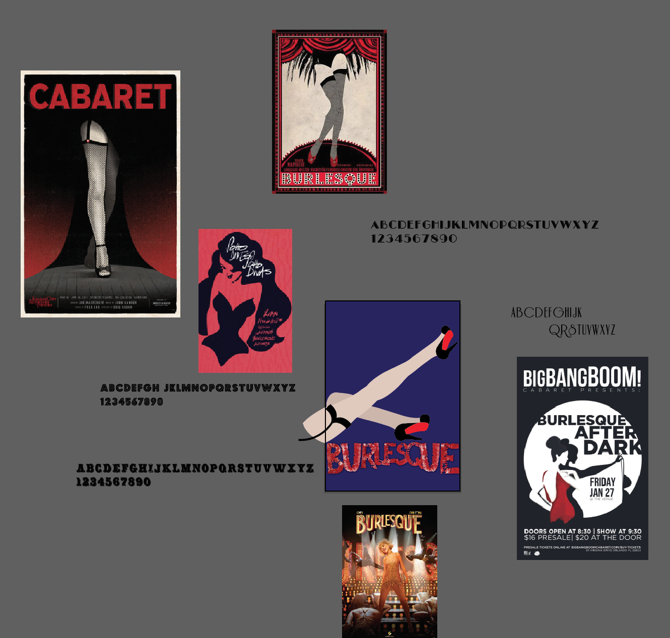
So I researched on minimal posters:

Related image

And So It Goes... • Malika Favre

movie poster art | ... > No153 My The Rocky Horror Picture Show minimal movie poster

I decided to play around with colours as well because it was no longer limited to just black and white. After researching into some of the fonts typically used by Burlesque, I decided to go with Riesling and Budmo to create the image due to the curves of the font.

Image result for burlesque fonts riesling

And if you recall from my Organic Type project, I created my own font that was textured like lips – which I thought was very apt to utilise on the poster as well.

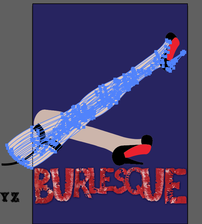
This was my first draft and after consultations with Shirley, she pointed out that one would not know that it was made up of the anatomy of the typeface as they simply look like vectors. So she pointed me in the direction of using anatomy to create the shadows of the image.

Some examples:
Typography / Albert Einstein

Typographic Portraits by Peter Strain More

Essentially using size, colour and also the spacing between each element to convey depth.

So I experimented with it.

With visual references.

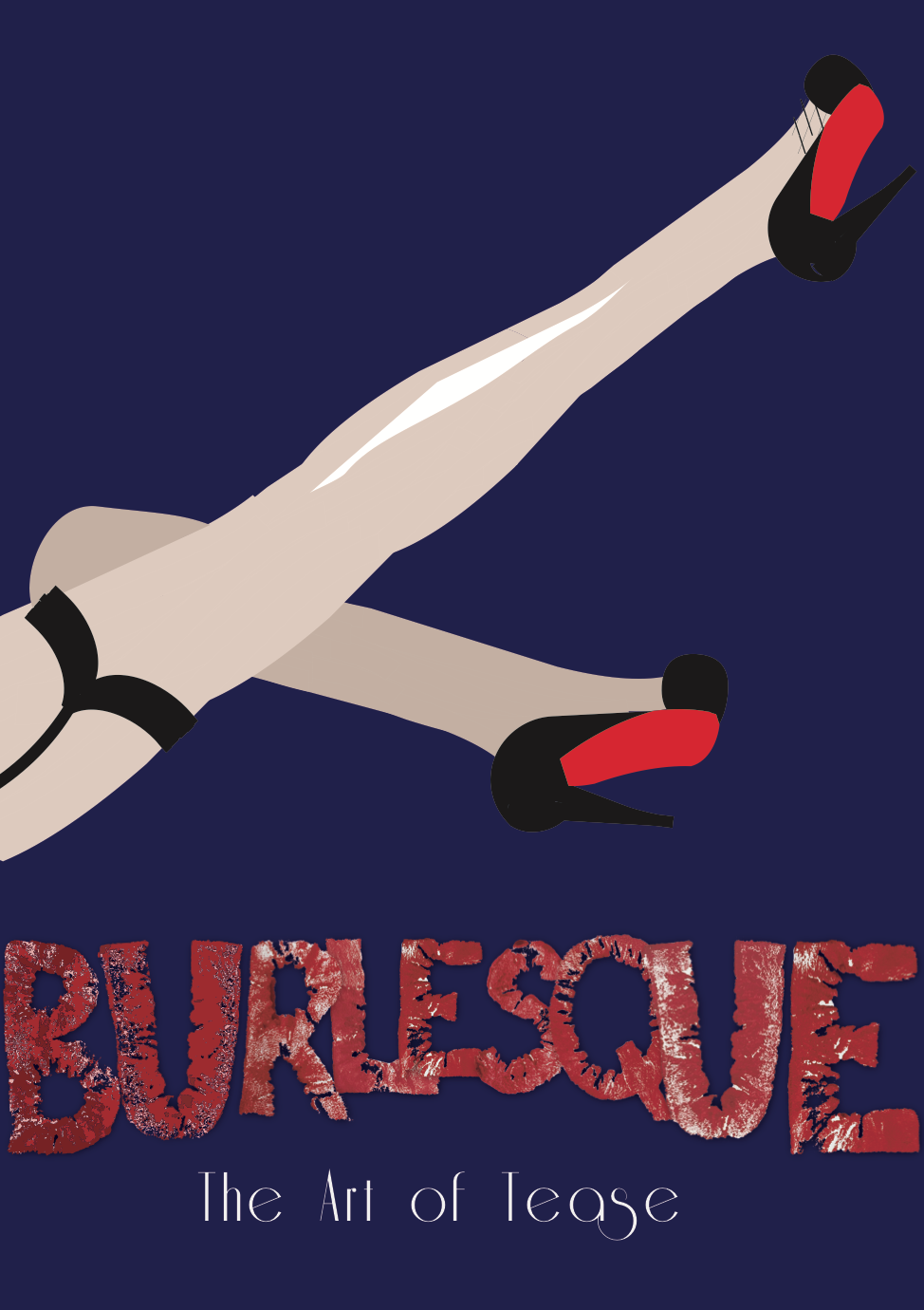
It was a very very tedious process and wasn’t easy but I did enjoy it nonetheless because when the results eventually showed through my work, I could really see the shadows and the rounded form of the leg, and it was satisfying.

This took me more than 6 hours straight definitely. But as I wanted to make it into a series of 3 posters, I continued with other elements of Burlesque, like lips and corsets.

I also used a spotlight effect for the background as I wanted something simple but could convey the message of it being a show poster, so it seems like the spotlight illuminates the feature points of what you will see at the show.

Process:

References:

FINAL

“In The Style Of” Final Assignment and Essay

“In The Style Of”

Final Assignment and Essay

History of Photography

DP2002


“Comparison of two Japanese Photographers in the Avant-Garde and Surrealist movement”

By Naomi Tham

U1630775F


The period between Meiji restoration in 1868 till the end of World War II in 1945, was known as the modern era of Japanese photography. This period saw an increase of focus towards the external world, direct photography techniques and larger ranges of subject matter.


The modernist movement of the late 19th century then preceded to focus more on the representations of reality, and also brought forth the various pursuits of experimentation. It resulted in the discovery of depicting new ways to show a photograph, bringing out exciting new realities presented.


In Japanese photography, these experimentations were done under the rubric of New Photography also known as the Shinko Shashin movement. One of the photographers I’ve chosen for my essay is Nakayama Iwata (1895-1949) who is regarded as a one of the most important contributors to this particular movement.


After graduating from the Tokyo School of Fine Arts in 1918, he received a scholarship from the Japanese government and went to California before settling in New York. At that time Nakayama was attracted to avant-garde movements and returned to Japan in 1927, bringing home his own vision of ‘pure art photography’. In 1929,  he settled in Ashiya and founded the Ashiya Camera Club with other photographers. This club became the main driving force of New Photography in Japan. New Photography based itself on the teachings of Laszlo Moholy-Nagy, Man Ray, Alexander Rodchenko and other photographic experimentalists. Nakayama gave a new expression to portraits, townscapes, still-lives, nude-studies, photo-montages, and theatrical shots experimenting with photograms, photo-montages or the use of obtuse angles, distorted reflections and time-lapse exposures.

Woman from Shanghai, 1936

Taken the year Japan invaded Shanghai, this photograph is dark and rather mysterious. The woman is smoking a cigarette. Her face is mostly cast in the shadows while half of her face and the smoke of the cigarette is highlighted. Given the time period this photo was taken in; it has been theorised of having an undertone of repressed fear.
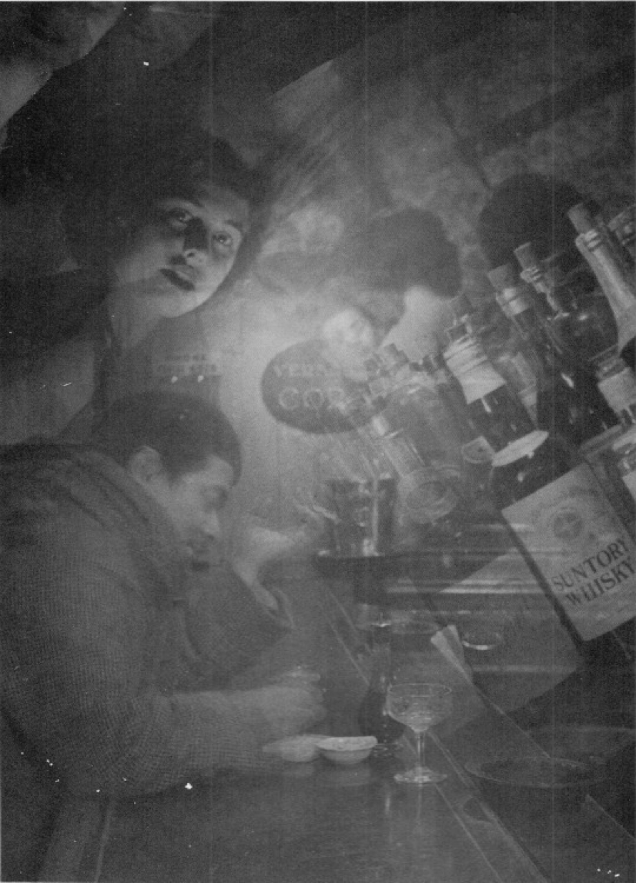
Iwata Nakayama – Night, Wine, and Lady (1933)

One of the key concepts that I found fascinating was the invocation of the feeling between reality and dreams that comes through from his photographs. I often have very vivid and realistic dreams that I wake up to feeling extremely perplexed as to what my reality actually was. Friends who spend a lot of time with me would also notice that I have very frequent and elongated déjà vus. All these constant personal battles between my own conscious and subconscious made me very excited to try and personify them in this assignment, and to somewhat emulate Iwata Nakayama.

I was experimenting with multiple exposures but I couldn’t exactly get the exact results I wanted so I turned to Photoshop to help manipulate this piece. I shot my friend over dinner whilst he was having a conversation, and I really do enjoy his expression in this photograph. He looks rather perplexed in this photo and does have the sense of wanting to speak his mind. I wanted to piece multiple of his expressions together to create the story of a conversation one often has with oneself. A piece of self-reflection in one’s head, if you will.
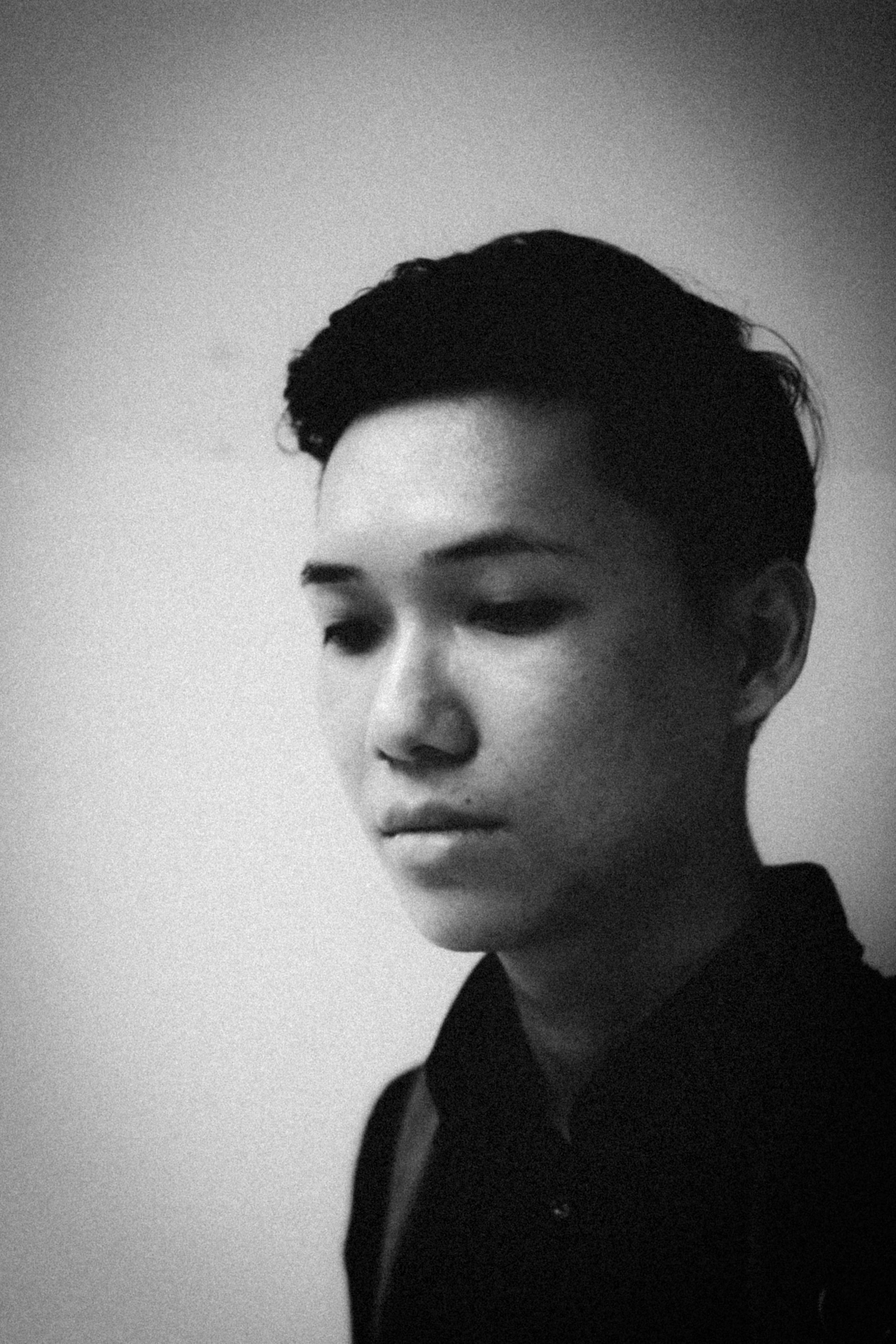
Having really enjoyed Iwata Nakayama’s Woman In Shanghai, I was thrilled to have recreated that same effect with one of my guy friends, titled Man In Singapore. This photograph was taken when we were walking along the streets, trying to take photographs but was interrupted by rain so we had to promptly seek out shelter nearby. We were waiting for the rain to stop so that we could continue shooting and I quickly shot this when he was looking at the rain falling towards the floor. I recreated the dark and moody setting to emulate how we felt about the constant rainy weather of Singapore these days.
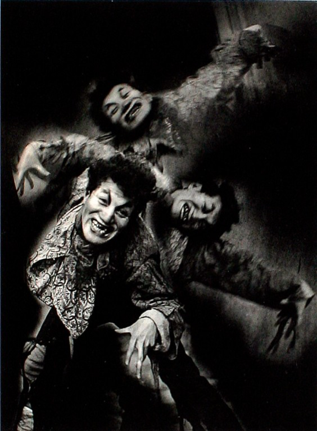
Nakayama Iwata – What of it? -1937- gelatin silver print
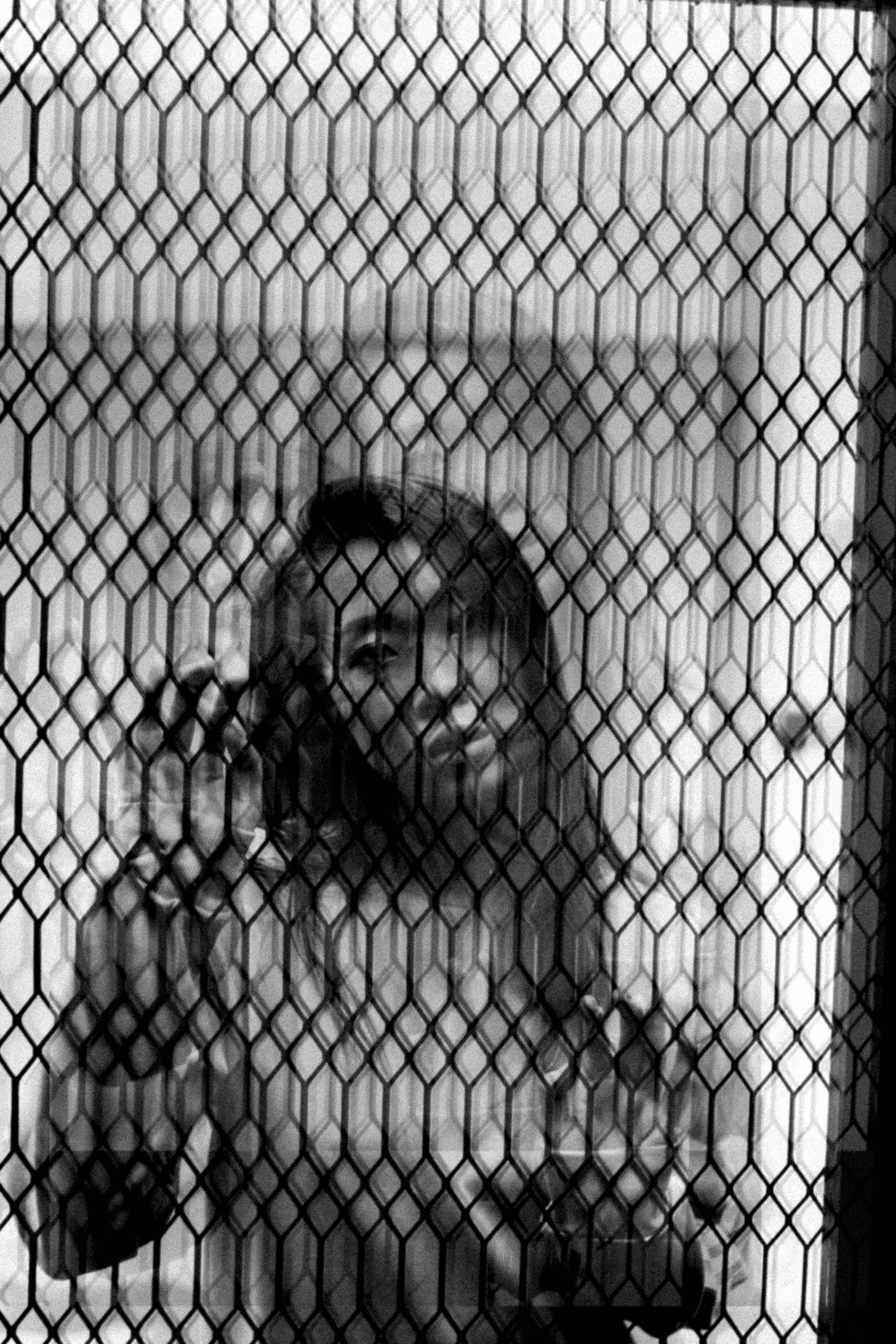
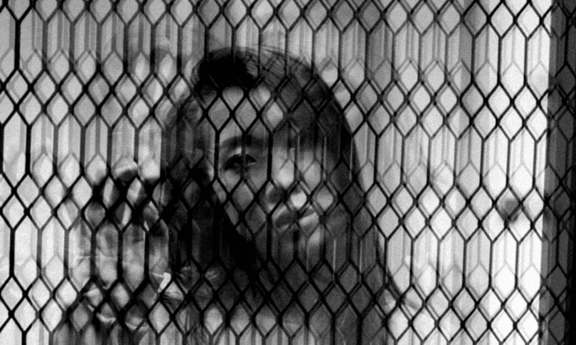
Finally, this is a self-portrait of myself depicted “behind bars”. I love the effect of the multiple duplicates of the photograph because it brings around a different design of the grill altogether. It creates a very lovely constant texture over the photograph and is juxtaposed by the subject matter that is cast in shadow of the grills. I would read the photograph as an expression of myself being cast in the shadows of societal judgements and wanting to escape that. Or it could also represent my subconscious wanting its freedom. With experimental photography, the possibilities are pretty endless.


Which brings me to my comparison artist, Terushichi Hirai, who was also a prominent Japanese photographer whose works were also produced within the same period as Iwata Nakayama. Although using different mediums as Nakayama, his photographs were also extremely imaginative, illusionary and surrealistic photography and he utilised photomontages and color painting on prints.

zero focus: Terushichi Hirai, Fantasy of the Moon, 1938.

Terushichi Hirai. Fantasy of the Moon, 1938
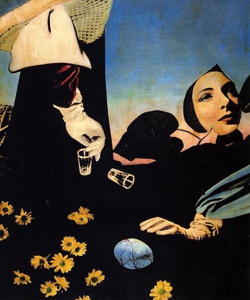
Image result for terushichi hirai life

Terushichi Hirai. Life, 1938


I feel that there are more similarities in the two photographers than differences. Although there is an obvious difference in the mediums they both used to produce their most prominent work, there is the deeper similarity between how both parties wanted to depict their idea of reality. To Iwata Nakayama – even though he was largely known for his beautiful portraits – I can feel that he wanted to express his ideal reality and his imaginative spirit into his work. That is done with the constant experimentations of photography mediums, techniques and composition. In which case, Hirai Terushichi, also did the same thing. Having found his ideal medium of photo collaging, Terushichi also stitched together images that he found to represent his reality and composed them together like a photograph.


Ultimately, photography to me is expression and I find it so wonderful that two photographers who wanted to create the same goal of achieving pictorial representations of reality could come up with photographs so drastically different yet meaningful to each of them at the same time. It goes to show that history of photography could indeed be time markers of events, emotions and overall vibe of a certain time and place if one looks hard enough.


Bibliography


Tucker, Anne. The History of Japanese photography. Yale University Press, 2003.


Rubenstein, Meridel. “Modernist 2: Experimental Photography” Presentation at History of Photography at Nanyang Technological University, Singapore, October 2017.


“Nakayama Iwata – Modern Photography.” The British Museum. Accessed on 12 November 2017.

http://www.britishmuseum.org/research/collection_online/collection_object_details.aspx?objectId=3191642&partId=1&people=116215&peoA=116215-3-17&page=2


Phillips, Richard. “Two Master Photographers from Japan” World Socialist Website. 9 October 1999. Accessed on 12 November 2017.

https://www.wsws.org/en/articles/1999/10/phot-o09.html


“Terushichi Hirai” Revolvy. Acecssed on 12 November 2017.

https://www.revolvy.com/main/index.php?s=Terushichi%20Hirai


Typography I: Project 3A, 3B, 3C

Project 3A: Typography as Image

As I read the brief wrongly, I thought we could do something more conceptual so I took one of the scenes from my favourite movies ‘Closer’ and used text to incorporate the character’s quotes from the movie to form the outline of the image.


So after an E-consult with Shirley I realised that I did it wrongly so I quickly adapted to the proper brief. But it’s still a little different as I realised we could cut up the font. I just wanted to include what I did because it is a little funny hahaha.

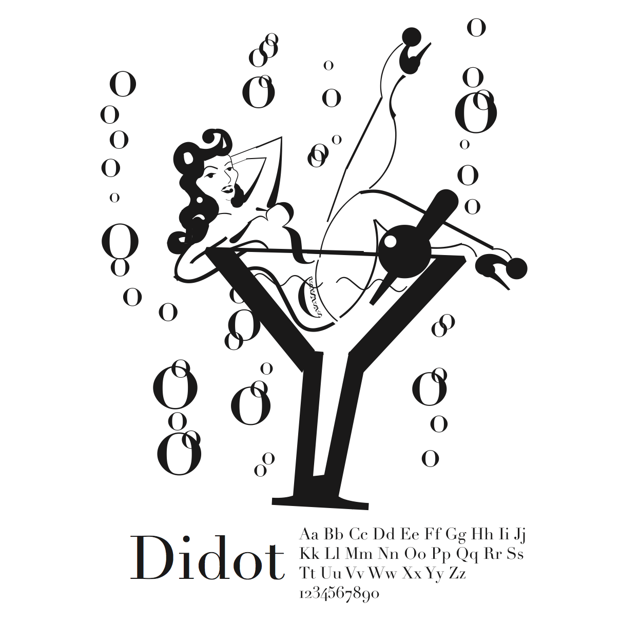
I chose this image as I could visualise using the different fonts to form the image like ‘Y’ could be used as the martini glass.
Work In Progress:

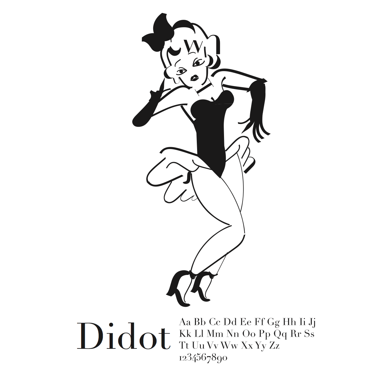
So eventually I finally caught on to the brief and this was what I came up with. I laid out the font choice on Illustrator to reference back and forth on the anatomy of the font to pick out the parts to use to form the image.

This was pretty straightforward (even though it took me soooo long to do it hahaha) and I enjoyed this project a lot because even though it was tedious, it was fun to pick out the parts of the anatomy of fonts to form the image.

I used the font ‘Didot‘ because I feel that the font has a great contrast between the thick and thin strokes and it would be better to use it to form the curves of the ladies in the images. And also, I was very inspired by Burlesque imagery after watching the Crazy Horse show.

FINAL


Project 3B: Typography as Pattern

One of my biggest struggles was Type as Pattern as you can see from my experimentations.

I thought we were supposed to use the whole font of the typeface to form the patterns so these were the first two I tried out using ‘A’ and ‘I’ respectively to create repeating patterns.

But after consult with Shirley, I realised that we were supposed to cut up the anatomy to make the type unrecognisable.

So these 3 are fonts cut up that I was experimenting with. It was soooo tough to get a pattern that I actually liked, all of them are pretty meh to me. This was truly the project that made me struggle with the most.

I also had difficulty figuring out which part of the font to cut up to make the basic shape for the pattern.

So I decided that perhaps I could use a reference image of a pattern to form using fonts.

So I pulled up this reference image to help inspire my design.
Using the letter ‘e’ and cutting it into half, I recreate the design and incorporated a few white overlays to make texture as well.

I chose to use ‘e’ because I think that there’s a certain direction to it depending on its positioning and it would be interesting to vary it to make the pattern.

For the other pattern, I was intrigued to use the tail end of the letter ‘Q’ because I realised that different fonts have very differing structures to that particular portion.

So I played around with it and created an ice cream swirl or snail shaped unit and duplicated it and played around with the positioning and scale.

In the end, I settled for a larger scale with lesser units instead of many smaller units. It kinda looks like a meteorite shower of snails or ice cream. And I also like how it has a leading line as well.

FINAL


Project 3C: Typography as Emotion

This is my type as emotion for the emotion: shy
Quite self-explanatory. Small, thin and hidden in a corner = shy.

This is my type as emotion for the emotion: Passive aggressive

I wanted to make it hidden because it’s passive yet bold and loud because its also being aggressive. Not sure if it is effective or not.

This is my type as emotion for the emotion: Distracted
Using all caps because it is constantly forgetting that it started out with a caps already. So every letter is the beginning of a new word that it wants to write but forgets because its distracted. Could also be forgetful?

This is my type as emotion for the emotion: seductive
I wanted to emphasise the HELL in Hello, if you try to imagine it in a seductive voice it will kind of waver as well.
Like: “well, HELLo there ;)”
I then realised that I was working on some emotions that were not mentioned in the brief so I had to change and adapt a few.
But I wanted to keep to this clean and minimalistic outlook to challenge myself to communicate emotions with just the font. And I used Arial as there are a few variations of the font (like the weight) to play with.

FINAL

To me, annoyance is rolling your eyes and saying ‘pppftt’ and then accidentally on purpose cause something to annoy the person back. I used Arial Narrow to make it very thin, and flipped it around at a weird angle and also reflected it such that when you look at the word at any angle it would still not read the way that we are used to. And I also made it such that it sits randomly within the space and very near the edge of the page (so that people would feel annoyed that its so near the point of being cut off).

For seductive, I imagine a sexy wavy voice coming from a corner from a dark room. So that’s what I did with the font.

I put it in a dark background and created a wave using differing baselines. I also used Arial in Italics so there’s an accent to the word thus emphasizing the sultry voice of the font.

As for depressed, I used Arial Bold to make a very heavy weighted font. I also increased the kerning so that it would fill the entire bottom of the space. I didn’t make the space black because to me depression is a dark emotion in the midst of a happy space. And it is cut off at the bottom because the ‘hello’ is sinking deeper and deeper into nothingness.

And finally for confused, I used varying styles of the font Arial like regular, italics and bold to convey confusion. And I also flipped and rearranged some of the fonts to read differently from how it’s usually read. And its also scattered randomly to convey confusion as well.

Overall I didn’t exactly enjoy this project because of some of the struggles I had and it was very frustrating and time consuming but I do agree that there are some important takeaways about how we can use fonts for so many other purposes other than communicate text.