Roots of our Origin was first inspired by intricate designs of paper cut designs which eventually sparked interest with the play on shadows. As there is a purposeful intention of raising awareness on consequences of waste and pollutions, the depiction of a deciduous tree at its maturity state where leaf are not present shows the tide it needs to turn just to survive through seasons after seasons. This is a symbolic representation of Singapore as we head towards our ‘Fall and Autumn’ seasons as we find ways towards Zero Waste! The shadow of the leafless tree aims to serve as a haunting reminder by hinting on what might bode for the future if nothing were to be done about this burning issue of wastage.
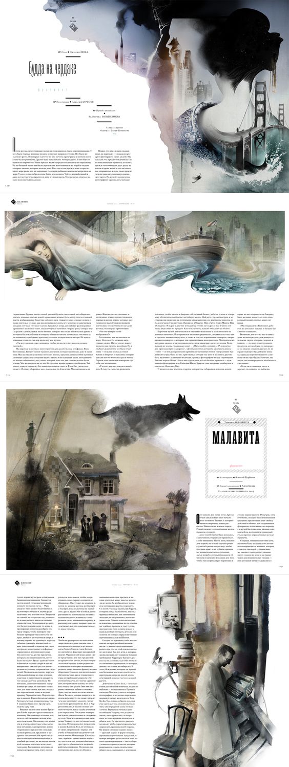
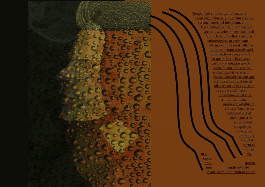
There were many composition that looked really attractive but did not suit the story and mood that I was trying to create for my Zine, thus I had to be exceptionally selective on using a referencing Layout for my spreads. I eventually found it in this sample below.
Despite the language, there is something about its imagery that screams a certain solemn feeling for me which caught my liking and was a direction that I wanted to work towards to.
In addition, the way its imagery interacts between a spread was something that I believe I took reference from to include into my Zine to make 2 pages feel as one rather than leaving them as individual pages which I thought was a really important inclusion.
Mood Board
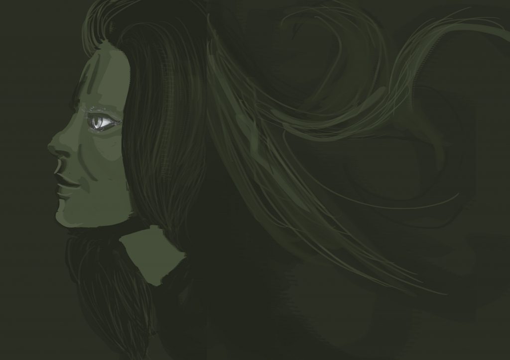
Working with illustrative portraiture art to try and capture the mood which is often done by photography was a huge difficulty for me but I sure as hell hope I did somewhat obtain the mood of the Zine and evoke a sort of feeling when people browse through it.
My choice of text took reference from this images which all used a somewhat ‘classy’ font which is a little similar to VOGUE’s Didot font. I eventually settled for the font –Bodoni.
Wasted Opportunity
Also, I would like to mention on how wasted it was for me to not being able to realize that I could have created my contents through photography and food styling on a model as I eventually aborted the last minute shoot 3 days before submission (amidst other submissions) as I thought it was a really huge risk.
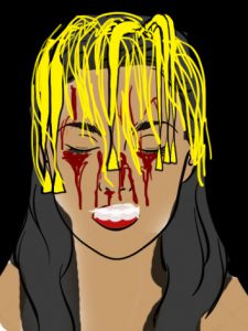
Quick Sketch of Bak Chor Mee Shot
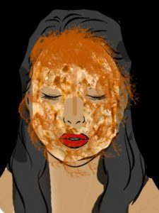
Quick Sketch of Ice Cream melting shot
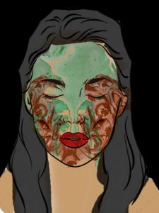
Quick Sketch of Prata Curry Shot
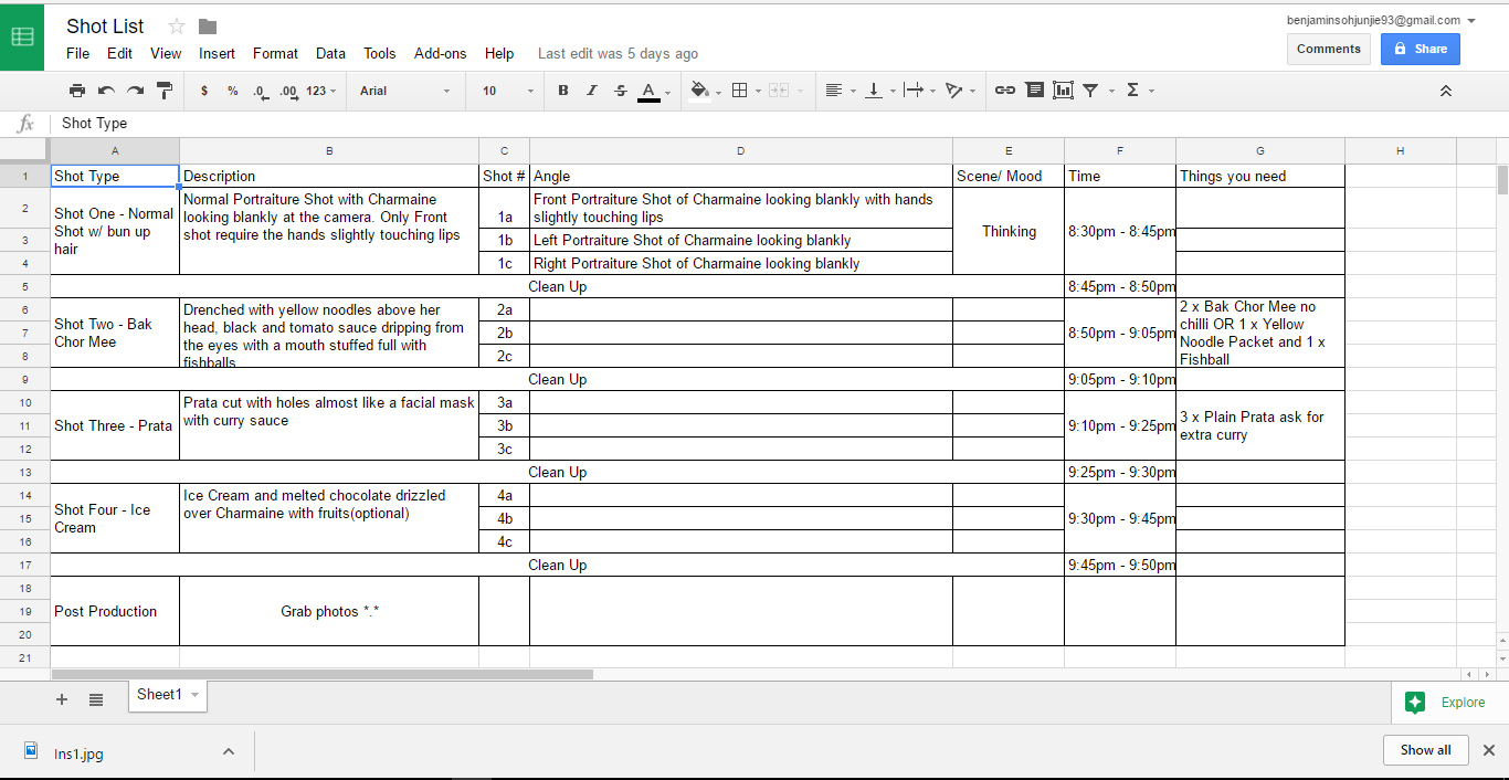
Here are some of the planning for the shots such as how to droop down the noodles, having fishball stuffed into the mouth of my model, how to cut the prata which look like a facial mask and many other considerations, which sadly, didn’t come to fruition in the end. Perhaps in the future since this concept is really interesting to work on in my opinion.
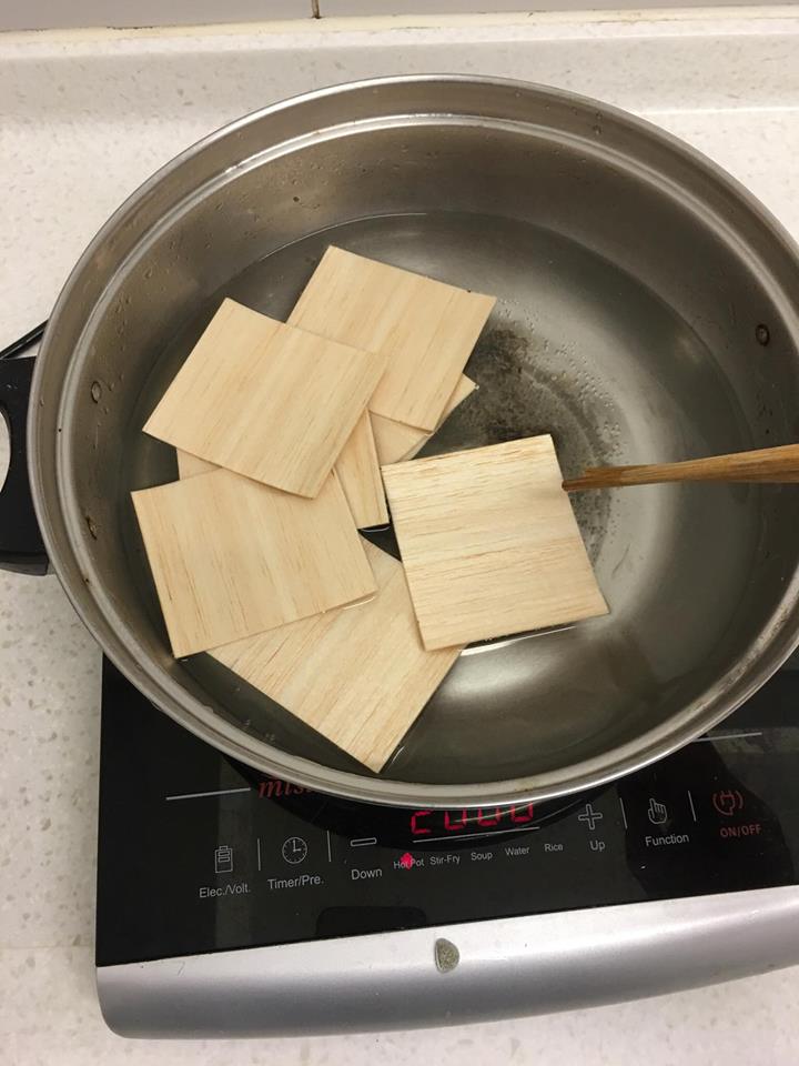
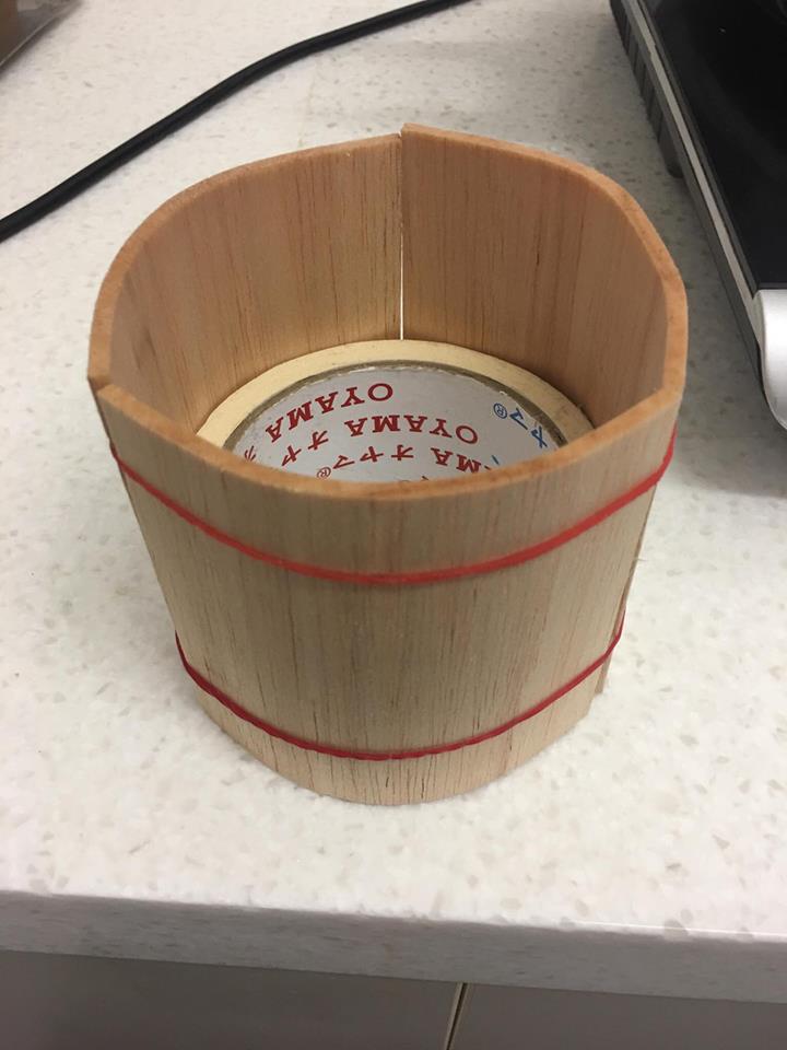
P.s – the pain of an art student, always spending so much money, I actually purchased some of the items for the shoot :'(
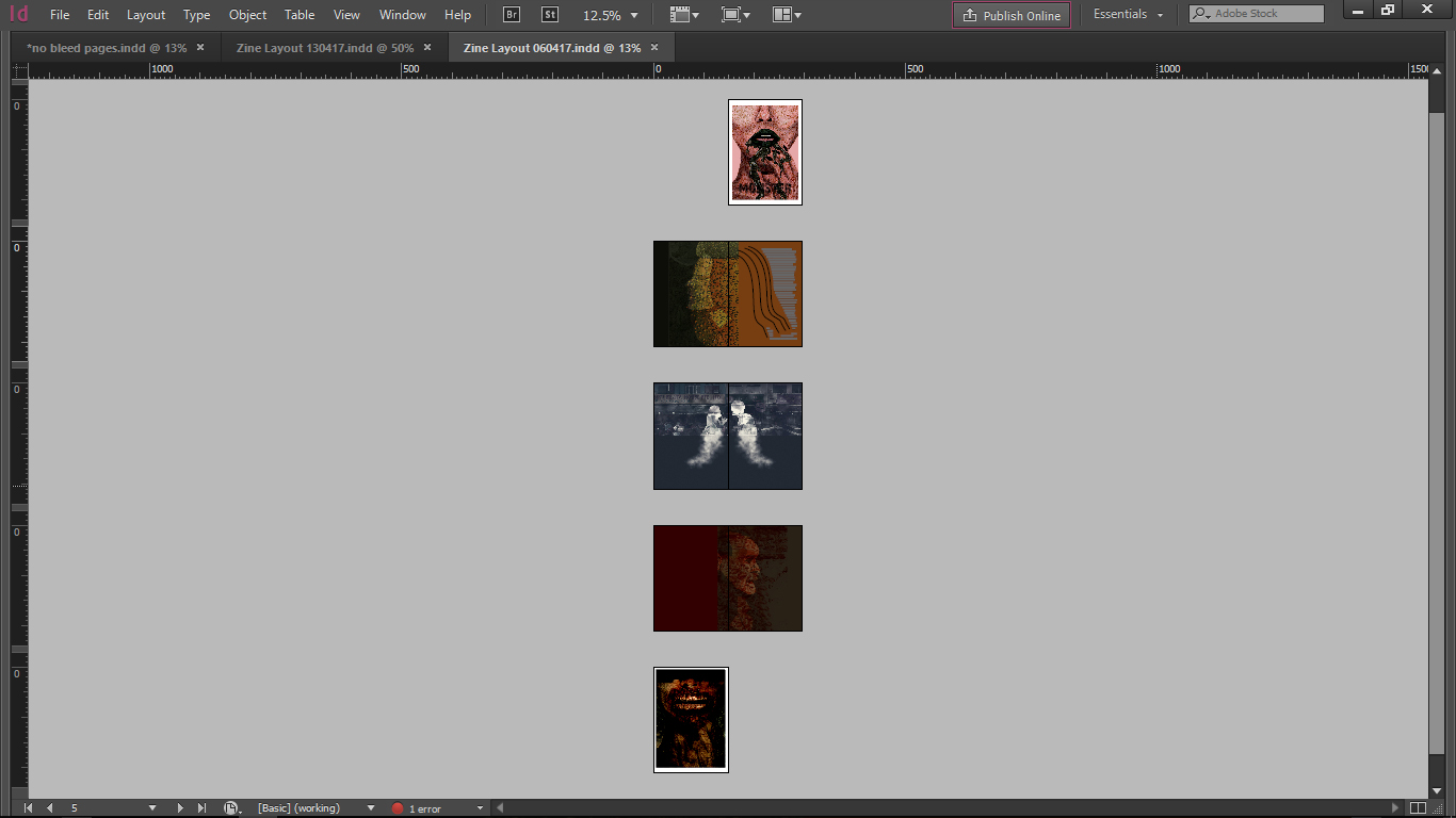
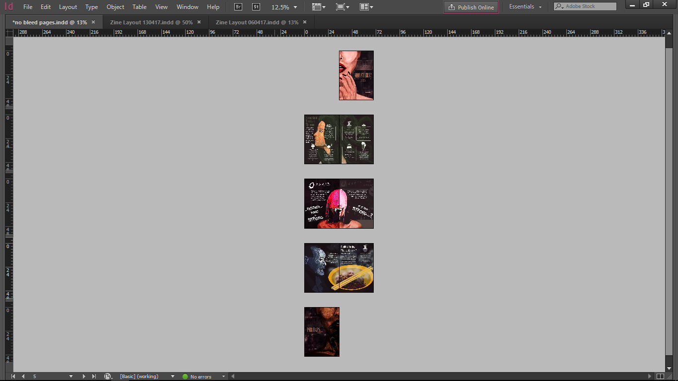
Changes from Initial Layout
Development of Pages
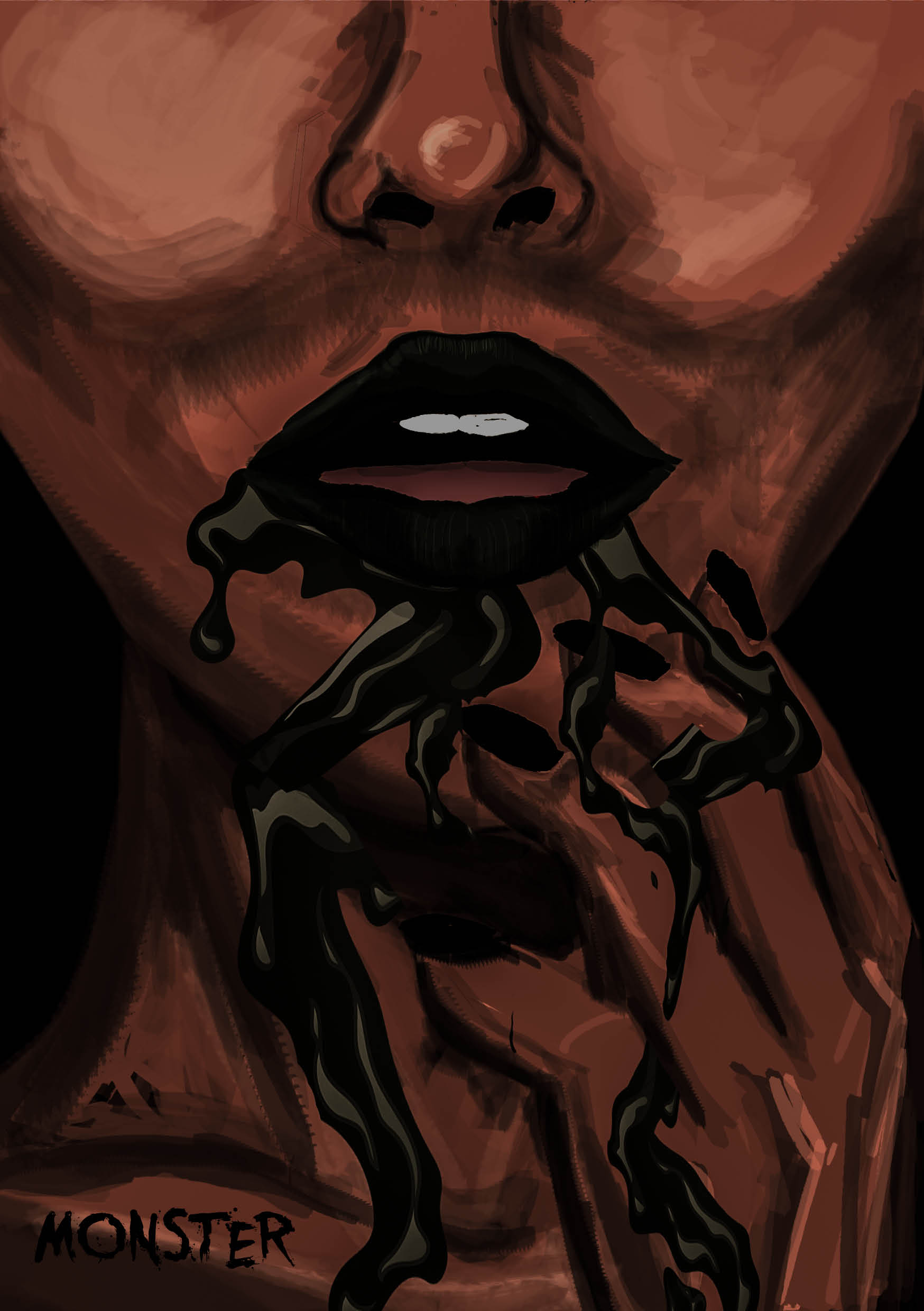
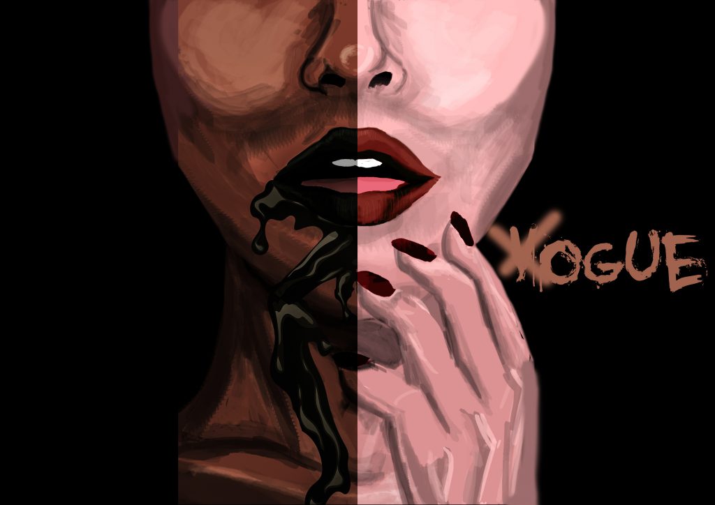
(First Spread – Page 1,8)
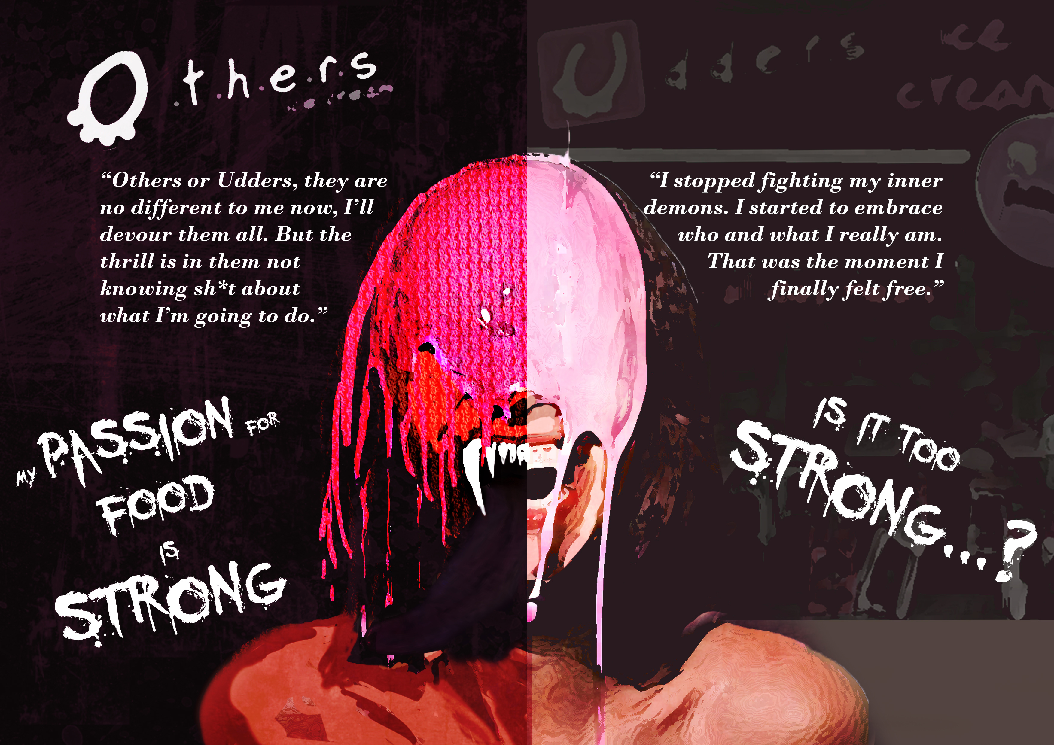
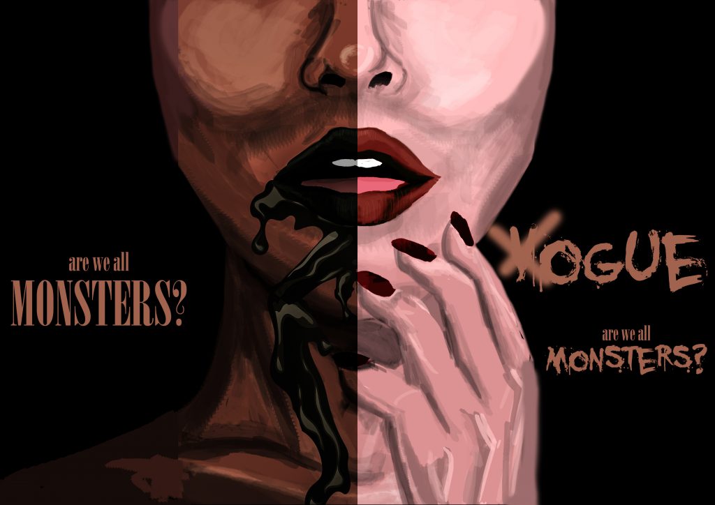
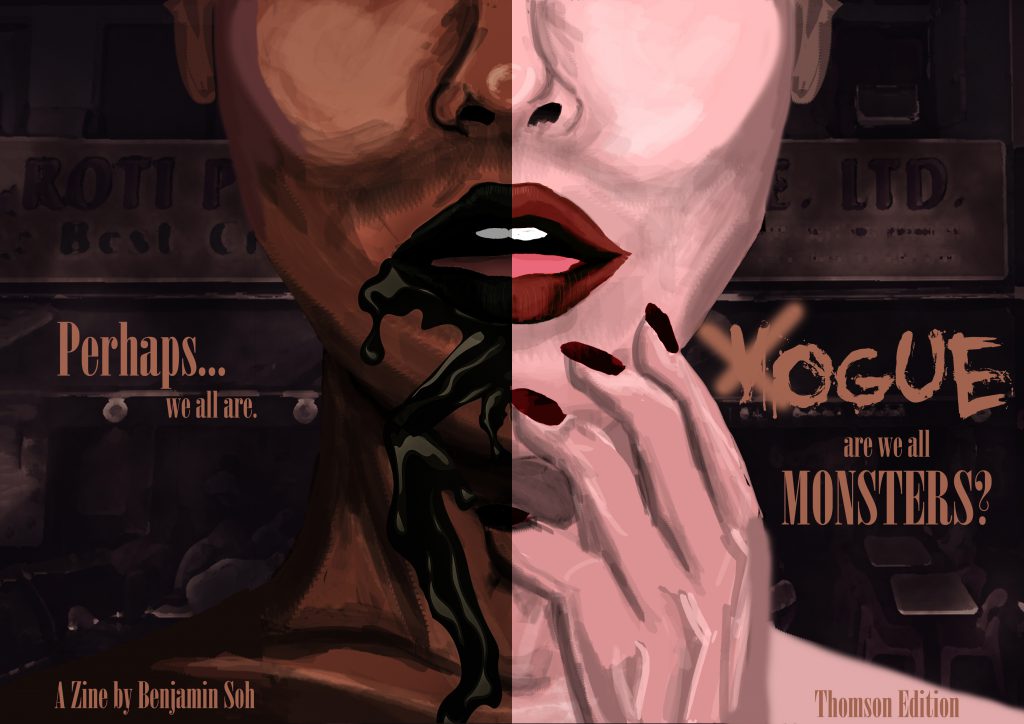
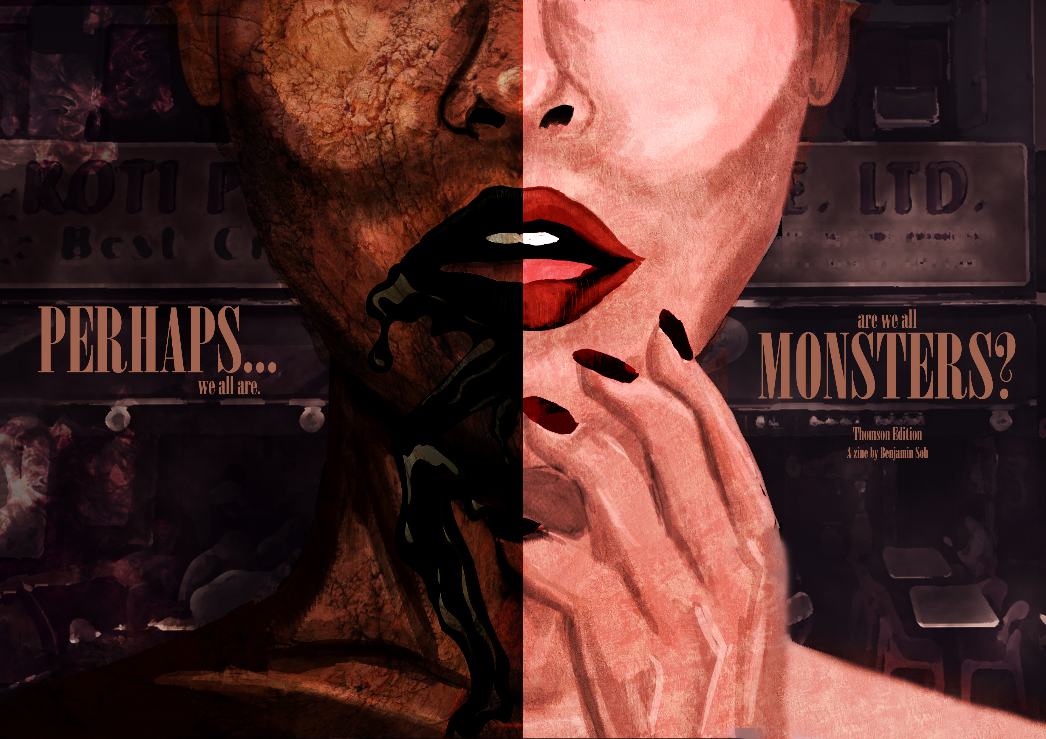
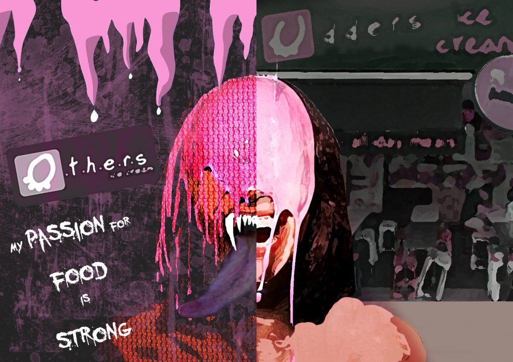
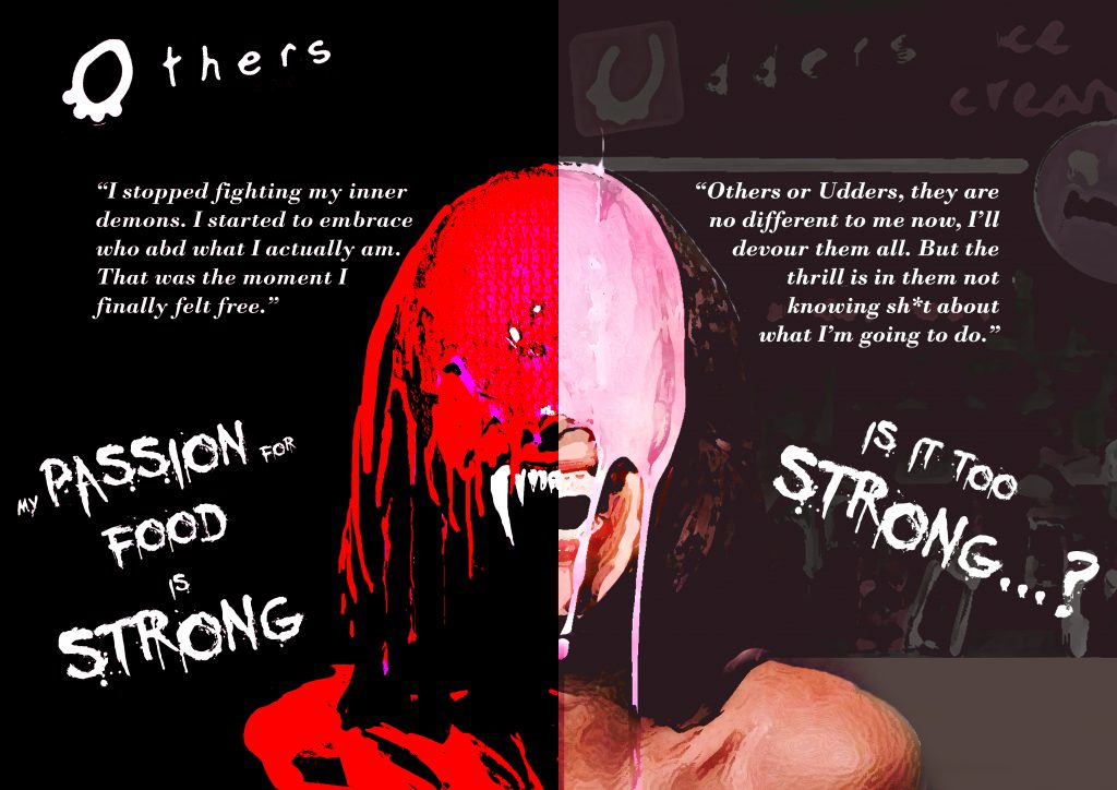
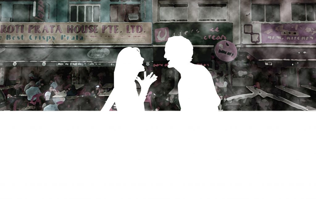
Imagery : The Questioning (Front) and Realization (Back) Moment
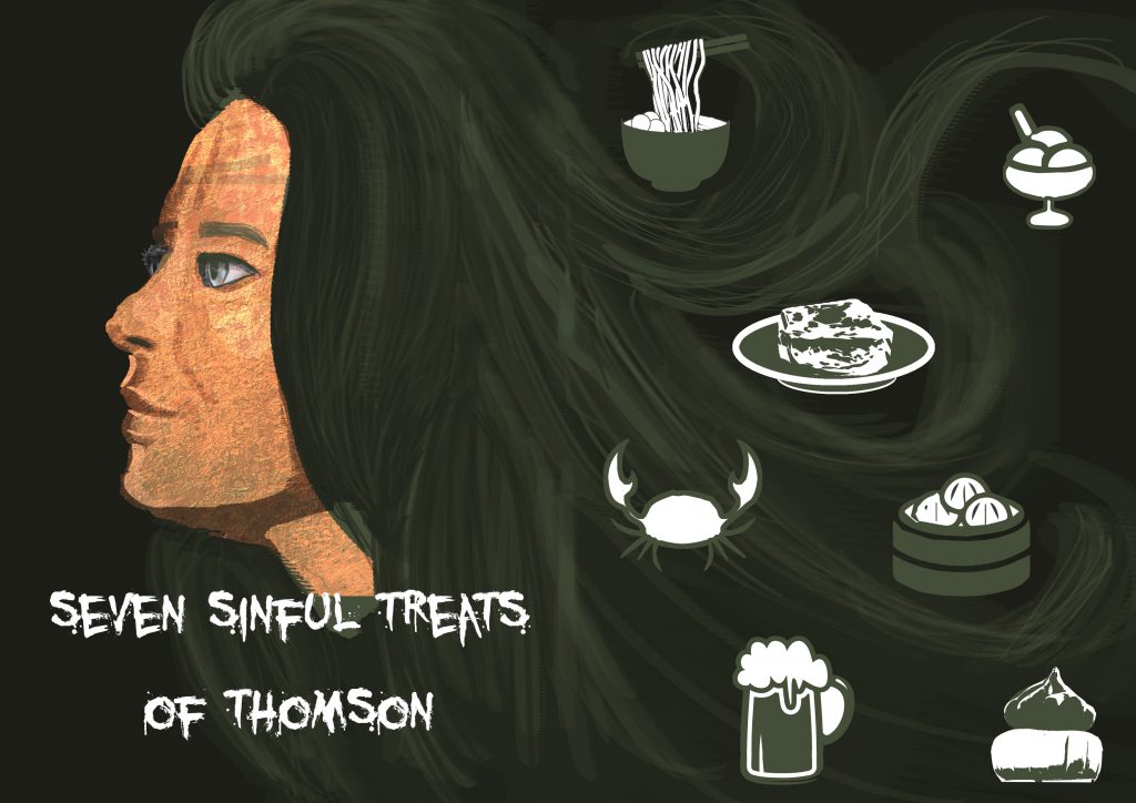
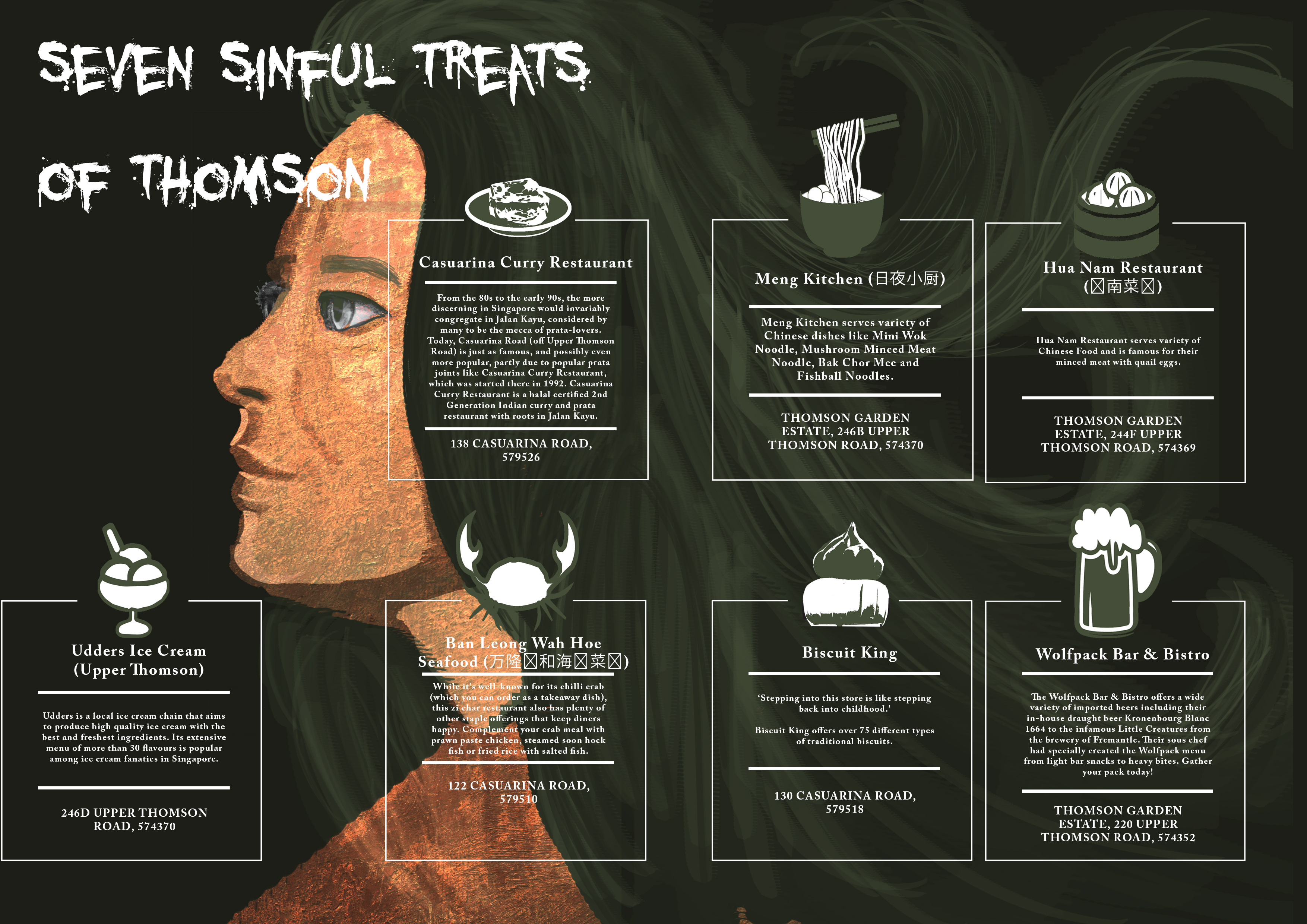
(Second Spread – Page 2,3)
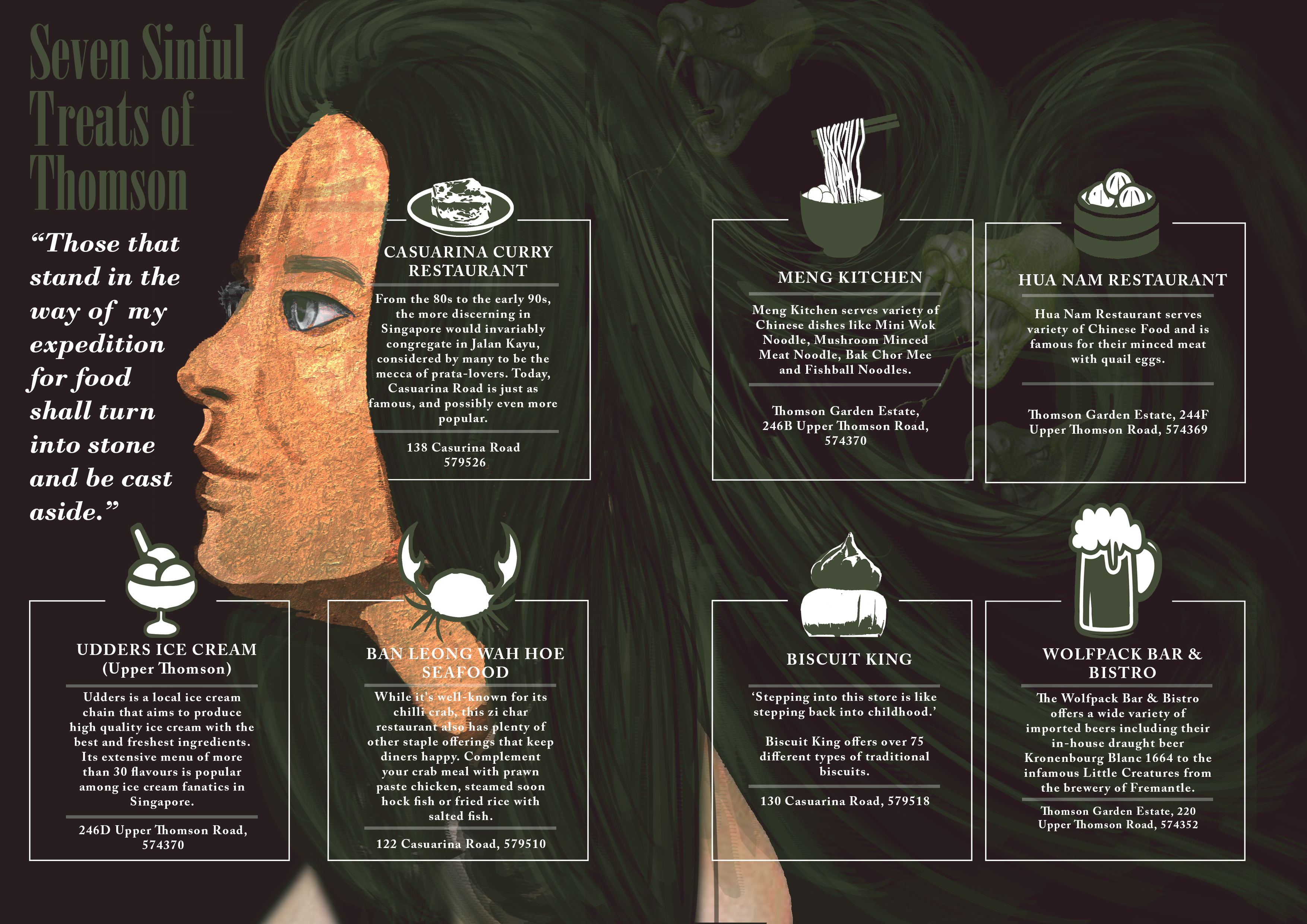
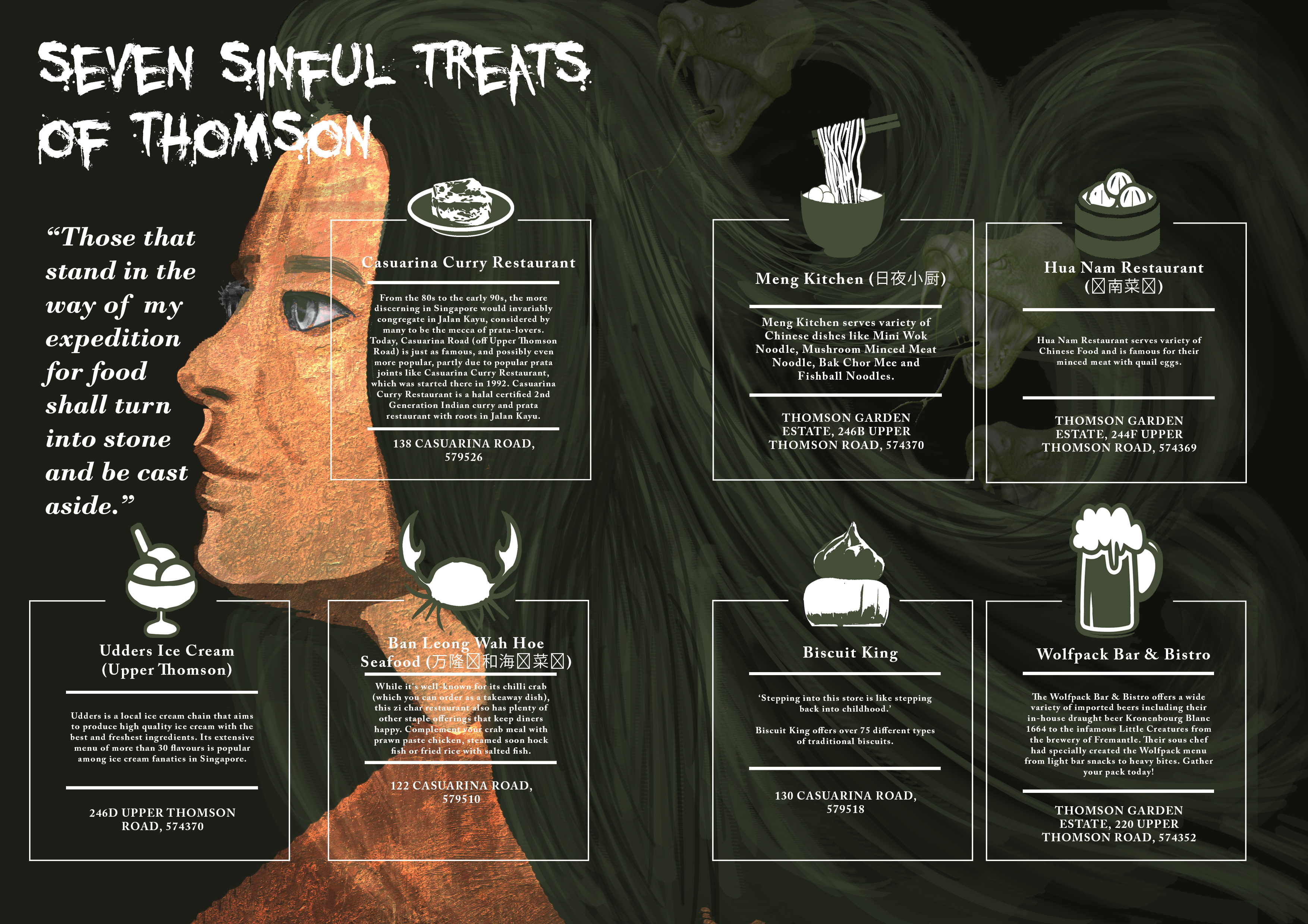
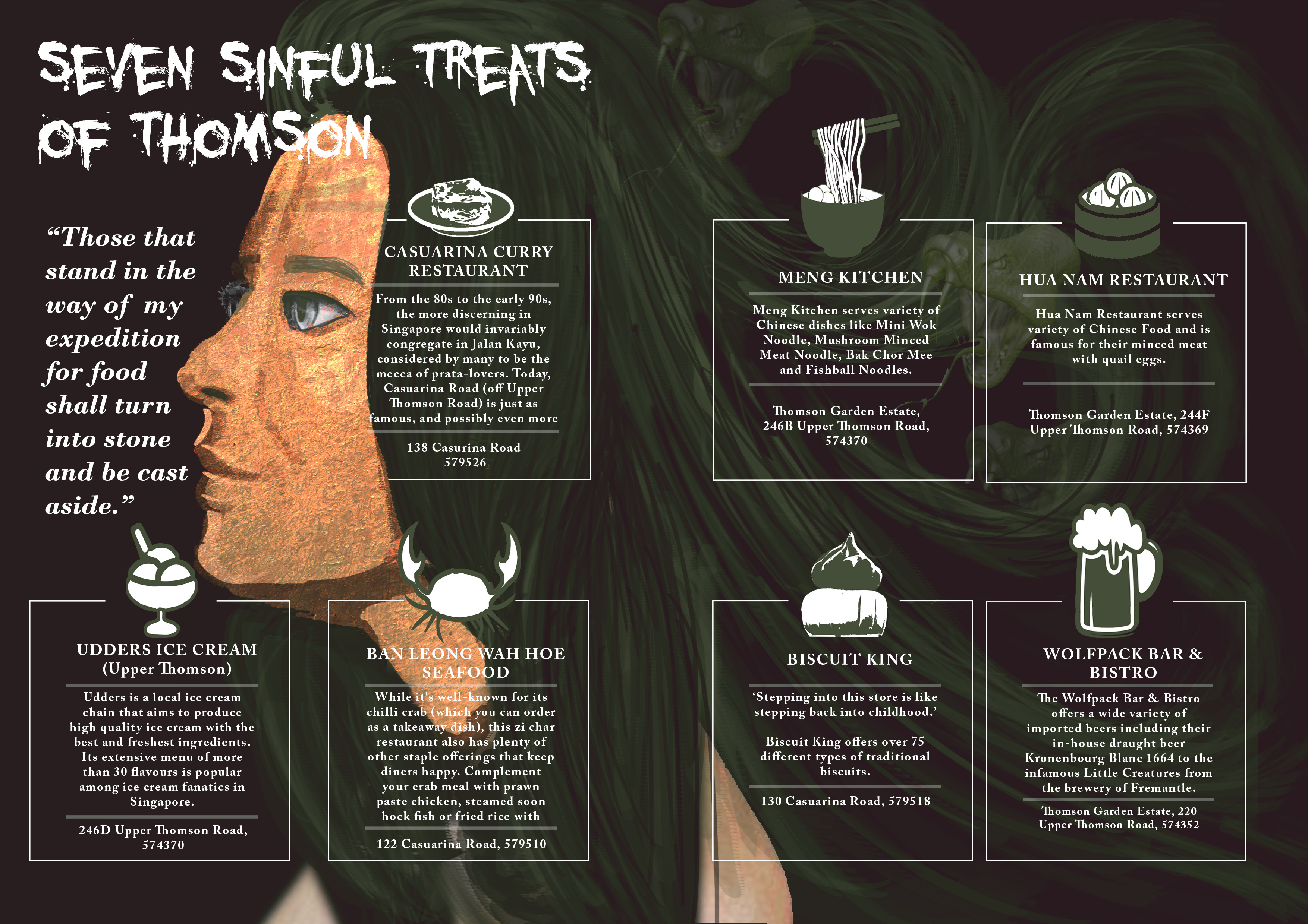
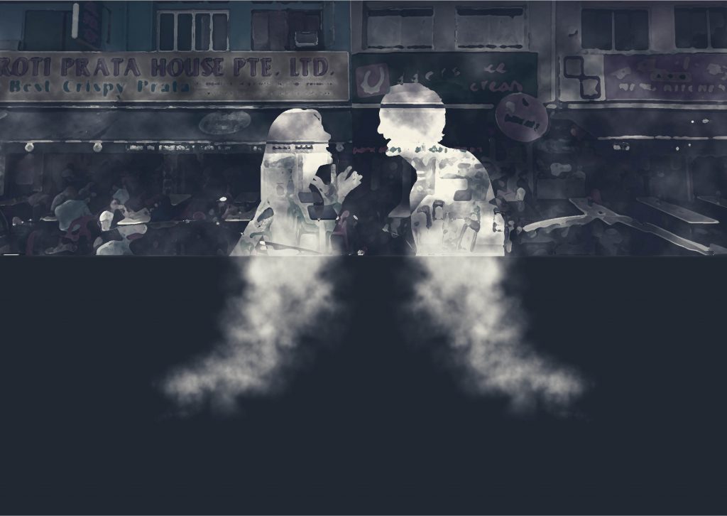
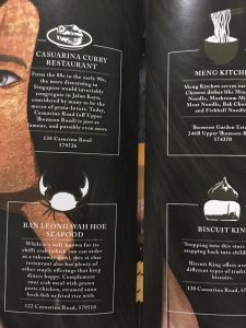
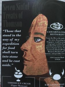
Imagery : A Medusa with each of her snake as a representation of the seven sins which in this spread context is the 7 food locations at Thomson.
(Third Spread – Page 4,5)
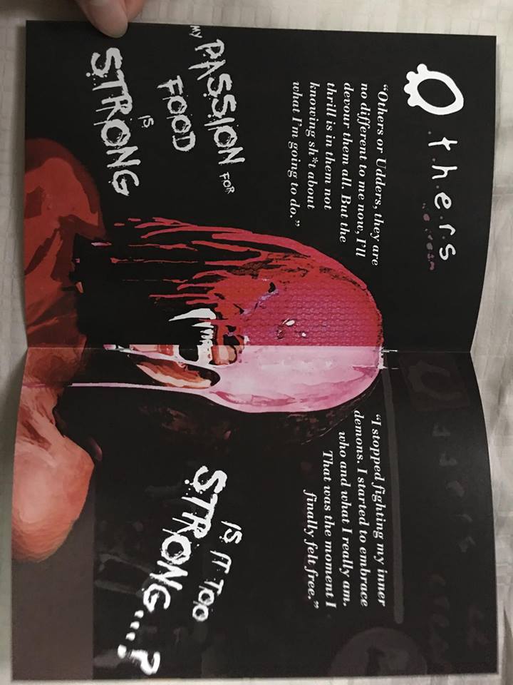
Imagery : An obvious setting of an angel vs devil illustration.
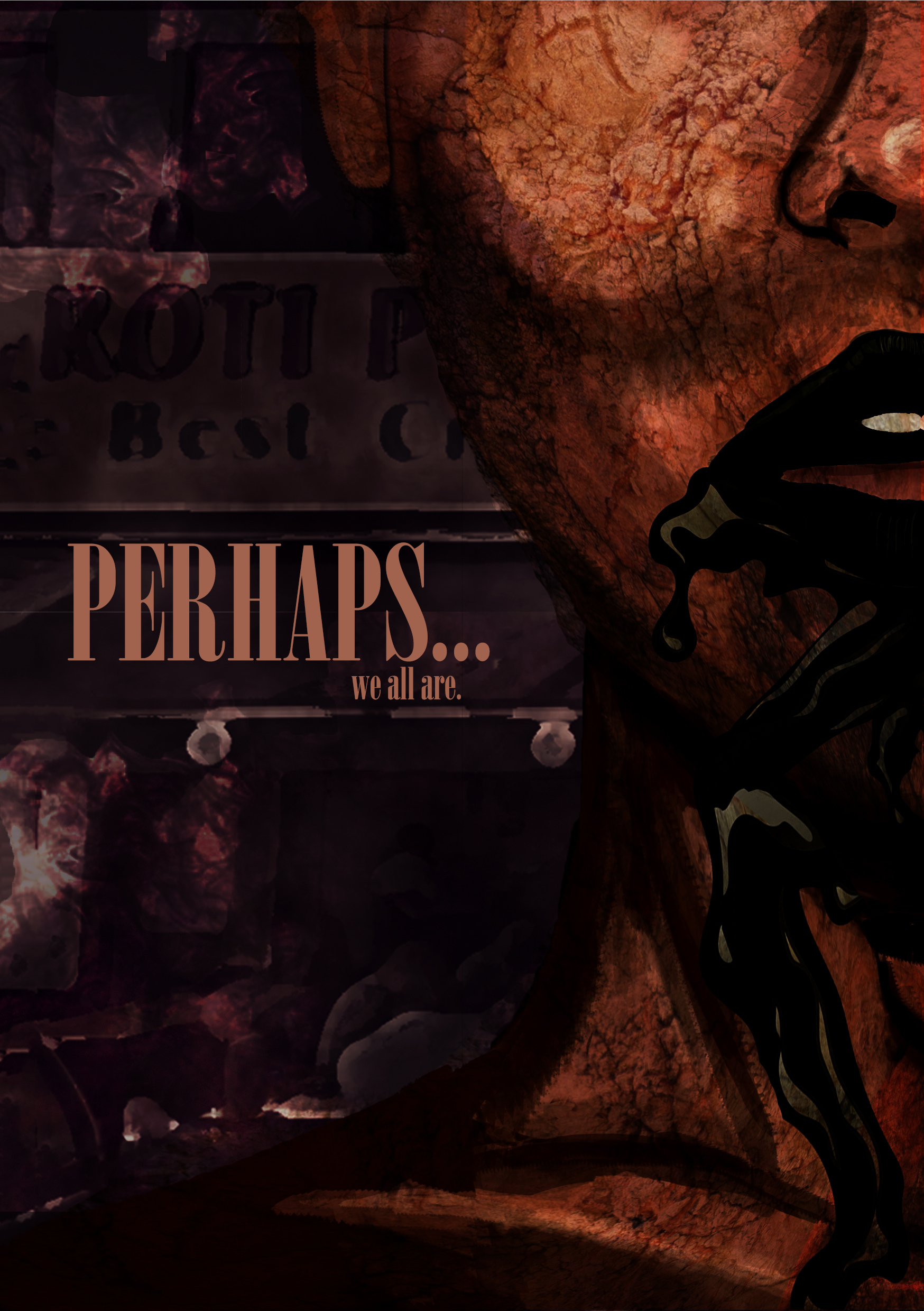
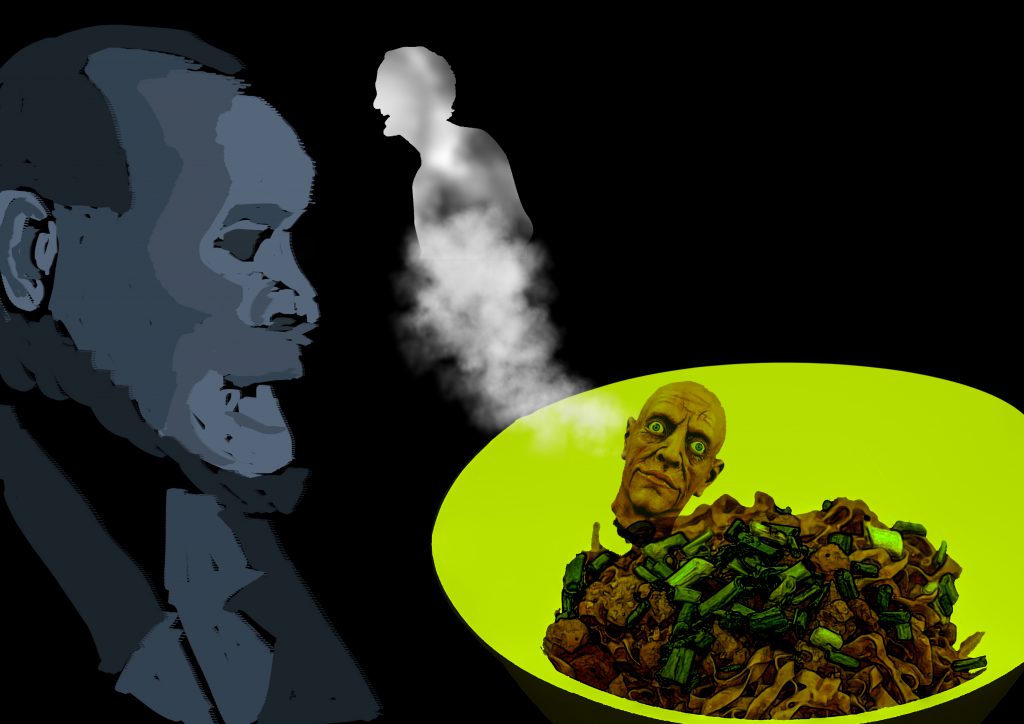
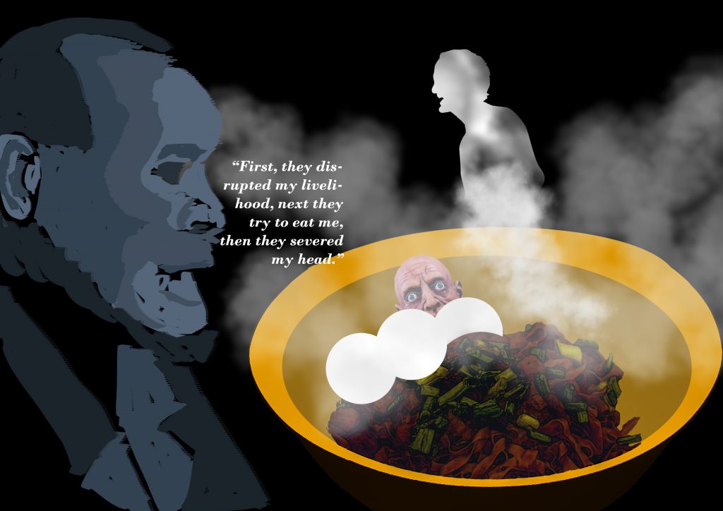
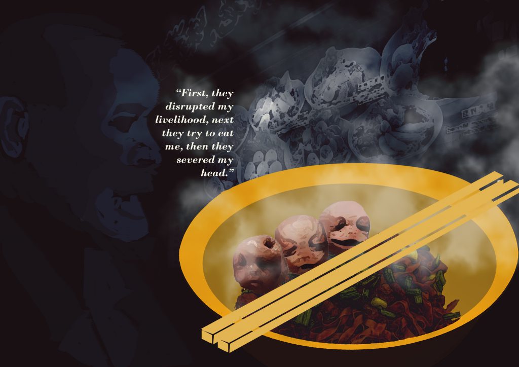
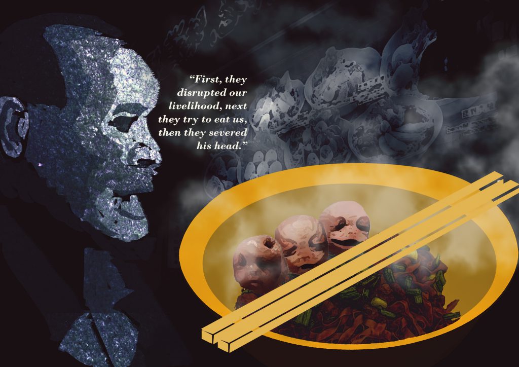
(Fourth Spread – Page 6,7)
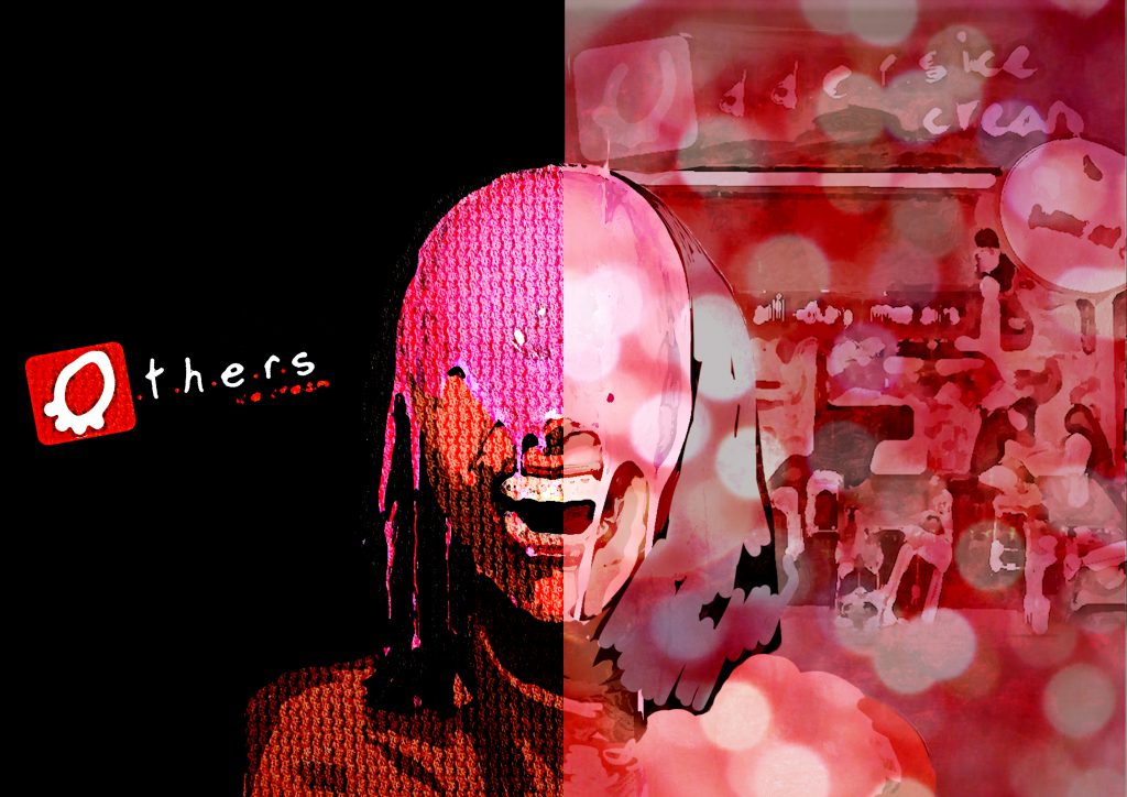
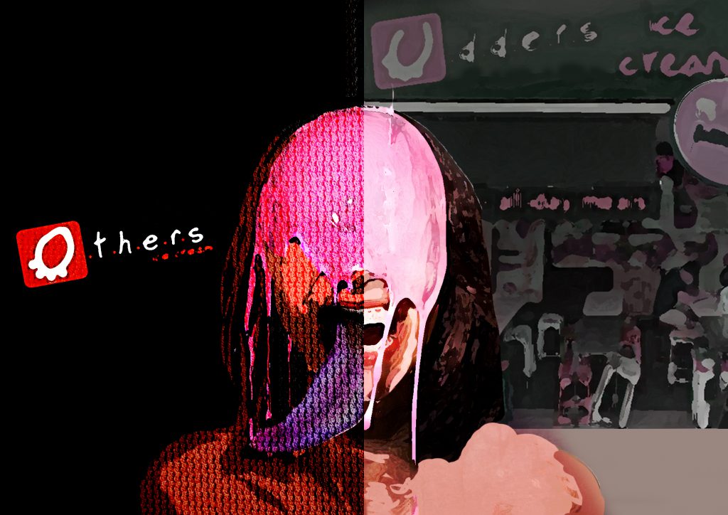
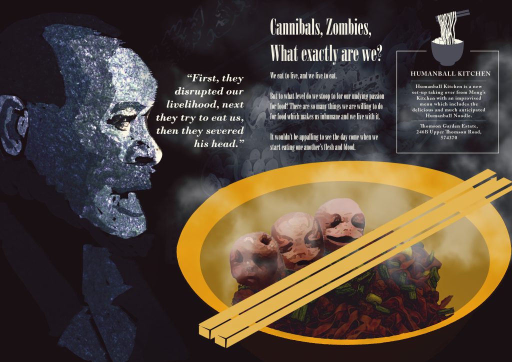
Imagery : The victimized of the uncanny situation of having human consuming human due to their huge appetite for food.
Reflection
In all honesty, I’m not a good writer nor do I aspire to be one(okay I actually do), thus I went ahead with a little of dark humor and irony and a huge load of imagination and exaggeration. A tongue in cheek approach as brought up by Mimi herself when reviewing my Zine.
Also, I should have chose this typeface and use it consistently, something for me to take note of in the future.
Print shop error in binding
Print shop error
Print shop cutting error
my worse mistake
Murphy’s law – Anything that can go wrong, will go wrong. That was the case on the day before submission at the print shop. I had my Zine printed over 5 times due to various reasons such as
over sized staples,
wrong alignment of paper when placed in printer,
having my print being cut off more than supposed to.
I have learnt once again that test printing and setting up your files ready for print isn’t as simple as it sounds as there are a lot of technicalities to take note of especially the settings.
And the most annoying mistake I believe I have made in this submission and perhaps the most amateurish one as well which was having some of my text done in Photoshop for convenience sake which led to the printout not having a crisp and full text but ending up somewhat rasterized/blurred!
Despite all the errors and regrets, I’m generally proud of the work I have produced as I have persevered and not second doubt myself on the unorthodox concept and worked towards a topic by using a method that was previously mentioned as risky to execute. Based on the general feedback from my peers, I do somewhat feel my illustrations did convey the mood that was achieved by photography and that is something I take really huge satisfaction from.
All in all, it had been a really long stretch of weeks with tedious steps and late nights to finally complete this Neighborhood Explorer Project aka as Zine. It had plenty of learning points for me to bring forward in not just my next few years in school but also further in my designing life.
FOUNDATION YEAR IS FINALLY OVER!!!! WEWWWWWWWWW!!!!!!!!
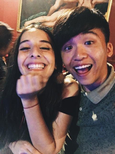
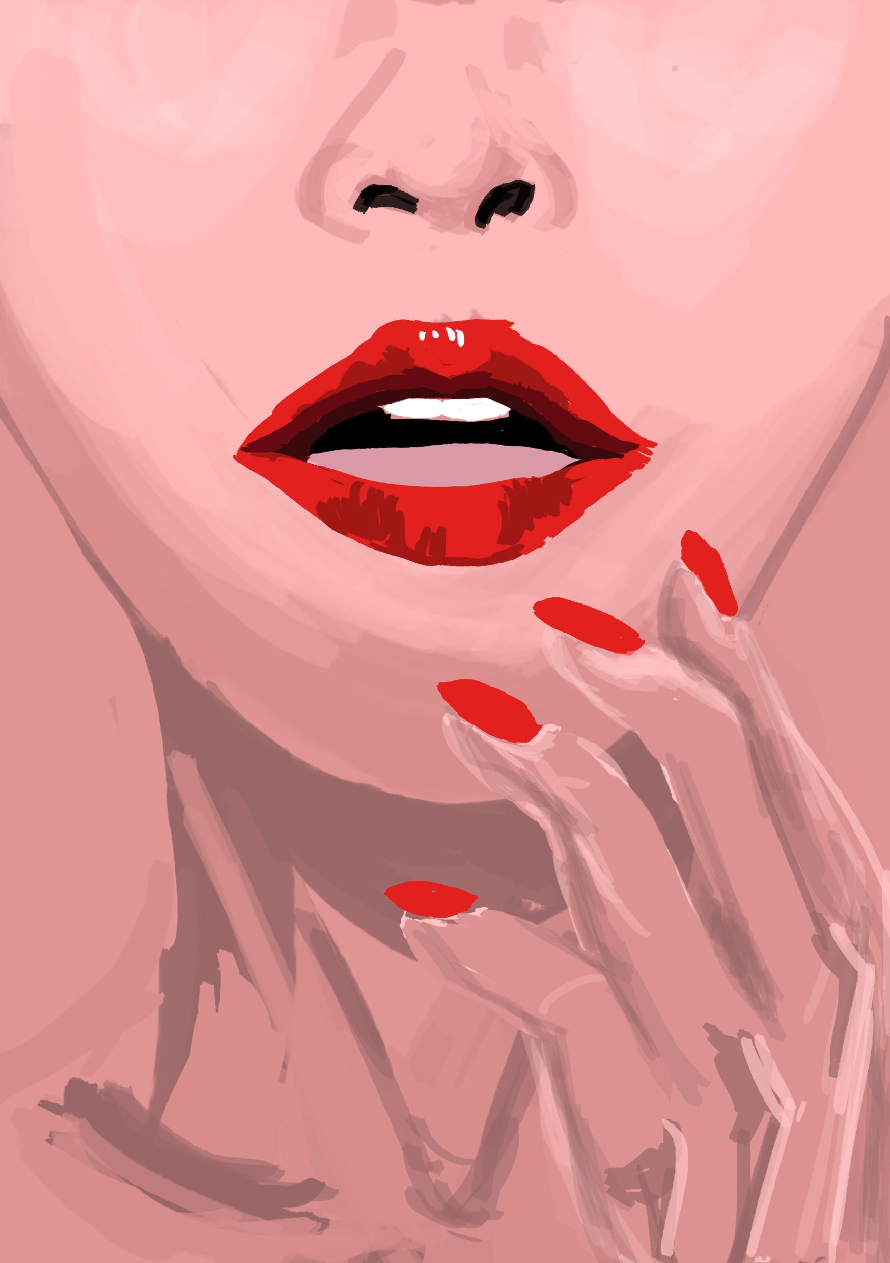
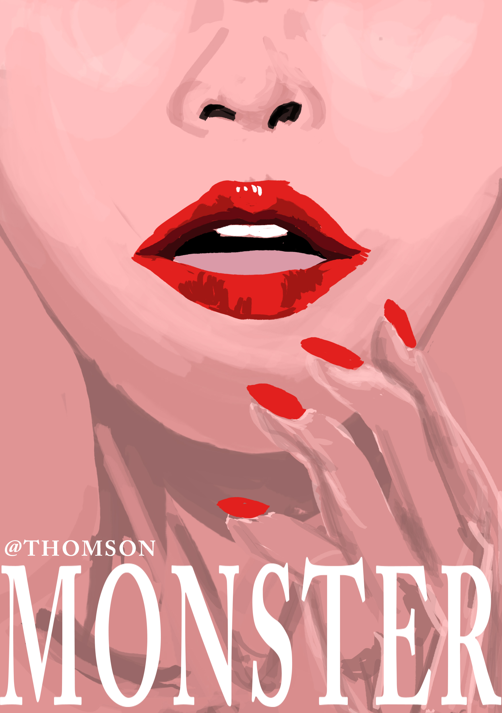
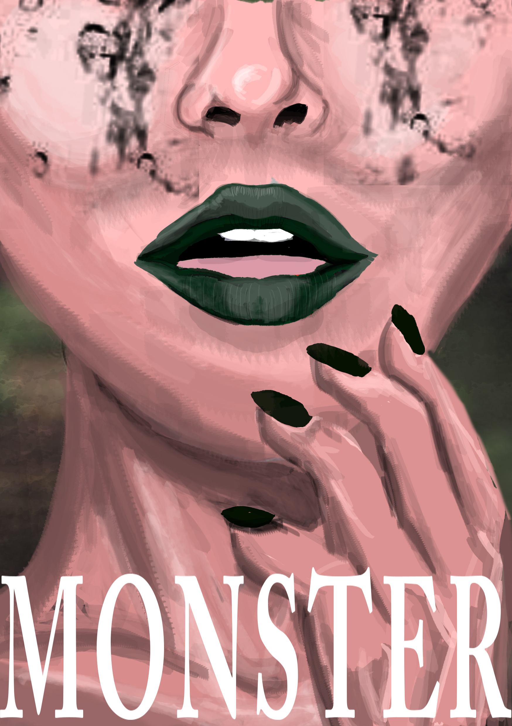
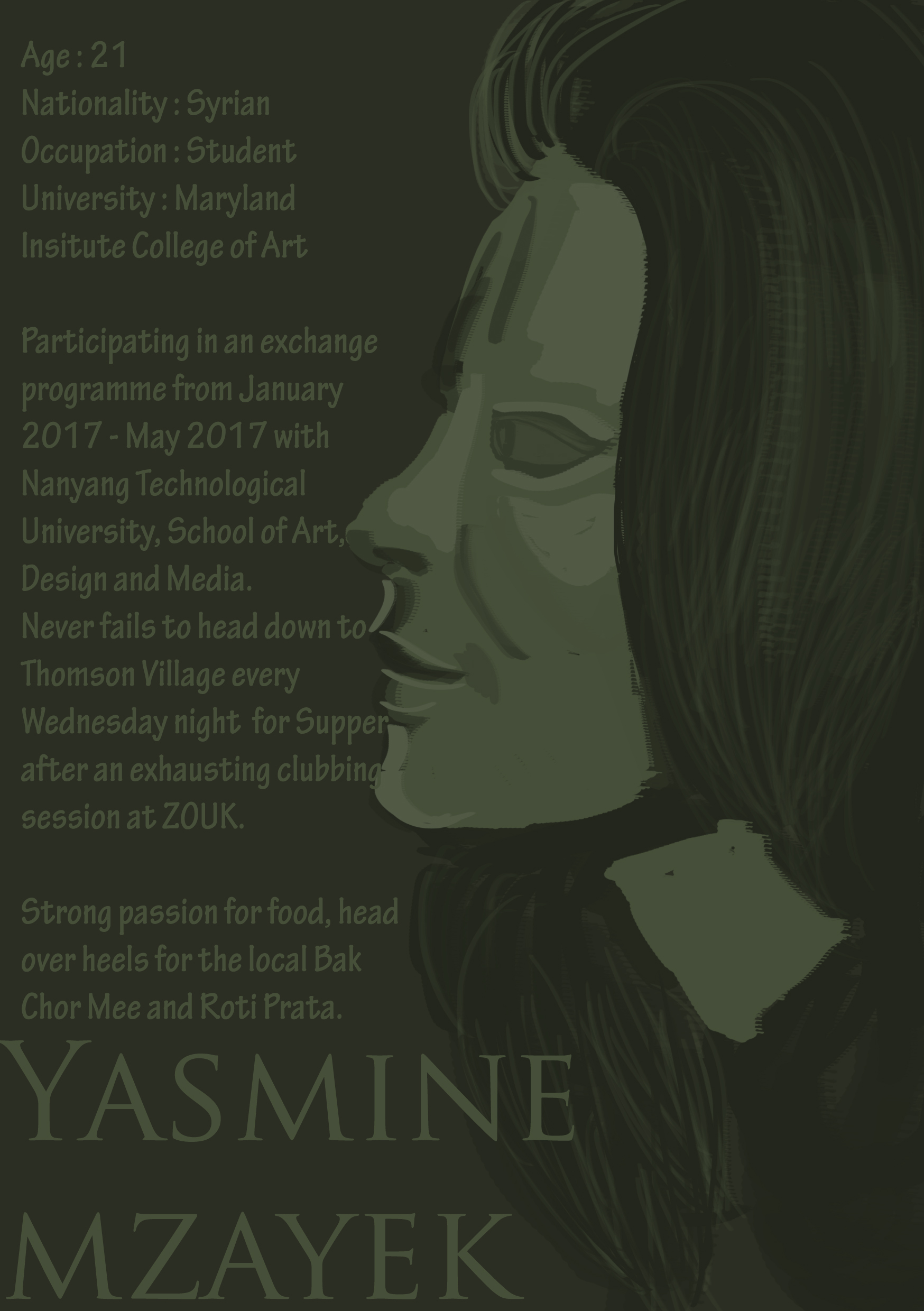
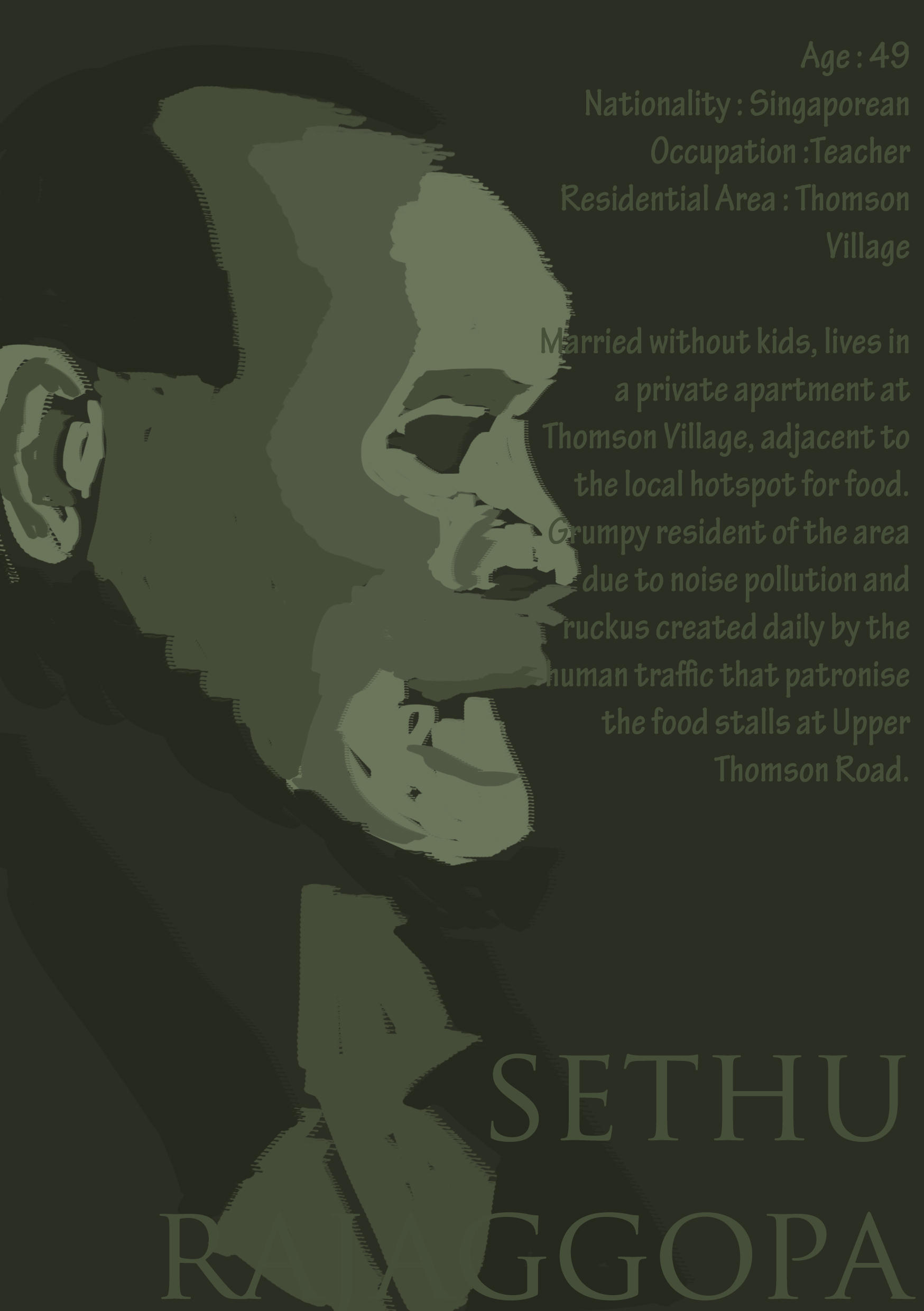
Based on my presentation idea of ‘MONSTER’, I have further dissect and improvise on how to capitalize on this unorthodox concept.So I brought Yasmine Mzayek, a friend of mine (whom eventually became the protagonist of my Zine) out for supper at Thomson, and we happened to had a lengthy conversation over her passion for food and how she felt uncomfortable with certain local food but heads over heels for some others.
The light-heart conversation slowly turned into a darker one, one that led me to realization about how strong the passion for food some of us actually hold that could be somewhat scary if the scenario was slightly exaggerated.
I simply couldn’t stop imagining the possibilities.
Zombies? What if one fine day, we all turn and start eating up each other’s limbs? Would I rely on unscrupulous methods to obtain what I want – food? Would I stab a friend behind his or her back just to get my hands on that Michelin star dish served by Gordon Ramsay?
What if secretly, we’re all monsters?
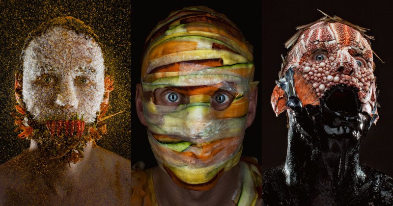
Creepy Portraits of a Chef Wearing His Menu Ingredients
Spices, radish and carrots, Octopus Ink and seafood
MENU is a new photo series by photographer Robert Harrison and chef Robbie Postma, a duo who decided to combine food and portrait photography in a strange and creepy new way. The photos show Postma wearing his menu ingredients on his face.
Postma is the chef for the cafeteria at the Dutch advertising agency J. Walter Thompson Amsterdam.
After breaking down menu items into their base ingredients, the duo carefully arranged the raw, unprocessed food onto Postma’s face. Everything was carefully planned and prepared, and the full project took a full year to complete — a single shot sometimes took 9 hours to prep and shoot.
“MENU is what happens when food meets photography on the dark side,” the duo says. “Served on the closest place you can get to a chef’s mind: on his face. The results are startling.”
“Every grain of rice was added by hand, without the aid of digital manipulation,” the image and culinary artists write. “MENU is hand crafted. Just like the best food.”
Ice Cream and fruits
“Creepy Portraits of a Chef Wearing His Menu Ingredients.” PetaPixel. Accessed April 9, 2017. https://petapixel.com/2017/03/23/creepy-portraits-chef-wearing-menu-ingredients/.
Note to self from Tutor : Photoshop it better with a 3 dimensional depth OR go all out on photography + Stylize + Makeup
I was told after consultation with Mimi, that the imagery contents of my Zine are very much trying to portray a distinct style that is achieved from Photography + Lighting + Stylizing and Makeup on a real-life model.
So one of the option was to do a photo shoot and I would first need to source for a willing party to aid me with this ambitious but surely rewarding attempt especially since I’ve never done it before.
I asked my sister-in-laws(had to ask for girls because of the narrative content beginning with my exchange friend) and they were all reluctant to and I also come to realize that such photography could be deemed as degrading for those that don’t come from the arts field.
A friend of mine mentioned that she charge $60/hour for such a shoot. Oh boy, how am I to afford such high cost for a project. Until I successfully source for a willing party, I guess I will have to bank on improving my photo-shopping skill, and it needs to improve tremendously. Also, I will have to illustrate with a more distinctive style to make the Zine content flow.


