The Last Song Syndrome | Final

~The Last Song Syndrome~

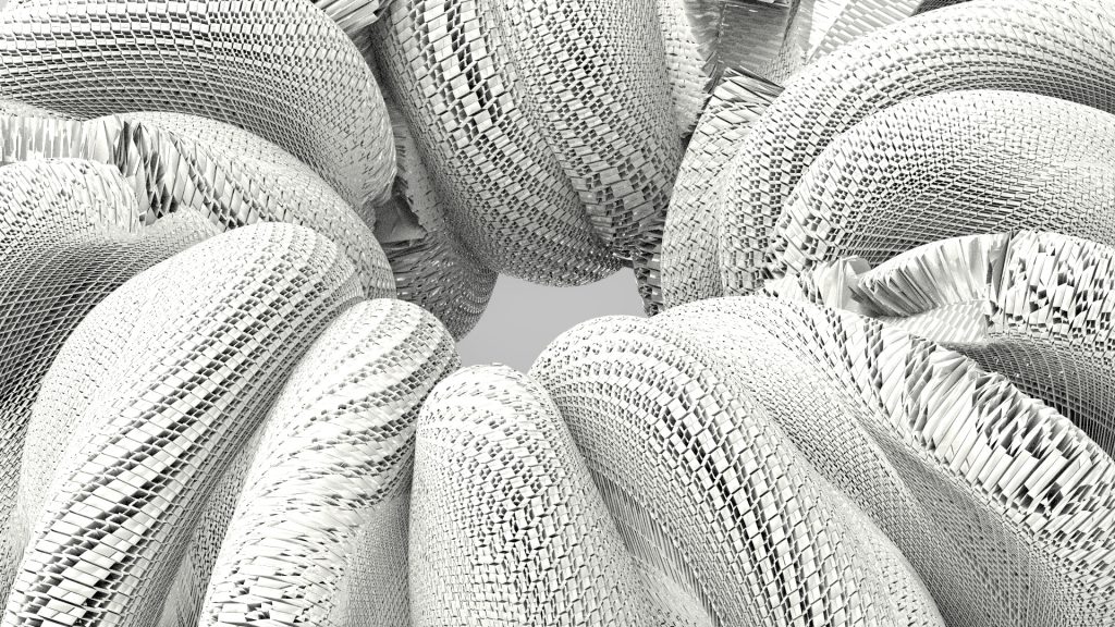
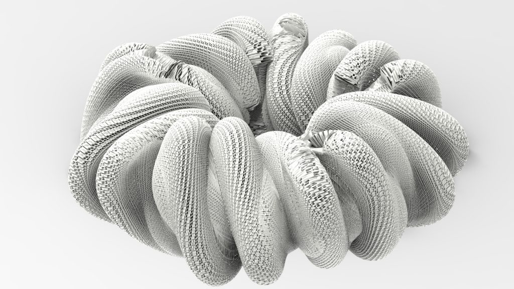
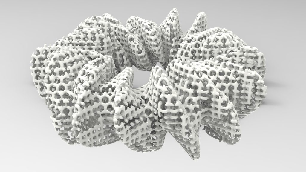
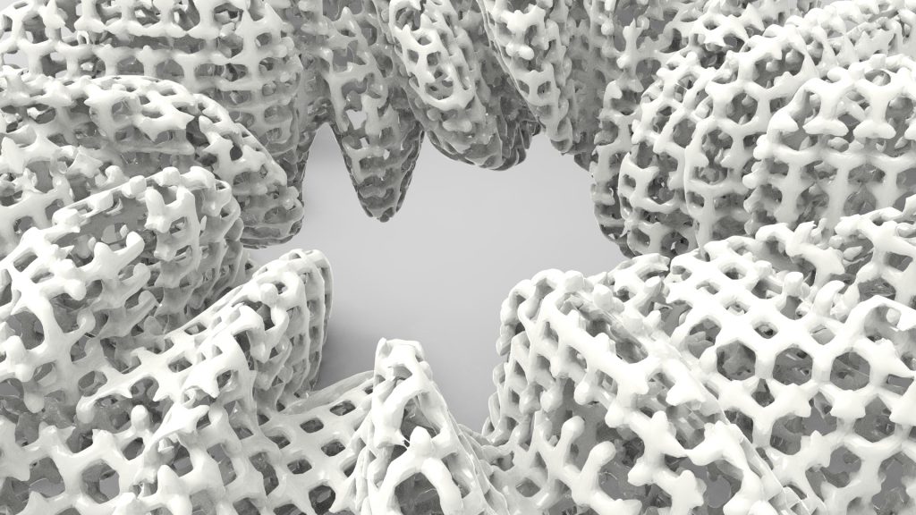
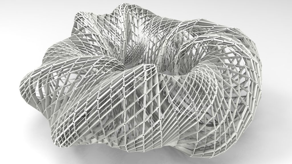
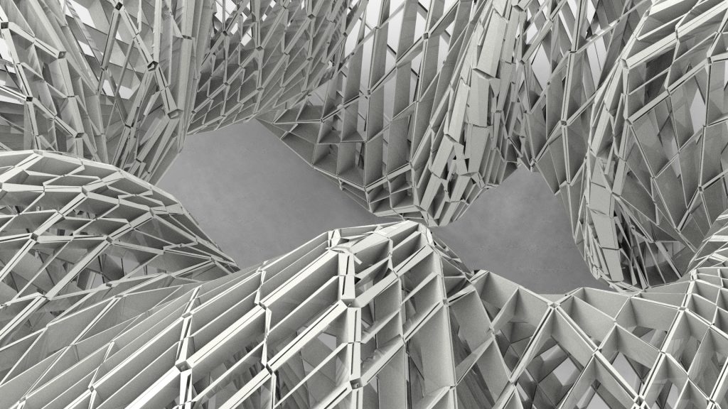
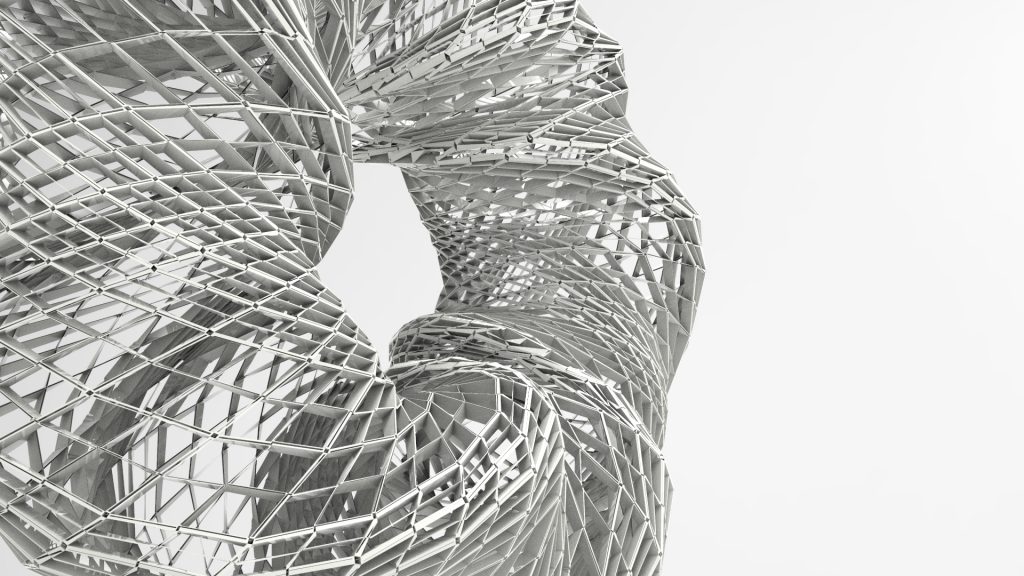
v. Media Wall (Off – White)

v. Elbphilharmonie (Off – White)

The Last Song Syndrome usually refers to an earworm, or sometimes known as a brainworm, sticky music, stuck song syndrome.

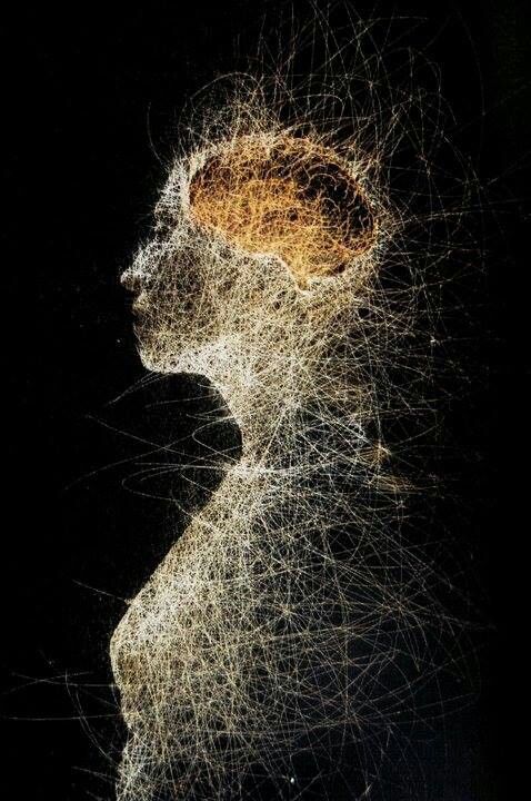
It is best described as an Involuntary Musical Imagery (INMI) which is a catchy piece of music that continually repeats through a person’s mind after it is no longer playing.

Some examples of such music are We Will Rock You (1977) by Queen, Never Gonna Give You Up (1987) by Rick Astley or more recently, Let it go (2013) by Demi Lovato.

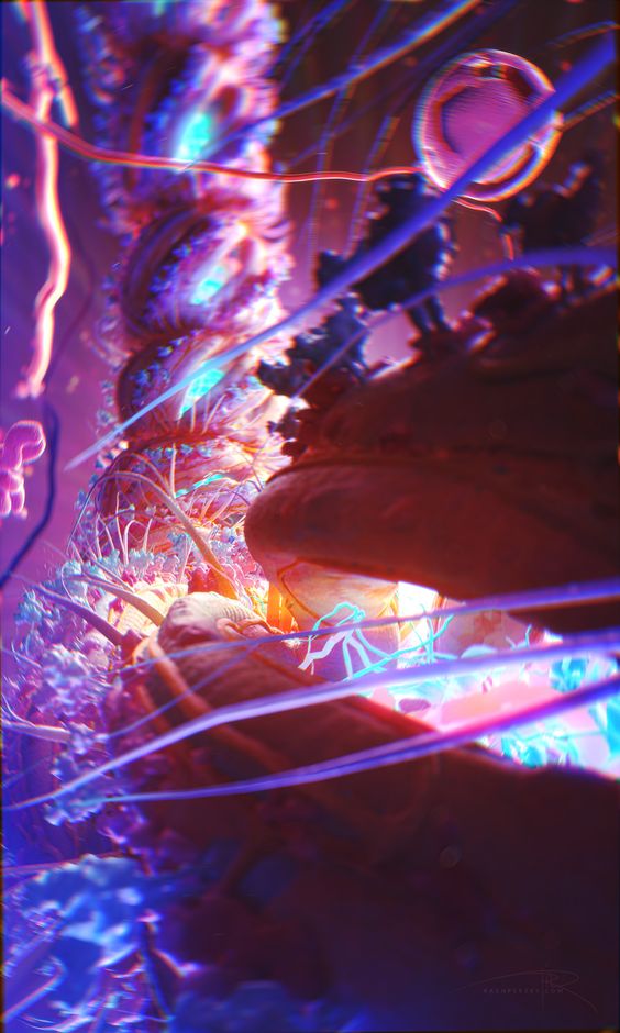
Our Media Art titled ‘The Last Song Syndrome’ revolves around depicting the process of INMI in an abstract manner in which we look to produce a couple of scenes within a 2 minute time frame.

Our workflow was nothing fanciful but largely efficient for both Qayyum and myself as we organised our thoughts and pen them down in a sequence of storyboard. We have long since lost that hand drawn copy but it is as follows in written words.

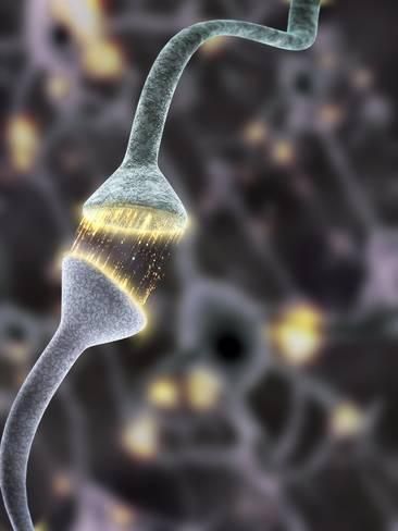
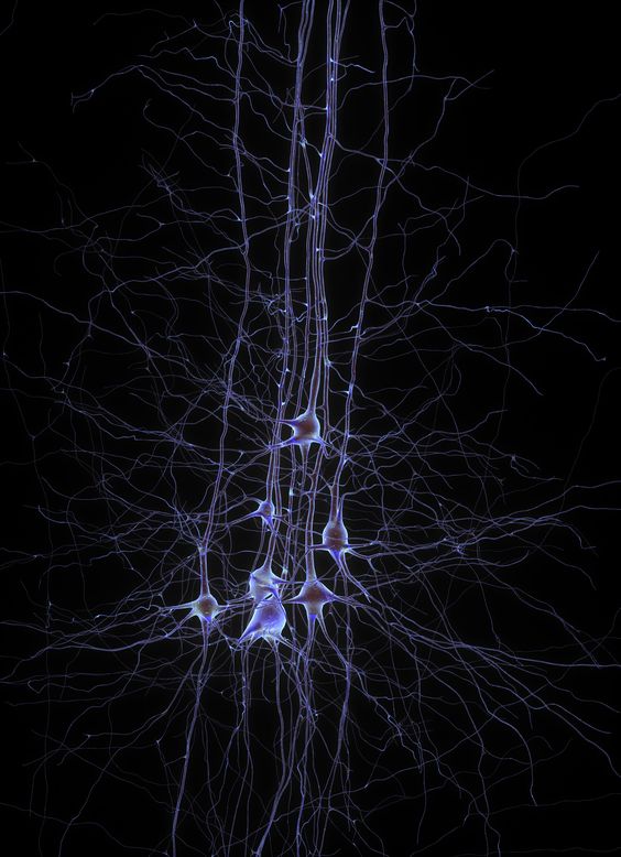
1 – The abstract manner of sound waves travelling and reaching the brain
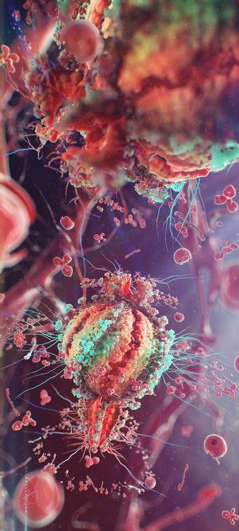
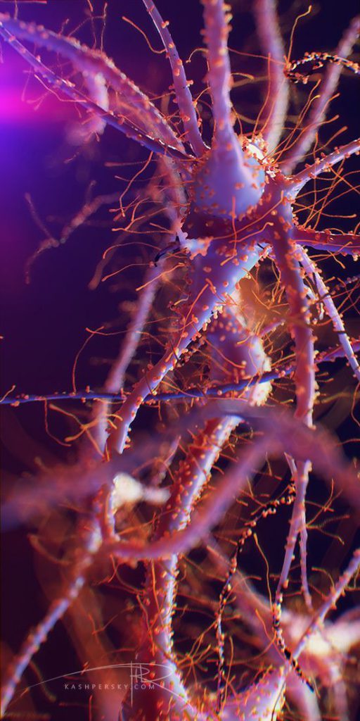
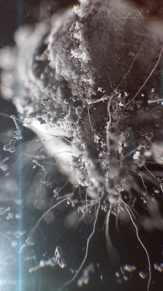
2 – The abstract manner of portraying music as parasite reacting to its host in this case, a brain.
3 – Ensuring that other organisms and bacteria within the body are present within the scenes to give hint that it is going through the human body.
4 – Portraying the journey the sound waves travelling through the bones and blood of the human body.
5 – The abstract manner of portraying music taking over the brain; latching onto its host.
6 – The abstract manner of enjoying the music through the quavers of the brain.

Before I begin explaining about the different techniques our group had explored, I would like bring across the importance of the PC unit that you are working on as our content would cover a lot of the plugins and software that we have tried out for this Media Art Nexus project and that requires a unit that has minimally of the specifications that I will provide for you to do a comparison to ensure that you will not have a frustrating time working on your project.

You are strongly recommended to use a computer/laptop with a strong Graphics Processing Unit to ensure that you won’t have a frustrating time working on your projects.

The specifications of my Operating System is as follows,
Intel Core i7
16.0GB of RAM
1060 GTX graphic card

Without further ado, let’s begin.

Techniques Applied

1) AfterEffects – Trapcode Form + Tao Plugin

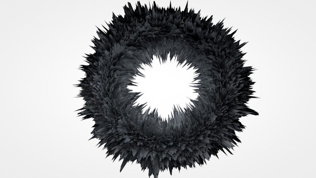
3D Geometry created with Trapcode Tao with a path

Laying Trapcode Form over an .obj file in After Effects


Using Repeated N-gons to create repetitive geometry which makes beautiful geometry shapes.

Trapcode Form is an Adobe After Effects plugin which allows beautiful organic animations where fluid system can interact with each other.

Bigger Value = Smaller and more comples
Smaller Value = Larger and simpler

Credits : RedGiant
Link : https://www.redgiant.com/tutorial/trapcode-form-4-new-features/

Trapcode Tao is an Adobe After Effects plugin that generates 3D geometry along a path. This opens up possibilities of creating 3D effects on what was supposedly for a 2D software.

Through the segment tabs, you can control the smoothness of the geometry at your disposal. You can choose the repeat N-gons under the Segment modes Tab to have your geometry repeated. Thereafter, you can rotate them through the X, Y and Z axis to explore different forms.

Credits : Red Giant
Link : https://www.redgiant.com/user-guide/trapcode-tao/

Plugins are not provided in the school’s computer labs so you can either purchase it from the Red Giant website or find an alternative way (if you know what I mean) 🙂

2) Expression Codes

We researched on how to make the parasite move more naturally, thus we stumbled upon an article where it uses the wiggle expression to randomize the movement while having a linear interpolation to smooth the animation. We then analysed the code and changed it to suit our needs where the parasite is moving towards a certain point.

freq = 1;
amp = 110;
loopTime = 3;
t = time % loopTime;
wiggle1 = wiggle(freq, amp, 1, 0.5, t);
wiggle2 = wiggle(freq, amp, 1, 0.5, t - loopTime);
linear(t, 0,  loopTime, wiggle1, wiggle2)

We researched on how to make the parasite move more naturally, thus we stumbled upon an article where it uses the wiggle expression to randomize the movement while having a linear interpolation to smooth the animation. We then analysed the code and changed it to suit our needs where the parasite is moving towards a certain point.

In my honest opinion, coding is such a tough language to pick up within months, so don’t even mention 13 weeks of course work. Strongly advised not to jump into it unless you already do have a strong background with it.

Credits : Dan Ebberts
Link : http://www.motionscript.com/design-guide/looping-wiggle.html

3) Cinema 4D 

Exploring the basics of C4D

Usage of Cloner, Random and Metaball function in C4D

There are plenty of great tutorials online to actually practice and understand what each function does. However, the biggest challenge is how we interpret each concept and logic of the function and apply it into our own work. Complex stuff does not always means its superior to stuff which are more straightforward. Remember to track back to the concept of your proposal and determine if its a suitable fit for you or not.

Research

Please also check out our mood board post which consists of many useful tutorials that gave us inspiration which served as a catalyst for us when we kick started our Media Art titled, The Last Song Syndrome in the link above.

4) Rhino + Grasshopper

Do not limit yourself to the normal convention of how work should be produced. It might be natural to think that Motion Graphics should be and only created using Adobe After Effects or Cinema4D but the truth is we there are more than just one way to actually achieving your intended outcome.

Along the way, I realized it was too difficult to learn Cinema4D to the extent that I am familiar enough to create the parasites that I envisioned through the mood boards and sketches. Eventually, for one of our scenes, I decided to fall back to what I am more comfortable with for a 3D Modelling software which was Rhino (as a Product Design Major). I applied the knowledge of the plugin Grasshopper to create parametric design which achieved the outcome of the bacteria/parasite we wanted.

Logic board of Grasshopper for one of the bacteria form that was created

Modeled with Grasshopper

Modeled with Grasshopper

Played with Camera Angles in C4D with .obj files from Grasshopper

Played with Camera Angles in C4D with .obj files from Grasshopper

Played with Camera Angles in C4D with .obj files from Grasshopper

The final process of working with Rhino and Grasshopper was to export the .obj file into Cinema4D and AfterEffects and explore the camera angles along a polyline and many other different possibilities. .obj file can be placed inside After Effects as well and used the aforementioned plugins such as Trapcode Form and you will be surprise with the different random results you can get.

5) Cinema 4D – Redshift Renderer

C4D – Physical Render

Redshift Render

Redshift Material + Physical Render

After exploring with different sets of Renderers, there is no right or wrong answers as to which one is superior to the other but more of which one fits to your concept/project more closely. Also, with the images above, it is an unfair comparison as they are made applied with different materials. But what I want to draw to your attention would be the application of normal Cinema4D materials but setting the renderer to Redshift would result in the outcome in the image below.
The outcome isn’t necessarily pretty or ugly but it just did not fit the color scheme that we were going for. So such random surprises are also what was exciting in the phase of exploring new possibilities with plugins .

Attached below are some of the renders from the link below.

Here are the renders using the Physical engine:
BWom0003-HD2-CS-01_1m18s.thumb.jpg.cf7703032315b0b126827903a58ef183.jpgBWom0003-HD2-CS-03.thumb.jpg.77f8a80b39dc7d1e69dcfcc3107e91d3.jpgBWom0003-HD2-CS-04.thumb.jpg.b23354aa2b032699ec93c73cadfc5d01.jpg

And these are from Redshift:
5ab723386e42c_BWom0003-HD2-CSredshift-01_1m7s.thumb.jpg.29acb0e2bb7e0a40256c590fae39e90c.jpg5ab7234565ef3_BWom0003-HD2-CSredshift-03.thumb.jpg.09a5b7a0b1f53e2dc9c1dbf738737c3a.jpg5ab723482c059_BWom0003-HD2-CSredshift-04.thumb.jpg.a5a1b9342989ac8ffb7cecfc3de4baeb.jpg

Credits : C4D Cafe
Link : https://www.c4dcafe.com/ipb/forums/topic/102460-quick-redshift-vs-physical-comparison/

6) AfterEffects – Turbulent Displace

Credits : Adobe
Link : https://helpx.adobe.com/after-effects/using/distort-effects.html#turbulent_displace_effect

7Camera Settings – F-Stop / Depth of View

Without Depth of Field

With Depth of Field

Depth of field was one area that was pretty hard to work on as you would have to calculate how much your F-stop/camera should move from let’s say key frame 45 to key frame 90. It was good for a quick render of an image but for a sequence would be way more challenging. We eventually opt out of it as we used the base file of this sequence and color graded it / turbulent displaced it in After Effects and made it our own.

Credit : Mono VFX
Link : https://www.youtube.com/watch?v=Z8LofHVjeoc&t=143s

8Render Settings – Frame Rates / Slow Motion

This set of renders

took a total of

49 hours to render :O

It was painful, rendering this sequence for a total of 49 hours on my laptop. Quick tip is to put your laptop on sleep mode and it will pause the render until you start using it again. With that said, the 49 hours comprised of maybe about 6 hours of travelling time from home to school and vice versa. You do the math.

Credit : Me, Myself and I (haha)

9) Render Settings – Alpha & .png

Rendered in Alpha with frames in .png to get a transparent background

Towards the end, we realised that we needed this scene to be without a background so as to merge them together with another scene as a background, we experimented with the alpha settings and eventually found out that you can achieve a transparent background in your .H246 / .mp4 files by rendering the frames as .png, period.

This provided us with the flexibility to place the rendered clip at any point in time which suit our intentions and worked really well for us.

10) Color Grading

Below are two color graded sample links. It is very subtle, be sure to view it in 720p and not 140p!

Mid Semester Review – The Last Song Syndrome

Please also check out our previous processes as to how we derived on the concept of The Last Song Syndrome in the link above.

With that, we have come to the end of the documentation of our processes for Media Art Nexus + Elphi and we hope that those that actually bothered to read up to here have learnt some quick tips of what we just picked up just 13 weeks ago.

All the best!

Development of Scenes (from latest to oldest)

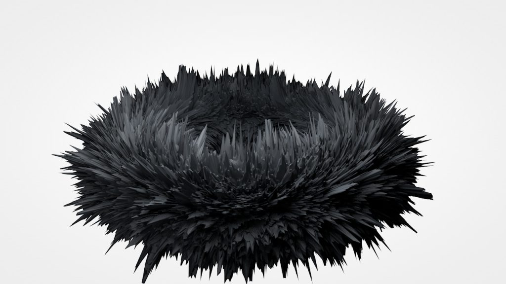
~The Last Song Syndrome~ v. Media Wall (Black)

The black rendition

~The Last Song Syndrome~ v. Elbphilharmonie (Black)

~The Last Song Syndrome~ v. Media Wall (White)

~Death Star Scene 1~

~Death Star Scene 2~

~Death Star Scene 3~

~Death Star Scene 4~
Mid Semester Review – The Last Song Syndrome

The Last Song Syndrome usually refers to an earworm, or sometimes known as a brainworm, sticky music, stuck song syndrome.

It is best described as an Involuntary Musical Imagery (INMI) which is a catchy piece of music that continually repeats through a person’s mind after it is no longer playing.

Some examples of such music are We Will Rock You (1977) by Queen, Never Gonna Give You Up (1987) by Rick Astley or more recently, Let it go (2013) by Demi Lovato.

Our Media Art titled ‘The Last Song Syndrome’ revolves around depicting the process of INMI in an abstract manner in which we look to produce a couple of scenes within a 2 minute time frame which may or may not include the following,

1 – The abstract manner of sound waves travelling and reaching the brain
2 – The abstract manner of portraying music as parasite reacting to its host in this case, a brain.
3 – The abstract manner of portraying music taking over the brain; latching onto its host
4 – The abstract manner of enjoying the music

Our first prototype for testing on the Media Wall at North Spine.

This is a visual sample that we came across and felt strongly about the transition in which portrays visual image of the travelling into microorganisms. We look to achieve this with Cinema4D and possibly other modelling programs.

Here are some of the still image renders of the various models we experienced with. Some prove to be more complex which at times are limitations to our work station to proceed with animating it.

We then proceed to play with camera angles and clipping the camera view along a spline to achieve this effect as shown above.


Research

As of now, I would like to create a Motion Graphic / Animation for Media Art Nexus (MAN) or even Elphi with the intention to evoke emotions on the fragility of life, hence my topic of choice at this moment would be closely related to

HUMAN IMMUNODEFICIENCY VIRUS 

Subject matters to be considered for further elaboration on further for MAN consists of the following,

  • parasite
  • bacteria
  • virus
  • germs
  • infections
  • blood
  • heartbeat
  • oxygen


Inspirational Videos


After Effects Tutorials

Cinema 4D Tutorials

CDL – Zero Waste

FINAL

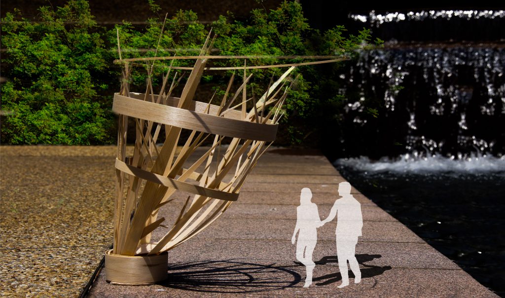
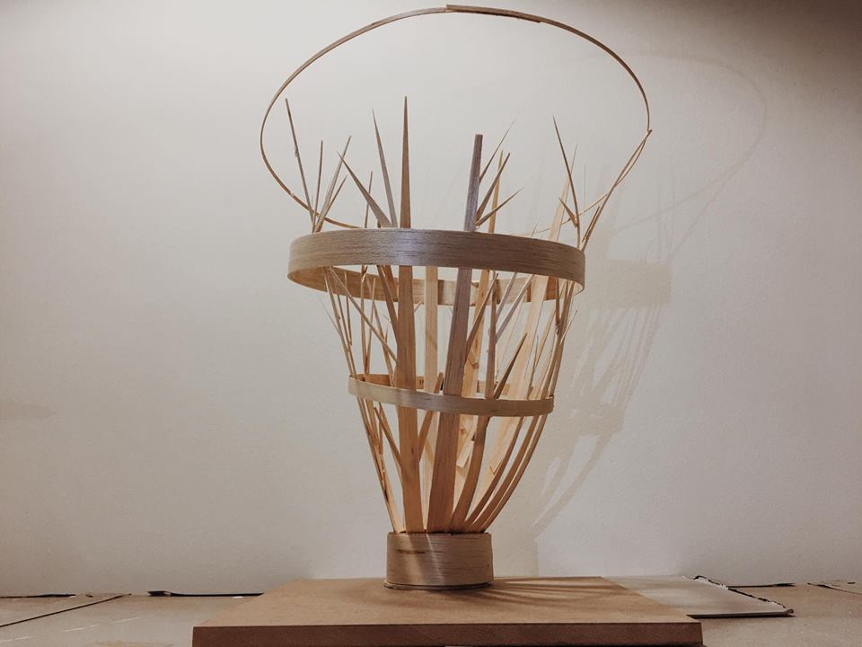
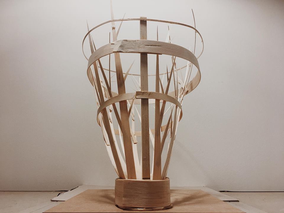
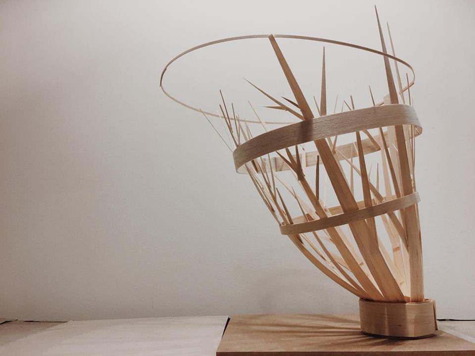
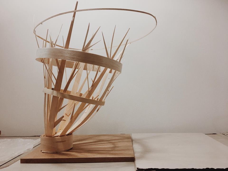
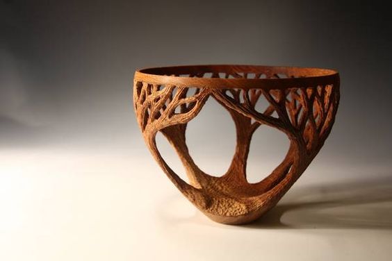
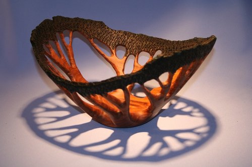
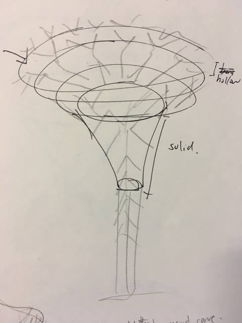
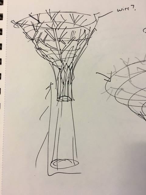
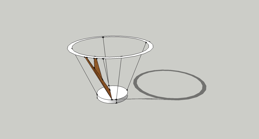
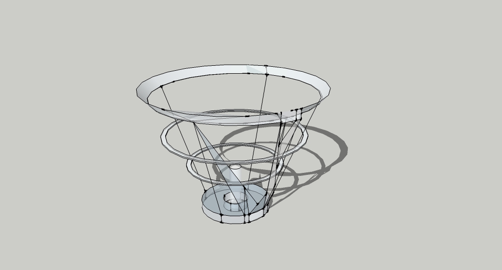
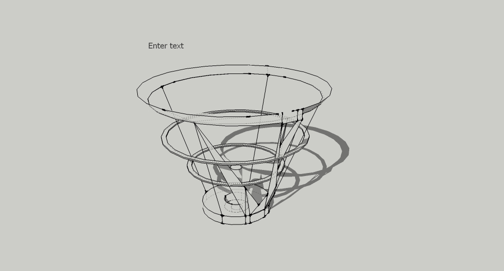
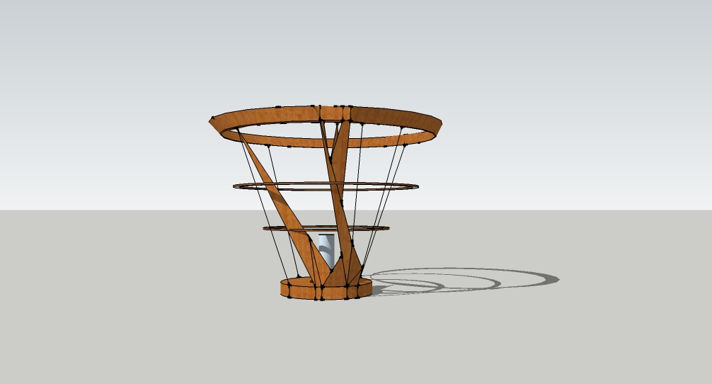
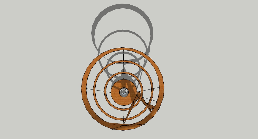
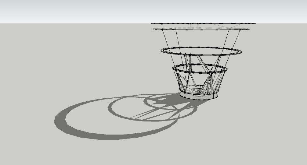
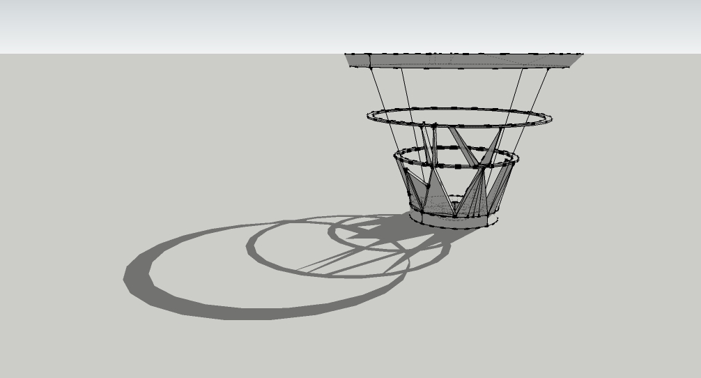
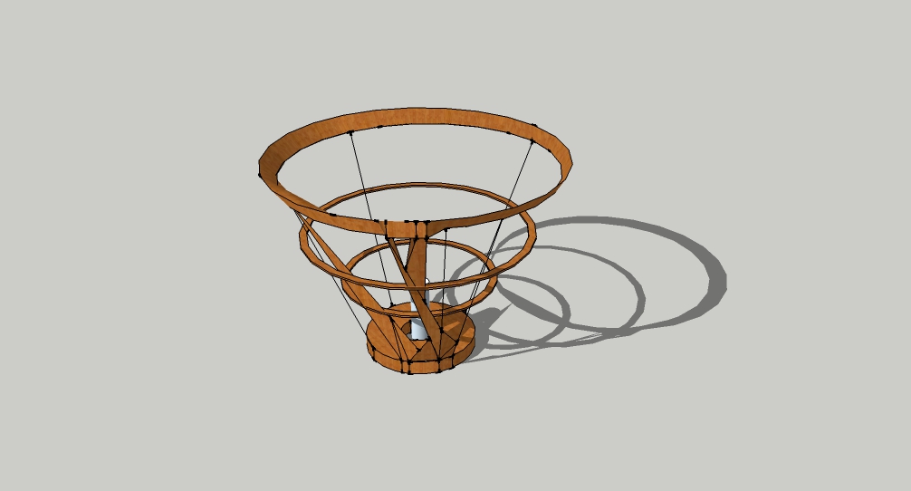
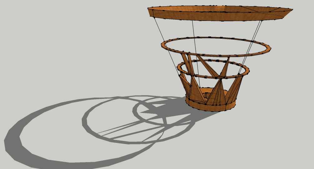
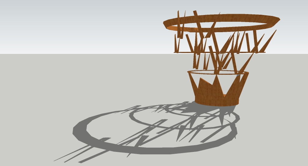
Roots of our Origin was first inspired by intricate designs of paper cut designs which eventually sparked interest with the play on shadows. As there is a purposeful intention of raising awareness on consequences of waste and pollutions, the depiction of a deciduous tree at its maturity state where leaf are not present shows the tide it needs to turn just to survive through seasons after seasons. This is a symbolic representation of Singapore as we head towards our ‘Fall and Autumn’ seasons as we find ways towards Zero Waste! The shadow of the leafless tree aims to serve as a haunting reminder by hinting on what might bode for the future if nothing were to be done about this burning issue of wastage.


FRONT & BACK

LEFT & RIGHT

INSPIRATION

INITIAL SKETCHES

DEVELOPMENT

STUDY MODEL


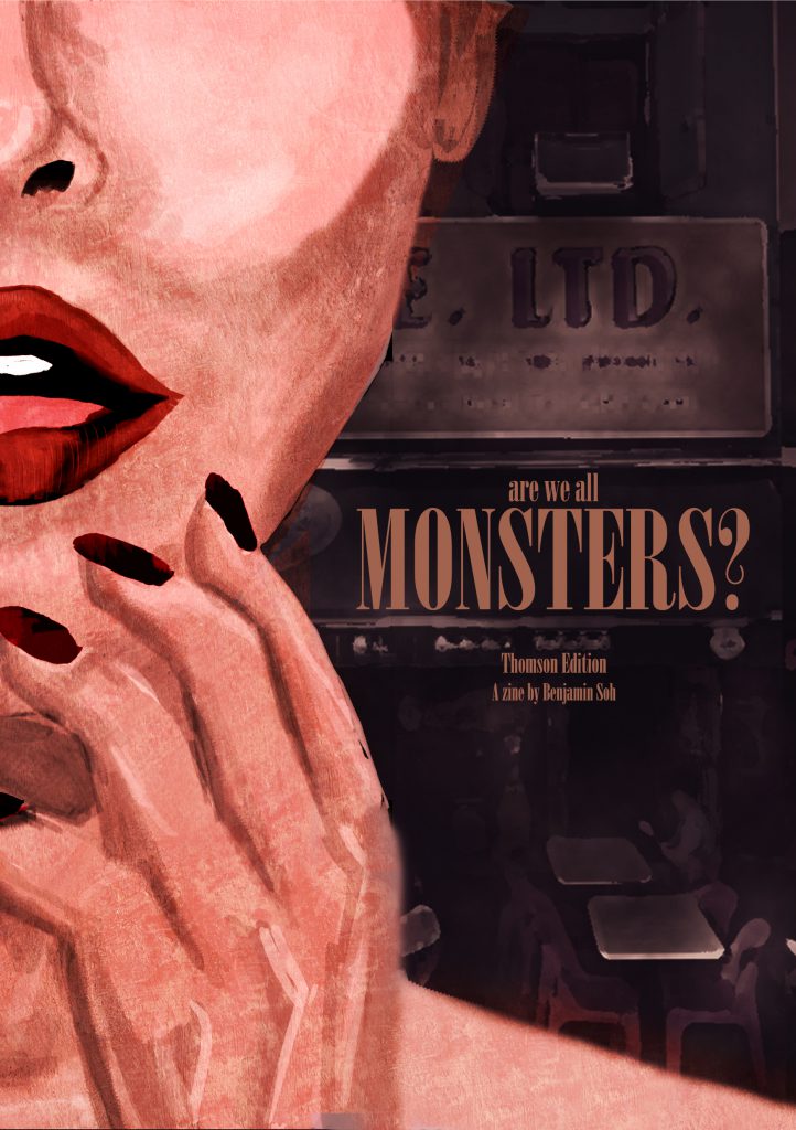
Zine – Neighborhood Explorer 4 (Final)

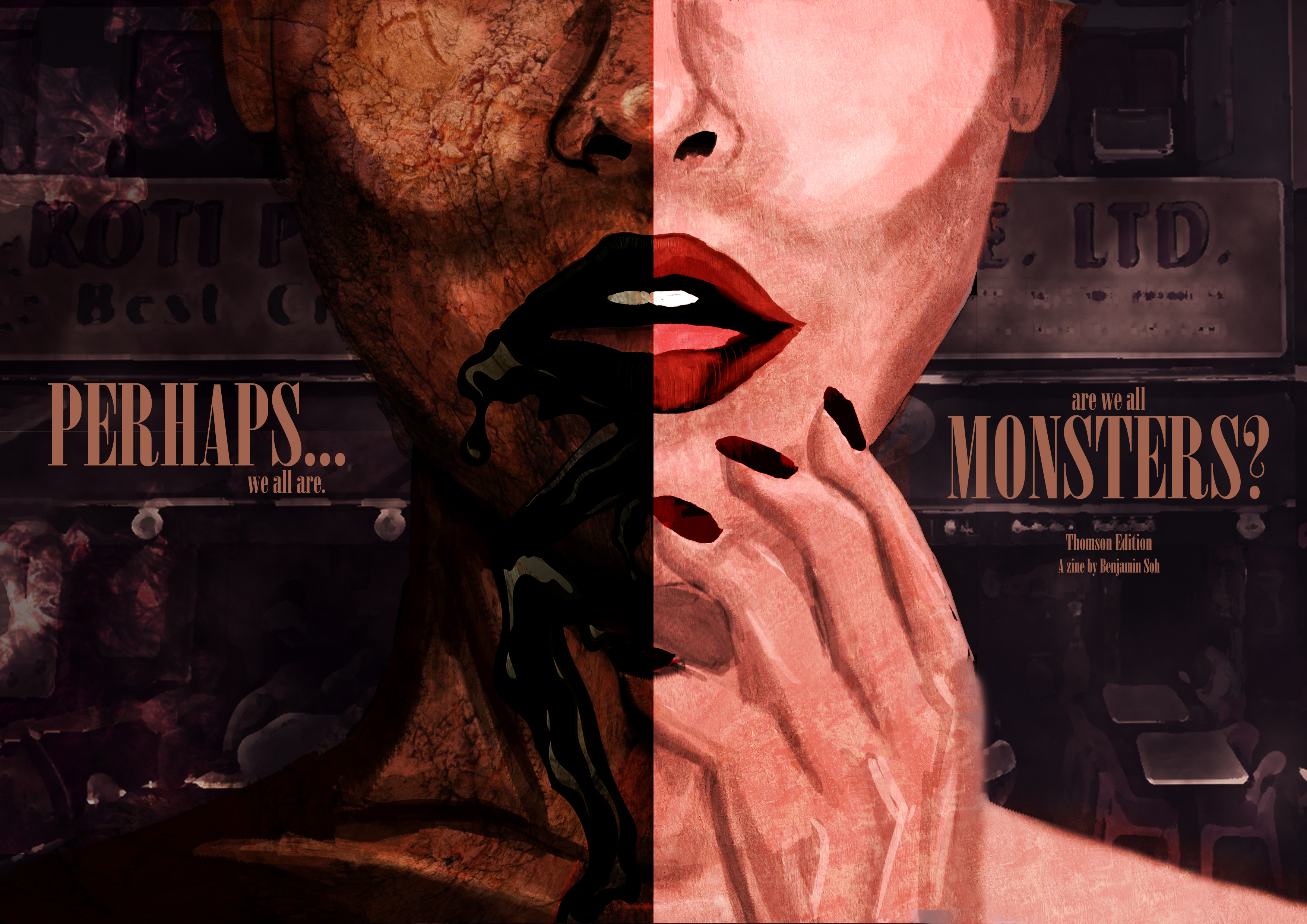
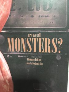
Final ZINE  

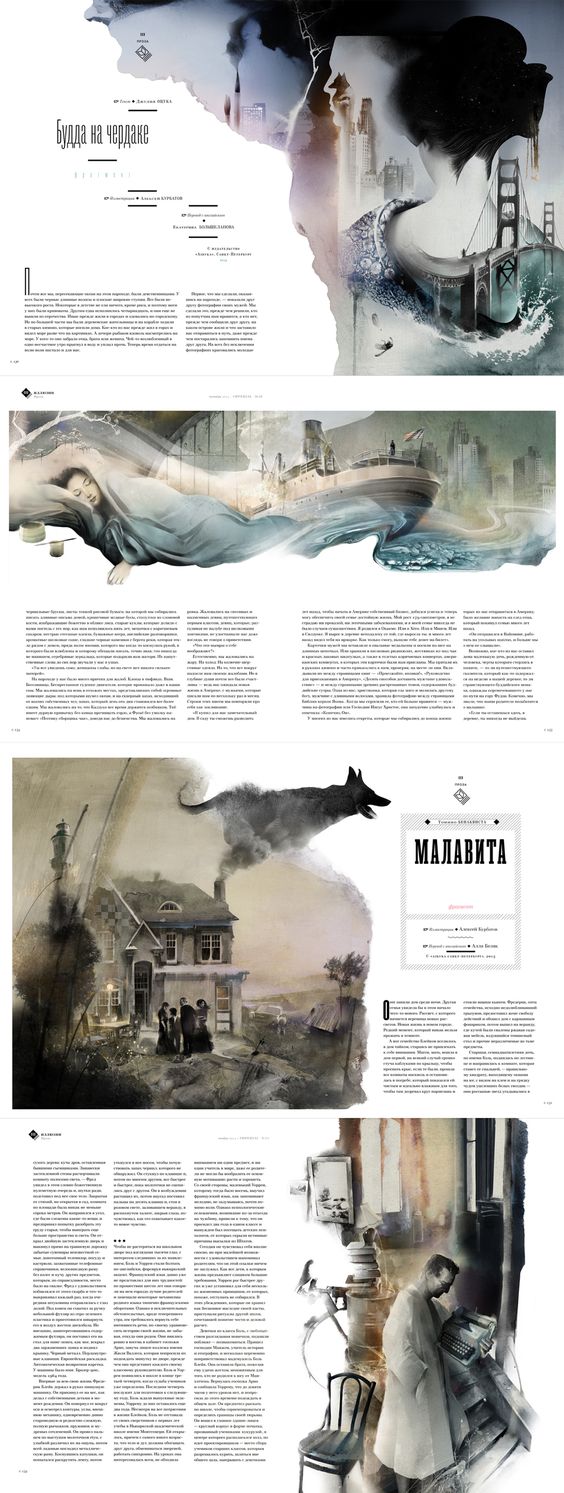
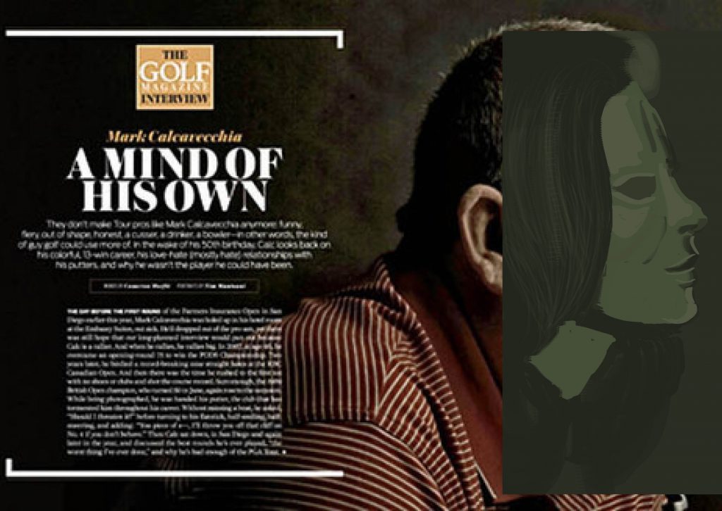
Layout Inspiration

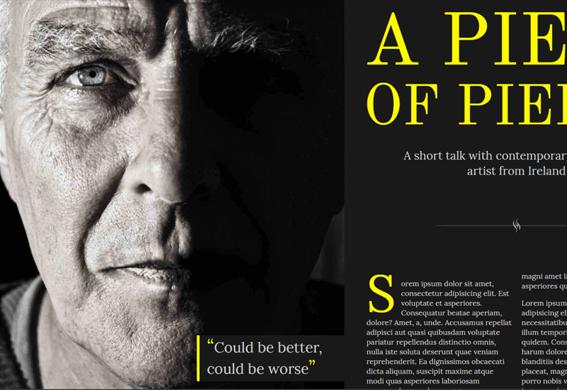
There were many composition that looked really attractive but did not suit the story and mood that I was trying to create for my Zine, thus I had to be exceptionally selective on using a referencing Layout for my spreads. I eventually found it in this sample below.

Despite the language, there is something about its imagery that screams a certain solemn feeling for me which caught my liking and was a direction that I wanted to work towards to.

In addition, the way its imagery interacts between a spread was something that I believe I took reference from to include into my Zine to make 2 pages feel as one rather than leaving them as individual pages which I thought was a really important inclusion.

Mood Board

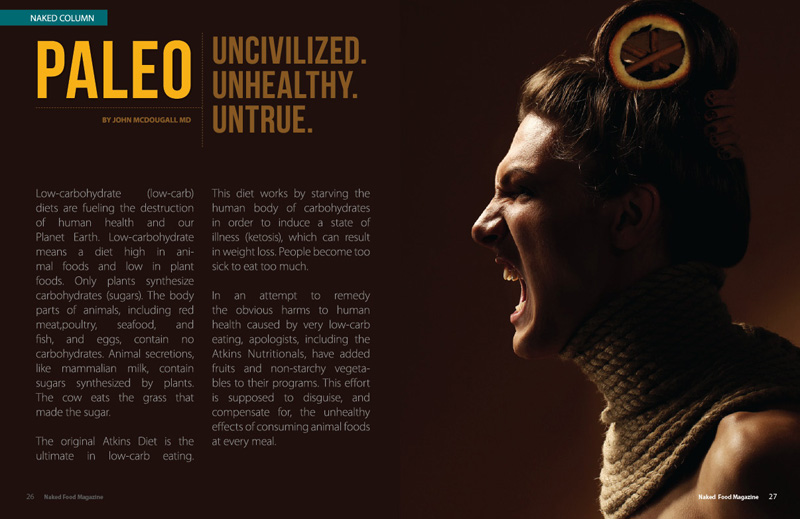
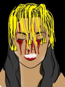
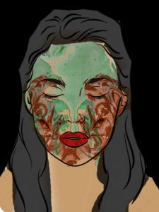
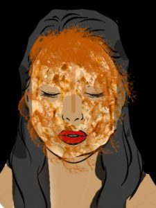
Working with illustrative portraiture art to try and capture the mood which is often done by photography was a huge difficulty for me but I sure as hell hope I did somewhat obtain the mood of the Zine and evoke a sort of feeling when people browse through it.

My choice of text took reference from this images which all used a somewhat ‘classy’ font which is a little similar to VOGUE’s Didot font. I eventually settled for the font –Bodoni.

Wasted Opportunity

Also, I would like to mention on how wasted it was for me to not being able to realize that I could have created my contents through photography and food styling on a model as I eventually aborted the last minute shoot 3 days before submission (amidst other submissions) as I thought it was a really huge risk.

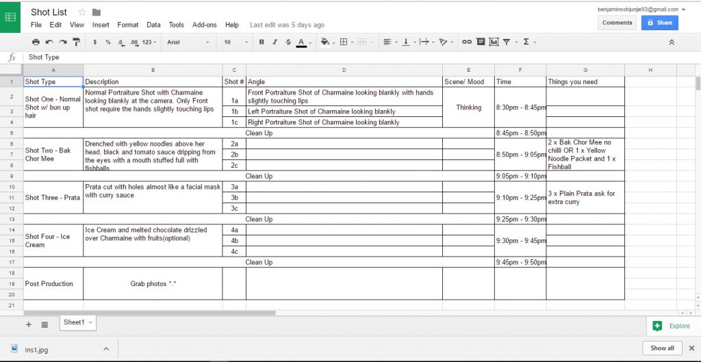
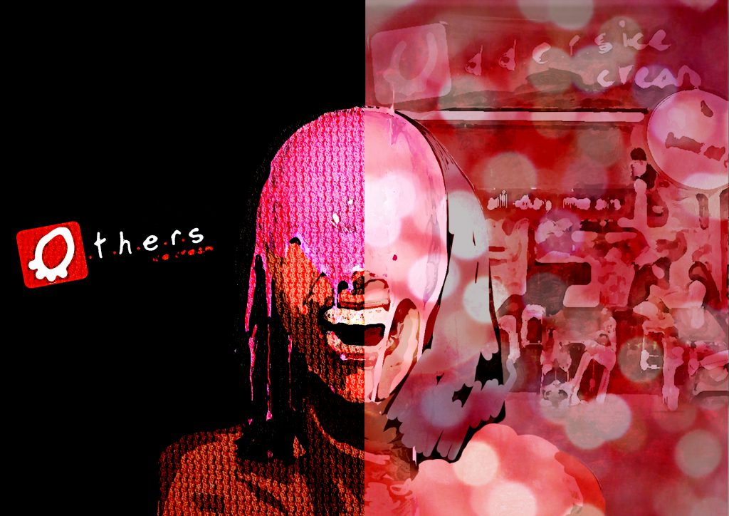
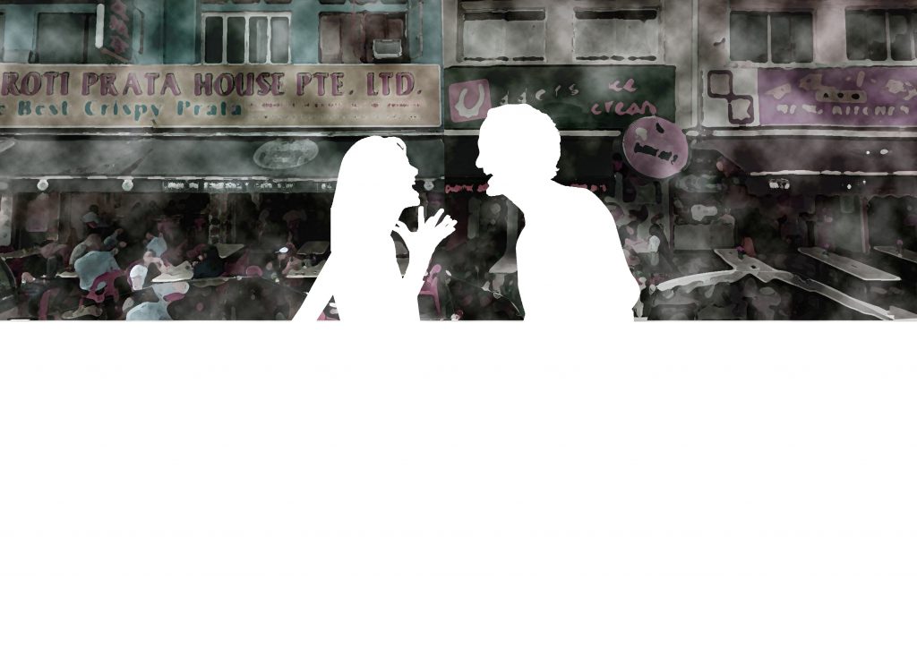
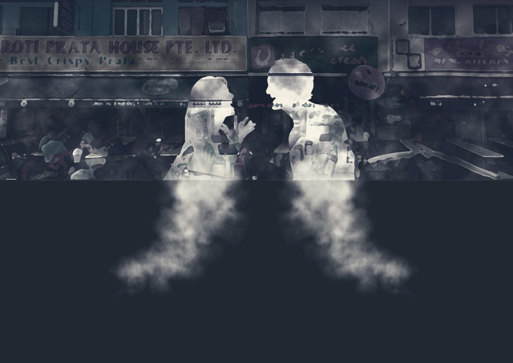
Here are some of the planning for the shots such as how to droop down the noodles, having fishball stuffed into the mouth of my model, how to cut the prata which look like a facial mask and many other considerations, which sadly, didn’t come to fruition in the end. Perhaps in the future since this concept is really interesting to work on in my opinion.

P.s – the pain of an art student, always spending so much money, I actually purchased some of the items for the shoot :'(


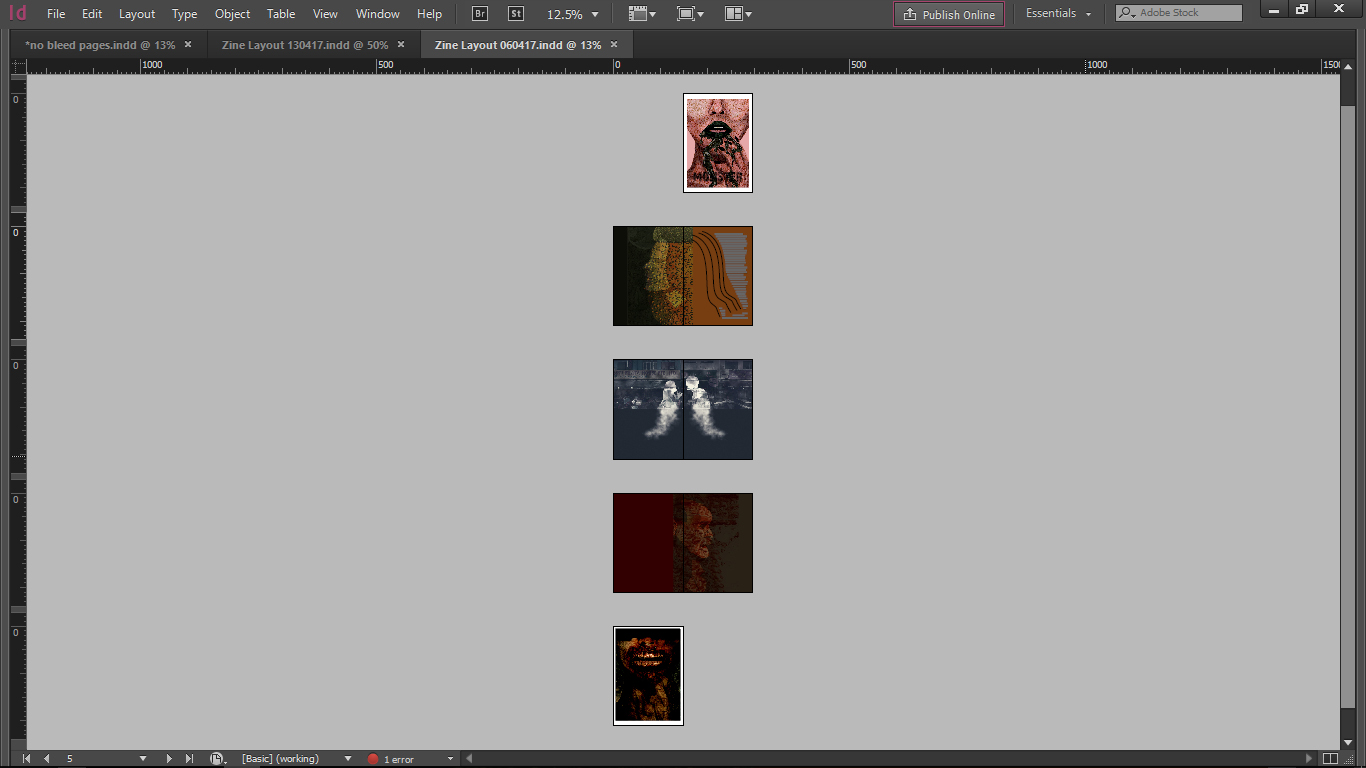
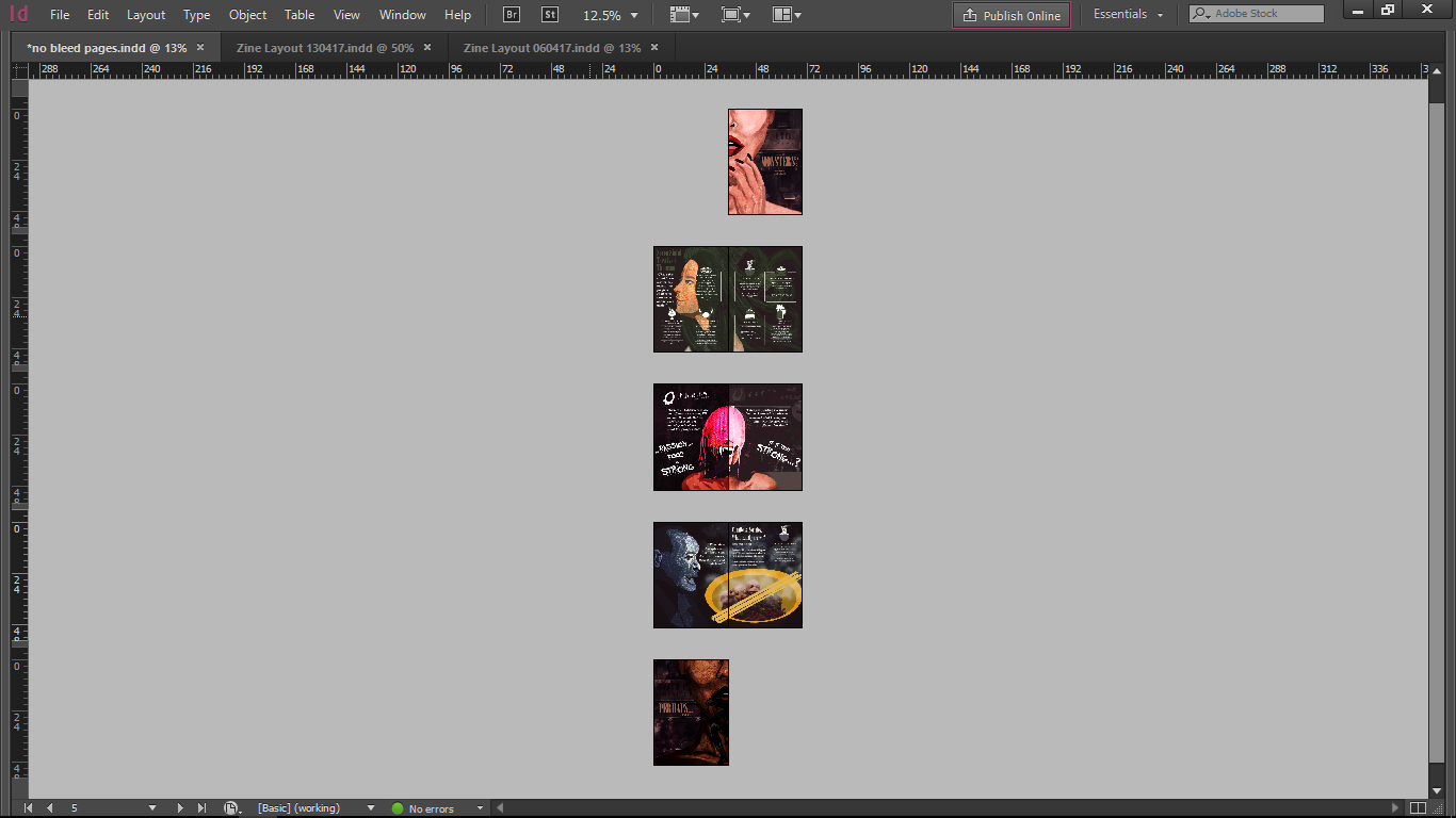
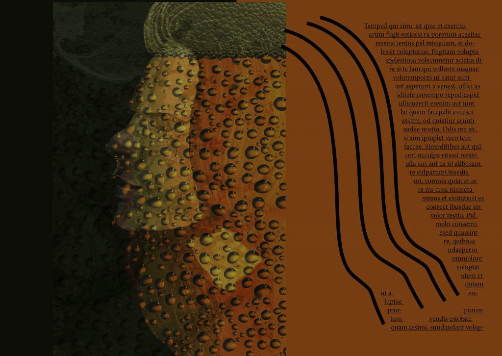
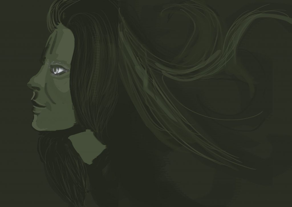
Changes from Initial Layout

Development of Pages

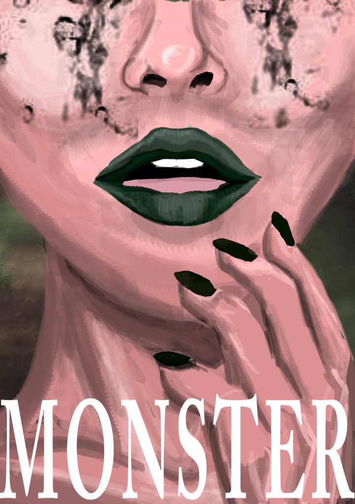
(First Spread – Page 1,8)

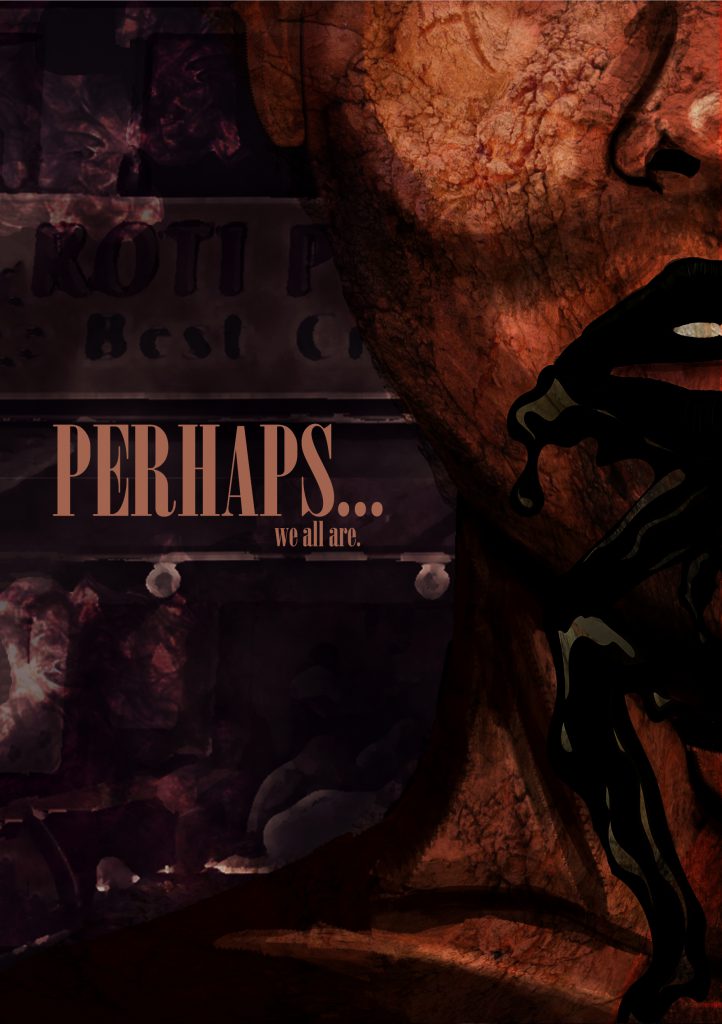
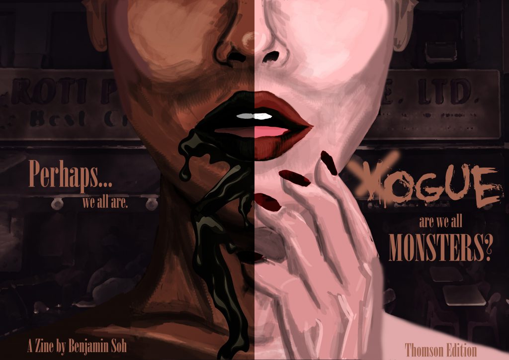
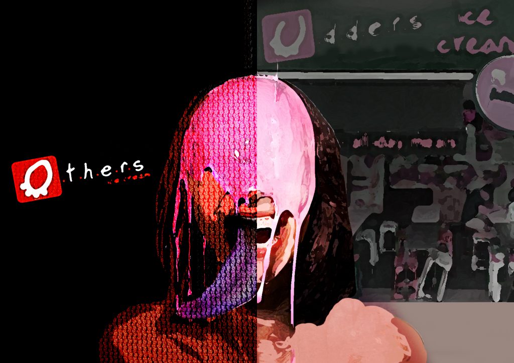
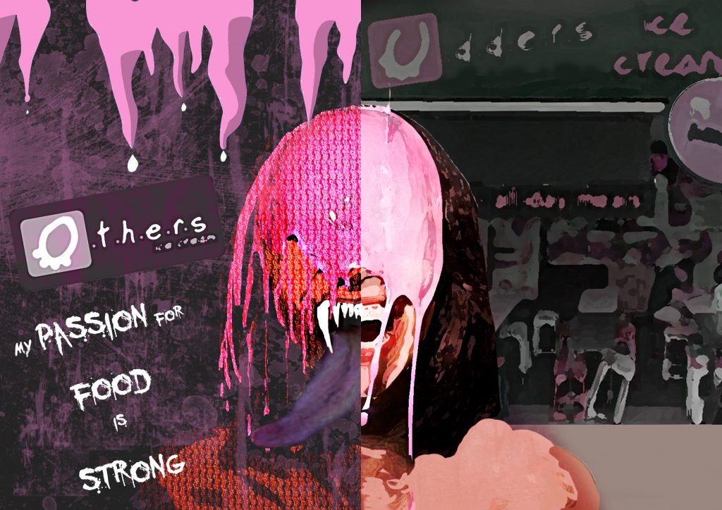
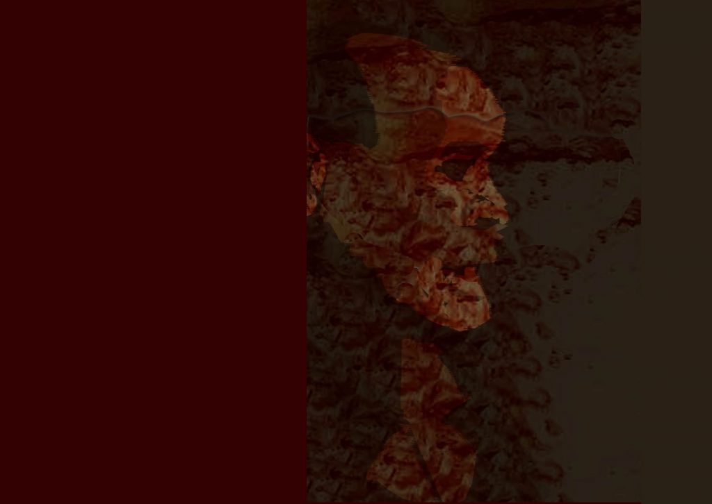
Imagery : The Questioning (Front) and Realization (Back) Moment 

(Second Spread – Page 2,3)

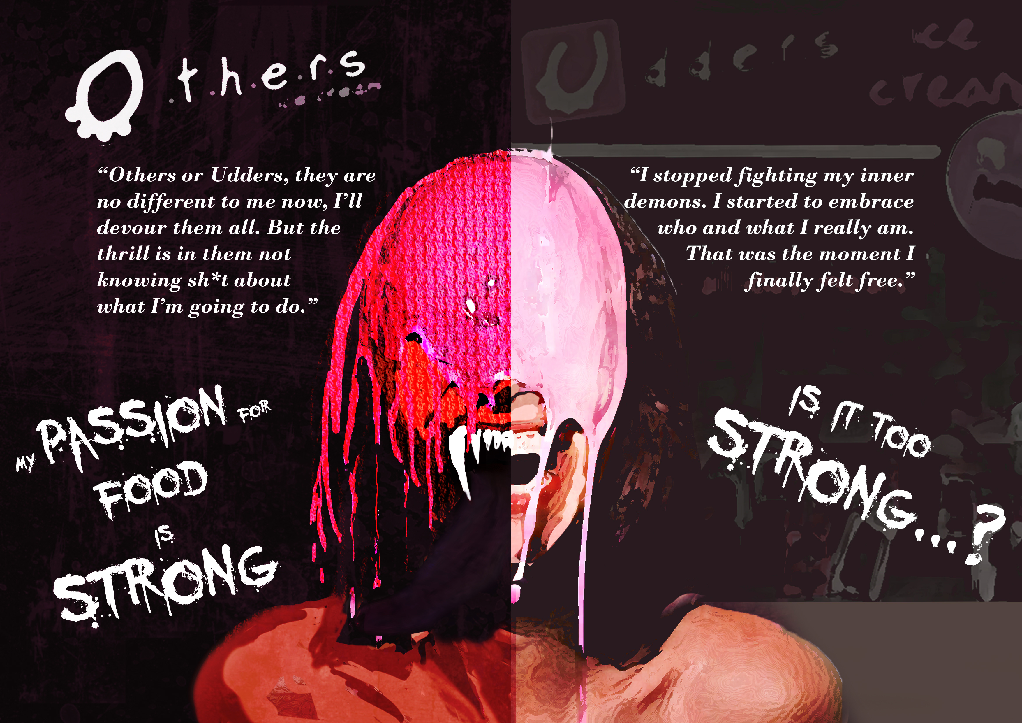
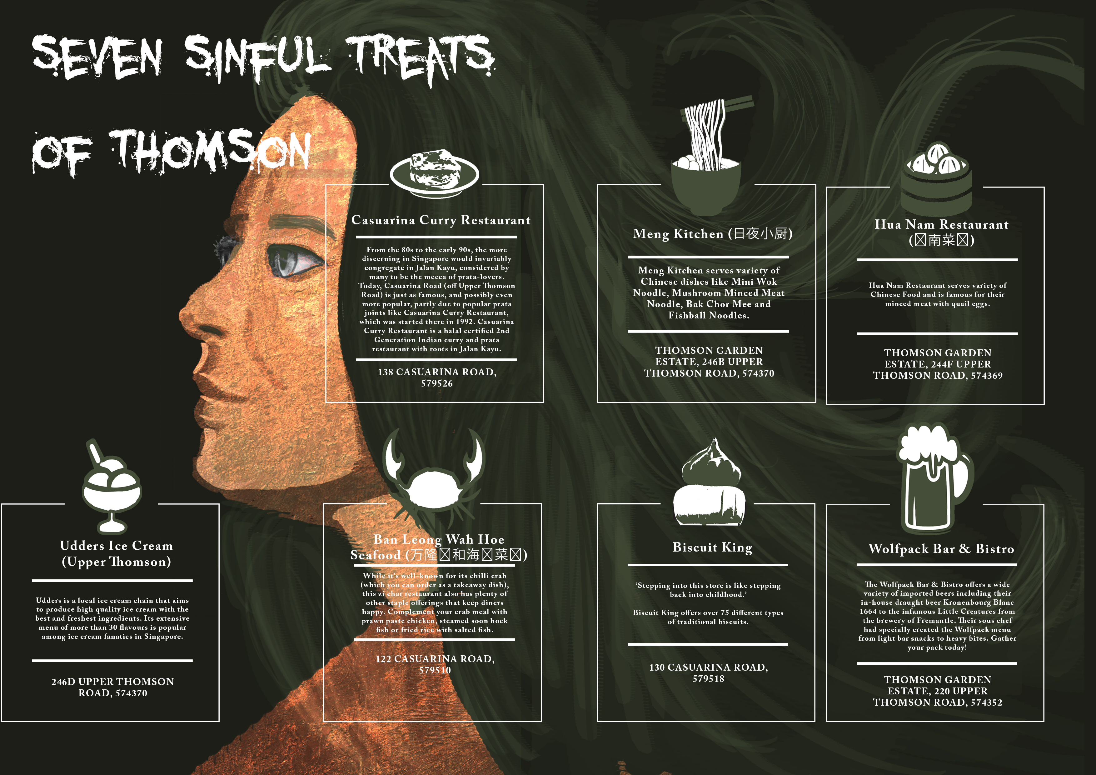
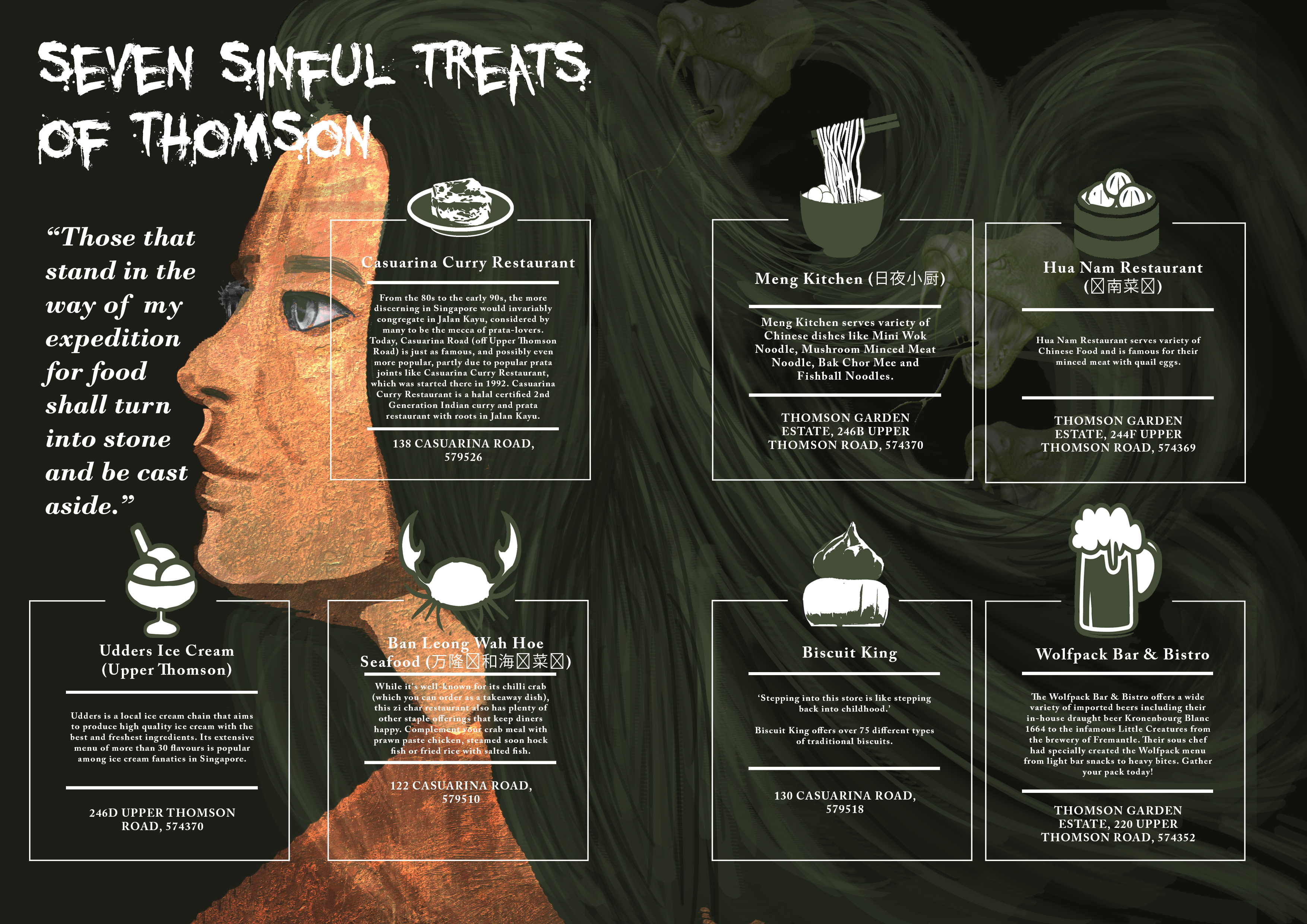
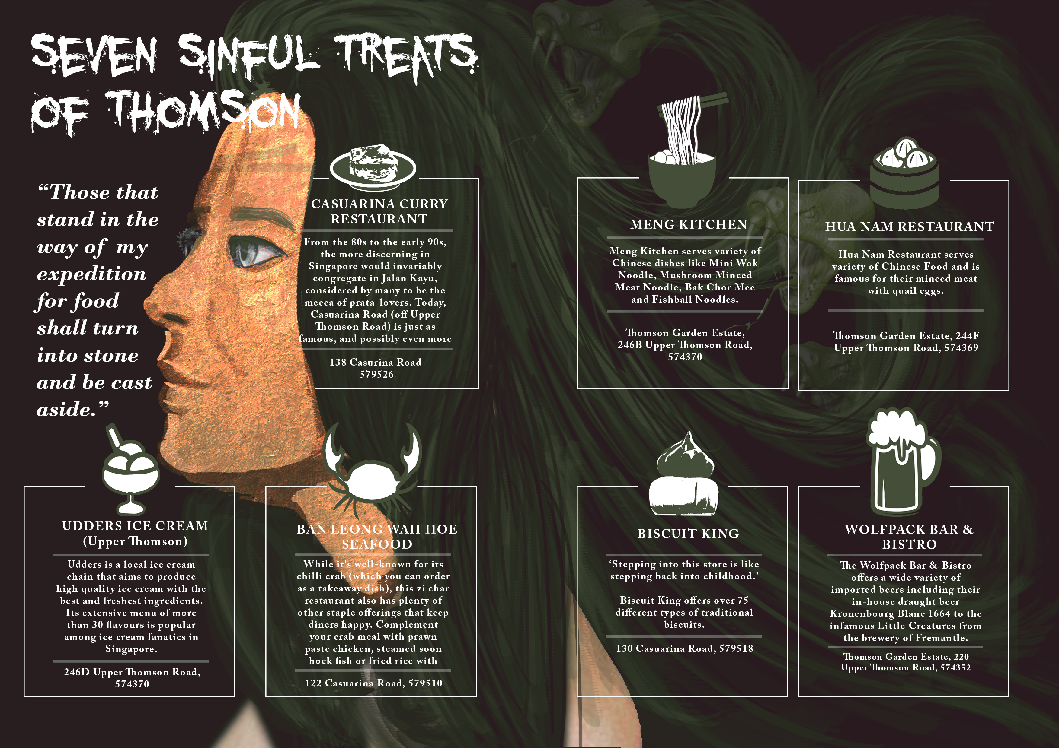
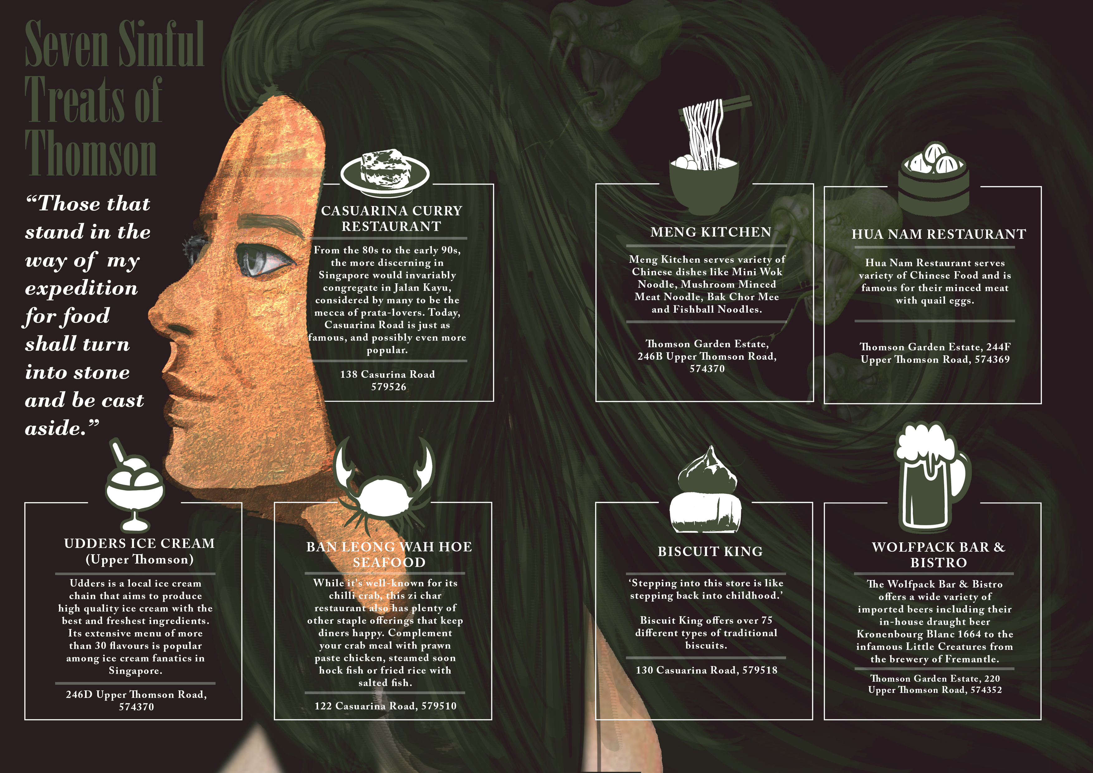
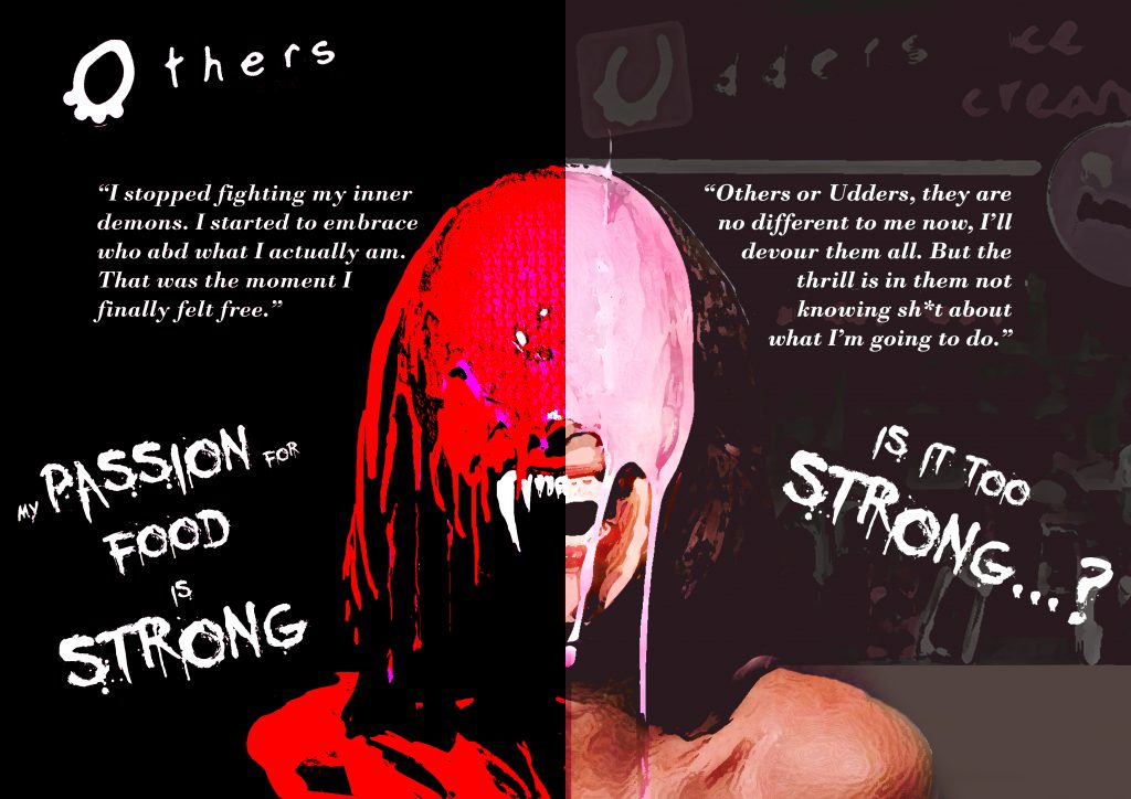
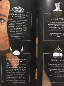
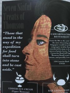
Imagery : A Medusa with each of her snake as a representation of the seven sins which in this spread context is the 7 food locations at Thomson.

(Third Spread – Page 4,5)


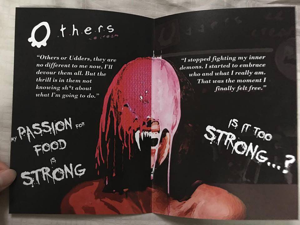
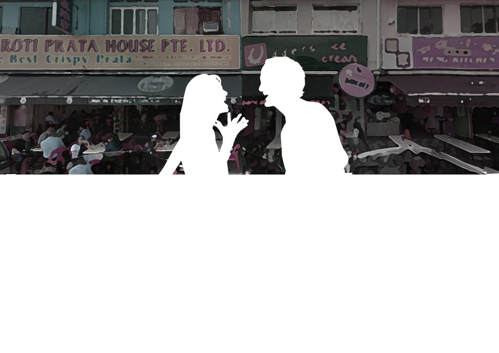
Imagery : An obvious setting of an angel vs devil illustration.

(Fourth Spread – Page 6,7)

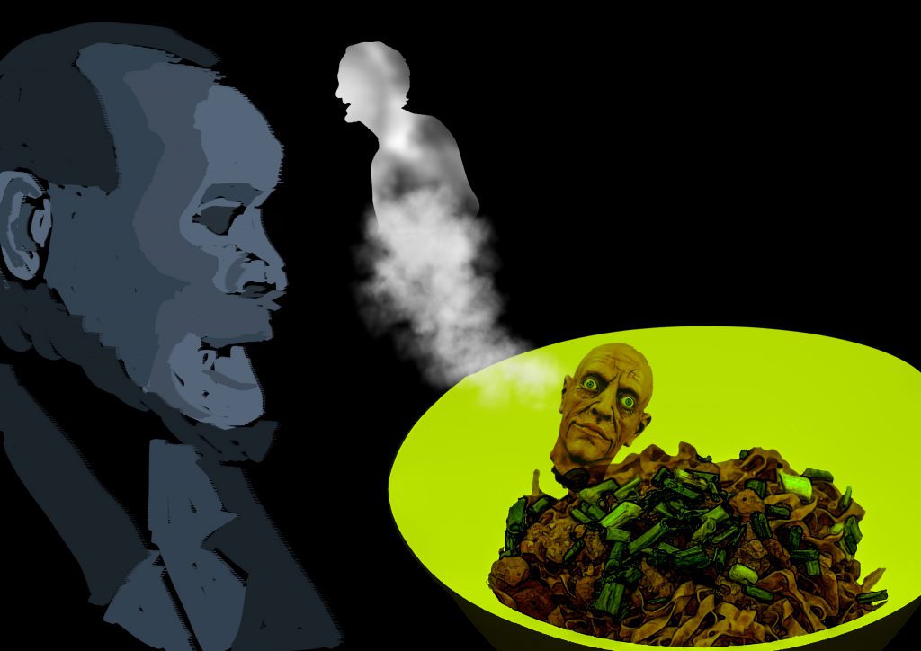
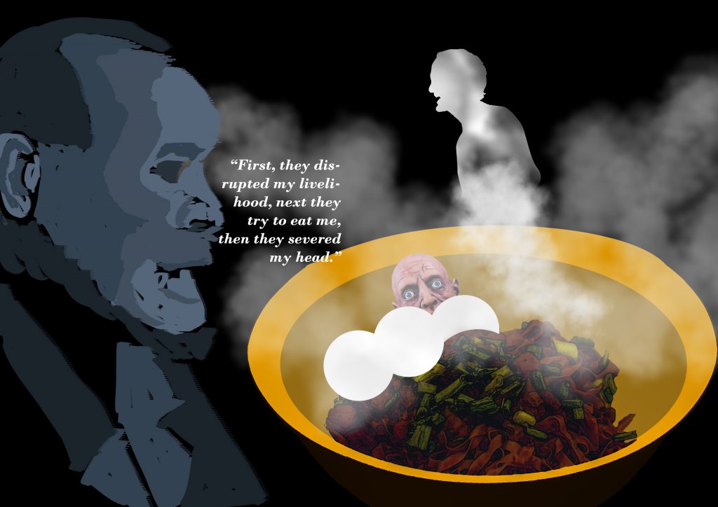
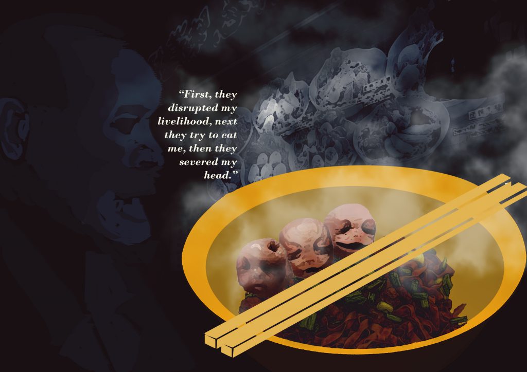
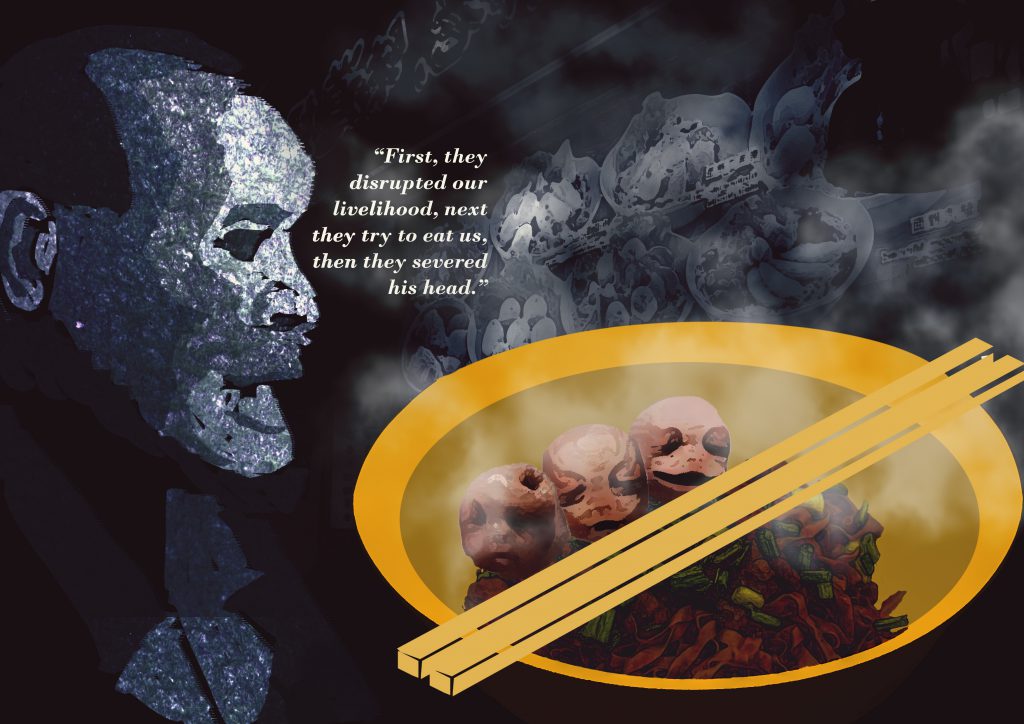
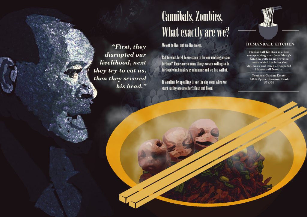
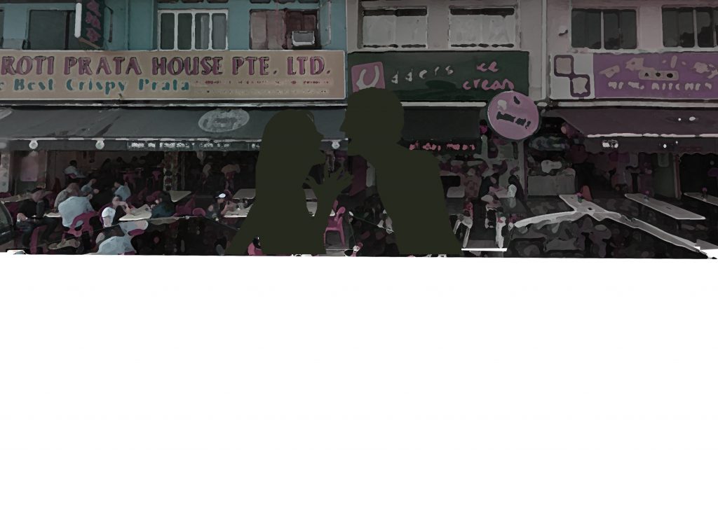
Imagery : The victimized of the uncanny situation of having human consuming human due to their huge appetite for food.

Reflection

In all honesty, I’m not a good writer nor do I aspire to be one(okay I actually do), thus I went ahead with a little of dark humor and irony and a huge load of imagination and exaggeration. A tongue in cheek approach as brought up by Mimi herself when reviewing my Zine.

Also, I should have chose this typeface and use it consistently, something for me to take note of in the future.

Murphy’s law – Anything that can go wrong, will go wrong. That was the case on the day before submission at the print shop. I had my Zine printed over 5 times due to various reasons such as

  • over sized staples,
  • wrong alignment of paper when placed in printer,
  • having my print being cut off more than supposed to.

I have learnt once again that test printing and setting up your files ready for print isn’t as simple as it sounds as there are a lot of technicalities to take note of especially the settings.

And the most annoying mistake I believe I have made in this submission and perhaps the most amateurish one as well which was having some of my text done in Photoshop for convenience sake which led to the printout not having a crisp and full text but ending up somewhat rasterized/blurred! 

Despite all the errors and regrets, I’m generally proud of the work I have produced as I have persevered and not second doubt myself on the unorthodox concept and worked towards a topic by using a method that was previously mentioned as risky to execute. Based on the general feedback from my peers, I do somewhat feel my illustrations did convey the mood that was achieved by photography and that is something I take really huge satisfaction from.

All in all, it had been a really long stretch of weeks with tedious steps and late nights to finally complete this Neighborhood Explorer Project aka as Zine. It had plenty of learning points for me to bring forward in not just my next few years in school but also further in my designing life.

FOUNDATION YEAR IS FINALLY OVER!!!! WEWWWWWWWWW!!!!!!!!

Zine – Neighborhood Explorer 3

Exaggeration of the scene in Thomson

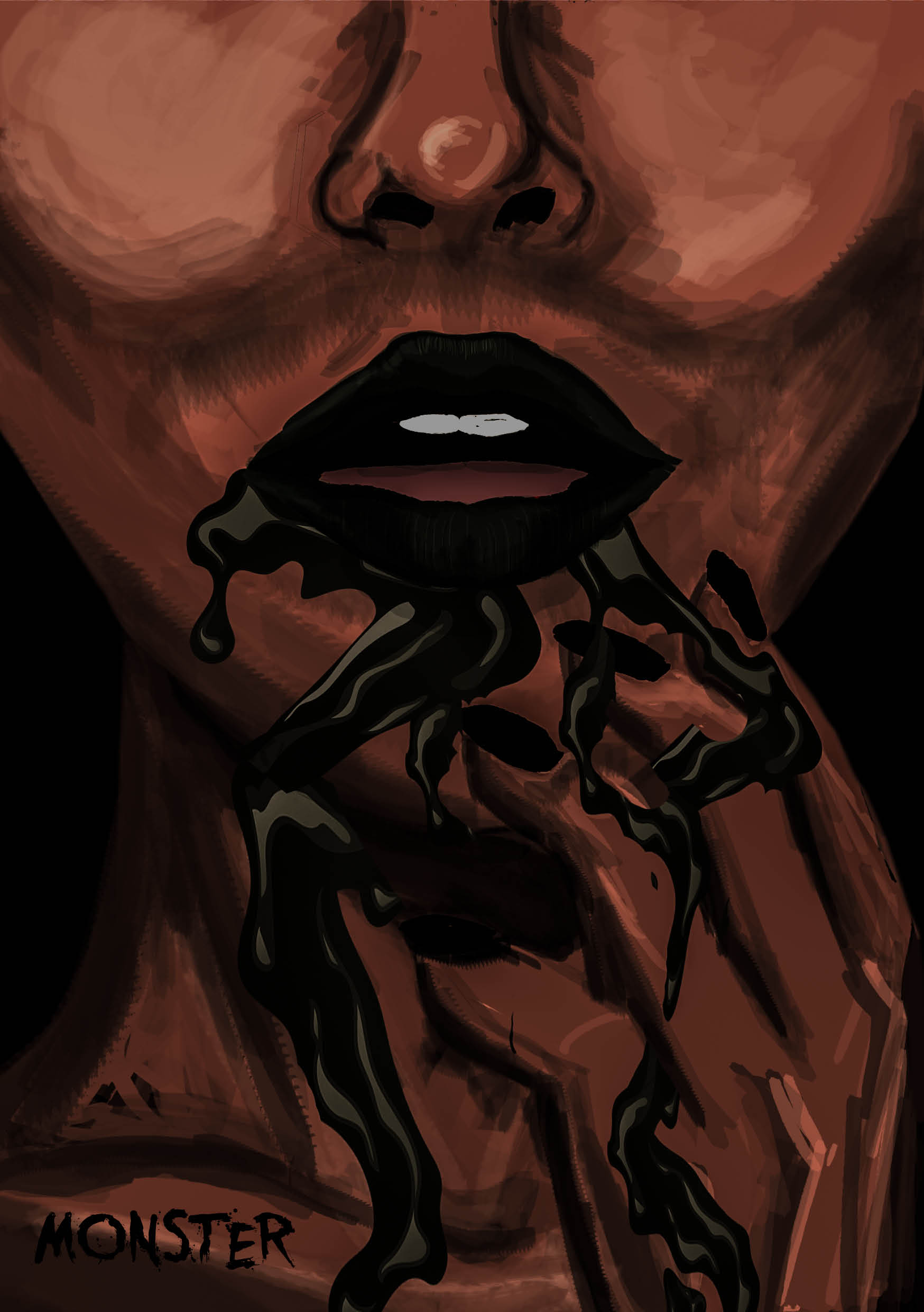
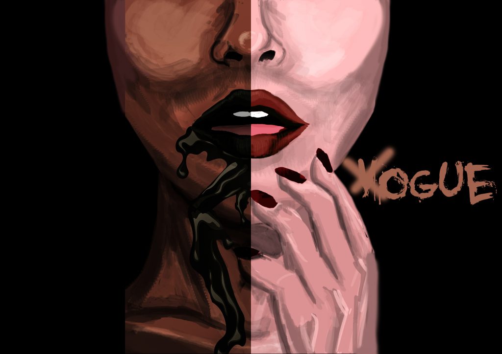
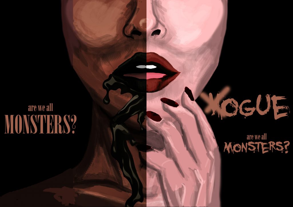
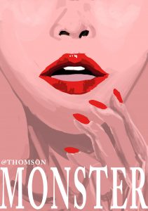
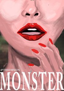
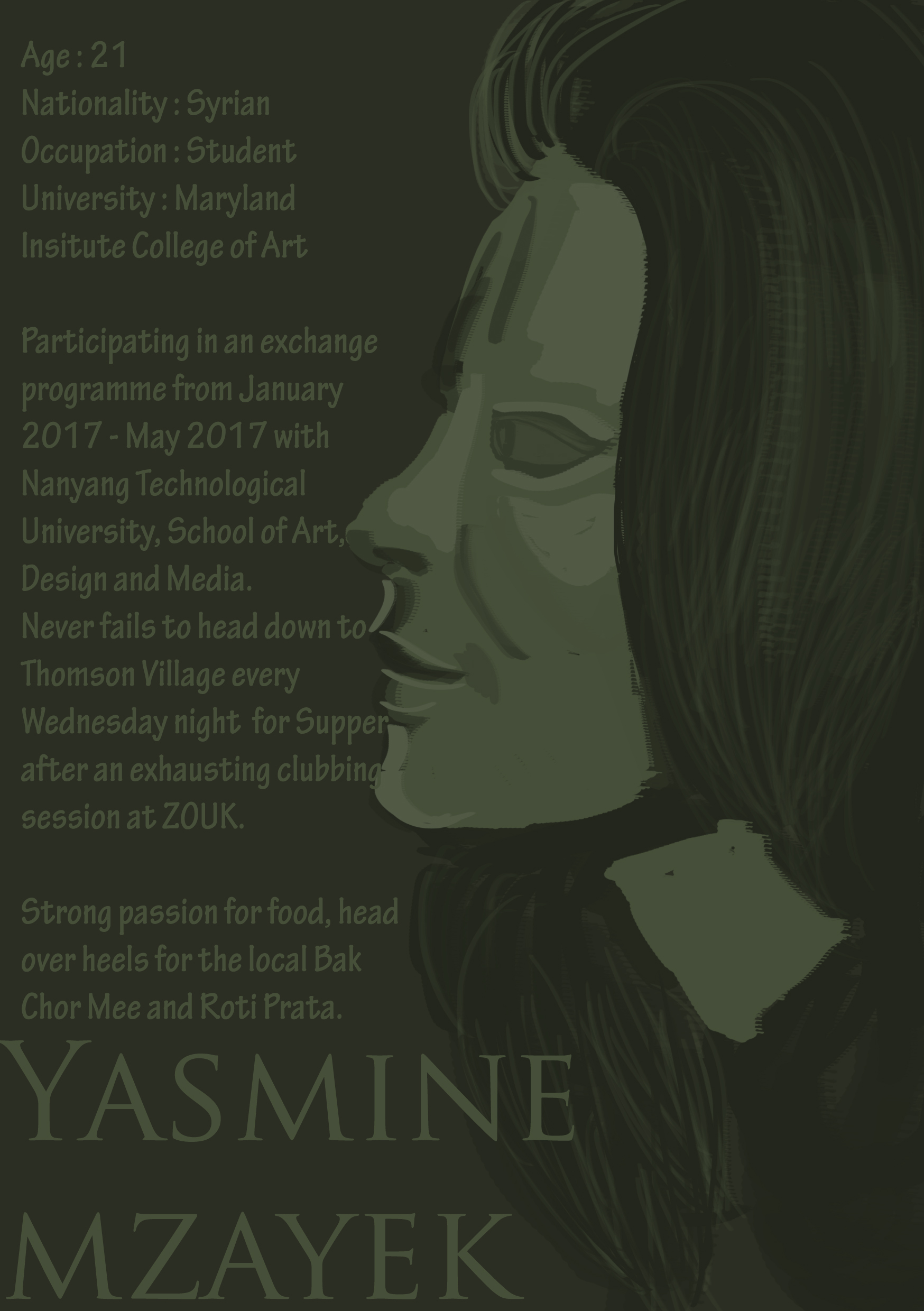
Based on my presentation idea of ‘MONSTER’, I have further dissect and improvise on how to capitalize on this unorthodox concept.So I brought Yasmine Mzayek, a friend of mine (whom eventually became the protagonist of my Zine) out for supper at Thomson, and we happened to had a lengthy conversation over her passion for food and how she felt uncomfortable with certain local food but heads over heels for some others.


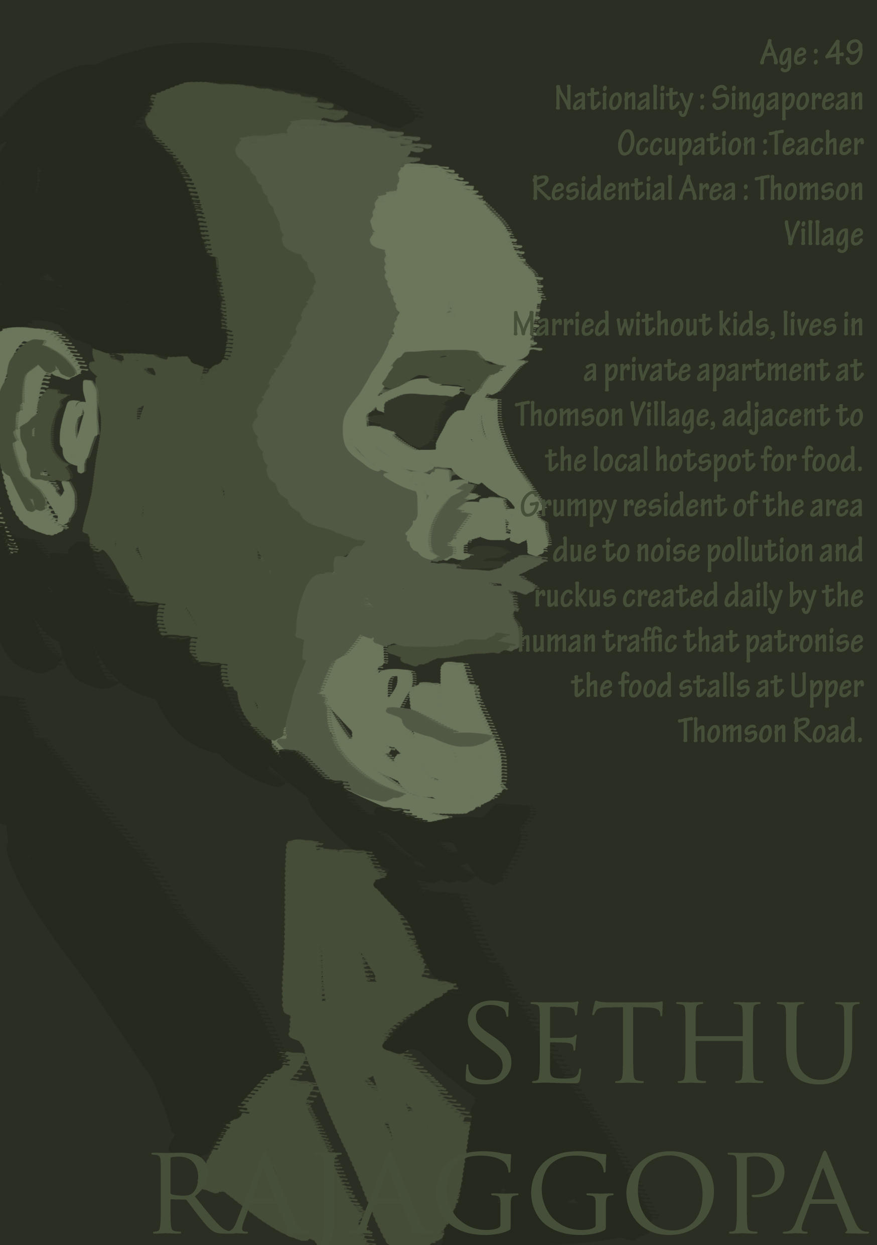
The light-heart conversation slowly turned into a darker one, one that led me to realization about how strong the passion for food some of us actually hold that could be somewhat scary if the scenario was slightly exaggerated.

I simply couldn’t stop imagining the possibilities.

Zombies? What if one fine day, we all turn and start eating up each other’s limbs? Would I rely on unscrupulous methods to obtain what I want – food? Would I stab a friend behind his or her back just to get my hands on that Michelin star dish served by Gordon Ramsay?

What if secretly, we’re all monsters?

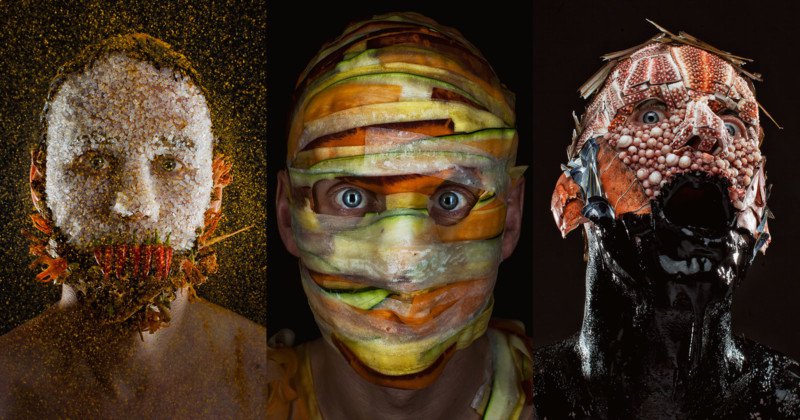
Creepy Portraits of a Chef Wearing His Menu Ingredients

Spices, radish and carrots, Octopus Ink and seafood

MENU is a new photo series by photographer Robert Harrison and chef Robbie Postma, a duo who decided to combine food and portrait photography in a strange and creepy new way. The photos show Postma wearing his menu ingredients on his face.

Postma is the chef for the cafeteria at the Dutch advertising agency J. Walter Thompson Amsterdam.

After breaking down menu items into their base ingredients, the duo carefully arranged the raw, unprocessed food onto Postma’s face. Everything was carefully planned and prepared, and the full project took a full year to complete — a single shot sometimes took 9 hours to prep and shoot.

“MENU is what happens when food meets photography on the dark side,” the duo says. “Served on the closest place you can get to a chef’s mind: on his face. The results are startling.”

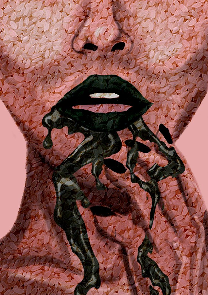
“Every grain of rice was added by hand, without the aid of digital manipulation,” the image and culinary artists write. “MENU is hand crafted. Just like the best food.”

Ice Cream and fruits

“Creepy Portraits of a Chef Wearing His Menu Ingredients.” PetaPixel. Accessed April 9, 2017. https://petapixel.com/2017/03/23/creepy-portraits-chef-wearing-menu-ingredients/.

Note to self from Tutor : Photoshop it better with a 3 dimensional depth OR go all out on photography + Stylize + Makeup

I was told after consultation with Mimi, that the imagery contents of my Zine are very much trying to portray a distinct style that is achieved from Photography + Lighting + Stylizing and Makeup on a real-life model.

So one of the option was to do a photo shoot and I would first need to source for a willing party to aid me with this ambitious but surely rewarding attempt especially since I’ve never done it before.

I asked my sister-in-laws(had to ask for girls because of the narrative content beginning with my exchange friend) and they were all reluctant to and I also come to realize that such photography could be deemed as degrading for those that don’t come from the arts field.

A friend of mine mentioned that she charge $60/hour for such a shoot. Oh boy, how am I to afford such high cost for a project. Until I successfully source for a willing party, I guess I will have to bank on improving my photo-shopping skill, and it needs to improve tremendously. Also, I will have to illustrate with a more distinctive style to make the Zine content flow.

Churning out the contents for each spread


Research Paper – Intro + Paragraphs

INTRODUCTION
Guo Xi’s and Katsushika Hokusai’s landscape artworks are the amalgamation of each individual personal experience and expression of nature and their respective philosophies towards the natural world. Both Guo Xi and Hokusai’s landscape artworks serves as a form of meditative art as it leaves the viewers to interpret the work as they wish limited by their own imagination which could relieve emotional stress, hence separating them from the truth and reality of their daily lives, momentarily.
(Do I need to add in visual evidence here or can I do it at the subsequent paragraphs?)
Despite sharing similar philosophies of asserting their ideal reality which are mentally constructed in their minds onto their artworks, the execution and purposes of each artist’s work is largely different in terms of not only the selected medium choices but also their views and play on perspectives. 


First Paragraph :

-updating-