Research Paper Proposal – Question 4

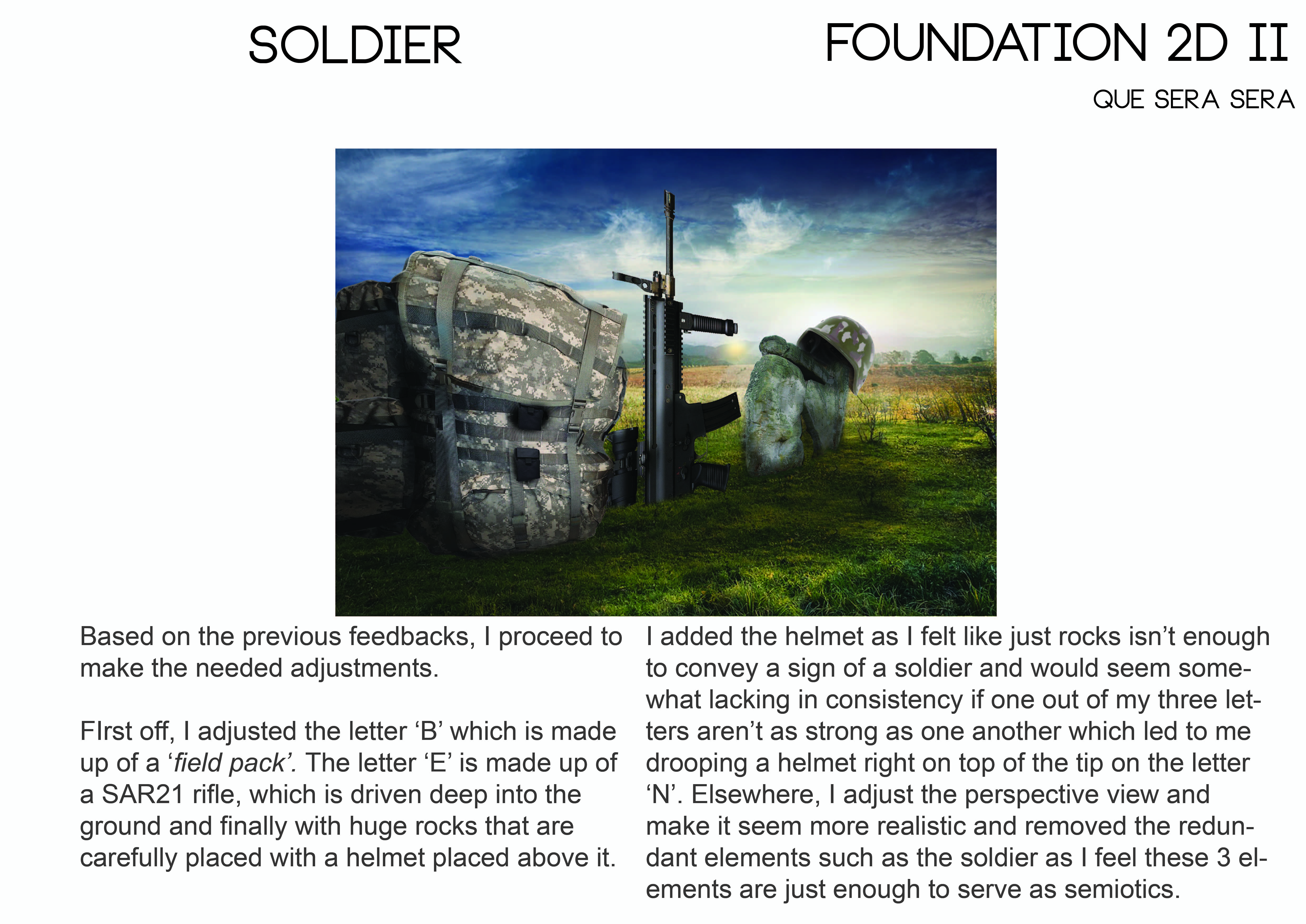
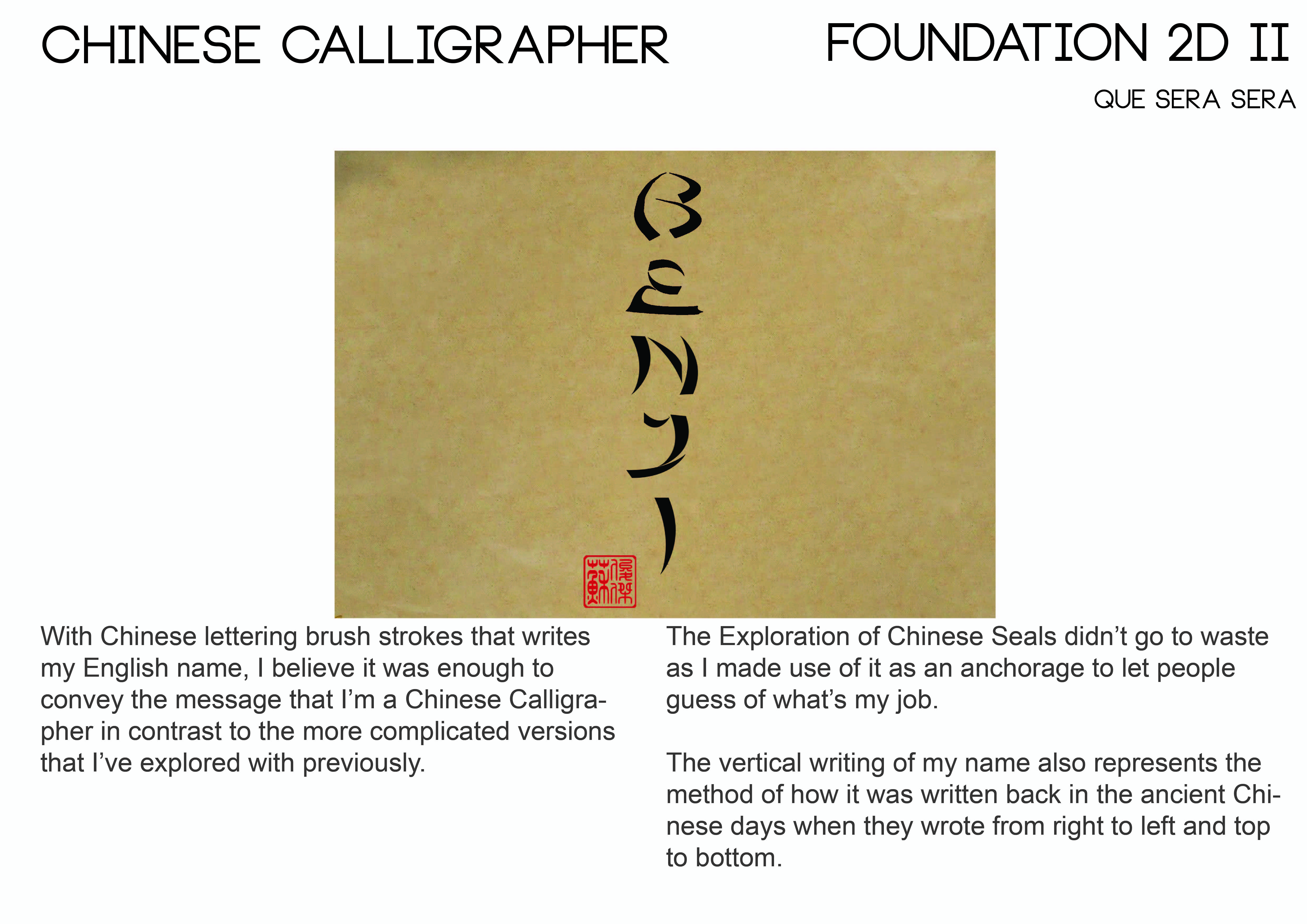
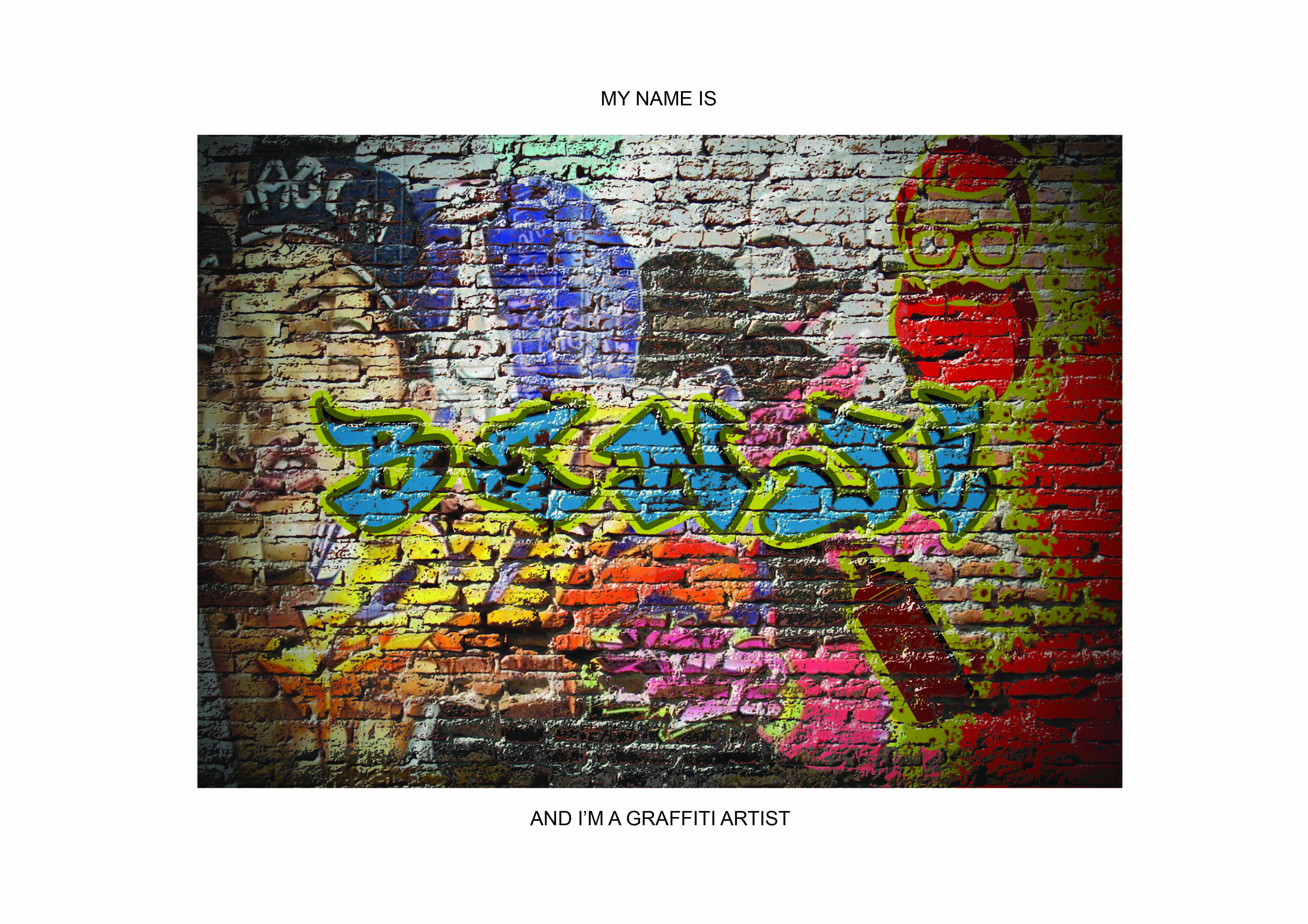
Question 4: Compare landscape painting by Guo Xi’s with woodblock print of Mt. Fuji by Hokusai. Consider the following in your discussion: patrons, producers, materials, production, function, and meanings.
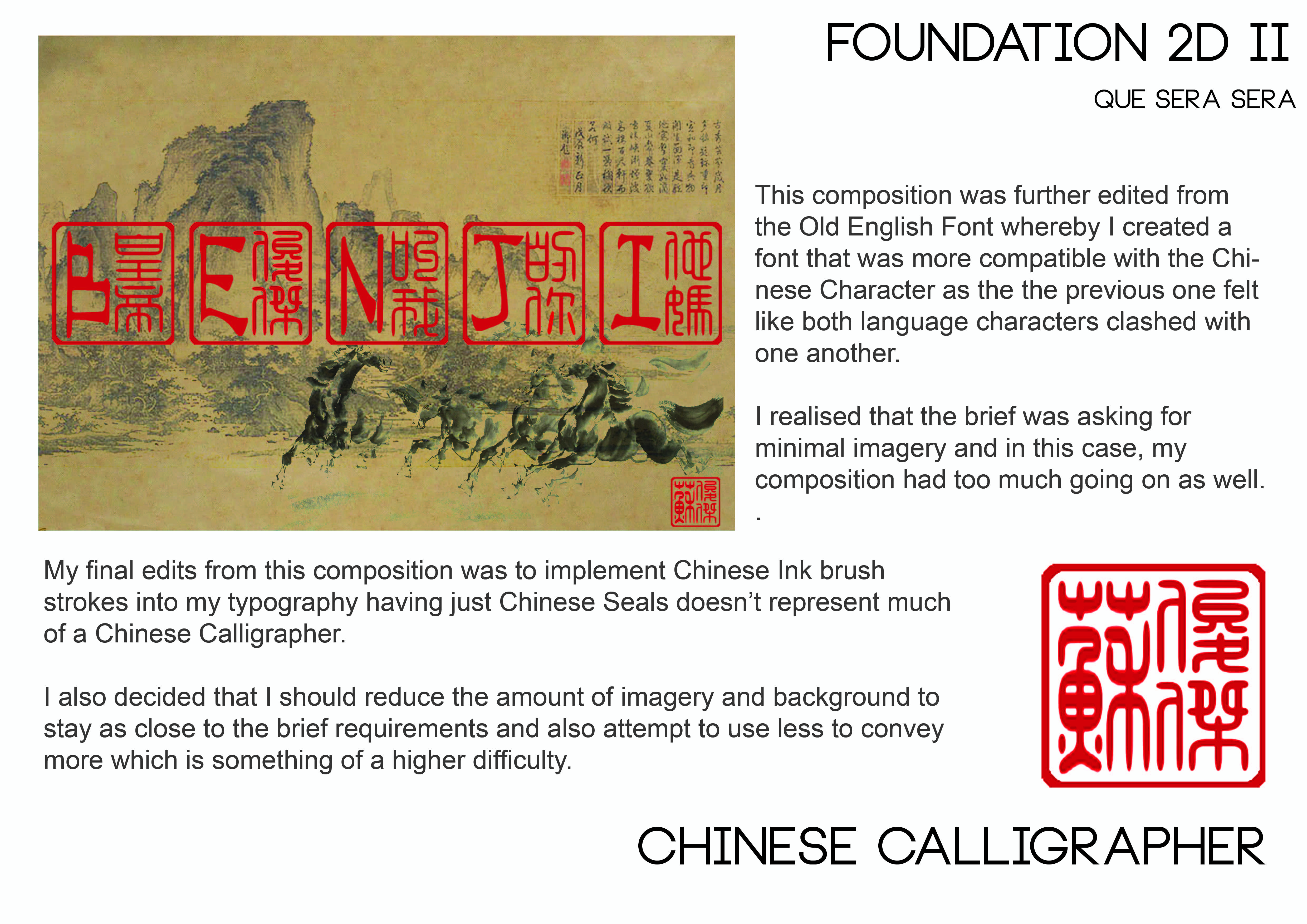
Introduction

Landscape painting is the amalgamation of the artist’s expression of his accumulated experiences in nature and his philosophical view towards the natural world which is richly symbolic as he depicts what the landscape personally embodies for him. The scenery painted often leaves the audiences to ponder in their own imagination as they wish which could provide metaphors for life.

Purpose/General Function/Buildup?

Landscape painting serves as a form of meditative art whereby viewers can get immersed into the art as the artwork takes you through on a journey of the serenity of nature, leaving the viewers with their own imagination to interpret the artwork which could relieve emotional stress, hence separating them from truth and reality momentarily as a way to escape from their daily lives, thus leaving the viewers feeling spiritually refreshed.

Tentative Claim

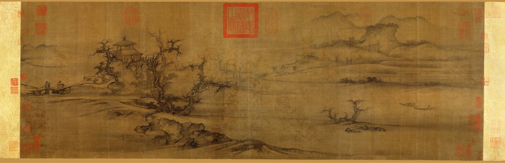
Figure 1 Old Trees, Level Distance, Northern Song dynasty (960–1127), ca. 1080 Guo Xi (Chinese, ca 1000-ca. 1090); Handscroll; ink and color on silk 13 ¾ x 41 ¼ in. (34.9 x 104.8cm); Source: Heilbrunn Timeline of Art History

Guo Xi’s landscape painting is mostly illustrated with the intent to depict a form of realism whereby he studies the nature elements such as mountains, greenery and lifeforms which he then transfers onto silk and paper marked with a Xuanhe zhongbi seal as seen in Fig 1. Old Trees, Level Distance just as the way he sees it. However, besides the idea of just realism in which he paints in a manner that does not challenge the laws of perspectives, Guo Xi’s intent to show the form of idealism is present as well in his work as he creates multiple perspectives which he calls ‘the angle of totality.’.

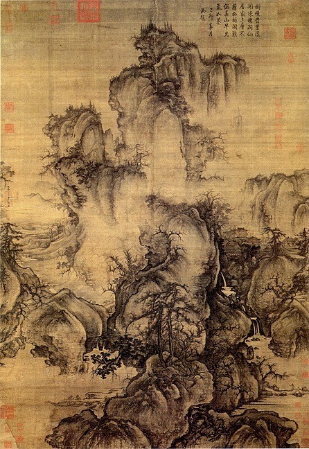
Figure 2 Figure 2 Early Spring, Hanging Figure 2 Early Spring, Hanging Scroll , Gui Xi (1010-1090) Ink on Silk. Source: GI

For instance, as seen in Fig 2. Early Spring, Hanging Scroll, we can observe that he attempted to paint the ideal landscape of a Taoist paradise by illustrating a somewhat smoky environment which is idealised to be mythical and powerful for the deities. Also, by including all angles of the mountain which defies the rule of perspective, this painting reeks of idealism. Hence, it is evident that Guo Xi’s painting style treads on both realism and idealism at the same time. – Evidence

  • Talk about who are the donors that commissioned Guo Xi to complete these artworks
    – Guo Xi was a scholar-official, a well-educated painter, likely to be commissioned by the Court/Emperor of the Northern Song Dynasty
  • What’s the purpose of this production
    – The purpose of these paintings were targeted for officials who cannot leave to visit the real landscapes.
  •  State the materials and medium briefly
    – Ink and Colour on Silk

INITIAL OPTION – HOKUSAI

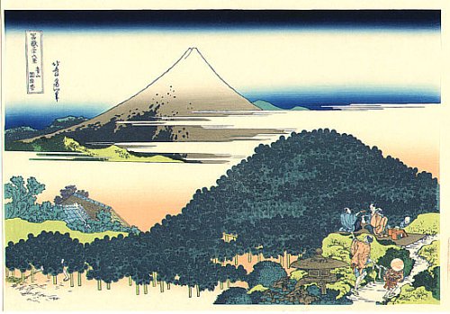
Figure 3 The Cushion Pine at Aoyama in Edo- Katsushika Hokusai’s ukiyo-e print, Katsushika Hokusai Edo period (1615–1868) ca. 1830–32 Polychrome woodblock print; ink and color on paper 9 5/8 x 14 3/4 in. (24.4 x 37.5 cm) Source: Henry L. Phillips Collection, Bequest of Henry L. Phillips, 1939

Fig. 3 The Cushion Pine at Aoyama in Edo is one out of thirty-six views of a series that shows the sacred Mount Fuji, produced by Katsushika Hokusai in 1830 when he was seventy years old as he reached the crescendo of his creativity and artistic vigour.

CHOSEN IMAGE – HOKUSAI

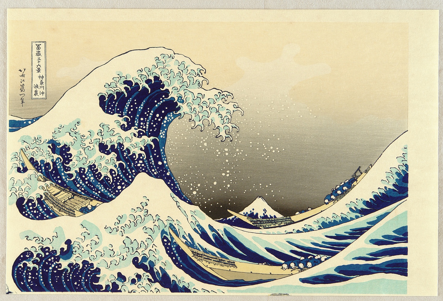
Figure 4 Under the Wave off Kanagawa (Kanagawa oki nami ura), also known as The Great Wave, from the series Thirty-six Views of Mount Fuji (Fugaku sanjūrokkei) Edo period (1615–1868) ca. 1830–32 Polychrome woodblock print; ink and color on paper 10 1/8 x 14 15/16 in. (25.7 x 37.9 cm) Source: H. O. Havemeyer Collection, Bequest of Mrs. H. O. Havemeyer, 1929

Description of Under the Wave off Kanagawa

  • Talk about who are the donors that commissioned them(patrons) to complete these two artwork and,
  • why both the artworks are produced(function)?
  • Compare their materials and medium briefly
  • *Talk about Katsushika Hokusai’s style – juxtaposition and linear perspective

Envisioned Paragraphs

  • Acknowledgement of some similarities in subject matter, degree of realism and medium.
  • Comparison of different style about Guo Xi’s realism + idealism(multiple angles) VS Hokusai’s realism + idealism (Juxtaposition/Linear perspective/Oblique angle/near and far)
  • Discuss whether both paintings serves the same/different purpose (Guo Xi’s targeting officials VS Hokusai’s personal facisnation with Mt Fuji and response to the domestic travel boom)
  • Possible meanings of the painting?

Zine – Neighborhood Explorer 1


So I was the first one to take part in the drawing of lots and with the possibilities of all the zones in Singapore, I was allocated with Thomson! My initial reaction was of course with great elation considering that I reside in Ang Mo Kio which really isn’t very far off from Thomson. It’s nearest MRT Station at the very start of Thomson Road happens to be Novena, a place that I frequent way too much as I make trips down to the Hospital almost once every week (no I’m not a doctor haha).

So I did up a little research on why it was named Thomson Road, I mean it could have been Benjamin Road right? (just kidding)

And of course, it was because of this guy!

John Turnbull Thomson (b. 10 August 1821, Glororum, England–d. 16 October 1884, Invercargill, New Zealand) was the Government Surveyor of the Straits Settlements from 1841 to 1853. He made a number of important contributions during his 12 years in Singapore, including the creation of maps of early Singapore, as well as the design and construction of several buildings and other public infrastructure on the island.1His greatest achievement was probably the design and construction of the Horsburgh Lighthouse on Pedra Branca.2 A self-taught artist and prolific writer, Thomson’s collection of paintings, books and articles now serve as invaluable records of the architecture and life of early Singapore.3

Source from Singapore Infopedia
http://eresources.nlb.gov.sg/infopedia/articles/SIP_230_2005-01-25.html

AHA – MOMENT

In an instant, I knew I had to do Architecture considering that it was Sir John Turnbull Thomson’s effort and results which contributed to a certain extent in some way albeit probably not as huge of an impact as the late Mr Lee Kuan Yew but hell, having a road named after you probably means your contribution meant something yeah?

With that, I found my first focus for my first trip of this Neigborhood Explorer project.

Private Apartments along Thomson Road

One of the many Condominiums by Thomson Road

Majority of the materials used in the architecture around this area of Thomson consisted of the above materials which are Blue tinted Mirror Glass, Timber and Concrete finish with different color of paint finish as their facade. This selection of materials spots a very modern look for an architecture in contrast with the other older buildings which was spotted a couple of streets down the long stretch of Thomson Road.

What a long way Singapore had come from planting trees all over Singapore, and in this age, we have many creative methods to provide a purposeful and aesthetically pleasing structure in this case, a vertical planting module which holds the flora which attract them faunas. This is a stark difference from what we can still find along, or rather will find a lot of along the Upper Thomson Road area where huge plots of land are still undeveloped and probably won’t be as those are protected areas and most probably used for the Army as the training ground purposes.

Vertical Planting Modules found outside Starbucks at United Square along Thomson Road

Did I mention that Thomson is a long stretch?

Old buildings beside United Square

One of the older buildings around the modern building at the start of Thomson Road which stood out really obvious. These buildings consist mostly of concrete with paint finish and certain portion of the facade are painted with really tacky colors such as bright green, yellow and blue. 

SC Global / NEWTON 200 along Thomson Road

Traditional Shop-houses featuring plenty of different cuisines of food

This Traditional Shop-houses were spotted with a lot of different cuisines…

and these varieties of food stretches further down with more delicious food

… which stretches further down Thomson Road all the way to Upper Thomson Road which based on map reference, could possibly be the distance of Novena MRT to Yishun MRT as a gauge of how long a stretch Thomson really is.

The topic food also branches out to possibly a new focus for myself as I’ve asked around so often about what do they think of when Thomson is mentioned – FOOD. 

More old private apartments with the construction of the church of St Alphonsus along Thomson Road

Church of St Alphonus before the reconstruction

image taken from http://www.panoramio.com/photo/67998490

Rather Old Private Apartments right opposite Novena Square and Velocity

This marks the start of my exploration around the residential area which range from terrace houses to really old HDB buildings. It was really quiet around this area around evening time even though people should be coming back from home by then.


The overall feeling this building gives off is really quite depressing and somewhat creepy?

This area feels a bit like Malaysia, but of course it isn’t. There really wasn’t much special stuff that really breathe Thomson, elements that I could instantly relate to Thomson Road/ Area.

As I delved further into the neighborhood of old Architectures which still doesn’t show much. By now, I was really unconvinced about doing things related to Architecture but I couldn’t let it go yet, so I sticked to my plan and explored further.


We could tell the huge difference between the older buildings as compared to the modern ones. There’s a stark difference between the two of them, in terms of colors, structure and aesthetics just as mentioned before, but it all aims to serve the same purpose – housing families.

On a side note, that right there (on top left) is really amazing, I wish I could go up there one day and see how it looks like and enjoy that spatial experience from that high up. 

I’ve finally reached Thomson Flyover by this point and I spotted something really interesting that resides underneath this Flyover which happens to be a Futsal Court – a smaller pitch for football. There were families and their children playing a game of football which is always a nice thing to see. However, it was nothing helpful towards my Zine to be honest which was quite a bummer as I had lots of hope looking from the outside.


Source - Straits Time

Source – Straits Time

Source - Straits Time

Source – Straits Time

With a slew of old-school restaurants and buzzy new hipster joints, some of which are open round the clock, Thomson Village near Upper Thomson Road is a magnet for diners in the evenings and on weekends.

IN UPPER THOMSON

They don’t just park illegally and block your gate, but shout and disturb the residents late at night.

MR LEE, Thomson Ridge resident

But the area’s popularity has created parking and traffic problems, with multiple instances of illegal parking occurring regularly, and residents in nearby estates complaining about restaurant patrons who park in front of their gates and block their cars.

To prevent the situation from deteriorating, the Urban Redevelopment Authority (URA) has banned additional eateries from opening in shophouses in sections along Jalan Todak, Soo Chow Walk, Sin Ming Road and Shunfu Road, as well as Upper Thomson Road.

Source from : http://www.straitstimes.com/singapore/ura-bans-new-eateries-in-upper-thomson-little-india-and-bedok-due-to-parking-woes

-UPDATING-

SONY DSC

SONY DSC

SONY DSC

SONY DSC

SONY DSC

SONY DSC

SONY DSC

SONY DSC

SONY DSC

SONY DSC

SONY DSC

SONY DSC

SONY DSC

SONY DSC

SONY DSC

SONY DSC

SONY DSC

SONY DSC

SONY DSC

SONY DSC

SONY DSC

SONY DSC

SONY DSC

SONY DSC

SONY DSC

SONY DSC

SONY DSC

SONY DSC

SONY DSC

SONY DSC

SONY DSC

SONY DSC

SONY DSC

SONY DSC

SONY DSC

SONY DSC

SONY DSC

SONY DSC

SONY DSC

SONY DSC

SONY DSC

SONY DSC

Que Sera Sera 3

oss-documents-csi-graf-01 oss-documents-csi-graf-03 oss-documents-latest-09
grafitti-gif

I made use of a brick wall image to ‘spray’ my name over it. I applied a stroke with another color to made it look as though it’s layered with multiple colors. I added some inner shadow and outer glow to give it some depth. It seem pretty plain to me but I received multiple feedback during the ‘work-in-progress’ session from both Mimi and my peers that it had too much going on in the background. Also, there was some issue with the letter ‘E’ as it wasn’t as legible as the other letters. However, to create depth, I had to forgo the functionality in this case the legibility in exchange for the aesthetics of this typography portrait. I eventually came to terms to let this piece go and proceeded on others.

oss-documents-csi-graf-02oss-documents-csi-graf-04oss-documents-latest-09csi-gif

With similar methods applied with the Graffiti piece, I managed to come up with this CSI piece which looked really decent to me as well. Similarly, I received the same feedback for this just like the Graffiti one which led me to work on other pieces which were eventually my final 4. I probably would not have settled for this piece anyway as I would have liked to explore on more methods digitally.

oss-documents-01

oss-documents-latest-04

oss-documents-latest-09

architect-gif

This piece was one of my favorite but due to the ambiguity of it’s identity as I was told that it could represent either Architect or Interior Designer or even a Landscape Architect(which was what it was meant to be) was really worrisome. I finally came to terms with it after a long struggle as I convinced myself that this is a module whereby I learn to communicate to the audience visually… but it was really hard.


Next Post : The final 4 
Architect
Game Designer
Soldier
Chinese Calligrapher

Client’s Gift

dawin-ho

demographicIMPORTANT INFORMATION TO NOTE OF CLIENT

  • Dawin’s expertise is on Branding, Packaging and Print, Publicity and Publications and also creating infographics.

  • Dawin is highly active on his social media specifically on his Instagram in which he posts images captured by himself of mainly the following components as follows, a) Group photos with friends, b) food, c) art & crafts, d) travelling and, e) Chinese cultural events and/or works.
  • Dawin shows high interest in Traditional Chinese Culture such as Chinese
  • Calligraphy and Lion Dance as evident in his social media accounts and especially since his personal name card has a Chinese Seal Hot Stamp print of his Chinese Name.
  • Despite his liking of food, he expressed his dislike for fruits strongly.

    DERIVED INFORMATION

    Needs – Client’s need for hall stay is beyond the idea of a gift to him by me.
    Wants – Similarly, Client’s want for more time for his holiday is beyond the idea of a gift to him by me.
    Request – Client is well versed in most art and craft aspects so what he requested for is as simple as Sincerity in the gift.

    Aesthetics – Client’s trait to focus more on the aesthetics than the functionality of a product but subjected to different circumstances.

    EXPLORATION ON 3 KEYWORDS

    Chinese Calligraphy Chinese Paper Cut Pantone (Colour System)


research-calligraphy-4research-calligraphy-5


research-calligraphy-6research-calligraphy-7


research-calligraphy-8

research-calligraphy-12 research-calligraphy-11 research-calligraphy-13

OBJECTIVES

  • To build something with very strong Chinese Traditional Culture such as Chinese Paper Cut and/or Chinese Calligraphy
  • Attempt to incorporate his favourite Colour of Pantone 109C (Yellow) onto the final product
  • To build a gift that would be very personal to him, something that he will not bear to throw away like flowers for an example

THE GIFT

1

  • Traditional Chinese Characters for Client’s name
  • Hand-made with Dull Grey Clay
  • Characters are hand-carved
  • Spray painted with Grey Stone finish

evolution

  • Each side represents the evolution of the Chinese letter for ‘Monkey’
  • Product was made without any general purpose for the client, simply a gift that represents a very Chinese cultured Dawin
  • Having said that, the weight of this gift is sufficient to act as a makeshift paper weight when required. :p3d7
  • A smaller prototype version whereby the accuracy in carving becomes way tougher
  • It was easier to mould it to shape as compared to a larger one
  • Significantly lighter in comparison to the large one
  • Could have used Gold paint to paint inside of the carved areas to bring out the characters and also as a makeshift of his favorite color – Pantone 109C

Que Sera Sera 2

PROJECT BRIEF
So creating typographic portraits by using my whole name, nickname or initials to describe my future job was the task at hand whereby each solution must consider the following factors: choice of typeface, style, size, weight, use of upper and lower case characters as well as space in between the letters.

And so the first job was to brainstorm about the jobs that I would be interested to work on, and there I was doodling on some of the ideas such as

  1. Architect
  2. Dentist
  3. Plastic Surgeon
  4. Chef
  5. Milkman
  6. Photographer
  7. Chinese Calligrapher
  8. F1 Driver
  9. Photographer
  10. Interior Designer
  11. Product Designer
  12. DJ
  13. Crime Scene Investigator
  14. Graffiti Artist
  15. Pastry Chef
  16. Product Designer
  17. Tattoo Artist

Okay wow, that’s actually a lot of jobs now that I listed them all out. Some of them I’ve tried initially by sketching out but did not further pursue the idea which I’ll point out or some that I just totally abort the idea because it was just beyond my current capabilities. Generally the jobs that I’ve listed are all things that I really like or careers I’ve thought of pursuing when I was younger.

Okay, enough of blabbering, let’s check out my processes on my initial ideas before we move on to how I have eventually come up with my final designs.

Architect

img_0179
So this was done on the very first lesson and I thought of working in somewhat similar manners for one of my final board and then I found this,ikea-create-small-27643
So there I was thinking I’m a genius for thinking of such a method to bring out my fonts for my Architect portrait but it had already been done by IKEA. Nevertheless, I proceeded on to work on my first composition.

16651703_10154273646318045_513902668_n

These are just some sketching as to how I’m going form up my name with the walls and rooms on a floor plan. Also, it shows my doodles on idea as to how to create other jobs such as the Dentist and Tattoo Artist.

architect-benji-process

Eventually, I proceeded to digitally created a floor plan which depicts my nickname ‘Benji’.

untitled-2

I used a background of a table top with timber finishing and lay over all my past technical drawing works in polytechnic as some sort of hints of the job related to this portrait.

architect-idea-2

I finished it off by using a first person view of drawing up a floor plan by placing a person’s hand drawing on the paper with a ruler and a marker.

architect-benji2

Alternatively, I attempted to create fonts from a 3D software which didn’t turn out the way I envisioned it to be as it would probably take a really long time for me to render it. Nevertheless, as shown below is my poor attempt.

architect-benjiarchitect-benji-1

However, this setback did not refrain me from trying to create something that looks 3D as I sought after different methods to produce something that seem somewhat 3 dimensional.

Chef

sandwich_alphabet

I happened to see this imagery and thought it was a really cool application of using real life items to create fonts. However, I thought since it was a 2D Module, I should use this opportunity to practice on my Adobe Photoshop and Illustrator skills, hence deciding against to create something physically and taking a good photo of it.

chef-benji

This was the final composition of this piece of ‘Chef’ and I was really disappointed as it was a really cheap way of creating one of my typography portrait and thought that I wasn’t really creating a font myself which led me on to the next typography portrait to solely focus on creating my very own type font and then proceeding to working on the aesthetics.

Milkman

benji-farmer-milkman-process

So in ‘Milkman’, I created the Font by using Shapes and then removing certain areas to give hints of my nickname Benji. A white color was used with a tint of grey to create a somewhat milky color. Black was used as background to thoroughly bring out the Milky color.

benji-farmer-milkman-3

This is the final layout as I used milk splashes on some of the fonts to create some sort of innuendo to what my job scope is. Straws coming out from a packet milk in the letter ‘N’ was one of the other one that I thought worked really well. The Bull’s horn didn’t really work for Mimi and I can see why she mentioned that because it is a Bull which i mistakenly took for as a cow.

F1 Racer

benji-f1-racer-process-2

For this piece, I first placed the chosen type font randomly and proceeded using pen tool to map out the roads.

benji-f1-racer-process

Thereafter, I filled the area with a road texture and used multiple effects in Photoshop

  • Bevel & Emboss
  • Stroke
  • Pattern Overlay
  • Drop Shadow

benji-f1-racer

This was the final piece after I added in a background. I really didn’t like how the roads turned out to be and decided to abort this piece as I couldn’t really relate to this job anyway.

Pastry Chef

benji-pastry-pancake-chef-process

After my initial disappointment with my ‘Chef’ piece, I decided to work on another, but this time using a type font and try to create the honey glaze over a pancake instead of using imagery directly found online.

benji-pastry-pancake-chef-jpeg

After multiple try outs with the various blending options in Photoshop such as

  • Pattern Overlay
  • Bevel & Emboss
  • Inner Shadow
  • Inner Glow
  • Drop Shadow

I was able to create the effect of honey over the top of a pancake depicting my nickname once ‘Benji‘.

After consultation with Mimi, she suggested me to make the font a bit more liquefied as it seems like it’s splat onto the pancake which didn’t come across as very natural but artificial. Thereafter I decided to scrap this piece and start working on other pieces.

Product Designer/Interior Designer (?)

benji-product-design-proto

In this piece, I tried to use furniture imagery found online to create my font and added feint background in my attempt for a 3 dimensional piece which I think I kind of failed miserably once again.

product-design-4

Halfway through this, I thought I was really trying to force it out and something just didn’t feel right. Perhaps it was the distracting background which kind of steals the attention away from the products which are supposed to depict my nickname.


Interior Designer

16651924_10154272329953045_1385342049_n

I came across this interior design of a cupboard/shelf which gave me some sort of inspiration for the upcoming piece.

interior-architect-benji

In this piece, I attempted to use shape and drop shadows to create some kind of a shelf design as referenced from the Instagram image.

Photographerphotographer-benji-process-1

Select a type font that I like in this case is ETH Black.

photographer-benji-process-2

By adjusting the brush setting and select directly onto the font, I was able to create the brush effect around the font. The settings I tweak with were

  • Brush Tip Shape
  • Scattering
  • Smoothing

photographer-benji

The final outcome of the brush wasn’t what I intended as I intended for the brush effect which seem somewhat like bokeh – the visual quality of the out-of-focus areas of a photographic image, especially as rendered by a particular lens.

The intended outcome was to have it in multiple colors with a larger brush tip but I decided to move on to trying other alternatives as I’ve achieved my objective of exploring the different effects Photoshop offers albeit not mastering it altogether.

DJ

dj-benji-process

This effect was created by Stylize > Wind. It created the effect of something like a soundwave which was to represent the music that I’ll be playing as a DJ.

dj-benji-process-2

I added a gradient of multiple colors to further bring out the sound waves.

dj-benji

I created a rounded rectangle and created it as a pattern and applied gradient over it to created the image of the volume on the sound system.

In all honesty, this piece was quite embarrassing as it look really tacky but it was fun trying out.


Conclusion
After doing all these exploration, I realized that I have done something that was somewhat similar to what Mimi made us do on the very first lesson, which was to churn out as many ideas as possible on the A3 paper with 30 circles.

Despite not having any final pieces, I managed to explore multiple ways of application on different methods which were detrimental in creating my next few pieces.

Sneak Peek
sneak-peak

Things to note
‘The aim of this project is to use typography as an end in itself, minimizing supporting imagery. Conceptually driven solutions and letter forms are combined with literal or abstract images to express your future job. The outcomes address either materials, the process or a result of using specific media and technique.’

After revising the brief and consultation with Mimi, I realized that my applications were somewhat narrative very much towards process and result and less of using literal or abstract images in my expressions for the fonts which I attempt to rectify. 

Que Sera Sera 1

Dada was an artistic and literary movement that began in Zürich, Switzerland. It arose as a reaction to World War I and the nationalism that many thought had led to the war. Influenced by other avant-garde movements – Cubism, Futurism, Constructivism, and Expressionism – its output was wildly diverse, ranging from performance art to poetry, photography, sculpture, painting, and collage. Dada’s aesthetic, marked by its mockery of materialistic and nationalistic attitudes, proved a powerful influence on artists in many cities, including Berlin, Hanover, Paris, New York, and Cologne, all of which generated their own groups. The movement dissipated with the establishment of Surrealism, but the ideas it gave rise to have become the cornerstones of various categories of modern and contemporary art.

It was the first conceptual art movement where the focus of the artists was not on crafting aesthetically pleasing objects but on making works that often upended bourgeois sensibilities and that generated difficult questions about society, the role of the artist, and the purpose of art.
Dada. [Internet]. 2017. TheArtStory.org website. Available from:
http://www.theartstory.org/movement-dada.htm [Accessed 01 Feb 2017]

MOST IMPORTANT ART OF THIS ART MOVEMENT

“R. Mutt’, however, was an unusual name, with comic overtones, and this might have given people a clue as to its falseness. Later in life, when asked whether ‘R. Mutt’ was a pun on the German word Armut meaning poverty, Duchamp was quoted as explaining:

Marcel Duchamp, 'Fountain' 1917, replica 1964

Marcel Duchamp, ‘Fountain’ 1917, replica 1964

Mutt comes from Mott Works, the name of a large sanitary equipment manufacturer. But Mott was too close so I altered it to Mutt, after the daily cartoon strip “Mutt and Jeff” which appeared at the time, and with which everyone was familiar. Thus, from the start, there was an interplay of Mutt: a fat little funny man, and Jeff: a tall thin man … I wanted any old name. And I added Richard [French slang for money-bags]. That’s not a bad name for a pissotière. Get it? The opposite of poverty. But not even that much, just R. MUTT.
(Camfield 1989, p.23.)” 
Howarth, Sophie. (April 2000) revised by Mundy, Jennifer. (August 2015) “Fountain.” http://www.tate.org.uk/art/artworks/duchamp-fountain-t07573 (1 February 2017).

“Duchamp was the first artist to use a readymade and his choice of a urinal was guaranteed to challenge and offend even his fellow artists. There is little manipulation of the urinal by the artist other than to turn it upside-down and to sign it with a fictitious name. By removing the urinal from its everyday environment and placing it in an art context, Duchamp was questioning basic definitions of art as well as the role of the artist in creating it. With the title, Fountain, Duchamp made a tongue in cheek reference to both the purpose of the urinal as well to famous fountains designed by Renaissance and Baroque artists. In its path-breaking boldness the work has become iconic of the irreverence of the Dada movement towards both traditional artistic values and production techniques. Its influence on later twentieth century artists such as Jeff Koons, Robert Rauschenberg, Damien Hirst, and others is incalculable.”
Dada. [Internet]. 2017. TheArtStory.org website. Available from:
http://www.theartstory.org/movement-dada.htm [Accessed 01 Feb 2017]

SUMMARY OF FINDINGS

  • Duchamp created a new way of looking at an object at it’s literal value – what we call conceptual art
  • Dada artists are known for their use of readymade objects – everyday objects that could be bought and presented as art with little manipulation by the artist.
  • The introduction of chance was a way for Dadaists to challenge artistic norms and to question the role of the artist in the artistic process. – Many artist were exponent on Hans Arp’s law of chance whereby he incorporate the chance factor into his creation of works of art which went against all norms of traidtional art production in which preparations were meticulously planned and thought for before the execution of completing the artwork.
  • Dada artists are known for their use of readymade objects – everyday objects that could be bought and presented as art with little manipulation by the artist. The use of the readymade forced questions about artistic creativity and the very definition of art and its purpose in society.


HANNAH HOCH

  • The only woman in the absurdist Dada art movement of the 1910s, German artist Hannah Hoch pioneered an edgy style of photomontage that’s showcased in a major new exhibition.
  • One of the originators of Photomontage
Das schöne Mädchen [The Beautiful Girl]
In terms of composition, the artwork by Hannah Hoch (image on the left above) was one that I really like among the others. Somehow the composition shows me a large head of a lady and a small body and with the recurring patterns, it really caught my eye. Well, she is one of the originators of Photomontage, right? I’m sure her composition skills would be second to none considering that she’s such a famous artist during the DADA art movement. 
Personally, I thought the artworks of Hannah Hoch’s were pretty minimal(image on the right above) and not what I usually try to produce. Then again, my works from Semester 1 was previously thought of as ‘too much’  as I tend to fill up way too much of a canvas when there are room to be lesser. So I thought Hannah Hoch’s work would be a good reference for me as to how to keep things minimal.
Image result for stefan sagmeister
However, one artist that Mimi introduced to us in class got me so amazed with his works. He’s none other than the legendary, Stefan Sagmeister.
The thing about Sagmeister’s artworks for me is that it works really well despite looking so minimal and clean.
Image result for stefan sagmeisterImage result for stefan sagmeister typography
Well, I guess the time is now for me to talk less and do more by start working on my A4 canvases for Que Sera Sera. 🙂

Ego 2

Hello there! Here are my final composition for the 4 x 3 series of Personal Trait, Situation and Imagined Outcome respectively! As mentioned in my previous post, I have decided on creating a series of Digital Art for this assignment as I explored with the
different methods such as Digital Illustration and Digital Painting and Photo Collaging.

My overall theme for these equation mainly revolves around a ‘digital me’ as I feel that the best way to represent myself, is myself.
Hence, you will tend to observe the recurring factor of human or signs of human in most of my composition.

Without further ado, let’s go check them out shall we!

EQUATION 1row-1

121116-creative-me-110916

SERIES 1 – A CREATIVE ME 

color-1

I would like to think that I have a rather creative repertoire to offer hence I have decided to use it as my first trait. The waves represents the creativity that flows within me just like they are in the ocean, naturally. There is a subtle attempt from me to blend the streaks of my hair into the ocean wave, symbolising my natural raw potential in the arts field(hahaha i laughed while typing this, honestly).

The colour composition included the colours of the sunset came about almost instantaeously when I decided to use the ocean wave, because what is better than the scenic view of the sunset while we stroll along the beach?

direction-composition-new

SERIES 1 – IN SEARCH OF A CLEAR DIRECTION

color-2

I have always had the dream of becoming an Architect but it seems to me that the route I have chosen seems to bring me further away from it. Meanwhile, I have no options but to brave through the cold through the stormy sea as I attempt to navigate my way back to my ultimate goal.

I have chosen the different tones of blue for this box to evoke the ice cold feeling of the harsh reality in society that things does not always go your way and sometimes, you might just have to take the longer route to achieve what you really want.

incomplete-puzzle

SERIES 1 – INCOMPLETE

color-3

As I have yet to successfully navigate to the destination I envsioned for myself, therefore I’m comparable to an incomplete puzzle – not yet the finished article. The reason of using grayscale tones for this composition is because until the day I feel like I’m actually the final product, the most complete version of myself, I just can’t see the colours in me.

EQUATION 2

row-2

111116-2d-box-1

SERIES 2 – AN AMBITIOUS ME

color-4

Despite my cheerful and nonchalent attitude towards many things in life, I actually do think a lot on the inside. I’m secretly very ambitious because I feel the need to succeed in life and the biggest motivation for me to do so is my family, hence the inclusion of the roots.

The colour component for this box is a colour scheme that I thought looked really beautiful. The dull tone of blue is my way of portraying my nonchalent attitude on the outside but the red shows how I think passionately and actively all the time.

 pressure1-low

SERIES 2 – ME BEING PUT TO THE TEST UNDER IMMENSE PRESSURE

color-5

When put under immense pressure to me feels like being thrown into a blaze of fire(which explains the colour scheme for this one), with the uncomfortable feeling of anxiety. However, the only time someone would grow and become better is when they step out of their comfort zone, only then will they improve and become better. In this case, I’m like an egg, that would crack under such stress but what is it that lies beneath me, just what could I find?

101116-a-diamond-is-a-chunk-of-coal-made-good-under-pressure-110916

SERIES 2 – THE DIAMOND THAT I ALWAYS HOPED I COULD BE

color-6

A lump of coal under immense pressure could do one or two things, it either crumble and turn to dust and render it useless or the pressure will turn it into the diamond that you always hope it could be. In this case, the ideal outcome would be that I become the diamond I always hoped I would become.

The tones of brown are used to show that it’s no easy work to succeed in life, you got to have your face in the mud, and claw your way up.

EQUATION 3

row-3

rooted-recovered2

SERIES 3 – A FEARFUL ME

row-7

This picture shows myself rooted to the ground, unable to move due to fear of actually doing something. I believe that I’m always thinking a lot, somewhat afraid of embarassment. The dull colour used for the background for this box attempts to evoke some sort of fear. The subtle dissolving effect represents me disappearing into air when I embarass myself. The red blush skin tone indicates my embarassment.

rooted-to-the-ground-low

SERIES 3 – GREEN WITH ENVY 

row-8

Not taking the first step because of being afraid always result in seeing somebody else getting what you want. When that happens, you can only look on green with envy because what else can you do? Slowly but surely, that envy becomes jealousy and turns you into a ‘green-eyed monster’ and the orange hand in this box shows the last bit of human in me longing for that something or someone.

jealousy2

SERIES 3 – AN EMOTIONAL WRECK

row-9

Jealousy refers to the reaction to their envious resentment of someone of their achievements, possessions, or perceived advantage. In this series, it means me becoming an emotional wreck whereby I see myself going on a frenzy, destroying everything in my way because of the devastation. The green tone is used in this box mainly because jealousy is the main reason for my path of destruction.

EQUATION 4

row-4-1

lonely-infatuated-me-final

SERIES 4 – A HEARTBROKEN AND REGRETFUL ME

row-10

The dull colours of the background indicates just the kind of life I would have (dark and gloomy) without her. However, she’s all I think of passionately everyday, as she’s the one I want to walk down that road together with.

121116-melting-clock

SERIES 4 – ATTEMPT TO GO BACK IN TIME TO REWRITE HISTORY

row-11

In television shows and movies, they always associate travelling back in time with black and white which was why I decided to use black and white for this box as well. To me, going back in time also means going through several dimensions before finally reaching the past(not that I believe that time travelling actually exist). Similarly, in the media, melting seems like the ideal way to create a trippy effect of going back in time.

love-4

SERIES 4 – HAPPILY EVER AFTER

row-12

In this series outcome, I have successfully managed to travel back in time and relive the moments and make amends to the mistakes that I have made previously – facing my fear and going all out for someone or something that I know I want in my life.  In this box, the color selection for this box is to illustrate the ideal outcome of a happily ever after. Black is used to bring out the red color.

& that is all I have for this assignment! I hope that you have learnt a lot more about me through my twelve boxes and I also do realize after my illustrations that I’m rather pessimistic in life or at least it seems to portray that I’m. It’s not that bad to be honest… really… no don’t go away, please be my friend.

On a more serious note, I felt like I have taken every box for this assignment as an individual painting as itself and only connect the content in terms of narrative but less of having the same colour scheme throughout one full series. I thought that it would look better across as a whole with a different variety. Well, that’s only my individual opinion! It has been a fruitful last assignment as I felt like I have learnt so much new methods and techniques to create artwork digitally, which was something I always wanted to do, I’m extremely satisfied with both this project and my final work 🙂

PROJECT 3 – EGO

– THE END –

Ego 1

Project 3 – Ego has officially begun and this time round, we are tasked to create four rows of three squares worth of content which can best describe,

  1. My traits as a person in the first row
  2. What kind of a situation I envision myself being in
  3. The outcome of what I will become after going thru the ordeal of that situation

fullsizerender

Across these twelve squares, I am required to create a narrative, metaphoric, abstract or symbolic approach.
I wasn’t quite sure on which one to choose nor did I want to limit myself to anything, hence I decided to try everything that comes across my mind.

1lonely-me 2meet-the-girl-of-my-life

Igor Morski

I came across the artwork of Igor Morski and thought that they were really intriguing and has some sort of narrative/message it wants to portray in a abstract manner. I am unsure if my work does turn out the way that I think it did but Igor Morski’s work was very much an inspiration for me as I strive to create my final boxes in the manner that he does for his famous art pieces.

I wasn’t a fan of his, didn’t even heard of his work before, but I definitely am one now. 🙂

regretful-me  surreal-poetry-riddlers-sage

In this project, we were expected to think deeply about the color theory and how to use it most effectively to portray the kind of feeling we would like to evoke from the audience through our art work.

img_2008-edited2d-result-1

Photo Collage

Very much similar to the Project 2 – Forrest Gump, in which we took materials from online and mash them all up together except that this time round, it involved colors!

I was researching online for interesting methods and came across a lot of artwork that applied Double Exposure which led me to try it for myself. This is a rough experiment which as evidently, wasn’t done very well as I try to understand how to do it.  There was a lot of masking involve and I have finally came to realize how important and useful masking is in Photoshop.

jay-chou-digital-painting

Digital Painting

Coming into ADM, I have always wanted to try digital painting and below is one of my attempt on digitally painting Jay Chou during my free time. Since this project didn’t limit us to any sort of medium, I thought it would be a good opportunity for me to try out Digital Painting once more.

me0 me1  me3

I started creating the base by applying the color I wanted and eventually applied different tones only to realize that I could work easier by painting in gray scale on one layer and then applying the color I want over the gray scale layer and it gets the gradual gradient tone I wanted. I thought the hair was really tough to create which led to me mashing it up with images I found online which resulted in a composition that I decide to retain towards the end of this project.

Exploring Color Schemes

I explored different color schemes by using the different types of layers in Photoshop.
They eventually created 3 different kinds of feeling to the same piece of collage I created which are

Explosive and Despair

breaking-through-walls-pl breaking-through-walls-exclusion

Victorious

breaking-through-walls-lumionisty

With that, I end my first post on the research and exploration of ideas for Project 3. In my next few posts, I’ll be going through on the concept and narrative of the series of my finalized pieces. Till then!

*Below are some of my drafts for my final composition*

love-2 love-of-my-life-low lonely-infatuated-me-exclusiondirection3 pressure puzzle-incomplete-1 oss