Ego 2

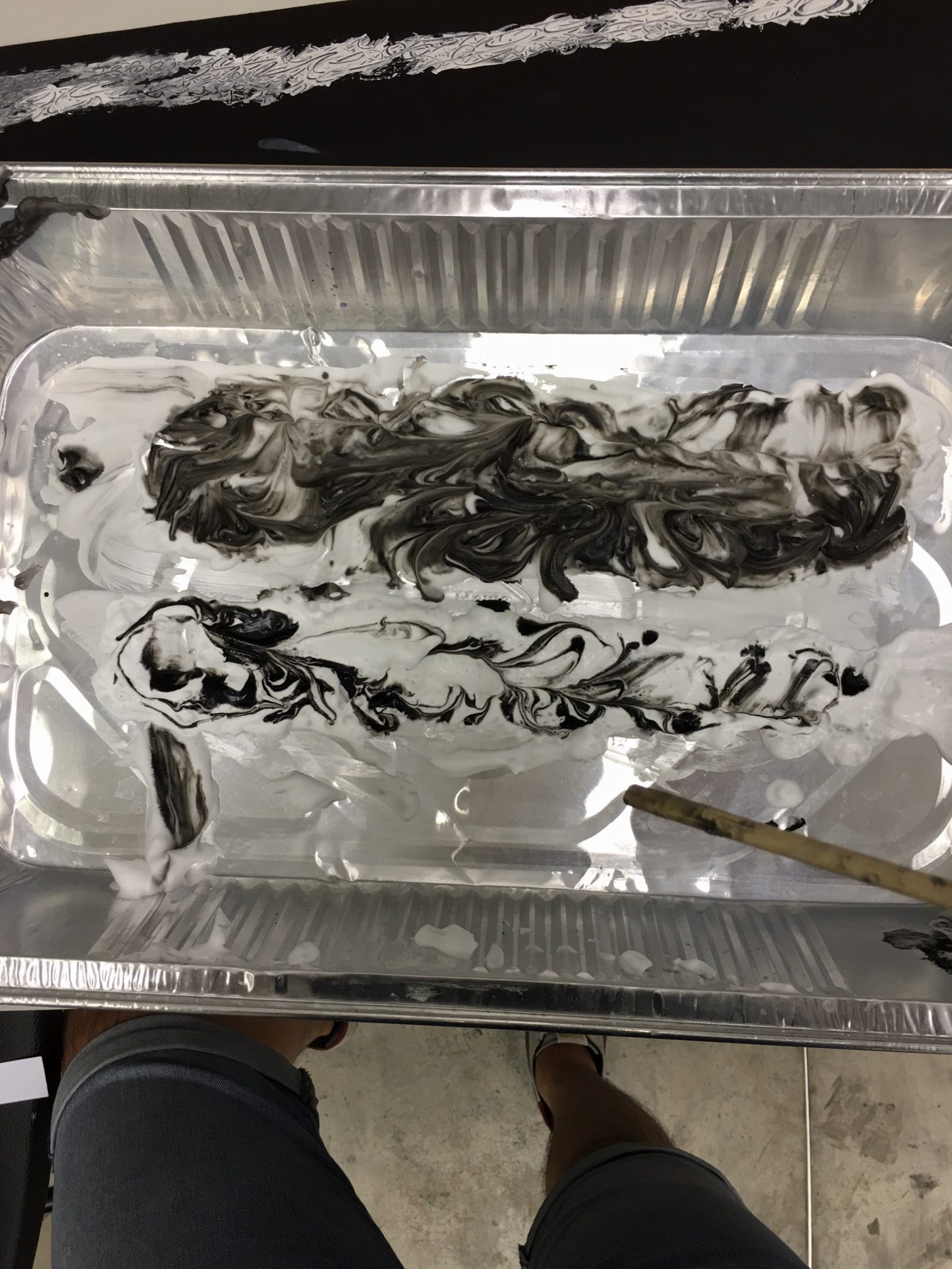
Hello there! Here are my final composition for the 4 x 3 series of Personal Trait, Situation and Imagined Outcome respectively! As mentioned in my previous post, I have decided on creating a series of Digital Art for this assignment as I explored with the
different methods such as Digital Illustration and Digital Painting and Photo Collaging.

My overall theme for these equation mainly revolves around a ‘digital me’ as I feel that the best way to represent myself, is myself.
Hence, you will tend to observe the recurring factor of human or signs of human in most of my composition.

Without further ado, let’s go check them out shall we!

EQUATION 1row-1

121116-creative-me-110916

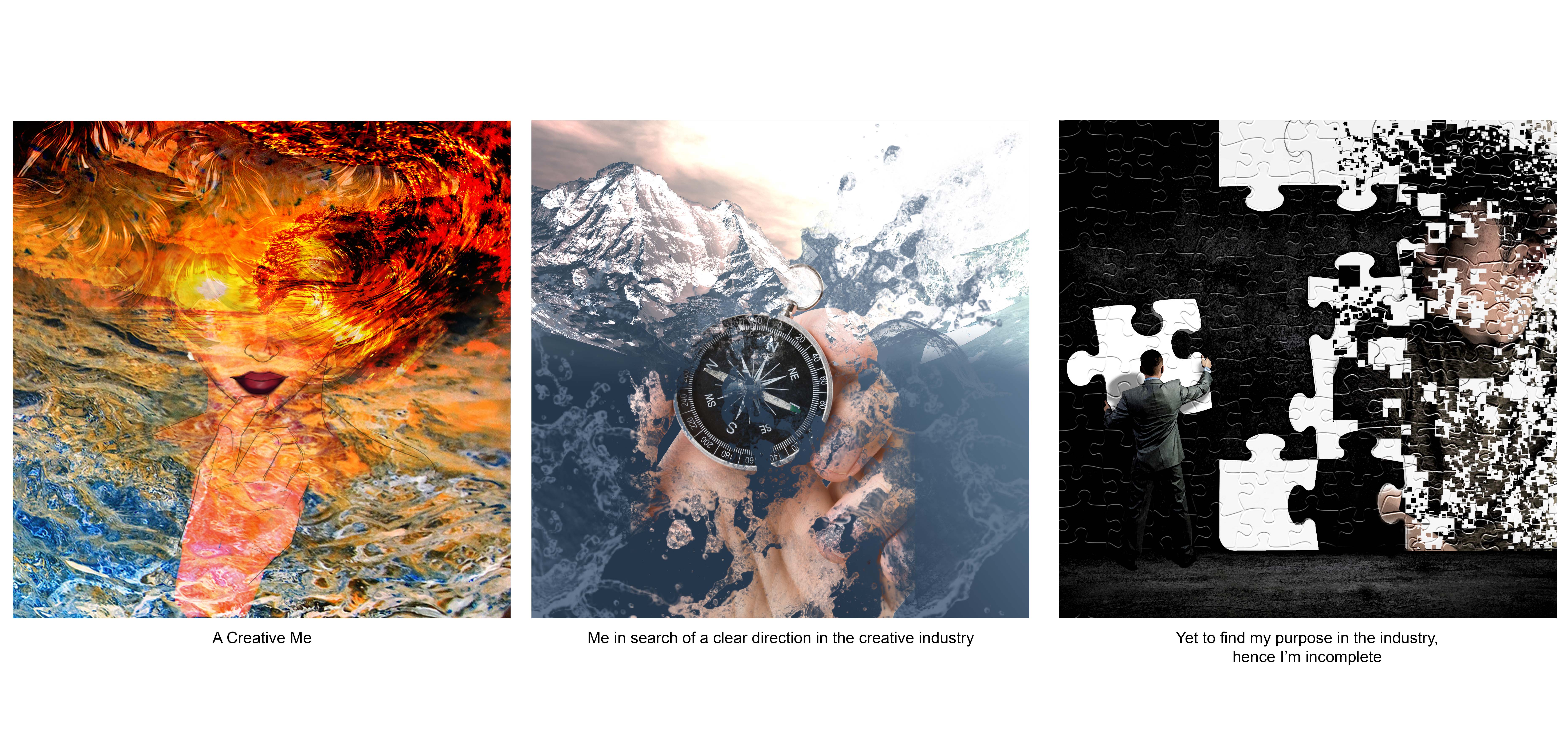
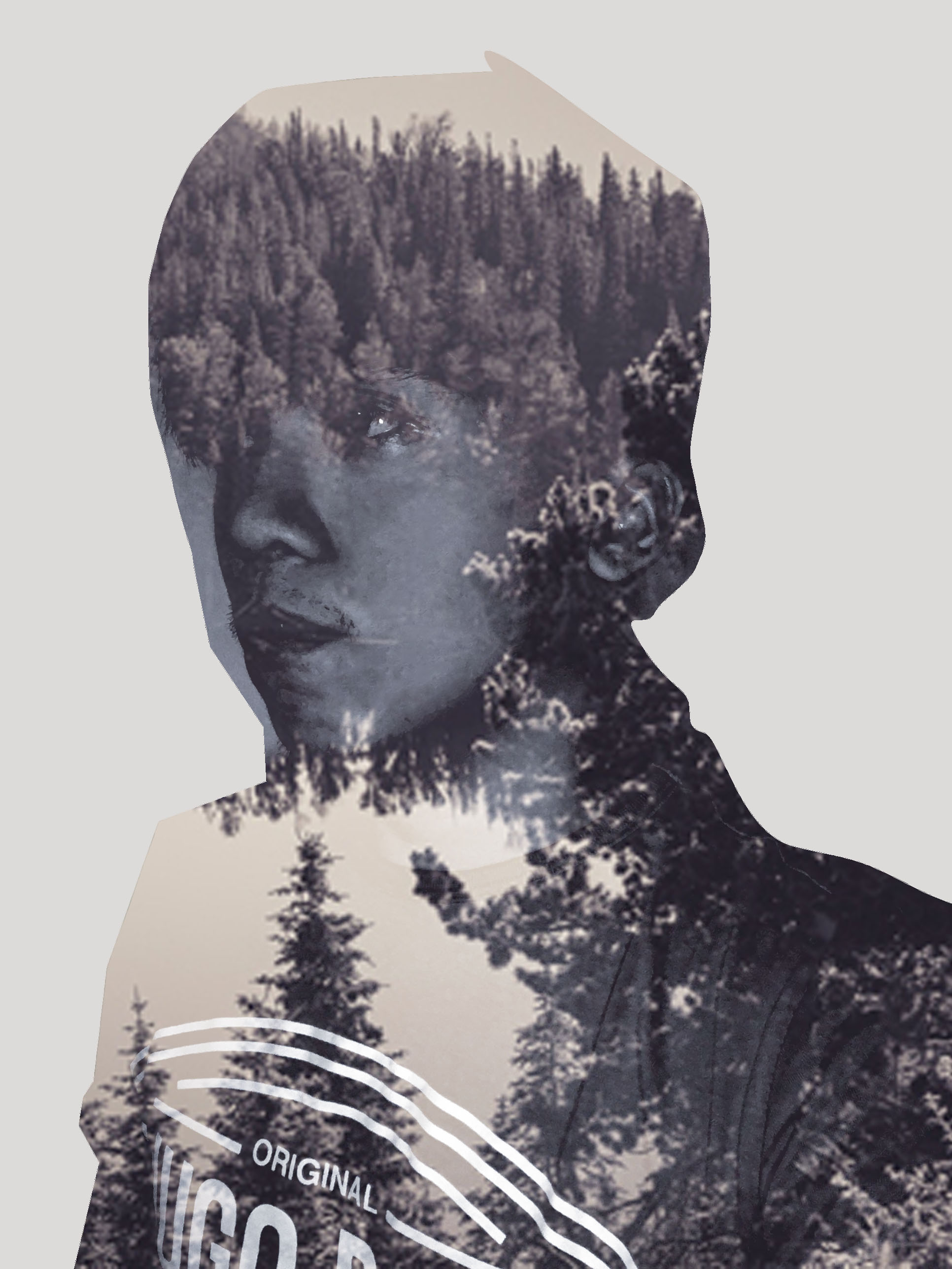
SERIES 1 – A CREATIVE ME 

color-1

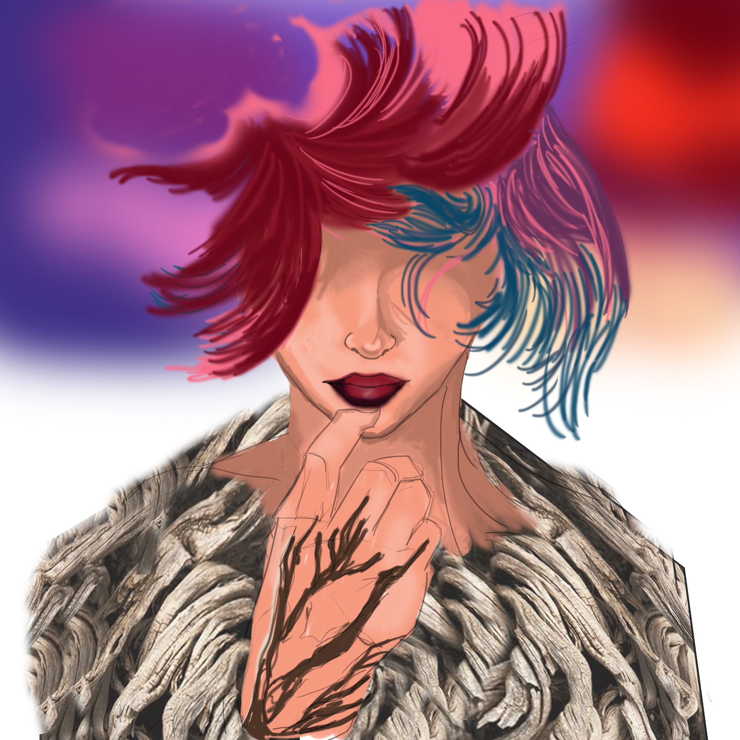
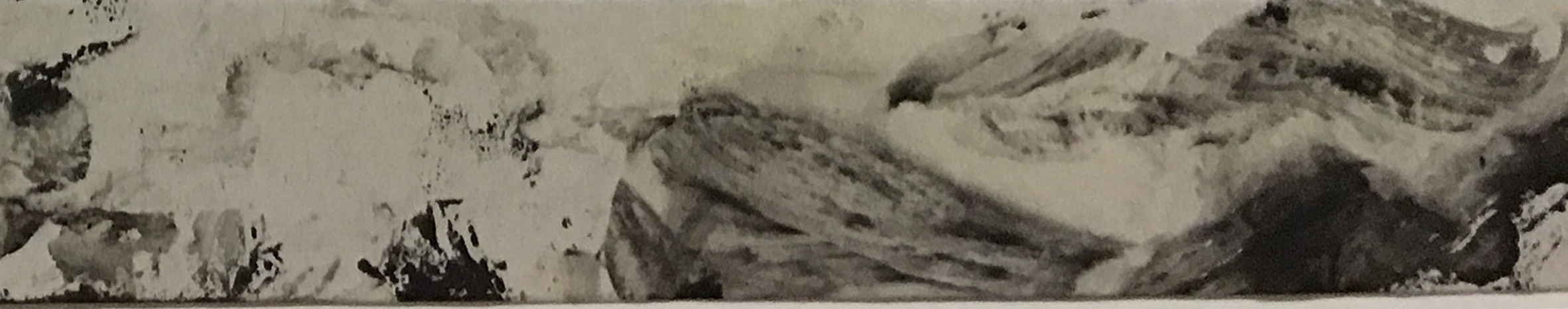
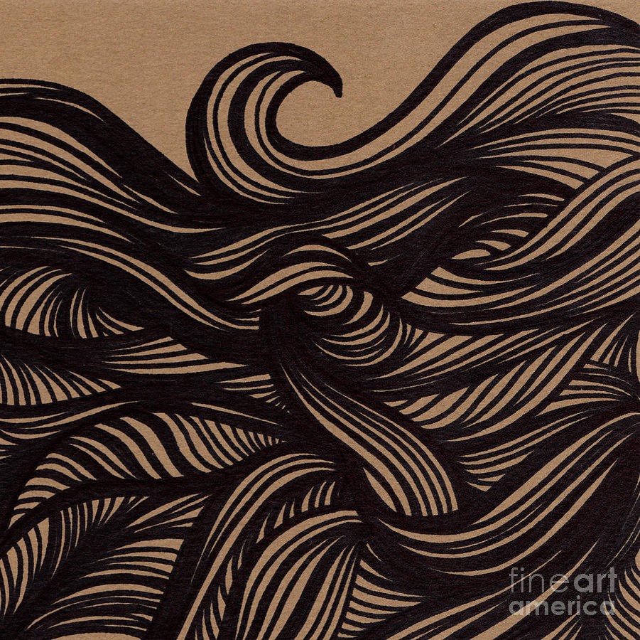
I would like to think that I have a rather creative repertoire to offer hence I have decided to use it as my first trait. The waves represents the creativity that flows within me just like they are in the ocean, naturally. There is a subtle attempt from me to blend the streaks of my hair into the ocean wave, symbolising my natural raw potential in the arts field(hahaha i laughed while typing this, honestly).

The colour composition included the colours of the sunset came about almost instantaeously when I decided to use the ocean wave, because what is better than the scenic view of the sunset while we stroll along the beach?

direction-composition-new

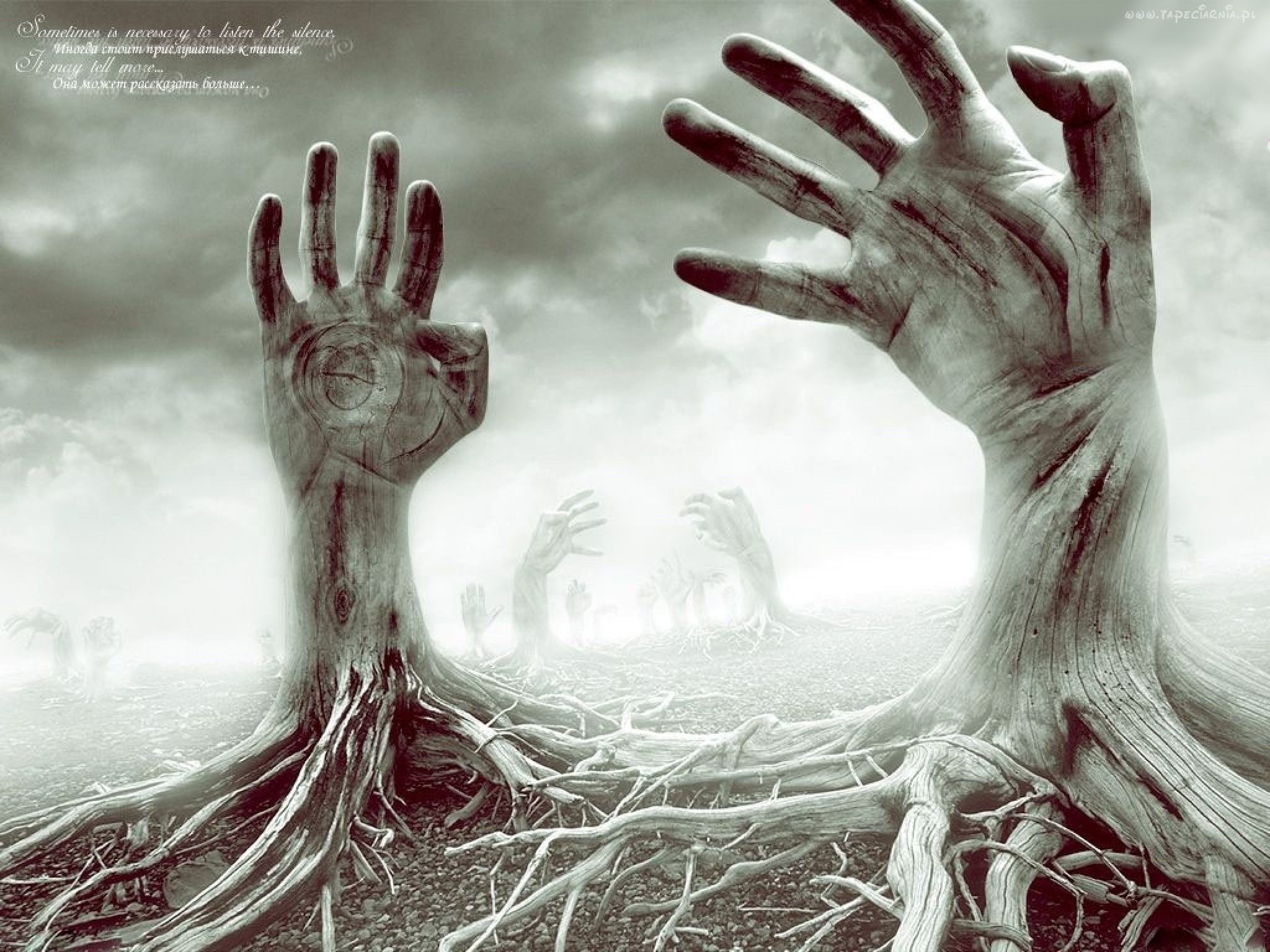
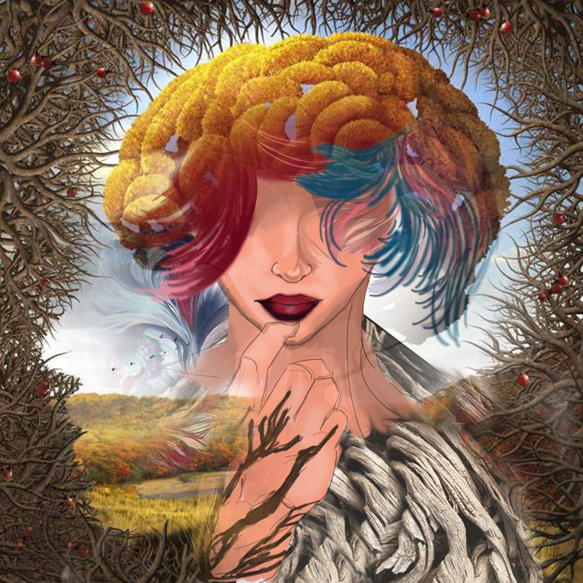
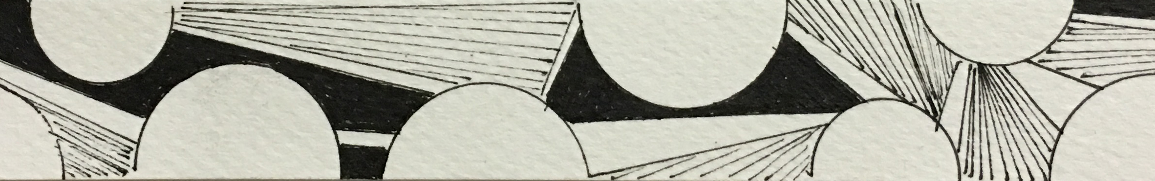
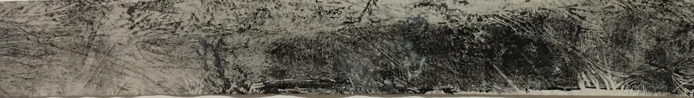
SERIES 1 – IN SEARCH OF A CLEAR DIRECTION

color-2

I have always had the dream of becoming an Architect but it seems to me that the route I have chosen seems to bring me further away from it. Meanwhile, I have no options but to brave through the cold through the stormy sea as I attempt to navigate my way back to my ultimate goal.

I have chosen the different tones of blue for this box to evoke the ice cold feeling of the harsh reality in society that things does not always go your way and sometimes, you might just have to take the longer route to achieve what you really want.

incomplete-puzzle

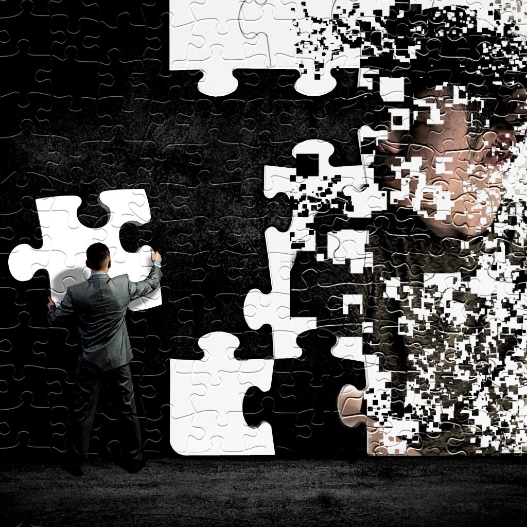
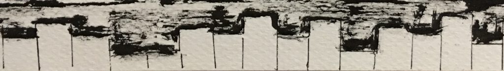
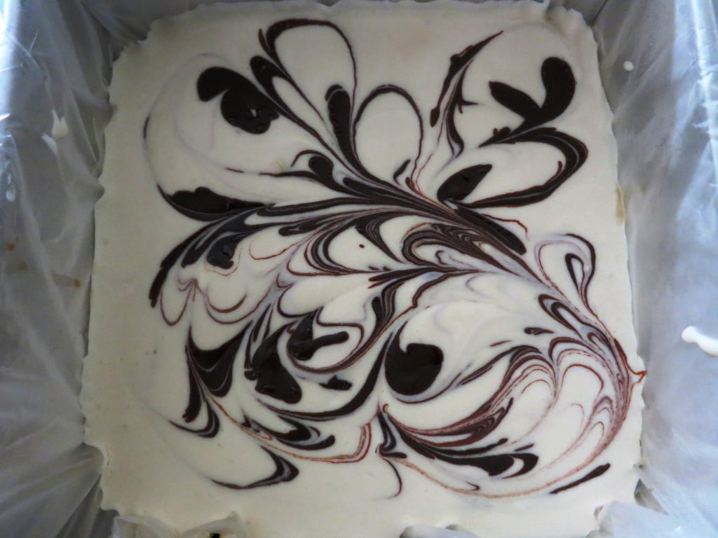
SERIES 1 – INCOMPLETE

color-3

As I have yet to successfully navigate to the destination I envsioned for myself, therefore I’m comparable to an incomplete puzzle – not yet the finished article. The reason of using grayscale tones for this composition is because until the day I feel like I’m actually the final product, the most complete version of myself, I just can’t see the colours in me.

EQUATION 2

row-2

111116-2d-box-1

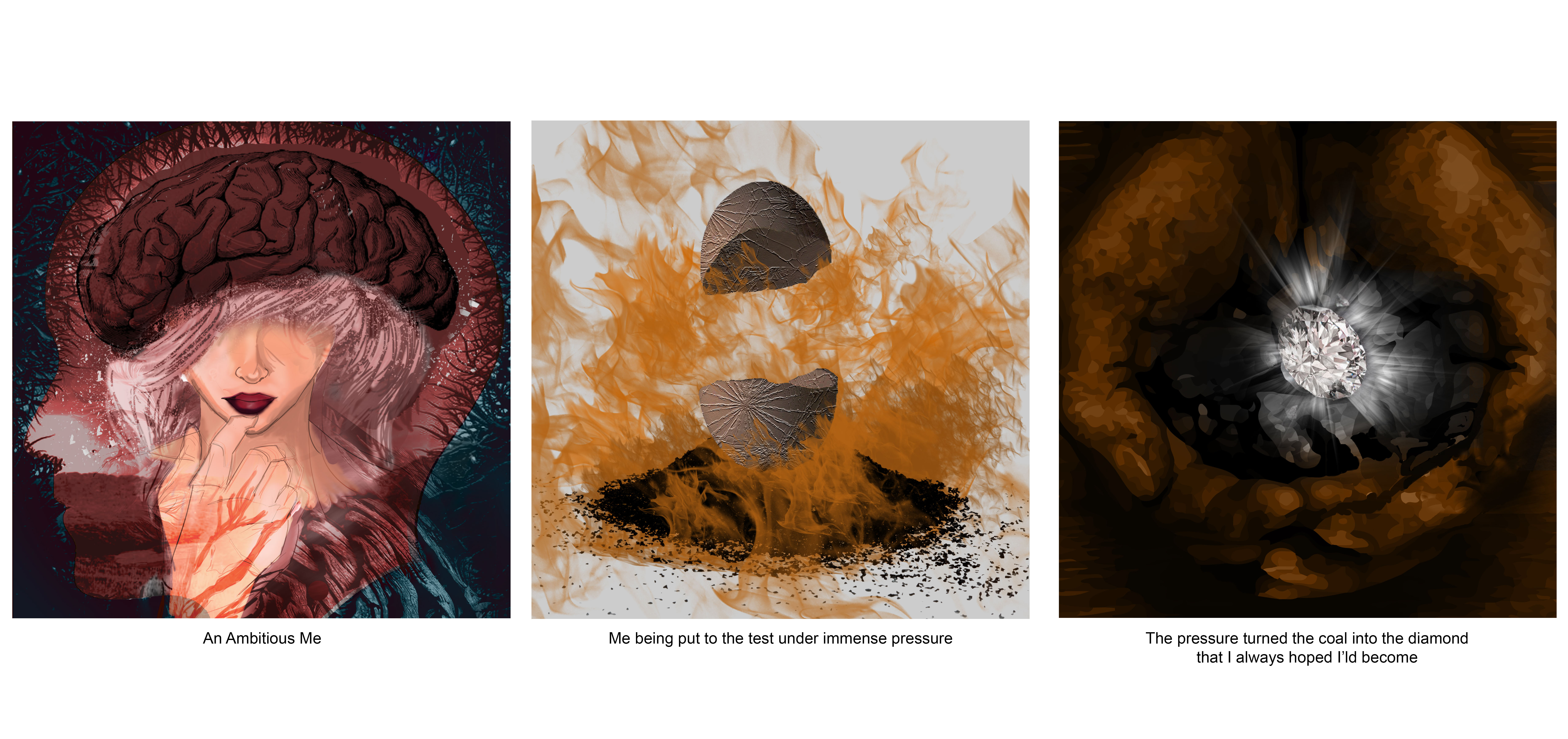
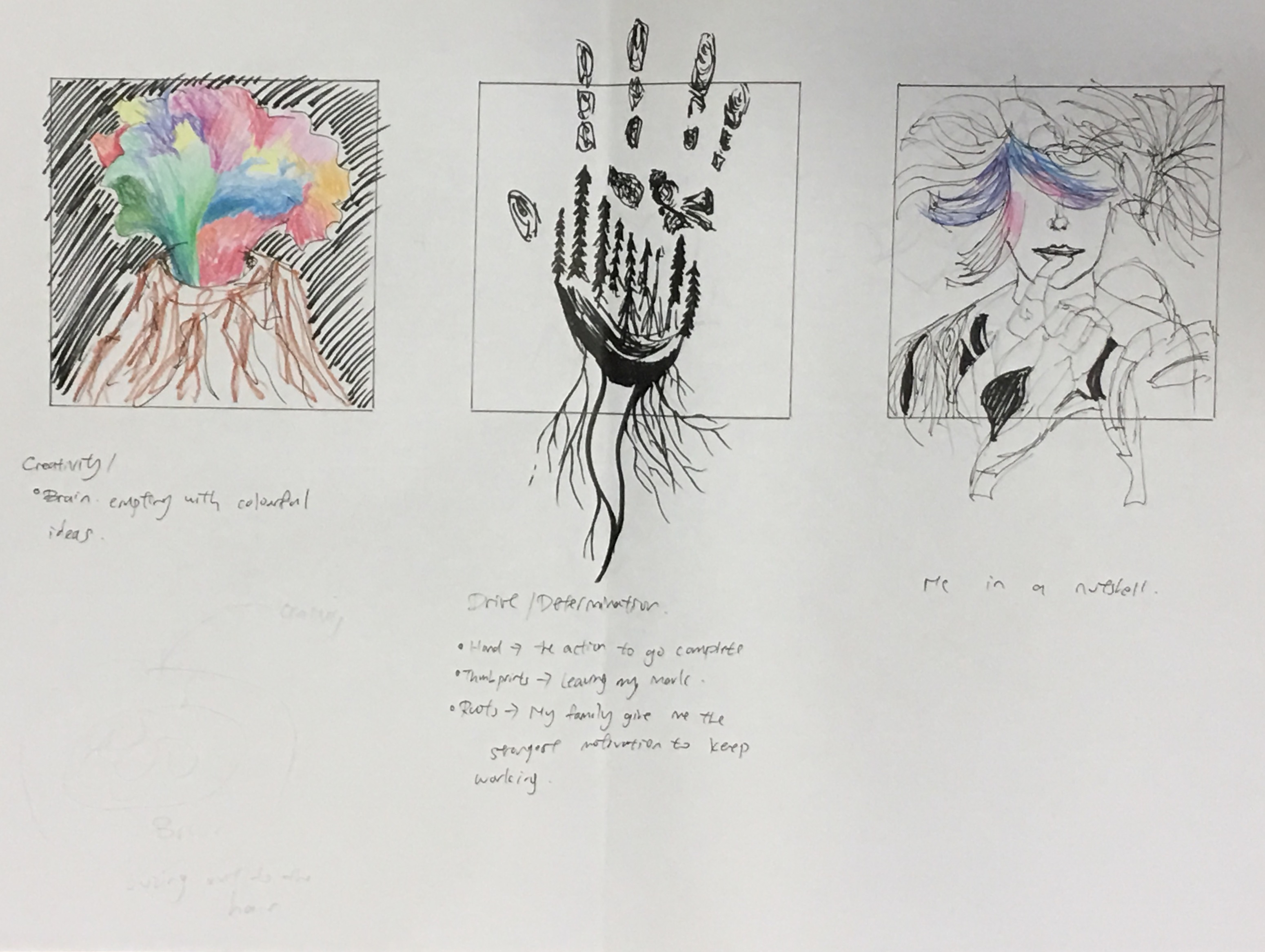
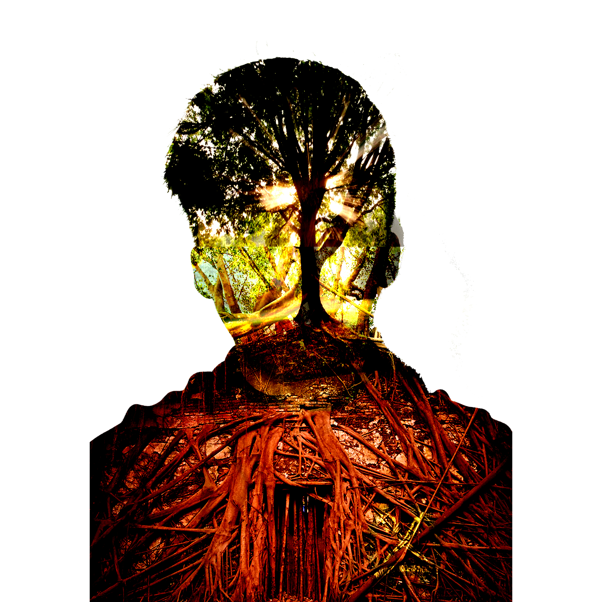
SERIES 2 – AN AMBITIOUS ME

color-4

Despite my cheerful and nonchalent attitude towards many things in life, I actually do think a lot on the inside. I’m secretly very ambitious because I feel the need to succeed in life and the biggest motivation for me to do so is my family, hence the inclusion of the roots.

The colour component for this box is a colour scheme that I thought looked really beautiful. The dull tone of blue is my way of portraying my nonchalent attitude on the outside but the red shows how I think passionately and actively all the time.

 pressure1-low

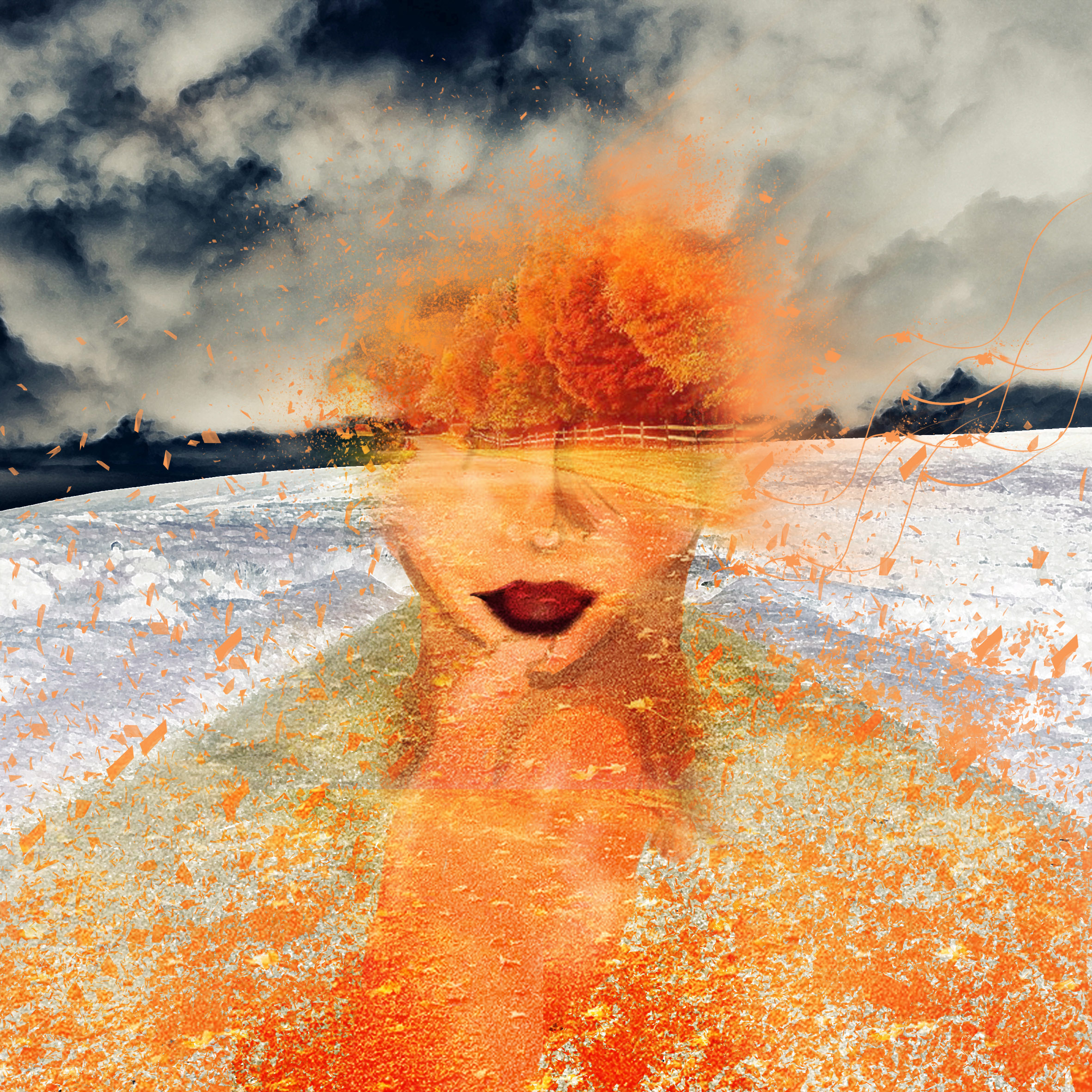
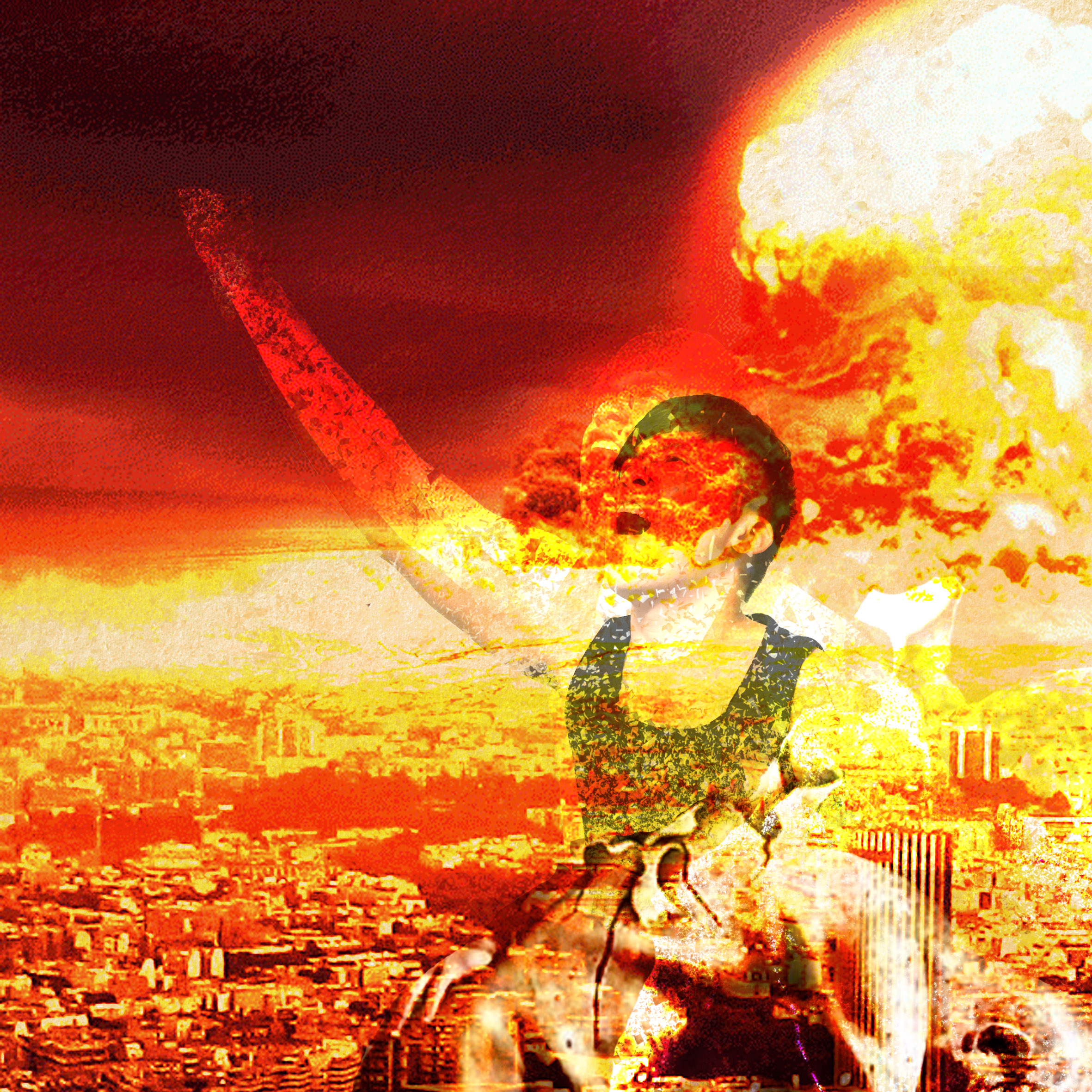
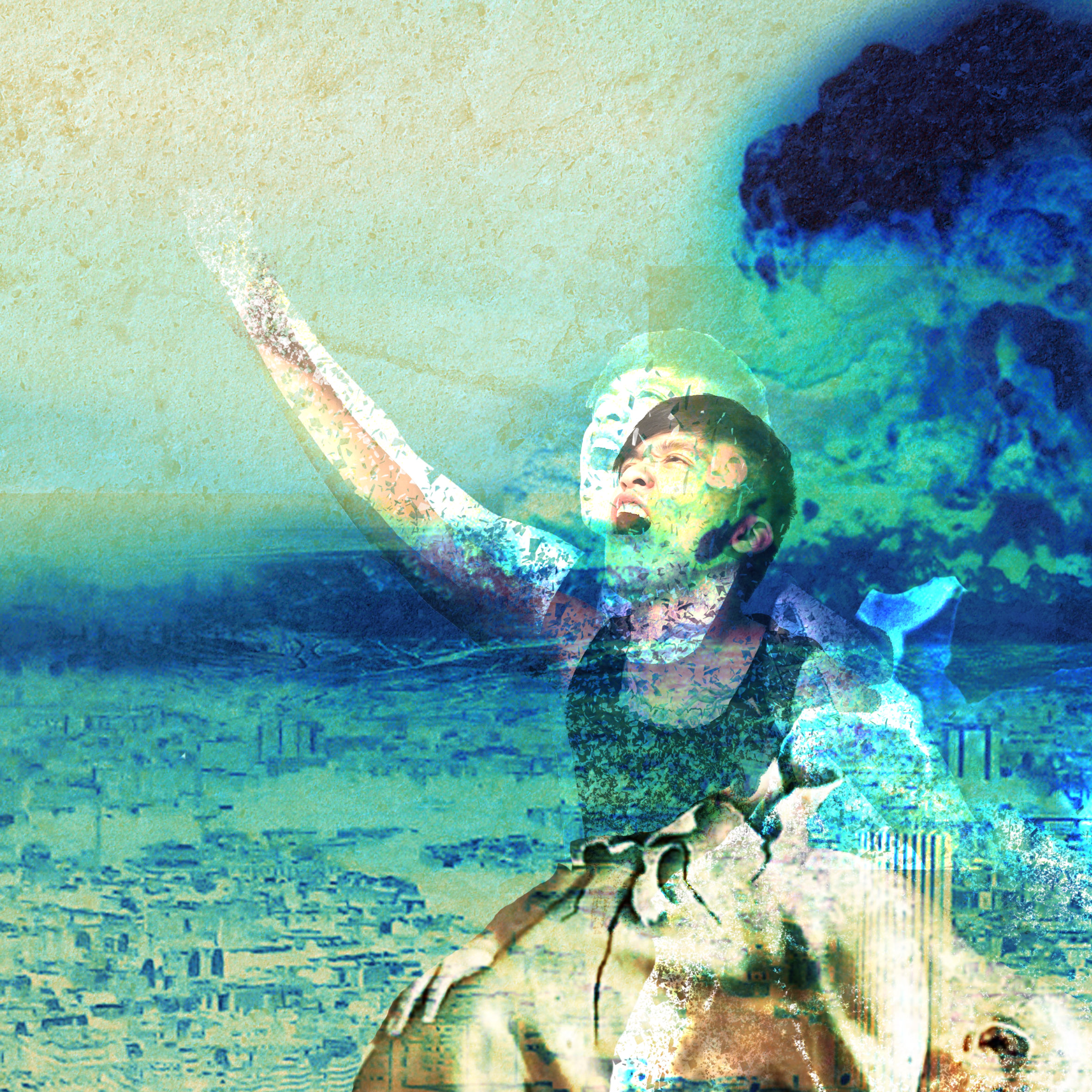
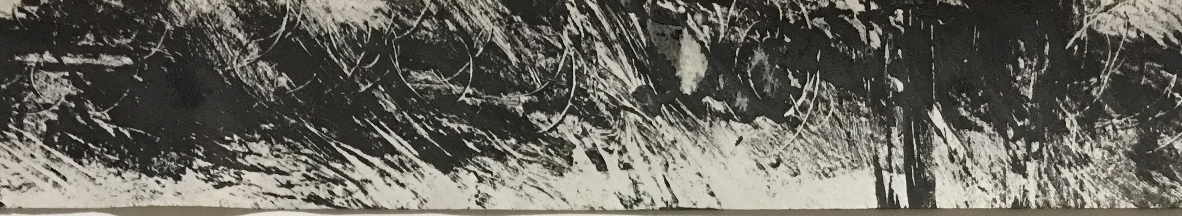
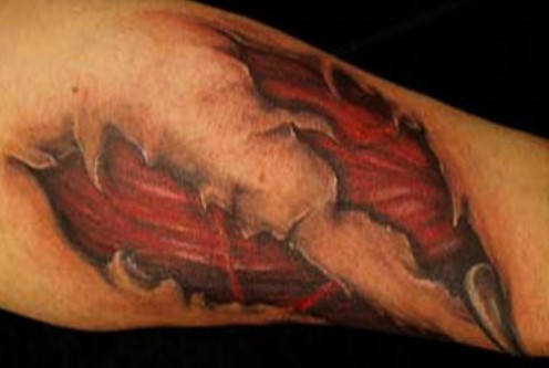
SERIES 2 – ME BEING PUT TO THE TEST UNDER IMMENSE PRESSURE

color-5

When put under immense pressure to me feels like being thrown into a blaze of fire(which explains the colour scheme for this one), with the uncomfortable feeling of anxiety. However, the only time someone would grow and become better is when they step out of their comfort zone, only then will they improve and become better. In this case, I’m like an egg, that would crack under such stress but what is it that lies beneath me, just what could I find?

101116-a-diamond-is-a-chunk-of-coal-made-good-under-pressure-110916

SERIES 2 – THE DIAMOND THAT I ALWAYS HOPED I COULD BE

color-6

A lump of coal under immense pressure could do one or two things, it either crumble and turn to dust and render it useless or the pressure will turn it into the diamond that you always hope it could be. In this case, the ideal outcome would be that I become the diamond I always hoped I would become.

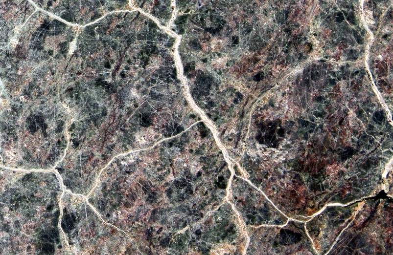
The tones of brown are used to show that it’s no easy work to succeed in life, you got to have your face in the mud, and claw your way up.

EQUATION 3

row-3

rooted-recovered2

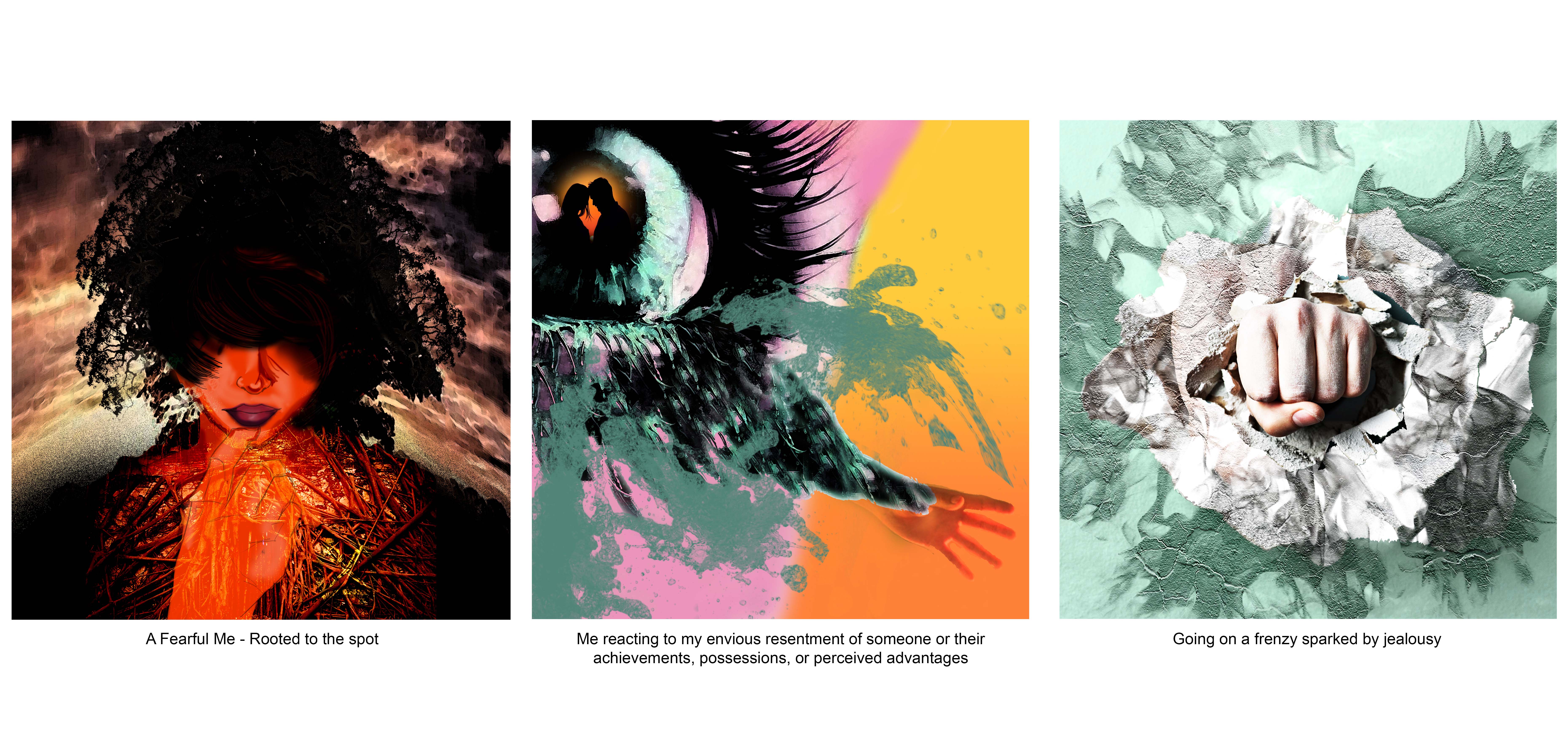
SERIES 3 – A FEARFUL ME

row-7

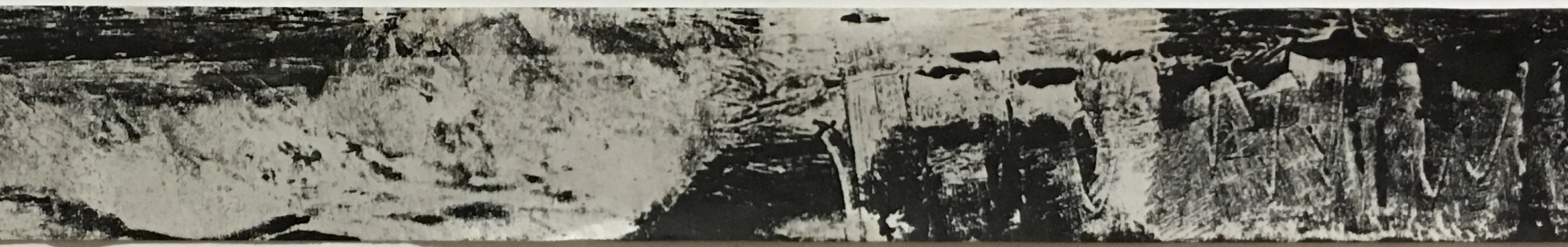
This picture shows myself rooted to the ground, unable to move due to fear of actually doing something. I believe that I’m always thinking a lot, somewhat afraid of embarassment. The dull colour used for the background for this box attempts to evoke some sort of fear. The subtle dissolving effect represents me disappearing into air when I embarass myself. The red blush skin tone indicates my embarassment.

rooted-to-the-ground-low

SERIES 3 – GREEN WITH ENVY 

row-8

Not taking the first step because of being afraid always result in seeing somebody else getting what you want. When that happens, you can only look on green with envy because what else can you do? Slowly but surely, that envy becomes jealousy and turns you into a ‘green-eyed monster’ and the orange hand in this box shows the last bit of human in me longing for that something or someone.

jealousy2

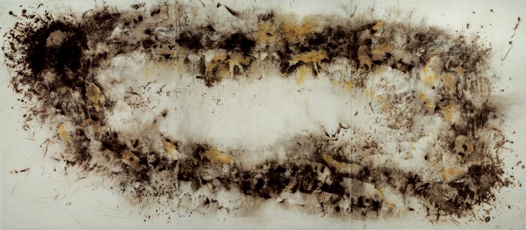
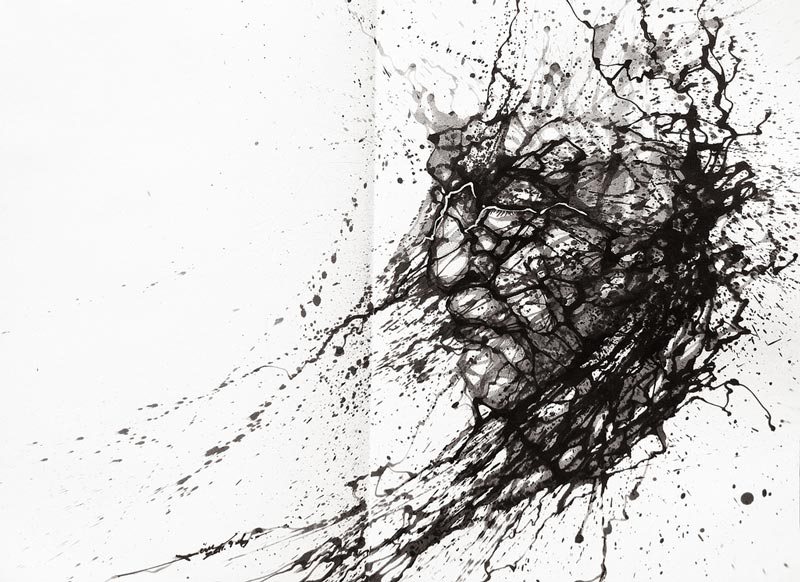
SERIES 3 – AN EMOTIONAL WRECK

row-9

Jealousy refers to the reaction to their envious resentment of someone of their achievements, possessions, or perceived advantage. In this series, it means me becoming an emotional wreck whereby I see myself going on a frenzy, destroying everything in my way because of the devastation. The green tone is used in this box mainly because jealousy is the main reason for my path of destruction.

EQUATION 4

row-4-1

lonely-infatuated-me-final

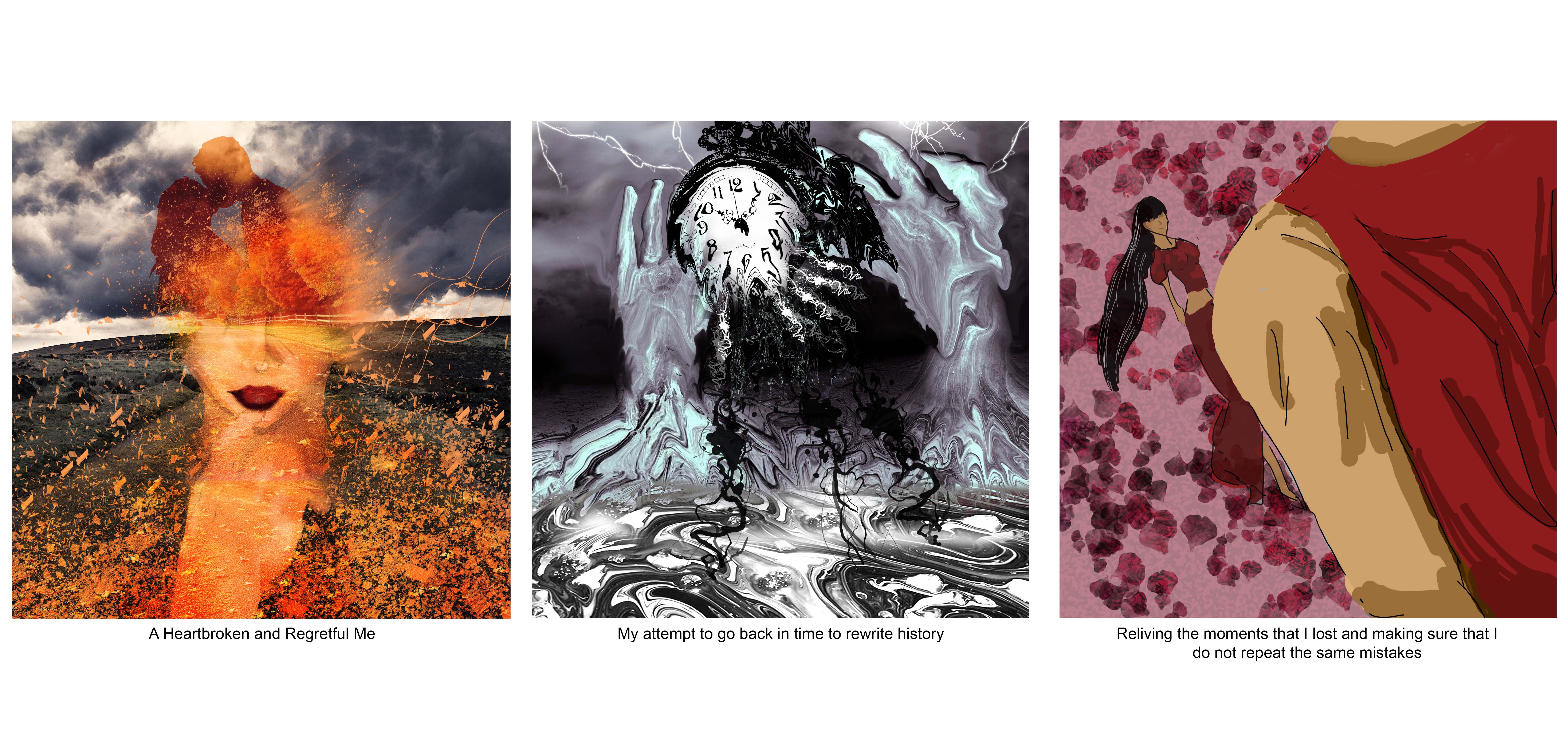
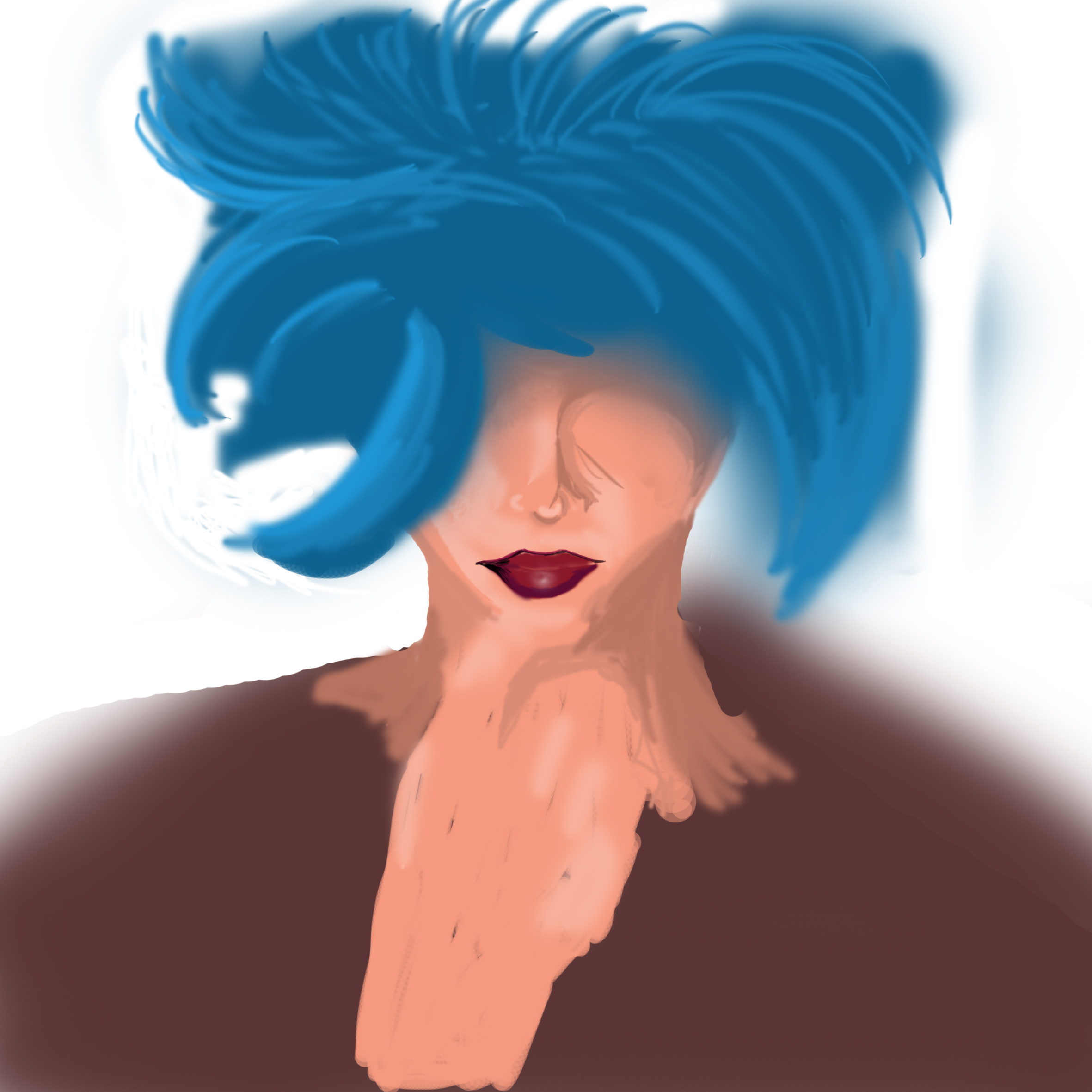
SERIES 4 – A HEARTBROKEN AND REGRETFUL ME

row-10

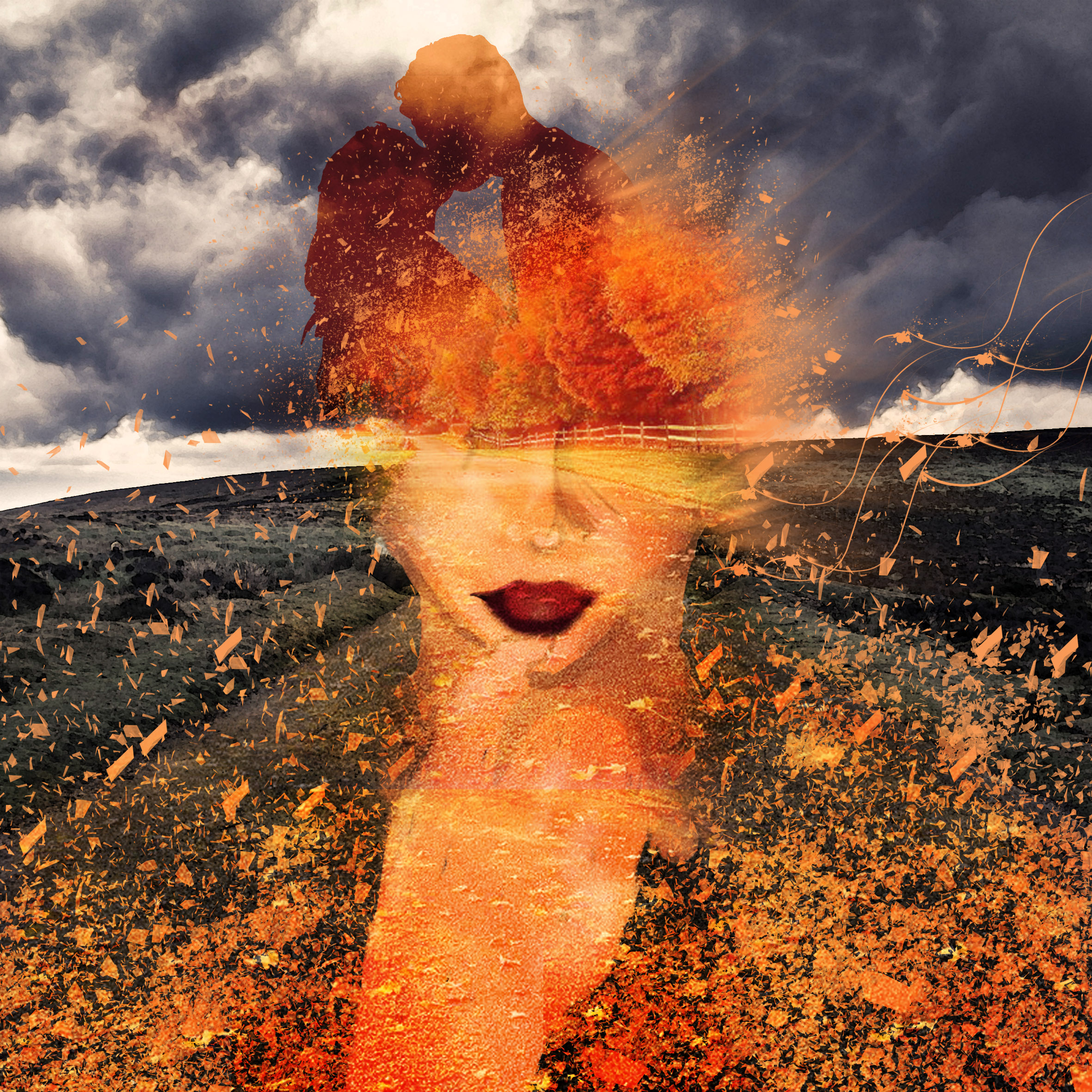
The dull colours of the background indicates just the kind of life I would have (dark and gloomy) without her. However, she’s all I think of passionately everyday, as she’s the one I want to walk down that road together with.

121116-melting-clock

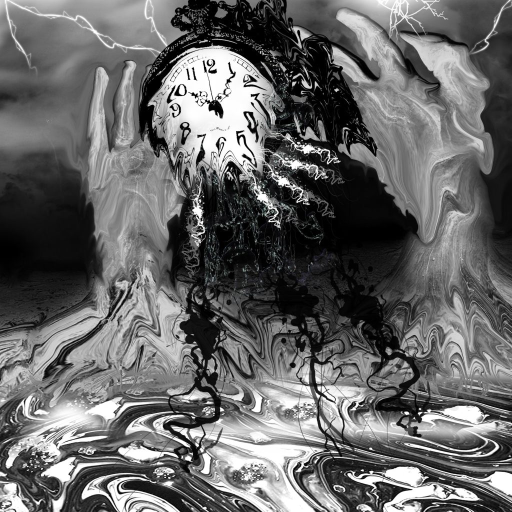
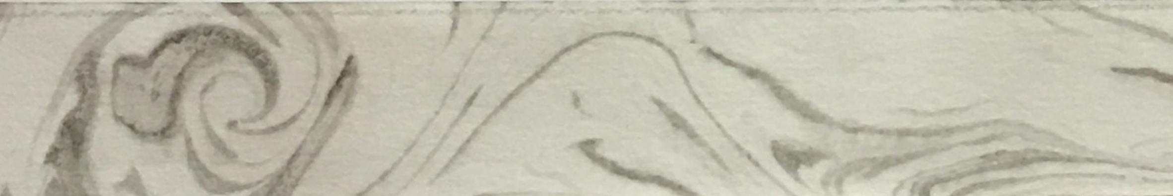
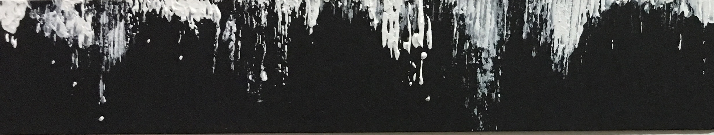
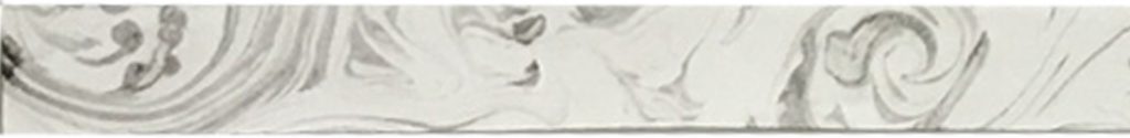
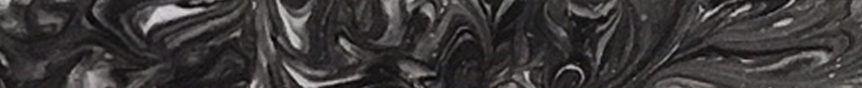
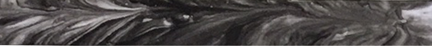
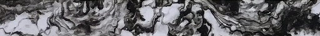
SERIES 4 – ATTEMPT TO GO BACK IN TIME TO REWRITE HISTORY

row-11

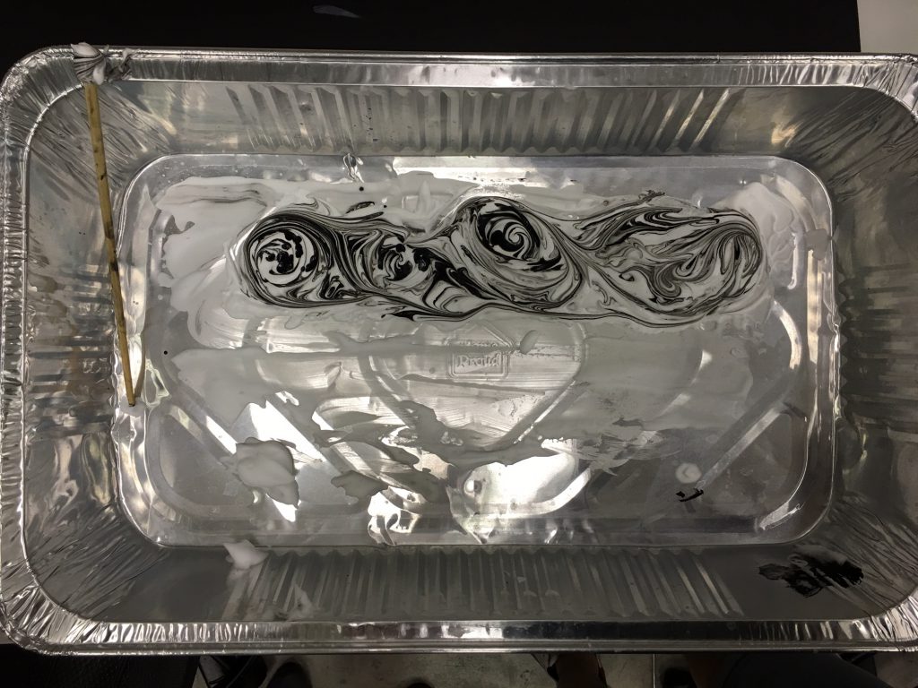
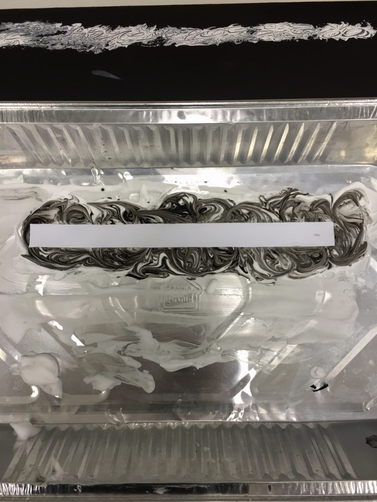
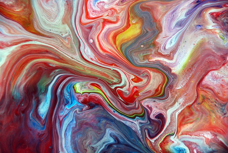
In television shows and movies, they always associate travelling back in time with black and white which was why I decided to use black and white for this box as well. To me, going back in time also means going through several dimensions before finally reaching the past(not that I believe that time travelling actually exist). Similarly, in the media, melting seems like the ideal way to create a trippy effect of going back in time.

love-4

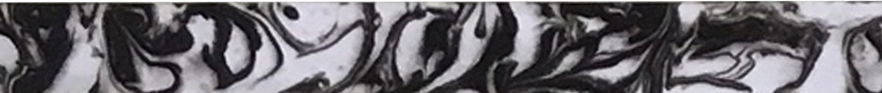
SERIES 4 – HAPPILY EVER AFTER

row-12

In this series outcome, I have successfully managed to travel back in time and relive the moments and make amends to the mistakes that I have made previously – facing my fear and going all out for someone or something that I know I want in my life.  In this box, the color selection for this box is to illustrate the ideal outcome of a happily ever after. Black is used to bring out the red color.

& that is all I have for this assignment! I hope that you have learnt a lot more about me through my twelve boxes and I also do realize after my illustrations that I’m rather pessimistic in life or at least it seems to portray that I’m. It’s not that bad to be honest… really… no don’t go away, please be my friend.

On a more serious note, I felt like I have taken every box for this assignment as an individual painting as itself and only connect the content in terms of narrative but less of having the same colour scheme throughout one full series. I thought that it would look better across as a whole with a different variety. Well, that’s only my individual opinion! It has been a fruitful last assignment as I felt like I have learnt so much new methods and techniques to create artwork digitally, which was something I always wanted to do, I’m extremely satisfied with both this project and my final work 🙂

PROJECT 3 – EGO

– THE END –

Ego 1

Project 3 – Ego has officially begun and this time round, we are tasked to create four rows of three squares worth of content which can best describe,

  1. My traits as a person in the first row
  2. What kind of a situation I envision myself being in
  3. The outcome of what I will become after going thru the ordeal of that situation

fullsizerender

Across these twelve squares, I am required to create a narrative, metaphoric, abstract or symbolic approach.
I wasn’t quite sure on which one to choose nor did I want to limit myself to anything, hence I decided to try everything that comes across my mind.

1lonely-me 2meet-the-girl-of-my-life

Igor Morski

I came across the artwork of Igor Morski and thought that they were really intriguing and has some sort of narrative/message it wants to portray in a abstract manner. I am unsure if my work does turn out the way that I think it did but Igor Morski’s work was very much an inspiration for me as I strive to create my final boxes in the manner that he does for his famous art pieces.

I wasn’t a fan of his, didn’t even heard of his work before, but I definitely am one now. 🙂

regretful-me  surreal-poetry-riddlers-sage

In this project, we were expected to think deeply about the color theory and how to use it most effectively to portray the kind of feeling we would like to evoke from the audience through our art work.

img_2008-edited2d-result-1

Photo Collage

Very much similar to the Project 2 – Forrest Gump, in which we took materials from online and mash them all up together except that this time round, it involved colors!

I was researching online for interesting methods and came across a lot of artwork that applied Double Exposure which led me to try it for myself. This is a rough experiment which as evidently, wasn’t done very well as I try to understand how to do it.  There was a lot of masking involve and I have finally came to realize how important and useful masking is in Photoshop.

jay-chou-digital-painting

Digital Painting

Coming into ADM, I have always wanted to try digital painting and below is one of my attempt on digitally painting Jay Chou during my free time. Since this project didn’t limit us to any sort of medium, I thought it would be a good opportunity for me to try out Digital Painting once more.

me0 me1  me3

I started creating the base by applying the color I wanted and eventually applied different tones only to realize that I could work easier by painting in gray scale on one layer and then applying the color I want over the gray scale layer and it gets the gradual gradient tone I wanted. I thought the hair was really tough to create which led to me mashing it up with images I found online which resulted in a composition that I decide to retain towards the end of this project.

Exploring Color Schemes

I explored different color schemes by using the different types of layers in Photoshop.
They eventually created 3 different kinds of feeling to the same piece of collage I created which are

Explosive and Despair

breaking-through-walls-pl breaking-through-walls-exclusion

Victorious

breaking-through-walls-lumionisty

With that, I end my first post on the research and exploration of ideas for Project 3. In my next few posts, I’ll be going through on the concept and narrative of the series of my finalized pieces. Till then!

*Below are some of my drafts for my final composition*

love-2 love-of-my-life-low lonely-infatuated-me-exclusiondirection3 pressure puzzle-incomplete-1 oss

Forrest Gump 2

rocky-balboa-1img_1759

  1. It is recommended to not have grey tones for silk screen printing but I particularly liked the outcome after adjusting with the threshold and levels of this design in Photoshop and chose to explore and see to what extent does grey tone affect the silkscreen printing. :p
    So we get started by having my selected design printed onto a transparency…

    img_1757img_1753img_1755
  2. Followed by coating a layer of print emulsion on both side of the screen and left it inside the dryer. All these were done inside the dark room because when over exposed to UV light, it causes the emulsion to harden and bind to the fabric rendering it difficult or impossible to wash out during the development stage.
  3. Place the screen into this huge oven for approximately 20 minutes
  4. Retrieve your screen and tape transparency onto the screen
  5. Place it into the exposure unit and it will vacuum out all the air before exposing the screens to light for 18 seconds. The light causes the emulsion to harden whereas the unexposed parts would still be soft and hence, removable.
  6. Next up, we wash away the unexposed area and witness our print. We tried with different level of water pressure and it was a lot of fun :p
  7. Conceal the frame with tapes and 4 x coins at each corner (the coins provide a small elevation which prevents unwanted ink to seep through the screen onto the medium that you intend to print on)
    img_1842img_1841img_1843
  8. Apply a layer of ink evenly onto the screen
  9. Use a squeegee and go over the screen in one swift motion with just enough pressure (too little will result in a light print and too much will just make it way too dark)
  10. Time to start printing onto your desire items 🙂
    Attempt #1 – Drawstring Bag

    Attempt #2 – Tote Bag

    img_1889img_1886img_1890

  11. Apply the remover onto your screen because it is now time to start washing up
    img_1894
  12. It took forever to scrub away the hardened part even with the use of the removal but all is good
    img_1900
  13. End the day happy with your printed items because I have just learnt how to do silk screen printing!!!!!


& that’s all I have for this post, Benji out!


Forrest Gump 1

I simply selected my 4 movie quotes to work with on this project from some of my all time favorites.

why-so-serious

Why so serious?
Joker (Heath Ledger) – Dark Knight (2008)

why-so-serious-1-low

Draft 1 (left) : 

Why did you pick this elements to express the meaning of the quote?

Decided to take a quirky approach to respond and come up with an imagery that people could relate to. Therefore the reason why I included G-Dragon of Korean Boy-band Big Bang in this draft as he had a solo piece titled ‘CRAYON’ which had ‘Why so serious?’ in it’s lyrics.

What design principles did you use to arrange these elements?

I used the design principle of Pattern, Rhythm, Size and Scale to achieve this composition.

why-so-serious-2-low

Draft 2: 

Why did you pick this elements to express the meaning of the quote?

Similarly, I still insisted on coming up with something ironic which explains the reason why I included plenty of Harry Potter references in this composition with the most prominent character – Sirius Black – in the center of this piece. I’m sure you have gotten the reason why by now, no? Why so Sirius? Get it? Hahahahaha

Potter and Voldemort are engaged in a showdown of Texas Hold’em Poker with all those chips and poker cards around.

If you look more carefully, you would see that Sirius Black and Severus Snape forms a Poker card itself representing the Joker which links to this famous quote that originated from the Dark Knight itself.

What design principles did you use to arrange these elements?

I used the design principle of Symmetry/Asymmetry and a bit of Radial component.

Comments and Improvements to be made :

  • Less symmetrical composition
  • Can include more Pictogram and symbols


rocky-balboa

You, me, or nobody is gonna hit as hard as life. But it ain’t about how hard ya hit. It’s about how hard you can get hit and keep moving forward. How much you can take and keep moving forward.
Rocky Balboa (Sylvester Stallone) – Rocky Balboa (2006)

 rocky-balboa-1rocky-balboa-2

Why did you pick this elements to express the meaning of the quote?

  • Anonymous Female boxer featuring UFC Women’s Bantamweight Champion, Ronda Rousey
  • Street Fighter Ryu in a blocking posture
  • Fruit Punch/Sliced (top right)
  • Eye of the Tiger (bottom left)
  • Hulk Punch x 2

The intention of this composition was to evoke a sense of struggle, trying to fight to survive despite multiple setbacks.

What design principles did you use to arrange these elements?

I used the design principle of Visual Hierarchy – Contrast.

Comments and Improvements to be made :

  • Was commended on this composition and the contrast level it provided, was recommended to use this for the silkscreen printing.


5-the-wolf-of-wall-street-quotes

Money is the oxygen of capitalism and I wanna breathe more than any man alive.

Jordan Belfort (Leonardo DiCaprio) – The Wolf of Wall Street (2013)

money-1money-2a9

Why did you pick this elements to express the meaning of the quote?

  • Money
  • Silhouette of human
  • Silhouette of Soldiers around the world

The intention of this composition was to relay the message of greed, illustrating someone being a money minded person as that’s all that appears on her face and the soldiers from all around the world represents ‘more than any man alive’ because that is the length that she would go to make sure that the money is hers to breathe.

What design principles did you use to arrange these elements?

I used the design principle of Symmetry/Asymmetry and a bit of Radial component.

Comments and Improvements to be made :

  • Overall composition is okay but was recommended to add more texture which resulted in the 2nd draft (right)


2acfef6da7aa64b4d4e036dc3352e1d6-500x243x10this-one-time

This one time, at band camp…
Alyson Hannigan American Pie (1999)

*Apologies for the crude language*

that-one-time-at-band-camp1-low-quality

Why did you pick this elements to express the meaning of the quote?

  • Cheshire Cat
  • Tentacles
  • Boom Box
  • Guitar
  • Musical instruments

A really naughty quote from American Pie and I’ll leave the elements of this composition to anyone that reads this place to derive their own conclusion on why and what it’s supposed to represent.

What design principles did you use to arrange these elements?

I used the design principle of Symmetry/Asymmetry and a bit of Radial component.

Comments and Improvements to be made :

  • Was pretty drained out by the time I got to this and realized that I’ve once again tried to fill up way too much on the empty spaces as though it is a criteria to do so (which it isn’t), will make amendments to my final pieces!

EMO FINAL

In all my years of expressing through words, images or drawings, never have I ever tried to explain a single emotion on a strip of paper, let alone 18 of them! Nevertheless, I have managed to done so and here is a look at all 18 of them in a whole.final-board-feature-photo-portrait

Below are my 18 attempts to create lines that reflects the emotions that I have selected.

love

Strip 1 : Affection

affection

Definition : A gentle feeling of fondness and liking.

Thoughts : Affection to me is being passionate towards a special someone, giving her my everything just to make her feel good and comfortable as though she was lying on a bed of roses with absolutely no worries at all.

affection1

Medium : Tissue, Calligraphy Ink, Cartridge Paper

Method : The application of heavier darker tones on this strip attempts to reflect the passion of love while the lines being all swirly and twirly implies that I have already fallen head over heels for her.


Strip 2 : Lust

lust

Definition : Very strong sexual desire.

Thoughts : Unpredictable lustful desires that comes irregularly in our everyday lives. Also a crude form of “wanting”. This would be one of the reasons why criminal behavior is often described as being actuated by primal instincts, somewhat animalistic.

lust1

Medium : Plastic Food Wrap, Acrylic Paint, Sharp Pin, Newsprint Paper

Method : On certain days, people just tend to crave more which is implied by the heavier tones on this strip. The curly markings created by a sharp pin on the plastic food wrap creates the positive space which was then shown on the strip after inking it onto the wrap itself. This white curly lines are reference to tentacles which are somewhat naughty.


Strip 3 : Sentimentality

sentimentality

Definition : Exaggerated and self indulgent tenderness, or nostalgia.

Thoughts : Nostalgic memories are all interlink with each other regardless of happy or sad. Self indulgent in the sense that at the very moment of reminiscing, it is as though the world is paused and there is that ray of light shining upon you, almost like filming your very own story.

sentimentality1


Medium : Coin, Ruler, Saintograph Drawing Pen, Cartridge Paint

Method : Shape, fills and lines are used in this strip to illustrate different components. Circles are used to represent memories with white and black fills to indicate the happy and sad moments and the thin lines illustrates that nostalgia, almost like a want to return back to those times.

joy

Strip 4 : Pleasure

pleasure

Definition: A feeling of happy satisfaction and enjoyment.

Thoughts : A visually satisfying strip to evoke an immediate sense of accomplishment. It should be a piece that is able to generate a visually pleasant and satisfying feeling as though you’re on top of the world after seeing the creation of your own come to life.

pleasure1

Medium : Aluminium Tray, Shaving Cream, Calligraphy Ink, Chopstick, Photo Paper

Method : Paper Marbling is applied on this piece by creating the desired patterns on the shaving cream. After capturing the design on one half of the strip, the remainder was used to capture a similar flow which was similar yet different at the same time. Combined together, it creates a piece that is visually satisfying, a pleasure to the eye upon looking.


Strip 5 : Bliss

bliss

Definition : Reaching a state of happiness, oblivious of everything else.

Thoughts : Drown in a state of happiness that you’re unaware of anything else that is happening around you because you simply don’t know and don’t care.

bliss1

Medium : Aluminium Tray, Shaving Cream, Calligraphy Ink, Chopstick, Cartridge Paper

Method : Paper Marbling is applied on this piece, similar to what was described in Strip 4 but with a different type of paper. The cartridge paper is not a suitable to capture the entire design but is a medium that can retain a very feint marks which illustrates the meaning of being oblivious to everything else when you have reached the state of happiness.


Strip 6 : Ecstasy

ecstasy

Definition : An emotional or religious frenzy or trance-like state, originally one involving an experience of mystic self-transcendence.

Thoughts : Transcending into a state that you have never felt before which can be quite an incredible feeling. A crazy and exciting experience which goes on for a while but eventually dies off after all that adrenaline generated.

ecstasy1

Medium : Aluminium Tray, Shaving Cream, Calligraphy Ink, Chopstick, Photo Paper

Method : Paper Marbling is applied on this piece by creating the desired patterns on the shaving cream. After capturing the design on one half of the strip, the remainder was used to capture a similar flow which was similar yet different at the same time. The bubbles of the shaving cream was able to create a subtle touch of round textures which represents that the inevitable end of the trance-like state eventually.

surprise

Strip 7 : Jolt

jolt

Definition : To jar, shake, or cause to move by or as if by a sudden rough thrust; shake up roughly.

Thoughts : A sudden uncomfortable feeling caused by abrupt movements.

jolt1

Medium : Plastic Food Wrap, Roller, Acrylic Paint, Newsprint Paper

Method : A simple and straightforward method by applying different amount of pressure when rolling paint onto the newsprint paper. A sudden but subtle movement  was manipulated to create a bit of the sudden rough thrust but subtle because of strip being extremely thin.


Strip 8 : Disbelief

disbelief

Definition : Inability or refusal to accept that something is true or real.

Thoughts : Simply speechless upon hearing the bad news but knowing that what’s happened has already happened, there is absolutely nothing to undo the incident but only to come to acceptance.

disbelief1

Medium : Roller, Acrylic Paint, Newsprint Paper

Method : This strip explains the emotions felt when receiving a bad news. It starts off with one being simply speechless, not being able to react properly. The darker tone shows the transition into acceptance mode which represents the news has been acknowledged which eventually returns to the initial tone which indicates that there is absolutely nothing else that can be done to help suffice the situation.


Strip 9 : Awe

awe

Definition : An overwhelming feeling of reverence, admiration.Usually something that just makes me look at in awe, captivated by it’s beauty.

Thoughts : A sight to behold. A piece that makes you go like awwww. The highs and lows of this strip teases the level of amazement you encounter because after every time you get impressed, you will think lowly of the next one you encounter not because it isn’t good but just because that your expectations has been raised. However, there will always be another one that just simply amazes you. This cycle just simply keeps going on and on.

awe1

Medium : Brush, Copic Multi-liner Pen, Saintograph Drawing Pen, Ruler, Cartridge Paper

Method : Inconsistent stiff brush strokes across the top to show the ever changing threshold required to impress you.

anger

Strip 10 : Frustrationfrustration

Definition : The feeling of being upset or annoyed, especially because of inability to change or achieve something.

Thoughts : A burst of strong and powerful negative energy. Scratch mark created to show signs of annoyance and inability to break out from this cage. The initial dark values indicates a very strong anger which slowly fades away as nobody can stay angry for all the time, can they?

frustration1

Medium : Plastic Food Wrap, Acrylic Paint, Sharp Pin, Newsprint Paper

Method : Applying a heavy layer of black acrylic paint on one side of the food wrap and dabbing a little at the opposite end, followed with long diagonal scratch marks created by a sharp pin and then laying over the newsprint paper onto the food wrap to register the desired design.


Strip 11 : Jealousyjealousy

Definition : Resentment against a rival, a person enjoying success or advantage, etc., or against another’s success or advantage itself.

Thought : Too much envy eventually turns into very strong jealousy after the strings pulled by the evil side of you because you could not achieve the results of what your rival managed to obtain.

jealousy1

Medium : Card, White Acrylic Paint, Black Cartridge Paper

Method : Dipping the card into white acrylic paint and slice it across the black cartridge paper inconsistently. This creates a a strip which shows the evil(black) eating up the good(white). The texture of the white creates a bit of a 3 dimensional effects almost to imply that it doesn’t want to be devoured by it’s own jealousy, trying to escape from the 2 dimensional paper.


Strip 12 : Wrathwrath

Definition : Vengeance or punishment as the consequence of anger.When you just want to tear somebody apart, literally.

Thoughts : Torn apart, wrecked, totally annihilated. Left in a heap of bloody mess.

wrath1

Medium : Sponge, Acrylic Paint, Cartridge Paper

Method : Dabbing the edge of the sponge onto acrylic paint. Adjust the surface area that will be in contact with the paper at different angle constantly to create a strip that has suffered badly.

sadness

Strip 13 : Guiltguilt

Definition : A feeling of responsibility or remorse for some offense, crime, wrong,etc., whether real or imagined.

Thoughts : A wall of bloody mess as the first thing that came to mind was a murder scene.

guilt1

Medium : Brush, Calligraphy Ink, Newsprint Paper

Method : Dripping ink from a brush onto newsprint paper to create something similar to bloodstains on the wall after a terrible act of murder.


Strip 14 : Regretregret

Definition : A feeling of sorrow or remorse for a fault, act, loss, disappointment,etc.

Thoughts : Not doing more to achieve the wanted results.

regret1

Medium : Brush, Calligraphy Ink, Cartridge Paper

Method : Subtle drops of ink onto the paper to create a seemingly lack of effort piece of strip.


Strip 15 : Lonelinessloneliness

Definition : Affected with, characterized by, or causing a depressing feeling of being alone; lonesome.

Thoughts : Being shunned by all kinds as though i’m not worthy of being part of them.

lonely1

Medium : Brush, Strips of Newsprint Paper, White Acrylic Paint, Black Cartridge Paper

Method : Creating a lonesome splat of white blob in the center which is created by white dripping paint dip avoided by a cluster of curvy lines indicating a happy group created by strips of newsprint paper folded in a funny shape.

fear

Strip 16 : Anxietyanxiety

Definition : Distress or uneasiness of mind caused by fear of danger or misfortune.

Thoughts : Indecisive lines created in a state of panic. Thin strokes of panic lines slowly build up to a section of thick lines indicates the uneasiness of the state of my mind.

anxiety1

Medium : Brush, Sponge, Acrylic Paint, Cartridge Paper

Method : Dabbing the edge of the sponge onto acrylic paint. Adjust the surface area that will be in contact with the paper at different angle constantly to create the thick and thin lines.


Strip 17 : Terroralarm

Definition : Extreme fear. Total destruction.

Thoughts : The fear of having something or someone going all out just to ruin you. Thoughts that comes to mind are substances abuse, terrorism and self inflicted pain due to depression.

terror1

Medium : Cigarette, Cigarette ashes, Windproof Lighter, Normal Lighter, Cartridge Paper

Method : Using lit cigarettes to burn holes through the paper to create holes in the center. Using a lighter to make the paper catch fire before extinguishing it with a step of my slipper. The control of fire contact to the paper needs to be very precise if not you will go from your desired outcome to a huge unintended hole.


Strip 18 : Mortificationmortification

Definition : Great embarrassment and shame.

Thoughts : Relating this to a scene of spilling coffee over myself. A very embarrassing moment happening which didn’t get to your head as you were trying to resolve it but only to realize that all eyes were on you at that moment when you embarrassed yourself and that’s when the lines get crazy going downwards as though trying to dig a hole in the paper to go into hiding because of the shame.

mortification1

Medium : Acrylic Paint, Brush, Newsprint Paper

Methods : Straightforward brush strokes to create the desired effects.


CONCLUSION

In all seriousness, these past few weeks has stretched my imaginations on how it is possible to create a nice looking mark with almost any materials such as our standard pens and brushes to the leaves and branches. Not mentioning the different methods of making prints such as Linocut and Monoprint. This trained me to be a bit more resourceful when it comes to completion of work which is a very good habit to keep being an Art student.

There were plenty of challenges faced in this project such as working within the boundary of such a thin strip of paper. That aside, there were also times that there were just no inspirations or thoughts on how to proceed onto creating the 18 lines especially when it is supposed to be abstract with no representations of anything. Eventually, it led to a stage where I was trying to fit in the creation of my lines into the shortlisted emotions instead of trying to feel the emotion whilst creating the line.

That sums up the end of Project 1 – EMO line for me as I’m officially certified EMO.

Benji Out.

EMO 4

In the 3rd and 4th week of Mark Making Sessions, I used elastic food wrap and attempted on marbling to create my EMO lines.

img_1334

Drying the strips after applying the strip onto the plastic food wrap

6

Applying a very thick layer of paint and started scrapping random cursive lines to create a pattern.7

The opposite what i did previously with different straight line markings created with a sharp object.

All in all, plastic food wraps are actually pretty useful for creating expressions on a thin strip of paper which was the dimension I chose to use.


It was the first time experiencing marbling and it was an interesting process. Tools that you will require are as follows

  • Tray
  • Shaving Cream
  • Calligraphy Ink
  • A wooden stick or chopstick (basically anything that you can swirl and twirl with!)

The step by step process is as follow

  1. Apply shaving cream onto tray, ensure that the shaving cream is evenly spread out and flatten it with a stick or your hand.
  2. Drip Calligraphy Ink onto the shaving cream
  3. Create your desired patterns with a stick
    img_1335
  4. Lay your strip of paper gently onto the pattern created
    img_1337
  5. Remove the strip from the pattern and let it run through waterimg_1338
  6. Let it dry and you are done!

1

This strip was the first attempt with cartridge paper which is not suitable for marbling with shaving cream. However, it was able to capture a very feint imprint of the design desired.

Coincidentally, it suited an emotion of my selection, Bliss.

3

A change of paper type managed to capture the design totally.

4

I used another piece to immediately capture the remains to see if it fits well together and it was pretty decent.

5

Attempt on trying to create a fiery design with a wet medium.

2

Eventually when your shaving cream runs out and the base you use to create your design with starts to look bubbly, you

img_1336

Happy Marble Making guys! 🙂


By the end of these, I was really frustrated and started playing with fire to create some designs.

img_1398

Firstly, safety, not to burn yourself and suffer any injury.

Secondly, A windproof lighter and one that isn’t has slightly different techniques, a second longer or shorter makes a huge difference between having the desired effect or just a huge hole on your paper!

Lastly, the quality of paper decides how quickly it gets burnt! A newsprint will definitely catch fire way faster than a cartridge paper.

Stay safe guys while burning paper!


emo-board-extra

Exploration of methods on strips

EMO 3

Long overdue post but here it is!

  1. Affection
    AffectionDefinition: A gentle feeling of fondness and liking.

    Wanting to give my everything just to make someone feel good as though they were lying on a bed of roses without any worries.
  2. Lust

    Lust
    Definition: Very strong sexual desire.Unpredictable lustful desires that comes irregularly.
  3. Sentimentality
    Sentimentality
    Definition: Exaggerated and self indulgent tenderness, sadness or nostalgia.

    Self indulgent nostalgic moments when you just feel like a ray of light shines upon you… okay this doesn’t really make much sense does it?
  4. Pleasure
    Pleasure
    Definition:  A feeling of happy satisfaction and enjoyment.

    A wonderful feeling, a sense of accomplishment, as though you’re on top of the world.
  5. Bliss
    Bliss
    Definition:  Reaching a state of perfect happiness, oblivious of everything else.

    Drown in a state of happiness that you’re unaware of anything else that is happening around you because you simply don’t know and don’t care.
  6. Ecstasy
    Ecstacy
    Definition: An emotional or religious frenzy or trance-like state, originally one involving an experience of mystic self-transcendence.
     

    Transiting into a state that you have never felt before, yet you love it!!! Almost like taking the drug itself….. no I don’t take drugs. Just describing!!!

  7. Jolt
    tenseness
    Definition:  To jar, shake, or cause to move by or as if by a sudden rough thrust;shake up roughly.
     

    A sudden uncomfortable feeling.

  8. Awe
    Awe1
    Definition: An overwhelming feeling of reverence, admiration.Usually something that just makes me look at in awe, captivated by it’s beauty.
  9. Disbelief
    Disbelief
    Definition: inability or refusal to accept that something is true or real.
     

    Unreal feeling, unable to accept something but eventually accepts the truth and lives with it.

  10. Frustration
    Anger
    Definition: the feeling of being upset or annoyed, especially because of inability to change or achieve something.
     

    Unhappy with oneself for being incapable, not having the ability to achieve something within a period of time despite the amount of effort put in, haven’t I felt this a lot? Hmmms…

  11. Jealousy
    Jealousy
    Definition: resentment against a rival, a person enjoying success or advantage, etc., or against another’s success or advantage
    itself.A weird feeling of being green with envy which keeps growing stronger and stronger eventually resulting with a very dark feeling, as though your resentment has reached it’s peak and your jealousy is about to consume you.
  12. Wrath
    Anxiety
    Definition: vengeance or punishment as the consequence of
    anger. 

    When you just want to tear somebody apart, literally.

  13. Guilt
    Wrath
    Definition: a feeling of responsibility or remorse for some offense, crime, wrong,etc., whether real or imagined.
     Committing something unsightly, or something that hurts other people, be it physically or emotionally and feeling extremely regretful.
  14. Regret
    regret
    Definition: a feeling of sorrow or remorse for a fault, act, loss, disappointment,etc.
     

    Not doing more to achieve the wanted results.

  15. Loneliness
    lonely
    Definition: affected with, characterized by, or causing a depressing feeling of being alone; lonesome.
     

    As though everything is avoiding you, leaving you slowly and painfully.

  16. Anxiety
    Picture3
    Definition: distress or uneasiness of mind caused by fear of danger or misfortune.
  17. Terror
    terror
    Definition: extreme frear.
    Total destruction.
  18. Mortification coffee-spill-interior-header Definition: great embarrassment and shame. 

    Almost like a coffee spill, happening abruptly, resulting in a state of shock and eventually consumed by shame.


EMO 2

Process 1

Mark effects by oranges, comb and some miscellaneous tool

Process 2

The unfinished Hot Pot

Process 3

More oranges, lettuce and cabbage

Had steamboat over the weekend with my family and had some leftover food such as Cabbage, Raddish and Mushrooms which all became my materials for mark making this week. tongue-outIMG_1261IMG_1262

The outcome of this mono-print was less than desired. In fact, it actually turned out worse than I expected with all the liquid oozing out from all the pressing creating a stench and worse of all, the imprint was disastrous that I did not even bother to take a photo of it.

But it did lead to other things, I tried to do it manually and created this

IMG_1271IMG_1270IMG_1269

It somewhat look like a scene in the forest, looking across the river with the leave as the focal point.

IMG_1268

More mark making done by painting over the materials…

I will try exploring ideas with Elastic Food Wrap, White Ink on Black paper next!

Benji out.

EMO 1

Process 1

Time to get my hands dirty

Started off with random brush strokes which wasn’t really productive…

Process 2

Marks produced with the ropes I brought for Mark Making Session 1

The texture of the ropes couldn’t really get itself imprinted onto the paper but what caught my attention was the strokes I was able to form with the rope by getting it inked and moving in a circular/random direction.

Process 3

Fat thumbs and Sponge

With my fat thumbs and Sponges! Was told by my classmate that the effect created looks somewhat similar to the science experiment we did back in Secondary school involving Iron(sulfate) or something.

Process 7

Guns and Roses

Try to create ‘love’ and ‘hate’ for this one with a rose effect done by tissue paper and blood splatters by splashing the brush!

Process 5

More of the above mentioned

Process 6

Trapped, Hazy, Wet, Irritating, Annoyed and Lemons

Process 4IMG_1154

Benji Out.