To start of project one “my life is emo” this semester, I have started by sourcing and gaining inspiration from various artists that have experimented with mark making methods in their works. This project requires us to create our own mark making creations by interpreting a total of 6 emotions with the use of traditional tools. The 6 basic emotions include anger, love, joy, fear, sadness, and surprise.
Ed Moses
Drawings from the 1960 and 70ties
Ed Moses is an American contemporary artist who primarily creates graphite drawings. The majority of his drawings from this period represented a wide range of innovation and experimentation.

https://www.artsy.net/artwork/ed-moses-rose-number-5

http://www.lacma.org/art/exhibition/ed-moses-drawings-1960s-and-70s
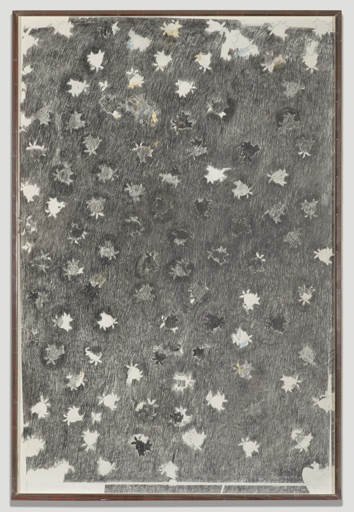
The irregularity present in Moses drawing strokes intrigued me to strive for imperfect mark-marking methods. Some irregularity includes gaps within each cluster of pencil strokes and the difference in graphite shades in respect to the weight put onto the pencil when drawing. The variety of tonal shades and texture created with a single one medium inspired me to explore my materials more extensively.
Comparing both images above allowed me to take note of how scale affects the details noticed. While finer details viewed from a further distance (the first image) may portray an emotion that is more subdued such as joy or sadness, a crop or creation of larger details may portray an emotion that is more expressive such as fear or anger.

https://www.artsy.net/artwork/ed-moses-color-rose
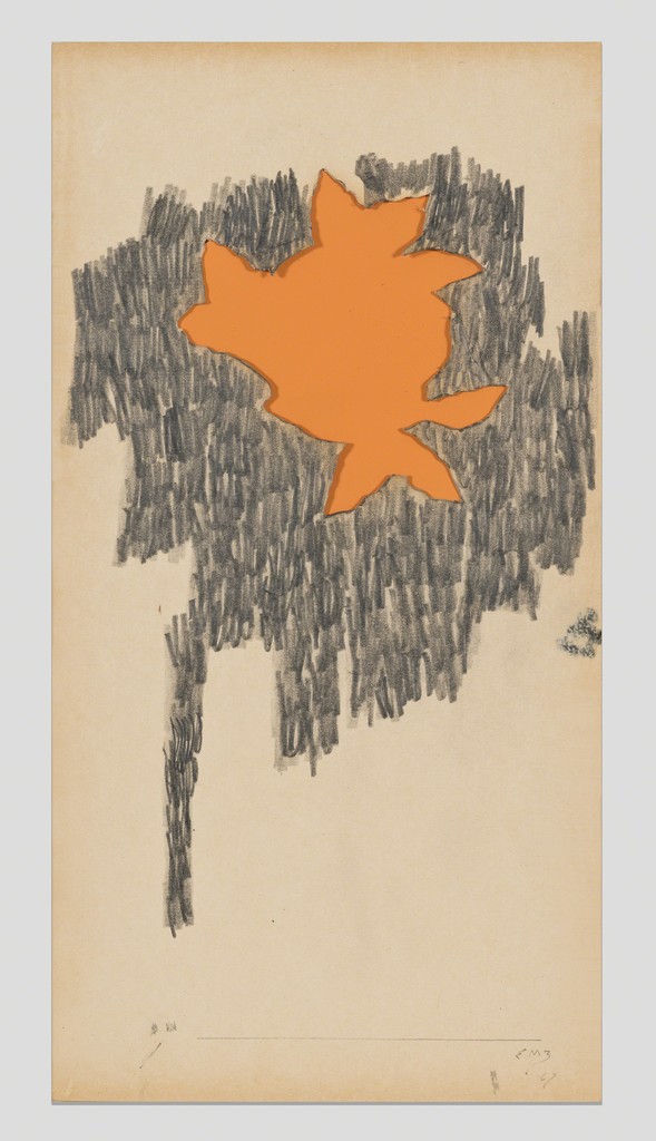
Apart from Moses distinct style and use of graphite, I admire the simple interpretation he has for the subject of his drawing. Through my interpretation of this work, there are three layers within the drawing. With the first outline comprising of the pale orange area, its loose outline has effectively portrayed a splitting image of a rose. Further supporting the first rose structure, the graphite mark making strokes created behind the orange outline forms an image of another rose (one with a stem). Although Moses’s drawings include subtle images of the main subject, it builds up harmoniously to create a constructed piece of mark making work.
Other works from this series: https://www.artsy.net/show/los-angeles-county-museum-of-art-ed-moses-drawings-from-the-1960s-and-70s
Sol Lewitt
Scribbles
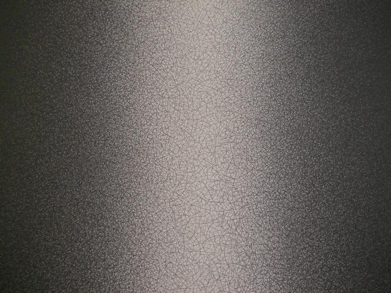
Soloman “Sol” Lewitt was an American Artist involved in art movements including Minimalism and Conceptual art. In 2005, Lewitt began his series of scribble wall drawings. “termed because they required the draftsmen to fill in areas of the wall by scribbling with graphite” that occurred at 6 different densities.

http://www.madrenapoli.it/en/collection/sol-lewitt-scribbles/
A quality about Lewitt’s Scribble that I admire the most is his ability to create an image with different tonal qualities by overlapping the same stroke of pattern multiple times throughout the canvas. The evenness within this piece of work shows great control that the artist has over every stroke made.
Julie Mehretu
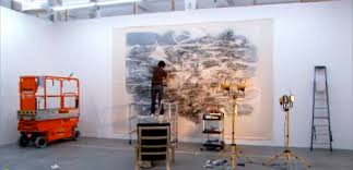
https://www.klejonka.info/2017jimage-julie-mehretu-studio.awp
Julie Mehretu is an American artist who is best known for her abstract paintings. Her sources of inspiration include urban landscapes and abstract energy; which explains the expressionistic flow of direction that I have observed within her work at first glance. Mehretu’s paintings comprise of layers of acrylic paint overlaid with mark making using thick streams of paint, ink, pens, and pencils. Figuratively, her paintings express a range of architectural structures providing connotations of today’s modern society.
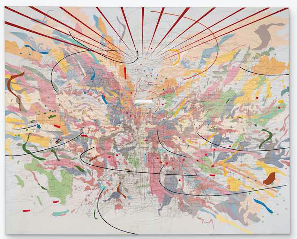
“By combining many types of architectural plans and drawings I tried to create a metaphoric, tectonic view of structural history. I wanted to bring my drawing into time and place.” – Julie Mehretu
http://www.culturetype.com/2017/02/27/detroit-museum-exhibits-major-painting-by-julie-mehretu-first-in-series-of-works-on-loan-by-black-artists/
In this painting, “Looking Back to a Bright New Future”, Mehretu combination of various strokes and layers inspired me to possibly work with layers for my own mark making project. Since our project will be in an achromatic colour scheme, it would be easier to form layers by working with a variety of thickness within the mark making strokes due to the lack of colour. This painting is filled with thin fine strokes in the background complimenting the thicker bold strokes in the foreground to create depth and the concept of space.