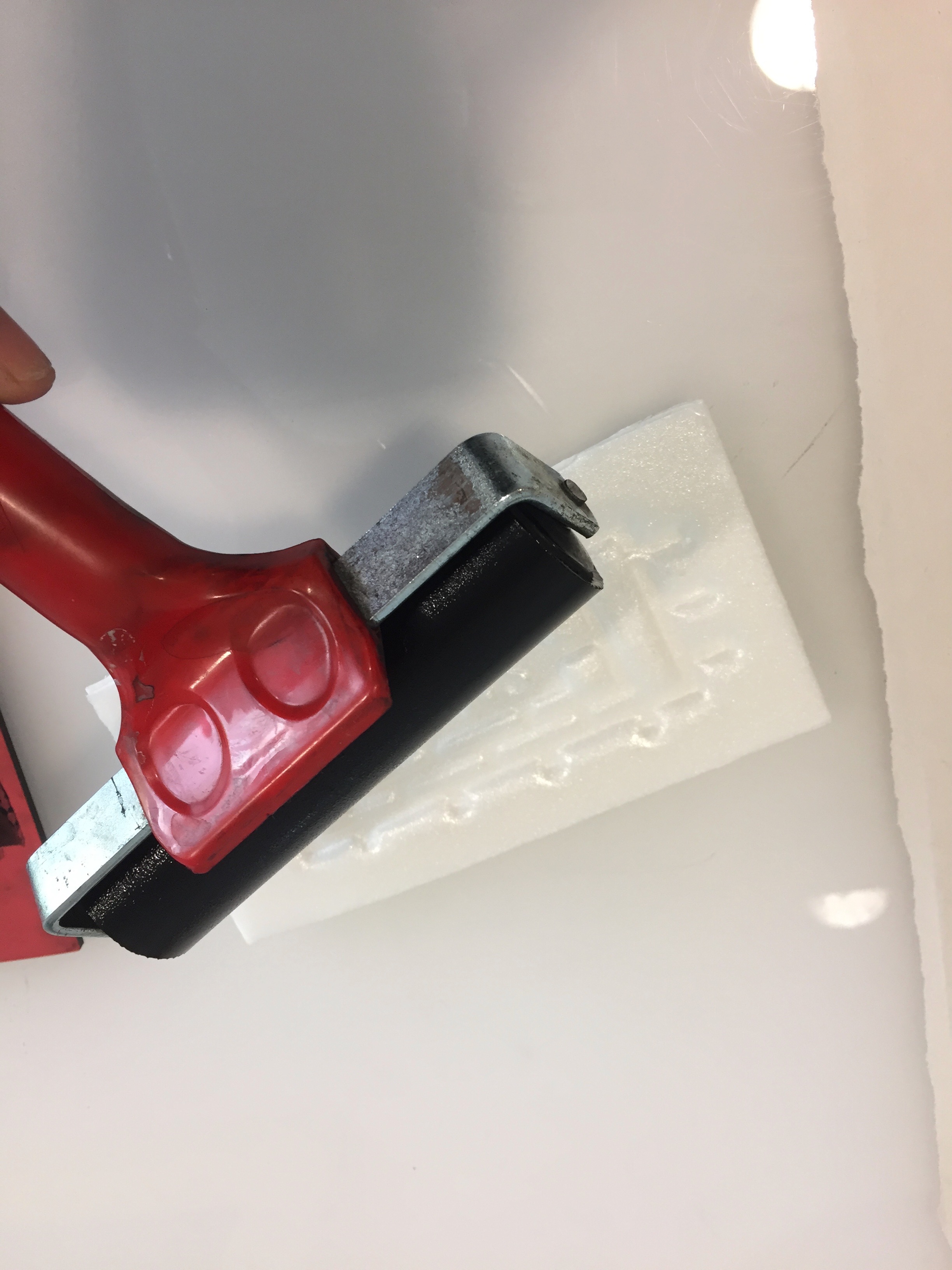
Following our second 3D lesson and first consultation, we learned about different ways on how to mount our individual rectilinear boxes together neatly. After a discussion about my first attempt at creating two sketch models, Cheryl advised me on how to further improve them to better represent my term Hirerachy as well as improving the technical qualities. After speaking with her, I thought more carefully about the sizing of my boxes, the relationship between each of the axis, and how the piercing and wedging method could allow me to construct more interesting compositions.
Methods of creating our 3D models
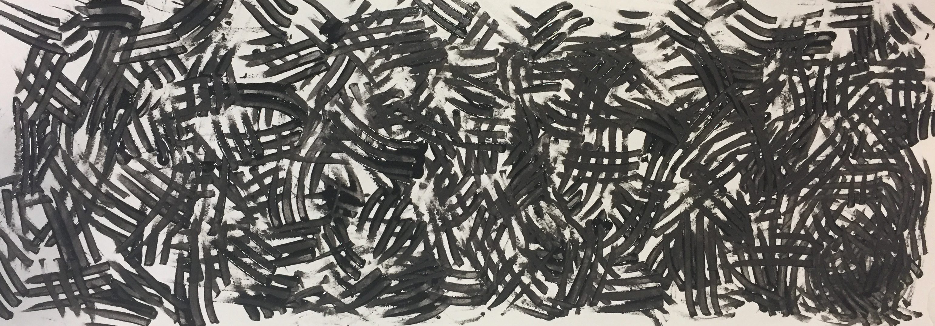
Wedging Method: When two shapes are slotted into each other
Piercing Method: When a volume goes through another
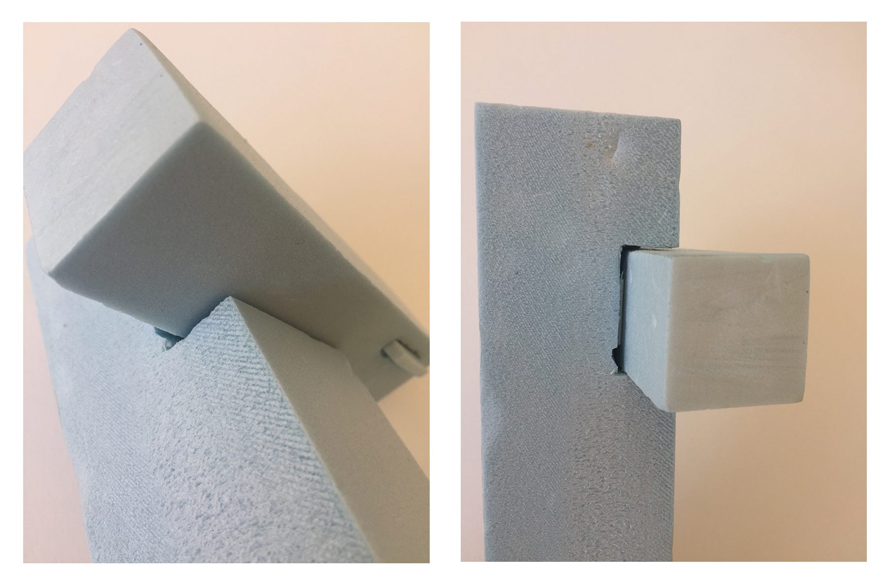
Model 1

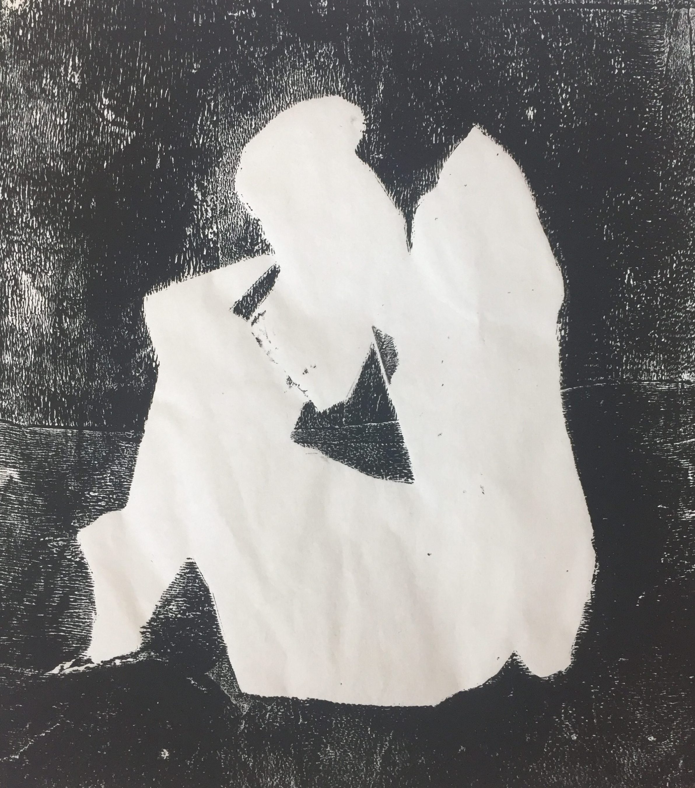
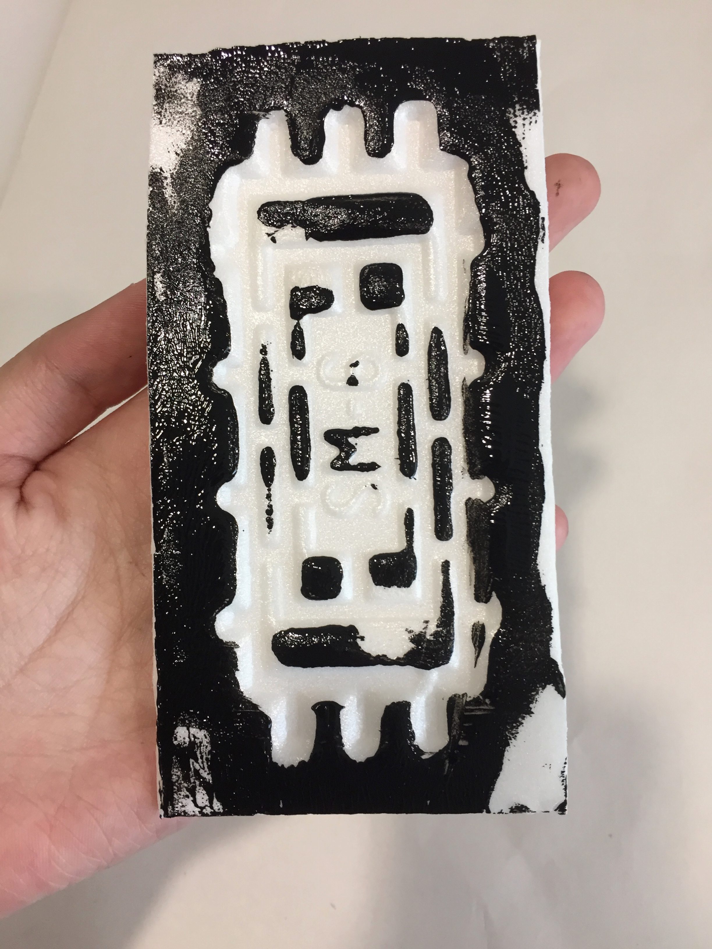
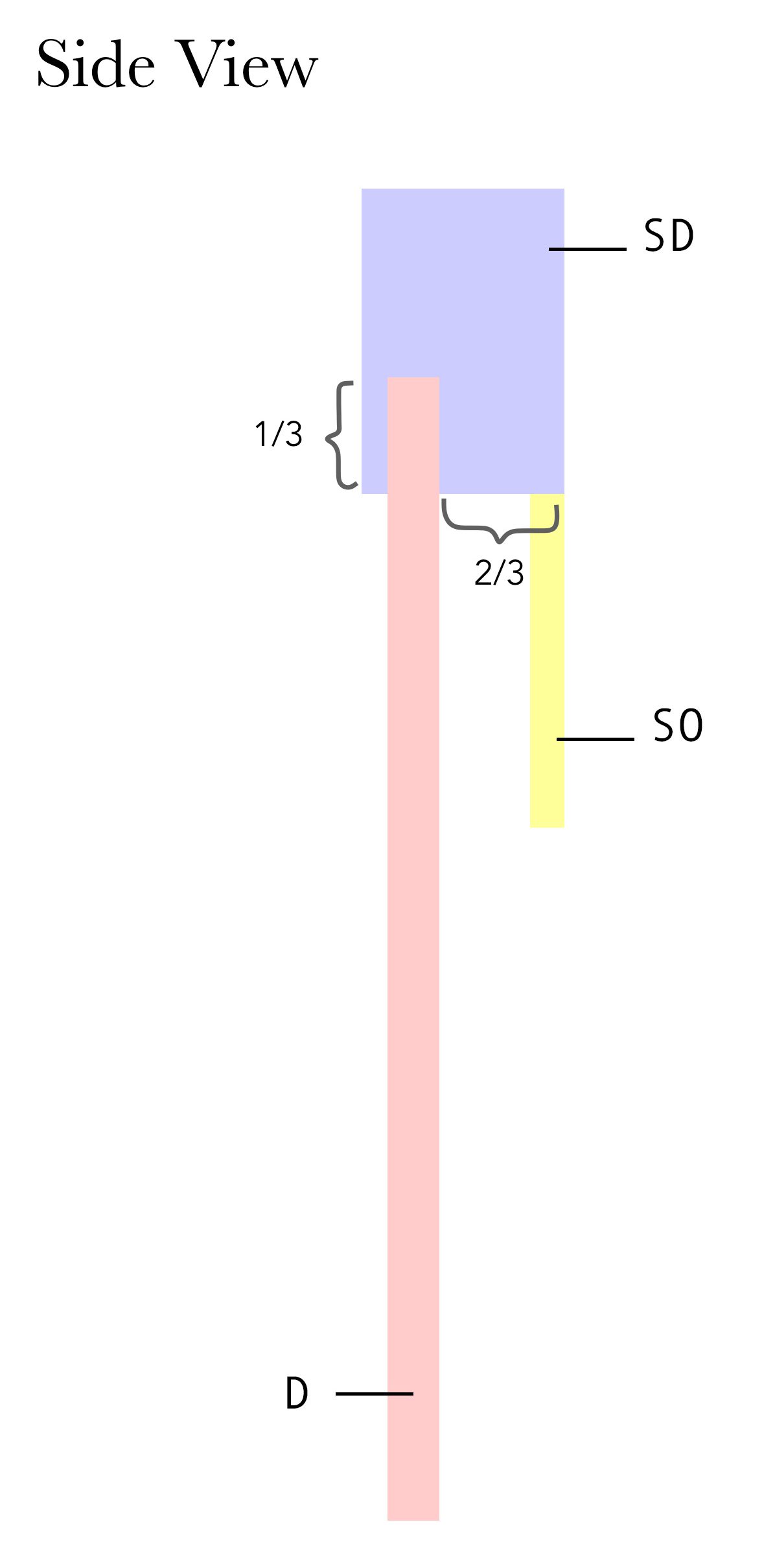
Blue Foam Model 1
In order to clearly represent each volume in my sketch models, I color coordinated the boxes for easy reference.
SO: Sub-ordinate (Long and thin)
SD: Sub-dominant (Long with a square cross-section)
D: Dominant (Long with a square cross-section)
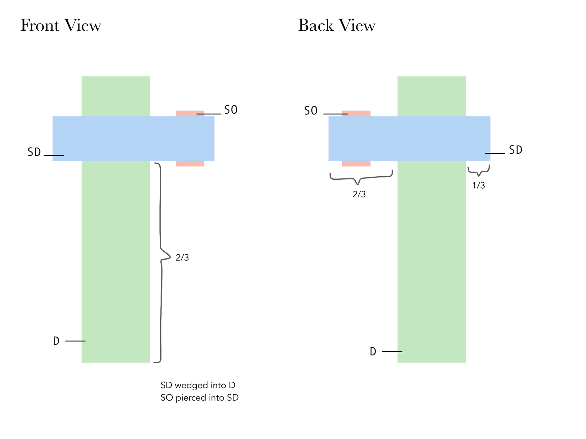
After analyzing this sketch model, I realized that although the SD and D varied quite a lot in size, it had very similar properties which tempted me to change the dimensions of either one. However, one advantage of this model is that the subordinate can be seen from all angles.
The dominant volume appears clearly as the largest volume except when the model is viewed from the top and bottom. Perhaps if the SD was slightly thinner, the dominant would seem larger.
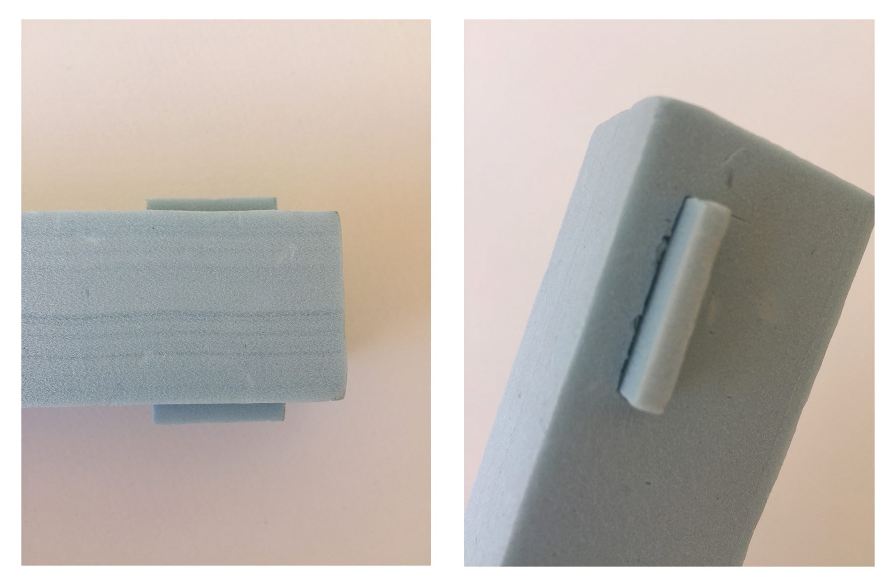
Model 2
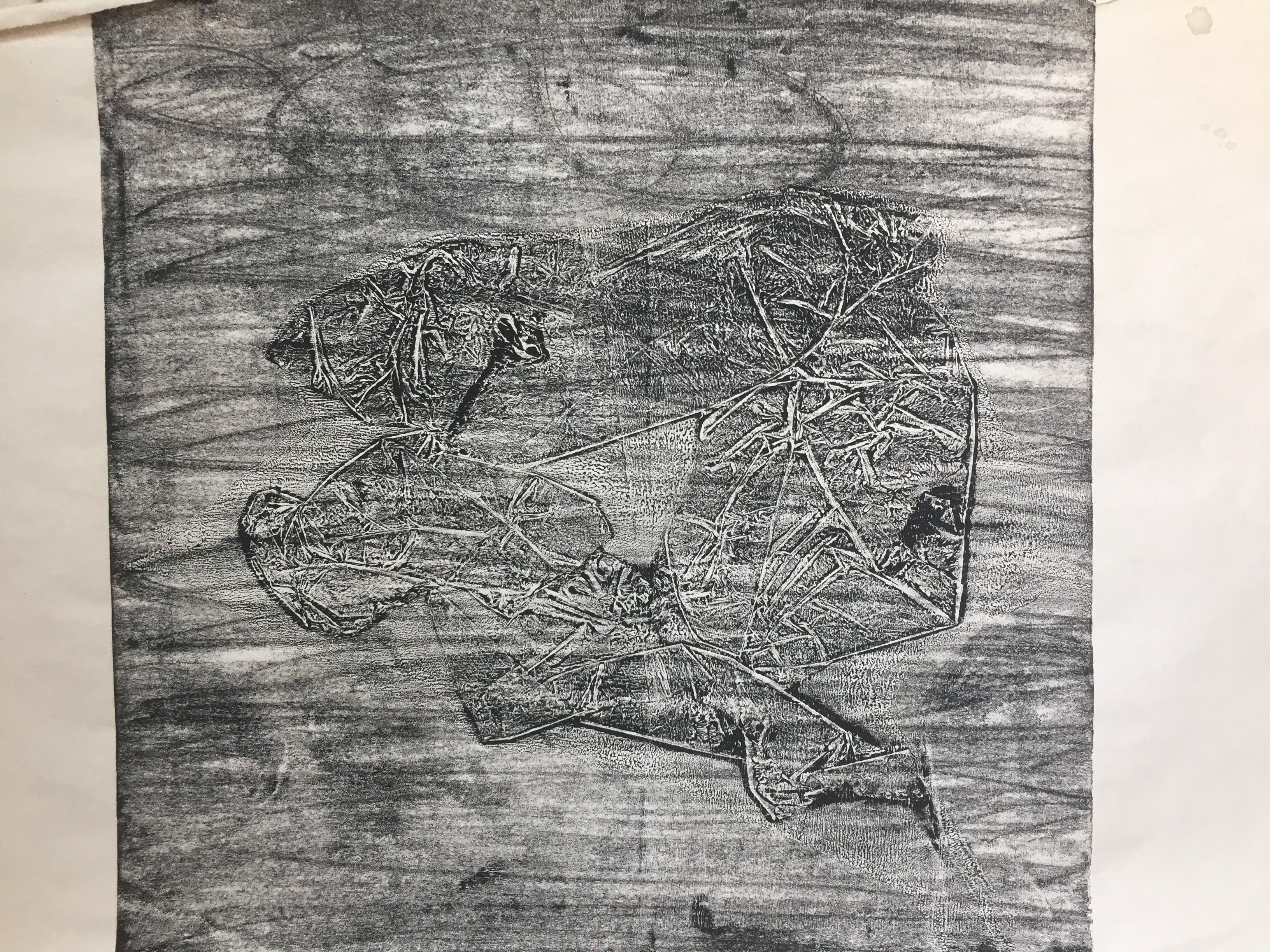
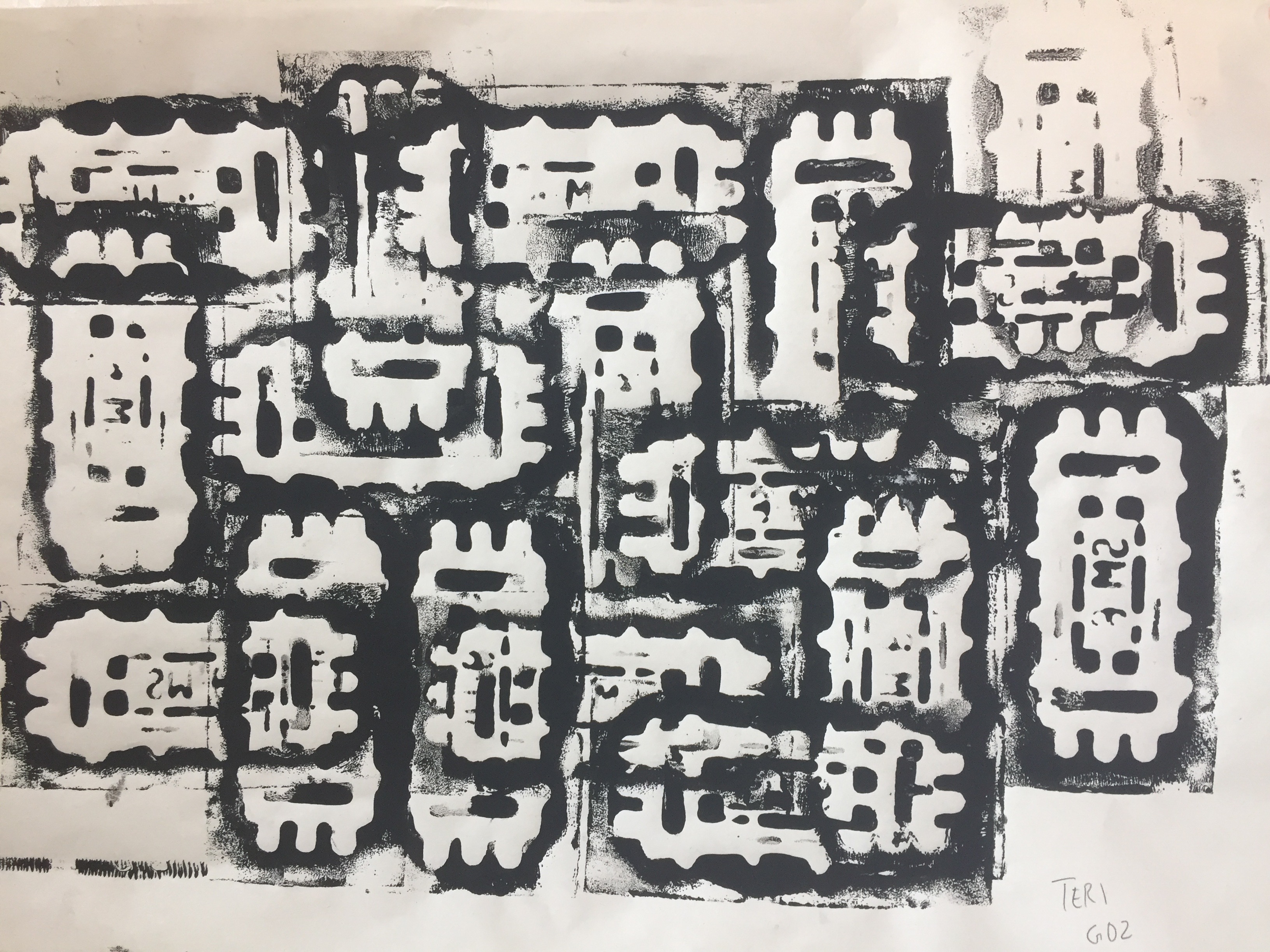
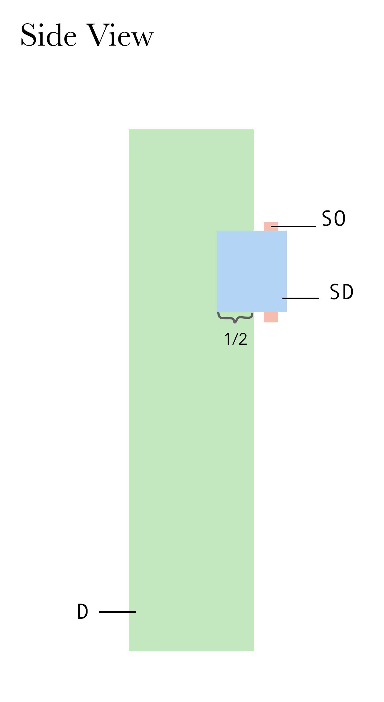
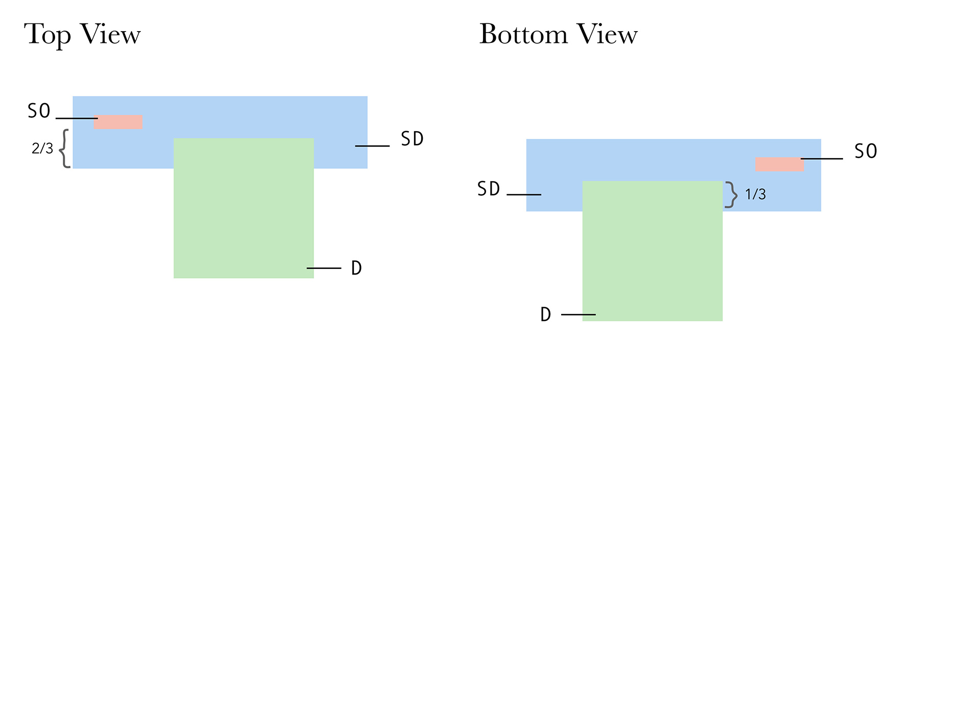
Blue Foam Model 2
SO: Sub-ordinate (Long and thin)
SD: Sub-dominant (Rectangular)
D: Dominant (Wide and thin)

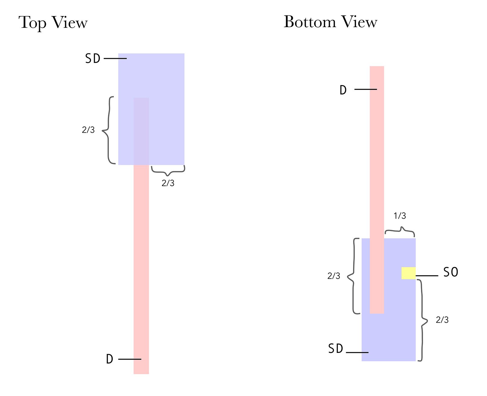
In this model, since the end of my SO was wedged into the SD and not pierced, it was not visible from the top as well as the back. However, by judging the visual qualities of both models, I actually prefer the second one because the three rectilinear shapes were of greater contrasting volumes compared to those in the first model. I ended up using the second model to create my final Pandora.
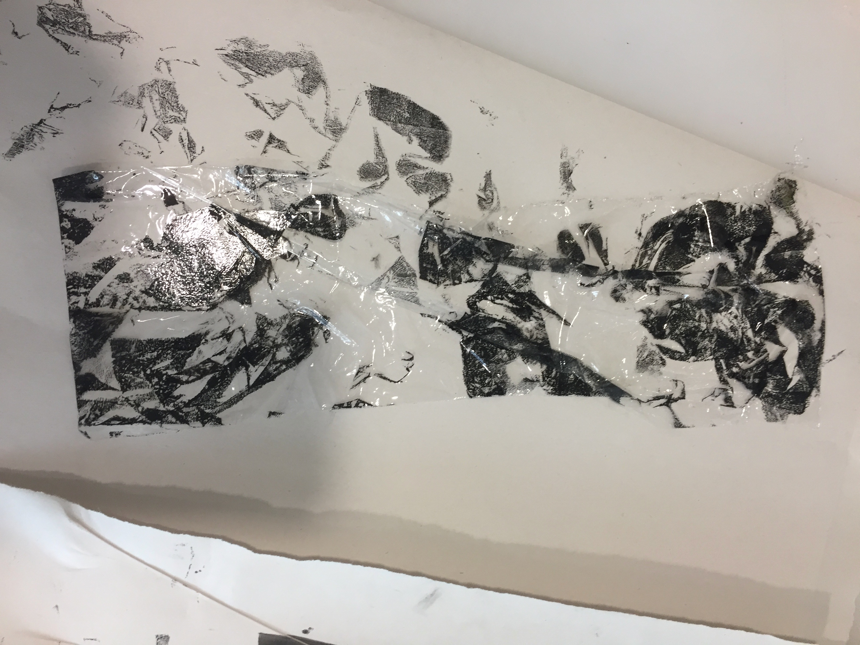
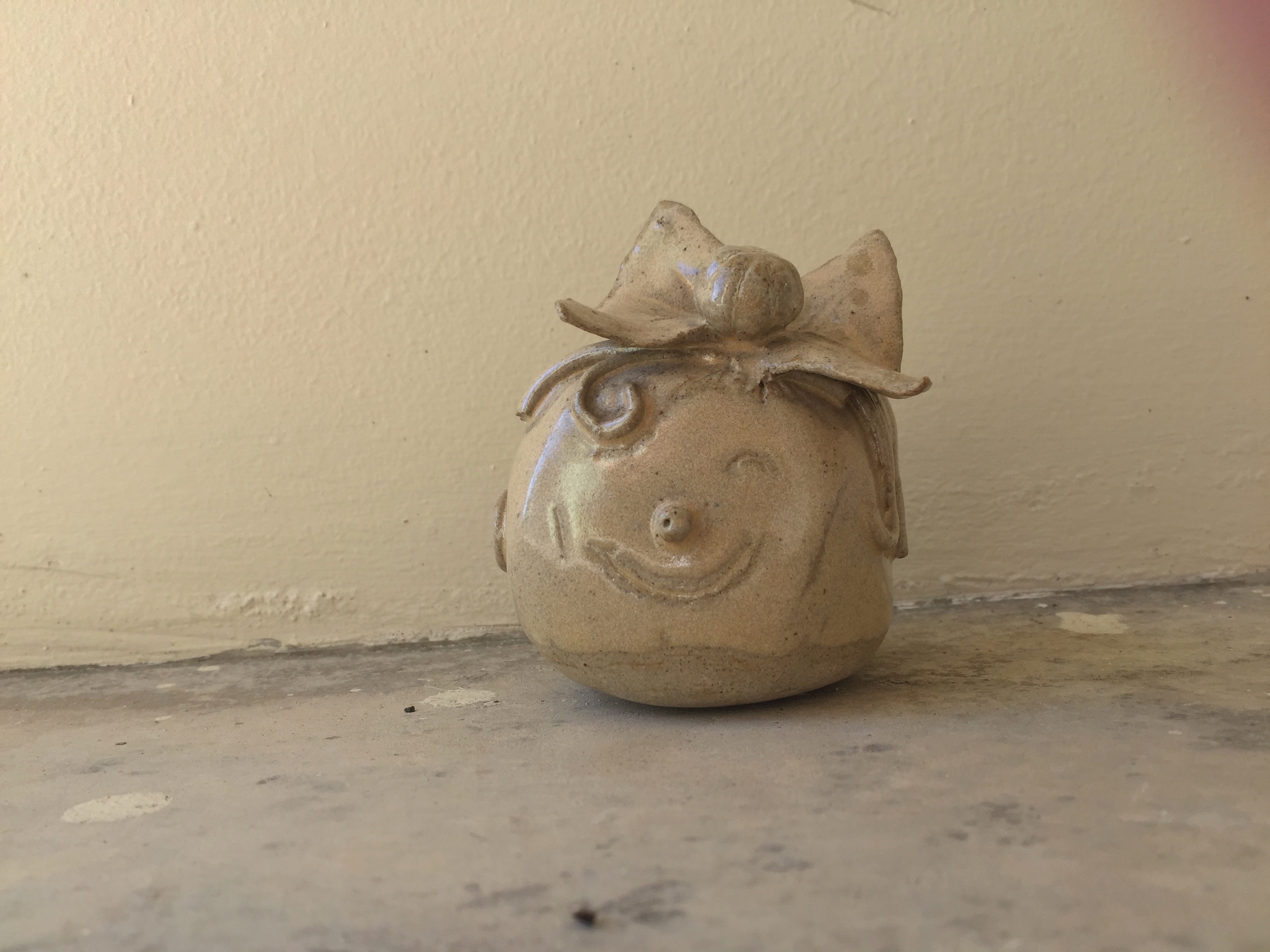
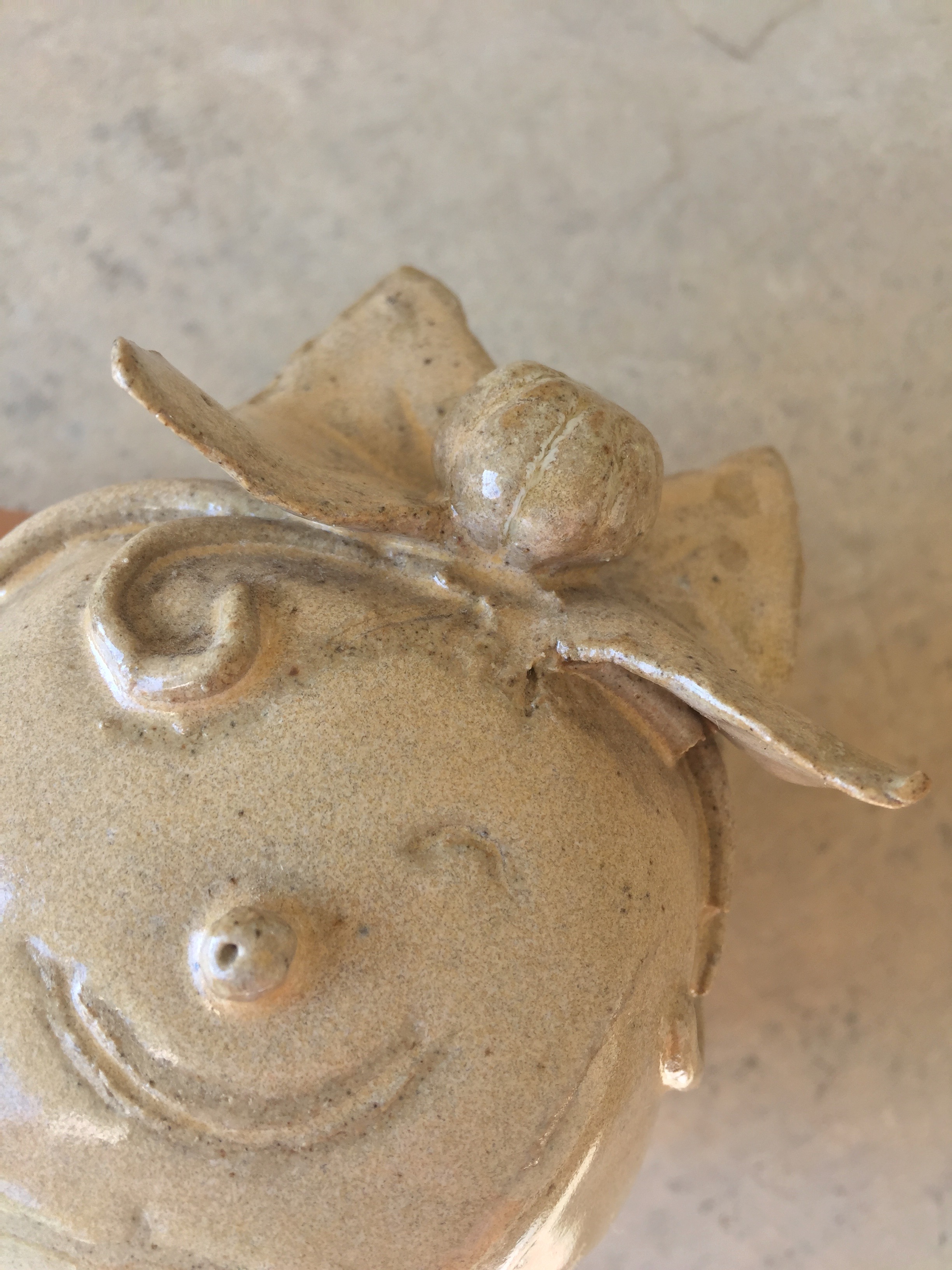
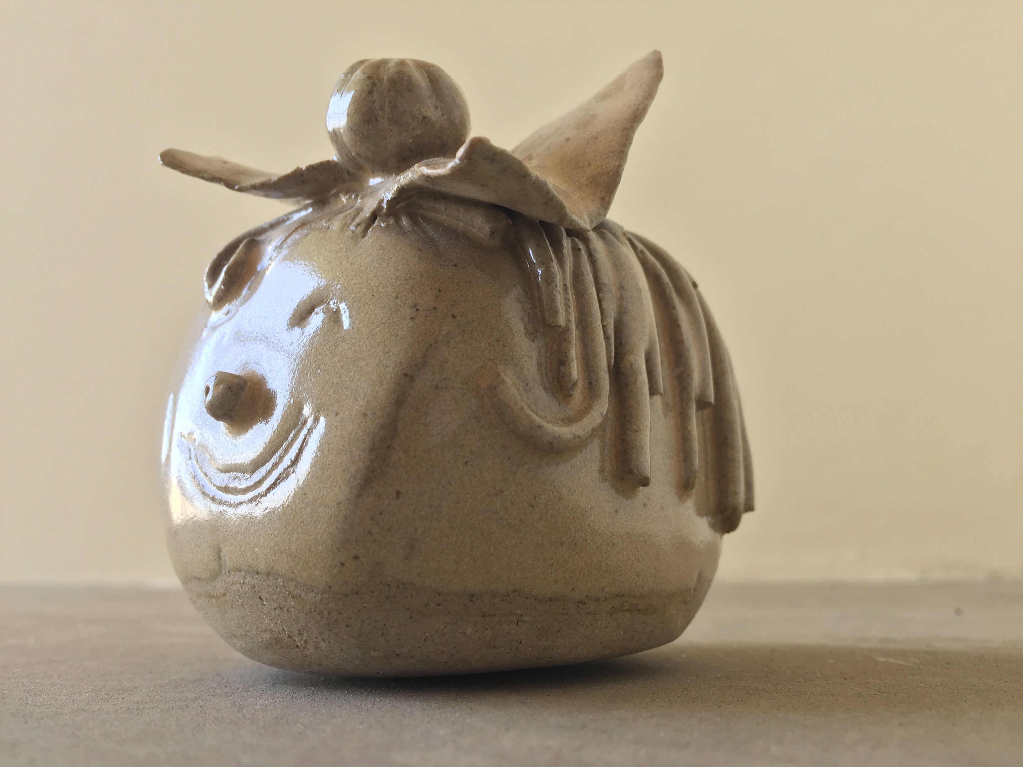
Final Model
Hierarchy – Food Pyramid
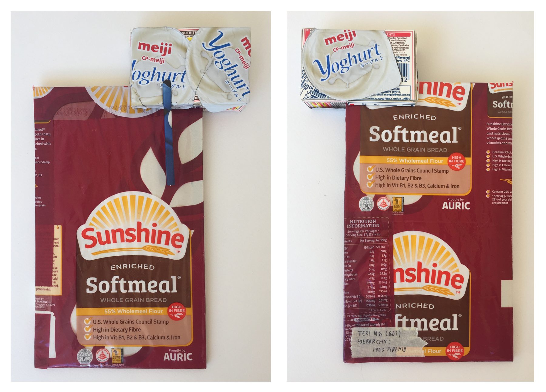
Front // Back

Side // Bottom
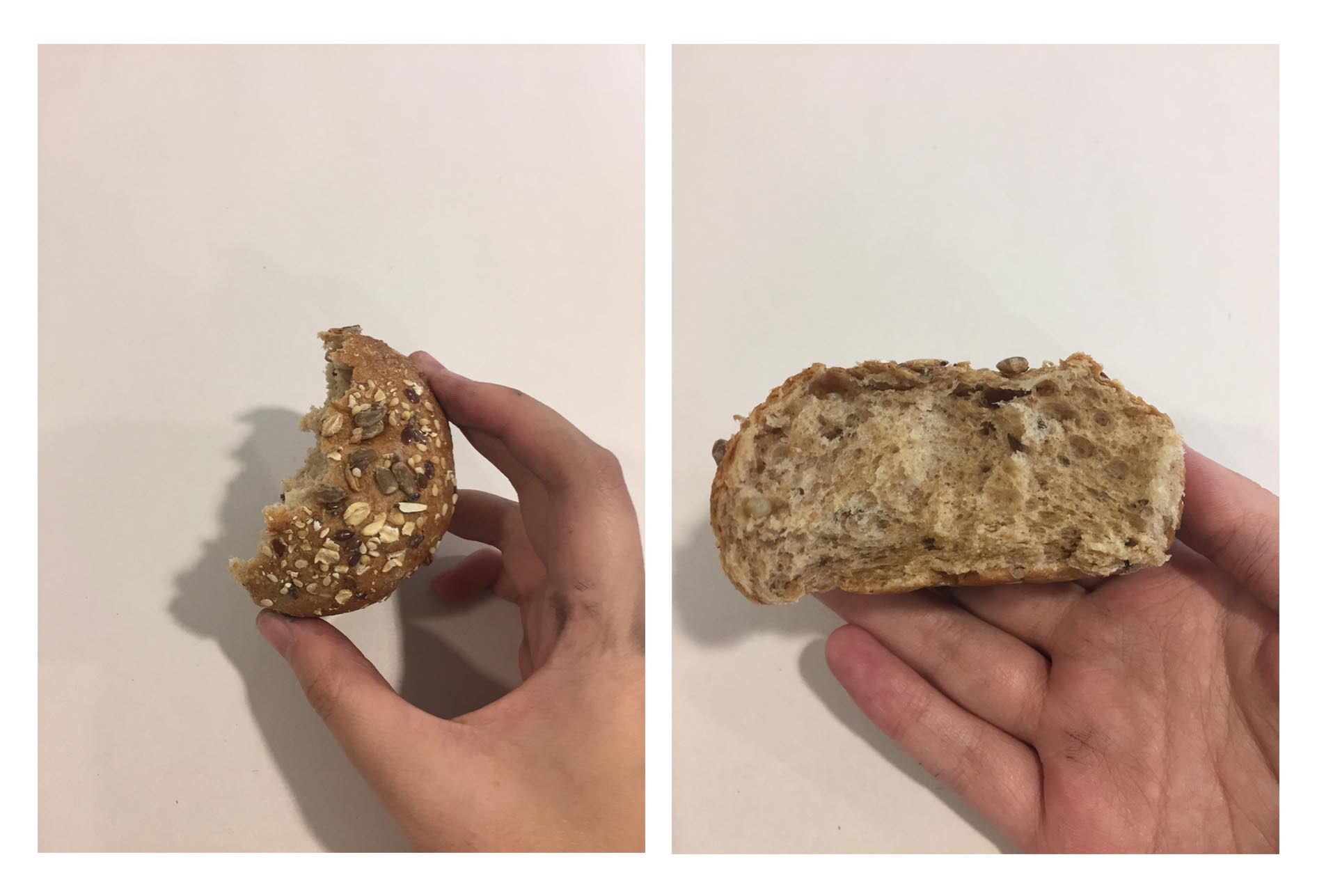
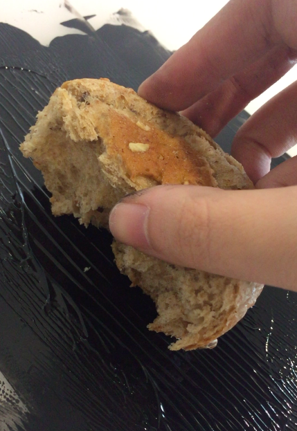
D – Healthiest (wheat bread)
SD – Eat moderately (dairy products)
SO – Consume the least (chocolate and sweets)
Before deciding my final theme (Food Pyramid), the term “hierarchy” generated other ideas in my mind such as:
- Transition of materials from old (D) to new (SO)
- Transition of materials from matte (D) to shiny (SO)
- Characters in a set of playing cards
Eventually, I thought of the idea of incorporating the food pyramid into my choice of materials as there are many food packages I could choose to work with from the pyramid’s various levels.
http://www.safefood.eu/Healthy-Eating/What-is-a-balanced-diet/The-Food-Pyramid.aspx
With reference to this particular food pyramid, I selected food from the first, fourth and fifth tier.
Choice of materials
Dominant
As seen in my final model, I choose to cover my dominant in the plastic package of whole grain bread. The main focus was to include the healthy facts about it as well as the nutrition information chart stated on the packaging.
Since there were areas of the packaging that was transparent, I wrapped my blue foam in some paper to create a white base.
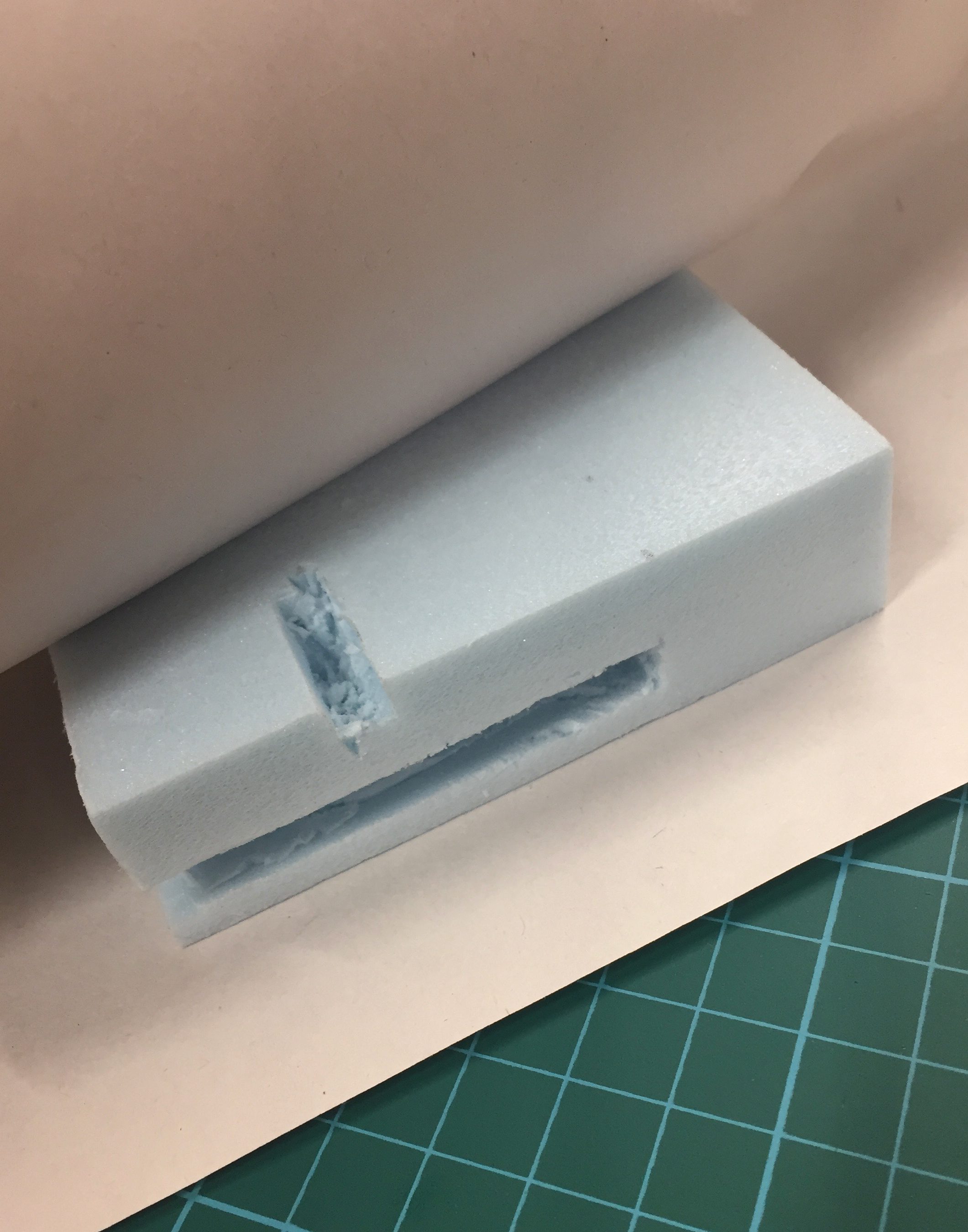

Wrapped blue foam

Sub-dominant & Sub-ordinate
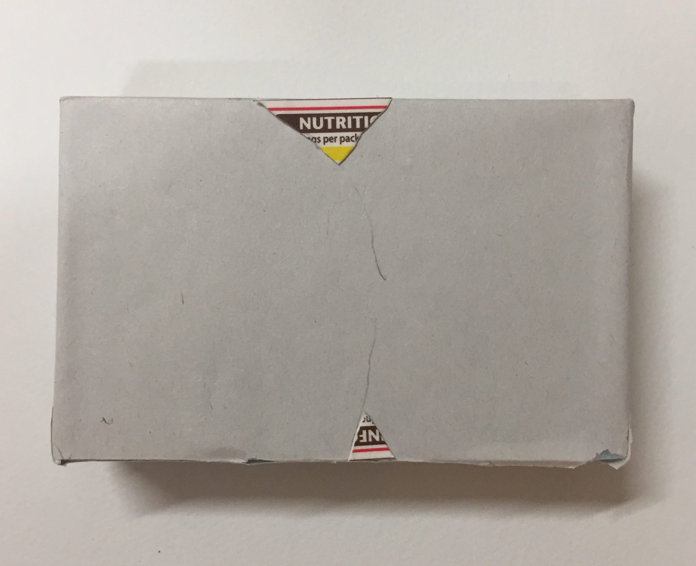
For my selection of dairy products, I chose to use the lid of yogurt cups as well as parts from milk cartons. The yogurt lids created a crinkled texture while the carton was smooth and flat.


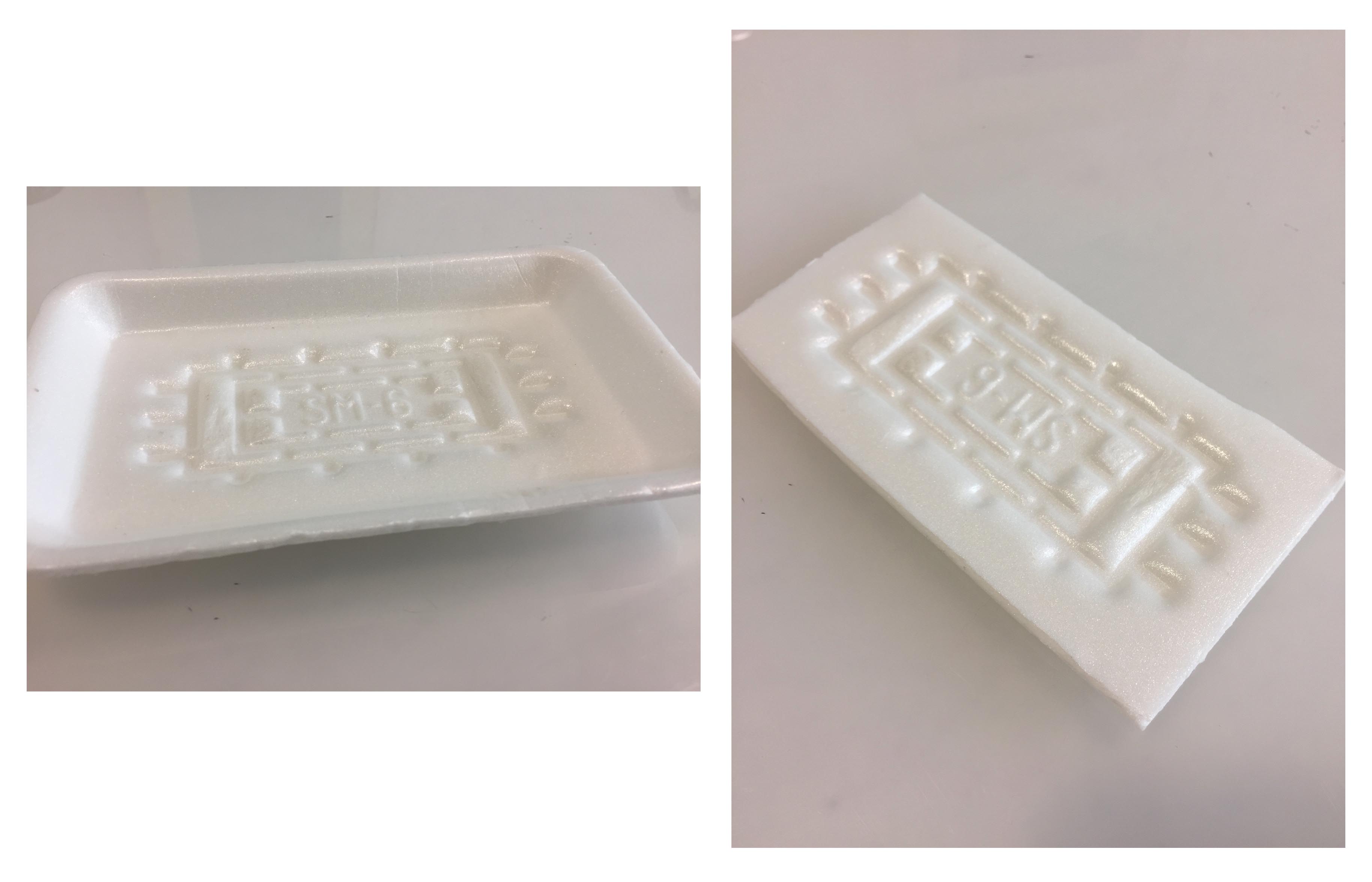
Nutrition Fact Label from Milk Carton
Cover blank areas in between the yogurt lids
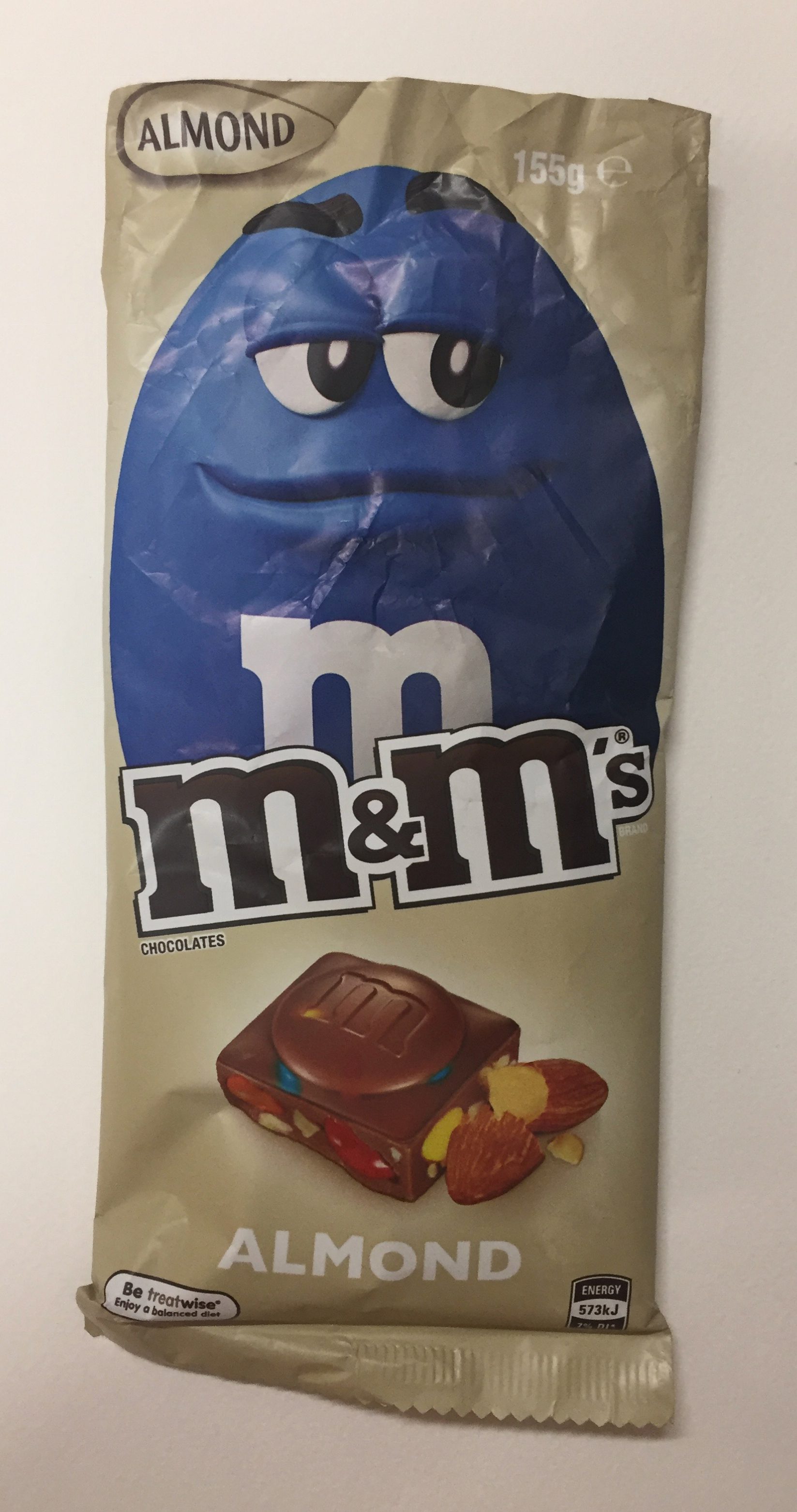
M&M chocolate bar
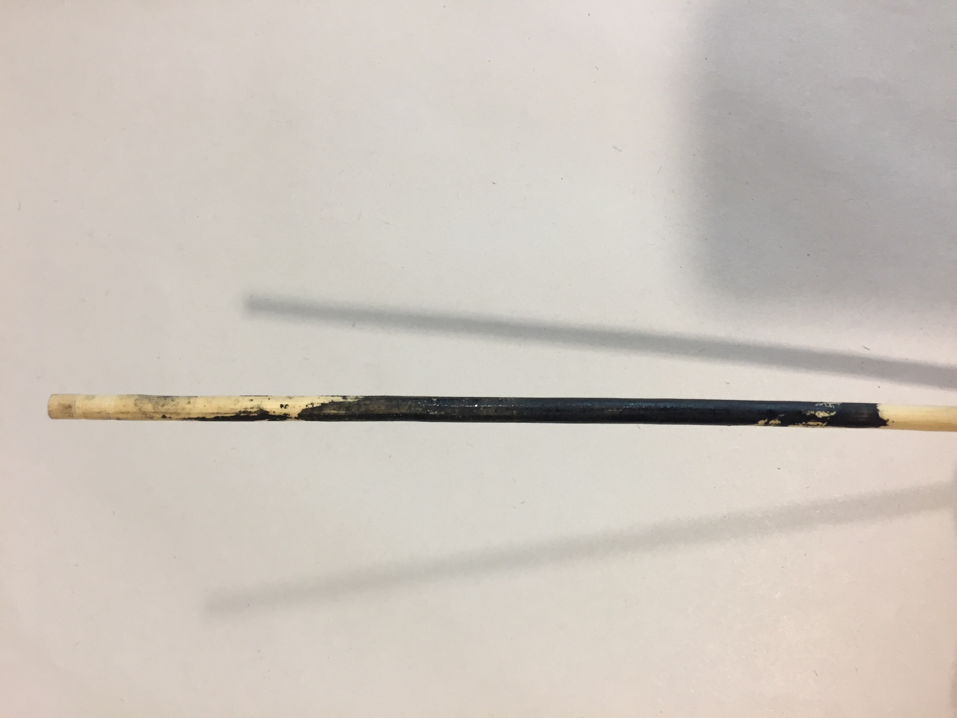
Lastly, for my SO, I decided to use the packaging of an M&M chocolate bar. Unfortunately, the size of my SO was very small that there wasn’t much surface area for me to cover with the material. Improvements for this model would be to possibly pierce my SO through the SD so that it could be visible from all angles and also to enlarge my model in order to have enough surface area for the material.
Future Application
For my large application, I thought my model could fit the structure of a shower. With a glass backing and wood covered heater, this shower could belong in an outdoor area.
Shower design:
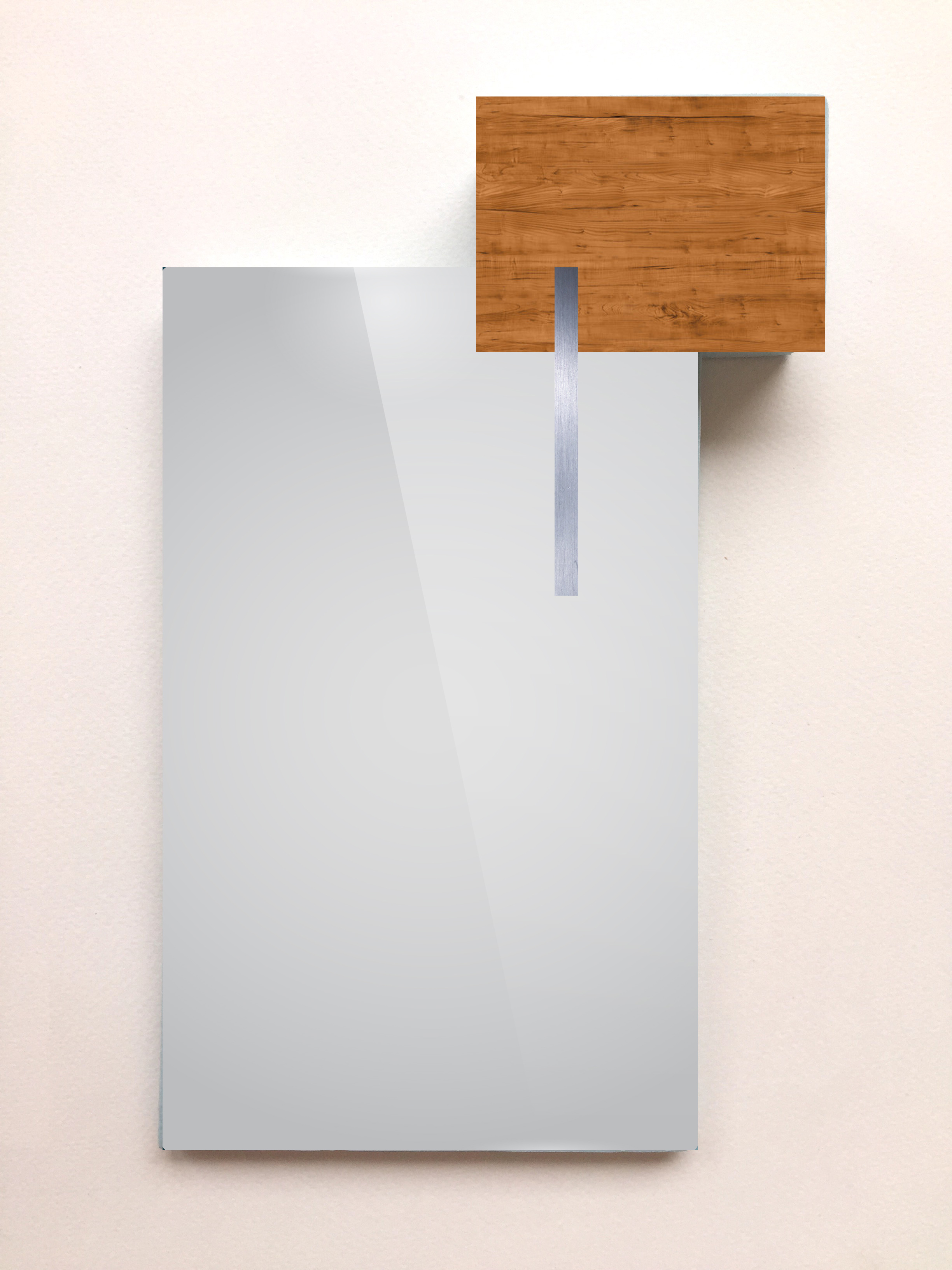
Glass backing, Wooden Heater, Metal shower head
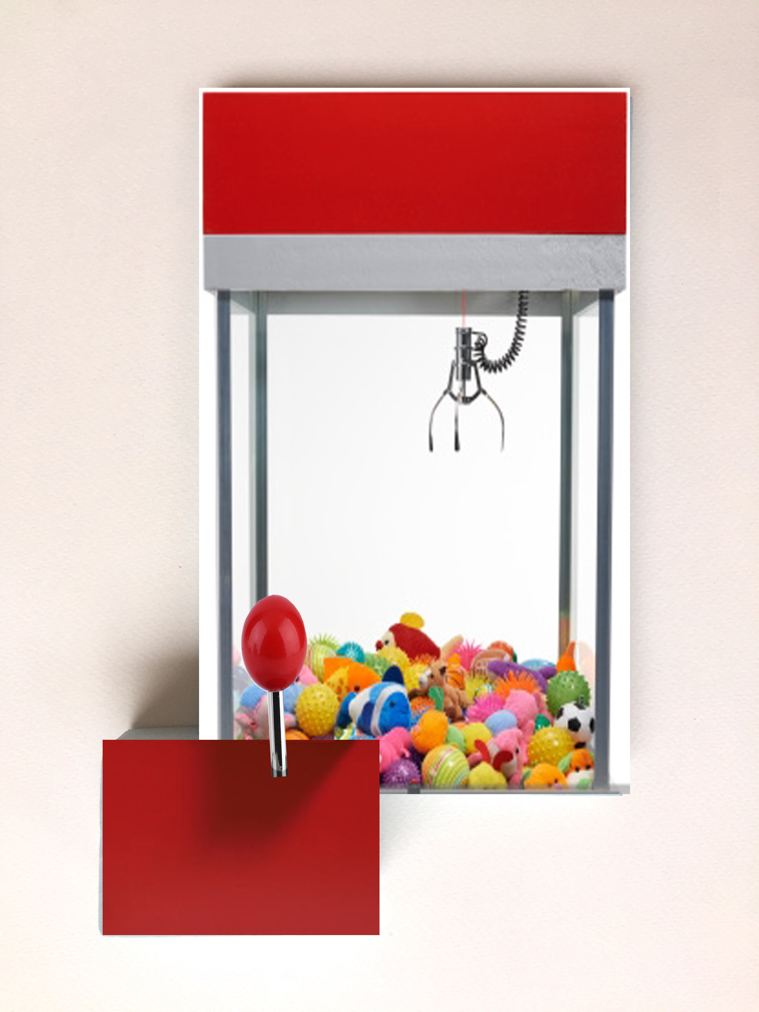
For my smaller application, I flipped my model upside down and turned it into a small claw machine. With the joystick being subordinate, the support of the machine will be the subdominant and the plastic top containing toys would be the transparent dominant.
Claw Machine: