
VAROOM RESEARCH
Varoom is a global magazine that features a broad variety of illustrations. Their editor Olivia Ahmad, describes the intention for each issue as being “to convey a live reflection of what is happening in illustration art at any given moment… presenting new work and giving insight into how its done, but also asking questions about it – why do you make it? what does it mean to people?”
The magazine has been quietly but effectively getting on with a series of strong themed issues.

https://www.grafik.net/category/case-study/shelf-love

https://www.facebook.com/Varoommagazine/photos/a.366181926777187/1673858609342839/?type=3
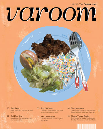
The publication welcomes any style of illustrations which ultimately helps to widen their spectrum of audiences. For my Varoom cover, I was inspired by the story of Horton Hears a Who! ; the idea of a world existing in another world. Hence, I decided on the theme of Fantasy.
PROCESS
The slides below demonstrate a few artist references which inspired me to look into abstract forms and bright unique colours for my fantasy world.


 The idea : illustrating an unknown world within an existing world
Location : on a plate of cai fan (vegetable rice)
Visuals : simple composition, realism vs artificial
Audience : appeals to the any local Singaporeans
I decided to go with food illustrations which led me to the visuals of a simple plate of vegetable rice. Something simple that many consume daily hence easily relatable for my audience. It would also capture the scene of a local hawker ; executed with the cheerful colours of the tables, plates and utensils.

Reference image
Starting off with the top view composition, I began illustrating the realistic portions first which included the plate, utensils and ingredients. Lastly, finishing off the fantasy world in the rice area.


Colour trials
Towards the last touch ups, I explored with various background shades to see which was most suited with the main illustration. I ended up going with something in between so that it wouldn’t be too distracting to the graphics but balanced it out instead. Final textures were with a pixel brush to add depth.
FINAL