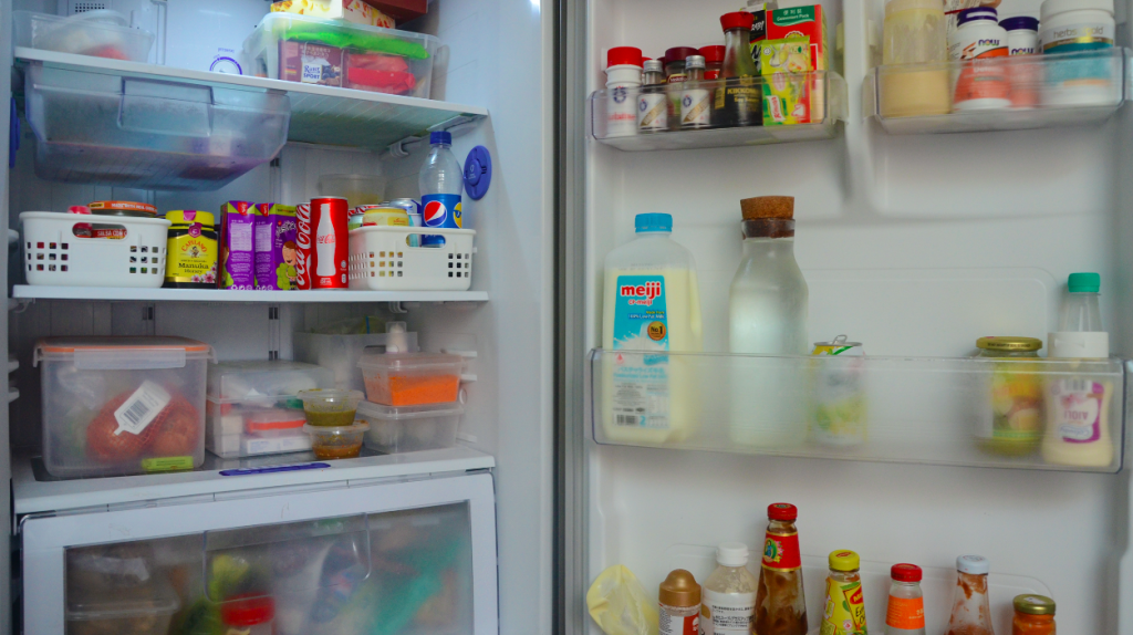
Poetics of time ~ Project 4

Project 4, poetics of time requires us to create a final project that expresses one of the categories of time. Since it could be created with any medium of our choice, I decided to work with film and record a video. Below is a copy of my first very first project proposal draft. (Explanation of changes below!)

project proposal

  1. Project Title
    • the inverse of time
  2. Describe the Art Project
    1. What is it about?
      • changing the normality of time that we experience every day
      • things that normally occur fast will become slow; vice versa
      • focus on human behaviours/emotions
      • Focus: Human reactions, grooming needs
        • Sneezing, pre-sneeze
        • Yawning
        • Smiling
        • Blinking
        • Nail biting/cutting
        • Nodding
        • Wave
        • Frown
        • Cough
        • Wink
        • Crawl
        • Laughing
    2. What has inspired you?
      • I wanted to explore a universe that experiences time otherwise
    3. Are you trying out a new concept or a continuation of a previous project?
      • New concept
    4. What do you intend to communicate to your audience?
      • Let us appreciate motion and live in the moment
    5. What is innovative or new about it?
      • Portrays scenarios that are against the norm
      • points out moments that we tend to overlook
  3. Objectives and activities of the Art Project
    1. What are you going to make or produce?
      • A video
    2. How are you going to produce it?
      • Film it from various angles
      • capture subtle movement
    3. What is the type of work?
      • Edited time
    4. What is the dimension?
    5. What is the length of time of this experience you are creating?
      • 2-3 minutes
  4. Art Materials and Equipment for the Art Project
    1. Describe the materials you are going to use
      • DSLR camera
    2. What tools will you be using?
      • Singapore
      • my surroundings
  5. Mounting and Installing the art project
    1. describe how you would install the art project
      • Played on the classroom projector
  6. Art Project Design 
    1. Mockup of your artwork
      • Trial shots below

concept development

Throughout the start of this project, I really struggled with the ideas that I had and was indecisive about what I wanted to focus on. However, I did kind of have a filming/editing style in mind which was inspired by the artists in my project 4 research post. For the filming and editing, I knew that I wanted it to be quite raw in nature, capturing the moments itself without the input of additional background music or visual effects.

ORIGINAL IDEA 

As seen in my original proposal, I wanted to create a video that expressed the inverse of time. Since there was no focus initially, I then thought of focusing on human behaviour/actions. After consulting with Lei, my plan was to film very close up shots of people in their natural state and try to capture the moments of sneezing, coughing, etc… With this focus, I proceeded to take test shots in the public space of a mall. Below is a compilation of some test shots.

During the filming process of these test shots, I realised that it was too challenging to capture the moments of natural human behaviours that I wanted; especially in a raw setting because the moment is unpredictable. It was also very awkward for me since I was trying to film strangers without them knowing. I also could not film them to the level of closeness within a frame than I intended.

FINAL IDEA

Moving on to another idea, I thought of filming something that could mark the end of this first semester and the new chapter in my life of staying at university. With this, I aimed to create a video that documents a day in my life specifically spent at hall. I took the DSLR around with me throughout the day to record everything and compiled it into a video filled with many short clips.

“day in the life of” // project 4 final outcome 
falls under the category of edited time

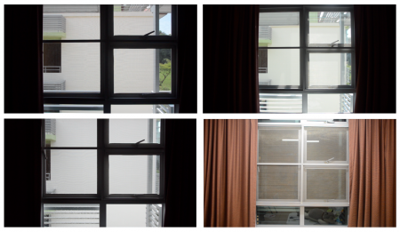
From morning to night, this video includes repeated clips of my window and the view when you step outside the door to show a progression of time throughout the day. Other repeated visuals included my shower basket, my bed, the view from when I am laying in my bed and the wall hook on my wall where my towel and shower bag hangs. Time stamps were also included to mark the time of day.

day // night

throughout the day

throughout the day

To sum up all the clips:

Morning – waking up
– ceiling fan
– window
– brushing teeth
– starting work
Afternoon – window
– afternoon sun
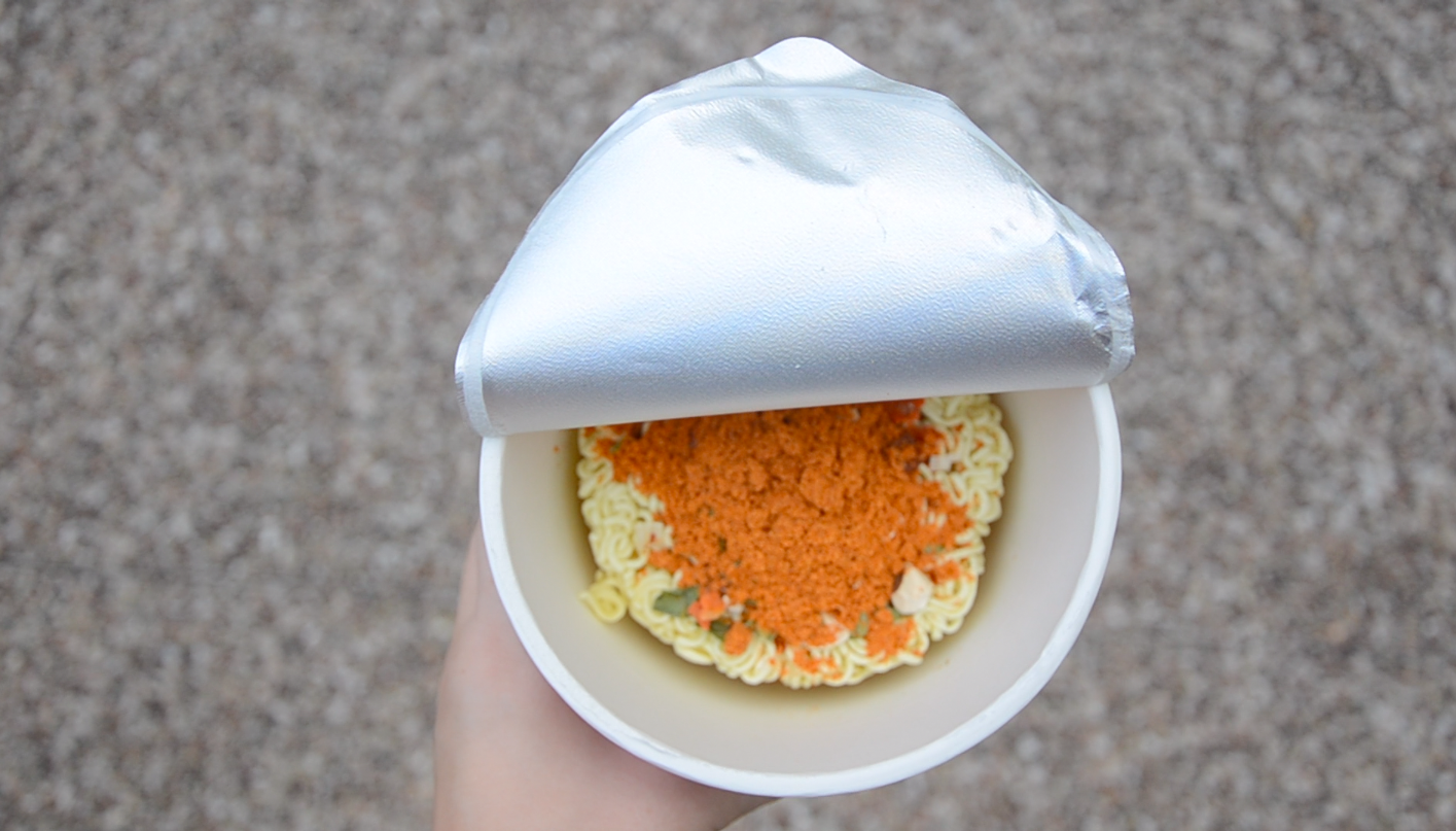
– cup noodle lunch
– cooking cup noodle
– enjoying cup noodle
– back to work
– nap time in the evening
– waking up
Night  – receiving a dinner invite
– window
– heading downstairs
– having dinner with friends
– spending time with time
– heading back up
– shower time
– watching tv shows/scrolling social media
– lights out

Filming/editing qualities

Throughout the filming process, I  held the camera still in a single position without the use of a tripod for the effect of a presence behind the camera as well as to portray my day through my own eyes.

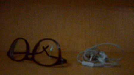
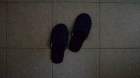
A few clips that I had to re-film another morning were the clips that turned out a little too dark and of bad resolution due to the lack of light. Initially, I had also filmed them out of focus to mimic the effect of me not wearing my glasses but it turned out even worse with the lack of light.

Out of focus // in low light

Out of focus // in low light

The audios present in the video were all ‘natural’ sounds that were present in my surrounding environment itself. I wanted to really capture the presence of motion and movement through the things around me that are often missed and overlooked hence for the lack of speaking and minimal movement of the camera.

As for the editing, I made decisions about altering the length of each clip when piecing everything together. During parts where I captured subtle motions such as natural movements and reflections within the frame, they tend to appear longer in order for the audience to appreciate the moment.

Critique/reflection

To sum up project 4, I really enjoyed experimenting with this style of filming and editing that I have always wanted to try. I am also glad that the outcome of this project documents this time in my life which I can look back on in the future. In the context that this video was shown in class and to an audience that is probably experiencing similar routines currently, I hope to have created something that feels familiar in some ways as they can relate to it.

Lastly, I had an amazing time during our last critique session admiring everyone’s amazing creations and development of their own styles 🙂
Project 4 ~ Research

Space and Time

In different ways, space and time are organising principles of all art. In the context of films, space and time allow for the inclusion of motion. In the late 19th and early 20th century,  the development of film medium led to a great influence on changing perceptions of space and time.

Measured time

  • Actual, objective, clock time
  • time is quantitatively measured by regularly recurring events of intervals
  • examples: cast shadows, recurring sounds, live durational performances
  1. Linear time – there is a beginning (past) and end (future), the present is always moving forward
  2. Circular time – repeated processes like cycles and seasons which creates continuous outcomes

Experienced time

  • Subjective, psychological, implied or perceived time
  • measured by the attention of the participant

Edited time

  • has been cut up and rearranged
  • can be linear or non-linear
  • linear is mapped out in the order of past, present and future
  • non-linear time can reveal parts of the future mixed in with the past and present
  • examples are montage and time-lapse photography

Biological time

  • a measure of time-related to bodily functions, such as when we feel awake, tired or hungry

Digital time

  • measured in milliseconds and often associated with technology
  • an example is how long a webpage takes to load and how long you feel when it takes longer

Running time

  • the total length of a live event or a video piece
  • running time = plot time

Artist Inspiration 

Singapore Gaga (2005) ” Tan Pin Pin

Singapore GaGa (2005)

“If you see only one Singapore film, let this be it” – TODAY

Subject: Singapore’s aural landscape

Form: A 55 minutes documentary with English and Chinese subtitles

Context: Considering the subject of this film, it is very relevant in the cultural context of Singaporean as well as other races living in Singapore. In relation to audiences outside of Singapore, they can learn a lot about Singapore from this film

Content: This documentary reveals the unique characteristics of Singapore and captures moments that makeup what this country embodies

Asia (2015) ” Will Darbyshire 

Short film created by Youtuber Will Darbyshire

Subject: Asia/Thailand

Form: 2:26 minutes edited short film, montage style

Context: Presence of Thailand’s cultural context, similar to other Asian cultures hence more relatable to audiences from these regions

Content: This video captures characteristics of Thailand whether its the food, people, culture or environment. It has been edited in a way whereby parts of a clip are removed to create a stop-motion like effect with matching audio

Formats from project 3:

  • synesthesia
  • a stream of consciousness
  • experimentation (material/medium)
  • semiotics (signs and signifiers)
  • non-linear editing (flashback/flashforward)
  • movement/choreography


Ego in Different Settings ~ Project 3

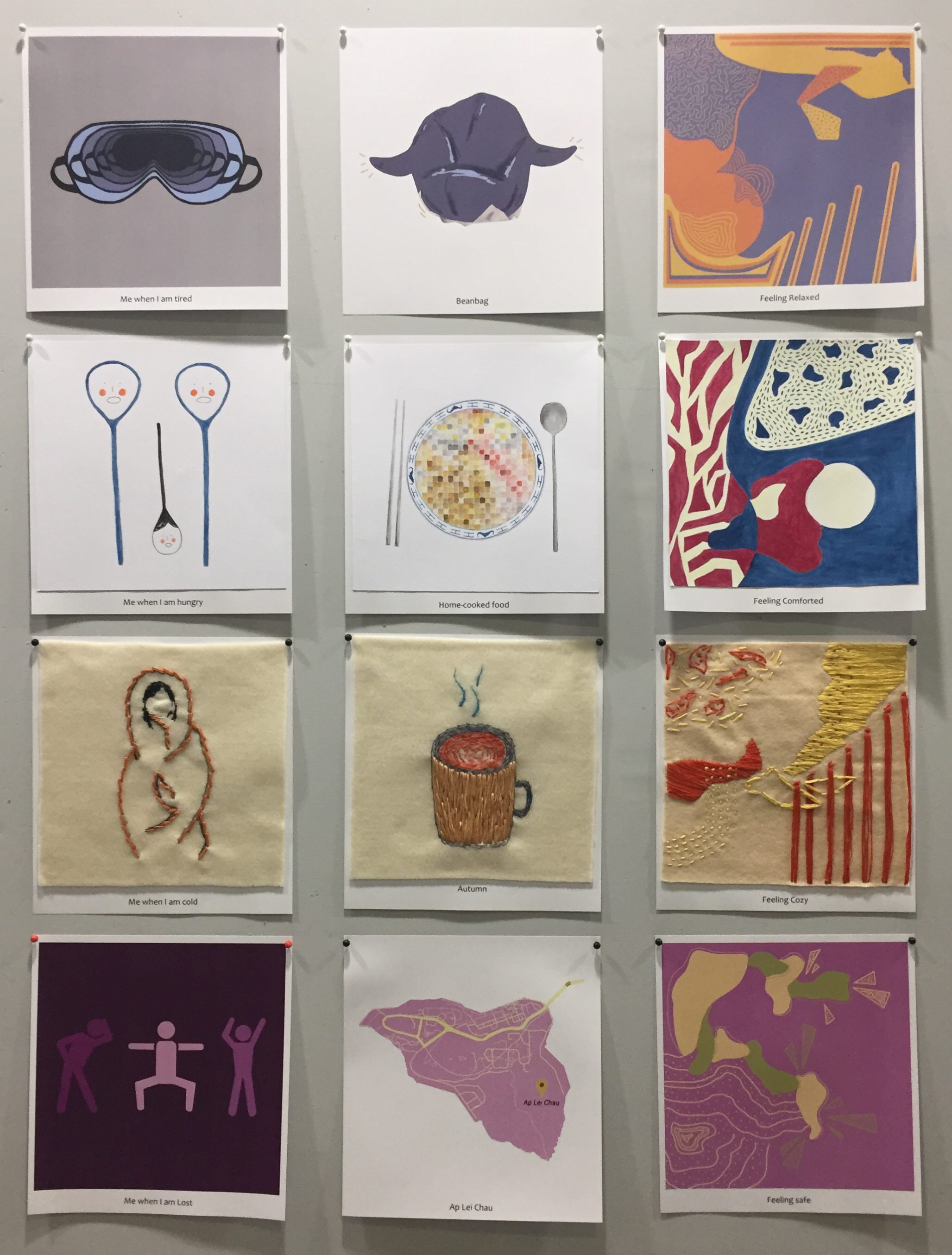
As the last third of this semester approaches, our final project requires us to create a total of 12 compositions. We were given the freedom to use any 2D medium that we wish in order to portray our “egos in different settings”. The 12 compositions will be split into 4 rows of threes and amongst each row, we had to represent ourselves, a setting and our reaction in that setting.

Since the style of this project was entirely up to us, the one rule we had to follow was to match our use of colours with various colour theories. Hence, I started this project with research on colour theories. 

Research on Colour Theories

Image result for colour wheel

http://designingfortheweb.co.uk/part4/part4_chapter16.php

Monochromes Harmony

http://designingfortheweb.co.uk/part4/part4_chapter16.php

In the monochromatic colour scheme, the lightness and saturation of a single colour are altered. Derived from a single hue, a variety of shades and tones are achieved by adding a darker colour, grey or black. It can also be lightened with the addition of white.

Analogous Harmony 
Image result for analogous colour scheme

https://30daysweater.com/ultimate-guide-color-theory-sweater-knitters-part-2-basic-color-schemes/

Colours in the analogous colour scheme are adjacent to each other on the colour wheel. Out of two colours, one is the dominant colour while the other is used to enrich the scheme. Since the colours are rather close to each other on the wheel, they do not create much contrast.

Analogous Harmony Warm and Cool 

The warm and cool analogous harmony are differentiated through the warm and cool portions of the colour scheme. The range of colours from red to yellow can be paired together as warm analogous harmony while colours ranging from violet to green can be paired together as cool analogous harmony.

Complementary Hues 

http://designingfortheweb.co.uk/part4/part4_chapter16.php

Made of two colours that are directly opposite each other on the colour wheel, the complementary colour schemes offer a great contrast between warm and cool colours. Its high contrast draws a lot of attention and is eye-catching.

Split Complementary  
Image result for split complementary color scheme

https://designmodo.com/wp-content/uploads/2011/12/Split-Complementary.jpg

Expanding on the standard complementary colour scheme, the split complementary uses a colour and the two colours adjacent to its complementary. It provides high contrast but is not as strong as the complementary colour scheme. It is harder to balance in comparison to the other colour schemes.

Triad
Image result for triadic colour scheme

https://www.homedit.com/triadic-color-scheme/

The triadic colour scheme essentially involves the use of three colours that are equally spaced on the colour wheel. The use of colours that falls under this scheme will look create contrast and look harmonious simultaneously. To allow for a nice balance, normally one colour will dominate while the other two will be used as accents.

Ideation

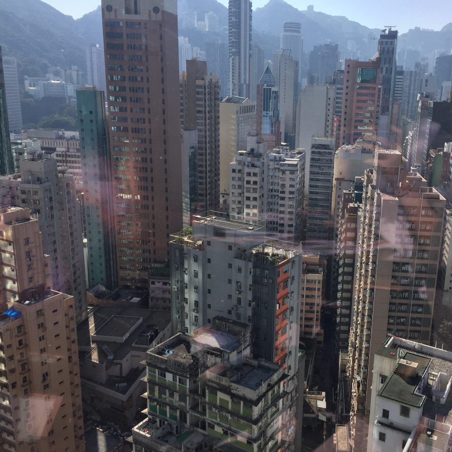
In the midst of missing many aspects of Hong Kong after having lived there for the majority of my childhood, I decided to incorporate these feelings into my compositions as an overarching theme. After mind mapping on things that I am reminiscent of in Hong Kong (which can be found in my visual journal),  I decided on the top few and came up with 4 equations.

First plan

  1. tired me + in my bean bag = relaxed (digital)
    • base colour = blue
  2. cozy me + during autumn = at peace (embroidery on felt)
    • base colour = orange
  3. walking home + at Ap Lei Chau/Hong Kong = safe, comforted and homey (colour pencil)
    • base colour = purple
  4. hungry me + eating home cooked food = comforted (watercolour)
    • base colour = blue

As for the colour scheme of each row, I decided to stick with a base colour and use it to work with various colour schemes for each individual compositions.

artist inspiration ” Mireia Ruiz

http://mireiaysuscosas.tumblr.com/

Mireia Ruiz was the inspiration for the last compositions of each of my four rows. During the planning of my compositions, I struggled with coming up with ideas for “me and my reaction to the setting” as I didn’t know how to express my emotions through the application of objects. Having stumbled across an interview with artist Mireia Ruiz in a magazine, I was intrigued by her abstract creations, especially her use of colours.

http://mireiaysuscosas.tumblr.com/

Although all her works were abstract pieces, the variety of form, colours, lines, negative and positive space present in her work really gave each painting its own unique quality. Thereafter, I was inspired to create abstract pieces to express my various emotions of me in my comforting setting.

first row

My 1st row of compositions portrays the reunion of tired me and my beanbag which I use to always take naps on after returning from a long day of school. The layered placement of the eye mask was executed in order to convey the deterioration of my energy during school; further emphasised with the monochromatic scheme that creates a depth within the piece. As for the setting, my beanbag is ‘personified’ in the sense that I had given it arms as a way to show its openness and invitation for me to join it. Coloured in a dark greyish blue hue, its dullness shows the absence of a companionship which in this scenario is me.

Tired Me Beanbag  Feeling relaxed
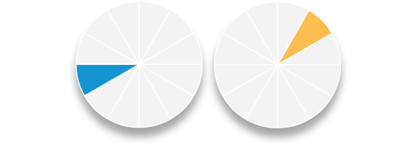
Colour scheme Monochromatic Complementary Spilt complementary (blue, red-orange, yellow-orange)

Eye Mask trials

After deciding on the second version amongst these two, Joy and I discussed during our first consult that the eye masks could be portrayed more clearly as eye masked and hence I added the straps for a clearer image.

Bean Bag trials

After my consult with Joy where she suggested I could try including features that related to the context of Hong Kong such as dim sum basket texture, food textures, etc…, the piece on the right was my attempt for that which didn’t work out quite well. Since I wasn’t able to capture the texture of a dim sum basket, I decided to go with the paper below steamed buns and dim sum dishes instead which is present in my final composition.

First Attempt // Final

The last composition for this row was the first abstract piece I tried to create. The piece on the right was my first attempt at it whereby the colours did not match well with the split complementary colour theory. Since I felt like the placement of lines and shape were also not as concise, I redid this piece which turned out to be the one on the right, that I choose for the final.

second row

This second row portrays my cravings for home-cooked food since living in hall at university. The distressed looked on the spoons in the first compositions represent my longing for home-cooked food and the placement of it also resembles tears of desperation. As for the second piece, the image of home-cooked food has been pixelated in attempt to show that although I still have memories of it, it is currently not present in my life and hence blurred.

Hungry Me Home-cooked food Feeling Comforted
Colour scheme Complementary Triadic Triadic

The triadic scheme adopted in the majority of this row is blue, red and yellow. Specifically because blue and red to me are iconic colours that represent Hong Kong. To allow for the presence of both these colours, I had to include yellow for them to fit as a colour theory. Hence for the paleness of yellow.

third row

Working with autumn as my favourite season out of the four seasons, I wanted to portray the cosiness and comfort that this weather brings me. Specifically for this row, I decided that I wanted to work with embroidery because it was suitable for portraying the theme of warmth and thicker clothes. The first composition is of myself being wrapped in a blanket as I do during the majority of autumn. Secondly, I conveyed autumn as my setting through an image of autumn being in a cozy cup of a hot drink.

Cold Me Autumn Feeling Cozy
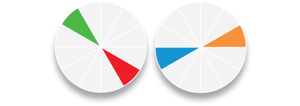
Colour scheme Spilt complementary (orange, blue-green, blue-violet) Spilt complementary (orange, blue-green, blue-violet)  Analogous

Orange used as the base colour to represent autumn, while the other two colours were used to create depth and shadow.

Photoshop sketches before embroidery

Digital draft of the third composition before embroidery

Before starting to embroider straight onto my felt, I created digital sketches and drafts of the compositions that I wanted to sew in order to get the measurements right and have a clear idea of what I was embroidering.

fourth row

Lastly, my fourth row of composition encompasses my feeling of comfort and safeness on the island of “Ap Lei Chau” in Hong Kong where I have lived all my childhood. I portrayed myself being lost, which could be interpreted mentally or physically, with darker hues of purple to express a sense of mis-belonging. In the second piece of this row, the use of lighter purple was intended to express a sense of nostalgia.

Lost Me Ap Lei Chau Feeling Safe
Colour scheme Monochromatic Complementary Spilt complementary (violet, yellow-orange, yellow-green)

First attempt

During the process of creating my abstract pieces, I actually found it quite challenging to piece together lines and forms that would somehow look neat yet random. This process resulted in many half-completed pieces as I redid them.

final presentation

To end of the first semester of foundation 2D, I really enjoyed implementing a style of my own into this project as well as experimenting with a variety of mediums. Although it was time-consuming and stressful at times, it was a great experience and I had a great time admiring the amazing work that my classmates created 🙂
Impossibilities of Being ~ Project 3

To kick off project 3, we brainstormed lists of places and sounds during class. Assigned to list locations where we’ve never been to, one of my favourite place that I thought of was a ziplock bag. However, upon tasked with project 3 which was to create a 3o second video about an encounter with my location, I felt a bit restricted working with a ziplock bag. As I progressed on getting started with creating my lo-fi storyboard, I decided to change my location to a fridge instead since it gave me a clearer space to work with.

Lo-Fi Storyboard

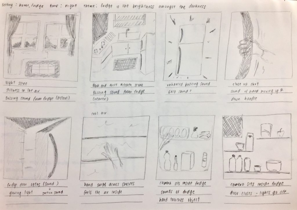
For my very first lo-fi storyboard draft, I sketched an eight frame storyboard focusing on the fridge as a whole object and a literal interpretation of my first discovery with it. Since the focus of this project was soundscape, I decided that I wanted to create a video with edited sounds recorded by a zoom recorder over it.

rough sketch of draft storyboard // discovery of fridge

This storyboard embodies my first encounter with a fridge during the night as I am alerted by the fridge’s buzzing noise. I had envisioned for it to be a rather magical discovery.

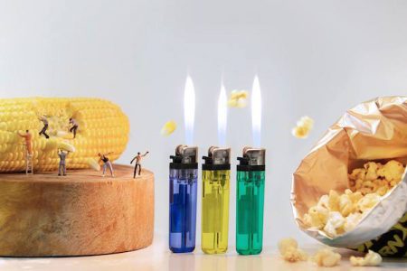
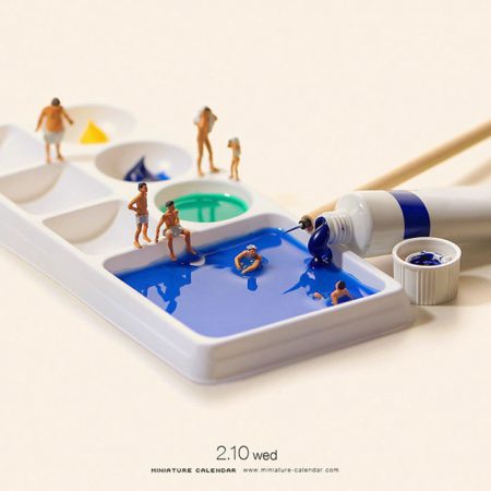
After the first consult with Lei, she suggested that maybe instead of discovering the fridge as an object from its exterior, I could slowly reveal it from the inside. The discussion came to the idea of a miniature world occurring within the life of the fridge and we looked at some inspirations online. Inspiration was then taken from images like these below, but for my project will be altered to fit with the context of a fridge.

http://editorial.designtaxi.com/editorial-images/PoyMiniFig28102015/1.jpg

http://www.ebaumsworld.com/pictures/36-amazing-miniature-scenes-using-everyday-objects/85244657/

Inspiration was then taken from images like these above but food items will be altered to fit with the context of a fridge for my project.

HI-Fi Storyboard

Moving on to the new concept, I developed my hi-fi storyboard based on plans for my still images since it wasn’t possible for me to film a miniature life in the form of a video. Starting off with items that I could commonly find in a fridge, I used inspiration from images found online to help me plan out some possible activities that could occur.

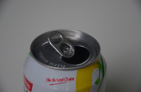
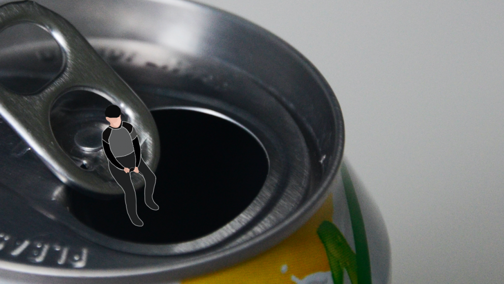
Can Drink

The transition of Sounds:
1. Pool sounds
2. Talking by the pool
3. Can opening
4. Placing can in fridge

Can drink // swimming pool

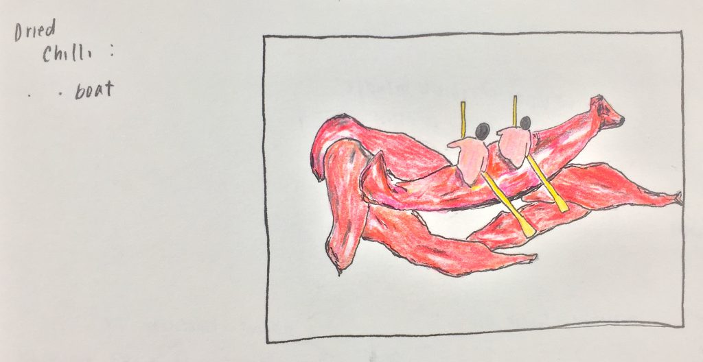
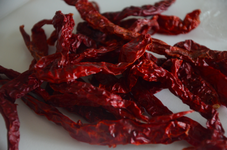
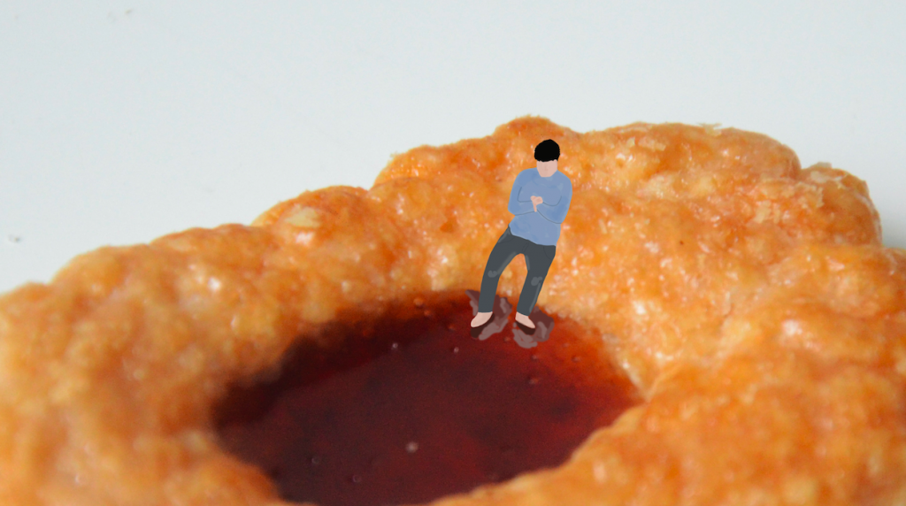
Dried Chilli

The transition of Sounds:
1. Rowing/water sounds
2. Conversation
3. Ruffling of dried chilli
4. Plastic sound from chilli packet

Dried chilli // rowing boat

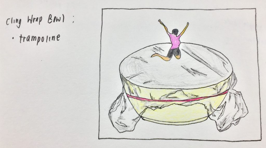
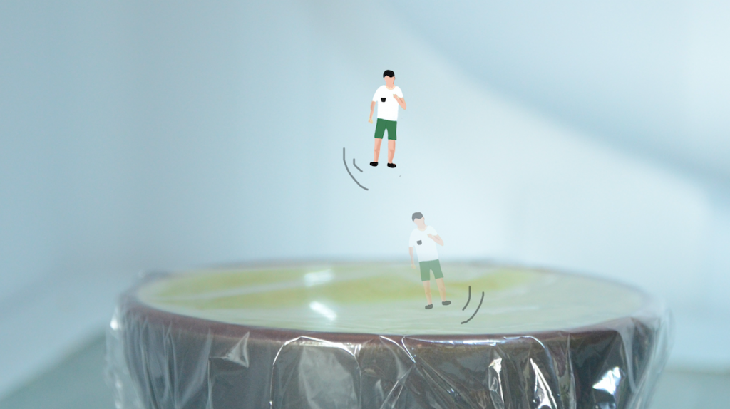
Trampoline

The transition of Sounds:
1. Cheering sounds
2. Bouncing on trampoline
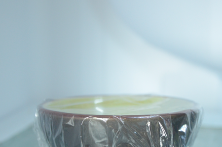
3. Cling wrap sound
4. Rubberband over bowl

Cling wrap bowl // trampoline

Since the plan now was to work with images, I arranged the order of my different scenarios in a way whereby the close-up images would be shown first, followed by the reveal of the location with a zoomed out shot.

1. Blank screen, sounds of pool area 2. Can drink image, volume increases, the transition to boat sounds 3. Rowing/water sounds, conversations, transition into cheering 4.Trampoline image, jumping sounds
5. Zoom out image of the can in fridge 6. Image of dried chilli packet 7. Cling wrap bowl sitting on shelf

video in the making

Images of my close up settings:

ended up removing this setting because the colors did not fit with the rest

replacement of chilli scenario

additional scenario because video had to be a minute long

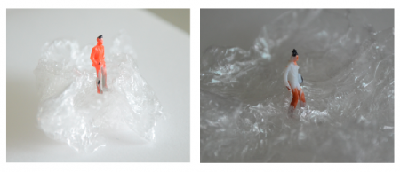
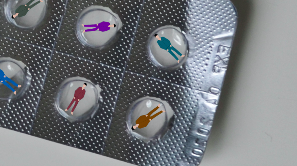
When I started the process of taking my images, I had originally wanted to use these tiny human figures that I had previously purchased at a very low price. Unfortunately, the quality of it wasn’t the best, especially the colours and how it had been painted. Even though including the actual figures would have included a much most realistic quality within the scenarios itself, I felt that the low quality of these figures ruined the visuals.

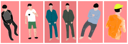
Hence, I resorted to photoshopping them into the close-up shots of the items and using them as a guide to creating my own illustrations of small humans instead.

Illustration of humans for all scenarios

To create these illustrations, I painted over the previous images with the use of a Wacom.

Images of humans in the respective settings:

These 4 scenes appeared in the first half of my video with sounds that match according to the setting. The following half consisted of the zoomed out images that revealed the setting of a fridge.

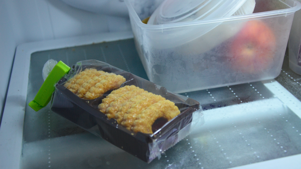
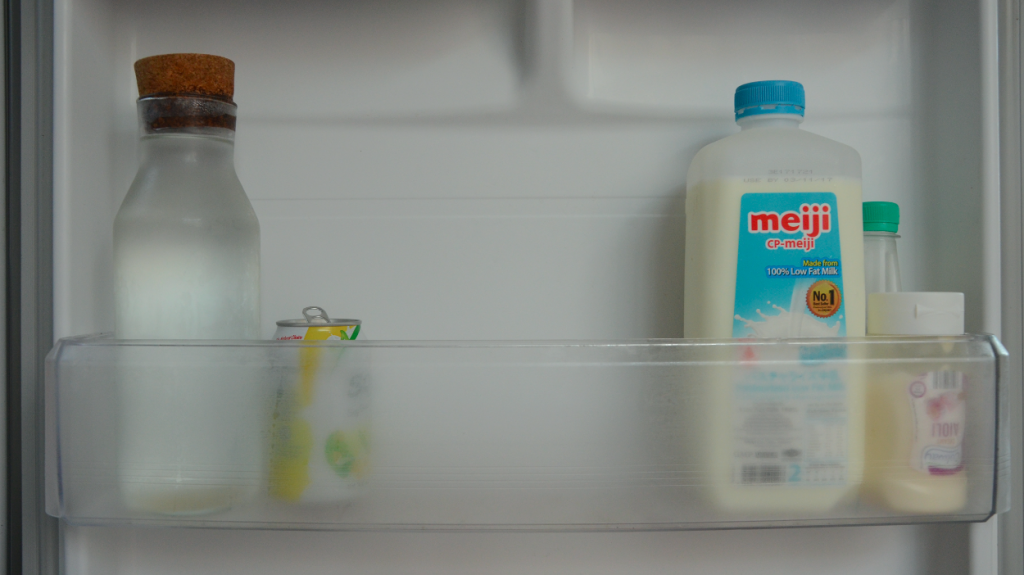
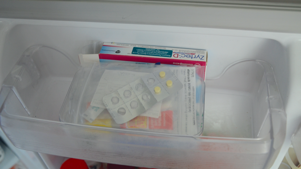
Images of fridge settings:

Finally, the last image consisted of an overall view of the fridge.

final outcome

After editing all my images that were taken with a DSLR, I compiled everything in order with iMovie and inserted the appropriate audio over it.

All sounds included in the video I recorded myself with a zoom recorder except for 2 which I had to source for online. With the zoom recorder, I recorded my sounds with the mic setting that was more sensitive to sounds closer to the mic to really capture the details and clarity.
Soundscape for the entire video
Credits to free sounds that I sourced online
snoring:
trampoline:

CRITIQUE/REFLECTION

During the critique, the feedback that I received was that the video would have been more realistic if the humans were not illustrated. I also felt that since we were limited to 1 minute, maybe it would have been better if I had stuck to 3 scenarios since it turned out to be a little rush.

To sum up project 3, I had a really good time experimenting with both realistic and illustrated qualities. Although the process was rather time-consuming with the photoshop and additional sound recording, I am very glad that I got to experience working with iMovie and piecing every part of this together.