Before proceeding with my concept and 4 compositions, I had to first list out my 4 future jobs. Upon further reflection of these jobs, I realized that I’ve always wanted to pursue them as a child perceiving these as pretty fun jobs.
- Flight attendant
- Interior designer
- Baker
- Supermarket cashier
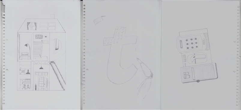
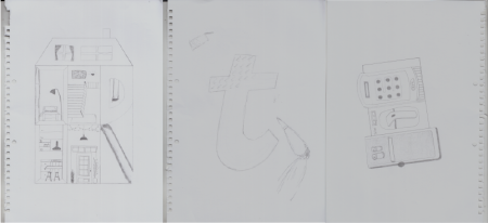
Starting off with objects that I could possibly include visually into my compositions, I began brainstorming for things that were relevant to the jobs in my sketchbook.

brainstorming
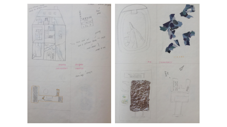
sketches
Following the development of ideas, I began sketching possible compositions. The interior designer ~ dollhouse sparked the idea of using other childhood toys to portray the remaining jobs. This concept of including childhood toy sets was then included in my art direction.
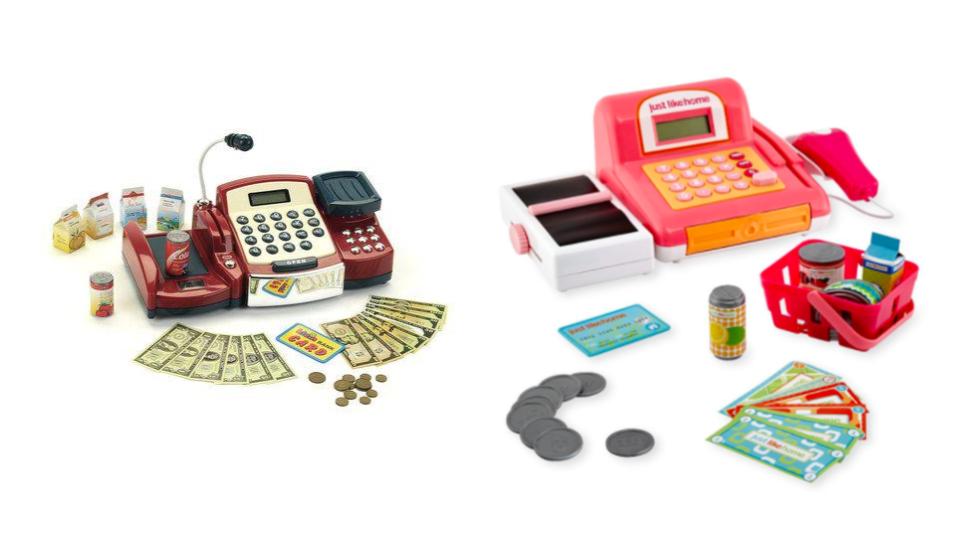
Toy cashiers
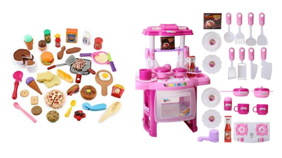
Kitchen/food sets
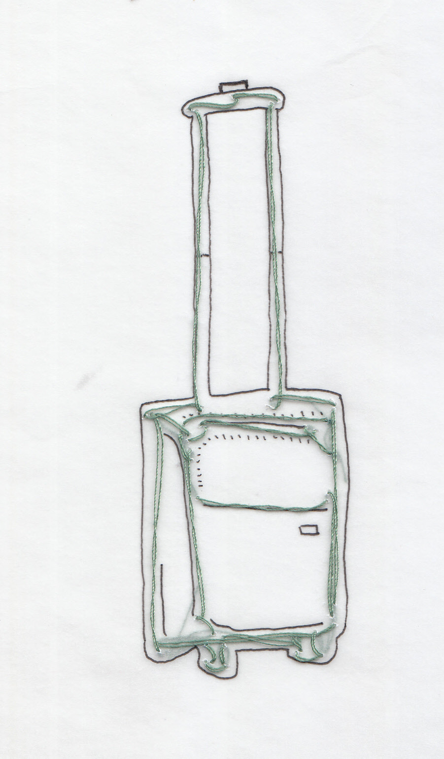
Prior to coming up with all the compositional concepts, I proceeded to draw them in greater detail so that I could lightly sketch it on the tracing paper before sewing the thread on.
SEWING PROCESS
Trial test aka exploring the medium:
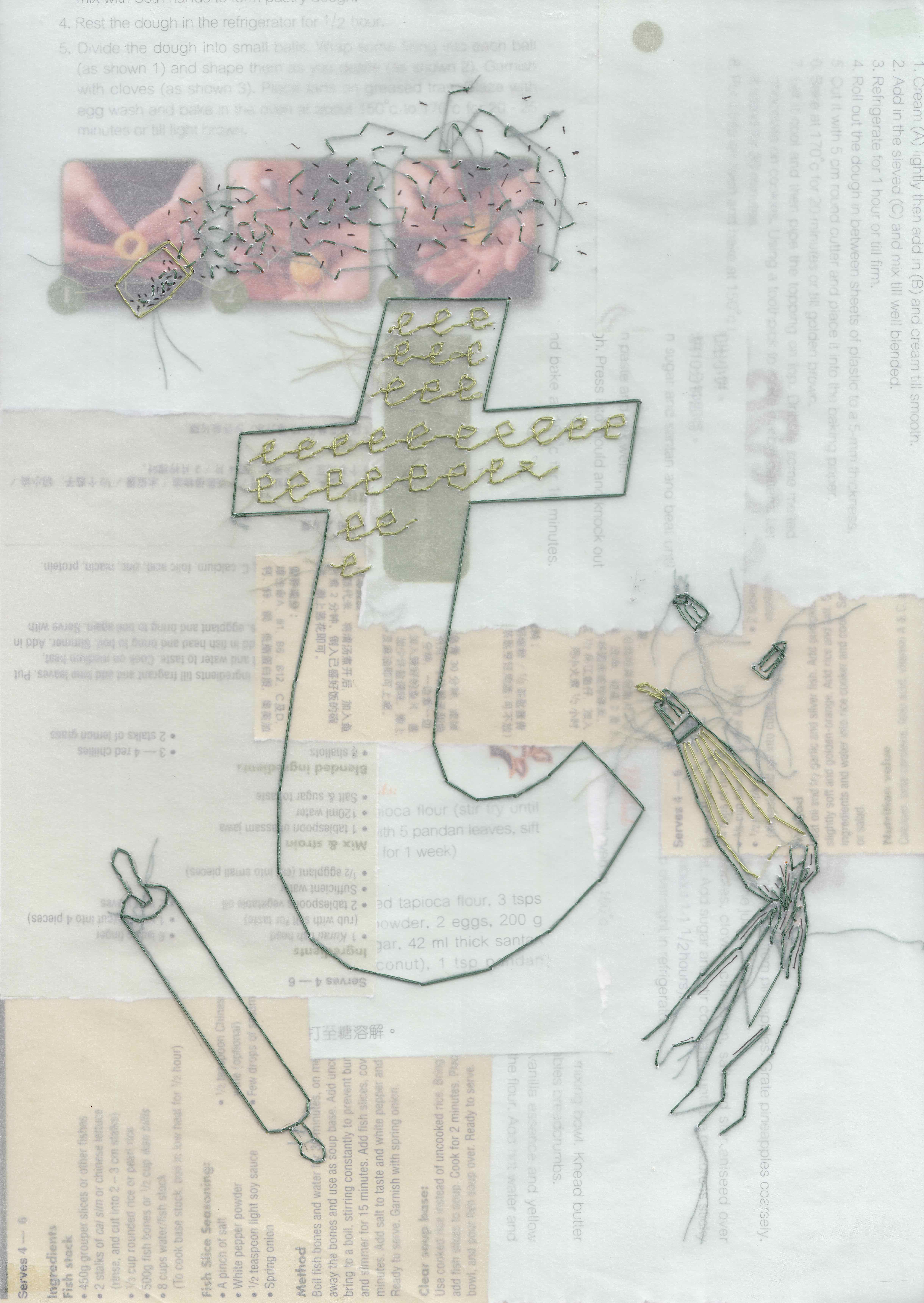
embroidery + pen detail
embroidery + colouring details
I choose to sew on tracing paper because its translucency allowed for layering of backgrounds.
Sewing process
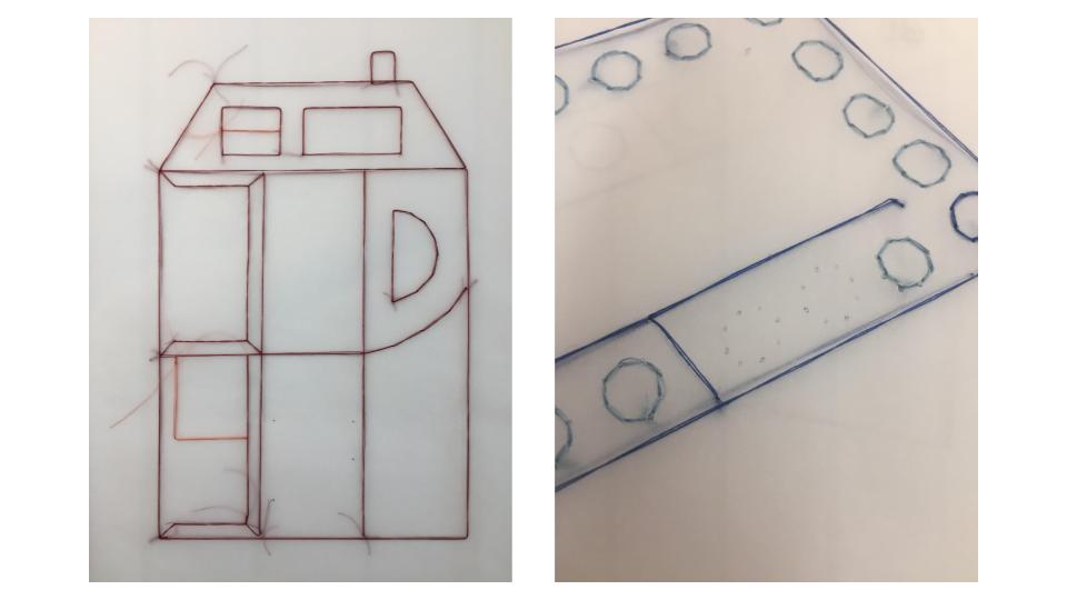
During the sewing of circles in the first composition, I realised that it was more efficient to poke holes in the paper beforehand with the needle.
Colouring in areas with colour pencils
TOP LAYERS
BACKGROUND LAYERS
- Air stewardess – Plain white background
- Interior designer – floor plan
-
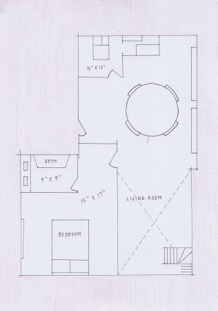
floor plan
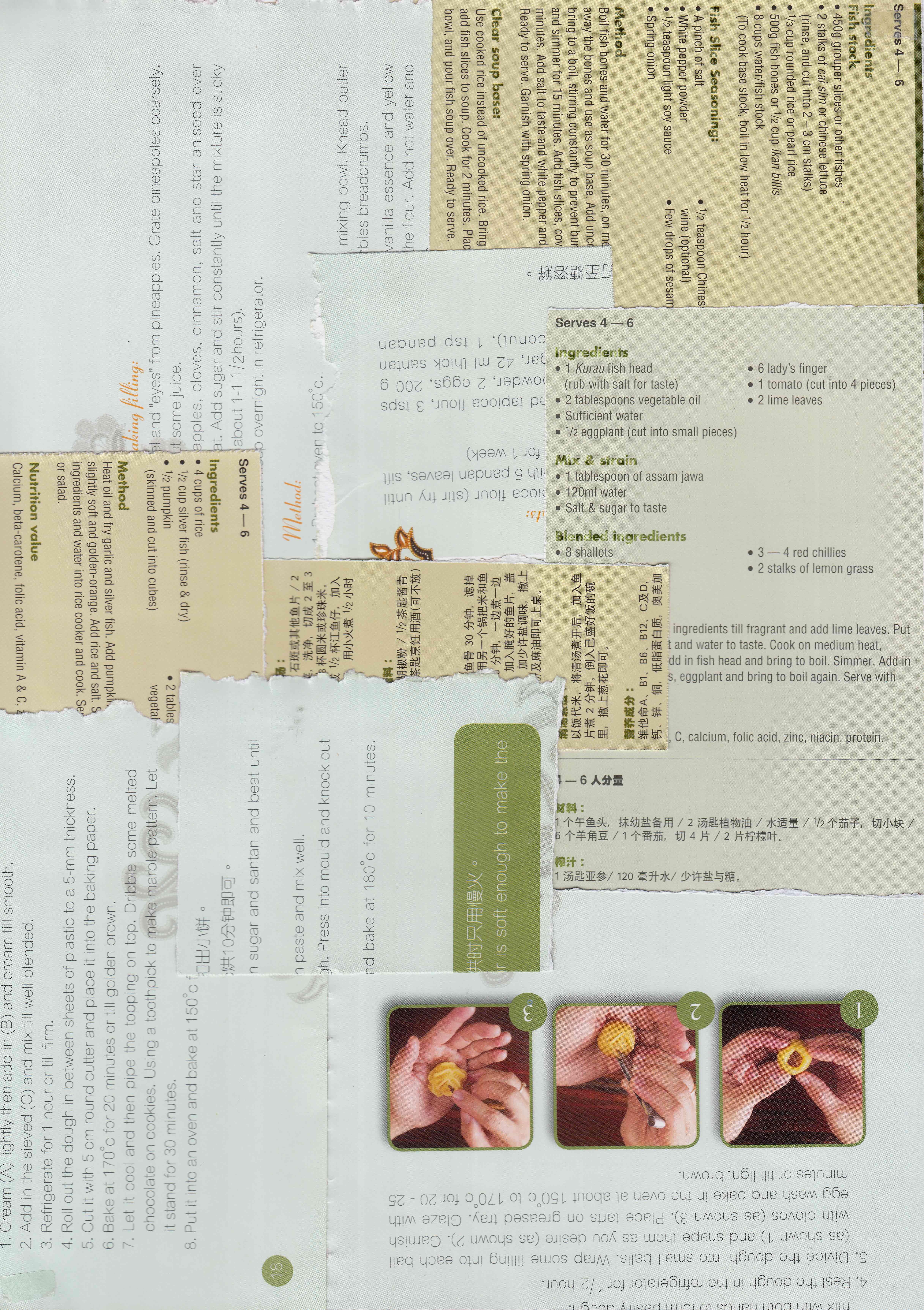
- Baker – recipe pages
-
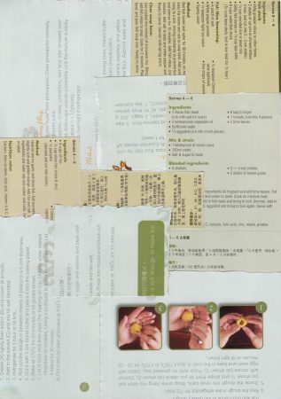
recipe pages
- Cashier – receipts
-
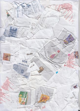
grocery receipts
FINAL PRESENTATION
Concept & message of work:
- Telling of my future jobs with the progression of time through
- Neatness of embroidery and background layer decreases with time
- Creasing of paper increases
- Increased length of thread that remains at the back
Art direction:
- Embroidery with monochromatic threads on the first layer with pen and colour pencil detailing
- Setting of job further emphasized in the second layer
- Fitting the letters of my name into the ‘structure’ of each respective job so that it can’t really be replaced with any other letter
- Using childhood toys as a guide for the compositions
The order of my four jobs is in the chronological order of age starting from a young adult, to adult, middle age and lastly as an elderly.
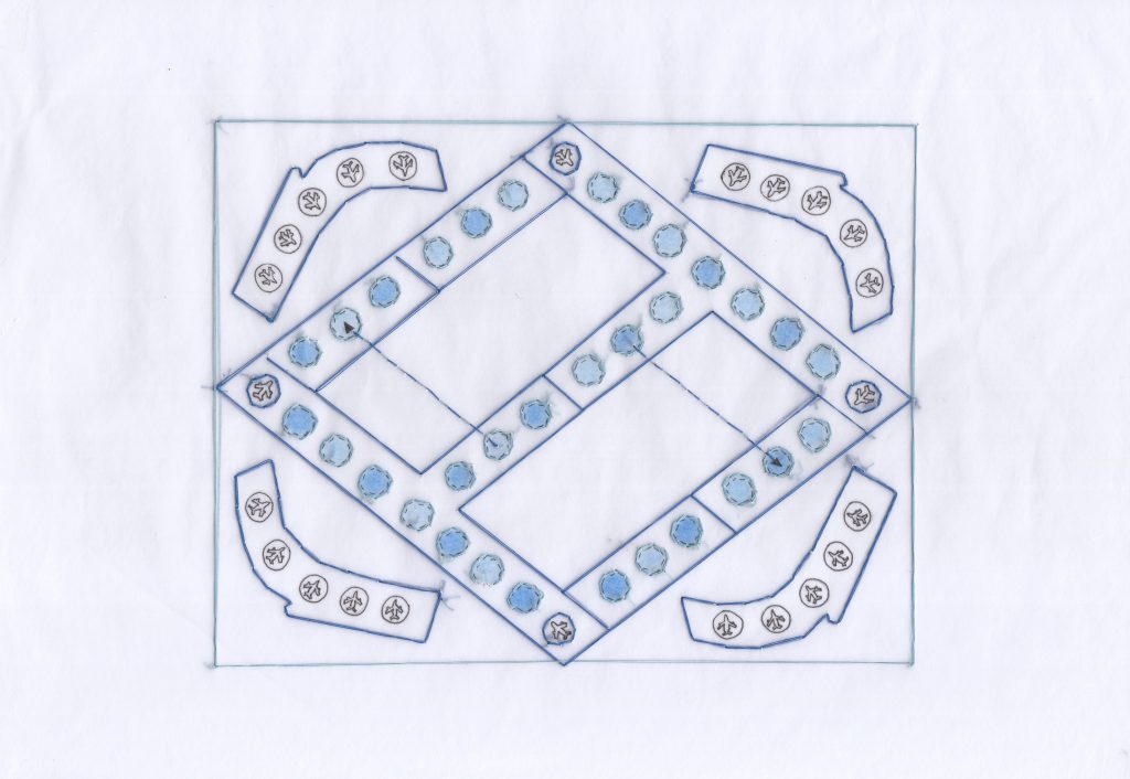
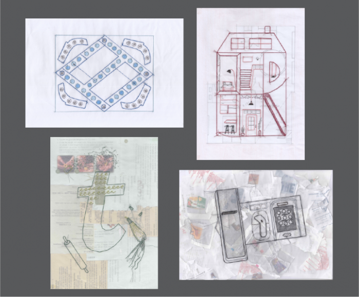
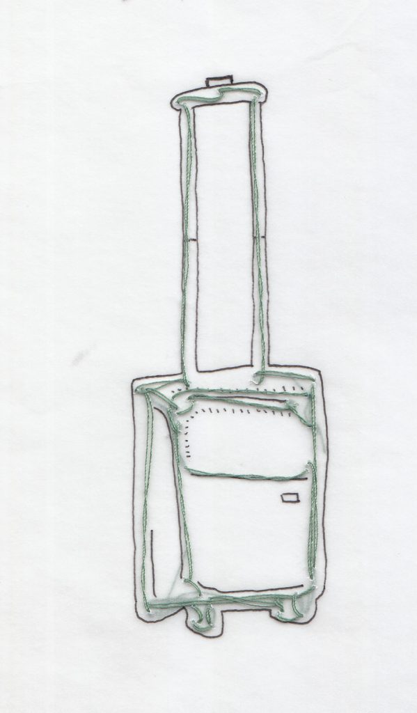
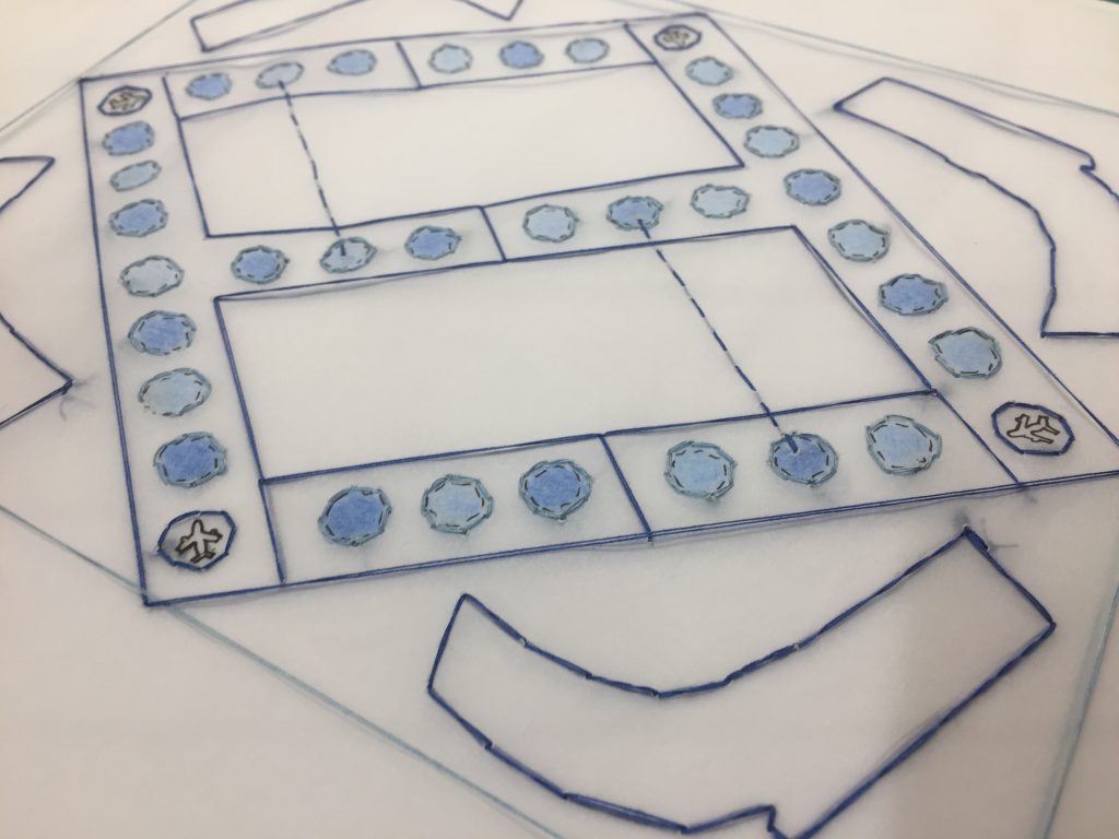
my name is Teri and I am an air stewardess
Inspired by the Chinese aeroplane chess board game that I use to play as a kid, I thought it was very suitable for this job as an air stewardess. The background for this piece was plain white to portray the neatness and certainty I have as a young adult. Blue monochromatic colour scheme.
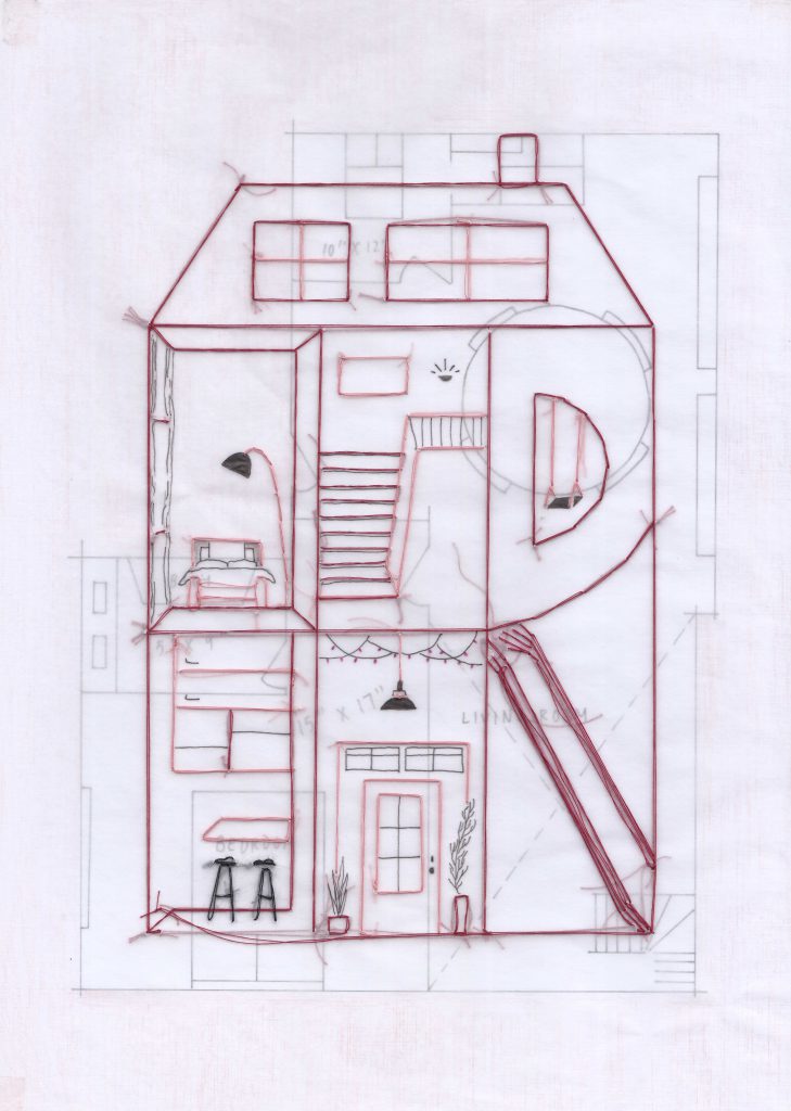
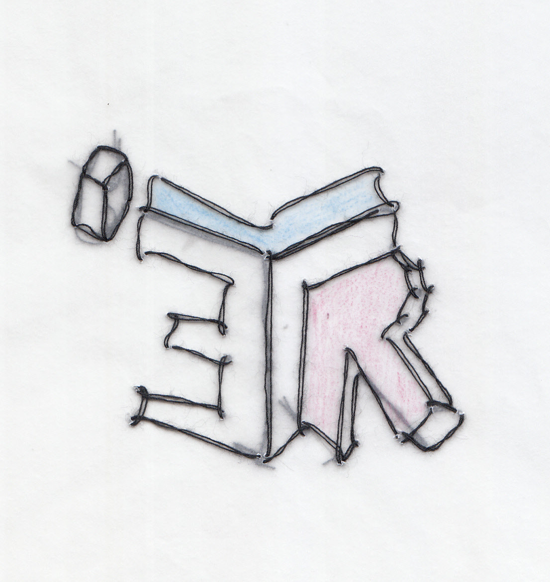
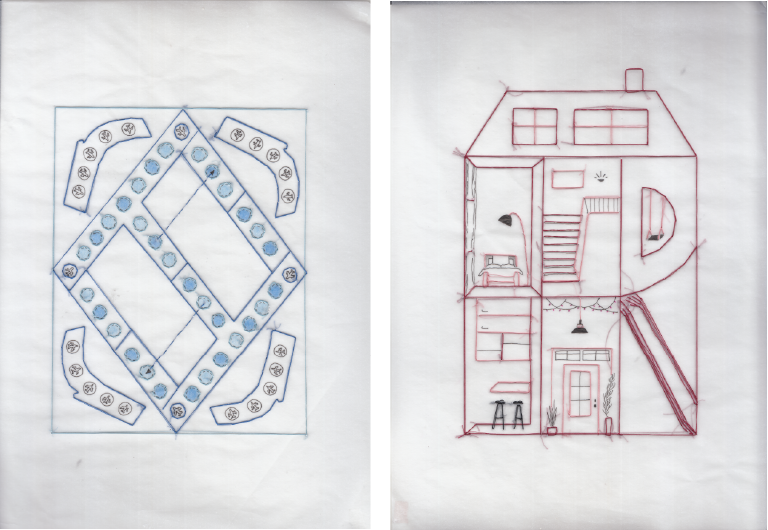
my name is Teri and I am an Interior designer
The composition of this piece I think turned out the strongest amongst the rest. It was the first piece that I was very certain of and it bridged the linking of letters into the structure of the item itself, which in this case was a dollhouse. As for the second layer background, I draw a floor plan in shades of pink to match with the red monochromatic scheme in the front.
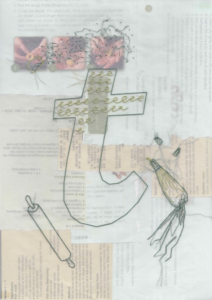
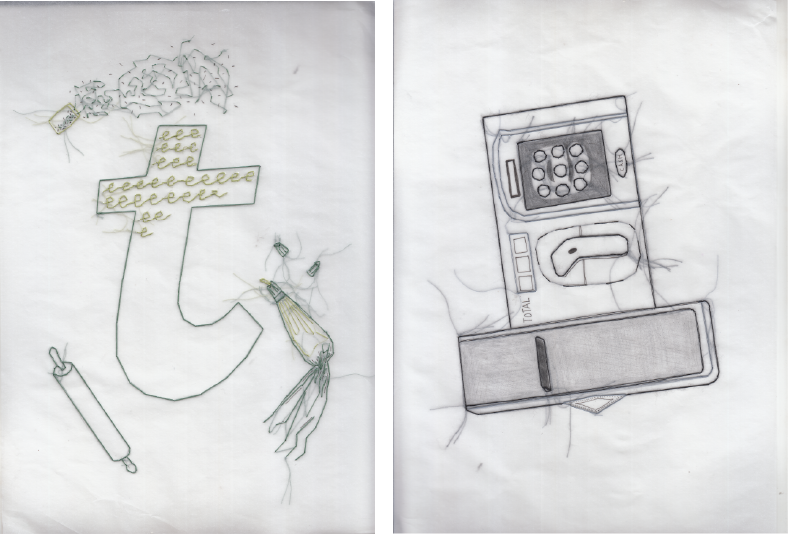
my name is Teri and I am a baker
The letter t in this third piece represents a cake on a baker’s table. The surrounding decorative materials around it make up the remaining letters in my name. In this composition is where I bring in collaging in the background; collaging of old recipe books but still arranged rather neatly. The use of green/yellowish pages complements the green monochromatic scheme in the front.
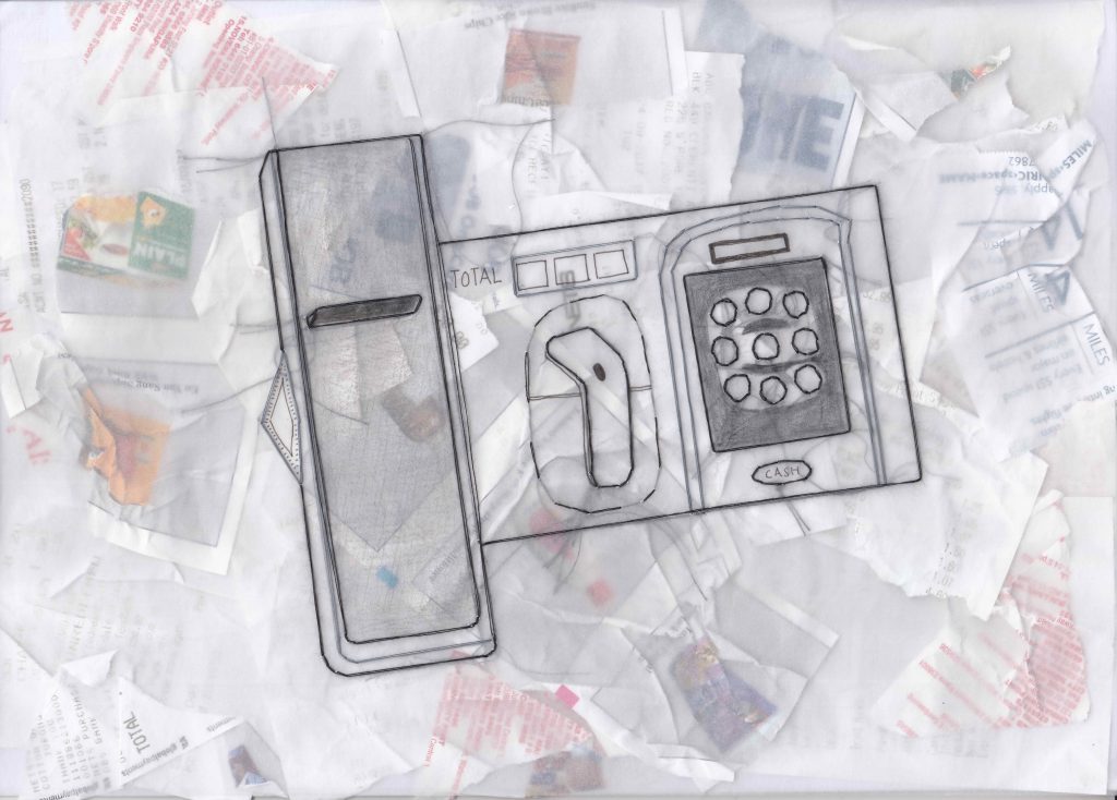
my name is Teri and I am a supermarket cashier
For my final job as an old woman, I’ve also wanted to sit by the cashier scanning groceries for others. Using a toy cashier set as a guide, I altered the structure of the set so as to fit the letters of my name. The age in this is reflected in the messy collage of receipts in the background. I used shades of grey for the thread in this while pops of colours from the receipts peak through the tracing paper.