FUNKY FLEA SWAP
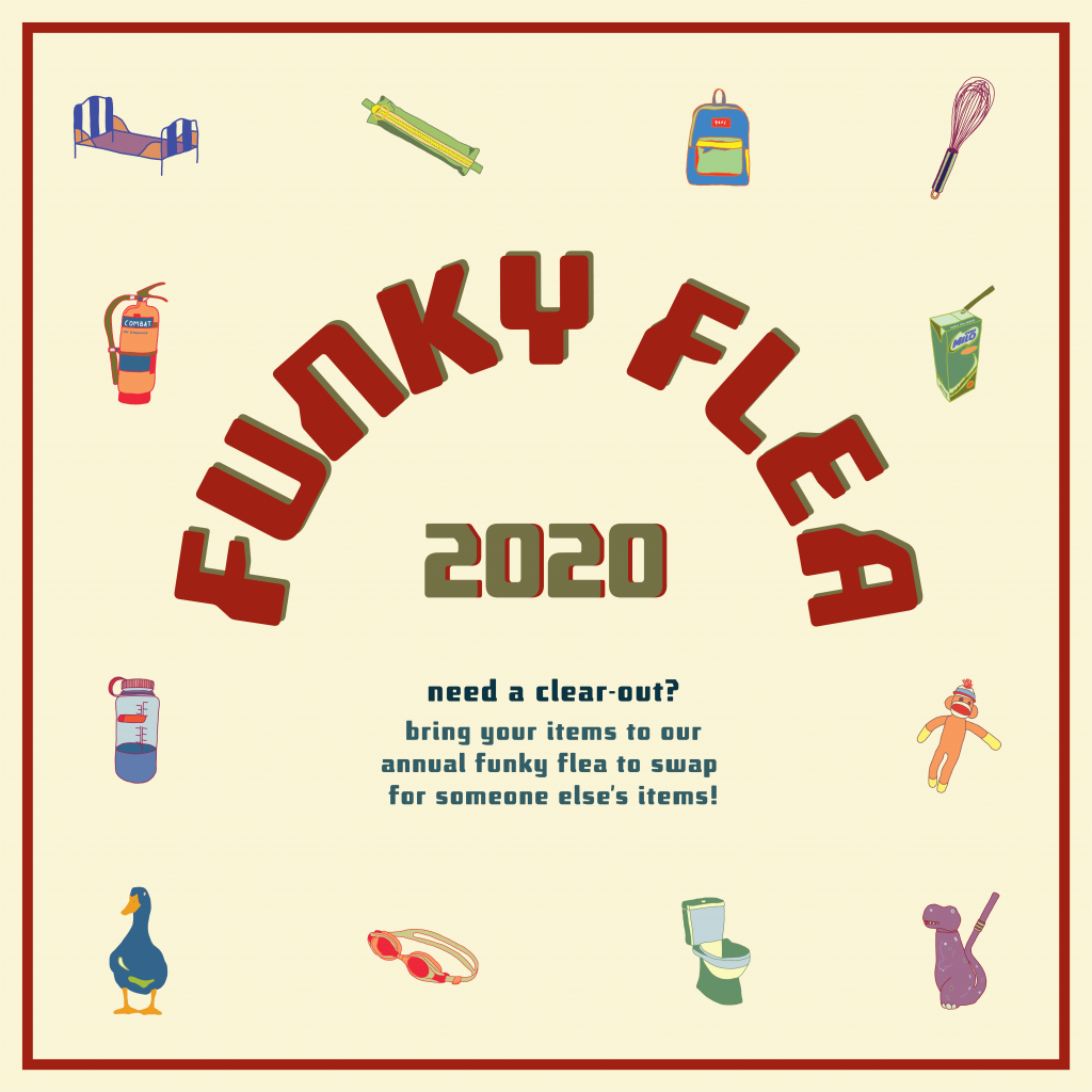
The event that I have created for project 3, applied illustration, is a funky flea swap. A flea market for anyone to trade their old gems for someone else’s. Bring a box of old items and propose a trade for something that has caught your eye. As long as the other trader agrees, you can proceed with the swap!
“one man’s trash is another man’s treasure”
I’ve decided that my 4 collaterals would be an event poster, an invitation card (with stickers), a tote bag (for storing your traded goods) and lastly some wrapping paper (for fragile goods).
PROCESS

Artist references + inspirations
- a collection of illustrations
- line work and solid colours
- fun, bright colours
- graphics that could also be made into stickers

http://graphsho25.blogspot.com/

https://www.behance.net/gallery/42025365/La-Porca-restaurant

https://creativemarket.com/atk_type/4312387-Cosmo?u=slvDev

https://les-surgeles.tumblr.com/post/85520577845/paul-cox/amp
The plan:
To create a series of graphics (maybe 10) that i could rearrange and work with for all 4 collaterals.

First batch of illustrations
I started off the project by creating the series of graphics, but I didn’t really have a direction to start with. Thus, I started drawing random objects that came to mind. After this first draft, I realised I wasn’t completely happy with it as I felt like I didn’t really connected to it personally.
So moving forward, I updated my graphics to personal objects that I had around me from my daily life. (keeping some from the first draft but forgoing others that I didn’t really like).

Second batch of illustrations
After further refining, I settled on the illustrations above. These were illustrated on adobe fresco. Upon finishing the graphics, I moved them into illustrator to begin organising the various compositions.

Poster – first draft
This was my first poster draft. While putting the graphics together, I struggled with the arrangement of the illustrations as they we created as individuals, not as a group. It appeared rather floaty and was not the main focus. The text was also too big and took attention away from the illustrations. Hence, I decided to rearrange everything in attempt to make the graphics the focal point.
FINALS

A3 Poster – final

Poster Mockup

Invitation card – final

Back of invitation card with stickers

Tote bag design – final

Tote mockup

Tote mockup

Wrapping paper
