
My mama always said, “Life was like a box of chocolates. You never know what you’re gonna get.” – Forrest Gump, 1994
Tasked to pick four movie quotes and create a visual narrative that expresses each quote using found images, project two challenges us to break away from translating literature into visuals that are too literal. The artist influences for this project are from art movements such as Surrealism, DADA, and Russian Constructivism.
Research on Surrealism
Surrealism is an art movement involving visual art and literature that grew out of the earlier Dada movement. Its emphasis was on positive expression and revolves around hyper-realistic styles. Art created in this art movement was a reaction against what people saw as a destruction wrought by the “rationalism” that had guided European culture through the horrors of WW1.

https://en.wikipedia.org/wiki/The_Empire_of_Light#/media/File:The_Empire_of_Light_Guggenheim.jpg
This surrealistic piece by Rene Magritte represents a fictional scene whereby day and night exist at the same time. Although portrayed in a very subtle manner, this piece allows me to appreciate surrealism.

http://www.joewebbart.com/
Another artist that I referenced for this project was Joe Webb. As an artist who works with collaging, the play on colour and scale in his works were very inspiring when creating my compositions.
Picking my quotes
The first movie that I looked at for my quotes was Mission Impossible Rogue Nation (2005). Although I gathered a total of 5 quotes initially, I realized that it was more challenging to interpret some of them rather than the others visually. Hence, only two out of four of my final quotes were from this movie. An example of a quote that I struggled with was “Sir, Hunt is the living manifestation of destiny, and he’s made you, his mission.” – Alan Huntley. When trying to develop ideas from this quote, I realized that not only was it a little too specific to the characters in the movie, the words had too broad of a spectrum that I struggled with visuals that could interpret it best.
“Human Nature, my weapon of choice…” – Soloman Lane, Mission Impossible Rogue Nation 2005
“What we’ve got here is a failure to communicate” – Cool Hand Luke, 1967
The approach that I took in creating my compositions was through dissecting various words in the quotes and piecing them together visually.
“Human Nature, my weapon of choice…” – Soloman Lane, Mission Impossible Rogue Nation 2005
Composition 1

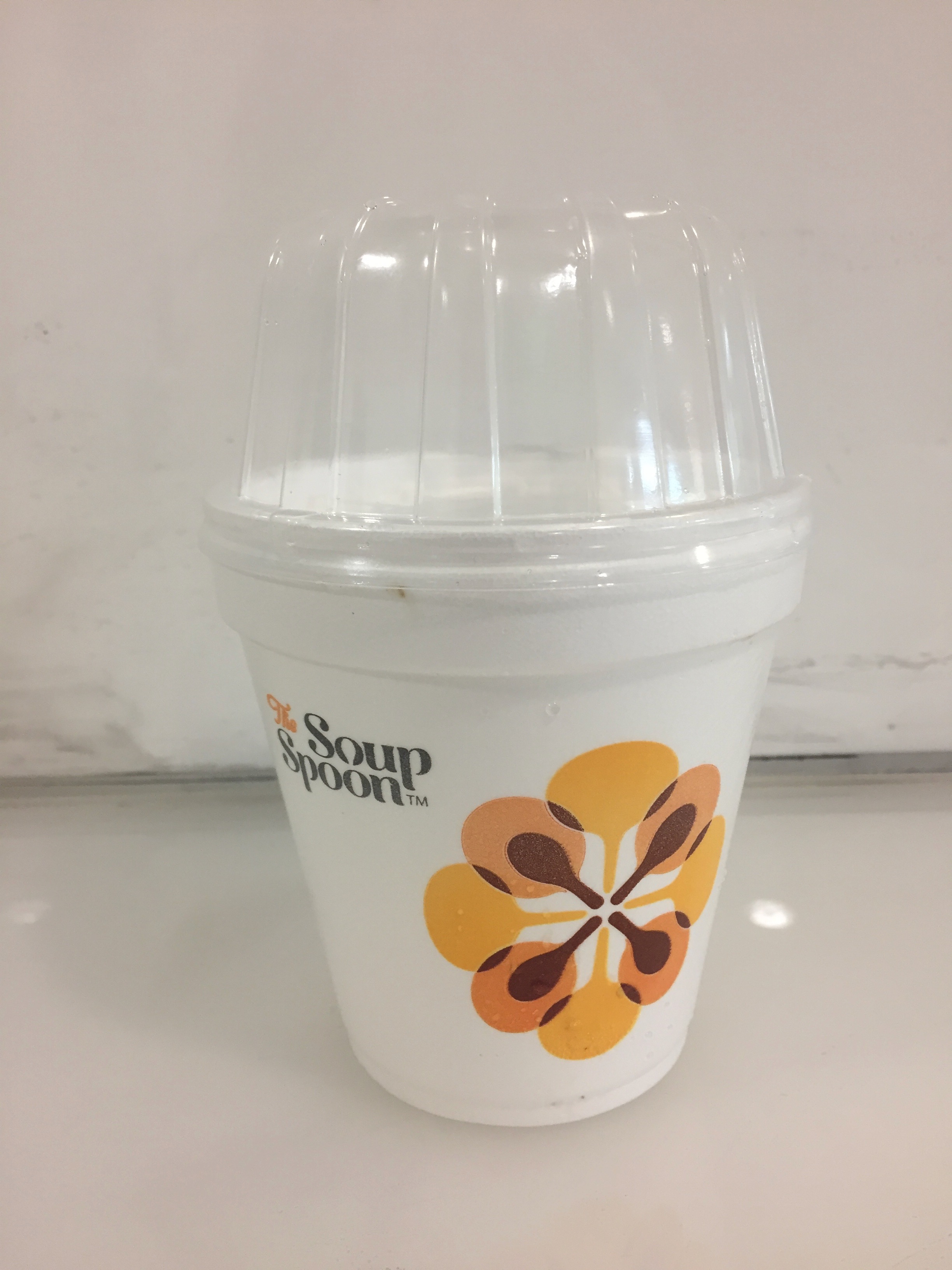
Final Tote Print
For my first composition that I had printed on my tote bag, this design portrays the ‘control’ in the first quote through the use of a vending machine as the main subject as well as a repeated pattern of joysticks in the background. Inspired by Rene Magritte’s Golconda, the inclusion of joysticks in the background creates depth. With the vending machine portraying choice and control over what the person wants, the context of ‘human nature’ comes into the content of the machine. Replacing the typical items such as food and drinks, I decided to work with elements of human nature which include emotions, senses and the physical human body. Emotions portrayed through the use of emojis, senses through the use of eyes, nose and mouth, and the physical body portrayed through the use of limbs.
Initially, when the application of halftone was compulsory, my composition looked very flat as a whole due to the lack of contrast. However, after we had the option of removing the use of halftone, I decided to only apply it in the background so as to not take too much focus of the vending machine.
Composition 2
In this next composition of the same quote, I wanted to portray control in the setting of a gamer playing a game. Using an image of a person holding a console to convey the control that they have in their hands, the weapons that are available to them on the screen shows imagery that reflects control over humans. The first one being a puppet master controlling its puppet, followed by images that represent mind control in the other two. The rippling background adds additional effect and focal point to the tv screen.
During the critique, it was brought up that the words within the ‘weapon’ frame were too distracting and it would have been better visually if I could find a different image to replace it.
“What we’ve got here is a failure to communicate” – Cool Hand Luke, 1967
Composition 3

The first composition for this quote was rendered through the exploration of communication which includes verbal and signs language. I decided to bring in a blender as the main focus because I was inspired by the use of a quirky object such as a vending machine in the first composition. Out of the many household objects, the blender was also one that produced a lot of noise which I thought was fitting since verbal communication is normally a failure when the environment is very noisy. Going against the norm of having hands pressing the buttons of the blender, I placed hands that form letters of sign language inside the blender. Although the five hands spell out the word ‘hello’, the messy blended motion jumbles the letters up to show a failure in communication. Another play of scale is shown in the smoke clouds that are placed by the wires on the bottom right corner.
Forming ideas that involve placing random everyday objects into a quirky context reflects a part of creativity that I really enjoy and hope to incorporate more into future creations.
Composition 4
Through this last composition, I portrayed the idea of realization that communication has broken down between two individuals in a relationship. Unknowingly, they are drowning each other literally and figuratively. Ironically, the person on the left is a lifeguard who is blind to see that he is drowning his friend. The weight towards the left of the composition portrays him as the dominating figure. The structure of the lifeguard house was also strategically placed to symbolize the form of a human body.
FINAL PRESENTATION

Compositions of the first quote on the top and second quote at the bottom.
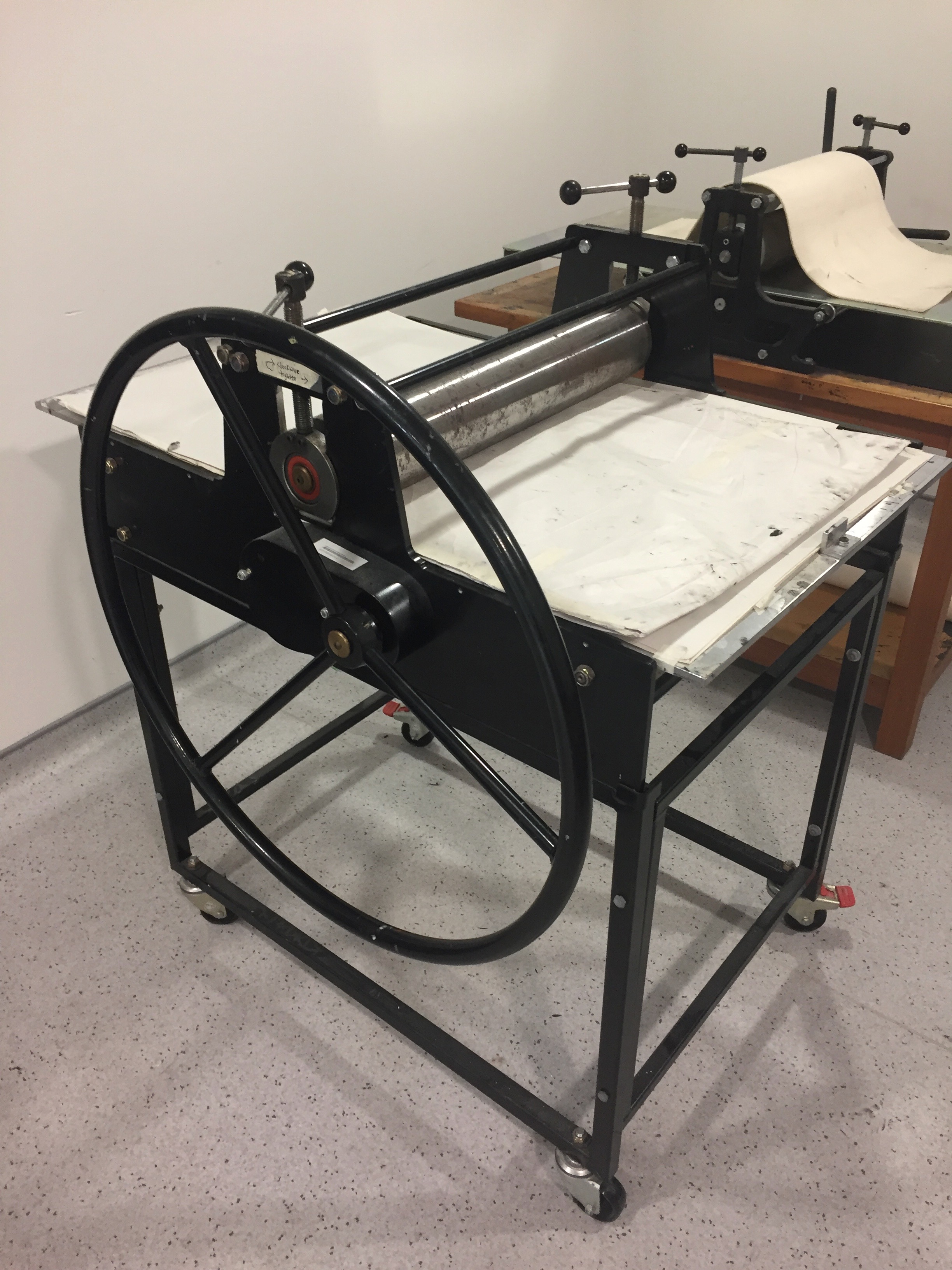
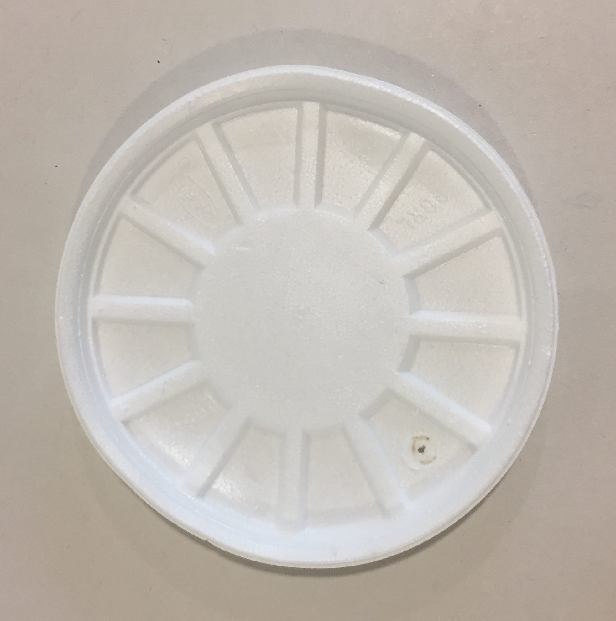
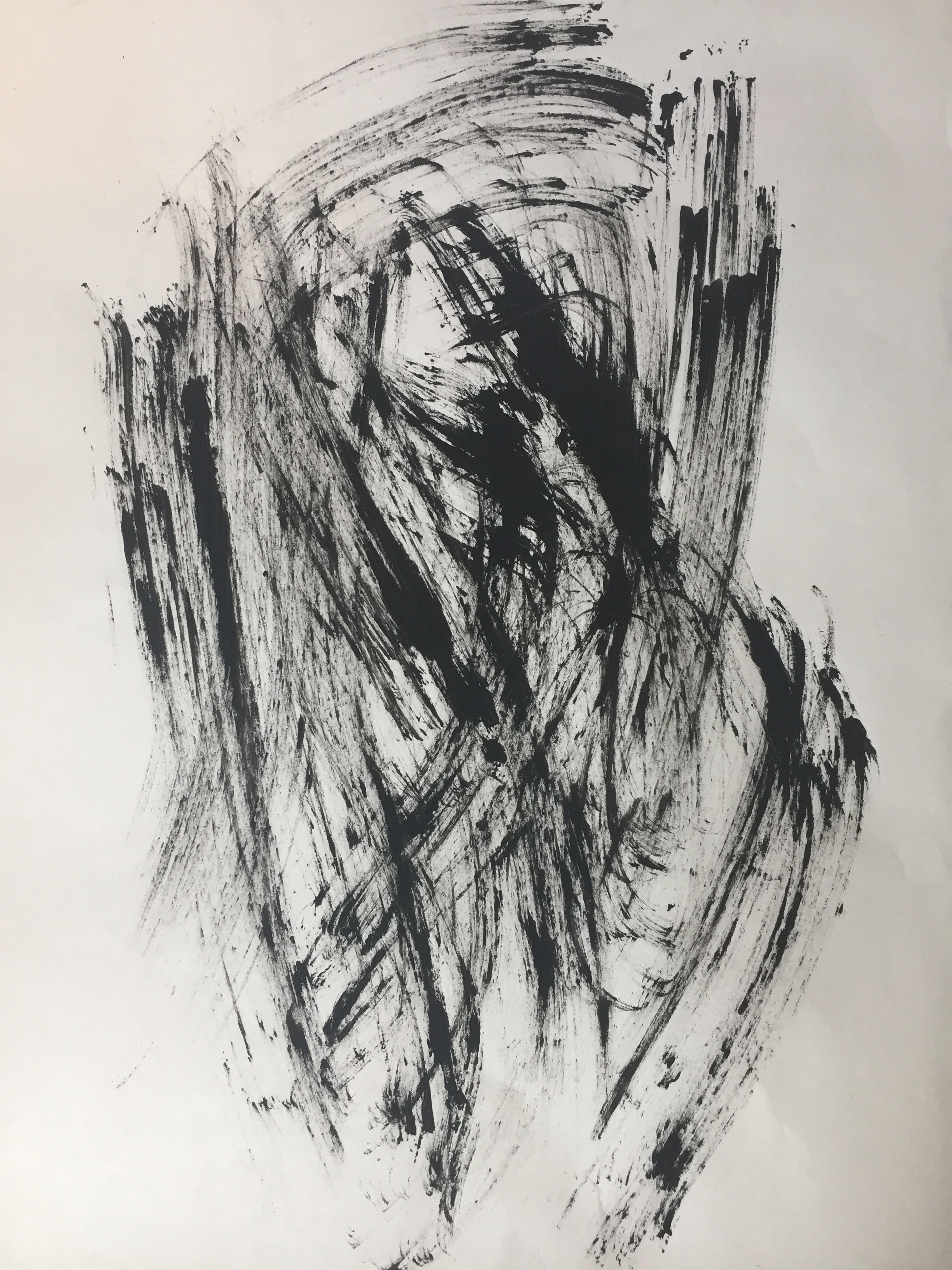
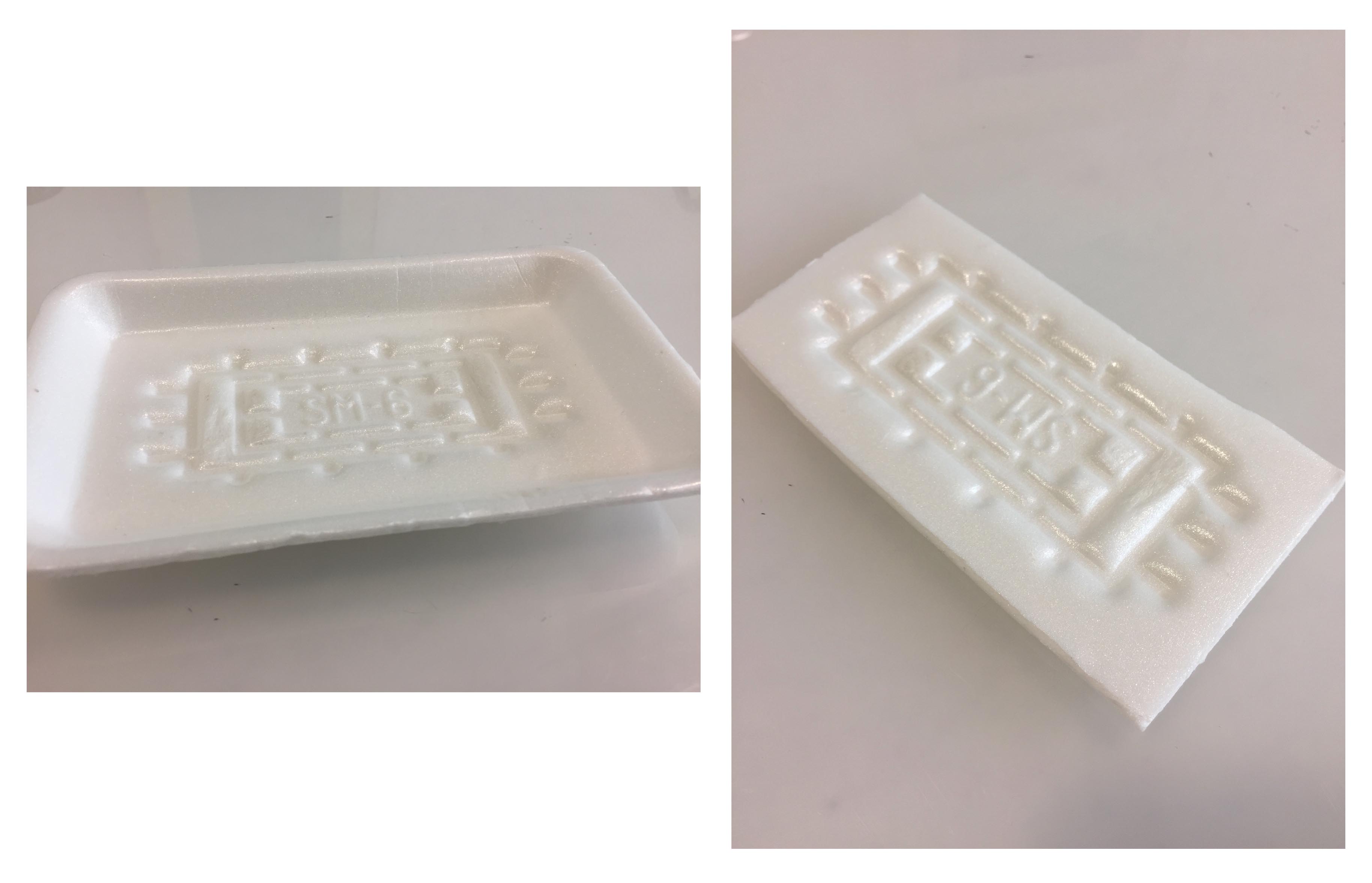
Silk Screening process
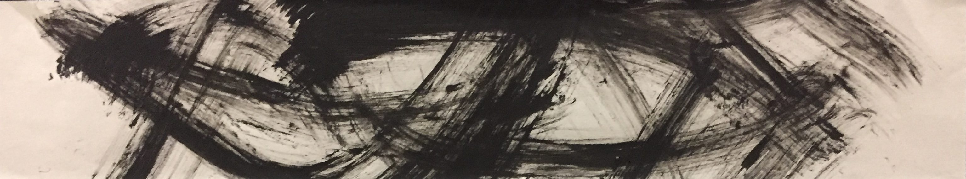
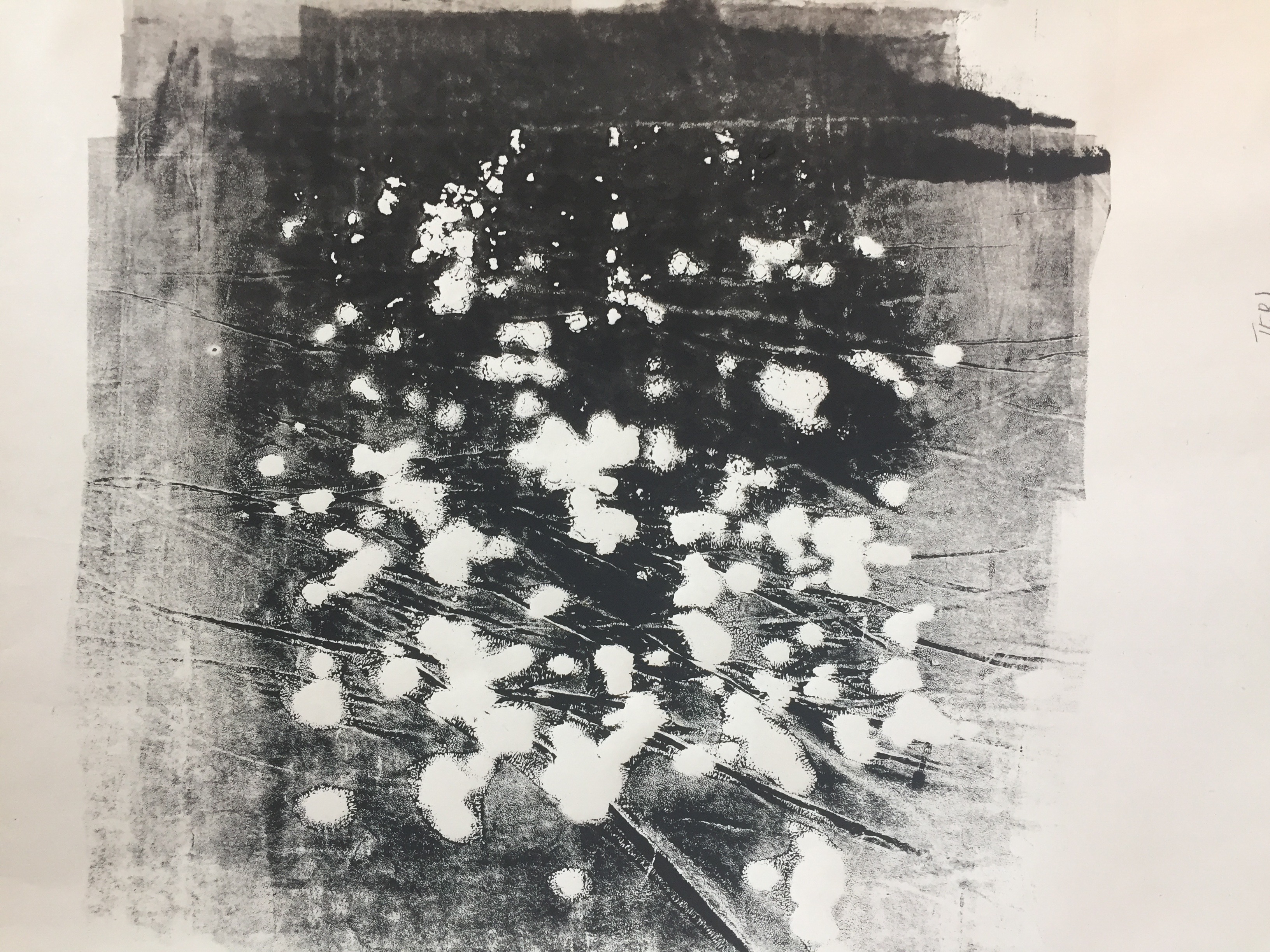
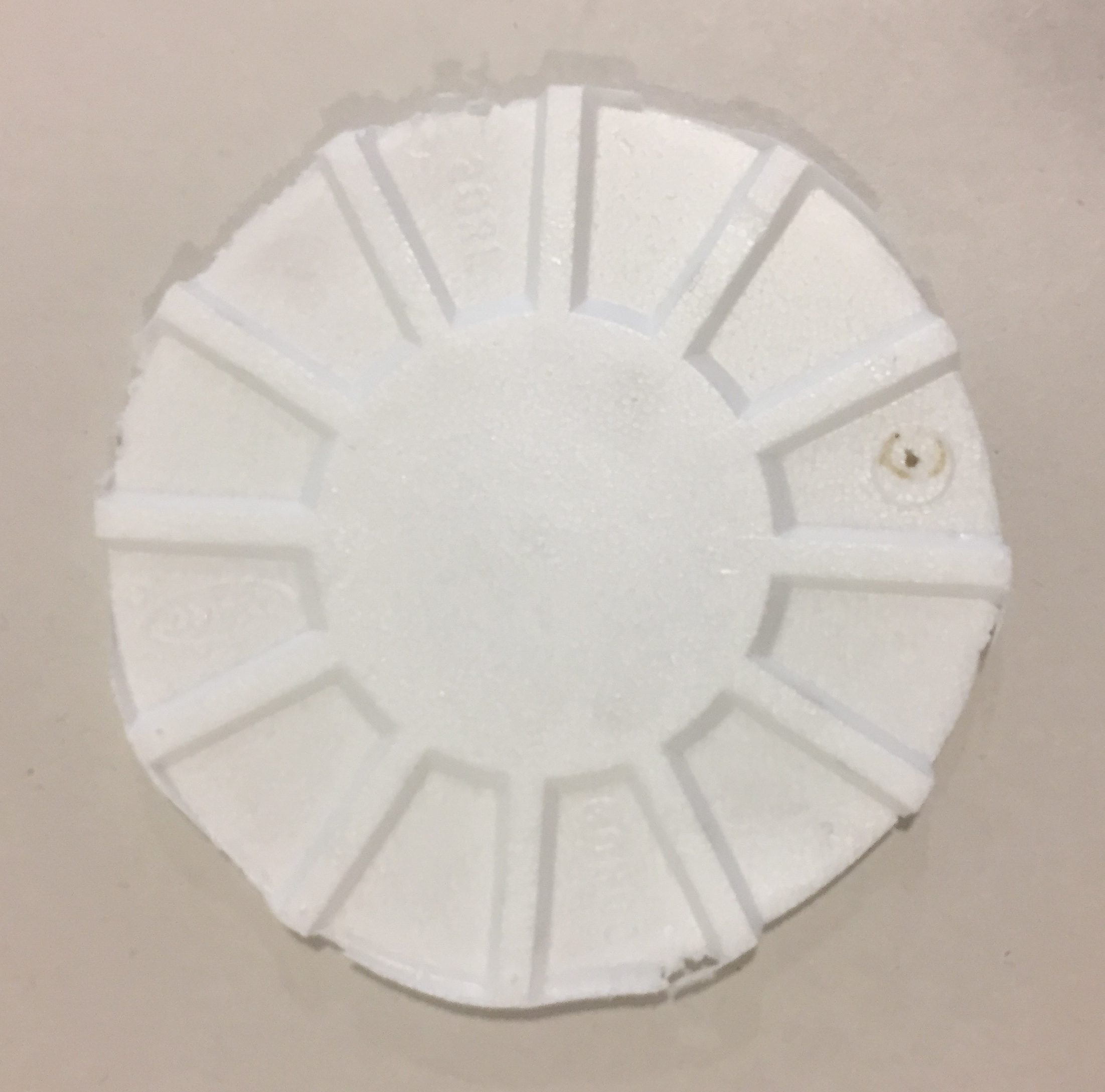
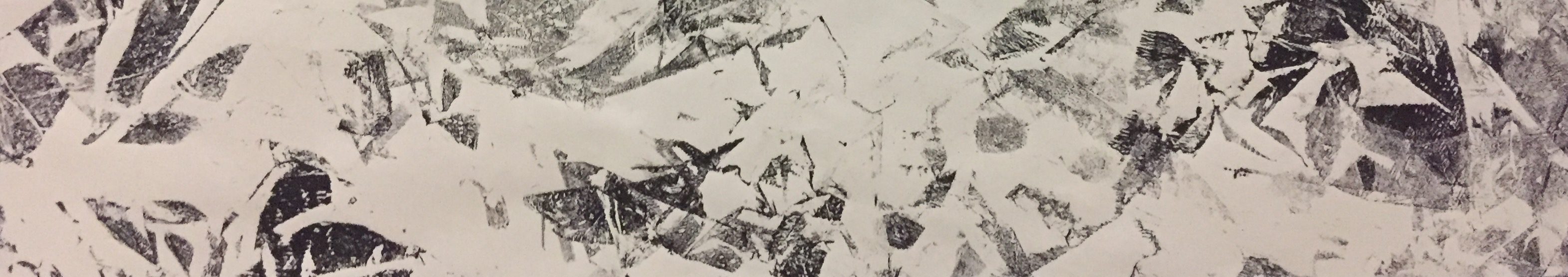
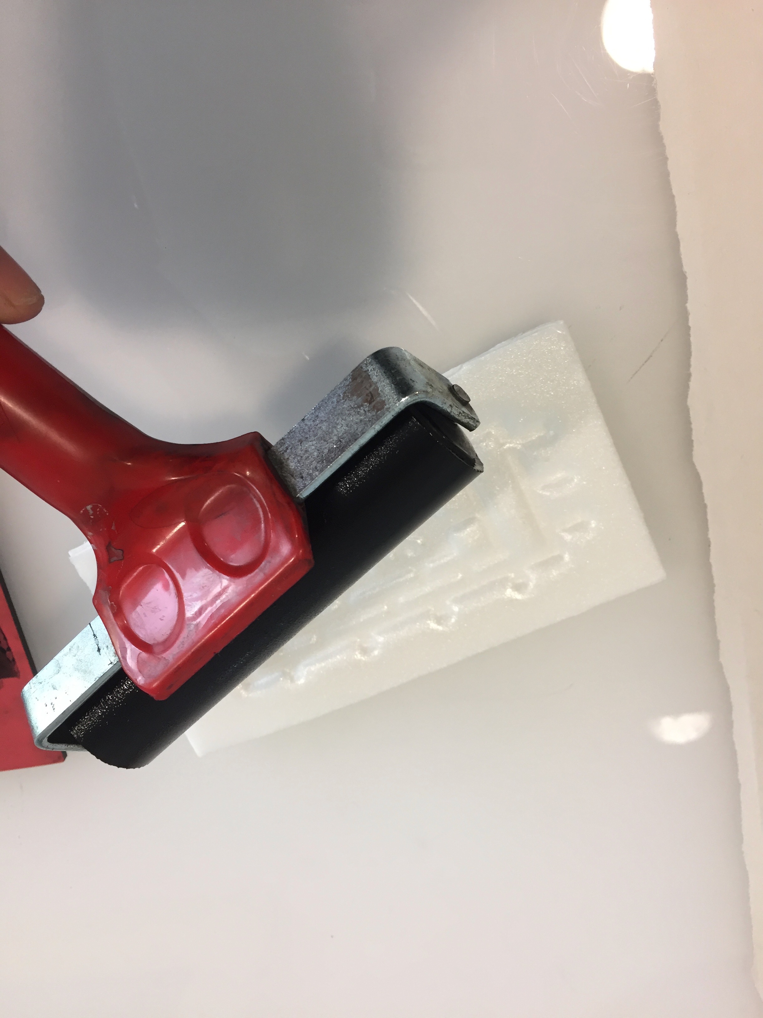
Ending off this digital project manually, we experimented with the process of silk screening. Although long and tedious, the process was still very fun and receiving an outcome felt rewarding. Unfortunately, since a large portion of the process took place in the darkroom, I was unable to record as many process pictures. I do however have an image of my exposed silkscreen. Exposed at 18 seconds, my second attempt with fewer halftones was more successful as the contrast turned out a lot greater.

Exposed silkscreen
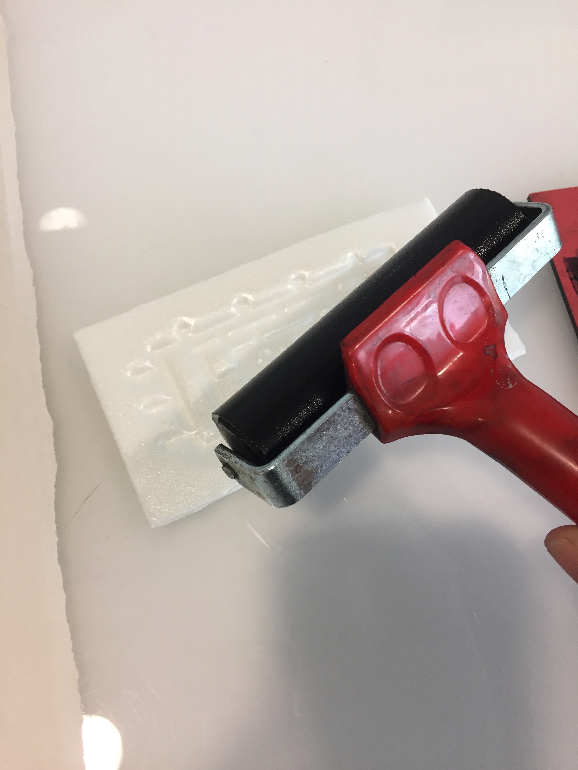
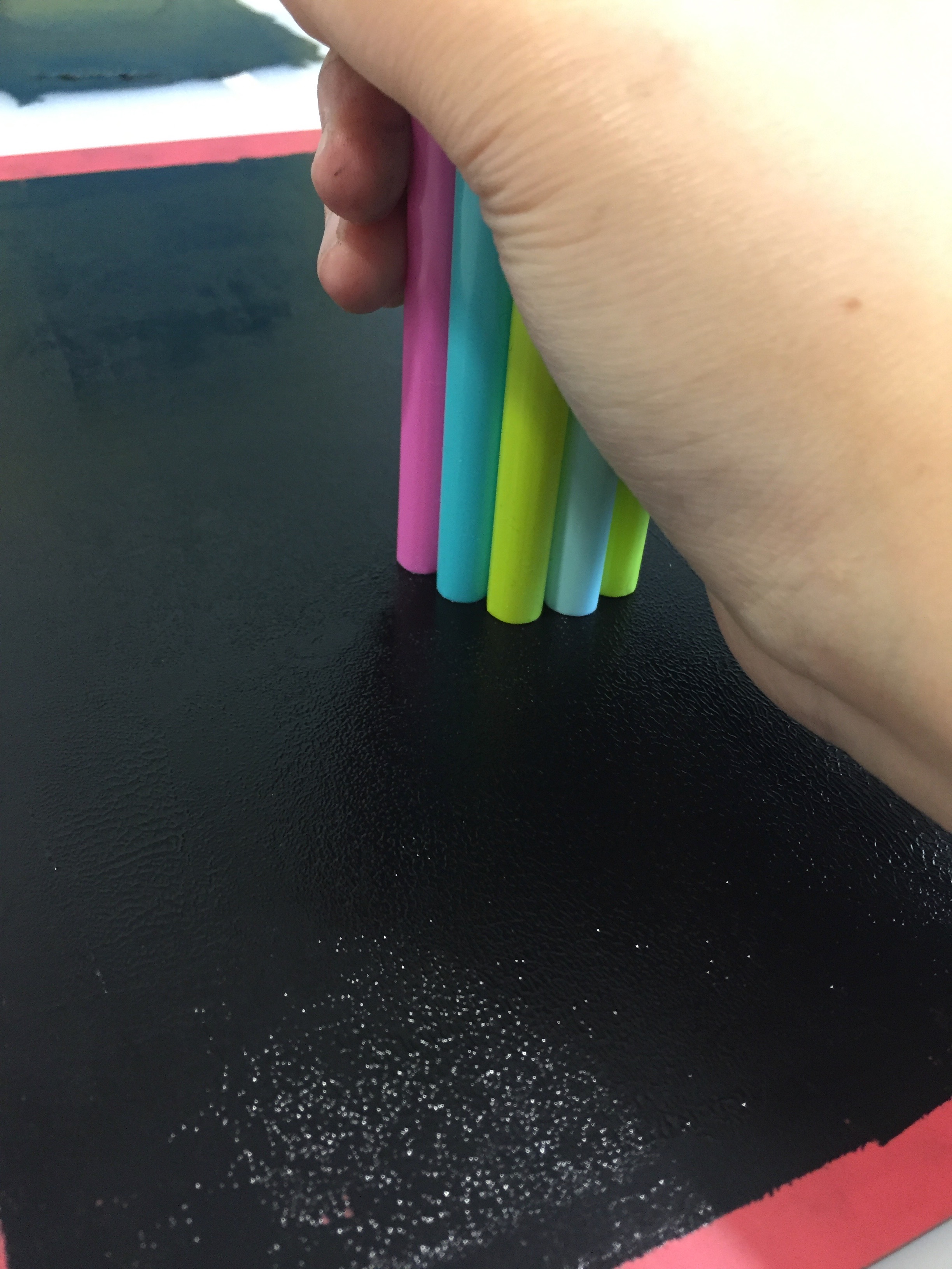
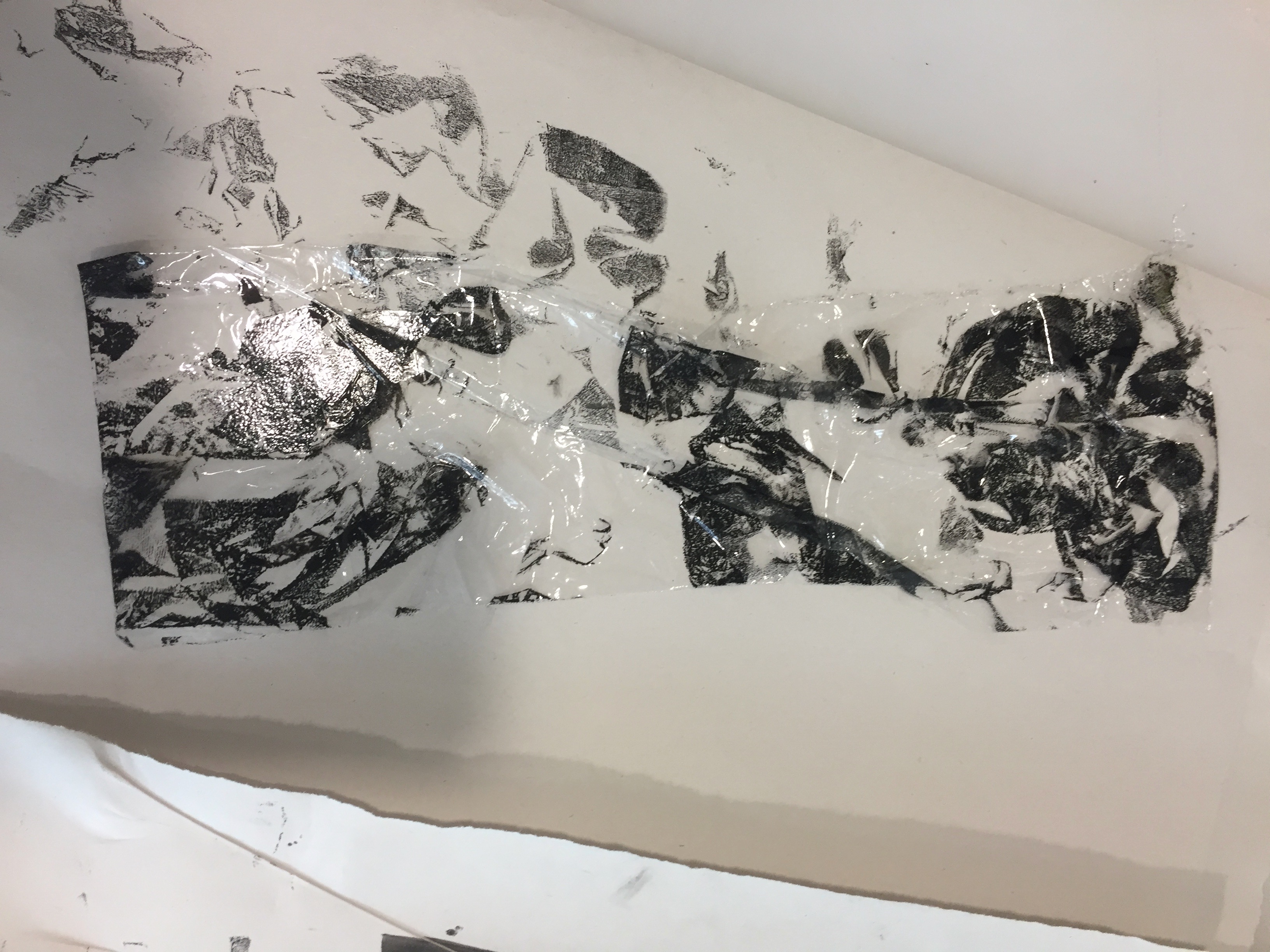
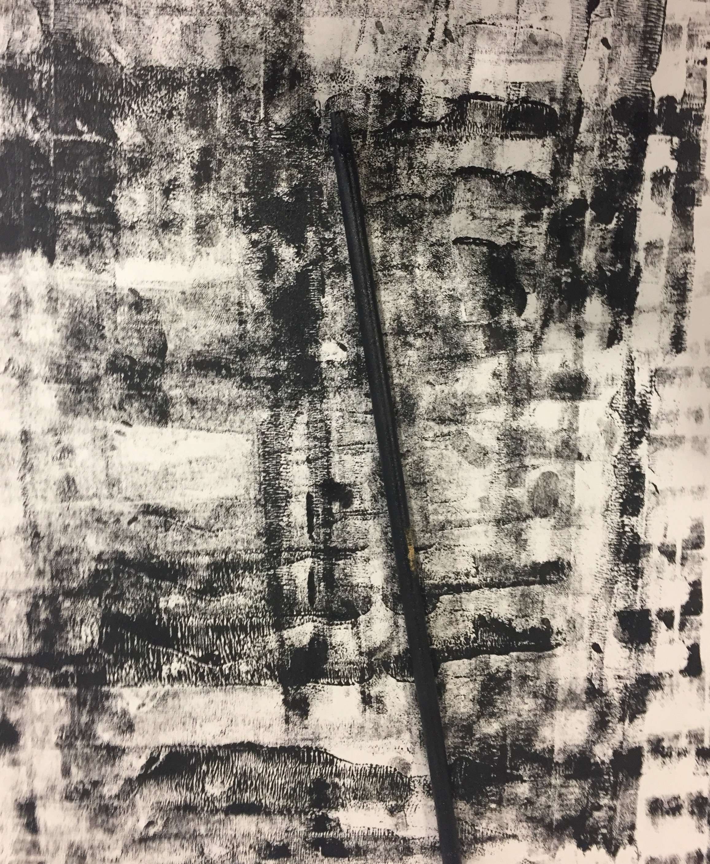
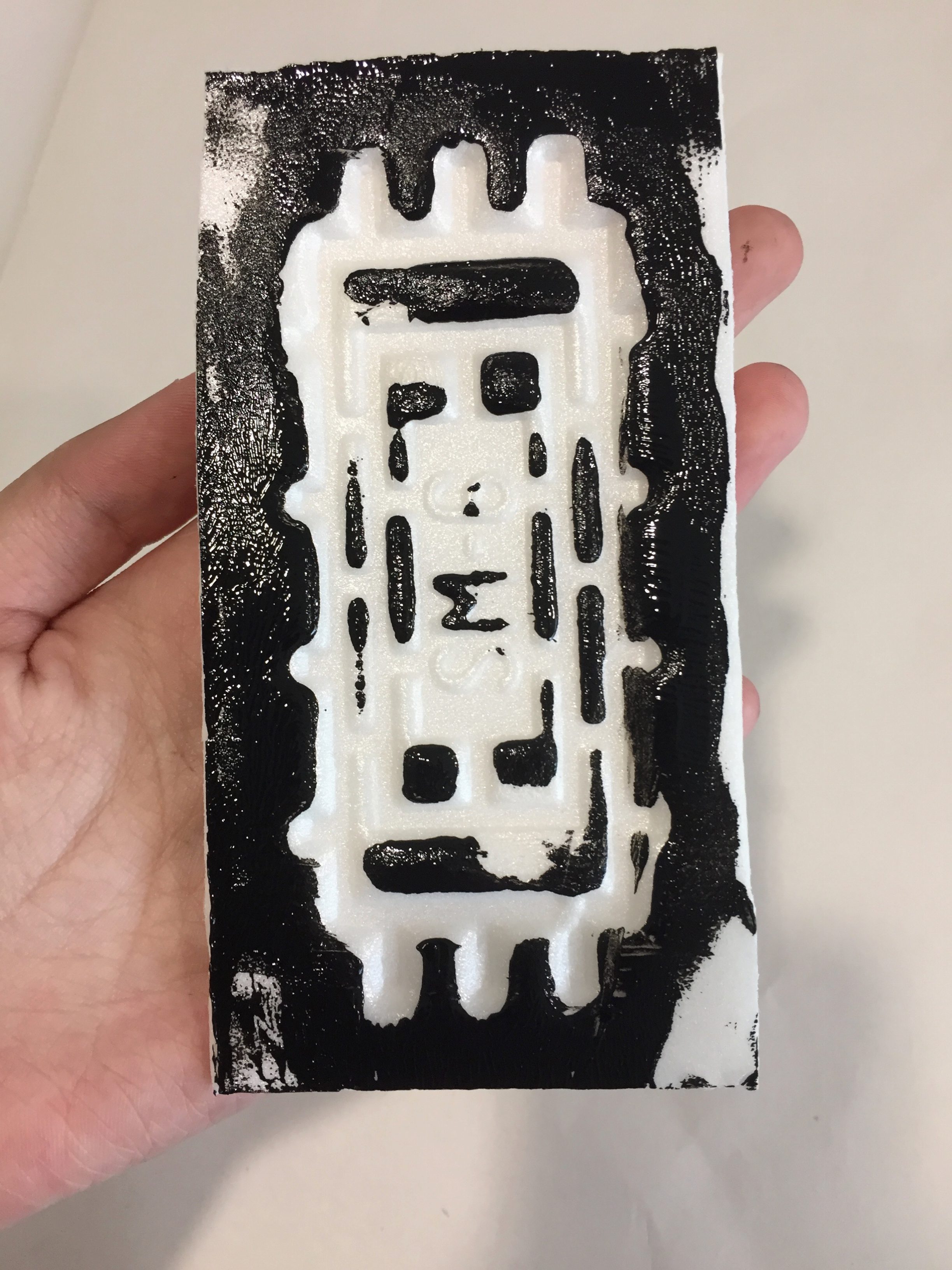
After washing our exposed silkscreen, the next step was to create prints with it. This involved the process of applying ink to one end of the silkscreen and using a squidgy to glide the ink over evenly by applying even pressure.

Ink on silkscreen before print
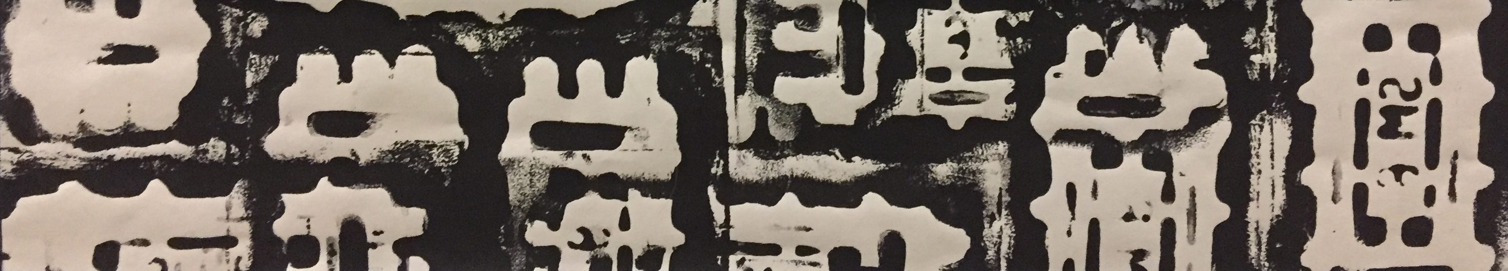
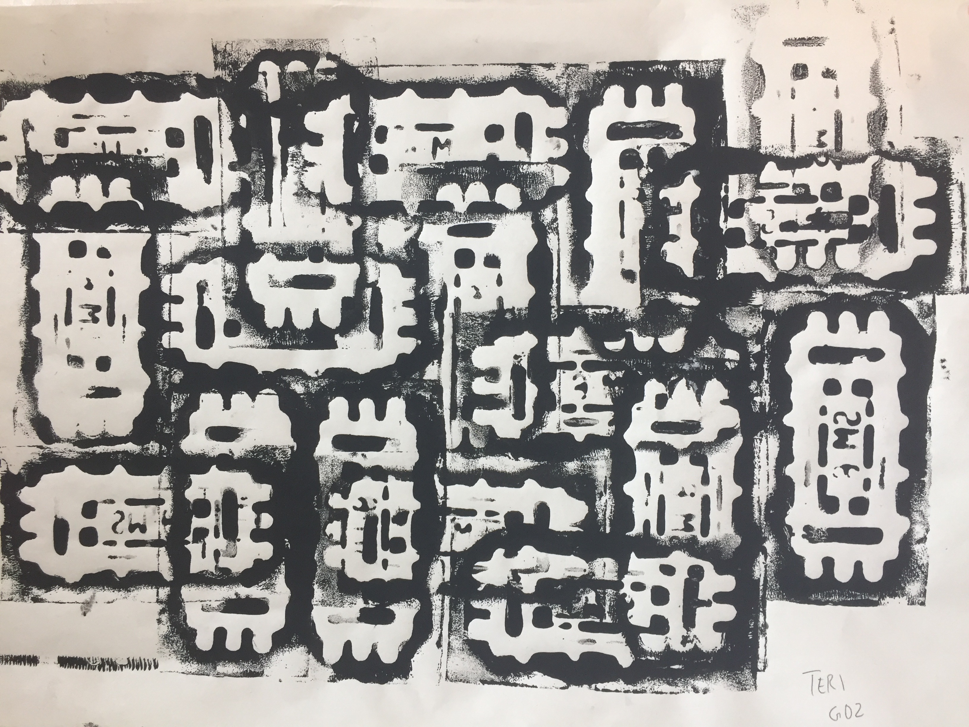
Since this was the first time I had tried silk screening, I learnt a lot about a new process of producing art 🙂
Improvements to be made
During the critique, it was mentioned that the outcome of two of my compositions was better, the vending machine and blender. Unfortunately, the other two did not portray the quote as well and it could have been because I kept going back to make changes hence losing the original meaning. Since the majority of some compositions were in greyscale, I could’ve contrasted them more to improve on its visual components. In conclusion, although I did struggle quite a lot in creating my compositions and making sure that the meaning of my quotes came through, I was pleased with the final result.