Recent Posts
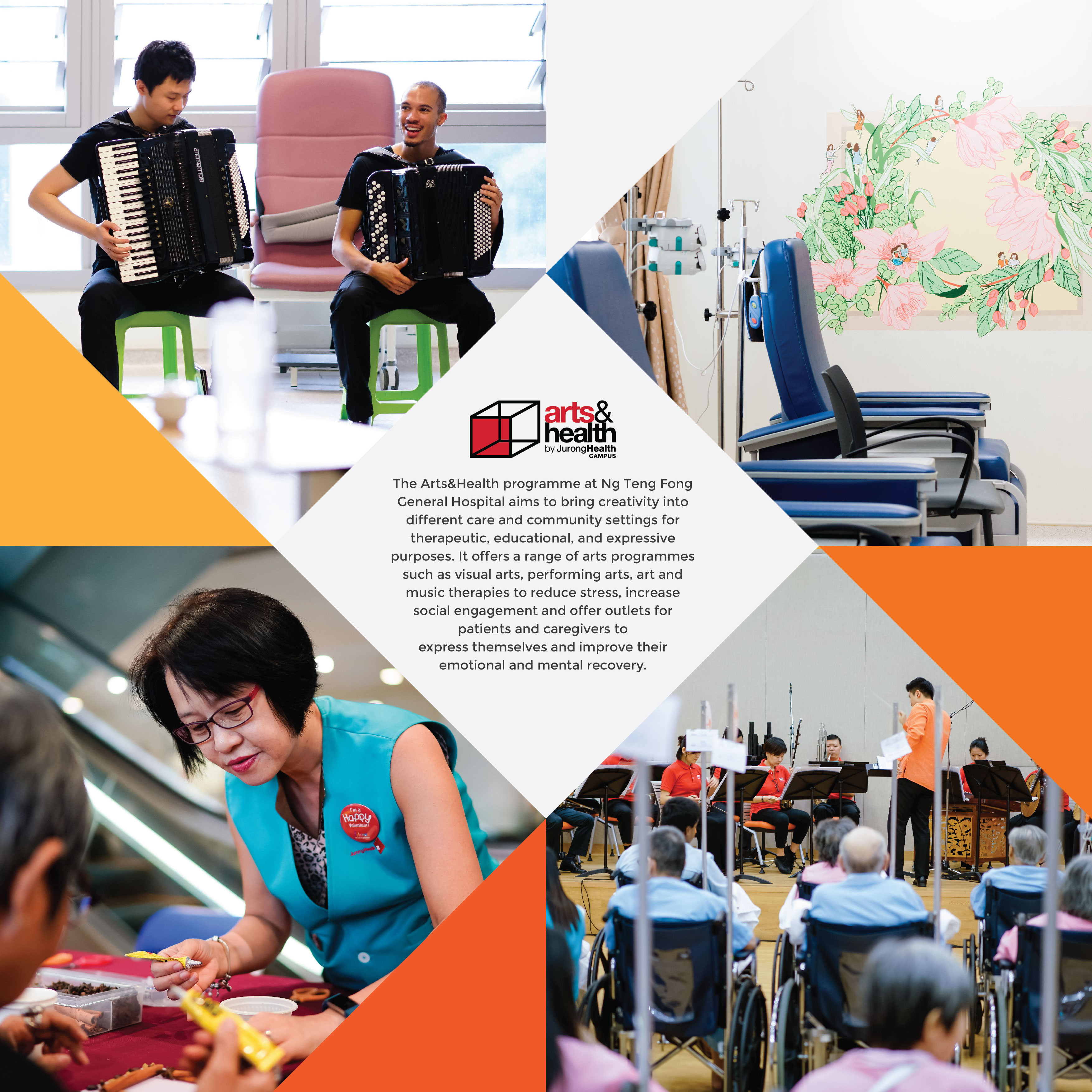
Final Poster Design
For my final design, I adjusted the text spacing and work on some final details for the illustrations.
Mood Board, Sketches, Development
My slogan: Doses of Fun with Art (Keywords in Bold)
DOSES: I wanted to use motifs of doses to express my slogan.
MUTED COLOURS: In consideration of the nature of programme and setting, I prefer muted colours as it is more soothing.
ORGANIC PATTERNS: I like the fluidity of these organic patterns. It is another way to express ‘doses’ instead of showing it literally.
The Read more →

(VC1) Assignment 3: Research & Development

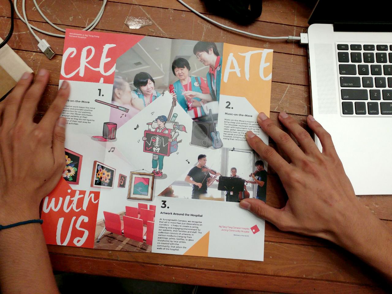
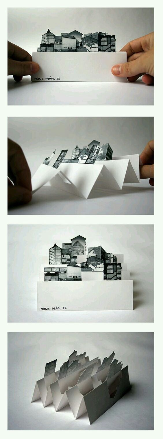
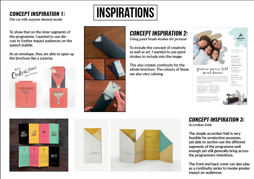
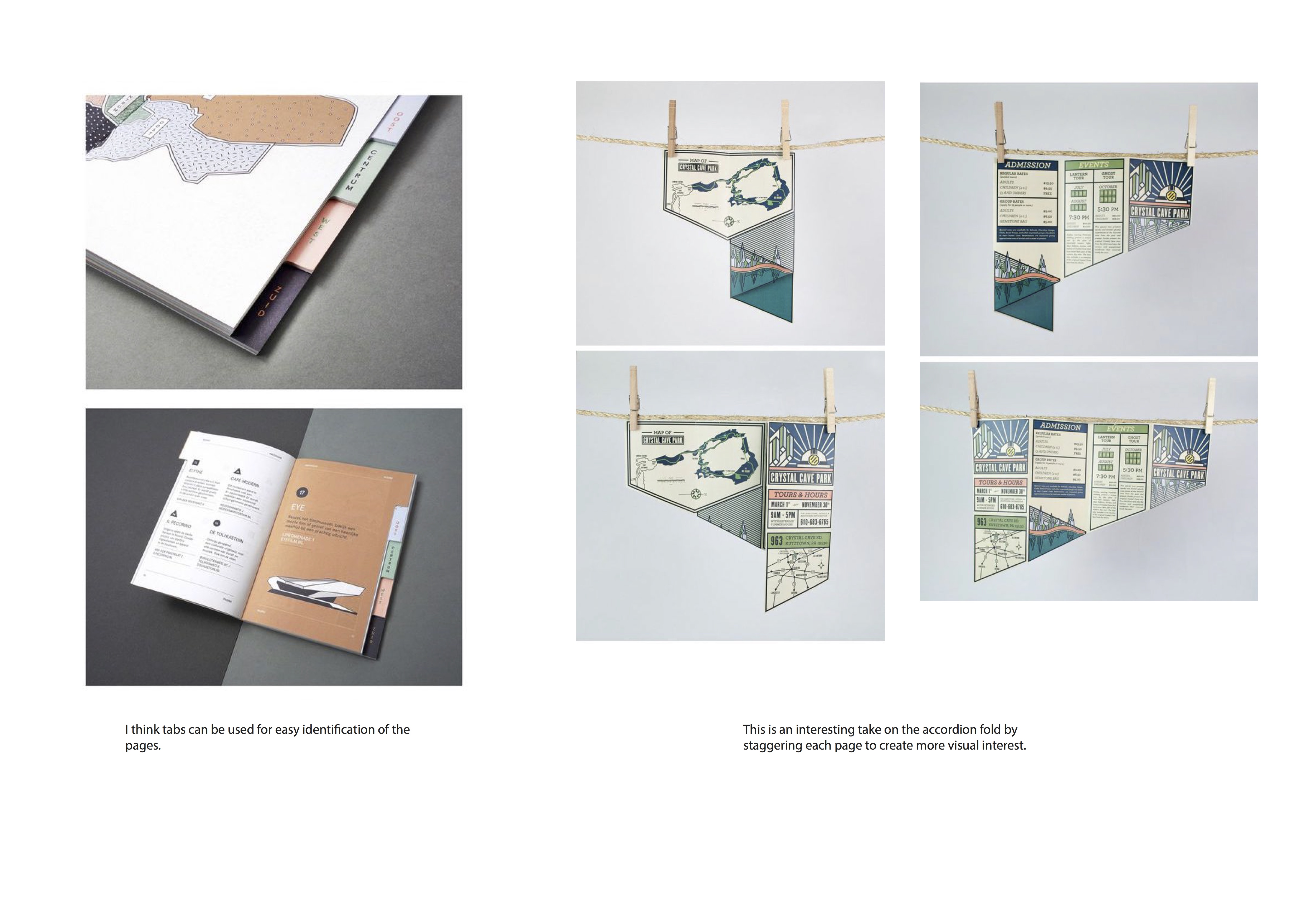
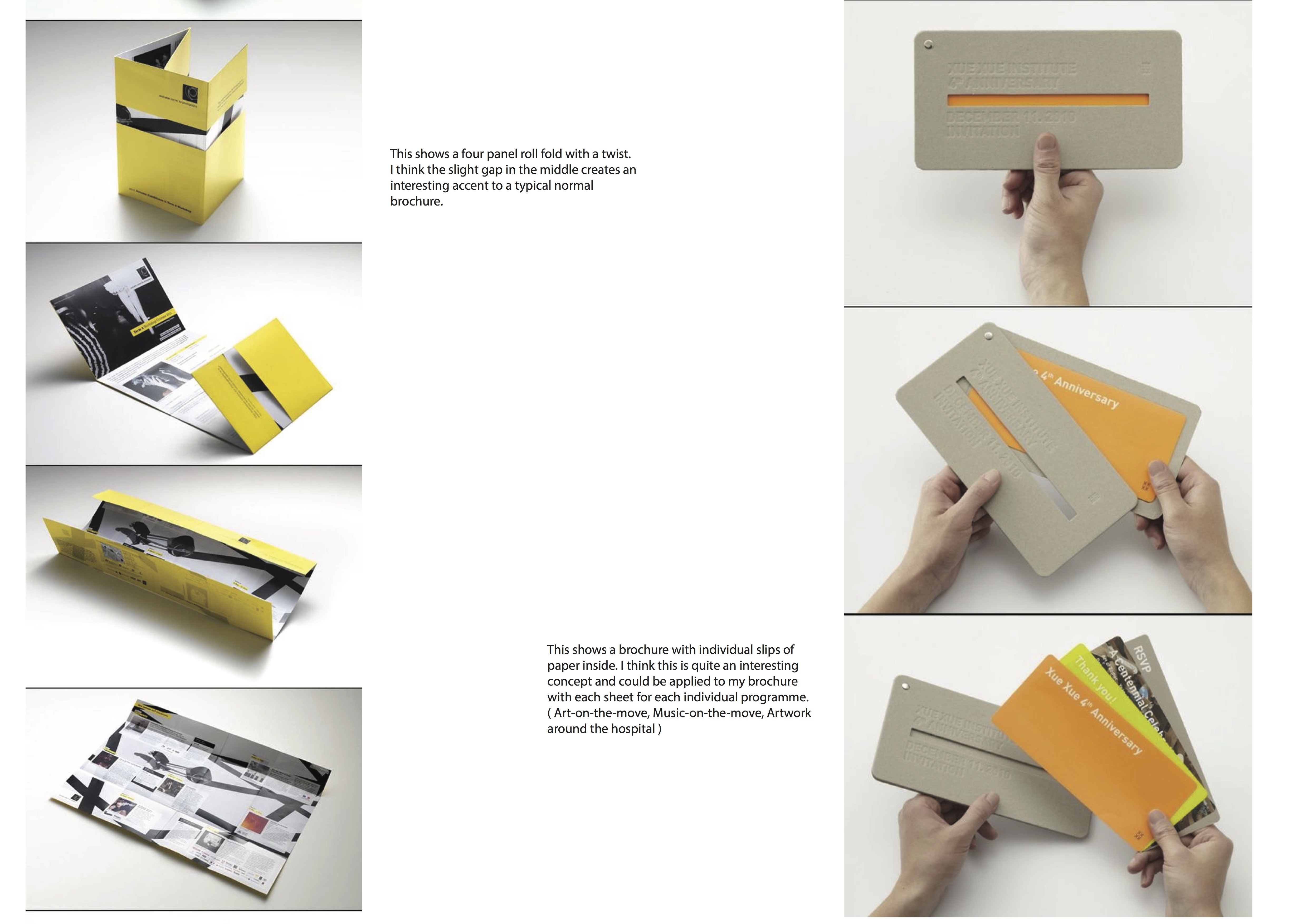
Task 1. Existing brochure designs x3
These 3 folds and card cut outs are what caught my attention.
The above 2 are the ones that had a certain focal point that i quite liked.
Especially the top left (square cut out). I liked that when it opened up, it had Read more →
Project 3: Process & Final Design

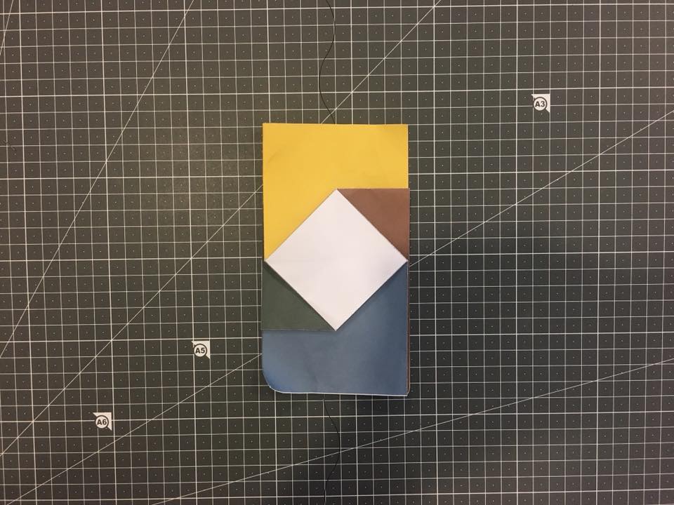
I started with a dummy to determine the folds and allocation of space:
Then I started to sketch on the parts where I need to place the images and body copy before going digital:
Refinements and adjustments using B/W print:
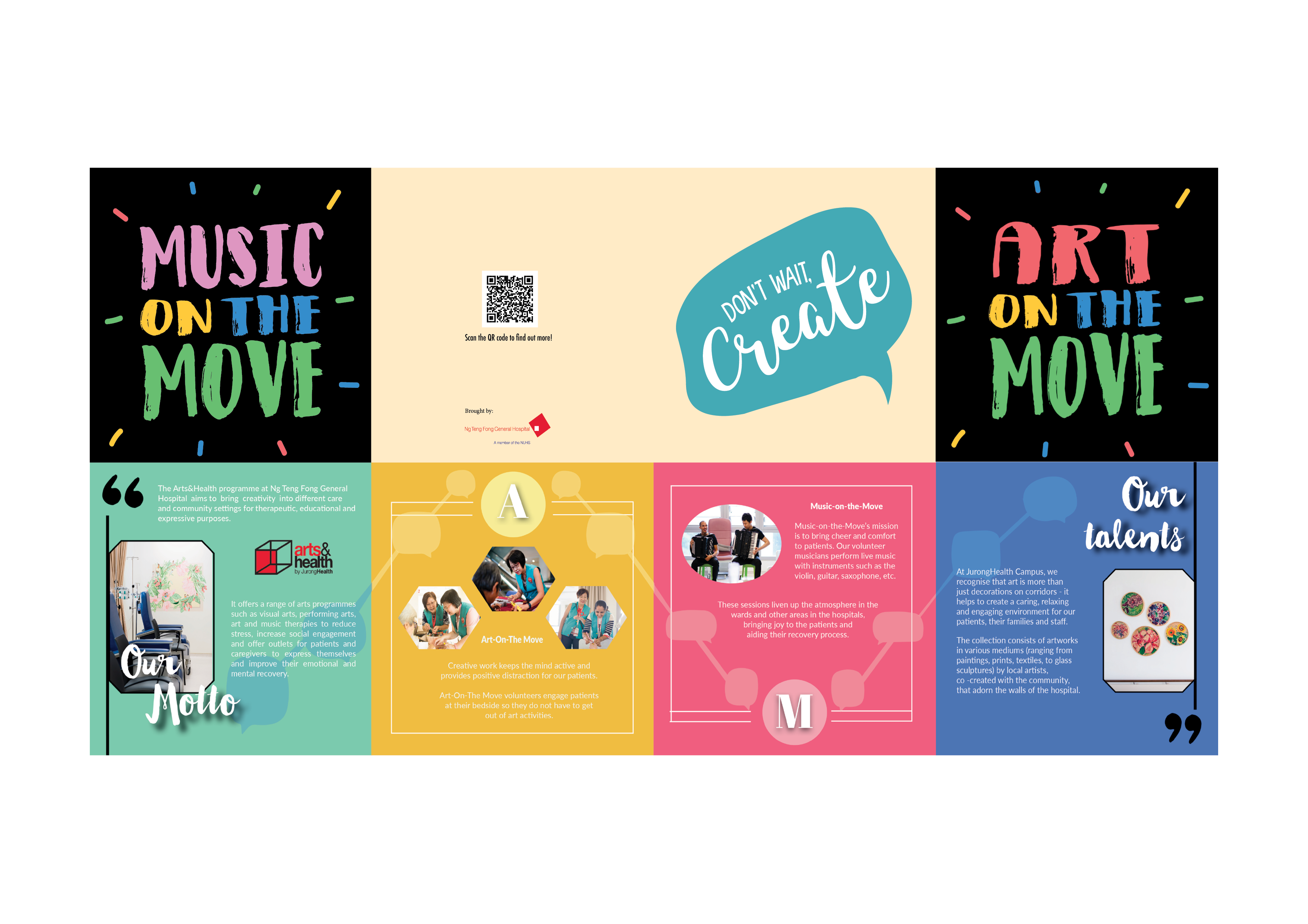
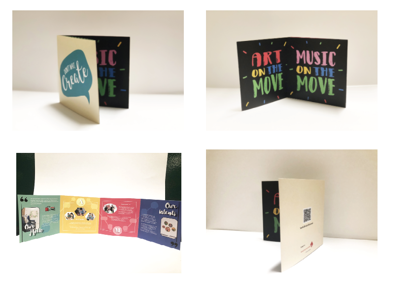
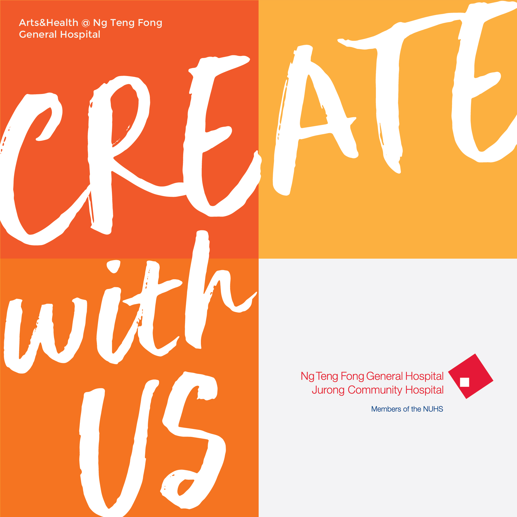
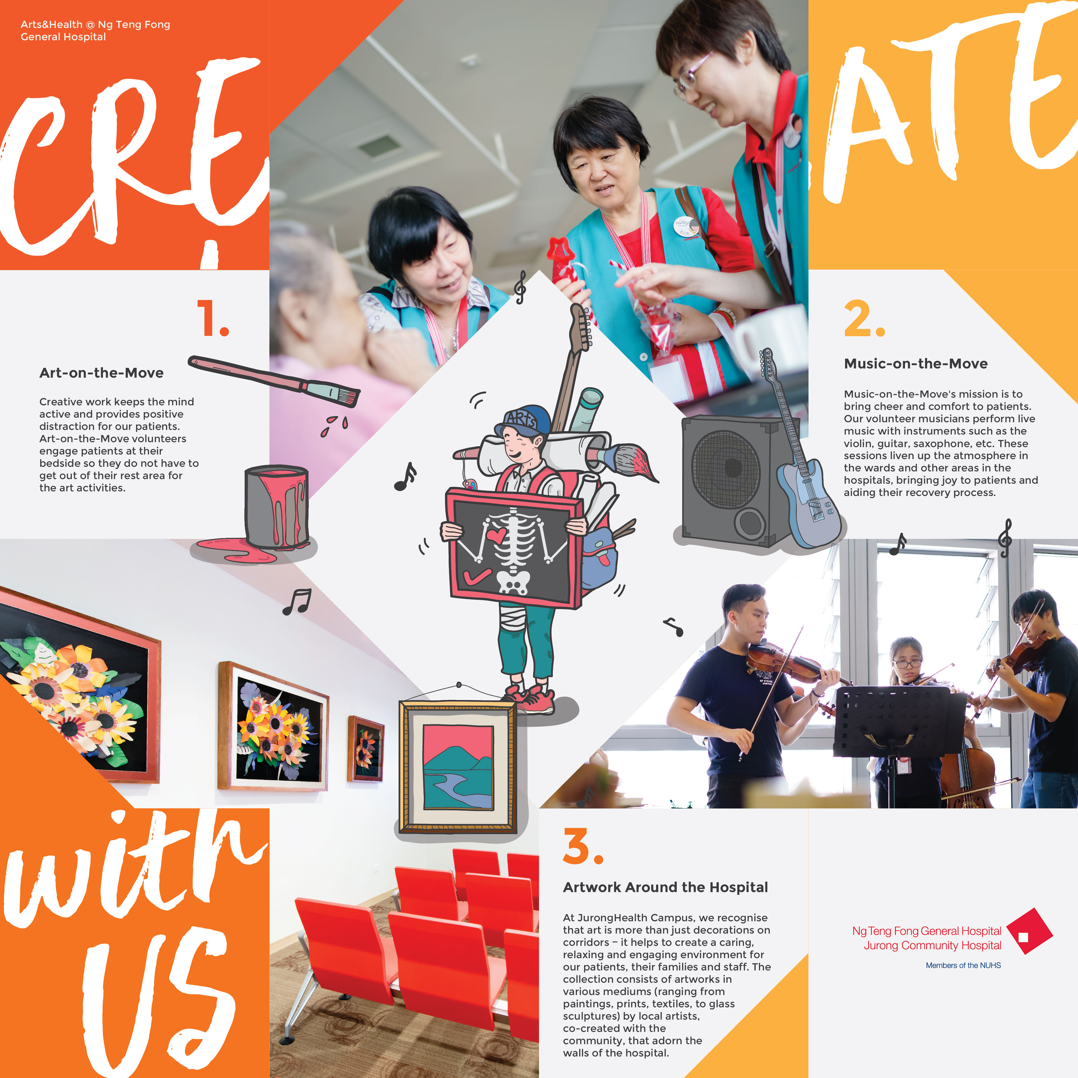
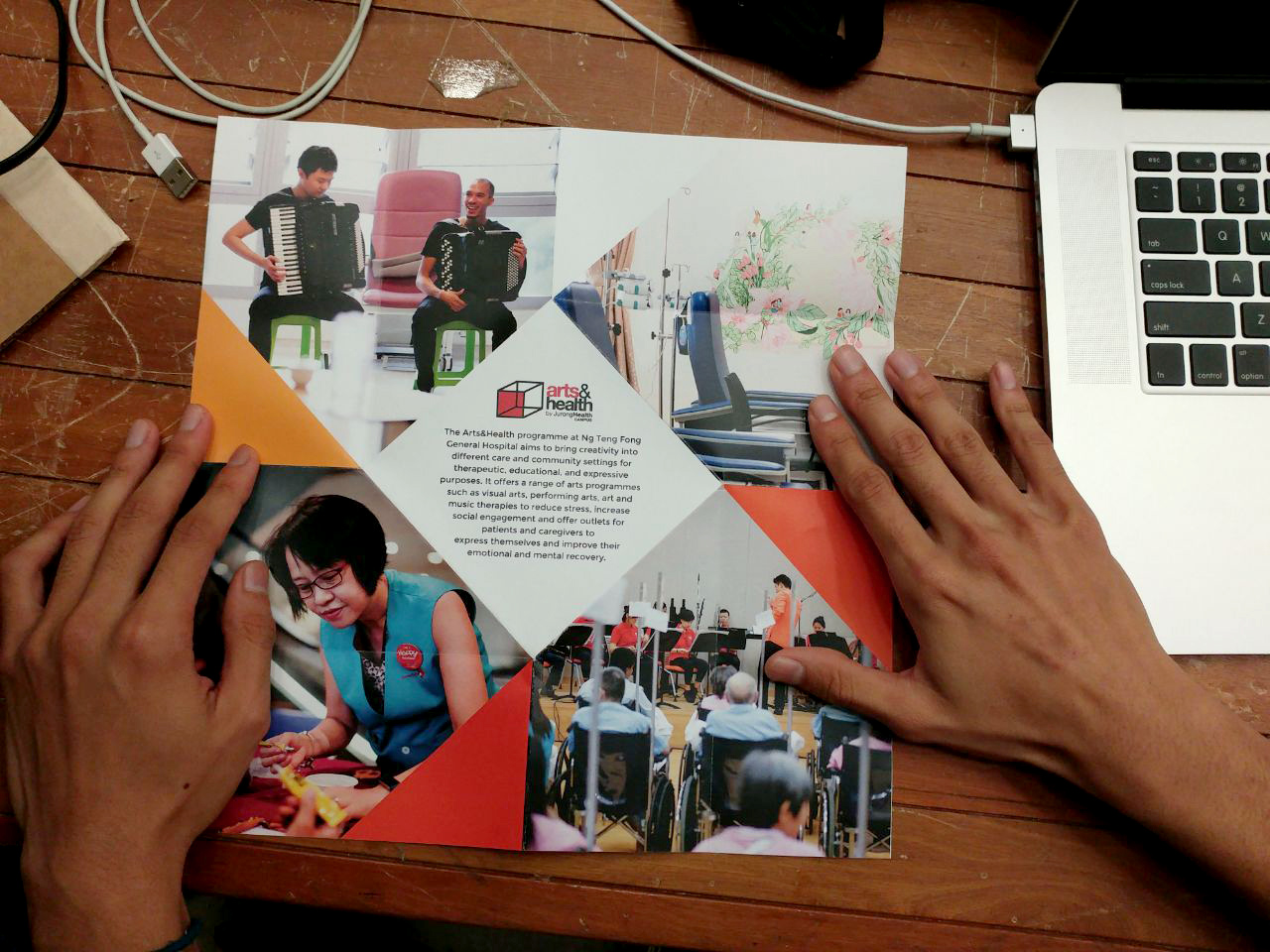
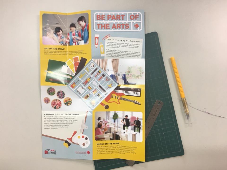
Final Design:
Project 3: Task 1 - Design Exploration

Existing Brochure Design:
Design 1: Simple paper cut and folds are used to achieve interesting pop-up effect.
Design 2: This piece is interesting as it transforms conventional A4 sheet using simple folding technique.
Design 3: Contents are divided through the smart use of colours.
Through these quick references, I wanted to design my brochure by incorporating the use of folding and colours to separate the contents.
Project 3: Final Presentation
After getting the feedback:
I decided not doing die cut. I placed my elephant at the front of the brochure. The first and last pages give a sense of continuity. The elephant is blowing the bubbles and the bubbles are flying to the last page. Also, I placed the piano keyboard at the inside and outside of the brochure to show Read more →