Recent Posts
Preliminary Design Review
Feedback and critic from peers and tutor:
colour as hierarchy – hot > cold, dark > bright – sequence orange first? mindful of the visual is the die cut for? – must have a purpose as it adds to the budget cost currently too bottom heavy cut out pictures to structure? has a sense of unity could move some shapes down be aware of contrast – visual vibrations – Read more →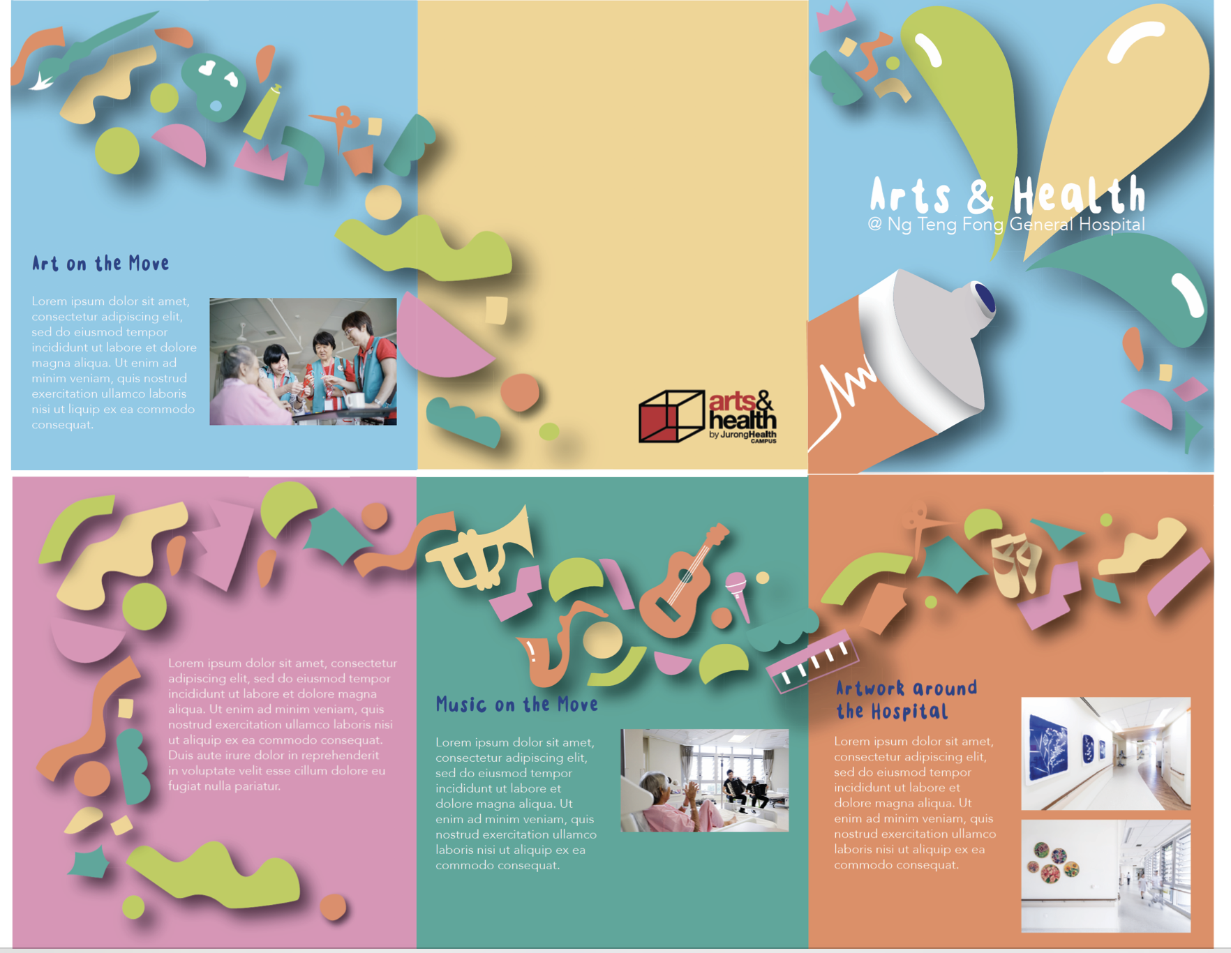
Week 10: Preliminary Design Review

Digital Translation With what I had last week, I proceeded on the feedback was given to me that I should include a captivating slogan (could be from the poster design) as it could better represent the overall theme rather than simply the generic lines of Arts & Health @NTF Hospital. I made use of the fold reference and redesigned a Read more →
Task 1: Designing Exploration
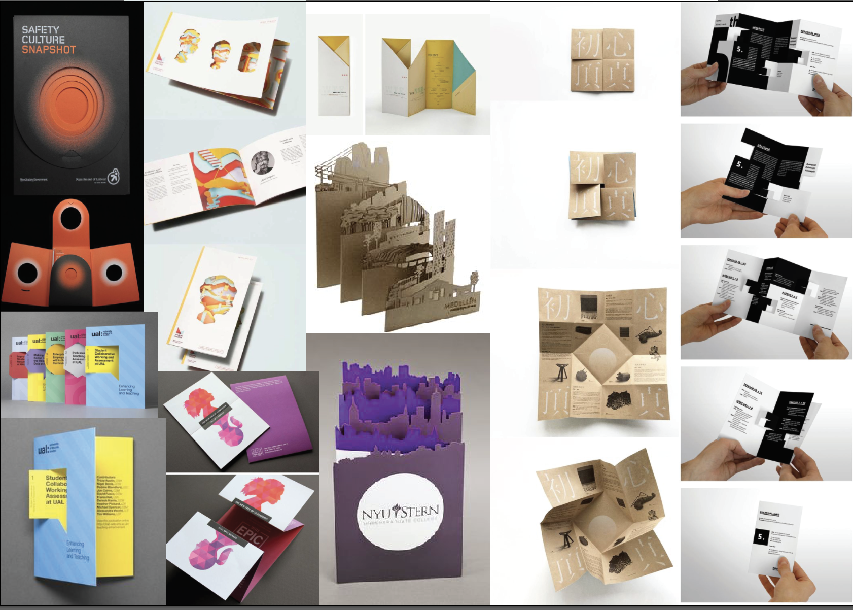
Existing brochure designs:
3 Favourites:
Using an accordion fold this brochure has been cut to create popups, surprising the reader when it is opened. This design is interesting and easily creates a rhythm with the eye.
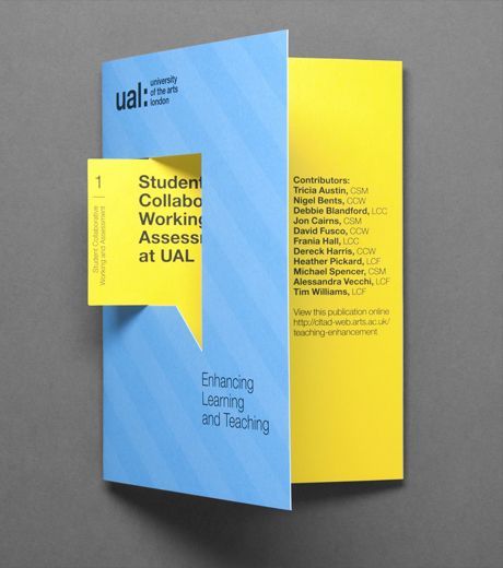
This brochure uses a die cut to highlight an element, the speech bubble.
This brochure is folded inwards using 4 panels. It is a fun way to Read more →
Week 9 : Design Exploration

Existing Brochure Design
I am always fascinated with origami folds. How it could unravel the message from within. I wish I could show more but here are three of my favourite designs.
# Numerical Order From Left to Right
Design Reference #01
Unravelling the fuller picture when unfolded. This technique of fold only require a slit in the middle while retaining the mystery of Read more →
Task 3: Design Refinement and Mock up

Based on feedback gathered in class, this was what I came up with.
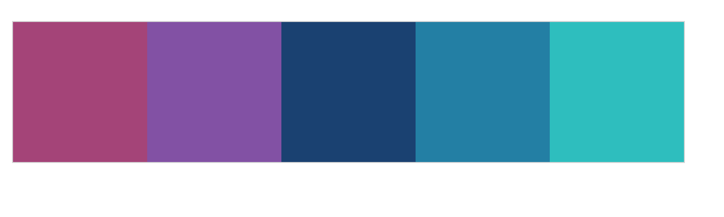
I decided to stick with a more consistent colour palette that is darker with accents of brighter colours compared to my previous one that was rather lacklustre in terms of colour choice.
Feedback gathered from Michael was:
Move the hospital logo to top right Align the arts and health Read more →Task 2: Design Exploration

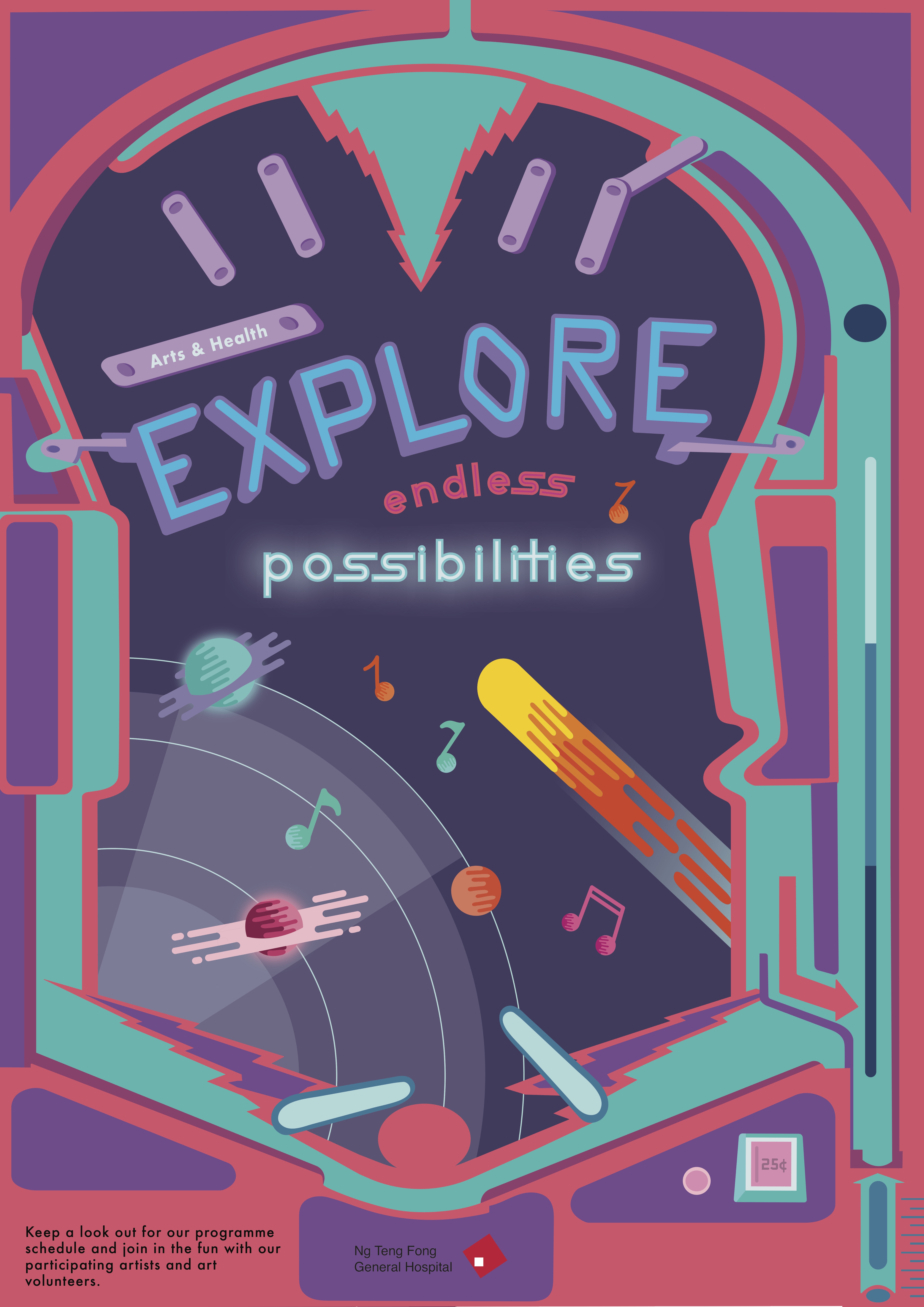
The final design that I decided to continue working on was the idea of a pinball machine. My final slogan was ” Explore endless possibilities”. I thought the theme and concept of a galaxy pinball machine really fits the idea of emoting fun, adventure, exploration etc.
My initial draft was to include the entire pinball machine in the poster. However, feedback Read more →
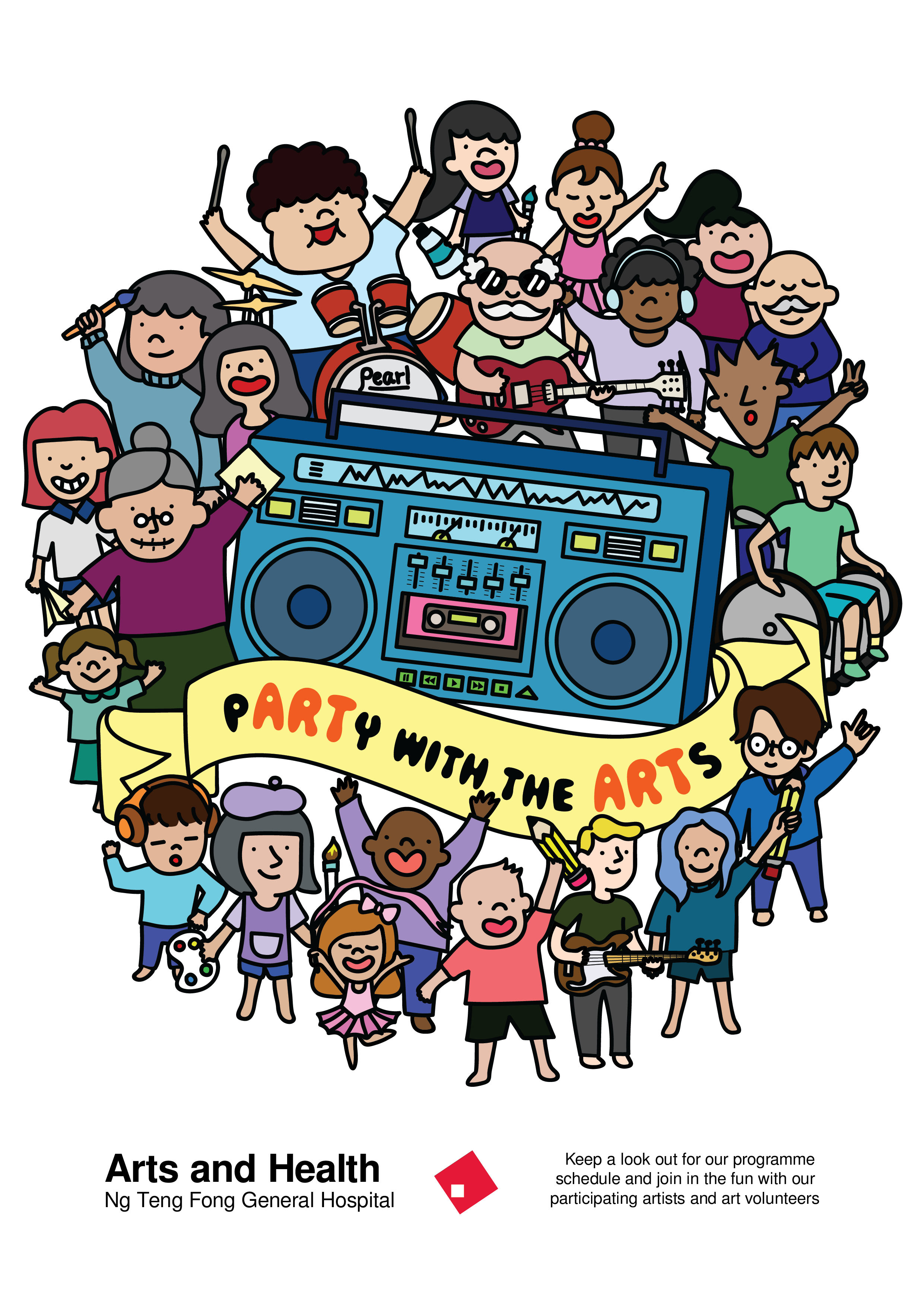
Project 2: Final Design

Here’s my final design of my poster.
I was happy with my work since I’ve never tried illustrating in this kind of style. I wanted to try something new and I was glad it worked out well for me in the end. I learnt a lot regarding the hierarchy, colour and layout of a poster.
Thanks for reading!
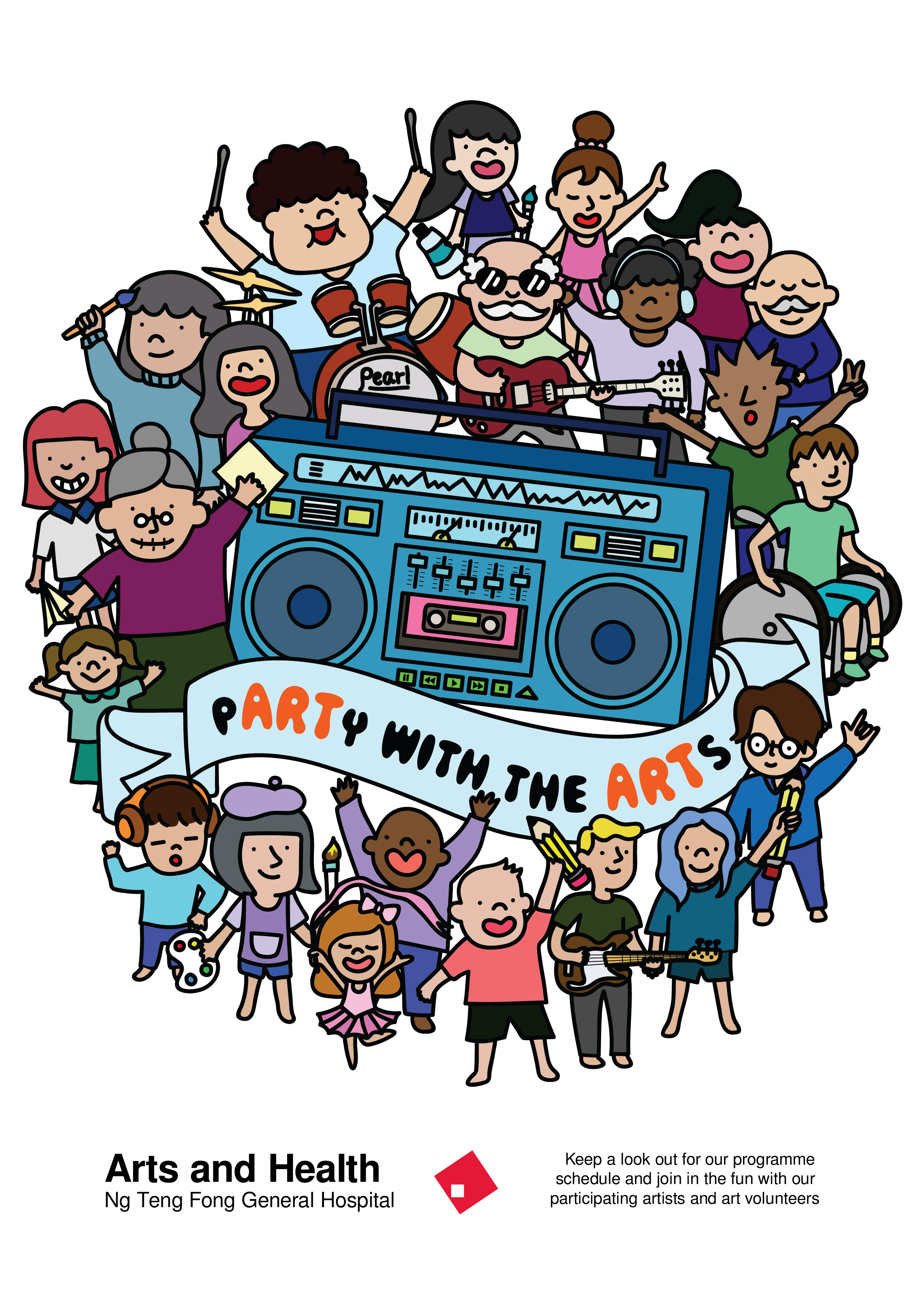
Project 2: Task 3 – Design refinement & Mock up

After receiving various feedback, I worked on the colour variations and moved people around to get a better sense of the hierachy within the design.
I tried to play with the colour of the banner to bring out the slogan. When I printed this out in A2, I realised that the lines became really thick when the poster Read more →
Project 2: Task 2 – Design Exploration

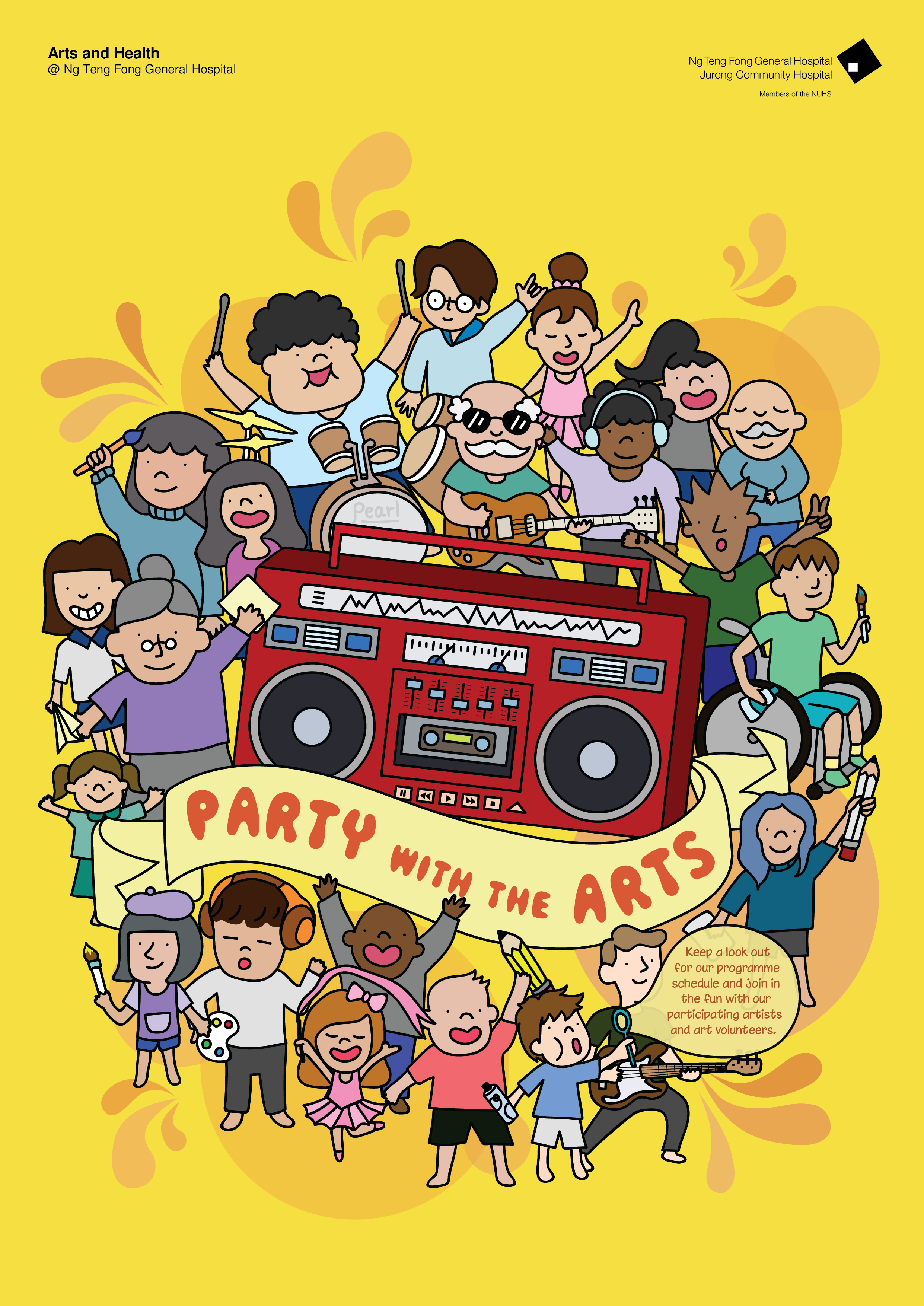
The slogan that I decided to explore further was “pARTy with the ARTs”.
So to incorporate the party within the design, I added a boombox with a community of people of all ages to signify the party and added elements of arts within. I tried to keep it within a circle shape but I still have to explore more and keep Read more →
Poster Exhibition
Final Design of Artwork
My concept is caring.
The main character in my poster is elephant.
Why I choose elephant?
In Christian, elephant is an icon of temperance, patience, and chastity. While as a Chinese symbol, the elephant is considered a symbol of happiness.
Action of the elephant is showing happiness. Coming down from the slides which is a piano keyboard with happy face. Elephant acts as the volunteer. Read more →