Initially I wanted to do a dye-cut of the pinball machine, a continuation of my design for the poster but after feedback and much consideration, I decided that a dye-cut might not be necessary as it would be harder to determine the folds of my design.
FOLD
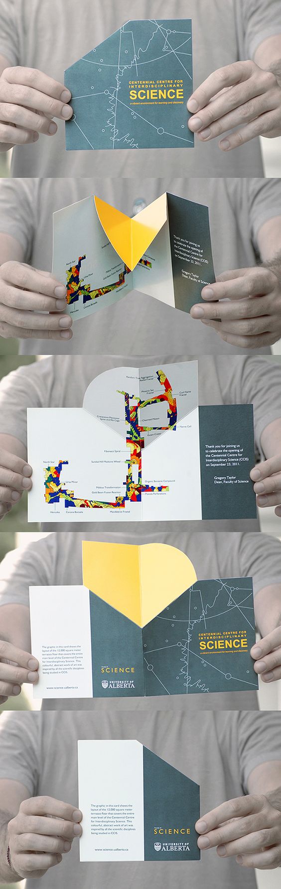
I found this fold online that I thought was pretty interesting and would work well with my design.
Final Design

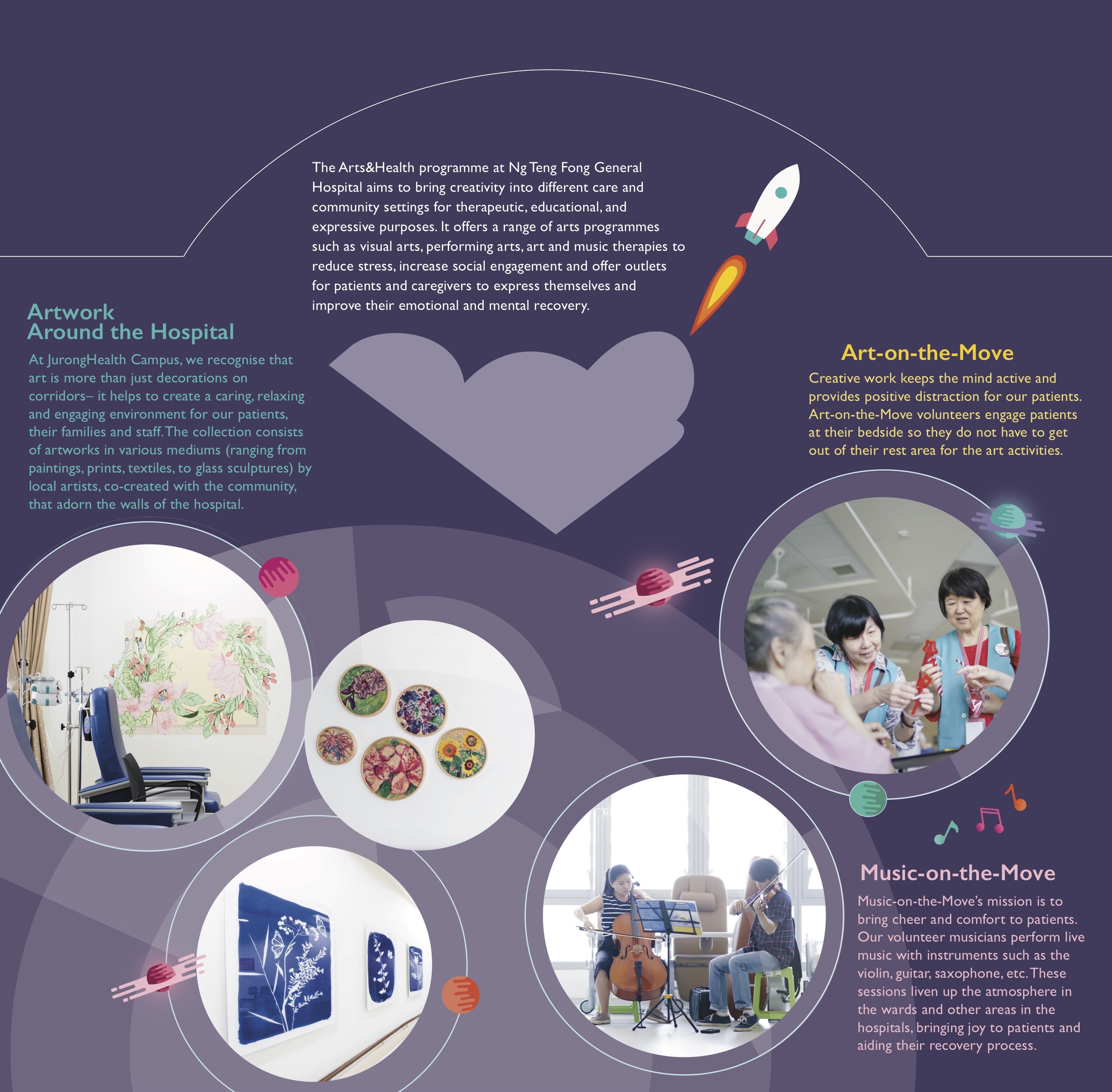
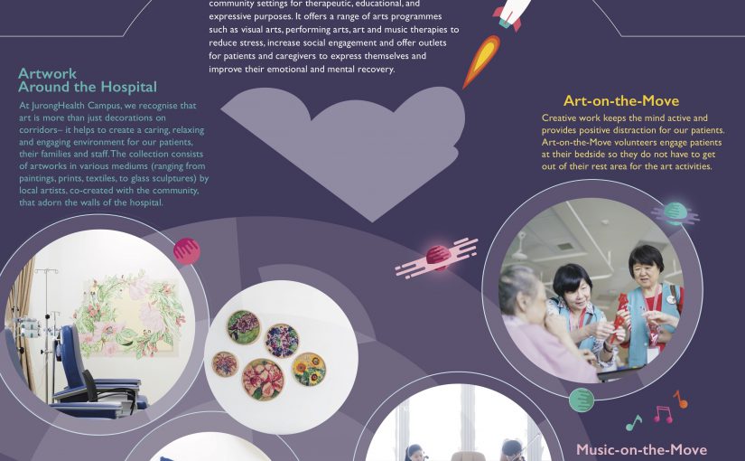
I stuck with the whole pinball & space theme where each of the programme is placed in a circular shape to represent different planets that volunteers can explore. I used different opacities of the circular orbitals to accentuate the background and illustrations of the planets as accents to the images. The use of the rocket on the front page followed by the inside spread is to represent the journey that one may embark on when they join the Arts&Health programme at the hospital.
Problems & Feedback
After my first consult with Michael, I learned about the use of hierarchy in my layouts. For instance, the spacing between text, colours, balance etc. determines what you want the reader to notice at first glance. I struggled a lot with the placement of my text on the front cover and found it hard to find a balance between the frame and the elements inside of it. Text placement was also an issue for me where the curvature of my “explore” did not fit with the texts that came below it and I had to rearrange, change the colours a few times to find the “perfect fit”. One of the things I learnt was how to use different shades of a colour to create visual hierarchy and that I should avoid using colours of the same shade if I want to create emphasise on certain elements.
Overall, I was pretty satisfied with my design but if I were to change anything, it would probably be the logo placement where the main hospital logo is in front and the arts and health logo at the back (and to avoid changing the logo colour). The “angular cloud” on the inside spread could also be better managed where I either change the placement or change the colour of the background of the semi-circle area if not it feels a little disconnected from the main page.