FINAL PRINT

FINAL PRINT
Initially I wanted to do a dye-cut of the pinball machine, a continuation of my design for the poster but after feedback and much consideration, I decided that a dye-cut might not be necessary as it would be harder to determine the folds of my design.
FOLD
I found this fold online that I thought was pretty interesting and would work well with my design.
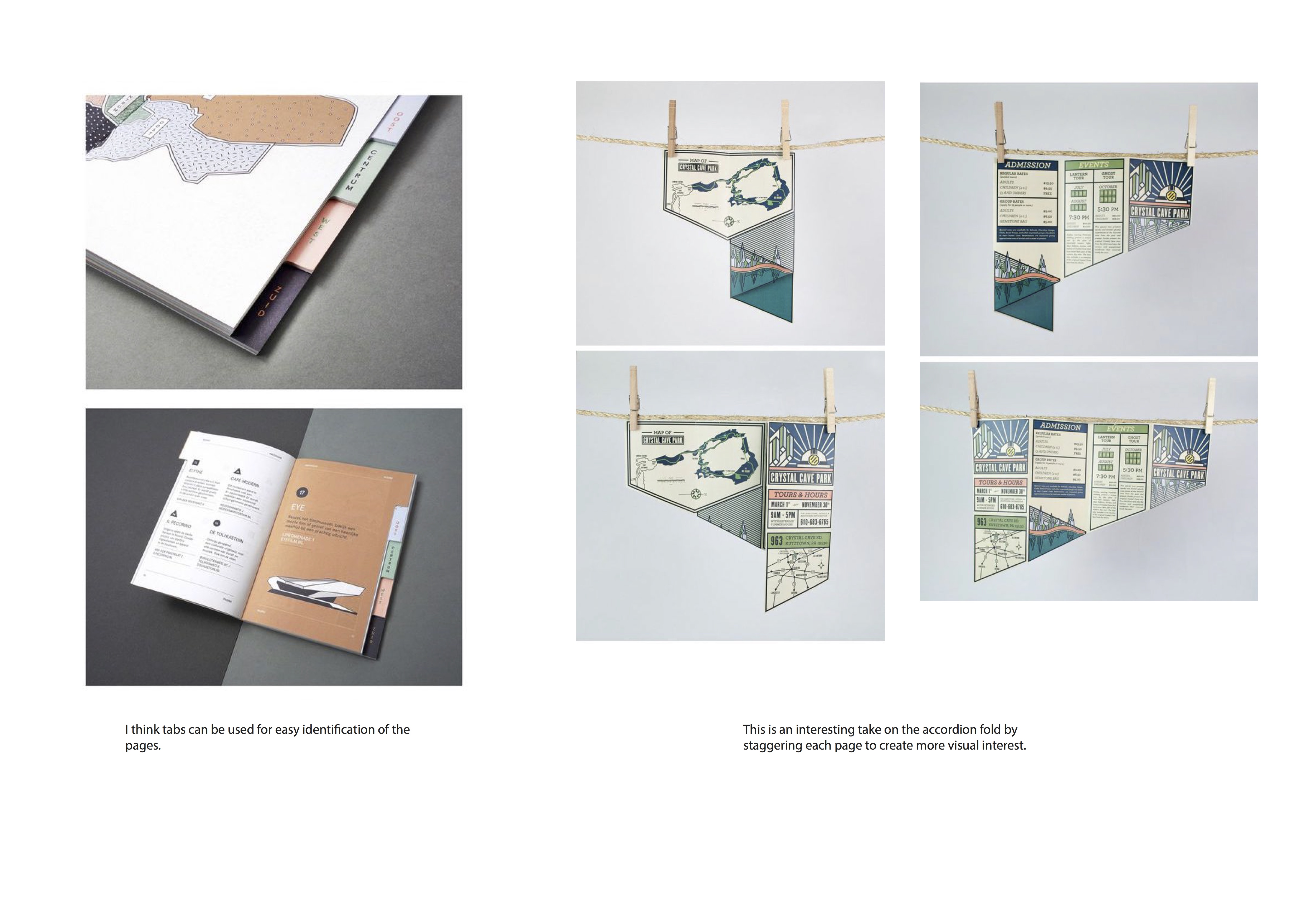
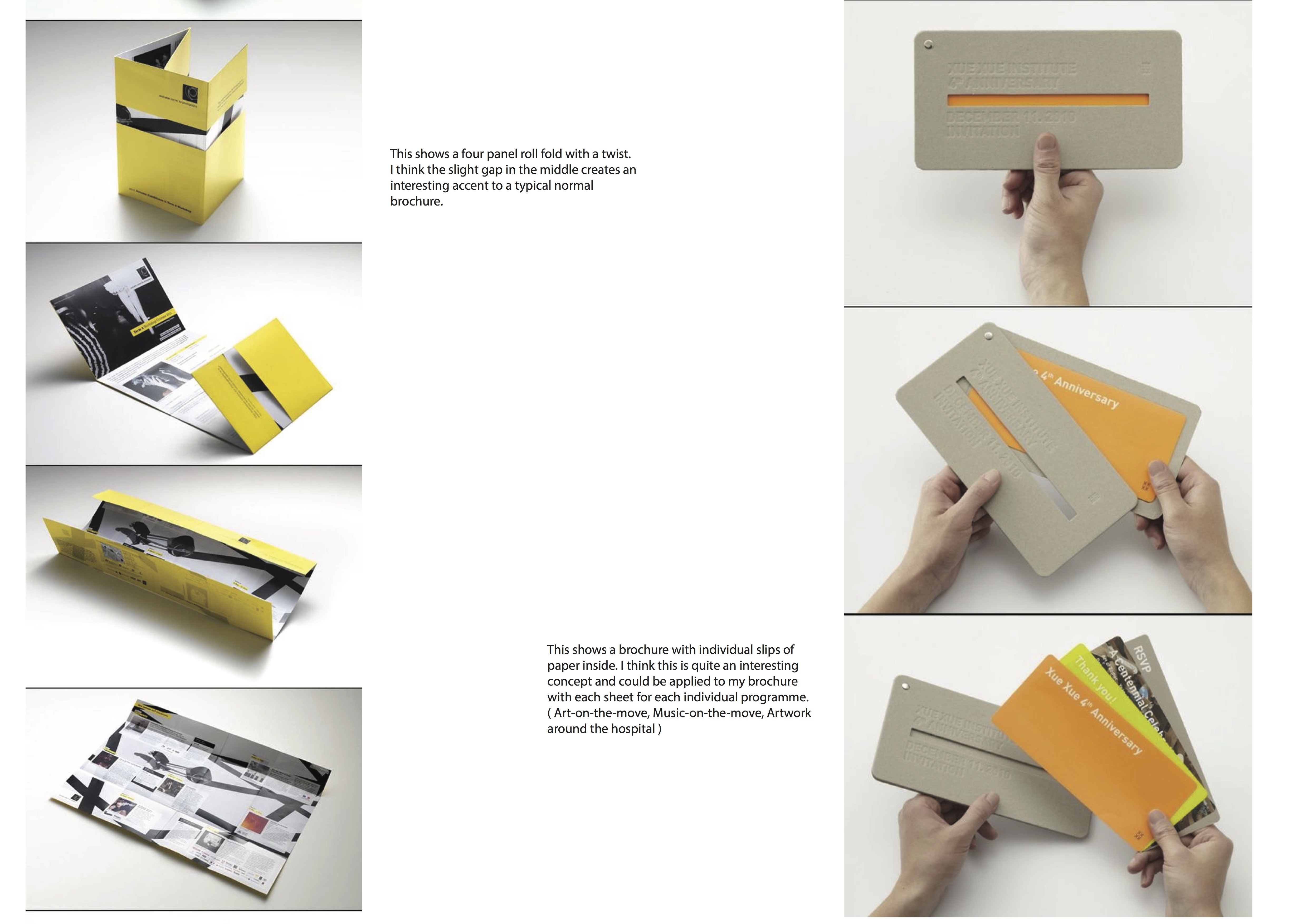
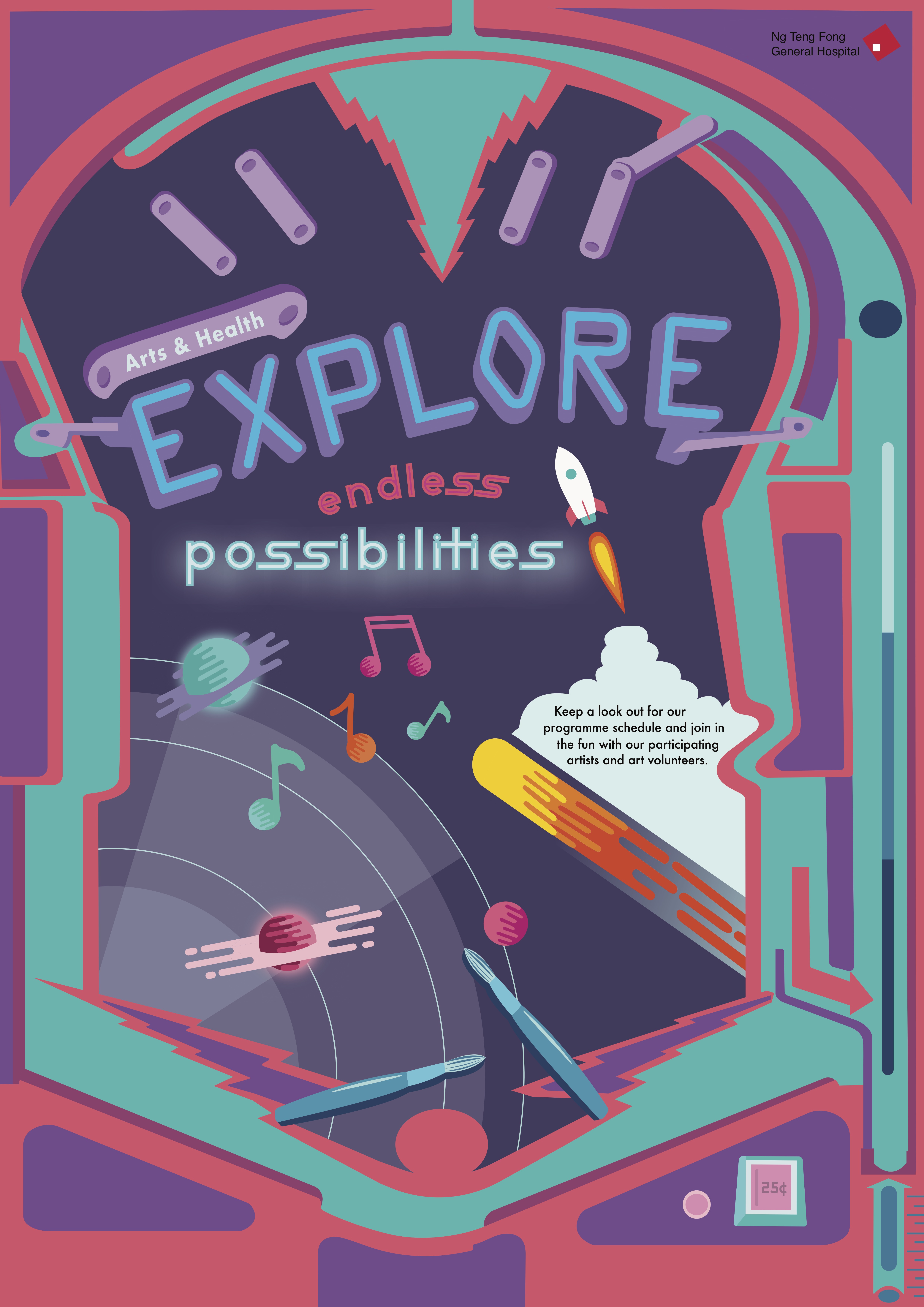
Final Design

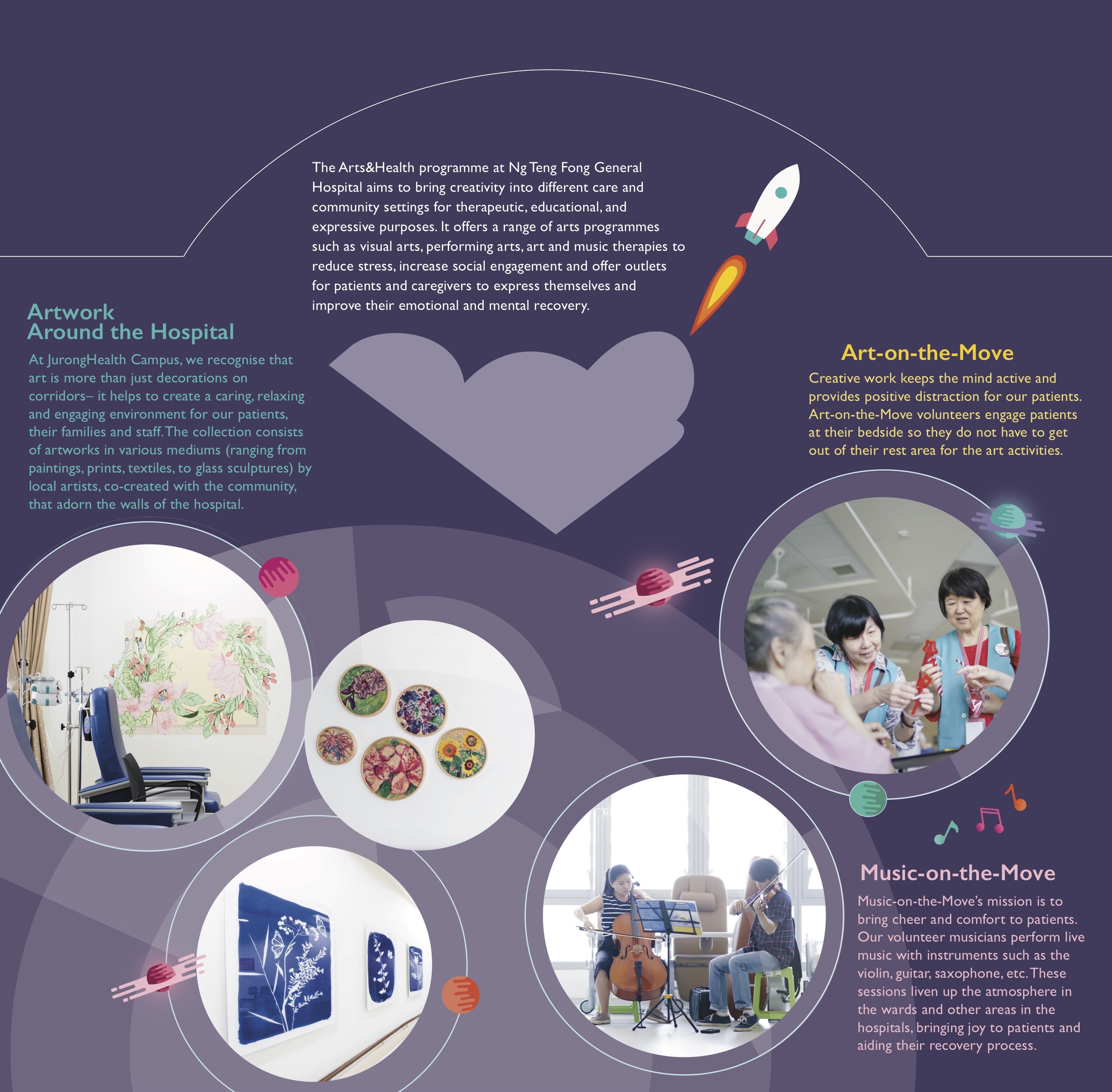
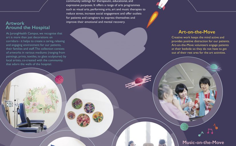
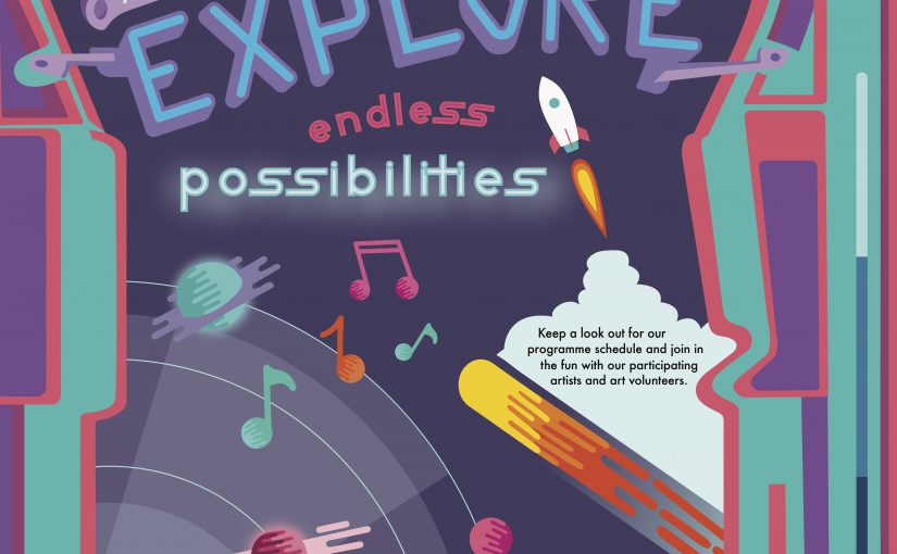
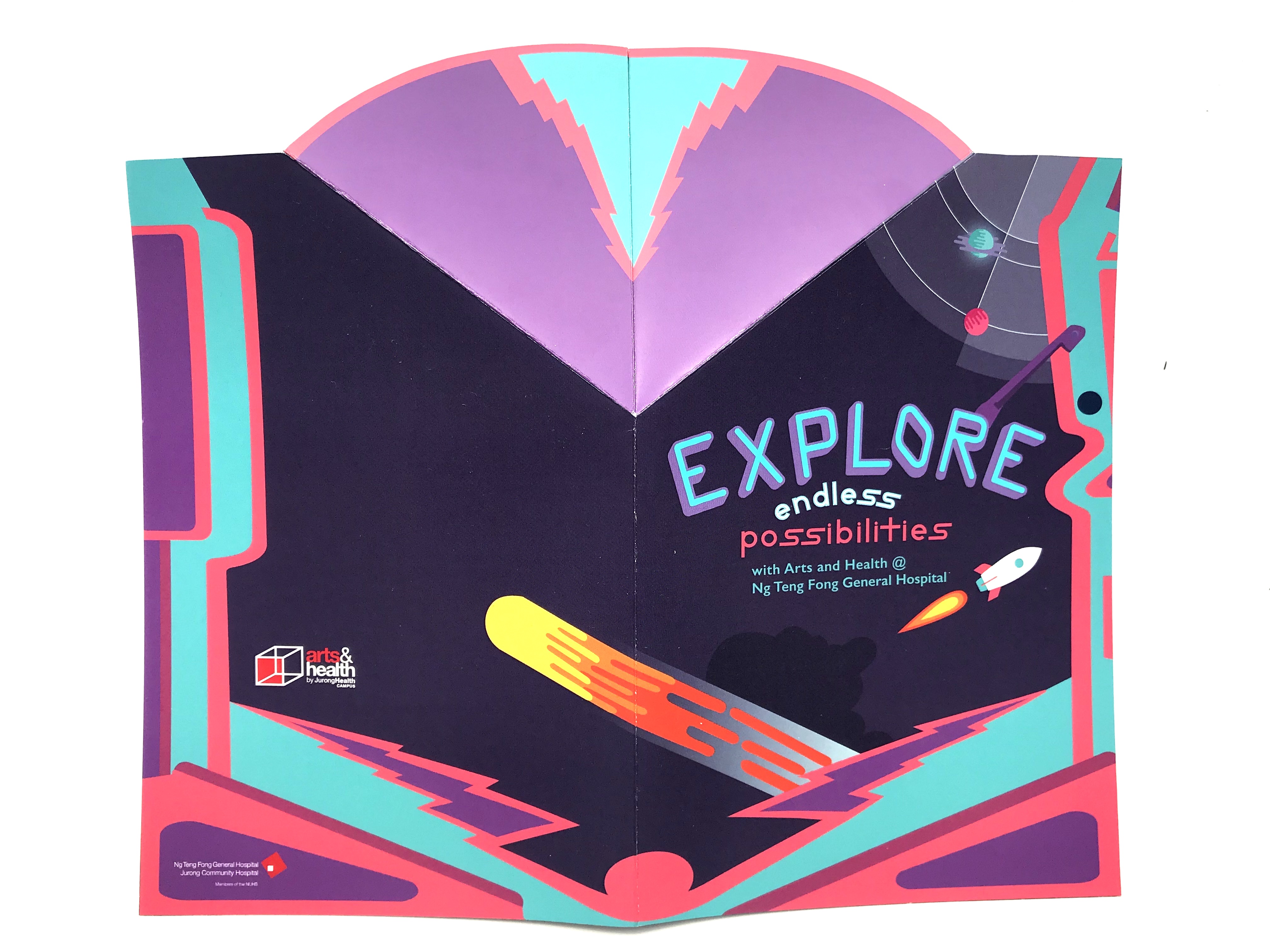
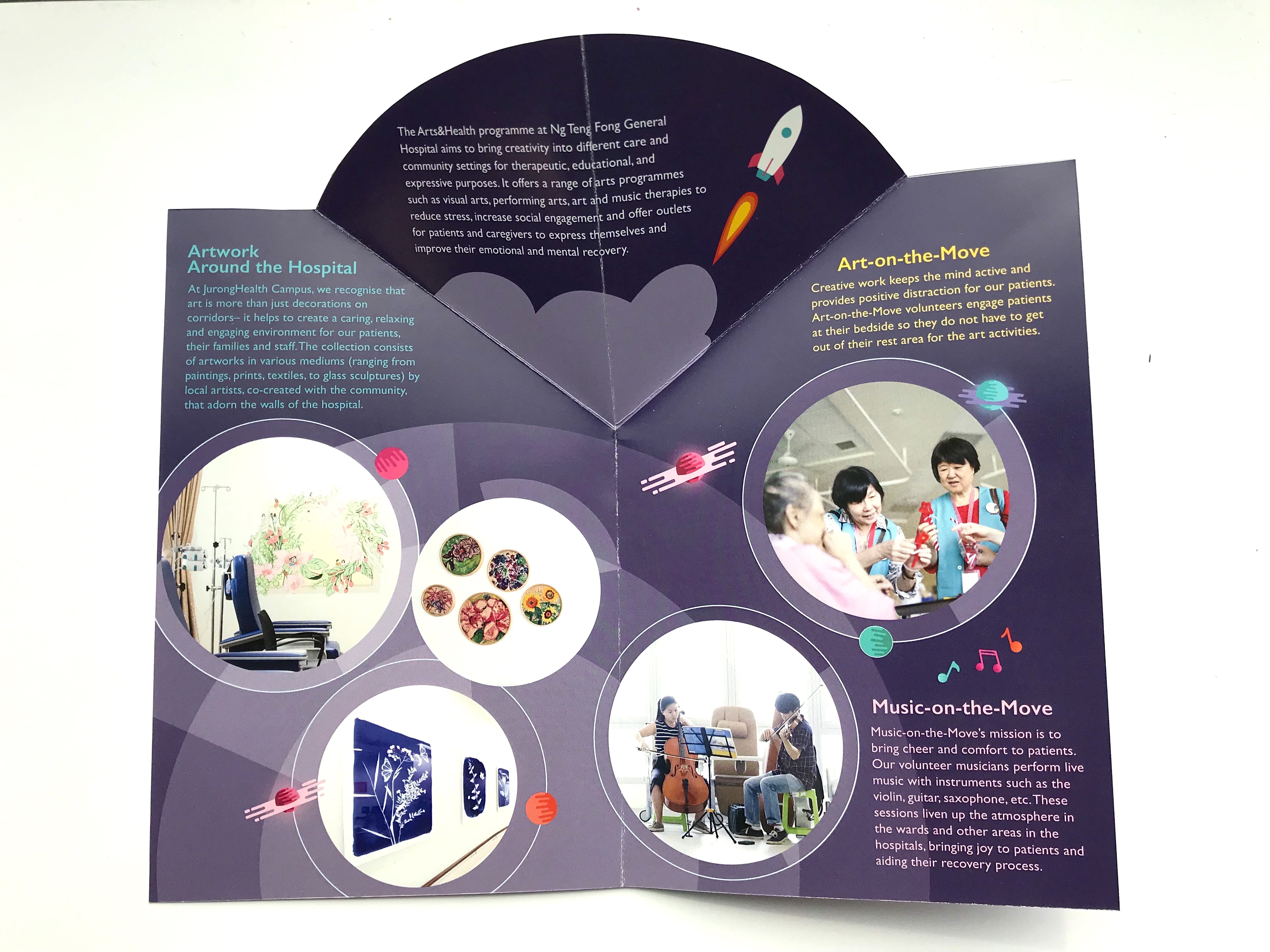
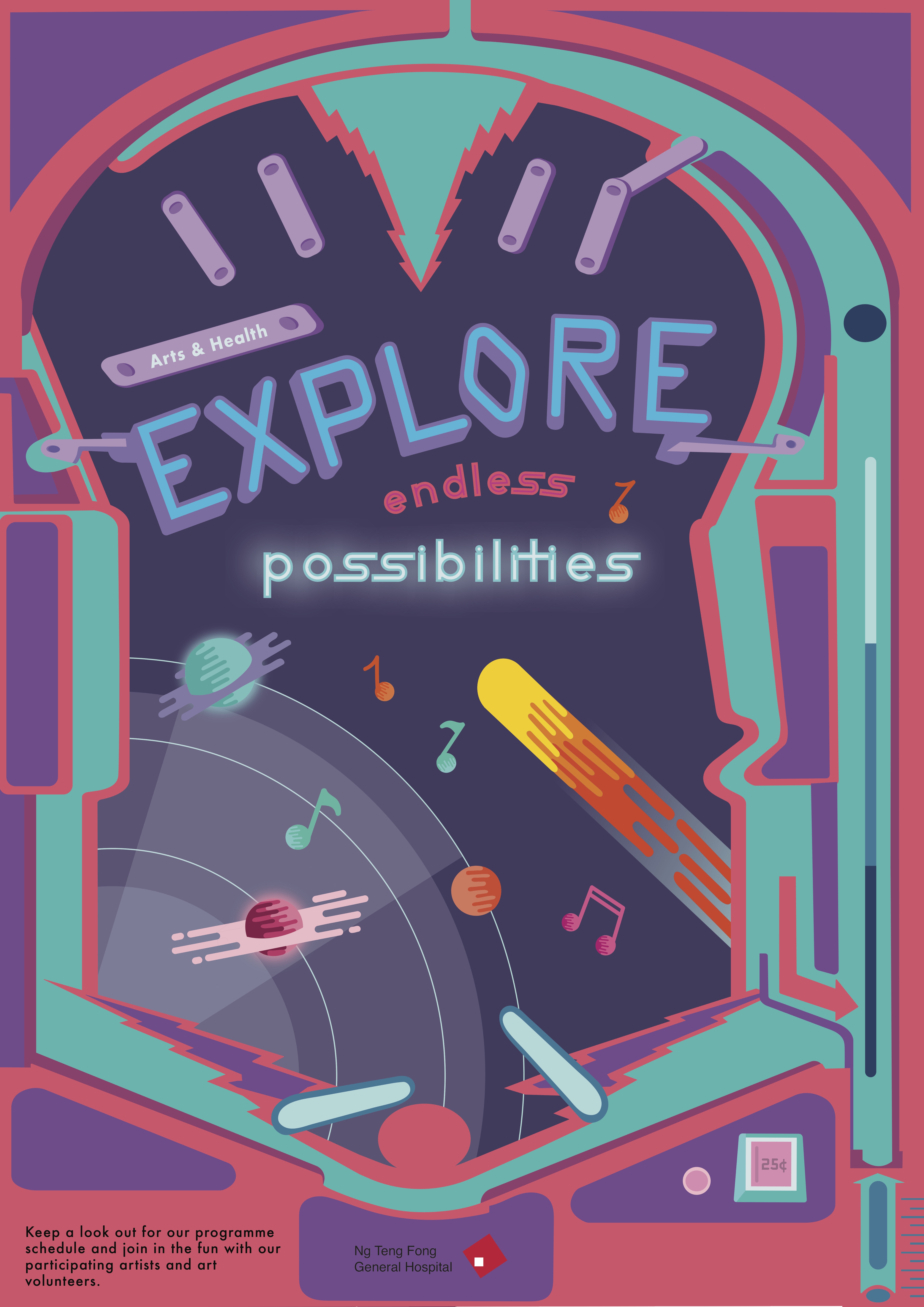
I stuck with the whole pinball & space theme where each of the programme is placed in a circular shape to represent different planets that volunteers can explore. I used different opacities of the circular orbitals to accentuate the background and illustrations of the planets as accents to the images. The use of the rocket on the front page followed by the inside spread is to represent the journey that one may embark on when they join the Arts&Health programme at the hospital.
Problems & Feedback
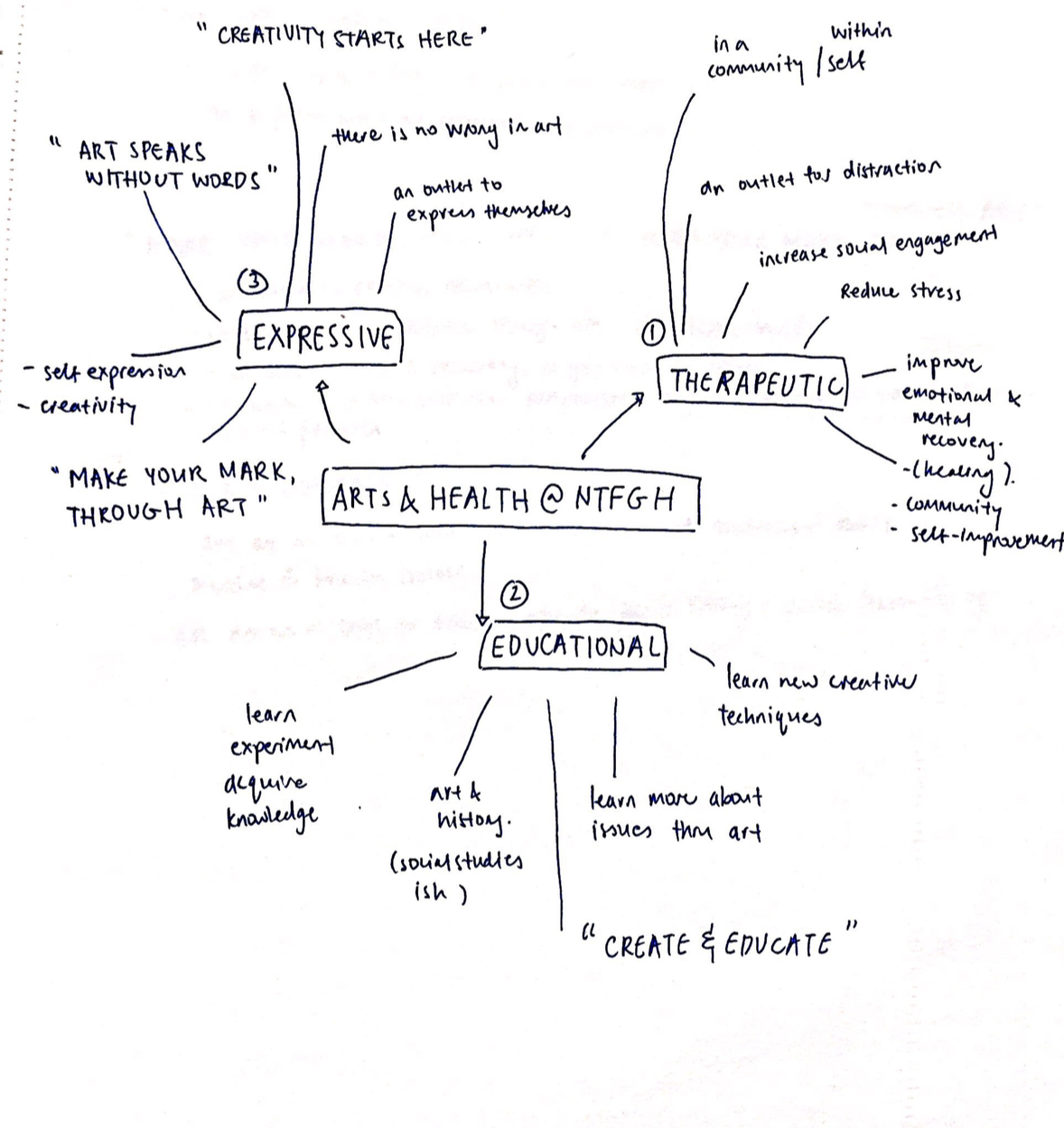
After my first consult with Michael, I learned about the use of hierarchy in my layouts. For instance, the spacing between text, colours, balance etc. determines what you want the reader to notice at first glance. I struggled a lot with the placement of my text on the front cover and found it hard to find a balance between the frame and the elements inside of it. Text placement was also an issue for me where the curvature of my “explore” did not fit with the texts that came below it and I had to rearrange, change the colours a few times to find the “perfect fit”. One of the things I learnt was how to use different shades of a colour to create visual hierarchy and that I should avoid using colours of the same shade if I want to create emphasise on certain elements.
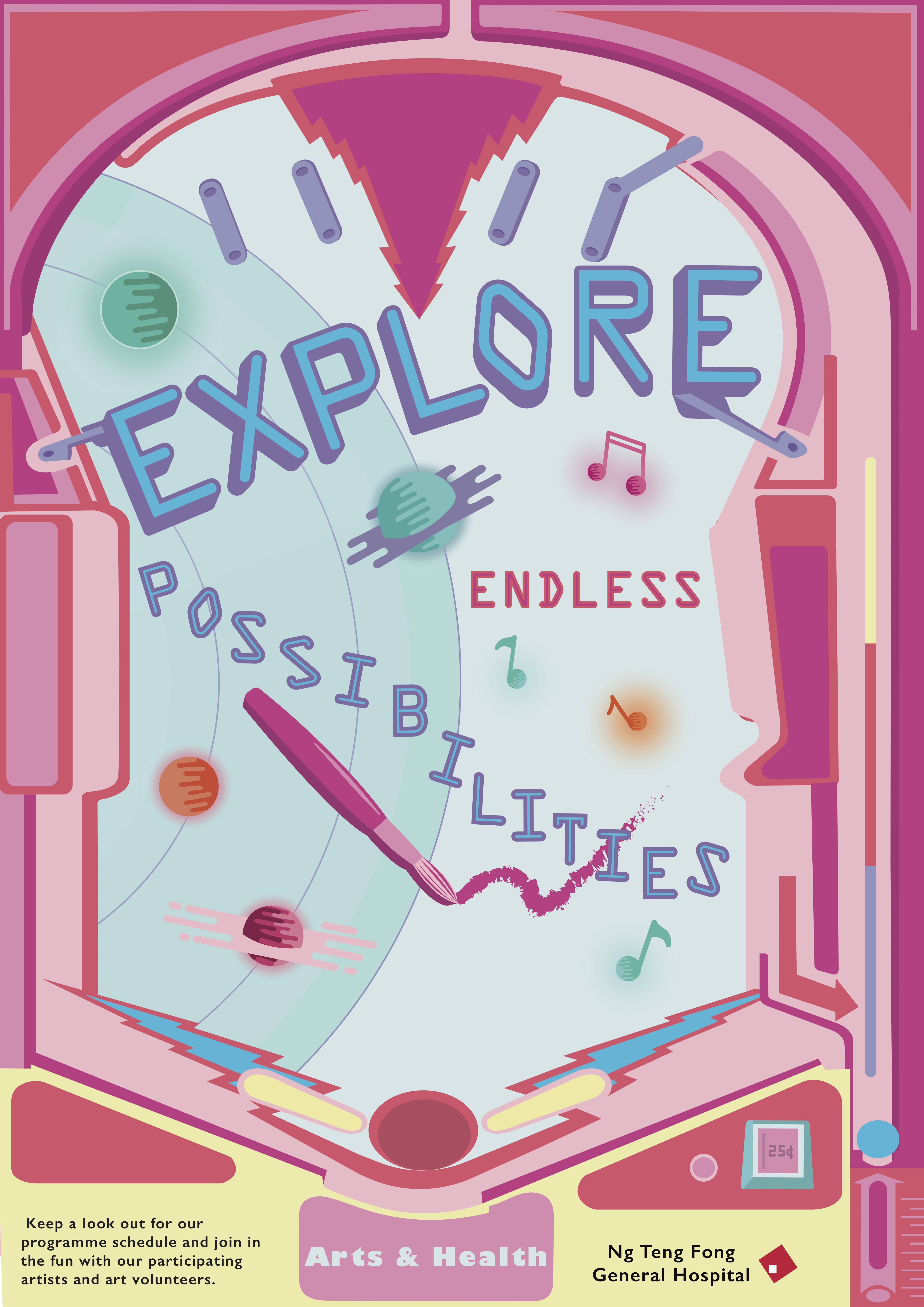
Overall, I was pretty satisfied with my design but if I were to change anything, it would probably be the logo placement where the main hospital logo is in front and the arts and health logo at the back (and to avoid changing the logo colour). The “angular cloud” on the inside spread could also be better managed where I either change the placement or change the colour of the background of the semi-circle area if not it feels a little disconnected from the main page.

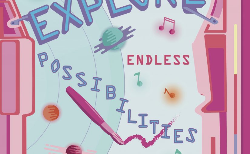
Based on feedback gathered in class, this was what I came up with.
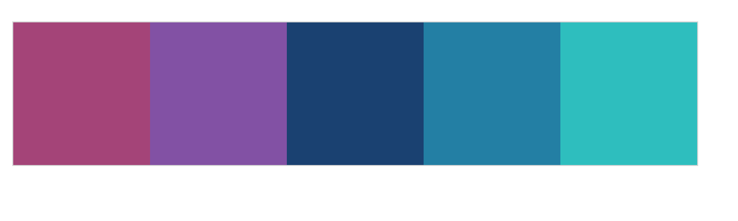
I decided to stick with a more consistent colour palette that is darker with accents of brighter colours compared to my previous one that was rather lacklustre in terms of colour choice.
Feedback gathered from Michael was:
Revised design
Takeaways and Reflection
I think this project really helped to push me to do a full on A2 illustrated poster and I really learned a lot from this assignment. I learned about poster layouts, colour schemes, text placement, choice of typefaces etc. I know that my poster design is not the best but I am proud of myself for being able to come out with this from the first initial draft. Moving forward, I would probably change the “NTFG” hospital logo to white to increase visibility, decrease the opacity or colour of the cloud to make it less striking, cut the space at the bottom of the poster, tighten the lines in between the slogans and probably reconsider the arrangement of the graphics in the middle to make it more “organised”. But yea overall, it was a great learning experience that I will take with me as I continue onto future projects.
The final design that I decided to continue working on was the idea of a pinball machine. My final slogan was ” Explore endless possibilities”. I thought the theme and concept of a galaxy pinball machine really fits the idea of emoting fun, adventure, exploration etc.
My initial draft was to include the entire pinball machine in the poster. However, feedback gathered was that I did not need to show the entire machine for people to know it was a pinball machine. I should focus instead more on the actual pinball table itself.
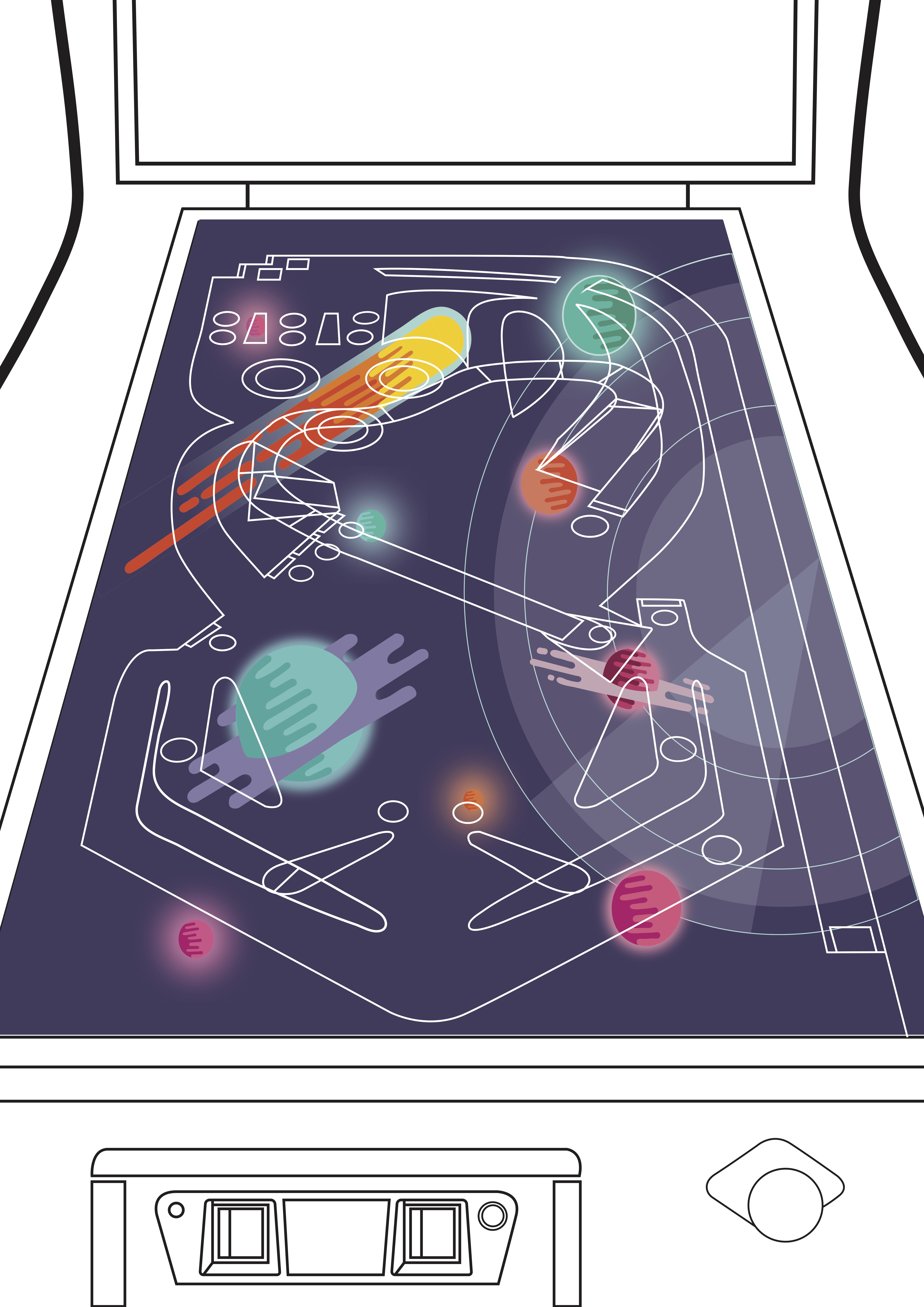
For my second draft, I struggled a lot with the colour palette as well as placement of objects in the centre. Hence, everything just ended up rather scattered, unfocused and messy.
Feedback gathered:
Moodboard
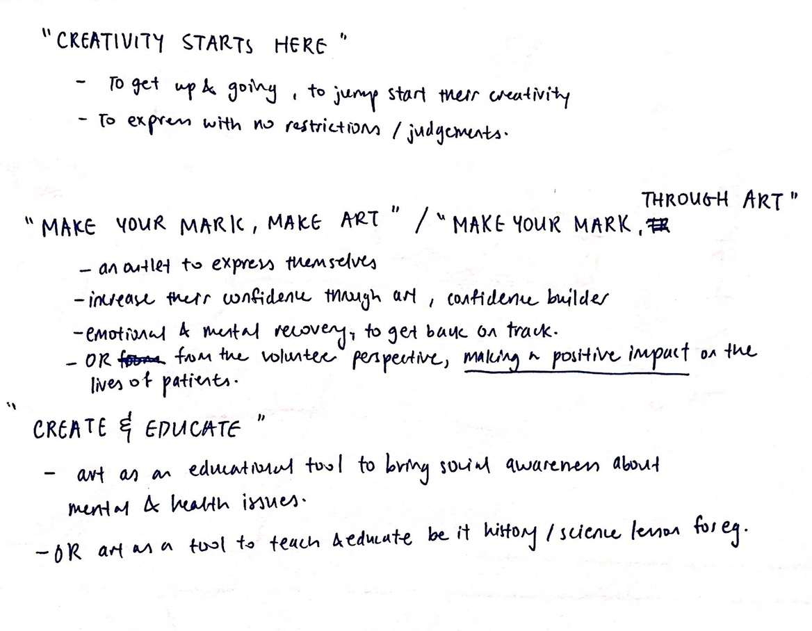
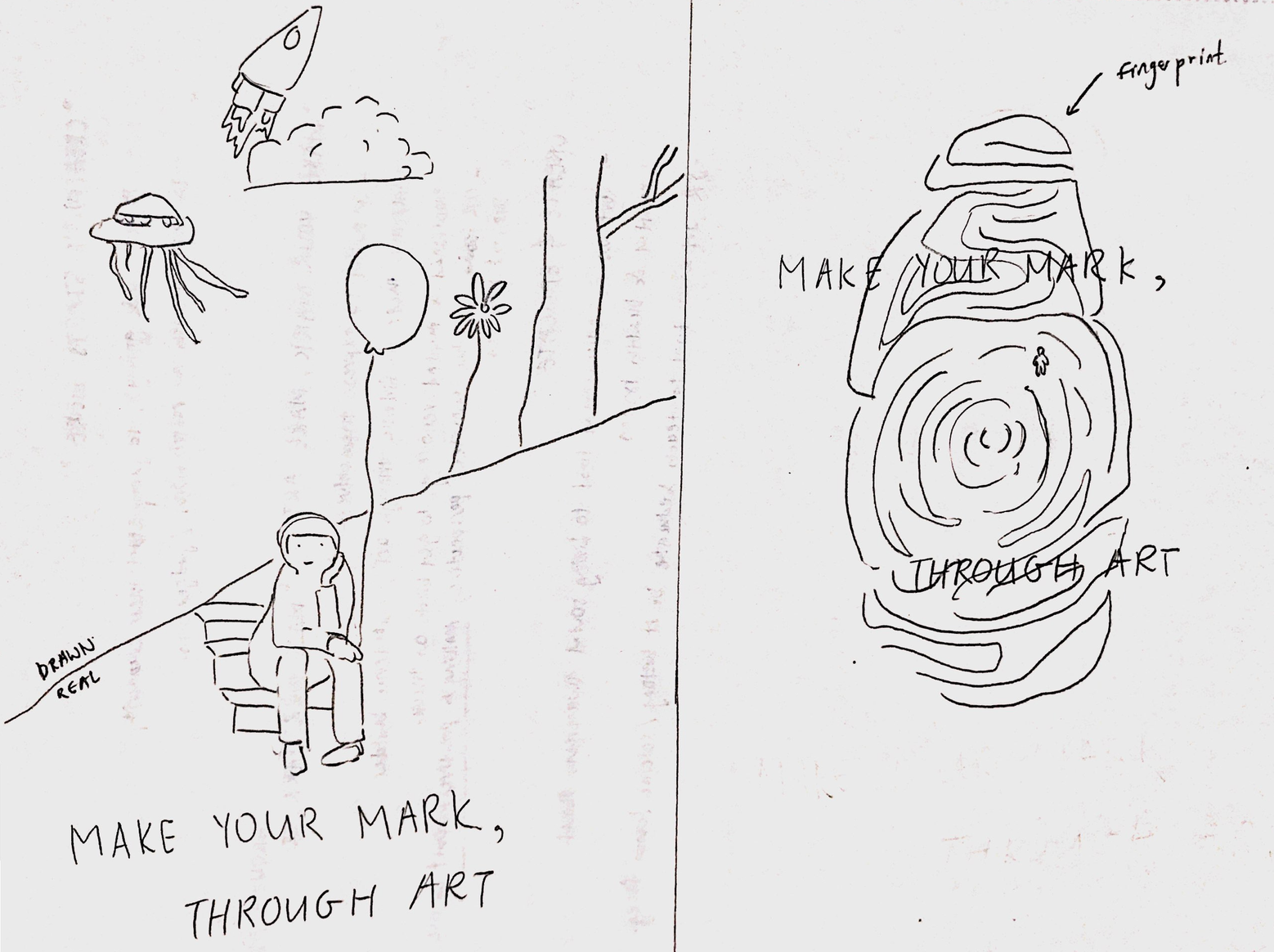
Make your mark through art
Possible elements: fingerprint, footprint, illustrations and real photos, touching hands

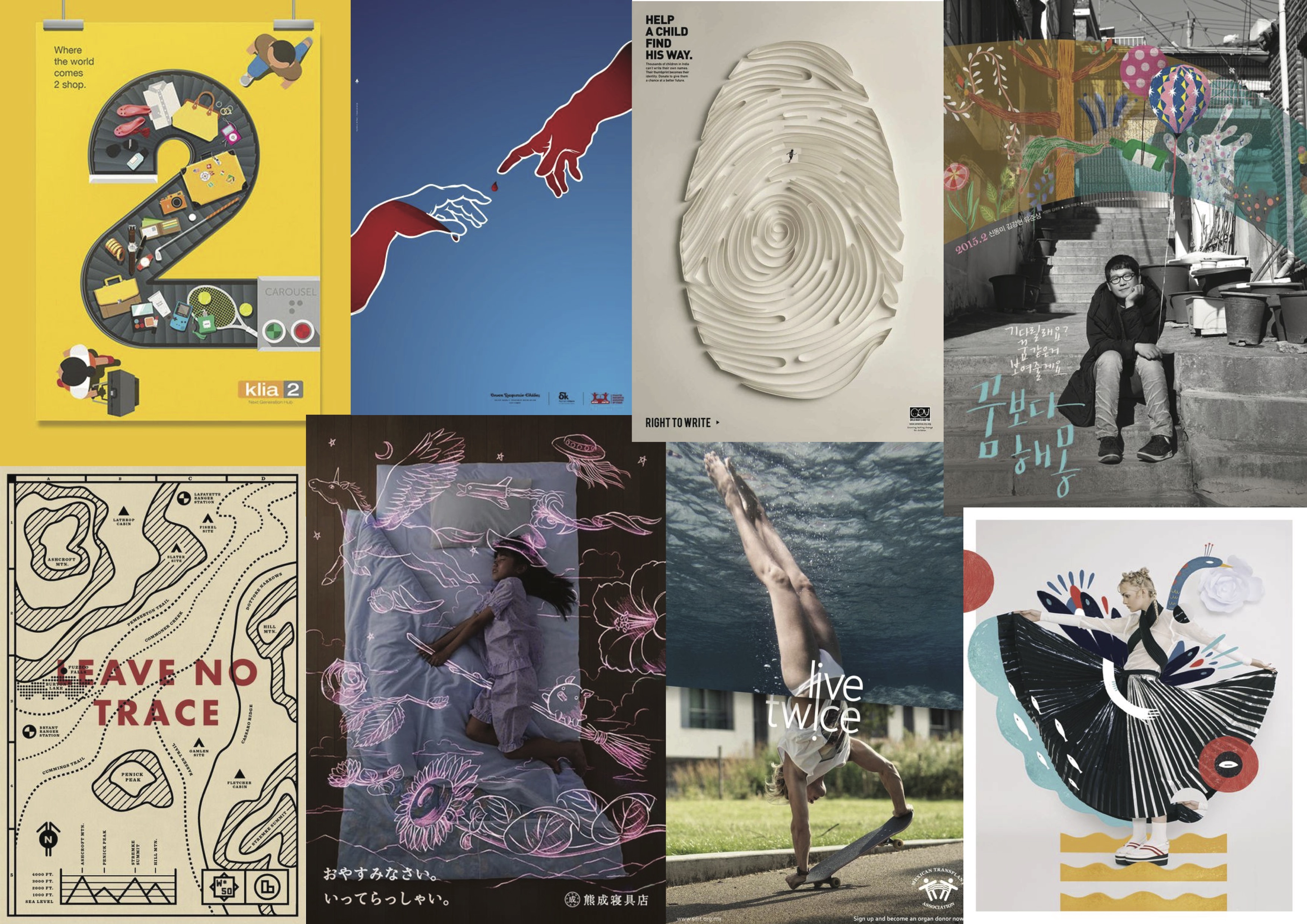
Illustrative posters


Illustrations + photographs
Photography/ Digital collage
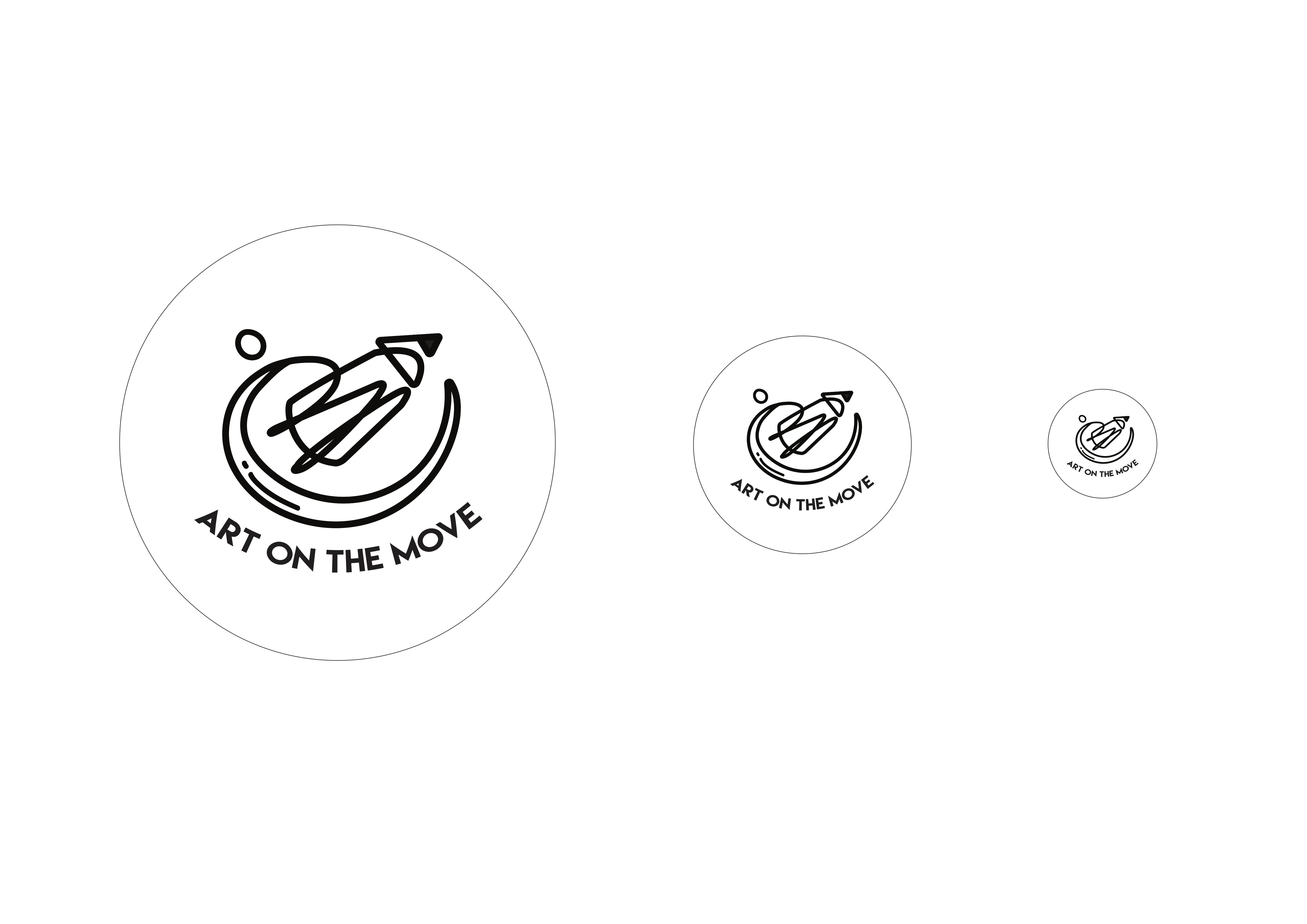
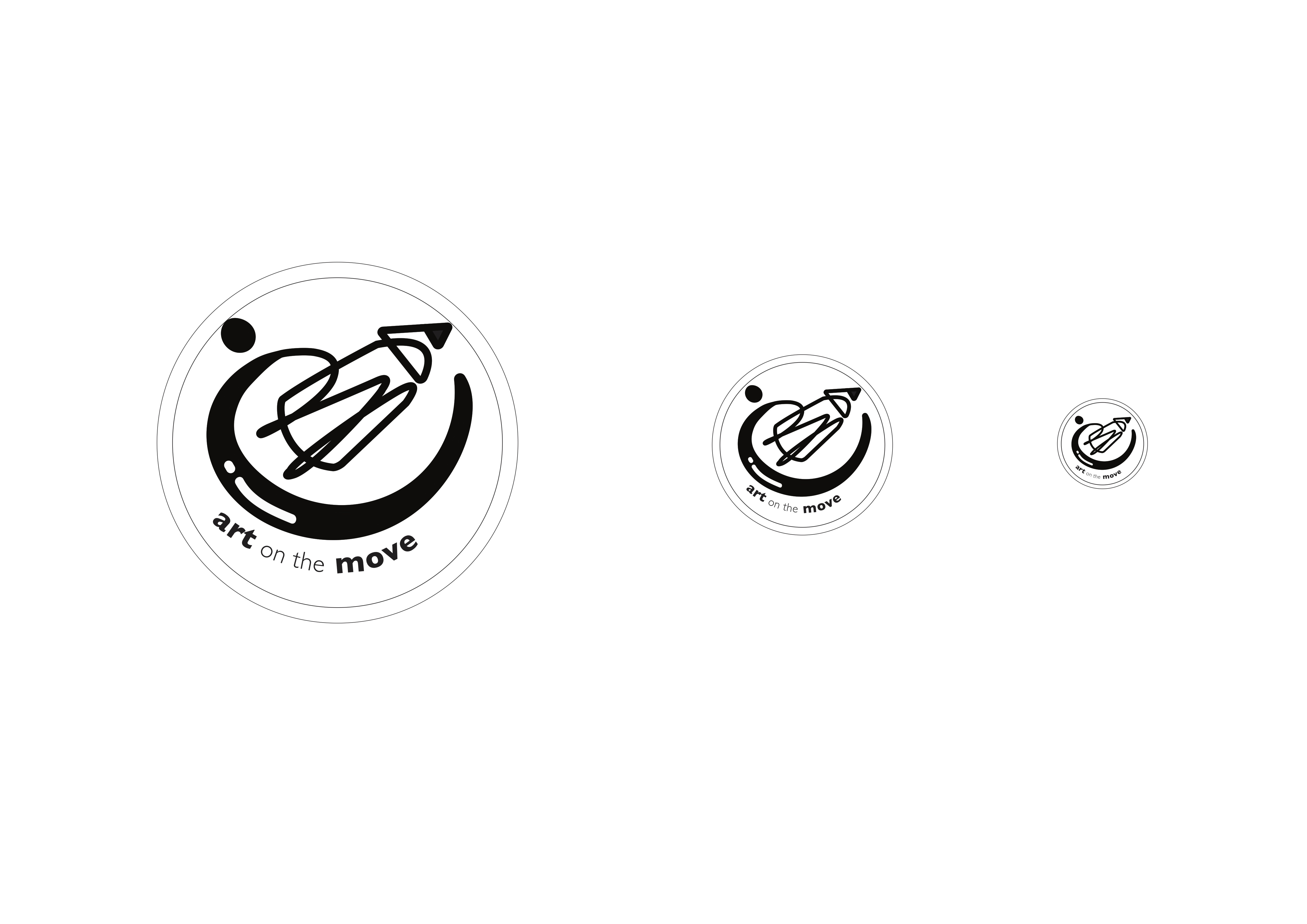
Final Design
My final design concept is titled “Sense of community” . I felt that the “Arts on the move” programme provides patients with more than just an outlet for stress relief or distraction. The fact that the hospital provides a platform for local artists to showcase their works along with the works of some of the patients shows a collaboration amongst local artists, staff and patients in the same space. This allows for the formation of a community spirit in an environment that is no longer sterile and unfamiliar.
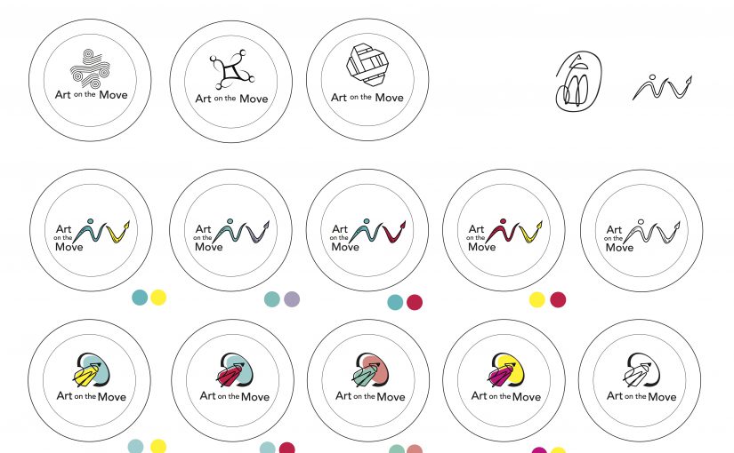
My design shows a figure interconnected with a pencil, symbolising the integration of each person in the community into the programme as well as the integration of arts into the environment and lives of patients at the hospital. The choice of shape of the logo, a circle, suggests community, friendship, relationships and unity. The choice of the colour blue, is a sign of stability and reliability as well as serenity and calmness, all traits that are important in invoking a sense of community. 


After the feedback gathered in class, I made some changes to my pencil design such as making the swoosh downwards instead of up and integrating an element of “community” in the design.
After more feedback from Michael, I decided to add more visual weight in my design and change the text font as well as orientation.
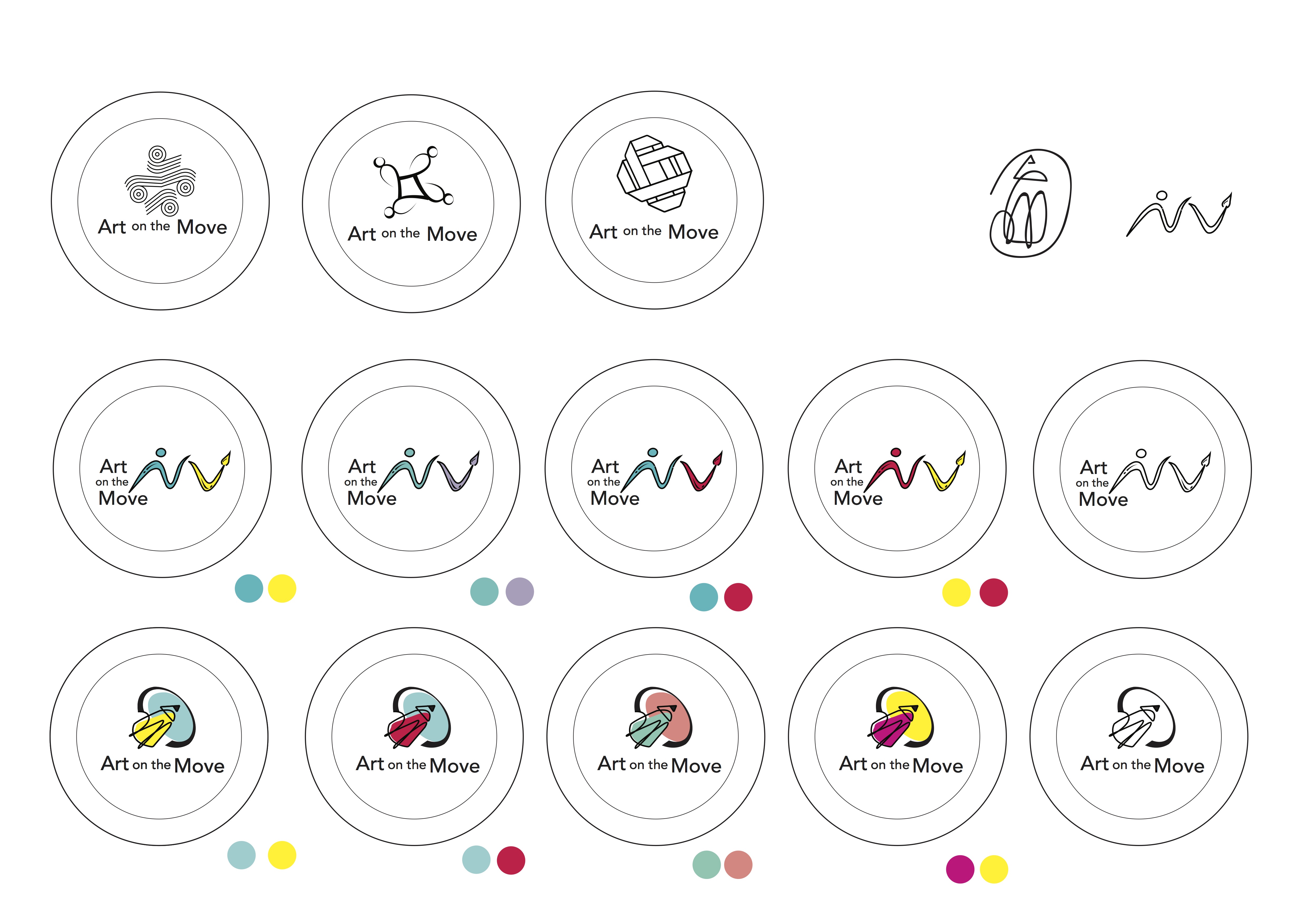
Colour Exploration

I played around with analogous colour schemes such as blue and green, orange and yellow as well as contrasting colours like yellow and blue to bring some vibrancy in the design. However, I felt like the colours felt a bit too “contained” within the black lines.
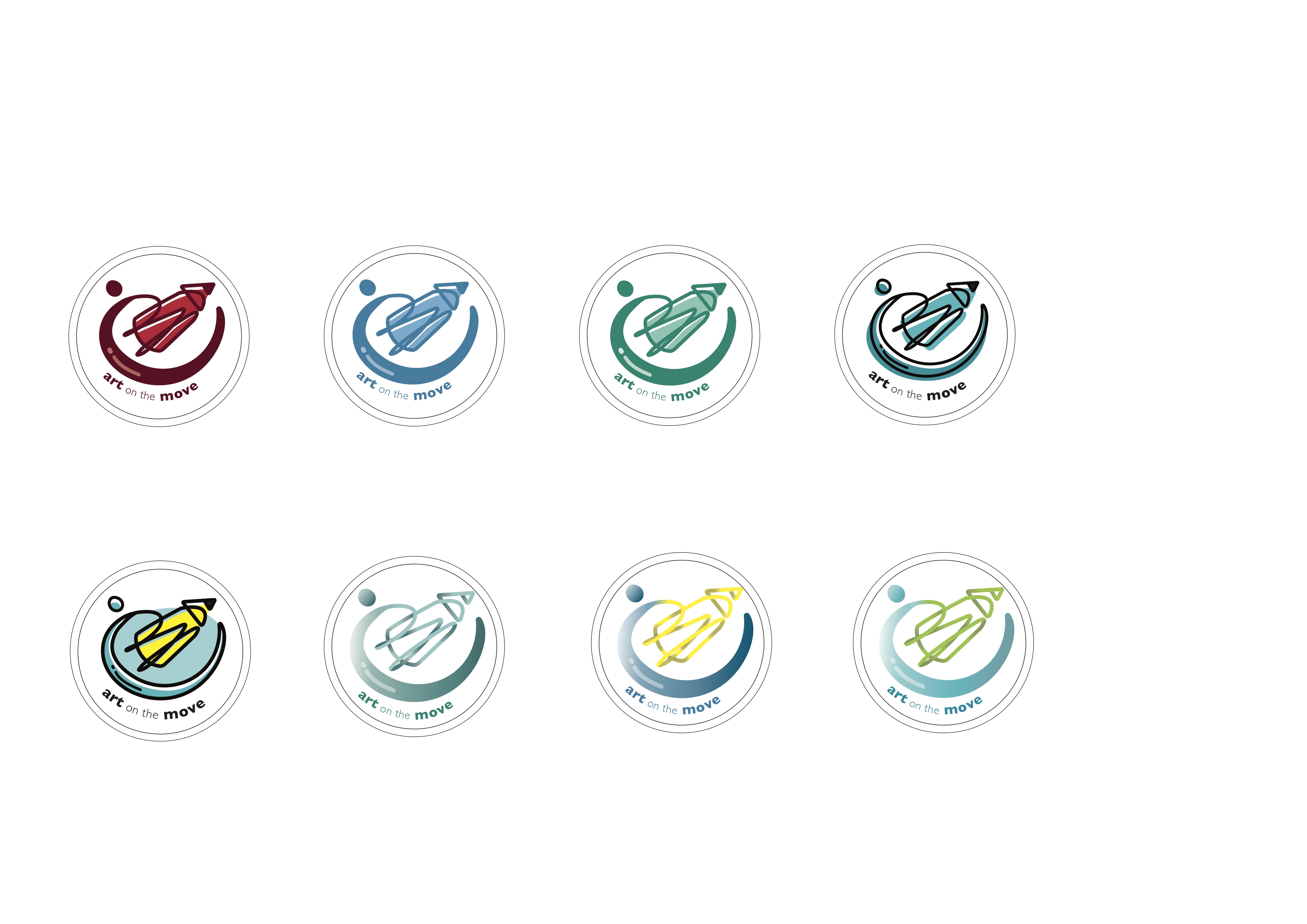
Subsequently, I tried different techniques such as gradient tones and playing with the shades of one colour. However, incorporating gradient in the lines made the “swoosh” lose its form. Hence, I decided to go with the flat colours instead and stick with the shades of one colour.
After conceptualising the possible themes I wished to explore, I went more in depth into the possible logo designs.
Initially, I was really interested to do my first concept which was ” A sense of familiarity” so I did a table based on a class exercise we did to explore the possible visuals I could come up with. It was really difficult and I found it hard to simplify the sketches or connect my concept with the mission and spirit of the programme.

I was really interested in the idea of lamps and I tried to combine the idea of 3 ethnic groups represented by each lamp. The concept was that light gives a sense of warmth and home as well as encapsulates the passion and spirit of the community. I also tried to incorporate some batik or traditional motifs into the designs.
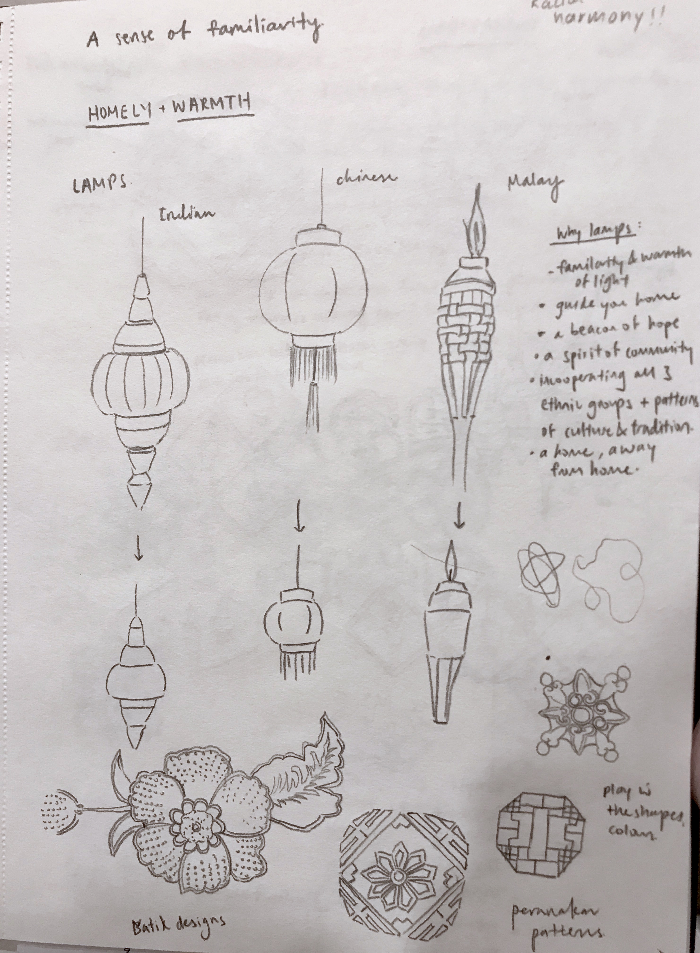

I played around with the different orientations and arrangements of the lamps. However, after feedback from the class and Michael, I realised that my designs came off more “cultural” and “racial harmony day” rather than “arts on the move”. Michael mentioned that one of the pattern motif I drew looked quite interesting so I decided to explore further and see how I could incorporate “arts” into it while simplifying and making it look more like a logo.
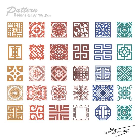
I looked more into tile patterns and explored the possible designs I could do. Since my inspiration was drawn from the Peranakan tile patterns, I looked more into the culture and customs of the Peranakan community and found that it actually tied quite well with the concept I was going for.
Peranakans retained their Chinese beliefs but also adopted local indigenous lifestyles such as having their own variations of the Malay language, Baba Malay. The culture also focuses a lot on family unit, an important facet of the peranakans and family members are usually found living under one roof. I felt that it was reflective of the mission and spirit of this programme, which was to bring people together through art and build a community regardless of one’s background or culture.
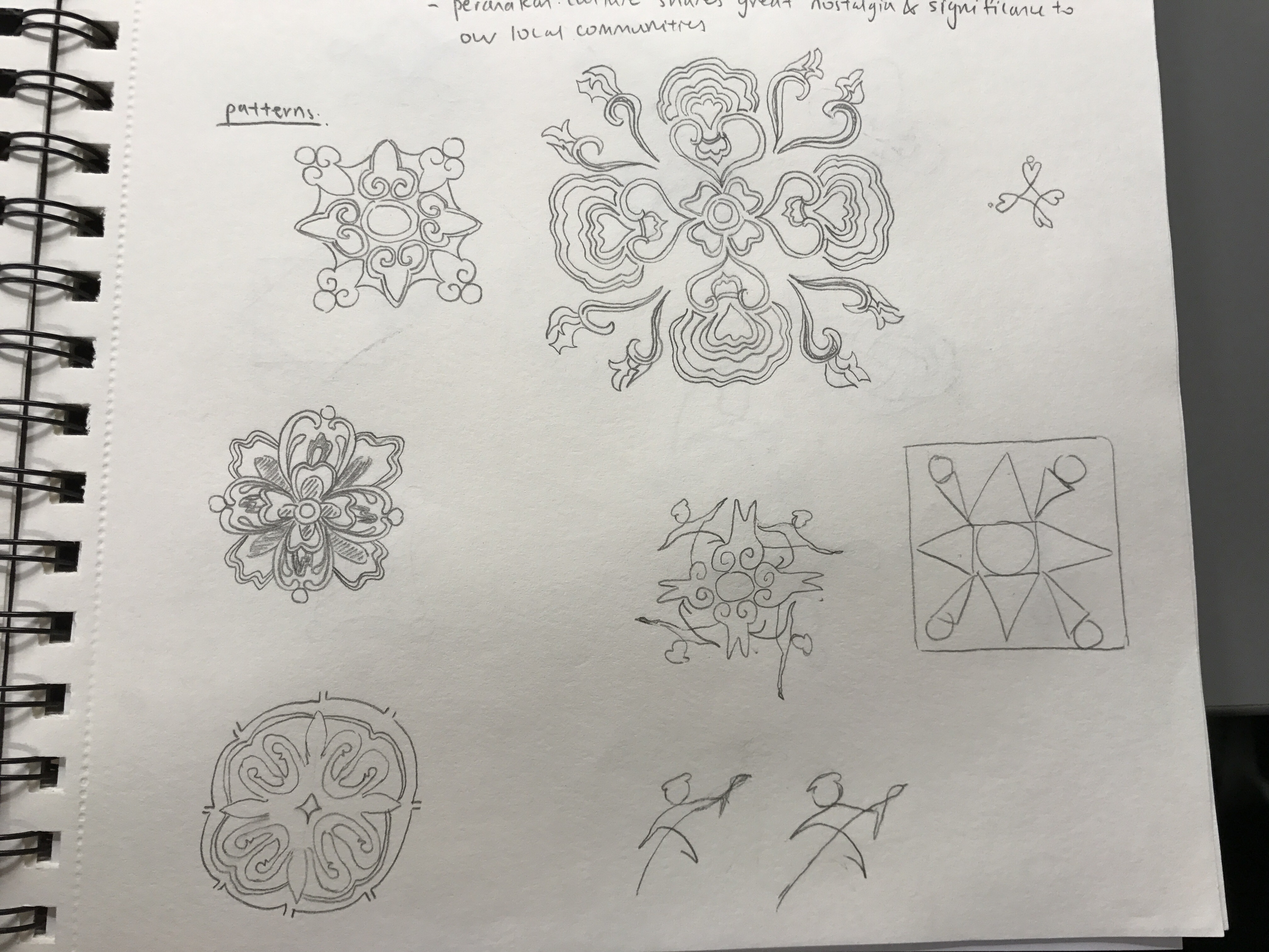
However, yet again, I struggled greatly with simplifying and showing the essence of “art” in the logo. So, I picked out the key idea and shape I wanted which was a circular structure, drawing on the idea of a community, family and interconnectedness. I explored many weaving and interlocking designs.

However, I still found it hard to show the “arts” element. I was afraid my designs would end up looking more “community centre” or “social service” like. As desperation drew close, I decided the best way was to not overthink and just show the obvious, which was to incorporate pencils and paint brushes. However, I felt it was the best way for the logo to stay relevant, distinctive and focused.

I stayed with the idea of community and interconnectedness while adding a bit of fun and quirky-ness into my designs. One big lesson I’ve learned from this process would be to just not over complicate things and overthink my concept, but rather just let the visuals speak for themselves 🙂 Moving forward, I will digitalise my designs and play around with scale, lines and perspective to see what I can come up with.
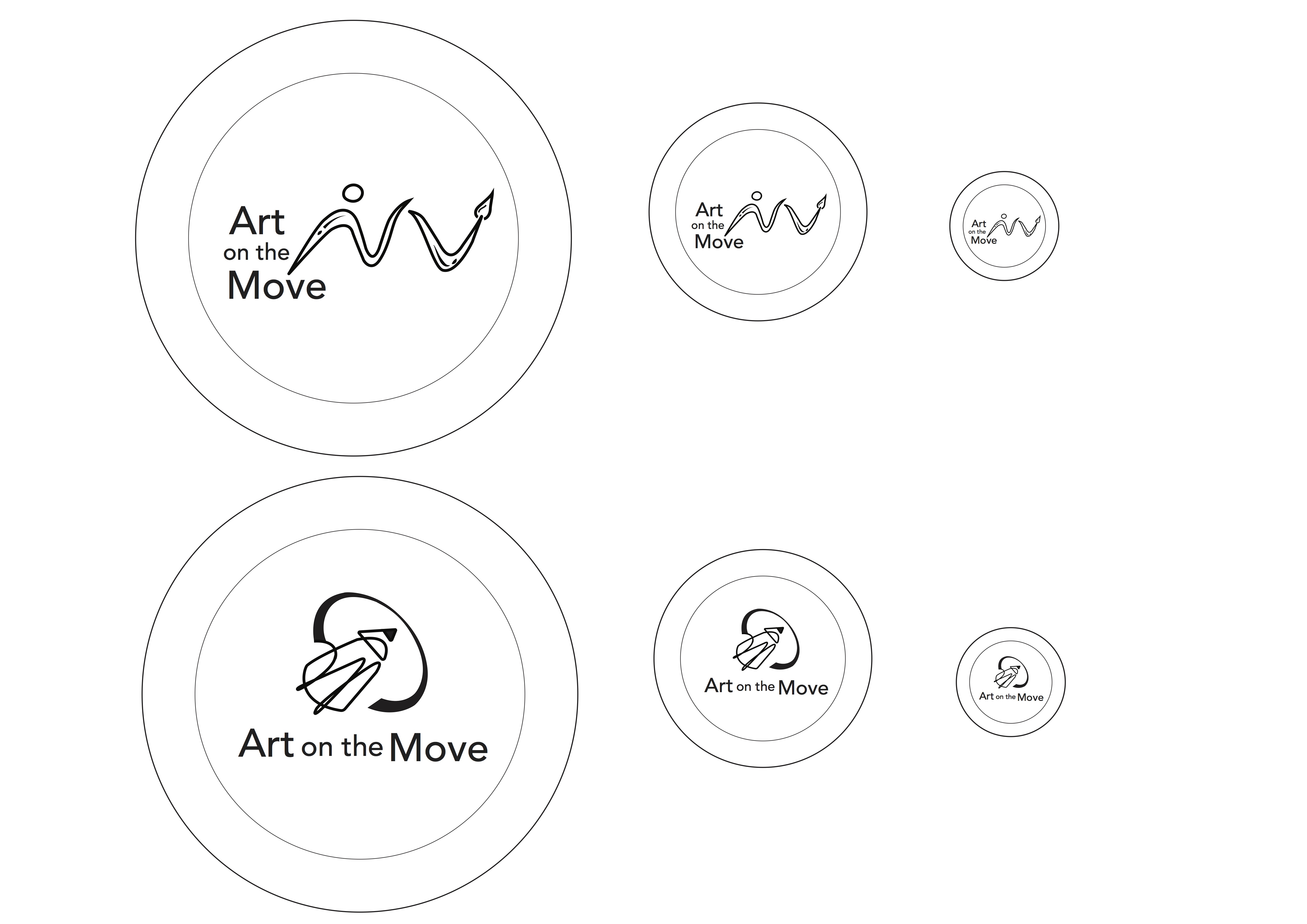
Feedback that I gathered after class was that the design with the paintbrush was too “spread out” and I had to put the brush with the person together in order to show some form of interconnectedness and integration.
As for the second design, the pencil was too big and perhaps I could make the community aspect show through better. Some suggestions were to bring the circle down to the bottom rather than covering the top and maybe show some human forms in the design.
I also did some mock ups for the colour schemes based on analogous and complementary colours as seen above.