I struggled quite a bit with the printing process as my layouts all either came out bigger than A5 or smaller than A5 and I had to visit the printing shop 3 times before getting the right size. I also tried experimenting on different coloured paper, white vs cream but went with the cream instead as I felt that it fits the feel of the zine better.
Sadly, the third time I went back and finally got the right size, I went to a different shop and my pink turned out more purple instead. 🙁
Takeaway and Improvements
Finally, after final presentation and critique, some feedback that I got was that my contents page didn’t really fit into the entire zine and that I had to look out for hypenations in my paragraph which I overlooked. Also that my paper type didn’t fit the required 100-120gsm that was a mistake on my part as I thought I could get away with it when the temptation for thicker paper got the better of me. I agreed that the execution of my contents page could have been better and maybe went with the tile/ traditional theme instead. Also, after looking through it once more, I felt that improvements could have been made like including a tile pattern at the corner of every page of example to tie the whole zine together better.
Overall, I think this project was definitely a really fulfilling one and I had a lot of fun coming up with the concepts and designing my first ever zine?!! Great end to F2DII to conclude my entire semester 😀 Thanks Joy for all your guidance throughout the semester and to the class for the good times and support!
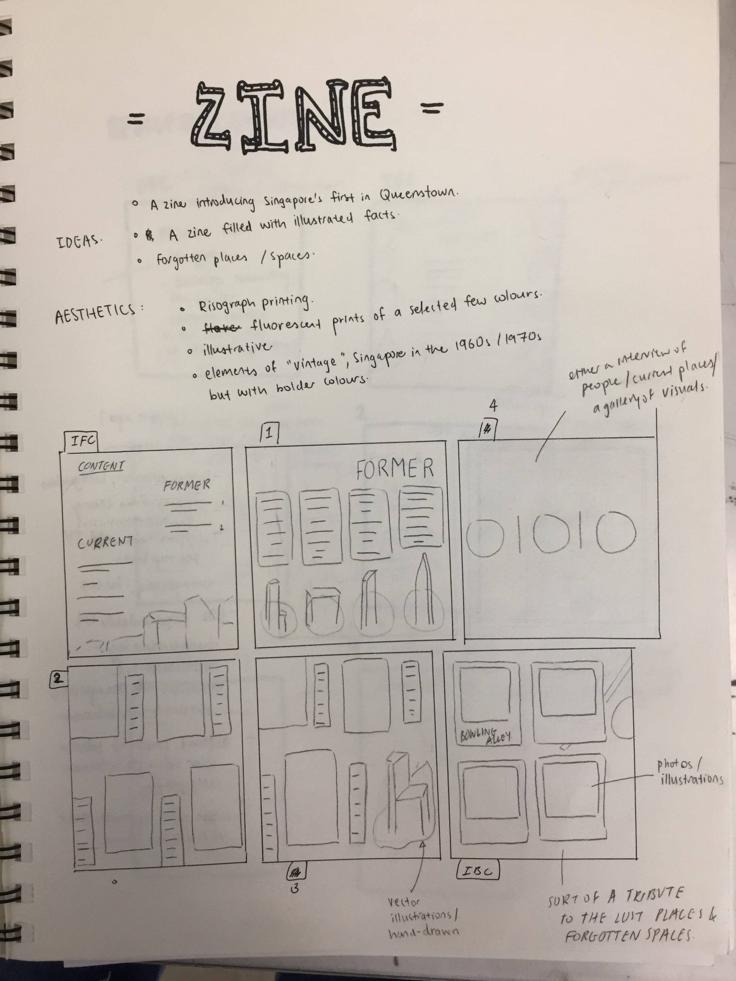
As a continuation from part 1 of our neighbourhood infographic research, my zine would consists of the “firsts of Queenstown” and here’s the break down of my work process!
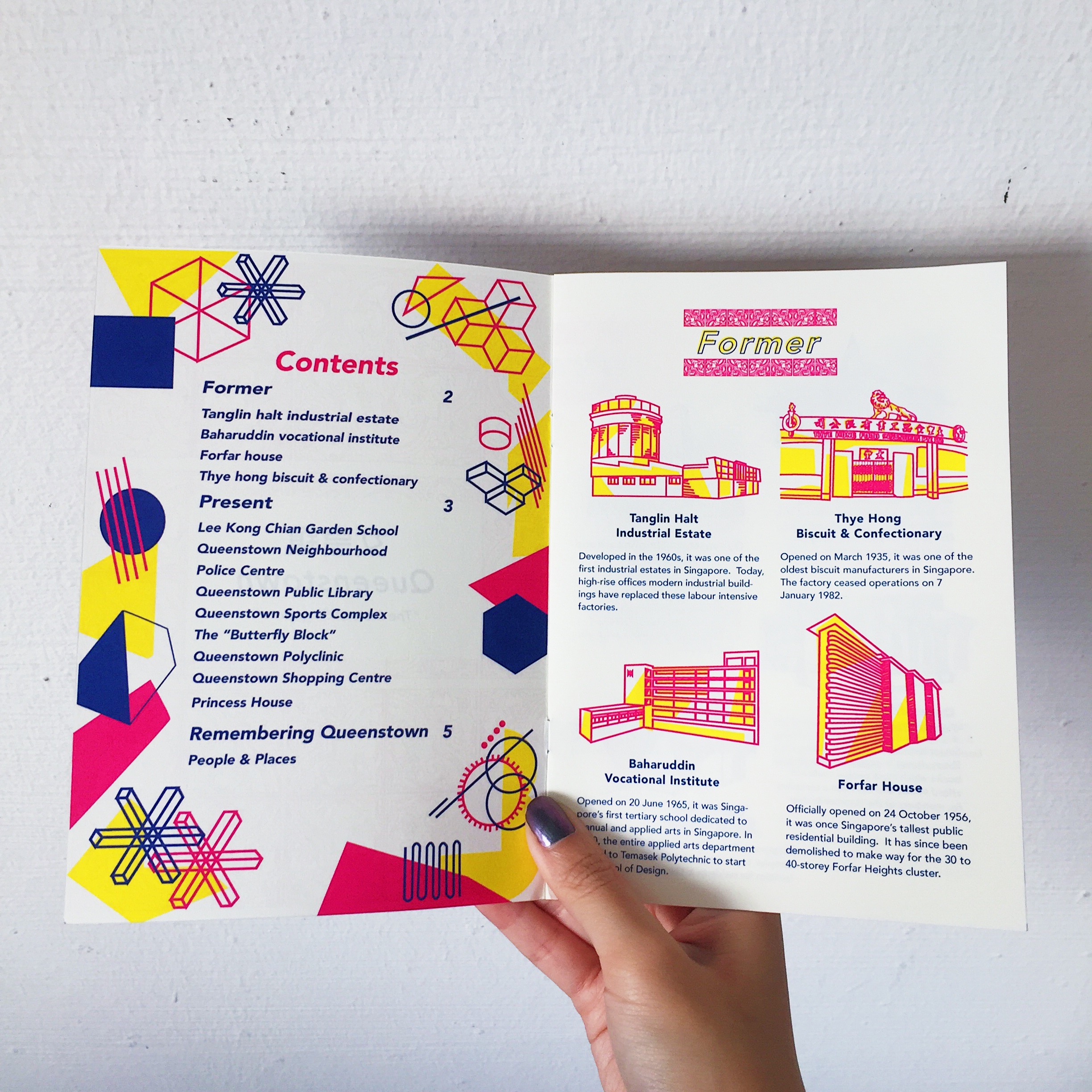
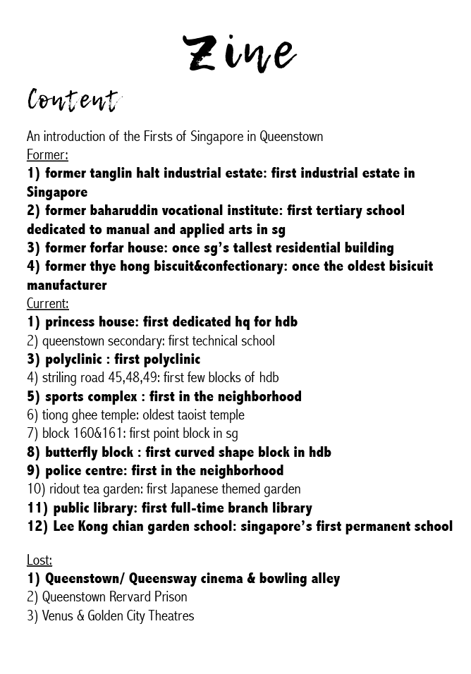
Due to space constraint, I had to narrow it down to the places that were bolded and they were places that I felt best embodied the spirit of Queenstown as the pioneer of many firsts.
References
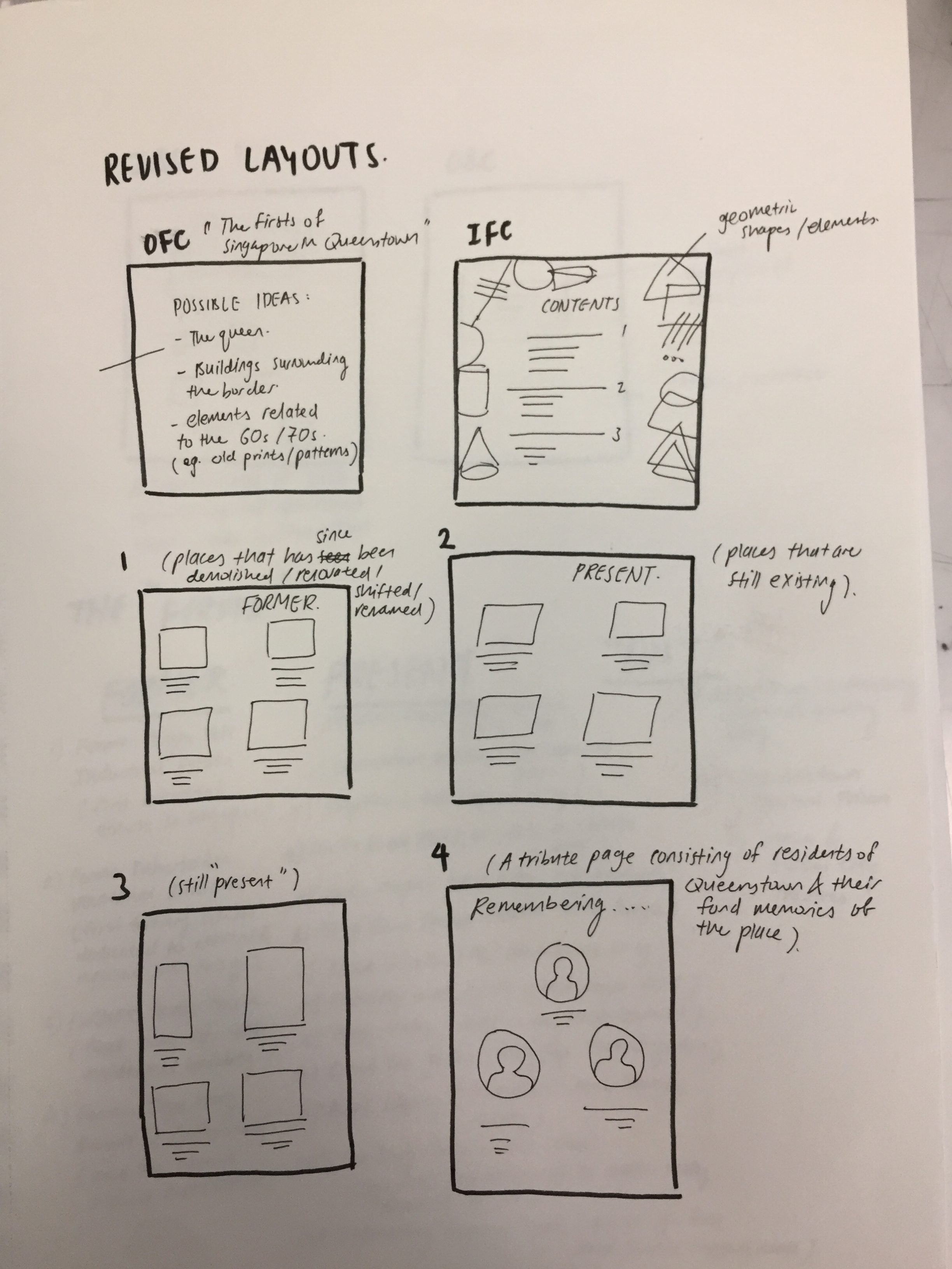
Layouts
My initial layout followed a simple 4 column grid and 2 places in each column. However, after my first consultation Joy advised me to experiment with different placements given the freedom of space I had with the middle spread.
My friend suggested why not I put 4 places in a spread instead to make it less cramp and gives more room for the text and illustrations to breathe. However, after trying it out, I felt like 4 places in a spread were too little and given the constraint of 8 pages, I had to maximise my space more and it also defeated the purpose of making a zine about the firsts of Queenstown if there were only 4 places mentioned.
Typeface & Text
Initially as you can see above, I used a total of 2 different fonts for the header and body text. My header text was more cursive and the body text was simpler and sans serif. However, after consulting friends, I also agreed that maybe sticking to one font was better and I could play around with the different weight, (heavy, medium, light etc.) to make the texts look neater and readable.
After the first consultation, Joy also suggested that I cut down on the description of each place to just the essential contents as it was coming off too wordy and cramp.
Illustrations
As seen above, my initial illustrations had blobs of pink overlaid with my line illustrations. I actually had the idea of doing this from some risograph illustrations I saw on pinterest and I thought that after printing the pink would be lighter and just provides a backdrop for my illustrations. However, my friends did mention that it looked like I was just “covering up a bad illustration”. Hence, I decided to continue with what I did with the illustrations for my infographic. https://oss.adm.ntu.edu.sg/limx0098/project-2i-infographic-process-and-final/
Highlighted shades of pink in Queenstown shopping centreinitial inspiration for the pink blobs
Revised Layout and Typeface
Spread 1
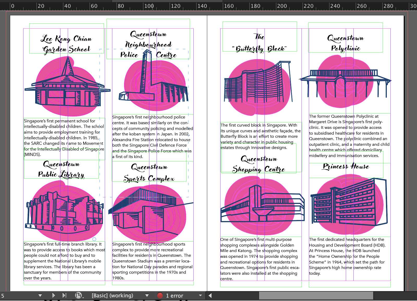
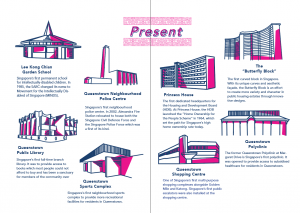
My contents page had elements of geometric shapes and patterns because I wanted it to be more fun and I thought it went well with my illustrations. To differentiate between the “former” and “present”, I used 2 different colour schemes. I also standardised the entire zine to just one font, Avenir in all its glory.
Spread 2
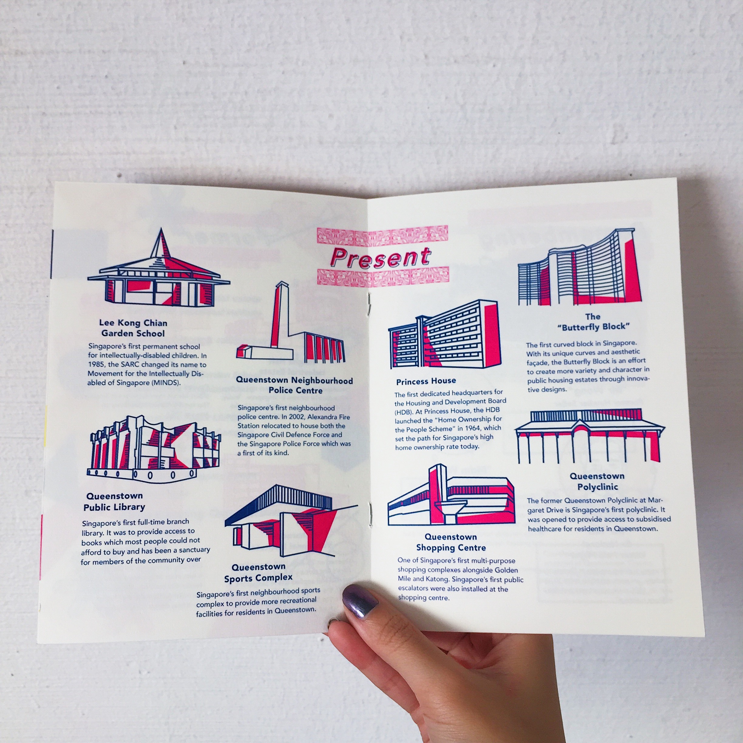
My middle spread layout was now placed in sort of a semi-circle instead of the previous more structured grid. How I came up with this layout was really just moving the objects around and just figuring out which layout worked the best with the limited amount of space I had. I had to consider factors like heading placement, body texts and the illustration. Do I centralise them? Or is the heading off centre for places at the side and centralised as it goes to the middle? Is there enough space at the sides for the text to breathe?
Spread 3
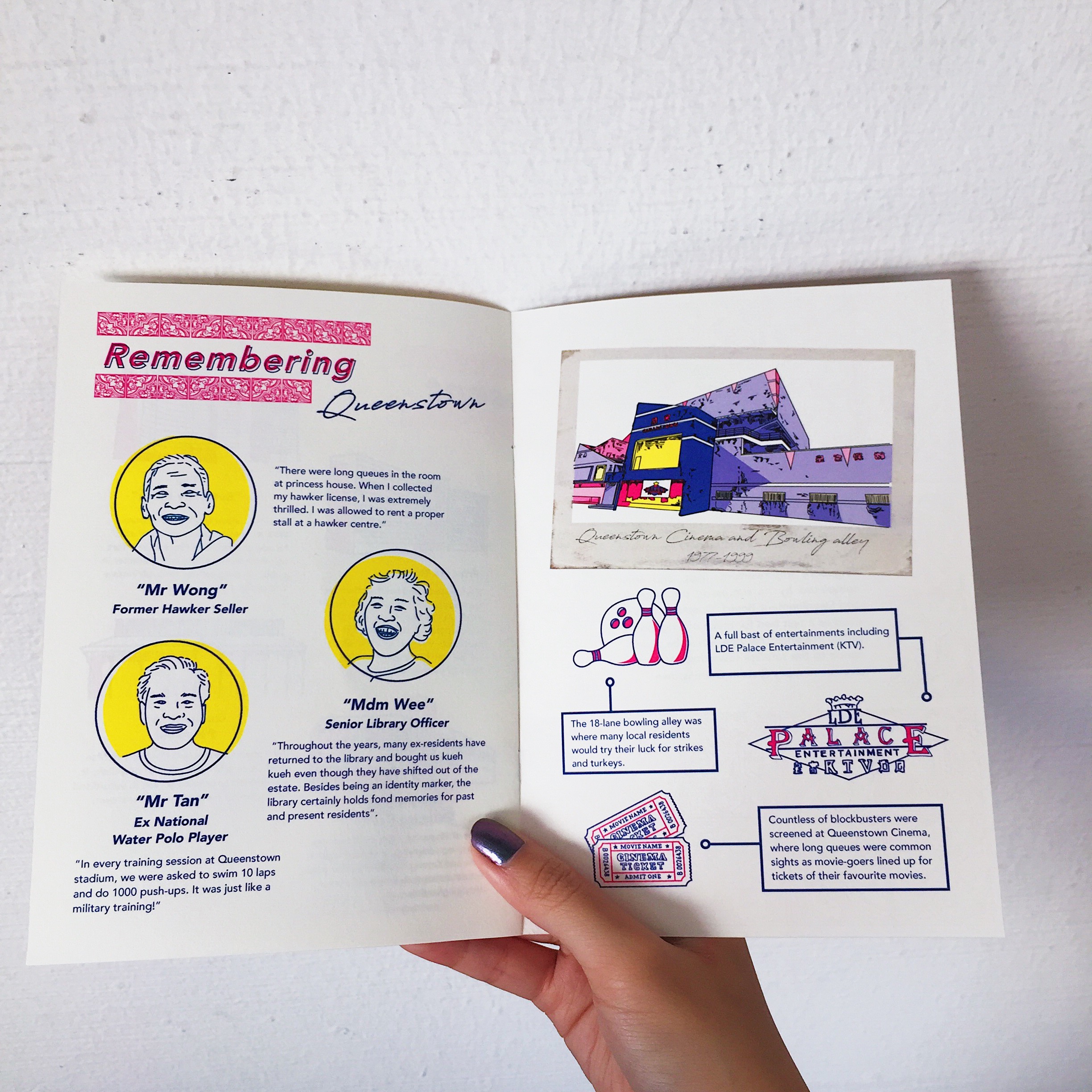
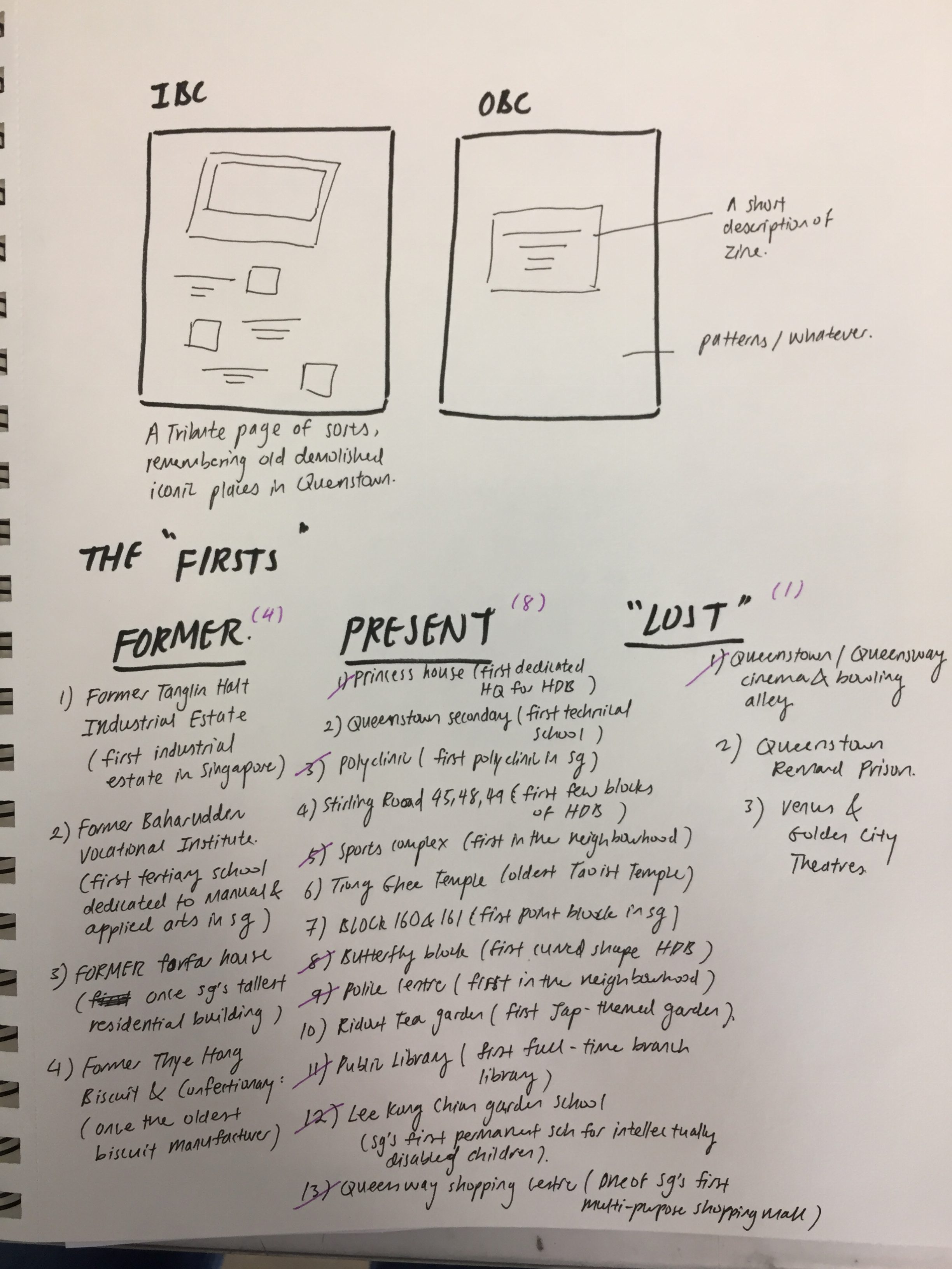
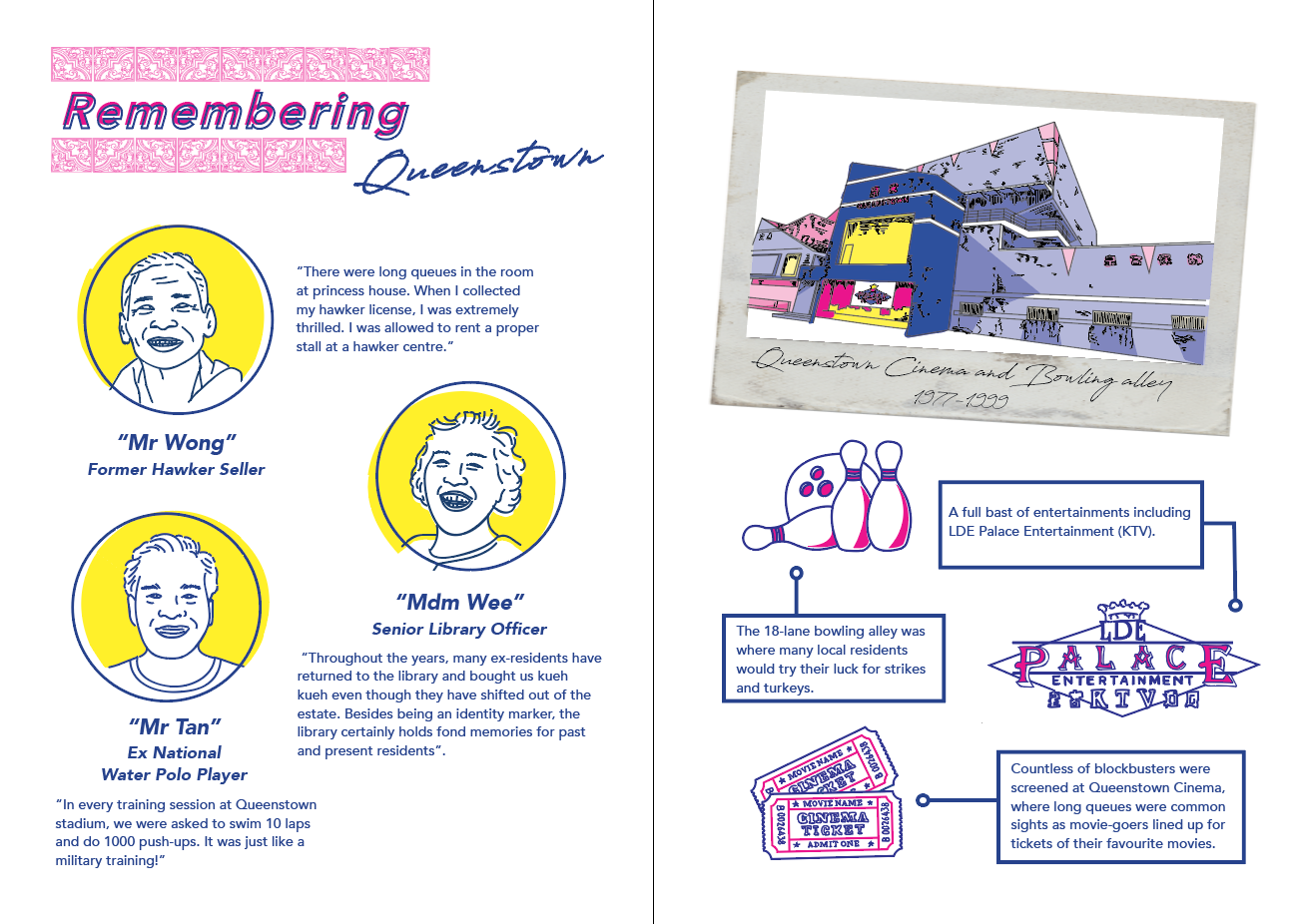
This spread was more of a “tribute” page. The left was a recount of the memories of old residences living in the estate after interviewing some of the residences during my site visit. The right was a tribute to the old Queenstown bowling alley, ktv and cinema with a short description of each. Initially during consult, Joy suggested that I change up the polaroid frame to a drawn one to match the rest of the pages. However, I had this idea in mind that the reason why a real picture was used was because much like the old bowling alley, it was a thing of the past and no longer fits in anymore. Hence, it was meant to look out of place amongst the rest. The illustration style of the bowling alley was also drawn differently in comparison to the rest of the spreads. Also, if we had the chance to explore more printing or layout options, I would have liked to print the polaroid out separately and slot it into the zine, making it detachable like a real polaroid.
Cover + back page
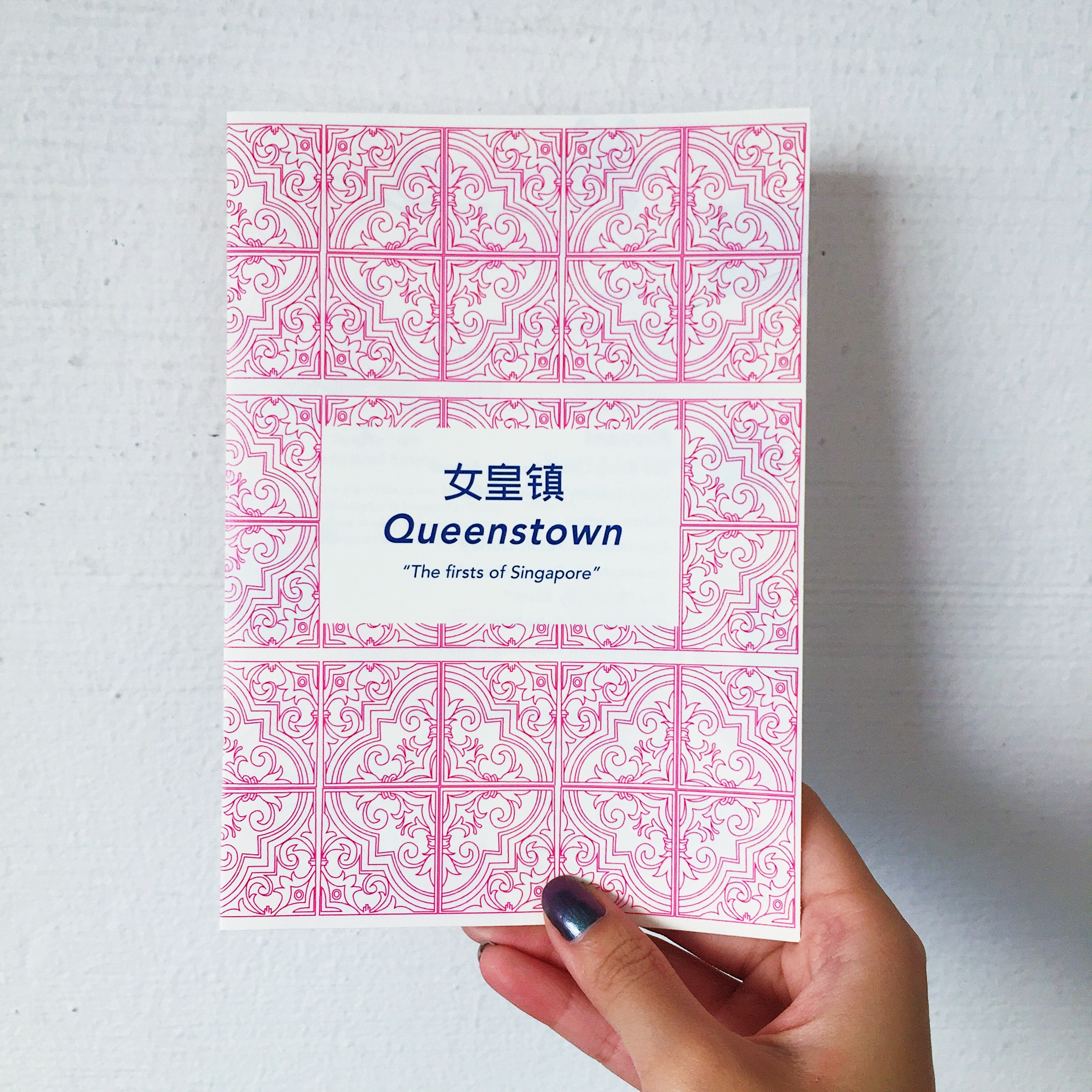
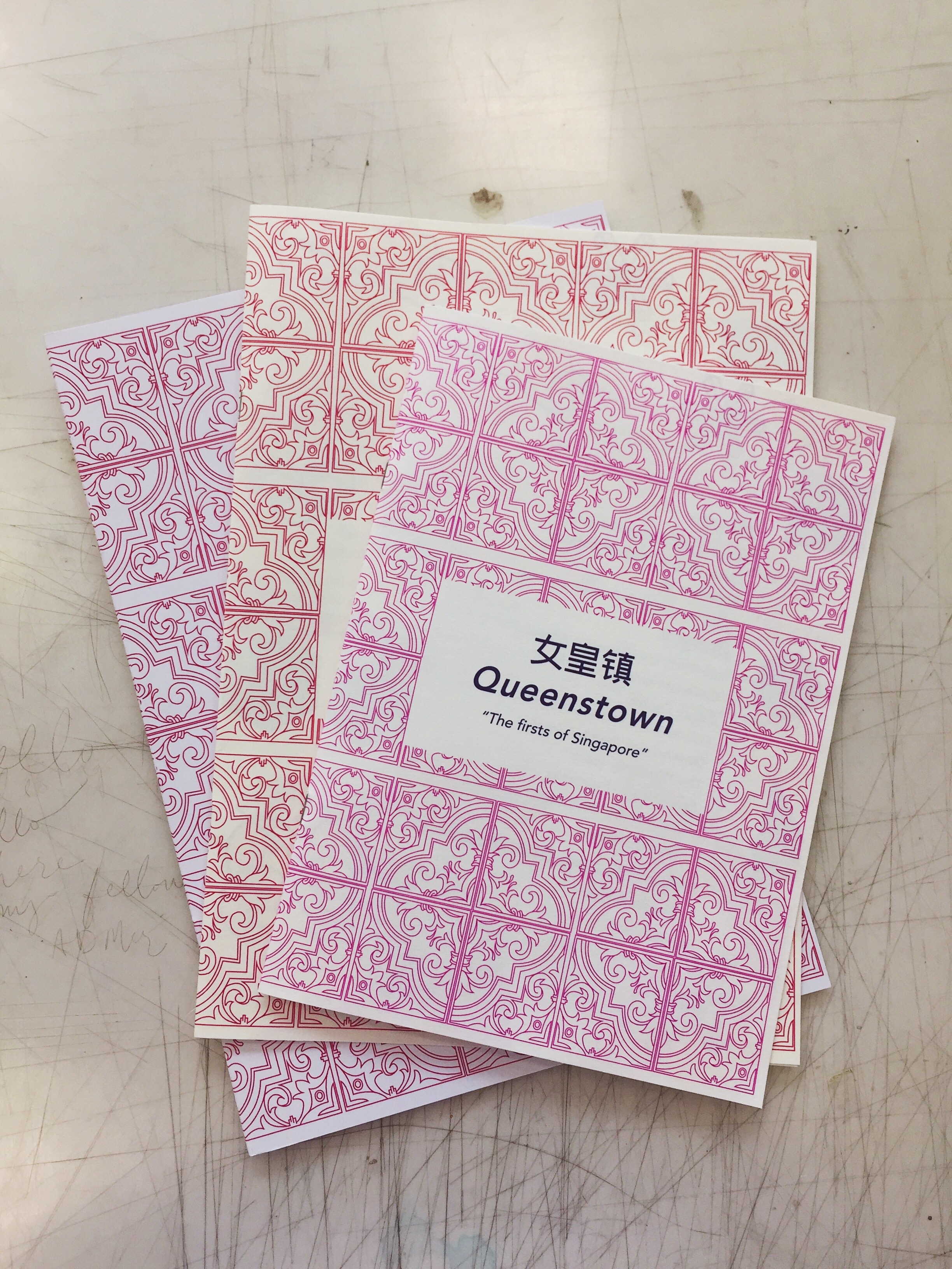
The idea behind the cover page was using the traditional peranakan tiles. Given that it was a historical recount of old places in Queenstown, I thought it would evoke a feeling of nostalgia with the use of a familiar pattern that is uniquely Singapore. The back page includes a short description of the history of Queenstown as sort of a introduction to the zine and the significance of the “firsts” in Queenstown.
Next posts will feature the final printed zine and reflections 🙂
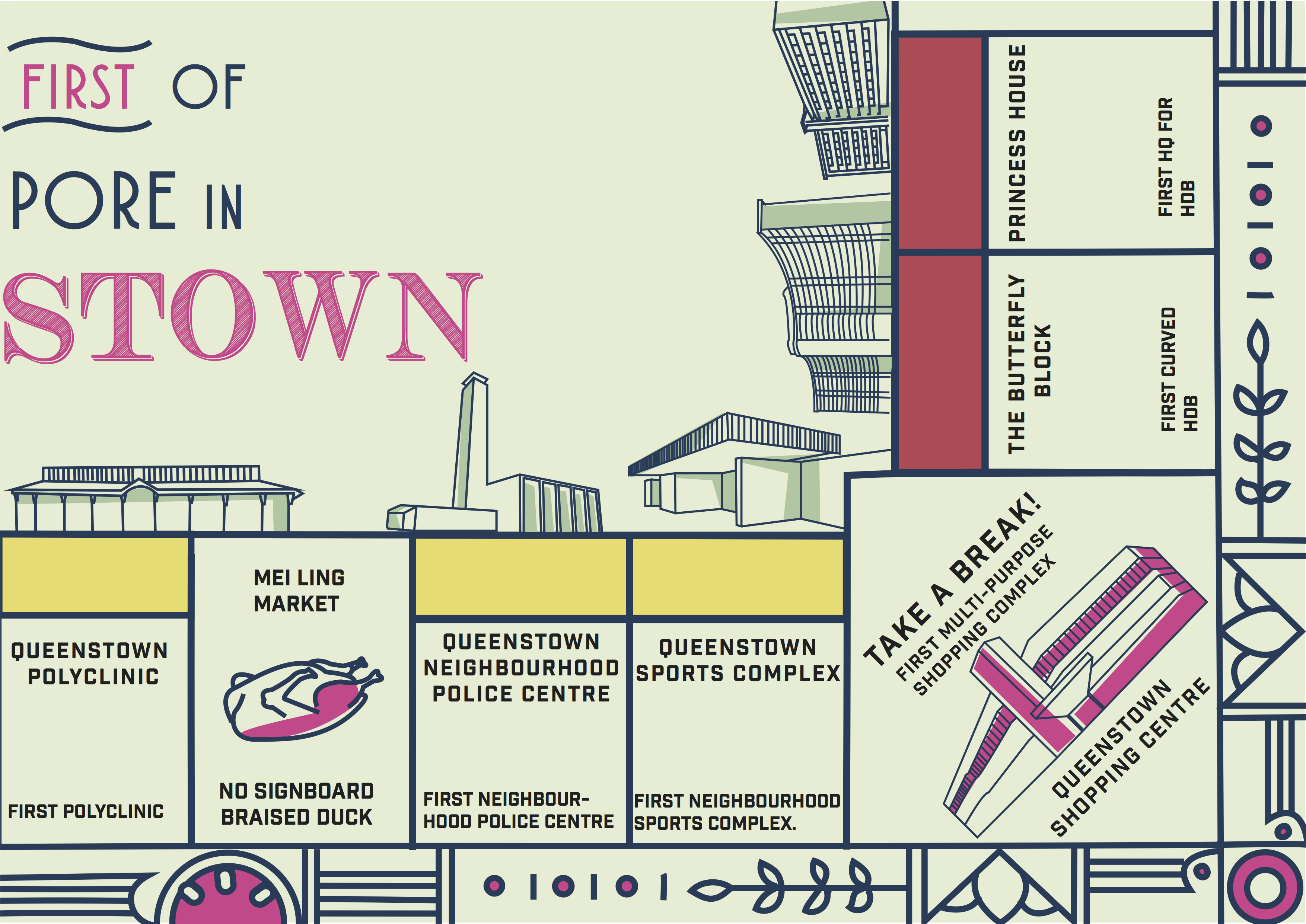
After much deliberation and site visiting, I had a few ideas in mind for my infographic which was either a heritage trail of Queenstown, iconic places in Queenstown or a guide for expatriates moving into the area. However, after visiting, I found that there was already an existing heritage trail of Queenstown and they even conduct weekly tours for the public. Hence, I thought that it wouldn’t be as interesting to make an infographic for something that already exists. Moving on, I also found it hard to make a guide for expatriates because of the fact that there wasn’t much entertainment in the area and many of the places that would typically be applicable to them such as shopping malls, food places etc. were pretty obvious and they wouldn’t require much of a guide for that. Hence, I went back to what makes Queenstown different from other estates? Queenstown is known for being the oldest estate in Singapore which makes it extremely rich in heritage. After much research, I found an interesting recurring theme amongst all of the heritage sites in Queenstown. Being one of the pioneer estates for many of Singapore’s early developments, Queenstown was the first for many things in Singapore for instance, the first estate for HDB blocks, first polyclinic to provide subsidized healthcare, the first neighbourhood public library and so on. I thought that this was an interesting angle to work on without making the heritage seem dull and overused but emphasizing on interesting “facts of firsts”.
References
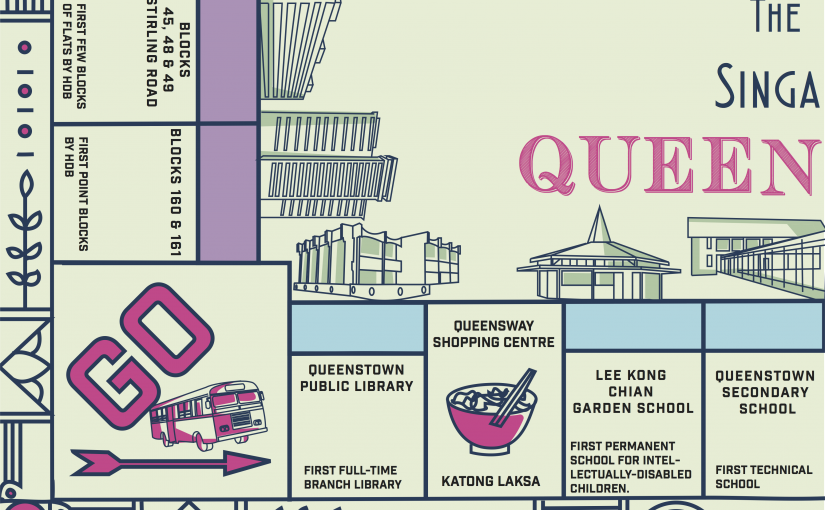
During consultation, I showed some of my infographic style references to my classmates and one of them suggested why not I make it into a card game or board game format like monopoly!
I also referenced these minimalistic icon styles for a visual representation of the places mentioned.
Colour Palette
As for the colour palette of my design, I took elements from the bright and pastel colours found at the Queenstown stadium and the “butterfly” HDB block.
Finally here is my final infographic!
I incorporated some food stop suggestions such as the famous katong laksa at Queensway shopping mall and braised duck at Mei Ling food street as well.
Pretty satisfied with my design and was happy with the overall positive feedbacks from everyone 🙂 However, Joy suggested that I could incorporate more visual elements related to that time period into the border instead of the current one which was a little unnecessary. Moving on from this, I hope to explore more of this style in my zine and maybe make it interactive(?) That’s it for now and thanks for reading! 😀
Before I embarked on my exploration of Queenstown, this was pretty much all I knew about the neighbourhood:
old
IKEA
Queensway shopping centre has chio and cheap sport shoes with nice laksa and muah chee
Anchorpoint shopping centre, one of the best place for outlet shopping
YEP. Soooo I asked my friend whose boyfriend stays there and this was what she suggested:
” you can go visit the 2 new HDB blocks damn nice, skyville and skyterrace. Or queenstown library, that place freaking old sia. All those historical sites tear down to build condo already. Queenstown not much to see but the new hdb damn nice.”
Actually prior to visiting, I considered doing a heritage trail sort of thing considering how Queenstown was famous for being one of the oldest estates in Singapore. However, most of the old heritage sites were gone and doing a infographic on nice condos in Queenstown wasn’t exactly that appealing.
I also had my consultation with Joy before going down to Queenstown and these were a few of her suggestions of areas I should look into:
old amenities in the area
new buildings vs old buildings – what was previously in the area and what is there now
After which, I decided on doing a map of amenities, food and entertainment in the area, sort of like a guide for newcomers who may be planning on moving into Queenstown. With a rough idea of what to look out for, I set off to explore Queenstown!
I wanted to get an idea of the neighbourhood from residences so I did a list of survey questions.
How long have you been living here?
What are some of the places you usually go to eat, shop or for entertainment?
What do you like about these area?
What are some places that have been around for a long time? (old amenities, etc.)
Here are a few videos of interviews I did with a few of the residences. Disclaimer: Pardon my awkwardness and HORRIBLE mandarin thanks!
Resident 1 ( stayed here for 40 years)
Key takeaways:
50-60 years old
Good food at Mei Ling Street Market ( only wet market here)
Tanglin Hock Market( not in the zone tho)
” Da Zhong” market for groceries
not much entertainment in the area
most of the old shops have moved away
used to go to the swimming complex when she was younger
Pasar Malam in the 1960s/1970s were popular
There used to be a prison behind the library and a bowling alley which were both demolished
Resident 2 ( stayed here for 2-3 years)
Key takeaways:
20-30 years old, from Mauritius
Shopping at Queensway Centre
Queenstown has 2 McDonalds (lol)
IKEA
Dawson Food Court
Alexandra Food Court
Suggested a Salute Cafe behind Alexandra food court
Resident 3 ( stayed here for 3-4 years )
Key takeaways:
18 years old, PR
Mei Ling Street – nice dessert, chicken rice, char kway Teow, Lor Mee
Queensway Shopping Centre
ABC market
AnchorPoint Shopping Centre
Resident 4 ( stayed here for 40 over years )
Key takeaways:
70 years old
ABC market at Alexandra- nice fish soup and herbal soup
Queensway Shopping Centre
not much entertainment
After interviewing the residences, I got pretty much the same responses and decided to check some of these places out.
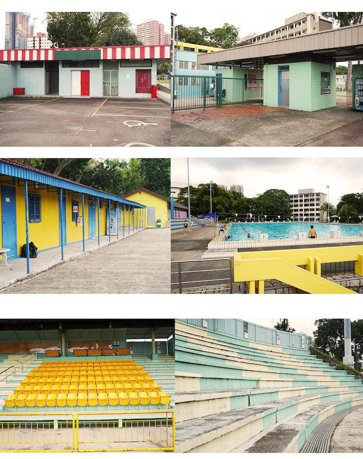
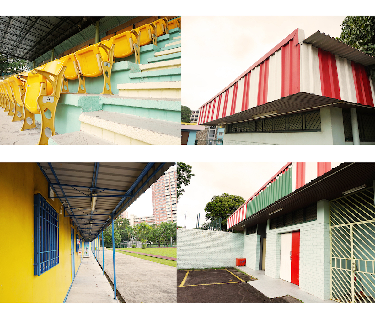
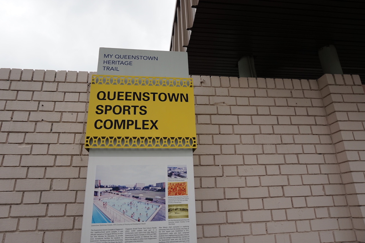
Queenstown Sports Complex
Singapore’s first neighbourhood sports complex. It comprises of 5 swimming pools and one of which is a 50-metre Olympic-size pool. The first thing I noticed about the stadium would be how retro the colours and infrastructure were. It was different from the typical stadiums we see in other neighbourhoods with its pastel paint and vibrate striking red, blue and yellow. I really love the colour scheme of the entire area. I wanted to take more pictures of the old swimming pool but got caught by the life guard for invasion of privacy.
I also found these “Heritage Trail” boards put at certain sites in Queenstown.
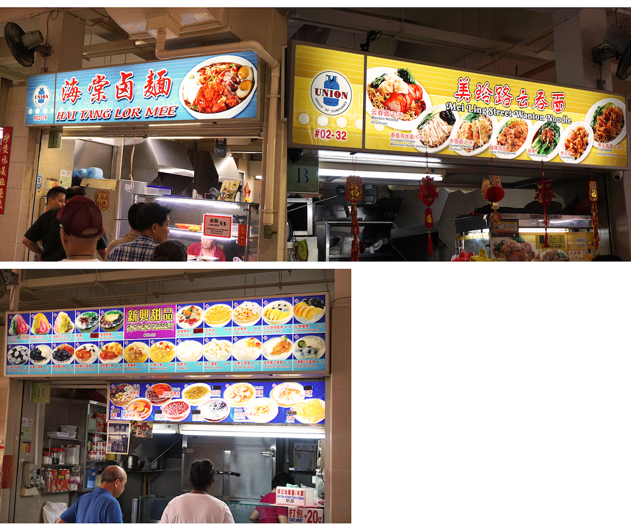
Mei Ling Market& Food Centre
This was another common suggested place for the best food and the only(?) wet market left in Queenstown. The most suggested food to try was the duck noodle/rice, dessert, chicken rice, char kway Teow, Lor Mee. However, sadly the chicken rice stall as well as a few others have moved to Holland V and other places.
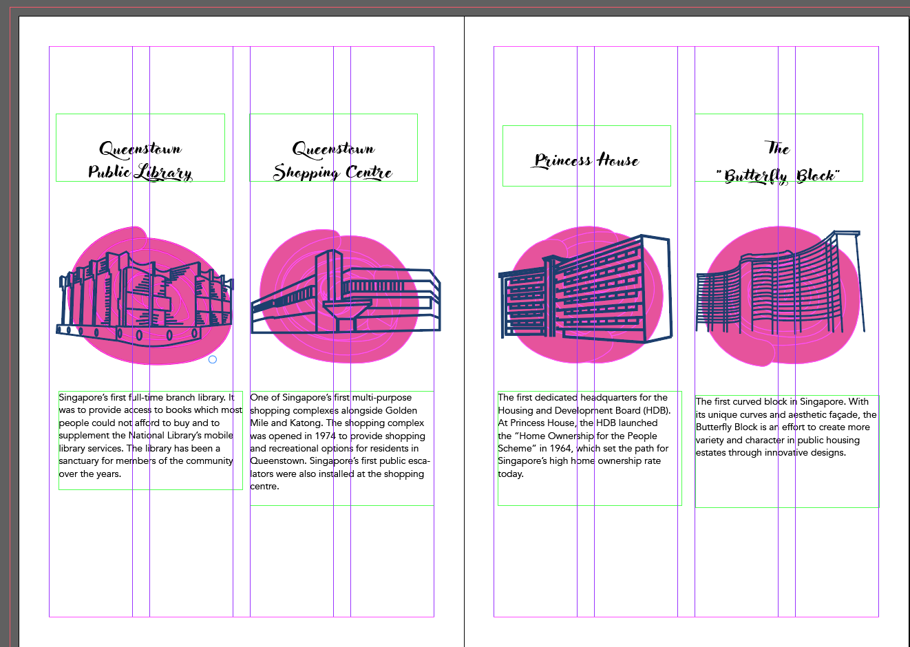
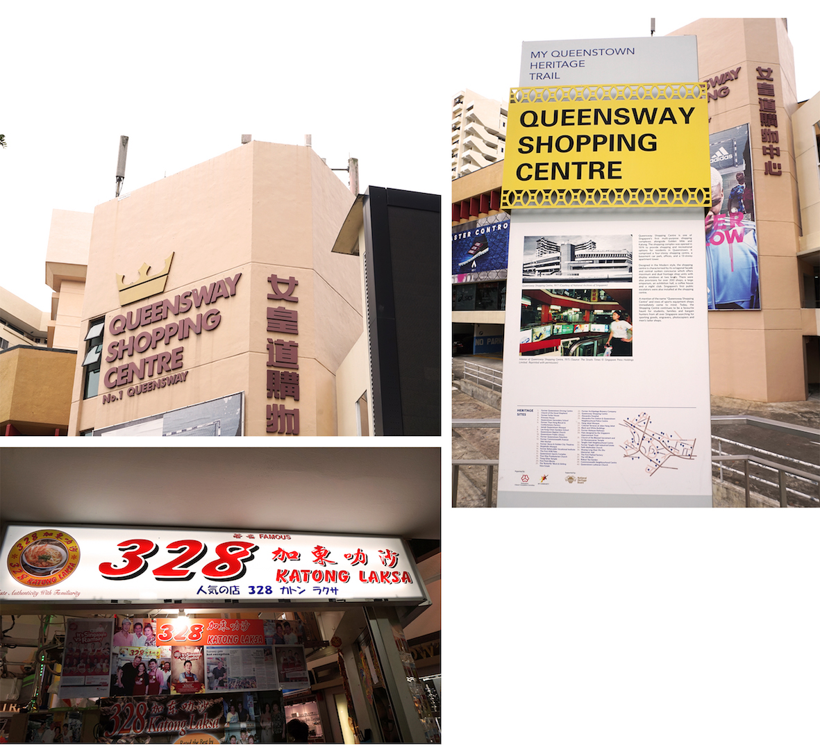
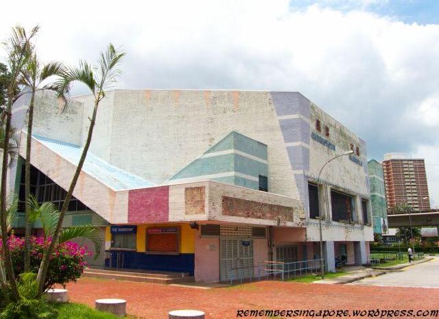
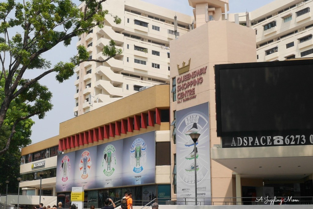
Queensway Shopping Centre
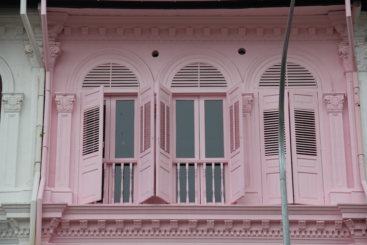
I have been to Queensway shopping centre on several occasions to buy shoes so this wasn’t anything new to me. But it surprised me to find out this mall was one of the first multi-purpose complex in Singapore alongside Golden Mile and Katong. Fun fact, Singapore’s first public escalators were also installed in this very mall! I know Queensway is famous for their Katong Laksa and really nice muah chee as well as other Pasar Malam food. This mall is definitely filled with a lot of history and not just a place to get great bargains.
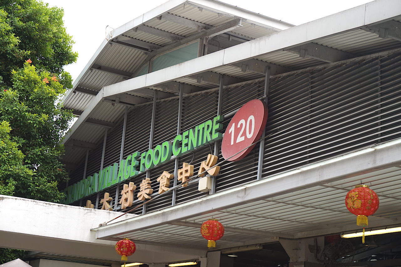
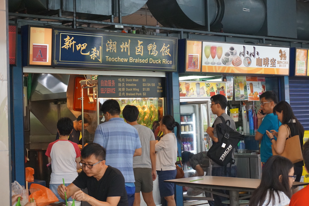
Alexandra Village Food Centre
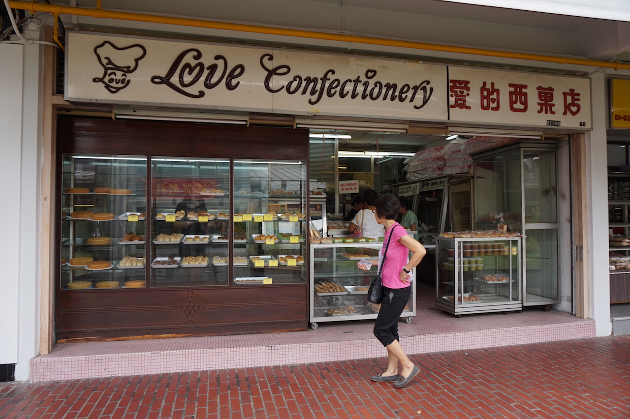
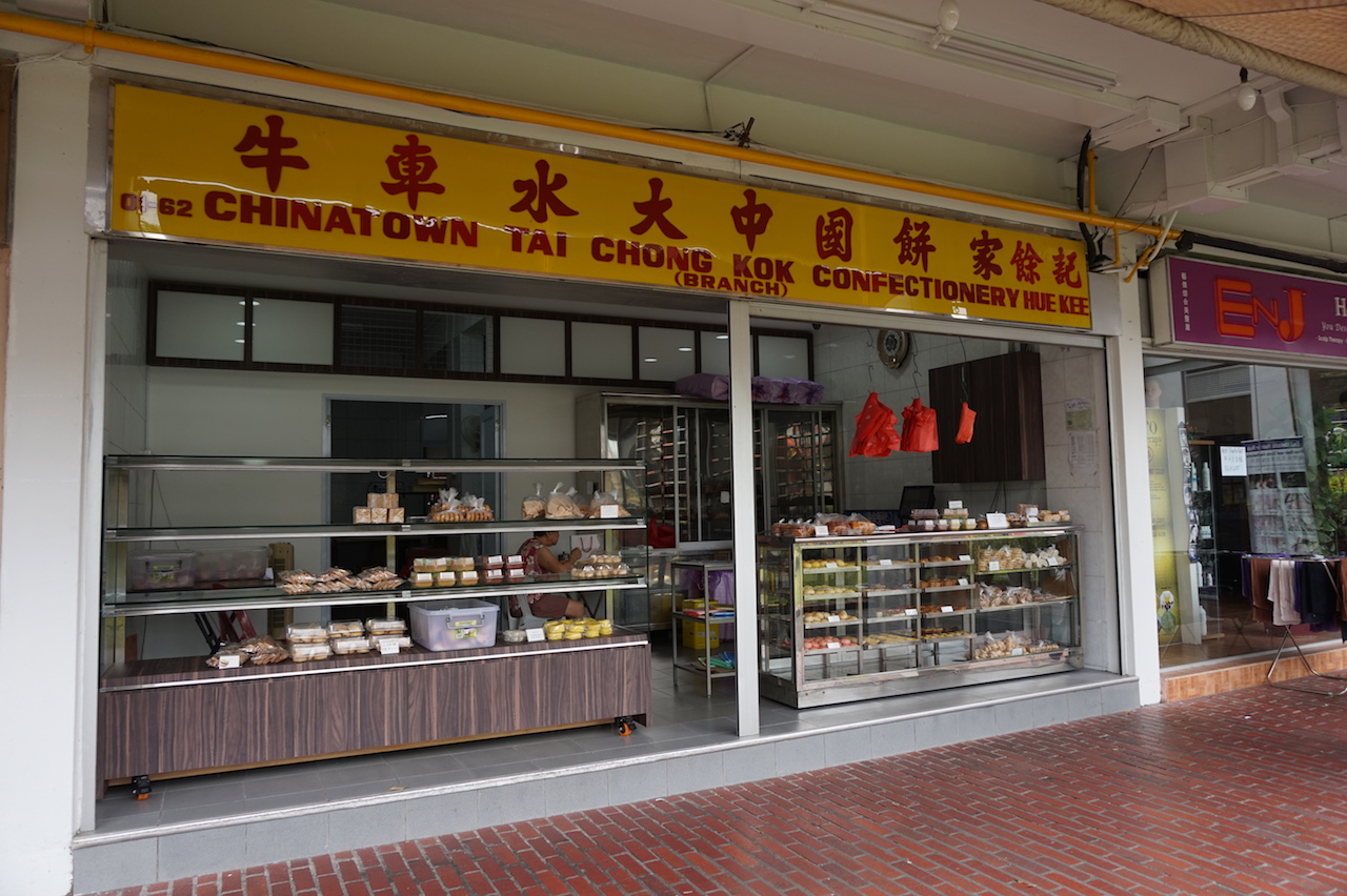
I have eaten here a couple of times but never really took the time to explore this part of the neighbourhood. Asides from the food centre, I also found many interesting old shops.
Queenstown sure love their duck rice haha
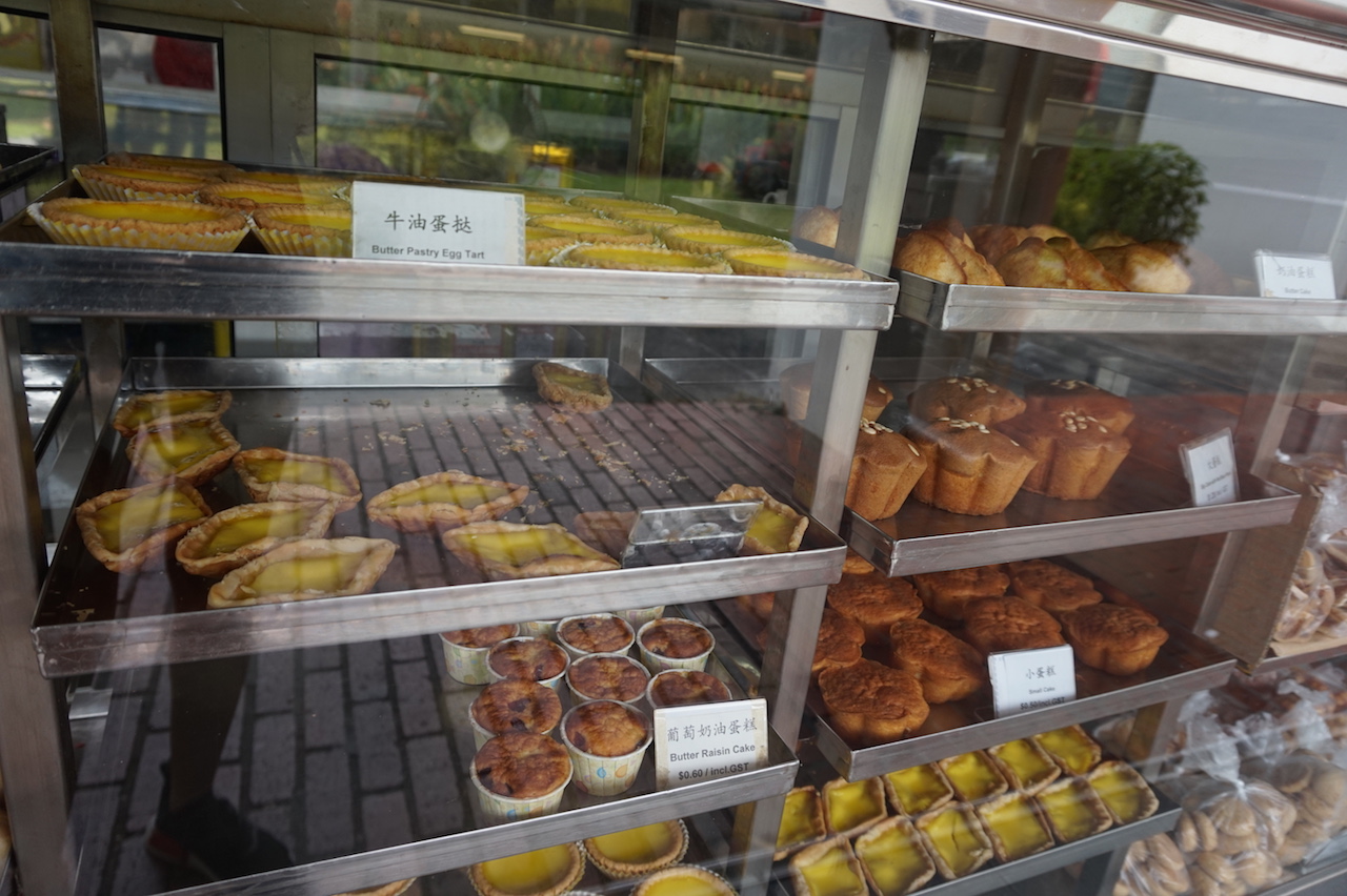
Also found some really old school bakeries and confectionery stalls in the area. They sell traditional cakes, egg tarts, pastries etc.
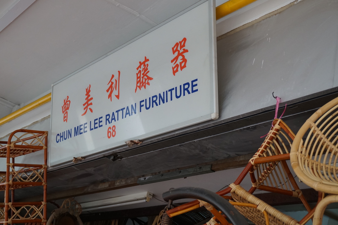
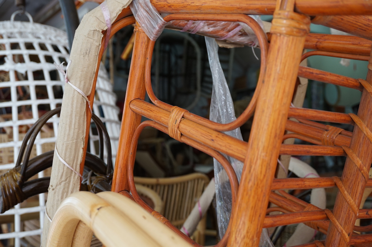
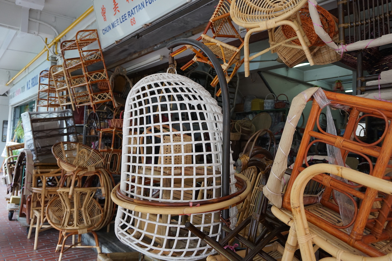
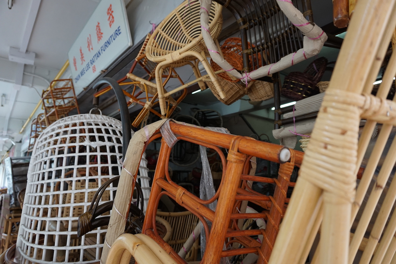
I also found a really interesting shop that sells rattan furniture. The kind that my grandparents used to use.
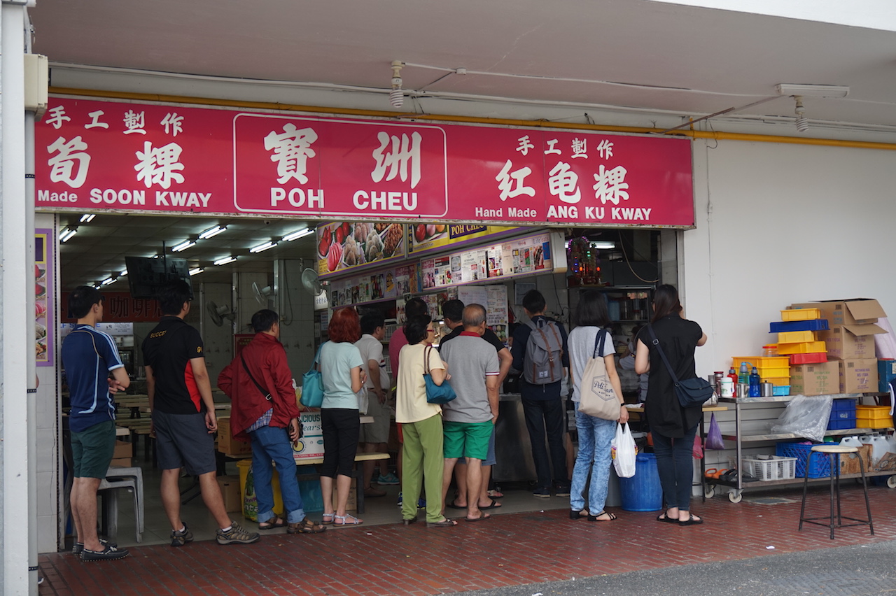
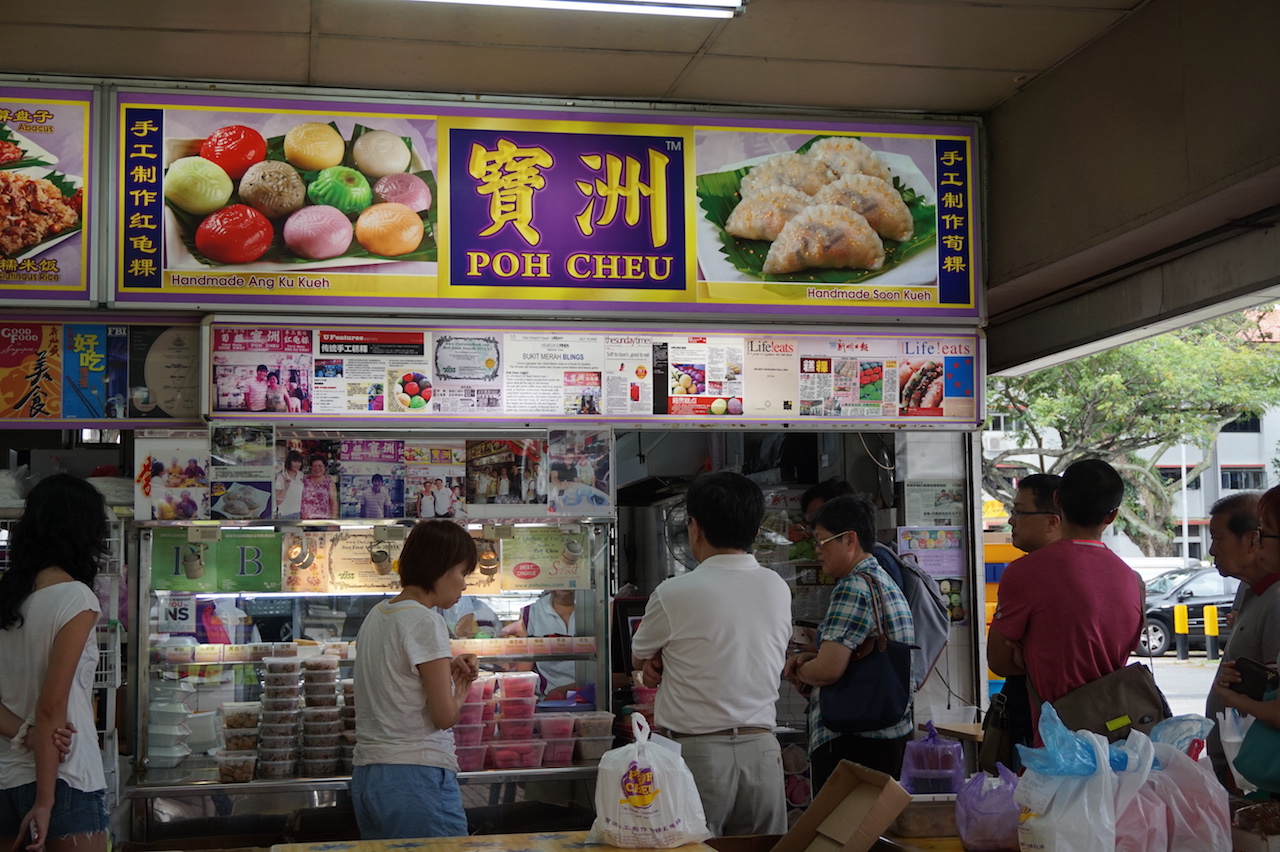
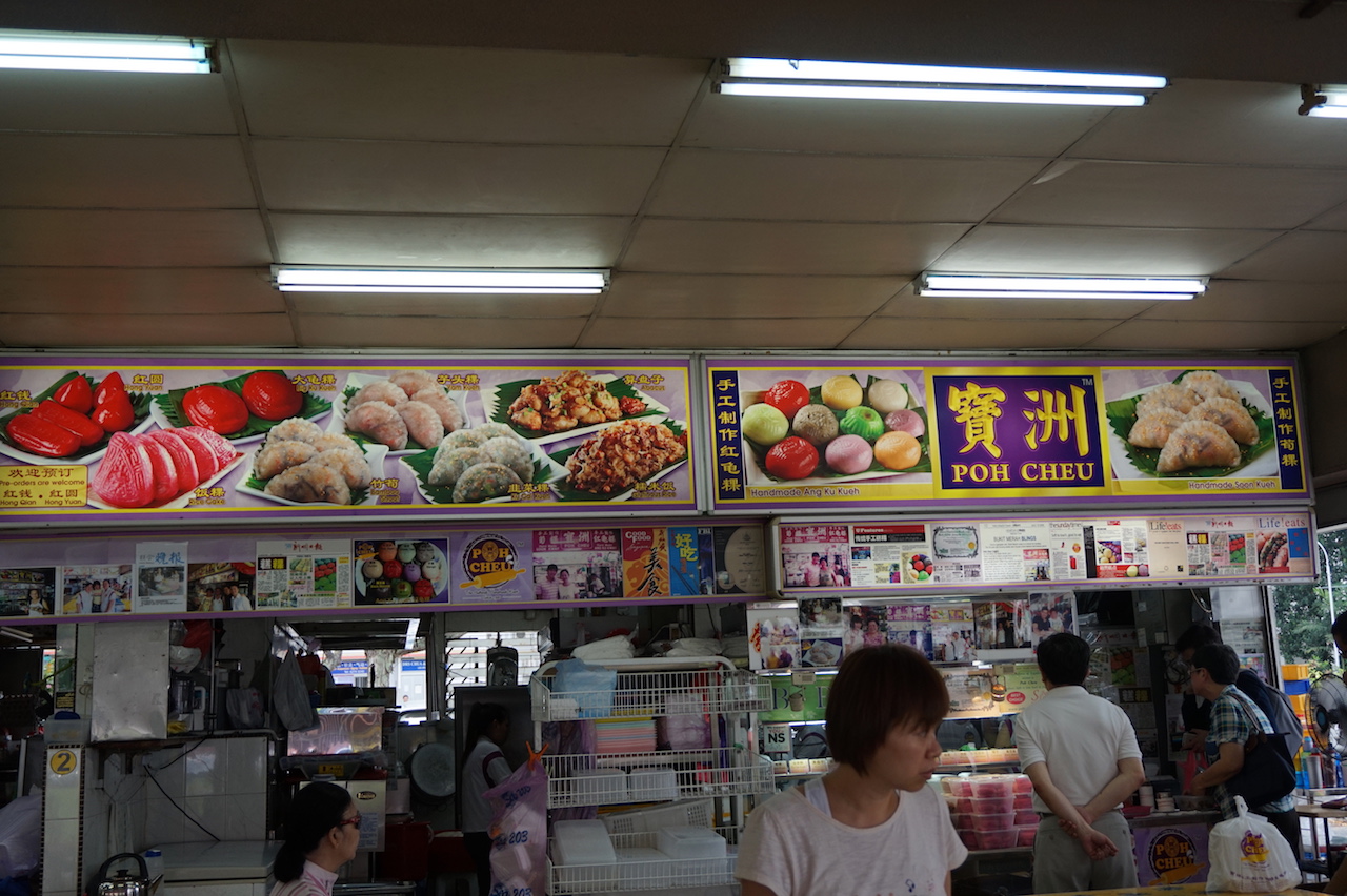
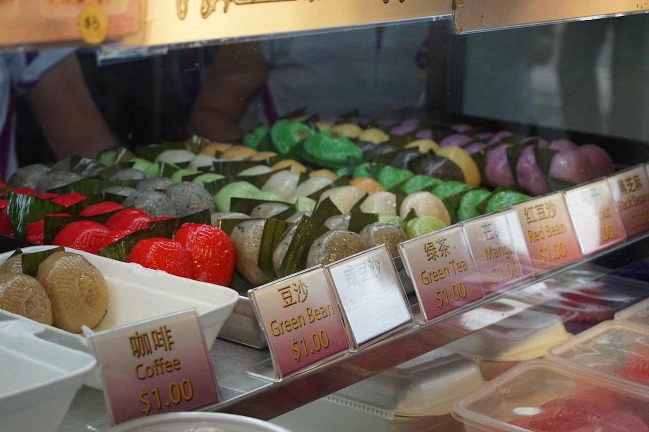
While exploring, I also chanced upon this handmade Ang Ku Kway stall that one of my interviewees mentioned as well. I went to take a look and was surprised at the variety of flavours they offered asides from just the traditional ones. Judging from the long queues it must be really good.
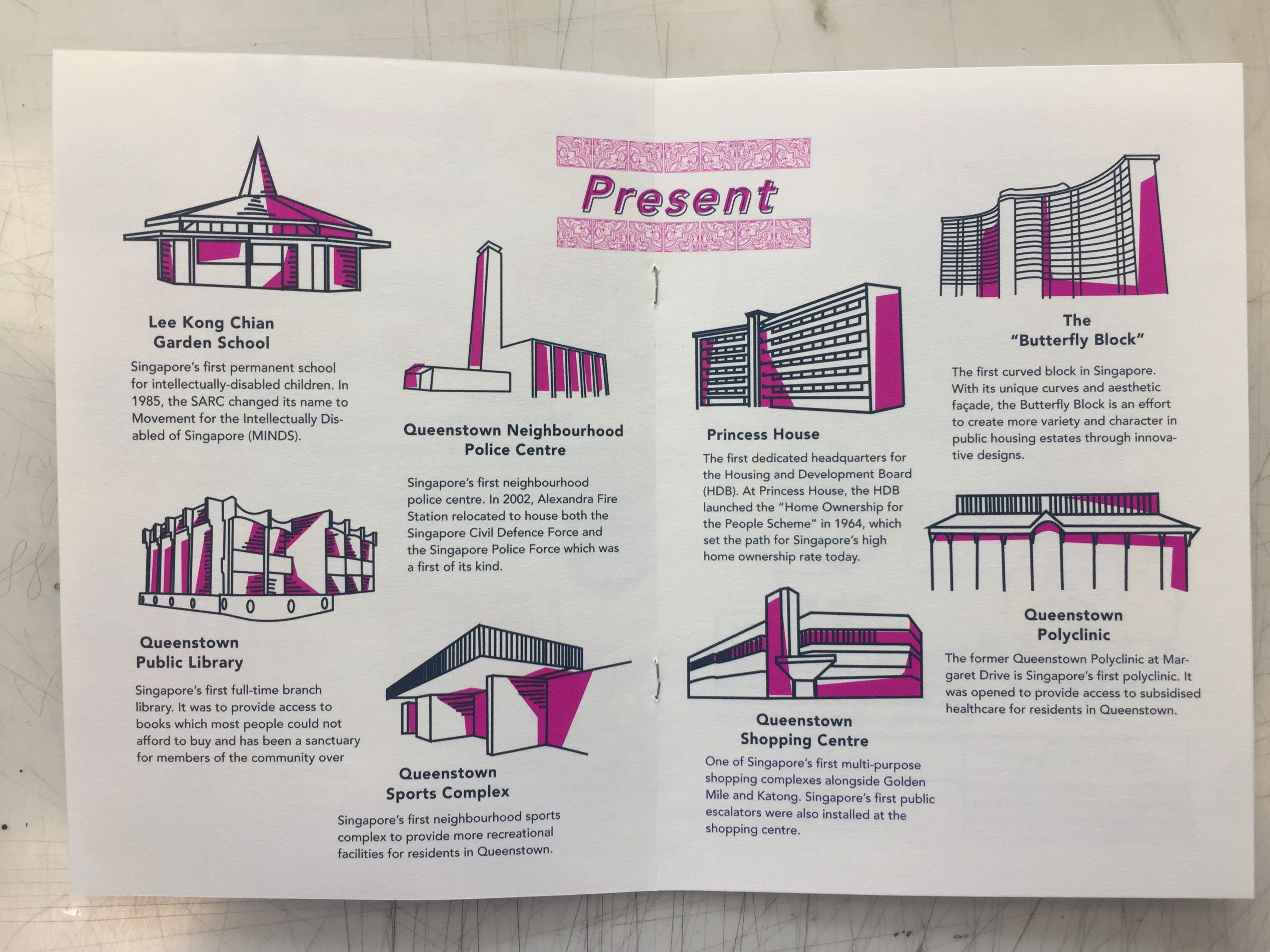
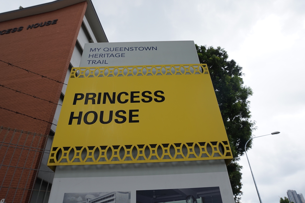
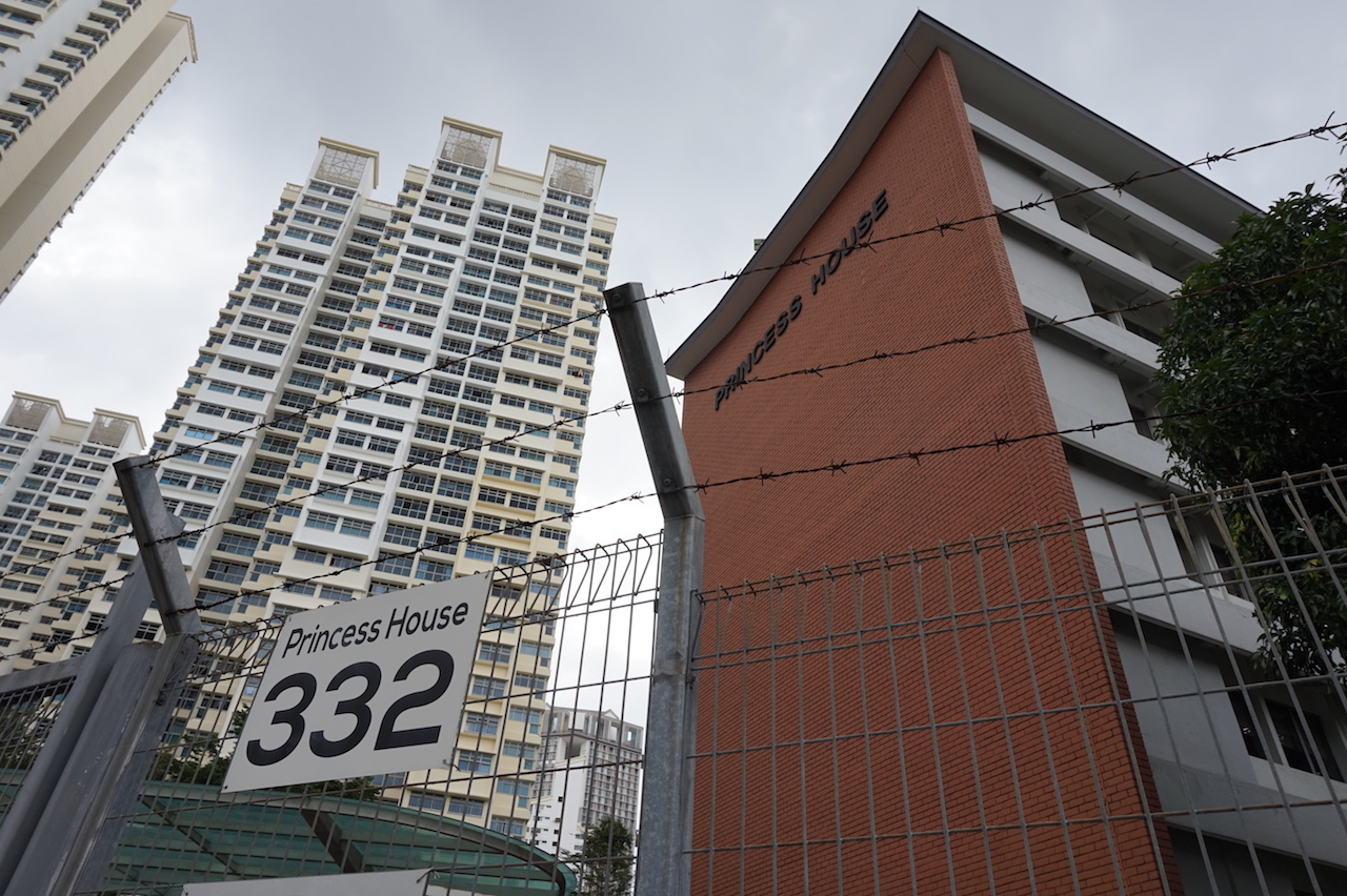
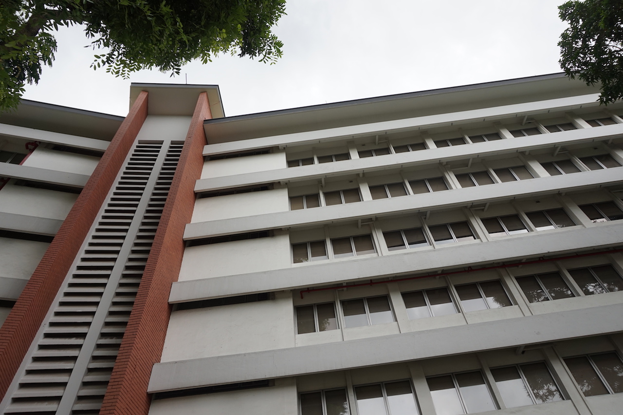
Princess House
Princess house was one of the few lasting historical sites. It was previously used as the headquarters for HDB. Many renowned dignitaries such as Prince Philip and Duke of Edinburg have visited Princess house to learn more about Singapore’s housing programmes. Even though the exterior of Princess house doesn’t look like much, the conservation of the building serves as a lasting reminder of Queenstown’s history.
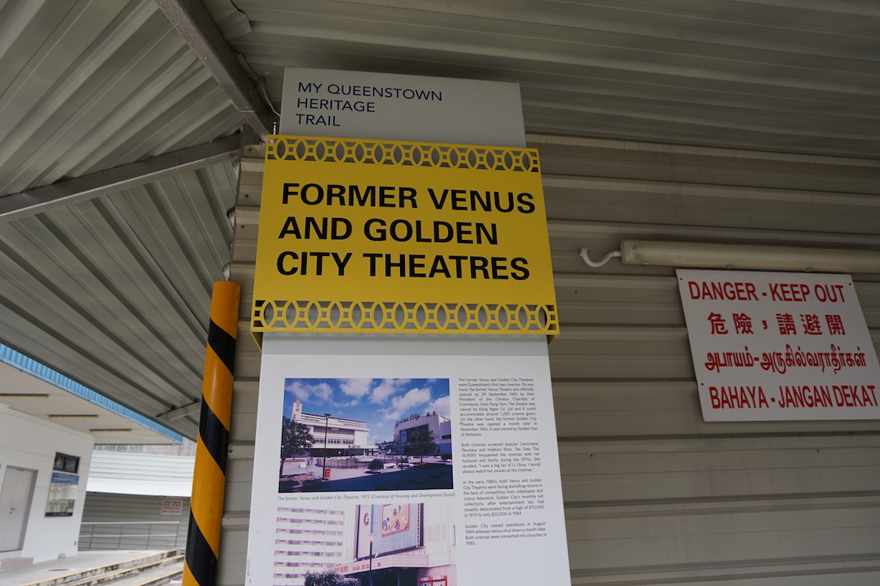
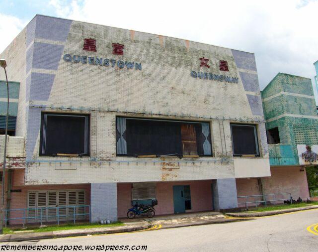
Former Venus and Golden City theatres
I also chanced upon the place that used to be the former venus and golden city theatres which were Queenstown’s first two cinemas. However, they have both been demolished and they are now building some condo in it’s place.
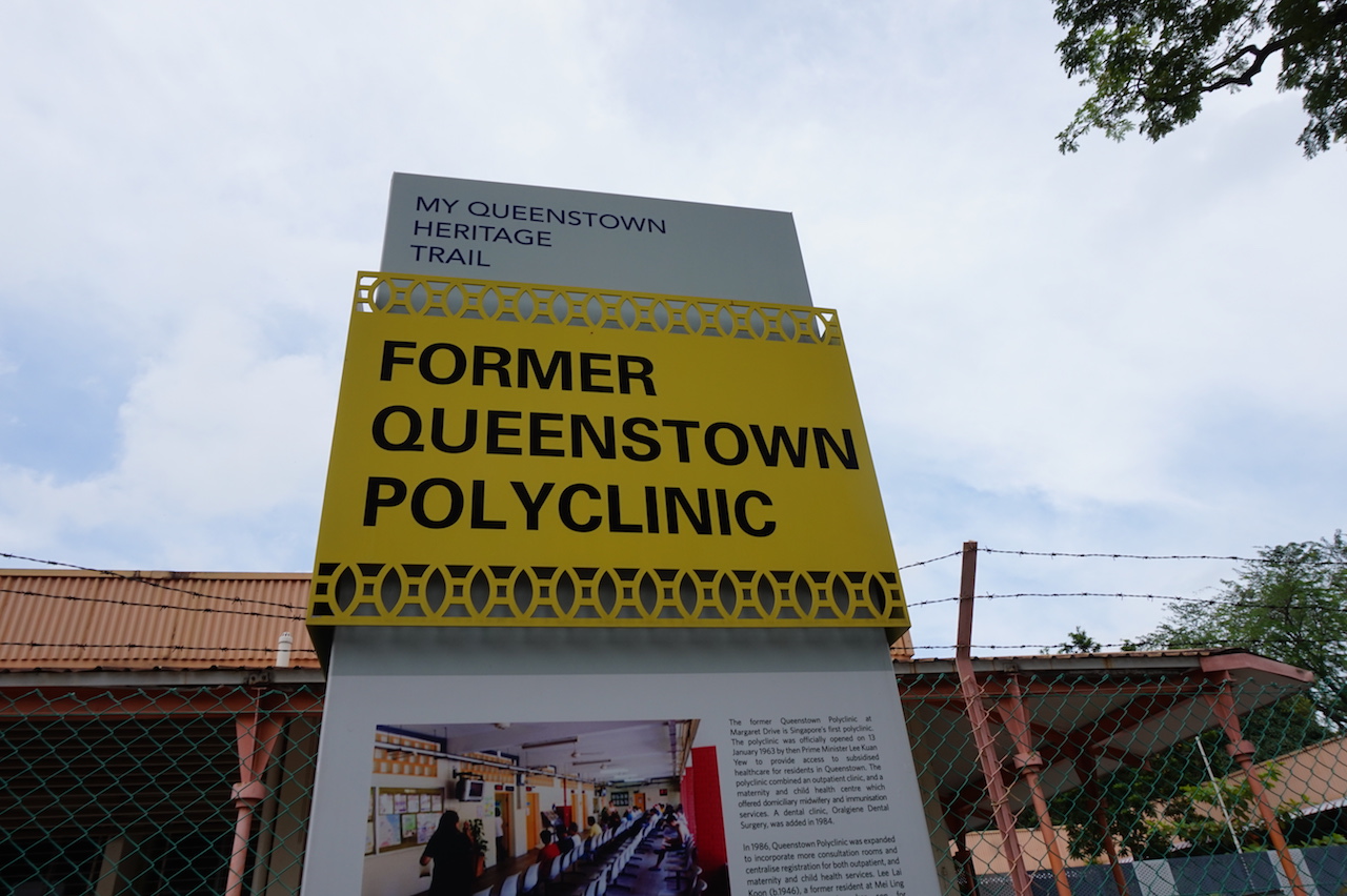
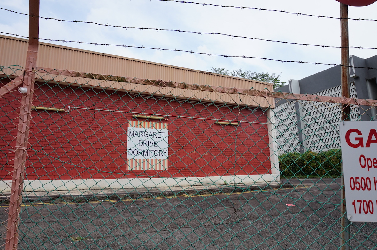
Former Queenstown Polyclinic
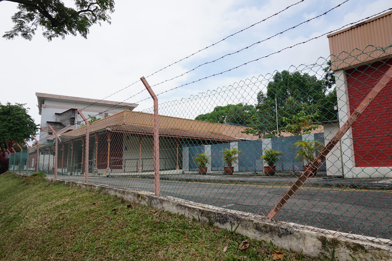
There is also the former Queenstown polyclinic, which was Singapore’s first polyclinic to provide subsidised healthcare to residences. However, it has since been converted into a dormitory.
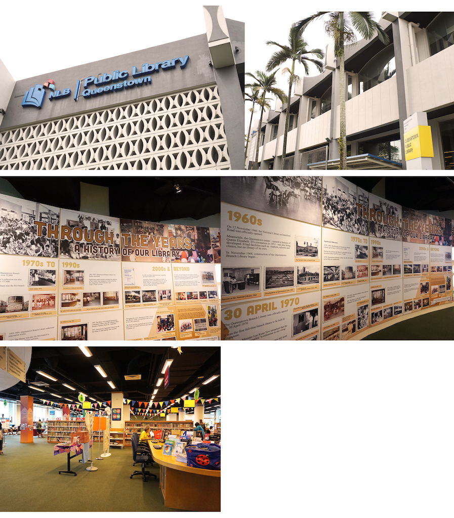
Queenstown Public Library
Queenstown public library is Singapore’s first public library. Lee Kuan Yew saw it as a step towards improving our standard of living by providing access to books which most people could not afford to buy. It has now become an identity marker of Queenstown which holds fond memories for past and present residences.
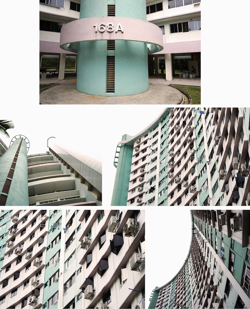
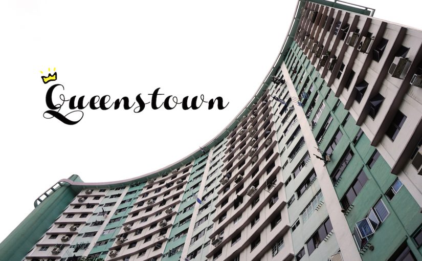
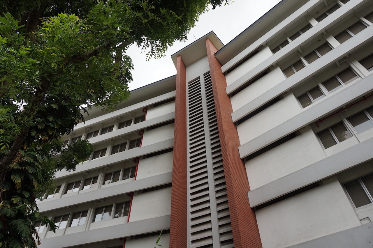
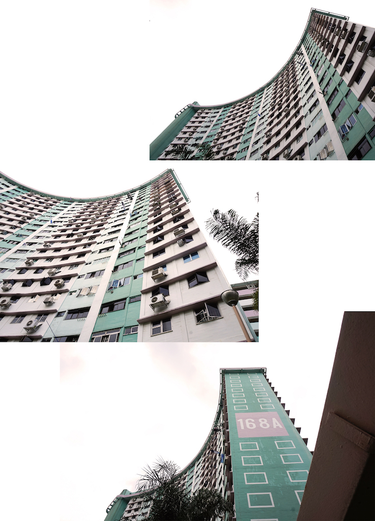
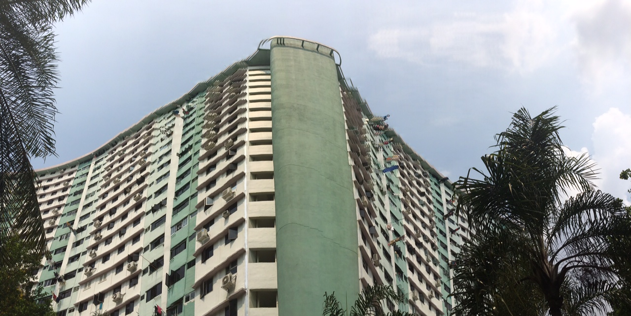
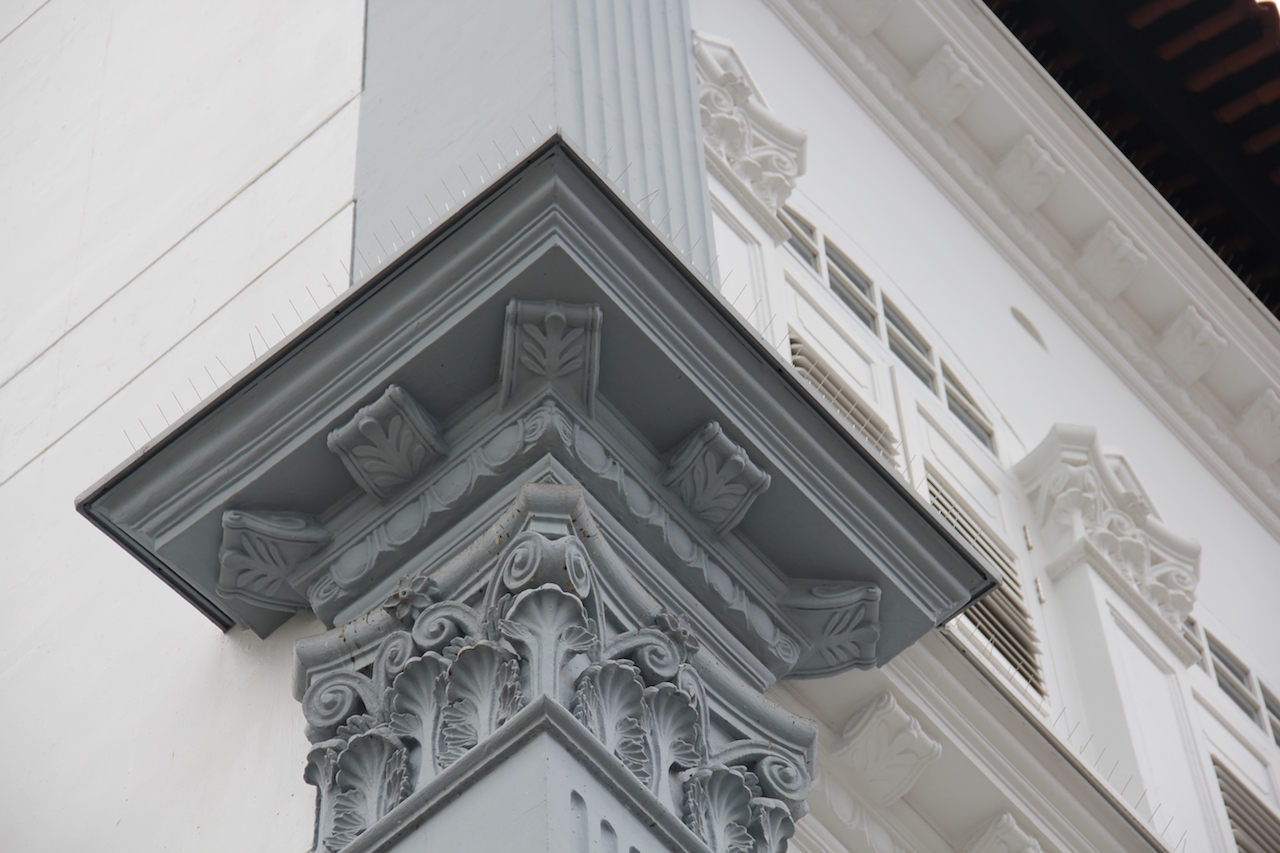
The “Butterfly” block
Block 168A is Queensway’s first curved HBD block and it’s unique facade was what earned it it’s name. Back then, HDBs were mainly built for function with simple slab blocks and point blocks. With its aesthetic facade, the “butterfly” block was an effort to encourage more innovative designs and character in public housing. The curves and colours of the buildings were definitely a sight to look at.
This pretty much concludes my visit at queenstown!
Post Exploration Thoughts
After visiting, I realise that my initial idea of a guide of Queenstown may not be that great. Firstly, most of the old amenities have shifted, most of the food places have shifted as well to commonwealth and Holland V area and to be honest, there isn’t much in terms of entertainment asides from shopping at Queensway, IKEA or anchorpoint. Furthermore, these are all pretty common and truth be told, you don’t need a guide for it when many people already know of these places. Therefore, I decided to play on the heritage and history of Queenstown. I scrapped the idea of a heritage trail since it has already been done. Throughout my research, I realise that Queenstown was actually the first for loads of things. The first polyclinic was built here, the first technical school, first library etc. Hence, I thought why not do an infographic for the lists of things that Queenstown was first for?
And this concludes my post!! Took me forever but thanks for reading!! 🙂
Sooo it’s time to get started on the second project of the semester! We were each given a neighbourhood to explore and find out about what makes that neighbourhood unique as well as interesting features in that area.
The place that i got was QUEENSTOWN! But before I went down to explore the neighbourhood, here are some secondary research I did on the neighbourhood as well as some research into infographics.
Your site/neighbourhood – some history/background/what is it known for?
Queenstown old cinema&bowling alley“butterfly block” unique curvature of the first curved HDBQueensway shopping centre- one of the first multi-purpose shopping centre
first Satellite new town to be proposed in Singapore
named in commemoration of Queen Elizabeth II’s coronation in 1953.
pioneer of many firsts in public housing history in Singapore
underwent major development from 1960 to 1965 as part of HDB’s first Five Year Building Programme.
first estate to Launch “Home Ownership Scheme” in 1964
First 14-storey (Forfar house) and 16-storey public housing blocks (Block 81, Commonwealth Close)
First Blocks by Housing and Development Board (HDB) 45, 48 and 49 Stirling Road.
Block 168A, Stirling Road was the First aesthetic Block constructed in the year 1973. This block is also known as butterfly block
remains as one of the 2 HDB estates to have double storey terrace flats at was built by SIT in the 1950s to attract the well to do.
total of 5 neighbourhoods were initially planned for Queenstown, namely Princess Estate (present day Dawson & Strathmore estates), Duchess Estate (where Blk 6C and the Terrace Typology HDB flats are located), Tanglin Halt Estate (next to Commonwealth MRT Station), Commonwealth Estate and Queens’ Close Estate (comprising of present day Alexandra hospital)
place where many social institutions were established
1956, Queenstown Secondary Technical School was the first technical school
1963, Singapore’s first polyclinic was built along Margaret Drive
1970, Queenstown Community Library, the first branch library in Singapore
1980s, Queenstown estate was becoming stagnant without much new developments.
1994, the Urban Redevelopment Authority (URA) issued a Development Guide Plan for Queenstown
proposals for a new sub-regional centre in Buona Vista, new infrastructure to link tertiary educational institutions and business parks, and good, high-density housing.
rejuvenated in the form of the Selective Enbloc Redevelopment Scheme, whereby older flats were demolished to make way for new ones
construction of new private residential housing, the opening of Swiss furniture giant IKEA’s flagship store, and the launch of The Anchorage, a condominium-cum-shopping complex.
History
formally a swampy valley with two hills named Hong Lim and Hong Yin.
Hong Lim hill was a cemetery for over 100,000 Chinese graves,
Hong Yin hill was covered with orchards and rubber plantations.
was formerly a A village called Bo Beh Kang, literally “No Tail River” in Hokkien, was settled by mainly Hokkien, Teochew and Hakka dialect groups.
area also housed a British military camp, known as Buller Camp
swamp, cemeteries, farm land and camp site were eventually cleared to make way for the development of Queenstown housing estate
In the 1990s and 2000s, many iconic landmarks in Queenstown, such as Tah Chung Emporium, Queenstown Remand Prison and Margaret Drive Hawker Centre, were torn down to make way for re-development.10 In 2013, three buildings in Queenstown, namely Queenstown Library, the former Commonwealth Avenue Wet Market and Alexandra Hospital, were announced to be gazetted for conservation under the URA 2014 Master Plan.11
What is ethnography and participant-observation? What are some ways collecting data?
Ethnography – the systematic study of people and cultures.
Participant-observation – one type of data collection method typically used in qualitative research such as interviewing, observation, and document analysis. Or the process of learning through exposure to or involvement in the day-to-day or routine activities of participants in the researcher setting
Data collection can involve active looking, improving memory, informal interviewing, writing detailed field notes, checklists, questionnaires
What is qualitative and quantitative data? What is the difference between primary and secondary sources of data? How would you go about collecting the two?
Qualitative Research
gathers information that is not in numerical form.For example, diary accounts, open-ended questionnaires, unstructured interviews and unstructured observations. Qualitative data is typically descriptive data and as such is harder to analyze than quantitative data.
Quantitative research
gathers data in numerical form which can be put into categories, or in rank order, or measured in units of measurement.This type of data can be used to construct graphs and tables of raw data.
Primary data is collected by the researcher him/herself in response to a specific question with a specific objective whereas secondary data is not collected by the researcher him/herselfbut rather reliant on the survey results, interview recordings or experimental outcomes collected by others.
Primary data would be more tailored to the study, easier to control and accurate compared to secondary data that can be vague or outdated.
This project really taught me a lot and gave me the chance to experiment with different mediums. It has also taught me to improvise a lot and to be more open minded when things don’t always go according to plan. This project has also been rather frustrating at times when ideas I had in mind didn’t always go according to plan or turn out the way I envisioned it to be. I learned more about expressing ideas visually through typography especially after looking at my friend’s works, I learned more about the different techniques they used and improvements I could make for future projects. Overall, this project has been rather fulfilling and I’m pretty satisfied with how my designs turned out 😀
To start off this project, I first listed out a few jobs I had in mind and what type of characteristics these jobs entailed.
In the end, I narrowed it down to these few
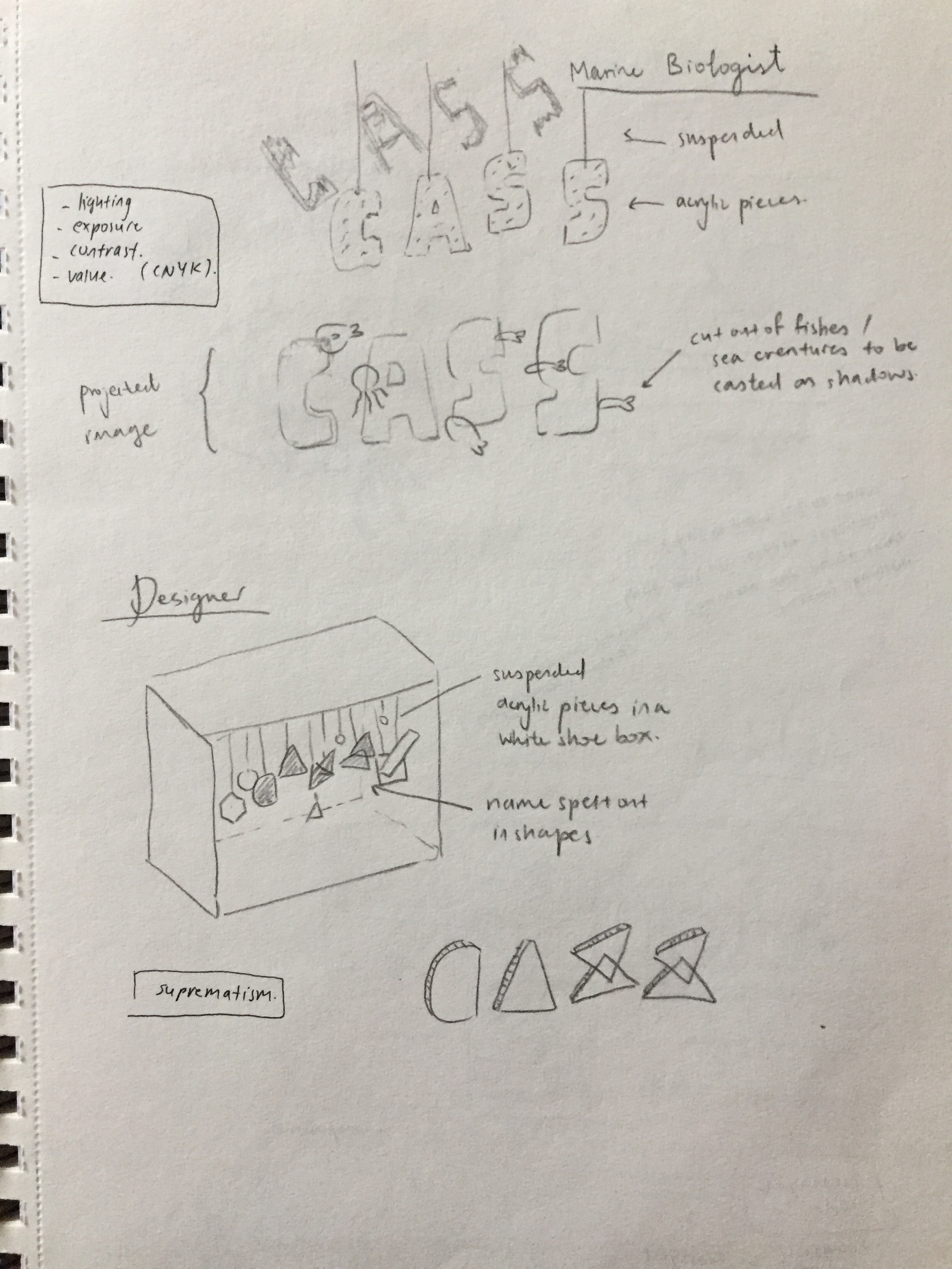
Designer
Architect
Tattooist
Marine Biologist
I was able to come up with a few ideas fairly quickly but it was the execution that would become the problem. After my first consultation, Joy also suggested that I have an over arching theme amongst all of my jobs to bring about a deeper meaning into my designs. I went with the idea of stereotypes of each occupation which I will elaborate on further in this post.
These are a few shots of my initial ideas:
Developments
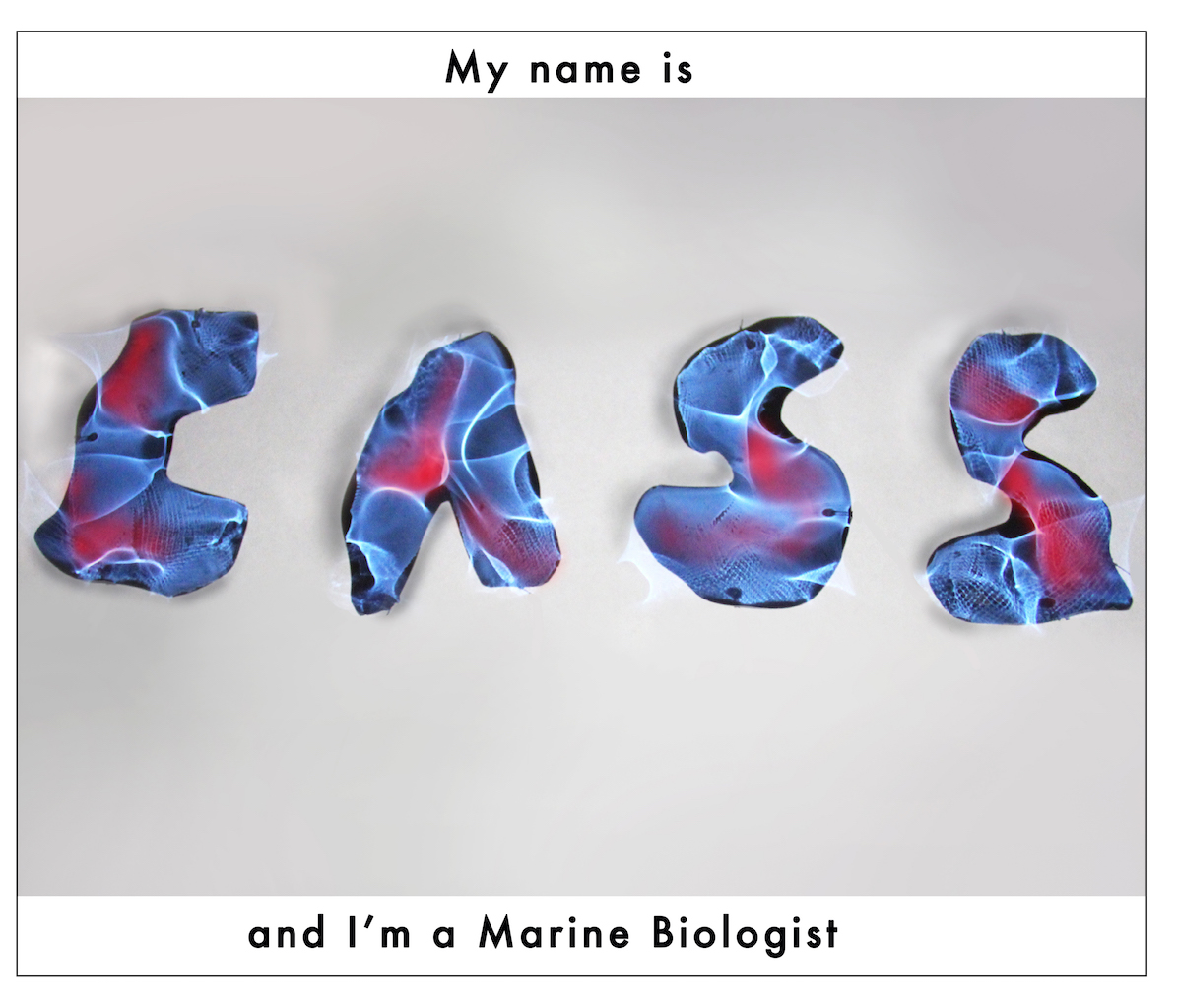
Marine Biologist
What do they do?
study all types of sea creatures
learning and research field, work with other universities and educational institutes
compiling research data, publish journals
workplace:
oceanography centres, travelling to interesting places
tide pool, swamp, mangrove, coral reef
out at sea for an extended period of time, diving
stereotypes:
dangerous
no social life, lack social or practical skills
I was inspired by these works by Sophia Collier and Kate Jackling as mentioned in my previous post.
Work by Sophia Collier
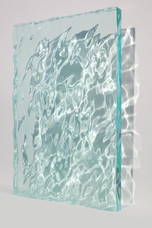
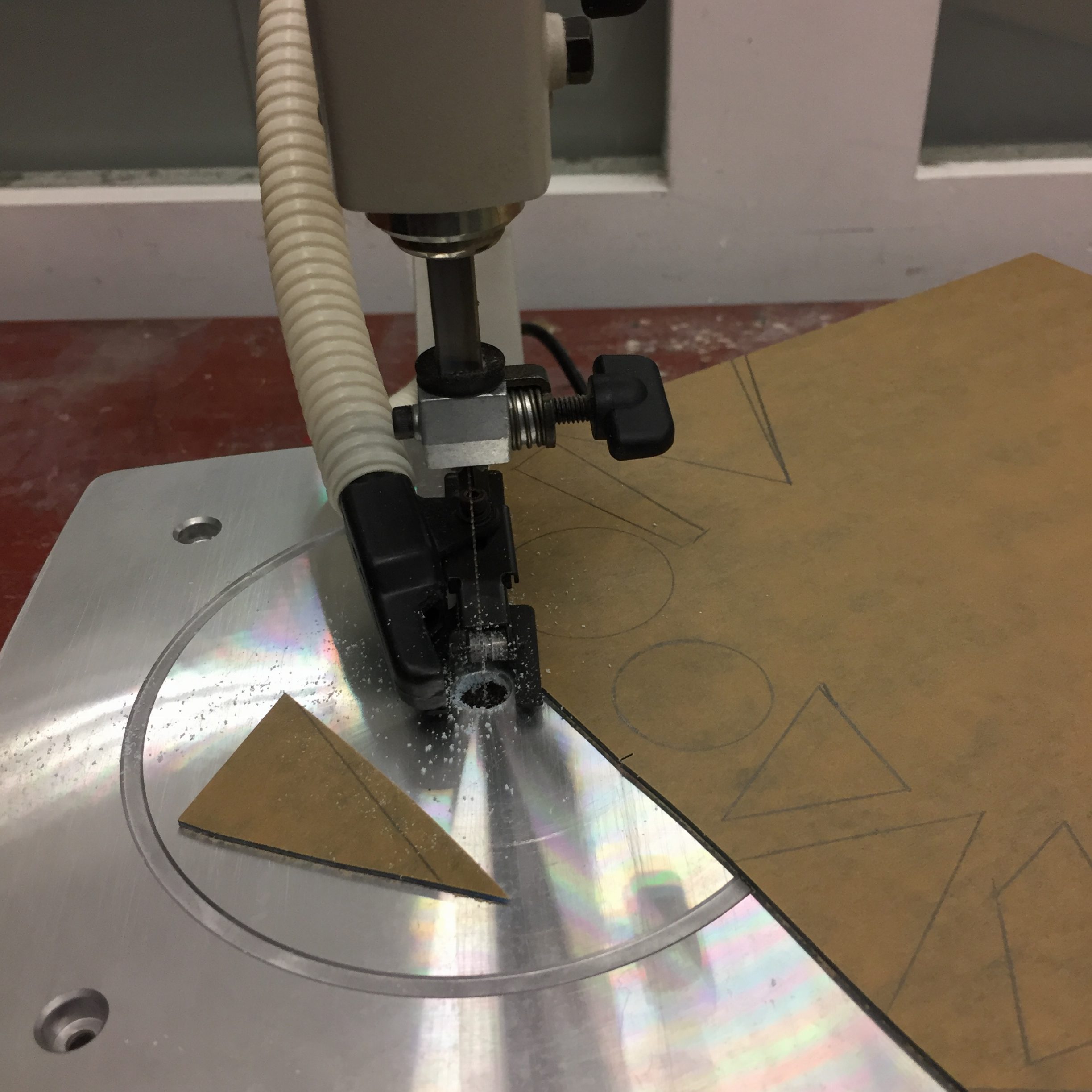
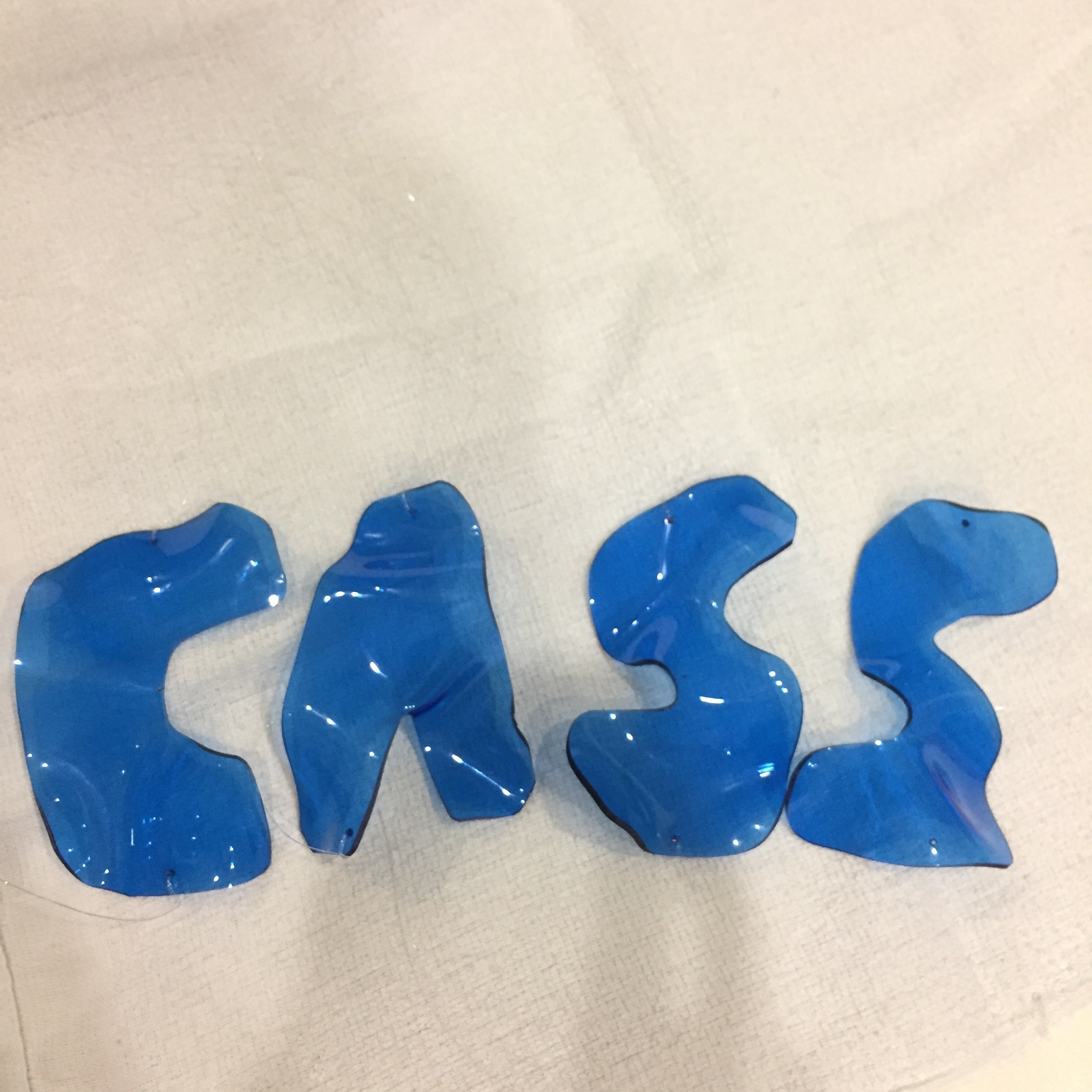
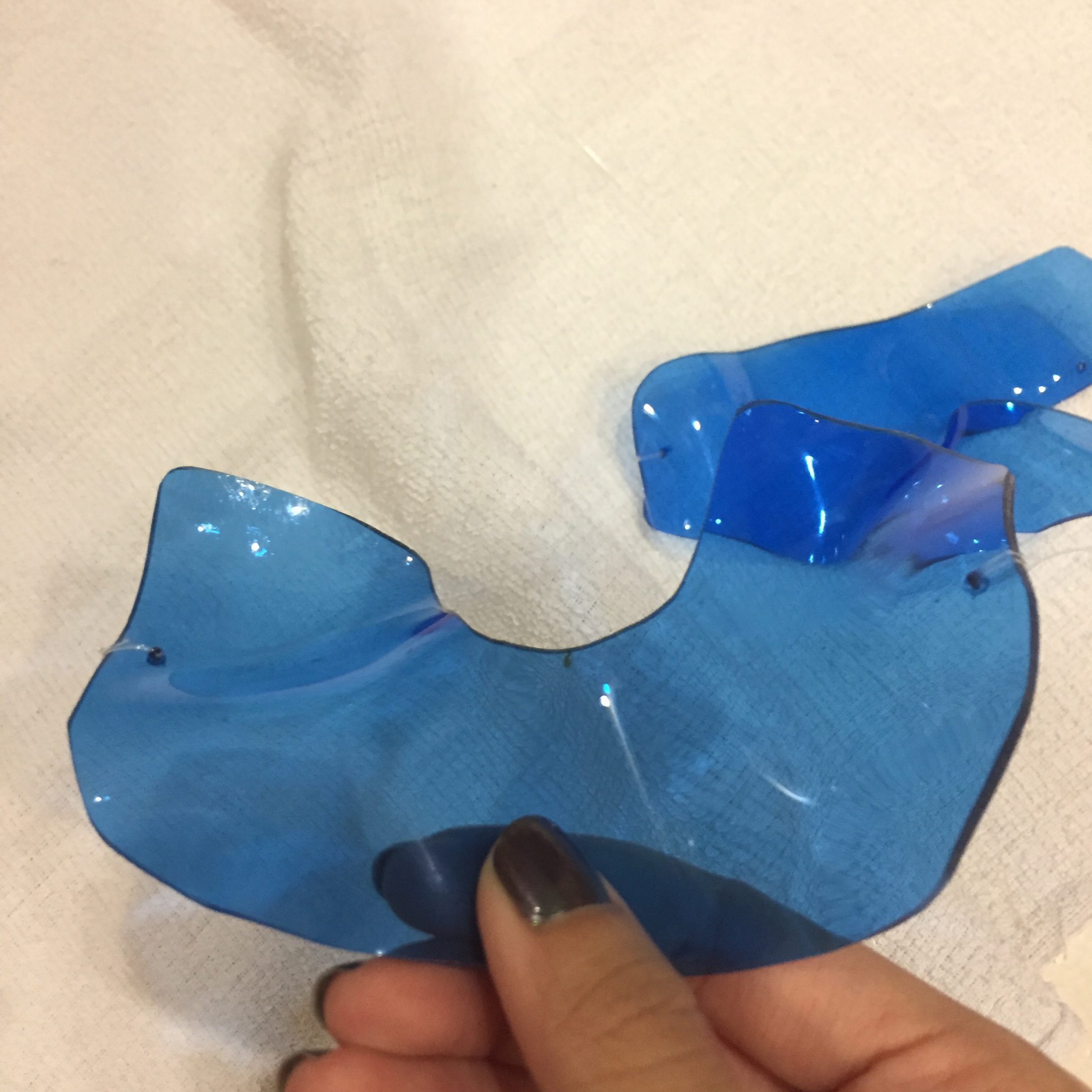
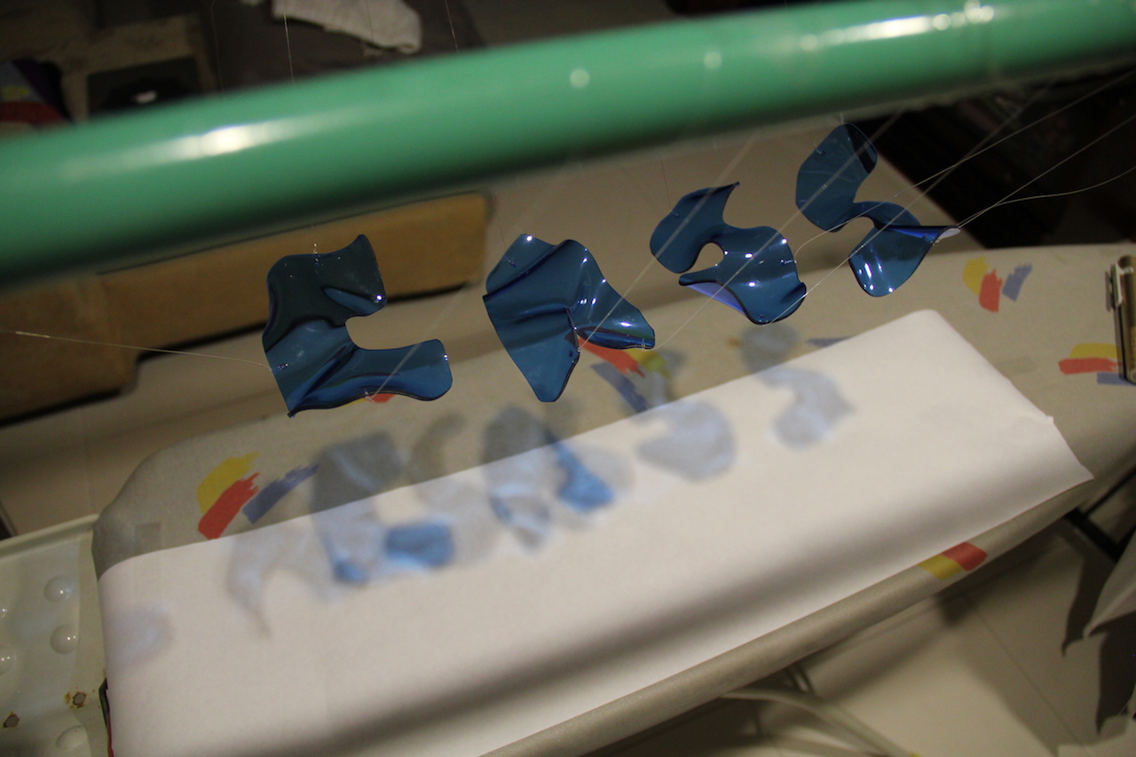
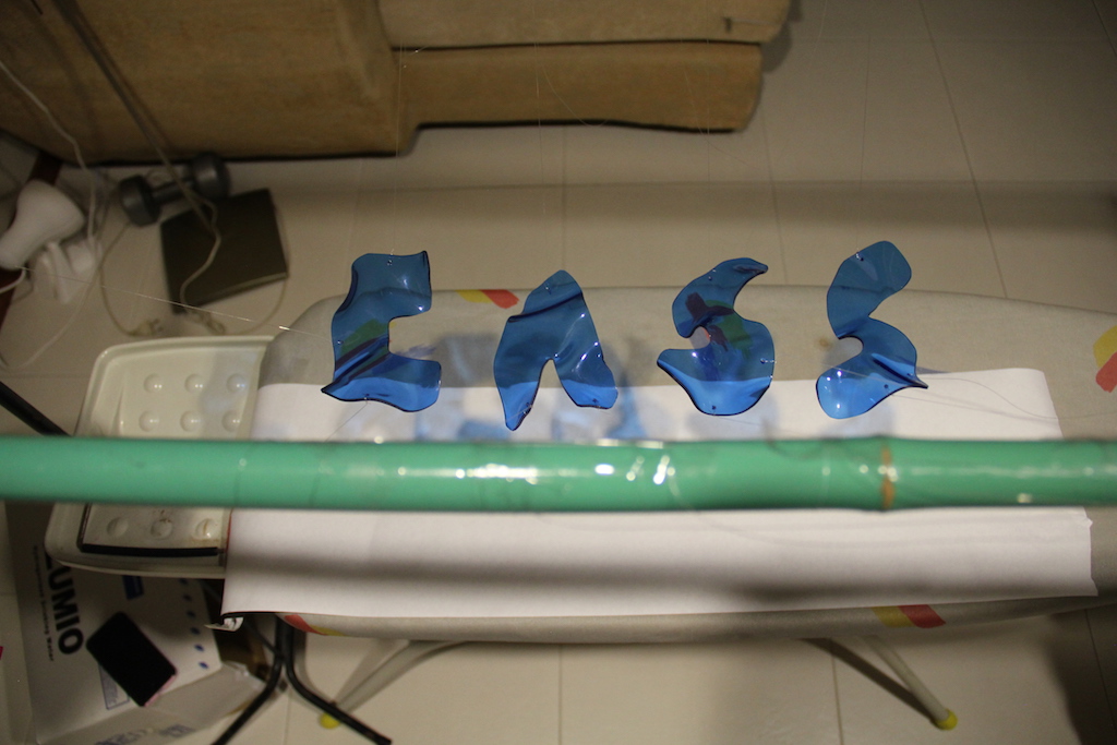
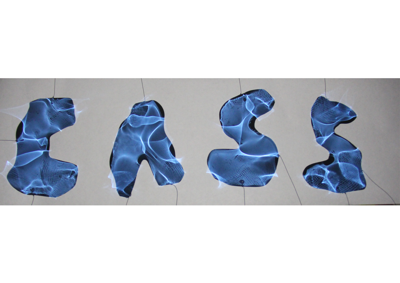
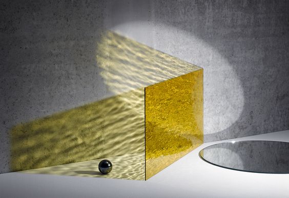
I got the idea to use acrylic pieces in the shape of my initials and warp it to give it that water shadow effect which I felt fits my occupation as a marine biologist constantly out at sea and studying marine life.
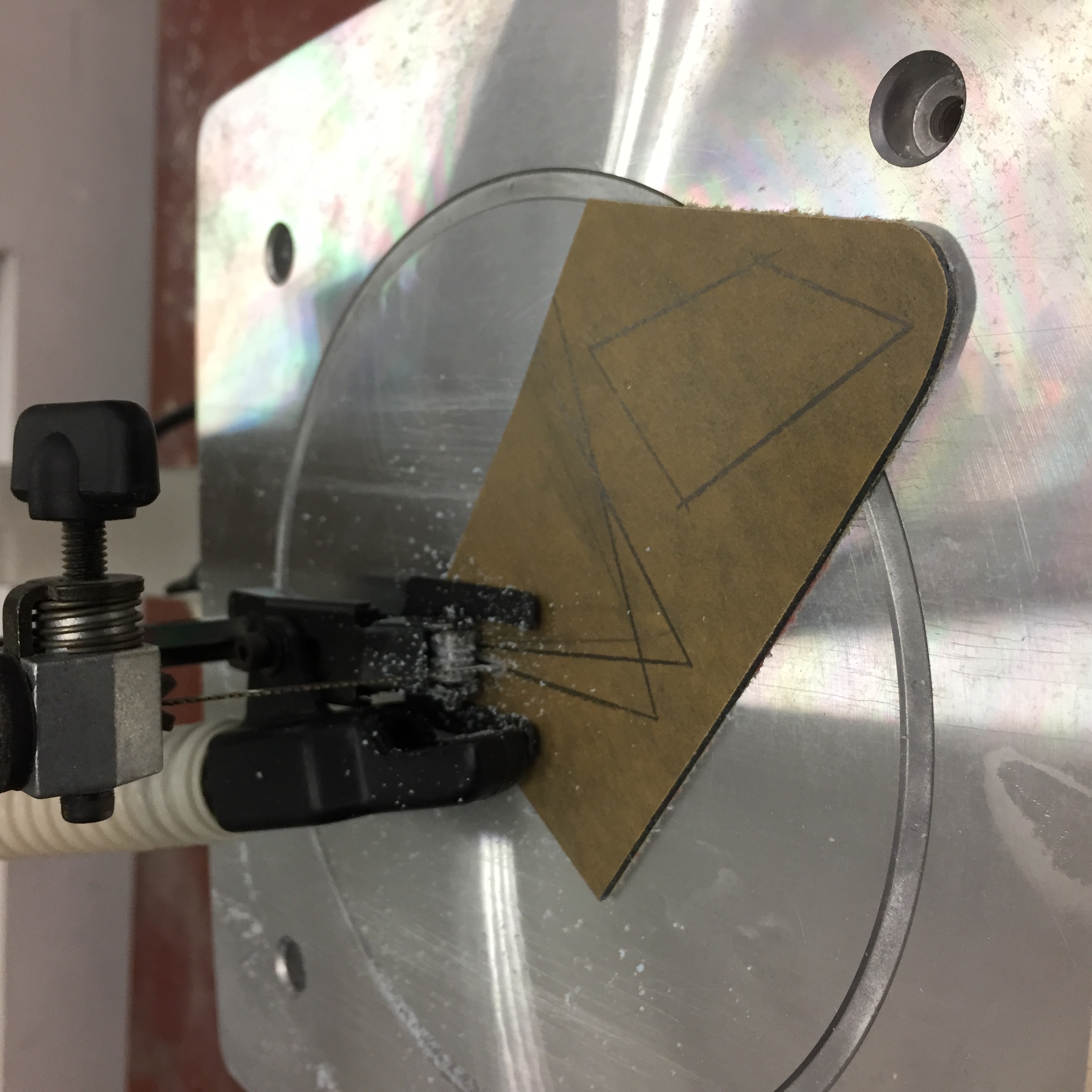
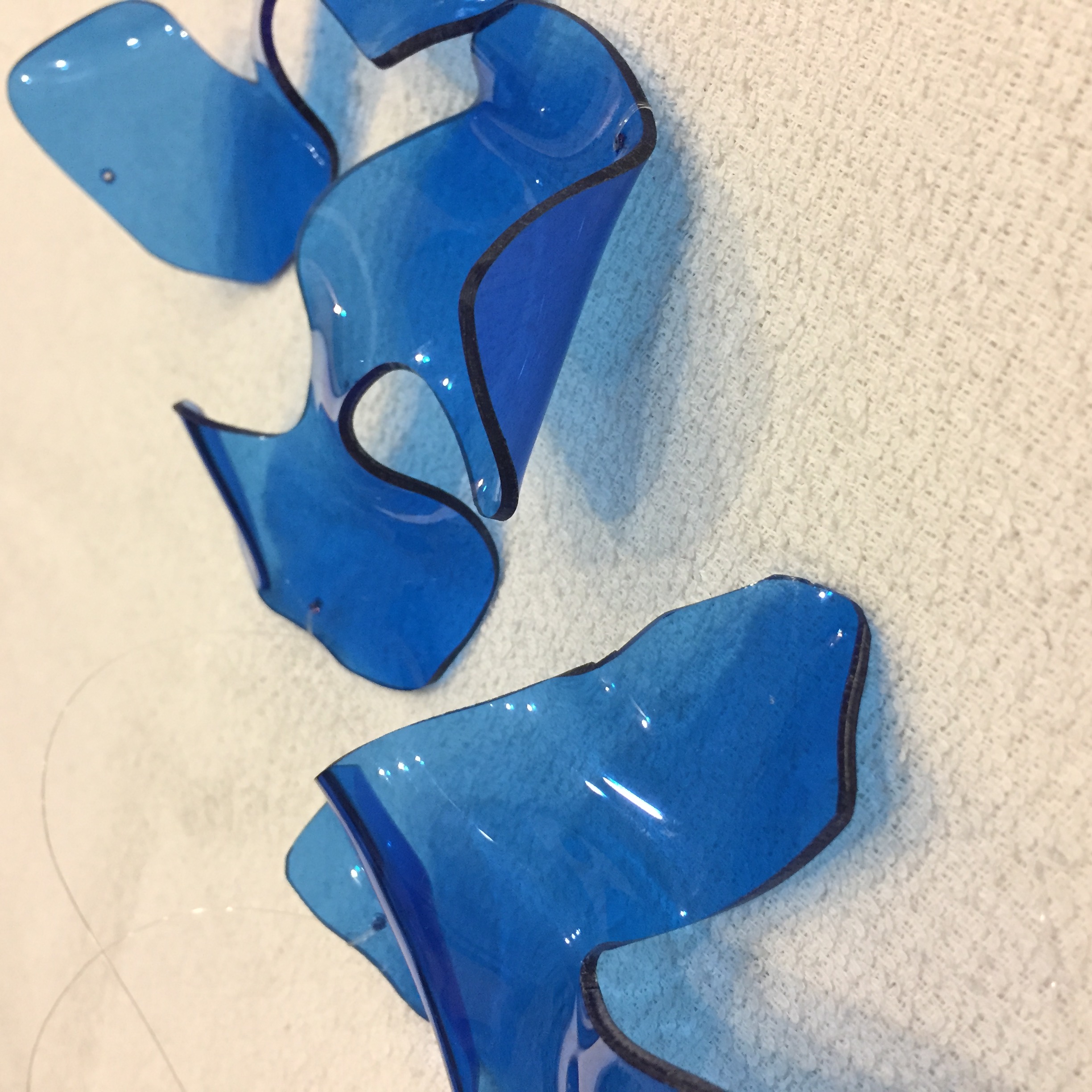
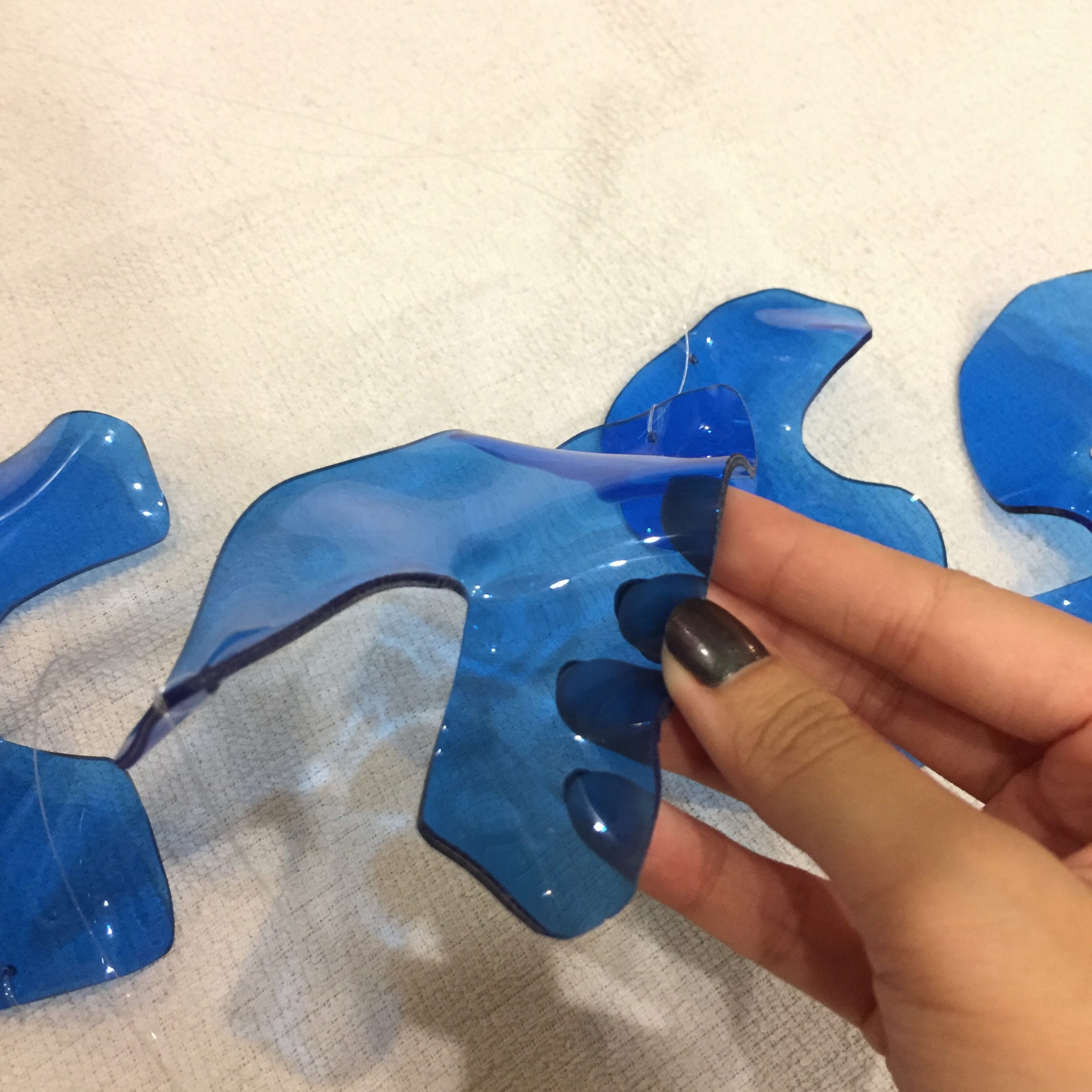
Using the scroll saw from the 3D room, I was able to cut the acrylic pieces into the desired shapes. However, cutting along the lines proved to be very difficult because the blade was hard to control and turn. After cutting the pieces, I used a hot gun to melt the plastic and warp the letters.
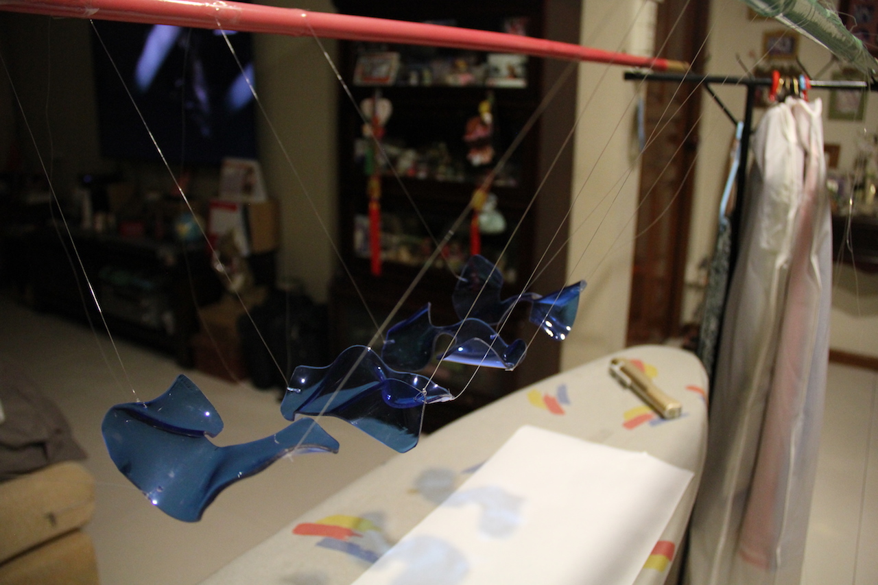
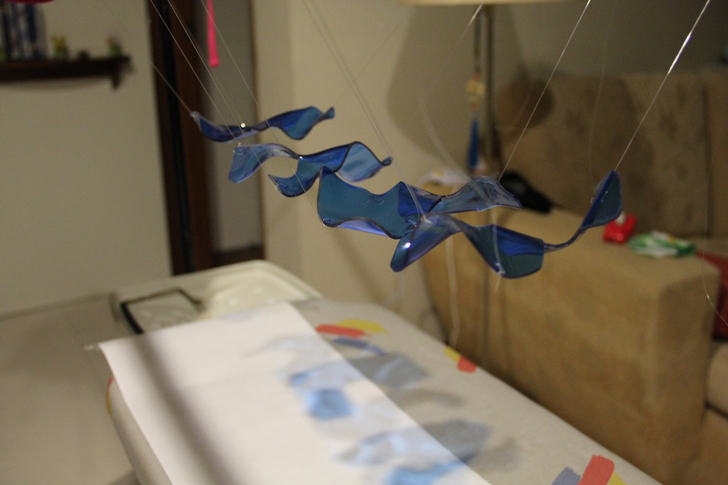
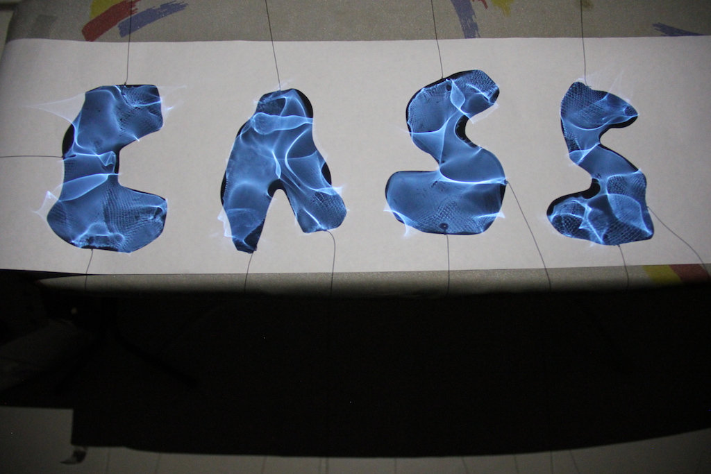
Using 2 bamboo poles and an ironing board for leverage, I tried to suspend the acrylic pieces using nylon strings to cast a shadow on a plain surface.
Image of shadow casted when a light source is shone on it.
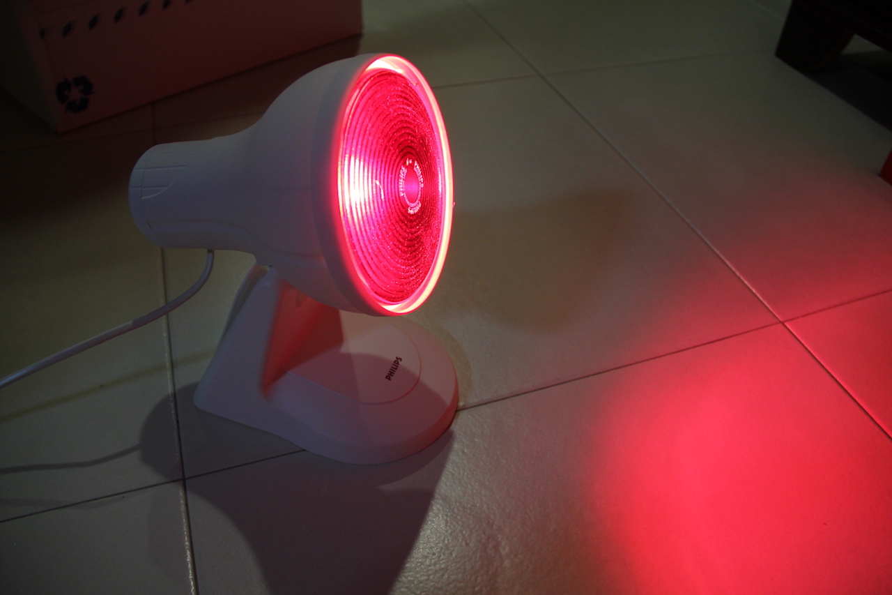
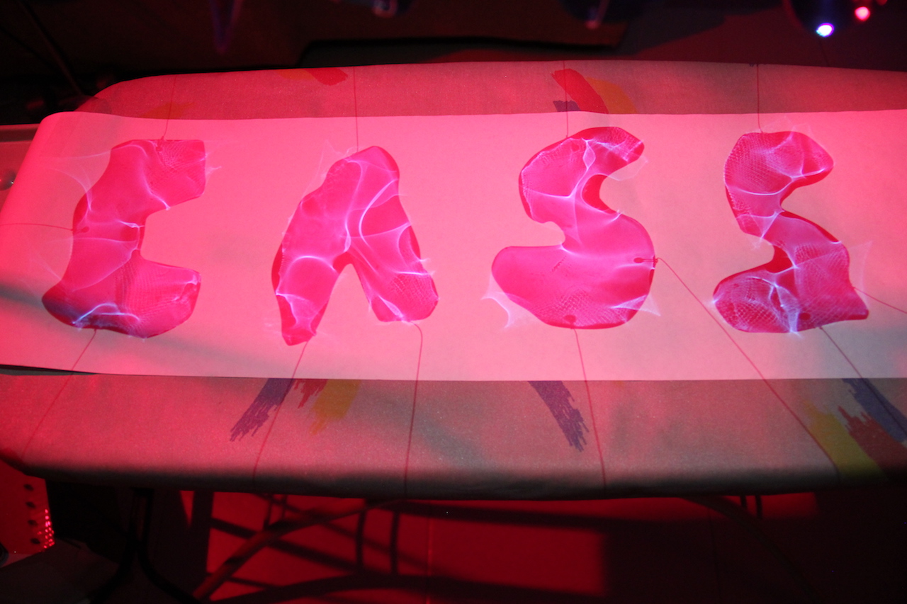
I also tried to play around with red light to bring the element of “danger” in my design ( a common stereotype of marine biologists ).
However, the desired effect was difficult to achieve and the red light ended up washing off most of the blue shadow. Hence, I decided to photoshop in the “blood” instead.
This was the original picture taken before edit.
Photoshopping away the background from the original picture proved to be very difficult without losing some of the reflectiveness of the letters as seen from the picture above. The clean white background also made the letters look flat and the edges sharp.
After consultation and advice from my peers, I decided to retain as much of the original picture as possible by keeping the grey ish background and adding a bit of a drop shadow to make the letters stand out more. I also adjusted the blue to bring out as much of the light details as possible. Using a brush tool, I brushed on some blood to illustrate the danger element in my design as a Marine Biologist is often considered a dangerous occupation with long hours out at sea.
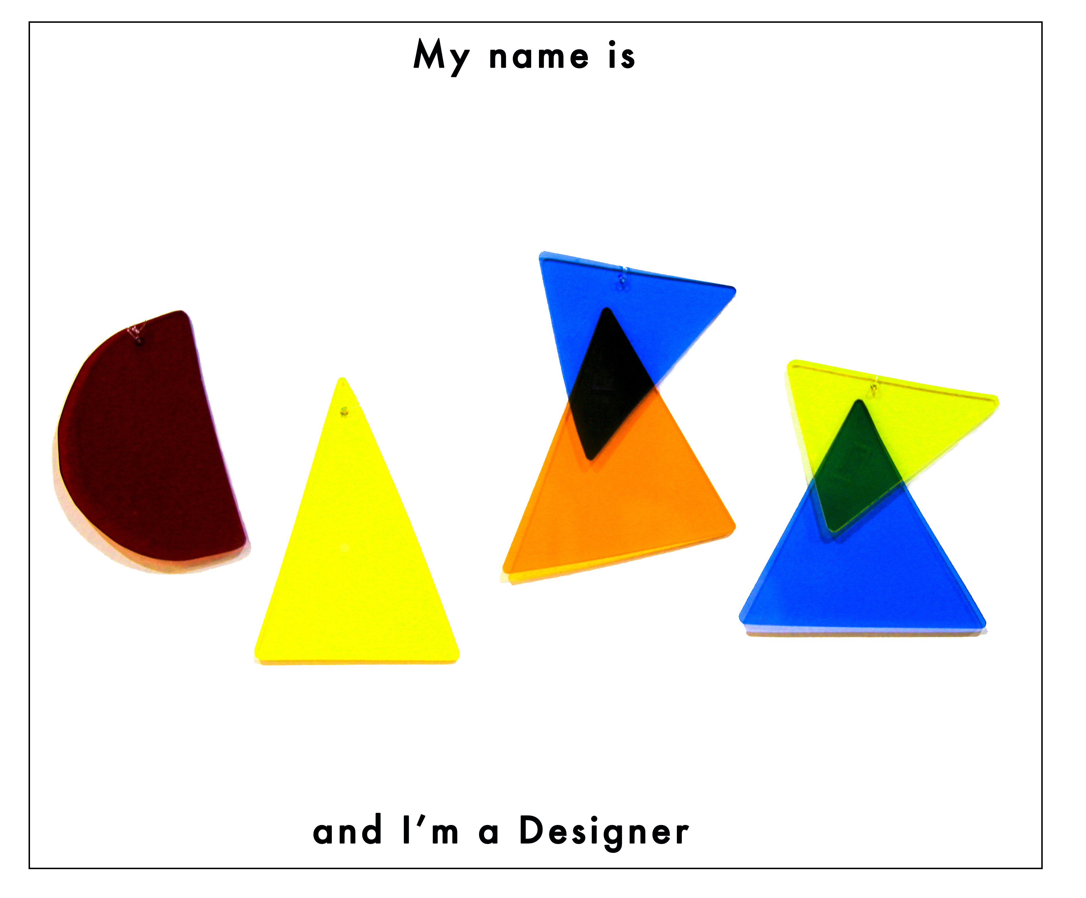
Designers
Stereotypes:
messy
hard to succeed in Singapore, unappreciated
open-minded, “carefree”
easier compared to other occupations such engineers
The stereotype I decided to go with was how designers are often misunderstood as being an “easy” and “simple” job, that they do not have it as hard as other occupations. As an art student, I often hear remarks that my course was fun and easier compared to my peers who were in business or engineering because of the lighter workload and the fact that we don’t have much written assignments or a final exam. However, they fail to see the effort behind each design we come up with. All the research and process put in to convey a message through visuals. I believe that design isn’t just about the aesthetics and looking good, it is delivering a message or story well. A successful aesthetic design is one that delivers the message well while utilising good principles of design.
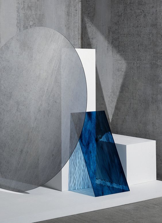
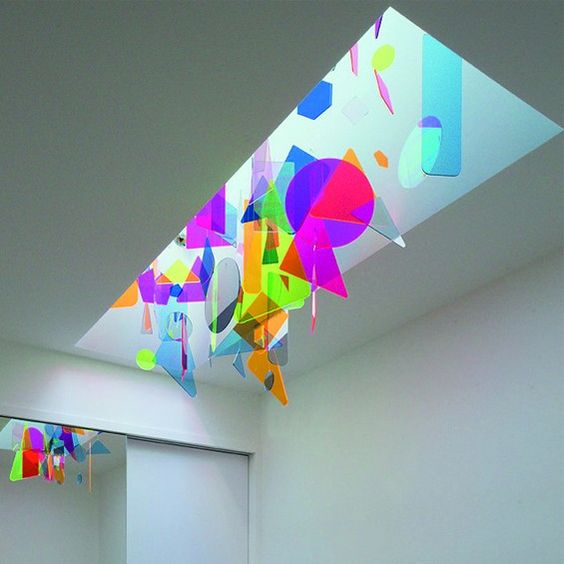
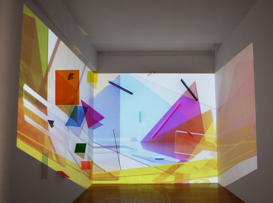
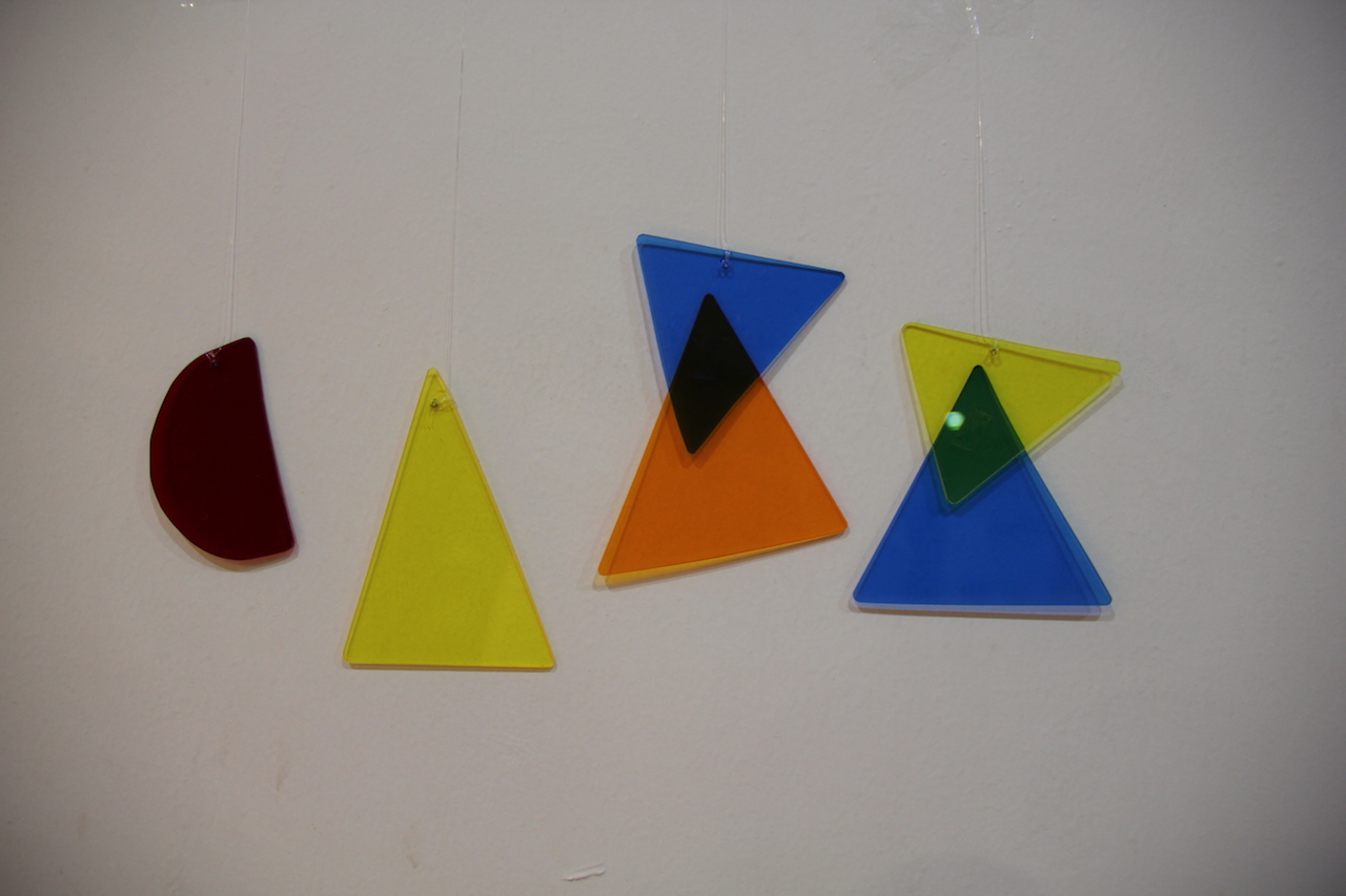
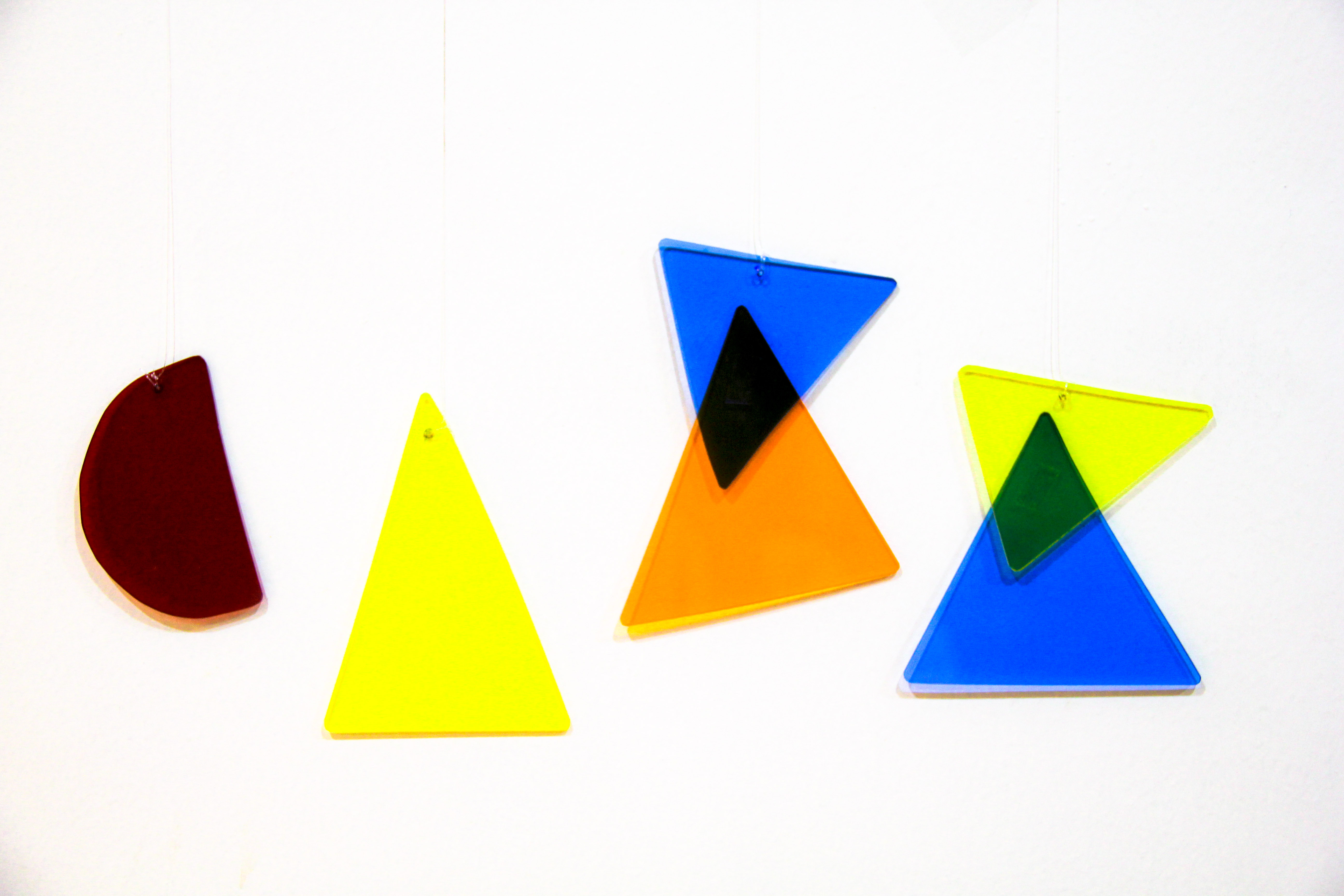
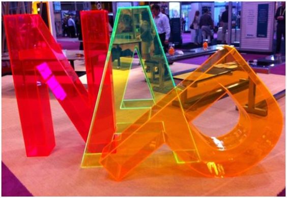
I was inspired by this installation by Inès Esna with the use of geometric shapes.
installation by Inès Esna
I also looked into the Suprematism movement and their use of geometry in the compositions. I wanted a clean minimal look in my design to bring across the idea of simplicity using basic shapes and primary colours.
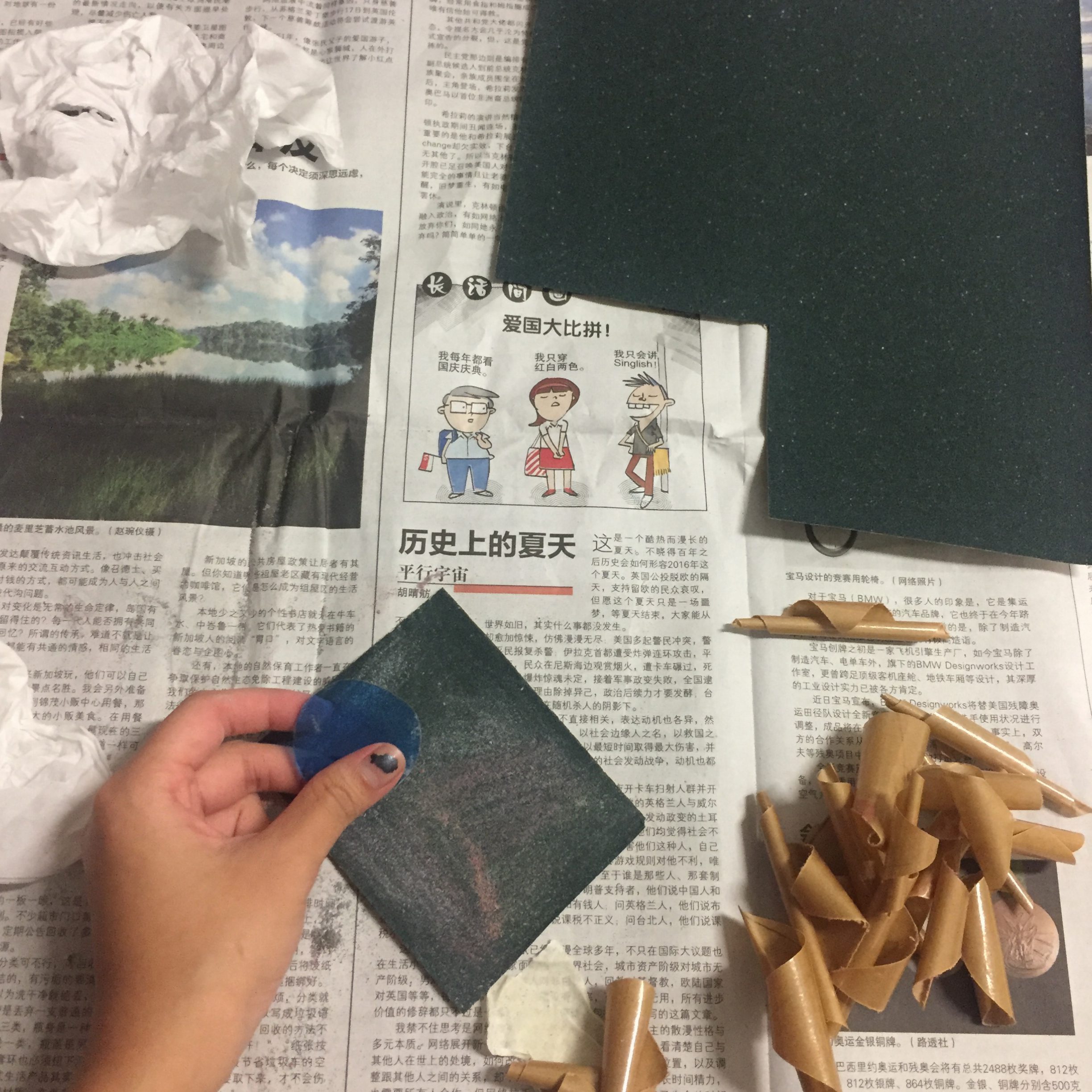
Using the scroll saw, I started cutting up the acrylic sheet into different shapes of different colours.
After which, I individually buffed the edges of the pieces using sand paper to smoothen out the edges.
Initially, I wanted to suspend the acrylic pieces in a box along with other shapes in the background as seen in Inès Esna’s installation but decided against it. Firstly, I was afraid the font would get lost in the shapes as other shapes could be mistaken as other letters and I did not want my name to end up ambiguous. Secondly, suspending the shapes proved to be really challenging in getting the lighting right as well as photographing it without the acrylic pieces moving about.
I tried hanging it in a box against a white background.
In the end, I decided to hang the pieces against a white wall and photograph it instead.
After which, I tried to play around with the different colour combinations using Lightroom.
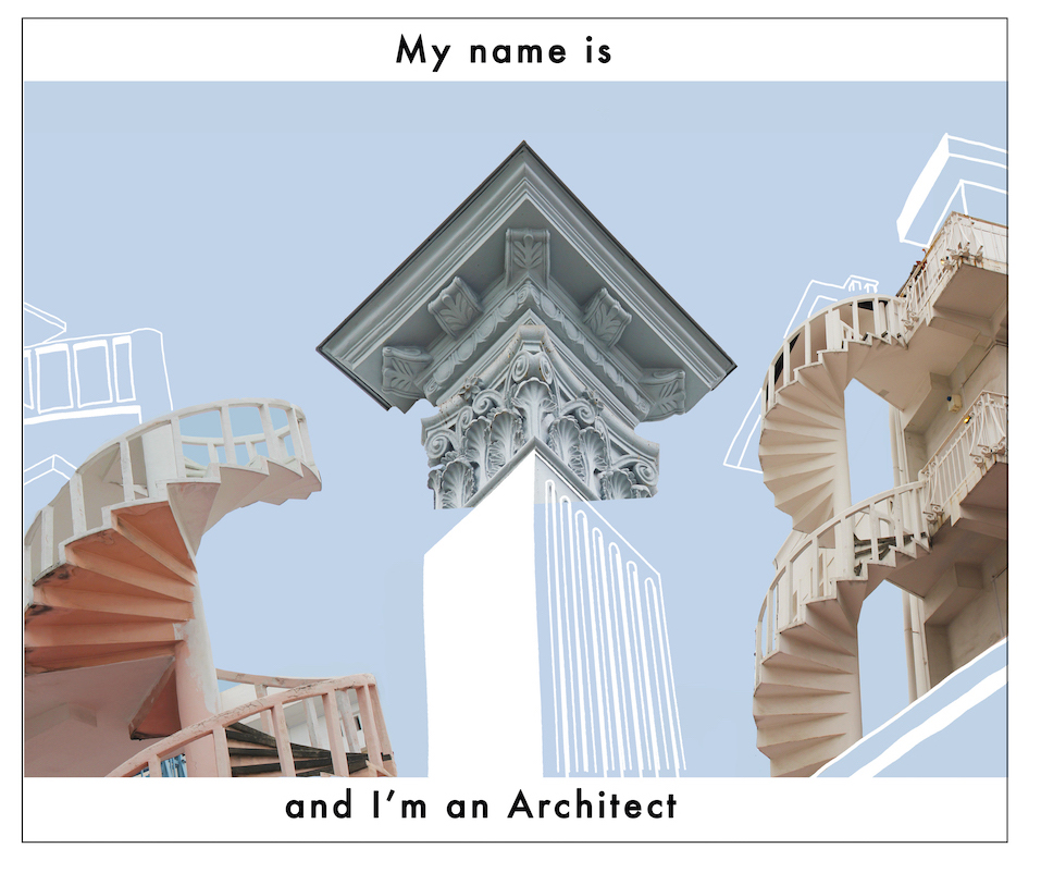
Architect
As the stereotypes for architects and designers are closely linked, I’m not going to make a list of stereotypes but rather talk about the stereotype I chose for architects in our local context. Considering Singapore’s growing economy and population with our limited land space, most of our old heritage buildings often get demolished to make space for new modern buildings. This is one stereotype I feel that people have of architects in Singapore, that they are constantly building new condominiums and shopping malls to replace our old buildings. However, I feel that this is not always true and that certain heritage buildings are still well preserved and appreciated. One example would be our shophouses. Shophouses are still widely seen around Singapore at places such as haji lane or duxton hill. They are integrated into our modern buildings and these places are often transformed into bars, cafes or hipster shops.
I got inspired to create letterforms from buildings using my name from some images I found online and I thought it would create quite an interesting composition.
Hence, I went around Singapore to photograph some shophouses to create letterforms of my name using the structures of these buildings.
I tried making use of the negative spaces to form the letters ( as seen from the example shown above) but that proved to be really hard and I decided on cropping parts of the building to form the letters instead.
This was the first draft I made but after consultation, feedback given was that the letterforms were ambiguous and hard to decipher.
I felt like most of the problems were in the “C” hence I changed the design but it was still too ambiguous to be seen.
It was suggested that I used a combination of sketch and photography to distinguish the letterforms and after several revisions, this was what I came up with.
Tattooist
stereotypes:
sign of rebellion& irresponsibility
unprofessional
only people of lower class get tattoos / tattoos to determine social status/class
Tattoo placement:
Lower back: promiscuous, “tramp stamp”
Chest: symbol of love/ affection, image is close to the person’s heart, loved ones
Finger: middle finger: blood vessel that is directly connected to the heart
Forearm: toughness/strength, depends on the imagery (skulls/ anchor shows the person is strong on the outside and inside, flowers, etc shows that the person is tough on the outside, soft on the inside )
Neck: risky/daring, makes bold choices
Back: mysterious/ shy, symbolise ending of a phase in their lives/ relationship, put their past behind them
I think that taboos surrounding tattoos are a thing of the past and there is a large shift in the demographics and people’s perceptions of tattoos. There is an increase in the number of people getting tattoos and it can sometimes serve as an important symbols for a person’s religious beliefs, commemorate achievements and mark rites of passage. From the society’s point of view, some employers are starting to see it as a sign of individuality and they value that as an assert of their company.
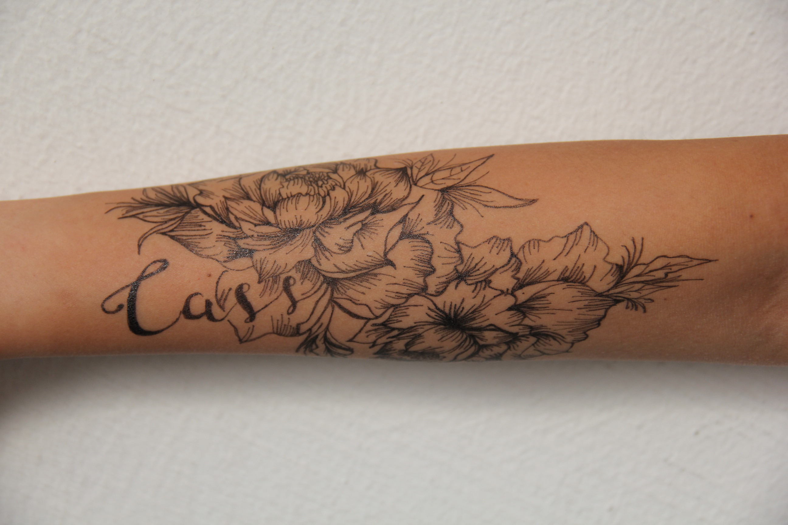
However, there is still a form of struggle for people with tattoos, especially in our more conservative society. The struggle of hiding their tattoos and choosing when is the “appropriate” time to show them. Hence, I chose the forearm as the placement to depict my design as I felt that it emphasises this internal struggle the strongest. Since the forearm is such a prominent place, it is hard to cover up and the person would feel the strongest sense of judgement from people.
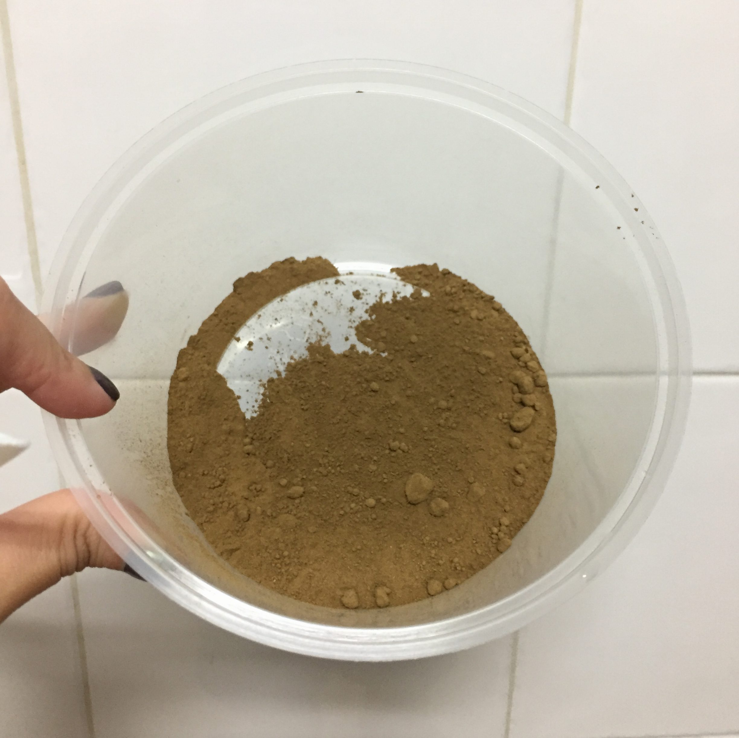
Initially, I wanted to use henna to draw on my design but decided on a black gel pen instead as it turned out looking more realistic and it brought out the details better. However, since I already DIY-ed my own henna, I thought I would just include the process in and it can be quite educational as well if anyone out there is thinking of making their own henna haha.
Step 1: 20g of fresh Henna
Step 2: 1/4 of fresh lemon juice
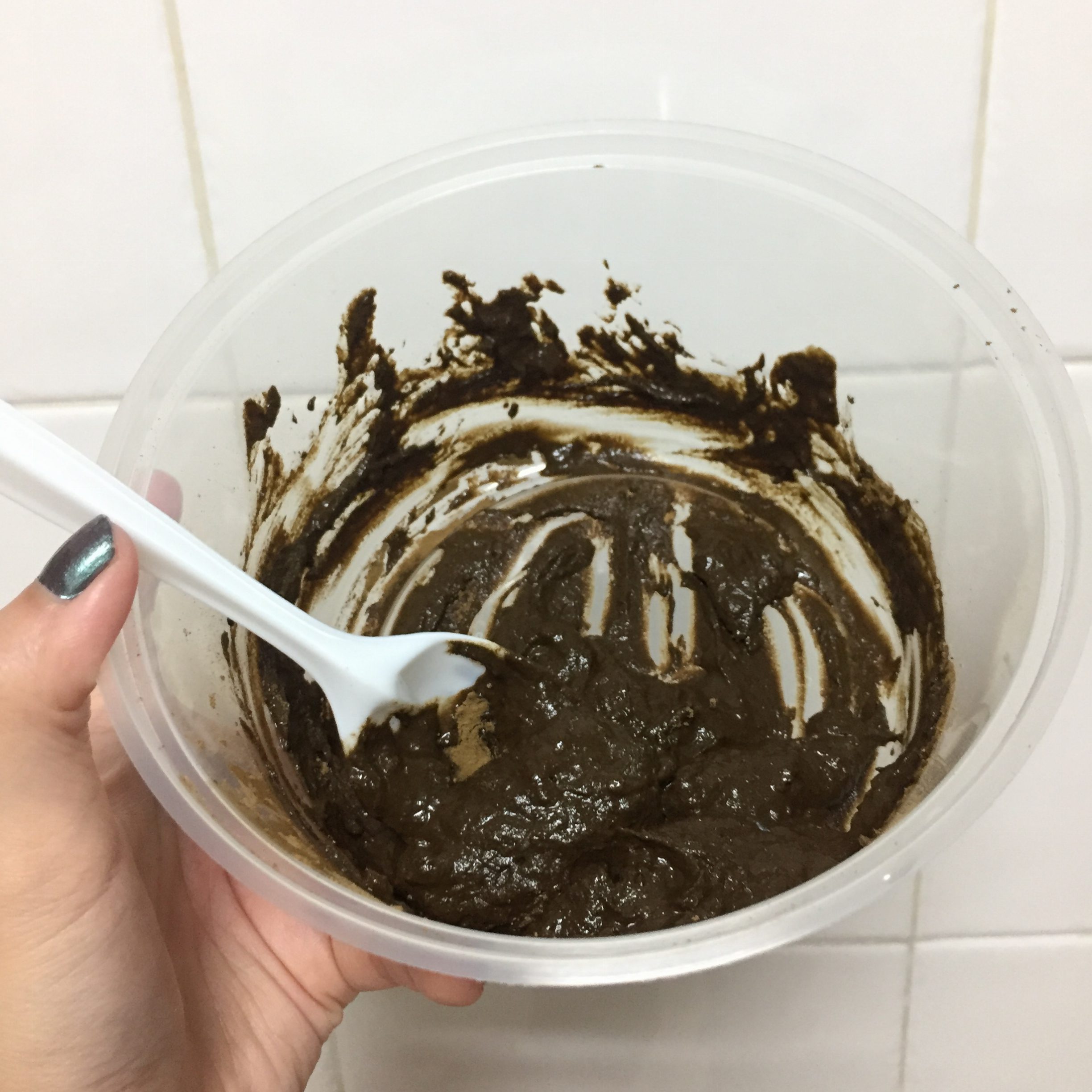
Step 3: Stir the henna and lemon juice until they are completely mixed together and no lumps of dry powder remain.
Step 4: Add 1.5 teaspoons of sugar and 1.5 teaspoons of essential oil
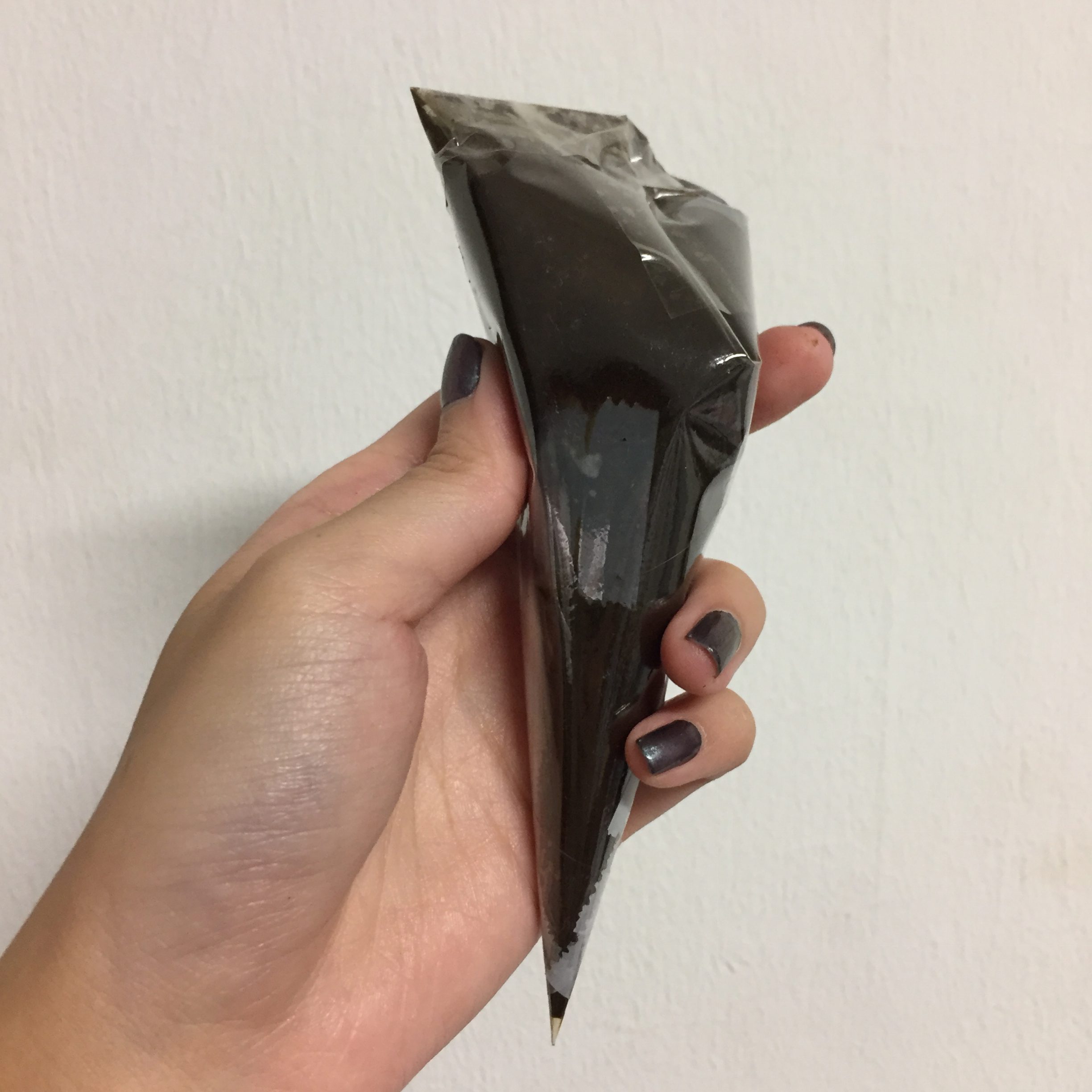
Step 5: Cover the paste with plastic wrap. Press the plastic wrap against the surface of the paste expelling any air pockets.
Step 6: Let the paste set for 24 hours and it’s ready for use!
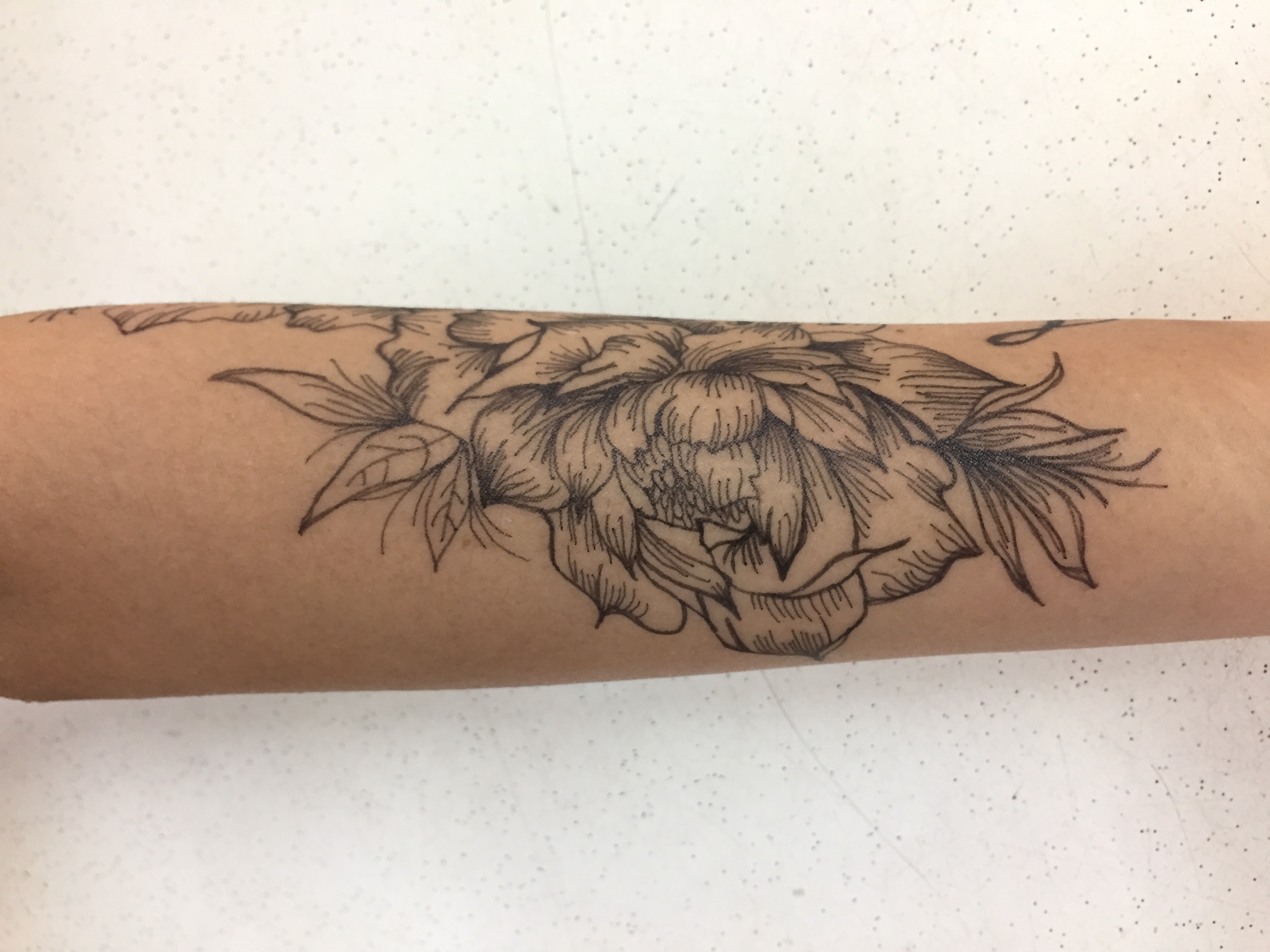
I referenced some floral images online for my tattoo designs.
My designs:
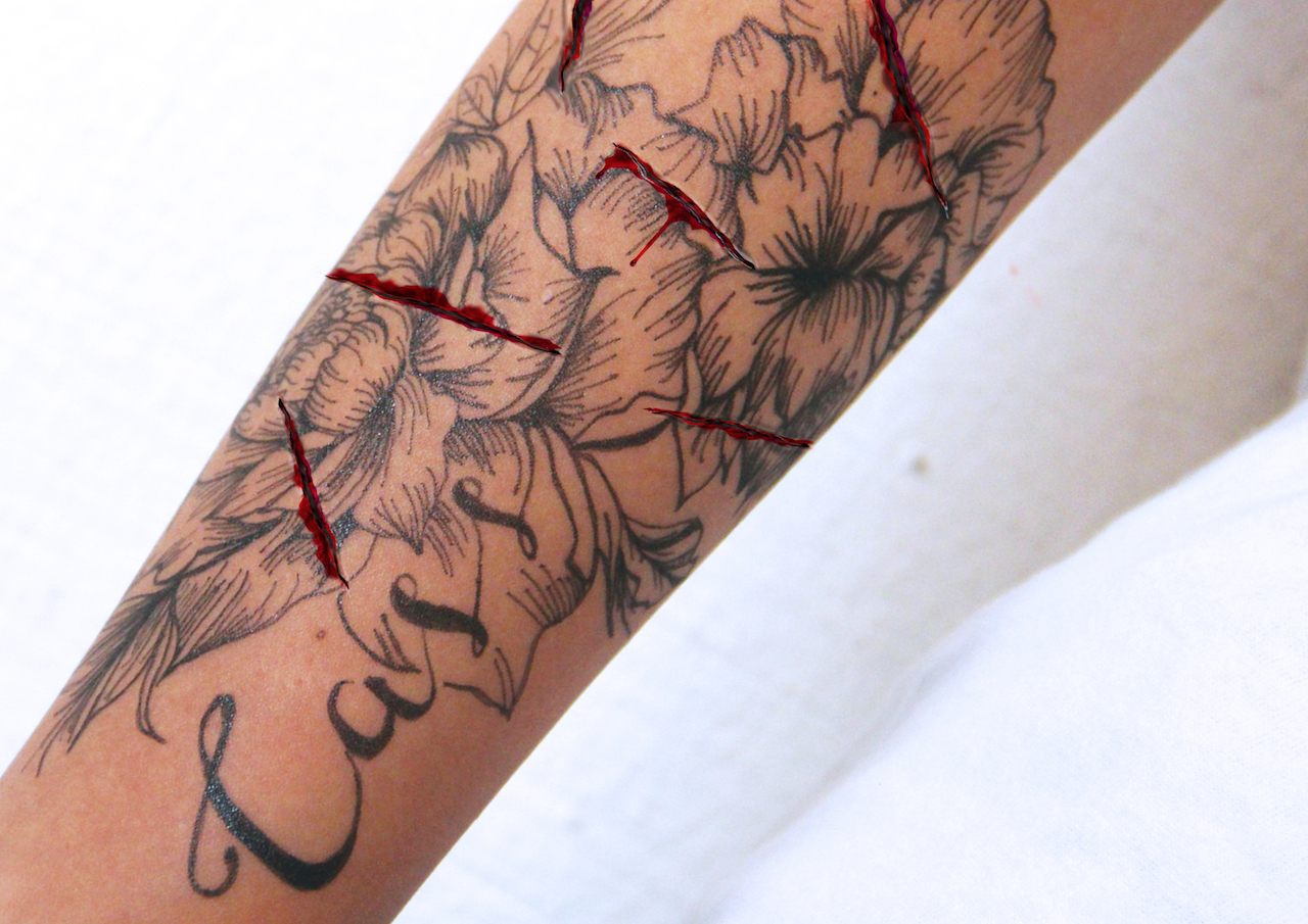
To better bring across my message, I thought of photoshopping cuts on my arm to show signs of distress and struggle of hiding the tattoos. However, I felt like the cuts were too random and was not as impactful as I wanted it to be.
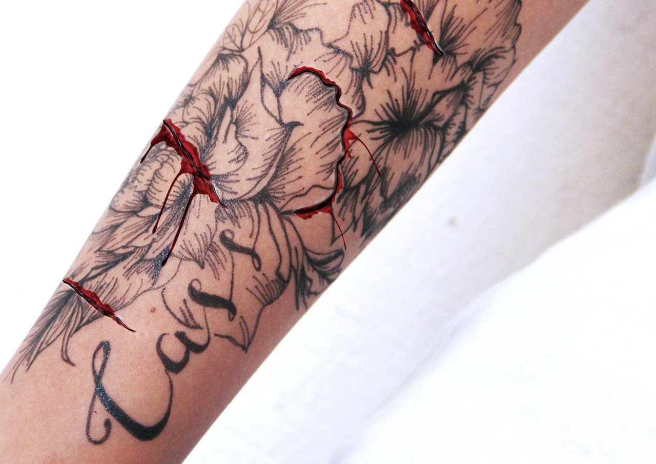
After consulting a few of my friends, I thought of making the cut surround the petal of the flower to show the act of carving the tattoo off of the skin as an act of distress. I really think this created the impact that I wanted much better.
Thanks for reading this super lengthy post! Next will be my final compositions 🙂
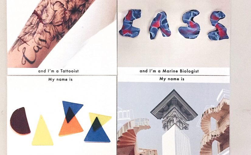
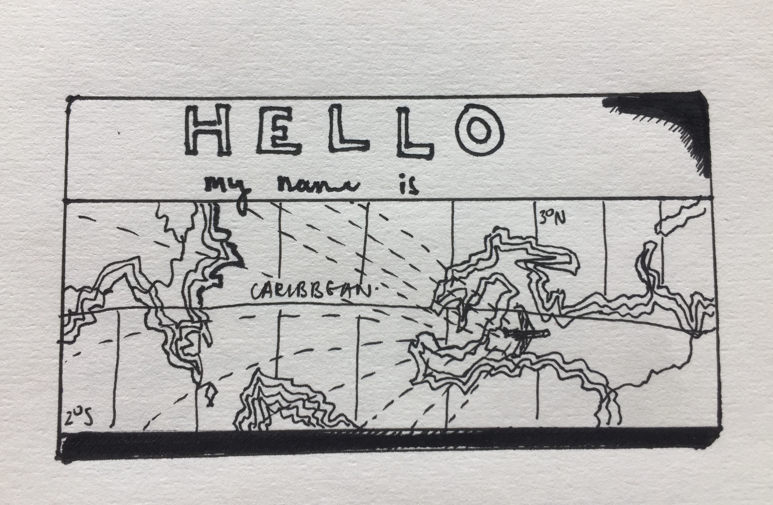
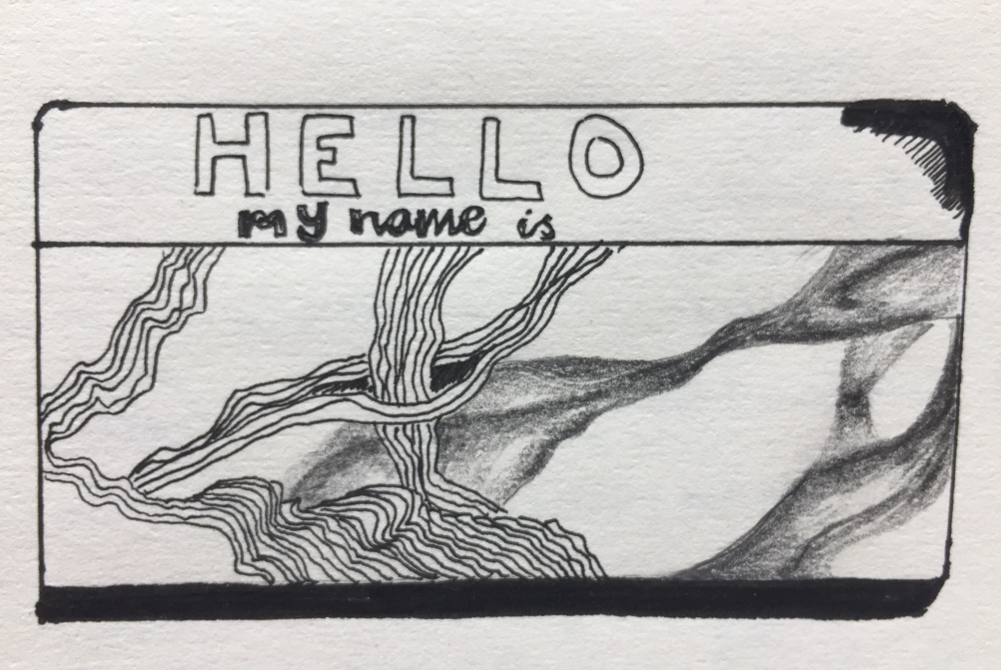
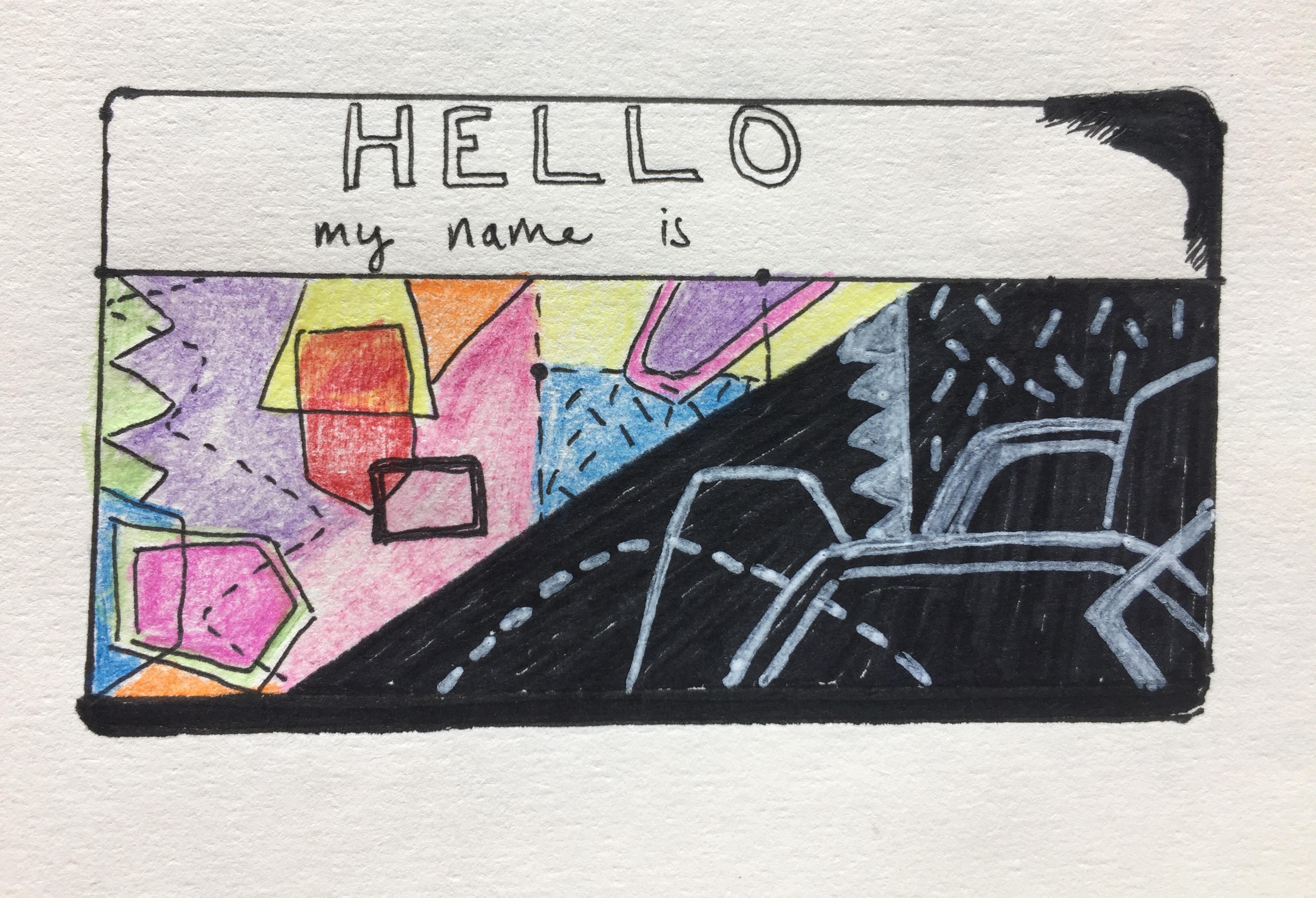
For our first in class exercise, we had to introduce ourselves with 3 different nametags.
I love to travel and explore new places.
I can be stubborn yet open-minded when needed. I represented this using abstract lines of pen, which is permanent and pencil, which is temporary and more subjective to change.
I try to be optimistic in good and bad situations represented by the two contrasting colors.
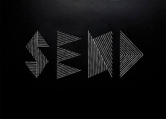
Typography, our first project of the semester! We have to create typographic projects using part of our names to describe our future jobs and we are free to explore different techniques and materials. Conceptually driven solutions and letter forms are combined with literal or abstract images to express our future jobs.
Name: “Cass”, “Cassy” or “Xin Yi”
Possible Jobs: Designer, marine biologist, architect, journalist, tattoo artist
Artist research- HandmadeFont
I found this design company known as handmadefont. They specialise in developing unique, untraditional fonts and they take inspiration from almost anything. I love their idea of using the unconventional and literal sense of the word to incorporate it into their typography which is something i might want to look further into.
Alex Trochut
Alex Trochut is known for his experimental style with a philosophy of ‘more is more,’ his array of work is a perfect example of embracing the endless spectrum of font formats.
Nina Gregier
She is known for combining typography with craft and one such example above would be embroidery on paper using different shapes and forms. My friends would know how much i love the use of geometric shapes and forms which is something i might want to use later on.
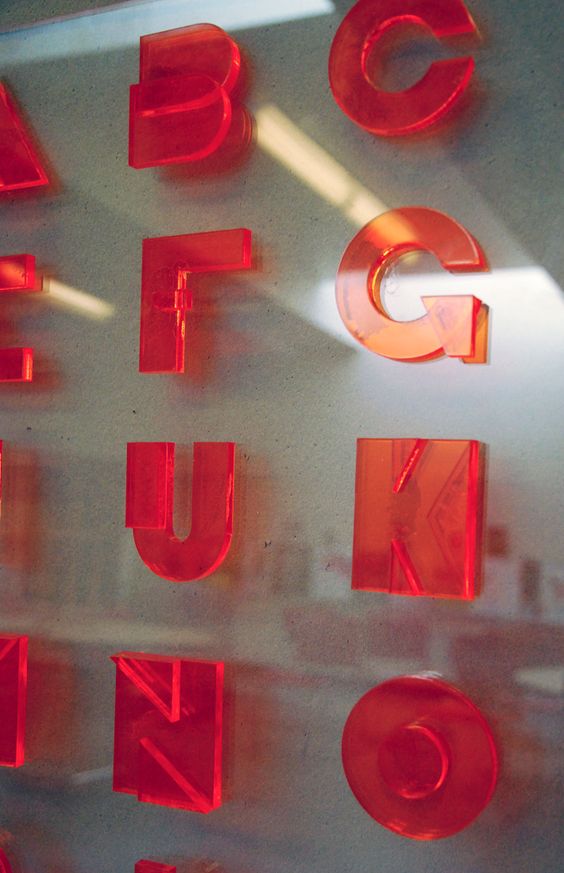
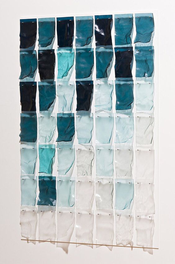
Other inspiration- Kate Jackling
I absolutely love love the play of shadows and colors from this series by kate jackling. Using acrylic pieces and creating that water reflective effect and incorporating the use of light and shadow. I was thinking of using this technique into my typography since one of my jobs is water related.
installation by Inès Esna
Work by Sophia Collier
I started looking up acrylic installations and came across some interesting pieces, Love the colors, shadow and light play. However possible challenges imposed would be cutting the acrylic pieces into their desired shapes without it looking too crude and messy but im really excited to try them out!
Overall after researching, I think I’m leaning more towards the use of 2D-3D-2D like installation typographic which is an area I am more inclined towards at the moment but we’ll see!