Project 2b: Organic Type

The quote that I chose was ” Psychedelic Dreams”

When I think psychedelic, colours, trippy, static, retro, 60s era immediately comes to mind. I knew that I wanted to do something colourful with bold and bright colours, now all I needed to do was look for techniques to create my type. Here are some 60s vinyl album covers that I found online for inspiration.

Raoul Yannik  ☮ American Hippie Music ☮ Fleetwood Mac

Cream  Mishka Westell’s poster for the 1960s psych rock act, from this year’s Austin…

The Jimi Hendrix Experience & The Crazy World of Arthur Brown. 27 August 1968, Saville Theatre #London. #psychedelic  grateful dead posters - Google Search

I decided to use crayons to create that nice psychedelic mix of bright colours. Melted crayons also gives a nice textured relief as opposed to paint that would just look flat.

First, I used an xacto knife to cut out the individual letters to create a template for my individual letterings. I free handed drew a font with a “bell-bottomed” stem and structure to give it a more 60s vibe.


Afterwards, I melted the crayons together to create a nice blend of vibrant colours.


However, I accidentally misspelled “psychedelic” so I had to add in a “h” afterwards haha.

For application, I created a vinyl cover. I tried to keep the colours a little desaturated for the type to stand out more.


F I N A L

And this concludes project 2 🙂

R E F L E C T I O N S

I definitely learned a lot from this experience. Looking for letters in everyday spaces really trained my eye to look out for type and the letters I found really surprised me as well. Type is everywhere in the most unexpected spaces.

As for the creation of my organic type, it made me realise how important handmade typography is even with the progression of digital media. The organic-ness and real-ness of handmade typography can never be recreated by any software and it serves as a reminder to never forget the traditional mediums even as we move on to digital media. 🙂

Project 2a: Vernacular Type

Quote: ” Silence amid chaos”

Location: Gardens by the Bay

Concept: To illustrate fabricated silence within the gardens amid the chaos of a city by incorporating nature with man-made elements.  SILENCE- nature CHAOS- man-made with nature

S I L E N C E

“E”
“C”
“L”
“S”
“E”

A M I D

I wanted to keep it consistent by making it letters from the “supertree” alone.


Thankfully, I was able to find all the alphabets within the structure by cropping and rotating the images.

C H A O S

Final Design


Project 1: Final Design

Final Design

My final design concept is titled “Sense of community” . I felt that the “Arts on the move” programme provides patients with more than just an outlet for stress relief or distraction. The fact that the hospital provides a platform for local artists to showcase their works along with the works of some of the patients shows a collaboration amongst local artists, staff and patients in the same space. This allows for the formation of a community spirit in an environment that is no longer sterile and unfamiliar.

My design shows a figure interconnected with a pencil, symbolising the integration of each person in the community into the programme as well as the integration of arts into the environment and lives of patients at the hospital. The choice of shape of the logo, a circle, suggests community, friendship, relationships and unity. The choice of the colour blue, is a sign of stability and reliability as well as serenity and calmness, all traits that are important in invoking a sense of community. 

Task 3: Colour Exploration

After the feedback gathered in class, I made some changes to my pencil design such as making the swoosh downwards instead of up and integrating an element of “community” in the design.

After more feedback from Michael, I decided to add more visual weight in my design and change the text font as well as orientation.

Colour Exploration

I played around with analogous colour schemes such as blue and green, orange and yellow as well as contrasting colours like yellow and blue to bring some vibrancy in the design. However, I felt like the colours felt a bit too “contained” within the black lines.

Subsequently, I tried different techniques such as gradient tones and playing with the shades of one colour. However, incorporating gradient in the lines made the “swoosh” lose its form. Hence, I decided to go with the flat colours instead and stick with the shades of one colour.


Task 2: Translating and Exploring Design

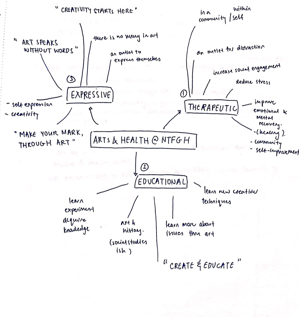
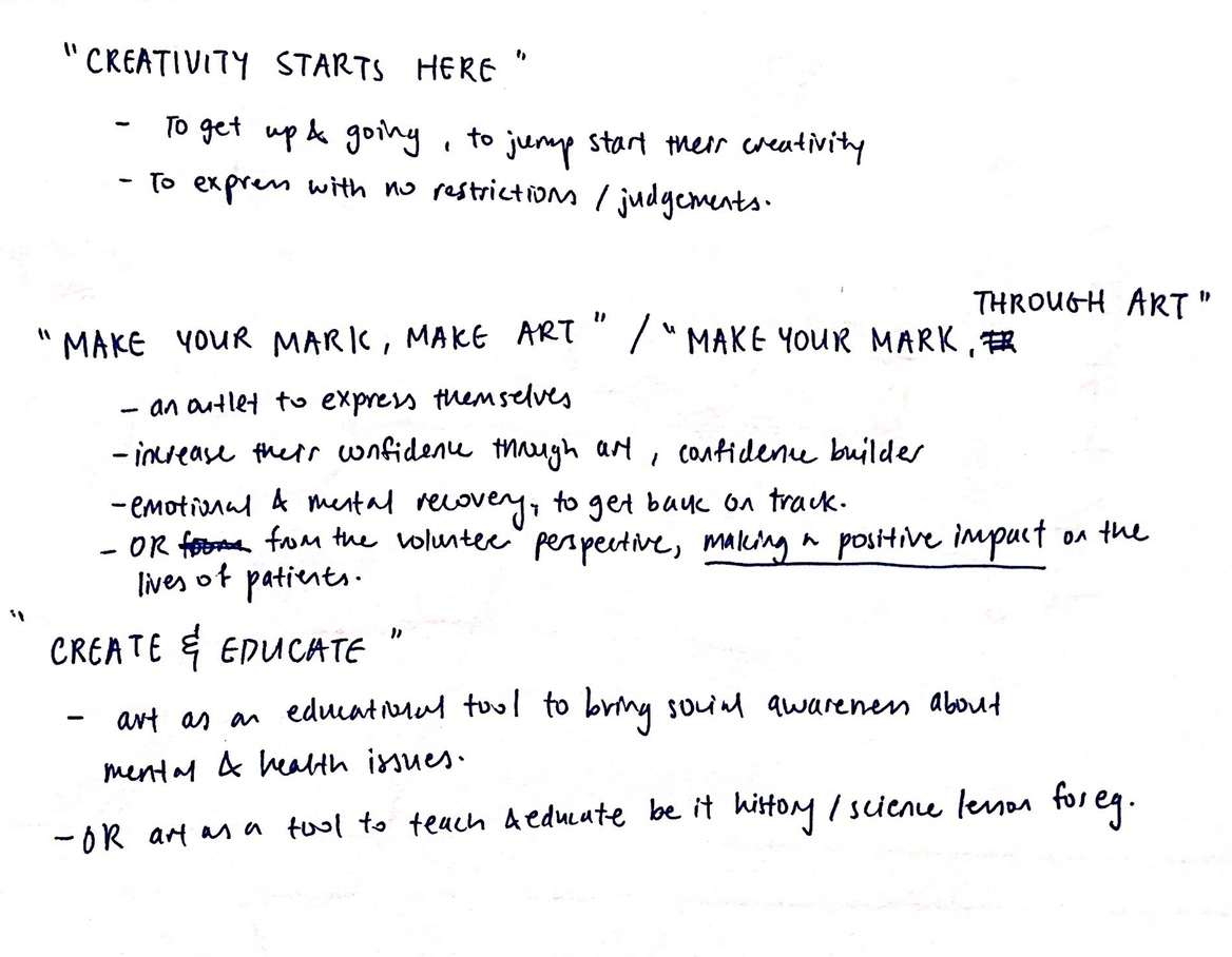
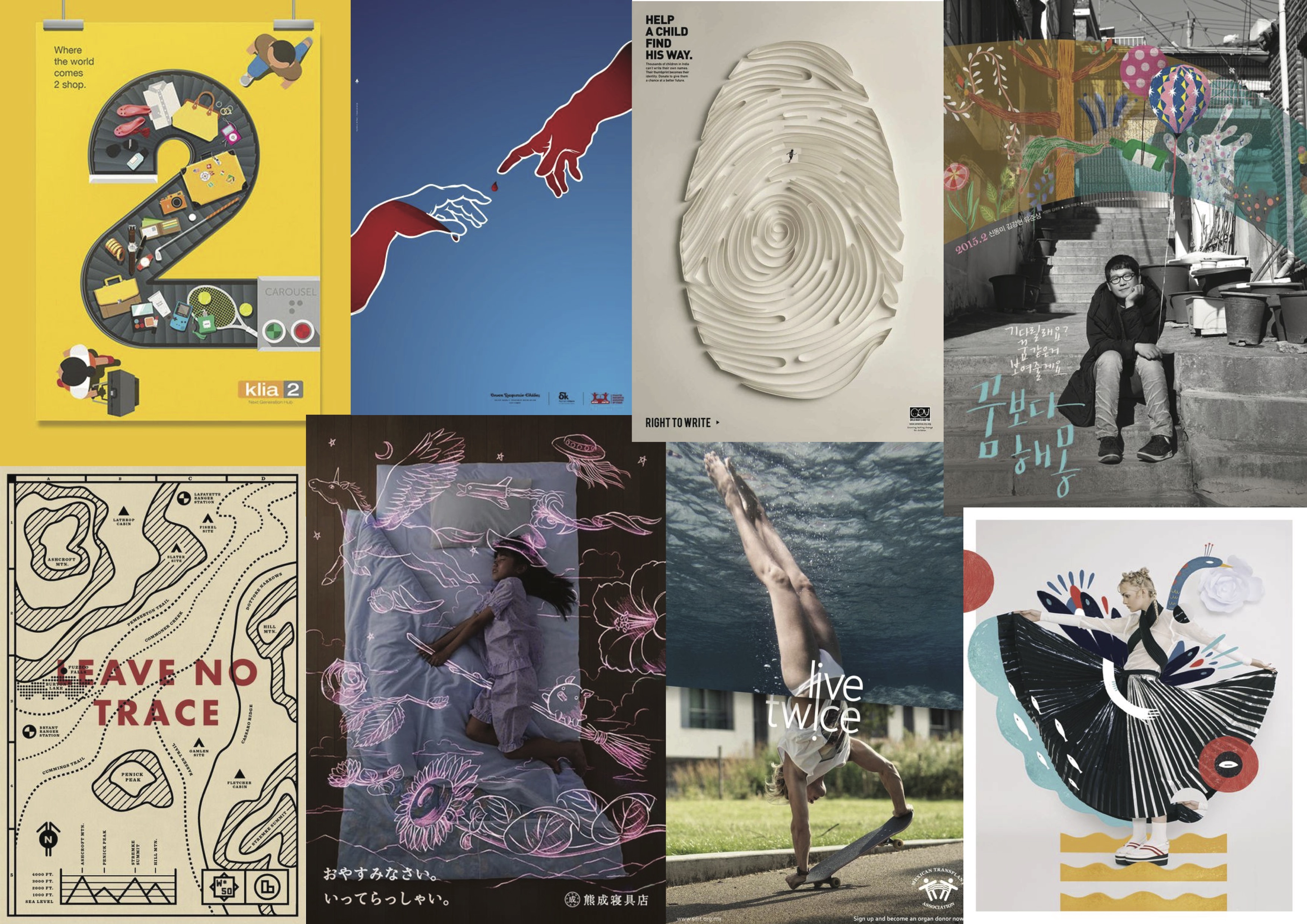
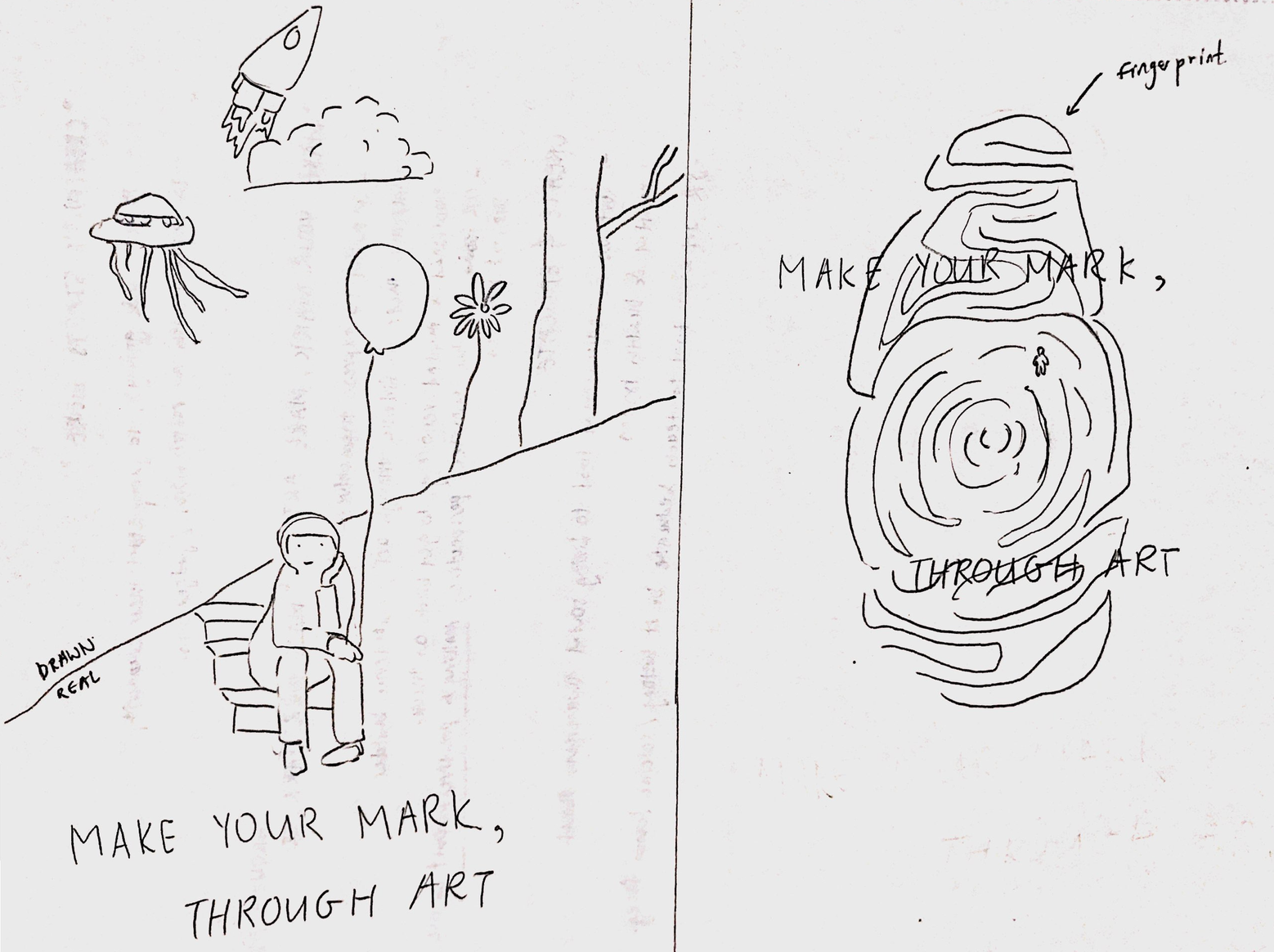
After conceptualising the possible themes I wished to explore, I went more in depth into the possible logo designs.

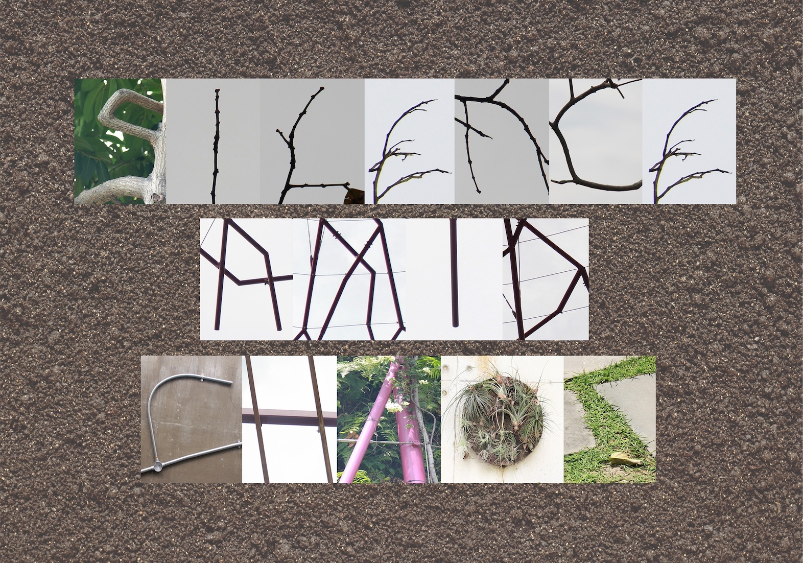
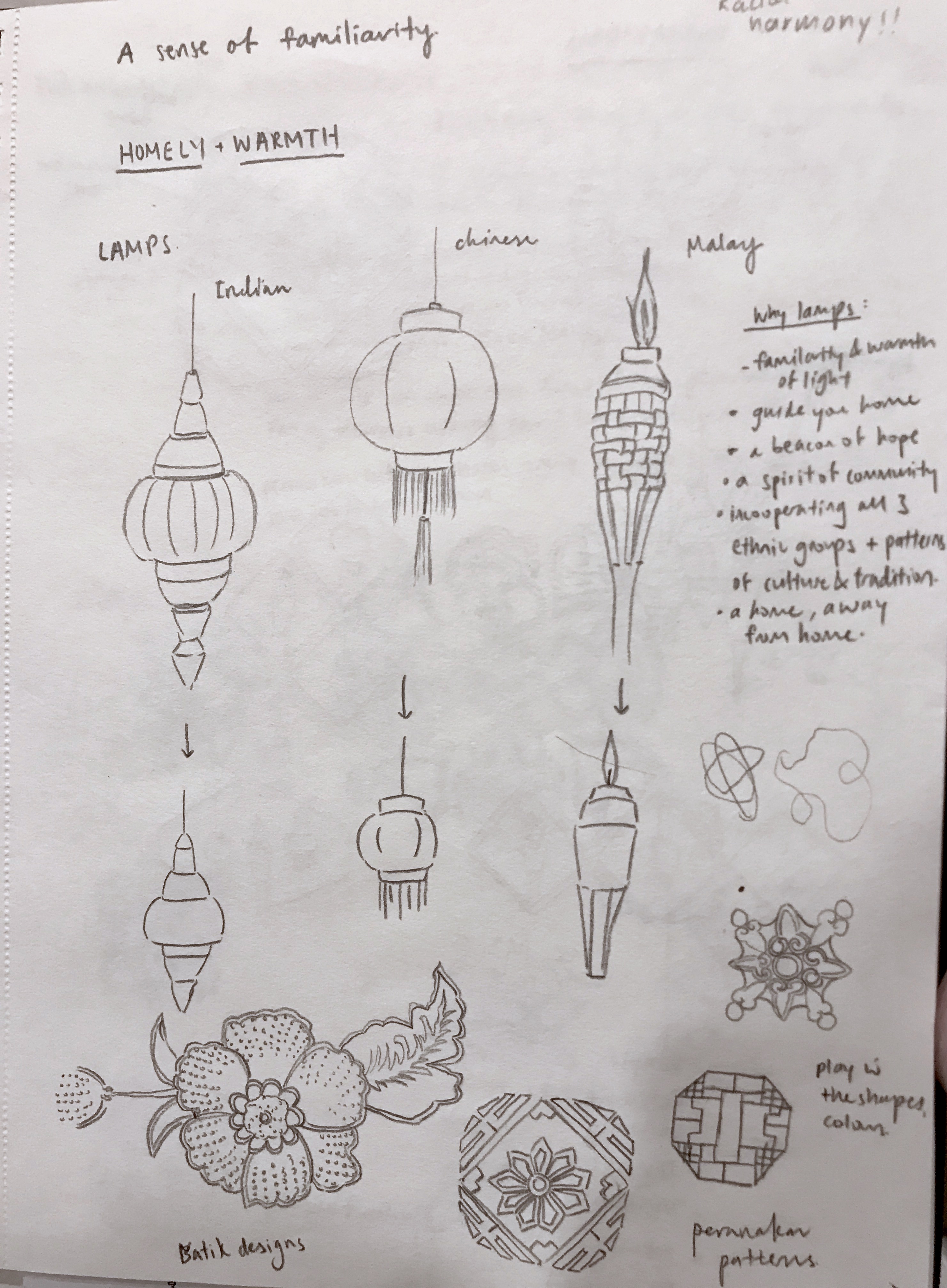
Initially, I was really interested to do my first concept which was ” A sense of familiarity” so I did a table based on a class exercise we did to explore the possible visuals I could come up with. It was really difficult and I found it hard to simplify the sketches or connect my concept with the mission and spirit of the programme.

I was really interested in the idea of lamps and I tried to combine the idea of 3 ethnic groups represented by each lamp. The concept was that light gives a sense of warmth and home as well as encapsulates the passion and spirit of the community. I also tried to incorporate some batik or traditional motifs into the designs.

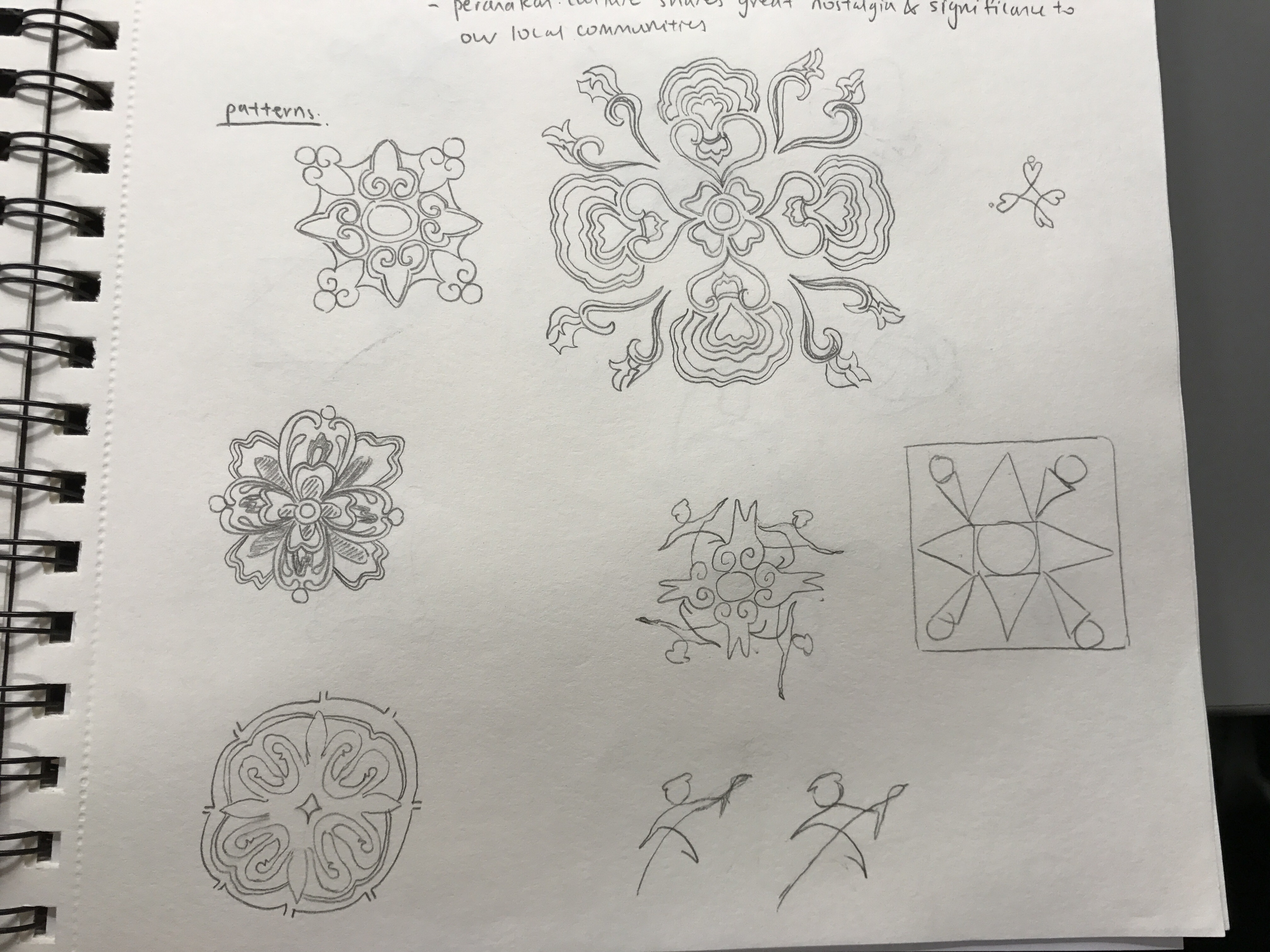
I played around with the different orientations and arrangements of the lamps. However, after feedback from the class and Michael, I realised that my designs came off more “cultural” and “racial harmony day” rather than “arts on the move”.  Michael mentioned that one of the pattern motif I drew looked quite interesting so I decided to explore further and see how I could incorporate “arts” into it while simplifying and making it look more like a logo.

I looked more into tile patterns and explored the possible designs I could do. Since my inspiration was drawn from the Peranakan tile patterns, I looked more into the culture and customs of the Peranakan community and found that it actually tied quite well with the concept I was going for.

Peranakans retained their Chinese beliefs but also adopted local indigenous lifestyles such as having their own variations of the Malay language, Baba Malay. The culture also focuses a lot on family unit, an important facet of the peranakans and family members are usually found living under one roof. I felt that it was reflective of the mission and spirit of this programme, which was to bring people together through art and build a community regardless of one’s background or culture.

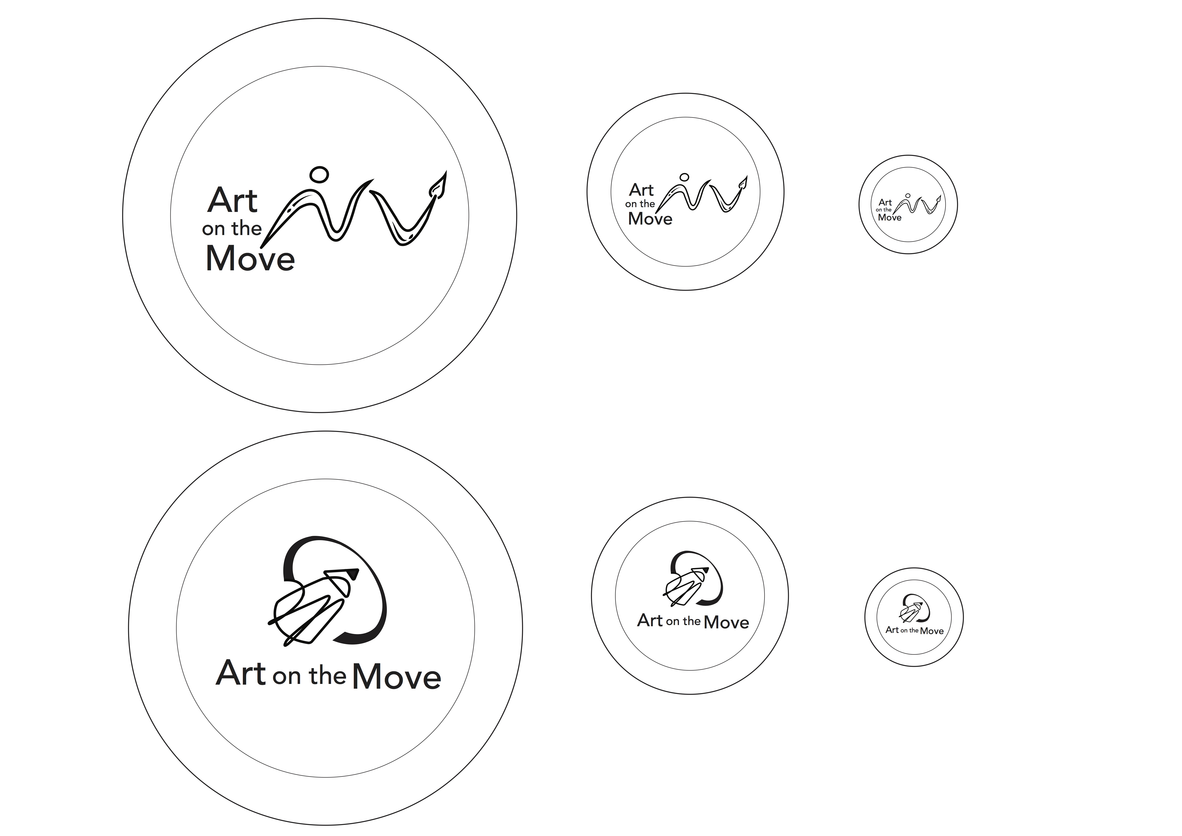
However, yet again, I struggled greatly with simplifying and showing the essence of “art” in the logo. So, I picked out the key idea and shape I wanted which was a circular structure, drawing on the idea of a community, family and interconnectedness. I explored many weaving and interlocking designs.

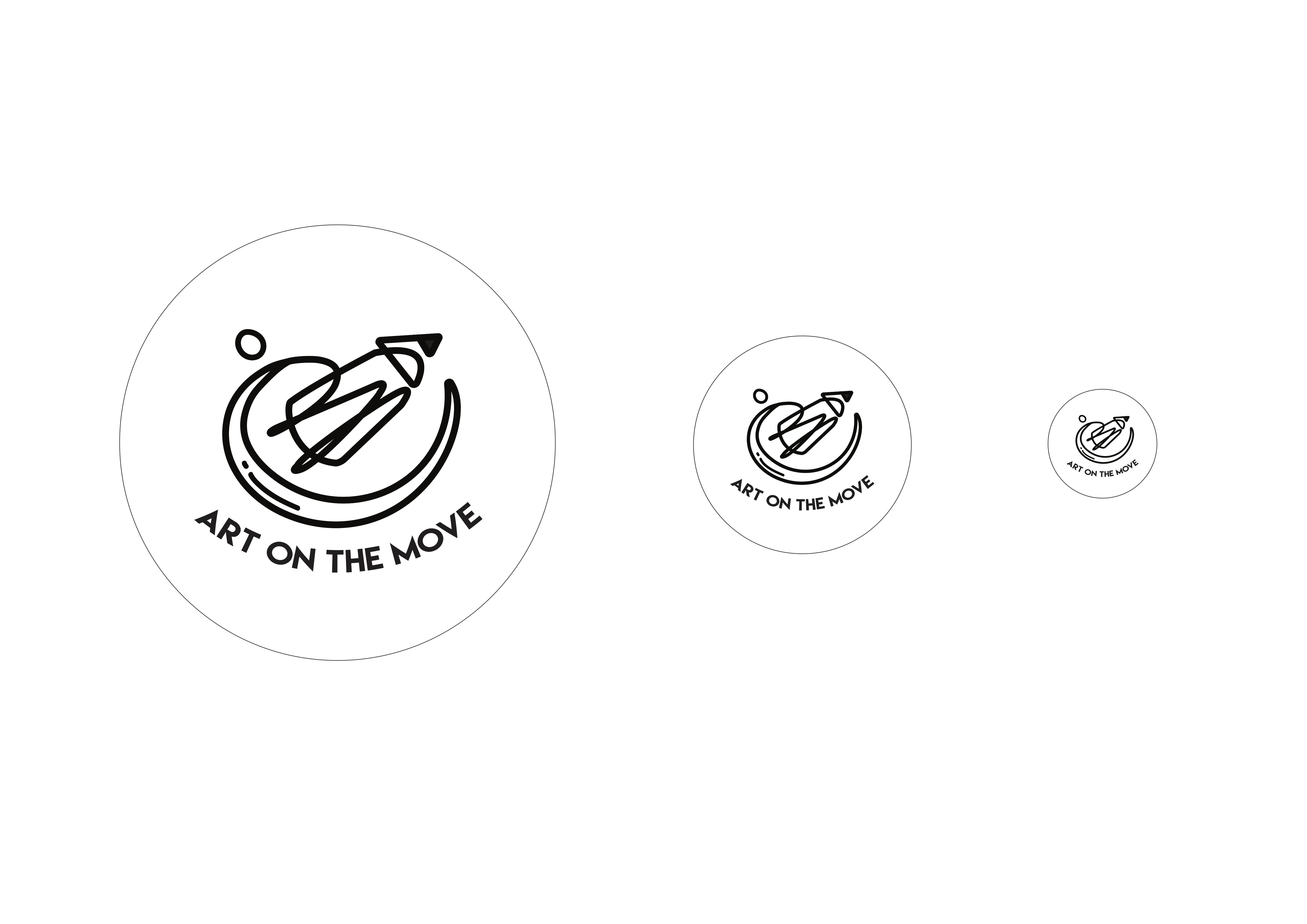
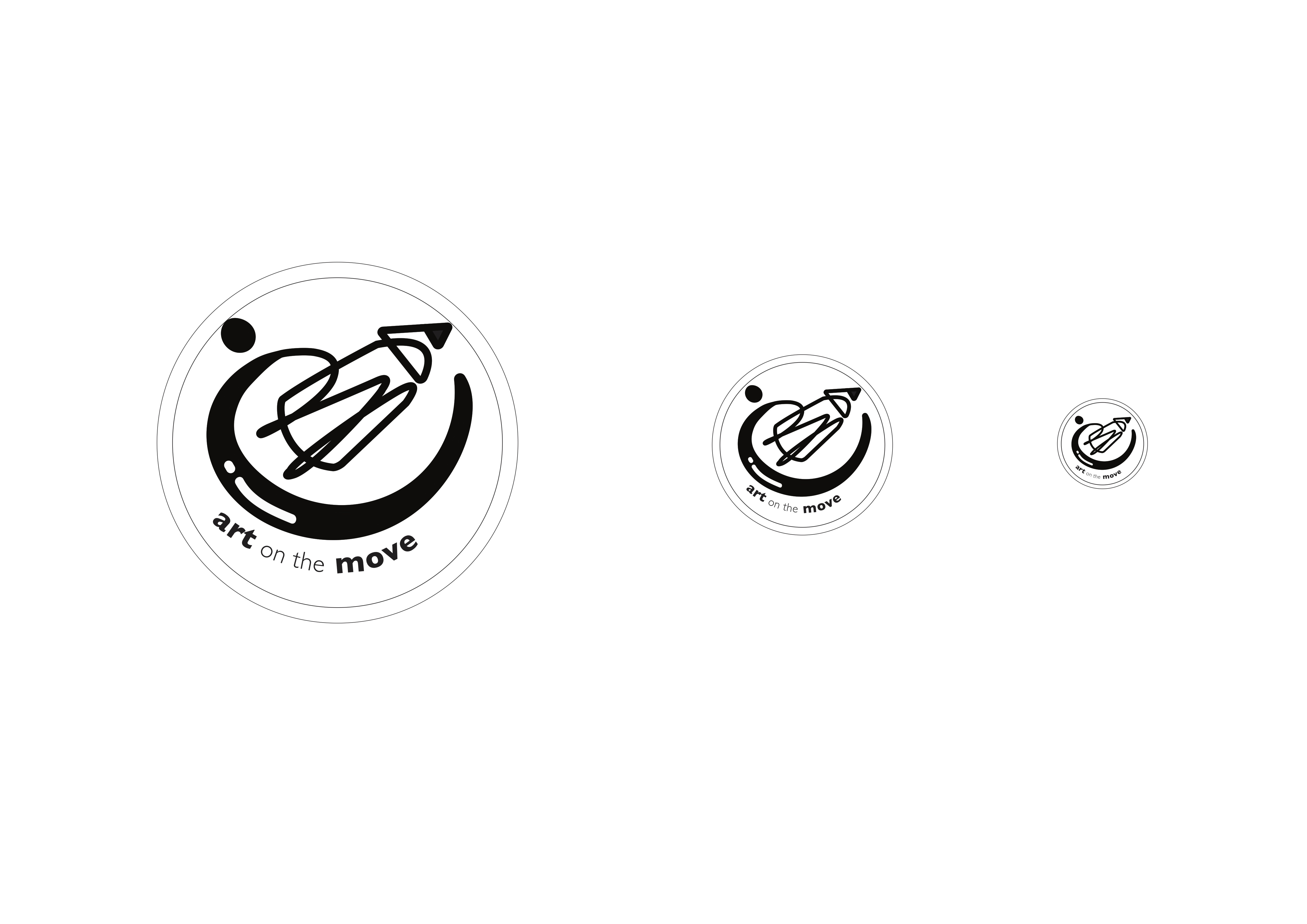
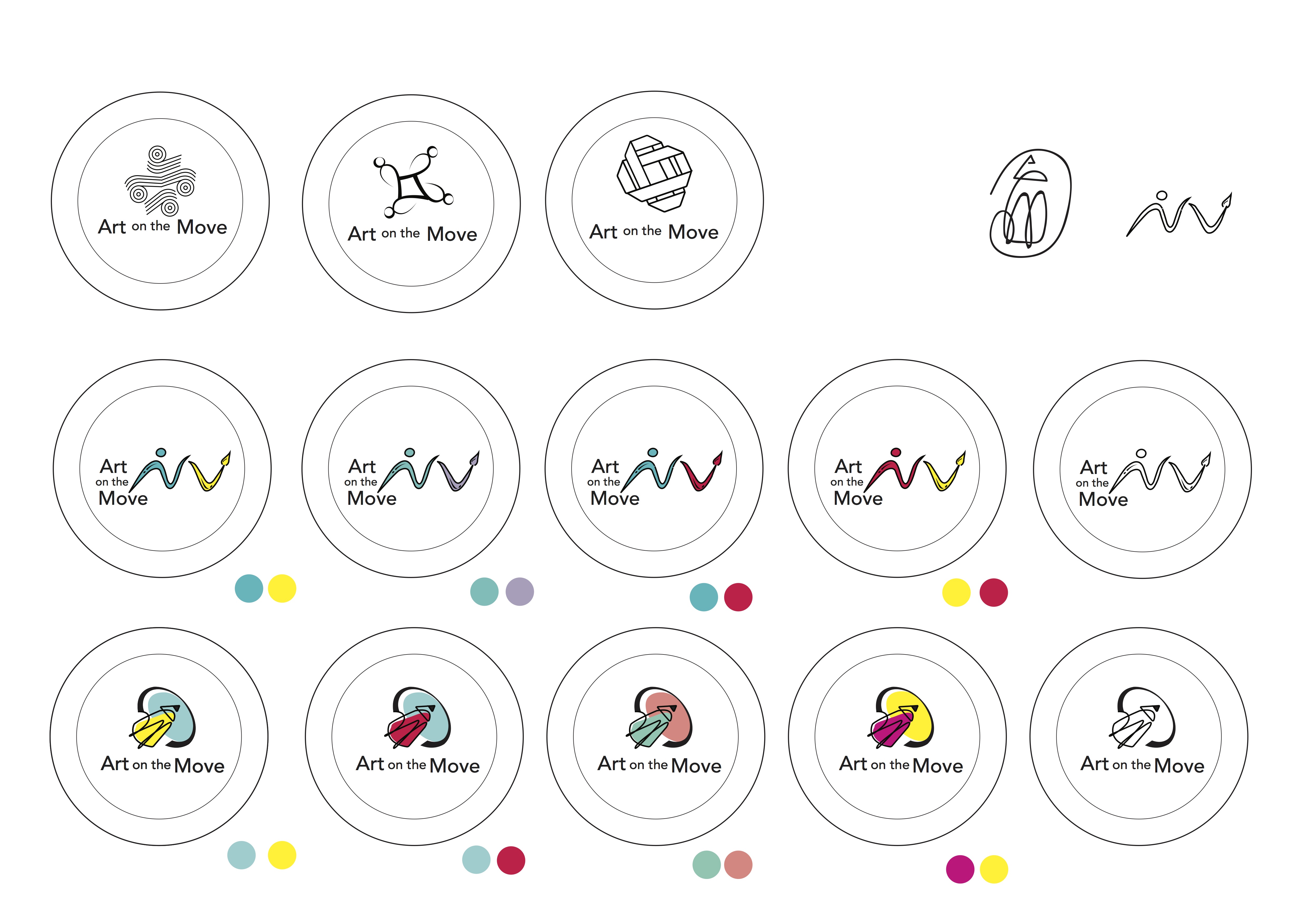
However, I still found it hard to show the “arts” element. I was afraid my designs would end up looking more “community centre” or “social service” like. As desperation drew close, I decided the best way was to not overthink and just show the obvious, which was to incorporate pencils and paint brushes. However, I felt it was the best way  for the logo to stay relevant, distinctive and focused.

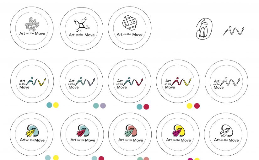
I stayed with the idea of community and interconnectedness while adding a bit of fun and quirky-ness into my designs. One big lesson I’ve learned from this process would be to just not over complicate things and overthink my concept, but rather just let the visuals speak for themselves 🙂 Moving forward, I will digitalise my designs and play around with scale, lines and perspective to see what I can come up with.


Feedback that I gathered after class was that the design with the paintbrush was too “spread out” and I had to put the brush with the person together in order to show some form of interconnectedness and integration.

As for the second design, the pencil was too big and perhaps I could make the community aspect show through better. Some suggestions were to bring the circle down to the bottom rather than covering the top and maybe show some human forms in the design.

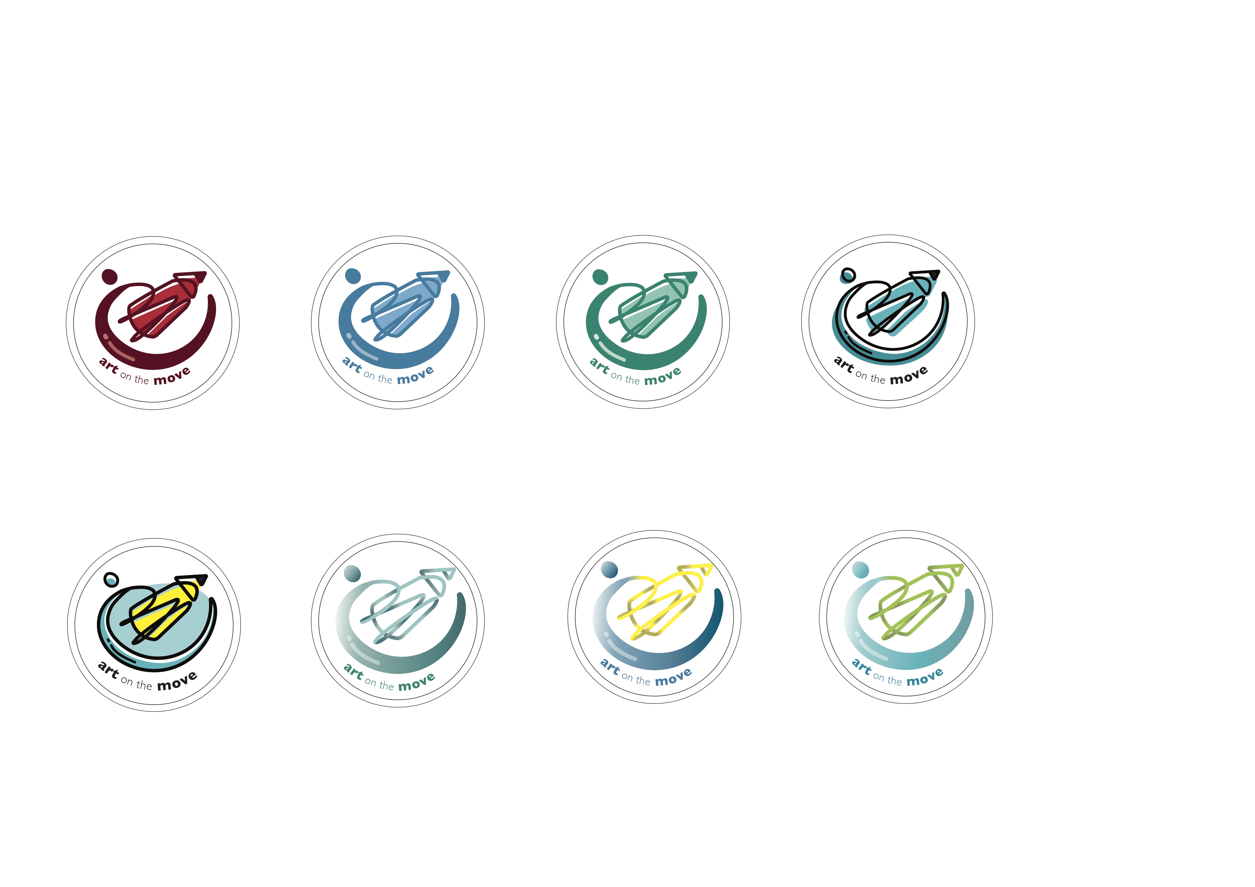
I also did some mock ups for the colour schemes based on analogous and complementary colours as seen above.