The quote that I chose was ” Psychedelic Dreams”
When I think psychedelic, colours, trippy, static, retro, 60s era immediately comes to mind. I knew that I wanted to do something colourful with bold and bright colours, now all I needed to do was look for techniques to create my type. Here are some 60s vinyl album covers that I found online for inspiration.


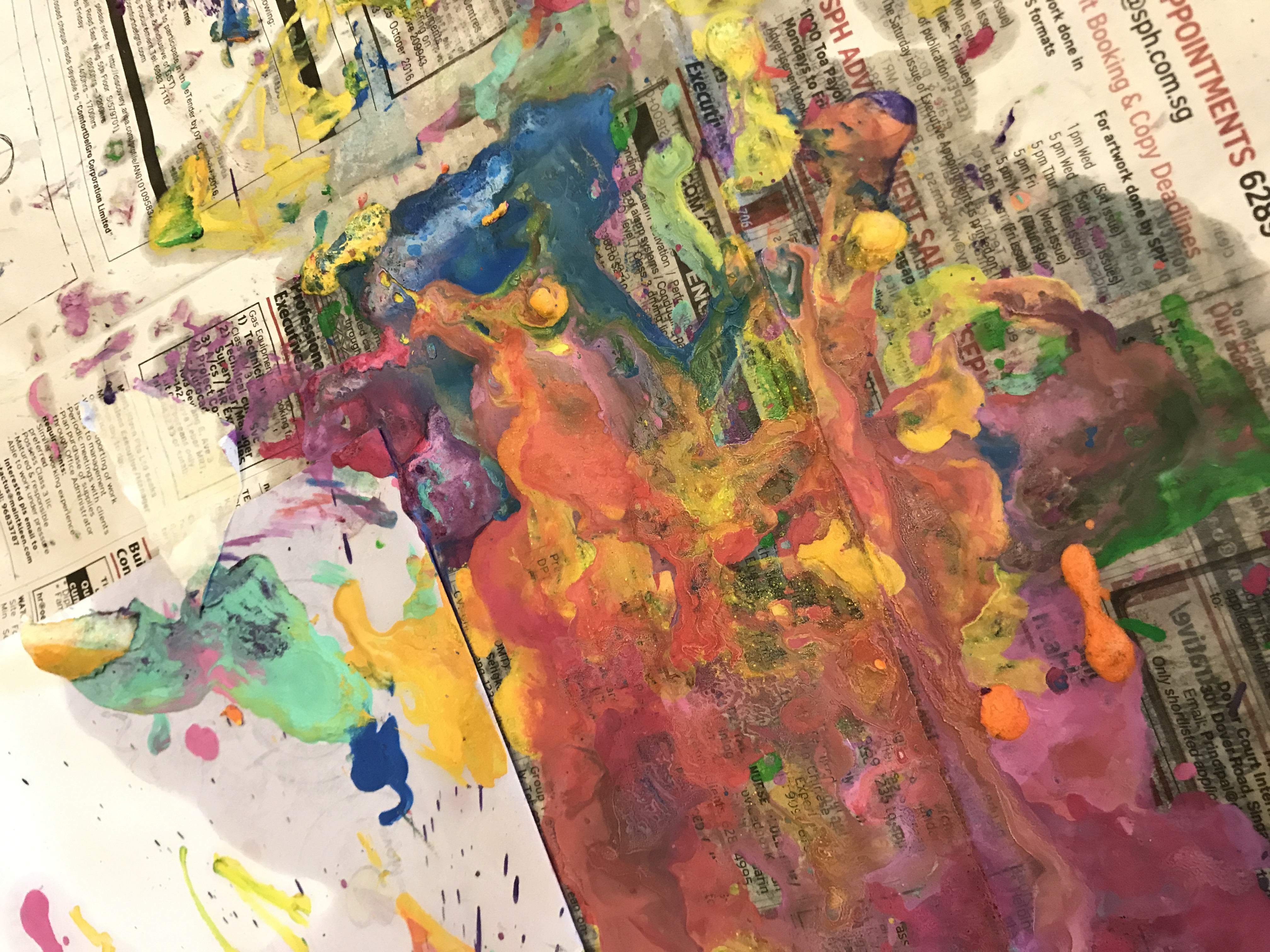
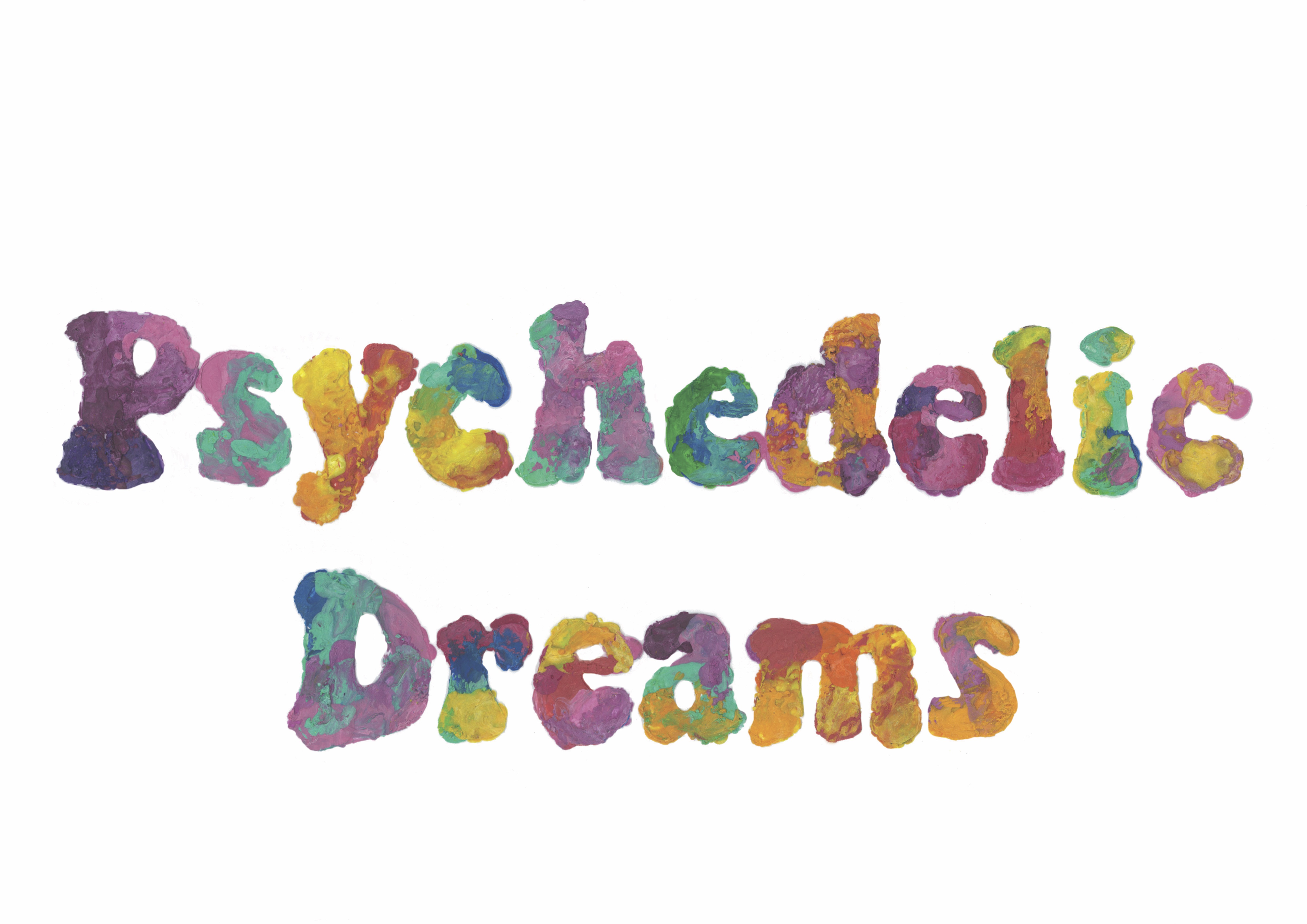
I decided to use crayons to create that nice psychedelic mix of bright colours. Melted crayons also gives a nice textured relief as opposed to paint that would just look flat.
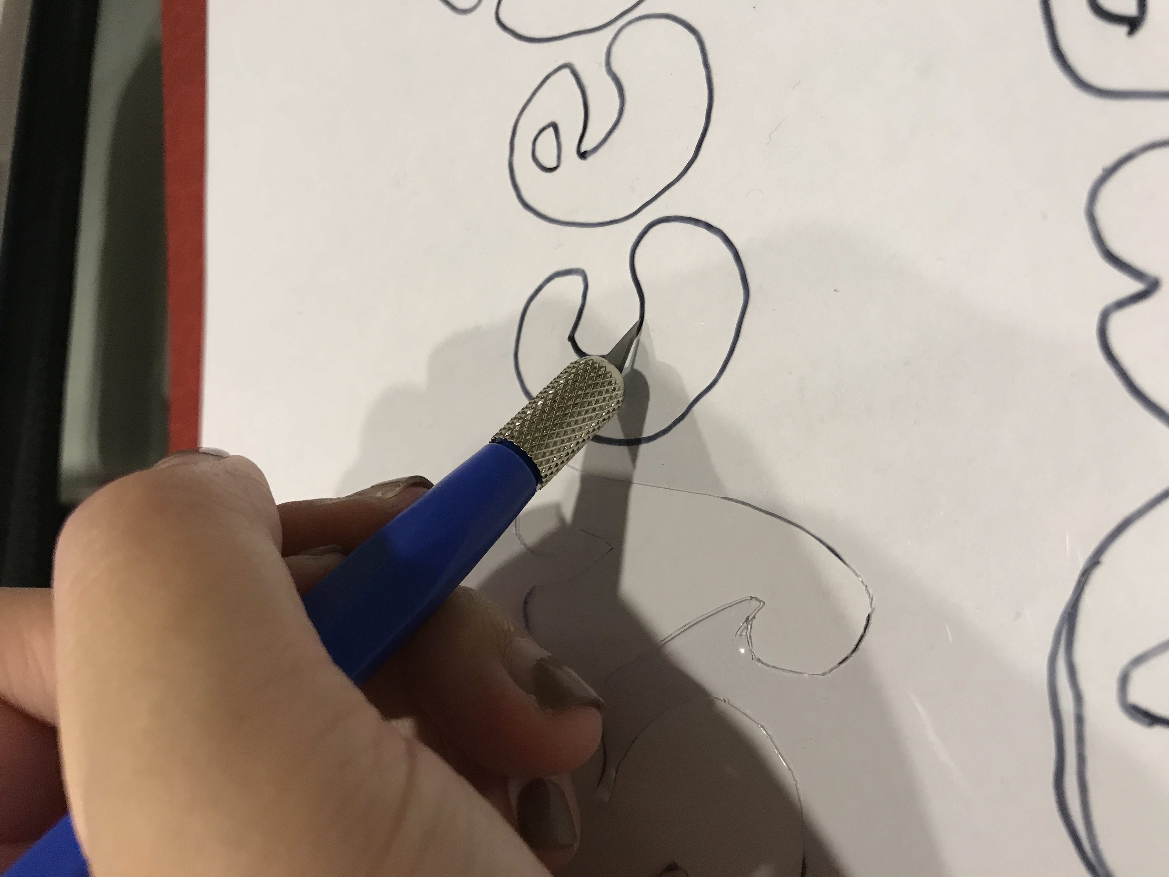
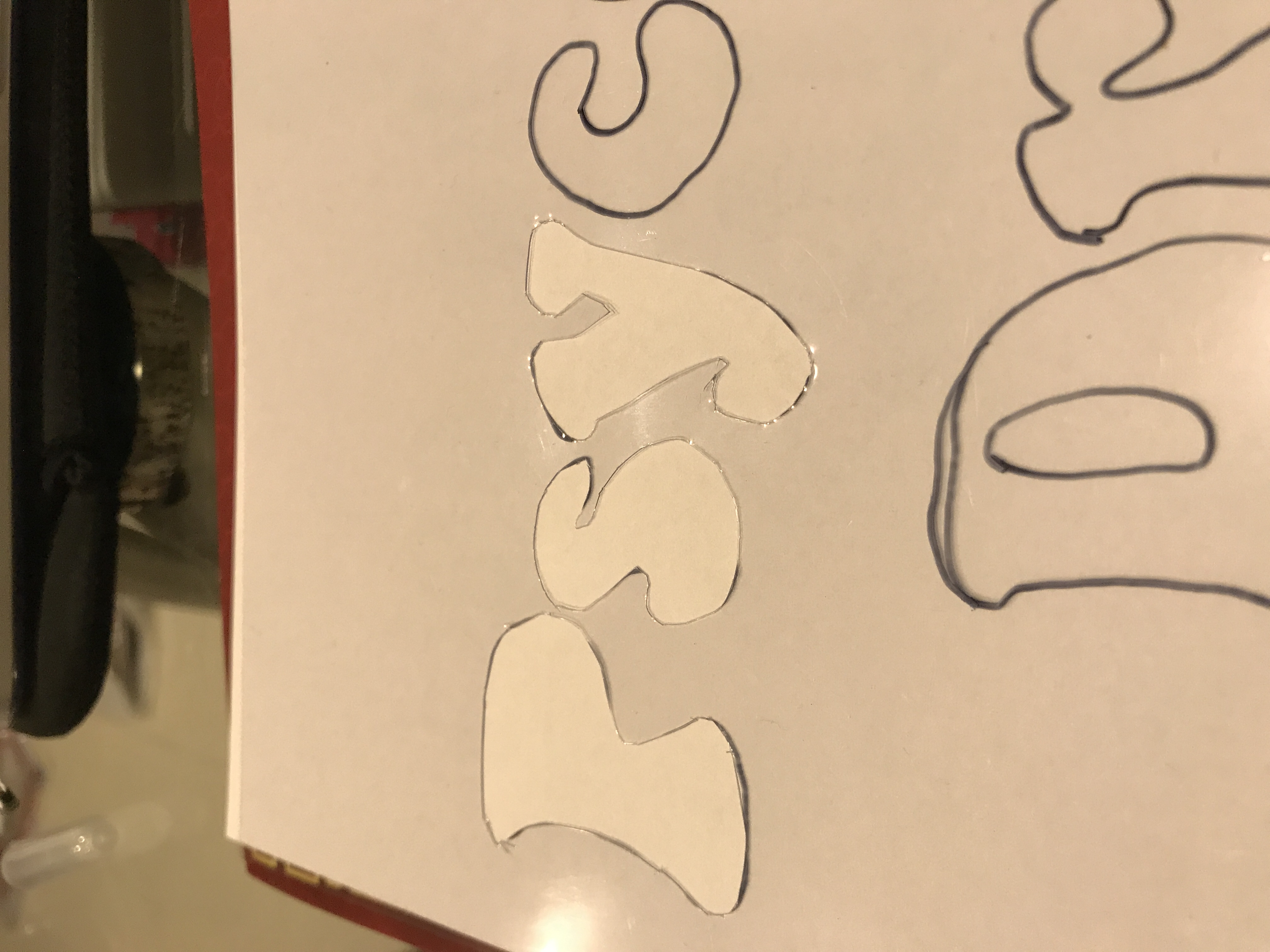
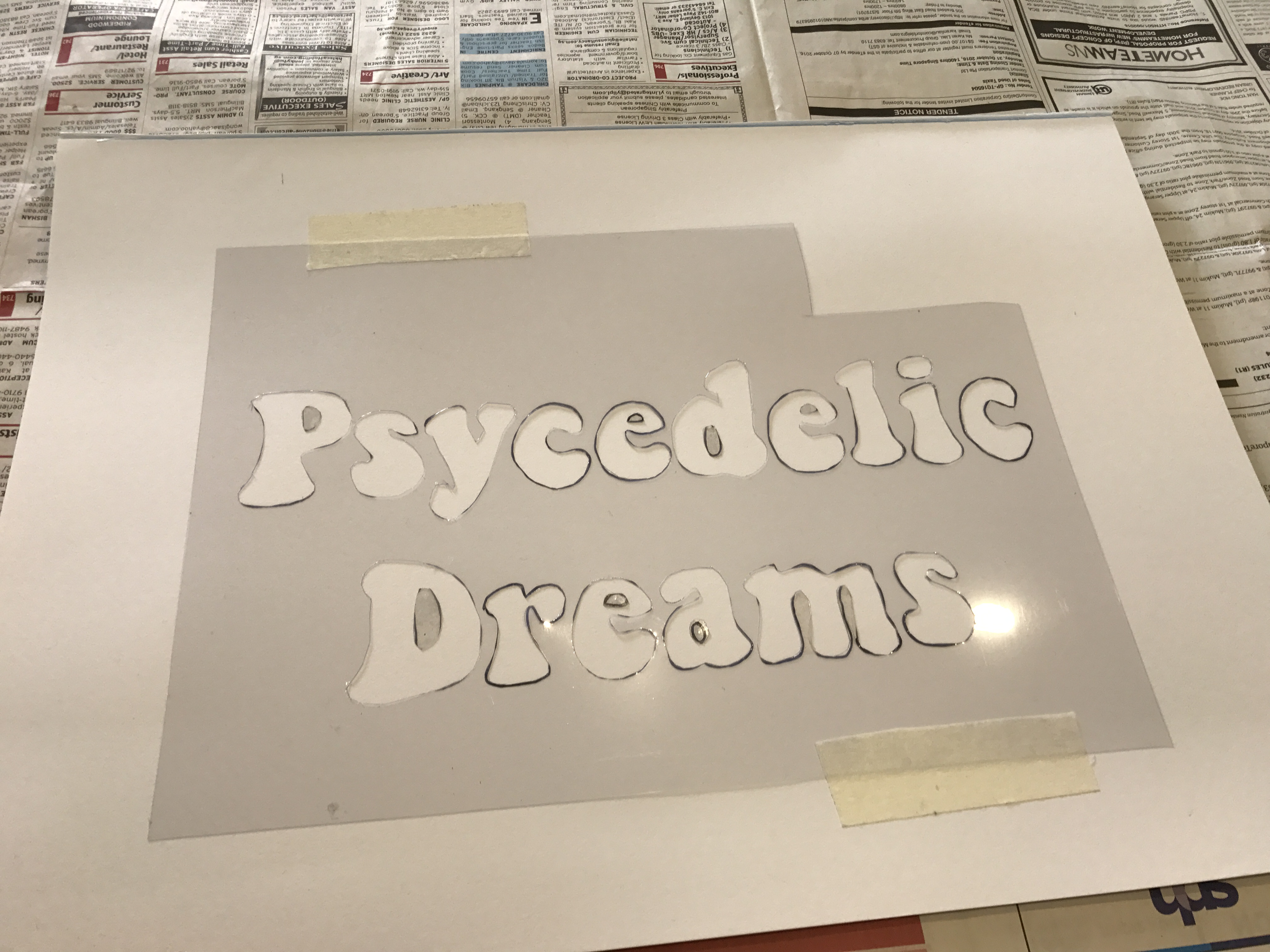
First, I used an xacto knife to cut out the individual letters to create a template for my individual letterings. I free handed drew a font with a “bell-bottomed” stem and structure to give it a more 60s vibe.
Afterwards, I melted the crayons together to create a nice blend of vibrant colours.
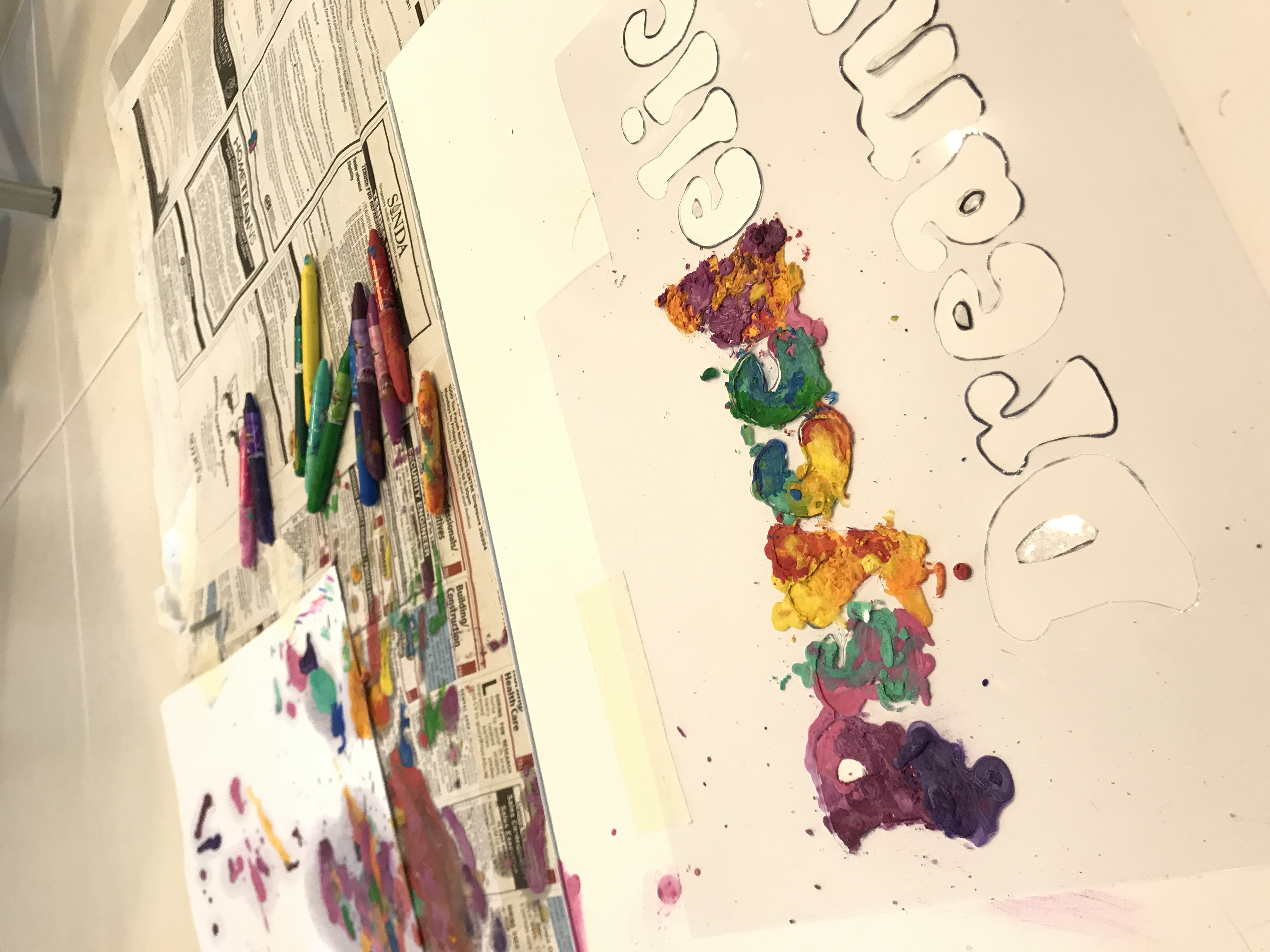
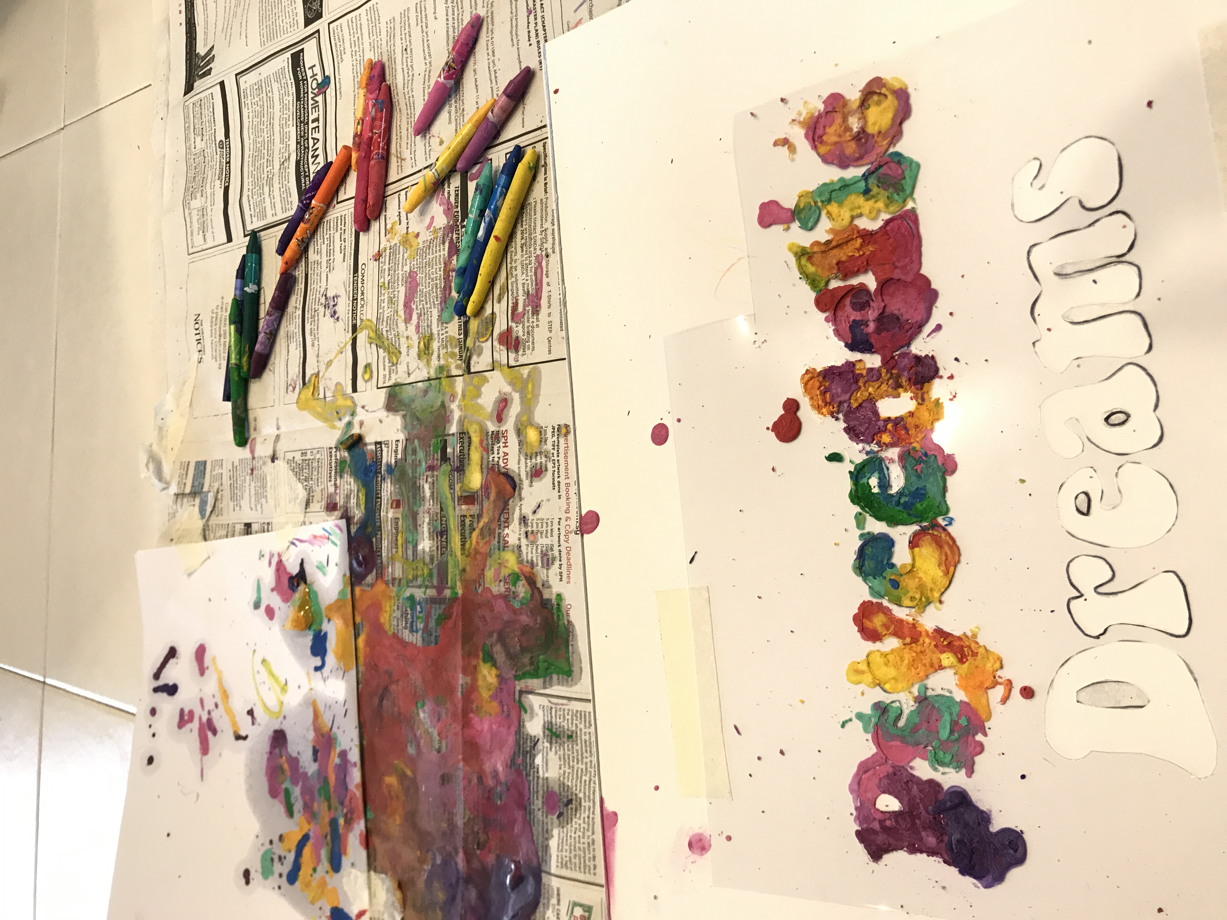
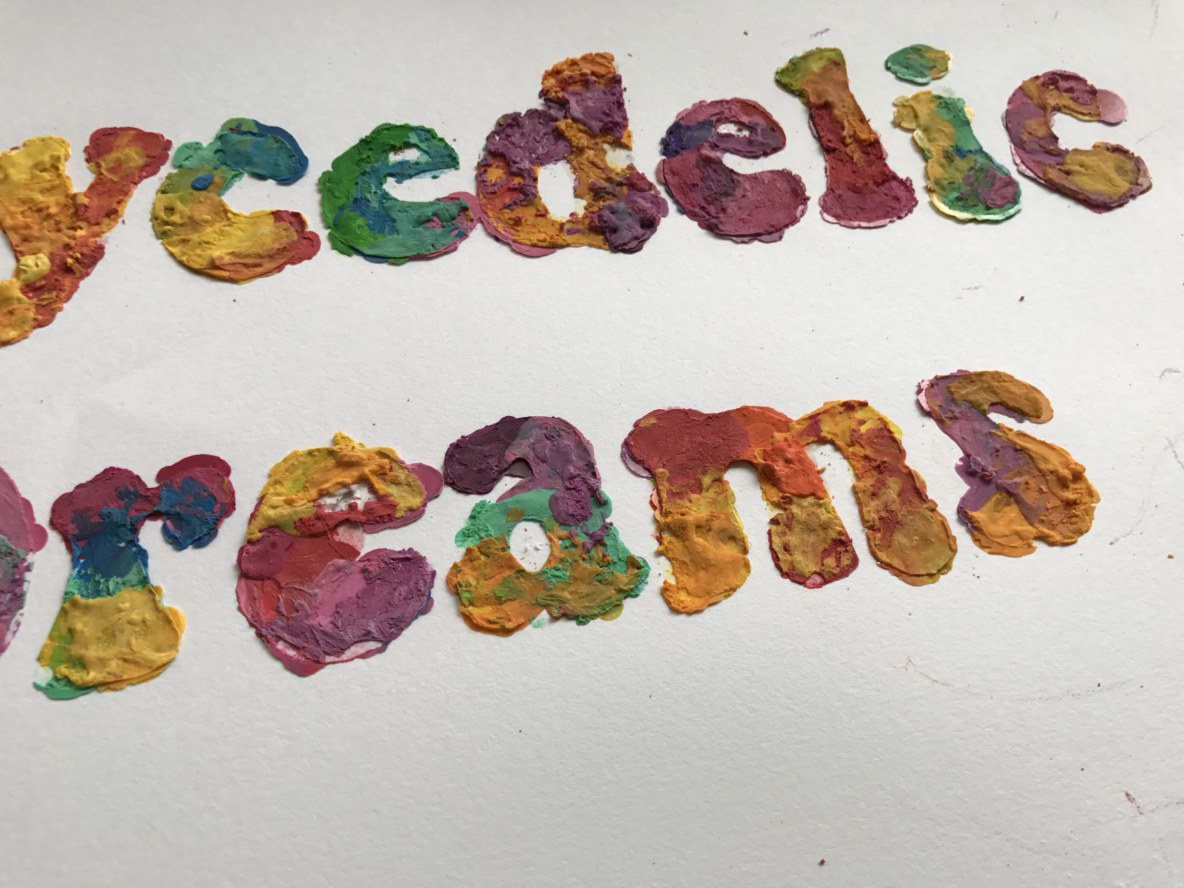
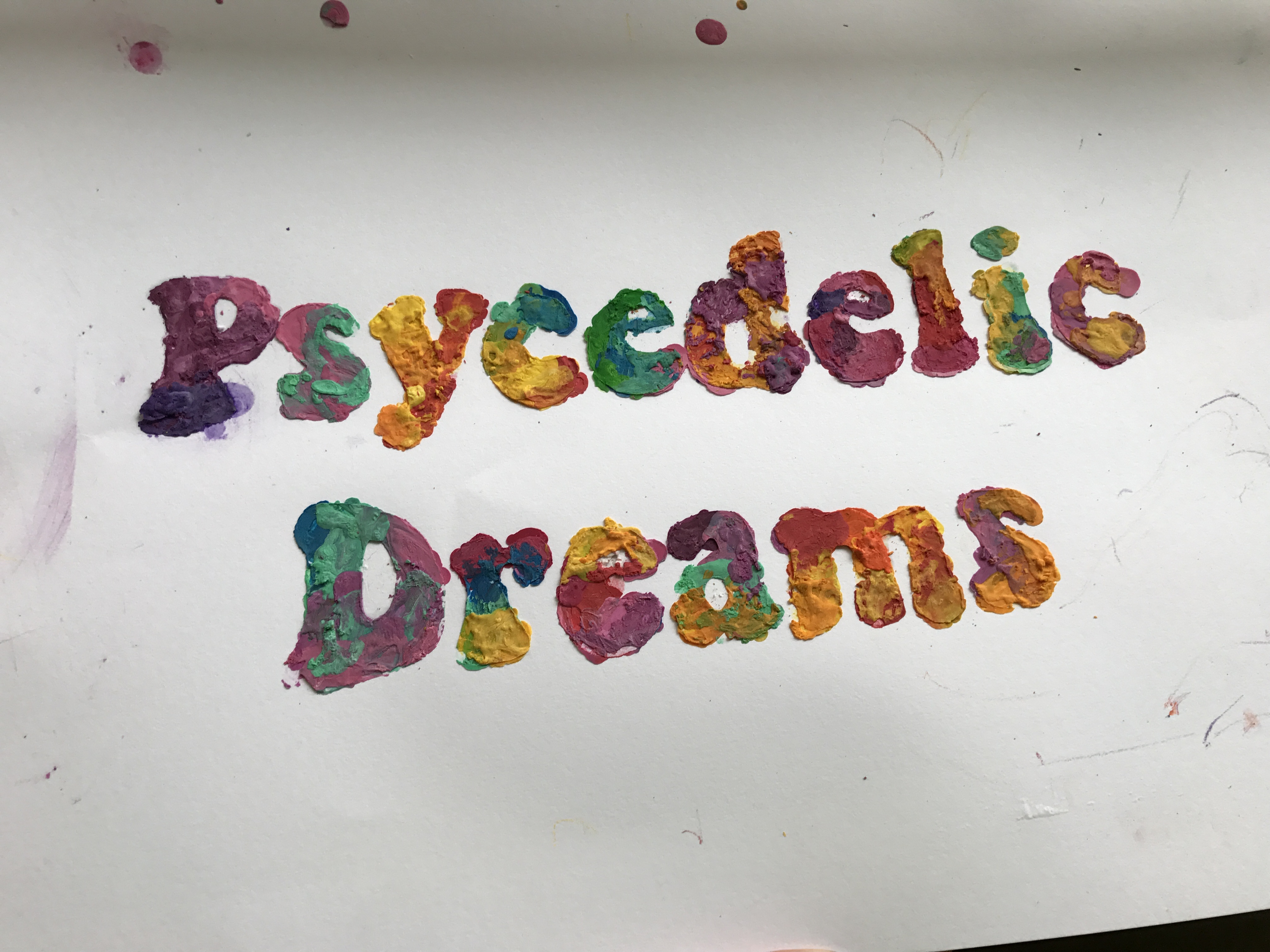
However, I accidentally misspelled “psychedelic” so I had to add in a “h” afterwards haha.
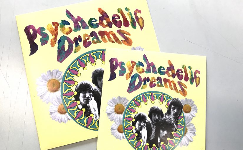
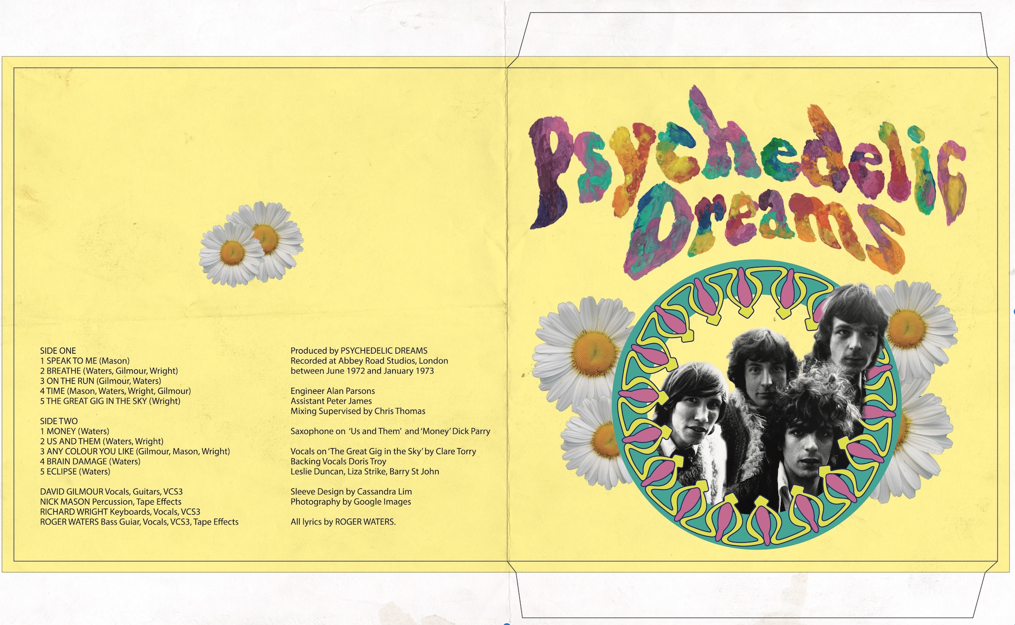
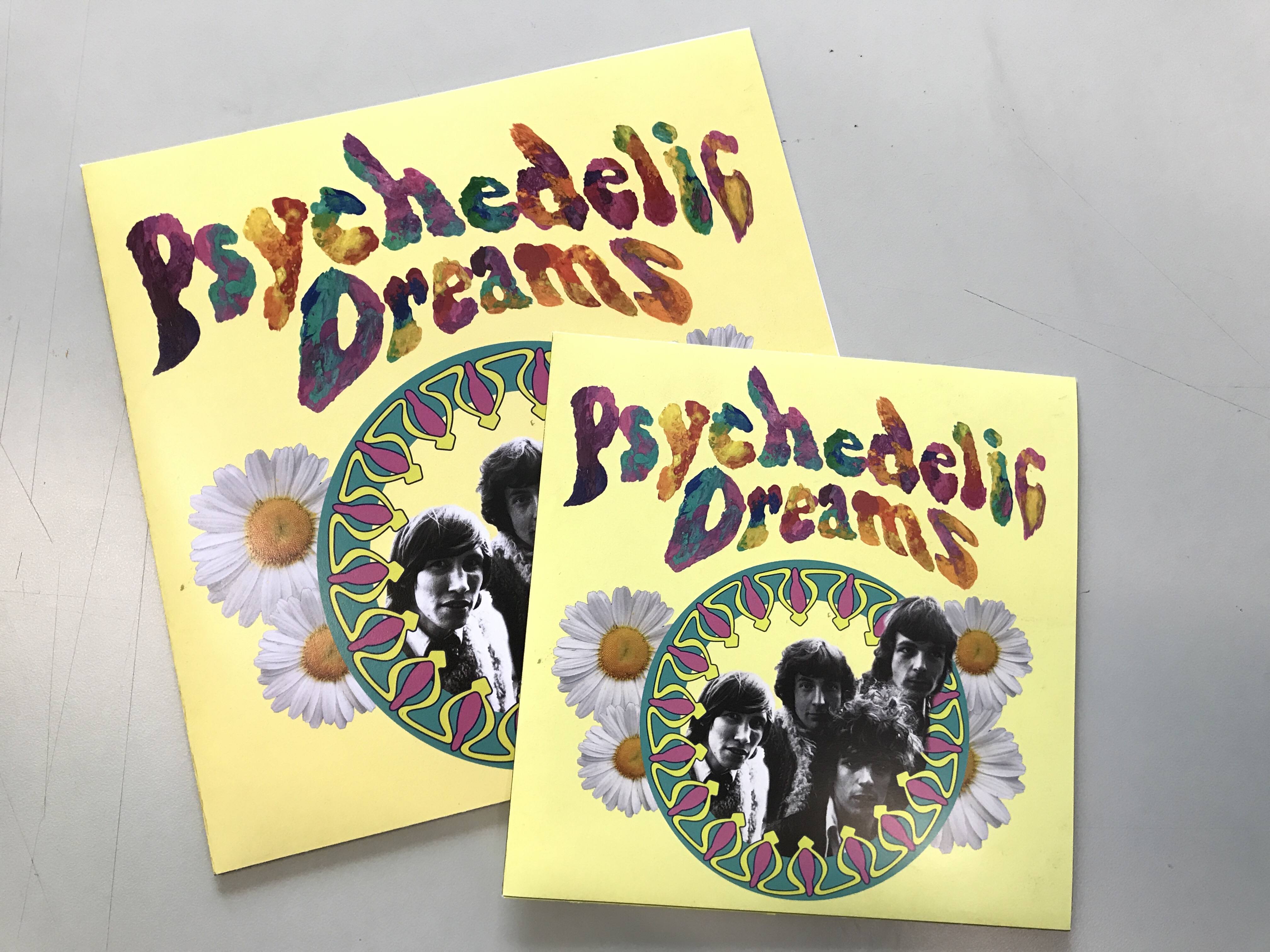
For application, I created a vinyl cover. I tried to keep the colours a little desaturated for the type to stand out more.
F I N A L
And this concludes project 2 🙂
R E F L E C T I O N S

I definitely learned a lot from this experience. Looking for letters in everyday spaces really trained my eye to look out for type and the letters I found really surprised me as well. Type is everywhere in the most unexpected spaces.
As for the creation of my organic type, it made me realise how important handmade typography is even with the progression of digital media. The organic-ness and real-ness of handmade typography can never be recreated by any software and it serves as a reminder to never forget the traditional mediums even as we move on to digital media. 🙂