Project 3c: Type as Emotion

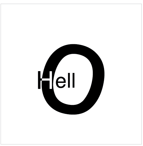
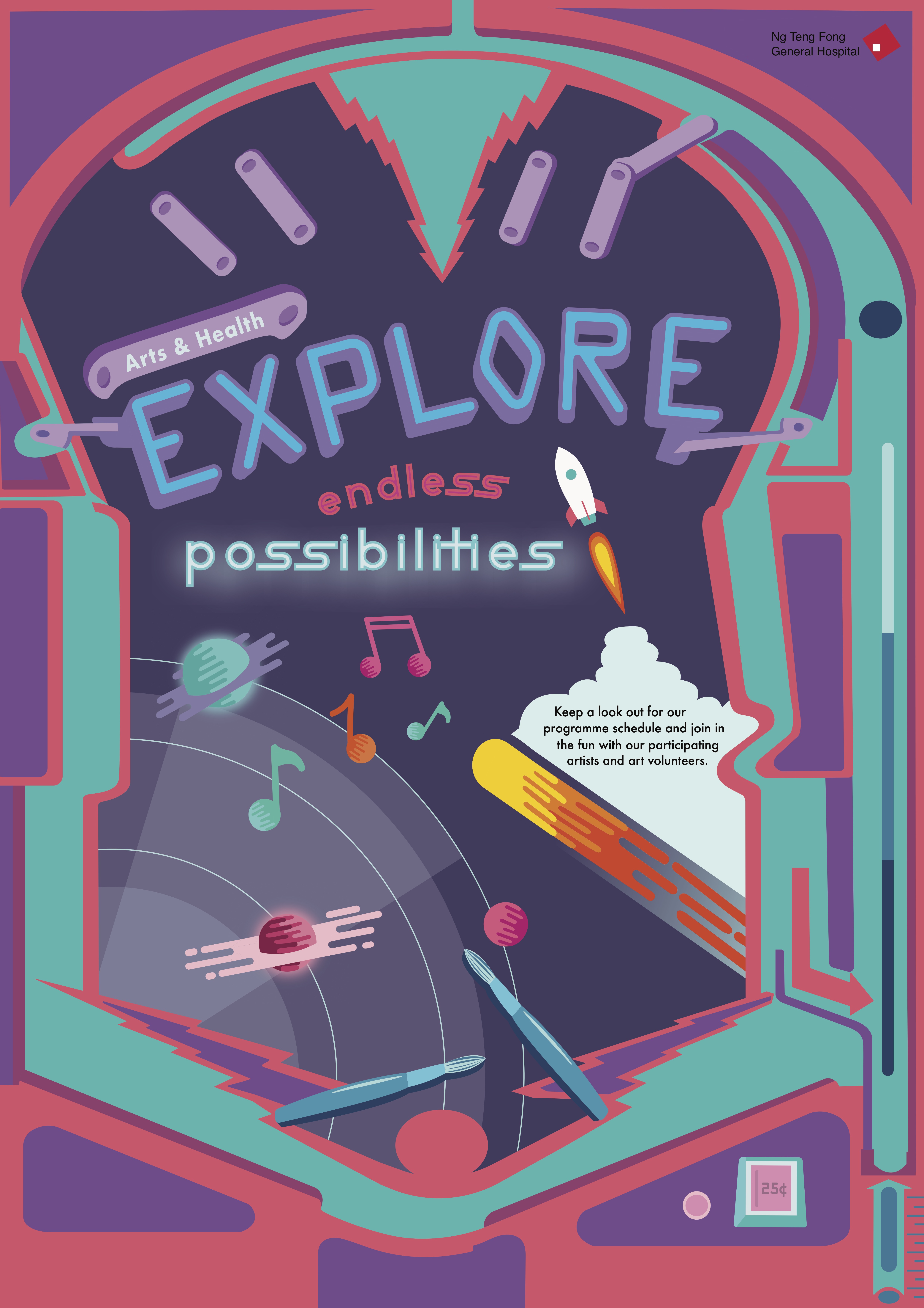
For project 3c, we had to express the word “HELLO” in the following moods: friendly, angry, seductive, confused, arrogant, depressed, annoyed, excited, bored. I used the font Gill Sans for all of the compositions. 

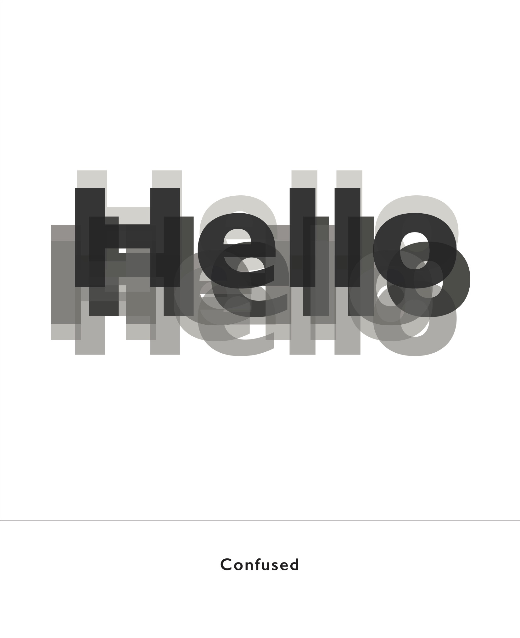
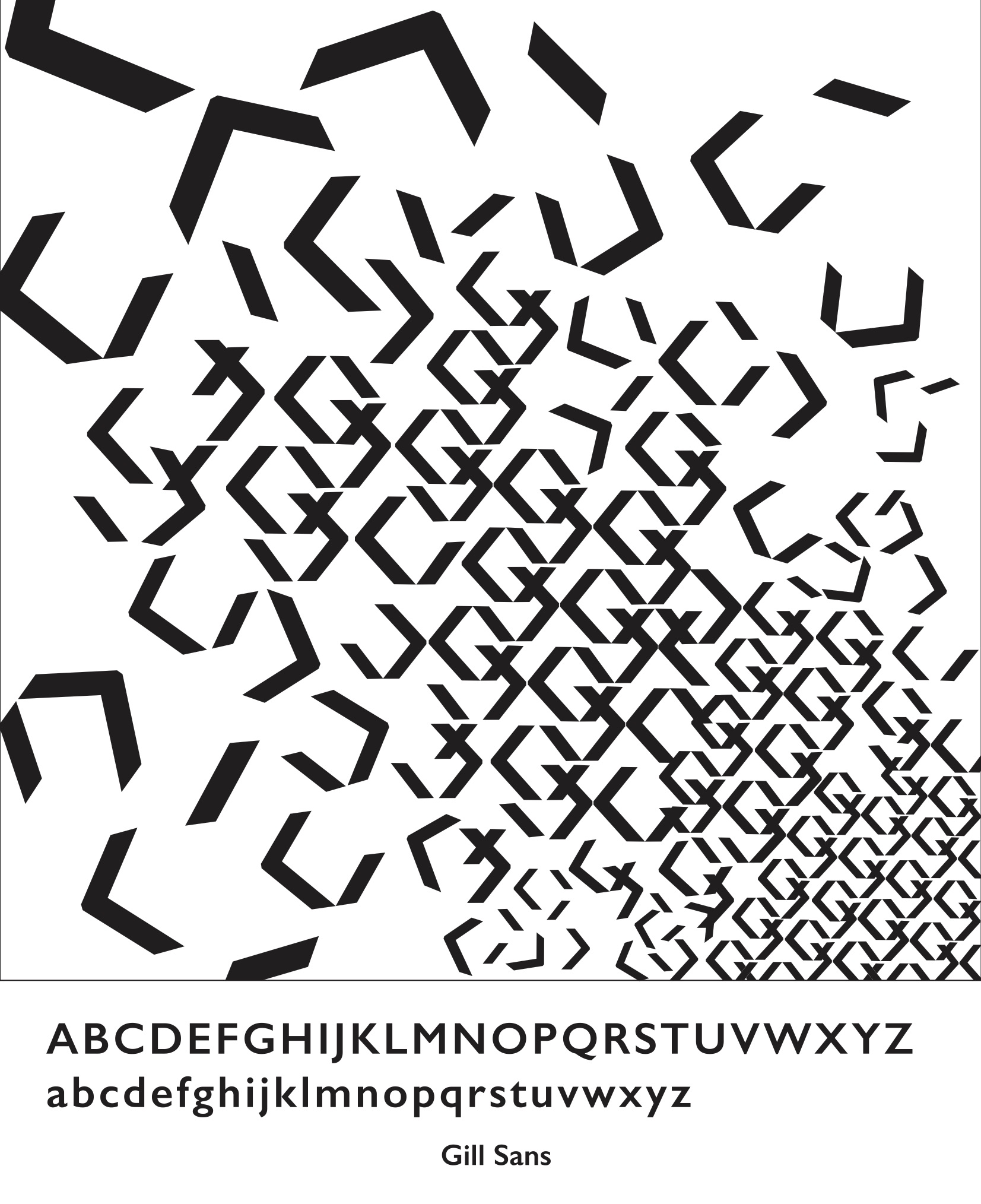
This was the first I thought of. I combined a variety of “hellos” with different opacities together to give the illusion of a blurred out hello much like how you feel when you’re confused by something. 

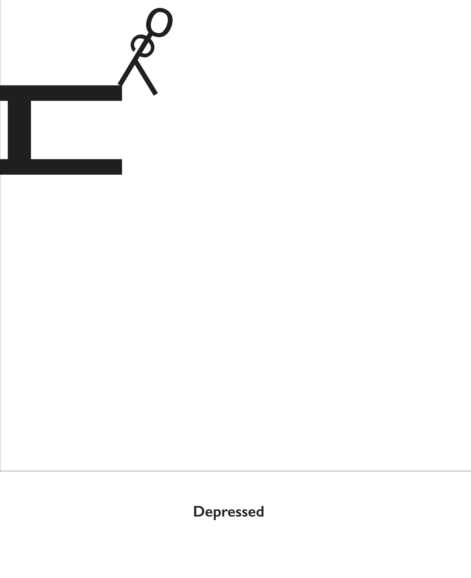
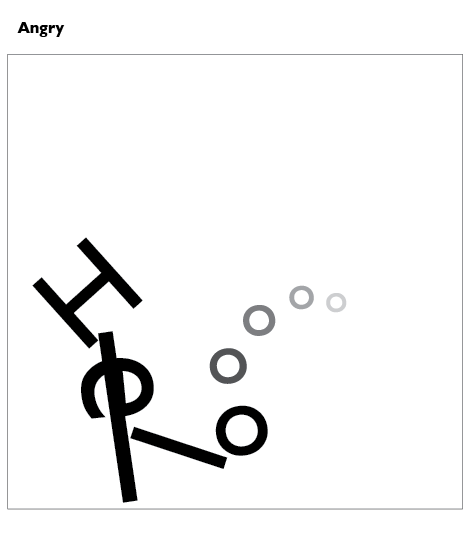
Initially I struggled with what else to do but as I played around with the letterforms, I realised that I could make a stick figureman out of the letters and tada this was what I came out with– a depressed stickman about to commit suicide.

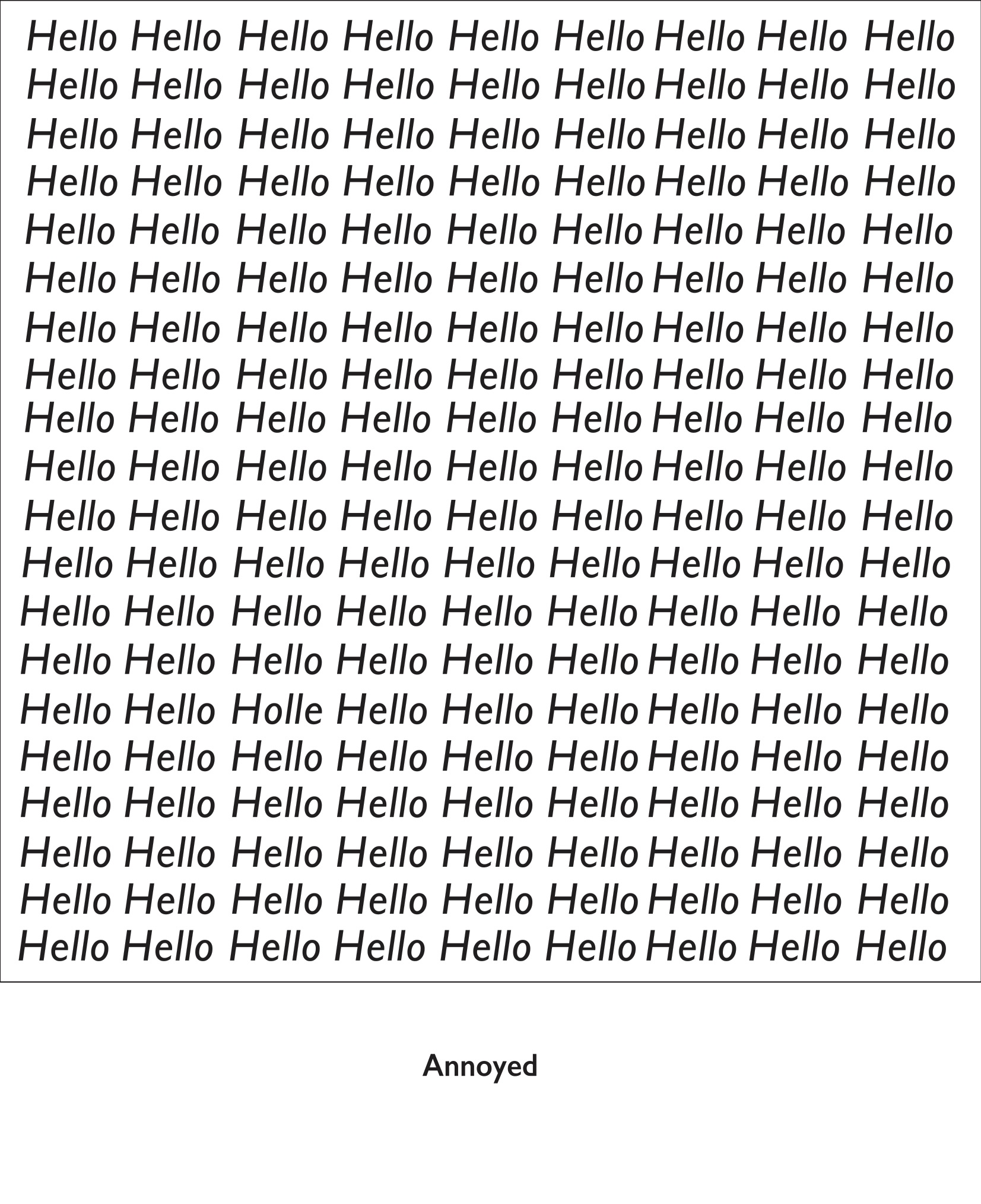
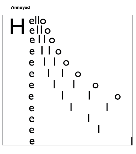
If you look closely, you would be able to find the misspelled “Holle”, but if you couldn’t you would probably be feeling pretty annoyed. I intentionally misspelled hello this manner to make it even harder for the viewer to find the misspelled word by just shifting the “e” and “o” but keeping the rest of the letters. This made the misspelled hello blend in better with the rest of the hellos, making it harder to find the word and brings out the feeling of annoyance better. 

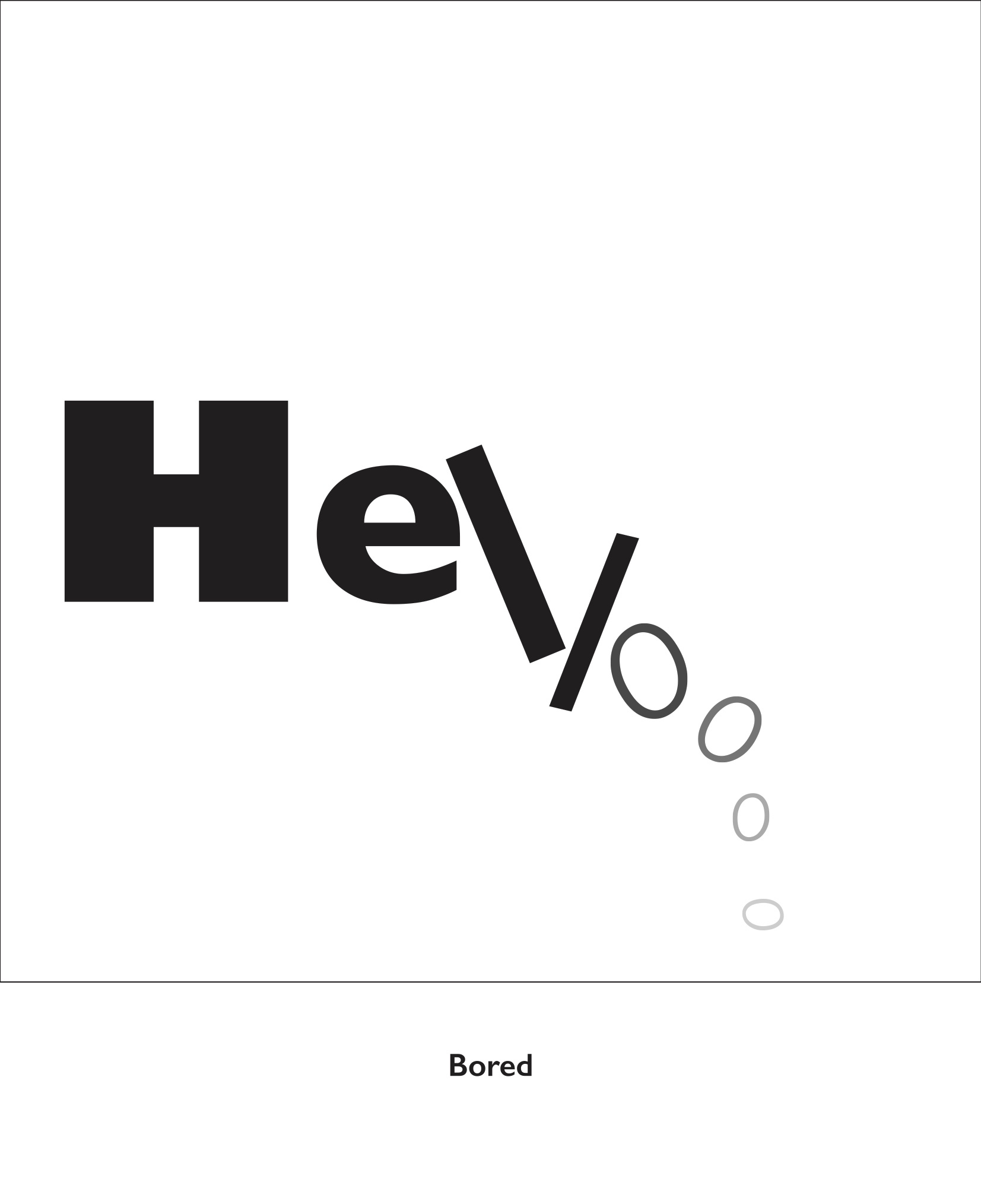
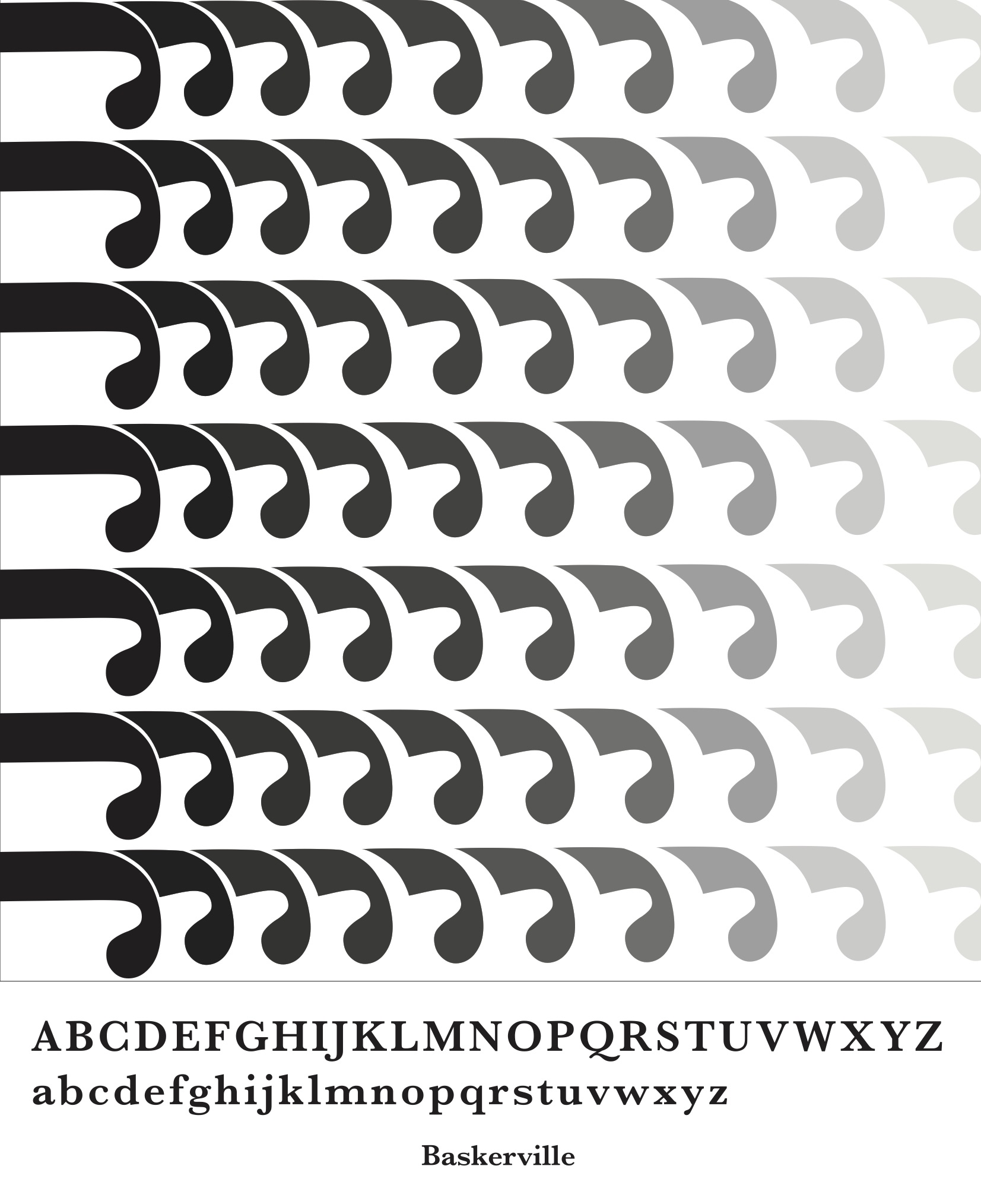
Much like your attention span, it starts out focused and bold but as time progresses and the feeling of boredom kicks in, you would slowly lose focus and attention, much like how the letter form slowly drops down and fades off. 

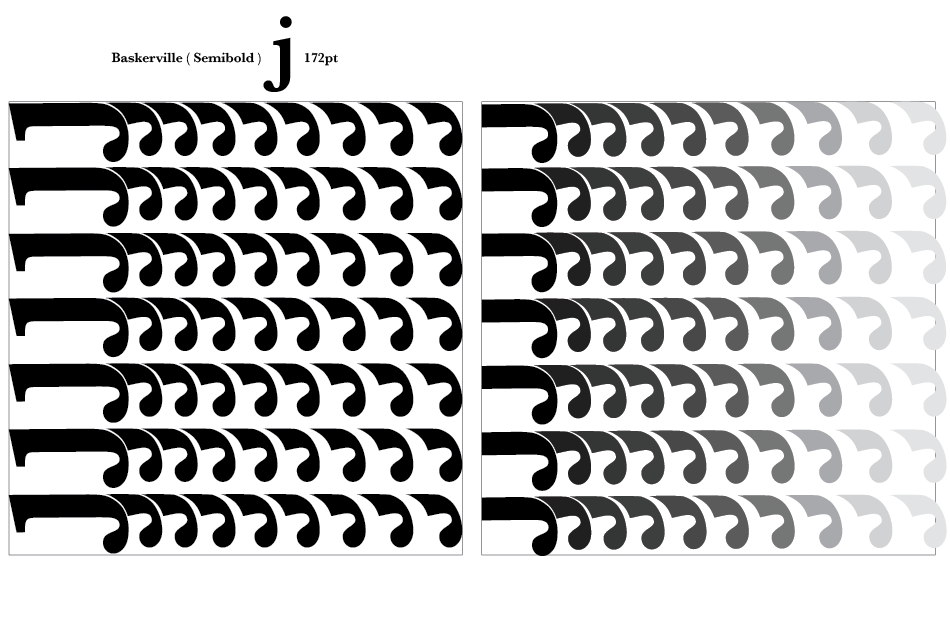
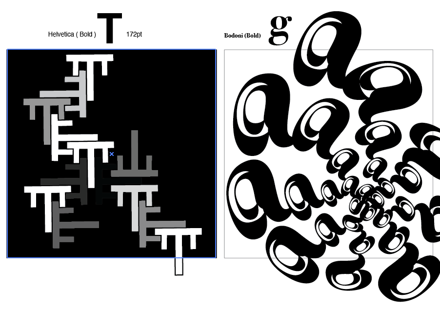
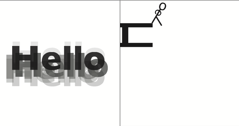
Other designs that didn’t make the cut.


Project 3b: Type as Pattern

For project 3b, we had to create a series of patterns using a single letterform and copy and repeat it to make an overall pattern. 

I started out with these 2 patterns and experimented with cutting up the text and playing with negative and positive spaces. However, after consult, Shirley said that I could try playing with more variations in sizes and density of text placement instead of just a flat repeated pattern. 

I started out with the pattern on the left and I really liked how it turned out using the descender of the “J”. It ended up looking like those telephone coil wires. The right pattern is the final edit after consult where I added a gradient and shortened the “J”. I think the spacing between the individual units and the gradient as well as the arrangement of the units along the same line really helped to create this 3 dimensional illusion. 

A few other patterns that I experimented with. 

FINAL PICKS:

Project 3a: Type as Image

For this project, we had to create a series of images using one traditional typeface and making use of the different weight of the type to create our image. 

While I was thinking of what image to do, I knew I wanted to do something intricately detailed and the first thing that came to mind were shophouses. I love the details and ornamentation of shophouses in Singapore and I really wanted to try it out to see what I could come up with. 

I chose a san serif font because I wanted something more structured and angular with less “curves” to really show the details of the patterns created and I went with Avenir because it had the largest family of fonts. I love how after stretching and manipulating the type, I was actually able to get a variety of thickness in the composition. 

In my second image, I wanted to do something related to local flavour so I went with traditional nonya kuehs. 

I decided to go with a serif font for a change from the previous image. It was really fun experimenting the different typefaces and figuring out ways of incorporating it into an image.

Task 3: Design Refinement and Mock up

Based on feedback gathered in class, this was what I came up with. 

I decided to stick with a more consistent colour palette that is darker with accents of brighter colours compared to my previous one that was rather lacklustre in terms of colour choice. 

Feedback gathered from Michael was:

  • Move the hospital logo to top right
  • Align the arts and health bar with the shape of the word Explore
  • Smoothen out the curves of explore
  • Group elements at the center together to create more focus and emphasis
  • Connect the comet graphic with the pinball lever to suggest motion
  • Vary the sizes of the music notes to make it less monotonous and static
  • Introduce a ‘rocket’ to help incorporate the body text within the pinball board
  • Introduce more art elements 
  • Create more space within the pinball board, less exterior needs to be seen

Revised design

Takeaways and Reflection

I think this project really helped to push me to do a full on A2 illustrated poster and I really learned a lot from this assignment. I learned about poster layouts, colour schemes, text placement, choice of typefaces etc. I know that my poster design is not the best but I am proud of myself for being able to come out with this from the first initial draft. Moving forward, I would probably change the “NTFG” hospital logo to white to increase visibility, decrease the opacity or colour of the cloud to make it less striking, cut the space at the bottom of the poster, tighten the lines in between the slogans and probably reconsider the arrangement of the graphics in the middle to make it more “organised”. But yea overall, it was a great learning experience that I will take with me as I continue onto future projects.

Task 2: Design Exploration

The final design that I decided to continue working on was the idea of a pinball machine. My final slogan was ” Explore endless possibilities”. I thought the theme and concept of a galaxy pinball machine really fits the idea of emoting fun, adventure, exploration etc. 

My initial draft was to include the entire pinball machine in the poster. However, feedback gathered was that I did not need to show the entire machine for people to know it was a pinball machine. I should focus instead more on the actual pinball table itself. 

For my second draft, I struggled a lot with the colour palette as well as placement of objects in the centre. Hence, everything just ended up rather scattered, unfocused and messy. 

Feedback gathered:

  • stick with the darker background I did initially to fit the whole “galaxy” theme
  • change orientation of orbits
  • bring planets closer together to create more focus 
  • text “endless” and “possibilities” can be put together 
  • the frame can be expanded outwards so more attention is placed on the middle of the board