Project 2 (II): Final Zine

Printing Process

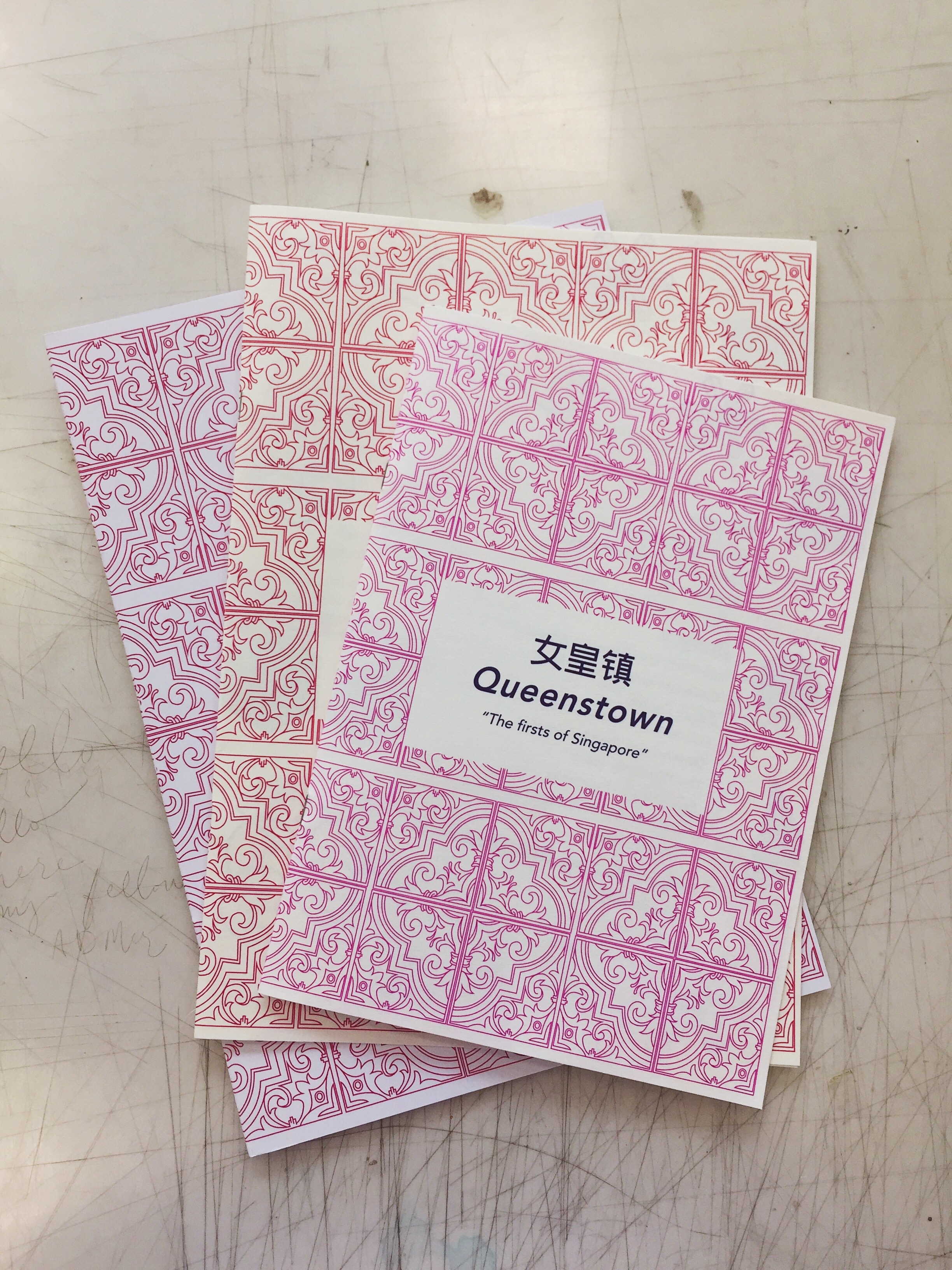
I struggled quite a bit with the printing process as my layouts all either came out bigger than A5 or smaller than A5 and I had to visit the printing shop 3 times before getting the right size. I also tried experimenting on different coloured paper, white vs cream but went with the cream instead as I felt that it fits the feel of the zine better. 

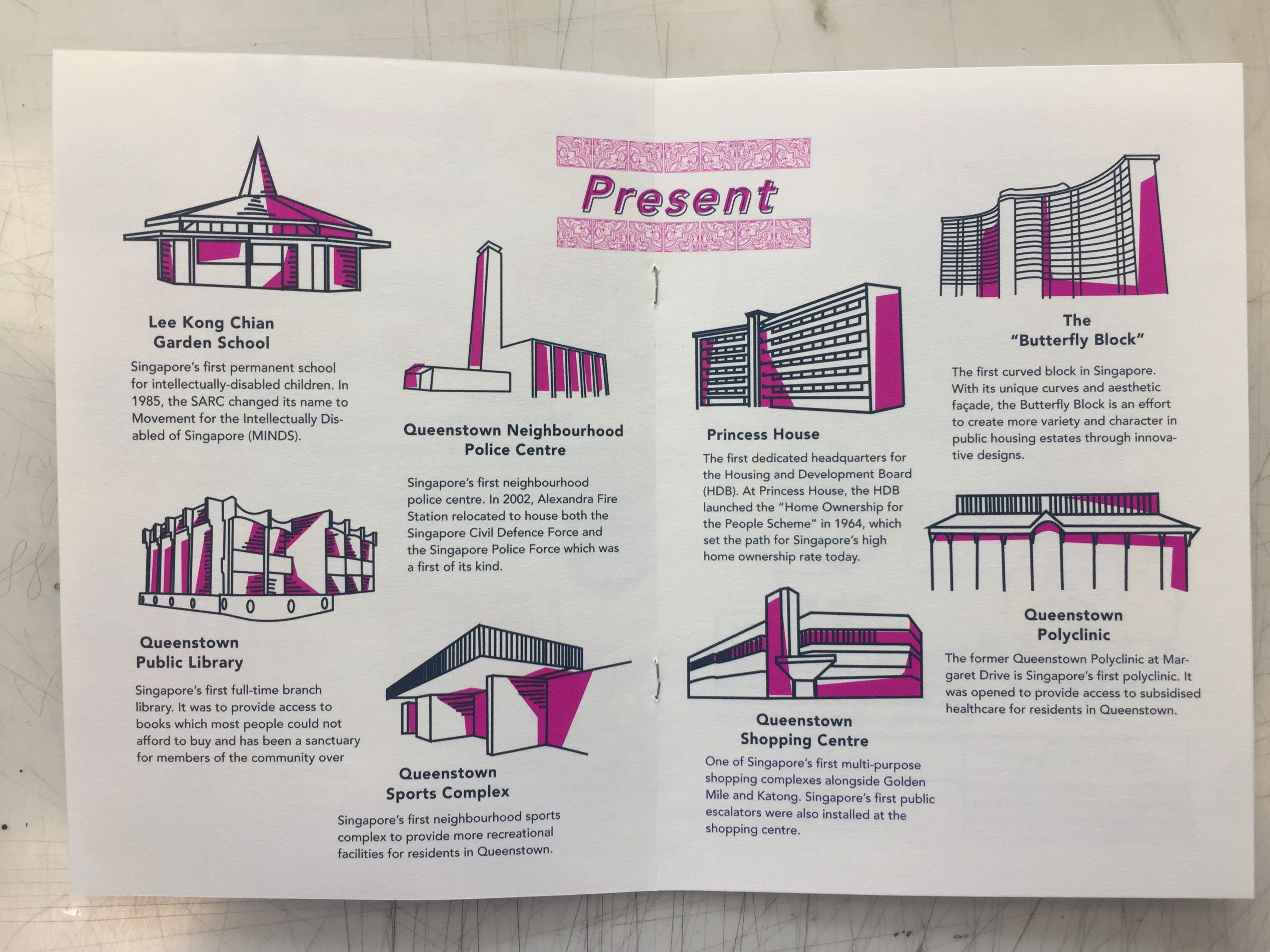
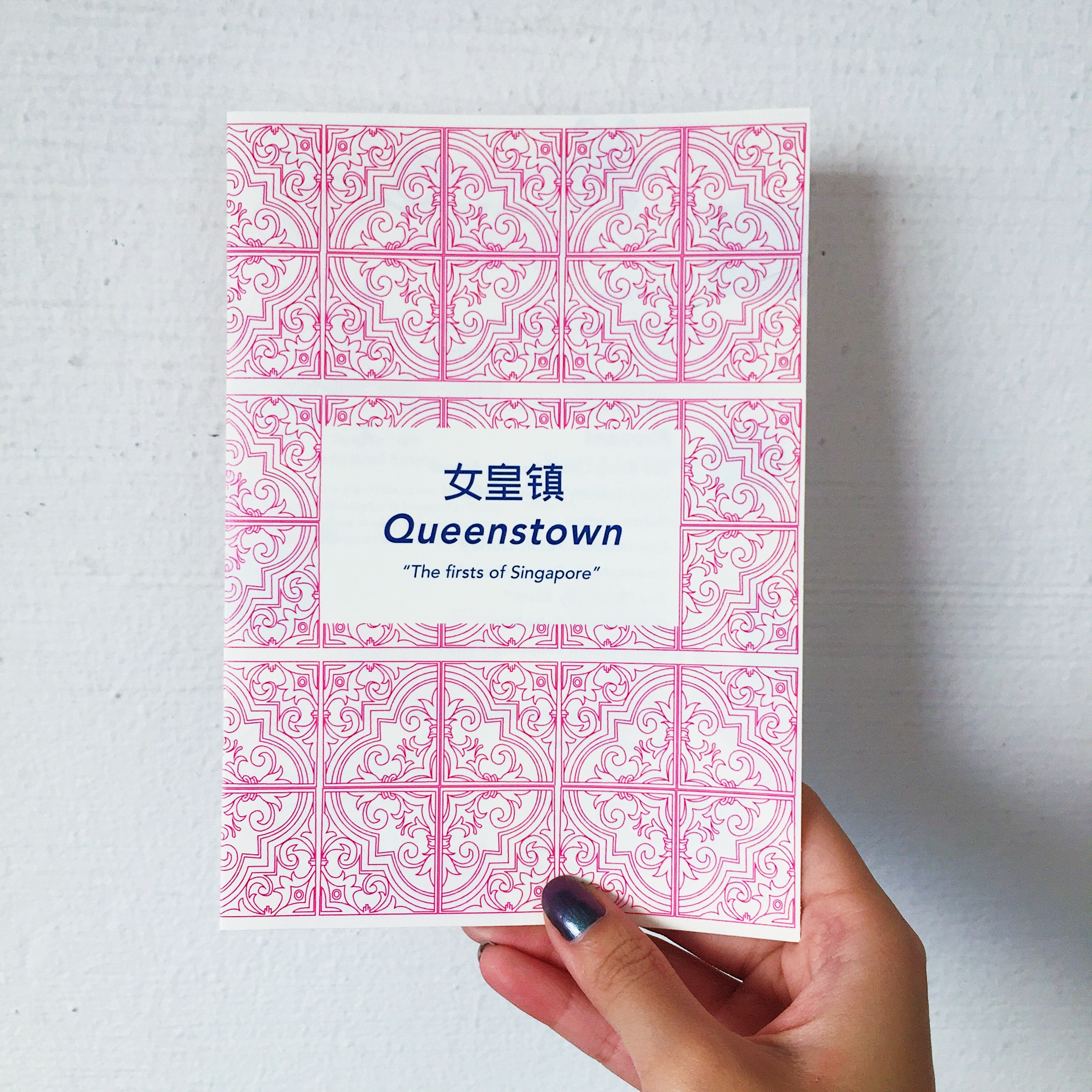
Sadly, the third time I went back and finally got the right size, I went to a different shop and my pink turned out more purple instead. 🙁

Takeaway and Improvements

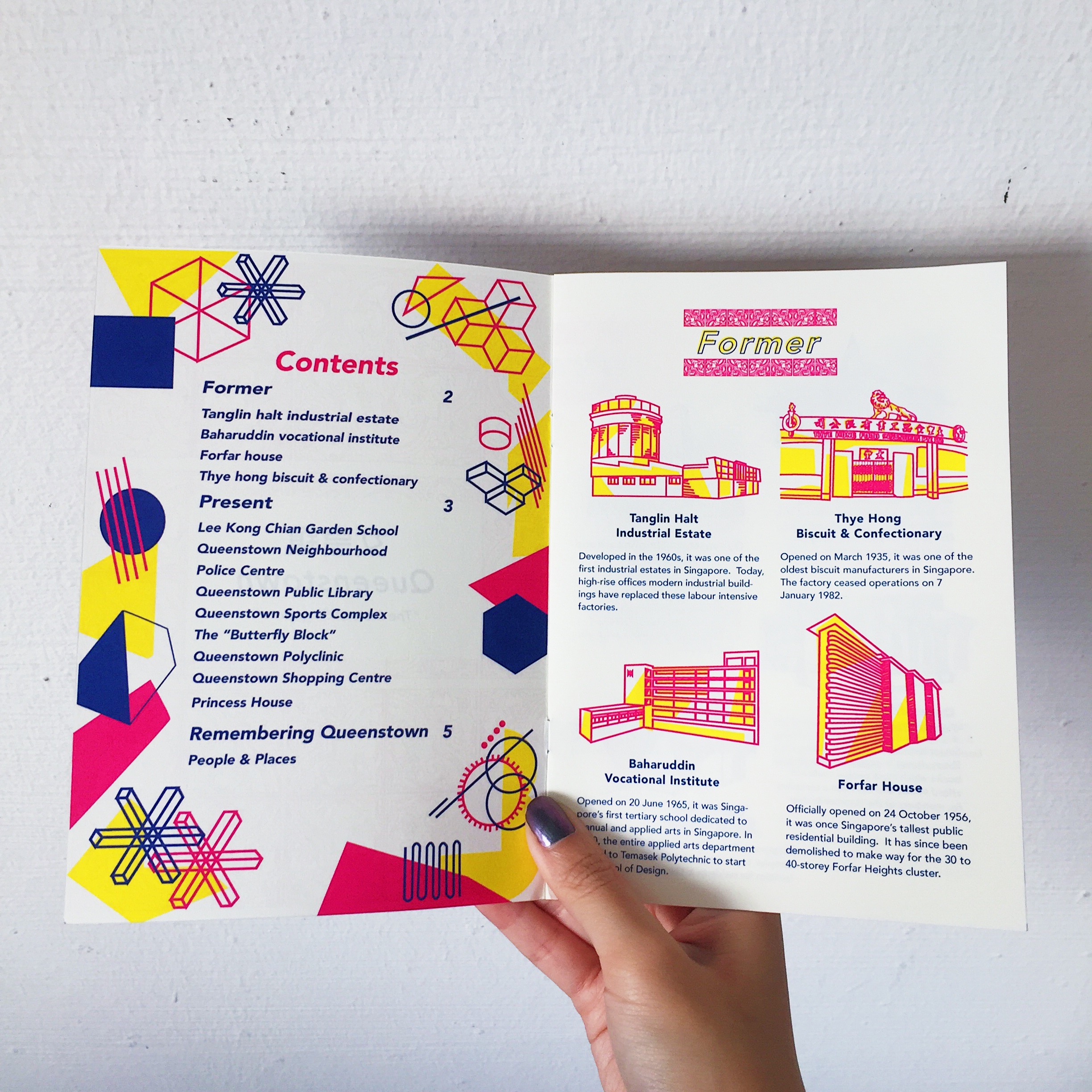
Finally, after final presentation and critique, some feedback that I got was that my contents page didn’t really fit into the entire zine and that I had to look out for hypenations in my paragraph which I overlooked. Also that my paper type didn’t fit the required 100-120gsm that was a mistake on my part as I thought I could get away with it when the temptation for thicker paper got the better of me. I agreed that the execution of my contents page could have been better and maybe went with the tile/ traditional theme instead. Also, after looking through it once more, I felt that improvements could have been made like including a tile pattern at the corner of every page of example to tie the whole zine together better.

Overall, I think this project was definitely a really fulfilling one and I had a lot of fun coming up with the concepts and designing my first ever zine?!! Great end to F2DII to conclude my entire semester 😀 Thanks Joy for all your guidance throughout the semester and to the class for the good times and support!

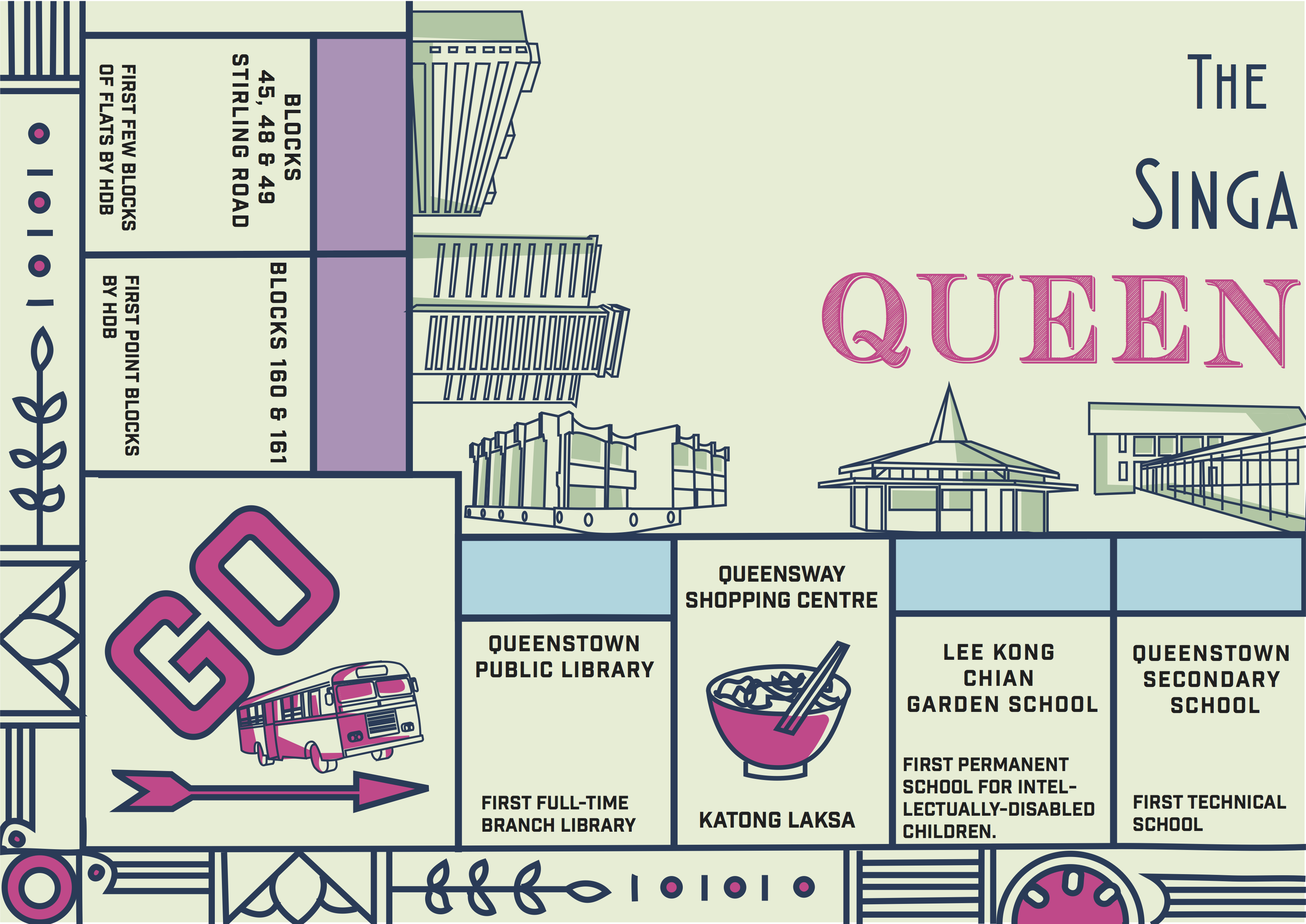
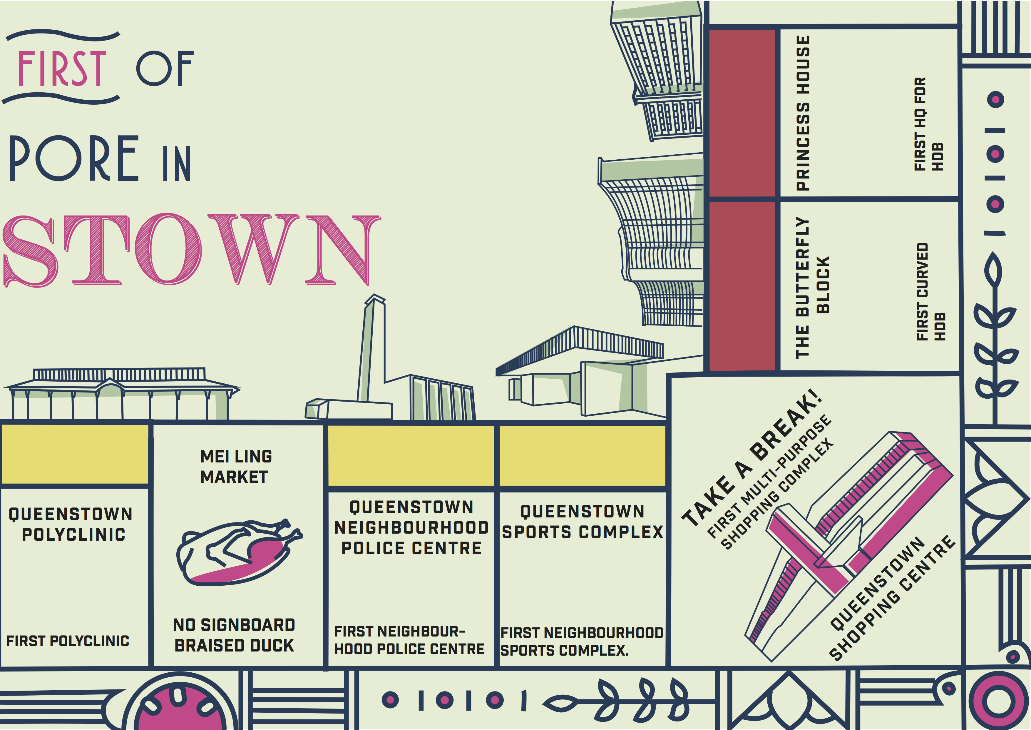
Neighbourhood exploration research – https://oss.adm.ntu.edu.sg/limx0098/project-2i-neighbourhood-explorer/

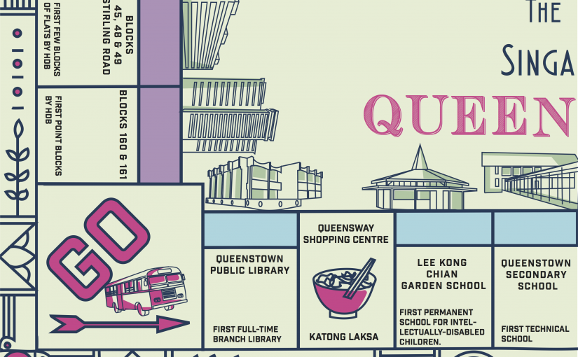
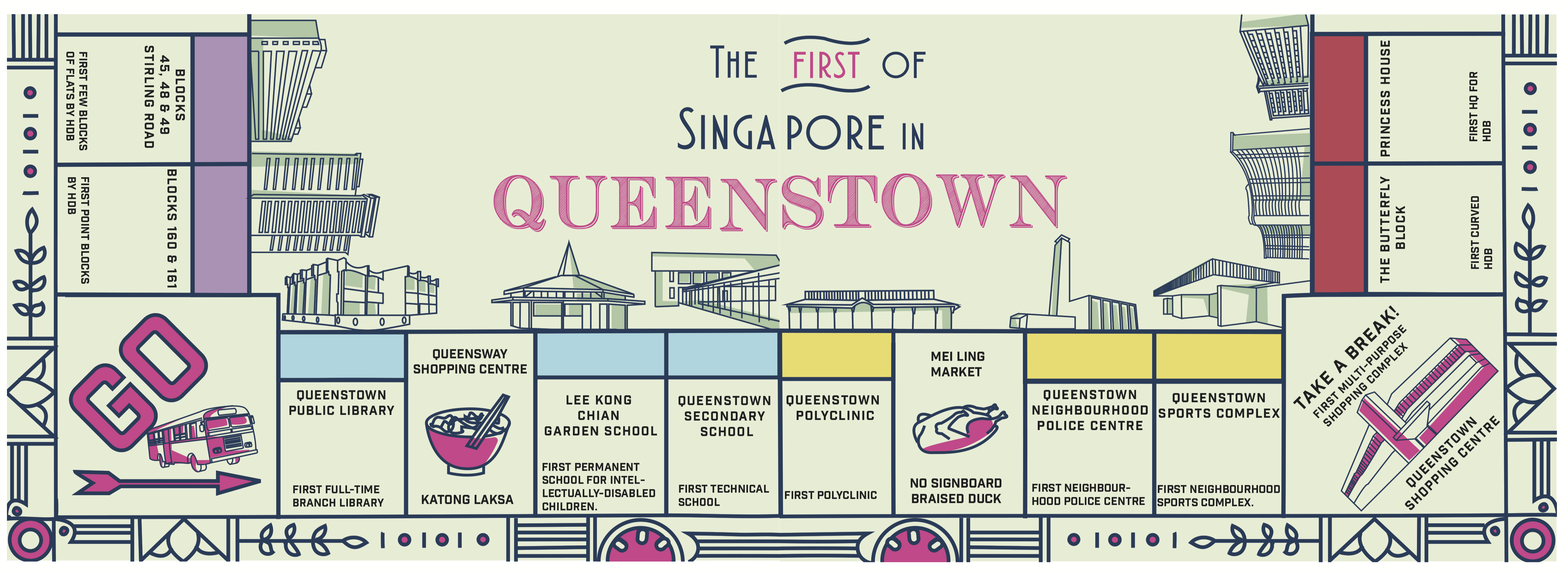
Infographic – https://oss.adm.ntu.edu.sg/limx0098/project-2i-infographic-process-and-final/

Zine Process  https://oss.adm.ntu.edu.sg/limx0098/project-2ii-zine-process/


Project 2(I): Infographic process and final

After much deliberation and site visiting, I had a few ideas in mind for my infographic which was either a heritage trail of Queenstown, iconic places in Queenstown or a guide for expatriates moving into the area. However, after visiting, I found that there was already an existing heritage trail of Queenstown and they even conduct weekly tours for the public. Hence, I thought that it wouldn’t be as interesting to make an infographic for something that already exists. Moving on, I also found it hard to make a guide for expatriates because of the fact that there wasn’t much entertainment in the area and many of the places that would typically be applicable to them such as shopping malls, food places etc. were pretty obvious and they wouldn’t require much of a guide for that. Hence, I went back to what makes Queenstown different from other estates? Queenstown is known for being the oldest estate in Singapore which makes it extremely rich in heritage. After much research, I found an interesting recurring theme amongst all of the heritage sites in Queenstown. Being one of the pioneer estates for many of Singapore’s early developments, Queenstown was the first for many things in Singapore for instance, the first estate for HDB blocks, first polyclinic to provide subsidized healthcare, the first neighbourhood public library and so on. I thought that this was an interesting angle to work on without making the heritage seem dull and overused but emphasizing on interesting “facts of firsts”.

References

During consultation, I showed some of my infographic style references to my classmates and one of them suggested why not I make it into a card game or board game format like monopoly!

無印良品  くらしの備え。いつものもしも。:

Wanderlust: Process Chart Semester 1 by Drishti Khemani, via Behance #infographics #process #illustration:

Swing Tour is a board game created to promote Seoul. Instead of promoting…:

I also referenced these minimalistic icon styles for a visual representation of the places mentioned.

Tokyoiconのアイコン:

한국의 랜드마크 일러스트.아이콘에 가까운 이 일러스트는 최대한 깔끔하게 본문의 모양을 잘 살려낸 그런 일러스트이다. 각 랜드마크별 안내표지판 이름옆에 붙여놓으면 깔끔한 멋이 날것이다.:

Colour Palette

As for the colour palette of my design, I took elements from the bright and pastel colours found at the Queenstown stadium and the “butterfly” HDB block.

Finally here is my final infographic!

I incorporated some food stop suggestions such as the famous katong laksa at Queensway shopping mall and braised duck at Mei Ling food street as well.

Pretty satisfied with my design and was happy with the overall positive feedbacks from everyone 🙂 However, Joy suggested that I could incorporate more visual elements related to that time period into the border instead of the current one which was a little unnecessary. Moving on from this, I hope to explore more of this style in my zine and maybe make it interactive(?) That’s it for now and thanks for reading! 😀

Project 1: Que Sera Sera Final

So here are my final 4 compositions!

architectprint-copy

designerprint-copymarinebiologistprint-copy

tattooistprint-copy

Reflection:

This project really taught me a lot and gave me the chance to experiment with different mediums. It has also taught me to improvise a lot and to be more open minded when things don’t always go according to plan. This project has also been rather frustrating at times when ideas I had in mind didn’t always go according to plan or turn out the way I envisioned it to be. I learned more about expressing ideas visually through typography especially after looking at my friend’s works, I learned more about the different techniques they used and improvements I could make for future projects. Overall, this project has been rather fulfilling and I’m pretty satisfied with how my designs turned out  😀