Typography 1 project 4

We have finally come to our project of the semester!! Initially I had a hard time coming up with an idea for my project but I knew I wanted to do an extension of our project 3 – type as pattern. I thought that slapping a pattern on a notebook would be too cliche and overdone so I thought of all the possibilities of when I could use type as pattern.

Moodboard


I came across a bunch of typographic card designs online which inspired me to make my own. I wanted to incorporate 4 different typefaces and a different colour to differentiate the 4 suits.

  • Clubs – Baskerville – blue
  • Spade – Bodoni – green
  • Hearts – Superclaredon – red
  • Diamond – Didot – yellow

Design Exploration

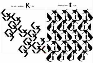
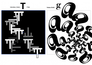
These were a few of the design explorations that I did. Initially, I wanted to make a unique design for each alphabet / number with different styles, playing with repetition, scale, gradient, density, opacity etc. However, after my first consultation, Shirley mentioned that everything ended up looking disconnected as there were multiple styles in a single set of suits and  and it was better to stick to a single style throughout. Also, for the design such as the “K”, the “pattern” aspect of the design was lost as I was just cutting up the K into fragments. In the end, I decided to just go with the style of the “A”, sticking to interlacing and slicing up the font. There was also the issue of whether I should use letters or numbers for the 2-10 but in the end, I decided to just stick to numbers to avoid making it too complicated for the user to read the cards. 

I wanted to keep the design consistent throughout all the “A”s but I found it a little hard given that each typeface has different anatomies and it was not possible for everything to follow a fix template. For instance, the difference in the height of the crossbar would mean that I have to alight it higher or lower according to the different types. As shown above, Bodoni has a lower crossbar, hence, it is cut off when interlaced with another “A”. It was also hard to interlace certain alphabets with certain typefaces being narrower or wider.  


Design Backing

As for the backing of my cards, I used my pattern design from project 3 but I had a hard time deciding on the colours. In the end I decided to stick to monochrome as using multiple colours wouldn’t make any senses given that the colour would give away the identity of the suits when playing. And sticking to blue would not match the other colours used on the front. 

Design packaging

I used elements of the different fonts on the box itself. The name font play is a dual meaning title. It means playing with the physical cards itself and playing with the typography at the same time. 

Font Play is a deck of cards that features the anatomy of 4 different typefaces– Baskerville, Bodoni 72, Superclaredon and Didot. A unique pattern is created for each set of number or alphabet based on the type’s anatomy. Notice how the characteristics of each font affects the design as you play!

The whole concept behind Font Play is to get users to compare how anatomy of the different typefaces affects the patterns created and to spot the differences behind each unique design. 

Coming up with the dimensions of the box was a bit of a challenge for me as I based the measurements off a generic poker card box template. However, the paper quality and thickness would be differ from the original poker card and I was afraid of whether my cards would fit. 

End product

Reflections

Overall, I was pretty satisfied with the results. Despite the tedious process of designing 52 cards, I really enjoyed myself and it was pretty fun exploring the anatomies of the different typefaces. Had I more time, I would probably explore more compositions and maybe include a “fun fact” sheet for each typeface used to tie the designs together better. Cheers to the end of project 4 to conclude this semester 🙂 


Project 3c: Type as Emotion

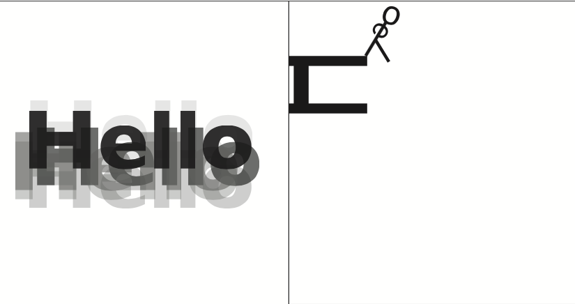
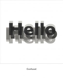
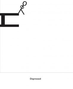
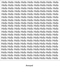
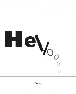
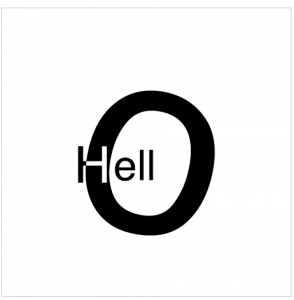
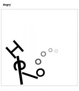
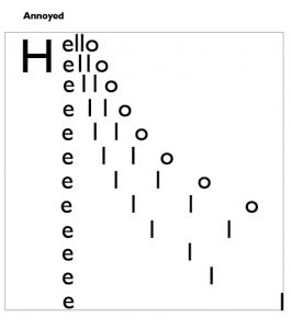
For project 3c, we had to express the word “HELLO” in the following moods: friendly, angry, seductive, confused, arrogant, depressed, annoyed, excited, bored. I used the font Gill Sans for all of the compositions. 

This was the first I thought of. I combined a variety of “hellos” with different opacities together to give the illusion of a blurred out hello much like how you feel when you’re confused by something. 

Initially I struggled with what else to do but as I played around with the letterforms, I realised that I could make a stick figureman out of the letters and tada this was what I came out with– a depressed stickman about to commit suicide.

If you look closely, you would be able to find the misspelled “Holle”, but if you couldn’t you would probably be feeling pretty annoyed. I intentionally misspelled hello this manner to make it even harder for the viewer to find the misspelled word by just shifting the “e” and “o” but keeping the rest of the letters. This made the misspelled hello blend in better with the rest of the hellos, making it harder to find the word and brings out the feeling of annoyance better. 

Much like your attention span, it starts out focused and bold but as time progresses and the feeling of boredom kicks in, you would slowly lose focus and attention, much like how the letter form slowly drops down and fades off. 

Other designs that didn’t make the cut.


Project 3b: Type as Pattern

For project 3b, we had to create a series of patterns using a single letterform and copy and repeat it to make an overall pattern. 

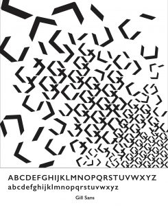
I started out with these 2 patterns and experimented with cutting up the text and playing with negative and positive spaces. However, after consult, Shirley said that I could try playing with more variations in sizes and density of text placement instead of just a flat repeated pattern. 

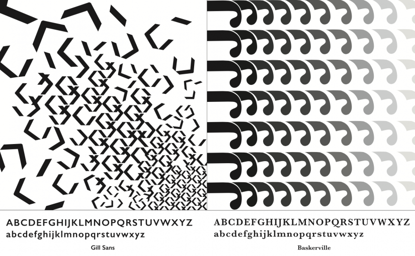
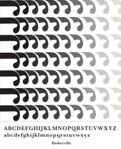
I started out with the pattern on the left and I really liked how it turned out using the descender of the “J”. It ended up looking like those telephone coil wires. The right pattern is the final edit after consult where I added a gradient and shortened the “J”. I think the spacing between the individual units and the gradient as well as the arrangement of the units along the same line really helped to create this 3 dimensional illusion. 

A few other patterns that I experimented with. 

FINAL PICKS:

Project 3a: Type as Image

For this project, we had to create a series of images using one traditional typeface and making use of the different weight of the type to create our image. 

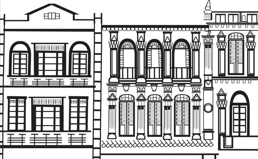
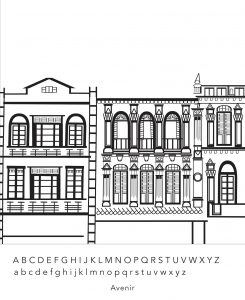
While I was thinking of what image to do, I knew I wanted to do something intricately detailed and the first thing that came to mind were shophouses. I love the details and ornamentation of shophouses in Singapore and I really wanted to try it out to see what I could come up with. 

I chose a san serif font because I wanted something more structured and angular with less “curves” to really show the details of the patterns created and I went with Avenir because it had the largest family of fonts. I love how after stretching and manipulating the type, I was actually able to get a variety of thickness in the composition. 

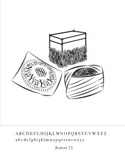
In my second image, I wanted to do something related to local flavour so I went with traditional nonya kuehs. 

I decided to go with a serif font for a change from the previous image. It was really fun experimenting the different typefaces and figuring out ways of incorporating it into an image.

Project 2b: Organic Type

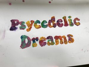
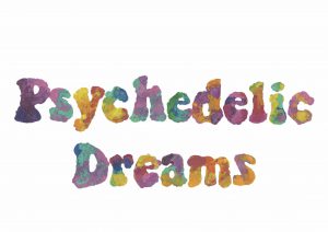
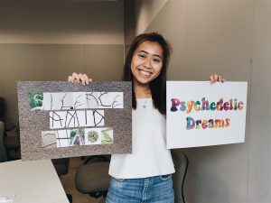
The quote that I chose was ” Psychedelic Dreams”

When I think psychedelic, colours, trippy, static, retro, 60s era immediately comes to mind. I knew that I wanted to do something colourful with bold and bright colours, now all I needed to do was look for techniques to create my type. Here are some 60s vinyl album covers that I found online for inspiration.

Raoul Yannik  ☮ American Hippie Music ☮ Fleetwood Mac

Cream  Mishka Westell’s poster for the 1960s psych rock act, from this year’s Austin…

The Jimi Hendrix Experience & The Crazy World of Arthur Brown. 27 August 1968, Saville Theatre #London. #psychedelic  grateful dead posters - Google Search

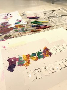
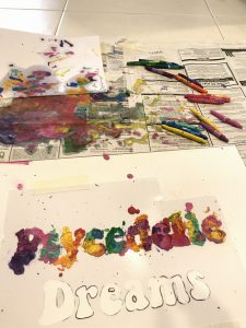
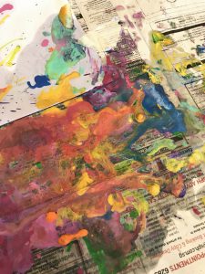
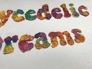
I decided to use crayons to create that nice psychedelic mix of bright colours. Melted crayons also gives a nice textured relief as opposed to paint that would just look flat.

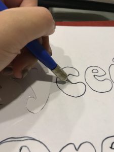
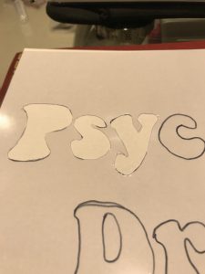
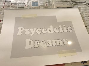
First, I used an xacto knife to cut out the individual letters to create a template for my individual letterings. I free handed drew a font with a “bell-bottomed” stem and structure to give it a more 60s vibe.


Afterwards, I melted the crayons together to create a nice blend of vibrant colours.


However, I accidentally misspelled “psychedelic” so I had to add in a “h” afterwards haha.

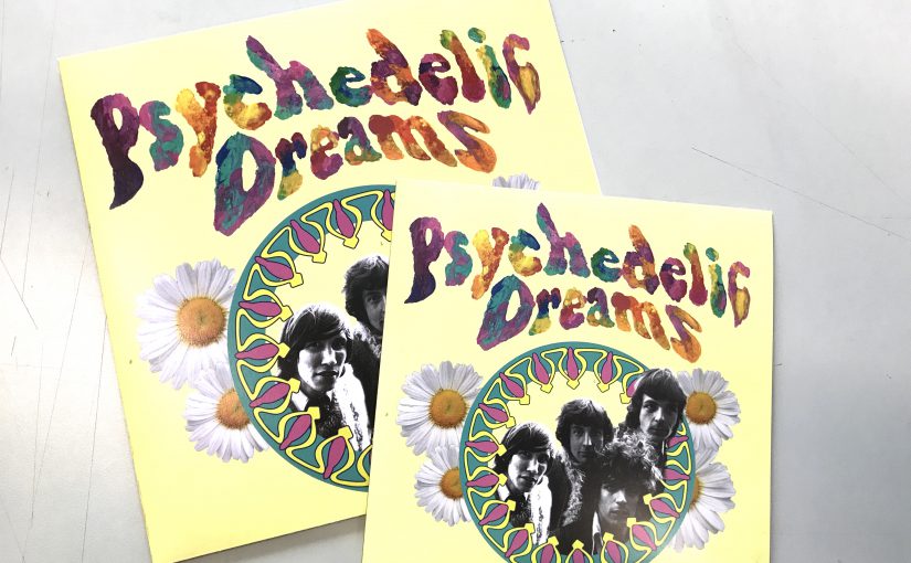
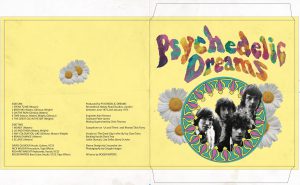
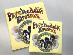
For application, I created a vinyl cover. I tried to keep the colours a little desaturated for the type to stand out more.


F I N A L

And this concludes project 2 🙂

R E F L E C T I O N S

I definitely learned a lot from this experience. Looking for letters in everyday spaces really trained my eye to look out for type and the letters I found really surprised me as well. Type is everywhere in the most unexpected spaces.

As for the creation of my organic type, it made me realise how important handmade typography is even with the progression of digital media. The organic-ness and real-ness of handmade typography can never be recreated by any software and it serves as a reminder to never forget the traditional mediums even as we move on to digital media. 🙂

Project 2a: Vernacular Type

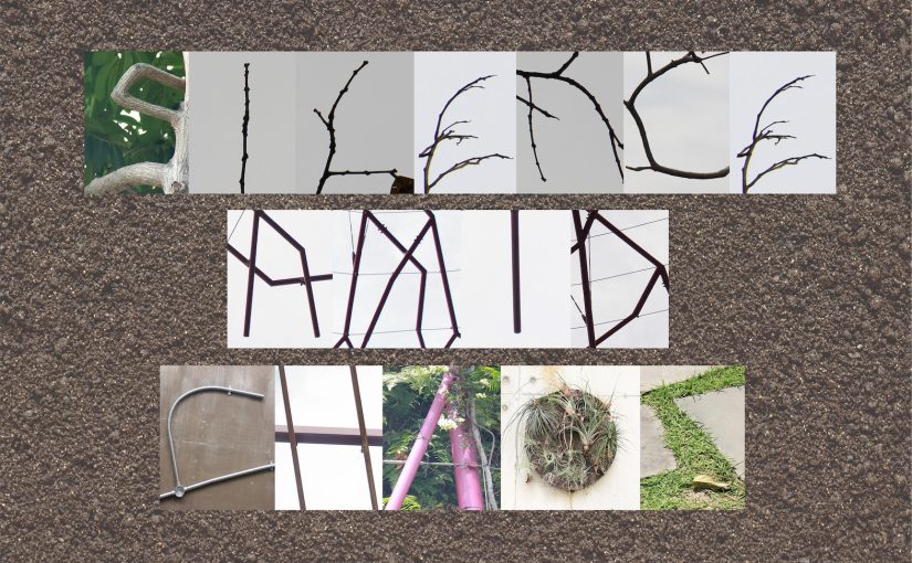
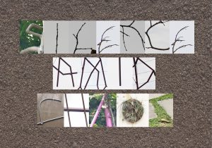
Quote: ” Silence amid chaos”

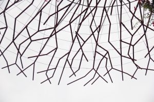
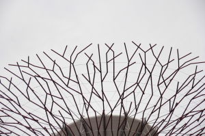
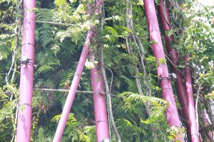
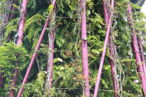
Location: Gardens by the Bay

Concept: To illustrate fabricated silence within the gardens amid the chaos of a city by incorporating nature with man-made elements.  SILENCE- nature CHAOS- man-made with nature

S I L E N C E

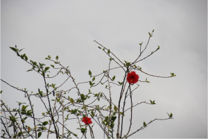
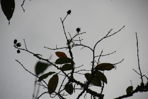
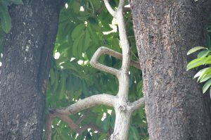
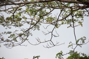
“E”
“C”
“L”
“S”
“E”

A M I D

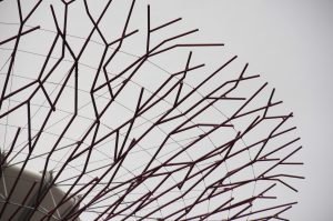
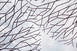
I wanted to keep it consistent by making it letters from the “supertree” alone.


Thankfully, I was able to find all the alphabets within the structure by cropping and rotating the images.

C H A O S

Final Design