Task 1A: Exploratory Research – Exploring the What, Why, Who, and How

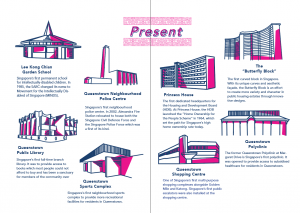
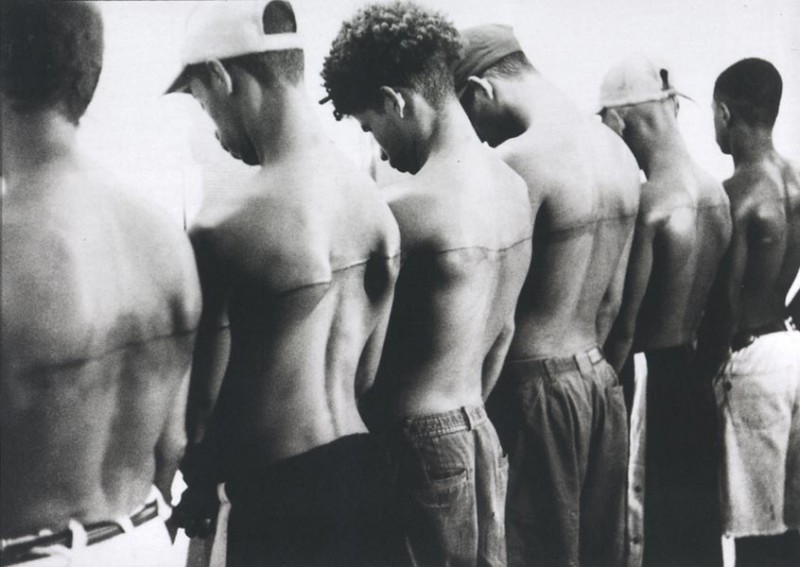
1. What are some of the current issues confronting our world today? Amongst them, what is of interest and a cause of concern to you?

1. Sexual assaults/ harassment

For every 1000 rapes, estimated that only 310 are reported ( just under 1/3) Rape is the most under reported crime
Only a fraction (57) lead to arrest
Only a fraction of the arrest lead to prosecution (11)

A fraction of the prosecuted lead to incarceration (6)
For sexual harassment in the workplace, the least common respond was to report it and only 30% of those harassed speak up – 70% remain silent
75% of employees who spoke out against workplace mistreatment faced some form of retaliation

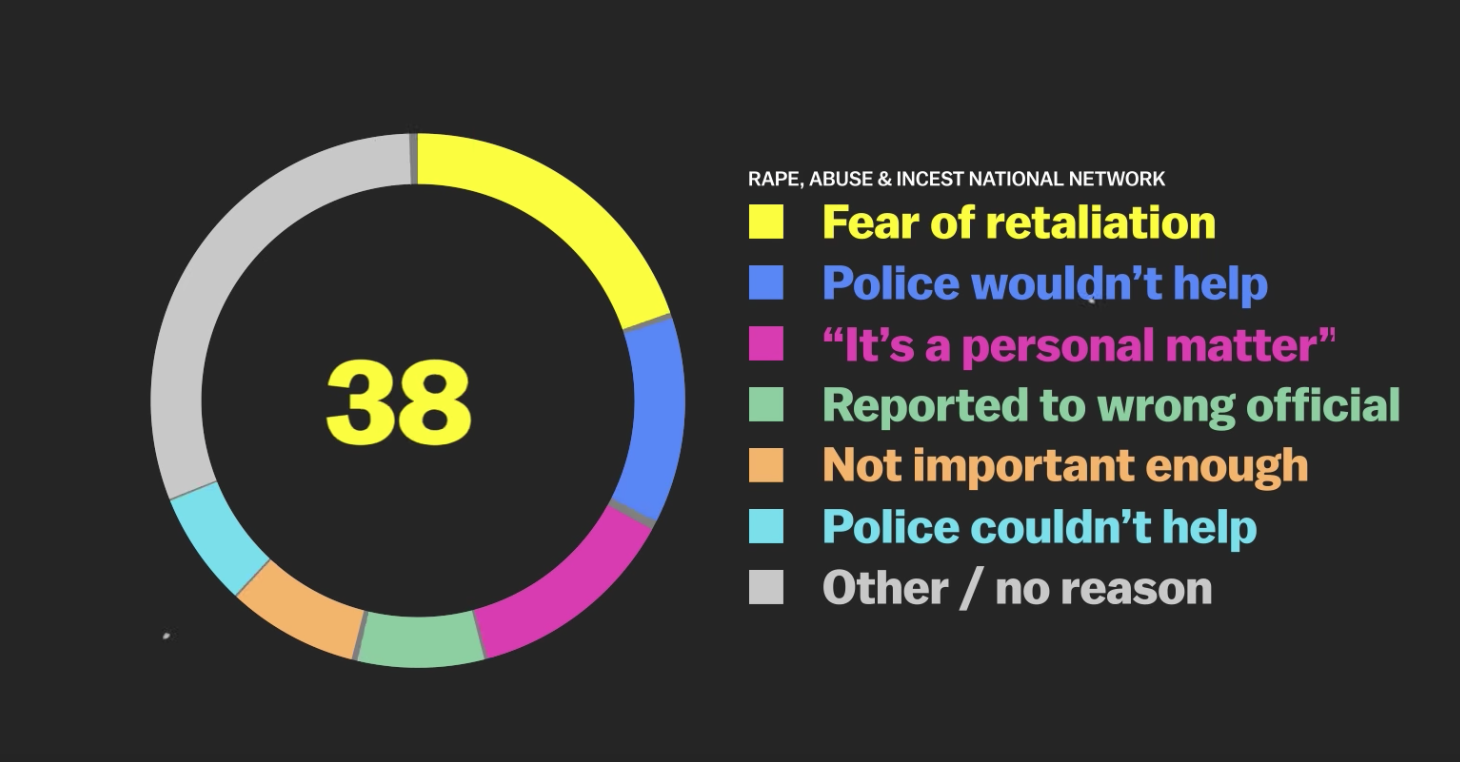
Fear is the number 1 reason (20%)
These stats only reflect those experiences of straight white women and not women of colour, gays, men, trans etc.

According to a 2015 survey by the National Center for Transgender Equality, 47% of transgender people report being sexually assaulted at some point in their lives, both in and out of the workplace.

http://time.com/time-person-of-the-year-2017-silence-breakers/
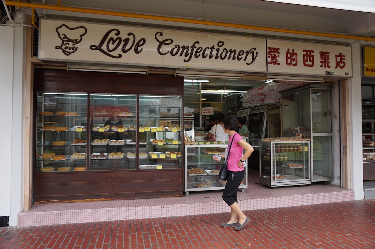
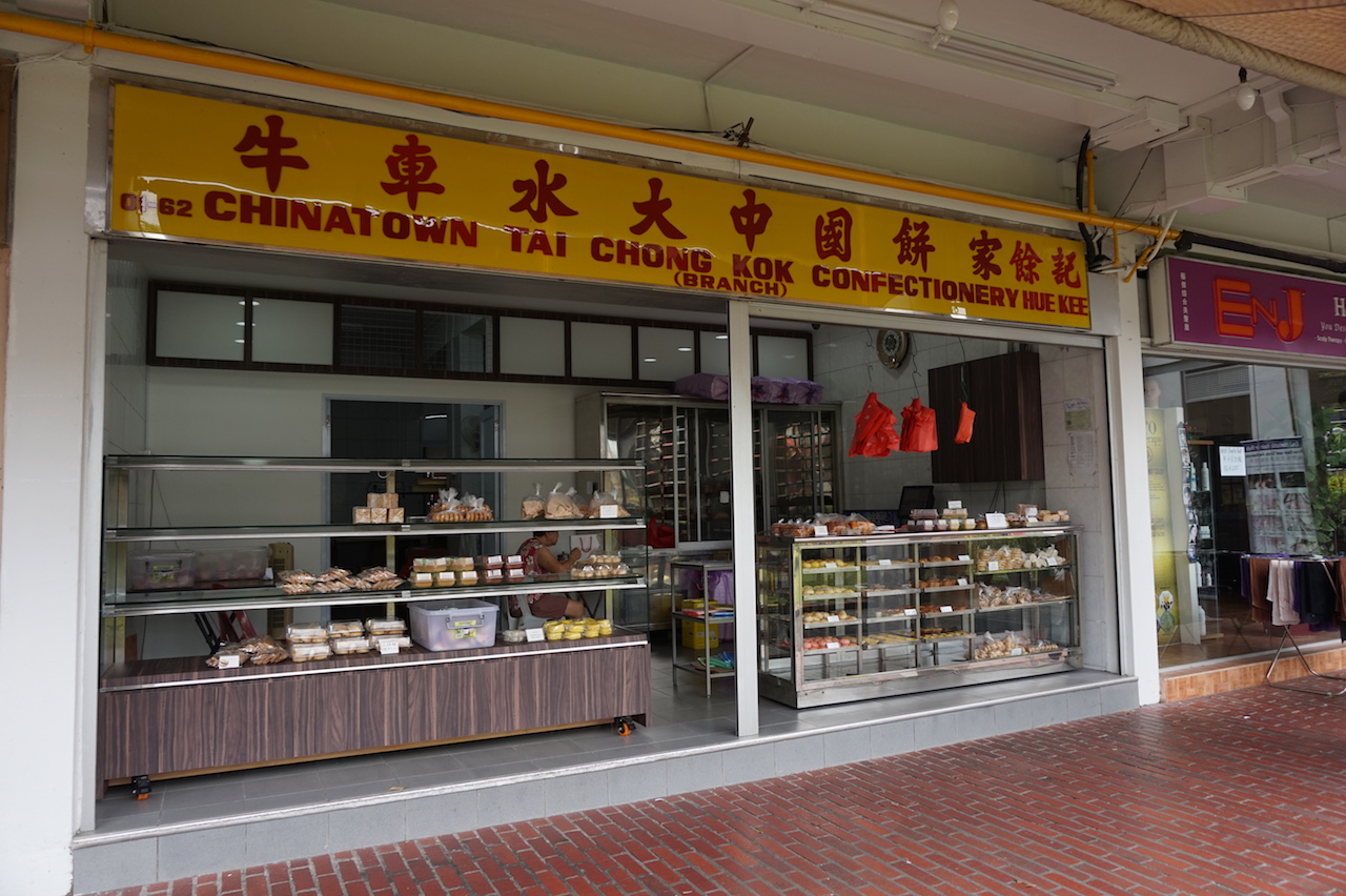
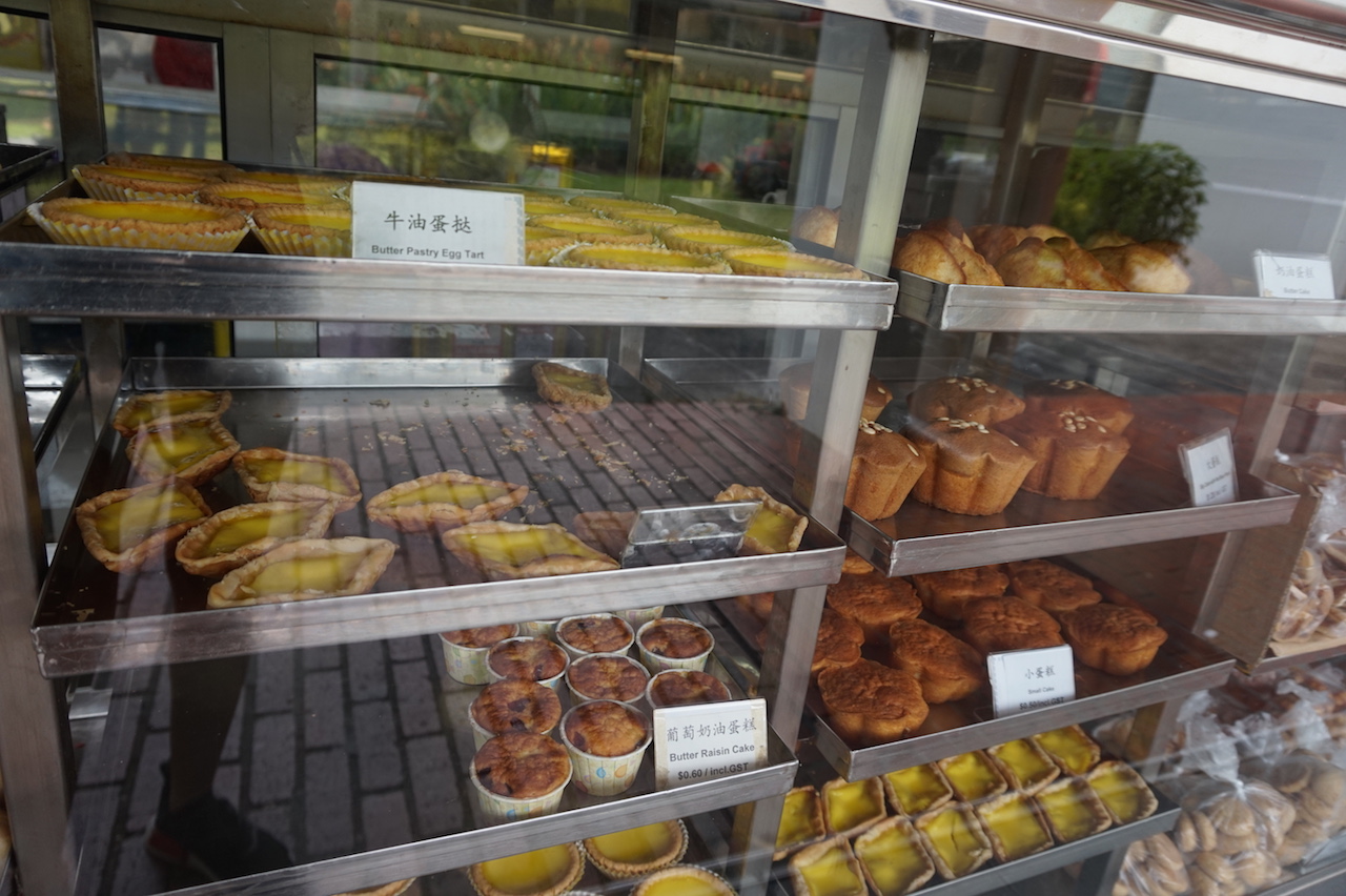
2. Takeout Waste

  • In the U.S. packaging takes up the largest percentage of waste
  • Single use items make up another 10% of U.S. discards
  • Mindless consumption
  • 29% of green house gas consumption comes from the way we make, consume and dispose of stuff 

Takes a lot of energy and resources to produce single use items, more resources needed to be extracted to replace it

Reduce & Reuse > Recycle – Waste Minimisation

  • Eg. Take out condiments ( chilli or ketchup packets ), serve condiments in bulk to reduce waste
  • 1 bulk ketchup dispenser – 359 packets of ketchup
  • 1 bulk sugar at the coffee shop – 120 packets
  • Stop overpackaging –  don’t offer the plastic bag until someone asks for it
  • 1 million plastic bottles are bought / minute
  • No. of bottled water consumption per capita has quadrupled from 1987- 2014

What is being done to mitigate this problem?

Reduce

  • Seamless & Grubhub, the food delivery apps are offering an option to skip the utensils and napkins ( in 2013, they reported having saved over 1 million utensils and napkins )

Reuse

  • Reusable takeout containers
  • 1/3 of meals served are to go meals = 350,000 single-use containers
  • checkout the container with your food and return them at the counter after consumption
  • GO Box, a reusable option for take out food
  • In UC Irvine, water bottle filling stations have popped up, making it easier to refill – avoid 3 million plastic bottle / year , disposable water bottle sale dropped 30%
  • UC Irvine, diverting 80% of waste from landfill to recycling and composting facilities

https://www.youtube.com/watch?v=5qx2WFpNTPs

3. Inclusivity of make up brands

  • The beauty industry neglected women of colour
  • The makeup industry’s frustrating cycle of struggle and progress for women of colour

“ African-American women spend $7.5 billion annually on beauty products, but shell out 80 percent more money on cosmetics and twice as much on skin care products than the general market.”

Why do most companies not have the same inclusivity or the success to go with it?

Fenty Beauty is not the first company to have such extensive foundation shades – but what made it stand out from the rest?

  • Make up forever
  • Loreal
  • Cover Girl
  • Revlon
  • Maybelline
  • Main stream makeup brands were limited to a handful of options , many of them fall short in providing the correct shade
  • Makeup artists say that there is no extra difficulty in understanding deeper skin tones
  • Deeper shades with the right undertone is difficult to find – why? considering how the difference between a lighter and darker shade is just the ratio of pigment
  • Not just limited to foundations but blush, eyeshadow etc. and deeper skin tones require more pigment
  • Only 18% of American Chemical Society (ACS) were people of colour
  • In 2013, black, hispanic and asian women made up only 16.3% of workers in the personal care products industry

There has been efforts made in mainstream beauty industry to be more inclusive, but why is it taking them so long?

  • Narrow ideals of what constitutes beautiful
  • Even though there are a wide range of women who are willing to pay and the demand is there to see themselves represented, companies are not willing to cater to them in fears of damaging their brand and make their brand less glamorous, less beautiful if it is attached to darker skinned women

There are products for women of colour but beauty industries still focused a lot on skin lightening products

Cultural movements– Black is beautiful and the all out effort to install racial pride in black people have done much to neutralise and offset much of the damaging effects of oppression from being black

Black owned cosmetics – Fashion Fair , Black Opl, Iman, Nars, Bobbie Brown, Mac

Mac Vibe Tribe collection – Cultural Appropriation, culturally insensitive

Independent brands have stepped in to fill the mark – The Lip Bar, Cocotique, koyVoca ( rely heavily on social media to promote their brand)

https://www.youtube.com/watch?v=v5e4gwDGrNk

4. Overconsumption– Fast Fashion

Apparel industry is the second most polluting industry in the world

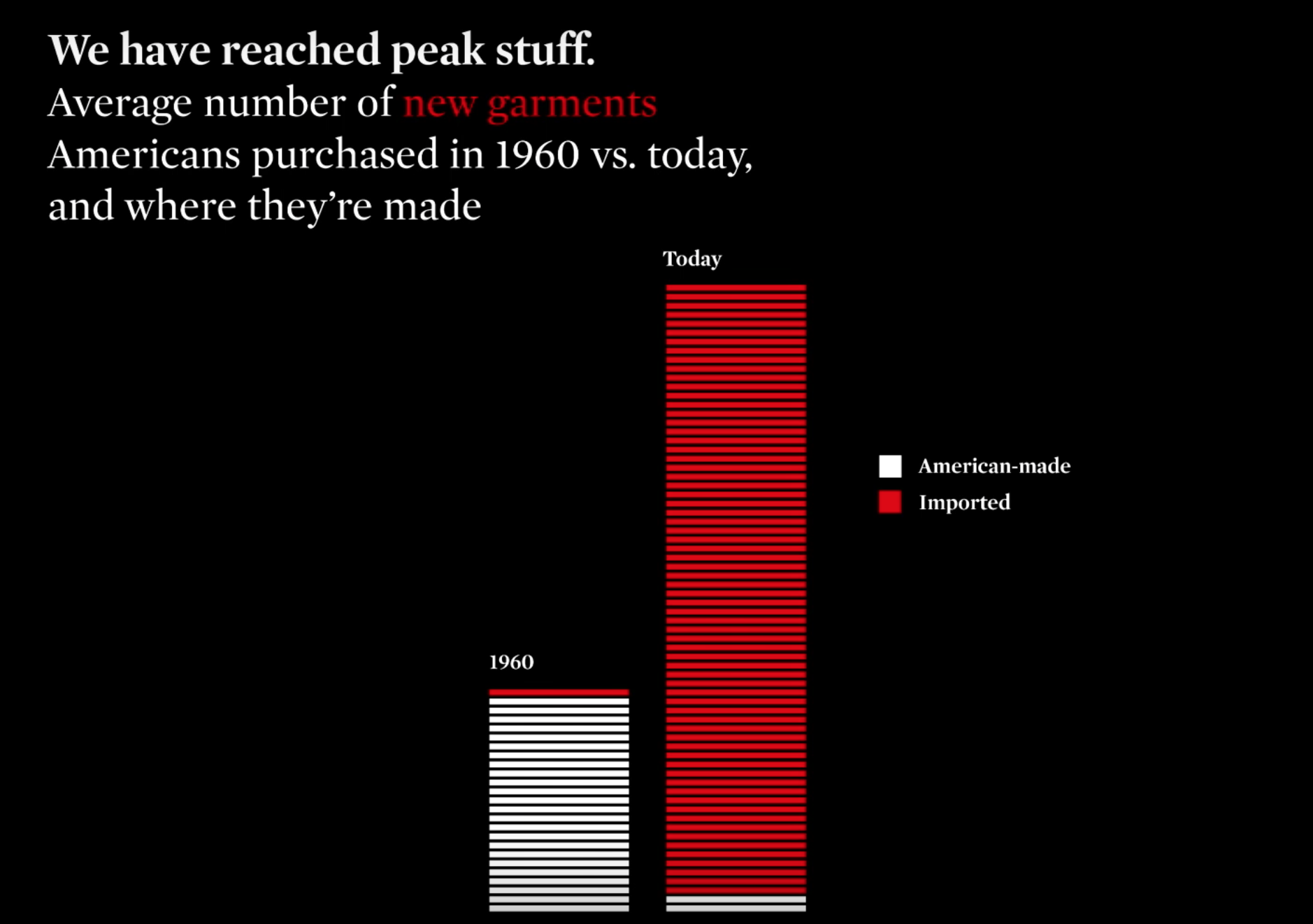
A trend for companies to outsource their production = demand for cheaper labour and material

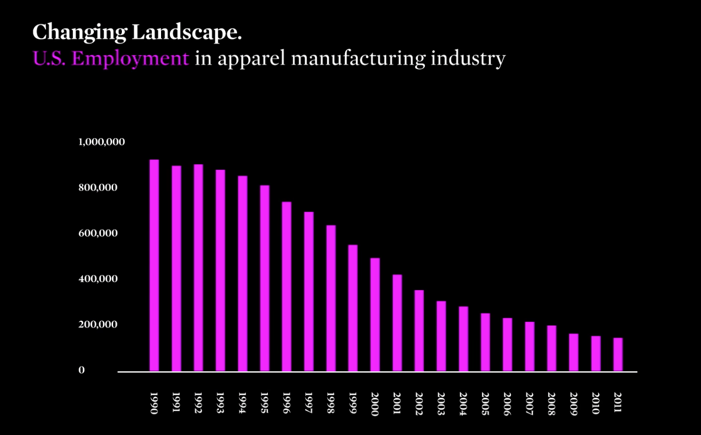
80% drop in employment since 1990s

Huge consequences for the people making the clothing and the environment

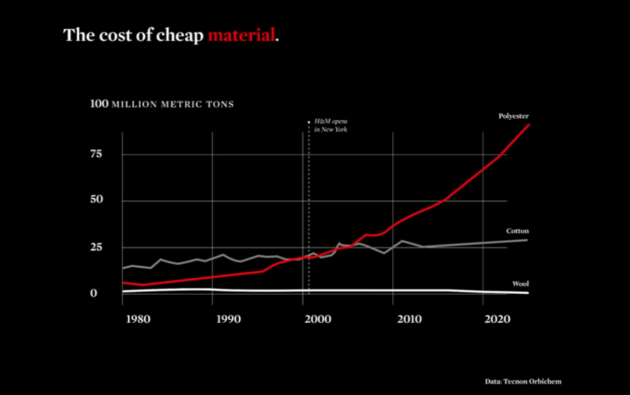
Polyester a polluting plastic made from fossil fuel, now in over half of our clothing 

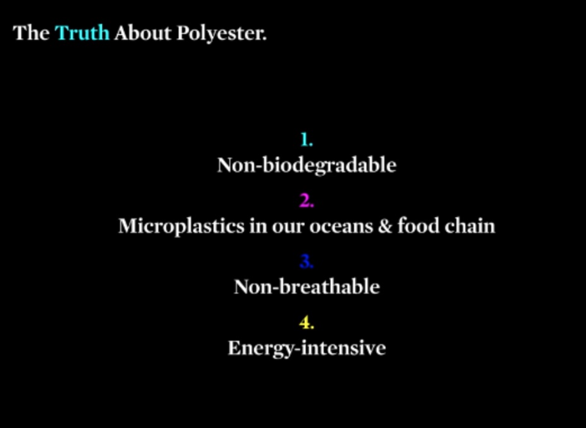
  1.  Every single piece of polyester clothing that has been produced is still on our planet today 
  2.  When we wash our clothing, thousands of microplastics go into our water systems 
  • Fishes are consuming the microplastics and we are consuming the fish 
  • Research done in California found that 1 in 4 fishes contain this microplastics 
  • The greatest pollution are actually these micro plastics

Requires 8x the energy to produce polyester

Where is this clothing being made?

Environmental Impact

  • In China, 3/4 of energy supply are coming from coal
  • Most of our clothing are coming from the most pollutive form of energy
  • 5x more carbon output than all of the airlines combined

Social Impact (Who are the ones making these apparels)

  • 1 in 6 people in the world work in some part of the apparel industry
  • 80% women, 98% of them are not receiving a living wage – locked in a channel of poverty
  • Shopping all the time but never having anything to wear

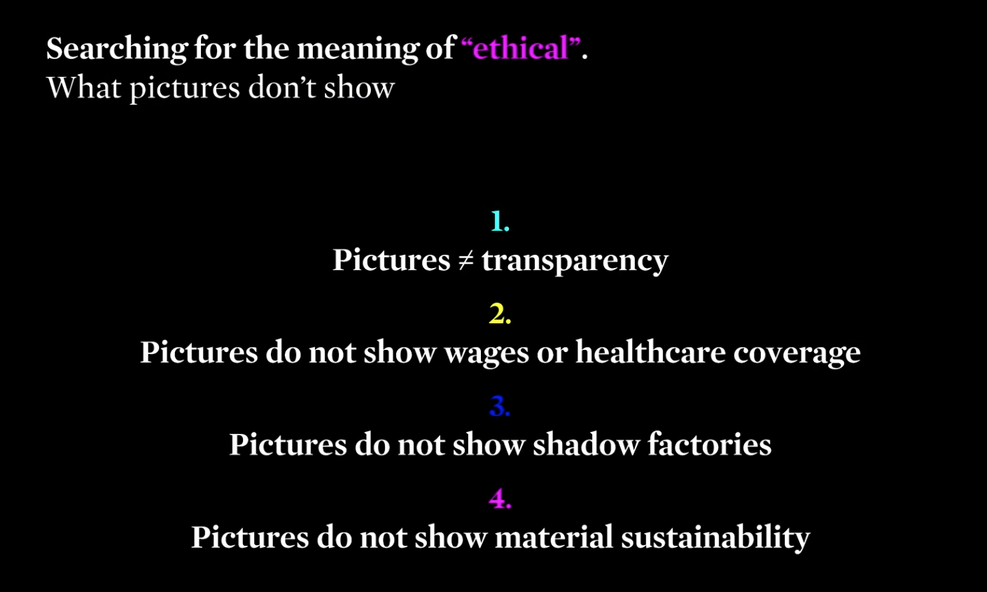
  1. Transparency is when companies are willing to name the factories they are working with , no way for third parties – media, people to search whether what they claim is actually taking place
  2. 98% not receiving a living wage
  3. Outsourcing is done to “shadow factories” to keep up with the low cost and high demands , they hv much lower living standards
  4. do not show if its actually organic cotton, cotton is the 4th largest pesticide consuming crop

Second largest polluter of fresh water globally – most developing countries release their dye products directly into the local water supply

Solution (what can be done?)

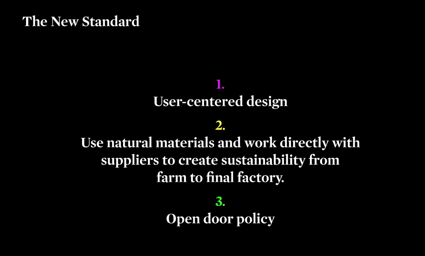
  1. majority of the resources focused on marketing and what can be sold to us, unlike technology it is really not designed for us at all– mass production
  2. 90% of brands do not actually know where their material is coming from
  3. open door policy with our manufacturers and production domestically

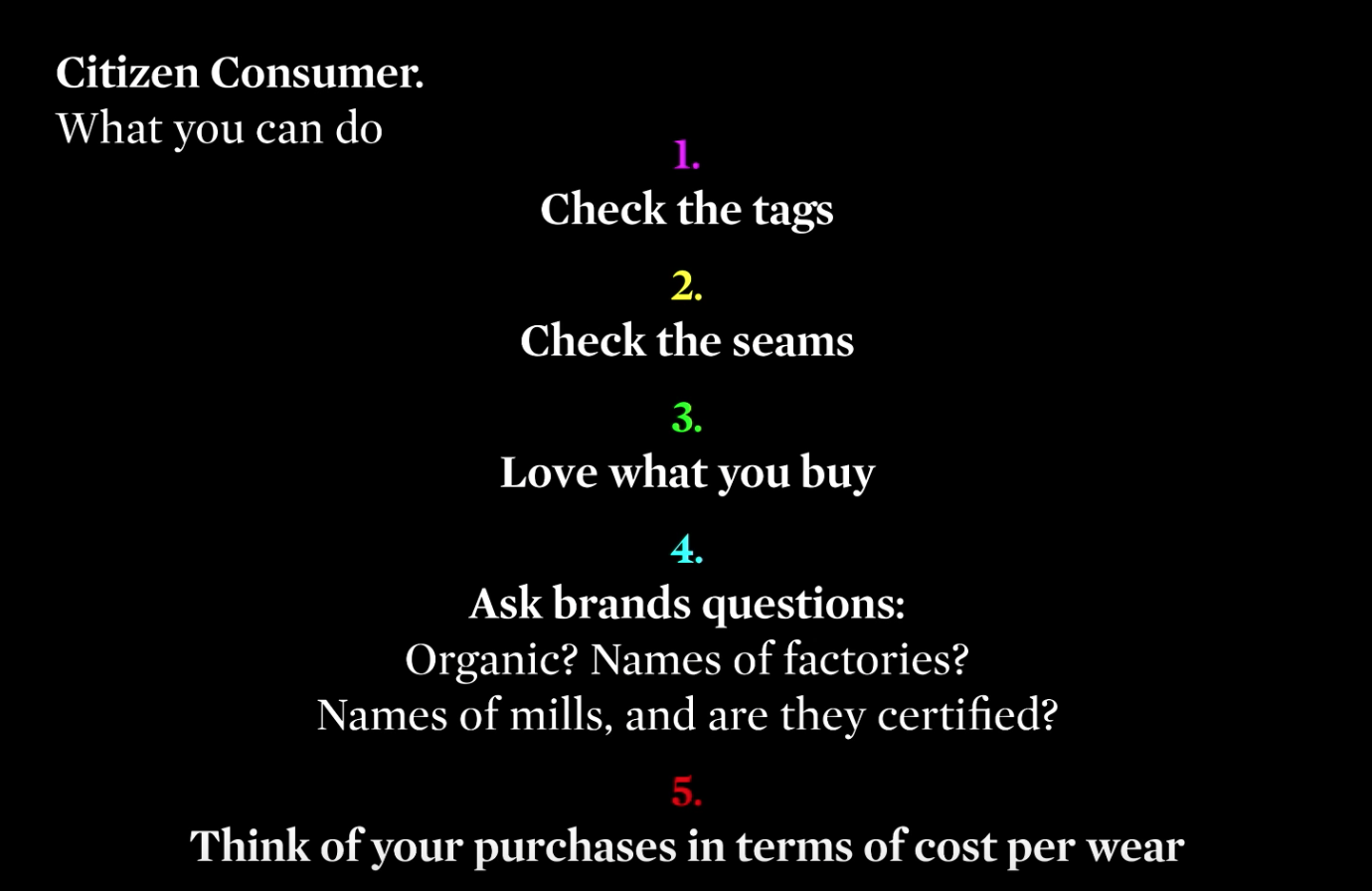
  • Love what you buy, quality > quantity
  • Clothing as an investment piece in the long term
  • Consumers dictate the direction in which the apparel industry goes

https://www.youtube.com/watch?v=5r8V4QWwxf0

The True Cost

2. Why is the issue important? Who does it affect and how? 

The term “fast fashion” refers to the speed at which clothes are consumed and disposed. On average, each American throws out 82 pounds of textiles each year. Large fashion companies such as Zara, H&M, Topshop and Forever21 release as many as 18 collections a year which results in consumers constantly renewing their wardrobes in accordance with the latest trends.

Inefficient production practices and the exploitation of workers in developing countries with capital-friendly labor laws allow these companies to produce clothing on a mass scale and sell them at extremely low prices. Many consumers are ignorant to the transnational flow of goods, exploitative labor conditions and environmentally corruptive production practices that result in the cheap prices we see on our clothing tags. Mass supply and affordability, combined with the incessant craving for novelty bred by consumer culture, has created a mindset of expendability when it comes to clothing that the planet is unable to sustain.

At the end of the day, fast fashion is bad for the environment, promotes labour exploitation, encourages a consumerist mindset of buying stuff we do not need and the only ones who benefit from this are corporate companies.

https://prospectjournal.org/2017/05/24/crisis-in-our-closets-the-environmental-impact-of-fast-fashion/

3. Who do you need to communicate to, and why?

Main target audience would mainly be consumers in developed countries such as ourselves who are the most susceptible to marketing campaigns by the fast fashion industries and the driving force behind the growth of this industry.

Hopefully to raise awareness on the detrimental effects of overconsumption socially and environmentally, as well as lifestyle changes they can adopt to mitigate this problem.  As consumers, we need to shift our habits toward investing in quality attire. We should buy clothing with the intent of wearing it for years to come and eliminate the desire to constantly renew the items in our closets. Each purchase must be backed by the consciousness of personal responsibility.

4. How has visual communication contributed to address the cause?

http://www.adweek.com/brand-marketing/ad-day-patagonia-136745/

Celeste Tesoriero’s “anti-campaign”

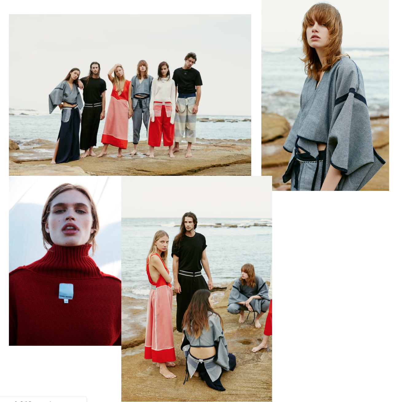
Celeste Tesoriero is the Sydney-based designer who has shot her AW’16 collection on location with every model wearing every garment inside-out.

“Sustainabilty doesn’t have to this big scary thing: it can be as simple as asking who made my clothes?” “You see this ripple effect: once people start asking simple questions, they soon start asking more complex ones, and they can make their own choices about what feels right for them and their morals with more knowledge.

http://www.styledbymarieclaire.com.au/inspiration/designer-spotlight/celeste-tesoriero

Fashion Revolution ( #whomademyclothes )

http://fashionrevolution.org/about/

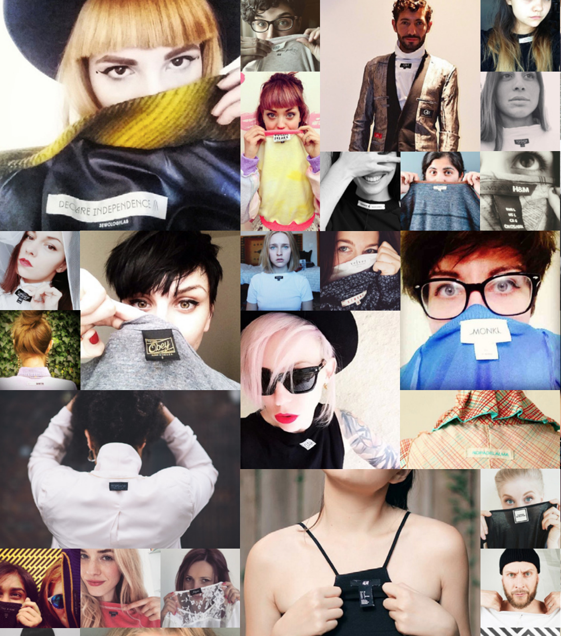
Fashion Revolution believe in a fashion industry that values people, the environment, creativity and profit in equal measure.

“We want to unite people and organisations to work together towards radically changing the way our clothes are sourced, produced and consumed, so that our clothing is made in a safe, clean and fair way.

We believe that collaborating across the whole value chain — from farmer to consumer — is the only way to transform the industry.”

Zine #002: LOVED CLOTHES LAST

http://fashionrevolution.org/resources/fanzine2/

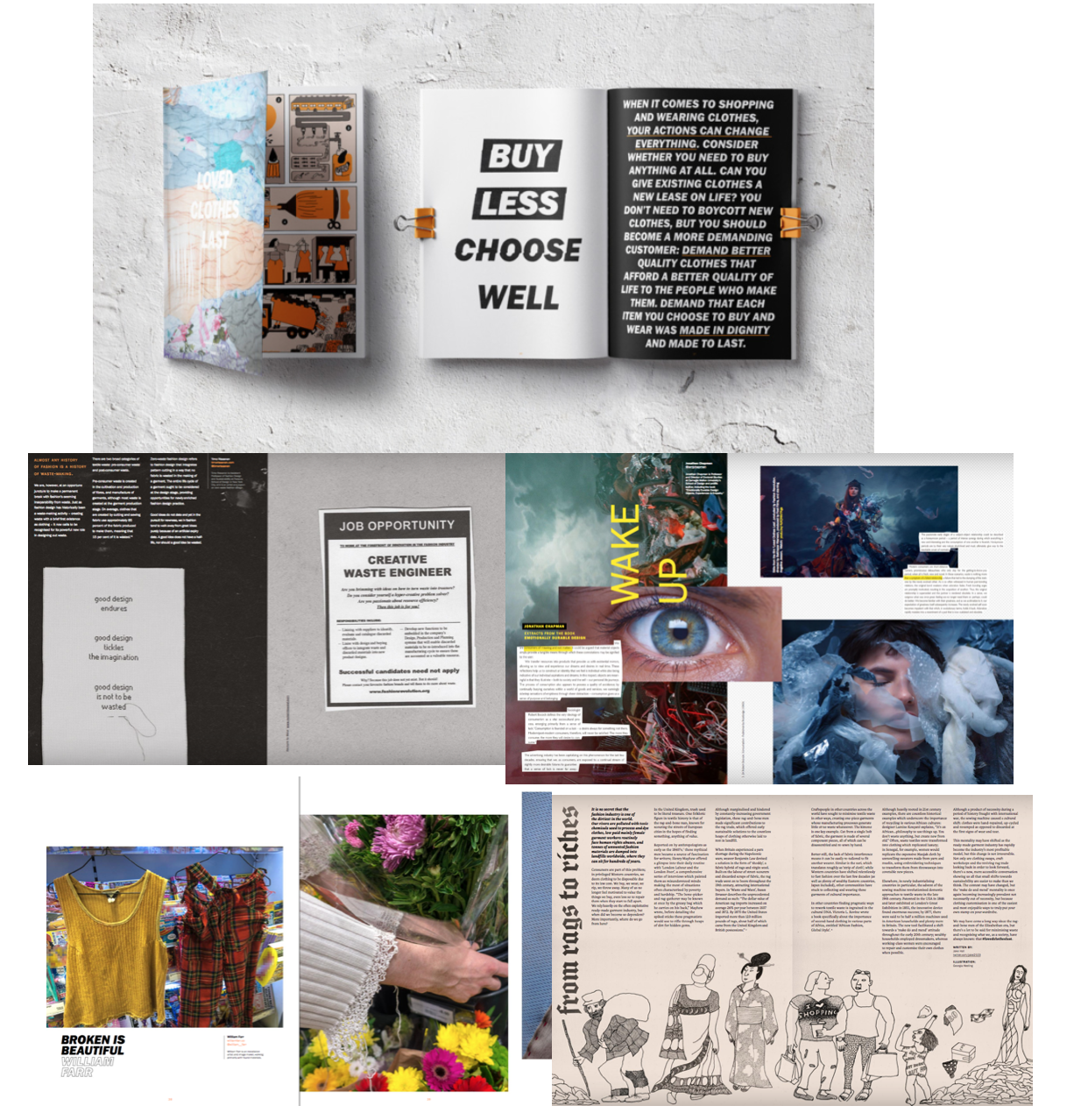
 #lovedclotheslast explores the issue of waste and mass-consumption in the fashion industry, and hopes to inspire you to buy less, care more, and know how to make the clothes you love last for longer.

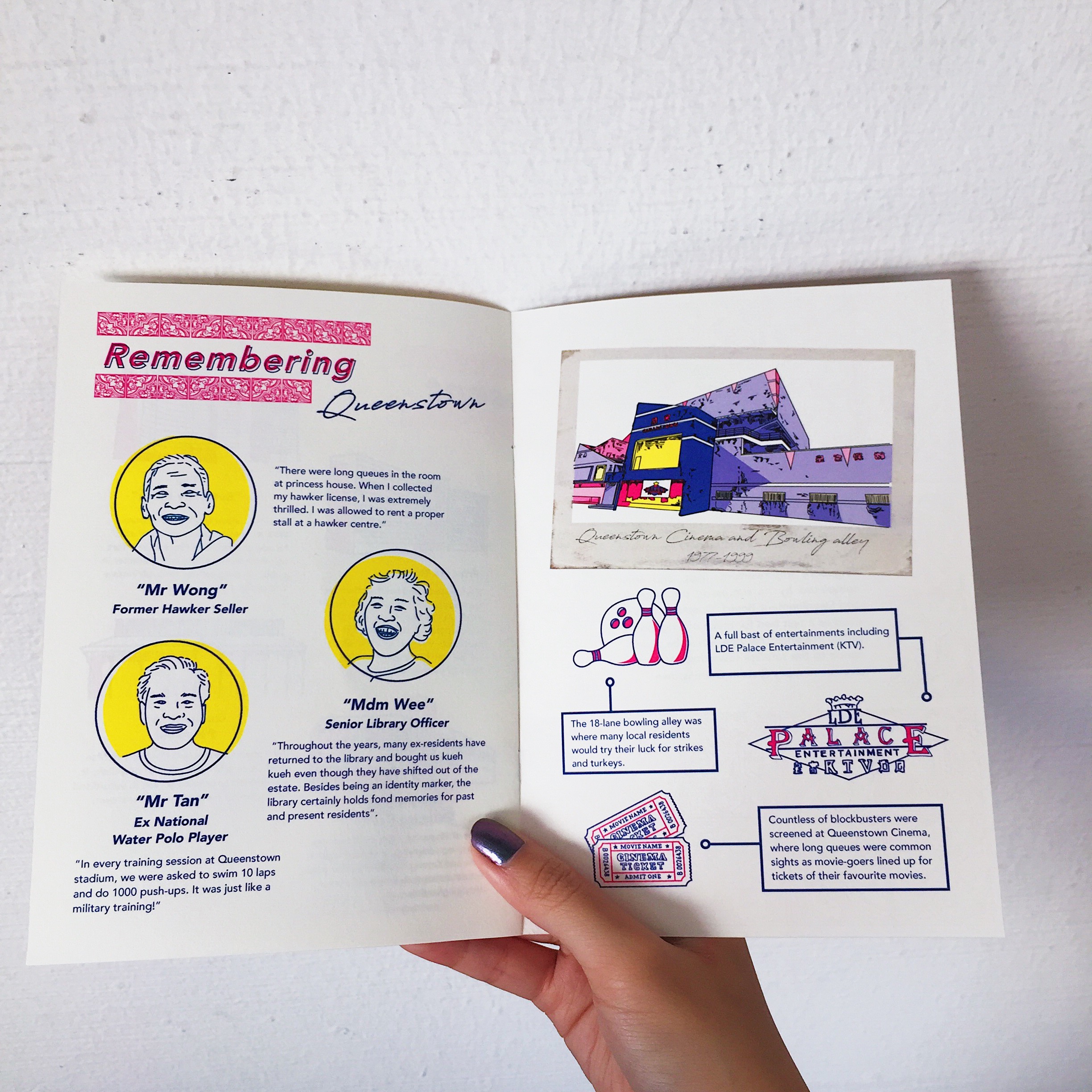
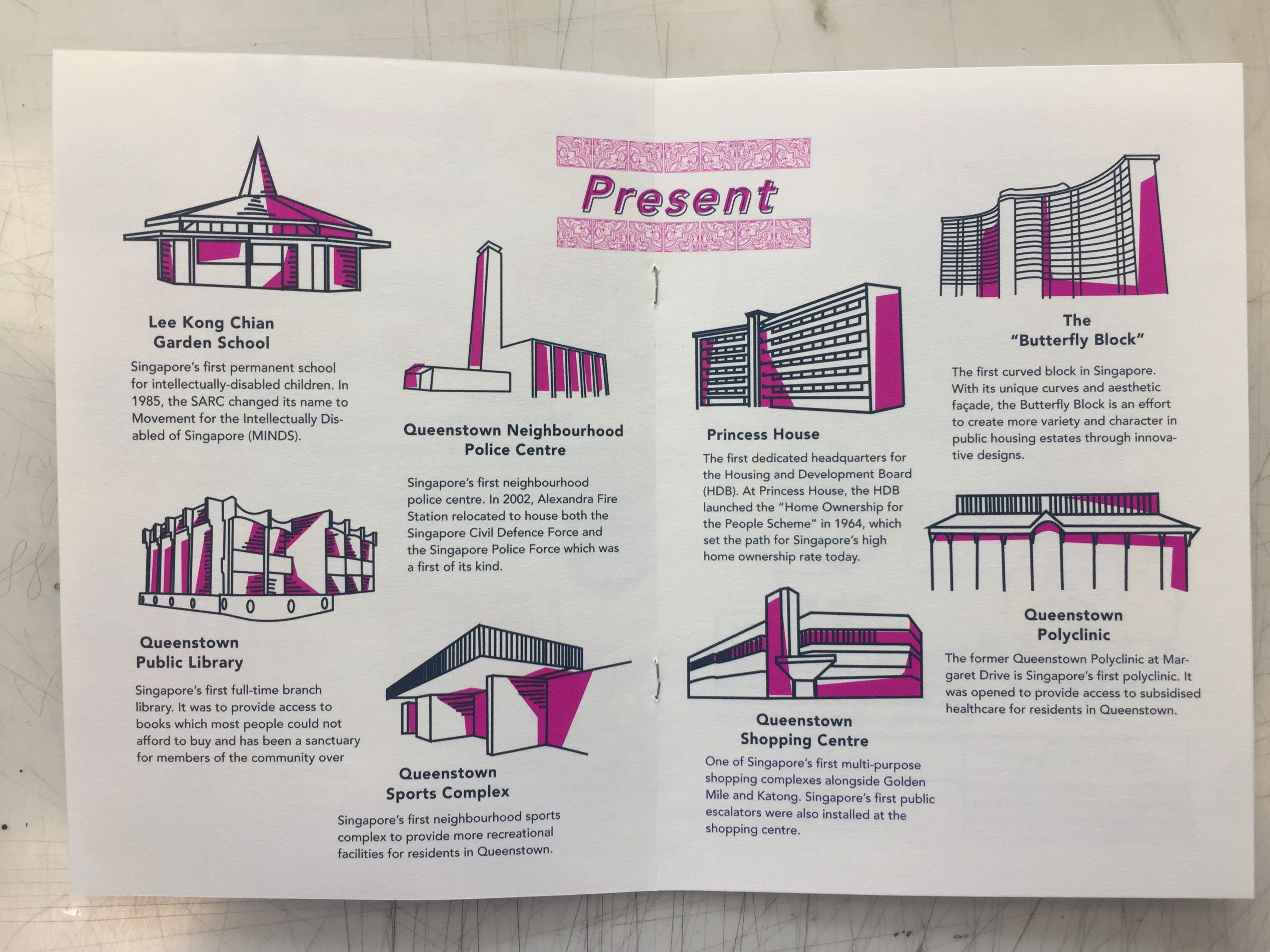
I think that the idea of a zine is a really smart way of tying it together with the cause – given its fresh take on a traditional fashion magazine. It is visually engaging with its infographics, illustrations, visuals, text, layout etc. It is bold, fresh and just screams “rebellious”. It is a great idea to create visual interest while providing the relevant information that makes the viewer want to pick up a copy to learn more about the cause.


Typography 1 project 4

We have finally come to our project of the semester!! Initially I had a hard time coming up with an idea for my project but I knew I wanted to do an extension of our project 3 – type as pattern. I thought that slapping a pattern on a notebook would be too cliche and overdone so I thought of all the possibilities of when I could use type as pattern.

Moodboard


I came across a bunch of typographic card designs online which inspired me to make my own. I wanted to incorporate 4 different typefaces and a different colour to differentiate the 4 suits.

  • Clubs – Baskerville – blue
  • Spade – Bodoni – green
  • Hearts – Superclaredon – red
  • Diamond – Didot – yellow

Design Exploration

These were a few of the design explorations that I did. Initially, I wanted to make a unique design for each alphabet / number with different styles, playing with repetition, scale, gradient, density, opacity etc. However, after my first consultation, Shirley mentioned that everything ended up looking disconnected as there were multiple styles in a single set of suits and  and it was better to stick to a single style throughout. Also, for the design such as the “K”, the “pattern” aspect of the design was lost as I was just cutting up the K into fragments. In the end, I decided to just go with the style of the “A”, sticking to interlacing and slicing up the font. There was also the issue of whether I should use letters or numbers for the 2-10 but in the end, I decided to just stick to numbers to avoid making it too complicated for the user to read the cards. 

I wanted to keep the design consistent throughout all the “A”s but I found it a little hard given that each typeface has different anatomies and it was not possible for everything to follow a fix template. For instance, the difference in the height of the crossbar would mean that I have to alight it higher or lower according to the different types. As shown above, Bodoni has a lower crossbar, hence, it is cut off when interlaced with another “A”. It was also hard to interlace certain alphabets with certain typefaces being narrower or wider.  


Design Backing

As for the backing of my cards, I used my pattern design from project 3 but I had a hard time deciding on the colours. In the end I decided to stick to monochrome as using multiple colours wouldn’t make any senses given that the colour would give away the identity of the suits when playing. And sticking to blue would not match the other colours used on the front. 

Design packaging

I used elements of the different fonts on the box itself. The name font play is a dual meaning title. It means playing with the physical cards itself and playing with the typography at the same time. 

Font Play is a deck of cards that features the anatomy of 4 different typefaces– Baskerville, Bodoni 72, Superclaredon and Didot. A unique pattern is created for each set of number or alphabet based on the type’s anatomy. Notice how the characteristics of each font affects the design as you play!

The whole concept behind Font Play is to get users to compare how anatomy of the different typefaces affects the patterns created and to spot the differences behind each unique design. 

Coming up with the dimensions of the box was a bit of a challenge for me as I based the measurements off a generic poker card box template. However, the paper quality and thickness would be differ from the original poker card and I was afraid of whether my cards would fit. 

End product

Reflections

Overall, I was pretty satisfied with the results. Despite the tedious process of designing 52 cards, I really enjoyed myself and it was pretty fun exploring the anatomies of the different typefaces. Had I more time, I would probably explore more compositions and maybe include a “fun fact” sheet for each typeface used to tie the designs together better. Cheers to the end of project 4 to conclude this semester 🙂 


Task 2: Design Exploration

The final design that I decided to continue working on was the idea of a pinball machine. My final slogan was ” Explore endless possibilities”. I thought the theme and concept of a galaxy pinball machine really fits the idea of emoting fun, adventure, exploration etc. 

My initial draft was to include the entire pinball machine in the poster. However, feedback gathered was that I did not need to show the entire machine for people to know it was a pinball machine. I should focus instead more on the actual pinball table itself. 

For my second draft, I struggled a lot with the colour palette as well as placement of objects in the centre. Hence, everything just ended up rather scattered, unfocused and messy. 

Feedback gathered:

  • stick with the darker background I did initially to fit the whole “galaxy” theme
  • change orientation of orbits
  • bring planets closer together to create more focus 
  • text “endless” and “possibilities” can be put together 
  • the frame can be expanded outwards so more attention is placed on the middle of the board 

Project 2 (II): Final Zine

Printing Process

I struggled quite a bit with the printing process as my layouts all either came out bigger than A5 or smaller than A5 and I had to visit the printing shop 3 times before getting the right size. I also tried experimenting on different coloured paper, white vs cream but went with the cream instead as I felt that it fits the feel of the zine better. 

Sadly, the third time I went back and finally got the right size, I went to a different shop and my pink turned out more purple instead. 🙁

Takeaway and Improvements

Finally, after final presentation and critique, some feedback that I got was that my contents page didn’t really fit into the entire zine and that I had to look out for hypenations in my paragraph which I overlooked. Also that my paper type didn’t fit the required 100-120gsm that was a mistake on my part as I thought I could get away with it when the temptation for thicker paper got the better of me. I agreed that the execution of my contents page could have been better and maybe went with the tile/ traditional theme instead. Also, after looking through it once more, I felt that improvements could have been made like including a tile pattern at the corner of every page of example to tie the whole zine together better.

Overall, I think this project was definitely a really fulfilling one and I had a lot of fun coming up with the concepts and designing my first ever zine?!! Great end to F2DII to conclude my entire semester 😀 Thanks Joy for all your guidance throughout the semester and to the class for the good times and support!

Neighbourhood exploration research – https://oss.adm.ntu.edu.sg/limx0098/project-2i-neighbourhood-explorer/

Infographic – https://oss.adm.ntu.edu.sg/limx0098/project-2i-infographic-process-and-final/

Zine Process  https://oss.adm.ntu.edu.sg/limx0098/project-2ii-zine-process/


Project 2(II): Zine Process

Hello!

As a continuation from part 1 of our neighbourhood infographic research, my zine would consists of the “firsts of Queenstown” and here’s the break down of my work process!

Due to space constraint, I had to narrow it down to the places that were bolded and they were places that I felt best embodied the spirit of Queenstown as the pioneer of many firsts.


References

box of books from los angeles art book fair / sfgirlbybay http://www.sfgirlbybay.com/2016/02/18/zine-mania/:

Risograph work - www.jakeb.org:

2015 Isometric Risograph Calendar:

Layouts

EntrePicos / by Coco Roto:

Lookbook Template InDesign INDD #design Download: http://graphicriver.net/item/lookbook/14095999?ref=ksioks::

My initial layout followed a simple 4 column grid and 2 places in each column. However, after my first consultation Joy advised me to experiment with different placements given the freedom of space I had with the middle spread.

My friend suggested why not I put 4 places in a spread instead to make it less cramp and gives more room for the text and illustrations to breathe. However, after trying it out, I felt like 4 places in a spread were too little and given the constraint of 8 pages, I had to maximise my space more and it also defeated the purpose of making a zine about the firsts of Queenstown if there were only 4 places mentioned.

Typeface & Text

Initially as you can see above, I used a total of 2 different fonts for the header and body text. My header text was more cursive and the body text was simpler and sans serif. However, after consulting friends, I also agreed that maybe sticking to one font was better and I could play around with the different weight, (heavy, medium, light etc.) to make the texts look neater and readable.

After the first consultation, Joy also suggested that I cut down on the description of each place to just the essential contents as it was coming off too wordy and cramp.

Illustrations

As seen above, my initial illustrations had blobs of pink overlaid with my line illustrations. I actually had the idea of doing this from some risograph illustrations I saw on pinterest and I thought that after printing the pink would be lighter and just provides a backdrop for my illustrations. However, my friends did mention that it looked like I was just “covering up a bad illustration”. Hence, I decided to continue with what I did with the illustrations for my infographic. https://oss.adm.ntu.edu.sg/limx0098/project-2i-infographic-process-and-final/ 

Highlighted shades of pink in Queenstown shopping centre
Poster - P.H Chang More:
initial inspiration for the pink blobs

Revised Layout and Typeface

Spread 1

My contents page had elements of geometric shapes and patterns because I wanted it to be more fun and I thought it went well with my illustrations. To differentiate between the “former” and “present”, I used 2 different colour schemes. I also standardised the entire zine to just one font, Avenir in all its glory.

Spread 2

My middle spread layout was now placed in sort of a semi-circle instead of the previous more structured grid. How I came up with this layout was really just moving the objects around and just figuring out which layout worked the best with the limited amount of space I had. I had to consider factors like heading placement, body texts and the illustration. Do I centralise them? Or is the heading off centre for places at the side and centralised as it goes to the middle? Is there enough space at the sides for the text to breathe? 

Spread 3

This spread was more of a “tribute” page. The left was a recount of the memories of old residences living in the estate after interviewing some of the residences during my site visit. The right was a tribute to the old Queenstown bowling alley, ktv and cinema with a short description of each. Initially during consult, Joy suggested that I change up the polaroid frame to a drawn one to match the rest of the pages. However, I had this idea in mind that the reason why a real picture was used was because much like the old bowling alley, it was a thing of the past and no longer fits in anymore. Hence, it was meant to look out of place amongst the rest. The illustration style of the bowling alley was also drawn differently in comparison to the rest of the spreads. Also, if we had the chance to explore more printing or layout options, I would have liked to print the polaroid out separately and slot it into the zine, making it detachable like a real polaroid. 

Cover + back page

The idea behind the cover page was using the traditional peranakan tiles. Given that it was a historical recount of old places in Queenstown, I thought it would evoke a feeling of nostalgia with the use of a familiar pattern that is uniquely Singapore. The back page includes a short description of the history of Queenstown as sort of a introduction to the zine and the significance of the “firsts” in Queenstown.

Next posts will feature the final printed zine and reflections 🙂


4D Project III- Artists Research

For this project, we had to propose an idea of an installation work that considers time, space and body. Here are a lists of controversial video, sound or performance art installation that I thought were quite interesting to look at and hopefully adopt certain ideas or styles from these artists.

Santiago Sierra 

His works mostly focuses on social issues of our economy today and highlight some of the often ignored problems inherent to a globalised capitalist economy. His works usually encompasses photography, video, text, sound, installation and sculpture. This  reveals the scope of Sierra’s practice and how he articulates his ideas through different media.

Santiago Sierra Installation view, Lisson Gallery, London

Sierra’s work normally takes the form of ephemeral actions or temporary interventions. While adopting a minimal language, he creates ‘incidents’ that highlight the existence of situations of conflict. Many of Sierra’s more recent projects have been the outcome of a particular social context, exposing the reality of that environment.

For the past two decades, Santiago Sierra has carried out provocative actions around the world. Influenced by the formal language of the minimal and conceptual art movements of the 1960s and 70s, Santiago Sierra’s work addresses the hierarchies of power and class that operate in our modern society and everyday existence. Sierra became well known for his actions in which underprivileged or marginalised individuals were hired to perform menial or pointless tasks in exchange for money.

Image result for Person paid to have a 30 cm line tattooed on them
Person paid to have a 30 cm line tattooed on them,  Regina Street # 51, Mexico City, May 1998 (1998)
Image result for 8 people paid to remain inside cardboard boxes,
8 people paid to remain inside cardboard boxes, G&T Building. Guatemala City, August 1999 (1999)

Pieces like these underline the situations of labourers’ exploitation, isolation, and repression within capitalist structures. By transforming individuals into consumer goods, Sierra also highlights current socio-political issues while challenging the intrinsic mechanisms of reality.

As a result, the essence of his work can often be found exemplified in the tension that is generated and sustained between the ephemeral performance, its documentation, and the spectator. The latter is hence exposed to the edges of morality and permissibility, but also to the formal and poetic articulation of the voices of those who are ordinarily invisible or unheard.

Wim Delvoye

Wim Delvoye is not merely an artist – he’s a provocateur. An enfant terrible of the contemporary art world, Delvoye’s work is often designed to shock, appall, and provoke. The Belgian artist regularly pushes the boundaries of his craft, forcing audiences to question his ethics – not to mention how we should be defining ‘art.’ He’s since become well-known in the art community for his provocative works employing a range of rather unconventional materials, to include fecal matter.

In 1997, Delvoye began tattooing live pigs in Europe – a practice which was, unsurprisingly, met with widespread criticism from animal rights activists.

In 2004 he bought a farm in a small village outside of Beijing, where animal rights laws are practically non-existent. He systematically elaborated a new concept that he called his ‘Art Farm.’ Here, specialists look after his pigs, while the artist sedates them, shaves their skin, and tattoos them. Veterinarians treat their skin after the process to ensure that their wounds are clean and their skin is properly moisturized.

Wim Delvoye, Art Farm Beijng 2003-2010, Live tattooed pigs

Wim Delvoye, Art Farm Beijng 2003-2010, Live tattooed pigs

The tattoos themselves are based on Delavoye’s drawings, mostly references Western iconography such as the Louis Vuitton monogram and characters from Disney films. By placing these iconic images on pigskin, the artist takes away their commercial value. They become pure decoration – their only purpose is to shock.

The artist sees the pig as an investment. Pig skins value highly in China, so Delvoye tattoos his pigs when they’re young. Buyers can choose from live or taxidermied pigs; some buyers choose to purchase the piglets and let them grow old on the farm. Others choose to purchase the pig’s skin after its death.

Delvoye doesn’t slaughter his pigs for their skin, but he repurposes their lives as living canvases. They are objects of a different form of consumption in life and death. In several different cultures, pigs are associated with filth, gluttony, and greed. But Delvoye compares them to humans, noting their perceived nudity and the texture and color of their skin.

With this piece I think it’s interesting how the artist used this notion of “branding” on a live animal. Often people purchase luxury goods made from the skin of exotic animals but they fail to realise the origin of these animals and how often they are harvested, slaughtered and tortured for their commercial value. I love the juxtaposition of taking something nice and innocent like characters from disney films and luxury brand logos and tattooing them onto a live pig that is portrayed as dirty and a symbol of greed.

Laura Lima

Working across mediums, the artist frequently subjects the body to surprising juxtapositions with objects and architectures. With each installation, Lima consistently reinvents the viewer’s encounter with her work, skillfully considering the nature of perception, social relationships, and human behaviors, while creating profound and startling aesthetic experiences.

Image result for laura lima the inverseRelated image Image result for laura lima the inverse


For this monumental, site-specific installation, Lima entangles the gridded support beams of the museum’s Atrium Gallery with industrial nylon rope. Enormous at one end, the braided material dwindles in size until it seems to merge with a female body. Set still and partially out of view, the participant’s body achieves uncanny abstraction, presence, and suspense.

“The Inverse” poses challenging questions, engaging topics related to identity, representation and agency. The female body, and the many fluid ideas of the feminine, is central to.

“The central topic of this conversation is to understand their part and the choices they make in bringing the work to life. Participants are not obligated by a script and are free to inhabit the space as they wish.”

This work brought about controversy when performers for felt pressured to perform sexual acts using a nylon rope at the museum. This is an example of a “happenings” type of performance art that required the audience to do certain things using the props provided.

I think it was definitely interesting to see the different styles and techniques artists used to convey an idea, regardless of how crazy some of them may be. I think I would want to look more into the different ways in which I can bring across a message of an issue such as multimedia installation, interactivity etc. while keeping consideration of the space and audience in mind.

4D II: Project 2 – Soundscape

Artist Statement

My soundscape illustrates a person walking through a forest but encounters a mysterious object or sound that ends up chasing after him. I layered a combination of sounds like the forest ambience, footsteps, breathing, rustling of clothes and belongings etc. I also wanted to create a sense of movement and anticipation as the person tries to escape from the mysterious sound by starting the scenario slow and building up towards the climax.

Concept 

After getting the brief for the project I don’t know why but the idea of thriller/horror stuck to me. I love the use of sound effects in horror movies and the sounds were what often ended up making a greater impact on me than the visuals.

In this video, I reference The Revenant and the usage of sound to build up towards the climax ( which was the bear attack)

Afterwhich, I made a list of sounds that I needed to record as well as the arrangement of sounds.

All of the sounds I recorded were done in hall at around 1am? But there were still a lot of people awake and walking about. The zoom recorder was so sensitive that it was able to pick up doors slamming and chattering from a few blocks away. Hence, isolating and recording the individual sounds were one of the challenges for me.

The ambience sound was probably the easiest to record and given that my hall was in a hilly and forested area, I just needed to go to an isolated area away from other noise disturbances. For the breathing and walking sound, I got my friend to walk about on a patch of grass and got him to vary his footsteps, faster, slower, etc. I wanted to use a combination of sound to create the illusion of running, hence I used a T shirt to rub against the mike of the zoom recorder and hit a bunch of hangers on the drying rack which I thought gave off a really nice sound of movement. As for the “mysterious sound”, I ended up scratching my nails on a metal pole to create an eerie screeching noise. I thought it was appropriate as it was a sound that makes the hair on the back of your neck stand and gives people goosebumps, which was what I wanted.

Another challenge I faced was probably the layering of the sounds. I started off the scene slow with minimal sounds and slowly build it up towards a loud symphony of sounds as the person is running away from the mysterious object. I ended off with just the ambience of the forest to create a feeling of eeriness. However, the layering of sounds proved to be pretty difficult as I had to be mindful of the background, middle ground and foreground and I had to vary the volume of the individual sounds if not it would just end up messy and disorganised. I also had issues with the transition between sounds. I wanted a “pause” in the middle to create some tension but I wasn’t sure if it ended up coming off as awkward.

I also tried to do some panning for movement as the person is running from the left to the right and tried to vary the sounds heard from the left and the right but it might have been a little hard to hear after the sounds have been layered.

This project has been really interesting for me and I have learned so much about sound. I could say that I prefer sound production than video production now 🙂


Project 2(I): Neighbourhood Explorer

Before I embarked on my exploration of Queenstown, this was pretty much all I knew about the neighbourhood:

  • old
  • IKEA
  • Queensway shopping centre has chio and cheap sport shoes with nice laksa and muah chee
  • Anchorpoint shopping centre, one of the best place for outlet shopping

YEP. Soooo I asked my friend whose boyfriend stays there and this was what she suggested:

” you can go visit the 2 new HDB blocks damn nice, skyville and skyterrace. Or queenstown library, that place freaking old sia. All those historical sites tear down to build condo already. Queenstown not much to see but the new hdb damn nice.”

Actually prior to visiting, I considered doing a heritage trail sort of thing considering how Queenstown was famous for being one of the oldest estates in Singapore. However, most of the old heritage sites were gone and doing a infographic on nice condos in Queenstown wasn’t exactly that appealing.

I also had my consultation with Joy before going down to Queenstown and these were a few of her suggestions of areas I should look into:

  •  old amenities in the area
  • new buildings vs old buildings – what was previously in the area and what is there now

After which, I decided on doing a map of amenities, food and entertainment in the area, sort of like a guide for newcomers who may be planning on moving into Queenstown. With a rough idea of what to look out for, I set off to explore Queenstown!

I wanted to get an idea of the neighbourhood from residences so I did a list of survey questions.

  1. How long have you been living here?
  2. What are some of the places you usually go to eat, shop or for entertainment?
  3. What do you like about these area?
  4. What are some places that have been around for a long time? (old amenities, etc.)

Here are a few videos of interviews I did with a few of the residences. Disclaimer: Pardon my awkwardness and HORRIBLE mandarin thanks!

Resident 1 ( stayed here for 40 years) 


Key takeaways:

  • 50-60 years old
  • Good food at Mei Ling Street Market ( only wet market here)
  • Tanglin Hock Market( not in the zone tho)
  • ” Da Zhong” market for groceries
  • not much entertainment in the area
  • most of the old shops have moved away
  • used to go to the swimming complex when she was younger
  • Pasar Malam in the 1960s/1970s were popular
  • There used to be a prison behind the library and a bowling alley which were both demolished

Resident 2 ( stayed here for 2-3 years) 

Key takeaways:

  • 20-30 years old, from Mauritius
  • Shopping at Queensway Centre
  • Queenstown has 2 McDonalds (lol)
  • IKEA
  • Dawson Food Court
  • Alexandra Food Court
  • Suggested a Salute Cafe behind Alexandra food court

Resident 3 ( stayed here for 3-4 years )

Key takeaways:

  • 18 years old, PR
  • Mei Ling Street – nice dessert, chicken rice, char kway Teow, Lor Mee
  • Queensway Shopping Centre
  • ABC market
  • AnchorPoint Shopping Centre

Resident 4 ( stayed here for 40 over years )

Key takeaways:

  • 70 years old
  • ABC market at Alexandra- nice fish soup and herbal soup
  • Queensway Shopping Centre
  • not much entertainment

After interviewing the residences, I got pretty much the same responses and decided to check some of these places out.


Queenstown Sports Complex

Singapore’s first neighbourhood sports complex. It comprises of 5 swimming pools and one of which is a 50-metre Olympic-size pool. The first thing I noticed about the stadium would be how retro the colours and infrastructure were. It was different from the typical stadiums we see in other neighbourhoods with its pastel paint and vibrate striking red, blue and yellow. I really love the colour scheme of the entire area. I wanted to take more pictures of the old swimming pool but got caught by the life guard for invasion of privacy.

queenstown-sports-complex

queenstown-sports-complex2

dsc02414 dsc02416

I also found these “Heritage Trail” boards put at certain sites in Queenstown.

Mei Ling Market& Food Centre

This was another common suggested place for the best food and the only(?) wet market left in Queenstown. The most suggested food to try was the duck noodle/rice, dessert, chicken rice, char kway Teow, Lor Mee. However, sadly the chicken rice stall as well as a few others have moved to Holland V and other places.

mei-ling-food-street1

mei-ling-food-street

Queensway Shopping Centre

I have been to Queensway shopping centre on several occasions to buy shoes so this wasn’t anything new to me. But it surprised me to find out this mall was one of the first multi-purpose complex in Singapore alongside Golden Mile and Katong. Fun fact, Singapore’s first public escalators were also installed in this very mall! I know Queensway is famous for their Katong Laksa and really nice muah chee as well as other Pasar Malam food. This mall is definitely filled with a lot of history and not just a place to get great bargains.

queensway-shopping

Alexandra Village Food Centre

I have eaten here a couple of times but never really took the time to explore this part of the neighbourhood. Asides from the food centre, I also found many interesting old shops.dsc02450

dsc02451

Queenstown sure love their duck rice haha

dsc02453

Also found some really old school bakeries and confectionery stalls in the area. They sell traditional cakes, egg tarts, pastries etc.

dsc02455 dsc02456

dsc02457

I also found a really interesting shop that sells rattan furniture. The kind that my grandparents used to use.

dsc02458 dsc02459 dsc02460 dsc02461

While exploring, I also chanced upon this handmade Ang Ku Kway stall that one of my interviewees mentioned as well. I went to take a look and was surprised at the variety of flavours they offered asides from just the traditional ones. Judging from the long queues it must be really good.

dsc02462

dsc02463

dsc02464dsc02466

Princess House

Princess house was one of the few lasting historical sites. It was previously used as the headquarters for HDB. Many renowned dignitaries such as Prince Philip and Duke of Edinburg have visited Princess house to learn more about Singapore’s housing programmes. Even though the exterior of Princess house doesn’t look like much, the conservation of the building serves as a lasting reminder of Queenstown’s history.

dsc02471 dsc02472 dsc02473 dsc02474

Former Venus and Golden City theatres

I also chanced upon the place that used to be the former venus and golden city theatres which were Queenstown’s first two cinemas. However, they have both been demolished and they are now building some condo in it’s place.

dsc02478

Former Queenstown Polyclinic

There is also the former Queenstown polyclinic, which was Singapore’s first polyclinic to provide subsidised healthcare to residences.  However, it has since been converted into a dormitory.

dsc02481

dsc02483 dsc02484

Queenstown Public Library

Queenstown public library is Singapore’s first public library. Lee Kuan Yew saw it as a step towards improving our standard of living by providing access to books which most people could not afford to buy. It has now become an identity marker of Queenstown which holds fond memories for past and present residences.

library-queenstown

The “Butterfly” block

Block 168A is Queensway’s first curved HBD block and it’s unique facade was what earned it it’s name. Back then, HDBs were mainly built for function with simple slab blocks and point blocks. With its aesthetic facade, the “butterfly” block was an effort to encourage more innovative designs and character in public housing. The curves and colours of the buildings were definitely a sight to look at.

butterfly-block-1

butterfly-block2

butterfly-block-3

This pretty much concludes my visit at queenstown!

Post Exploration Thoughts

After visiting, I realise that my initial idea of a guide of Queenstown may not be that great. Firstly, most of the old amenities have shifted, most of the food places have shifted as well to commonwealth and Holland V area and to be honest, there isn’t much in terms of entertainment asides from shopping at Queensway, IKEA or anchorpoint. Furthermore, these are all pretty common and truth be told, you don’t need a guide for it when many people already know of these places. Therefore, I decided to play on the heritage and history of Queenstown. I scrapped the idea of a heritage trail since it has already been done. Throughout my research, I realise that Queenstown was actually the first for loads of things. The first polyclinic was built here, the first technical school, first library etc. Hence, I thought why not do an infographic for the lists of things that Queenstown was first for?

And this concludes my post!! Took me forever but thanks for reading!! 🙂

Project 1: The Gift

For the first project of the sem, we were required to make a gift for our client based on their interests, hobbies etc. Initially, I found it hard to come up with an idea for the project while incorporating all the interests of our client. My client, Li Ling was an avid collector of the Japanese gundam toy, loves drinking coffee and the outdoors, loves working with children and tries to keep up a healthy eating lifestyle by packing her own meals.  In the end, I was given 3 key topics to research on for my gift idea.

Gundam, Coffee, Healthy Eating

In the end by some miracle and help from our prof peter, I came up with the idea of a mini healthy eating toy set inspired by the Japanese toy, Gundam.

screen-shot-2017-02-12-at-3-54-33-pm

The trademark for any gundam toy was that it came in these little plastic frames with parts that you were suppose to assemble together using an instruction menu.

screen-shot-2017-02-12-at-3-54-18-pm

I decided to replace these plastic toy parts with miniature food which I made using clay.

img_8982

Because I wasn’t able to find a plastic frame, I had to go out to buy a gundam toy set and removed the toy parts for the frame. img_8984

I hand painted each “food” using acrylic paint.

img_8988

And here are the finished products!! I made a combination of fruits, vegetables, protein and wholemeal bread, all the food you need for a healthy balanced diet.

img_9005

img_9007 img_9009 img_8990

screen-shot-2017-02-12-at-3-53-52-pm