I struggled quite a bit with the printing process as my layouts all either came out bigger than A5 or smaller than A5 and I had to visit the printing shop 3 times before getting the right size. I also tried experimenting on different coloured paper, white vs cream but went with the cream instead as I felt that it fits the feel of the zine better.
Sadly, the third time I went back and finally got the right size, I went to a different shop and my pink turned out more purple instead. 🙁
Takeaway and Improvements
Finally, after final presentation and critique, some feedback that I got was that my contents page didn’t really fit into the entire zine and that I had to look out for hypenations in my paragraph which I overlooked. Also that my paper type didn’t fit the required 100-120gsm that was a mistake on my part as I thought I could get away with it when the temptation for thicker paper got the better of me. I agreed that the execution of my contents page could have been better and maybe went with the tile/ traditional theme instead. Also, after looking through it once more, I felt that improvements could have been made like including a tile pattern at the corner of every page of example to tie the whole zine together better.
Overall, I think this project was definitely a really fulfilling one and I had a lot of fun coming up with the concepts and designing my first ever zine?!! Great end to F2DII to conclude my entire semester 😀 Thanks Joy for all your guidance throughout the semester and to the class for the good times and support!
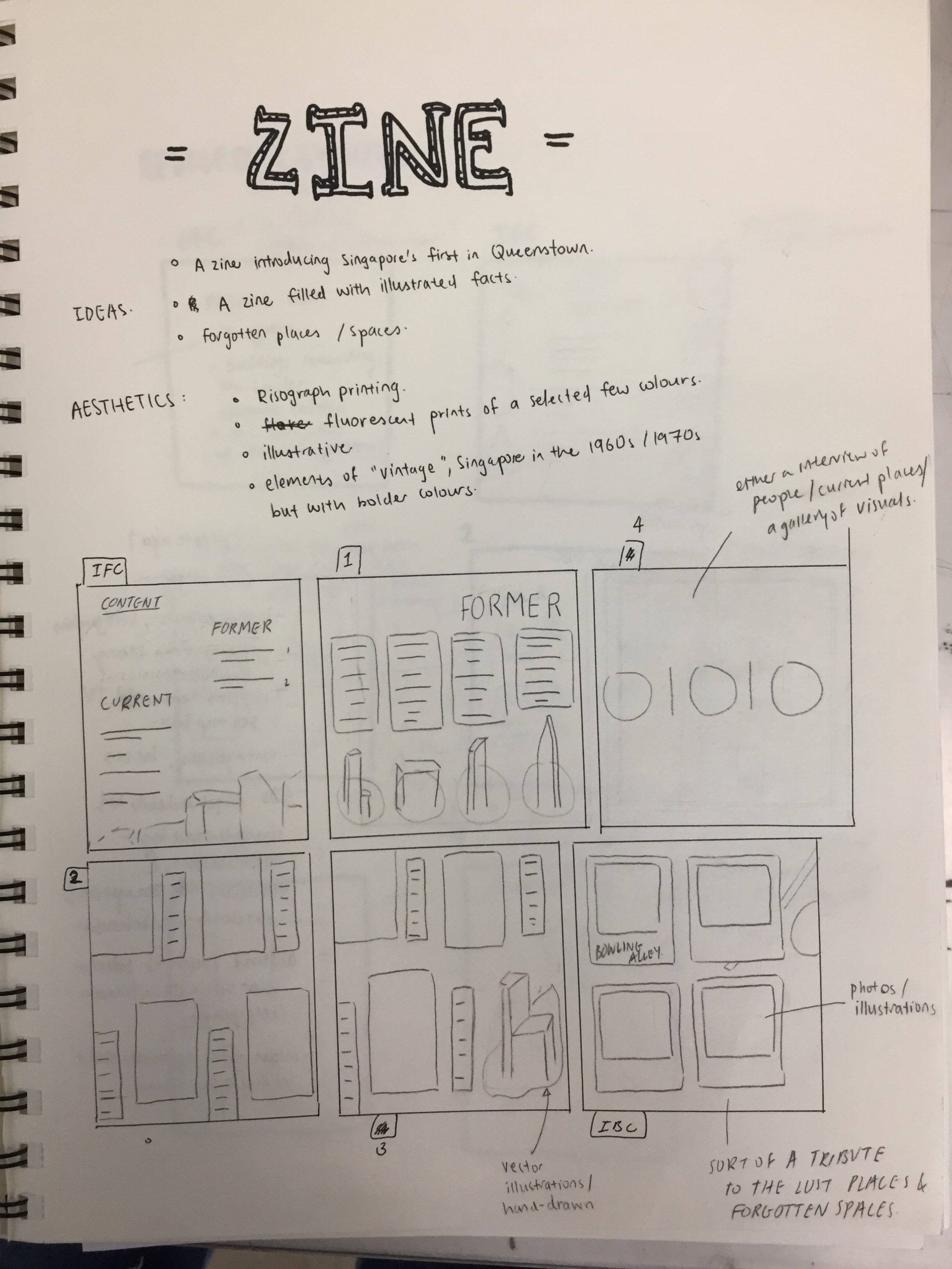
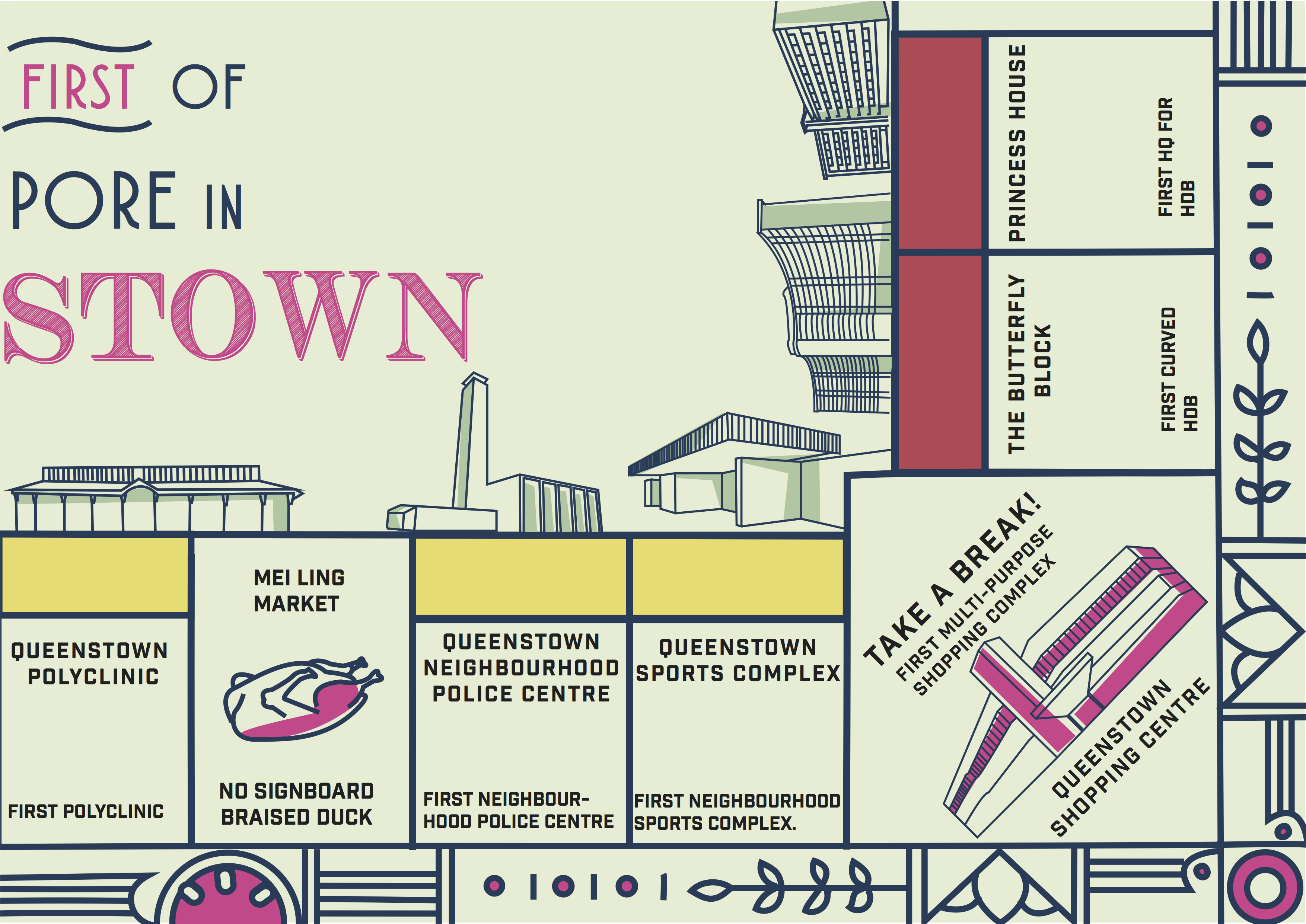
As a continuation from part 1 of our neighbourhood infographic research, my zine would consists of the “firsts of Queenstown” and here’s the break down of my work process!
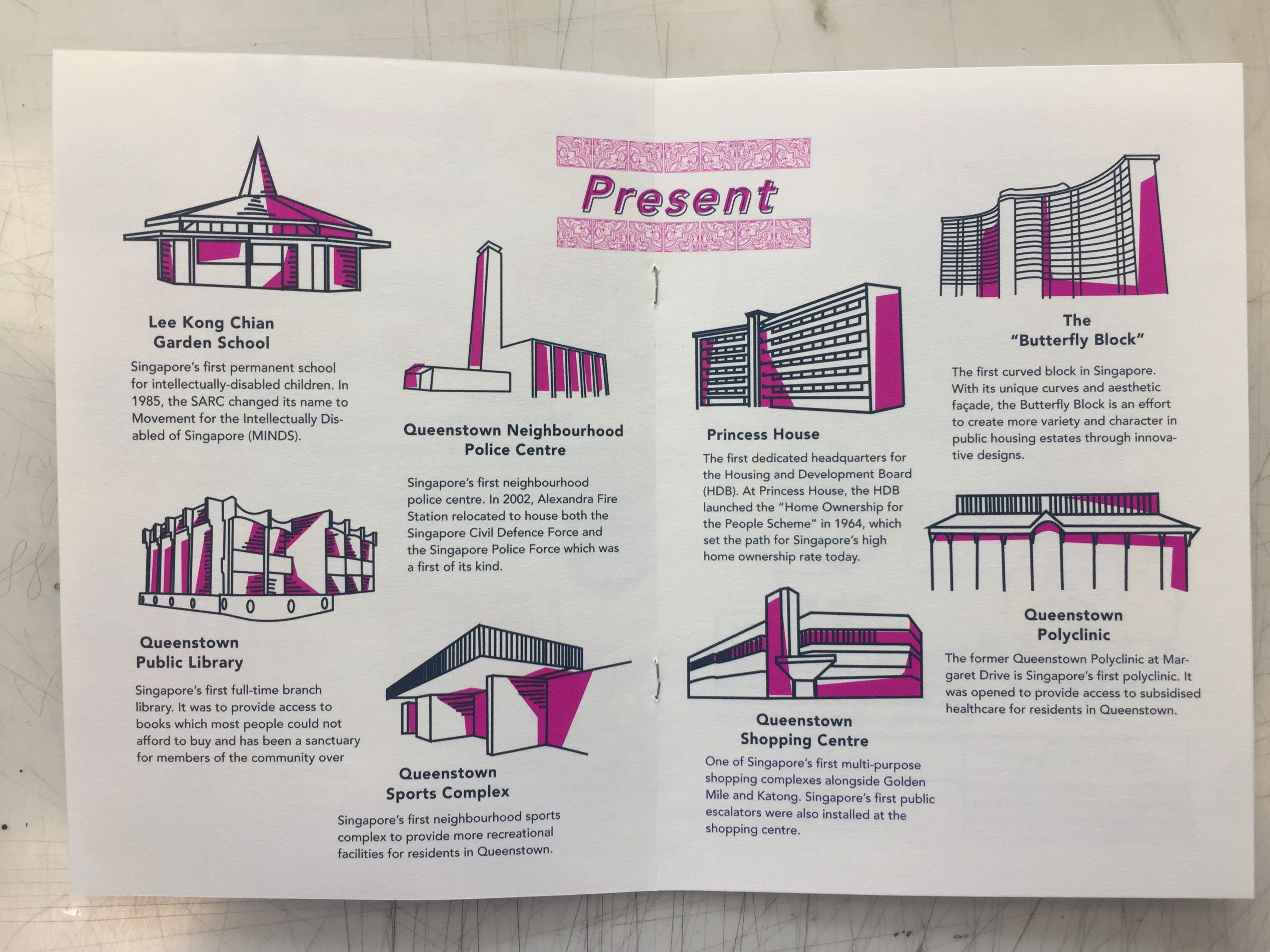
Due to space constraint, I had to narrow it down to the places that were bolded and they were places that I felt best embodied the spirit of Queenstown as the pioneer of many firsts.
References
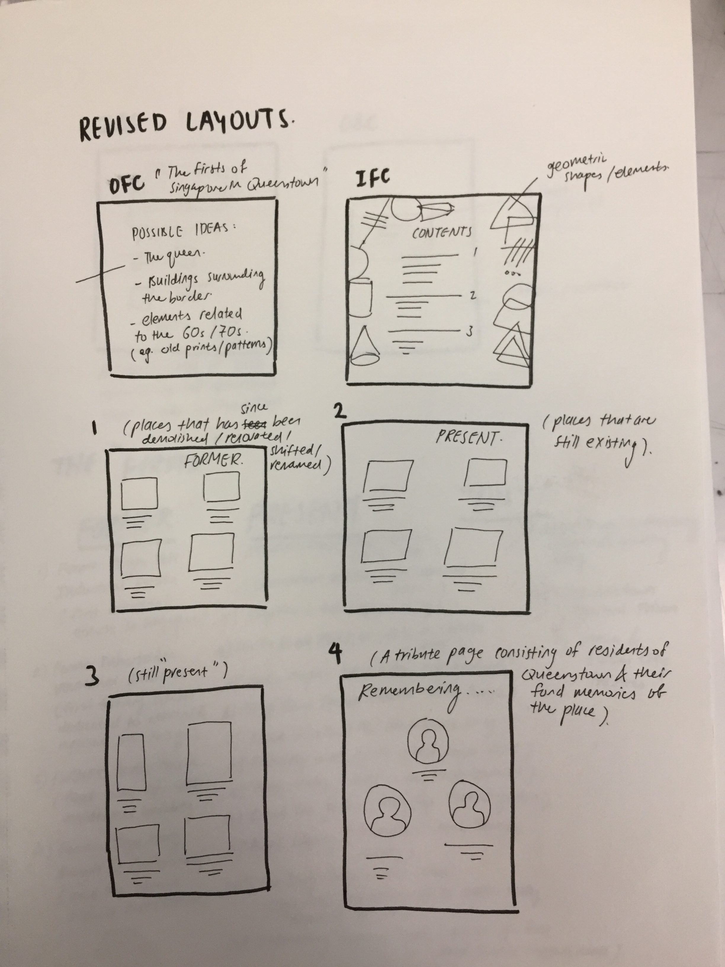
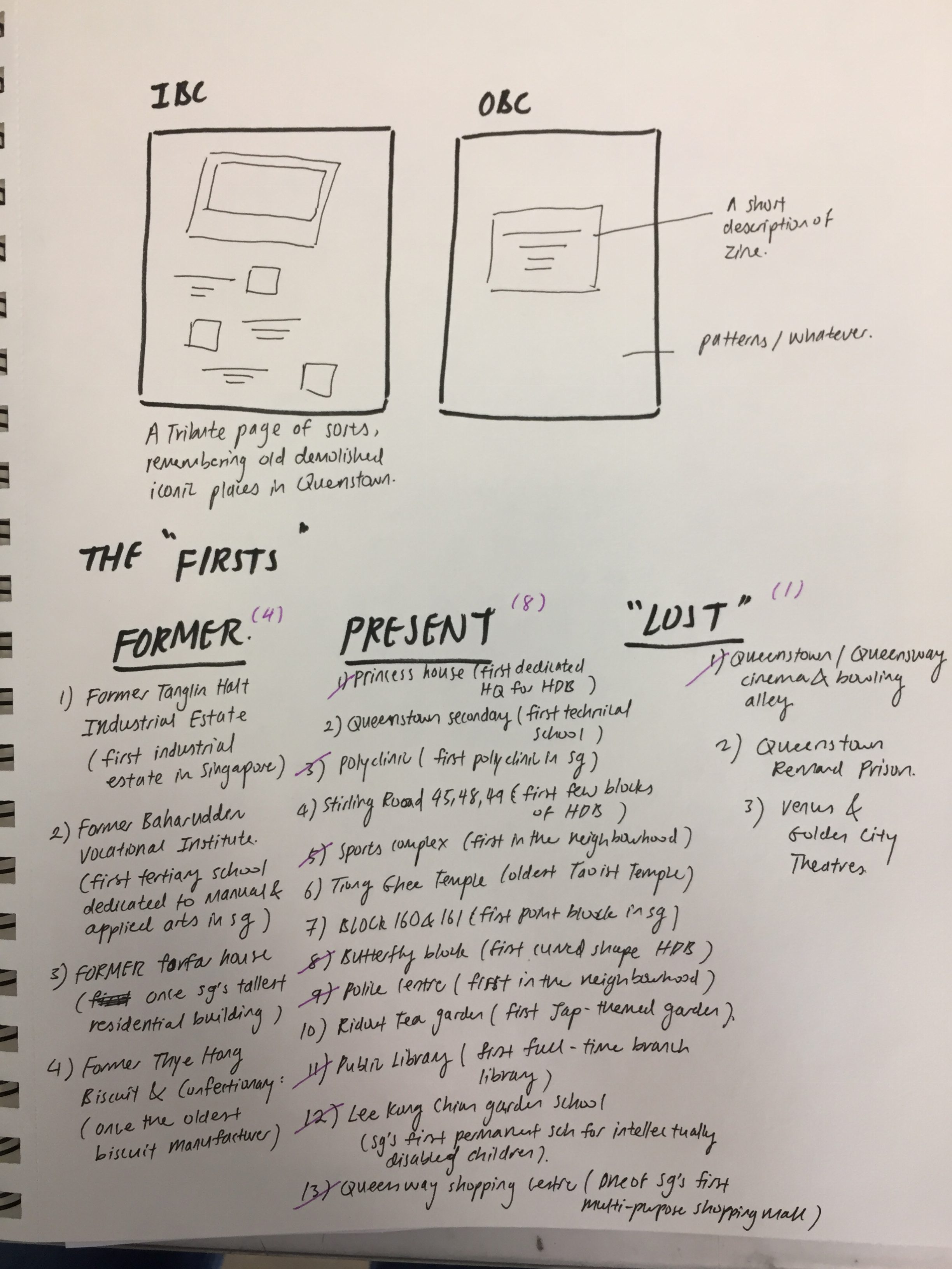
Layouts
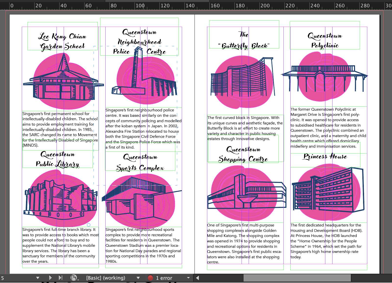
My initial layout followed a simple 4 column grid and 2 places in each column. However, after my first consultation Joy advised me to experiment with different placements given the freedom of space I had with the middle spread.
My friend suggested why not I put 4 places in a spread instead to make it less cramp and gives more room for the text and illustrations to breathe. However, after trying it out, I felt like 4 places in a spread were too little and given the constraint of 8 pages, I had to maximise my space more and it also defeated the purpose of making a zine about the firsts of Queenstown if there were only 4 places mentioned.
Typeface & Text
Initially as you can see above, I used a total of 2 different fonts for the header and body text. My header text was more cursive and the body text was simpler and sans serif. However, after consulting friends, I also agreed that maybe sticking to one font was better and I could play around with the different weight, (heavy, medium, light etc.) to make the texts look neater and readable.
After the first consultation, Joy also suggested that I cut down on the description of each place to just the essential contents as it was coming off too wordy and cramp.
Illustrations
As seen above, my initial illustrations had blobs of pink overlaid with my line illustrations. I actually had the idea of doing this from some risograph illustrations I saw on pinterest and I thought that after printing the pink would be lighter and just provides a backdrop for my illustrations. However, my friends did mention that it looked like I was just “covering up a bad illustration”. Hence, I decided to continue with what I did with the illustrations for my infographic. https://oss.adm.ntu.edu.sg/limx0098/project-2i-infographic-process-and-final/
Highlighted shades of pink in Queenstown shopping centreinitial inspiration for the pink blobs
Revised Layout and Typeface
Spread 1
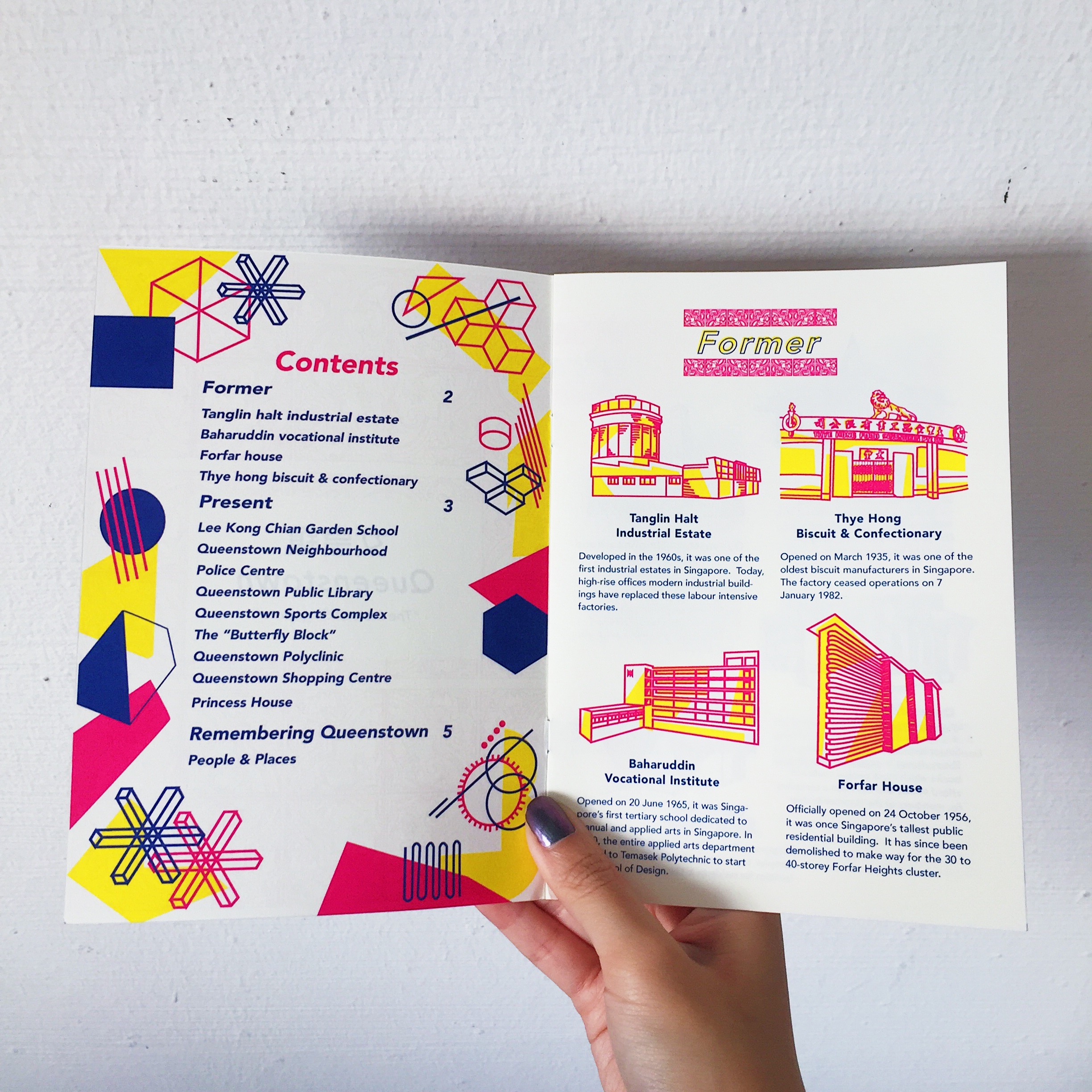
My contents page had elements of geometric shapes and patterns because I wanted it to be more fun and I thought it went well with my illustrations. To differentiate between the “former” and “present”, I used 2 different colour schemes. I also standardised the entire zine to just one font, Avenir in all its glory.
Spread 2
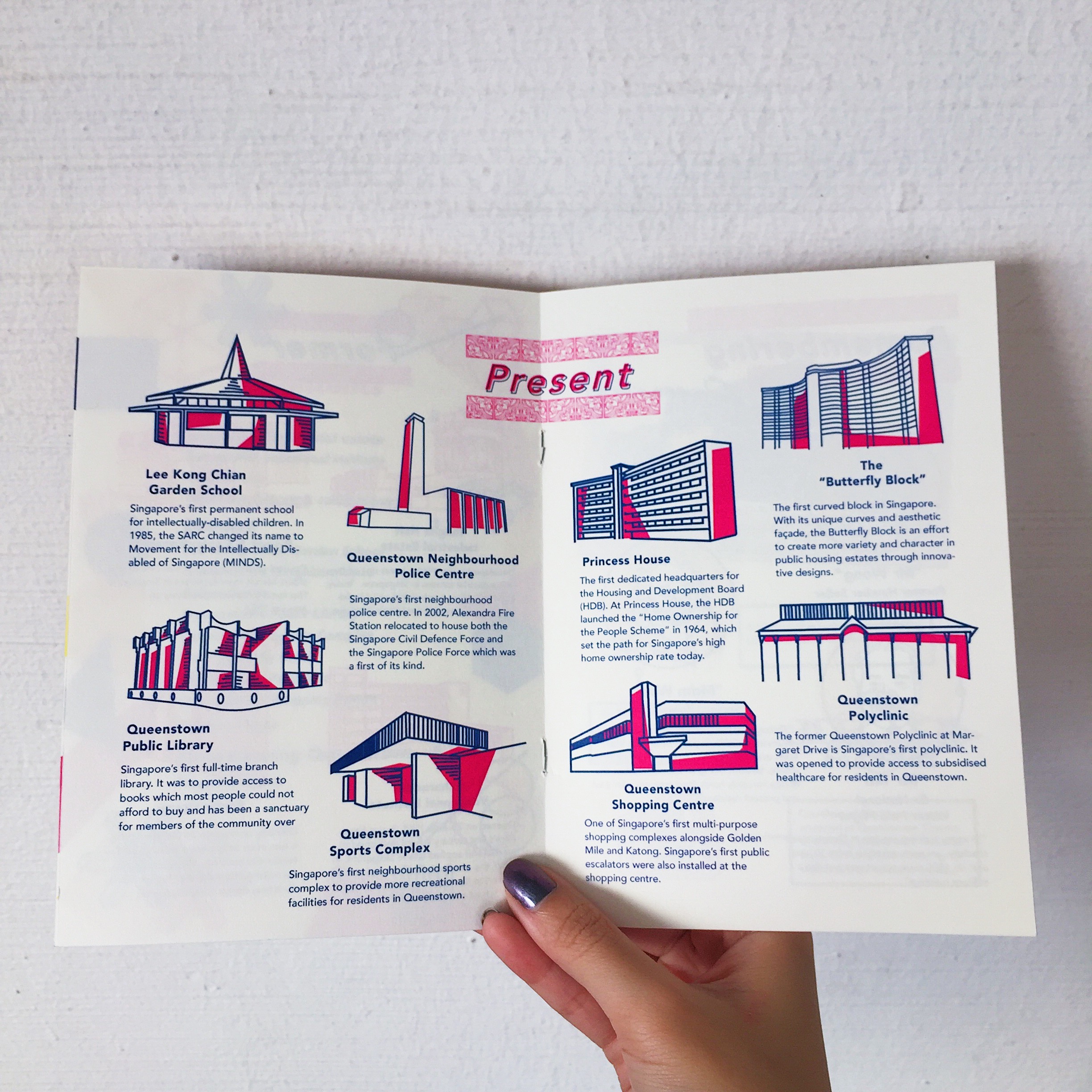
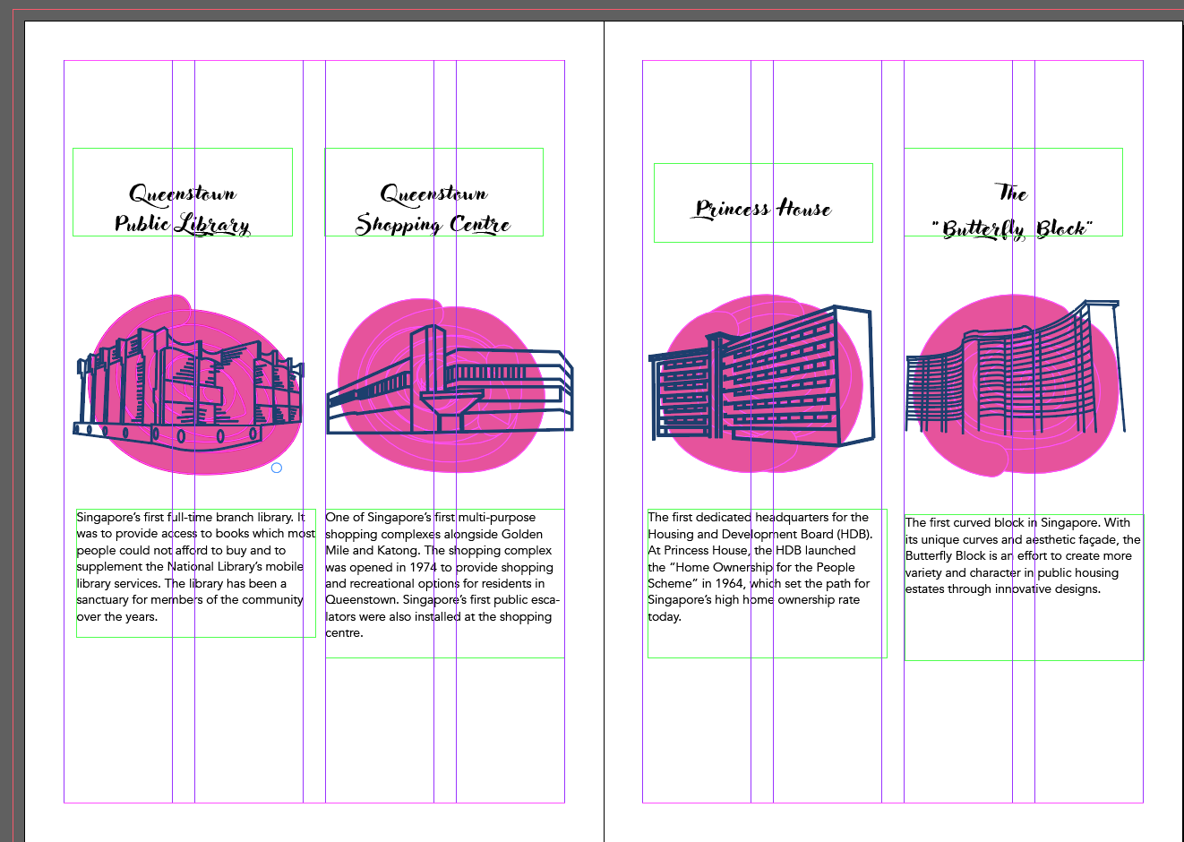
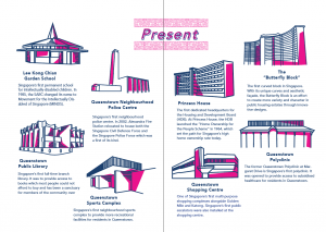
My middle spread layout was now placed in sort of a semi-circle instead of the previous more structured grid. How I came up with this layout was really just moving the objects around and just figuring out which layout worked the best with the limited amount of space I had. I had to consider factors like heading placement, body texts and the illustration. Do I centralise them? Or is the heading off centre for places at the side and centralised as it goes to the middle? Is there enough space at the sides for the text to breathe?
Spread 3
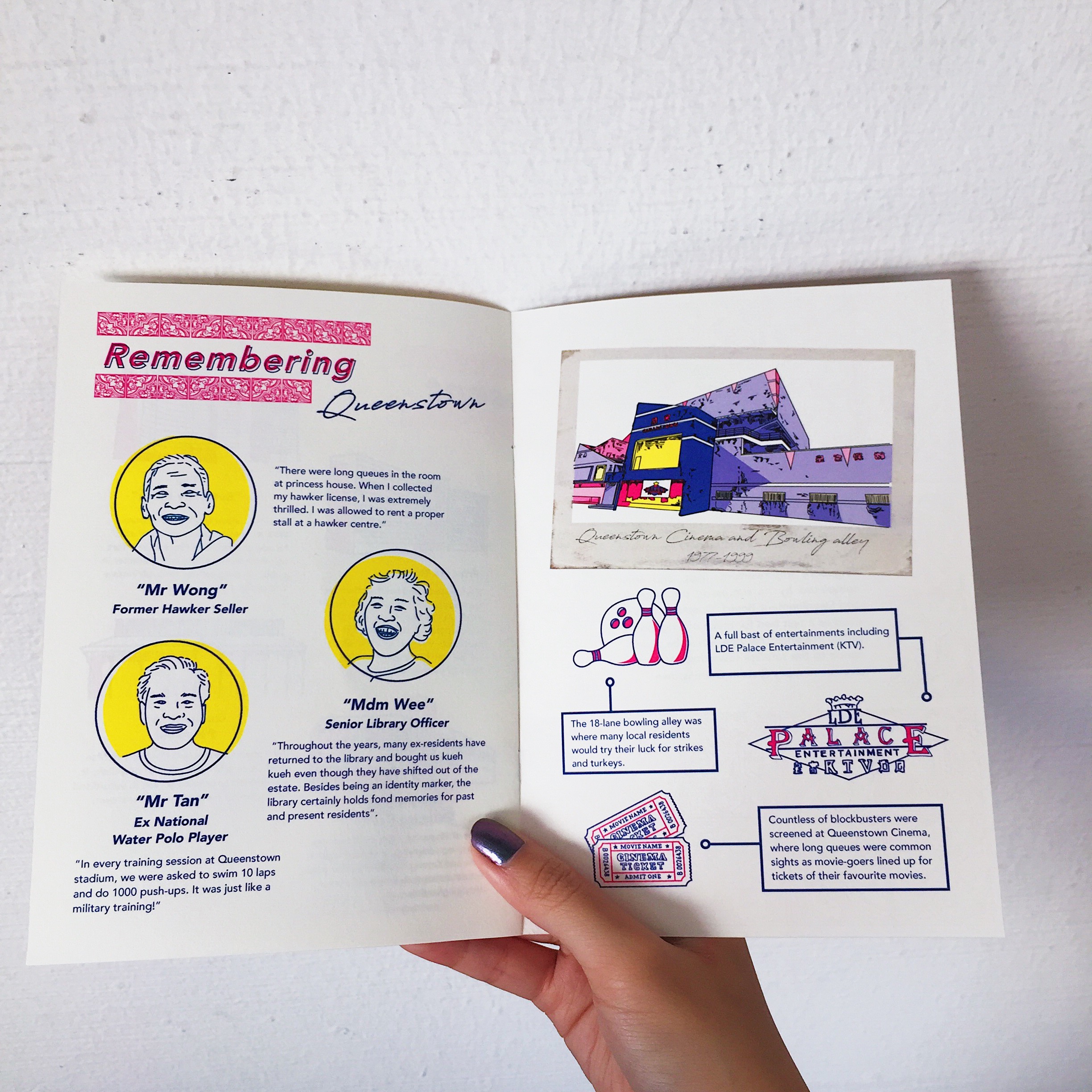
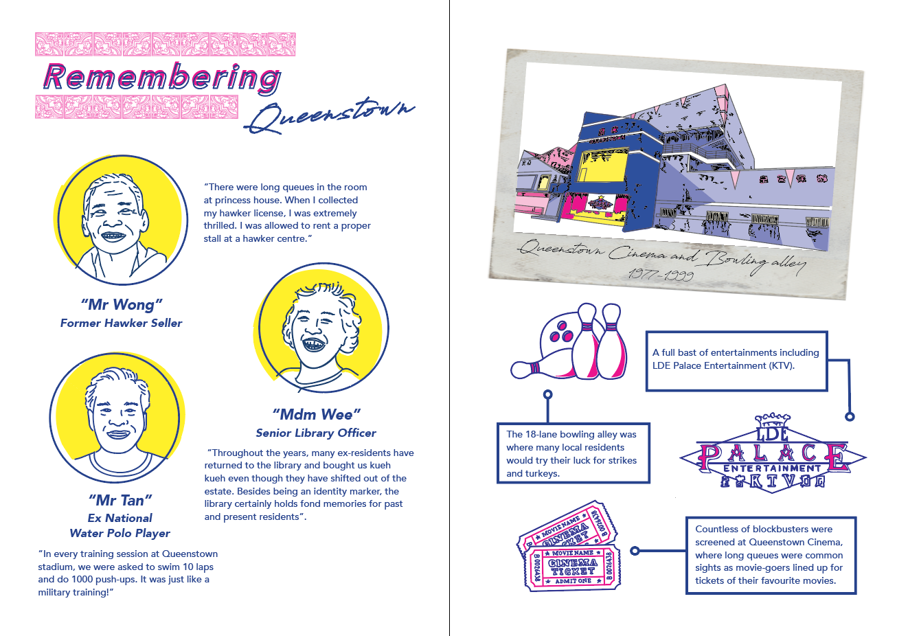
This spread was more of a “tribute” page. The left was a recount of the memories of old residences living in the estate after interviewing some of the residences during my site visit. The right was a tribute to the old Queenstown bowling alley, ktv and cinema with a short description of each. Initially during consult, Joy suggested that I change up the polaroid frame to a drawn one to match the rest of the pages. However, I had this idea in mind that the reason why a real picture was used was because much like the old bowling alley, it was a thing of the past and no longer fits in anymore. Hence, it was meant to look out of place amongst the rest. The illustration style of the bowling alley was also drawn differently in comparison to the rest of the spreads. Also, if we had the chance to explore more printing or layout options, I would have liked to print the polaroid out separately and slot it into the zine, making it detachable like a real polaroid.
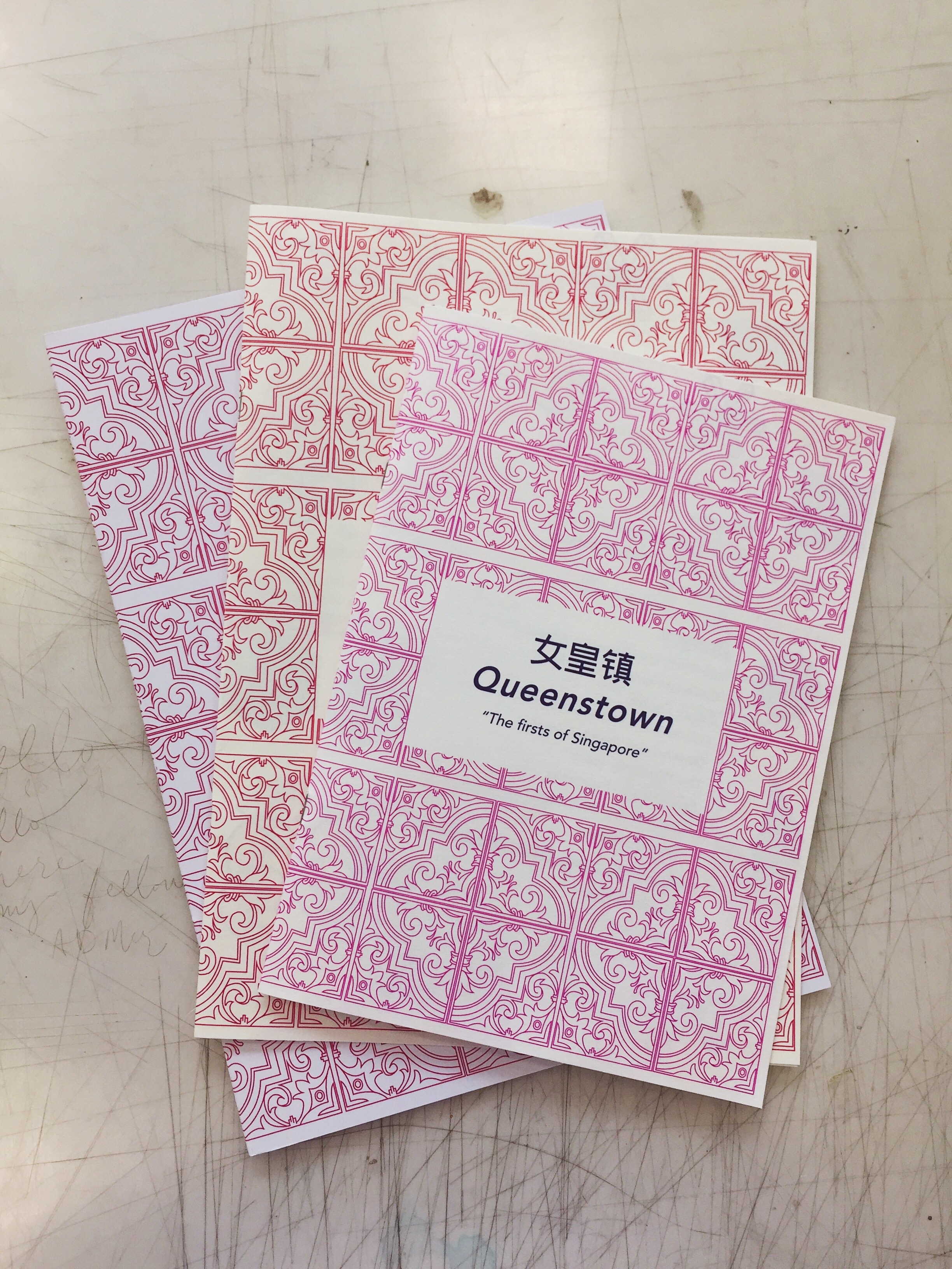
Cover + back page
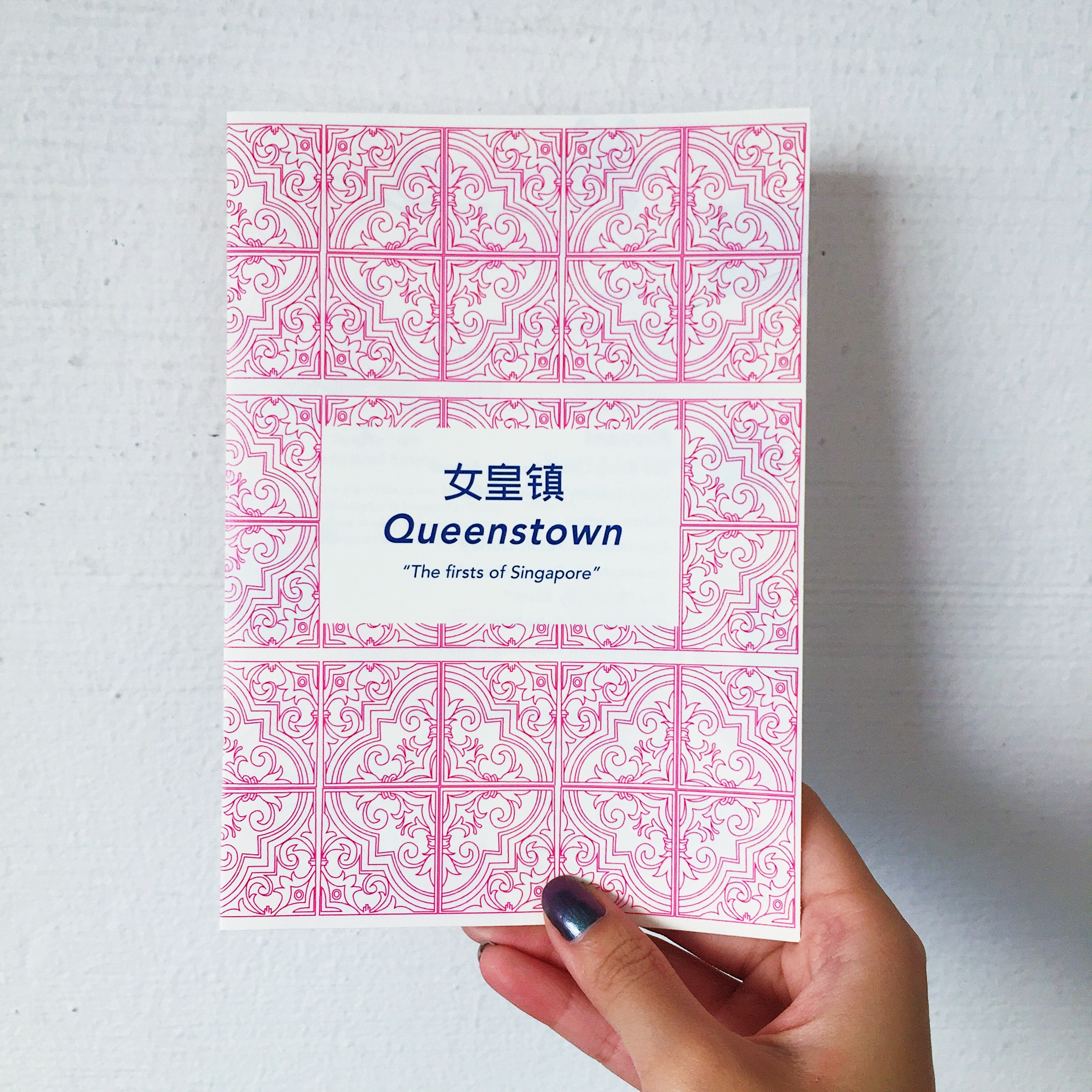
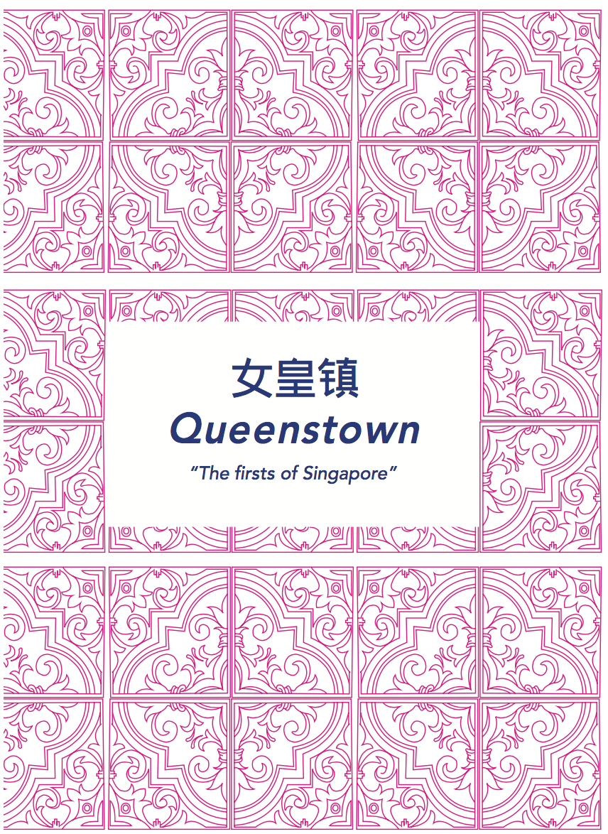
The idea behind the cover page was using the traditional peranakan tiles. Given that it was a historical recount of old places in Queenstown, I thought it would evoke a feeling of nostalgia with the use of a familiar pattern that is uniquely Singapore. The back page includes a short description of the history of Queenstown as sort of a introduction to the zine and the significance of the “firsts” in Queenstown.
Next posts will feature the final printed zine and reflections 🙂