
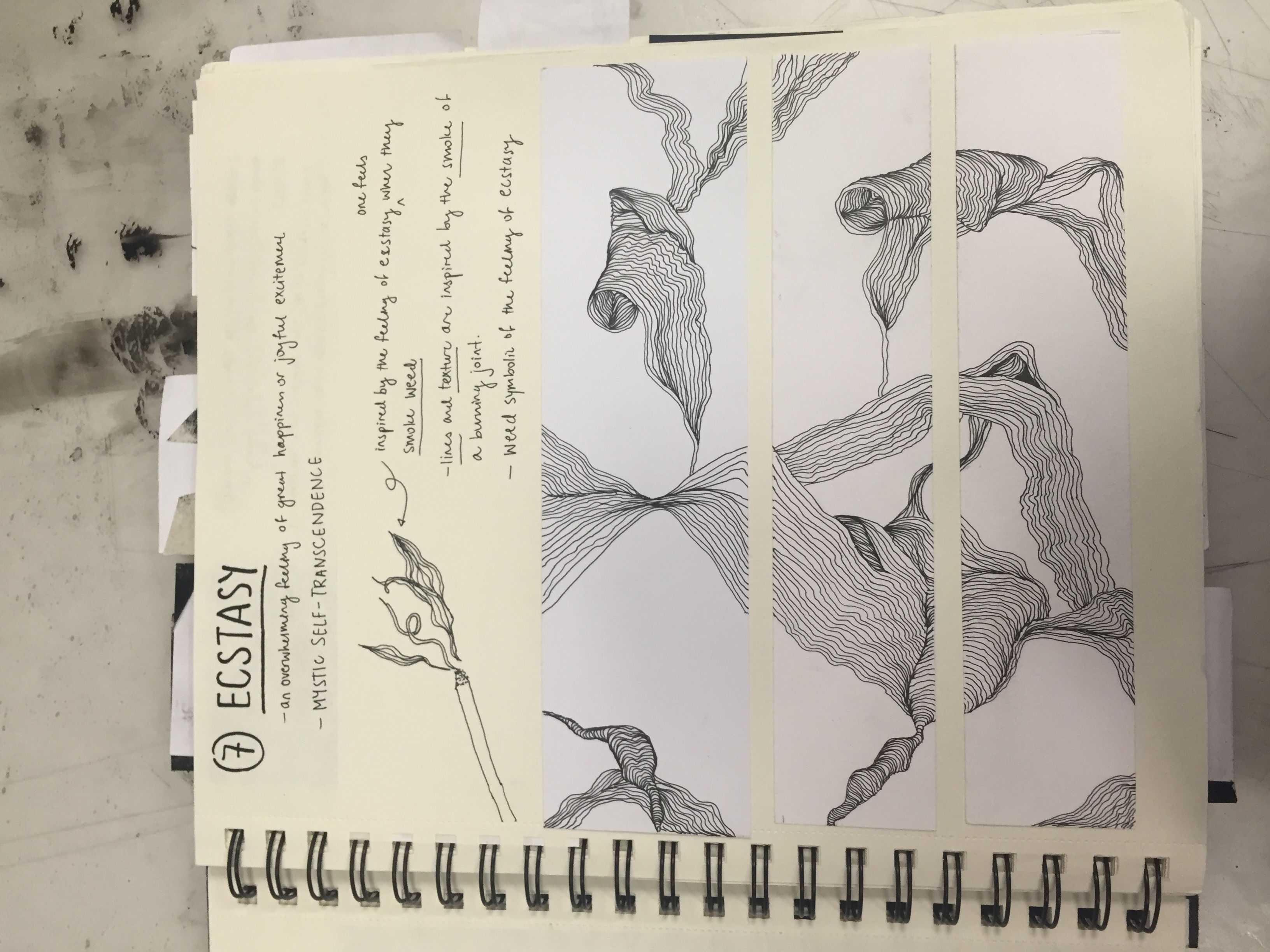
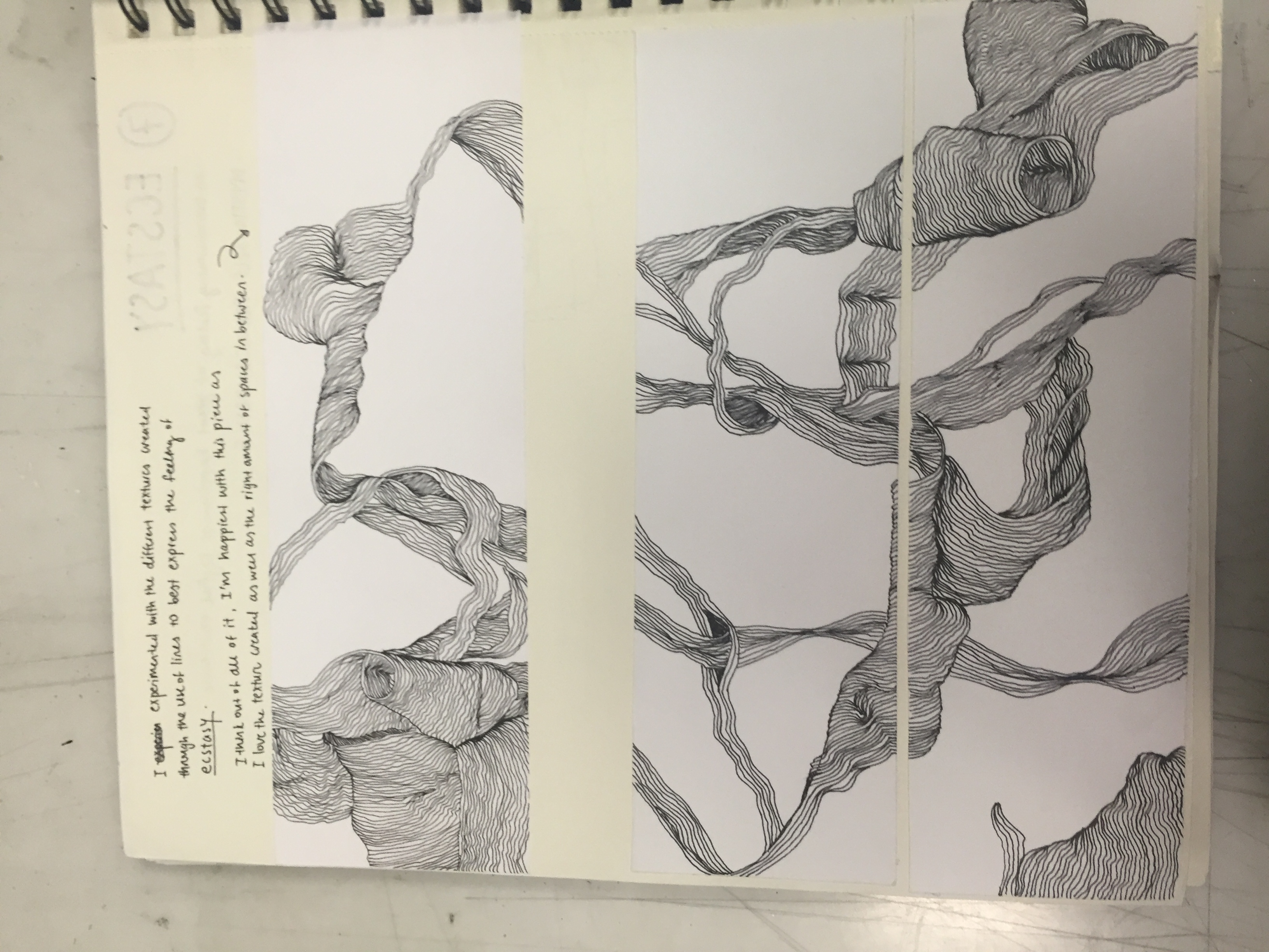
1. ALONE + OUT AT SEA = REFLECTIVE
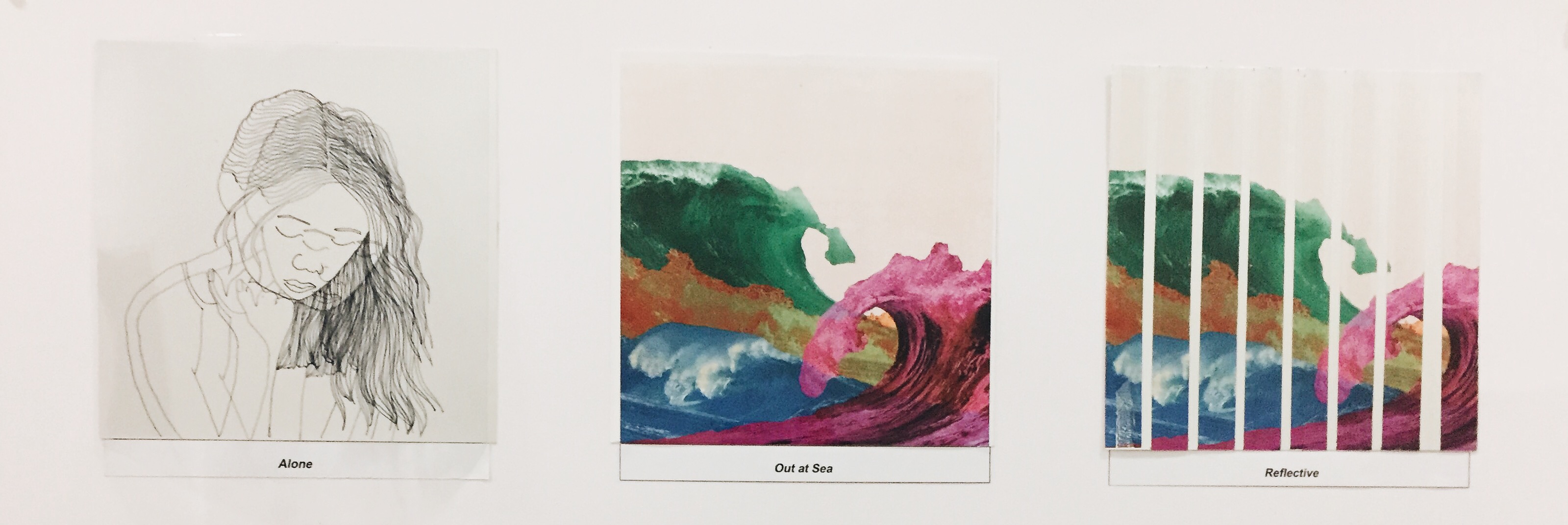
When I am alone, especially in bed at night, I have a tendency to overthink about life in general. Be it thinking about work, self-doubt, relationships or the future. Because I am alone, I have no need to put up a front for anyone else and I am bare/transparent to my own feelings and emotions.
Me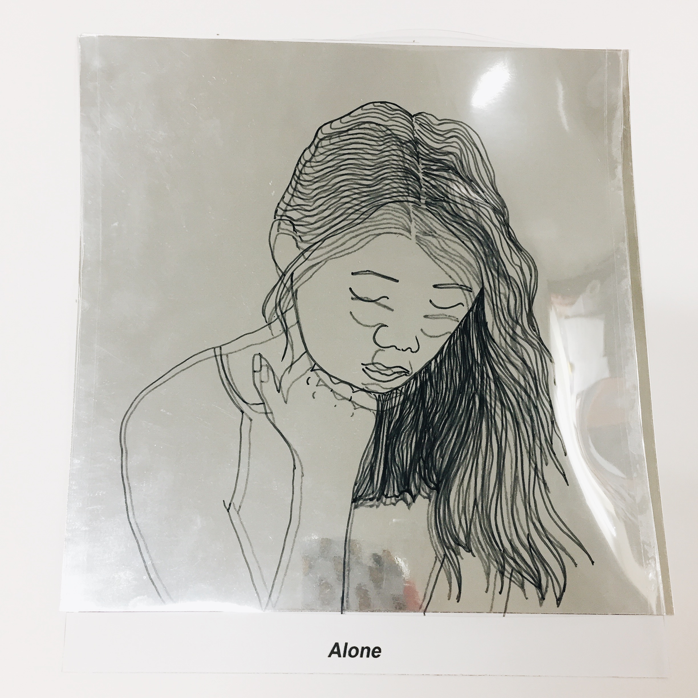
Hence this is depicted in the “ME” through the use of reflective paper and a transparency which I drew of myself to represent transparency and reflectiveness of self. Initially when i came up with this idea. I just wanted to stick the transparency on the reflective paper. But when i put the two together, I found that the reflectiveness of the paper creates a 3 dimensional feel if i elevate the transparency which creates the illusion of “2 MEs”. I thought this was a perfect representation of how torn i feel sometimes when I am alone. Torn between the feeling of being optimistic or pessimistic and self-love or self-doubt.
SETTING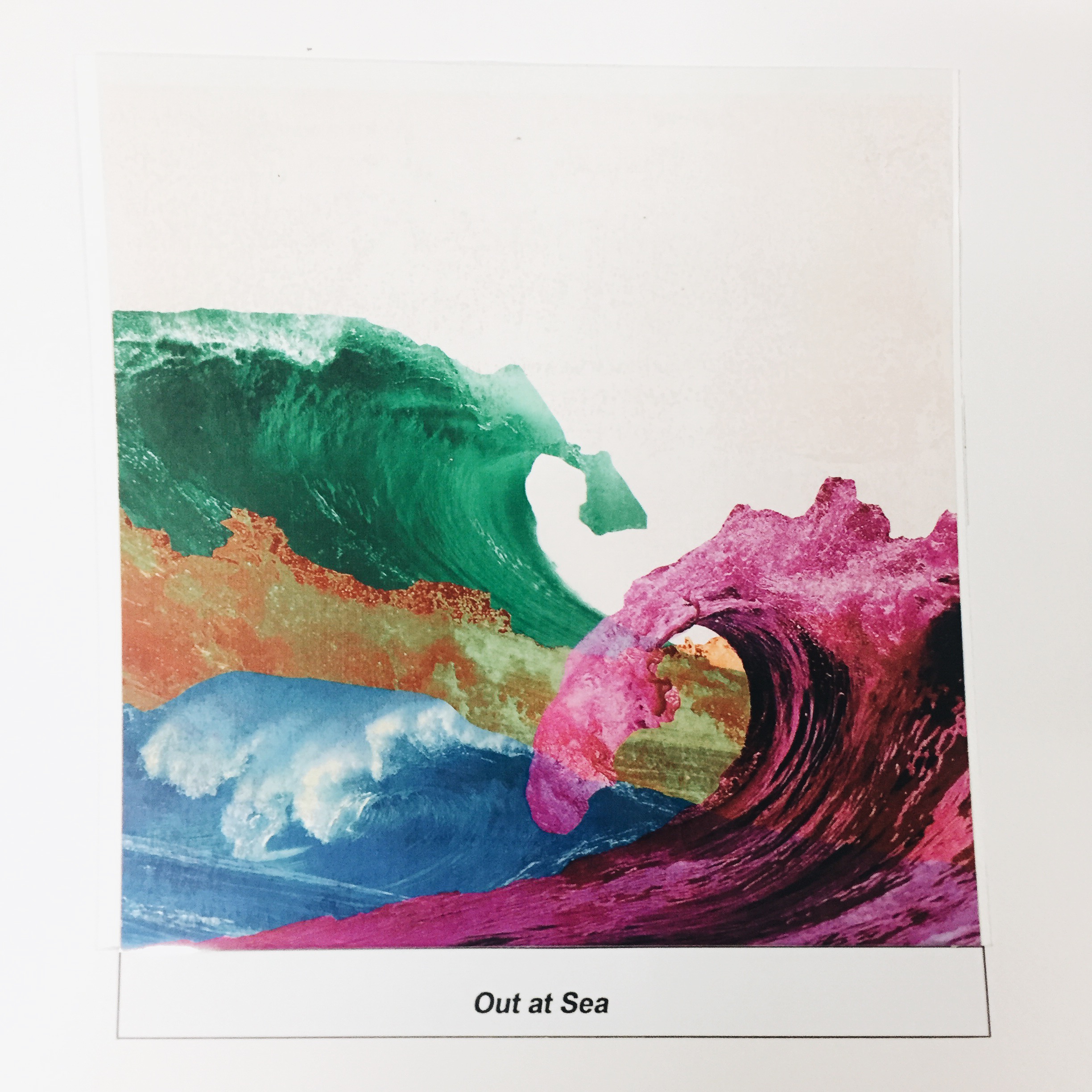
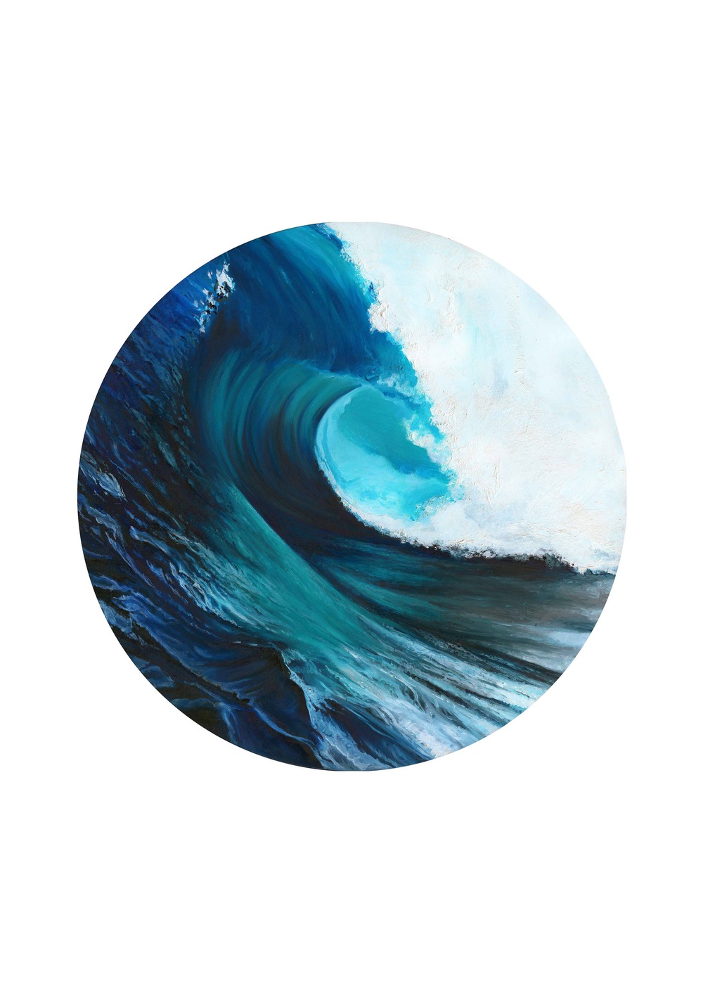
The setting I chose were waves to represent “waves of emotions” or the tranquility I feel when I am alone much like the feeling when I am out at sea. The waves were presented with different colors to show the different emotions such as jealousy, sadness, love and happiness.
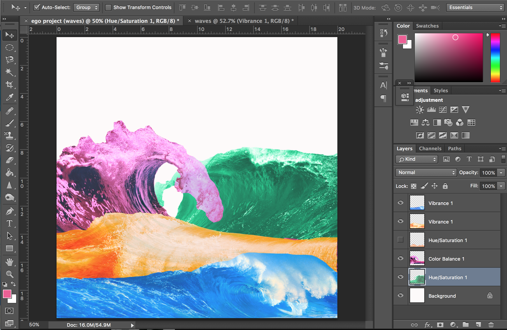

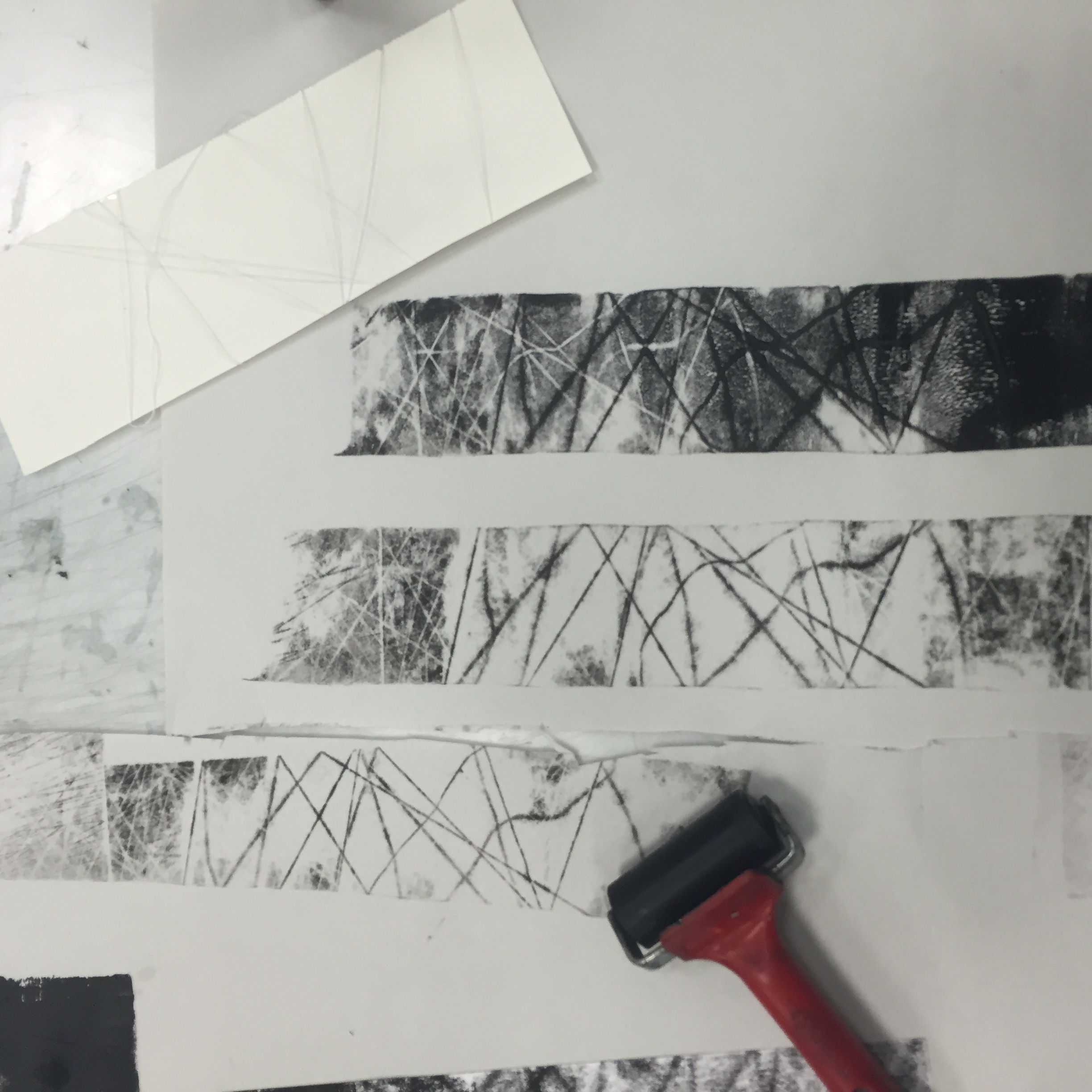
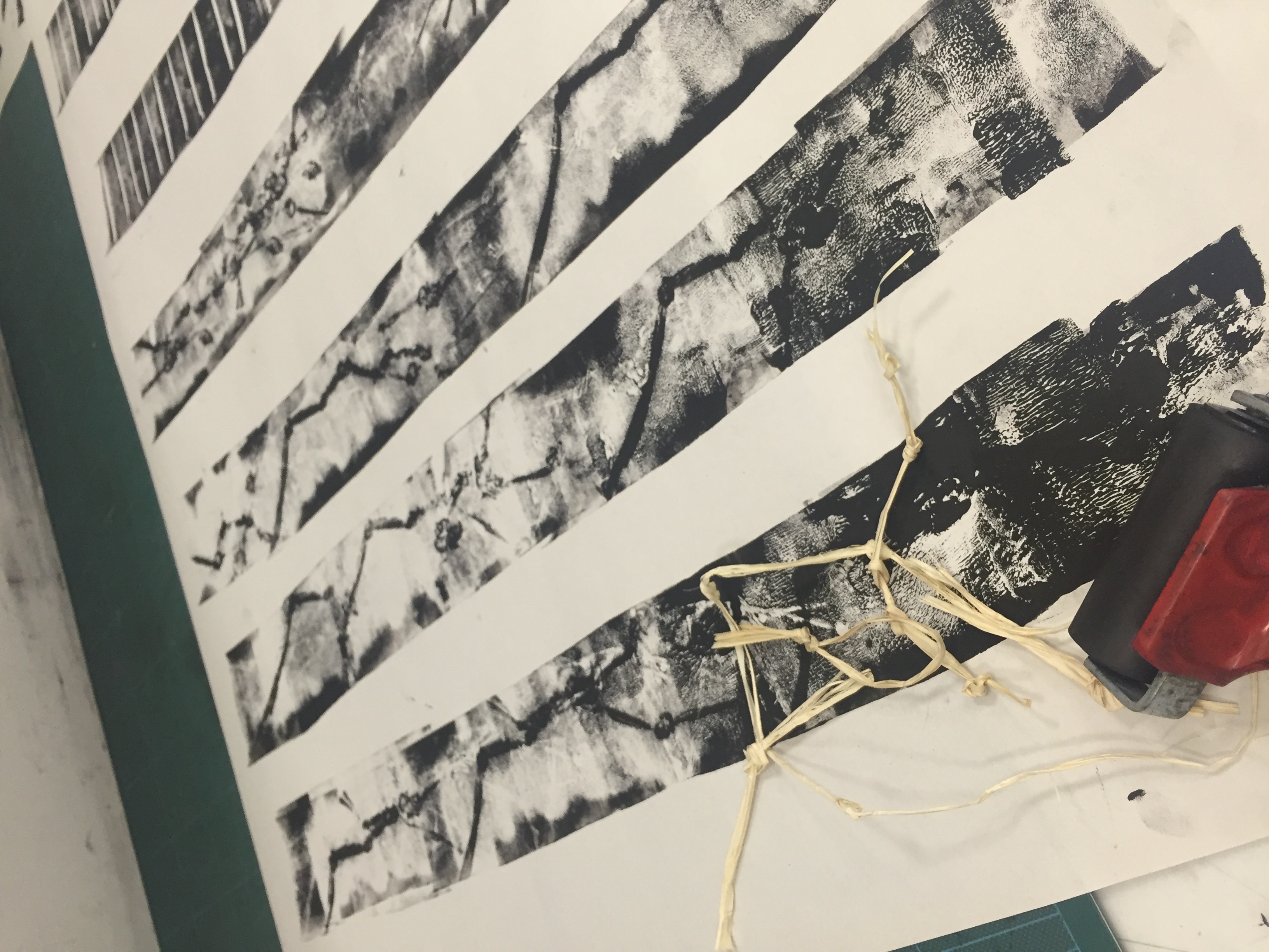
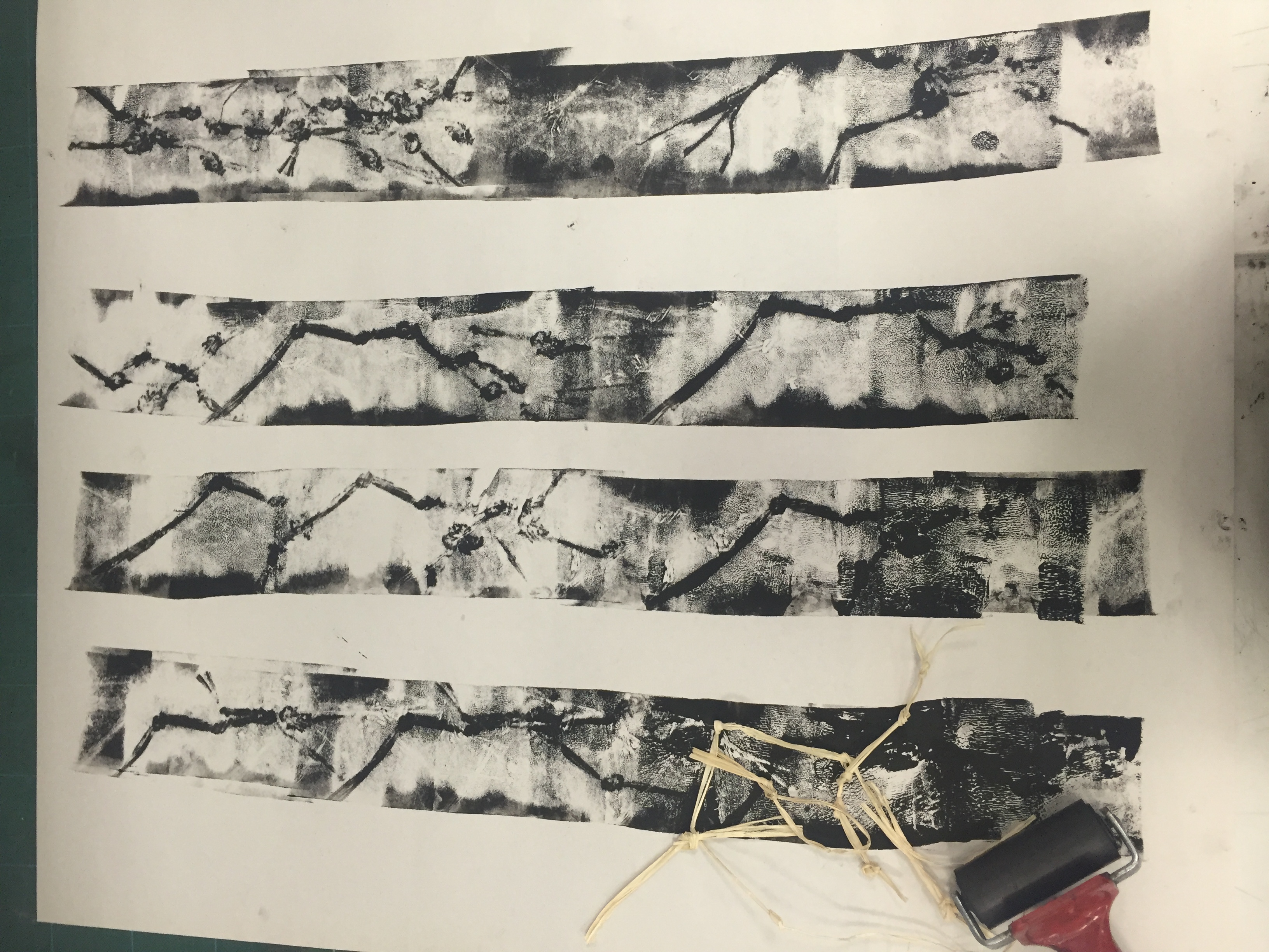
I played around with the different compositions, printed it on transparency and pasted it on white paper.
OUTCOME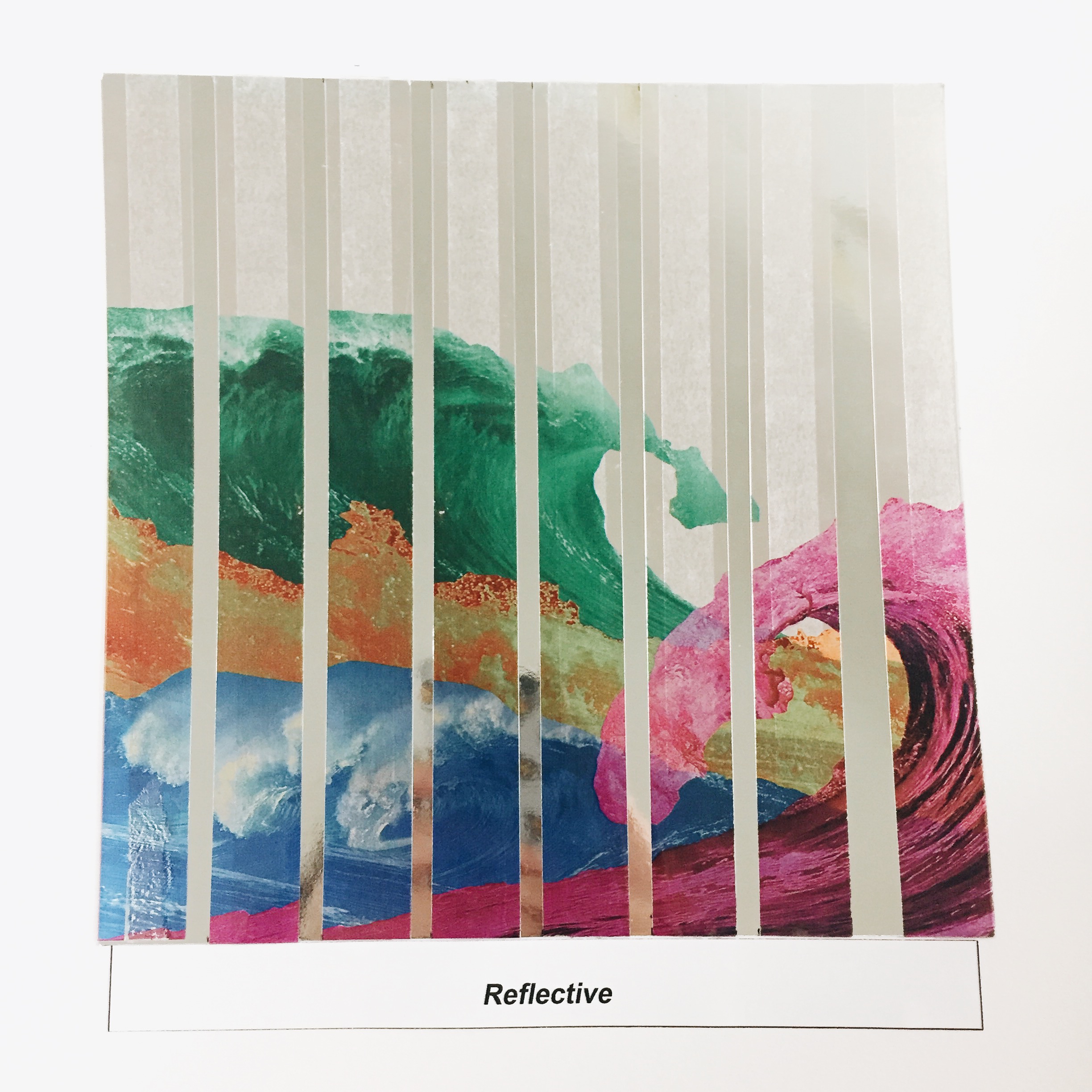
The outcome of the two would be reflective. I actually struggled a bit with the composition of this but i decided to slice up an image of waves and paste it over reflective paper to show the feeling of being torn in the midst of self discovery.
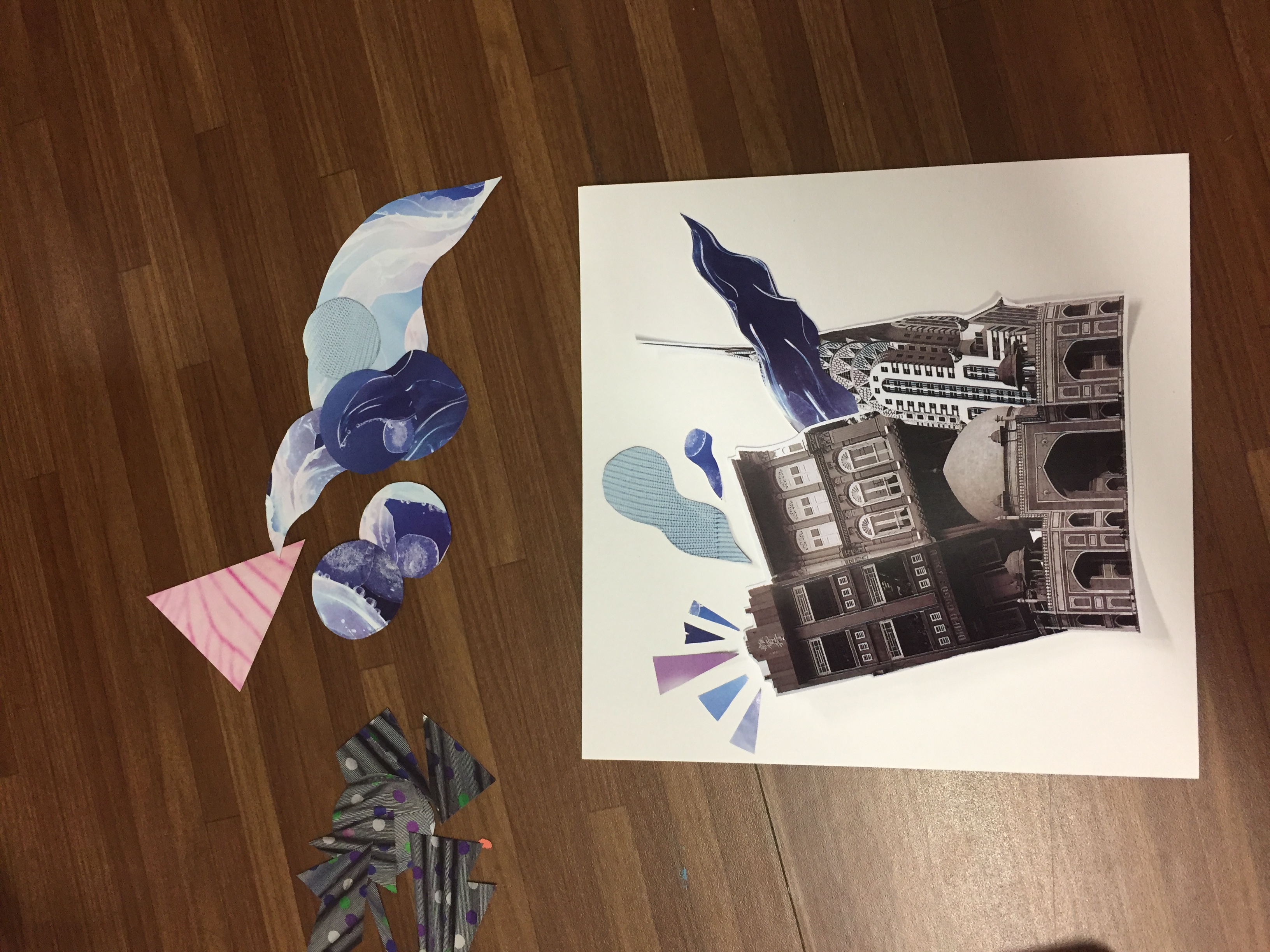
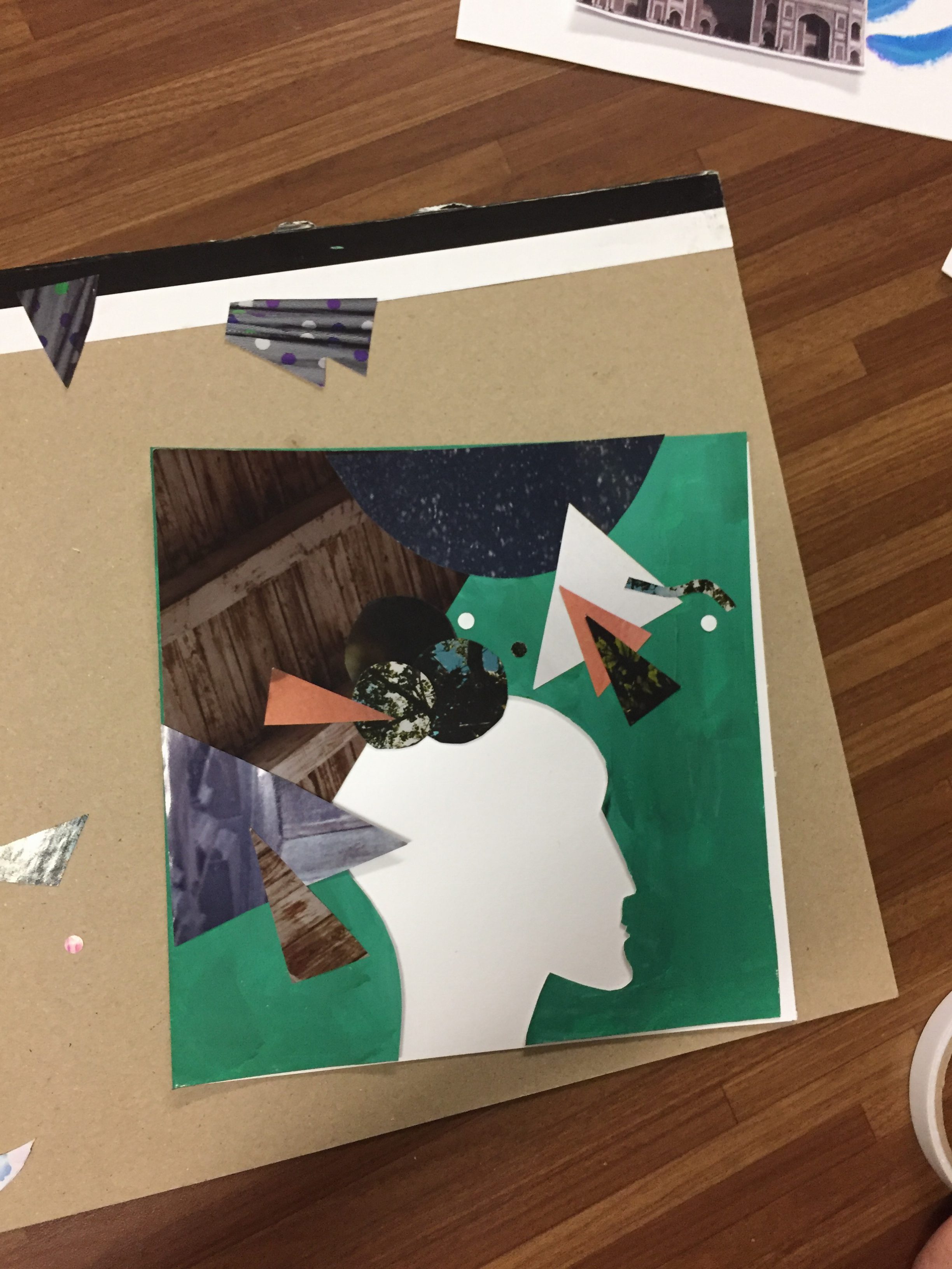
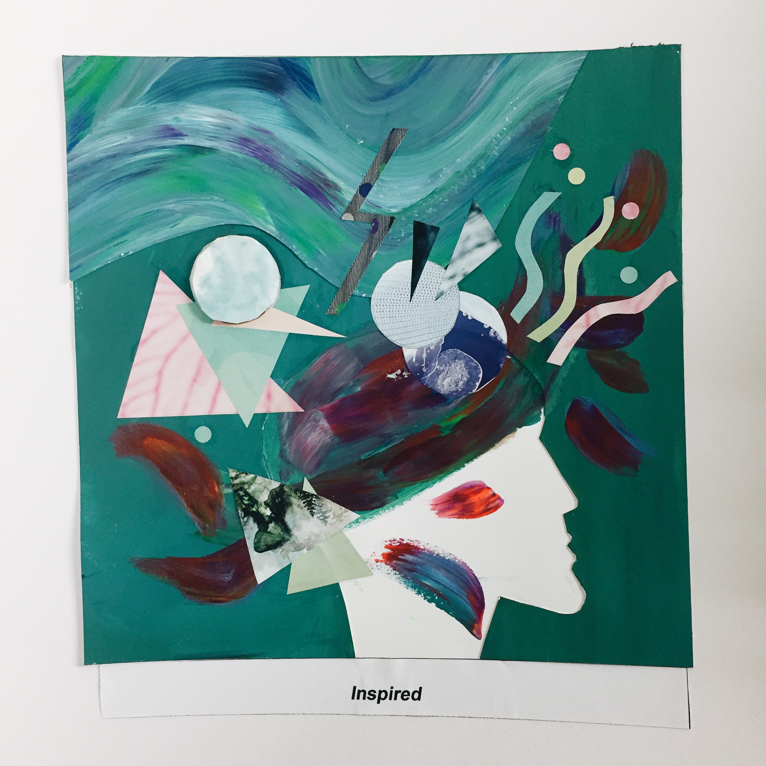
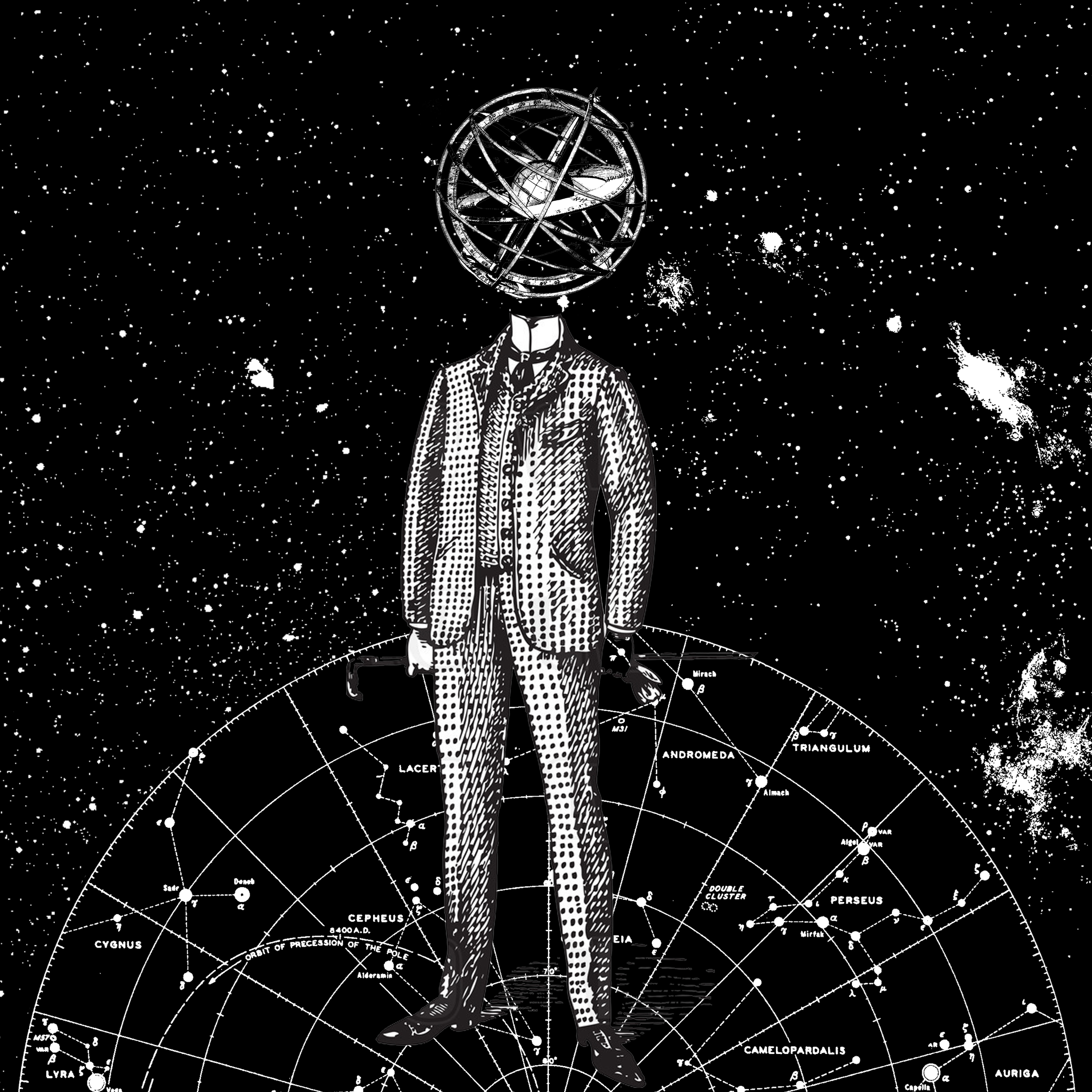
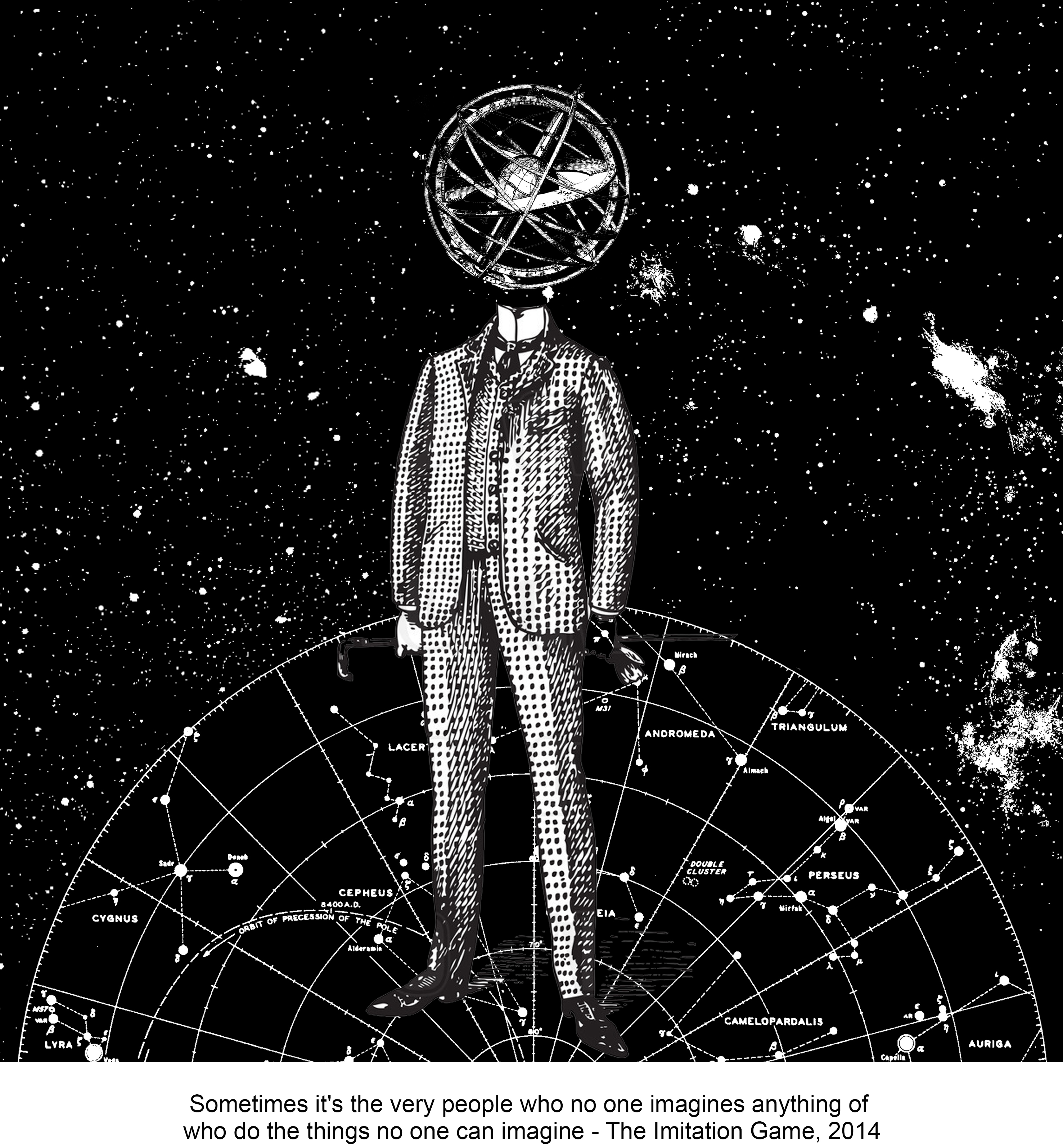
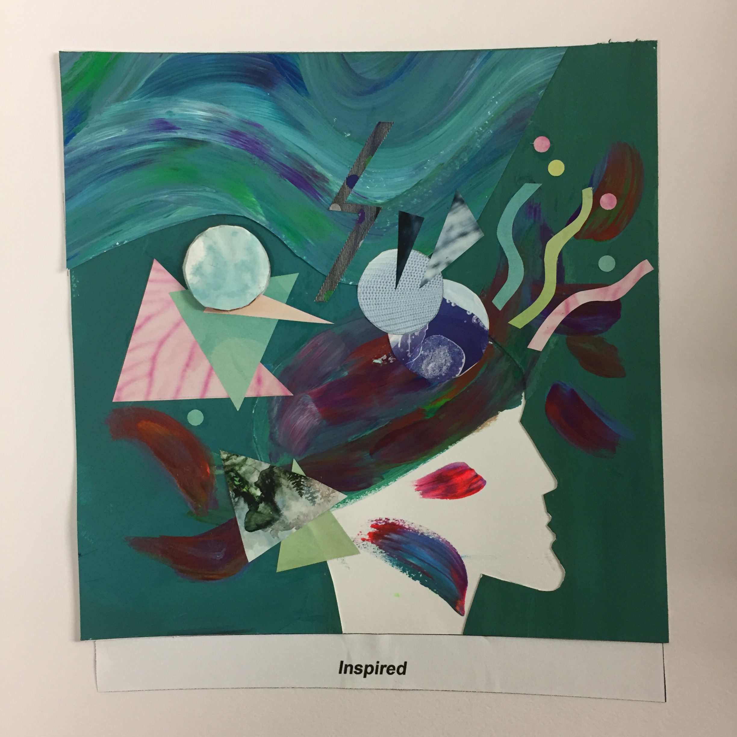
2. UNINSPIRED+EXPLORING NEW PLACES= INSPIRED

Often when I travel, I feel greatly inspired and a sense of enlightenment from discovering new places and meeting new places.
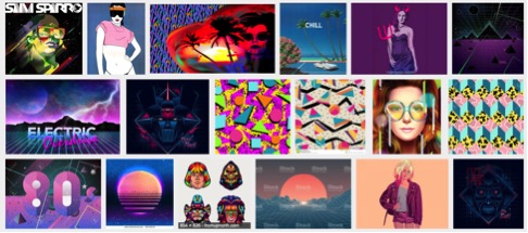
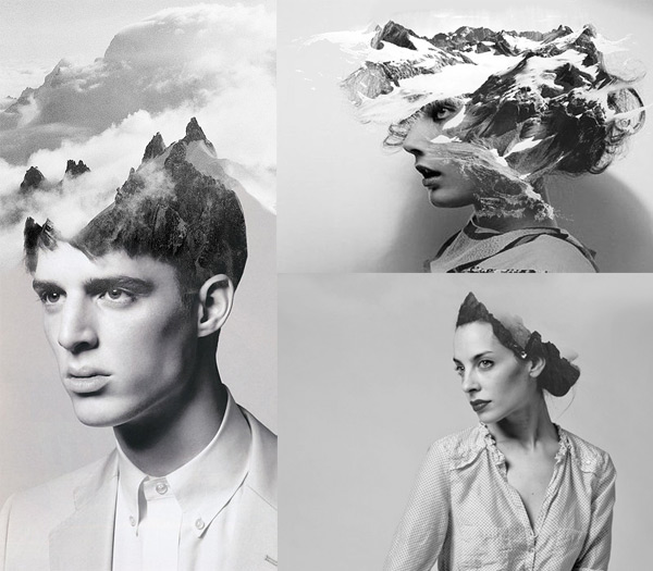
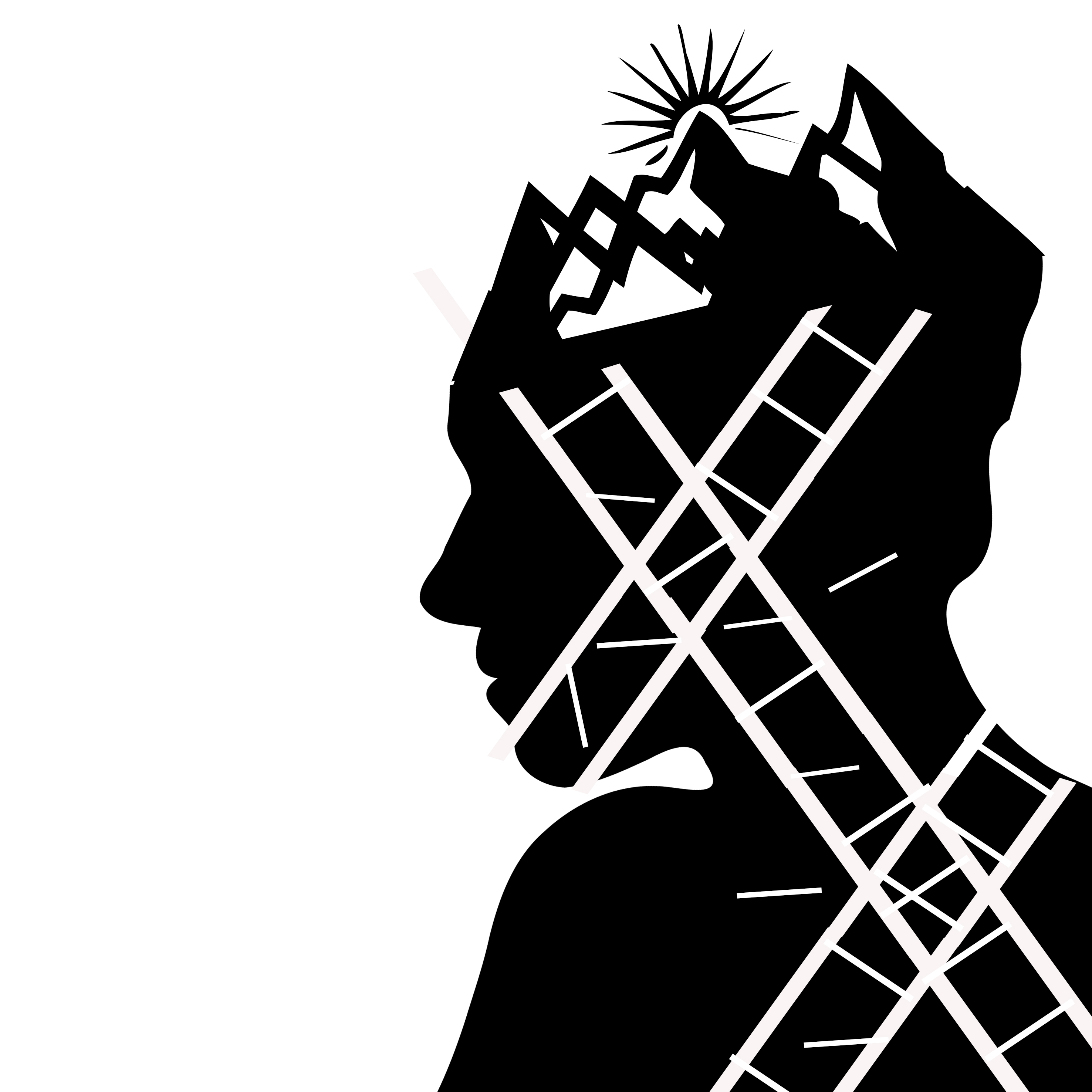
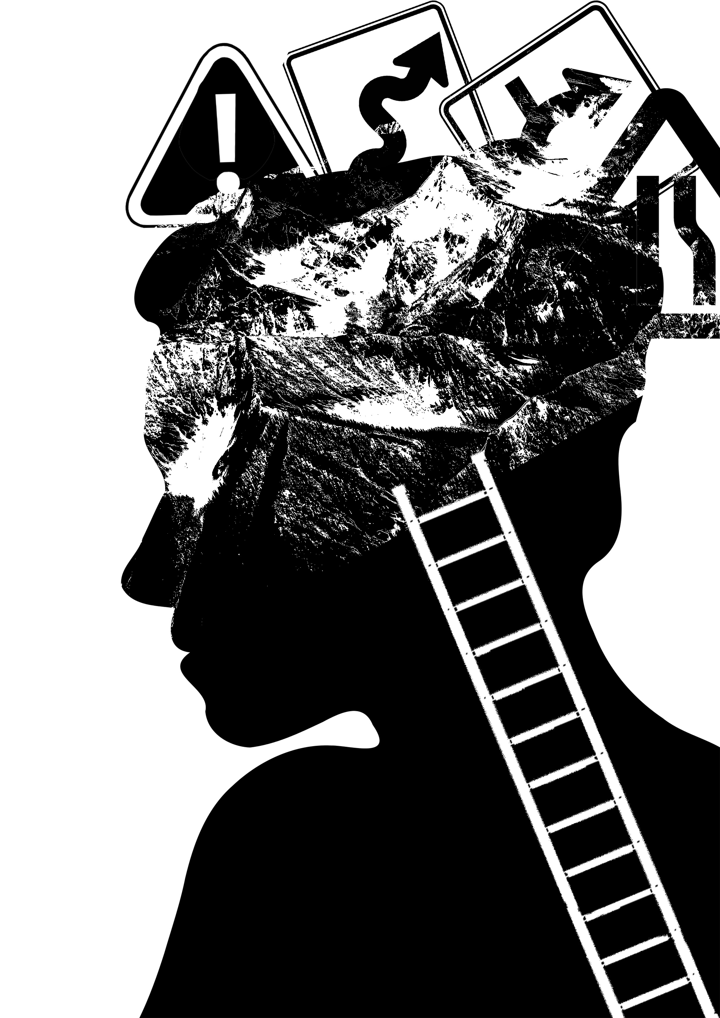
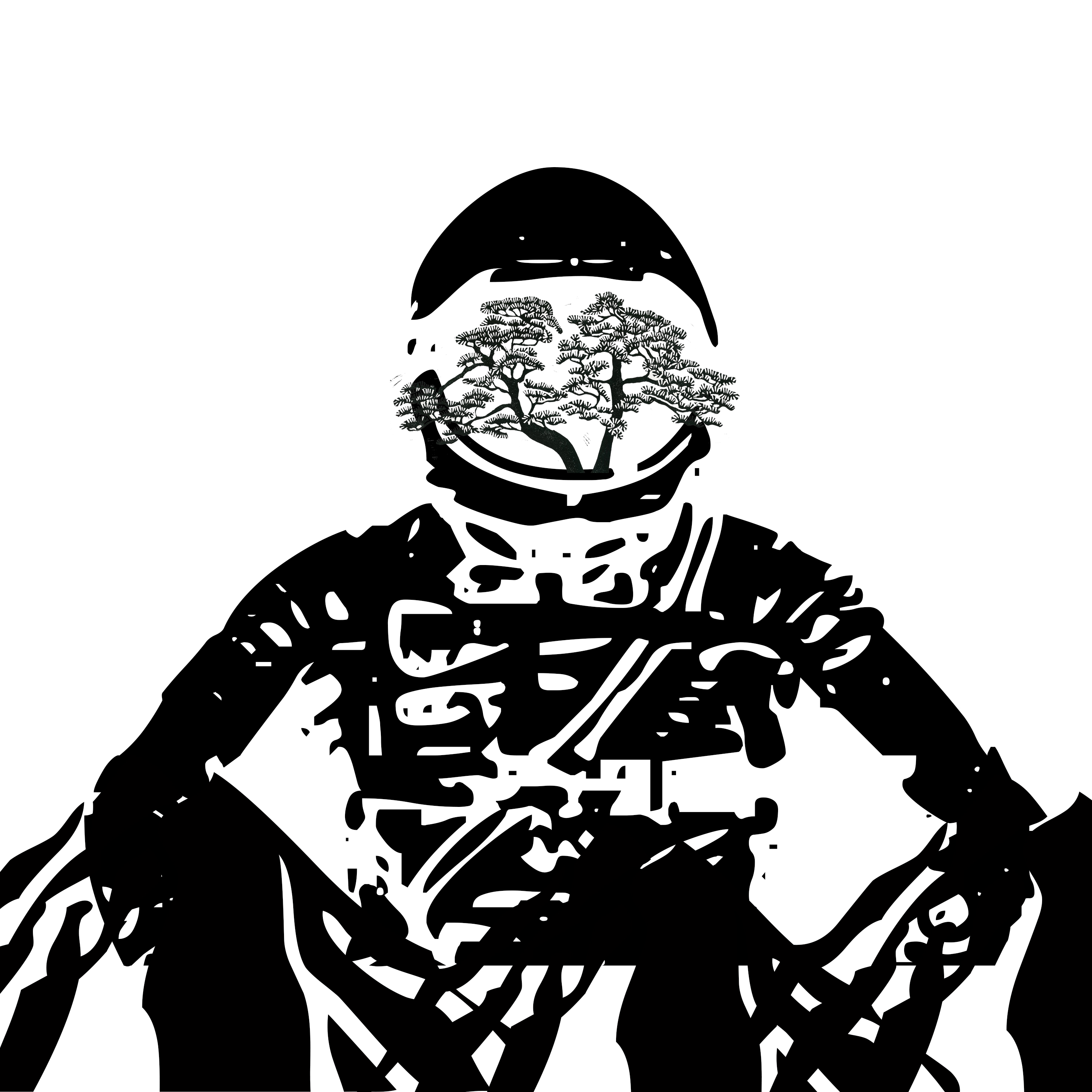
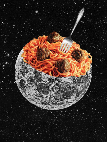
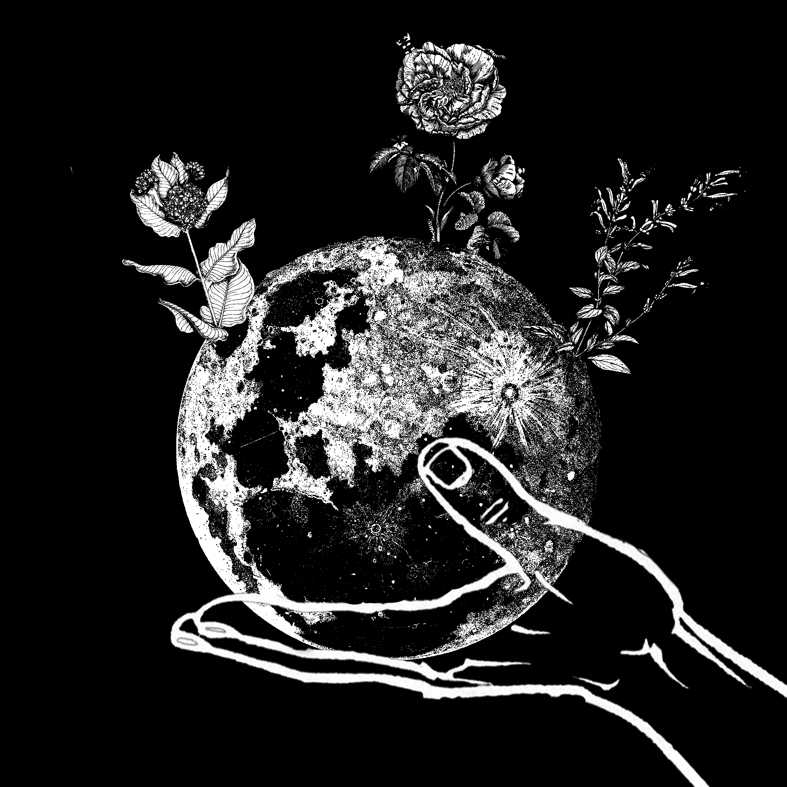
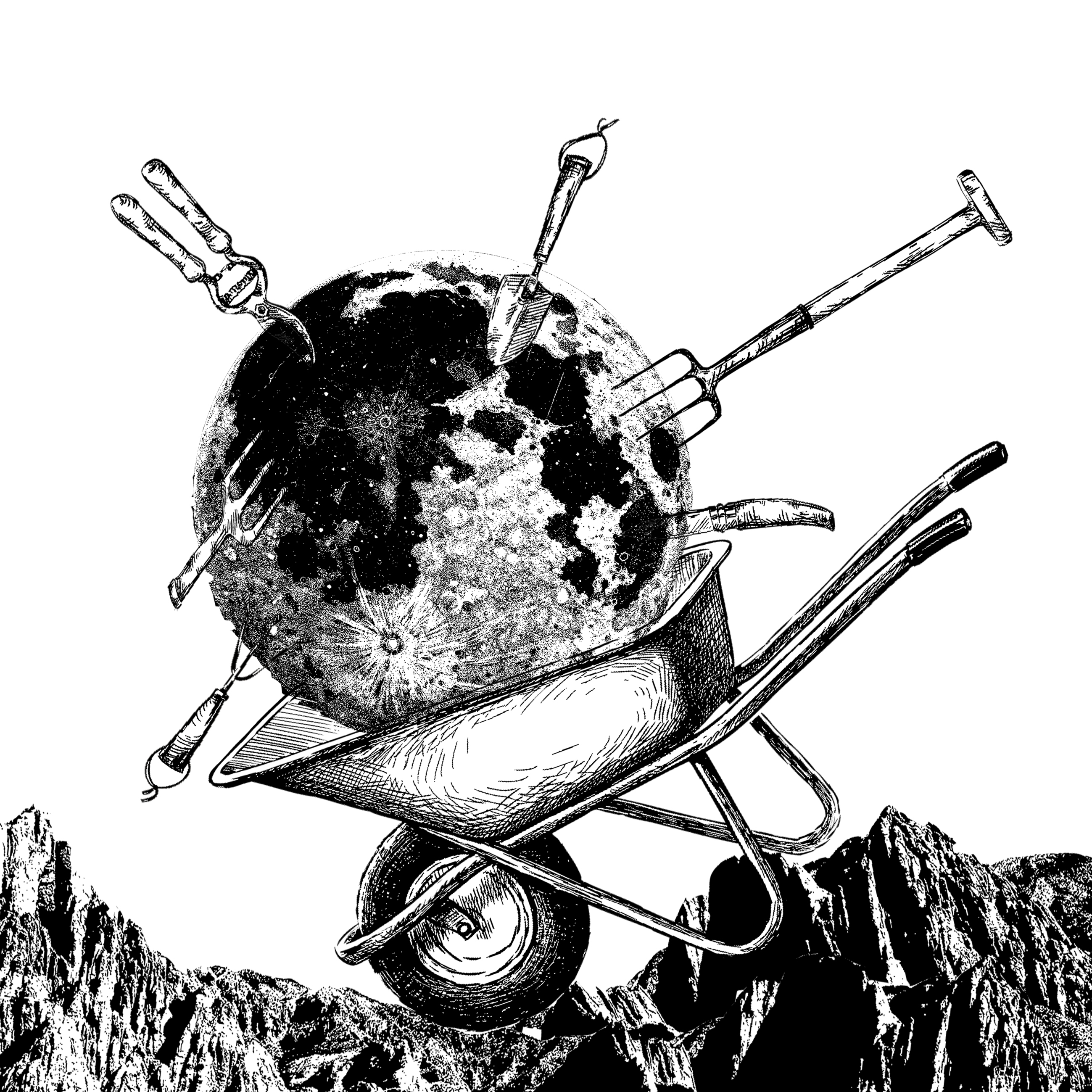
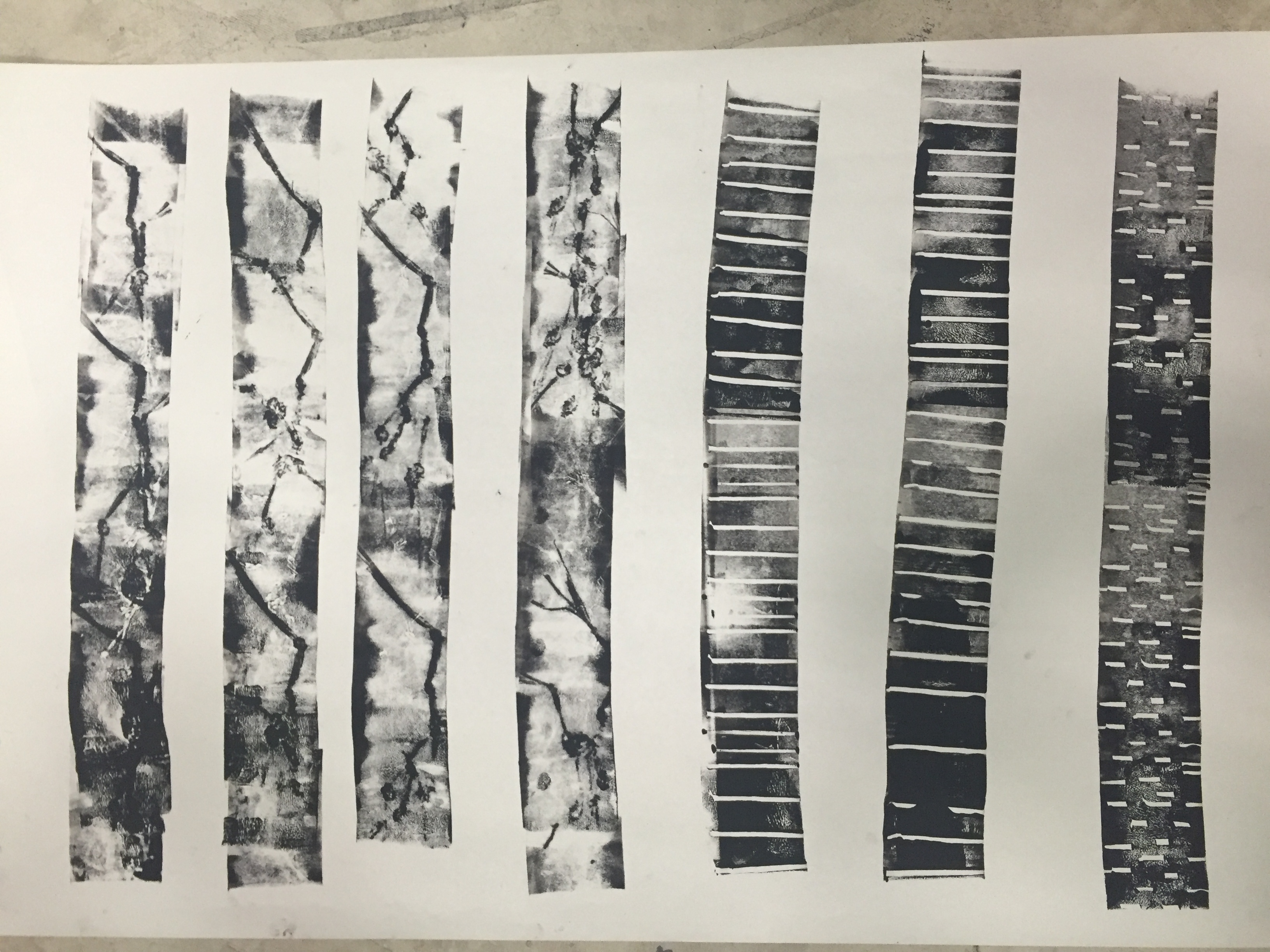
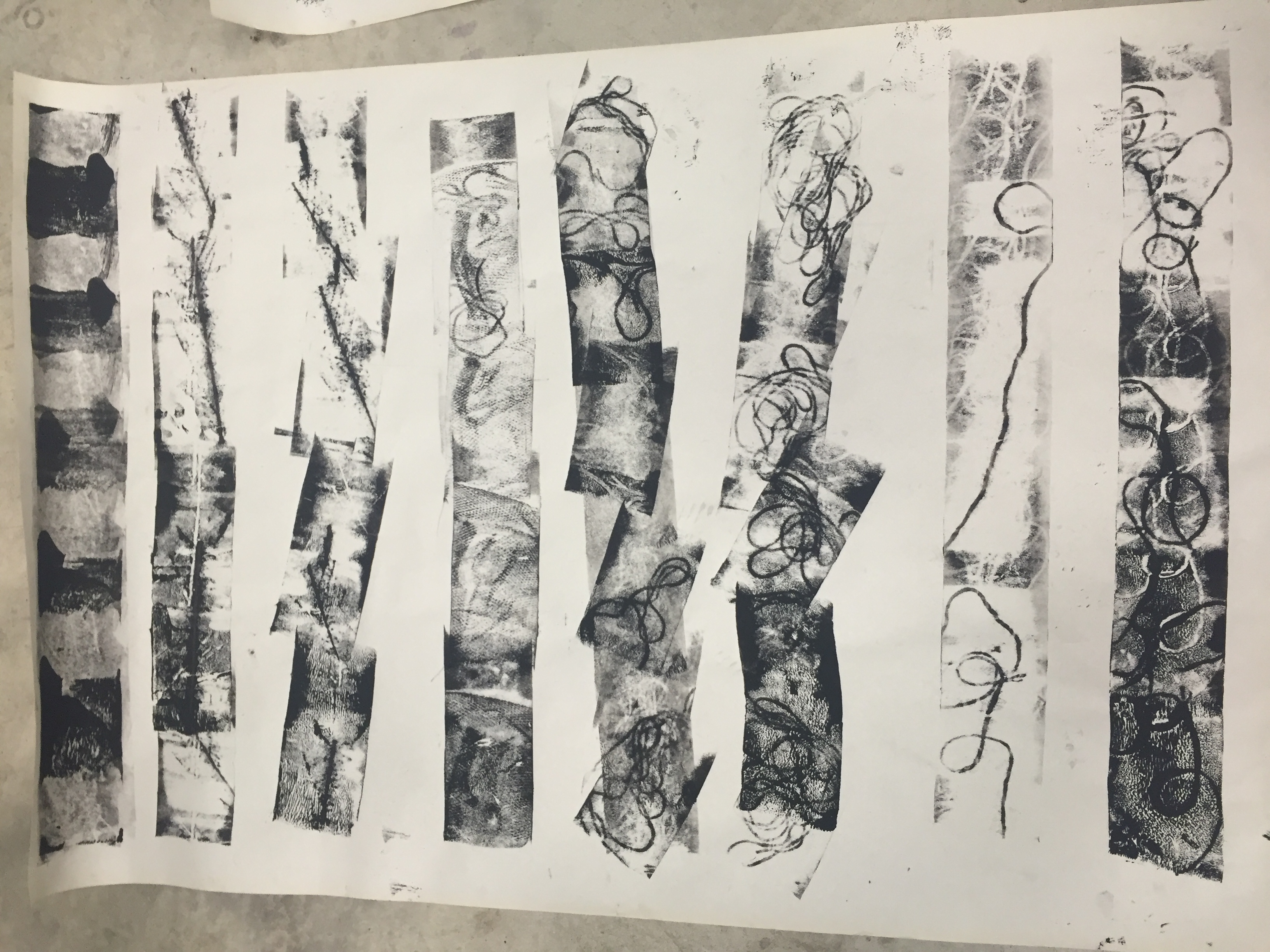
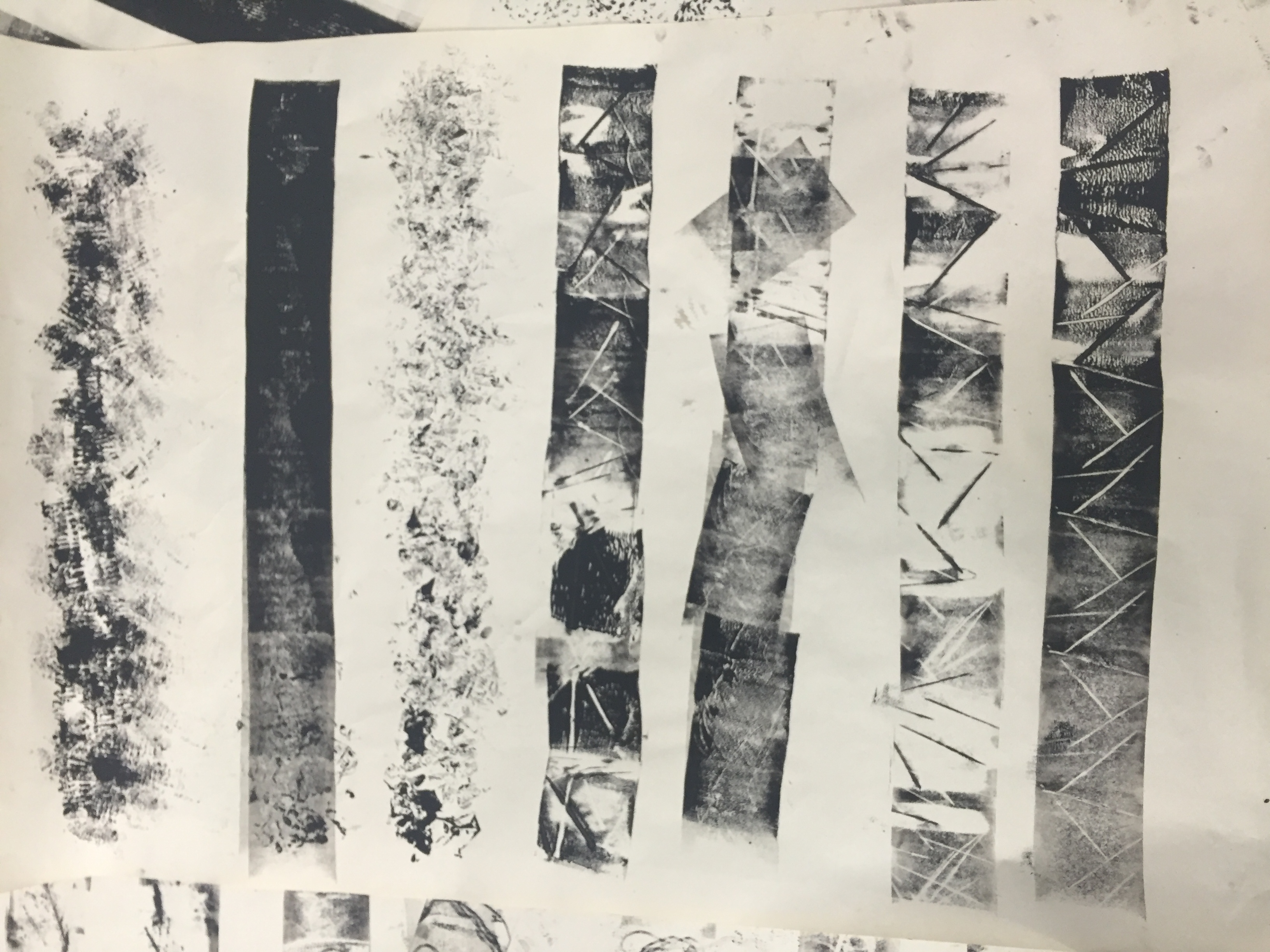
References


Final Pieces!
Me ( Uninspired)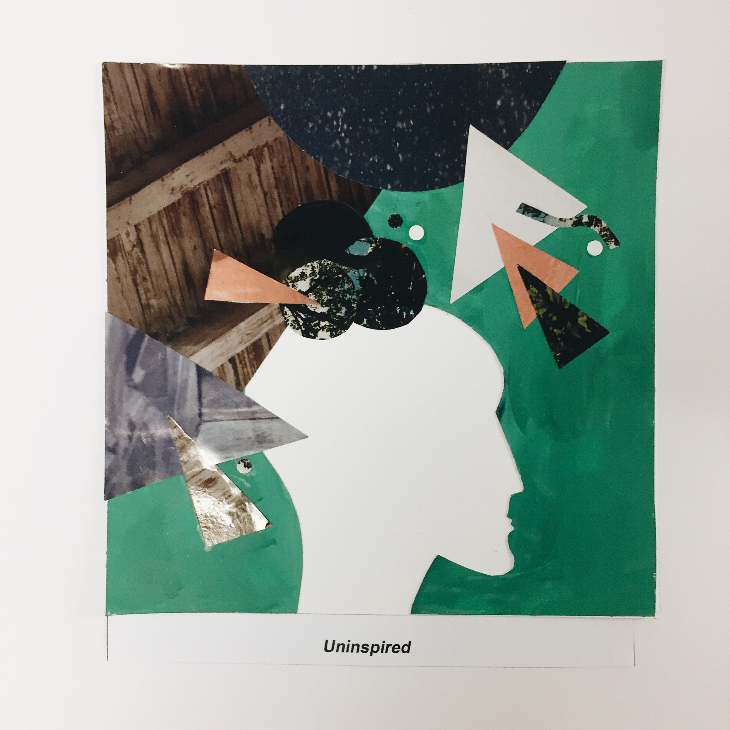
Setting ( Exploring New Places )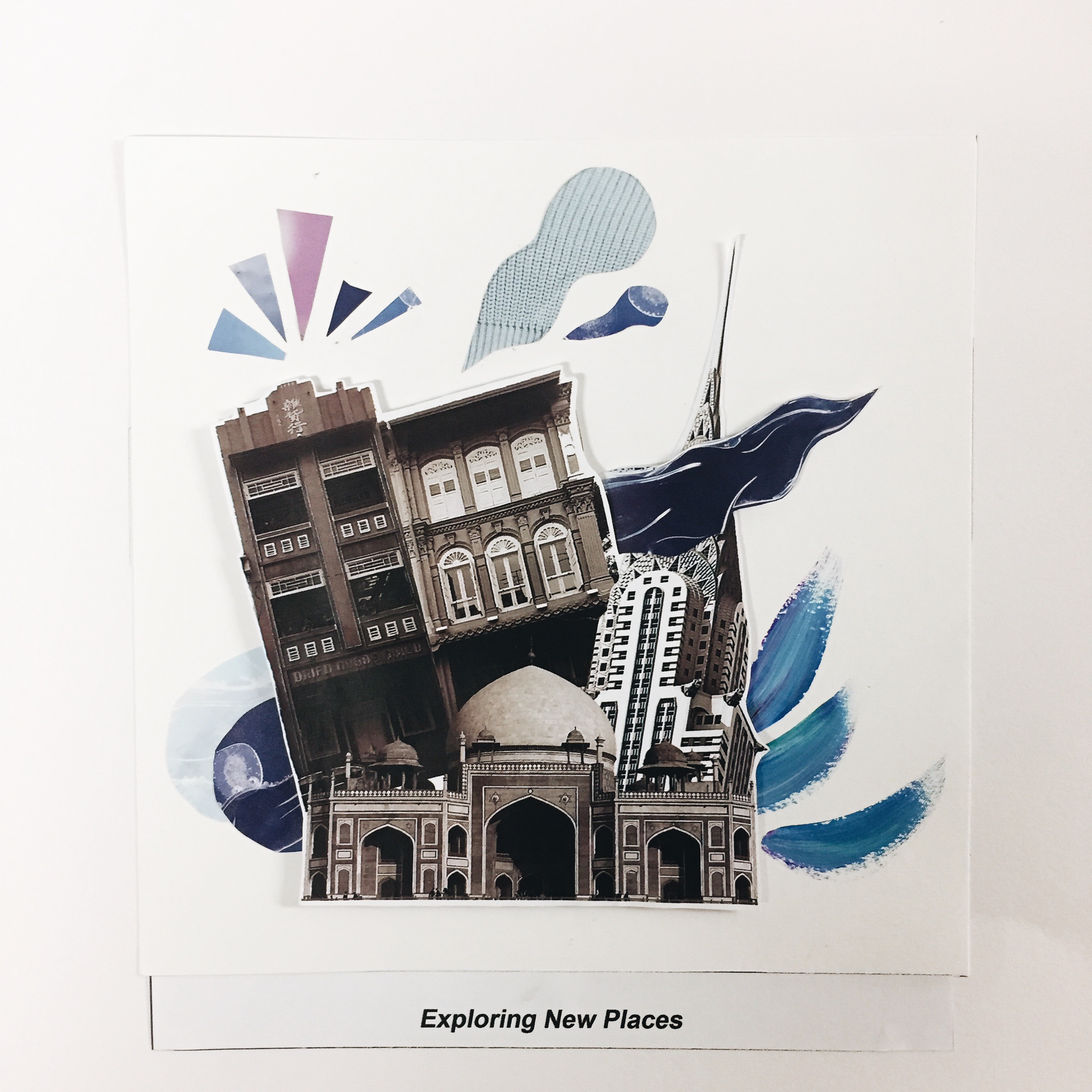
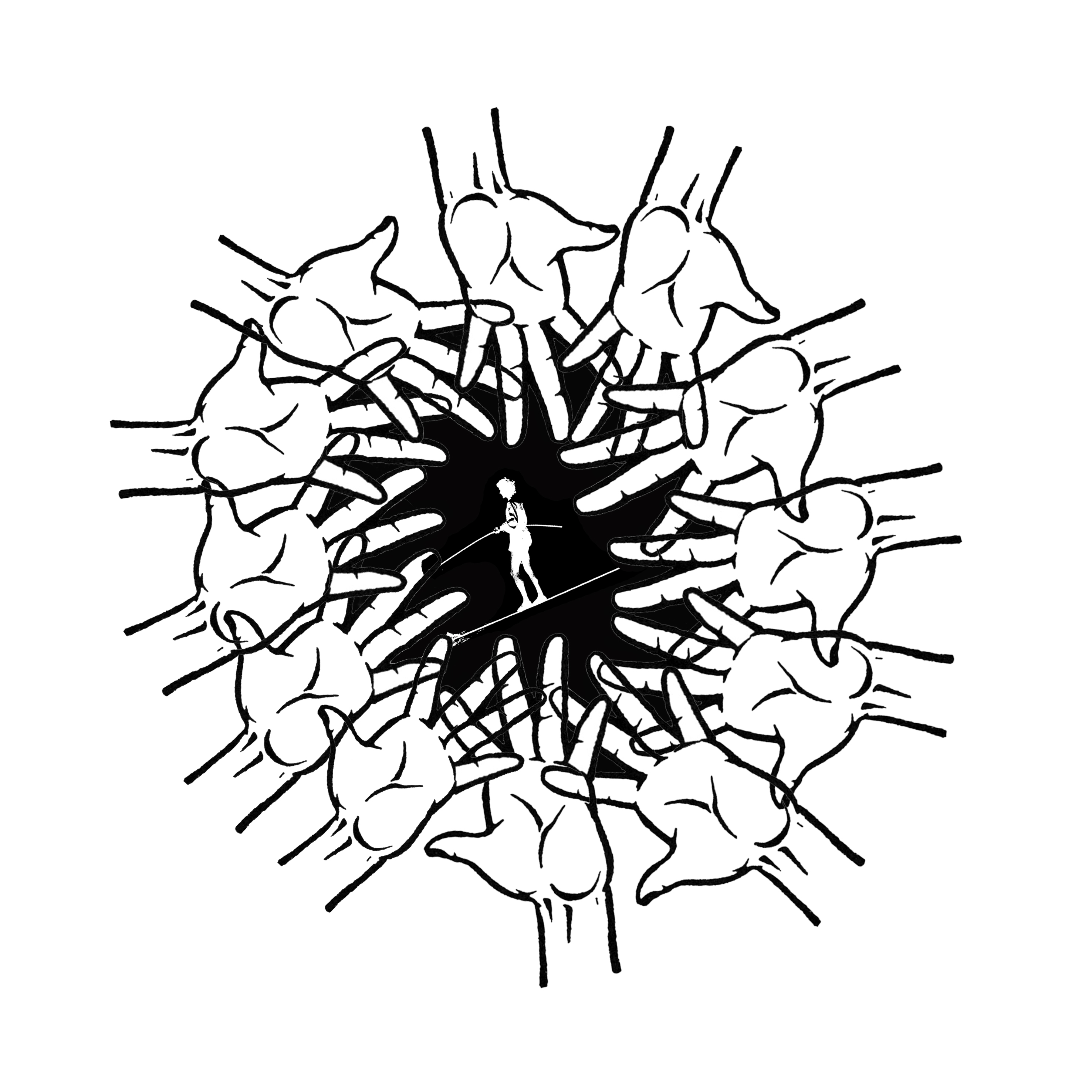
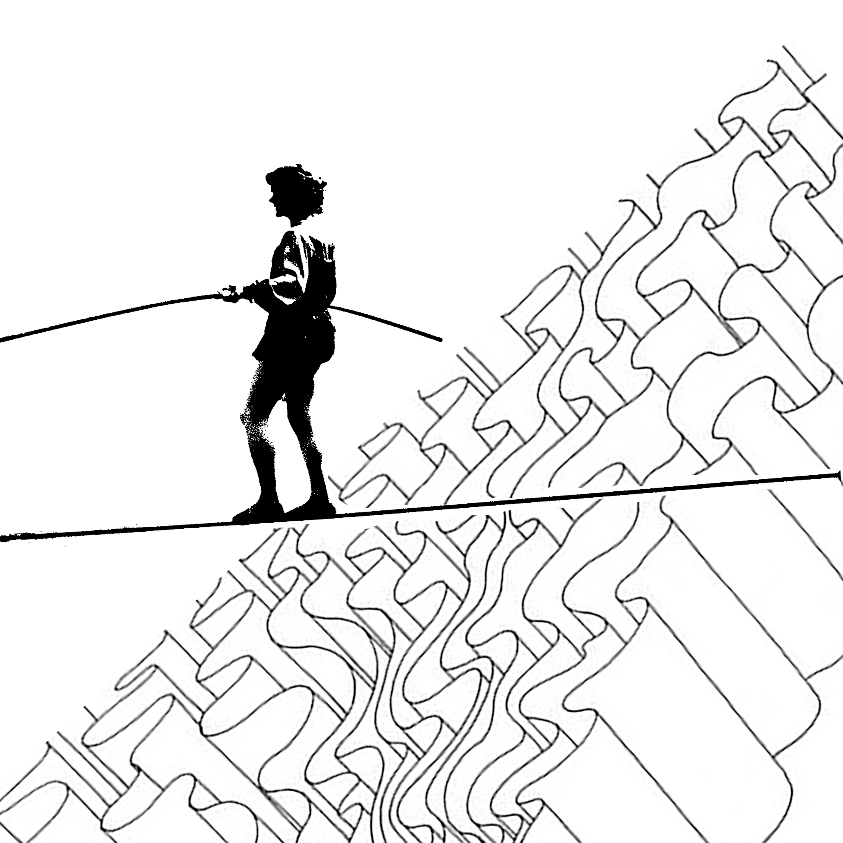
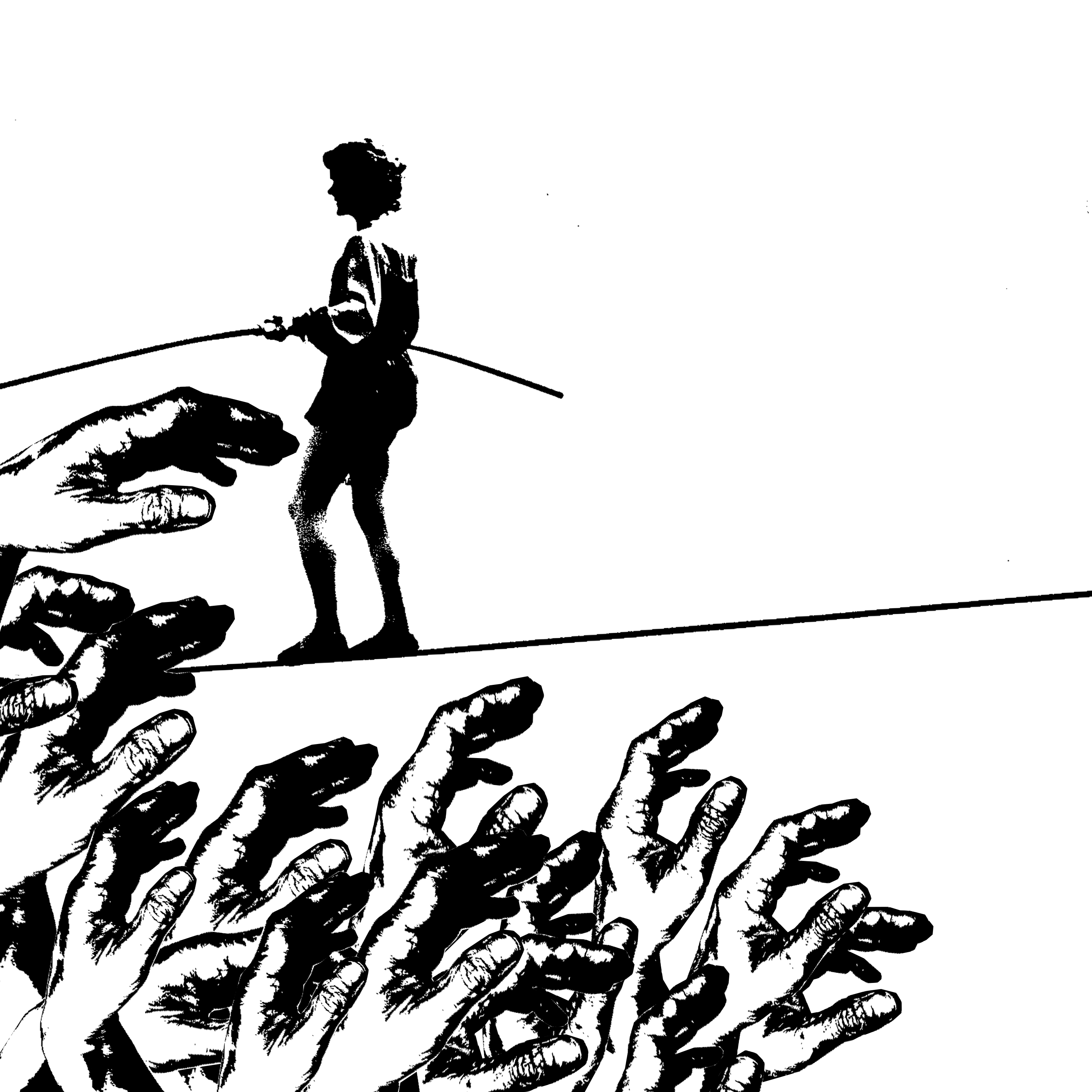
3. WITH STRANGERS+MEETING NEW PEOPLE=HESITANT
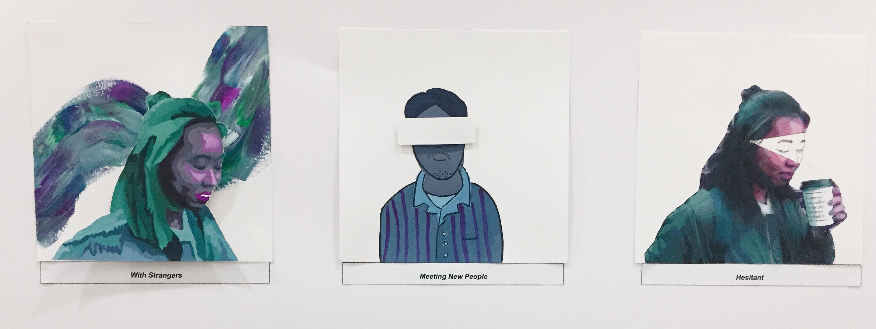
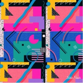
For this, I chose to use analogous colours such as blue, green and purple to create a serene and comfortable design. I also chose to use cooler tones to portray the idea of how much more introverted or not as expressive I am especially when I am meeting new people.
Me ( with strangers )

I posterized a picture of myself on photoshop and painted a self portrait using hues of purple, blue and green. I also added a touch of neon paint in my designs to further enhance the colours better. For the background I was inspired by the references below of using unmixed acrylic paint to create splashes of colour.
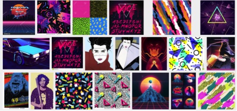
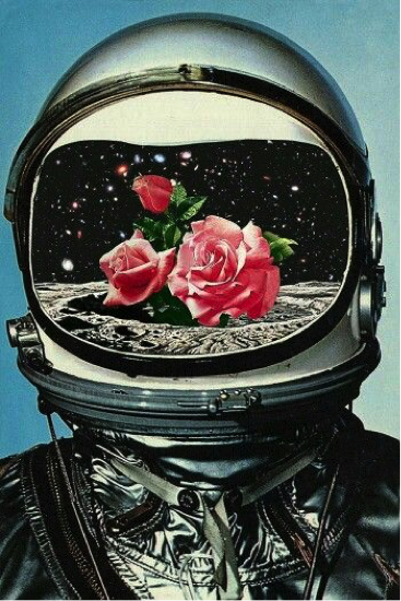
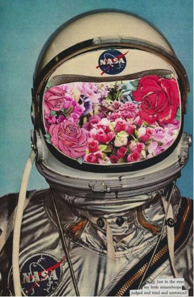
References


Setting ( Meeting New People )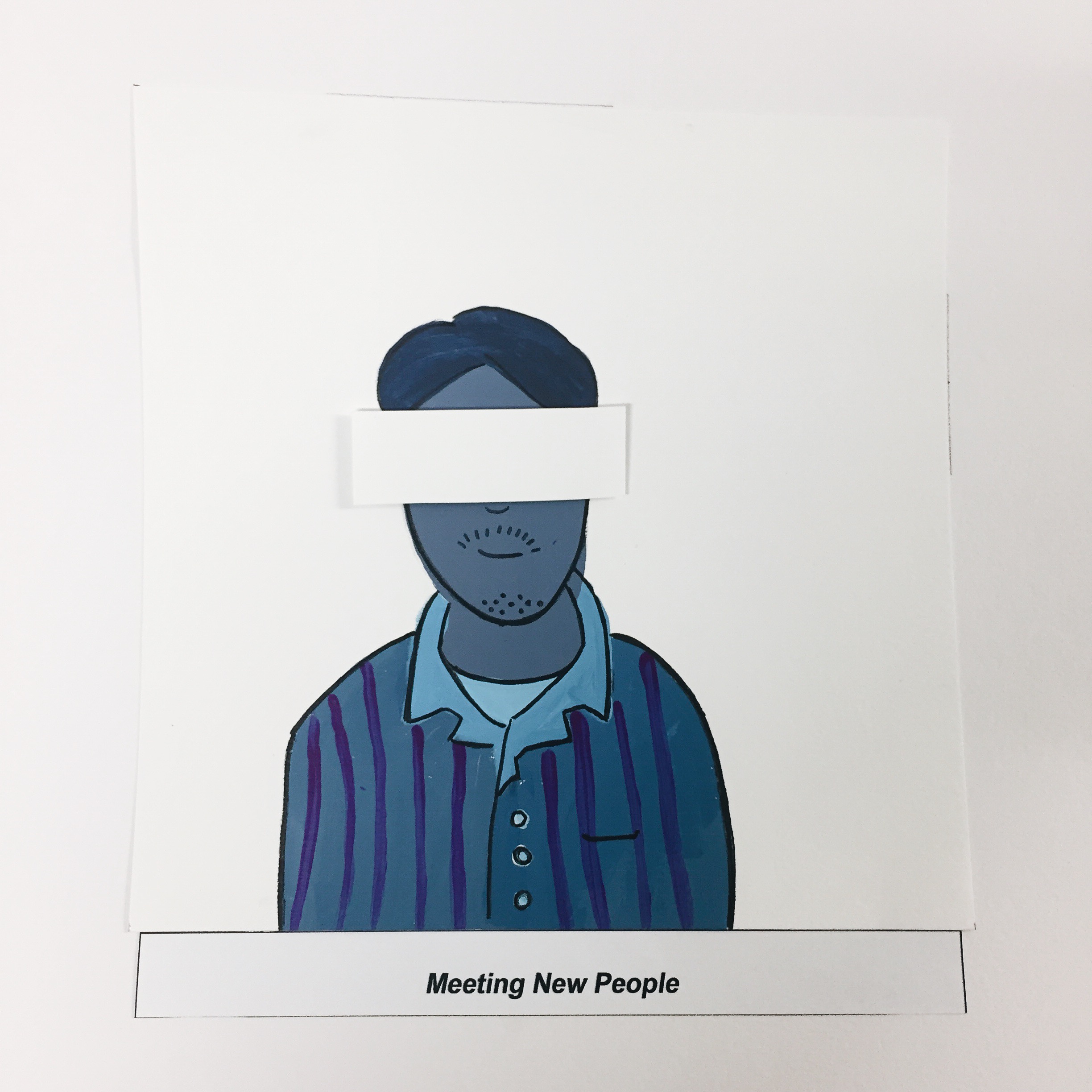
For the setting I decided to portray a person or “stranger” in a completely different style in contrast to the “me” to show the disparity when meeting a stranger. I also chose to block out his eyes as when you’re meeting a stranger, you know nothing about him or his identity. After putting the pieces though, I felt like maybe the style choice for this design was too much of a contrast and the piece as a whole kind of lose its cohesiveness. But I guess this is a learning point for me to take note of in future projects.
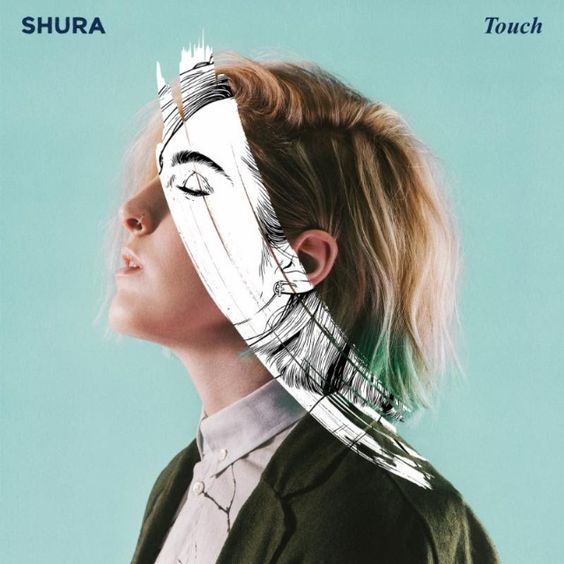
Outcome ( Hesitant )
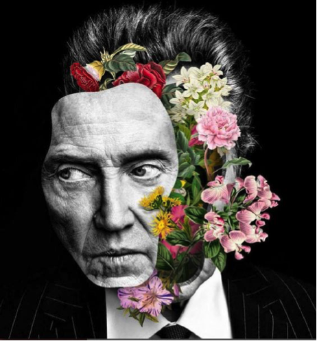
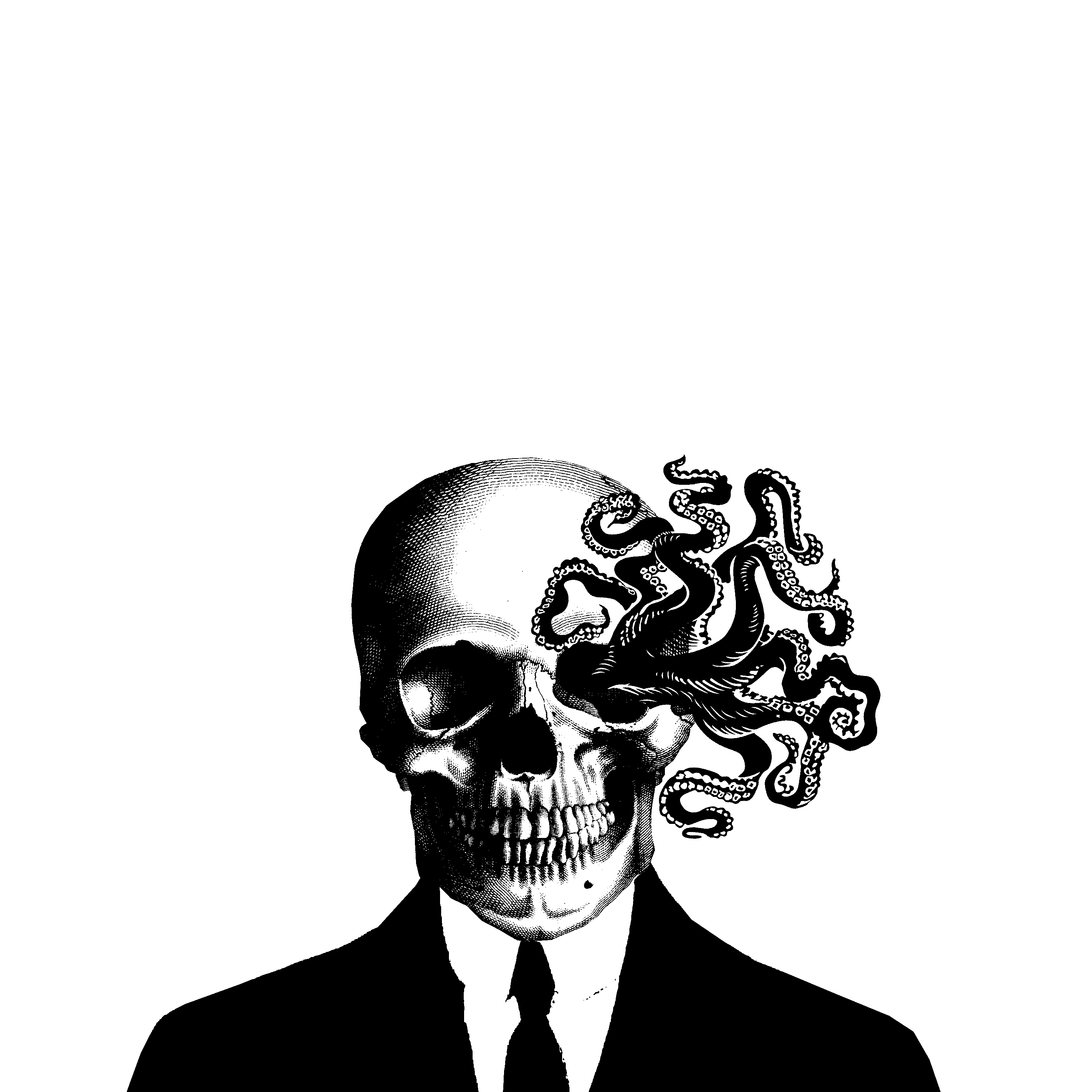
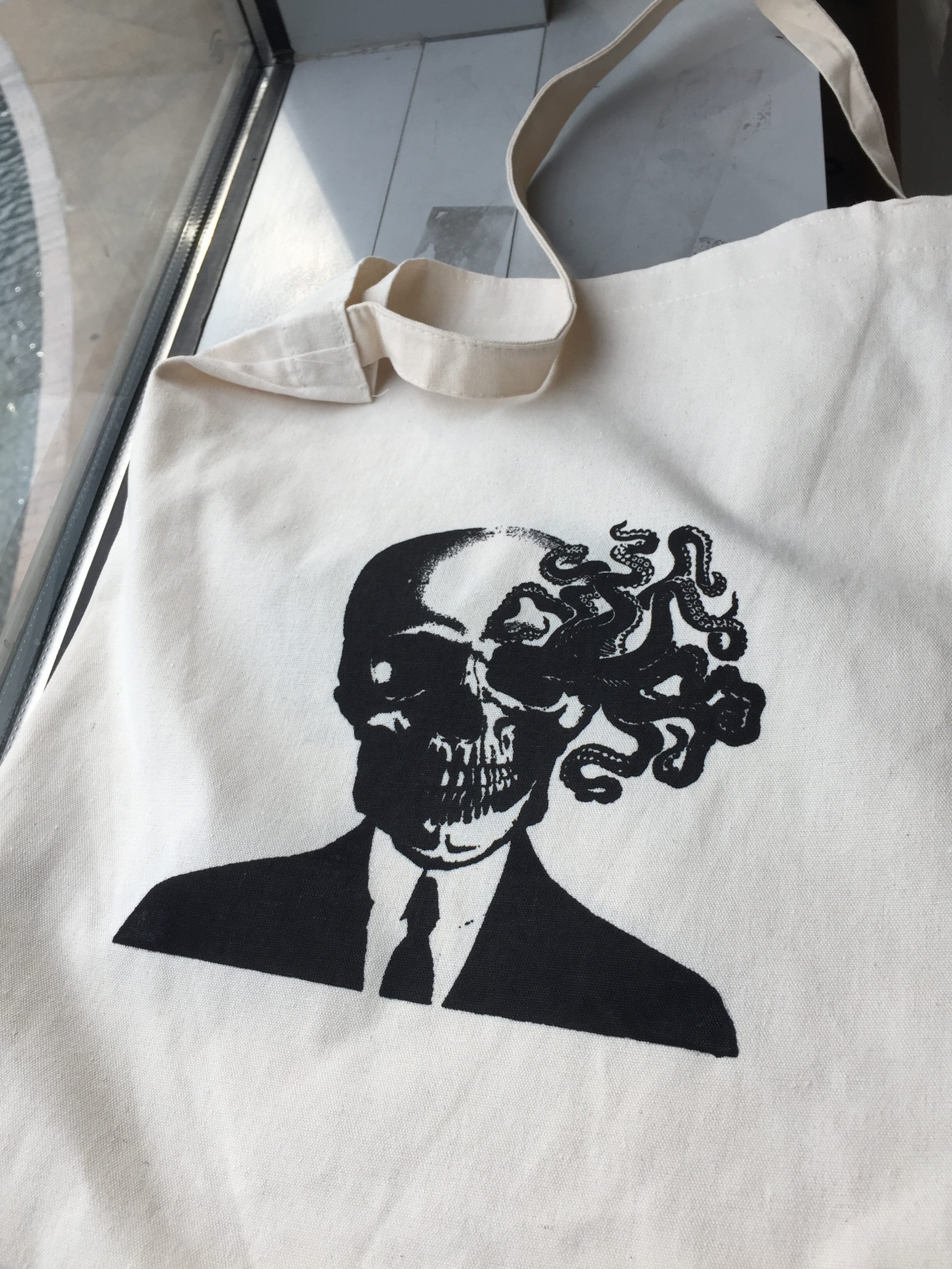
When meeting a stranger, I would feel hesitant to be myself hence, only a small part of my true self is revealed as seen above. I got inspired by this idea from Shura’s album cover which I thought was quite an interesting idea of incorporating b&w with a real photo.
References
4. WITH FRIENDS+ MEETING UP WITH FRIENDS= COMFORTABLE
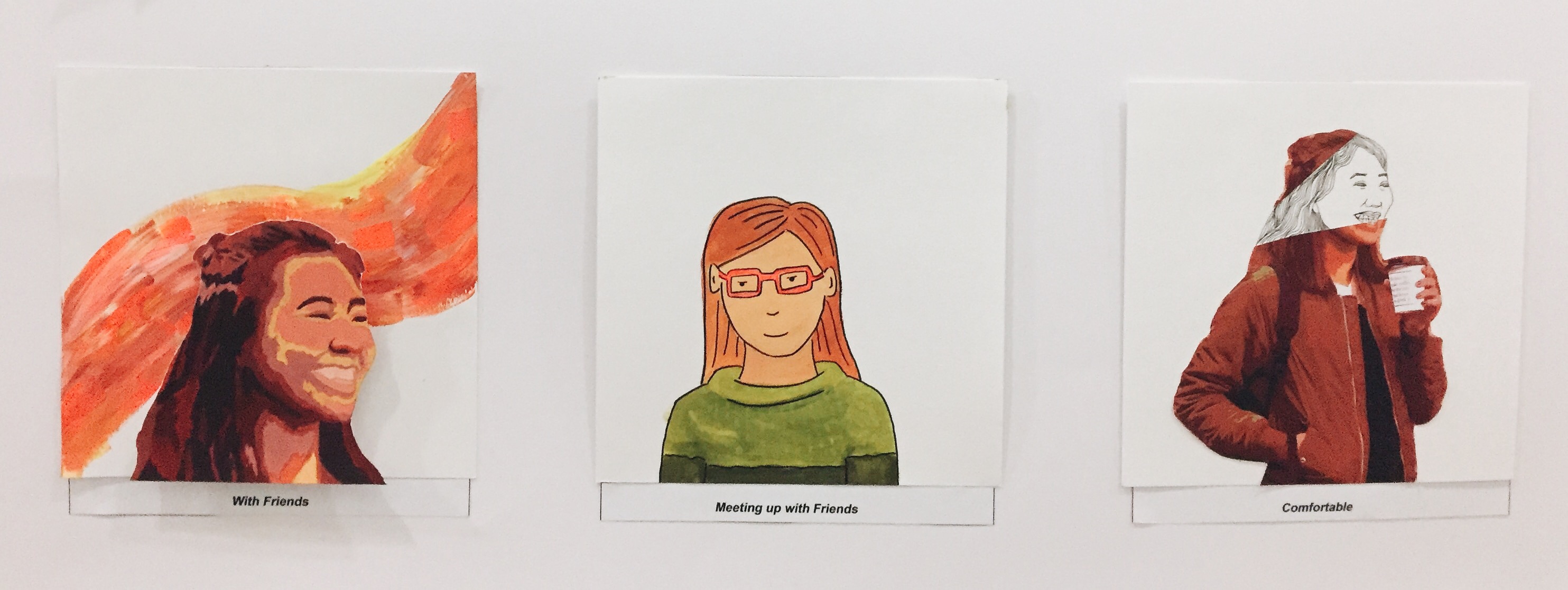
This is in contrast with my previous row but with friends. I chose to use warmer analogous colours such as red, orange and yellow as with friends, I feel more comfortable in my own skin.
Me ( With Friends )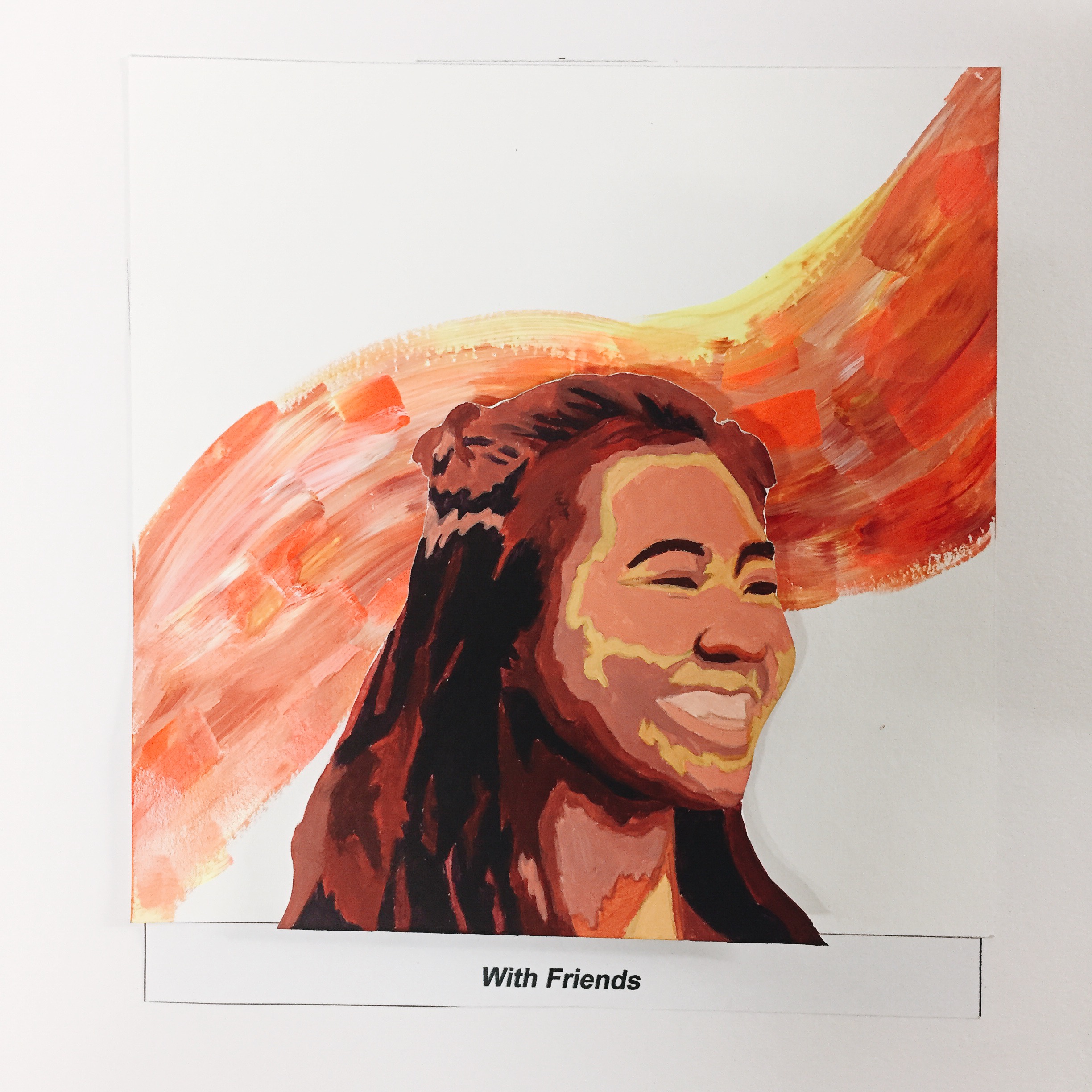
Setting ( With Friends )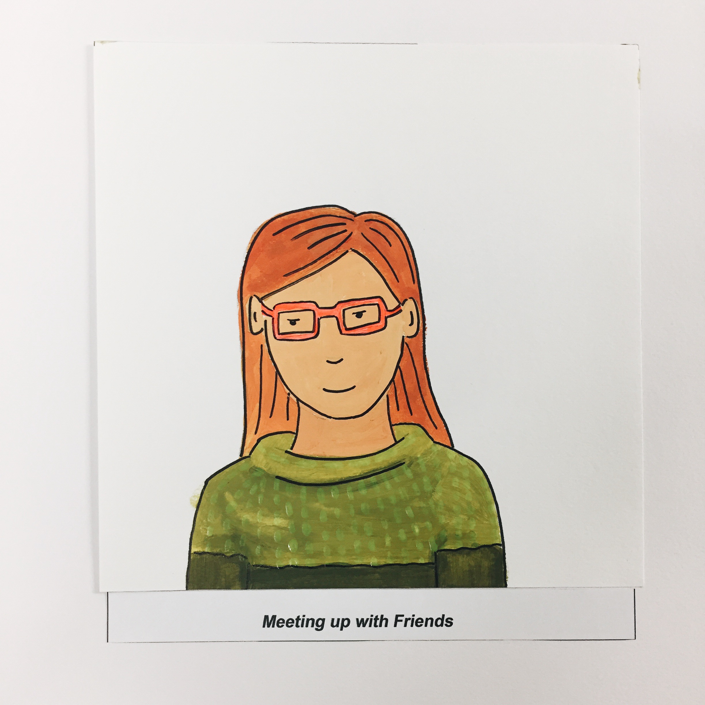
Outcome ( Comfortable )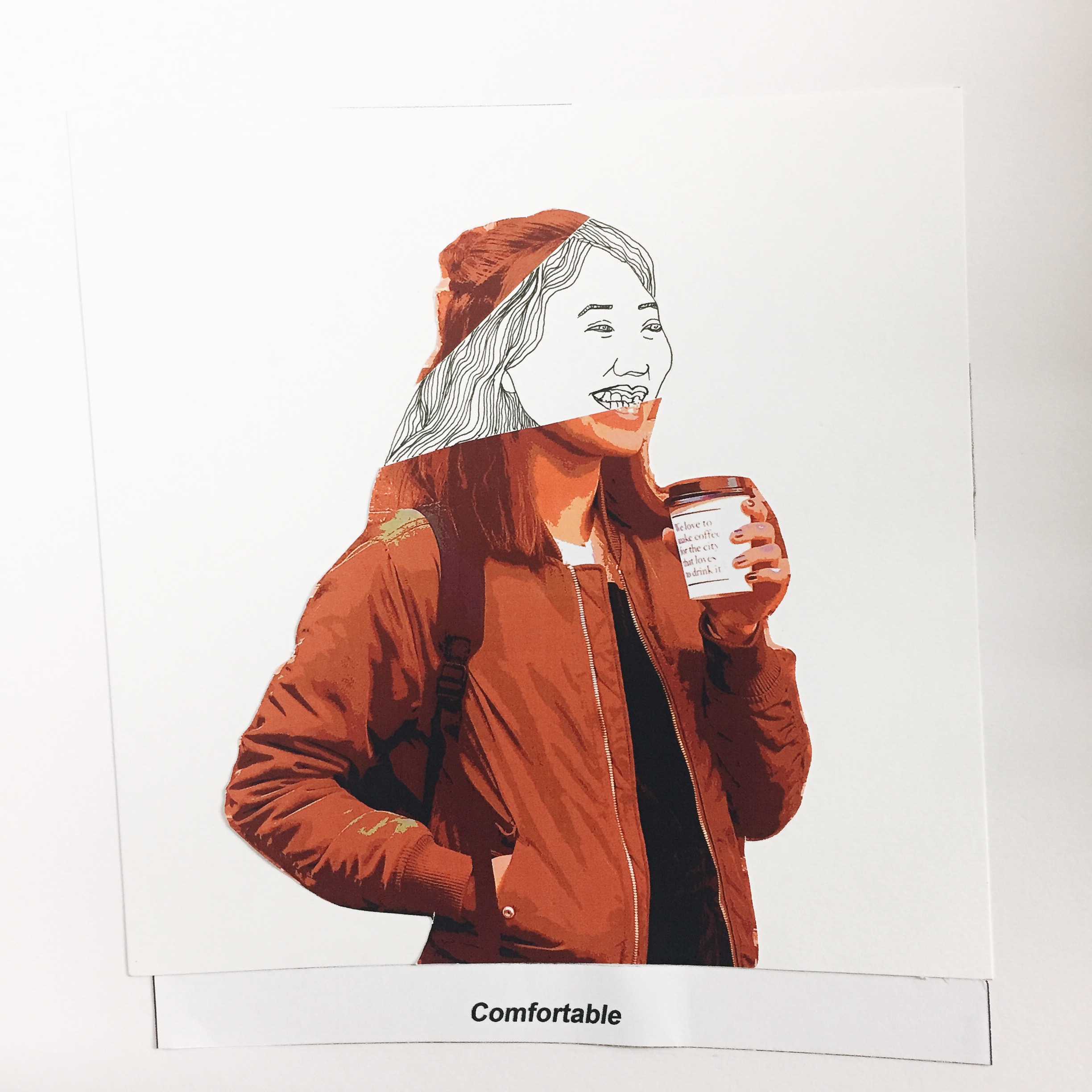
A larger part of my true self is revealed when I am with my friends.
FINAL DESIGNS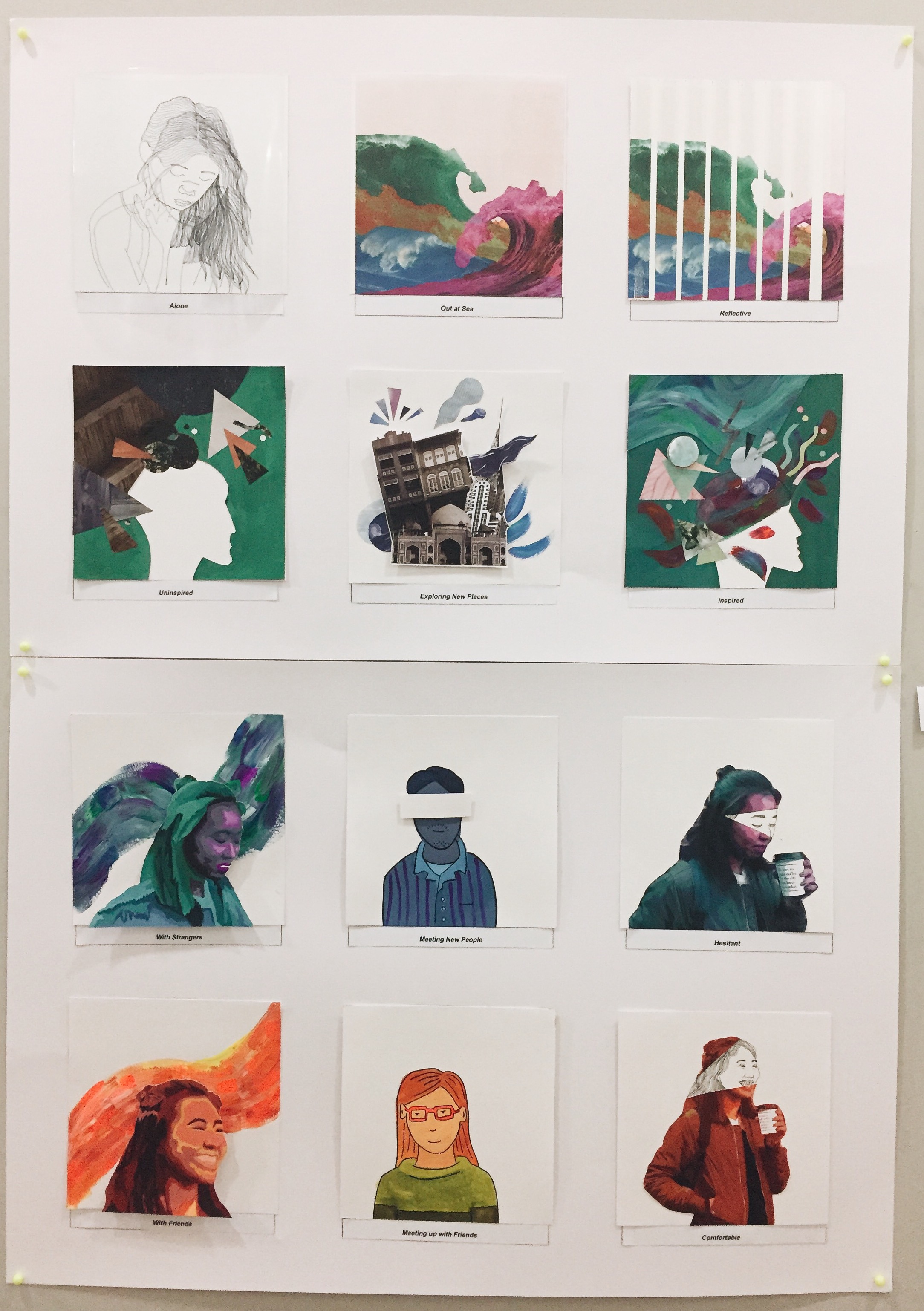
REFLECTION
This project has mostly been experimental for me with the use of colours, collage, paint and different mediums which are all a first for me. I think there is definitely a lot to learn from this project and Im excited to apply these techniques learned again in future projects with perhaps some digital painting involved. I have definitely learned and experimented a lot which i feared would cost the style to become inconsistent. I guess it is all part of the learning process and I am glad I took the risk to try things I never thought I would have attempted.


