This project really taught me a lot and gave me the chance to experiment with different mediums. It has also taught me to improvise a lot and to be more open minded when things don’t always go according to plan. This project has also been rather frustrating at times when ideas I had in mind didn’t always go according to plan or turn out the way I envisioned it to be. I learned more about expressing ideas visually through typography especially after looking at my friend’s works, I learned more about the different techniques they used and improvements I could make for future projects. Overall, this project has been rather fulfilling and I’m pretty satisfied with how my designs turned out 😀
To start off this project, I first listed out a few jobs I had in mind and what type of characteristics these jobs entailed.
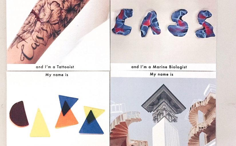
In the end, I narrowed it down to these few
Designer
Architect
Tattooist
Marine Biologist
I was able to come up with a few ideas fairly quickly but it was the execution that would become the problem. After my first consultation, Joy also suggested that I have an over arching theme amongst all of my jobs to bring about a deeper meaning into my designs. I went with the idea of stereotypes of each occupation which I will elaborate on further in this post.
These are a few shots of my initial ideas:
Developments
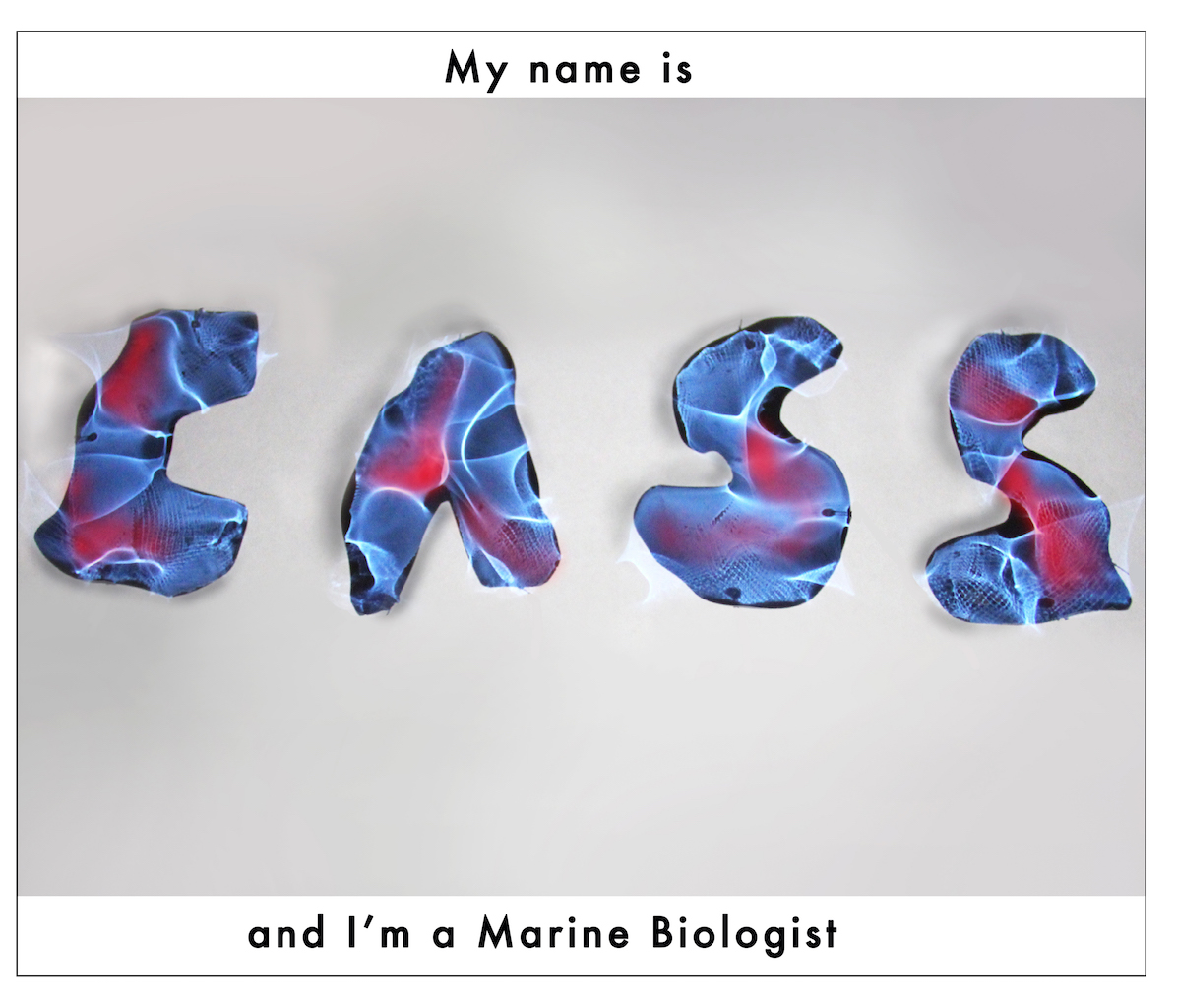
Marine Biologist
What do they do?
study all types of sea creatures
learning and research field, work with other universities and educational institutes
compiling research data, publish journals
workplace:
oceanography centres, travelling to interesting places
tide pool, swamp, mangrove, coral reef
out at sea for an extended period of time, diving
stereotypes:
dangerous
no social life, lack social or practical skills
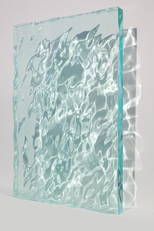
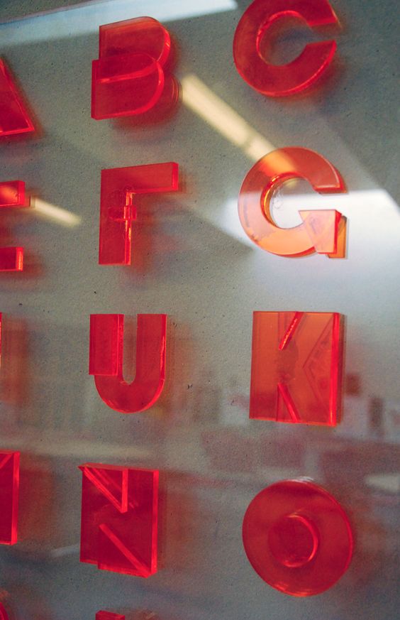
I was inspired by these works by Sophia Collier and Kate Jackling as mentioned in my previous post.
Work by Sophia Collier
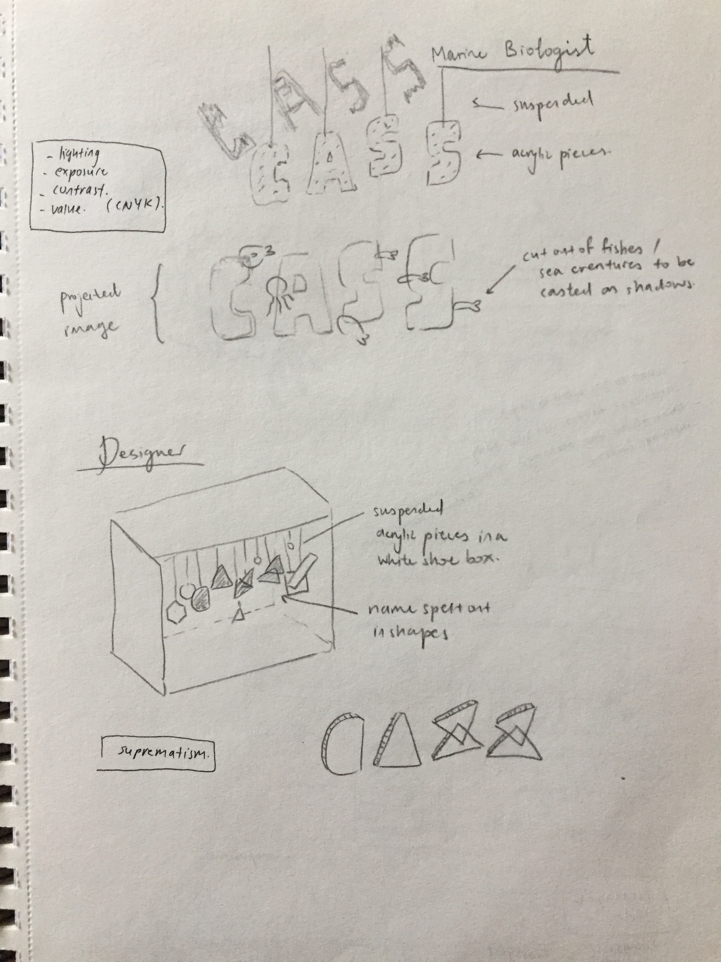
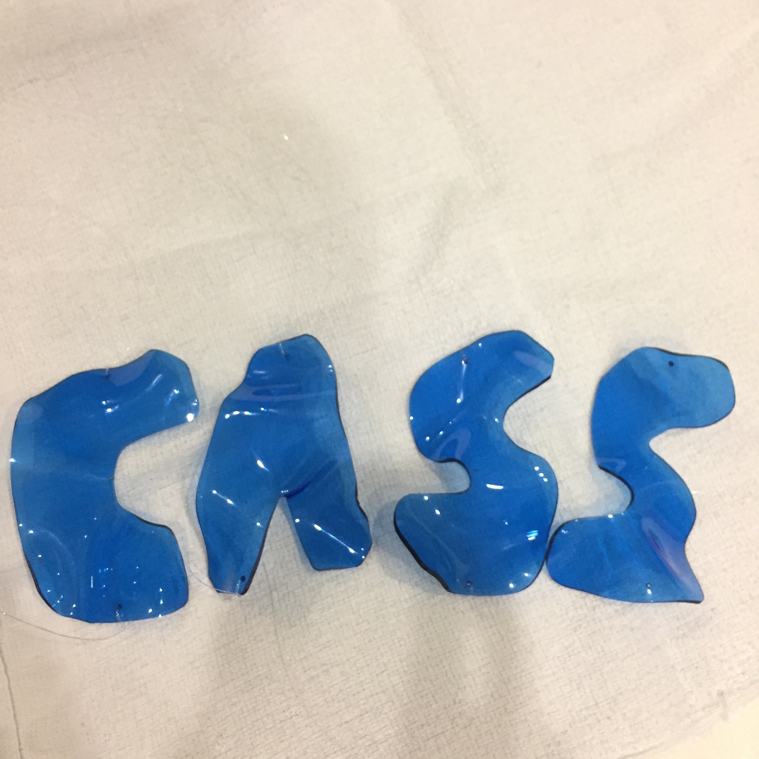
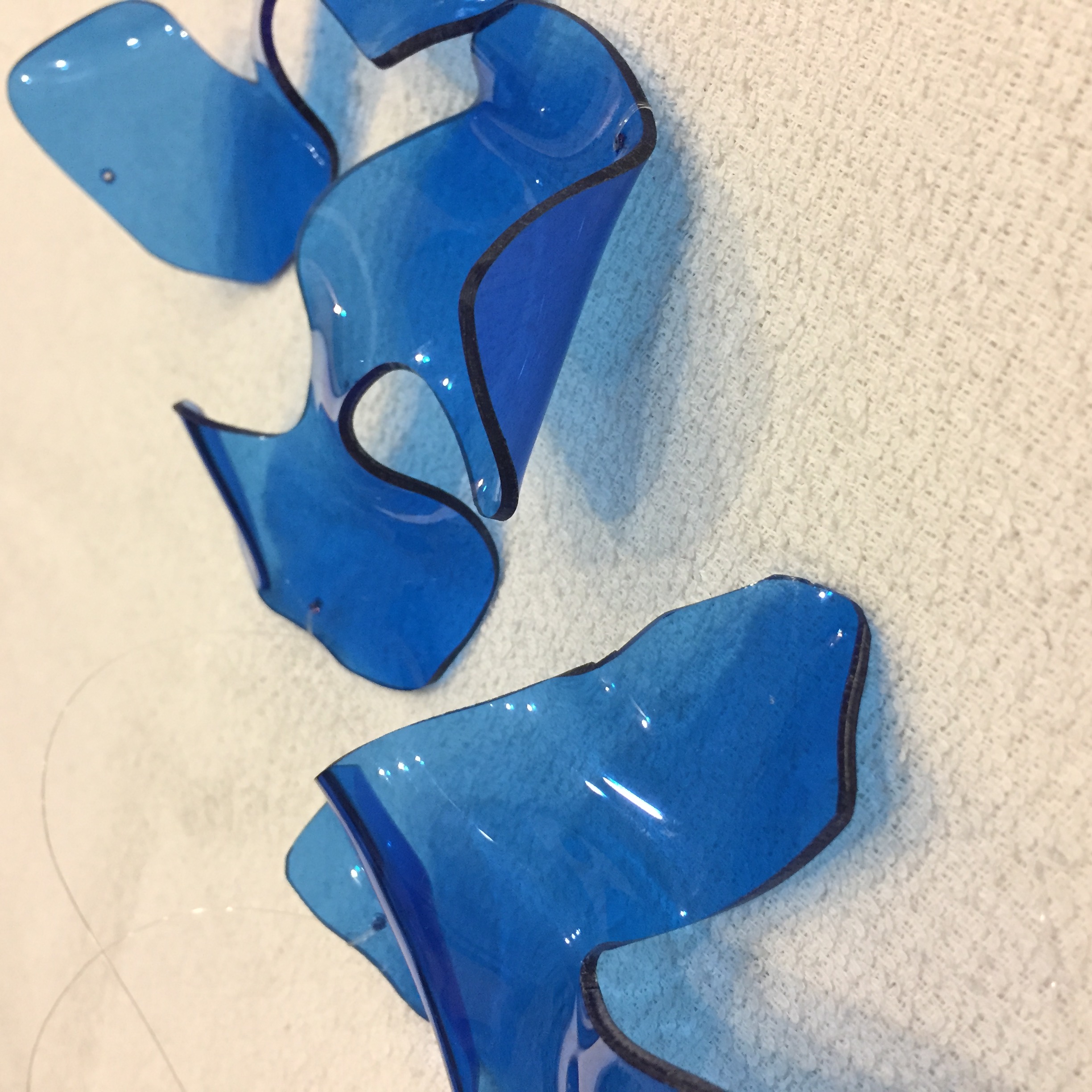
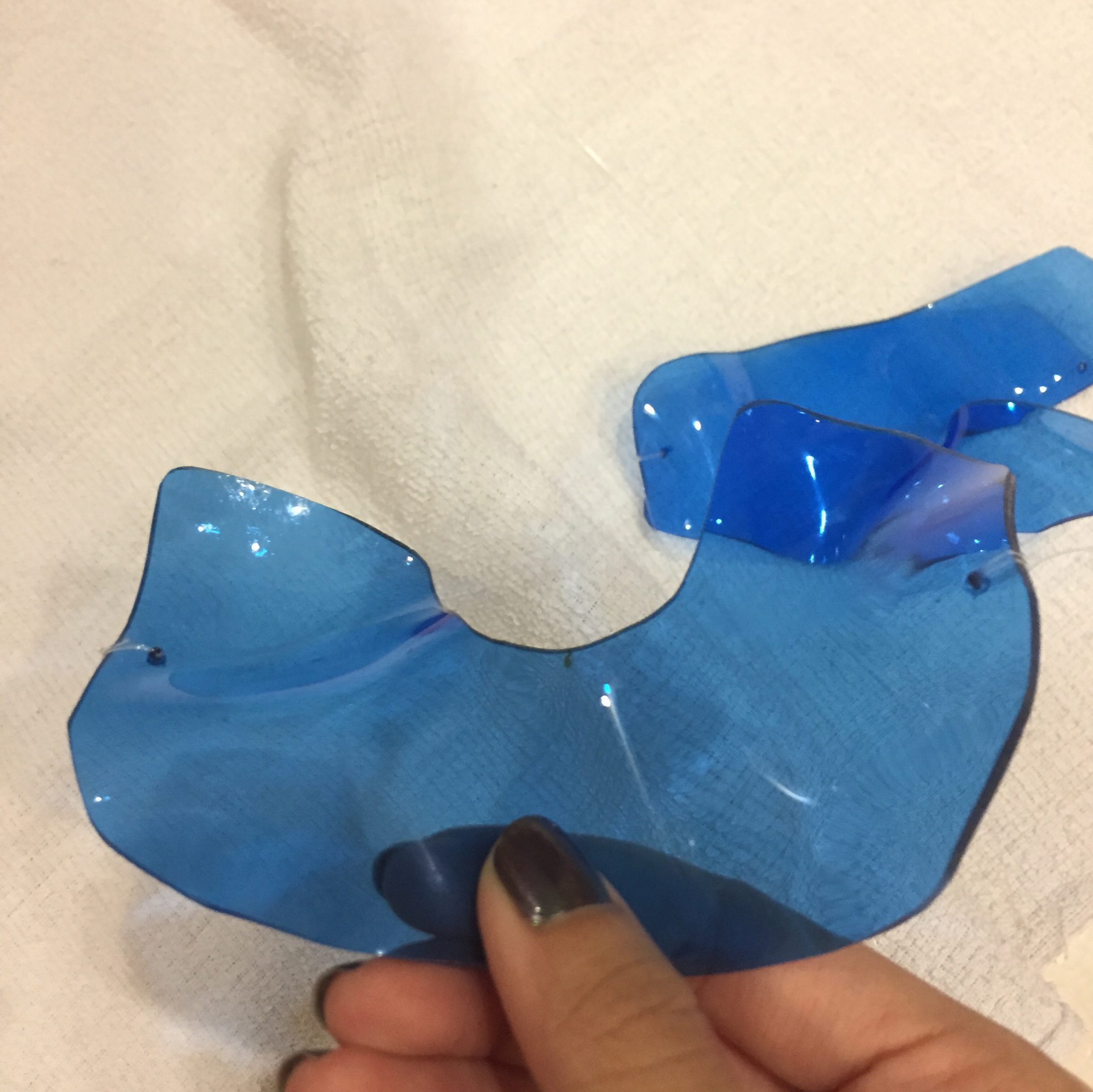
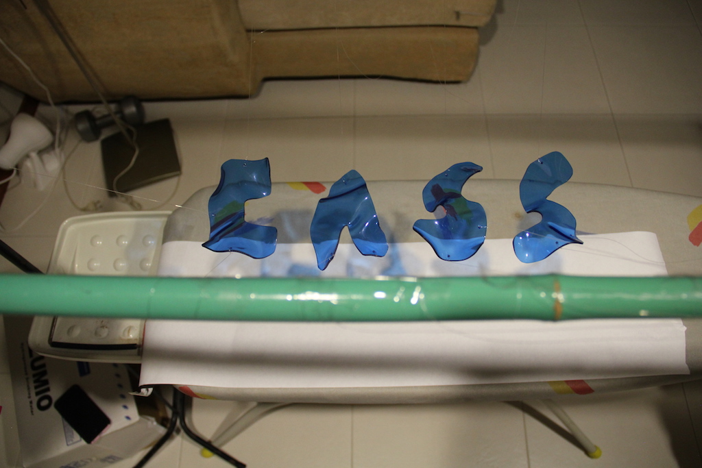
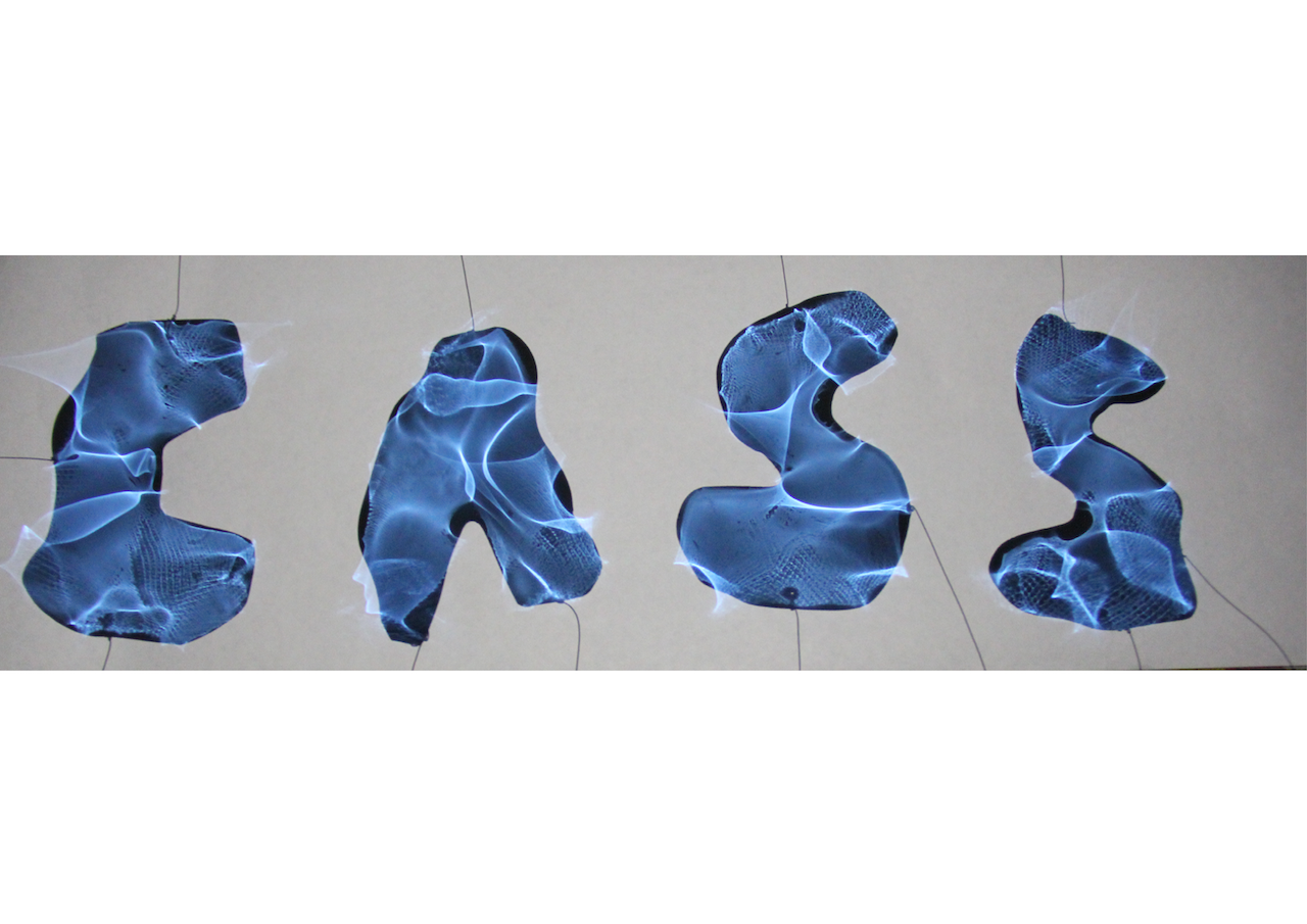
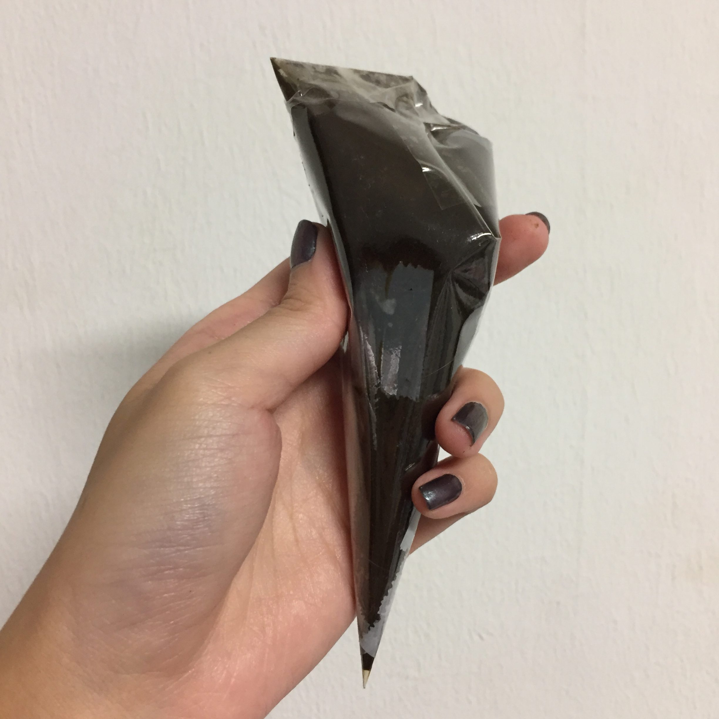
I got the idea to use acrylic pieces in the shape of my initials and warp it to give it that water shadow effect which I felt fits my occupation as a marine biologist constantly out at sea and studying marine life.
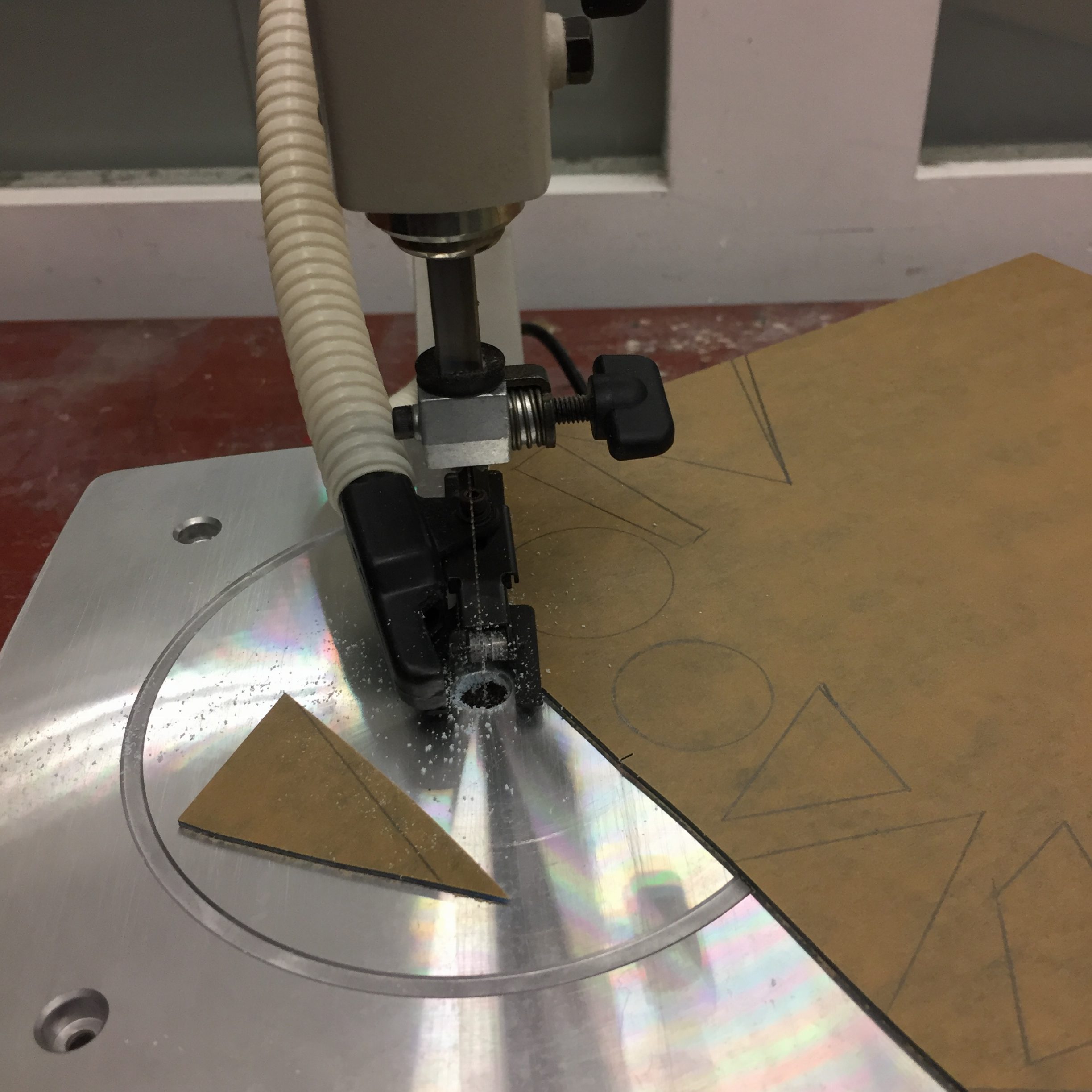
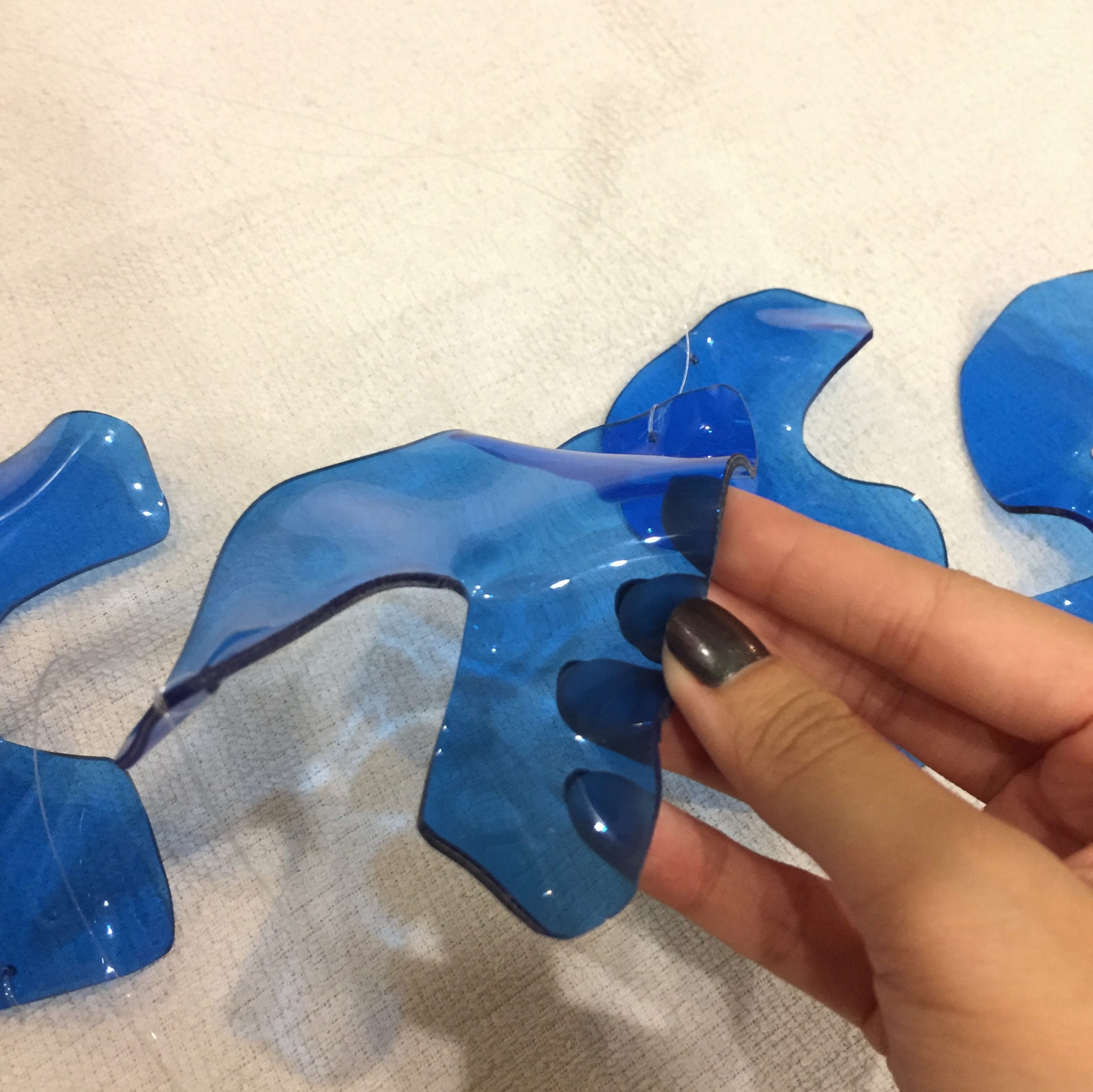
Using the scroll saw from the 3D room, I was able to cut the acrylic pieces into the desired shapes. However, cutting along the lines proved to be very difficult because the blade was hard to control and turn. After cutting the pieces, I used a hot gun to melt the plastic and warp the letters.
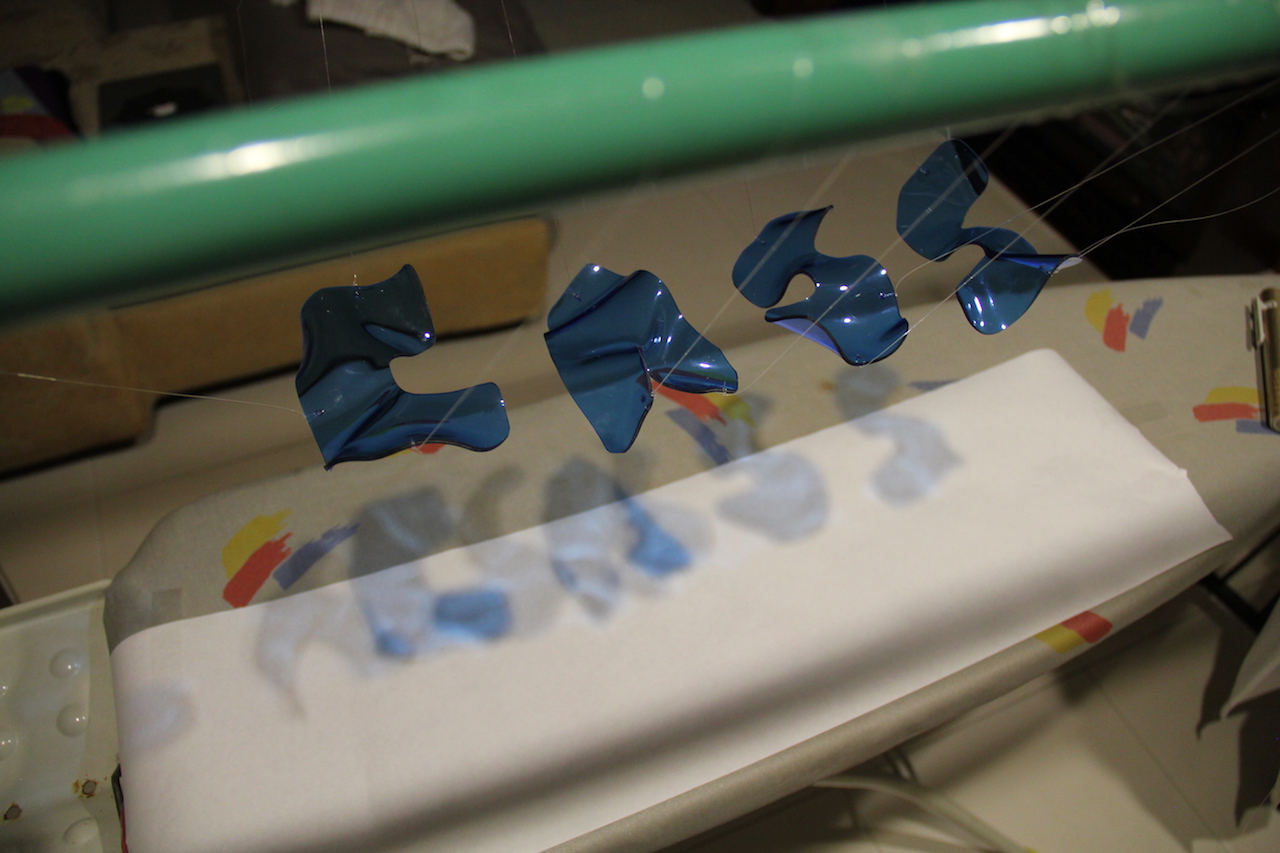
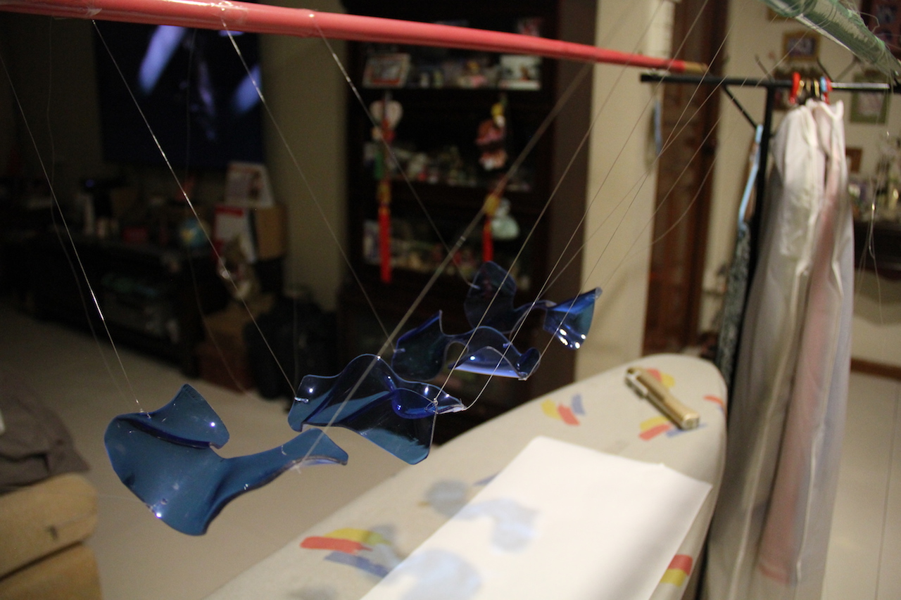
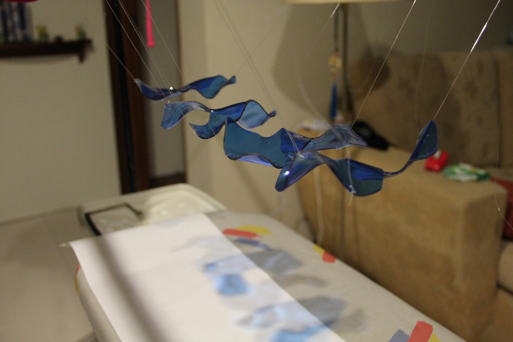
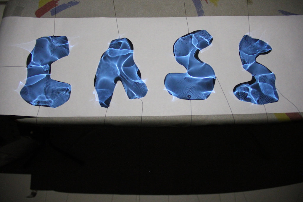
Using 2 bamboo poles and an ironing board for leverage, I tried to suspend the acrylic pieces using nylon strings to cast a shadow on a plain surface.
Image of shadow casted when a light source is shone on it.
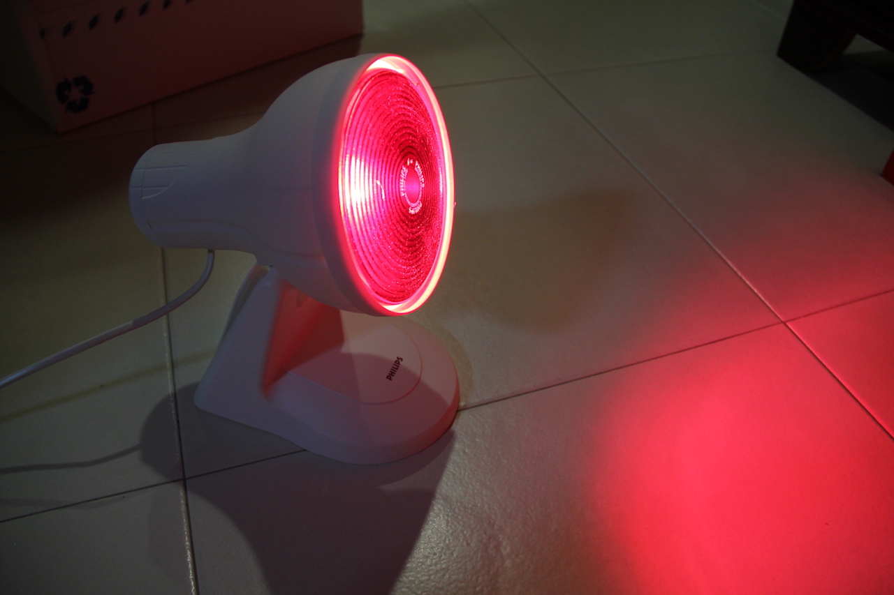
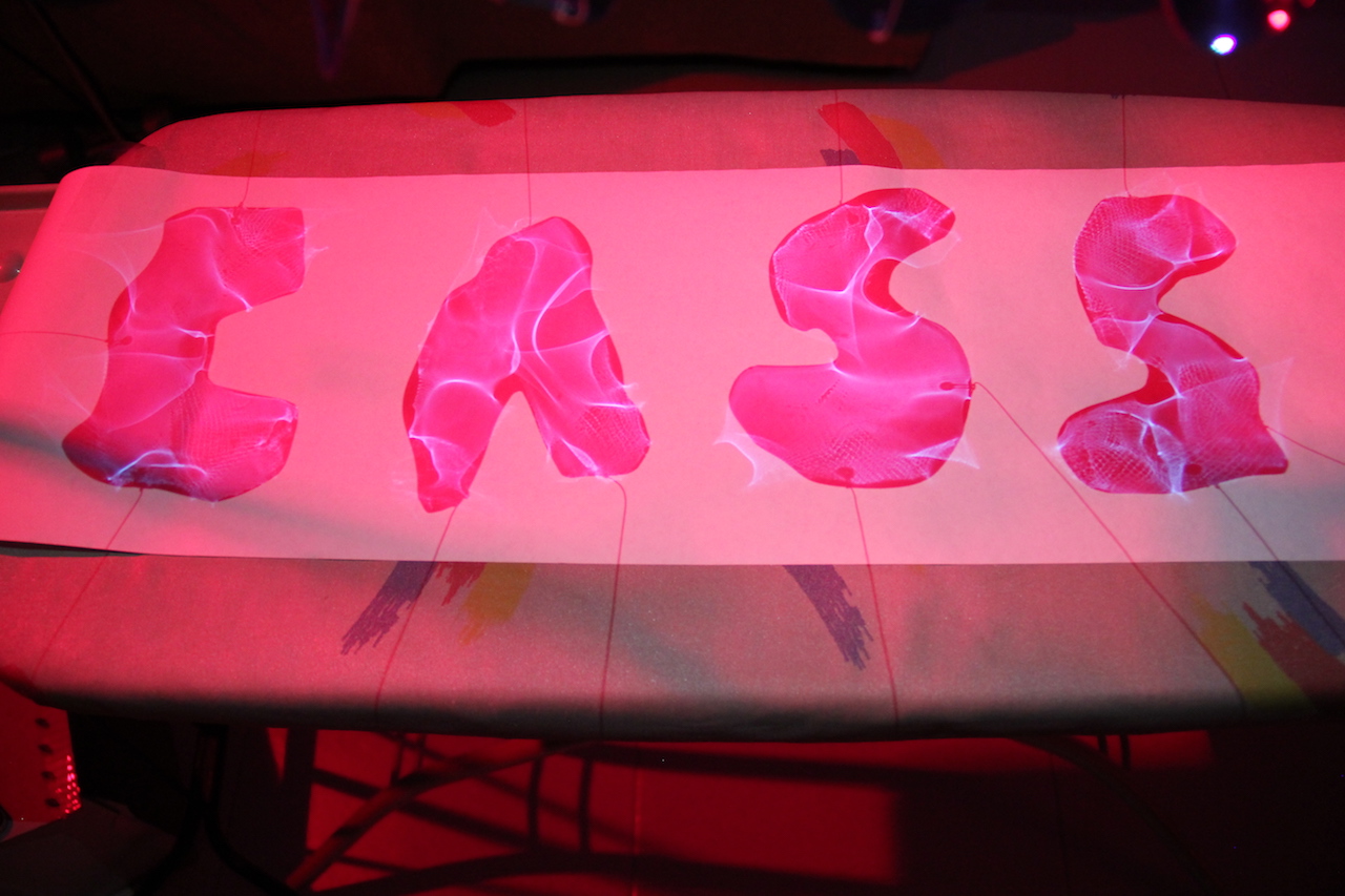
I also tried to play around with red light to bring the element of “danger” in my design ( a common stereotype of marine biologists ).
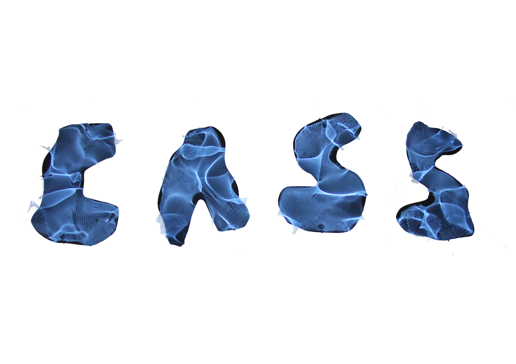
However, the desired effect was difficult to achieve and the red light ended up washing off most of the blue shadow. Hence, I decided to photoshop in the “blood” instead.
This was the original picture taken before edit.
Photoshopping away the background from the original picture proved to be very difficult without losing some of the reflectiveness of the letters as seen from the picture above. The clean white background also made the letters look flat and the edges sharp.
After consultation and advice from my peers, I decided to retain as much of the original picture as possible by keeping the grey ish background and adding a bit of a drop shadow to make the letters stand out more. I also adjusted the blue to bring out as much of the light details as possible. Using a brush tool, I brushed on some blood to illustrate the danger element in my design as a Marine Biologist is often considered a dangerous occupation with long hours out at sea.
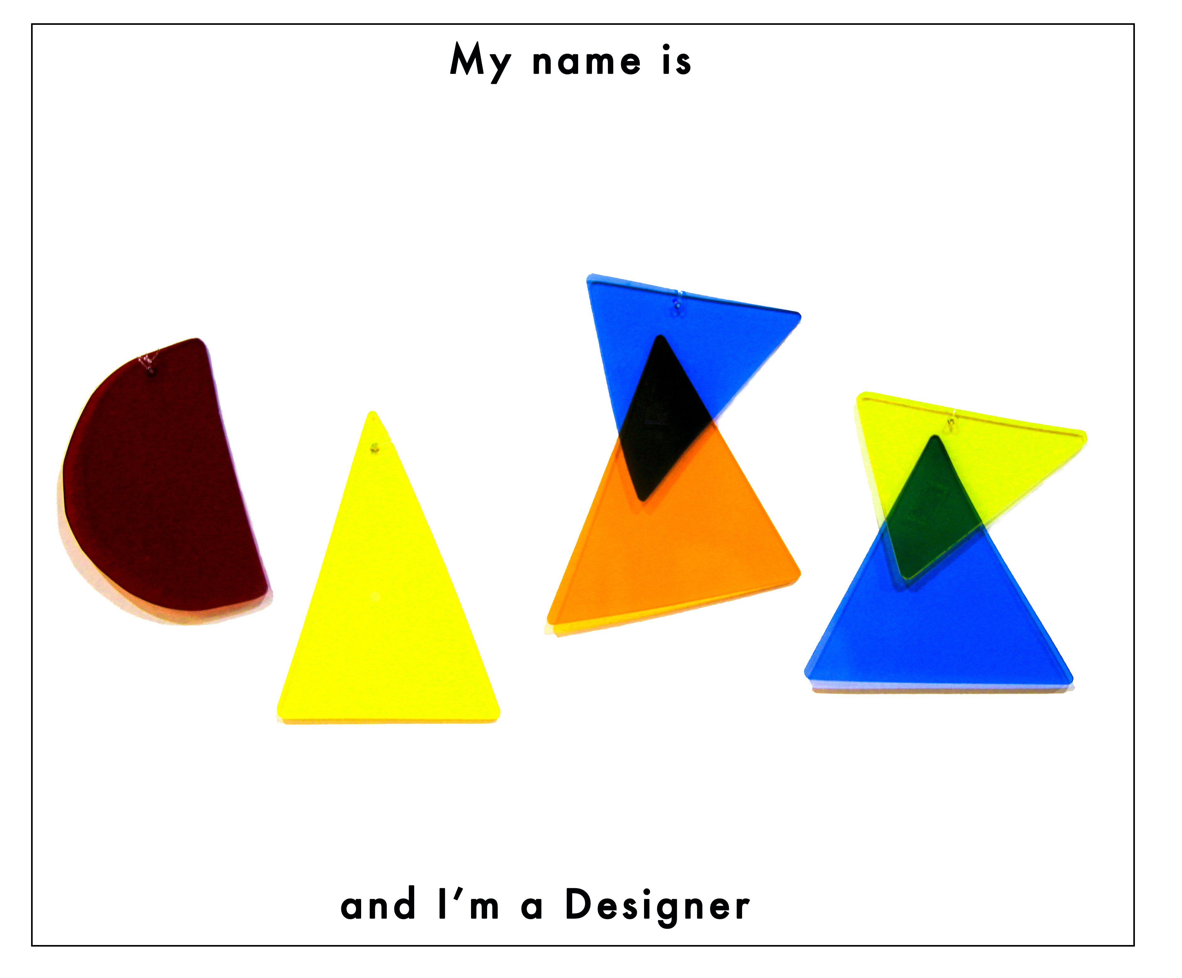
Designers
Stereotypes:
messy
hard to succeed in Singapore, unappreciated
open-minded, “carefree”
easier compared to other occupations such engineers
The stereotype I decided to go with was how designers are often misunderstood as being an “easy” and “simple” job, that they do not have it as hard as other occupations. As an art student, I often hear remarks that my course was fun and easier compared to my peers who were in business or engineering because of the lighter workload and the fact that we don’t have much written assignments or a final exam. However, they fail to see the effort behind each design we come up with. All the research and process put in to convey a message through visuals. I believe that design isn’t just about the aesthetics and looking good, it is delivering a message or story well. A successful aesthetic design is one that delivers the message well while utilising good principles of design.
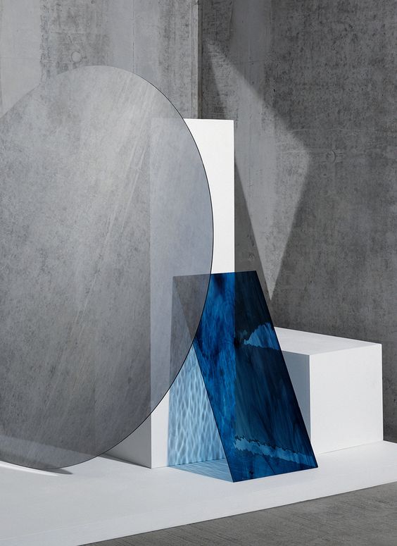
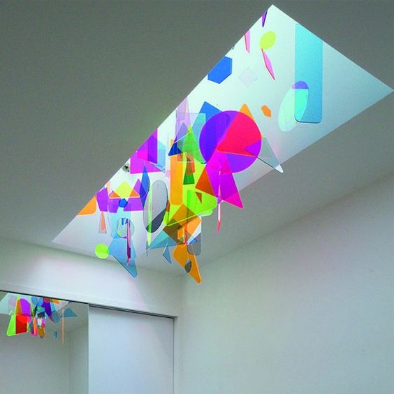
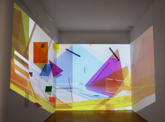
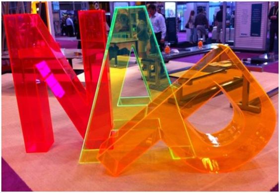
I was inspired by this installation by Inès Esna with the use of geometric shapes.
installation by Inès Esna
I also looked into the Suprematism movement and their use of geometry in the compositions. I wanted a clean minimal look in my design to bring across the idea of simplicity using basic shapes and primary colours.
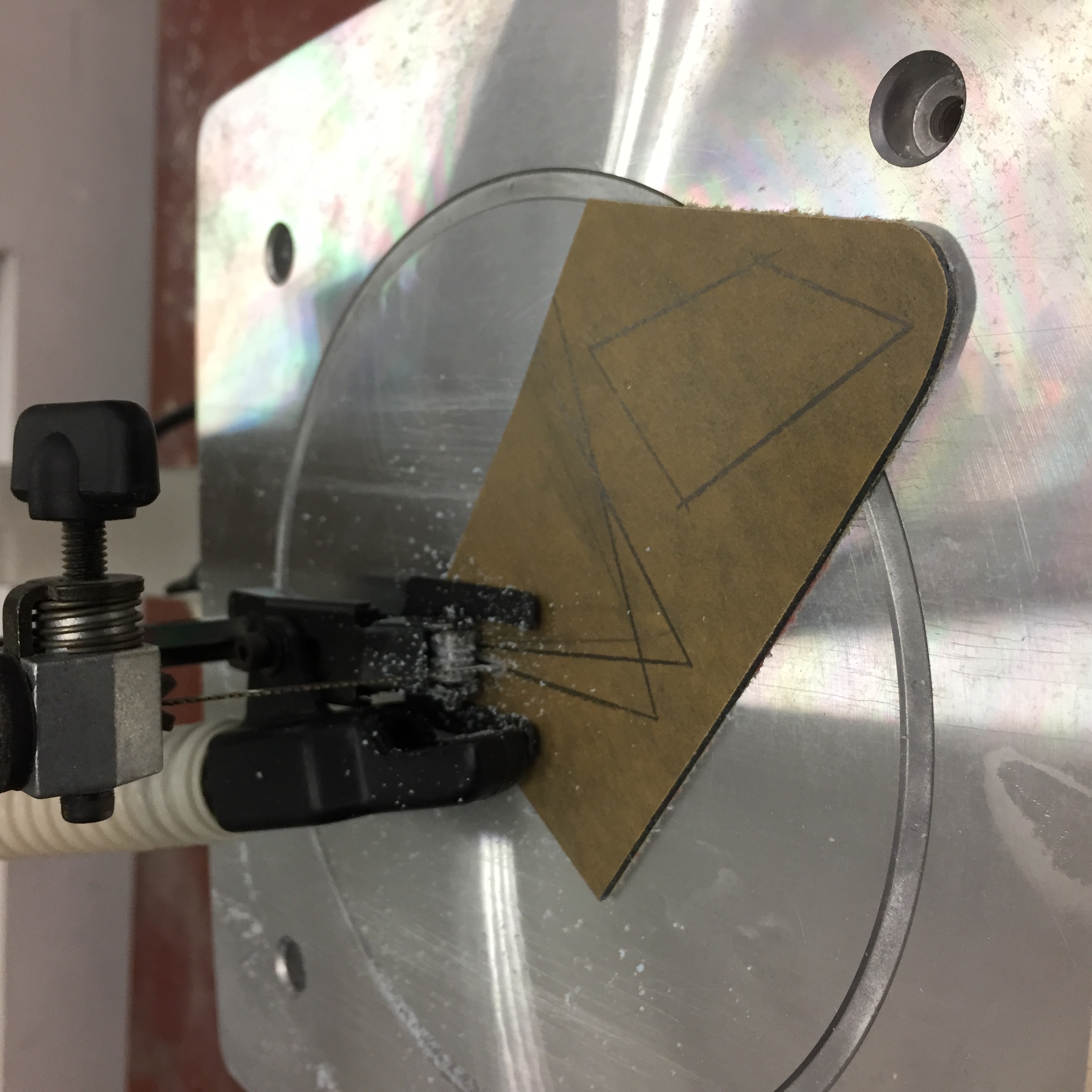
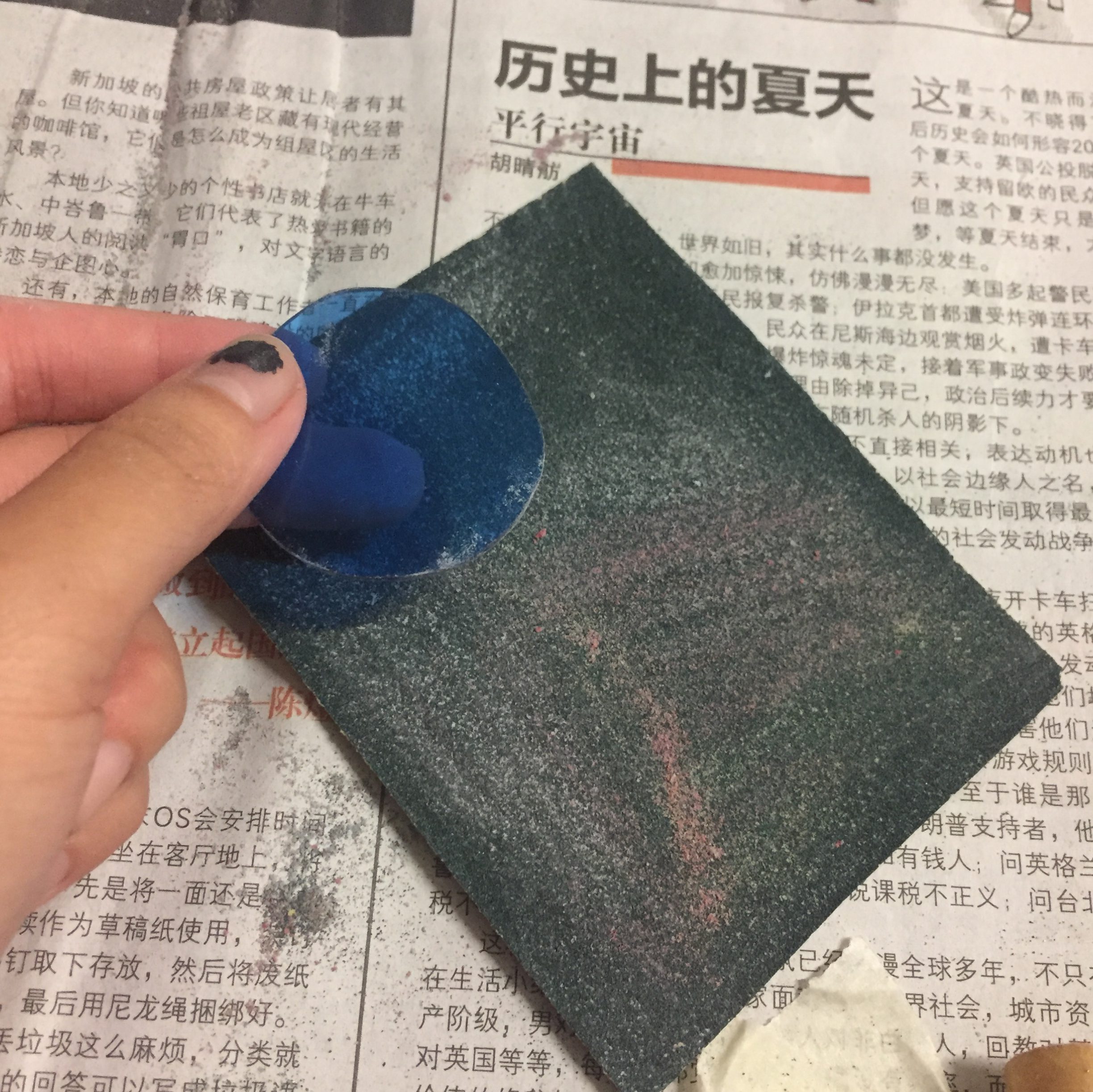
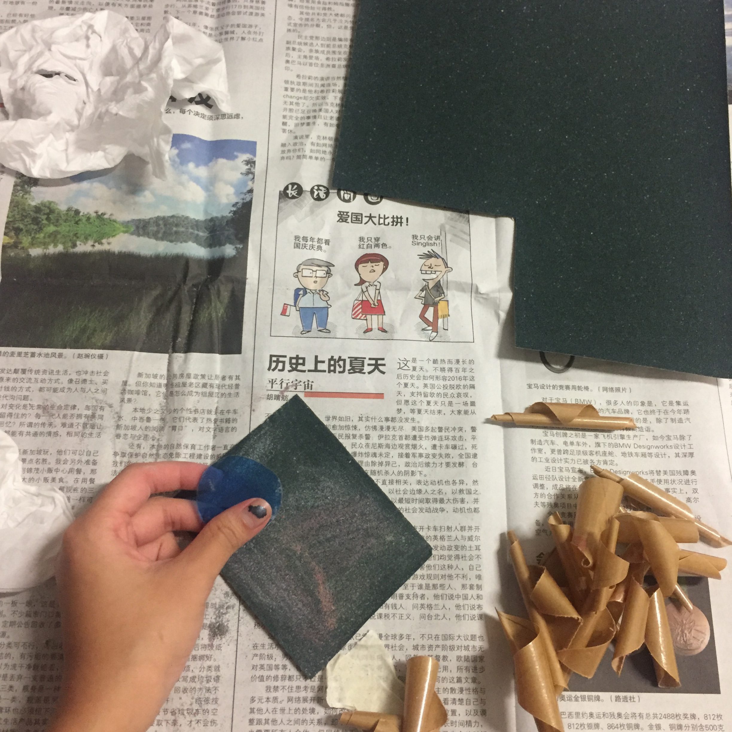
Using the scroll saw, I started cutting up the acrylic sheet into different shapes of different colours.
After which, I individually buffed the edges of the pieces using sand paper to smoothen out the edges.
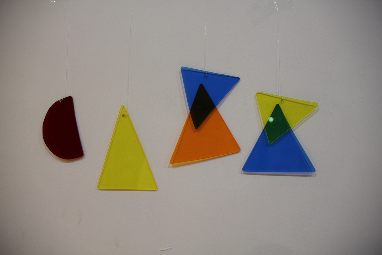
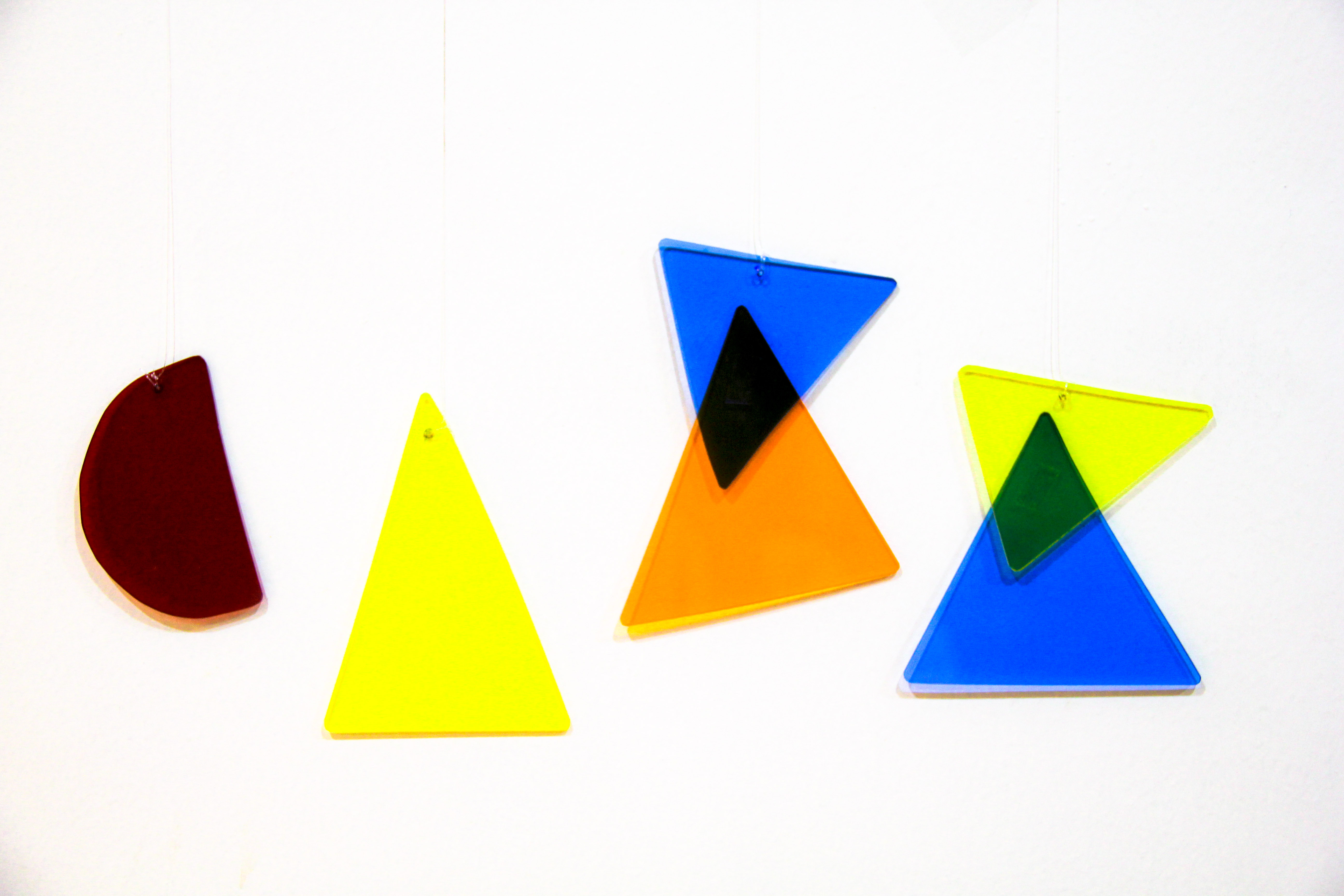
Initially, I wanted to suspend the acrylic pieces in a box along with other shapes in the background as seen in Inès Esna’s installation but decided against it. Firstly, I was afraid the font would get lost in the shapes as other shapes could be mistaken as other letters and I did not want my name to end up ambiguous. Secondly, suspending the shapes proved to be really challenging in getting the lighting right as well as photographing it without the acrylic pieces moving about.
I tried hanging it in a box against a white background.
In the end, I decided to hang the pieces against a white wall and photograph it instead.
After which, I tried to play around with the different colour combinations using Lightroom.
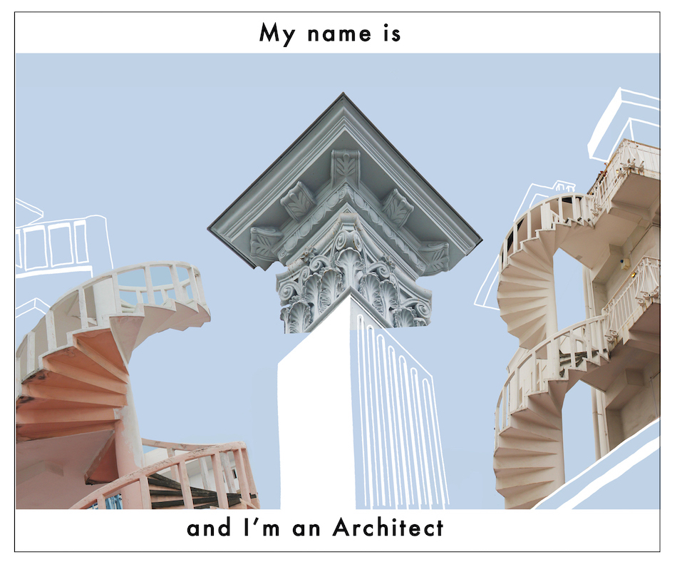
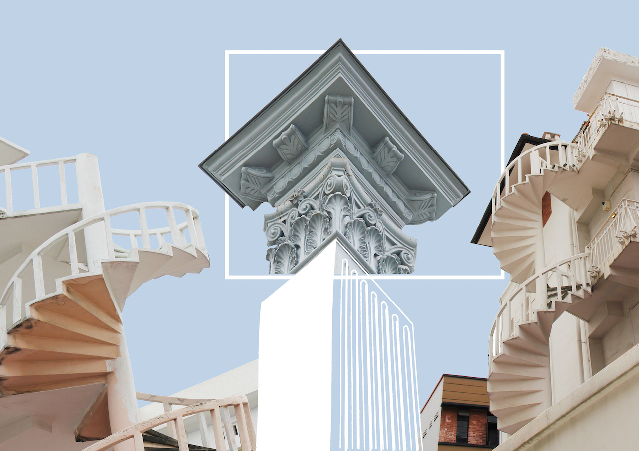
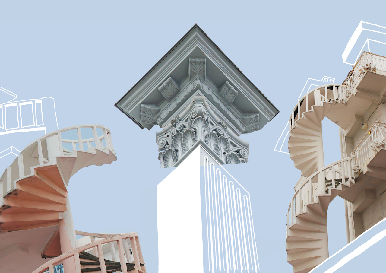
Architect
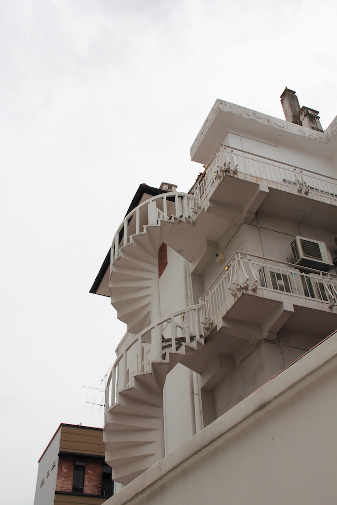
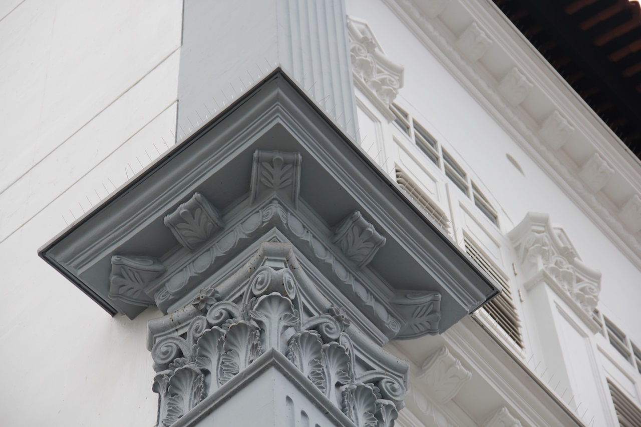
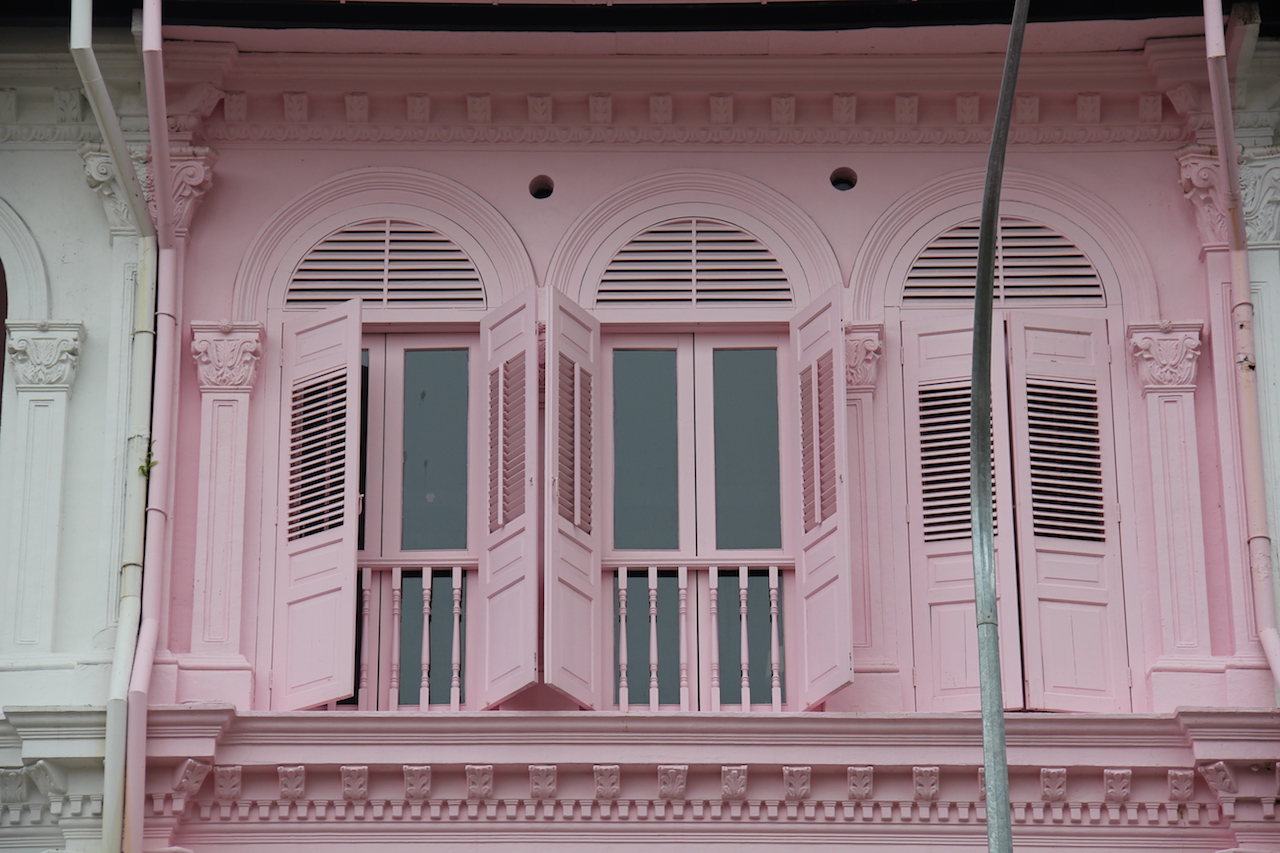
As the stereotypes for architects and designers are closely linked, I’m not going to make a list of stereotypes but rather talk about the stereotype I chose for architects in our local context. Considering Singapore’s growing economy and population with our limited land space, most of our old heritage buildings often get demolished to make space for new modern buildings. This is one stereotype I feel that people have of architects in Singapore, that they are constantly building new condominiums and shopping malls to replace our old buildings. However, I feel that this is not always true and that certain heritage buildings are still well preserved and appreciated. One example would be our shophouses. Shophouses are still widely seen around Singapore at places such as haji lane or duxton hill. They are integrated into our modern buildings and these places are often transformed into bars, cafes or hipster shops.
I got inspired to create letterforms from buildings using my name from some images I found online and I thought it would create quite an interesting composition.
Hence, I went around Singapore to photograph some shophouses to create letterforms of my name using the structures of these buildings.
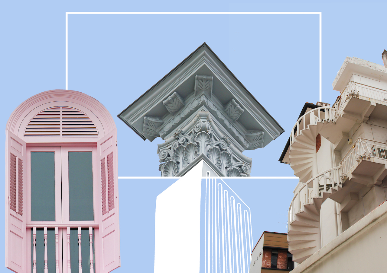
I tried making use of the negative spaces to form the letters ( as seen from the example shown above) but that proved to be really hard and I decided on cropping parts of the building to form the letters instead.
This was the first draft I made but after consultation, feedback given was that the letterforms were ambiguous and hard to decipher.
I felt like most of the problems were in the “C” hence I changed the design but it was still too ambiguous to be seen.
It was suggested that I used a combination of sketch and photography to distinguish the letterforms and after several revisions, this was what I came up with.
Tattooist
stereotypes:
sign of rebellion& irresponsibility
unprofessional
only people of lower class get tattoos / tattoos to determine social status/class
Tattoo placement:
Lower back: promiscuous, “tramp stamp”
Chest: symbol of love/ affection, image is close to the person’s heart, loved ones
Finger: middle finger: blood vessel that is directly connected to the heart
Forearm: toughness/strength, depends on the imagery (skulls/ anchor shows the person is strong on the outside and inside, flowers, etc shows that the person is tough on the outside, soft on the inside )
Neck: risky/daring, makes bold choices
Back: mysterious/ shy, symbolise ending of a phase in their lives/ relationship, put their past behind them
I think that taboos surrounding tattoos are a thing of the past and there is a large shift in the demographics and people’s perceptions of tattoos. There is an increase in the number of people getting tattoos and it can sometimes serve as an important symbols for a person’s religious beliefs, commemorate achievements and mark rites of passage. From the society’s point of view, some employers are starting to see it as a sign of individuality and they value that as an assert of their company.
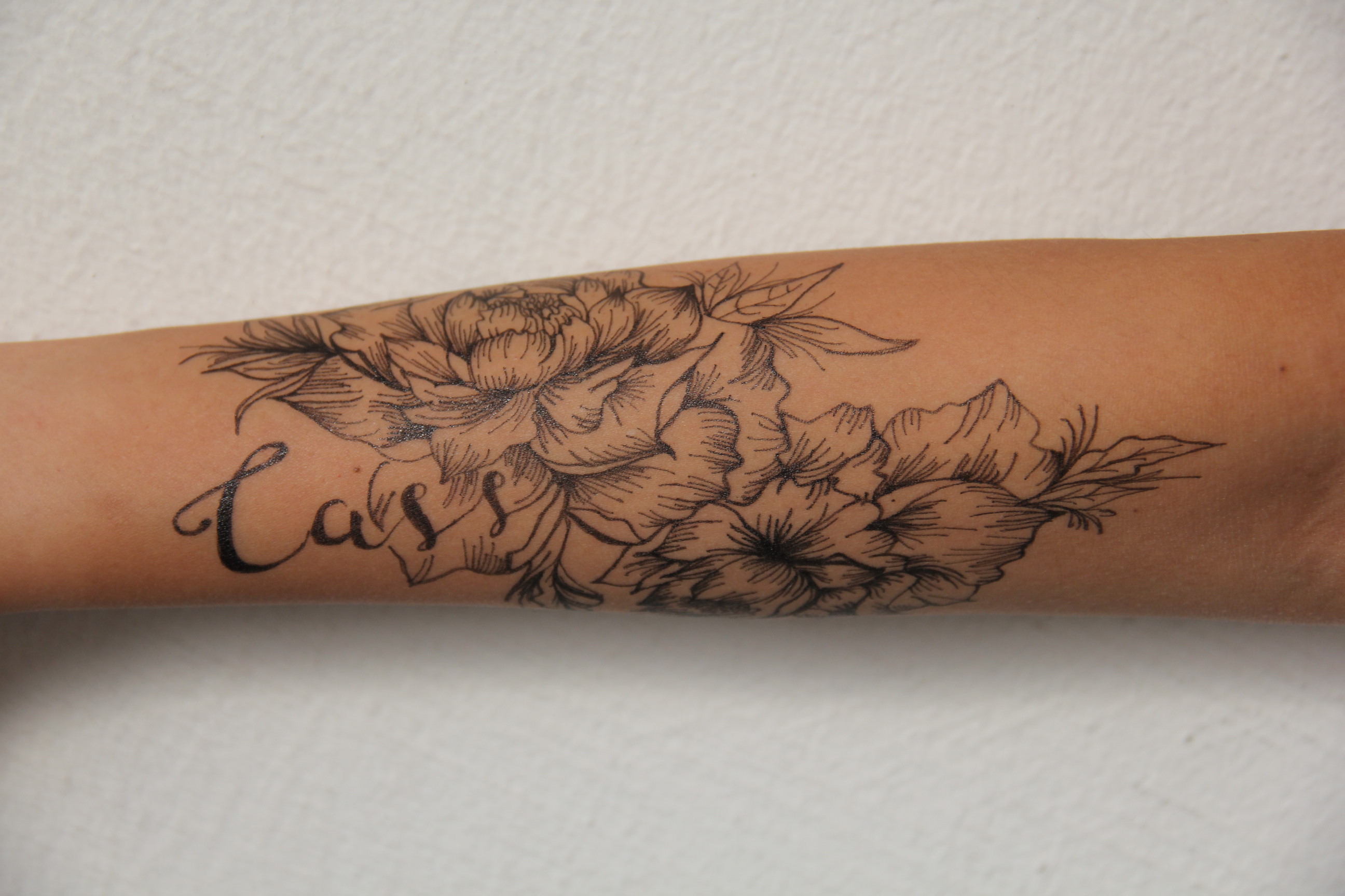
However, there is still a form of struggle for people with tattoos, especially in our more conservative society. The struggle of hiding their tattoos and choosing when is the “appropriate” time to show them. Hence, I chose the forearm as the placement to depict my design as I felt that it emphasises this internal struggle the strongest. Since the forearm is such a prominent place, it is hard to cover up and the person would feel the strongest sense of judgement from people.
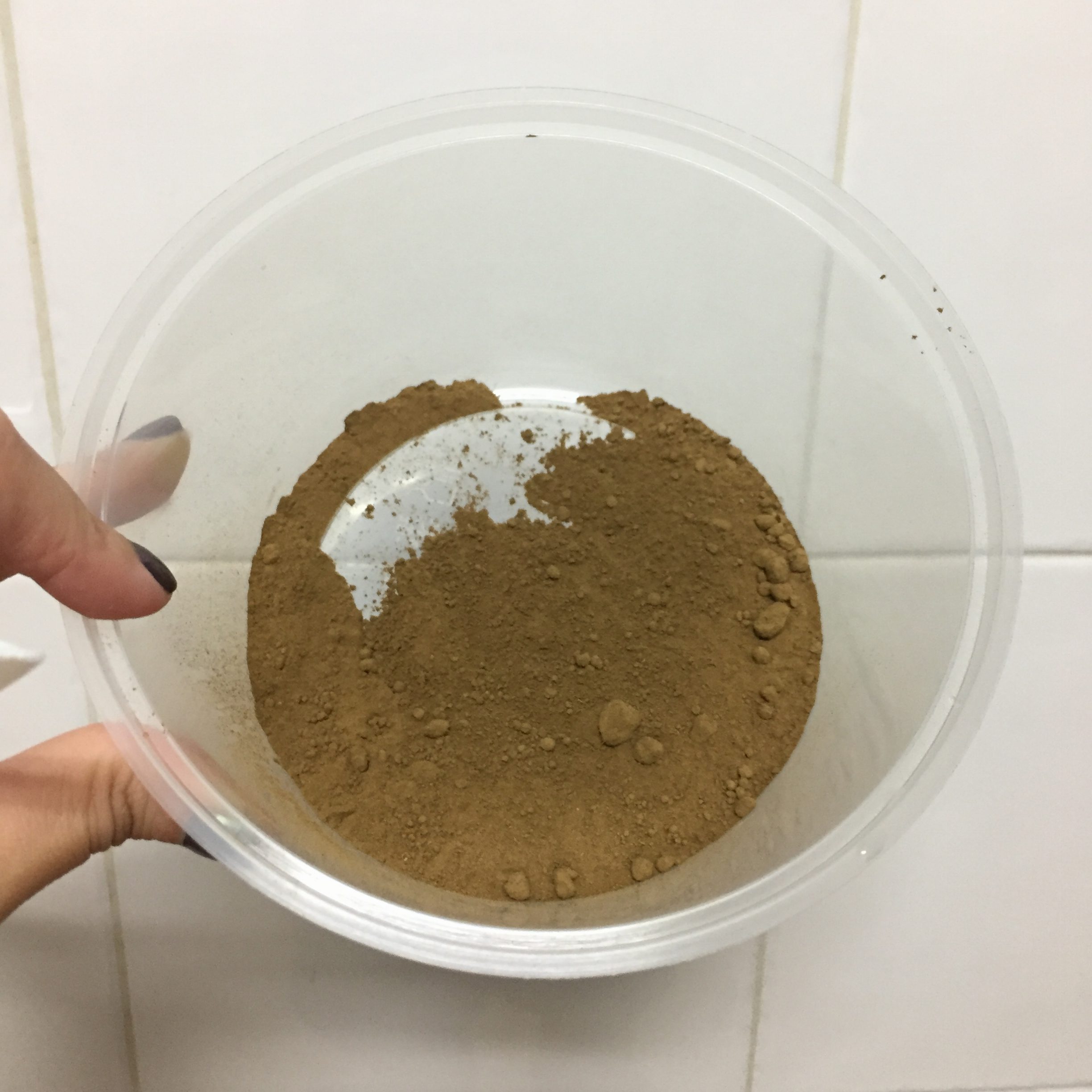
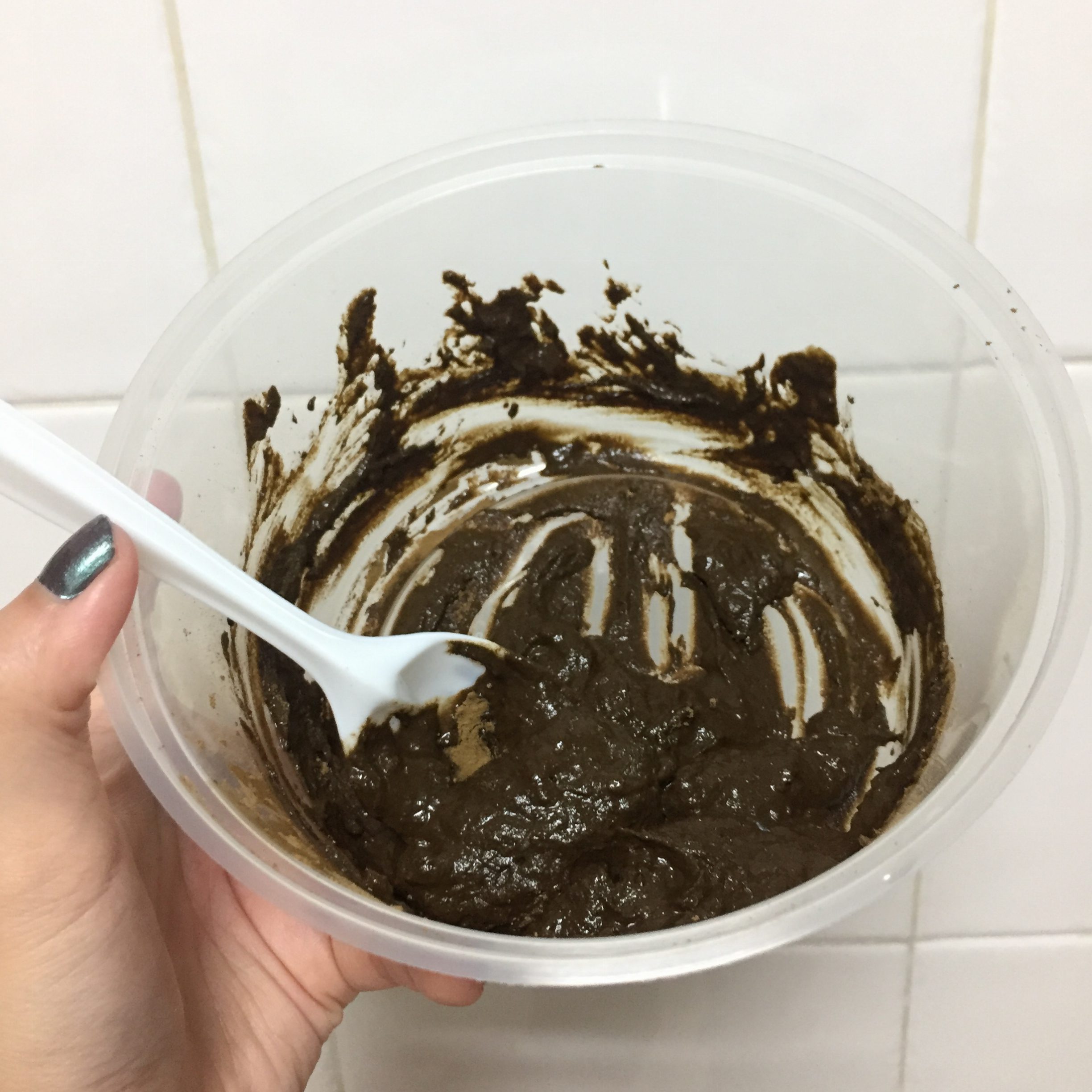
Initially, I wanted to use henna to draw on my design but decided on a black gel pen instead as it turned out looking more realistic and it brought out the details better. However, since I already DIY-ed my own henna, I thought I would just include the process in and it can be quite educational as well if anyone out there is thinking of making their own henna haha.
Step 1: 20g of fresh Henna
Step 2: 1/4 of fresh lemon juice
Step 3: Stir the henna and lemon juice until they are completely mixed together and no lumps of dry powder remain.
Step 4: Add 1.5 teaspoons of sugar and 1.5 teaspoons of essential oil
Step 5: Cover the paste with plastic wrap. Press the plastic wrap against the surface of the paste expelling any air pockets.
Step 6: Let the paste set for 24 hours and it’s ready for use!
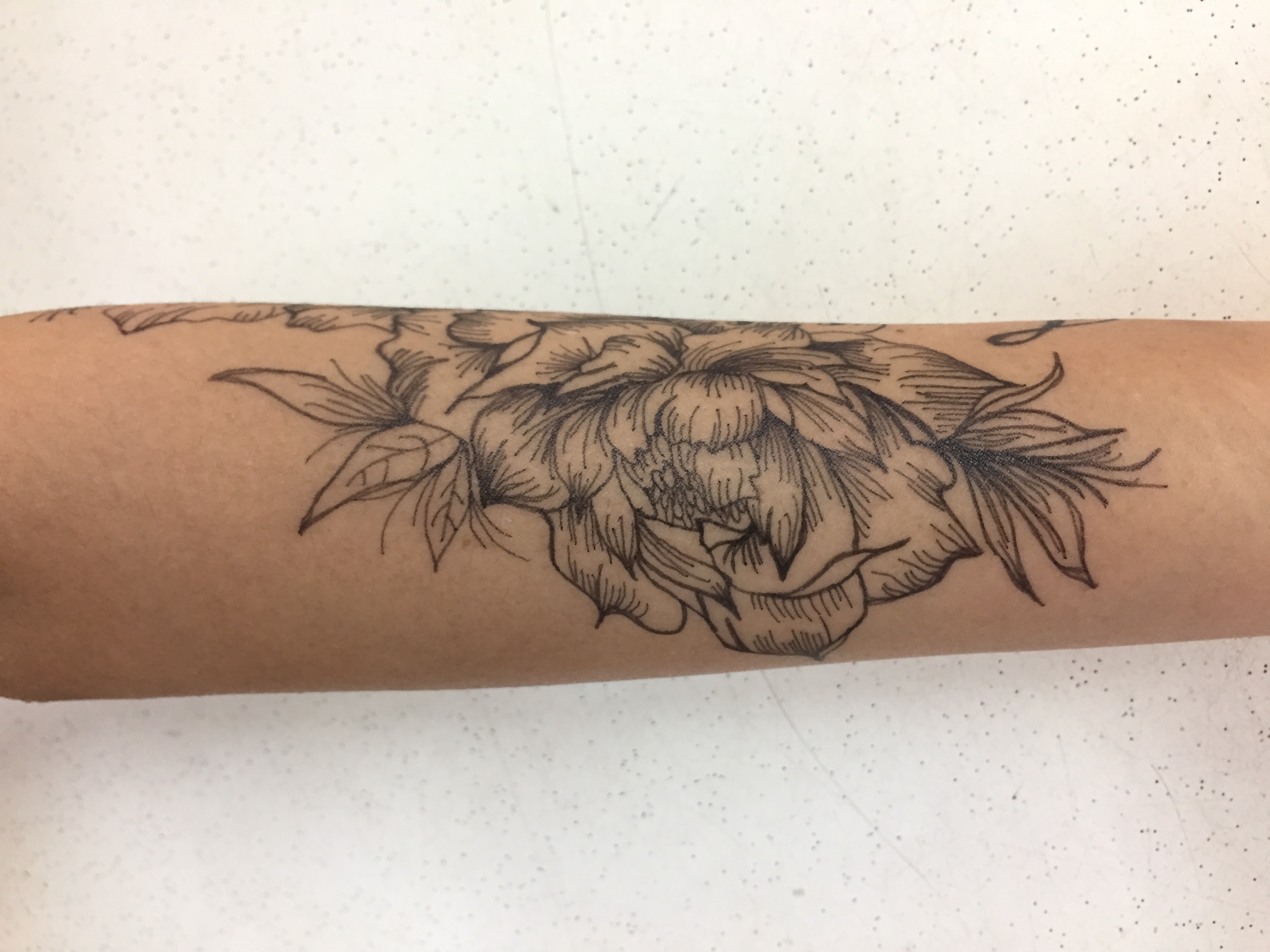
I referenced some floral images online for my tattoo designs.
My designs:
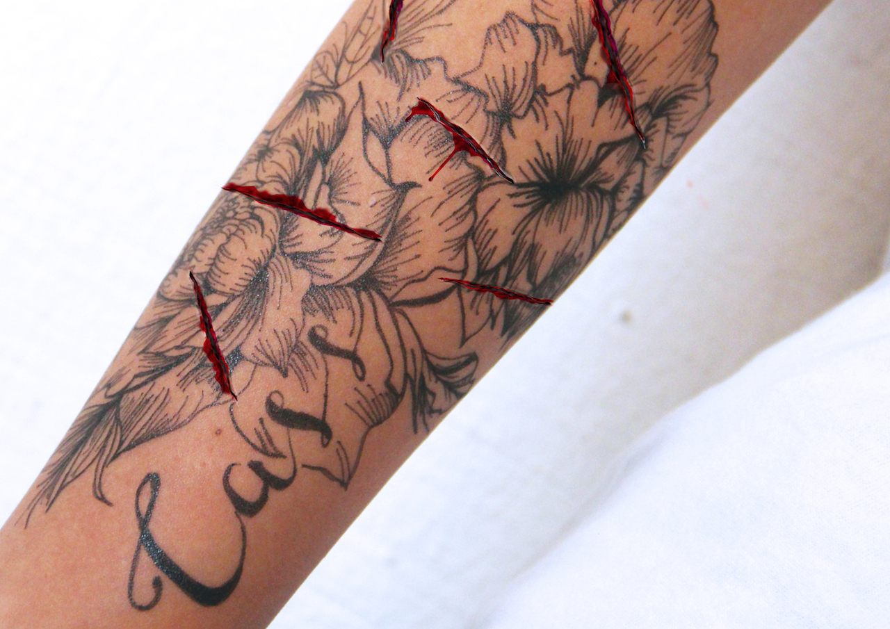
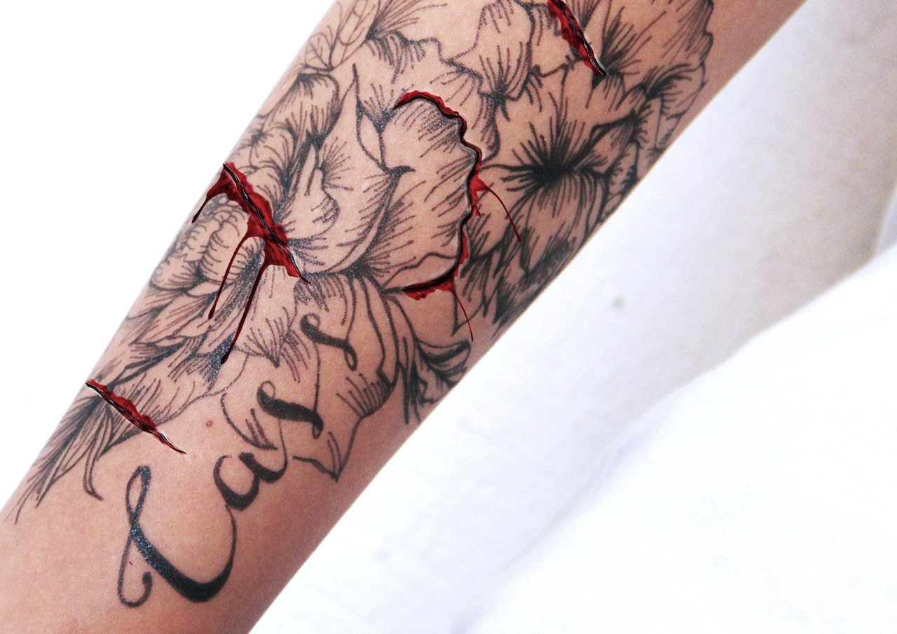
To better bring across my message, I thought of photoshopping cuts on my arm to show signs of distress and struggle of hiding the tattoos. However, I felt like the cuts were too random and was not as impactful as I wanted it to be.
After consulting a few of my friends, I thought of making the cut surround the petal of the flower to show the act of carving the tattoo off of the skin as an act of distress. I really think this created the impact that I wanted much better.
Thanks for reading this super lengthy post! Next will be my final compositions 🙂
Typography, our first project of the semester! We have to create typographic projects using part of our names to describe our future jobs and we are free to explore different techniques and materials. Conceptually driven solutions and letter forms are combined with literal or abstract images to express our future jobs.
Name: “Cass”, “Cassy” or “Xin Yi”
Possible Jobs: Designer, marine biologist, architect, journalist, tattoo artist
Artist research- HandmadeFont
I found this design company known as handmadefont. They specialise in developing unique, untraditional fonts and they take inspiration from almost anything. I love their idea of using the unconventional and literal sense of the word to incorporate it into their typography which is something i might want to look further into.
Alex Trochut
Alex Trochut is known for his experimental style with a philosophy of ‘more is more,’ his array of work is a perfect example of embracing the endless spectrum of font formats.
Nina Gregier
She is known for combining typography with craft and one such example above would be embroidery on paper using different shapes and forms. My friends would know how much i love the use of geometric shapes and forms which is something i might want to use later on.
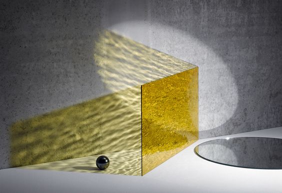
Other inspiration- Kate Jackling
I absolutely love love the play of shadows and colors from this series by kate jackling. Using acrylic pieces and creating that water reflective effect and incorporating the use of light and shadow. I was thinking of using this technique into my typography since one of my jobs is water related.
installation by Inès Esna
Work by Sophia Collier
I started looking up acrylic installations and came across some interesting pieces, Love the colors, shadow and light play. However possible challenges imposed would be cutting the acrylic pieces into their desired shapes without it looking too crude and messy but im really excited to try them out!
Overall after researching, I think I’m leaning more towards the use of 2D-3D-2D like installation typographic which is an area I am more inclined towards at the moment but we’ll see!