Zine Designing Process (with supporting Research)

EDIT (17/4, 1100h): Added peer comments.

(Final posting found here.)

On the last episode, we investigated a government coverup in a place where everyone had disappeared. This episode, we draft up a report for higher management, with extremely consistent assistance from Shirley.

… Or so was the underlying idea. Upon beginning the creative process for the zine, I contemplated 2 directions in which it could go:

  1. A conspiracy report on a mysterious, unexplained disappearance
    • Drawing upon the aesthetic approach I took for the Project 2A slides
    • Either a) a broad overview of all investigated portions (spray painting, trash, etc),
    • or b) an in-depth analysis of a certain portion (e.g. spray painting only)
  2. A post-apocalypse journal on the landscape of after the end
    • Drawing upon the idea of exploring a dead world
https://vignette.wikia.nocookie.net/life-is-strange-w/images/8/87/Diario_de_Max_-_Corrompido.png/revision/latest?cb=20160114234600&path-prefix=es
From Life is Strange (2015 game), the journal of the protagonist. If I had gone with the idea of the end of the world, it might have looked something like this, with many illustrations, perhaps a few photos pasted in.

Eventually, though, I settled for the conspiracy report, considering that it would be more aligned to Part A, and that I had a clearer idea of how it would look.

After which, I considered two report styles: a typewritten report style, or a journalistic report style.

http://www.mischievouspeeps.com/wp-content/uploads/2012/03/FBI_02-resized.jpg
From an FBI report. I found the many layers of stamps, blackouts and annotations rather appealing to look at, especially when put against the neatness of the typewritten report. However, it was limited in terms of colour palette, and the orderliness of the fundamental structure.
https://jostwald.files.wordpress.com/2012/10/notesexamplenotepaper0011.jpg
No suitable reference exists, but the general idea of hastily taking notes while on the move. Scribbling down notes, taking instant photos and making quick, short comments. (I would later learn that this is, in essence, a sort of messy scrapbooking.)

Eventually, I settled on the journalistic report, owing to more flexibility in terms of more dynamic compositions.

CONTENT

First, I established the flow of the zine through determining the content. At this point I had yet to decide whether to have broader or deeper content, and thus went for broadness first, assigning each 2-page spread (folio?) a specific content. The flow would then be as followed:

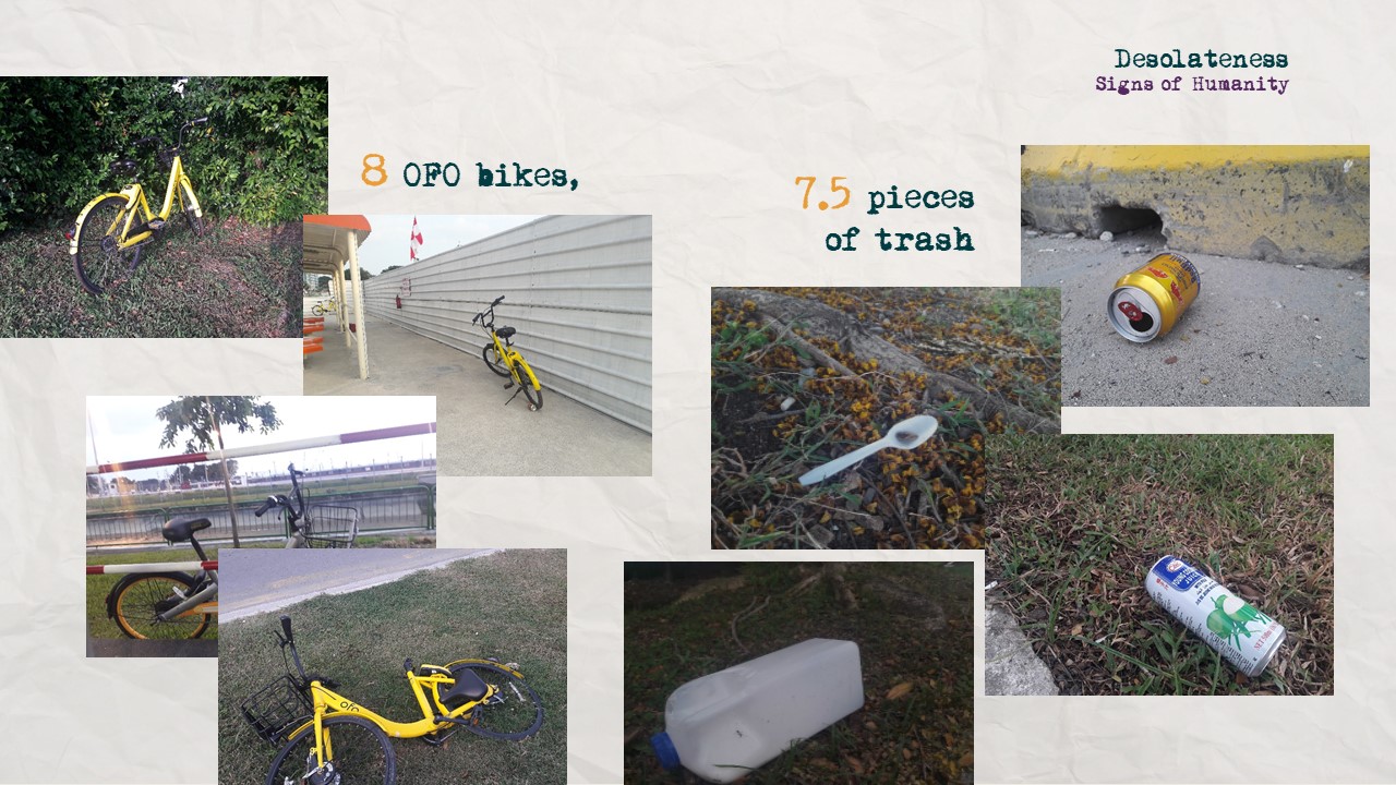
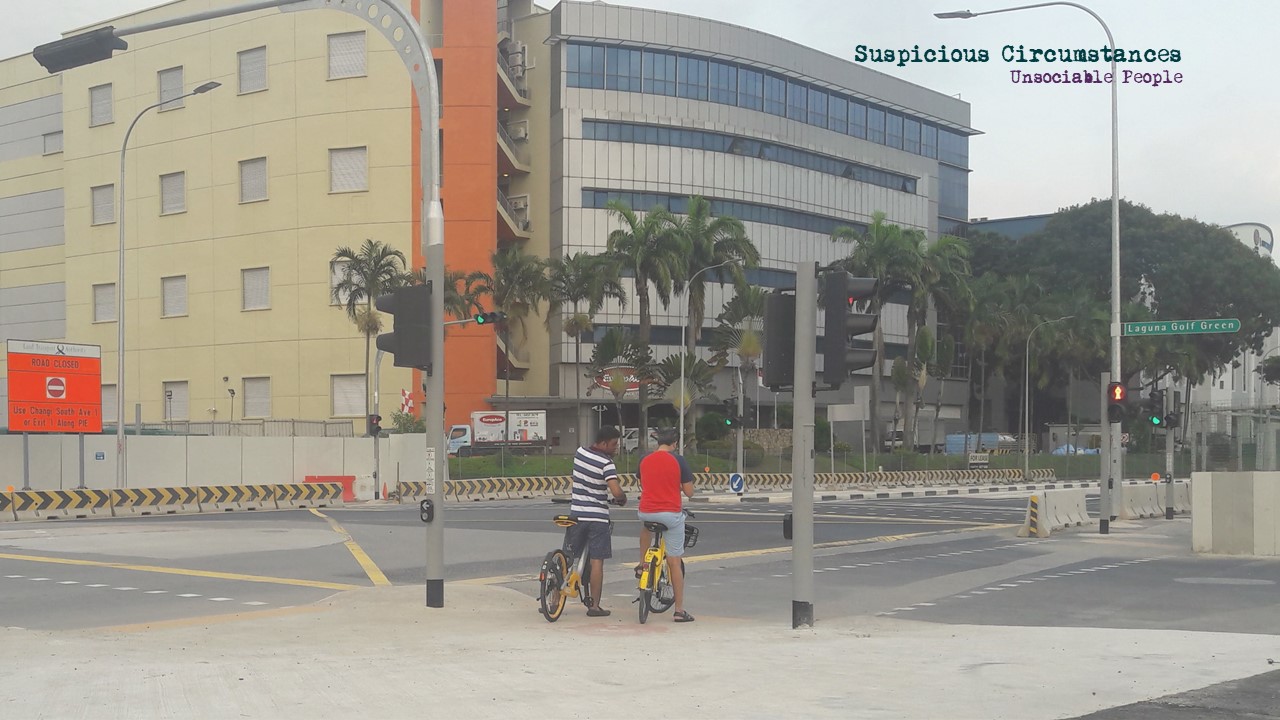
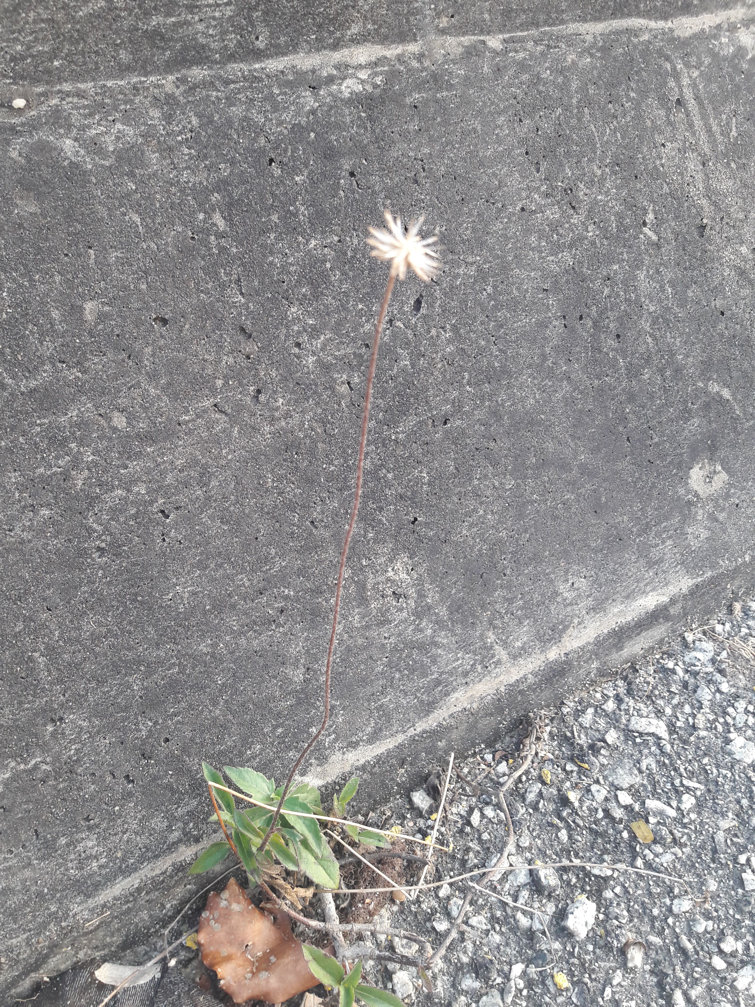
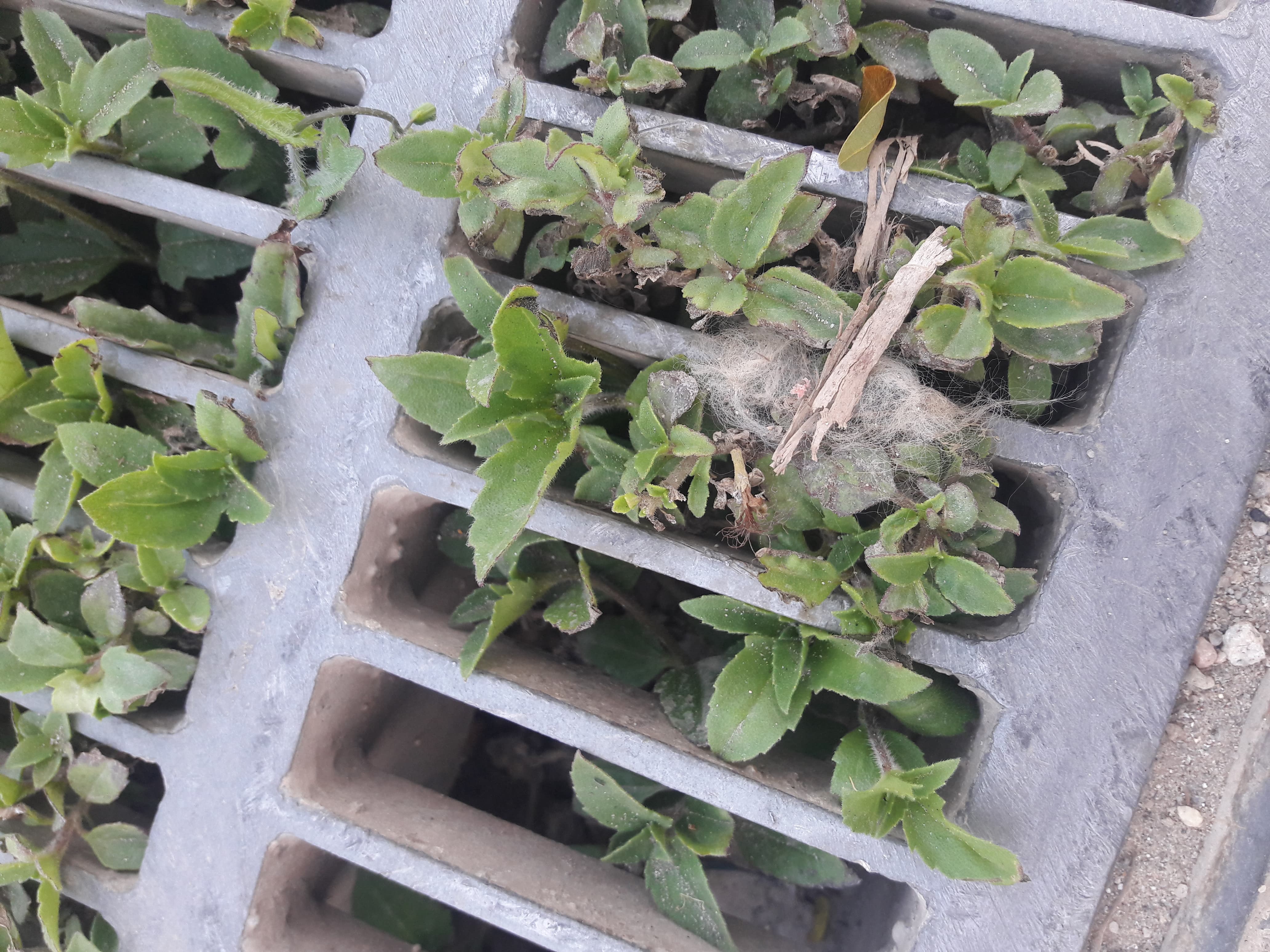
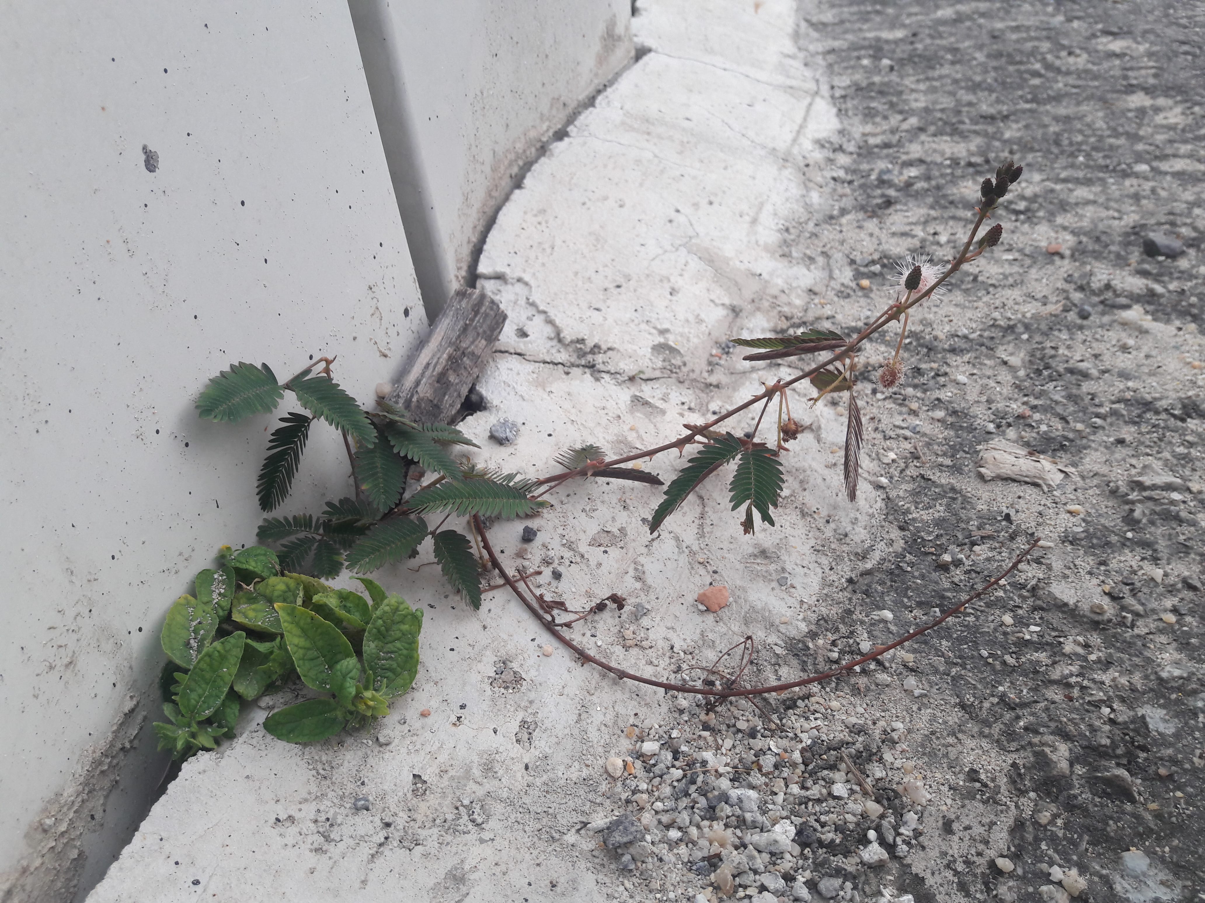
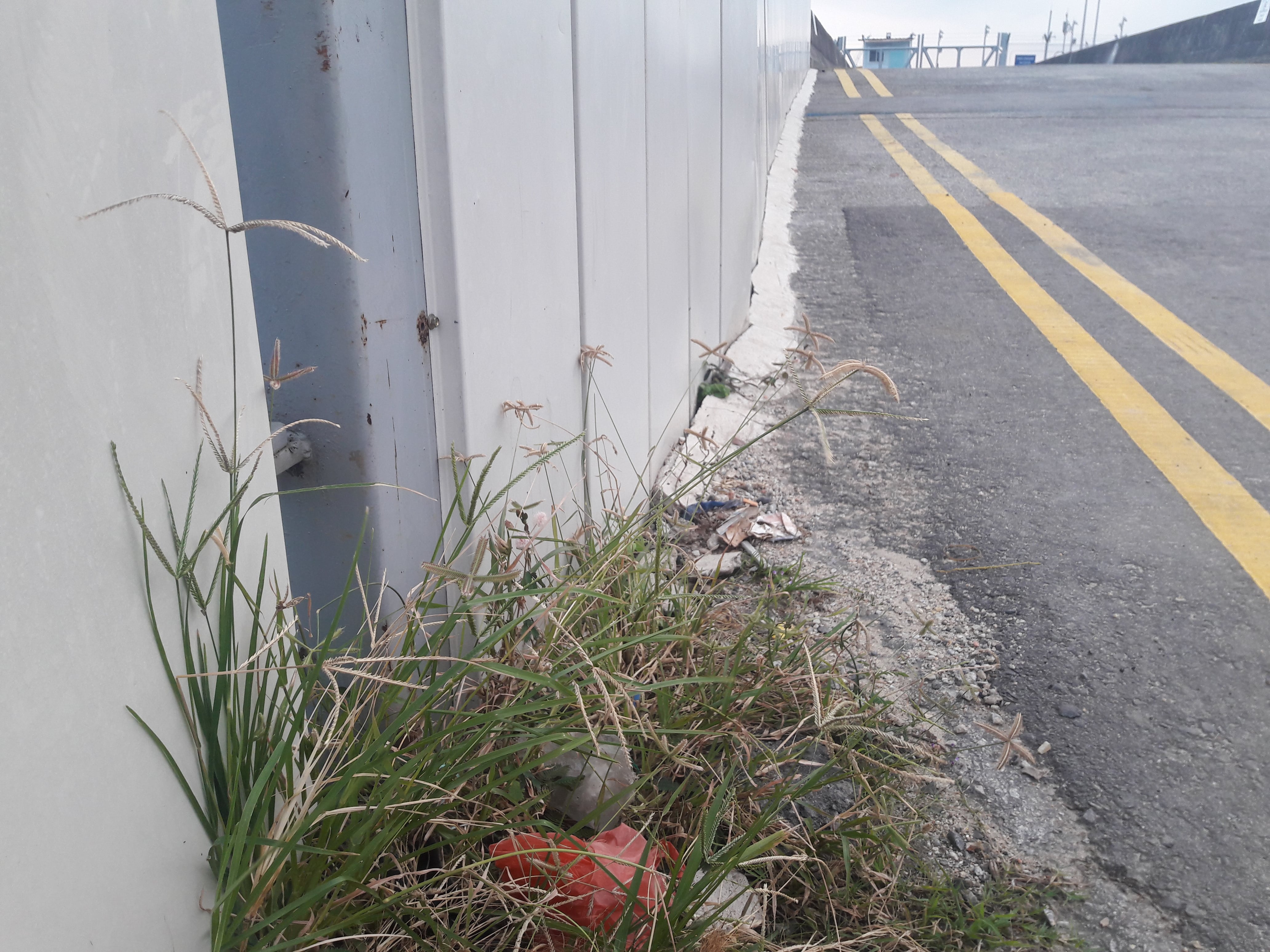
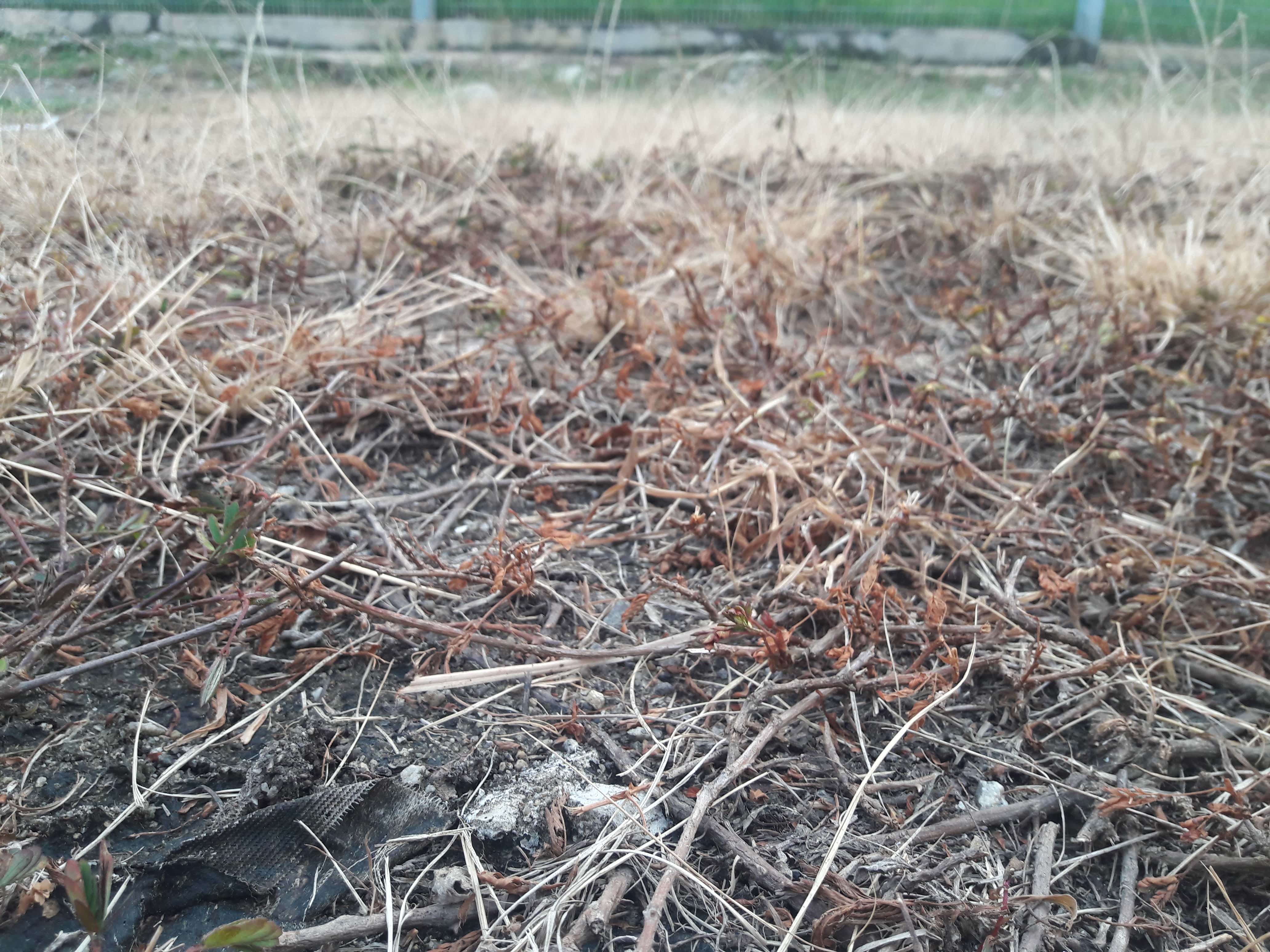
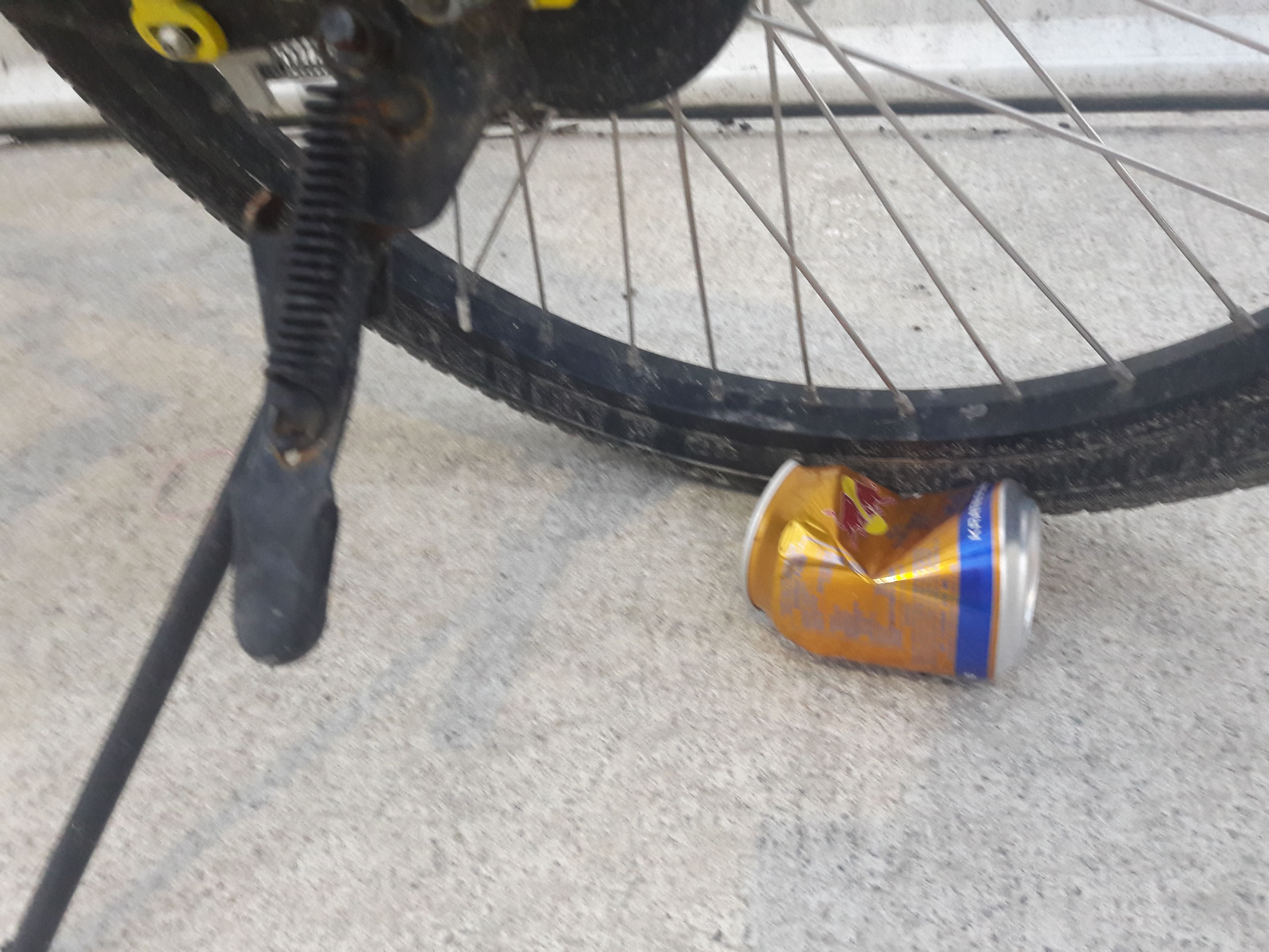
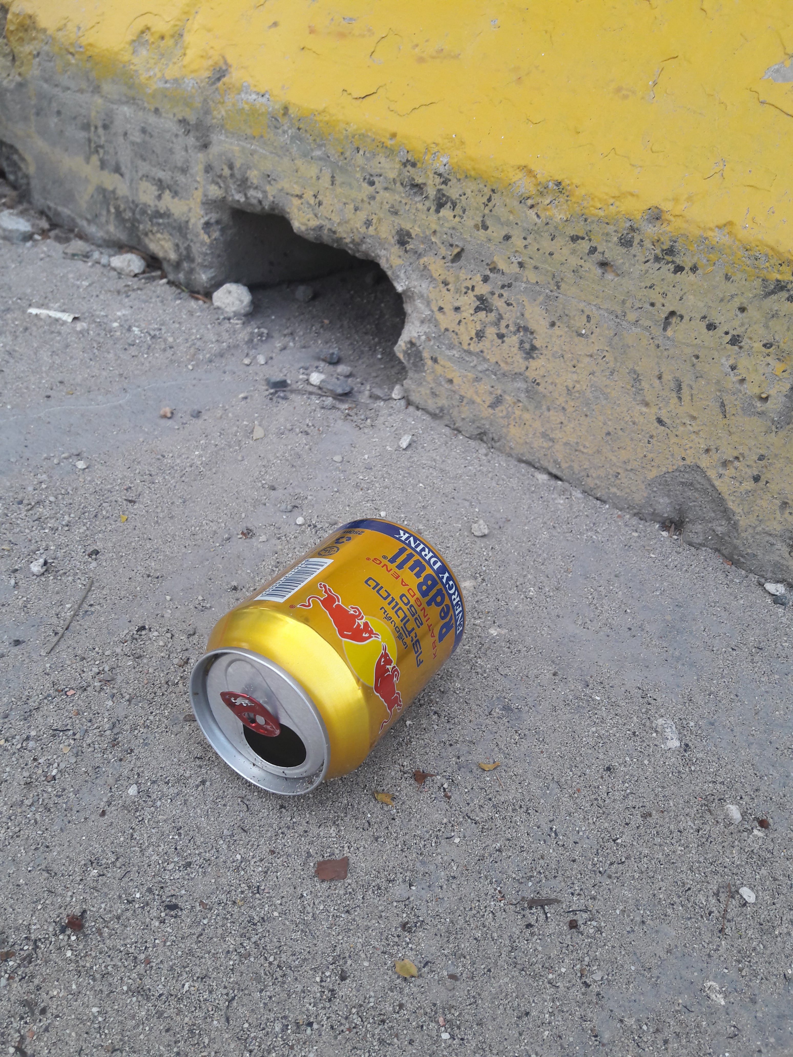
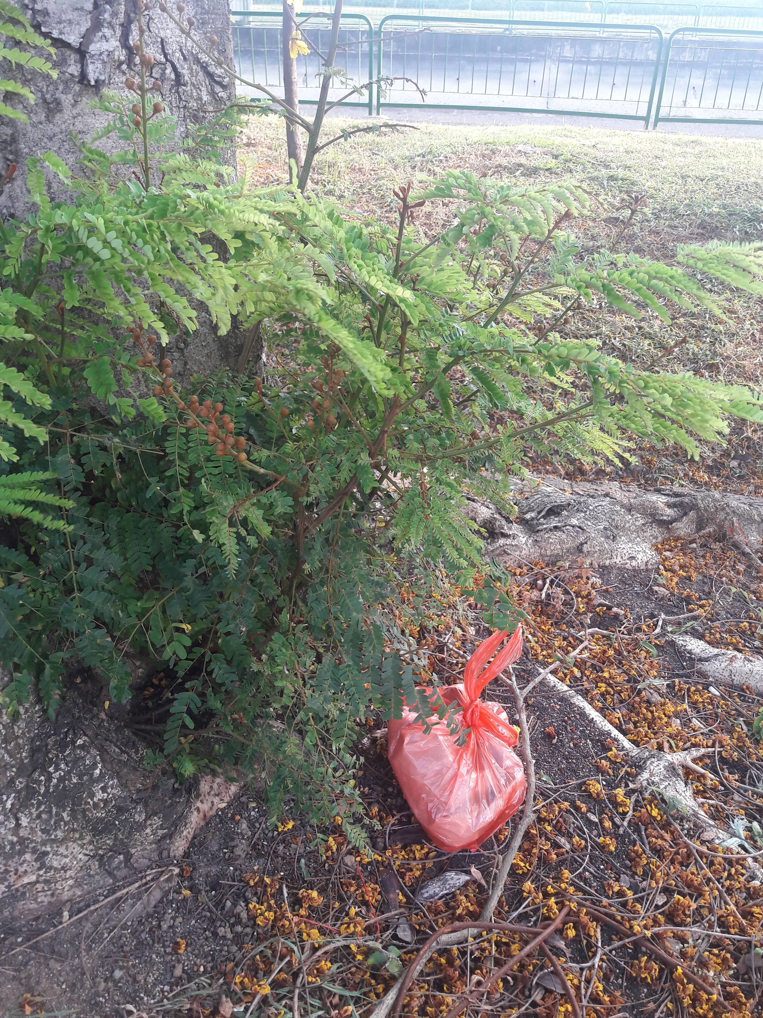
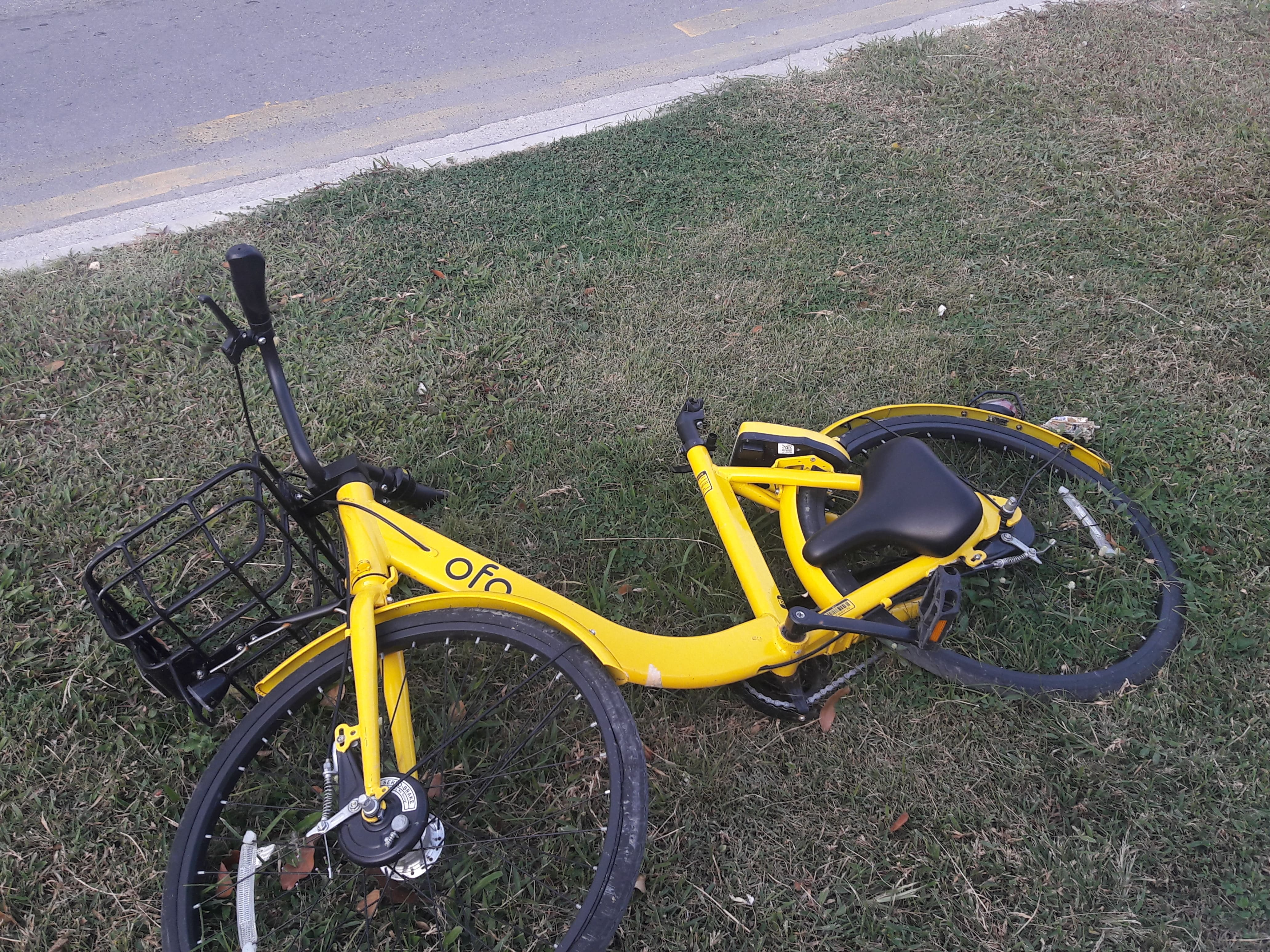
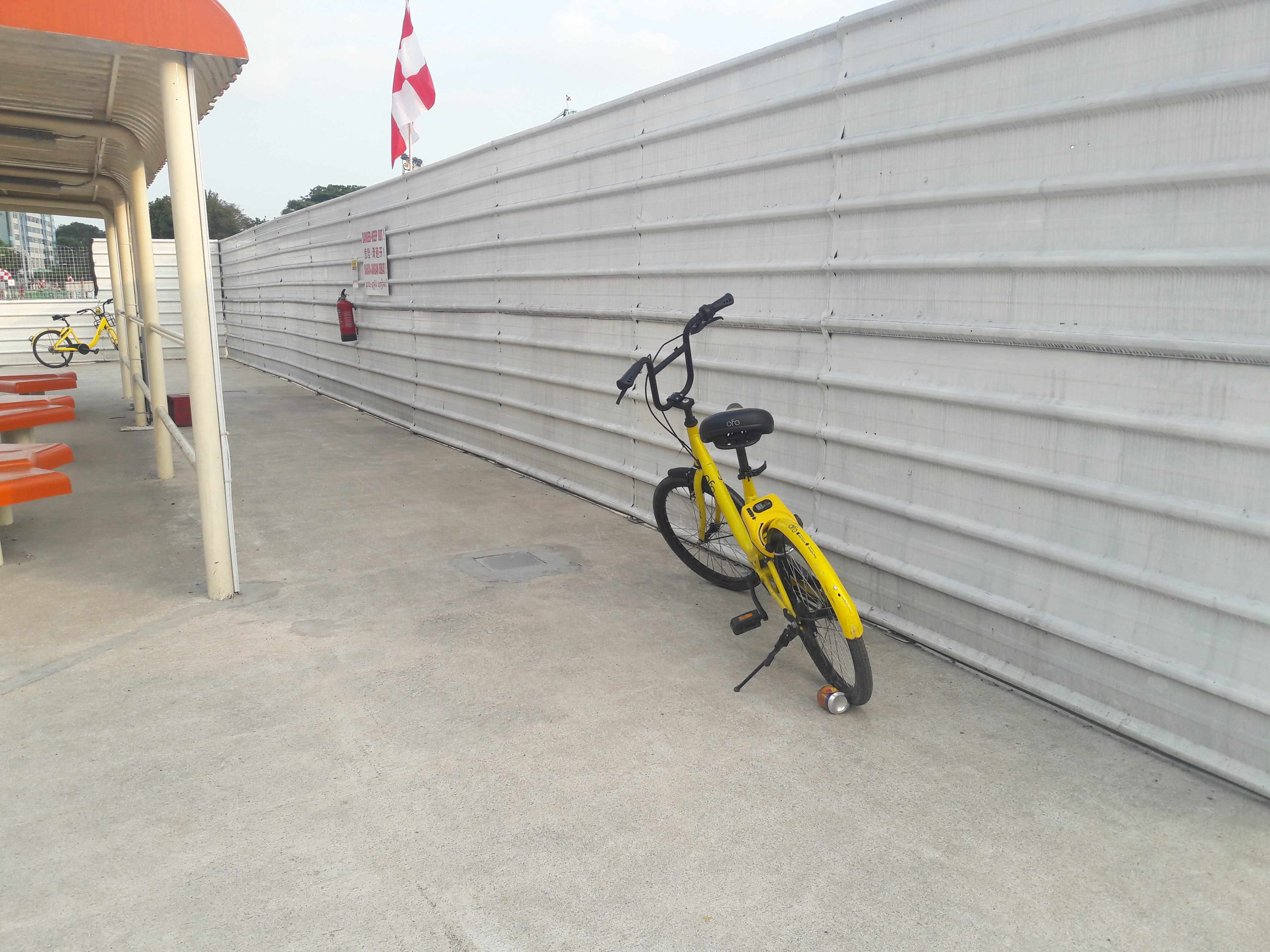
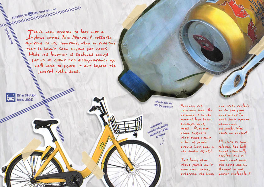
  • Remains: implication that people were there, but are currently missing
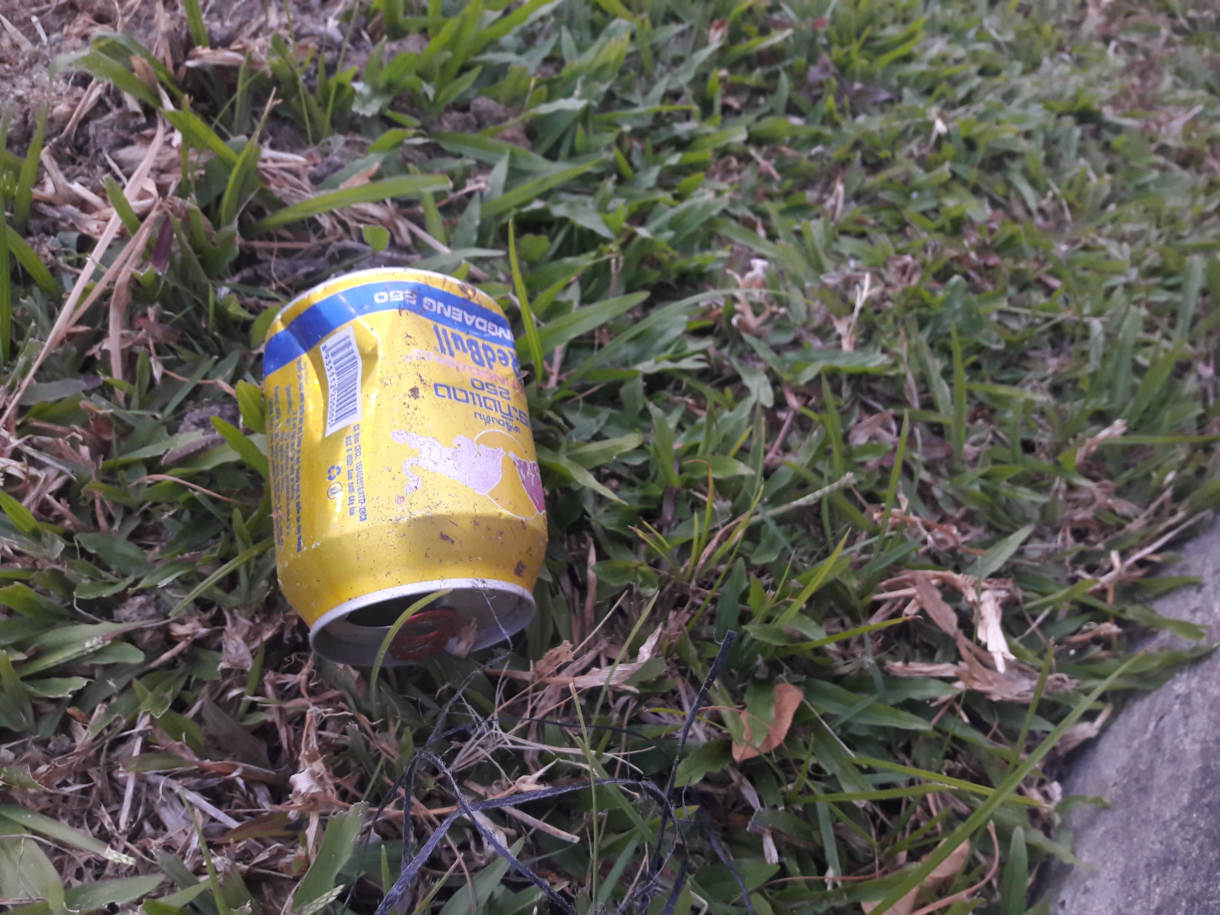
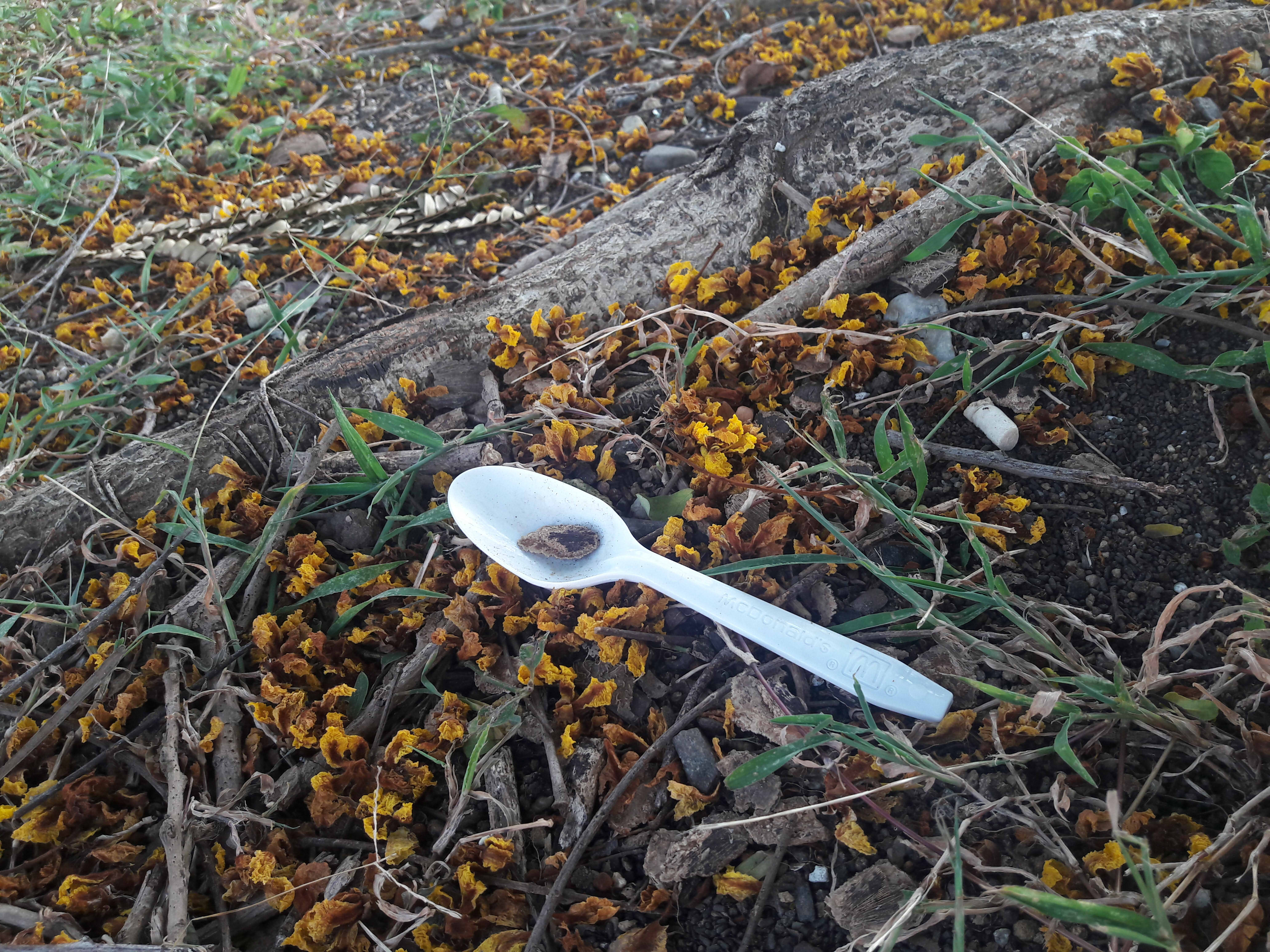
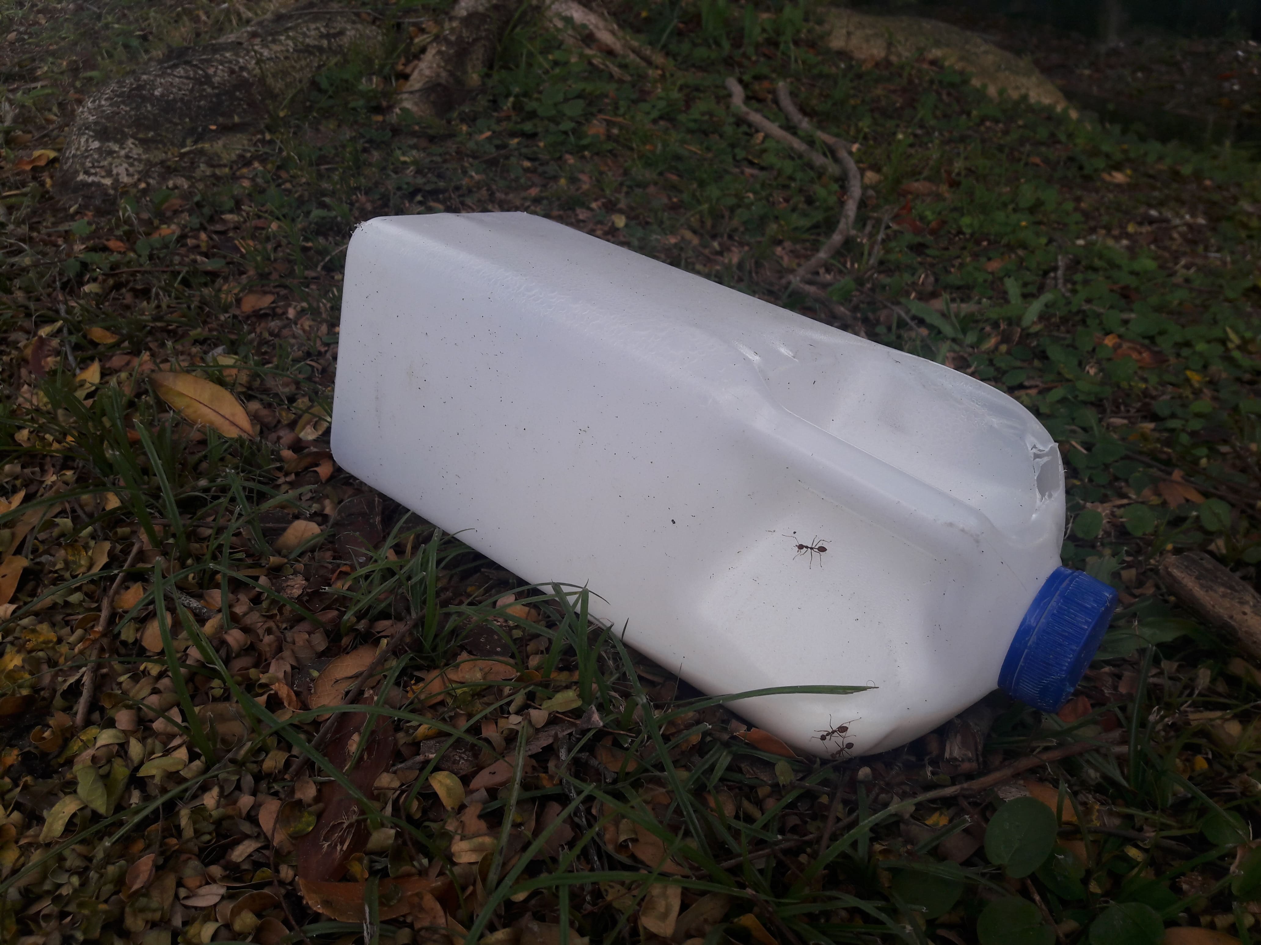
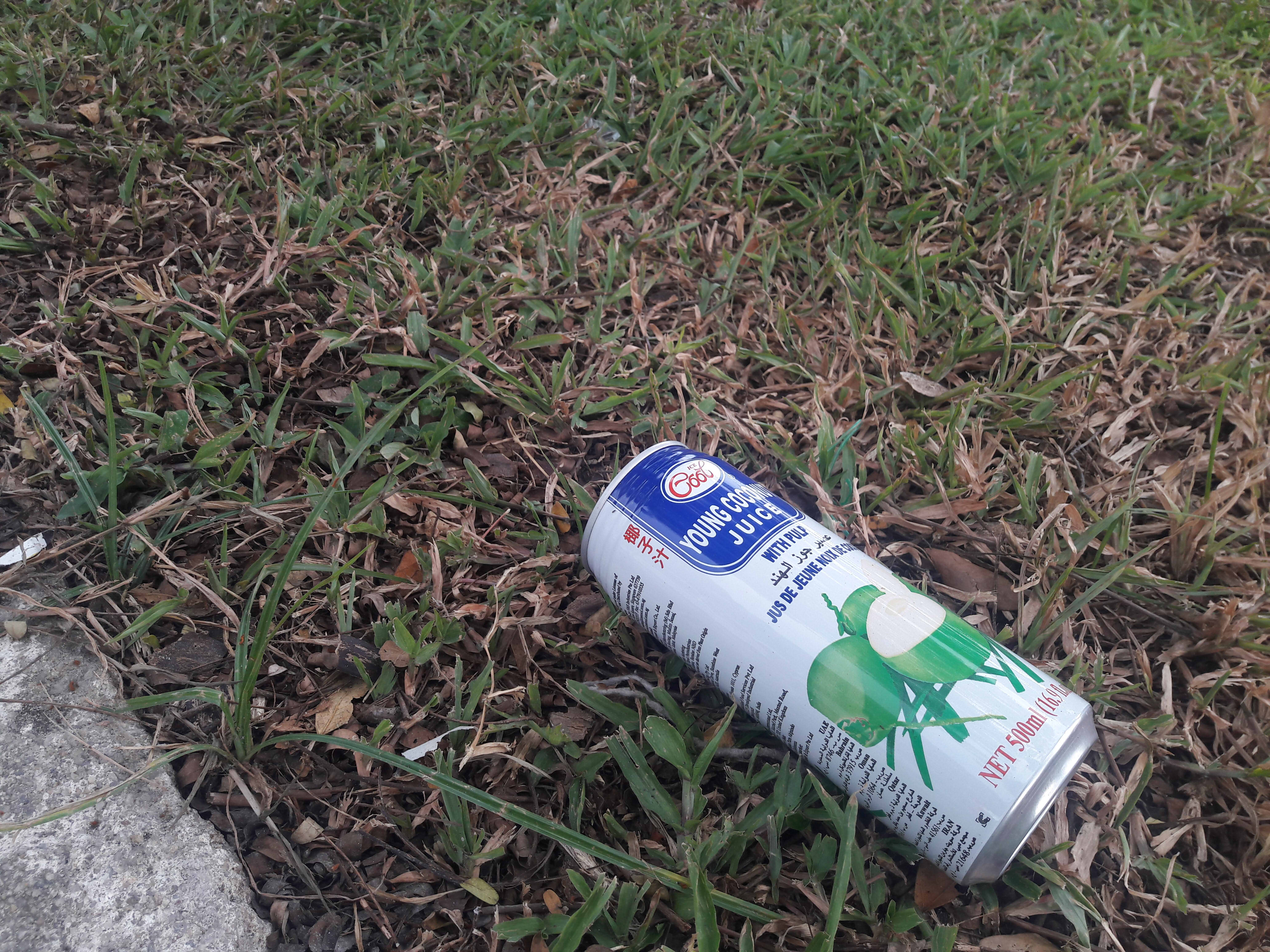
  • Corresponds to slide 9 of Part A
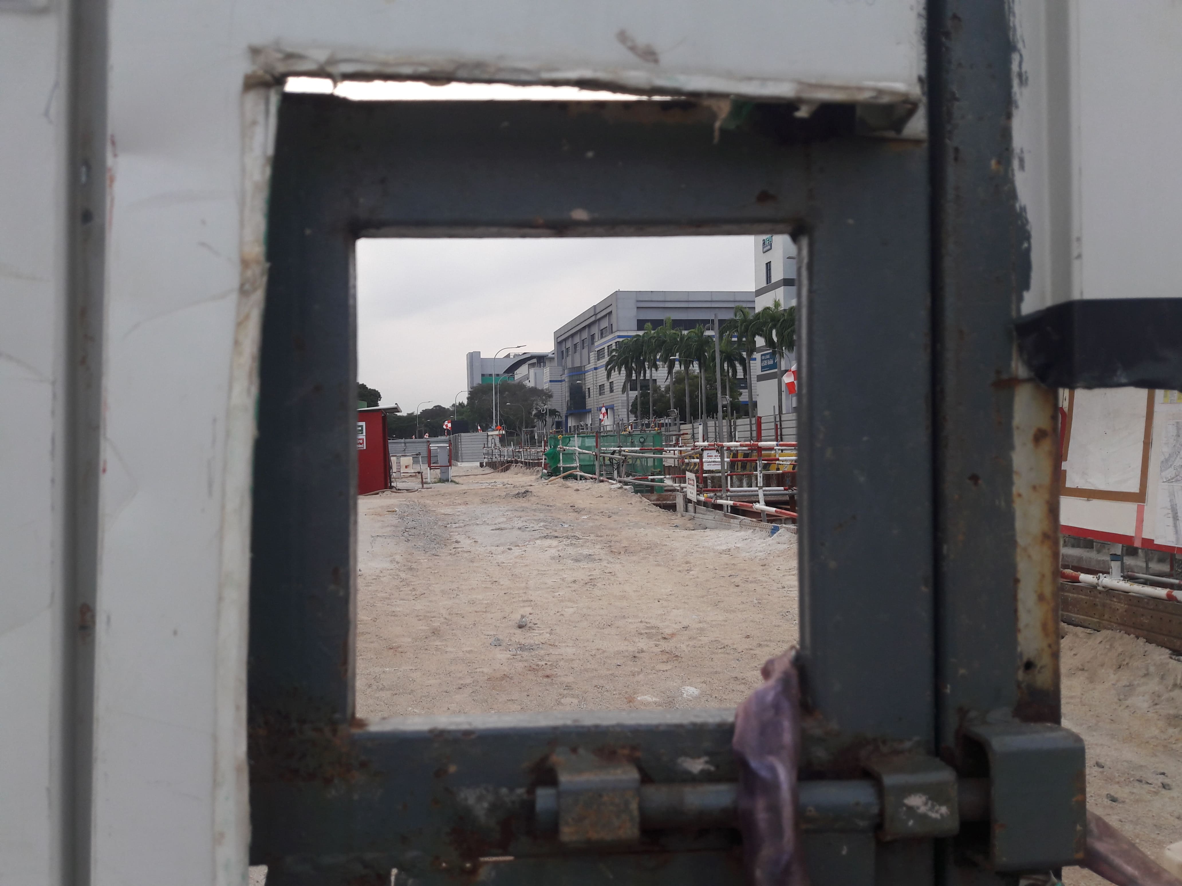
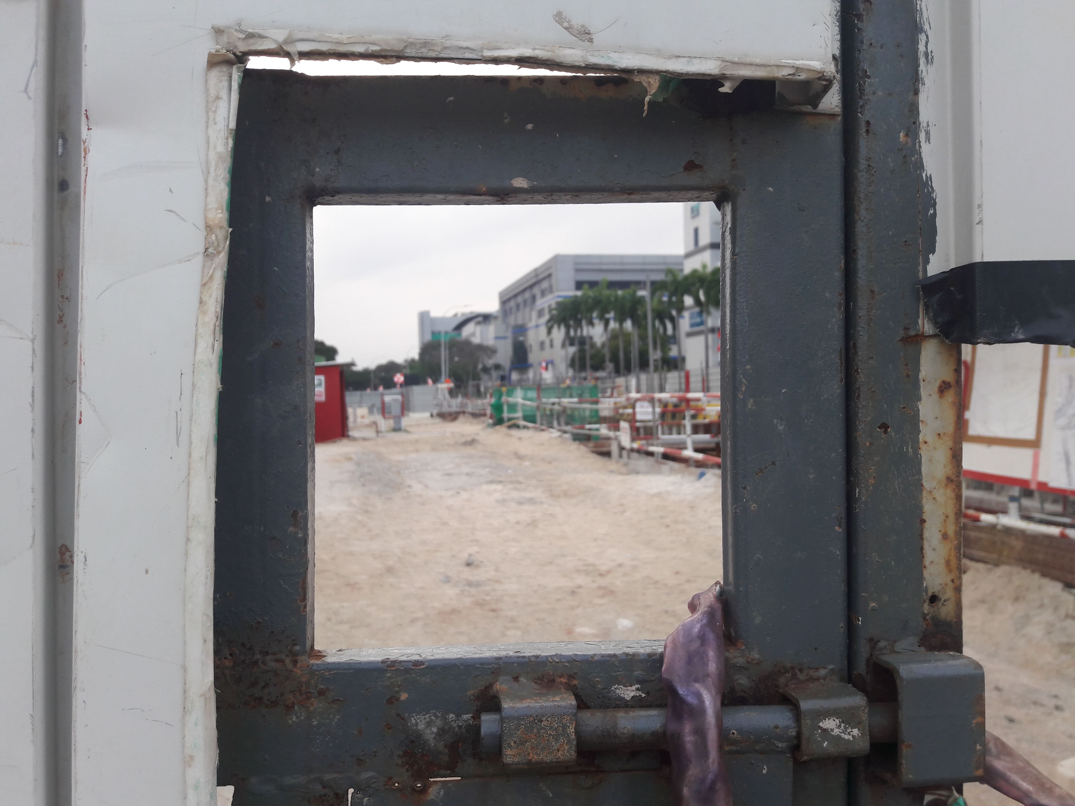
  • Images of bikes and trash

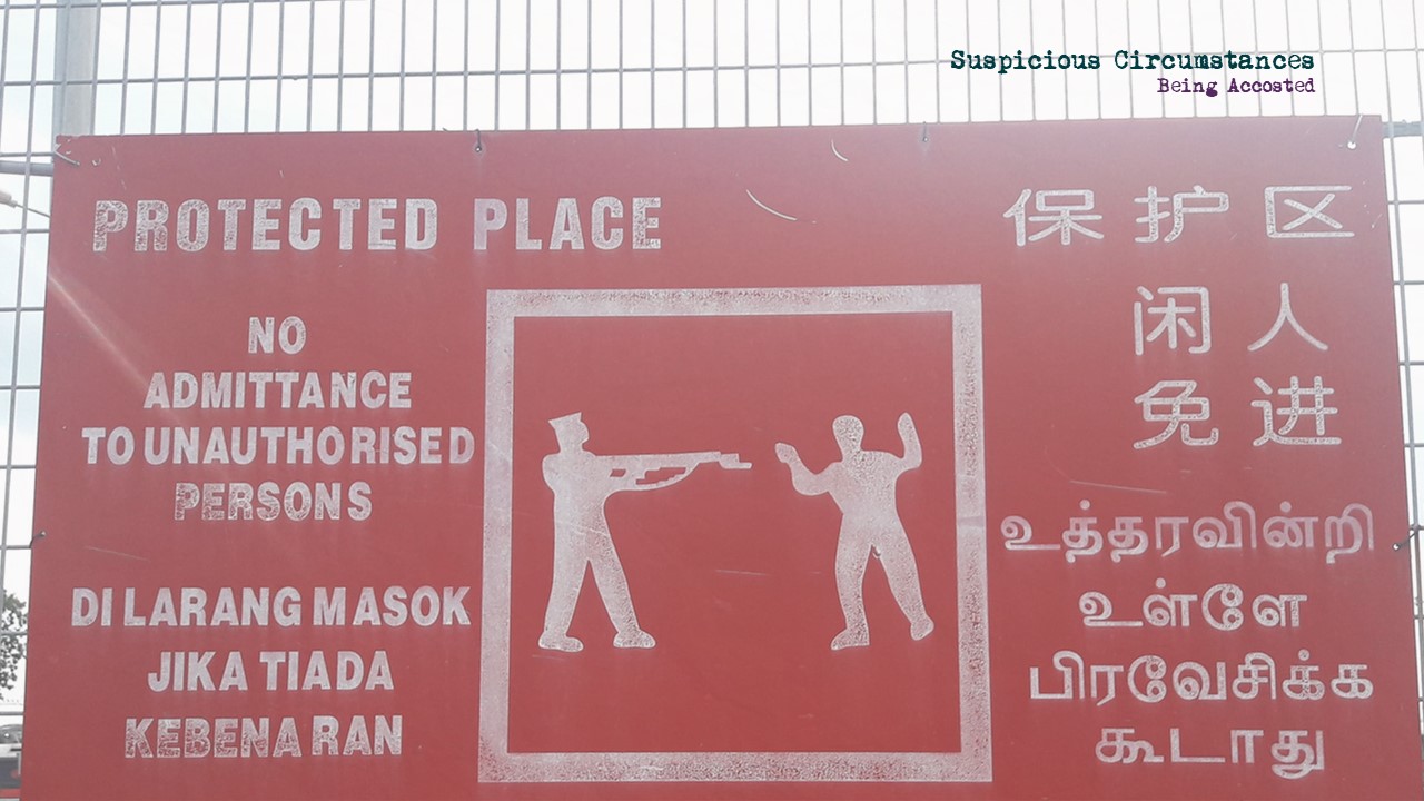
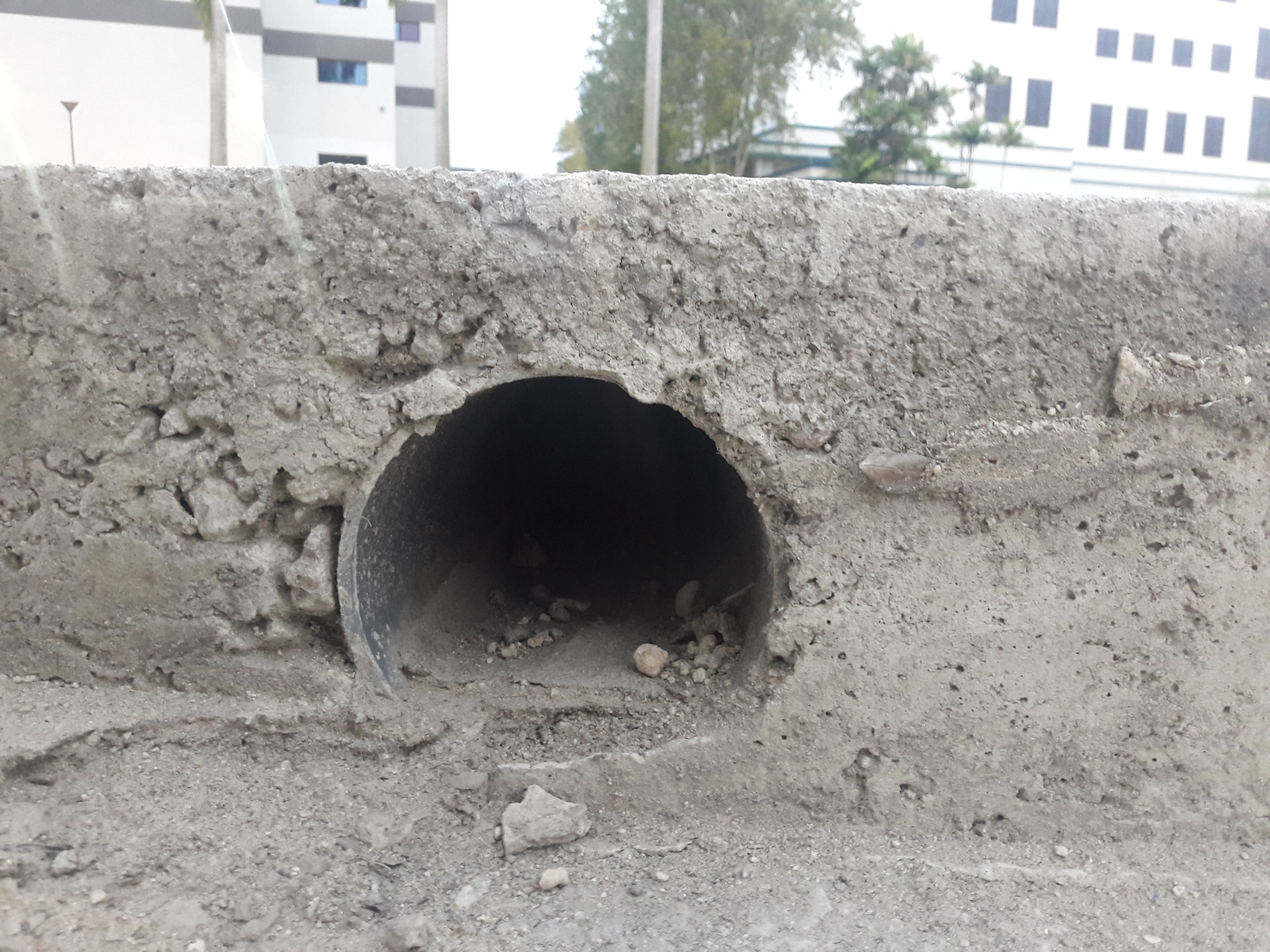
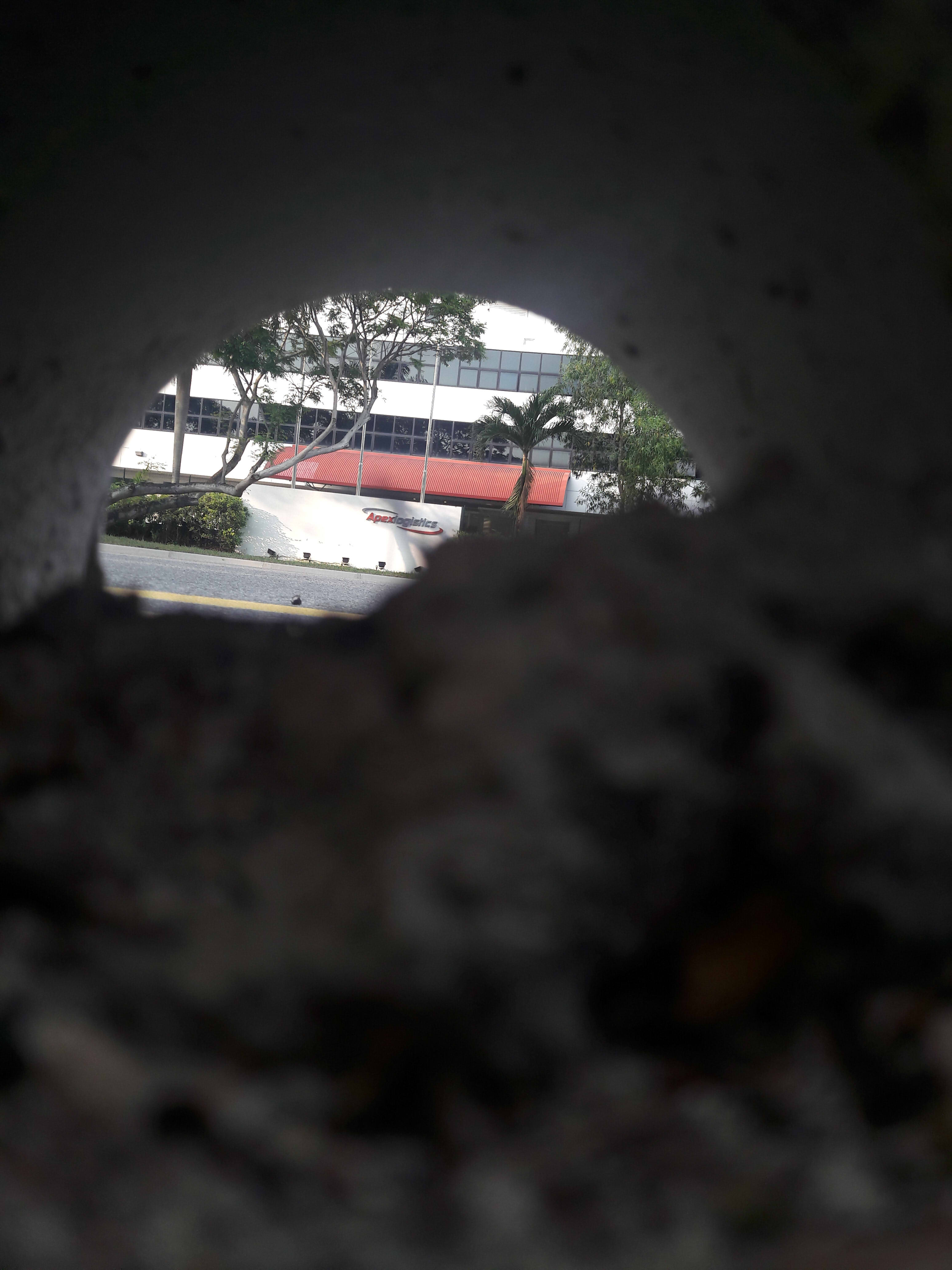
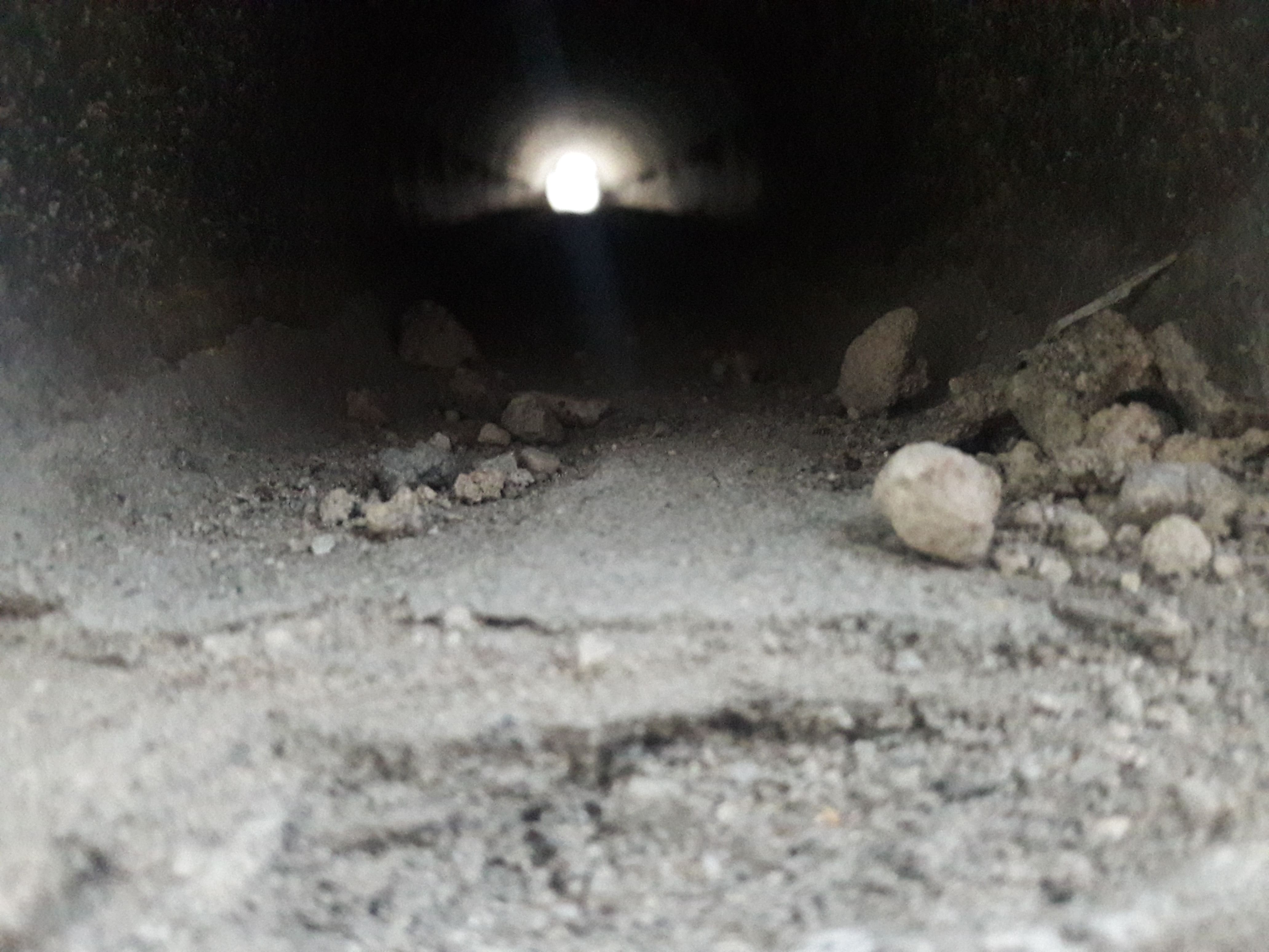
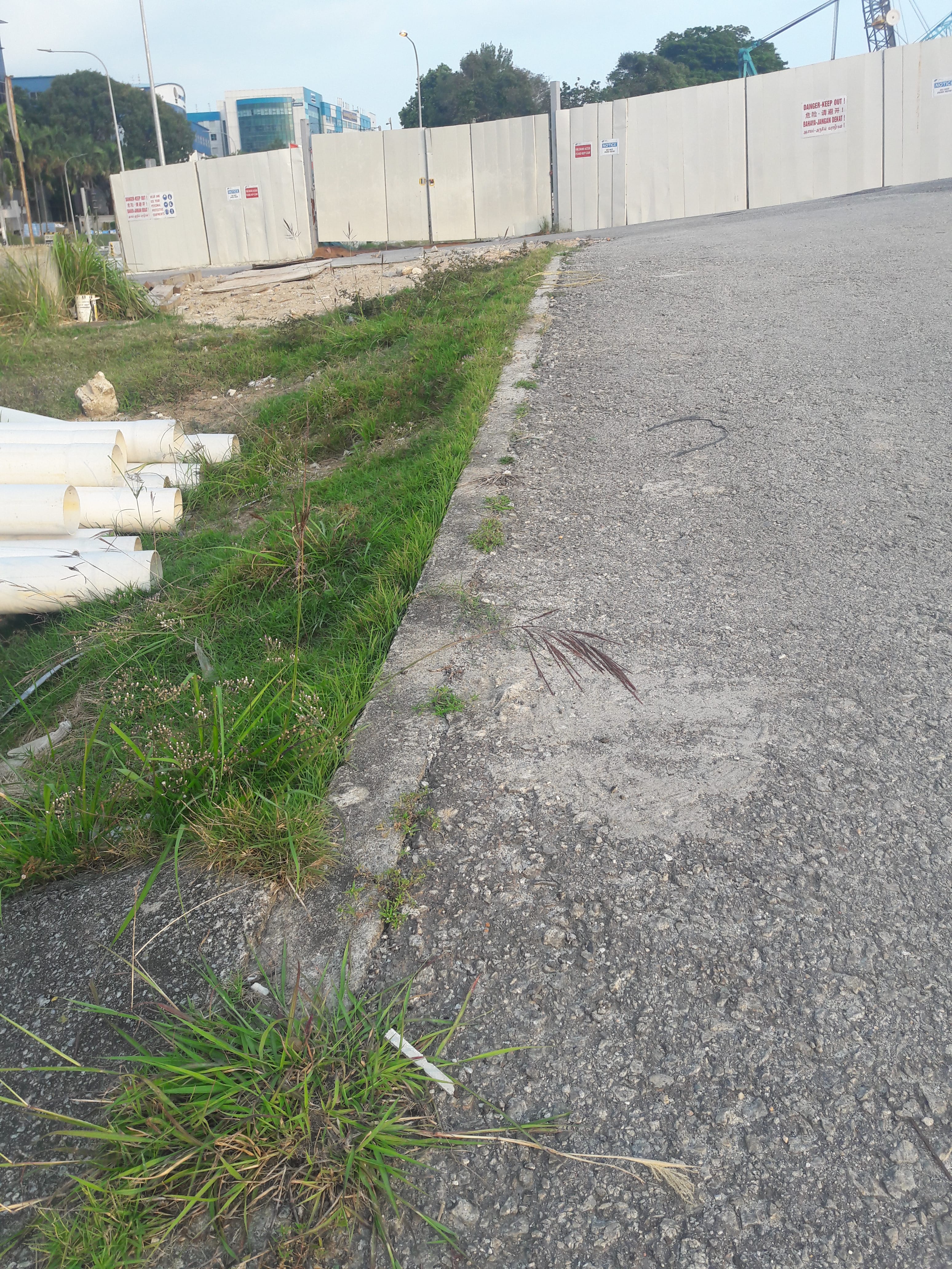
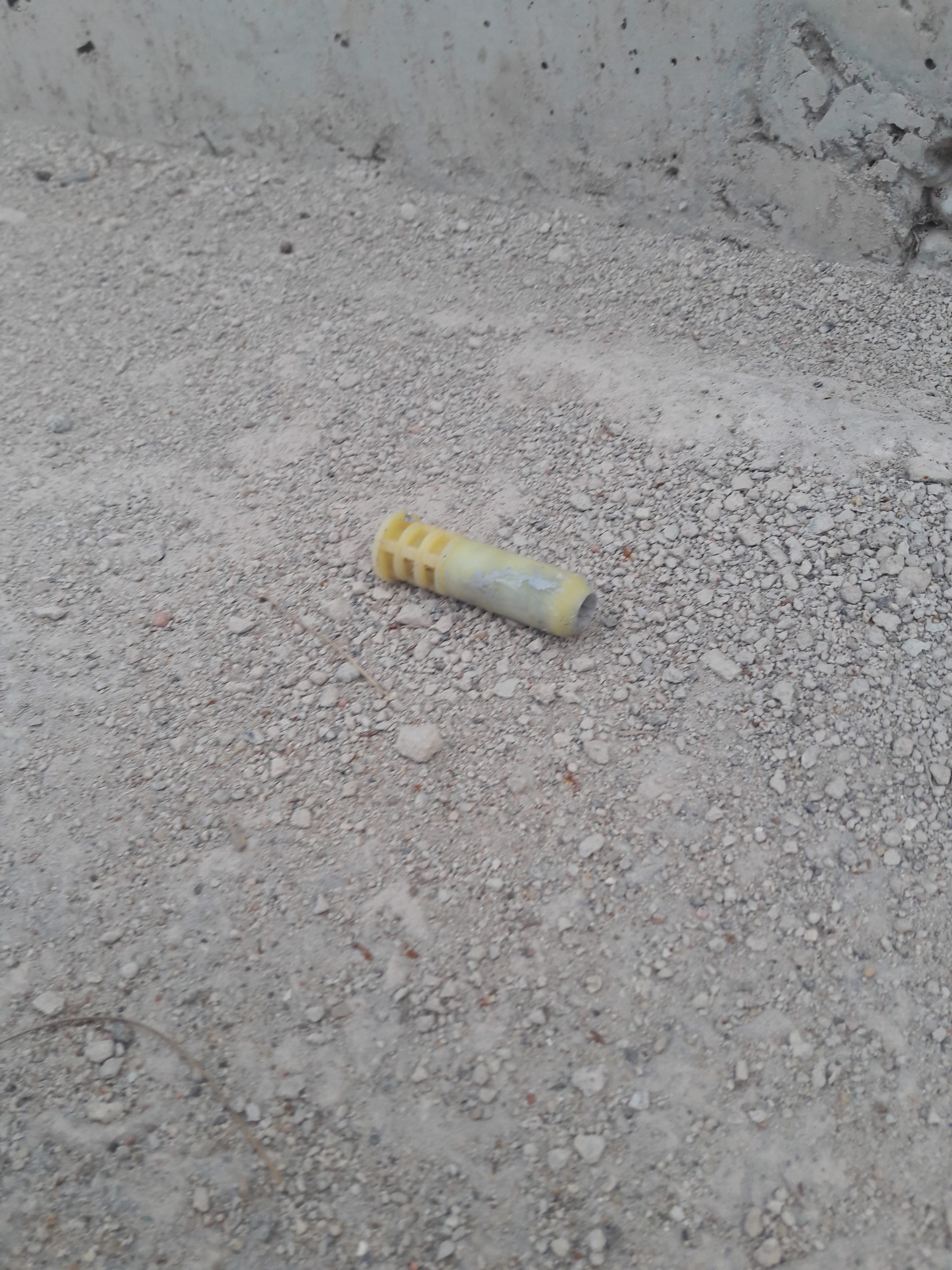
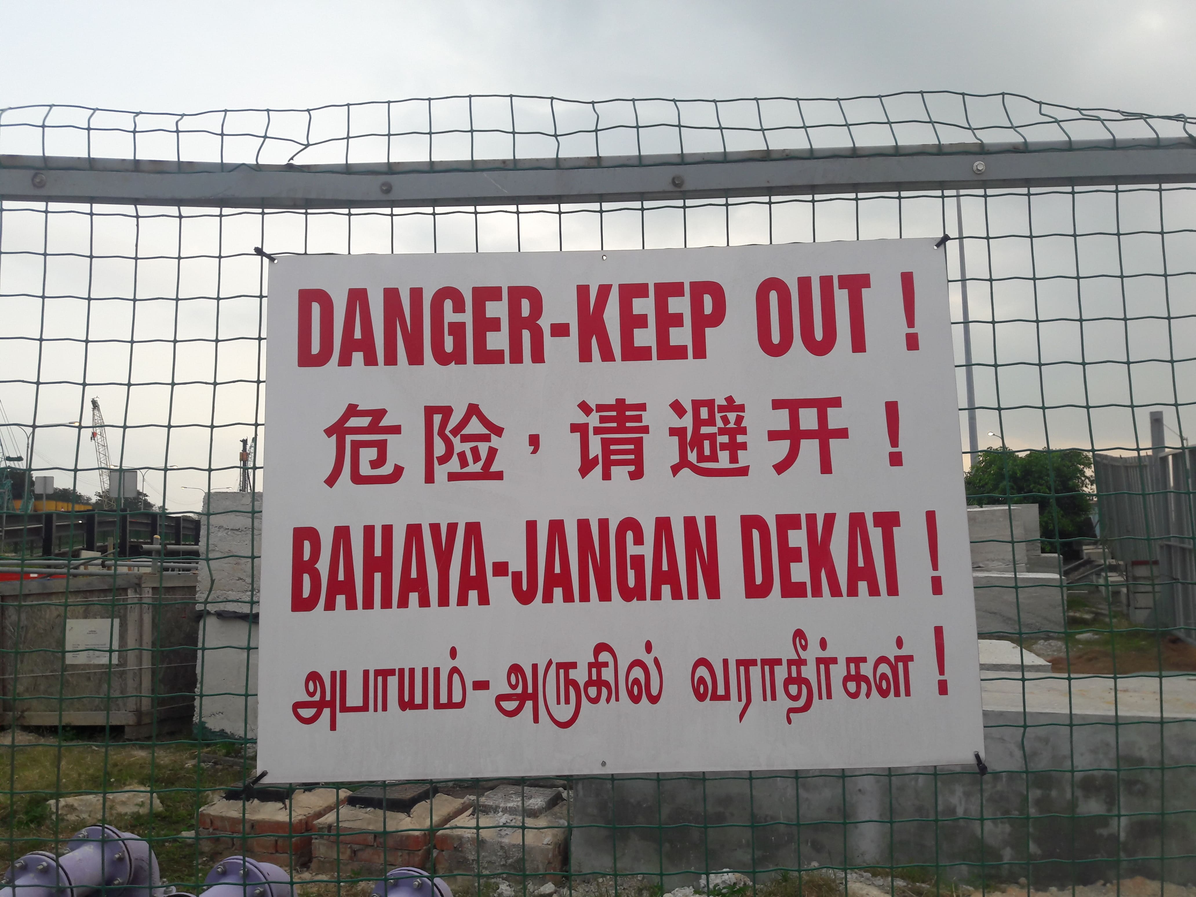
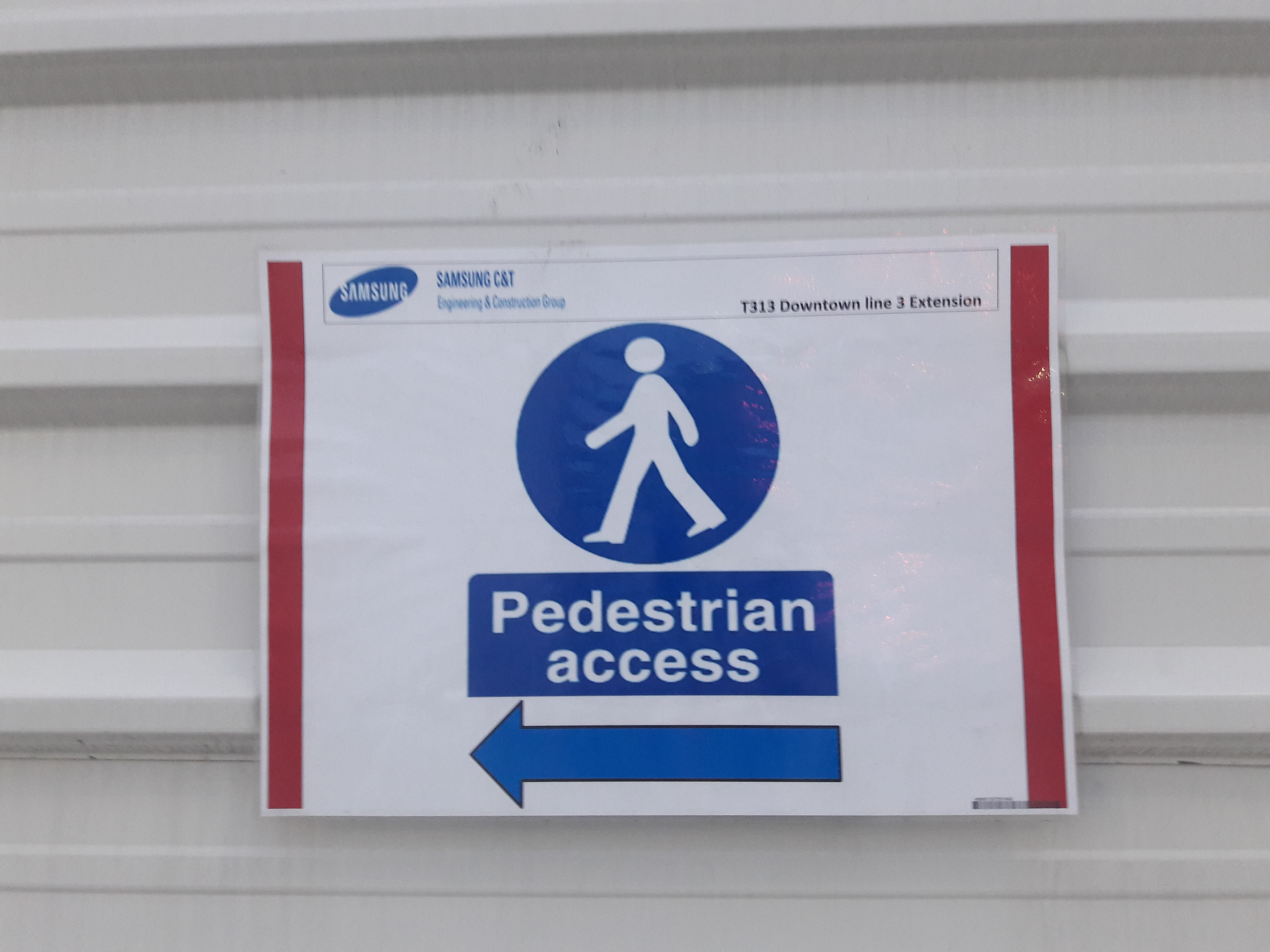
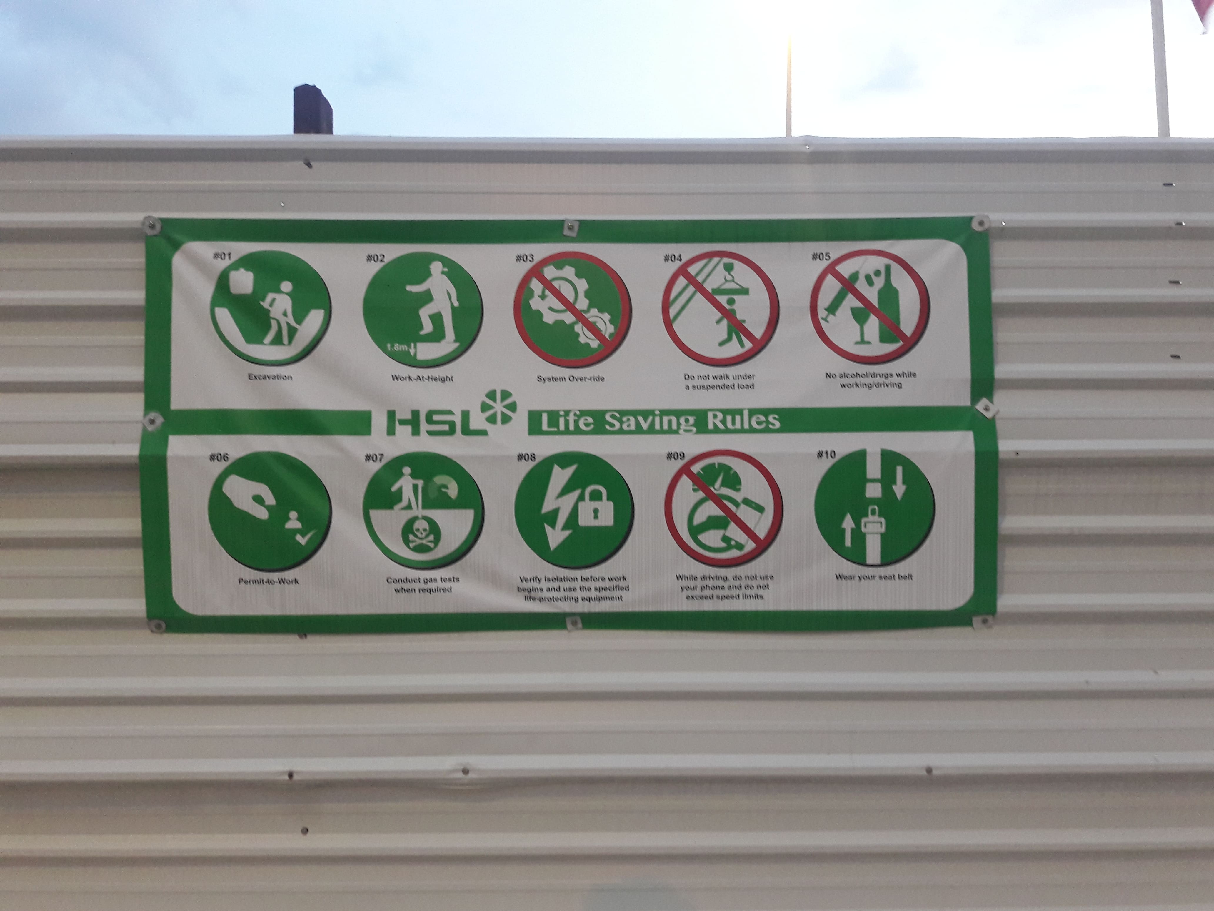
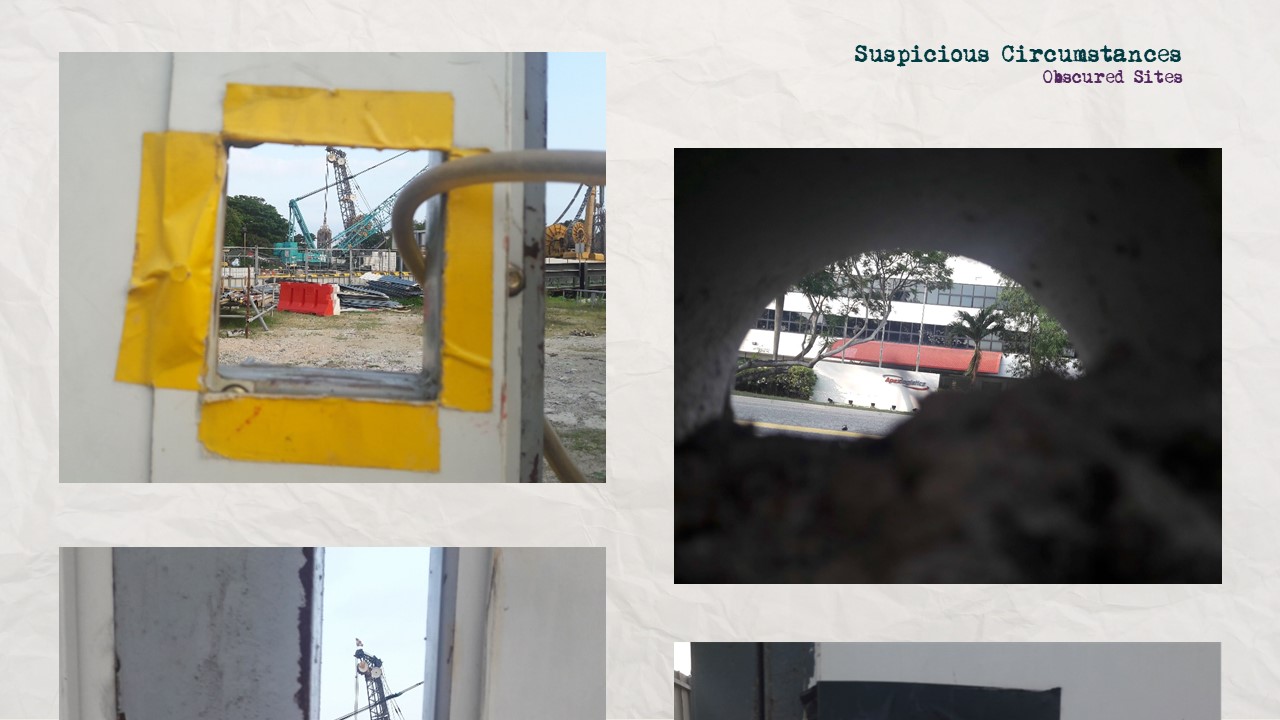
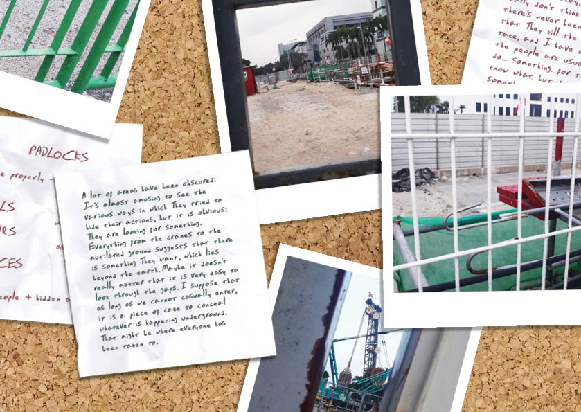
  • Obscuration: implication that something is being concealed
  • Corresponds to slides 13-14
  • Images of fences, barriers, etc.
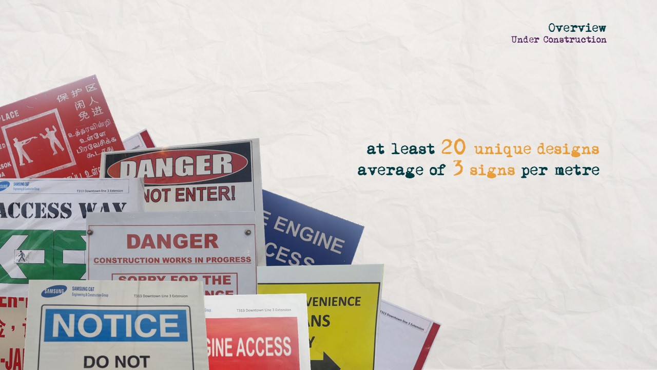
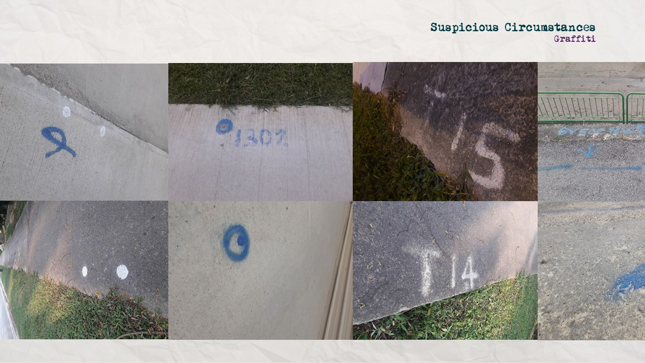
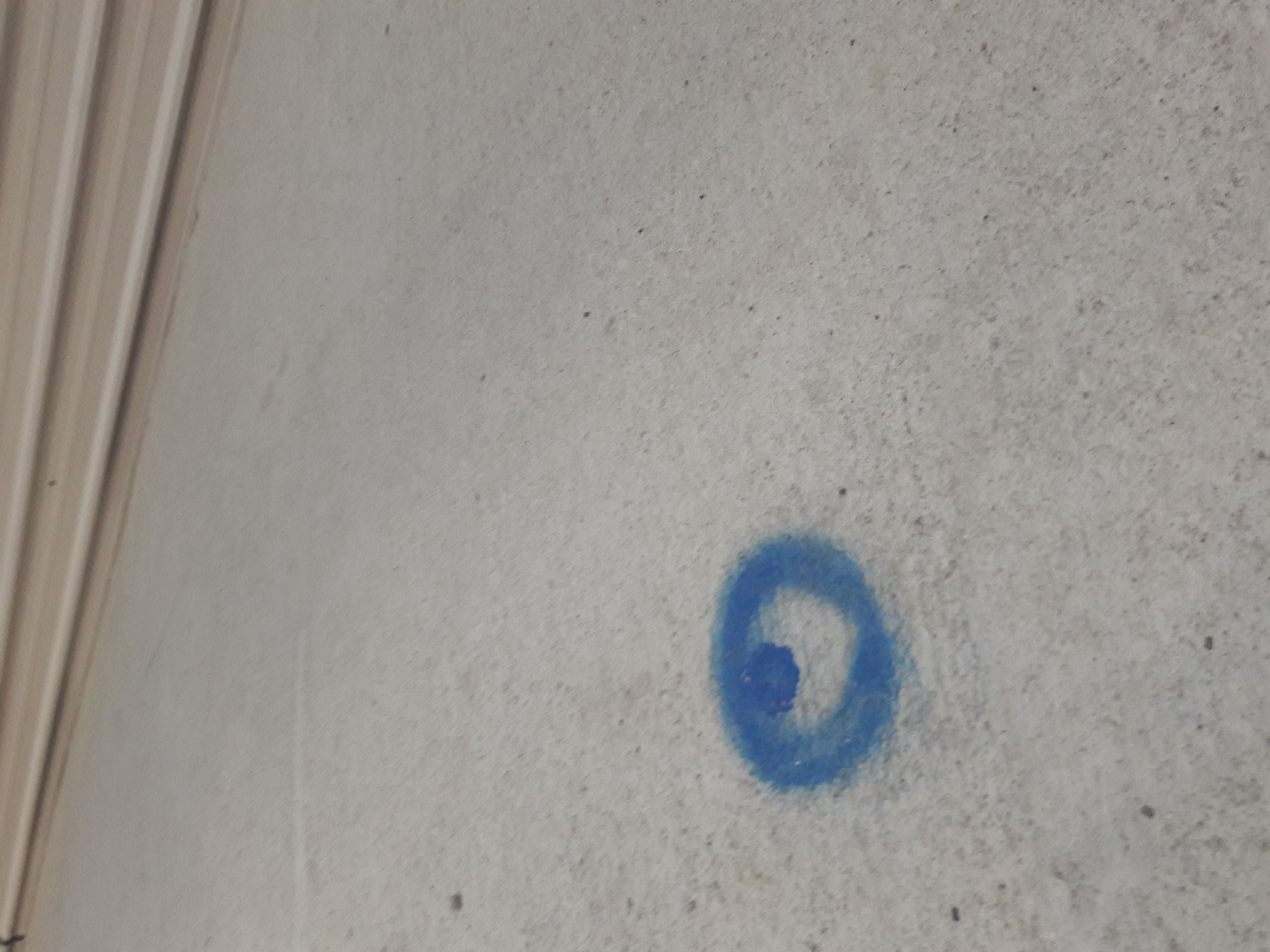
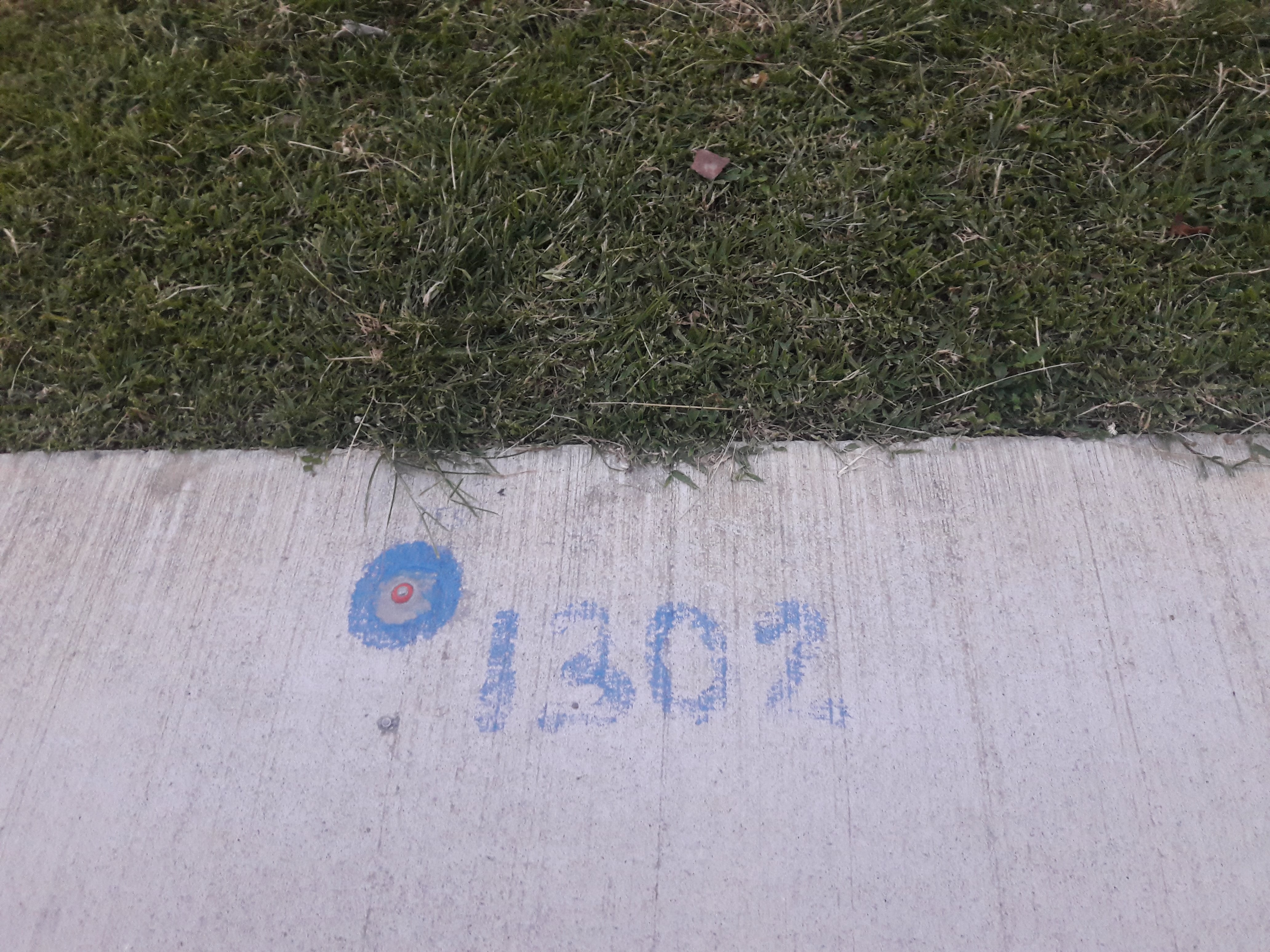
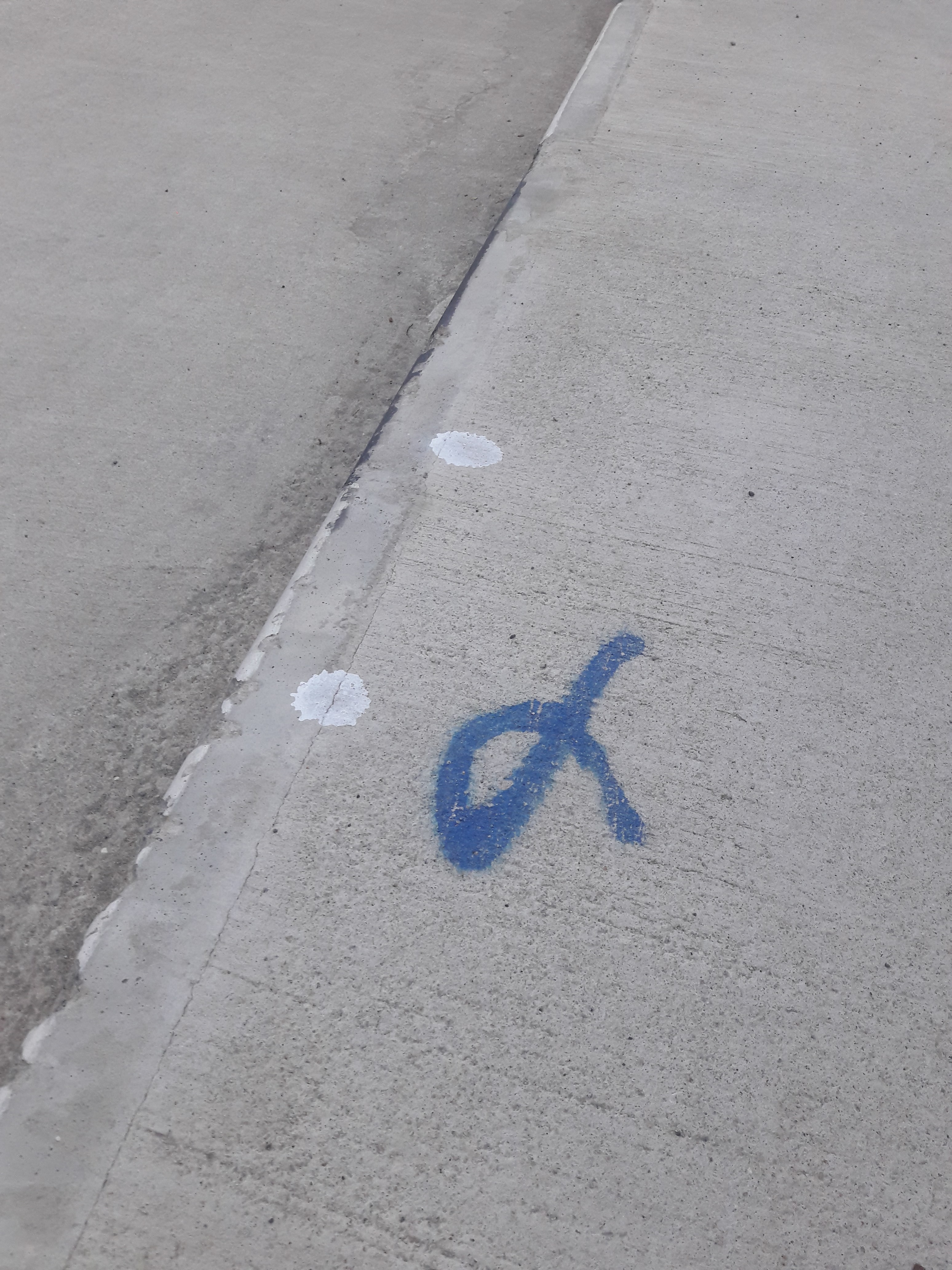
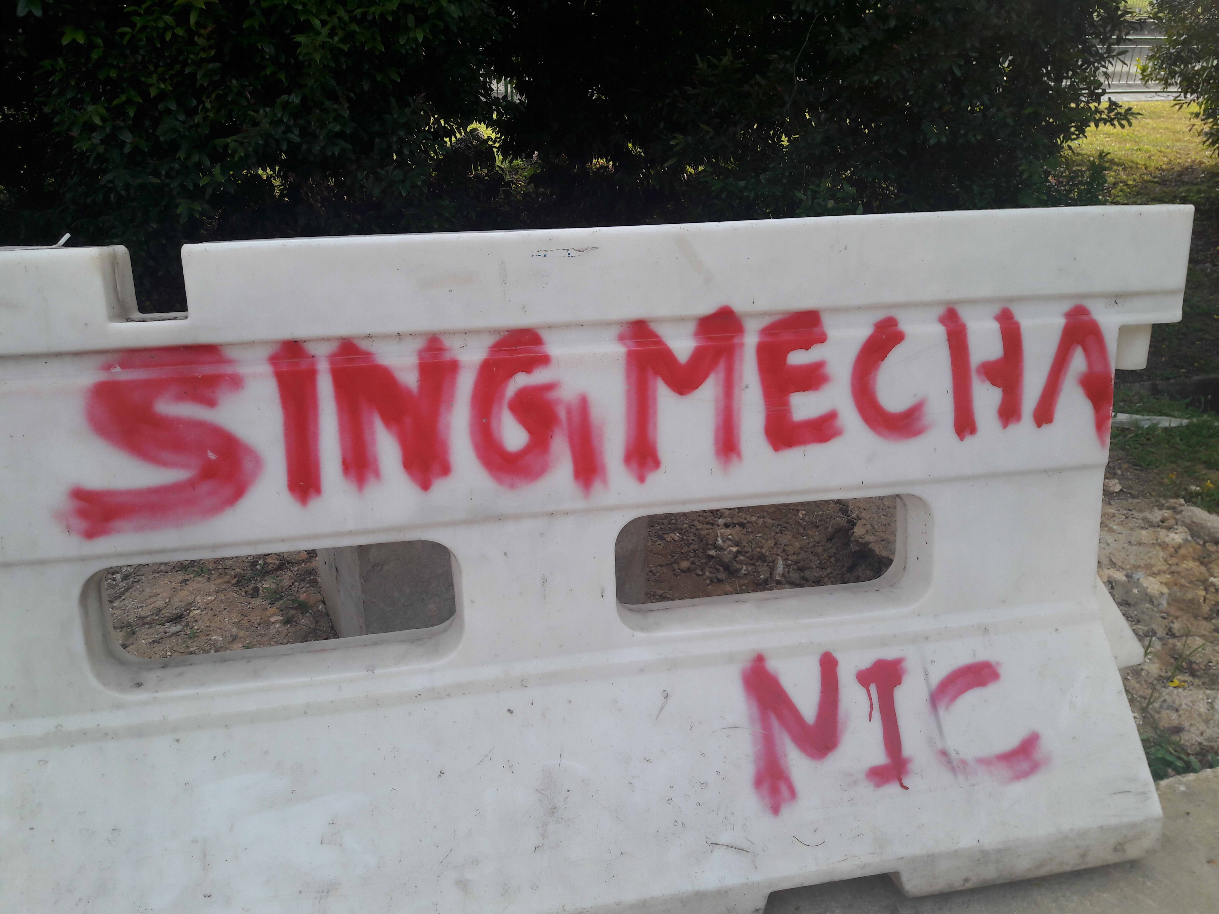
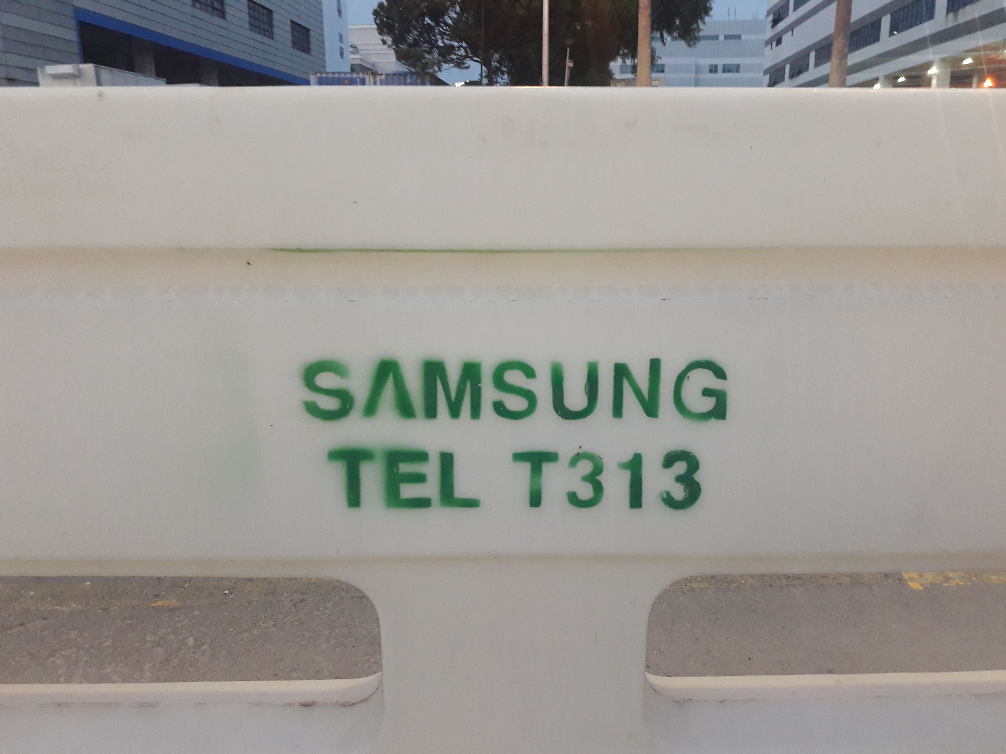
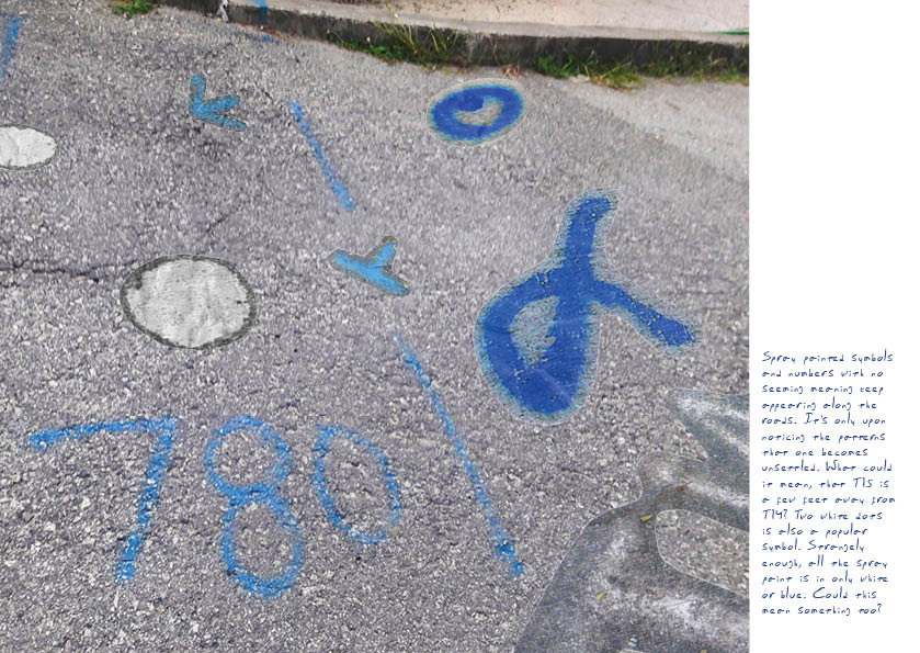
  • Symbols: implication that there is an undecipherable secret message
  • Corresponds to slide 11
  • Images of spray painted symbols and numbers


For the first draft, I designed based around the many photographs I had, opting not to use many hand-drawn elements to emphasise the notion of “quickly taking notes” with photography than sketches. The second draft onwards mostly includes minor edits to make it look more realistic, as well as complete upheavals of design for certain pages.
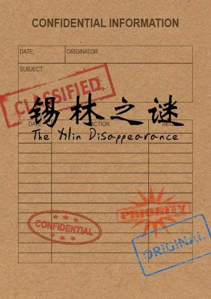
COVER

For the front and back cover, I was uncertain of what to do, and thus tried to think of it in terms of associated images. Thus, I considered the character 目, for the following reasons:

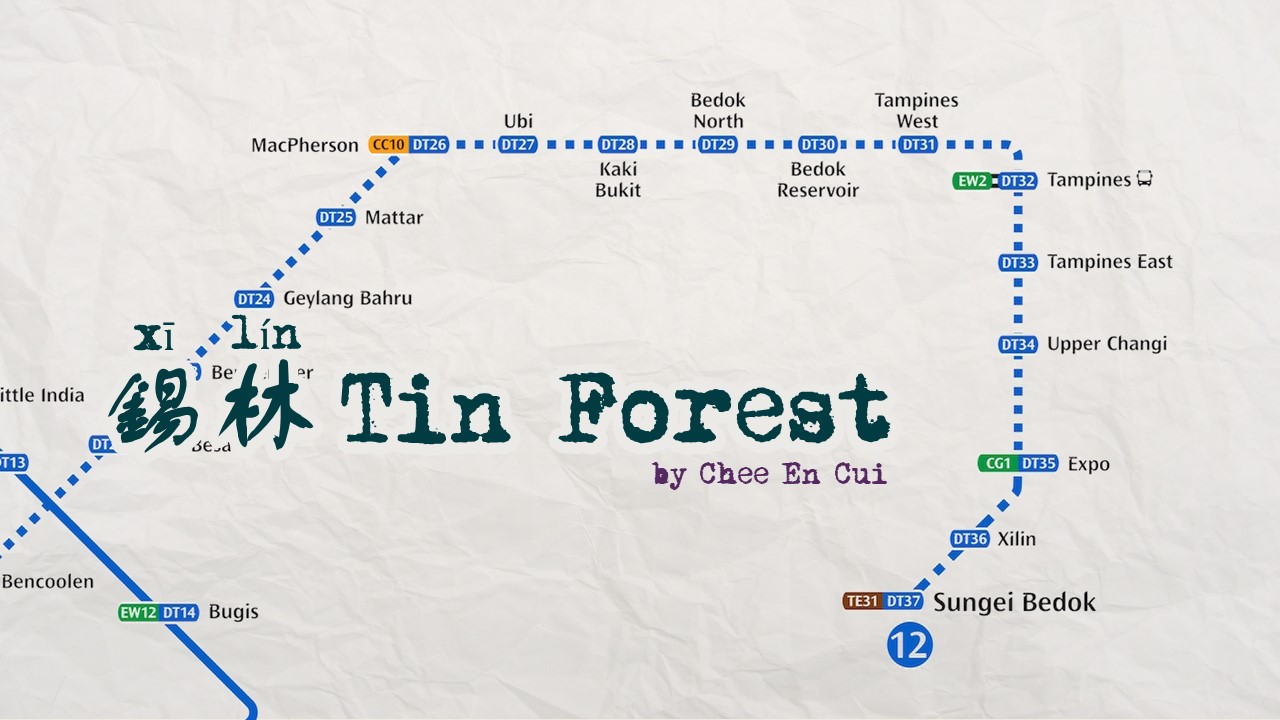
  • As a Chinese character, it links back to the Chinese name of Xilin
  • As a word related to “eye”, it evokes the eye of the Illuminati (conspiracy)
  • As a character with “bars”, it resembles the many fences of obscuration
  • As a character with three “windows”, each window corresponds to a folio of information
I was also curious as to the notion of having an image carry over from the front page to the back page.

Shirley’s suggestions:

  • Remove design elements which cannot be immediately understood without explanation

Thus, I shelved that character. After settling on the conspiracy report idea, I decided to go for a certain look, that of the brown case file folder.

However, I wasn’t quite sure WHAT to do with the kraft paper texture, until Shirley suggested to mimic the case file. When I expressed concern over that it would look too rigid, she suggested to just have it as a background, while keeping the title in the foreground and distinct from it.


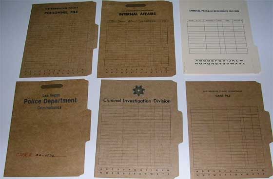
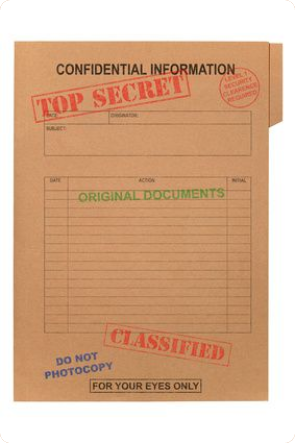
For some reason, the above designs instantly evoke an idea of the report, and thus I made sure to include key defining elements.

The title on the folder, the table cells, the brown textured background, and the stamps. (I lowered the opacity on the background text to emphasise the foreground.) With the background and foreground distinct from each other, there’s more opportunity for dynamism. I did try to get the stamps to interact with the title, though, in an attempt to show a certain level of depth.

REMAINS

In this page, I was uncertain what to do, and thus opted to focus on creating suitable spaces for text through proper positioning of images. Consequently, I tried to have balance by putting the images diagonally opposite such that it wouldn’t be too image-heavy on any particular side. To incorporate the element of haphazardly pasting photographs in, I skewed the images as well.

Shirley’s suggestions:

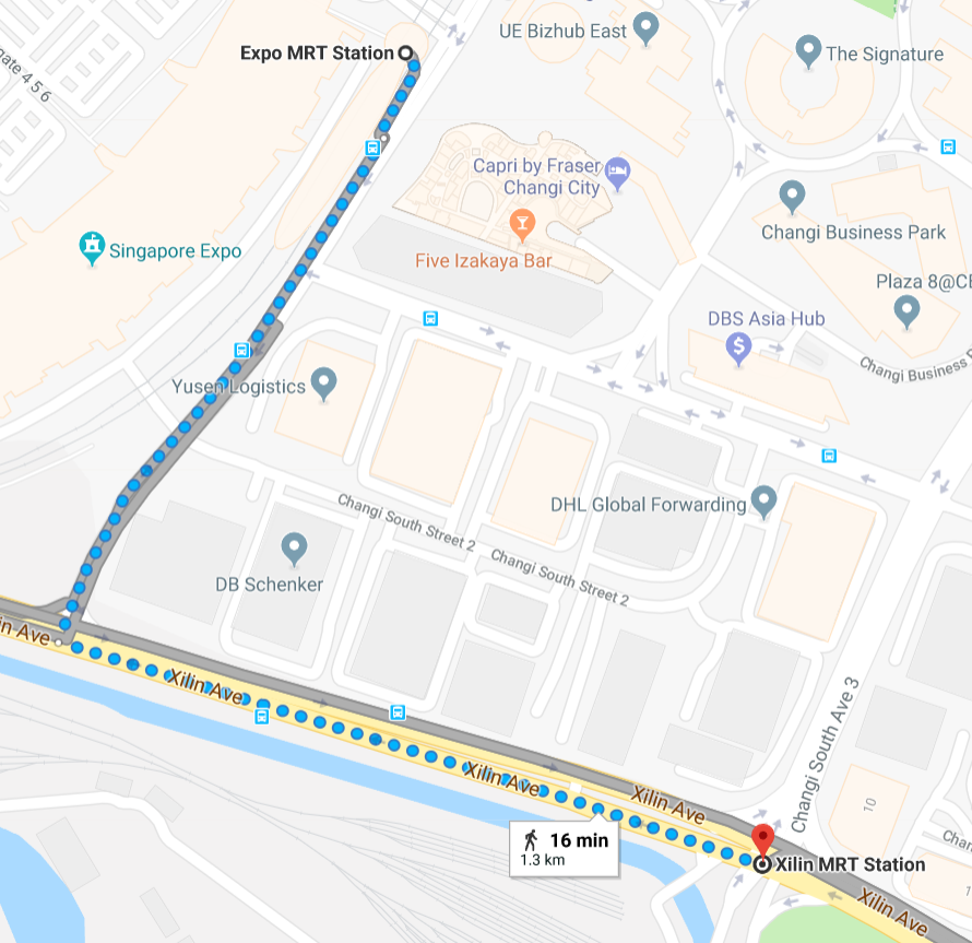
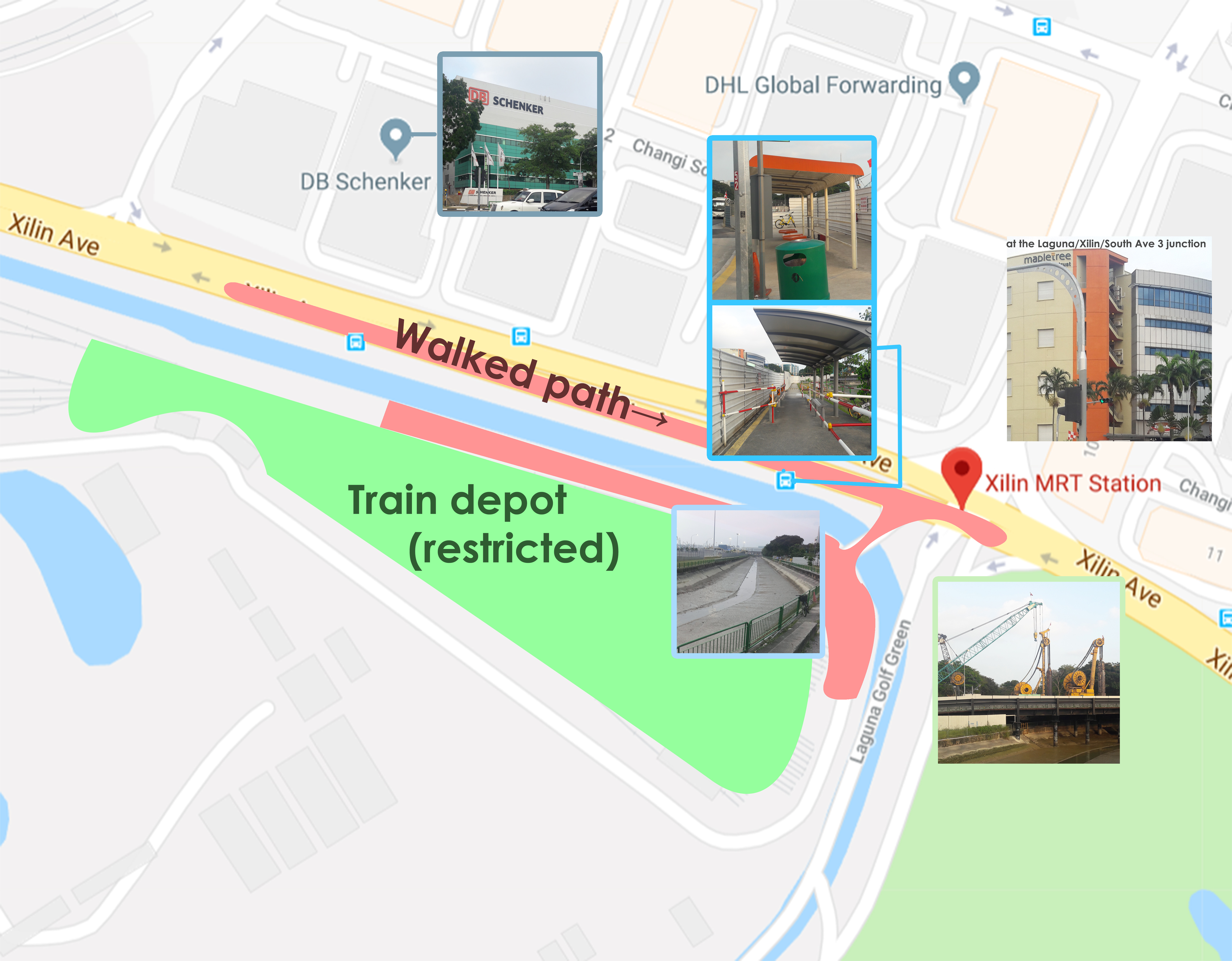
  • Insert a map (I decided this would be the best place to, and thus proceeded to do so)
  • Have an introduction than jump straight into content
While digitalising, I cut the edges rather rigidly with the Polygonal Lasso Tool to mimic scissors cutting. It also did not originally come with masking tape, which was added as an afterthought (and to provide some level of depth).

Shirley’s suggestions:

  • Reduce opacity of masking tape, to appear translucent than opaque
  • Too much vertical height of text without sufficient counteracting horizontal pull
  • Lack of visual hierarchy
  • Use drop caps to indicate the beginning of text

The images still appeared extremely unreal due to its flatness. Thus, I printed it out and slightly marred the papers by crumpling and folding them. For some, I tore the images slightly, or made a dog ear. Then, I scanned them back in.

In black and white due to being a test run (and saving ink). I also added in a proper map and annotations, where the map is meant to look hand-drawn. I also tried changing the ink colour to resemble handwriting. To try and counter the vertical pull/hierarchy issue, I shifted the milk carton and map to provide more space, to increase the font size, and make the textbox horizontally wider. Shirley also suggested actively having a colour palette (e.g. triadic), and some minor edits as to text hierarchy and drop caps.

Shirley’s suggestions:

  • Have a conscious colour palette (e.g. triadic, owing to the yellow bike/can, blue milk carton cap, and perhaps red text)
  • Only use drop caps for the first beginning
  • Have varied fonts for dynamism (e.g. typewritten font for the map or annotations, font weight)
  • Improve the map (logos to indicate MRT stations, reduce font size)
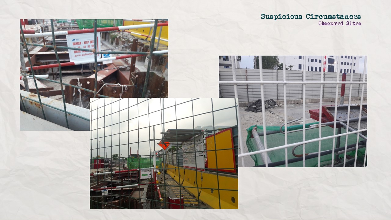
Final. In line with the change to a typewritten font, I changed the map to a digitalised map than the previous handdrawn version (the vectorised arrows, too). I also altered font weight for the hierarchy.

OBSCURATION

In this page, I considered a grid system, which would resemble the bars of a chain-link fence. At the same time, this would be helpful in limiting the amount of text while providing many spaces for images.

I felt that it would make for an interesting image, the lines of the fences against the lines of the grid system

Shirley had no comments for this, and thus I went ahead with it.

Upon digitalising, however, it turned out to be too neat, owing to the orderliness of the grid as opposed to the less rigid layouts of the other pages.

Shirley’s suggestions:

  • Change the design altogether, to something with a less orderly design
As such, it became a corkboard, which is typically messy. Initially, I had the text on InDesign-rendered white squares, but it was too neat, thus I printed, corrupted, and scanned them back in. I also added drop shadows to provide some sense of depth.

While I was concerned about the colours in this page, Shirley assuaged my doubts in pointing out a seemingly high level of green, accented by subtle reds, and the brown corkboard. I decided that it was important to try changing the text colour, regardless.

Final. Other than being complementary, I find that the green and red helps to differentiate what is “crucial” and what isn’t, where red is often an accent while green depicts the main subject.

SYMBOLS

In lacking a substantial design idea, I followed the first spread’s idea of haphazardly putting images to reduce space. I considered the use of negative space, where I would have a scatter brush of graffiti as the border, leaving negative space as the text box.

An example.

Shirley’s suggestions:

  • Use a concrete background instead for the texture
However, this structure simply did not work due to too much text space available even with an overload of images. Also, the structure was too similar to the first spread, which makes it rather boring.

Shirley’s suggestions:

  • Full-page image with 1 column of text on the side
(Additional graffiti in black and white as I printed and crumpled and rescanned) It worked a lot better in terms of limiting text space while remaining aesthetically pleasing due to the rule of third. I also tried to have a sense of depth by having slight perspective.

Shirley had no comments for this specific page, but in line with her comments on colour, I figured to actively consider the colours on this page. The graffiti I have only comes in white and blue, and the concrete is grey.
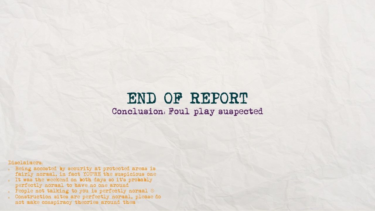
Final. In the end, it remains blue, the only colour with hue.

BACK COVER

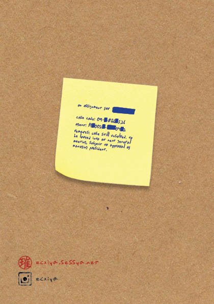
I was uncertain as to what to do with the back, considering that there is typically nothing on the back of a report. Using my imagination, then, I figured that it was not improbable that one might put additional notes on the back, to be read after reading the report. As such, I attempted that.

It did come off somewhat awkward, though.

Shirley’s suggestions:

  • Place the content on a post-it note instead
Final.

PEER COMMENTS

Some of the more common comments:

  • More high-res images
    • wasn’t sure if it was high res enough, so good to know
  • More plays on visual hierarchy, esp. on 2nd and 3rd spreads, e.g. by putting titles/more info
    • While I’m unsure if it’s wise to add unnecessary information, point is taken :’)
  • More sketches, doodles, annotations
    • no tablet so a bit hard but good to know :’)
  • Last spread not as interesting, not consistent design
    • In hindsight, agree. Perhaps it might have been useful to let the spray painted images splay over the edges of the background image such that it looks less like a properly designed page as opposed to many scattered images placed over a properly formatted page.
  • (varying opinions, some said it was good but a few said) font choice was slightly kiddish than strict
    • Not sure what to make of this personally
  • Consistency between cover pages and inside content, e.g. paper clips, post-its, folder tabs, etc
    • Another good point in hindsight :’)
  • More exaggerated narration, like Geronimo Stilton
    • Which I have… Never read but point taken :’)

OVERALL

All in all, it’s amazing how many issues seem so obvious in hindsight, but went completely undetected by me. To me, the most interesting part was that of trying to “collage” successfully: unlike illustrations, it’s difficult to control the proportions, perspective, colours. This made it somewhat difficult to me, in that I had to find ways to make the images work in my favour. While I picked by gut feeling, it seems that somehow my instincts managed to choose images with consistent colour palettes, surprisingly, which made things slightly easier.

I also felt like I learned a lot about graphic design just through experimentation and Shirley’s remarks, from text hierarchy to style consistency to variety (listening in on other peoples’ consultations was also surprisingly helpful!). I’d like to thank Shirley for being so helpful throughout the entire project. Thanks Shirley for being so helpful throughout the entire project!

Project 2 Research, and a semblance of Process

Project 2 Part 1 slides found here.

“If you’re going to go somewhere, might as well go all the way,” I said to myself, and that’s how I found myself wishing I hadn’t had the superb idea of riding the entire Downtown Line and beyond.

In all seriousness, though, the East is probably the most unknown to me, in that I have literally never been there apart from Changi, simply because I have never had any need to go there. Thus, I decided to look at the MRT map and find a nice sounding Eastern place to go to. Preferably, one I’ve never even heard of, because why not?

Also, I opted to go for DTL. Being the newest line, it probably also has newer and less well-established stations. Going beyond existing stations to DT36 Xilin also reaped fruitful puns involving “ceiling”, “east” and “forest”, which caught my attention.


THE JOURNEY

My first impressions on the way there from Expo was that it was a quiet area. Sure, there were a decent number of people at the bus stop, a mall, and the Expo to boot, but even the roads were almost eerily silent. That, and the general ability to see the sky clearly: many places tend to have tall buildings which obscure the skyline, but here, there was so little going on that it was somewhat easy on the eyes, having so few elements. The further I walked, the less populated the roads became. Awkwardly enough, this was pretty much the same on my second trip (in all fairness, both days were Saturdays).

Welcome to Xilin! As suggested on the shown map, this building is a marker of the junction between Xilin and South Ave 1.

As it turns out, Xilin is a somewhat significant road, and as such traffic exists, even if at a constantly low rate. While the roads may have had cars, though, the sidewalks were empty save for me. My guess is that the absence of people also had to do with the time of the day and the time of the year: as far as I could tell, Xilin was an industrial area, what with the many company-based buildings and general lack of HDBs. In fact, I don’t even think anyone was working, considering the lack of industrial sound, the lack of people leaving the buildings to go home, and the fact that it was a Saturday and the 2nd day of Lunar New Year to boot.


DOCUMENTATION OF AREA

PLEASE NOTE THAT quite a few of my photos and videos have been deleted as they involve the train depot, which, as it turns out, is a restricted area (I was hunted down by security).

I took a lot of photos, but for convenience’s sake, I’ve grouped them not by chronology, but by visual/thematic similarities. To avoid information overload, I’ve refrained from posting all pictures pertaining to said category. (This is the semblance of process part, where I mostly chose to photograph things on a whim, and later tried to determine why I had felt the urge to.)

  • Obfuscation
  • A lot of places were fenced up or hidden behind walls, and so it became a prominent part of the journey, to peek through various holes to see what the construction or industrial site looks like. Or, in general, to see how perception is warped.


  • Plants
  • Nothing new, but I was vaguely fascinated by some plants which I either have never noticed, or have never seen, especially the fuzzy, cross-shaped golden weeds.
  • Trash
  • What’s new, really! Trash is everywhere! Worker gloves and shoes were a somewhat unique but unsurprising trash, but I didn’t really find them interesting, so I neglected to photograph them.
  • Spray-painting
  • Weird markings on the ground and various things. You see this everywhere, really, but never quite question it. And yet, some of them form patterns in terms of repeated images, or colours, or numerical sequences.
  • OFO bicycles
  • While not new knowledge to me, it’s still interesting that industrial areas often have a lot of bicycles lying around, because it’s convenient for workers, where there are few buses, and it’s often flat and long stretches with practically no one to crash into.
  • Signs
  • Not unexpected for restricted or dangerous sites. What’s interesting, though, is variations of a sign meaning the same thing, or just how there ARE many different types of signs.
  • Peoplelessness
  • I’m still awestruck by how quiet it is.
Few images fall into this category alone, but it is the idea of the “index”, in the traces of humanity though there is no one in sight. (e.g. OFO bikes, trash, tyre tracks, etc). Or even the fact that there are buildings and construction sites at all, a testament to our existence.
  • The Sky
  • Like I mentioned, often not blocked, giving a fairly good view. Sometimes has planes too.


(that’s the train depot) All in all there really isn’t any sound but that of the strong wind, passing cars, the occasional train, and the occasional bird.

All in all, I have mixed feelings about the place. There is little sound but the wind, rushing cars and occasional bird, but it’s not really a peaceful quietness, not even melancholic or eerie. Instead, it’s more like silence, sterile and stagnant, devoid of people, of scent, anything. Indeed, it might be refreshing compared to the bustle of a shopping mall, but it lacks organic serenity, which leaves me feeling somewhat disoriented. There is a difference between solitariness and desolation, after all.

Xilin, in fact, reminds me strongly of various other industrial areas, such as Senoko Way or Joo Koon Road, just much less populated in that there doesn’t appear to be any of the usual local coffee shops to cater to workers. Additionally, it is surprisingly close to a reknown location, the Singapore Expo, and the Changi City Point shopping mall. In itself, though, the only differentiating quality is perhaps just that there is the Changi train depot.

In the end, though, it’s a place which can easily become rumour fodder, due to its low profile and desolation. It has the makings of a post-apocalyptic location, not unlike the feeling you might get when you come out of a shelter to find that the world has ended.

It also has potential to sound exactly like the site of a government conspiracy, where a lot is covered up, or can be viewed with suspicion. Perhaps my zine would be a thesis for a conspiracy, or a documentation of the end of the humanity.