Analysing SHAFT surrealness & Quote exploration

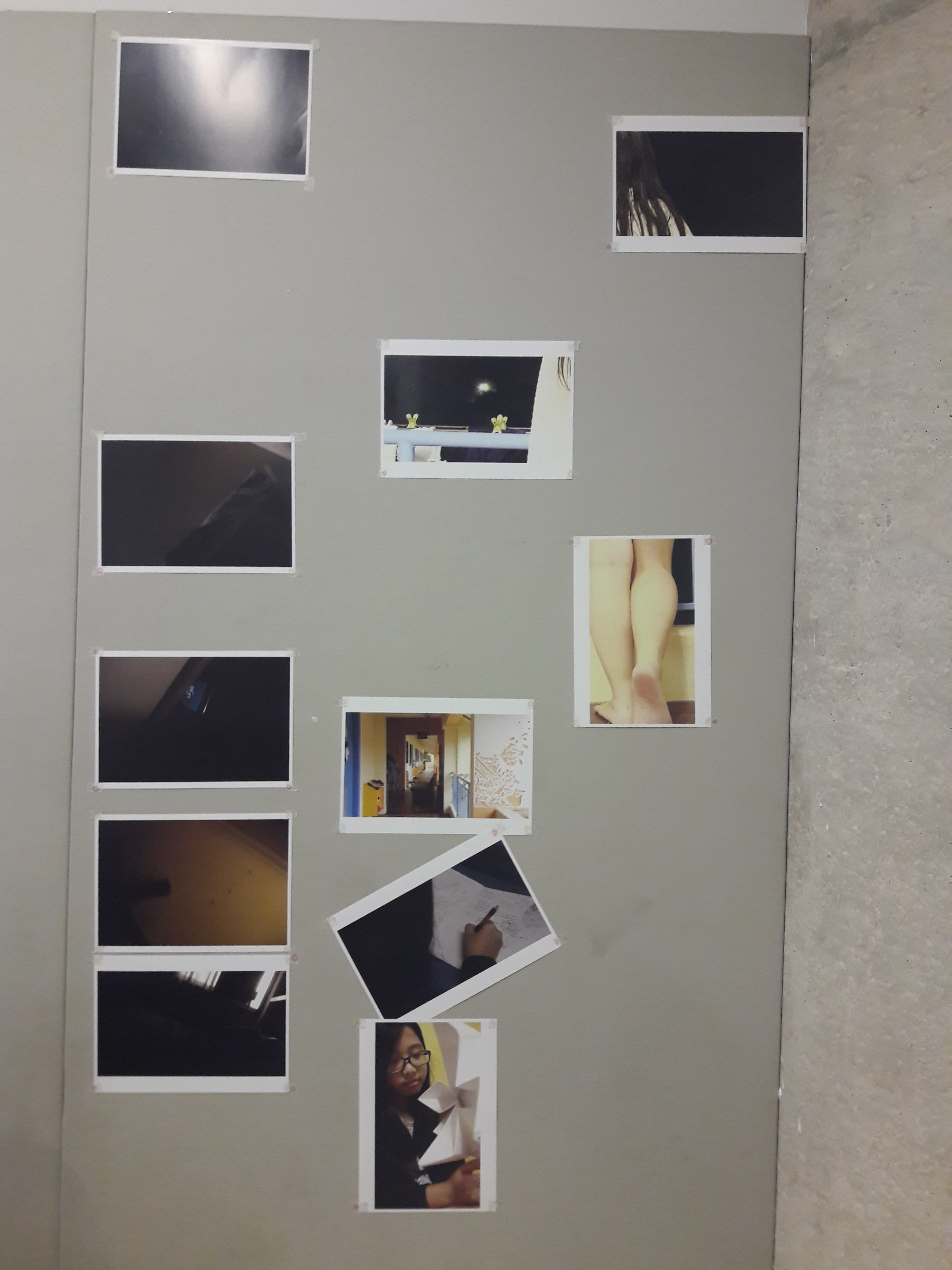
Alternative title: Excerpt of me brainstorming on Sept 23 at 01:03:29 because I couldn’t think of anything.

The fact that I myself, at the moment of painting, do not understand my own pictures, does not mean that these pictures have no meaning; on the contrary, their meaning is so profound, complex, coherent, and involuntary that it escapes the most simple analysis of logical intuition.

I always feel like I have problems conceptualising “surreality”, probably because my opinion on it is very close to Salvador Dali’s, that true surrealism is when I create something that even I can’t understand. But I don’t think that’s something I can do, to let go of all rationality and be able to confidently say that’s what I’m presenting, and yet, I can’t feel comfortable creating something that was purposeful, imbued with meaning, and call it “surrealism”. And that’s problematic for me, because it really affected my ability to complete Project 1, and, as evidently shown by my lack of progress even by this date and time, Project 2.

So I’m writing to make sense of things. When I try to narrow down the scope to something more tangible, then, I think more of SHAFT. They’re a Japanese company renown for their unique style, which often treads the line of symbolic surrealism.

SOME SHAFT ANALYSES

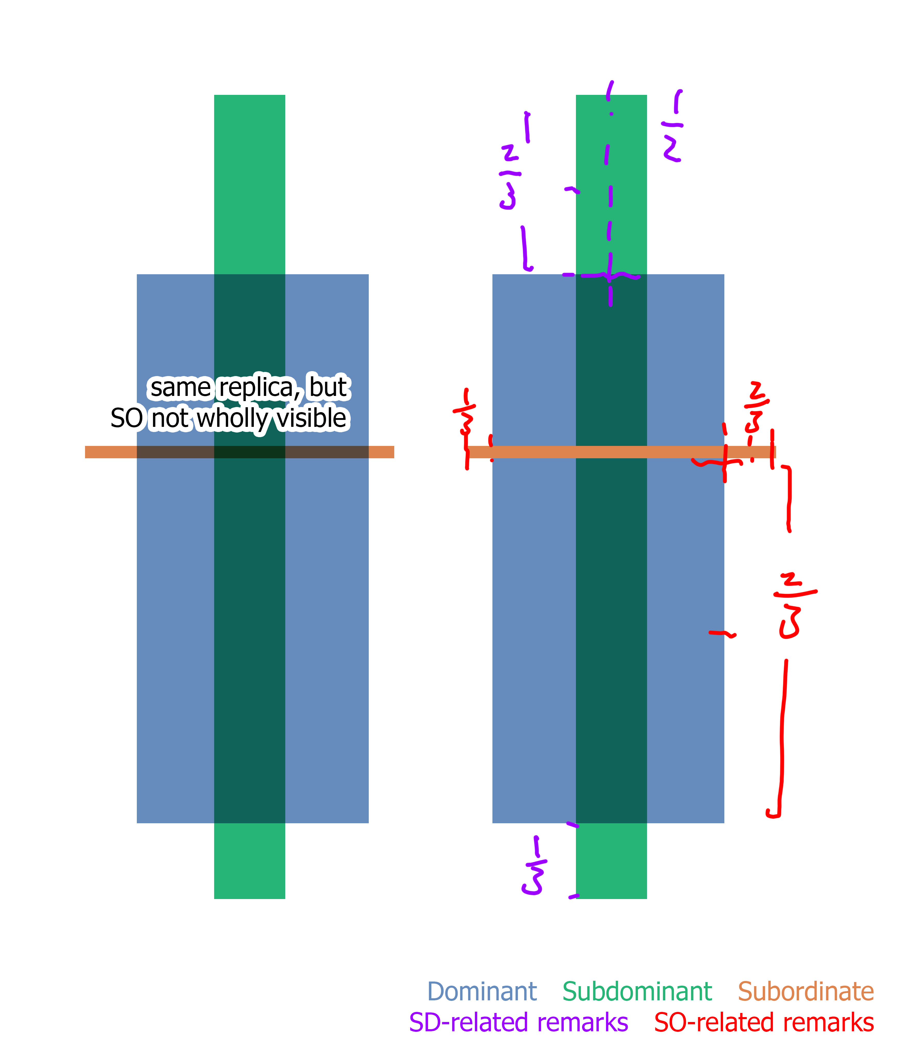
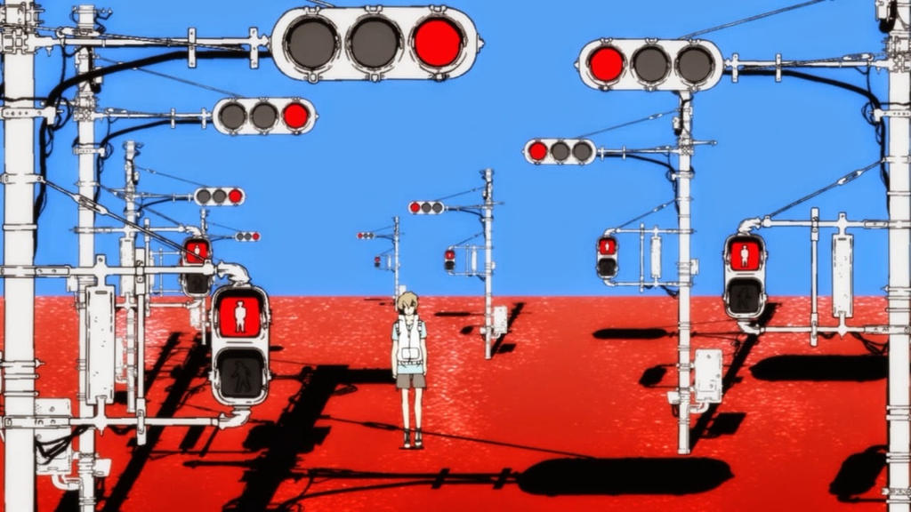
I think the best examples are their portrayals of witches, otherworldly beings of despair (sample 1 and sample 2). In both examples, the witches and their domains are seen in juxtaposition to the “real world”, where they create a world which is nonsensical, filled with extended imagery, repetition, etc.

(Some background knowledge, first. The “witch” is an otherworldly monster, which has her own domain, a world separate from the real world and shaped by her warped consciousness. She also has minions, servants which act as her proxies. Also, Madoka is the pink-haired girl.)

Sample 1 shows the domain of the witch Elly, who is described as the “box witch with a covetous nature. She is a staunchly reclusive witch. Anything she covets she locks away within glass. The thoughts of her prisoners are laid bare, but one can strike her without thought without problems.

The video presents this nature in a surreal way which I will now attempt to analyse.

The witch herself takes the form of a girl. Her torso is like that of a ball jointed doll’s, and her bottom half is a mess of colours (a skirt?) resembling some kind of haphazard oil painting. Everything about her looks like a messy painting, but when presented on screens she is shown to have a clear form, though she is but a silhouette. Perhaps this pays homage to her nature as a recluse, as she appears only through screens, only appearing as her true form when dead. That her body is like that of paint (and of a doll) is also suggestive of how she is easily struck, like paint which can be melded easily (or a doll which can be fragile).

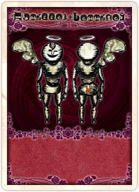
Her servants are humanoid, but anti-naturalistic, and with one wing and a halo. “The box witch’s minions with the duty of transportation. Anything they touch becomes easy to carry.” Again, the bizarre form ties in with the crazed mind of the witch, and the wing and halo likely represents how they are like angels, which “carry” precious things to “paradise”. Their purpose also likely ties in with her coveting nature, in wanting to take precious things. This is shown thoroughly in the video, where they carry Madoka, defying the laws of physics (she’s probably heavy!)

http://wiki.puella-magi.net/File:Card_Daniyyel_Jennifer.png

SHAFT also uses a lot of imagery, and for conciseness I’ll just summarise:

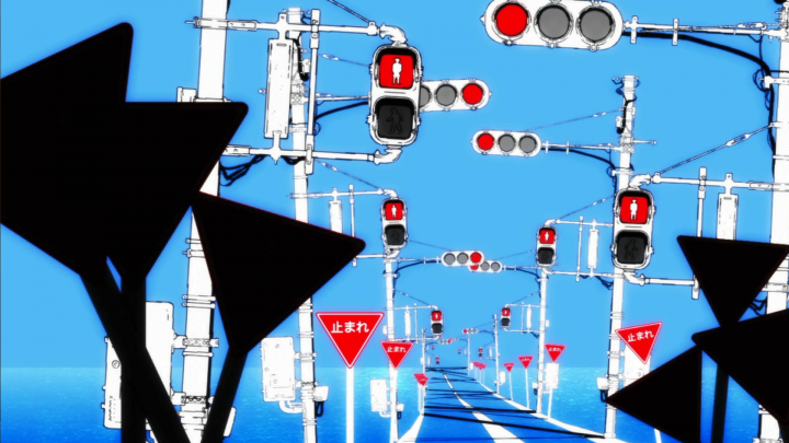
  • Entering the domain: I’m classifying this together because it’s a mess of fast-paced “blink and miss” patterned images. Doors opening, windows with people behind curtains, a screen with illegible green digital text, headless women dressed in different colours, flipcard-worthy girl-walking animation, then the “eye” opening. I think the door is pretty obvious, the curtain not so much (the idea of a guest being anticipated?) The screen, perhaps the witch setting up; the headless women, possibly previous prisoners, all similar looking with only minute differences, and the flipcards, possibly showing the witch preparing herself? The eye opening is rather clear, too, that it’s about entering the soul.
  • Carousel horses: Gaiety? Naivety? I’m not too sure on this, but it’s probably safe to say it shows a certain carefree festivity. The horses are also shown to carry the screens, and line the domain in a cylindrical shape, so they possibly act as the “bars” as well.
  • Screens: Likely the “box” that she is mentioned to be the witch of. The screen likely represents her nature as reclusive, in that she appears only through a proxy. It also shows the ability to lay bare the thoughts of prisoners, where the screens show things about Madoka which the witch should not know
  • Water: Or is it? It appears to be, but there’s no oxygen deficiency, and the water doesn’t seem to adhere to physics. Nevertheless, this probably corresponds to the idea of being trapped within “glass”, where both are clear.
  • When Madoka is saved, au contraire, things shift back to “reality”, the original art style, and proper “real” forms fighting against the surreal witch’s world.
  • Even at the end, “blood” is presented as a colourful rainbow, or black ink spurting out and splattering onto the domain’s borders (the real screen)

I won’t talk about Sample 2, which involves a main character and will definitely have a lot of things which can be mentioned.

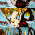
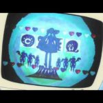
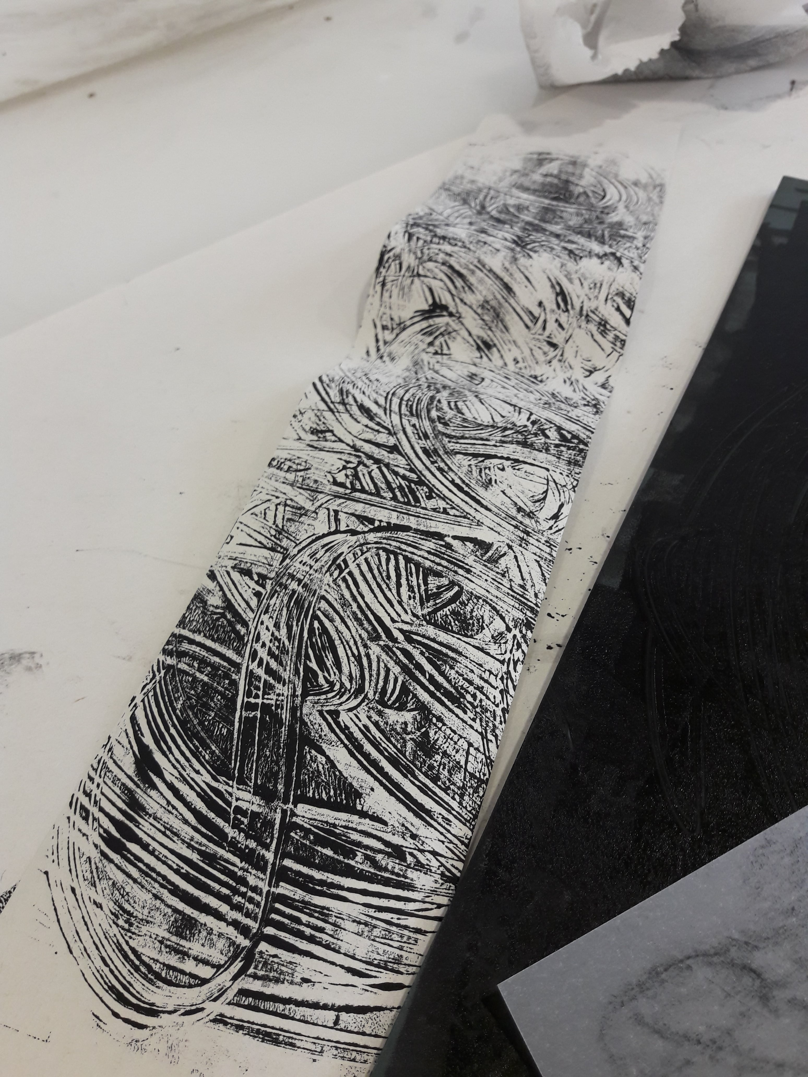
Some of their backgrounds too, especially when the background doesn’t represent the physical space as opposed to a character’s feelings, or a certain overarching theme/aesthetic. I mostly like the random/alternating/whatever rhythms, especially geometric shapes with a chaos of intersecting lines at random angles. (1 2 3 4)

HOW THAT APPLIES TO ME

For me, what I find most admirable is the beauty of extended imagery. I really like having consistent ideas running throughout and reminding you of their existence. I also like contrasts, so the whole surreal versus reality/single person vs repeated background/etc is really appealing to me too.

I initially wanted to do some other “real people” films, like the charming (but also non-international release and obscure) Tetsu no Ko and Kingsglaive (just because I’m FFXV trash). For the sake of actually having a linking theme, though, I decided to just go with animated Japanese youth drama films, i.e. over the top drama, some existential crises, social anxiety, etc.

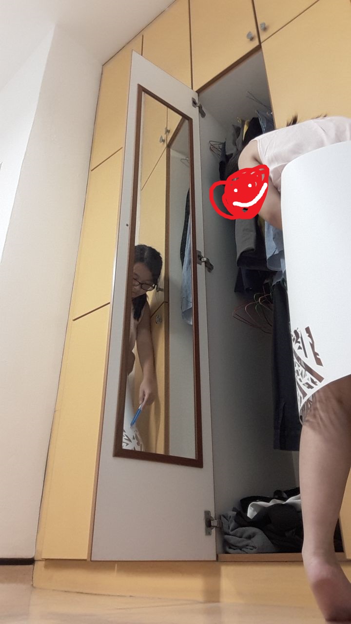
The problem I previously had was lack of personal input. So I’m going to do what I do (almost somewhat) best, which is writing prose about my feelings, then taking the key points and associating it with images.

どうすれば良かったの?(What should I do?)

I’m at a loss as to what to do, with too many burdens pulling me down. Somewhere out there must be some form of salvation, I wish that I could purge it all, throw away everything, but vines hold me down, they ensnare me and whisper to me that there is no hope beyond this mundane existence. Please let me be free. I want to be free from all of this.

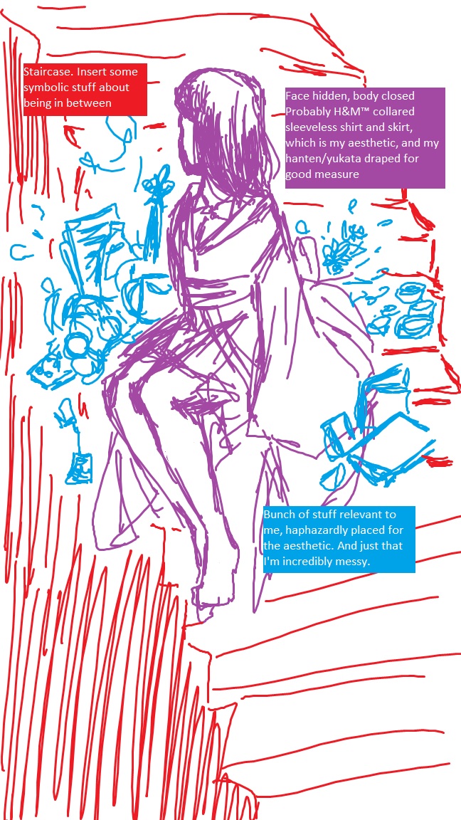
  • At a loss (human figure background)
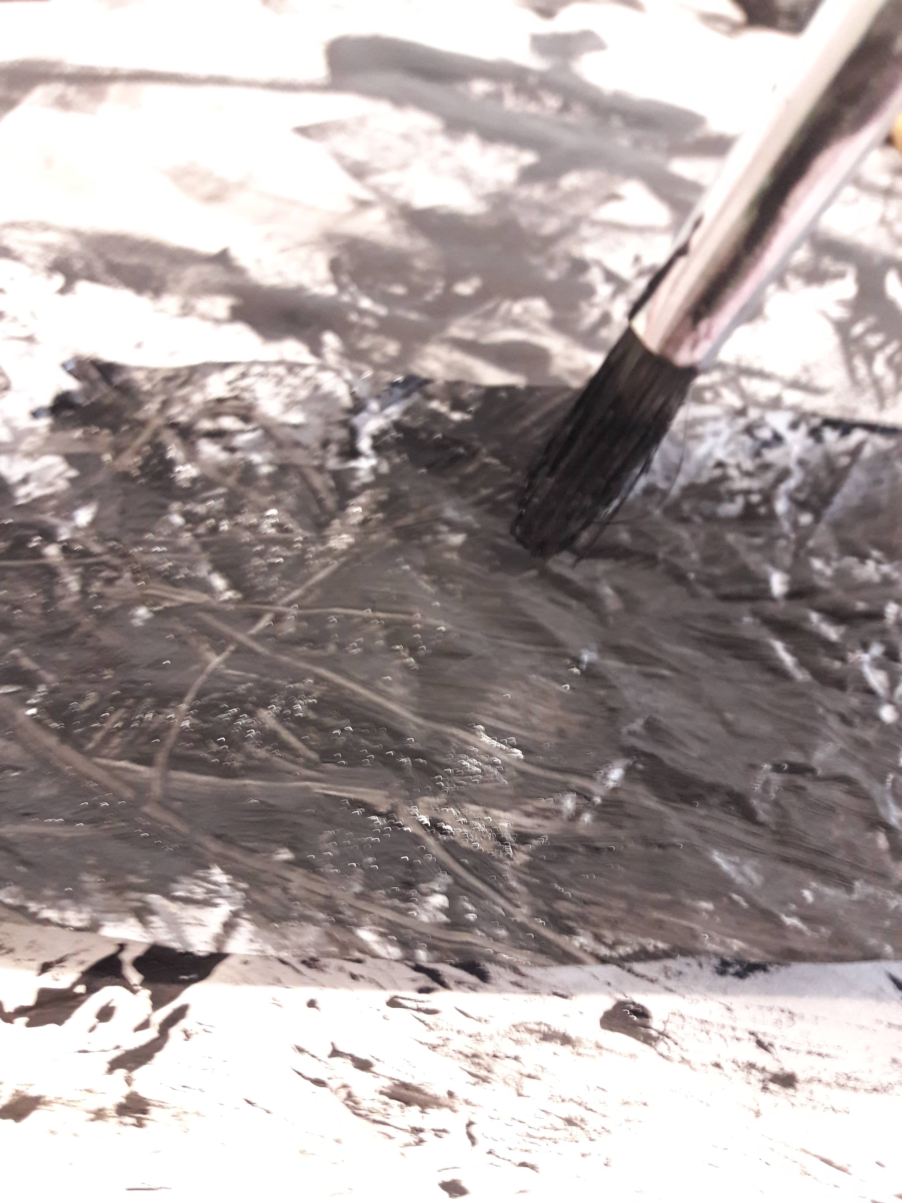
  • Burdens (a mess of stuff)
  • Salvation (water, heavenly and clear)
  • Ensnarement (snakes, holding you down)

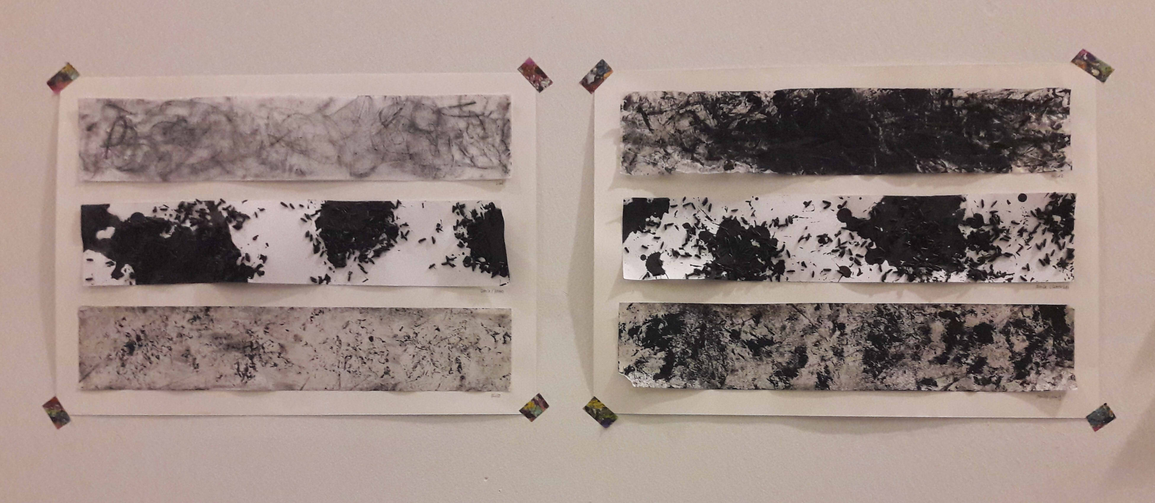
I’m feeling somewhat dissatisfied at my current composition, because I did it separately before the others so I don’t feel like I’ve put enough linking qualities to the other compositions (e.g. border shape, repeated/similar imagery), and it feels very different from the rest in terms of overcongestion. I do want to include koi fish and “no solution” math, but it seems somewhat irrelevant…

それが結び。それが時間。(This is connection. This is time.)

Even though my body is torn to shreds and I am wrecked beyond repair, but my existence still remains. As long as my influence on this world remains, even in the smallest shard, I still remain, for all my ephemerality, for all time and space. Even my cough can change the world, or perhaps not, but somewhere, somehow, I changed something in this world, and that binds me eternally to this space.

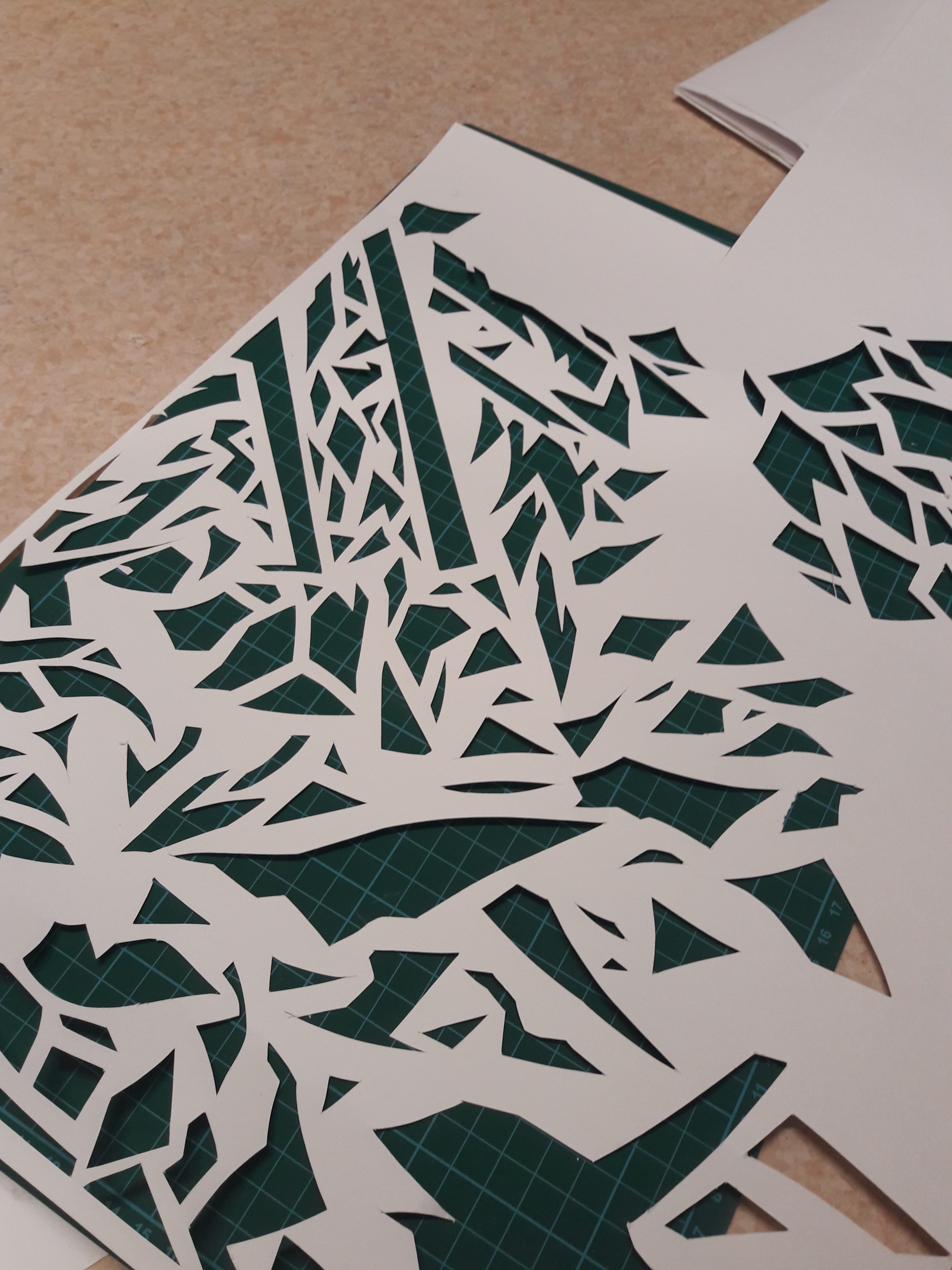
  • Destroyed body (cracked sculpture)
  • Ephemerality (sand)
  • Influence on world, even smallest (butterflies)
  • Time and space (ancient architecture)
  • Eternal binding (??

私の声消えたことみんな喜んだ (Everyone is happy that my voice has disappeared)

No more, I am afraid, don’t listen to me. How audacious, how filthy the sound, and when even I can see the entrails of these soiled words, no matter how innocent they seemed to be when they came out. I can’t breathe knowing that someone possibly holds disdain for me, by what I said, I can’t breathe thinking their eyes tear me apart and my words which I didn’t think of prior have were always monsters which would create a rift between me and everyone else.

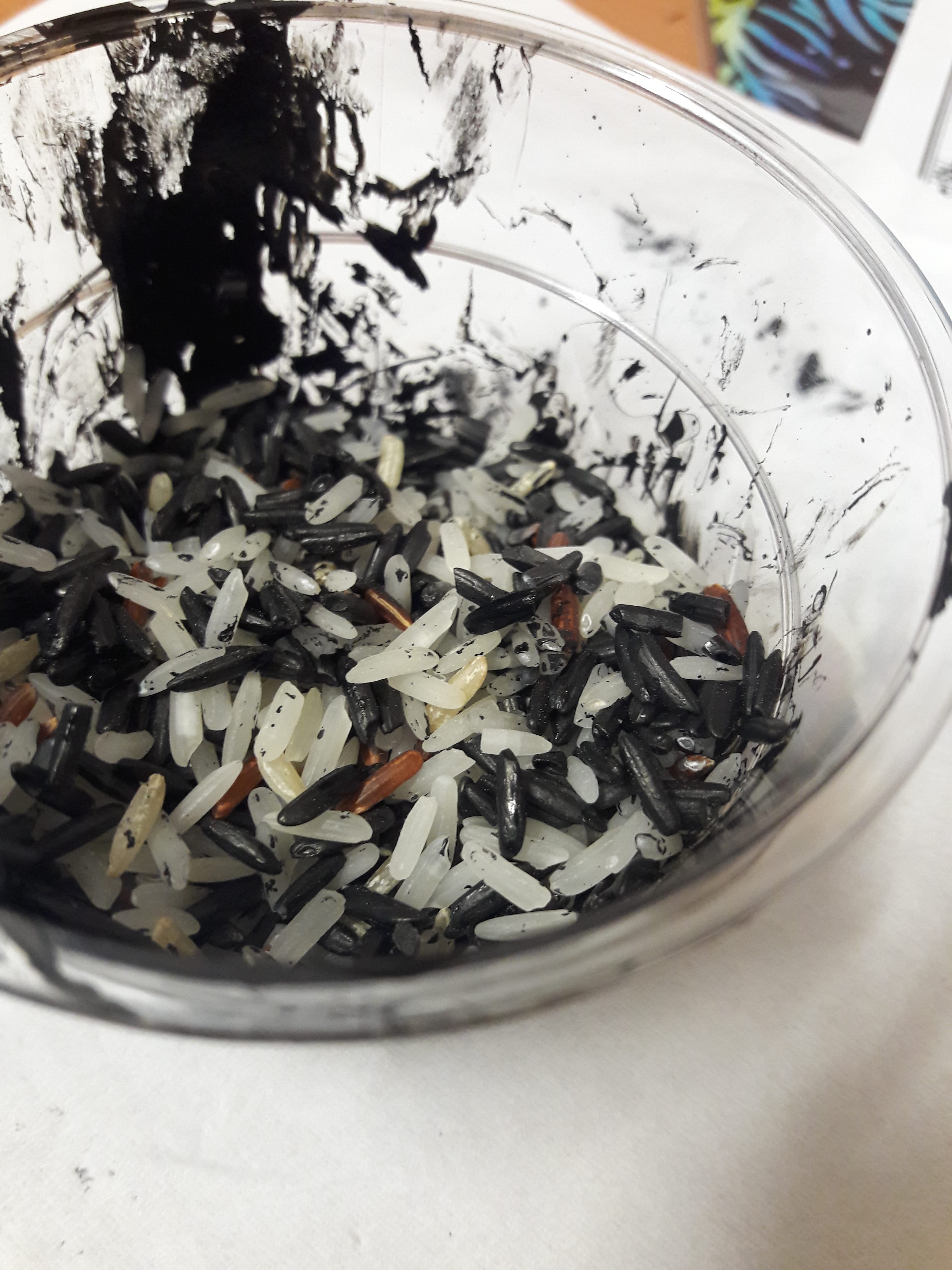
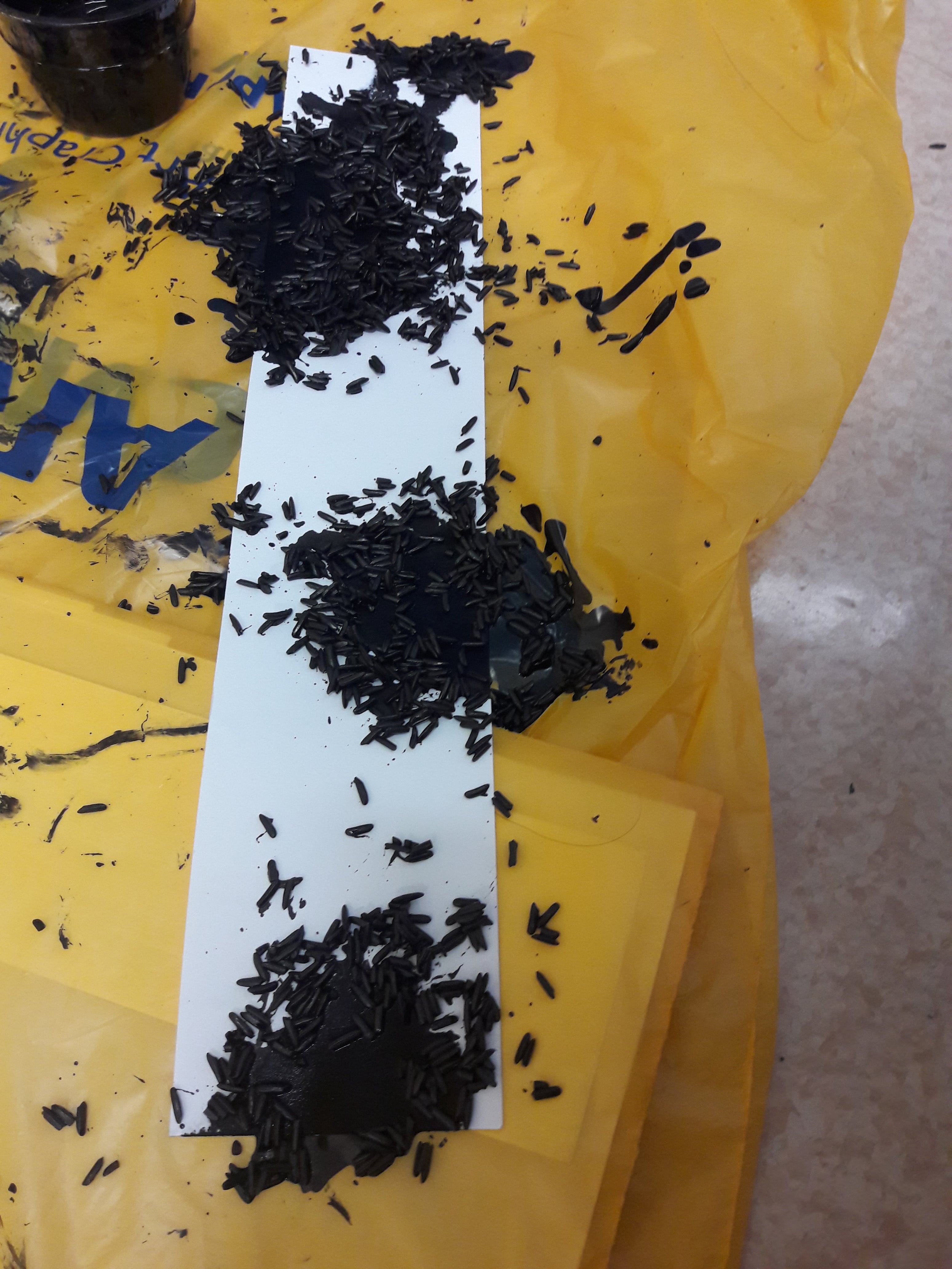
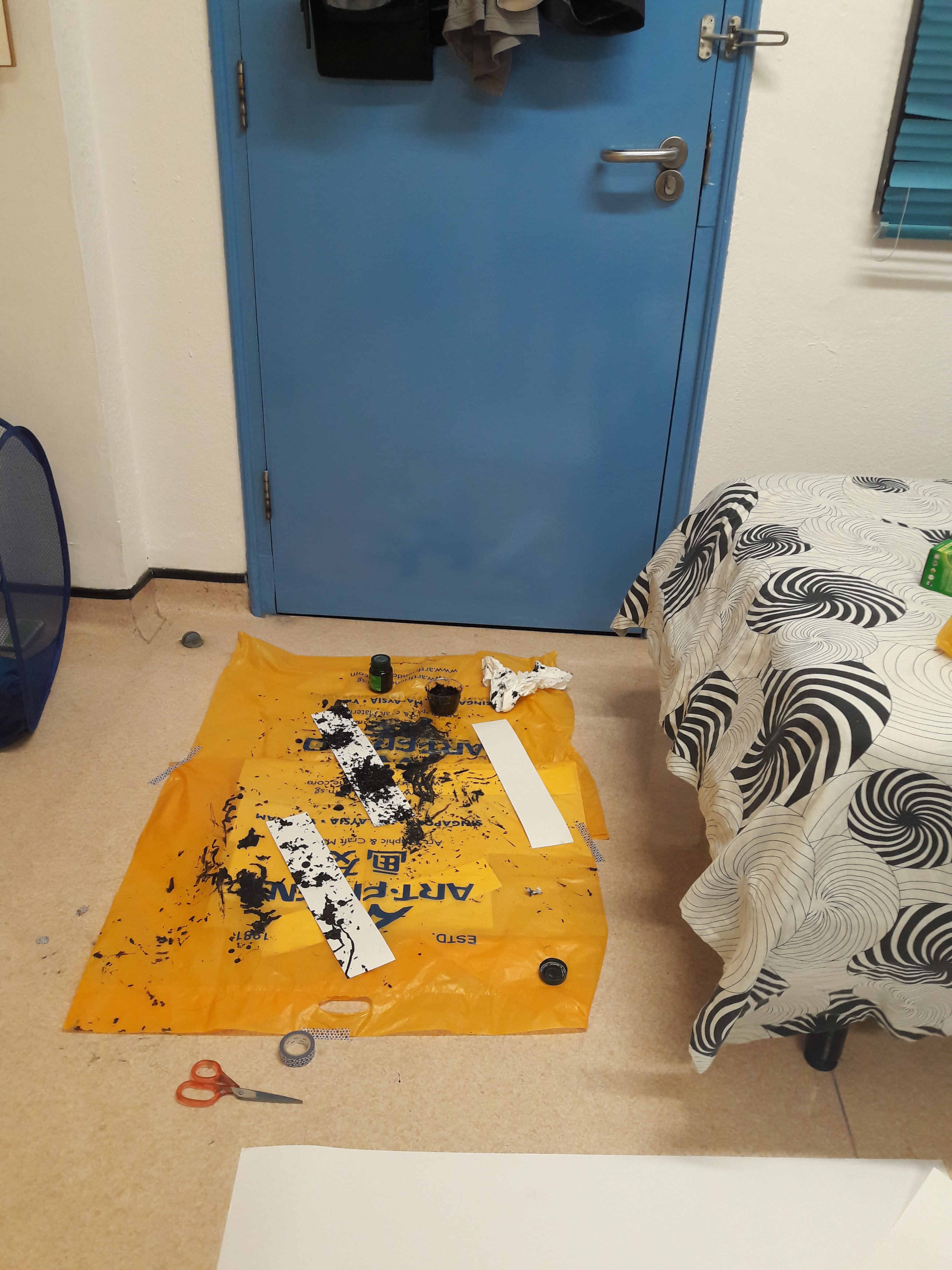
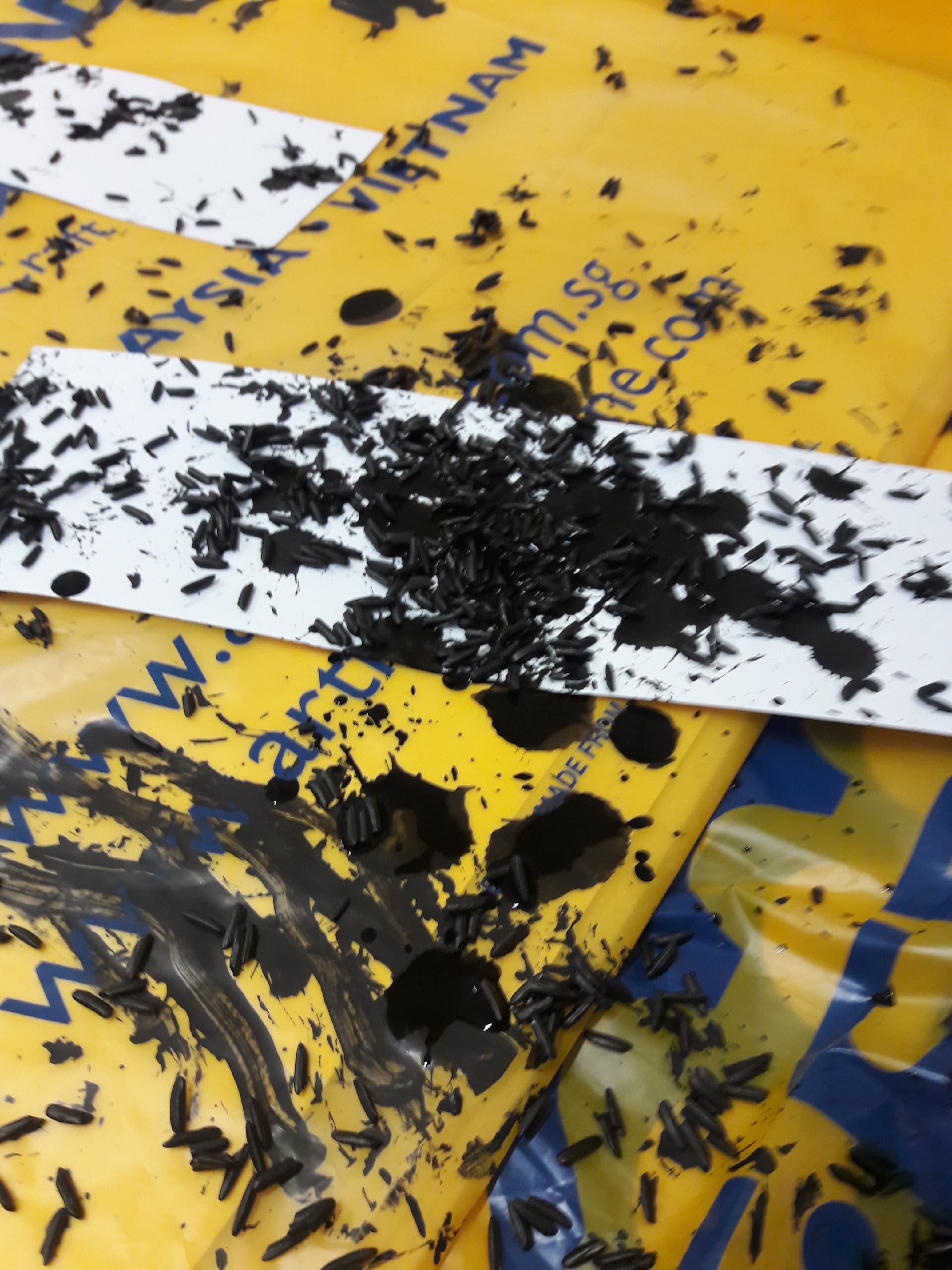
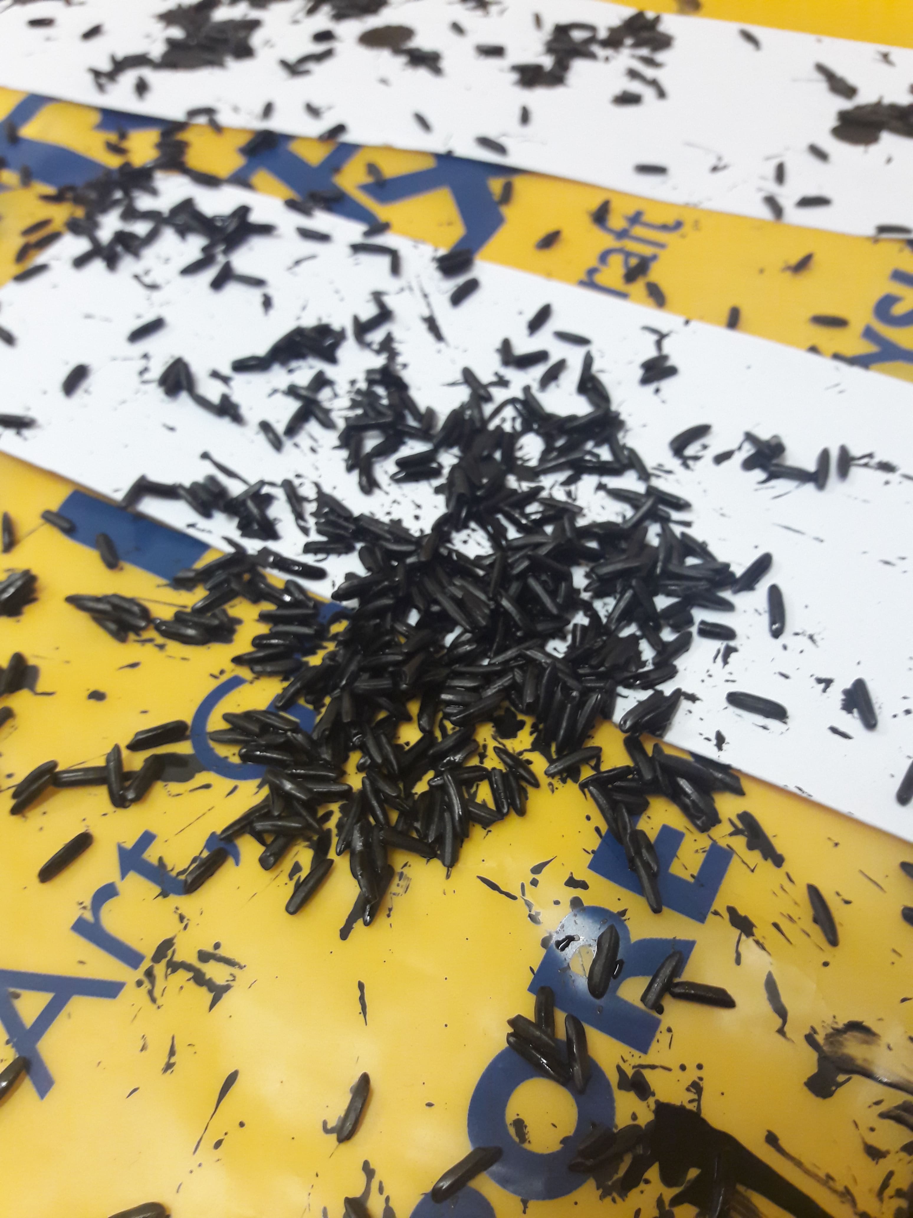
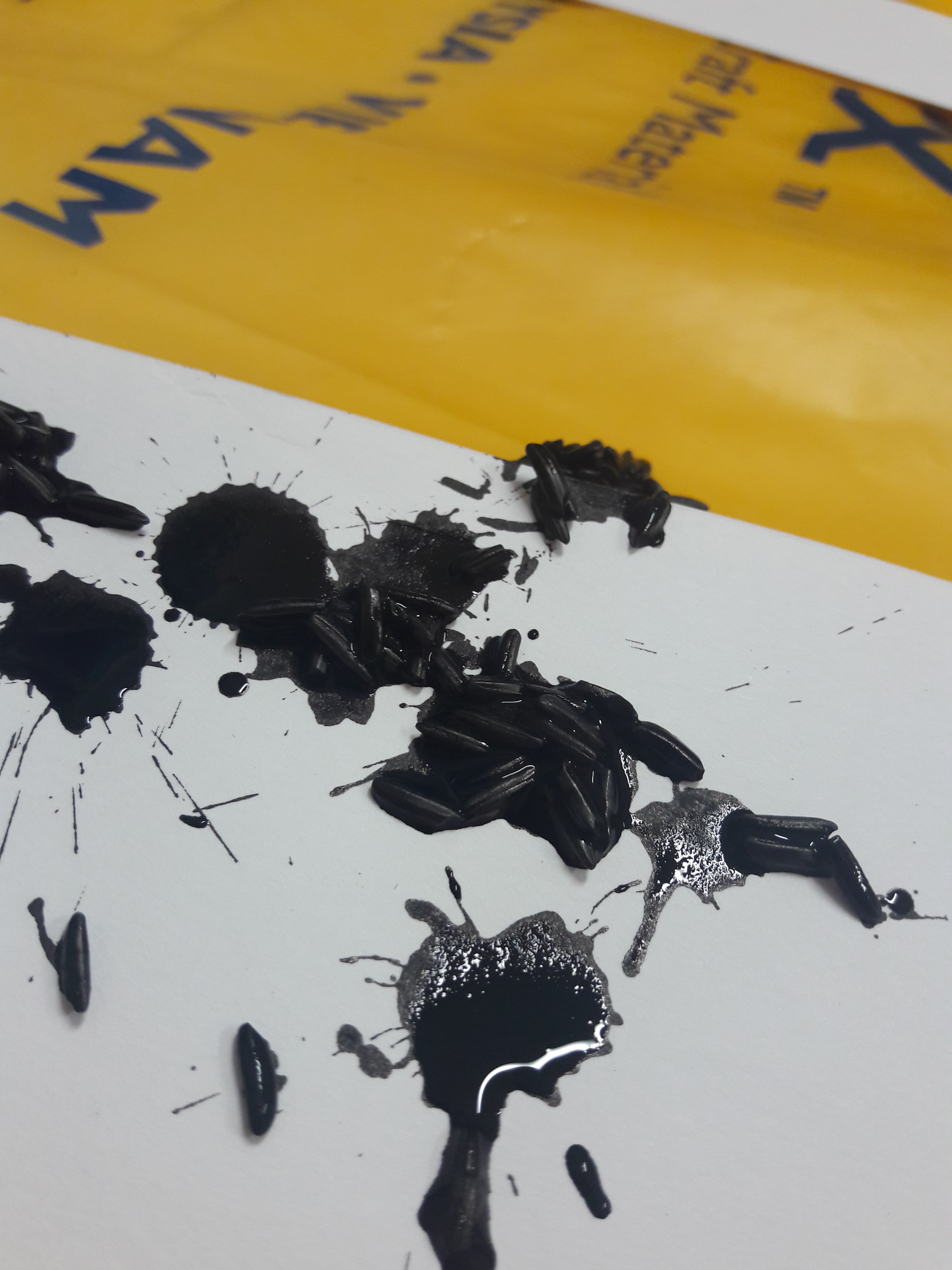
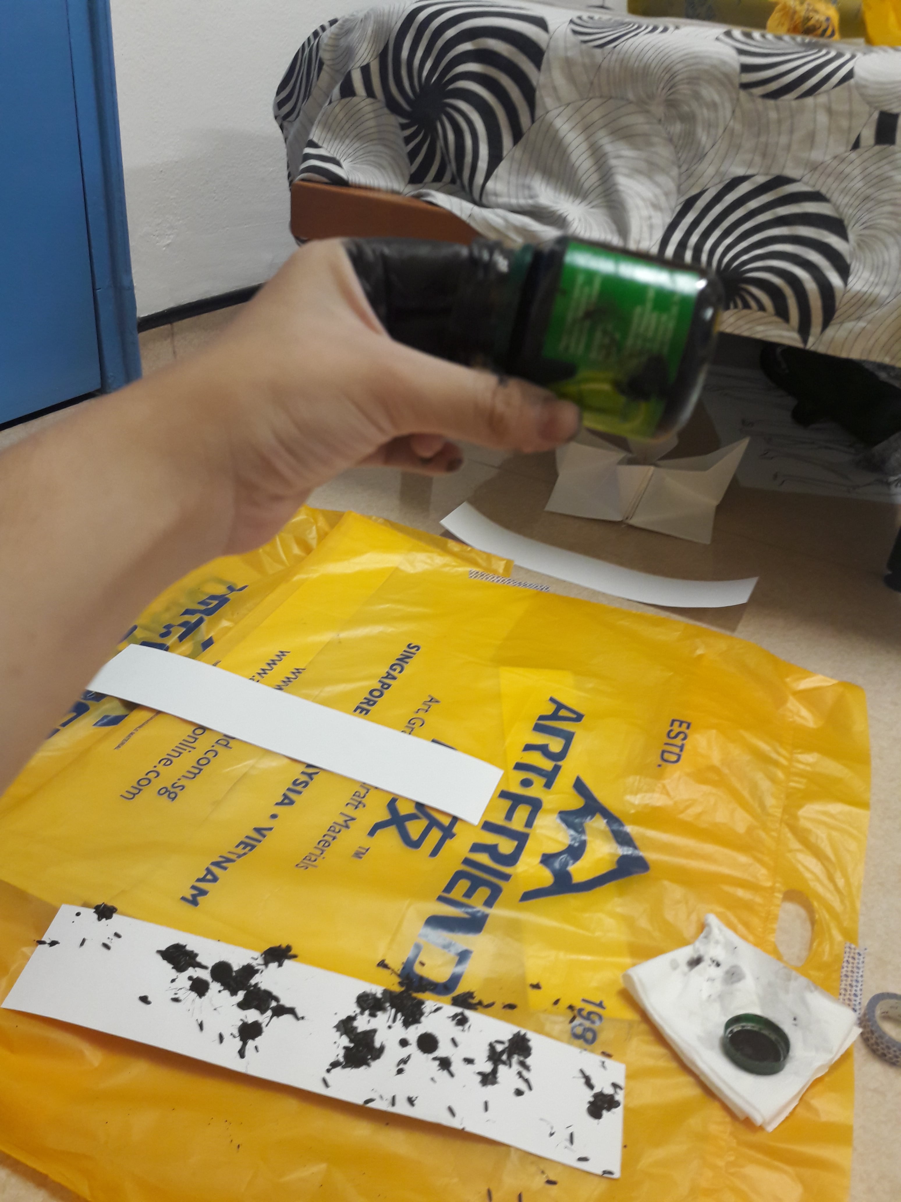
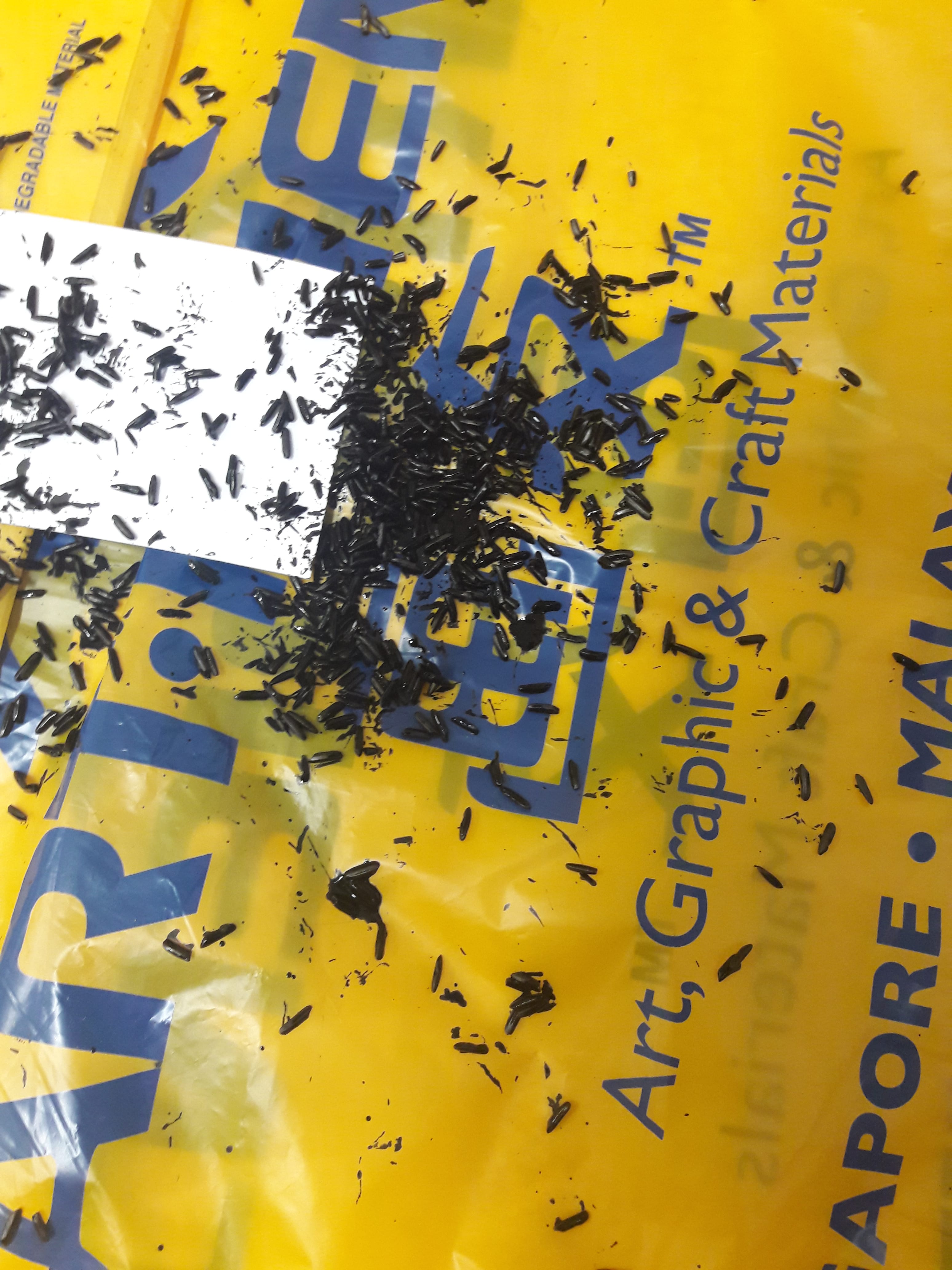
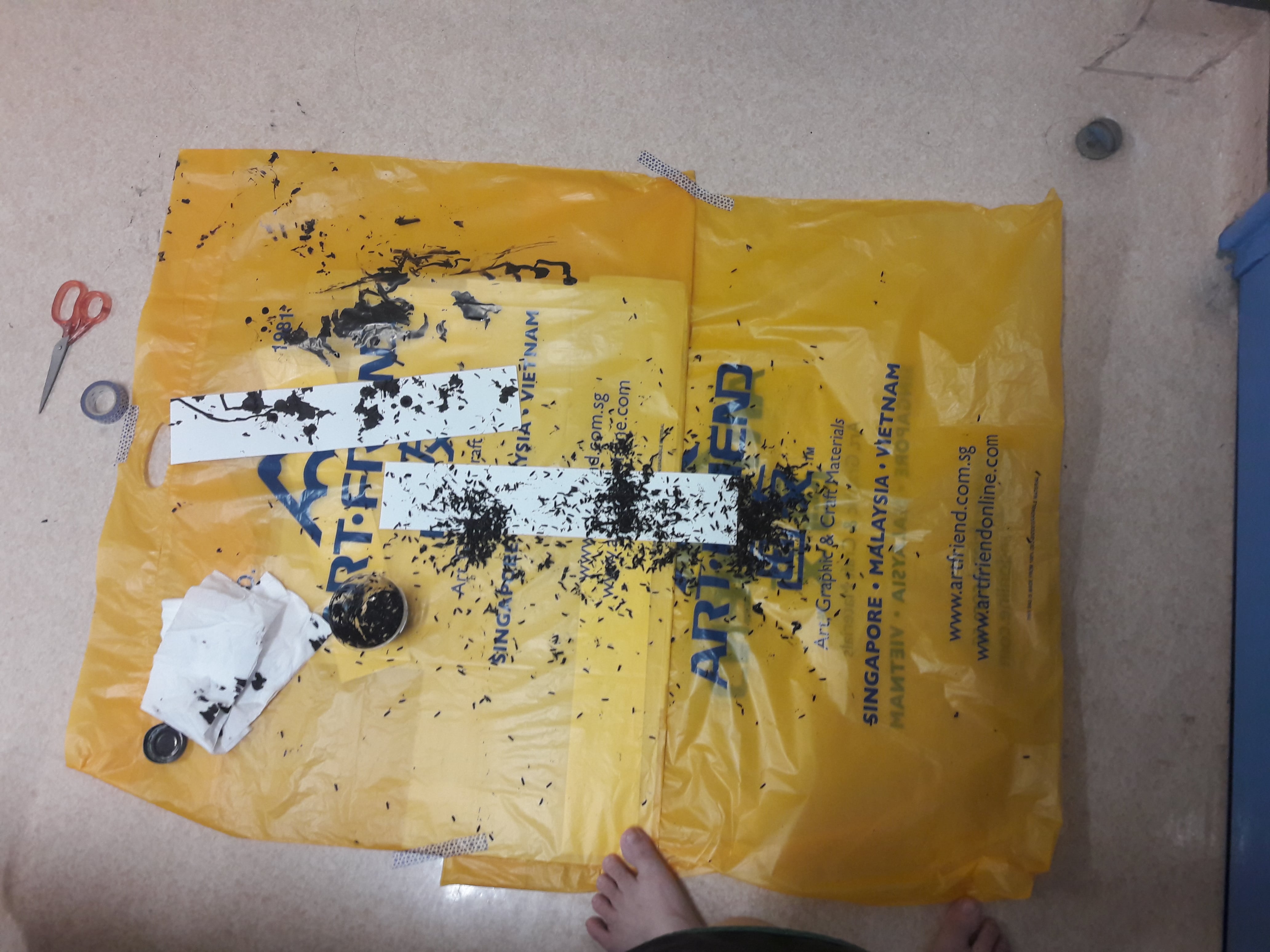
  • Disgusting words (bleeding ink)
  • Twisted words (scrabble tiles, THEA or HATE)
  • Disdain for me
  • Rift creation

もう一回。 (Just once more.)

Just once more, I’d like to remember what it was like. To be able to careen in fields of green with bare feet, sing unabashedly into the night sky, forget the passing of time with fine lines. If I am to spend eternity as a cog in society, doomed to tedium and normality, then please let me remember once again, what it was like, freedom and serenity without the scorns of time, and all of humanity’s business and productivity which I cannot bear.

  • Insignificant piece of society (cog)
  • Tedium (also cog)
  • Freedom and serenity (??)
  • Cannot bear it (??)

[To be continued. Or edited. Maybe]

[Edit: Now my problem is conciseness. Why am I so weak]

☔ Project 2

The layout was meant to resemble an umbrella, where I paired off “similar” images to be on opposing sides (since umbrellas are mostly symmetrical). Also, each photo has a differently-coloured umbrella to make rainbow colours ?

1st set: Internal and external of umbrella

I did close-ups to focus solely on the qualities.

  • Indigo: Colour of mystery. Shows the internal structure of the umbrella, complex and incomprehensible.
  • Yellow: Colour of clarity. Shows the external of the umbrella canopy, how it is water-resistant and simultaneously translucent.

2nd set: Umbrellas as alternative items

I did mid-range shots because the context was somewhat important.

  • Green: Colour of health. Orientation is upright but flipped canopy, context is kitchen, with utensils and cutlery on top (it becomes a table!)
  • Orange: Colour of adventure. Orientation is upside down, context is water body, with a soft toy (just imagine it’s a person) on board (it becomes a boat!)

3rd set: Portrait orientation

There was nothing much linking them to each other but orientation, but I like to think it’s a contrast thing, like time (night vs day) and people (presence vs absence).

  • Red: Colour of passion. Meant to show umbrella thematic association: intimacy (in sharing the umbrella), concealment (in hiding the face), protection (in both begin sheltered)
  • Blue: Colour of sadness. Meant to show the physical quality of portability, where it is located in its typical location, outside the door (where you would casually take it while on your way out)
it’s actually (photoshopped) purple, but different screens show different colours.

Poster: Umbrella Uselessness

  • Purple: Colour of “finality” (the last colour of the rainbow), identifying this as the last photo to look at, in a way
  • Overarching idea: Undermining the umbrella’s usage by showing a situation in which it’s entirely useless, a situation so bizarre it makes people pretend they don’t see me and makes me feel stupid
  1. It’s not raining
  2. It’s indoors
  3. The umbrella is wet on the inside
  • WhatsApp message formatting to show informality and ridiculousness, and how this is typically the kind of thing you’d send to your close people (pictures of stupid things that make them roll their eyes)

As usual, some process shots and stories can be found here.

☔ Project 2 Process

The actual final post is here!

But here’s just some work in progress shots/stories, because it turns out I’m easily amused by myself.

RED

I decided that 1. I didn’t have any more quirky ideas on how to remake an umbrella as something else, so 2. I figured I’d show a different side of the umbrella, in terms of thematic significance. Unfortunately, this also happened to be the time where my ENTIRE FAMILY went on a holiday (without me!), and I don’t… Really have friends.

So I did what I did best, i.e. lost my face. Holding a umbrella, I… May or may not have pointed it rather dangerously at fellow Choir members while begging them to help me after practice. I also may or may not have rolled over and keeled on the floor after about 7 rejections, and had to be towed away. (I considered begging the Choir teacher, but was shot down by the realisation that he’s a busy man.)

ORANGE

I think this image I posted to Insta really sums it up.

Also, being the resourceful person I am, I spotted a lady with her baby in a pram, and asked her if I could borrow her baby to put on a free floating umbrella which may or may not capsize in a 0.6m pool where he could drown! (She said no.)

YELLOW

Fun story. Lei suggested shining a light through the umbrella to show how it’s translucent, and I thought that was a good idea. Until I tried it, and realised I was going to need much darker lighting if I wanted the light to actually show. So I did! Then the light was too bright to actually see the water beading on the surface. So I Photoshopped it! By overlaying two photos. I’m thankful that we live in this day and age.

(Also, Photoshopping it yellow.)

GREEN

Also a fun story. The umbrella evidently could not stand on its own, so I took a tall, slender cardboard box and stuffed a whole roll’s worth of toilet paper inside. This lowered the centre of gravity, and the umbrella COULD stand, surprisingly. Until I gently put a plate on it, at which point it promptly fell over. (I tried taping it down, to no avail.)

Luckily (and surprisingly, that I actually thought of it), I had fishing line left over from Foundation 4D class, so I tied strings holding the umbrella in place. As long as I didn’t move the anchors, of course, and me being me, I… Forgot I placed a line there, tripped, and everything came crashing down.

BLUE

This didn’t really have many issues, to be honest. I managed to get up and take the photo before my roommate left for class, so I used her shoes.

INDIGO

One of the first shots I took, at my HDB void deck. I originally wanted to emphasise the use of the umbrella and its form by Index, the void created by an umbrella when it shields you from rain. (Also, that morning happened to have heavy rain, of which I was lucky enough to get out of the house fast enough to set up in time for it to start raining.)

PURPLE

Inspiration struck on the way back from the swimming pool, where I was drying off the umbrella instead of it keeping me dry, and everyone was avoiding me. I didn’t realise that when the brief said “Select 1 image from Task 1 or Task 2” it meant FINAL image than any image you’d taken (and to be honest it seems a little bizarre to me that you’re supposed to present both a photo and poster version. A lot of the posters seemed to have the “photo” version overlooked because the “photo” as a standalone was insufficient).

So after I took the original photo for sending, I realised it could work, and spent the next half an hour just… Standing there, trying to get the perfect photo with people passing by, and with a water spray to wet the umbrella. (It didn’t work, so I just Photoshopped the person in too.)

W5 Pandora’s Box (Final)

My final model was based off the 2nd model in this post. I increased the overall size since I realised that the reason why I couldn’t adjust the dimensions of my boxes (lest they have “similar lengths”) was because they were all too small. The final dimensions were about 10×9×4, 19×1.7×1, 6×3×0.1 (cm).

Twice the size of the original

My word was XYZ axes. Initially, I left the subordinate larger in size to emphasise the 3-dimensionality, but the advice was to trim it to emphasise hierarchy rather than 3-dimensionality. So I did. Then the remark was that it wasn’t 3-dimensional enough… T_T

me </3

I guess the moral of the story is to take everything with a pinch of salt. A piece of advice followed may resolve the current problem, but raise new problems… T_T


2D sketch analysis and 3D sketch models

Verily summarised version (see aforementioned linked post for more details on actual selection of boxes and reasons for joining together in certain way):

  • Purposeful extreme variation of rectilinears
  • Emphasis on “directional pull” in 6 directions


Material: Wire mesh and fishing line

The overarching idea was that planes are just a unison of many lines. Hence, the idea was to use a “transparent” frame, to see inside where many lines cross each other randomly.

Wire mesh was chosen for the fact that it was the best material for providing anchors to the lines (through the holes), where I could make the lines out of fishing lines, sewn in with a needle, while still vaguely giving that sense of lack of mass. I also used the same material because I personally feel that, more than being separate axes, all 3 axes are fundamentally the same (especially in that X, Y and Z are interchangeable terms.)

Fishing line, joining all of them together, was meant to re-emphasise that unity, while having the fishing line somewhat not visible as well to add to the lack of mass.

(Will update later when I have access to my journal, 3 pages on the step-by-step process of making with wire mesh) Written step-by-step process. I used an embroidery needle specifically for the length, relative thickness and hole size.

(Will update later when I have access to my journal, a page on contemplations of techniques to get what I want with acrylic) I also considered acrylic, which would have fulfilled the transparency criteria much better, but mostly discarded that idea by virtue of that I couldn’t think of a time and cost-efficient way to use acrylic, especially since I have zero knowledge of it as a material. At least wire mesh was malleable. And had in-built, evenly spread and decently-sized holes.


Possible Usages

  • Stilt house: Bamboo house with nipa doorstep-roof, a chimney-thing, and hardwood stilts (may come with windows, drive-through windows, etc)
My photoshop skills are poor, but I try
  • Weapon: Cannon, gun controls behind a gun shield, and a protruding end for manual swivelling (may come with ladder) (all metal)
http://www.picquery.com/modern-military-fortress_Oxq3scalfRHaBHHQf%7Cwfcz8DV9KoZepnsJzYKcsFPec/

Other ideas also include: elevator (SD as elevator shaft and D as elevator), lever-pulling-based exercise machine (SD as lever with elastic wire attached to SO)


Some work-in-progress shots

(to form the lines inside)


W4 Project 1: My Line is Emo

I’m unfortunately a very trigger happy person (this always, inevitably works against my favour), so all emotions focused a lot on natural forms, where I didn’t control much as opposed to trying to aim for a certain state while making, and letting the marks turn out as is (as long as it generally looked ok).

The key ideas were both of these:

  • Emotion quality

For me, emotions are often not clearly separable. To avoid too many visual similarities, I narrowed the quality of each emotion down based on 3 overarching criteria: intensity, protractedness and frequency. Intensity is associated with the strength of the emotion (typically once-off and large), protractedness, with the duration of the emotion (typically underlying and mild), frequency, with the occurrence rates of the emotion (typically short-lived and mundane).

  • Binary opposition

With three defining criteria, I decided to try to represent feelings sharing similarities, and work on using the contrast between both to bring out each other. Also just that 3 criteria and 6 emotions meant 2 emotions would have to share the same spectrum anyway. The linking quality is typically the paper, and the general shape of each mark.

Consequently, the final emotions were as follows:

From left to right, up to down: Love, Anger, Shock (Fear), Shock (Surprise), Bliss, Melancholy

Love & Anger

Both are on tracing paper. I wanted to try gouache/cold-pressed watercolour paper for the texture and whiteness, but it worked really badly with crushed paper (what I presume is named froissage). Seeing ink seep through the tracing paper, I decided to go with that instead, firstly because aforementioned would actually worked, and because the idea of anger literally overflowing and staining was kind of interesting to me.

The key term is intensity, where these feelings are immense and overpowering. (As a byproduct, neither were renamed, since I couldn’t find a better word to describe this all-encompassing emotion.)

  • Intensity: Only one point of focus. Centralised to reiterate the idea of singularity
  • Immensity: Reflected in large concentration of positive/negative space
  • Overpowering: Overflowing from the focus, spreading out

Differences:

  • Both were pressed onto linoleum, but anger was pressed while there was a lot of ink, as opposed to love, which was pressed after I had dabbed off the ink (to have a much lighter imprint)
  • The focus is white for love, as opposed to black for anger (colour association). By extension, love features lighter colours (made by diluted Chinese ink) as opposed to anger, which used normal ink
  • Love features swirly, smooth lines (automatic drawing with fingertips and diluted Chinese ink/leaf on linoleum), as opposed to jagged lines for anger (froissage/automatic slashing on ink with brush held with a fist)
  • Paper for anger is crushed, as opposed to paper for love. Also, ink face is facing outwards for anger, as opposed to for love (smooth surface), and love actually has a 2nd layering of white paper underneath as opposed to anger

Shock (Fear) & Shock (Surprise)

Both are on cartridge paper. I wanted to emphasise the intensity and shortlivedness by having very white paper to show the contrast between feeling and unfeeling. (The paper scrunched up and made it difficult to paste the lines though, especially where if I bent it excessively rice would fall off.)

The key term is frequency, where they’re of a relatively strong but short-lived nature, e.g. a jumpscare. (I opted to use shock for both purely because I have literally never felt surprise without some form of fear.)

  • Frequency: Unlike Anger & Love, multiple points of focus
  • Strength: Not as powerful, but still relatively strong emotions, hence still featuring foci
  • Short-lived: Small splatters, lack of grey as opposed to absolute black and white

Differences:

  • Both used rice to have the graininess reflect the antsy, fuzzy feeling of shock. However, fear has the rice mostly at the edges of the foci to reflect the sense of defensiveness of encircling oneself that arises with fear (protecting), while surprise has the rice centralised to reflect the sense of tenseness of recoiling (contracting)
  • For both, I soaked the rice in ink, and slabbed on ink perpendicular to the paper itself. For fear shock, however, I slapped the rice on from a “me kneeling on the floor” height, versus surprise shock which was from a “me standing on my bed” height. Again, to reflect the different between containment and outward spreading.

Bliss & Melancholy

Both are on newsprint paper. This paper was vaguely not-white, which I wanted for the dullness of the feelings.

The key term is prolongation, where emotions are mostly dull and weak (i.e. the after-effects of a trigger event, or unconsciously occurring feelings).

  • Prolongation: Reflected in consistency of repeated patterns. Underneath is a bordering layer of brayer rolls, on top, pressed shapes with linoleum, even more on top, hand-pressed flowers
  • Dullness: There is no focal point, with multiple layers of unrecognisable and indistinguishable marks
  • Weak: Colours are generally in the grey zone, than absolute black or white (also assisted by paper colour)

Differences:

  • Both used brayers as the base layer, but bliss used a lighter-coloured, wiped brayer as opposed to melancholy’s darker (but also wiped to prevent too dark) brayer rolls
  • Both used pressed shapes, but bliss used linoleum pressed with objects still present (i.e. creating white areas) as opposed to linoleum pressed WITHOUT (i.e. creating grey areas).
  • Objects were pressed onto white areas of bliss to avoid too much lightness, but pressed onto melancholy to result in darker colours

Overall, I think Joy was perfectly right in talking about craftsmanship when it comes to me. On a physical level, I never quite figured out how to flatten the paper while keeping the rice still stuck in place, and on an intangible level, I still feel like I couldn’t express what I wanted. Partially because my definition of abstract involves the absence of recognisable forms, or of representative qualities, as opposed to absolutely indiscernible forms, partially because I probably didn’t study or experiment enough, partially because my technical skills are w e a k. I suppose for the next project I should set my standards lower considering I don’t have enough technical expertise to actually meet whatever unreachable definitions I will set, and get over my general skepticism for copying artists.

(A bunch of photos and 1 video from throughout Week 3 while working on this)

W4 Pandora’s Box

My term was XYZ axes, and it immediately sparked tragic memories of a topic named Vectors in a subject named H2 Math, which I never quite managed to pass. On a brighter note, that prior knowledge was somewhat effective in assisting me. Here’s some of the things I still remember which vaguely helped me:

  • 3 axes = 3 dimensions, the X, Y and Z axes
  • There’s 3 main features, the point, line and plane
I haven’t done this much Math since November.

I didn’t particularly think of this while working, and not all of it is applicable because we can only use right angles, but it was what unconsciously led me to thoughts on things like origin points, etc.


I really disliked my previous designs, especially where jointing wasn’t available yet. It’s a little hard for me to see the 3D-ness happen if I can’t joint to allow the edges to jut across all 6 sides, than just 3, which undermines the unflatness.

For versatility purposes, I decided to use foam rather than boxes, where my dismal collection of  boxes didn’t seem to fit together well (and the colours were rather distracting). Consequently, I headed out to ADM, picked out pieces of scrap foam at random, and spent a wonderful late evening of foam cutting! (This was mostly just to straighten the edges, but it’s surprisingly therapeutic once you get into the routine.)

Backstory

The usage of the foam cutting machine, along with a pet peeve of mine (which involves the use of too many rules at once), led to me deciding to make this.

After the initial cutting therapy, I started to notice that there was 2 ways to cut the foam: one, by lining the part to be discarded on the left and the part to be kept on the right; two, vice versa. I know it sounds incredibly simple, and it probably IS very obvious, but I’m ashamed to say that my common sense also failed me similarly when it came to paper cutting for Foundation 2D. Regardless, prior to this I had only been using method 1 to cut, so with this epiphany I realised I could use the measurements to line up and cut the foam to certain dimensions as so desired.

I’ve previously mentioned that I have a certain distaste for similar shapes, similar meaning sharing the same ratio but just in a different scale. With that in mind (and Cheryl’s mentioning of cutting boxes to two-third sizes of each other), I hence decided to do exactly that, in a sort of masochistic, self-spiting way.

Initial Problems (and any refining actions taken)

If I rotate the SD/SO to solve flatness problems, it causes hierarchical problems instead, so even with a 2D sketch it’s kind of difficult to find a solution anyway.

Measurements: The dominant was 13×20×5cm, the subdominant is 8.6×13.3×1.6cm, and the subordinate is 4.3×6.6×3.3cm (3:2:1;3:2:1;3:1:2) (I would have went for all round 9:6:2, or 3:2:1, but the lack of appropriate foam worked against me). Taking into account the fact that the dominant and subdominant were fairly close in terms of 13cm and 13.3cm, I decided to shorten the dominant’s X to 12cm (the only nearby number which would result in non-clashing measurements).

Without jointing

Splicing: I neglected to realise that I needed to factor in additional foam for things like wedging or piercing until I actually tried to put the foam together but when I tried to join them without jointing techniques, it seemed poorly executed. So, I tried using only wedging instead.

Why I wouldn’t choose this

  • Forms too similar, it plays by the rules but it’s boring (linked to comparative proportion?)
  • Difficult to adequately show 3D-ness without compromising hierarchy


Backstory

Prior to doing the second model, I drafted the OSS post for the first one (as seen above). Writing really helps me to sort my thoughts out, and I noticed certain patterns in how I approached it. With this in mind, I decided to try avoiding what I did for the first model, to see what I felt would actually work.

As stated in the brief, students are to cut “at least 12 rectilinear volumes” BEFORE proceeding to organise them. Presumably, this is either a negotiable point, or intended to ensure students avoid the methodical approach of measuring each box and making them already well-placed with each other. Hence, I decided to approach this less methodically, by refraining from doing any initial touch ups, and just picking 3 volumes which looked wildly different: 1 decidedly normal piece, 1 ridiculously slim piece and one looooooooooooooooooong piece.

(I happened to be in possession of many long and slim foams, results of the foam trimming therapy session)

Initial Problems (and any refining actions taken)

I like this one in terms of direction, but the subordinate is really messing up the subdominant on 2/6 sides

Measurements: I trimmed the subordinate from the start, of course. Afterwards, though, it was still rather big, so I sliced it into nearly half again to reduce the surface area, and wedged it to give the dominant more dominance in the bottom left sketch. (Then, the subdominant was also really long so I trimmed it from about 18.3cm to 15.4cm,)

It WAS really big.

Hierarchy: Natural problems arose from a too thin subdominant paired with the wide subordinate. If I were to rotate to counteract there wouldn’t be the nice 4-directional pull anymore, so I didn’t really manage to find a solution for this, but since it’s 2/6 sides maybe… It’s.. Passable?

Also mostly just that I randomly made it in class previously and kind of liked it, so I used a similar idea. Instead of wedging, I used both piercing and wedging though.

Why I wouldn’t choose this

I mean, I prefer this over the other two, so…


Backstory

I tried to combine elements of both 1 & 2, 1 in actually considering factors like precise measurements; 2 in choosing seemingly “random” pieces (and also the general design, though this time I tried piercing through BOTH pieces than just one to create an “origin”, like XYZ axes typically have).

Initial Problems (and any refining actions taken)

Since the design is really similar too, I had similar problems to the 2nd one

Measurements: Surprisingly, nothing much. Besides the foam trimming therapy, I did almost nothing.

Hierarchy: I do feel the subordinate is somewhat underwhelming, especially from that one (two) angles where you see practically nothing (0.2×1.05 cm²). However, changing to a different piece might compromise the slenderness I enjoy for the other 4 angles, so…

Why I wouldn’t choose this

Purely just the subordinate problem; if I could resolve that, I would pick this over the second one, where the piercing/wedging cut the dominant enough to avoid excessively large, flat planes.


I made some other random stuff in class, but other than aforementioned under the second model, they were all mostly useless, and just cutting/jointing practice. I did make a sailboat with all planes intersecting at one point, which inspired me to try to make an origin point for the third model though!

I’m still vaguely confused as to if we’re supposed to have a critique… Today, or if this is the end of the project, or if we still have time to rework our things, but if I could, I might opt to use some kind of textured, wild surface, one that really emphasises the idea of unflatness. Like… Rock. Or something.

Project 1 Rejected Ideas

I realised that my self-rejected ideas takes up a lot of space in the final Project 1 post, so I decided to take it out and put it separately! Here’s a link back to the actual post.


TASK 1

Similar in the idea of fragmentation, but with much more semiotics. There would be a lot of items laid around me, such as my Final Fantasy 30th Anniversary cup, headphones, manga books, Watership Down, and I’d be dressed in certain clothes to imply femininity, cultural alignment, etc. A very prominent reason for me ditching this idea was just the sheer level of preparation, where it felt wrong to be purposefully setting up a scene to paint myself as more than what I am.

Incidentally, I have a new computer and I still can’t figure out how to use anything beyond Paint, so this is about the best I can do right now. Forgive me.

The concept was to emphasise that multifaceted sensation, where the composition would all be the same, but differing locations and clothes would suggest different sides to me. I rejected this one for the sense of wholeness it would have, which would imply I am only those 3 identities, than something more than just that.

Look at this space above! I didn’t know you can’t scale beyond a set proportion in Paint!


TASK 2

Before I really got into the attention level thing, I focused on different uses of paper. Same as aforementioned, but with some additional ideas like a papercut skirt/cloak/whatever. This was rejected upon the realisation that there wasn’t enough display of emotion, as opposed to just presentation.

My physics isn’t very good, so it took me a lot of trial and error to capture the reflection successfully. In hindsight, though, there really wasn’t any meaning to it.

(There’s quite a few other unused prototype shots, remnants of a time before I suddenly and violently thought up the idea of differing levels of attention.)

I initially intended to focus more on the omnipresence idea by shooting in varied locations. There really wasn’t any good reason as to why this was rejected other than my self-consciousness (I tried. I really did, but people taking photos of you being in stupid positions while you’re taking photos on a self-timer, it does things to you.)

People are naturally unhelpful.


TASK 3

The bookshelf next to my bed is pretty important to me in that it provides easy access to any book, ranging from comics to Chinese comics to Japanese comics to one of those Disney Fairies books to actual literary works. I discarded this in the end due to the need to actually get up to be able to see the books (which breaks the angle consistency), and that I couldn’t find a way to fit it into the narrative.

I personally enjoy the geometry, but it just didn’t work.

Also, just leaving my bed in general.


FINAL REMARKS

Here’s a sample example of why I decided to leave all photos unedited.

Edited with about 6 different filters. Insert lengthy explanation on warm filter to show gentleness of the light, increased contrast/exposure/whatever to emphasise the brightness, heightened saturation to show greenness of bed, etc.


Original. I think the gentleness of the light is brought across, though it’s still evidently bright, also helping to bring across the feeling of the sheer curtain. The darkness of everything else accentuates that, though it’s still possible to make out certain forms and contours, and it feels natural and cosy in the lack of saturated colours or high contrast.

Then again, it could be that I’m just really, really bad at editing.

Project 1: Picture Story – Curating Self

From the moment everyone started putting up photos, I started calculating to see if I could actually not fail. What a piece of work is a man!

Here’s the final arrangement.

Final Display. While positioning within each task was intentional, overall positioning was a matter of me trying to actually fit everything in.


TASK 1

A

B

C

I don’t really know where I got this idea, it came out of nowhere, mostly. I suppose it was mostly based on the theory of positive and negative spaces, and how I’ve used a similar technique when doodling: draw a full fledged form, then use a penknife to cut out parts of the paper, leaving a still intact form, though missing certain parts.

Key Concepts & Ideas

If all of this is too long, I think this quote from Atonement by Ian McEwan is a pretty good summary as to explaining the feeling of infiniteness and nothingness which led me to this form. If not, then proceed ahead.

  • Fragmentation

Humans are multifaceted creatures ruled by change, where there is no derivable self from our flawed perspectives. Where the identity reshapes itself eternally and is too extensive, there is no way to express it tangibly. How can anyone comprehend me from only what they can discern? How can I know the unfathomable depths of my inconceivable lump of flesh? How can 3 photos capture the entirety of an intangible soul?

All that is visible is only what is perceived, but there are many things which cannot be seen. While it is easy to extrapolate and imagine you know what is in those fragments you can’t see based on what you CAN see, there is no certainty; there is only assumption. Consequently, in the lack of an ability to consolidate and present everything, I purposefully took a single photo, and presented pieces in a way that would make people assume it’s “me”, where that can still not be an absolute certainty, though it is likely.

Consequently, the final display has the photos at appropriate distances from each other to provide the idea of puzzle pieces in the right places.

To add onto that, I fall back onto presenting “nothing”:

  • Mundanity

It’s very simply a view of me outside my room, where I attempted to, minimally, ensure each photo provided sufficient context. Photo A shows that it is night, and that my hair is wet; B, the laundry pegs and distinctively hall railing; C, bare feet standing comfortably. (Also, not incredibly clear, but a towel is draped over my shoulders.) As I mentioned in the tutorial, it’s meant to give insight into a regular occurrence in my daily life, that of me tending to shower at night before hanging my hand-washed clothes outside, where I am often too lazy to wear footwear (it’s really a very, very short distance and I refuse to expend energy on something so unnecessary). There’s a lot I could say, like how I’ve developed all these little habits of air drying my hair versus blow drying, or draping a towel, or showering only at night, or not wearing shoes… But no matter how you analyse it, it’s literally just me doing something ordinary. It could be special that I drape my towel around my shoulders and let my hair air dry as I leave my hand-washed clothes to dry at night in hall, or it could be meaningless.

It’s a reflection of the fact that I am a mere ordinary creature, one of many humans who believe they are “unique”, when we are fundamentally more similar than we think. I’m horrified by the state of the world! I’m depressed by the transience of life! I’m pained by the cruelty of humanity! We make infinity out of nothingness. That people express those feelings is sometimes a form of egoism, that “I am more human than another” simply because you assume you hold more depth of character.


TASK 2

P

Q

R

This was a much more ordinary idea which didn’t involve me utterly neglecting everything we learned in class about framing and shot. The idea for the object mostly stemmed from right after the project brief was introduced, and I instantly remembered a photo which was once taken of me, back in junior college (the photographer was my classmate):

It was my origami phase.

I feel like what struck me about the photo was the seeming tenderness of the hands, and the “purity” of the image. I have a thing against showing my face, especially where I dislike looking at my face, facial expression is far too unsubtle, and I seem to have difficulty making my emotions and facial muscles synchronise.

That’s also where I got the idea for paper.

Key Concepts and Ideas

  • Varying levels of attention (linked to shot scale)

Paper is rather omnipresent, from the flyers we ignore to the paper we use in Foundation Drawing. I tried to present a sort of spectrum of attention versus inattention, where the physical distance between the paper and I indicated varying levels of focus.

Photo P shows me far away, neglecting the paper in favour of a destination; Photo Q, me interacting with the paper, but not as an object in its own right as opposed to a medium for drawing and writing (also reflected in lack of direct touch as opposed to through a proxy, the pen); Photo R, me interacting with the paper directly (that’s the face I make when I’m casually focused on something). Another factor to present that is the “gaze”, where my eyes go from not even seeing, to looking at the marks of the paper, to the paper itself.

In the final display, I varied the photo orientation to reflect that spectrum, where landscape = distant, portrait = intimate. (Also why there’s that one photo which is 45 degree slanted, it was a canted angle on purpose to make it appear straight when physically placed that way.)

  • Versatility of paper

Again, I had difficulty choosing an object simply because there are many things in my life that could both qualify and not. So when I thought of paper, I immediately decided to settle on that, as it’s something prevalent in all our lives (have you seen the number of trees art students kill?), which takes many forms which I interact with on a regular basis.

As a result, there’s a proud display of paper in its various “edited” forms, from cut paper to marked and folded paper. (In all honesty, I didn’t particularly exploit camera angle at all, as opposed to merely aiming to effectively catch everything in the photograph, especially in the flat nature of the paper in Photo 1 and 2.)


TASK 3

The bed was a natural choice, in that I spend most of my time on it. I’m a very mundane person: my daily routine is genuinely mostly bed.

0100

0700

0705

0710

0715

At first, I was very divided as to if I should use my bed, or the area below my HDB. The decision, however, was made for me when I woke up early to do my work, and decided I was too lazy to take the lift downstairs. Or even get out of my bed. As with Task 1, I attempted to “set up” the area and take photos with framing and shot in mind, but it felt unnatural, detached, curated. So I got back into bed and started taking photos with

  • Canted angles

Mostly to give that idea of lying down and just rolling around, without concern for proper shooting.  At least it’d feel more intimate, in my opinion. (On a photography level, the shot scale is mostly irrelevant, but most things are extremely close by default.)

  • Blurriness

This was mostly unintentional in that things were far too close up for the camera to actually focus on it. Still, I like to think it worked out in my favour, in that it gives a feeling of just waking up, and everything being out of focus (especially where I wear glasses, but not to sleep).

  • Segmentation

My initial plan was to capture important aspects of my bed, without any repeated ideas. This also contributed to a few other photos, which eventually didn’t make it into the final product due to the presence of:

  • Time progression (narrative)

Again, this was not intentional, but happened to happen because I take photos slowly. Each photo has a timing on it (24 hour clock), which indicates a general timeline.

  1. Going to sleep after doing work on the bed
  2. Blearily waking up to the sight of my hand clutching my pillow
  3. Looking up to see my phone alarm going off at the headboard
  4. Looking past the phone to see the light on the ceiling
  5. Looking at the foot of my bed to see the light streaming in from the window

In the final display I also varied the distance between each photo to indicate the amount of time between each photo (also why the 0100 photo was ridiculously far away from every other photo).

Everything above has mostly explained it, but to summarise, the Key Concept & Idea was the intimate and cosy connection between it and me, by providing a glimpse into a daily morning routine.


FINAL REMARKS & REFLECTIONS

All photos were left unedited simply because I opened the first photo in Photoshop, tried to put filters, and realised that I couldn’t find any good reason to edit the photograph whatsoever, in that nothing I did actually felt like it helped with what I was trying to convey, while the unedited versions actually brought across the sense of intimacy and normalcy I found important.


In the end, though, I feel like I’ve definitely tackled (or avoided?) the task in a really weird way, “curating myself” by “not curating myself”. For the next task(s), I’m vaguely curious to know if, when more divorced from the self, I’ll produce something which blends in seamlessly with everyone else’s.

There’s also another post here, about rejected photograph ideas and why.