Sapir-Whorf Hypothesis: a hypothesis that the structure of a language determines or greatly influences the modes of thought and behaviour characteristic of the culture in which it is spoken
I first encountered the concept of stream of consciousness in my study of modern literature, and for some reason it was the first thing I thought of when it came to creating a video based on sound. It’s easy to express that flow through words, and my dreams move by means of flowing images, often only so sparsely interlinked to form a bizarre narrative. What about sound? What if your thoughts were defined by sound, such that each sound flows into each other to create a stream powered by such?
With that in mind, I did a quick survey among fellow choir mates to figure out if that was actually a thing.
“I usually think in dialogue”
“i’ll hear myself think apple then i’ll see the image of an apple”
“when I am thinking I use sound, when I am memorising I use image”
“read up on the Whorfian hypothesis”
“when I think its always visual, sound comes when it’s like applicable”
What I got out of it, really, is that it’s not implausible. Plenty of people think through sound, though for some it’s only an accessory. (Also, I DID read up on the hypothesis, and it was somewhat helpful in my understanding!)
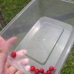
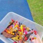
Consequently, for my sounds I tried to create a coherent soundscape which would have the sounds flowing into each other naturally, even if it seems to be incomprehensible when seen altogether. Here’s a table of the sounds, and the logic behind the association.
Bus Ambience
Based off setting directly
Traffic Jam
Thematic similarity (transport)
Car Crash
Thematic similarity (transport)
Falling Glass
Similar/chronological sound (glass shatter of crash, falling glass)
Chimes
Timbre (tinkling of glass and tinkling of chimes)
Choral
Sound connotations (ephemeral sounds)
Song
Sound type (musical quality)
Heartbeat
Tempo (bass of the song, beating of the heart)
Bowling
Similar/chronological sound (beat of heart, ball hitting ground)
Thematic similarity (ominous cawing with thunder and vampires)
Singing Glass
Pitch (same pitch, D4)
Mist
Sound connotations (airy fairy sensation)
Sigh
Sound connotations (melancholy)
Drip
Sound connotations (melancholy)
Bell
NA. Sequence breaker
Footstep
NA. Real life sequential sound
The sounds were a mixture of mostly recorded sounds with some downloaded ones: where possible/necessary, I provided sound myself, e.g. Bus, Choral, Song, Organ, Bowling, etc. There was fairly little sound editing, other than fades and crops, and just specific timing as to when to have the sound come in.
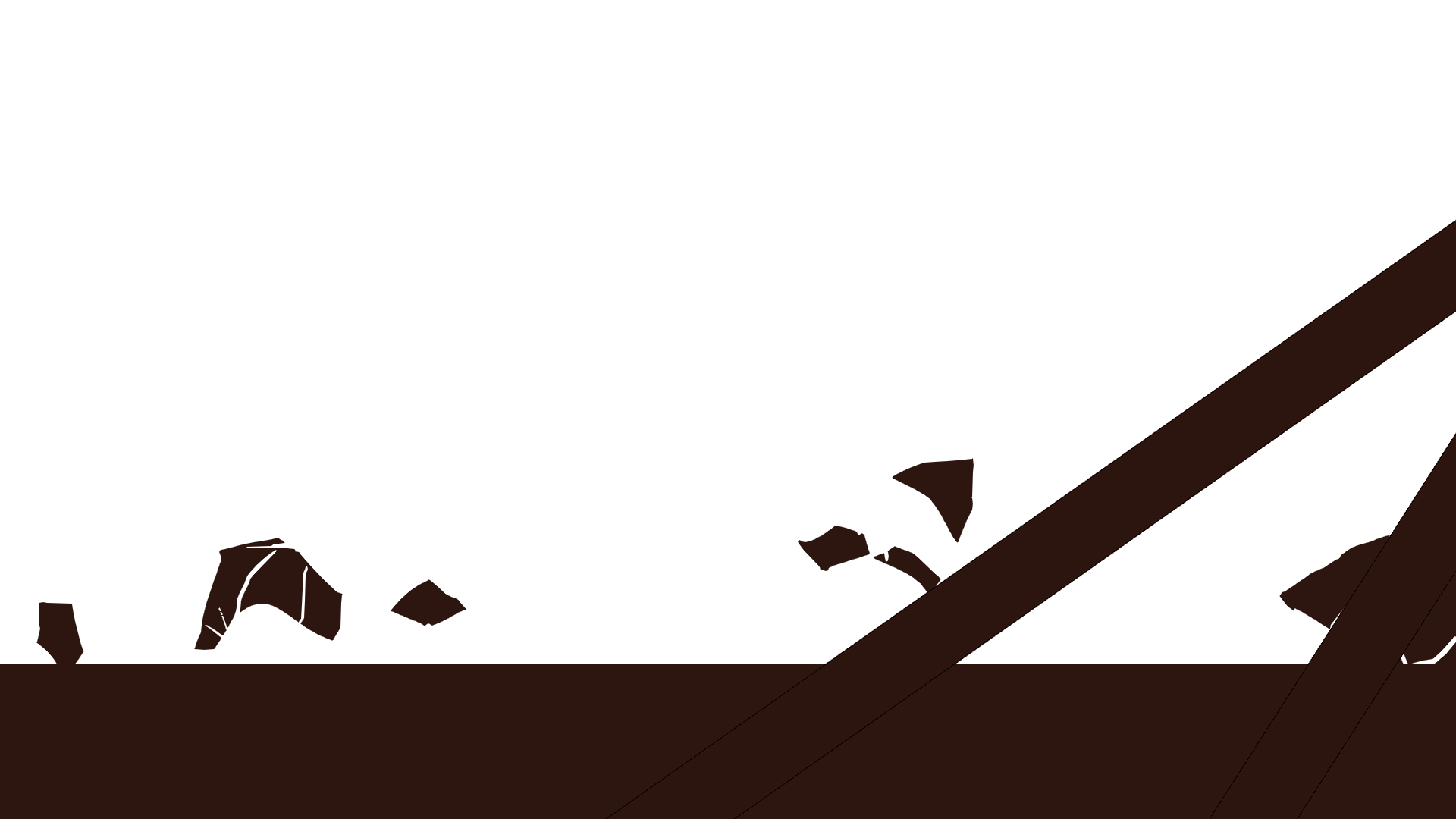
For the video itself I used 2 styles, that of live action and animation, to highlight the disjunct between the real and unconscious world. In the unconscious world I had intended to use various styles to highlight the bizarre and incomprehensible nature of the stream of thoughts, which was minimised after Lei suggested that it might be too much. Overall, though, I focused on the transitions, making each scene short and simple but with elaborate transitions into the other scenes (mostly because it was difficult to link such unrelated scenes together) (I referenced this, by the way).
As the guiding force was the sound, I went with images which would likely instantly be associated upon hearing the sound rather than anything particularly abstract (e.g. cawing = crows). The main style was black (actually dark brown) and white solid shapes, such that I could easily transition by flipping the positive and negative spaces. I DID deviate, though, especially for scenes which required some level of detail, which couldn’t be expressed properly through solid lines due to an unstable form, or required colour for easier comprehension.
My process was as follows.
Draw key frames in Paint Tool SAI (it’s lightweight, so it’s good for animation in that I don’t need to focus too much on great key frames anyway)
Create short frame animations for each event/asset (e.g. pins turning into crows, moving lips, crows flying) in Photoshop
Import and layer together in Adobe After Effects (mainly to determine things like framing, position changes, scale changes, etc)
To prevent it from becoming too clogged (since I have many elements), I did each scene in a different composition, before importing those compositions into the final composition. I did a lot of RAM previews to ensure the timing was right, too.
Sample of key frames, where I only had 5 for the vampire. Note the lack of eyes, which is because I had already established this would be a looping sequence, while the movement of the eyes is separate from that of the movement of the vampire and hence requires a separate frame animation (I would later overlay the two.)
Sample of short frame animation at 30 fps. It began with 18 key frames, which became 55 frames in Photoshop. (click for gif)
Sample of short frame animations which were layered together to form the scene. In distinguishing elements, I was able to create a rough estimation of the likely timing, then use Time Remapping/Time Stretch to make minor adjustments, instead of prepping elements from scratch in After Effects.
I’m here to do what I do best, which is fangirling over my favourite artists! And it’s even relevant to the project at hand! (Note: I use “they” to refer to those whom I don’t know their genders because I’ve been in enough non-binary gender debates)
I only chose to talk about artists with colouring styles I adore, as opposed to any artists, so. And since we have to have active colour choices, I’m going to (try to) identify and state what type of colouring style they use.
Monochromatic Harmony = same hue, different lightness & saturation levels (e.g. greyscale)
Analogous Harmony = colours adjacent to each other on colour wheel (e.g. yellow & green)
Analogous Harmony (Warm & Cool) = basically same as above, but active choice of warm (orangy) colours or cool (bluish) colours (e.g. orange & red, blue & green)
Complementary = Opposite each other on the colour wheel (e.g. blue & yellow)
Split Complementary = well, I don’t know how to explain this except “imagine an isoceles triangle on the colour wheel” (e.g. yellow, orange and purple)
This was one of those random artists I followed. What attracted me to them was mostly the soft, girlish colours. Something else interesting is also how they tend to attach jewellery to their works!
夜と炉. Framed watercolour painting + sequins & jewellery. I enjoy how it provides a 3-dimensional aspect, where such fashion accessories accentuate the girlish, delicate colours. It also goes to show how important framing can be, where the dull frame really brings it out!
Very high lightness overall, though with lower lightness for certain decorations. I would say they use analogous harmony for blending and colouring of the person, and an extended analogous (it’s not far enough to be complementary so idek) in terms of decor (clothes, accessories, etc). An earth tone frame too, to draw focus.
I’ve been stalking Nano since before they changed their username on deviantart, and what I adore is mostly how it’s a very limited palette mixed with an angular style to create something rather unique.
It varies, but I’d say they typically use monochromatic harmony with complementary hues? Other than black and white contrasts, there’s a lot of shades of green against shades of red.
I accidentally came across Fish during that one Yuri on Ice craze (I’m not into it but Instagram thought I was), and I mostly enjoy how there’s always an overarching dominant colour defining each piece, most likely because she tends to do a large wash before layering on the actual colours.
This one’s pretty easy: it’s an analogous harmony (almost made to look monochrome since it’s so subtle) with a dominant colour for each, which gives off quite a good sense of warm and cool as well. As seen by the last picture, though, some blue-yellow complements happen.
What I love about Yue is their mixed medium and how the colours come together beautifully, regardless. They usually do a rough sketch with pencil, then refine the sketch, then watercolour to create a basic wash, then adding tone and hue with copic markers before defining edges with colour pencils. (If you see their commissioned works you will know that this is a stylistic choice and they can actually do other styles as well)
Also, they’re the one who taught me how to make my own paints!
This is really hard for me to identify though, because they blend a LOT of colours together. If I ignore the analogous blending I guess it’d overall be some double complementary? Like the blue green yellow purple of the 2nd work.
Her style is also rather unique to me, especially because she liberally uses resin on wood to create 3 dimensional works. On top of that, she combines acrylic paints and washi tapes, and uses a lot of polka dots and positive/negative spaces to add detail!
May Ann Licudine. Acrylic painting on wood + washi tape and resin layering. It depends on how you use it, but I would say that, in general, washi tape is useful for creating patterns (unless you use it as a strip, in which case it’s good for forming patterned lines). Resin is a good choice for depth creation, but is unwieldy in that it’s rather expensive, and requires extensive safety protocols.
This is another difficult one to figure out, probably because her work is really complex such that different elements have different colour harmonies in themselves. For example the 3rd one has the green and blue (analogous) plants, but the 2nd one has the girl herself mostly being analogous (pink and purple) with some complements of yellow and green.
Again, another person I admire for more linework, but I do admire how they maximise their limited palette by using watercolour to vary the exact shade (and blending to create different hues). There’s also always obviously dominating colours!
I thought it was analogous, but I was woefully mistaken for the first one (as Joy pointed out) because of the blues, such that it’s actually complementary.
While she dabbles in colour, she’s more oriented towards black and white (and grey), but I think what’s impressive is how her black and white (and grey) shows a pretty good understanding of highlights and shadows and contours and all!
Definitely monochromatic harmony, no arguments. Joy mentioned to avoid, though, so I suppose I might work with blue/purple instead, which will make a pretty nice overall kind-of-square.
Could it be any less obvious? Monochromatic! (and well okay a bit of analogous)
Edit 26/10/17: I’m adding in Mayumi Konno, more for style than colour. My work is looking to tend towards body parts, and I feel she’s quite good at using the body to express things (although the expression and facial features are virtually identical for every single work, so).
In Conclusion,
I have a fervent admiration for complex works where colour harmony tends to be suggested than absolutely clear. It seems that many artists I admire tend to use analogous harmony as a dominant rather than a single hue as a dominating colour, but also add a level of delicacy by having 1 to 2 complementary hues.
I am also, however, about 89% certain I need to have clear colour harmonies, and if that’s the case I would look more at Nano, Fish, Koyamori and Norin. Of course, I haven’t quite talked about chroma and value as opposed to just hue, and I am also severely lacking in artists who actively use complementary colours, but hey. Gotta start somewhere right?
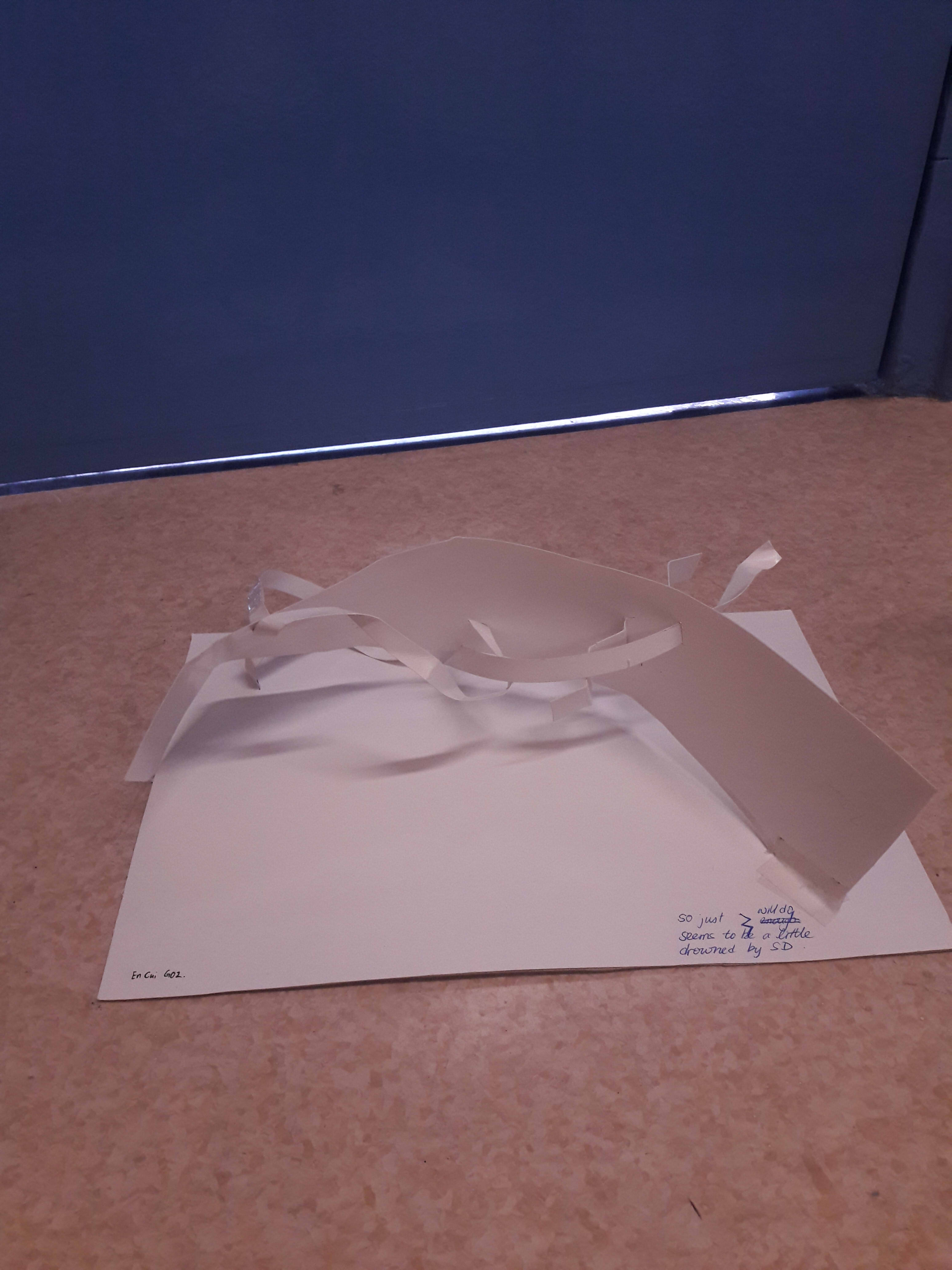
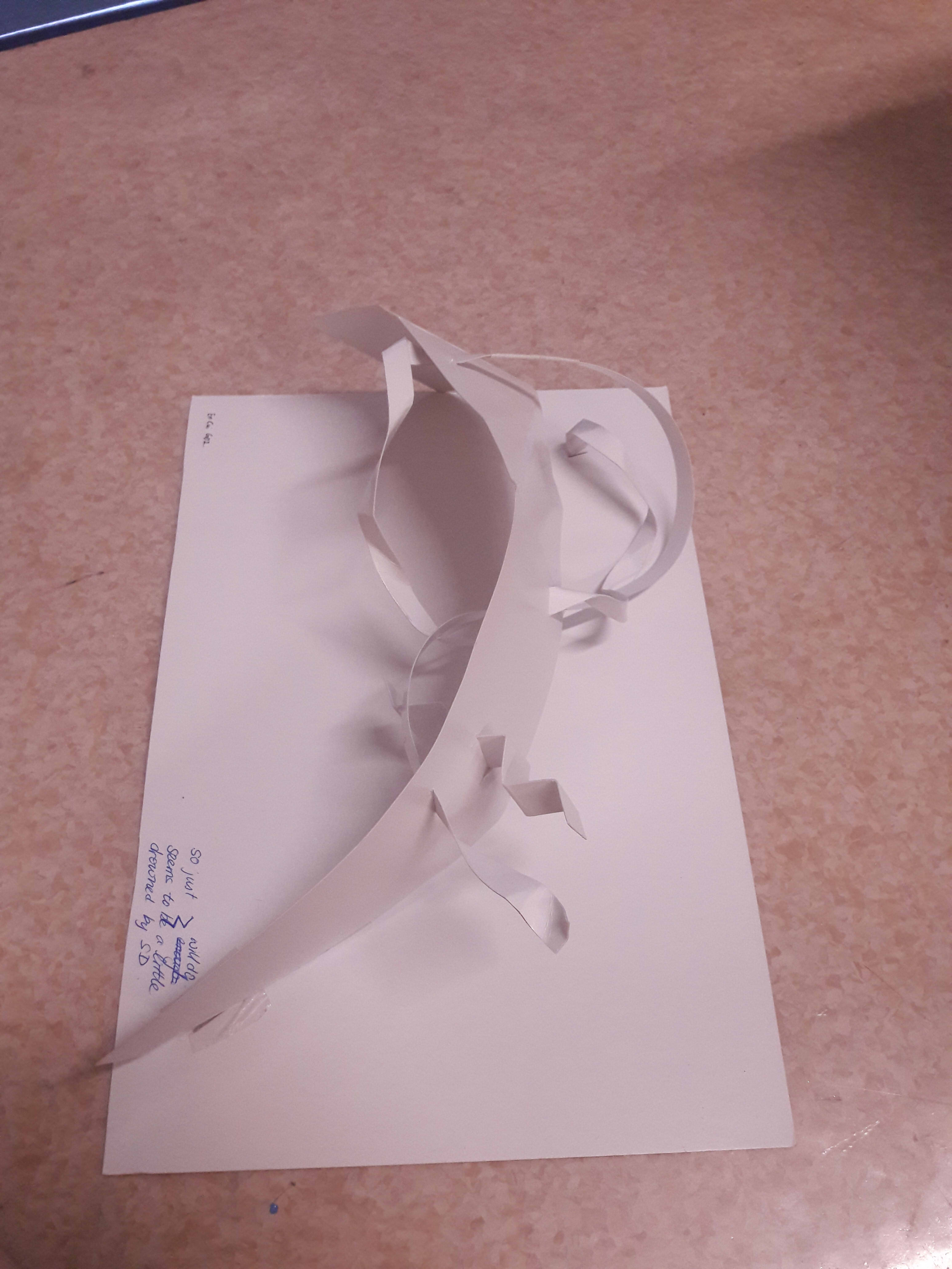
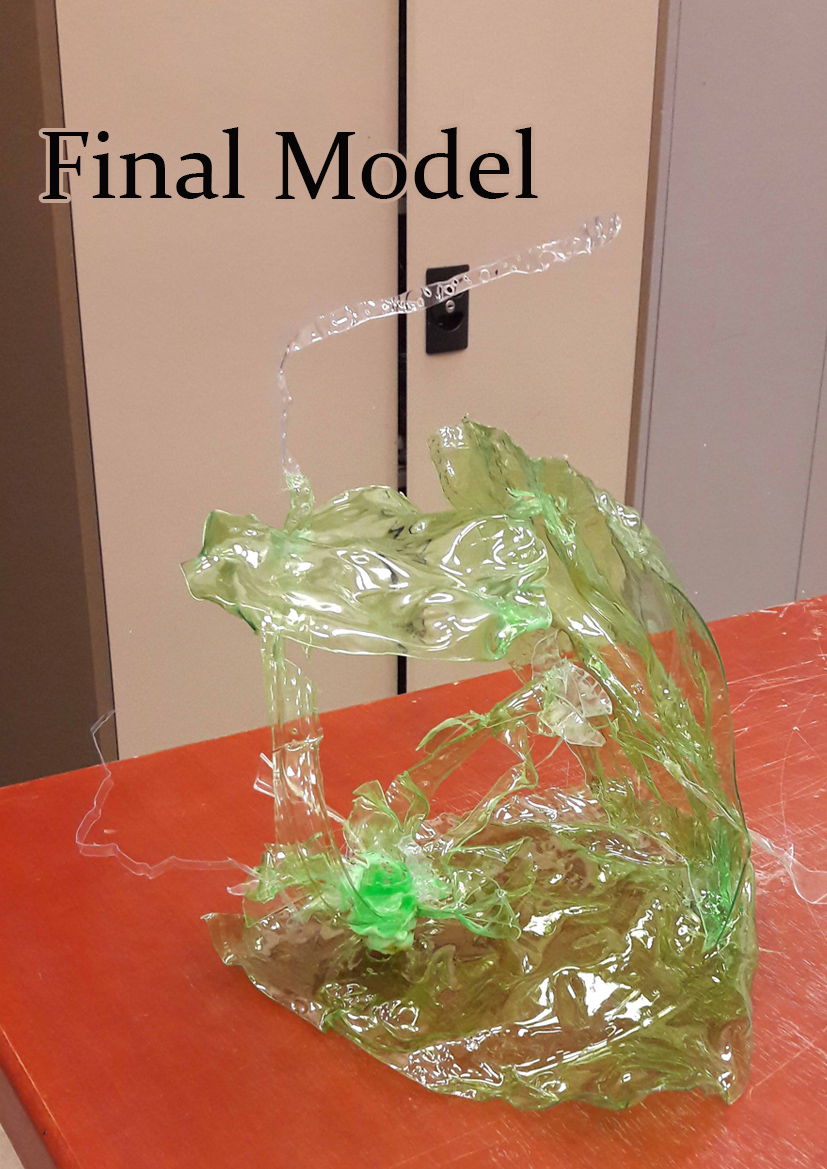
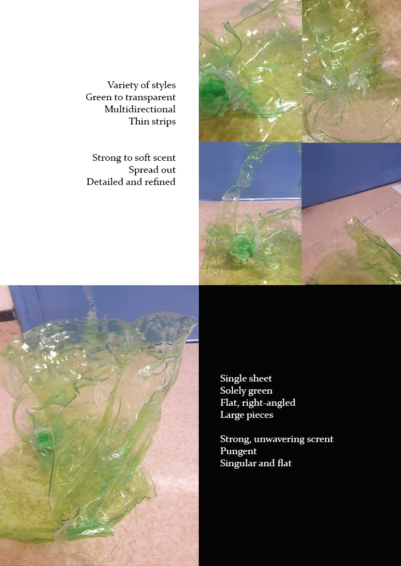
Initially, I misunderstood “don’t play with width” as “don’t vary width and only vary length”, and thus my models were woefully inadequate. As such, for the final, I didn’t particularly play around, as opposed to focusing solely on emphasising the dominant, subdominant and subordinate.
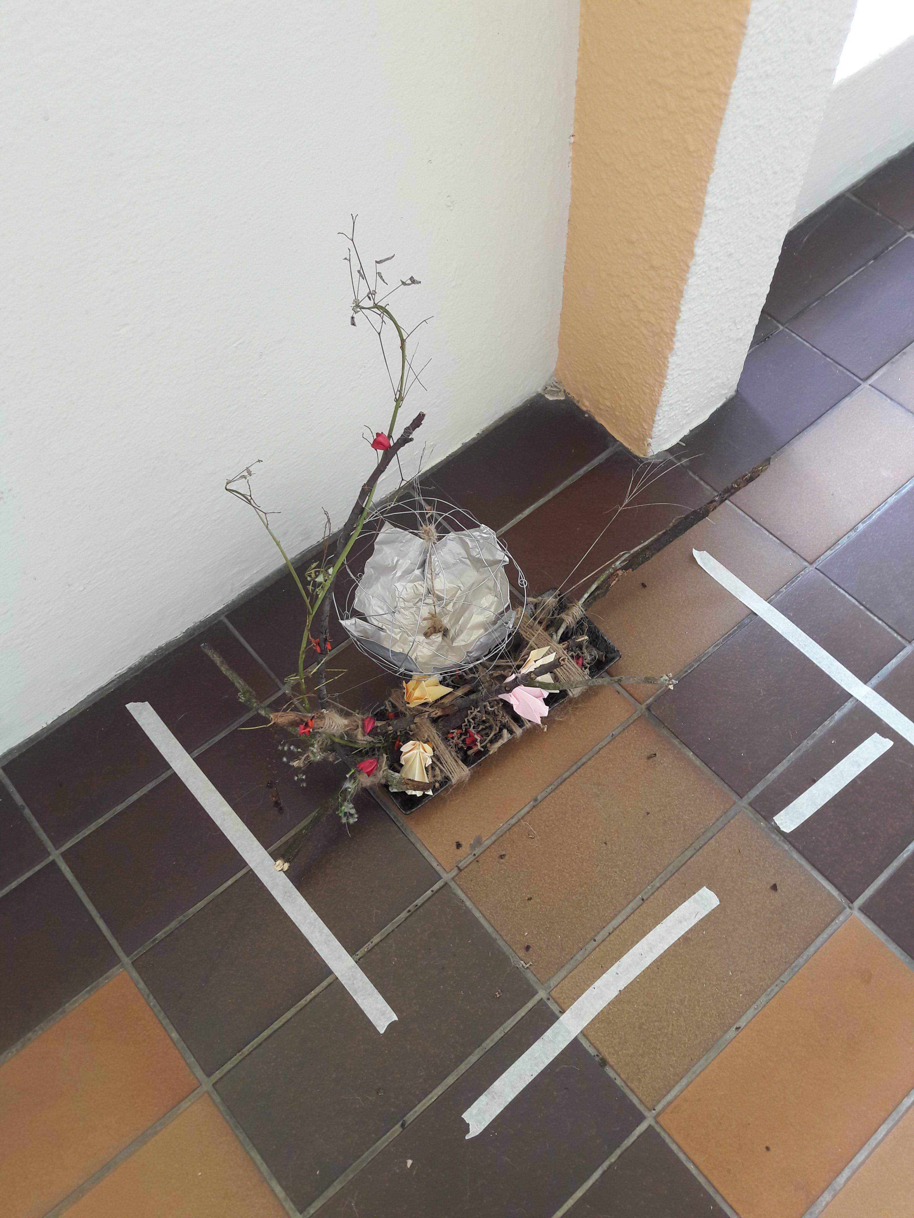
I attempted to play with a subdominant curling around the reaching dominant, and the subordinate as the cherry on top, though I couldn’t quite make it stand well despite supporting with wire and a cardboard+art card base.
The one I submitted was hence a low dominant sailing over the base, with a subdominant coiling around it and a subordinate stabbing right through. The dominant is mostly a single curve, with a little breaking towards the ends, while the subdominant is much thinner and features both smooth curves and 3D broken planes. The subordinate, conversely, is thicker than the subdominant (experimental), but much shorter, and features only a 2D broken plane. I do agree with the comment that it seems somewhat drowned, which could perhaps have been resolved with a different direction.
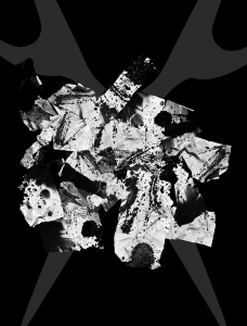
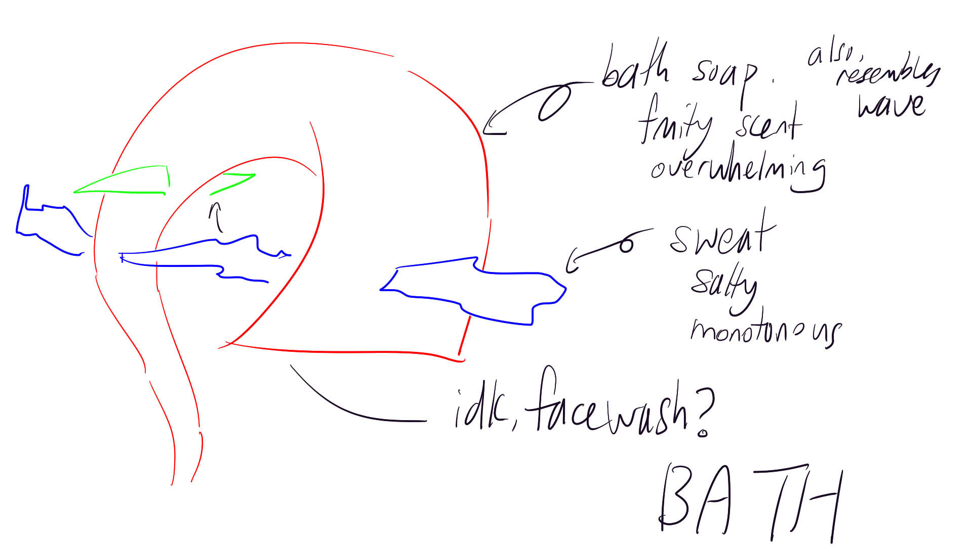
plaSTIC
(i tried)
plaNET
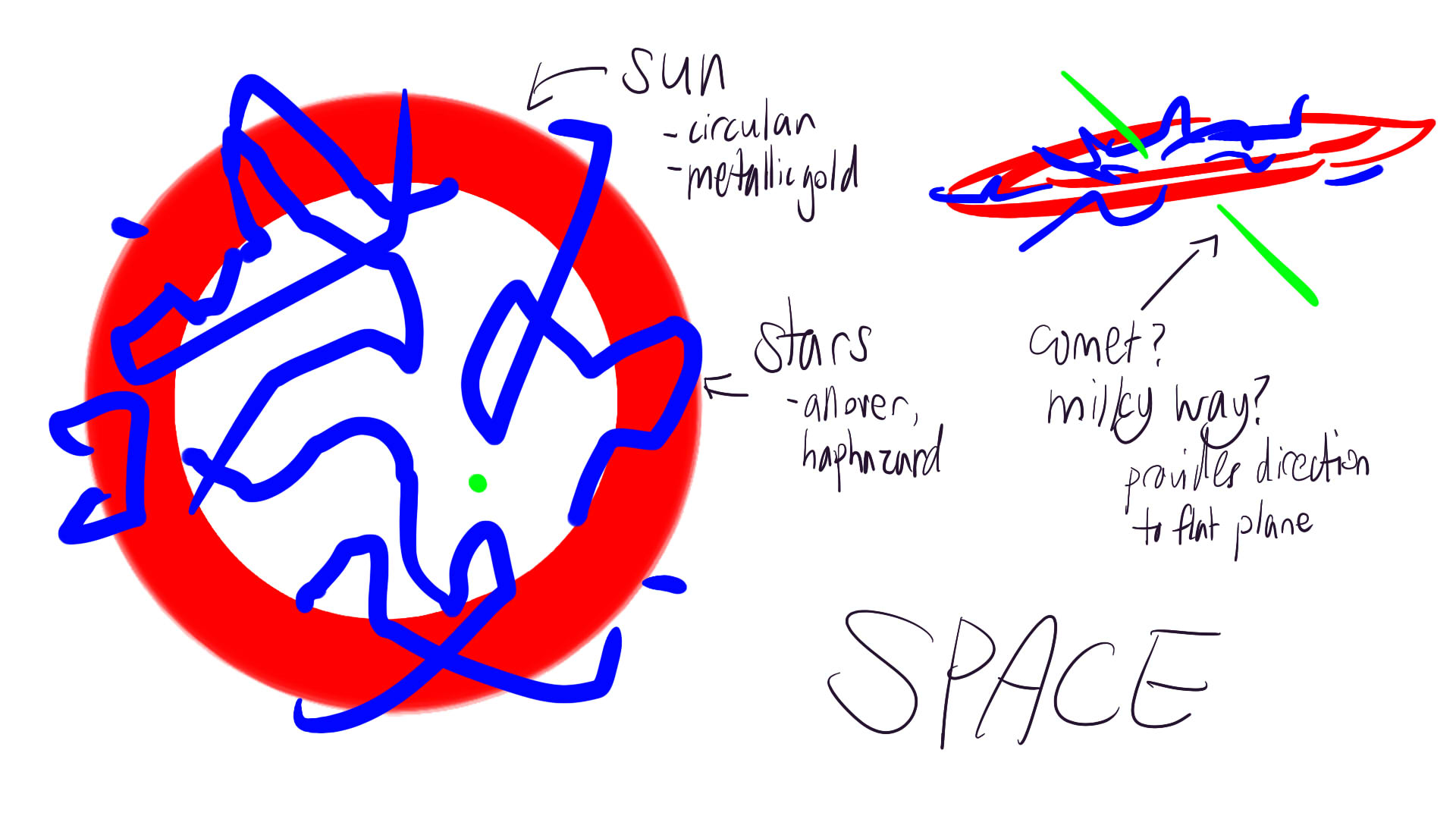
CONCEPTUALISATION PROCESS
We were idealess, so we tried brainstorming from all angles: material, theme, scent, shape, etc.
We eventually settled on SALT CRYSTALS, and brainstormed themes from that material
Bath (salts), laboratory (minerals), outer space (crystals), transparency, sea etc
We narrowed down to BATH and SPACE, but couldn’t think of anything more, so we split for the day
I made designs by drawing various shapes, and considering scents and their shapes to me
We eventually settled on the SPACE one
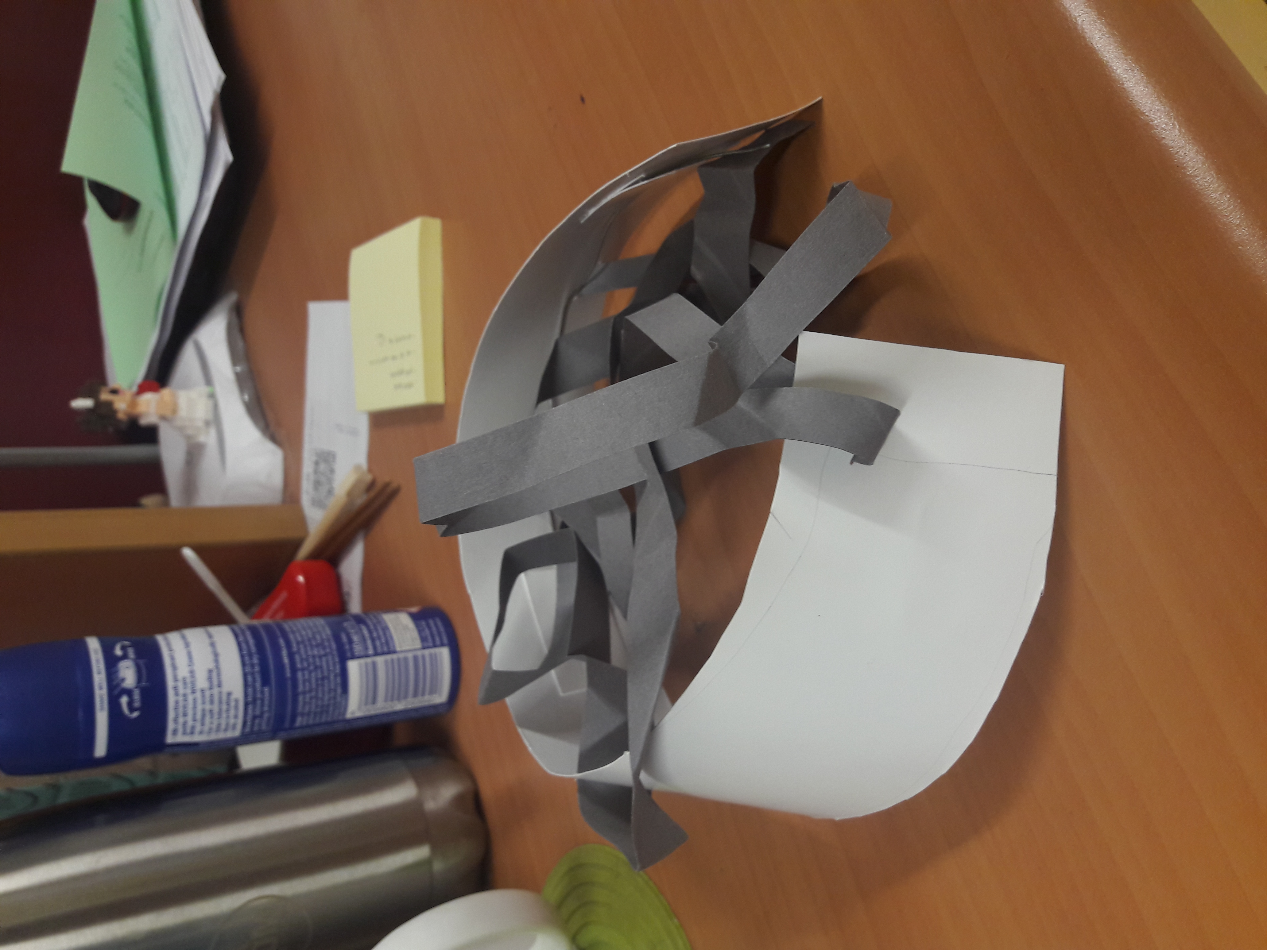
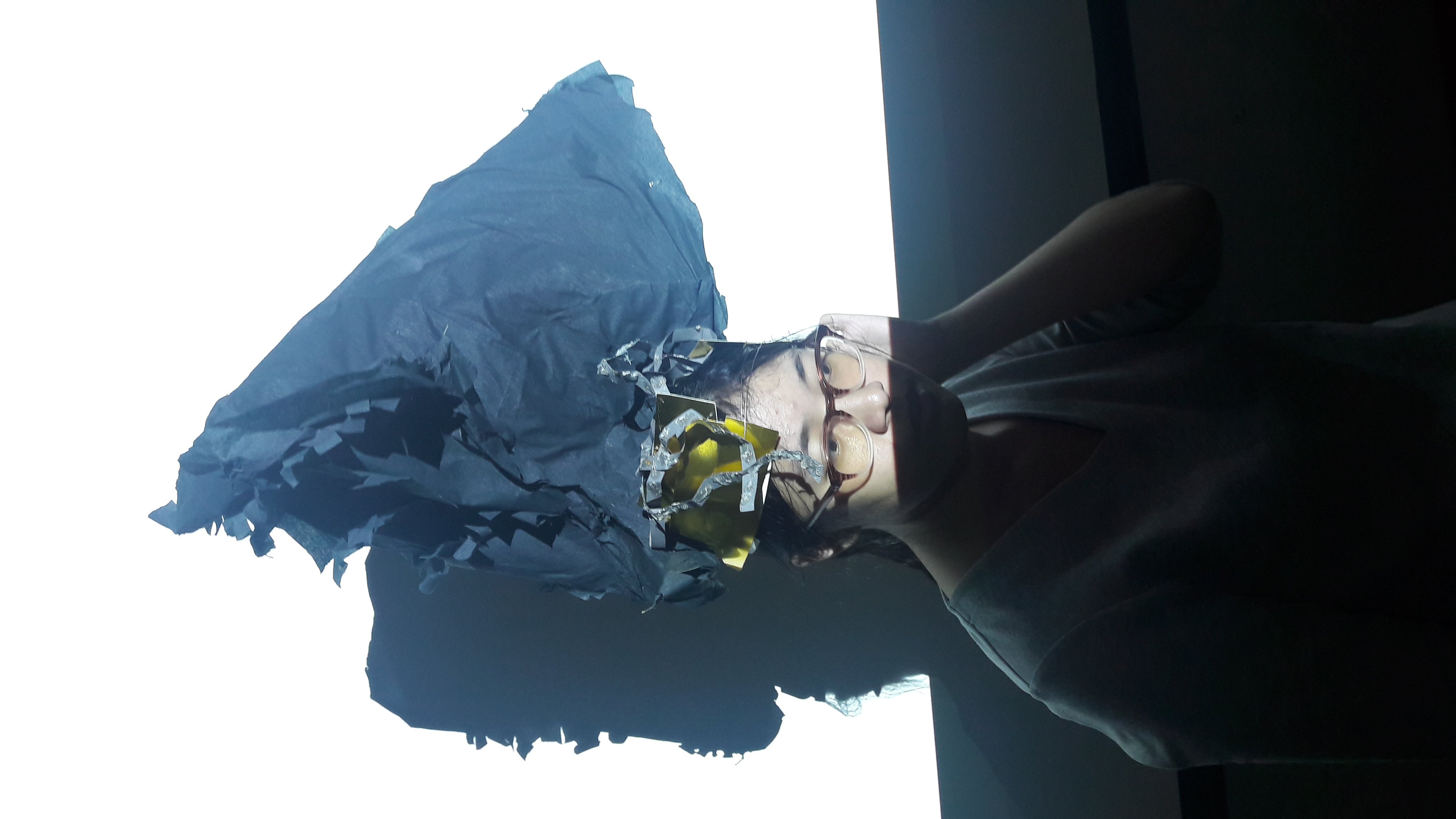
We made a prototype with art card and paper
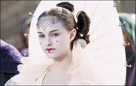
Esther suggested shifting the hierarchy by using a large dominant like Queen Amidala’s
leg so hot/hot hot leg/leg so hot u fry an eg (an erotic poem by basedmadoka)
Some drafted ideas. I did 4 panels only, because most of the ideas are generally static and meant to focus on details than huge movements.
I thought the rest were vaguely boring, so I decided to go with Legs. I like the idea of the subtlety of legs suggesting something about character, anyway. (But I did it after class because I’m too shy to ask classmates for help and the only people I can shamelessly ask for help are my choir mates. rip)
I cropped this 30 seconds out of about 5 minutes worth of video. I learned a lot about the people around me just by looking at their leg moving patterns. One guy, for example, claimed that he has a bad habit of shaking his leg, but only when he’s doing homework and not when eating. Also, no one I video-ed crosses or puts up their legs, which is… Markedly different from me.
The one featured in this video was the most expressive girl, who adjusts her legs a lot while talking animatedly. She also seems to have some form of discomfort, lifting and lowering her heels slightly.
Also other interesting 30 second stuff~
You know it’s gonna be good when the title sequence summarises the entire show for you in 30 seconds.
It looks fun, but I’ve never tried. A game about saving the world in 30 seconds.
While I originally contemplated movies of different genres, I eventually decided on Japanese animated youth drama films just to have some form of unity. All in all, though, my works follow a more chronological sequence, in that I learned various lessons along the way on techniques (mostly by discreetly looking at other poeple’s stuff and Googling “surrealism”), and tried many different things along the way: those which worked reappeared in later pieces, and those which didn’t were eliminated.
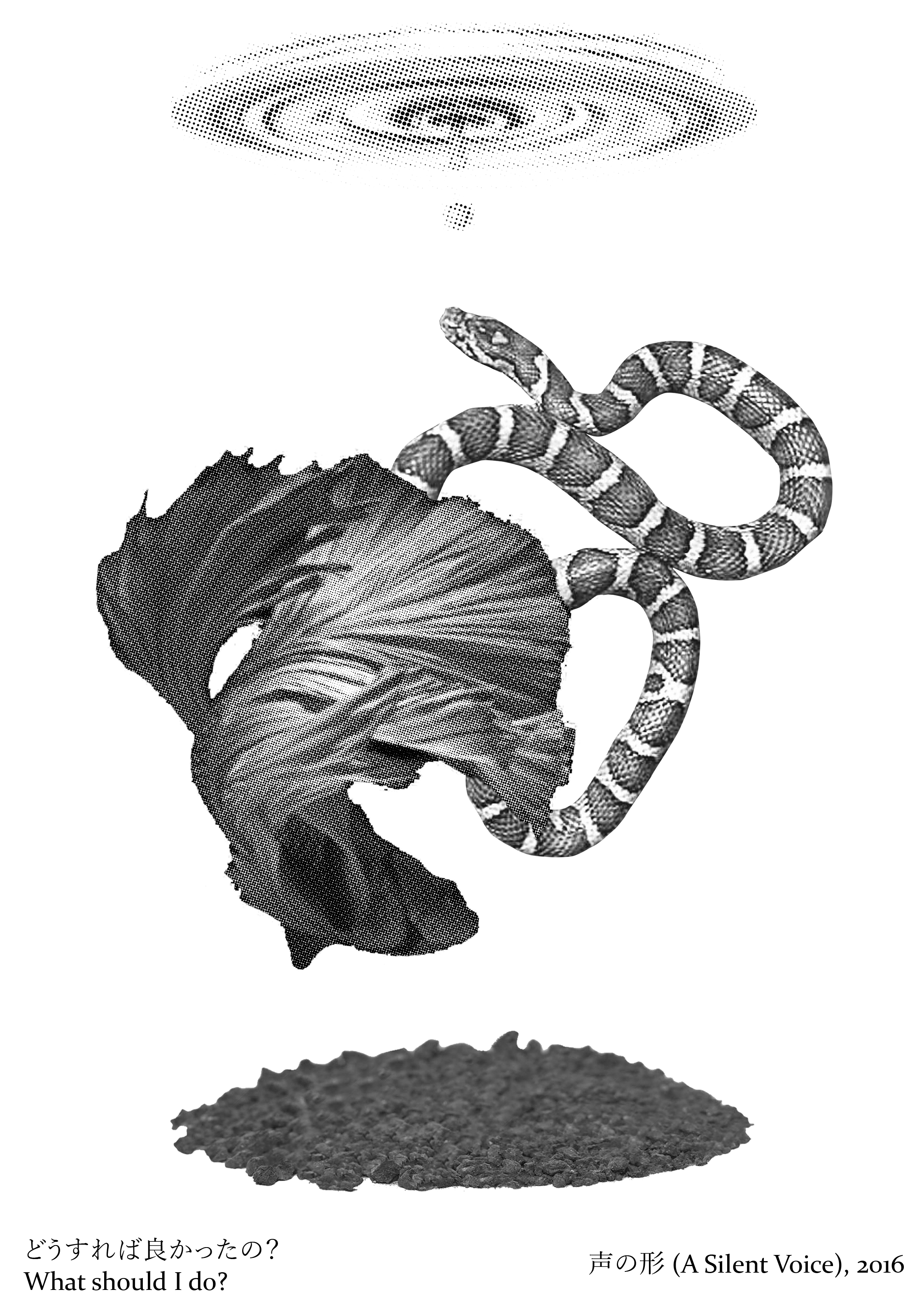
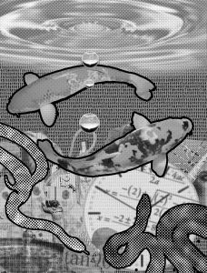
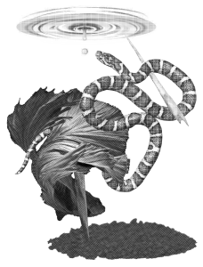
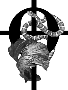
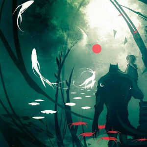
Summary: A sense of helplessness in not knowing what to do, mixed with hope for the better. Both animals often appear in intertwining pairs, where the downward-swimming fish symbolises the involution of the spirit, the snake, the succumb to venomous depravity. Yet, while the fish dives towards the soiled earth, the clarity of heaven still drips as a form of hope that things can improve.
This was the first one I started on, and probably one of the more experimented-on ones as a result.
ver1.0
ver2.0
ver2.5
ver2.7
ver1.0 was the original, and already had some element of the dichotomy I was trying to present. The earth was much more cluttered, with various things which are common sources of anxiety (e.g. clock=time, heart=relationships). Mathematical statements (all with no solutions) were clipped on to try and further that idea. ver0.9 didn’t have the stroke around the fishes/snakes, but it was added when Joy mentioned that the focus wasn’t clear enough. The common consensus was that too much was happening, and looking at the others during the group consultation also made me realise that I didn’t really consider the borders. Also, a perfunctory look at surrealist artists made me reconsider the usage of a meaningful background with a meaningful foreground, mostly because blue cloudy skies seemed to be quite a common theme to diminish the background and bring out the foreground.
From ver2.0 onwards, the background of human figures (to suggest uncertainty on what to do) was omitted, and I tried to focus on using shapes with clear directional outlines. Little variation happened between ver2.0 and ver2.7 in the general shape of the intertwining fish and snake to suggest a balance between 2 elements. ver2.5 is a sad remnant of when I was attempting to incorporate basic shapes to unify and differentiate my 4 pieces. But I couldn’t make it work, so I gave up (that’s both a Celtic cross and a coda, incidentally). Dhanu suggested to make everything line up though, so I figured might as well! (Also, I half-toned one half to try and contrast more.)
Summary: Even if our bodies decay, our existence is connected to the world for all time and space simply because we once were. The worm destroys and remakes our bodies to rejuvenate the earth, rising over the time and space of different parts of the world in different eras. Butterflies come from the worm, representing the choices one makes in his life through the idea of the butterfly effect.
This was the second I worked on, and was also vaguely annoying (but not as much because I hadn’t put the same amount of intricacy as for the first).
ver1.0
ver2.0
ver2.7
ver1.0 was also a remnant of my attempt to use basic shapes. I wanted that posture more than any possible meaning associated with the statue, but I eventually figured there was really little purpose in putting a human figure and it wasn’t subtle enough. Also, Joy mentioned that half-toning distorted the background and made it difficult to make out details, which I later tried to resolve by using different half-tone settings and taking at least one building out in its full glory. (There’s also the stroke, which was again an attempt to draw focus. I later learn that this is not a great way of defining focus, but that’ll be for later.)
ver2.0 onwards is all very similar, but with the figure swapped for the worm. This is also due to the earlier realisation that using the shape of the object to provide definition was good. The worm was originally cracked to suggest the breaking of the body, but Joy mentioned that it made the worm very unwormlike, and thus I toned it down (to the point of omission). I also just scaled down the buildings and darkened the butterflies with Threshold to try and define the focus more, although the eventual result still wasn’t sufficient, it seems. (I DID learn that Threshold was very useful for creating focus, though, which I applied in small amounts.)
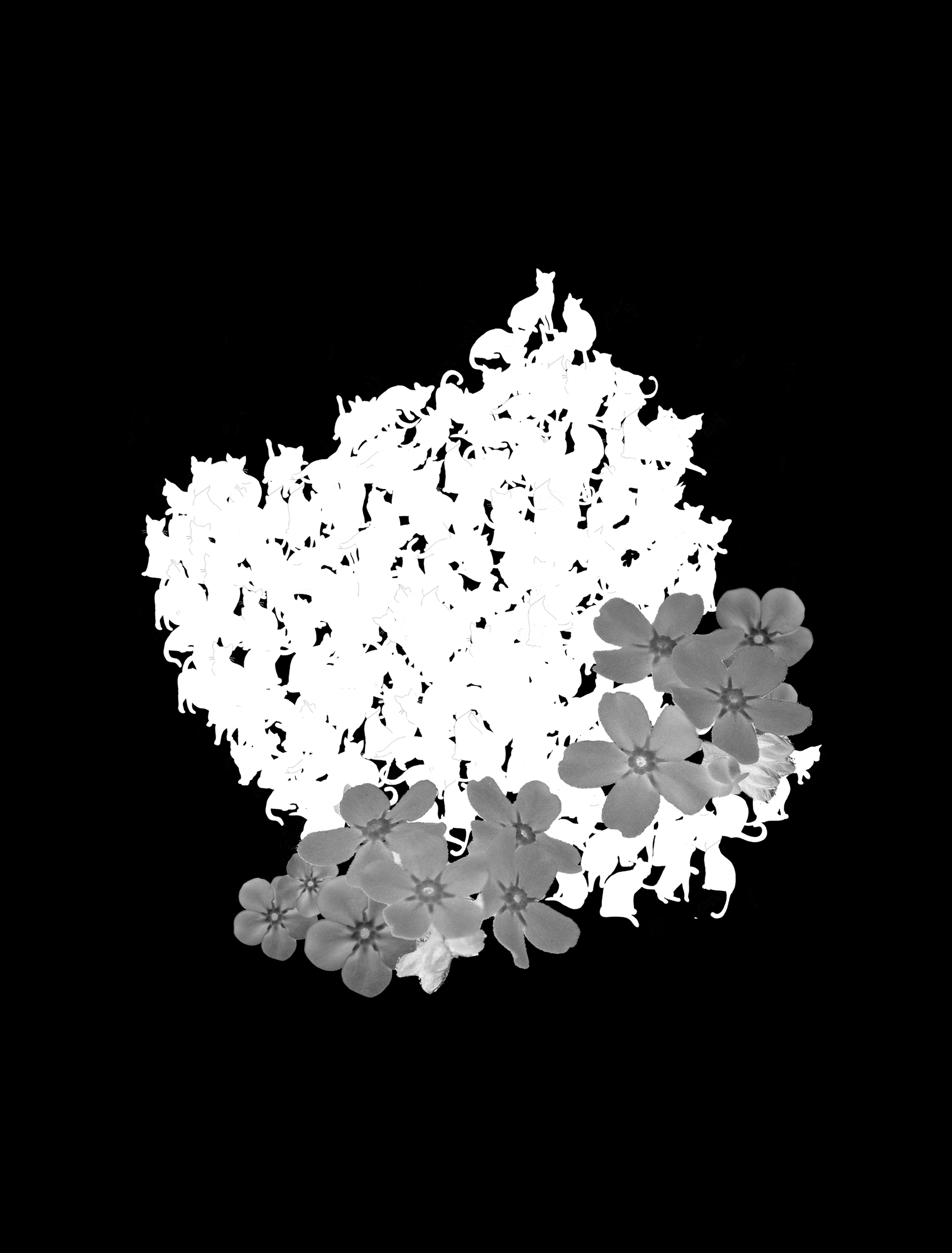
Summary: If your cat is missing, it could just be that it’s among the stars.
This was really the easiest of them all, somehow. I think it was the simplicity of the narrative, added with the fact that I don’t really have any particular emotion towards the quote that made me particularly want to show anything.
Halfway through making this, it was gently rejected, but I just wanted to finish it anyway because it was cute. This was also my first attempt at intentional and overdone implied lines, and absolute use of half-tones to slightly blur everything that isn’t the focus (and binary colour for the focus). The final comment was that the star on the side looked uncomfortably cut off. It was supposed to be slightly out of the frame, but perhaps I should have moved it in a little more to make it look more intentional.
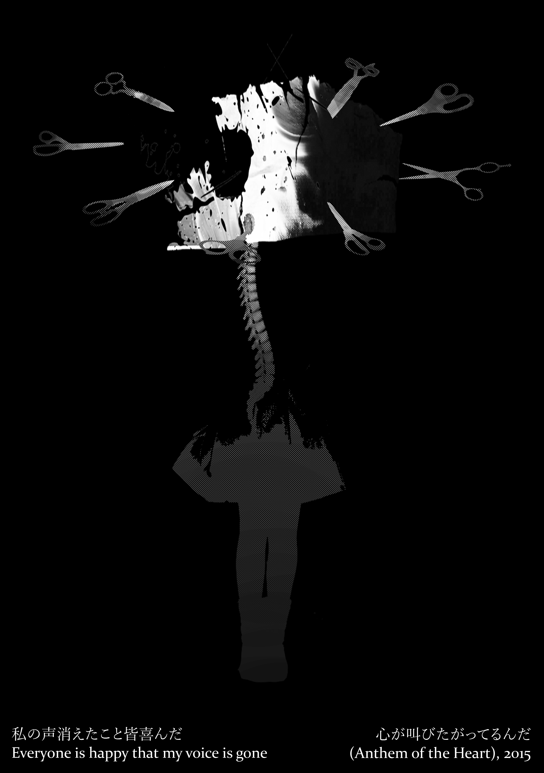
Summary: To be stripped of your voice is like becoming absent, and for everyone to be happy means that everyone despises you and wishes you don’t exist. The body is fading away, the skeletal spine suggesting decay while the head, the location of your mouth, is replaced by the ink splattered paper. That the paper is shredded and blotched indicates that your words can’t reach anyone, while the scissors represent people who all despise you, their blades pointed at you. Also, there are various scissors to suggest all kinds of people.
This was a headache in that it was the quote I resonated the most with, and thus the quote I was most trapped by, because there was a feeling I really wanted to bring across, but I didn’t want work to be defined by my personal feelings because that always makes it hard on everyone. In the end, I couldn’t make anything satisfactory, so I gave up and went with my feelings.
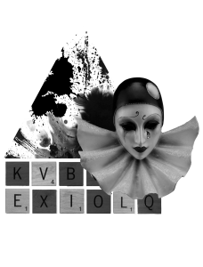
ver0.2
ver0.4
ver1.0
ver0.2 and ver0.4 don’t even get to 1.0 simply because it wasn’t much of a composition as opposed to a cluster of ideas. Again, the triangle was an attempt at basic shapes, with the ink splatters meant to suggest blood and hurt. The scrabble tiles was a link to the idea of “voice” again, an attempt at breaking the regular rhythm to create focus. The focus would then be letters which form words with multiple meanings/multiple words: in this case, L I V E / E V I L (I couldn’t think of anything better, so I ended up giving up on this one). The pierrot was an attempt to link that to emotion, where the clown lets himself be ridiculed, to the happiness of others (it was an idea from a song). But, again, I generally dislike directly representing human faces in surrealism so I axed it.
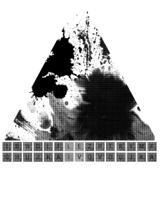
ver1.0 was me deciding to go with the ink splatters as the most aesthetically pleasing (and gut feel appealing) to me, and trying to go with the idea of paper as a representation of the voice and feelings. It’s the same as for the final, where wrecked paper = failure to communicate, but now revolving around ideas linked to paper, such as that of stationery (the scissors) to represent “everyone” and the idea of injury infliction (because scissors is sharp. and wins paper). The comment from Joy was that it was too abstract, though, so… Against my better judgment, I linked it back to personal feelings such that it became a human figure. Also, I reduced it to a single paper because many of my previous pieces had problems with “overdoing it”, and I figured 1 paper was enough. Similar to the 3rd piece, I used halftones, and tried to use white to define the focus: consequently, everything else consists of darker shades of grey.
The 4th composition is unusually high res because I edited it in after forgetting to photograph 🙁
What annoyed me most for this project was the number of minor issues I didn’t even think would be issues being issues. A splatter (pastel?) I can’t even recognise appeared on my bag on Sunday night and no amount of detergent nor scrubbing could get it off, I decided to print at home because my 4th composition still needed work even on Friday but my printer evidently cannot print tones of black properly, and printed all my pieces slanted so I had to use the paper cutter to adjust the sides, then the paper cutter kept cutting off little corners/didn’t cut perfectly to the edge. Learning from my previous mistake of being slightly late, I woke up at 4am to prepare everything properly, but it still didn’t work out, miraculously. I’m not sure what to make of this, because it could be me being an utter failure, or just rotten luck.
Something interesting that was mentioned was from Brendan, that there was a lot of animal imagery. I hadn’t even thought about it, and I suppose if I had I would have tried to link the 4th composition too. A human figure may have been good in that humans are considered the only species capable of “thought”, and thus that form of paranoid anxiety, but perhaps something like a fly (I can’t remember the exact one, but there’re quite a few poems about killing flies and the poet’s feelings towards the act) might have been interesting to work with.
Links where I got the images (not all images in the links were used in the final designs)
Alternative title: Excerpt of me brainstorming on Oct 08 at 16:02:32 because I couldn’t think of anything. (Incidentally, even this whole post is some kind of strange stream of thought!)
My initial location was Illyria. Not the actual location, but the fictional version in a book series revolving around a pig farmed named Blart (I didn’t know it sounds like Blood when said out loud). It’s basically some kind of communist country, but as an impressionable 7 year old with no awareness of economics it was a rather revolutionary idea. Here’s the description.
They continued along the road. Each time they passed a stall someone would dash out and give them something, be it some fresh fish or some wine or some elaborate jewellery. However much they protested they could not reject the goods they were given. If a stallholder couldn’t get them to take a gift directly then he just placed the object in one of Pig the Horse’s saddlebags. More and more things mounted up. In their pockets, in their hands and over their shoulders.
‘There’s going to be a terrible bill at the end of this street,’ warned Capablanca.
But they reached the end of the street and there was no bill. Nobody stopped them and nobody demanded payment.
‘Sure, we’ll be arrested as thieves,’ said Beo.
But they weren’t arrested as thieves. And the reason they weren’t can only be understood by understanding the nature of the Illyrian economy.
You see, most economies work on the “buy” idea. You want something. You go to someone who has it. You agree a price. And then you get it.
The Illyrian economy didn’t work like this. their economy, instead of being based on the idea of buying, was based on the idea of giving. Everybody gave a share of whatever he or she had to everybody else. So, a man who has grown a lot of oranges gave some to everybody he knew. A woman who made cheeses gave some to everybody she knew. And so on. Everybody ended up with all the oranges, apples, cheeses and everything else that they needed, which is all that an economy is there for the first place. And if, for example, the man with the oranges had something go wrong like his orange trees getting a disease and dying, then it didn’t mean that he had to starve because everybody carried on giving him things even though they didn’t get any oranges back. They had everything else so missing out on oranges wasn’t so terrible. And as soon as the man got some new orange trees he’d start growing oranges and giving them away again. This is why everybody was always trying to give Blart, Beo and Capablanca things.
Economists from all the other countries of the world had heard of this idea and said that it couldn’t work because people were naturally greedy and selfish and that they liked having more things than everybody else. But Illyrians continued to make it work in complete disregard of economic theory, which was very rude of them in the opinion of the economist. And because they weren’t always competing with each other and trying to make a profit, the Illyrians ended up being friendly and generous to one another and they were the happiest people in the world. It made all the economists mad.
It’s very light reading even for a 7 year old, but I recommend it just because it’s hilarious.
However, I decided I didn’t particularly want to do it by virtue of the fact that I can’t visualise it as anything but a children’s show animation (think Adventure Time), and while I like those plenty, what’s the point of being allowed to use any medium if I’m just going to make some boring expository animation with boring expository sounds?
Also, I like trying out a variety of things. I’ve already attempted the mundane and the quirky, so it’s probably about time to do the faux-psychological stuff, isn’t it?
What I hence want to focus on is the stream of consciousness. I first encountered it in literature (think James Joyce), but I think the fundamental idea still works, since it’s a narrative technique. It’s very fascinating to me that one can begin from somewhere, and through the most serendipitous development, end up somewhere seemingly unrelated through a chain of interlinked thoughts. For example:
I need to find my nail clipper
My nail clipper is silver in colour
Kind of like the colour of Pokemon SoulSilver
Thinking about it, Pokemon was a good game
I hope that the new Xenobladegame comes out soon too
And that the Xenoblade soundtrack is still composed by ACE+
I loved that song by ACE+
It reminded me a lot of…… (stream continues)
You wouldn’t think nail clippers and songs are related, but they can be.
I also know this might sound weird, but for inspiration I looked towards the things I recorded. I have a habit of recording my thoughts and dreams. And funnily enough, they are kind of what I’m aiming for.
i dreamt that i walked to the MRT with them regardless, but ended up sidetracked as we went into Vallaha. We went into the boss map where Nagasakihime, an extremely large (we were only as tall as the width of her thigh!) was sitting on a royal wooden plate, wearing a white royal kimono with her long black hair (her face was out of the screen) as she began to rain hail down on us: i cast protective barrier spells but also decided to just run for it. outside, there were many mobs summoned by her and i took care of some of them but ended up dying so i revived myself there, and tried to kill them by seeing the next move they would make (which didnt make things any easier). in the end i just switched over to my Buccaneer, who could just trash them by sending nukes down from platform above. there was a lot of loot: red/gray crabs, bees, stingers… i collected them from right beside a conversation between Lucifer and a crab: the crab was shortsighted but somehow I knew Lucifer would not say anything about me. After i went back i was reprimanded, while they told me about how Nagasakihime boss fight allows 1 person to sleep and gain ores in the dream while the others fight, and i handed over the stuff i looted from killing everything, which also involved ores. at the same time, Lucifer‘s servant encountered the Demon King, and suggested for him to visit his son’s room, which was currently in terrible shape as his son seemed to have killed everything. The King went in and remarked the lack of mobs, but when Lucifer said he no longer wished to be attacked by the mobs, the King coaxed him by showing the number of injuries each Demon King had to have, with his grandfather clocking in the most at 1842 fatal ones, 1536 with medical attention and 182 minor ones. it was inevitable, and Lucifer had to get used to it. which he did not, and so he plotted to escape, remembering a story he once read of a Demon Queen to be who desired not the position, and so when she brought her horse back in after training and as the stable doors were about to close, she ordered the sun to rise instead, as the tendrils of trees ripped the doors open and she flew off on her horse, free.
74% of dream 030916 (edited typos to allow for basic comprehension)
the skin of my eyes feel heavy but even if it close then i cant stop thinking. what else must i do. what else can i finish doing. i want to work on the lyrics i want to write i want to produce keep producing something if its the only way i can get this turmoil into some shape someway or the other if i draw what should i draw maybe another 2 col piece black and white positive and negative space but ive been doing that a lot recently its an apt style for my mood but i must keep progressing, im bored i want to do something else. ive watercoloured too much for work. maybe acrylic again i liked the effect with luna. or matcha paint thatd be interesting or a silver/gold toned work whenever i find my brush pen. who has it? who can i blame? this is why i hate giving anything. even though i tried to no one appreciated it no one seemed to like it no one cared and in the end why did i do it? i hate giving anything. loaning anything. of course you shouldnt be expecting gifts back but i always feel so underwhelmed. i gave this gift which i worked so hard on and no one cares. maybe im succumbing to a superiority complex again, remember when i mentioned this and all i got was the suggestion that i seem to think im the only one whos “unique”? any element of not liking others must mean some form of egoism. “theyre bad” “theyre inefficient” to be able to say that must mean in some form that you think youre better. “theyre bad and i am too”? what does bad even mean what right do i have to define that word, i dont have jurisdiction what must i do to gain that right my heart skips a beat when my phone drops. it also skips many beats when i have to say nothing ive thought through a lot, i cant breathe it hurts, my heads dizzy, i can focus on nothing but the rapid beating of my heart and i have to struggle to control my breathing, is that what it means to “be anxious” or to “have anxiety” ill never know because ill never work up the courage to believe that i have a “right” to having a mental illness, thats so incorrect to say and that just makes me sound like an asshole, but honestly im just normal norm normal all the way i wont ever be outstanding or dysfunctional in any way
29% of sleeptalk 290717 (edited typos to allow for basic comprehension)
What I enjoy is the fact that they don’t seem like they make sense, but at the same time they kind of do, especially dreams. Once you write it down it becomes truly apparent how bizarre it is, but when you’re still experiencing it, it all makes logical sense to you. The challenge, of course, is to make it make sense beyond just me.
For the dream I find it bizarre that new characters can be introduced so easily without it seemingly weird, and sometimes order is maintained just by the same character appearing again even if in the most different scenarios (and even if you have no awareness of their appearance you can still tell it’s them). Also, how incredibly weird it is that you can have the most detailed information even with the most vague descriptions. And how very different things are happening, but with an adequate explanation you can convince people that it’s all interlinked.
For the sleeptalk it’s also interesting to see how it’s a lot about the person themself. For the me of then, when I think of what I can do, I think of drawing, and that leads to me exploring different mediums. Then the fact that I’ve recently lost my brushpen helps to lead from the subject of drawing to general angst at other people. The real world interrupting the stream of thought and starting a new one is also an interesting concept.
So far I’ve only talked about visuals when the emphasis should be on sound, so let’s try looking at a childhood favourite of mine, hanamushi (花蟲)! Hanamushi has a very distinctive, surreal and eerie style, and I think the idea of reverie was nicely shown in this work:
Short Animation 「Daydream Girl」
I opted against doing the full video analysis since that’s kind of long, but I’d say there are 4 very evident categories of sound.
Diegetic: Could be further divided into real sound and “fantasy” sound, but let’s leave it as is. Sound like the mouse’s squeaking, frog’s clapping, page’s flipping, all fall under here.
Non-Diegetic long-term: The closest to mood music there will be, things like the sounds of chimes and xylophones and bongos which transition from each other as per parts of the video. It helps to define changes in the landscape, with things like the frog getting the deeper sound of drums versus the lighter chime sounds of things like flies.
Non-Diegetic short-term: Like long-term in defining movement, only that rather than characterising whole chunks of areas it provides context as to occurrences, such as a scale ascension when the skeleton unfurls.
Non-Diegetic permanent: The consistent sound throughout everything, the static. I think this is more an accident of sound mixing than actual intention, though, because it’s present whenever there’s sound, but absent whenever no sound track is being played.
I think what helps to keep the sounds remaining united even with different instruments is the common time signature, and what helps to separate is the deviation from that, sometimes with increasing tempo too. There’s a purposeful use of tempo, so fluctuations or off beat sound effects stand out.
I came up with this narrative ordering by myself, but I think it’s a fairly obvious chain of effect which was also shown in hanamushi’s work.
Something of the real world acts as a trigger
The trigger leads onto another thought and another, and another
The chain is broken when something of the real world snaps you back to reality
There are very few examples I could find, but I thought this was good too:
Regardless, the point of the reverie style is to allow a mixture of different types of sounds and mediums. I don’t want to be limited to anything, because it’s all about your head and where your thoughts lead you, so it could go anywhere.
Again, though, it’s about trying to make it relatable to everyone, which is hard because the ways people think are different from each other, so things that have an obvious correlation to me might not link up as well for another. At the very least, though, the location I’m working on is
? THE MIND WHEN YOU’RE STONING ON A BUS ON THE WAY HOME AT 11PM ?
It’s very specific, but necessary I suppose. I’m still working on the sequence of images and sounds, trying not to focus too much on images as opposed to linking sounds. The trigger I’m thinking of is the bus halting sound, so I suppose I’d try to find sounds which sound similar, or which are commonly associated with that.
Or maybe I can try the Good Books thing, in having a sort of monologue, although I don’t think that’d be as effective simply because people DON’T monologue in their head (as far as I know, which I wouldn’t because I only know I don’t).
Many years had elapsed during which nothing of Combray, save what was comprised in the theatre and the drama of my going to bed there, had any existence for me, when one day in winter, on my return home, my mother, seeing that I was cold, offered me some tea, a thing I did not ordinarily take. I declined at first, and then, for no particular reason, changed my mind. She sent for one of those squat, plump little cakes called “petites madeleines,” which look as though they had been moulded in the fluted valve of a scallop shell. And soon, mechanically, dispirited after a dreary day with the prospect of a depressing morrow, I raised to my lips a spoonful of the tea in which I had soaked a morsel of the cake. No sooner had the warm liquid mixed with the crumbs touched my palate than a shudder ran through me and I stopped, intent upon the extraordinary thing that was happening to me. An exquisite pleasure had invaded my senses, something isolated, detached, with no suggestion of its origin. And at once the vicissitudes of life had become indifferent to me, its disasters innocuous, its brevity illusory – this new sensation having had on me the effect which love has of filling me with a precious essence; or rather this essence was not in me it was me. I had ceased now to feel mediocre, contingent, mortal. Whence could it have come to me, this all-powerful joy? I sensed that it was connected with the taste of the tea and the cake, but that it infinitely transcended those savours, could, no, indeed, be of the same nature. Whence did it come? What did it mean? How could I seize and apprehend it?
I drink a second mouthful, in which I find nothing more than in the first, then a third, which gives me rather less than the second. It is time to stop; the potion is losing it magic. It is plain that the truth I am seeking lies not in the cup but in myself. The drink has called it into being, but does not know it, and can only repeat indefinitely, with a progressive diminution of strength, the same message which I cannot interpret, though I hope at least to be able to call it forth again and to find it there presently, intact and at my disposal, for my final enlightenment. I put down the cup and examine my own mind. It alone can discover the truth. But how: What an abyss of uncertainty, whenever the mind feels overtaken by itself; when it, the seeker, is at the same time the dark region through which it must go seeking and where all its equipment will avail it nothing. Seek? More than that: create. It is face to face with something which does not yet exist, to which it alone can give reality and substance, which it alone can bring into the light of day.
And I begin to ask myself what it could have been, this unremembered state which brought with it no logical proof, but the indisputable evidence, of its felicity, its reality, and in whose presence other states of consciousness melted and vanished. I decide to attempt to make it reappear. I retrace my thoughts to the moment at which I drank the first spoonful of tea. I rediscover the same state, illuminated by no fresh light. I ask my mind to make one further effort, to bring back once more the fleeting sensation. And so that nothing may interrupt it in its course I shut out every obstacle, every extraneous idea, I stop my ears and inhibit all attention against the sound from the next room. And then, feeling that my mind is tiring itself without having any success to report, I compel it for a change to enjoy the distraction which I have just denied it, to think of other things, to rest refresh itself before making a final effort. And then for the second time I clear an empty space in front of it; I place in position before my mind’s eye the still recent taste of that first mouthful, and I feel something start within me, something that leaves its resting-place and attempts to rise, something that has been embedded like an anchor at a great depth; I do not know yet what it is, but I can feel it mounting slowly; I can measure the resistance, I can hear the echo of great spaces traversed.
Undoubtedly what is thus palpitating in the depths of my being must be the image, the visual memory which, being linked to that taste, is trying to follow it into my conscious mind. But its struggles are too far off, too confused and chaotic; scarcely can I perceive the neutral glow into which the elusive whirling medley of stirred-up colours is fused, and I cannot distinguish its form, cannot invite it, as the one possible interpreter, to translate for me the evidence of its contemporary, its inseparable paramour, the taste, cannot ask it to inform me what special circumstance is in question, from what period in my past life.
Will it ultimately reach the clear surface of my consciousness, this memory, this old, dead moment which the magnetism of an identical moment has traveled so far to importune, to disturb, to raise up out of the very depths of my being? I cannot tell. Now I feel nothing; it has stopped, has perhaps sunk back into its darkness, from which who can say whether it will ever rise again? Ten times over I must essay the task, must lean down over the abyss. And each time the cowardice that deters us from every difficult task, every important enterprise, has urged me to leave the thing alone, to drink my tea and to think merely of the worries of to-day and my hopes for to-morrow, which can be brooded over painlessly.
And suddenly the memory revealed itself. The taste was that of the little piece of madeleine which on Sunday mornings at Combray (because on those mornings I did not go out before mass), when I went to say good morning to her in her bedroom , my aunt Léonie used to give me, dipping it first in her own cup of tea or tisane. The sight of the little madeleine had recalled nothing to my mind before I tasted it; perhaps because I had so often seen such things in the meantime, without tasting them, on the trays in pastry-cooks’ windows, that their image had dissociated itself from those Combray days to take its place among others more recent; perhaps because of those memories, so long abandoned and put out of mind, nothing now survived, everything was scattered; the shapes of things, including that of the little scallop-shell of pastry, so richly sensual under its severe, religious folds, were either obliterated or had been so long dormant as to have lost the power of expansion which would have allowed them to resume their place in my consciousness. But when from a long-distant past nothing subsists, after the people are dead, after the things are broken and scattered, taste and smell alone, more fragile but more enduring, more unsubstantial, more persistent, more faithful, remain poised a long time, like souls, remembering, waiting, hoping, amid the ruins of all the rest; and bear unflinchingly, in the tiny and almost impalpable drop of their essence, the vast structure of recollection.
And as soon as I had recognized the taste of the piece of madeleine soaked in her decoction of lime-blossom which my aunt used to give me (although I did not yet know and must long postpone the discovery of why this memory made me so happy) immediately the old grey house upon the street, where her room was, rose up like a stage set to attach itself to the little pavilion opening on to the garden which had been built out behind it for my parents (the isolated segment which until that moment had been all that I could see); and with the house the town, from morning to night and in all weathers, the Square where I used to be sent before lunch, the streets along which I used to run errands, the country roads we took when it was fine. And as in the game wherein the Japanese amuse themselves by filling a porcelain bowl with water and steeping in it little pieces of paper which until then are without character or form, but, the moment they become wet, stretch and twist and take on colour and distinctive shape, become flowers or houses or people, solid and recognizable, so in that moment all the flowers in our garden and in M. Swann’s park, and the water-lilies on the Vivonne and the good folk of the village and their little dwellings and the parish church and the whole of Combray and its surroundings, taking shape and solidity, sprang into being, town and gardens alike, from my cup of tea.
À la recherche du temps perdu (ENG: In Search of Lost Time) by Marcel Proust
The “Episode of the Madeleine”, extracted from here
It’s a long novel which may be vaguely boring if you’re not into literary modernism, but nevertheless I enjoyed this excerpt, which I first saw in the menu of a random cafe I wandered into.
The entire book, and especially this segment, is focused on the theme of involuntary (Proustian) memory. Though it’s not really related to the task at hand, thinking of food and memory reminded me of this passage. Having a memorable scent is somewhat related to Proustian memory, since it’s about being able to evoke a memory without conscious effort. In fact, allegedly, the ‘expression “Proust’s madeleine” is still used today to refer to a sensory cue that triggers a memory’ (The Guardian). It’s not as related to actually translating the scent to a shape, though.
There’s also another copy of the excerpt here, this time with 2 extra paragraphs in front. I find it more charming without, but those 2 paragraphs provide a brief summary of sorts.
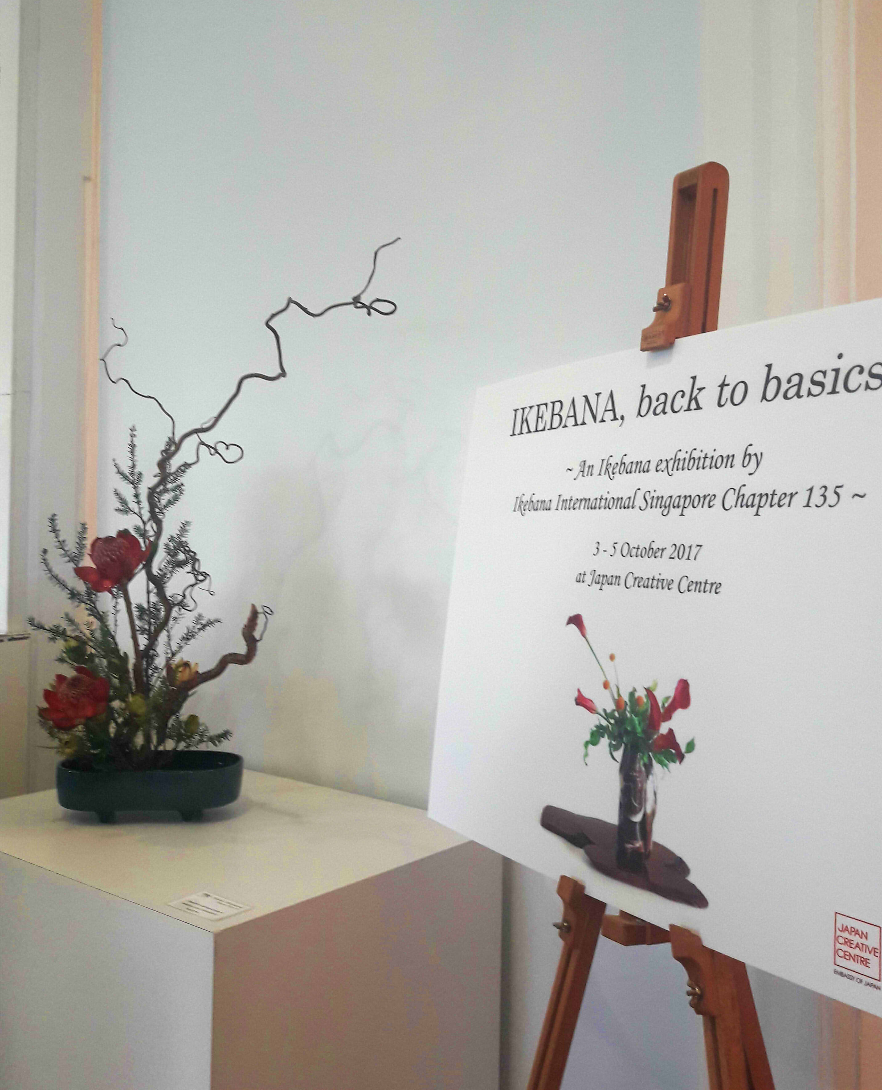
I have never written an article before, so this ought to be good.
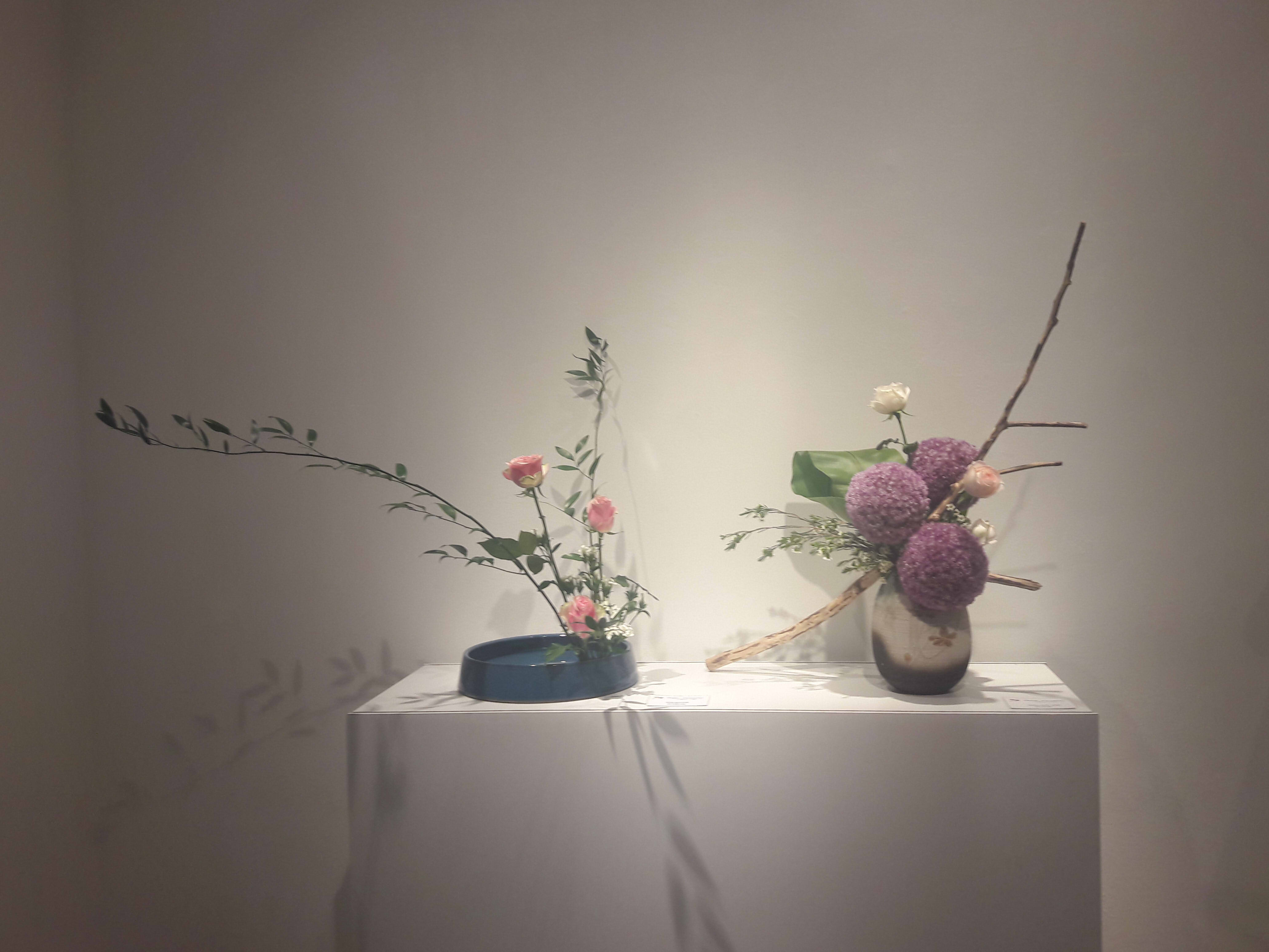
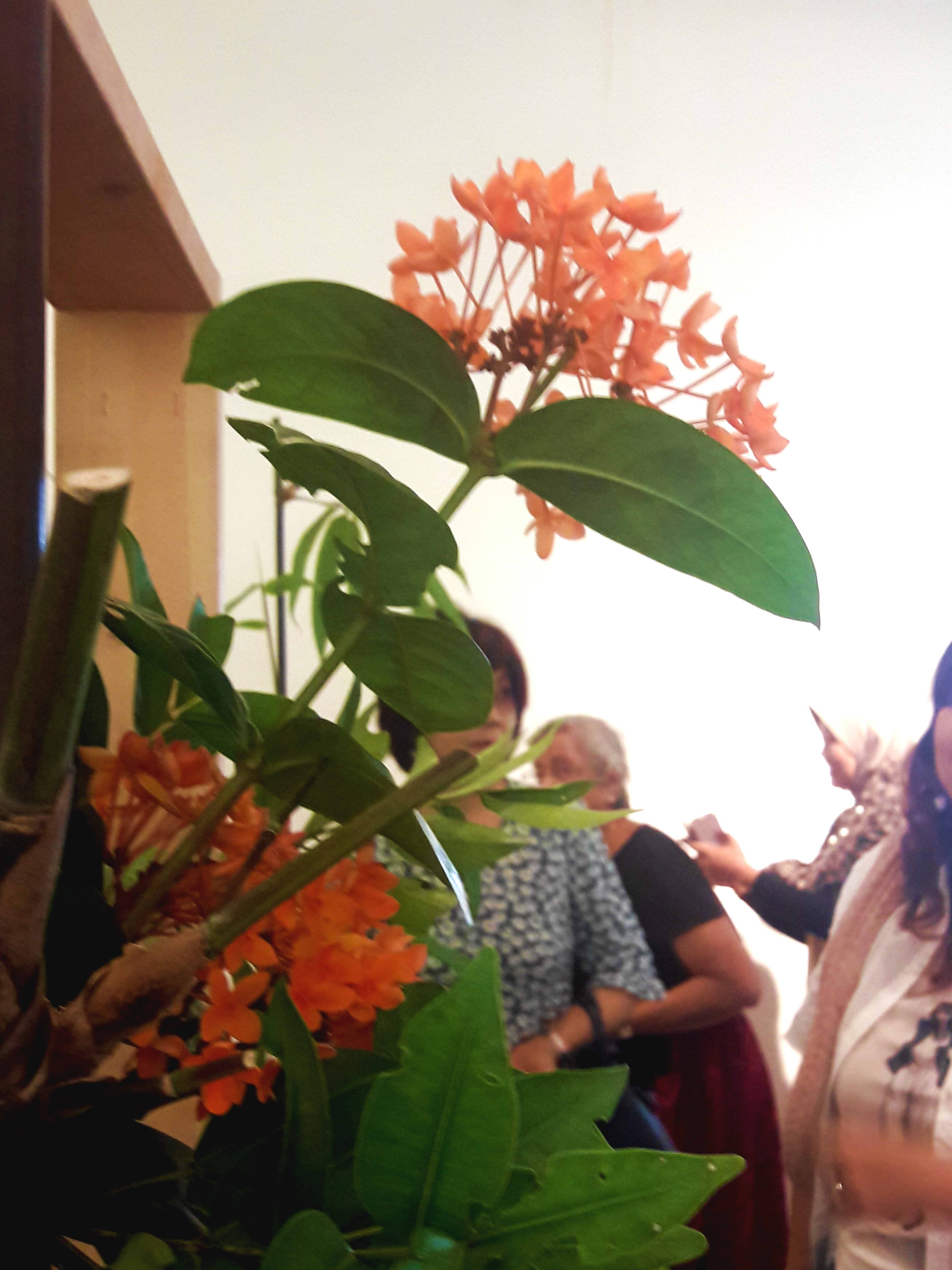
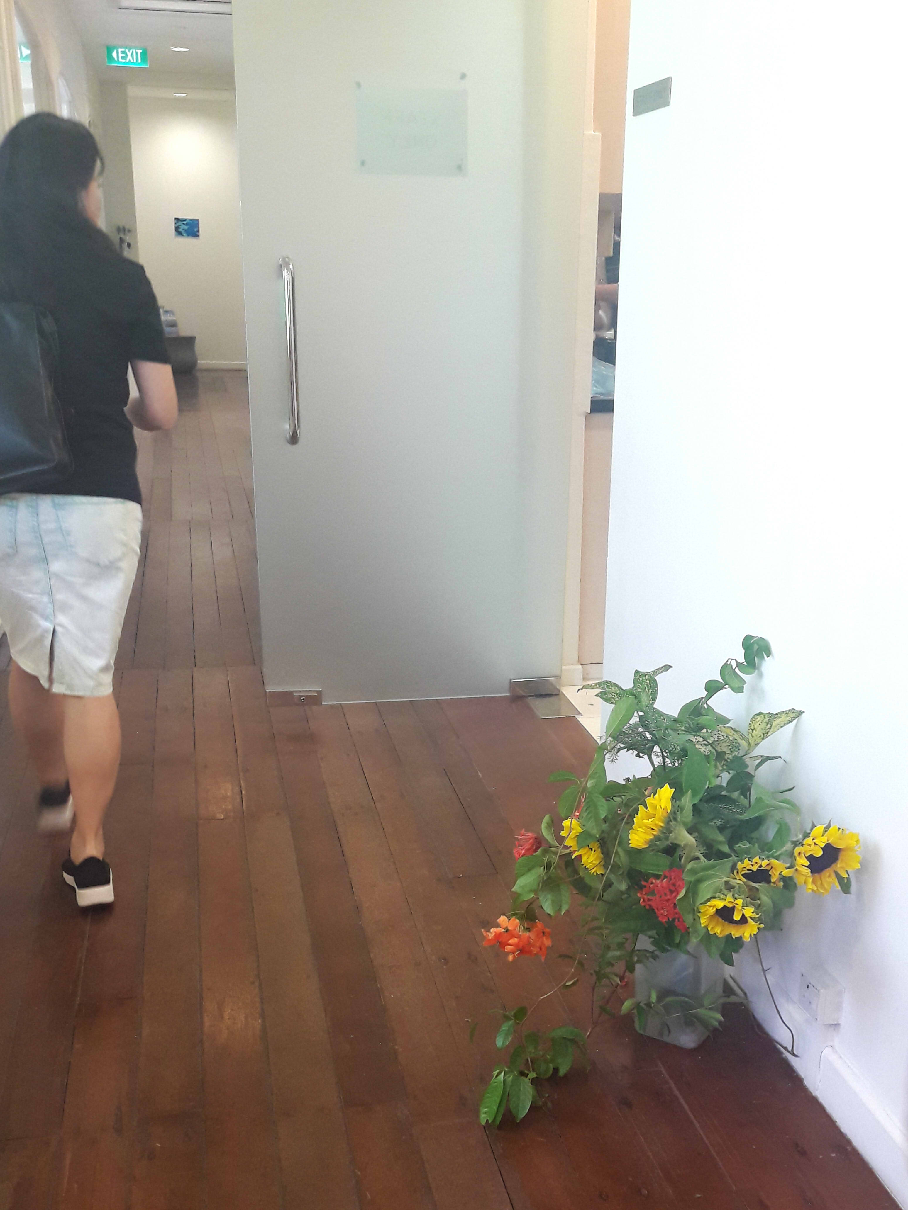
On October 2 (Monday), I attended the opening of the Ikebana, back to basics exhibition by the Ikebana International Singapore Chapter 135, hosted at the Japan Creative Centre.¹
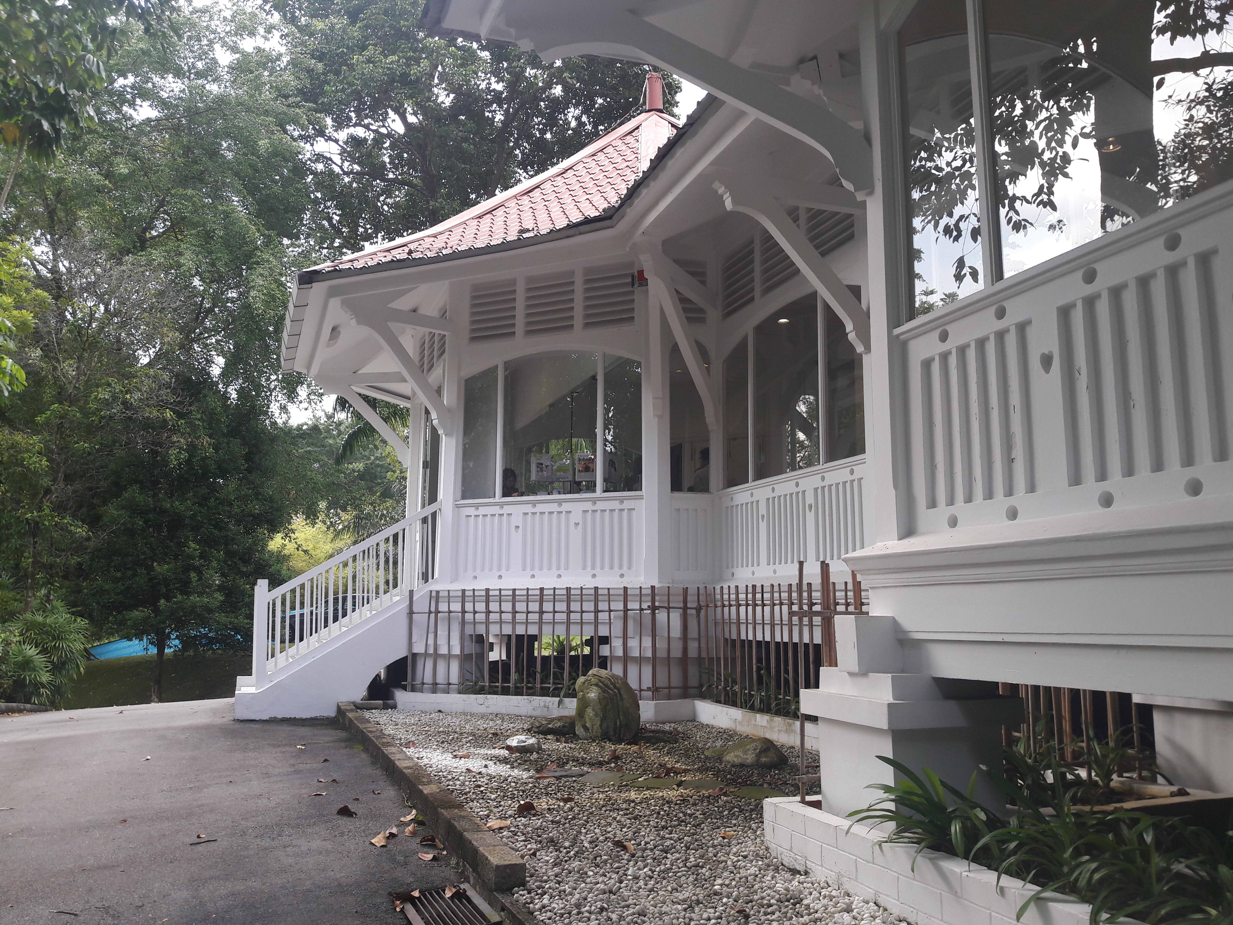
The place is essentially a private mini gallery.
The atmosphere is somewhat unnerving, from the average age being twice of mine, to the fact that a doorman opens the door and greets you personally.² Part of it is also perhaps just the minimalistic elegance of the rooms, which are small and uncluttered. An ikebana and introductory placard can be seen before the doorless chamber, no bigger than a typical classroom.
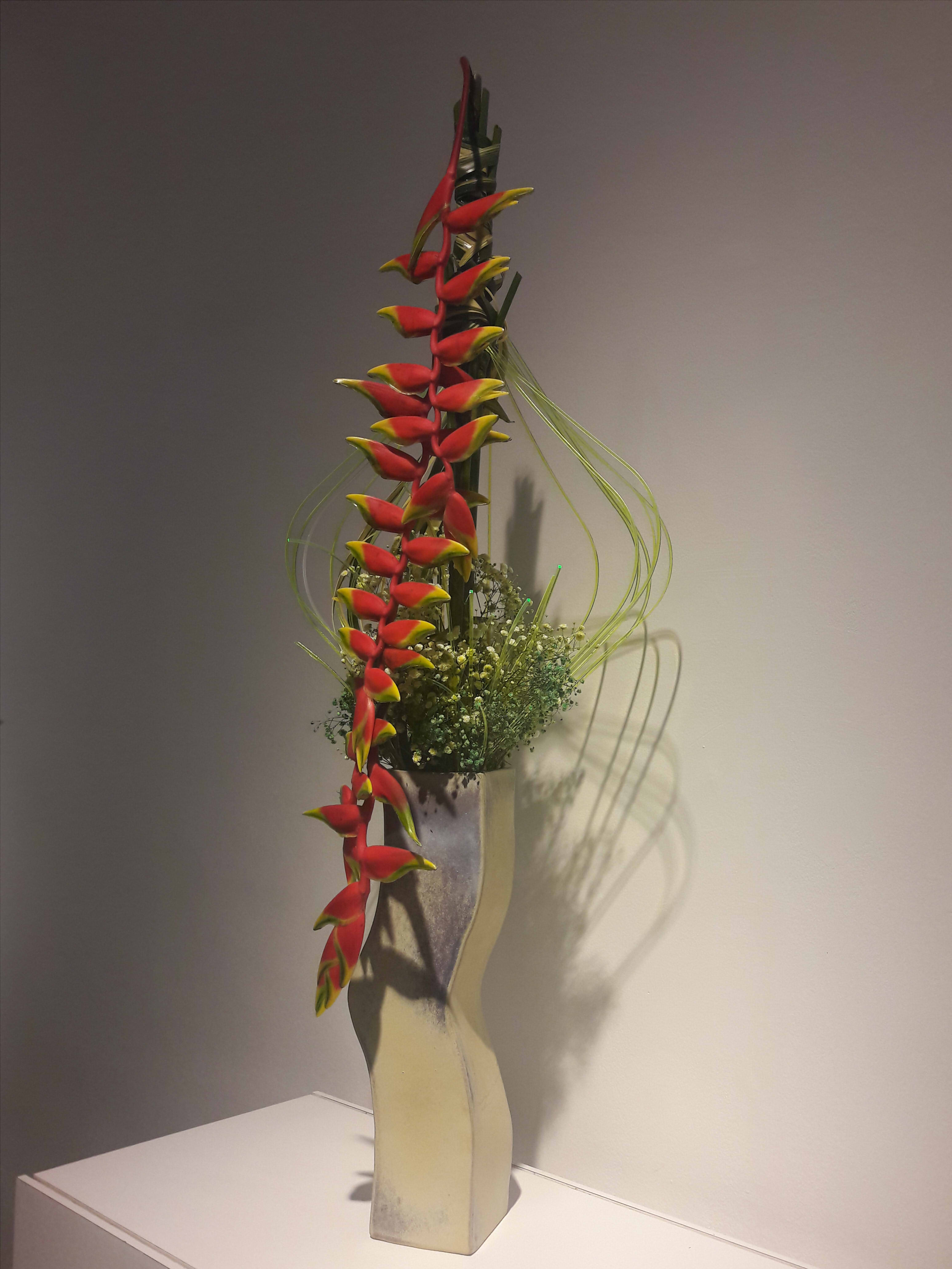
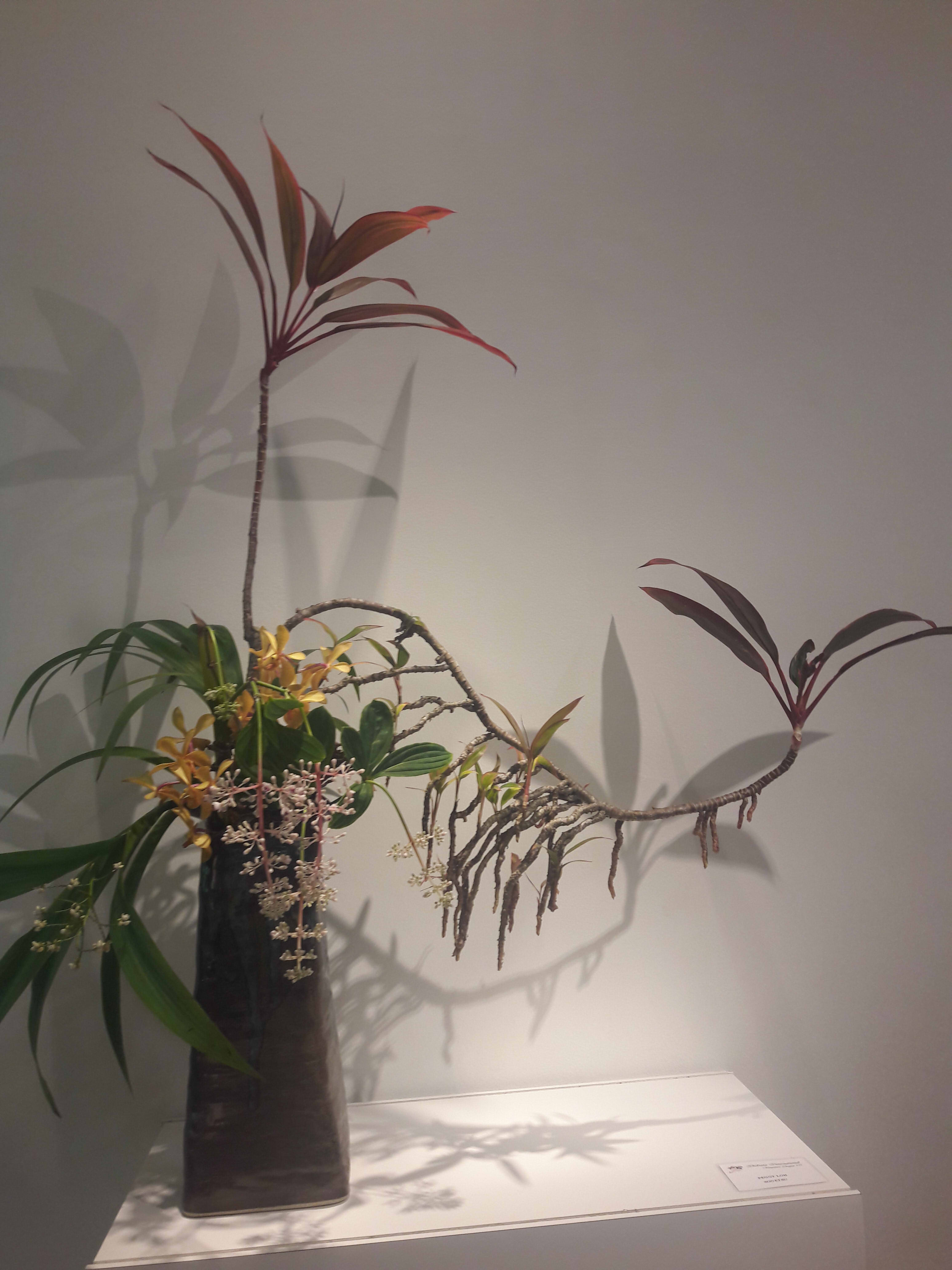
What strikes me most is the natural, yet haphazard, curls of the branches.
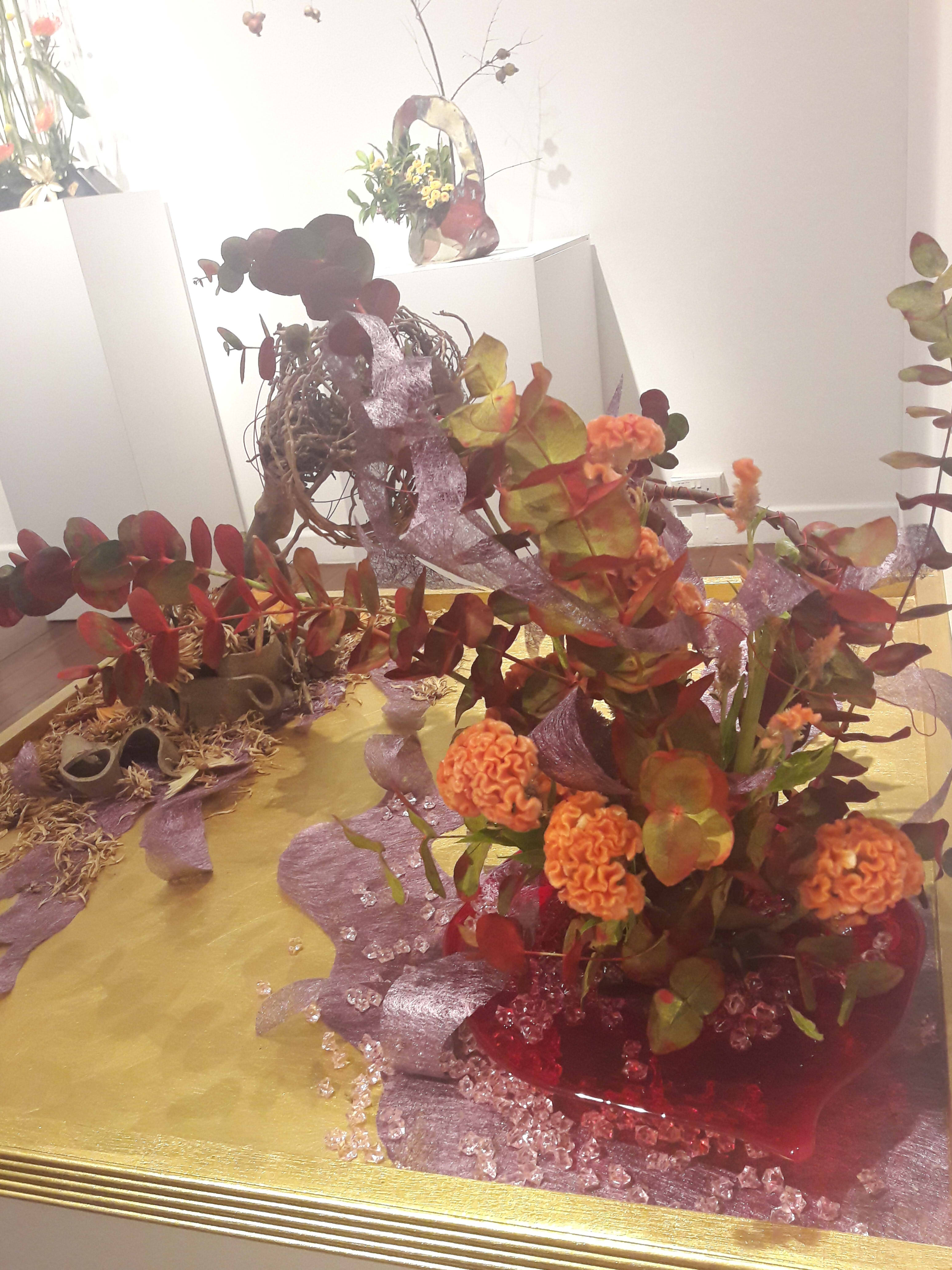
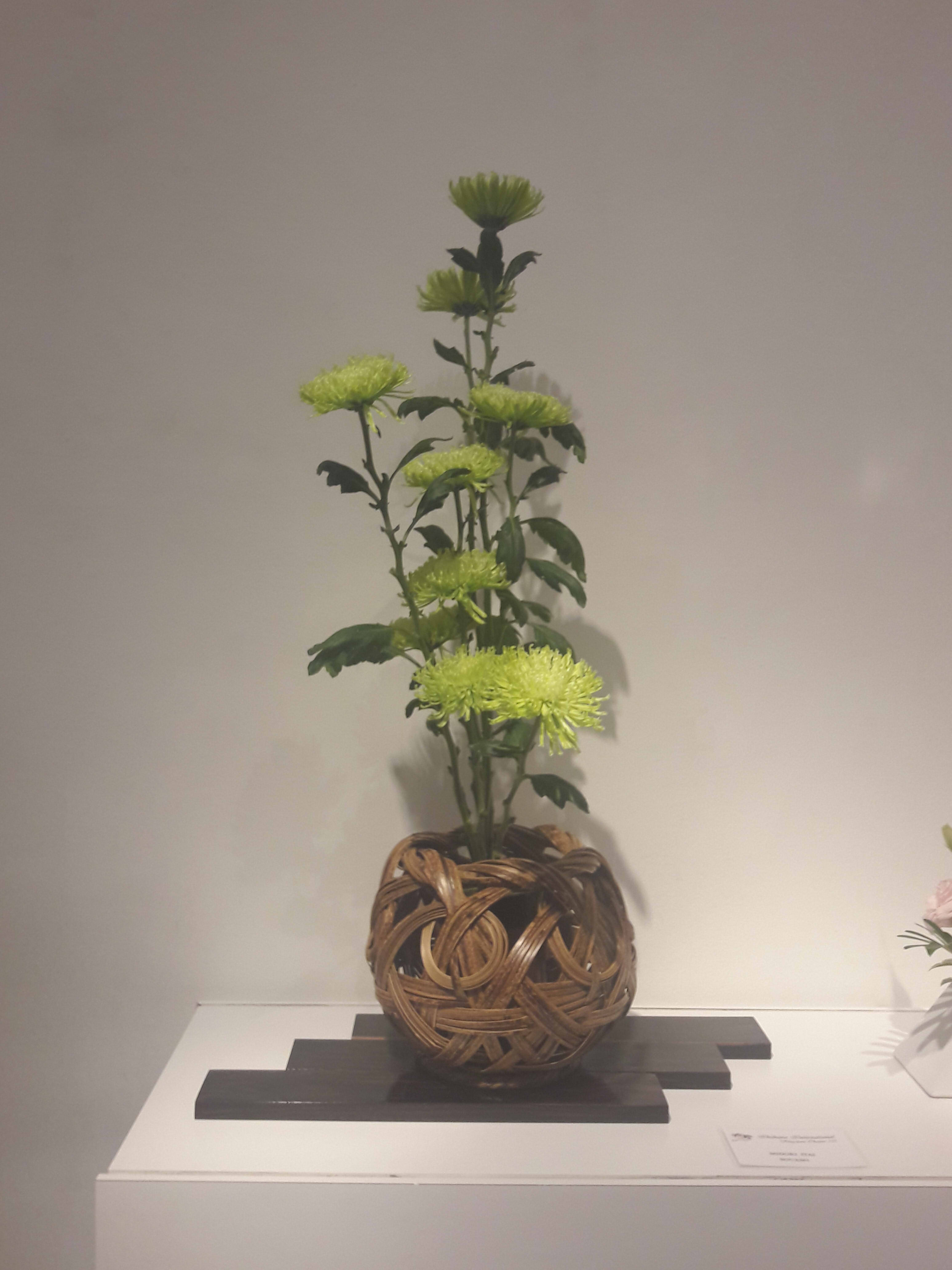
Bathed in gentle, warm lighting, the white walls were lined with various flower arrangements at apt intervals. Upon closer inspection, placards could be seen beside each ikebana, inscribed with the name and school of the creator. An overwhelming majority were of Sogetsu, with a few from the other 5 schools being displayed.
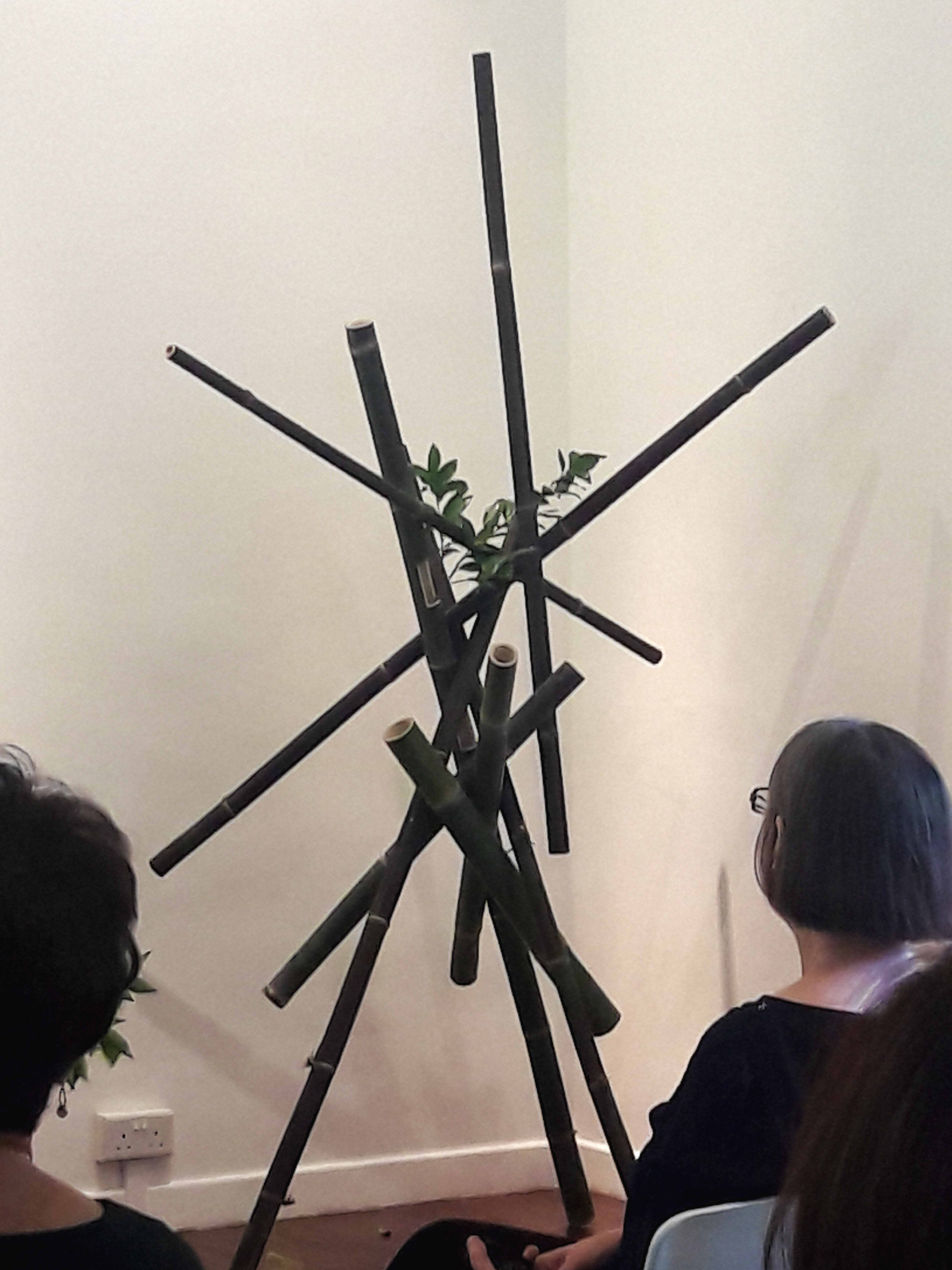
The chamber was adorned by white chairs, barely enough to seat 20 people, with an aisle in the middle. I quickly settled in the barren back row. My awkwardness was masked by my act as an enraptured audience member (or, at least, I hoped it was). A long table adorned by a sea green cloth remained empty, though the corner was occupied by a bamboo structure which jutted out at various angles.
Originally without the leaf.
⁴ The event began with the opening speeches of two distinguished speakers: Mrs. Yuko Shinoda, the wife of the Japanese ambassador to Singapore, and Ms. Angela Kek, the President of the Chapter. They spoke of the progress of the Chapter since its founding in 1969, where educational platforms to bring ikebana to Singapore have flourished⁵. Furthermore, the Japanese art of ikebana still remains rooted in traditional forms, despite having adapted to modernity. This was the inspiration behind the theme of “basic”, in returning to basic rules and concepts.
Some other important figures were also introduced, such as Ms. Akiko Sugita, the Director of the Japan Creative Centre, and various members of what, presumably, is their exclusive inner circle.⁶
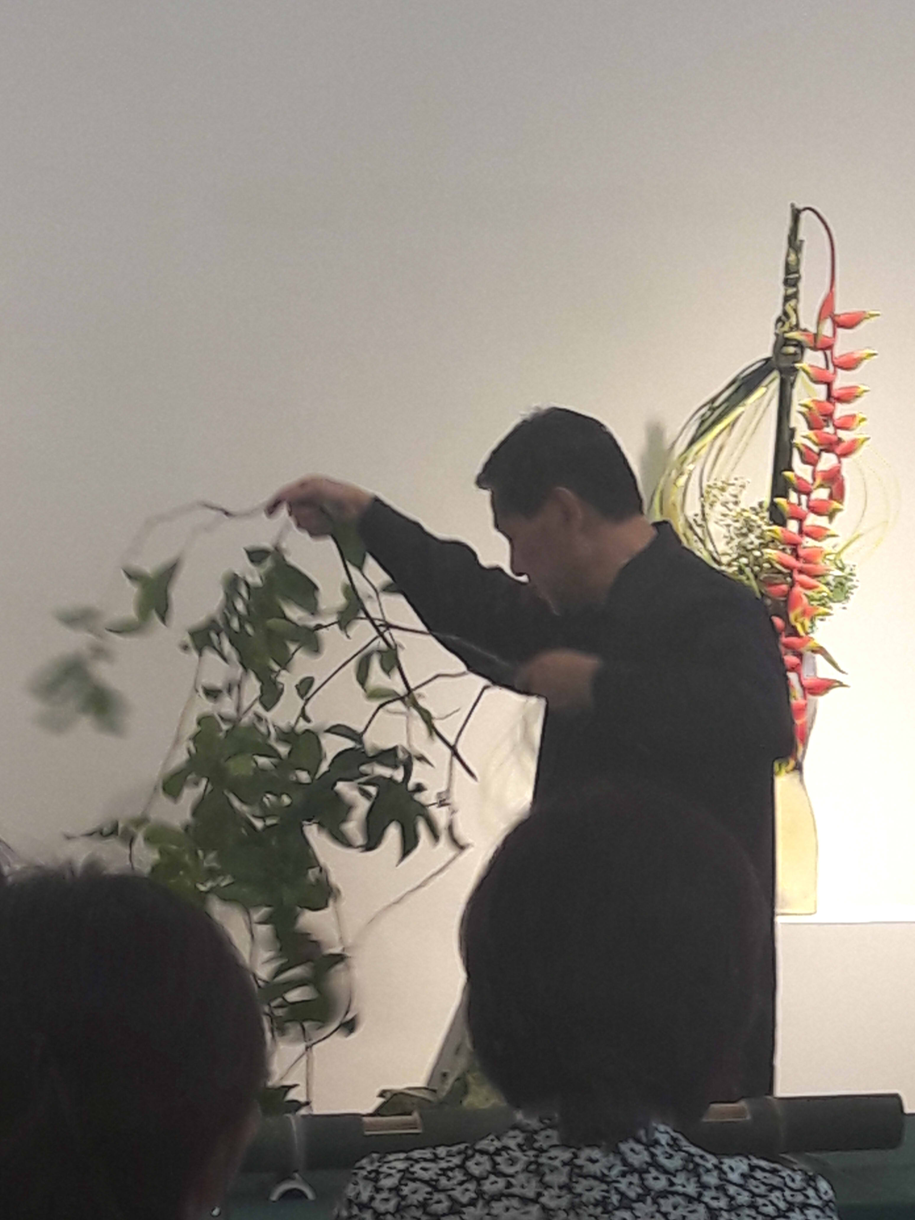
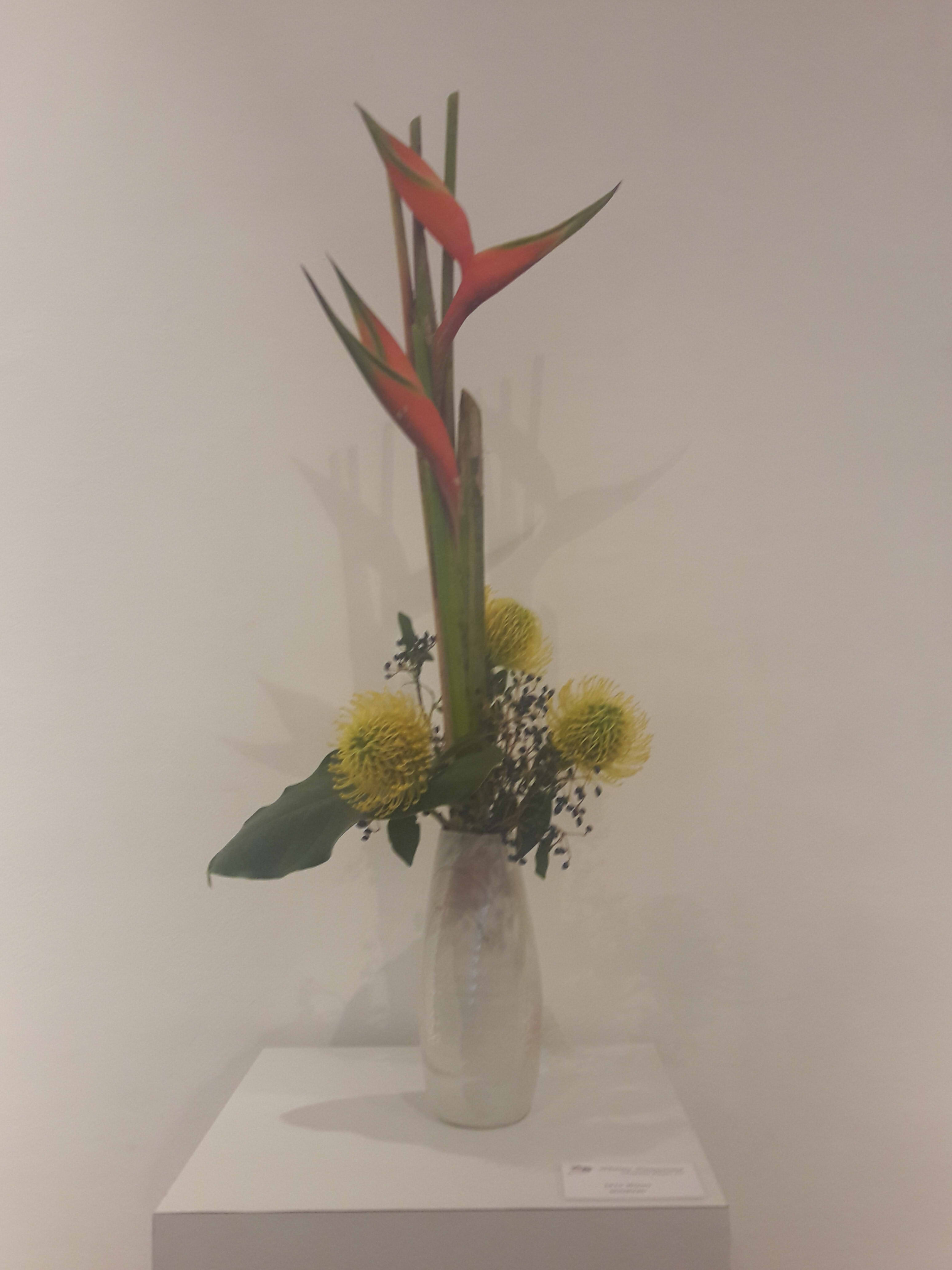
A live exhibition ensued, showcasing the working process of Mr. Peter Chin, a committee member of the Floral Designers Society (Singapore). A floral designer who has been in the business for 43 years, he created 3 ikebana within approximately 15 minutes each, colouring his working process with live commentary. All 3 ikebana used different bases, and thus, presented various techniques.
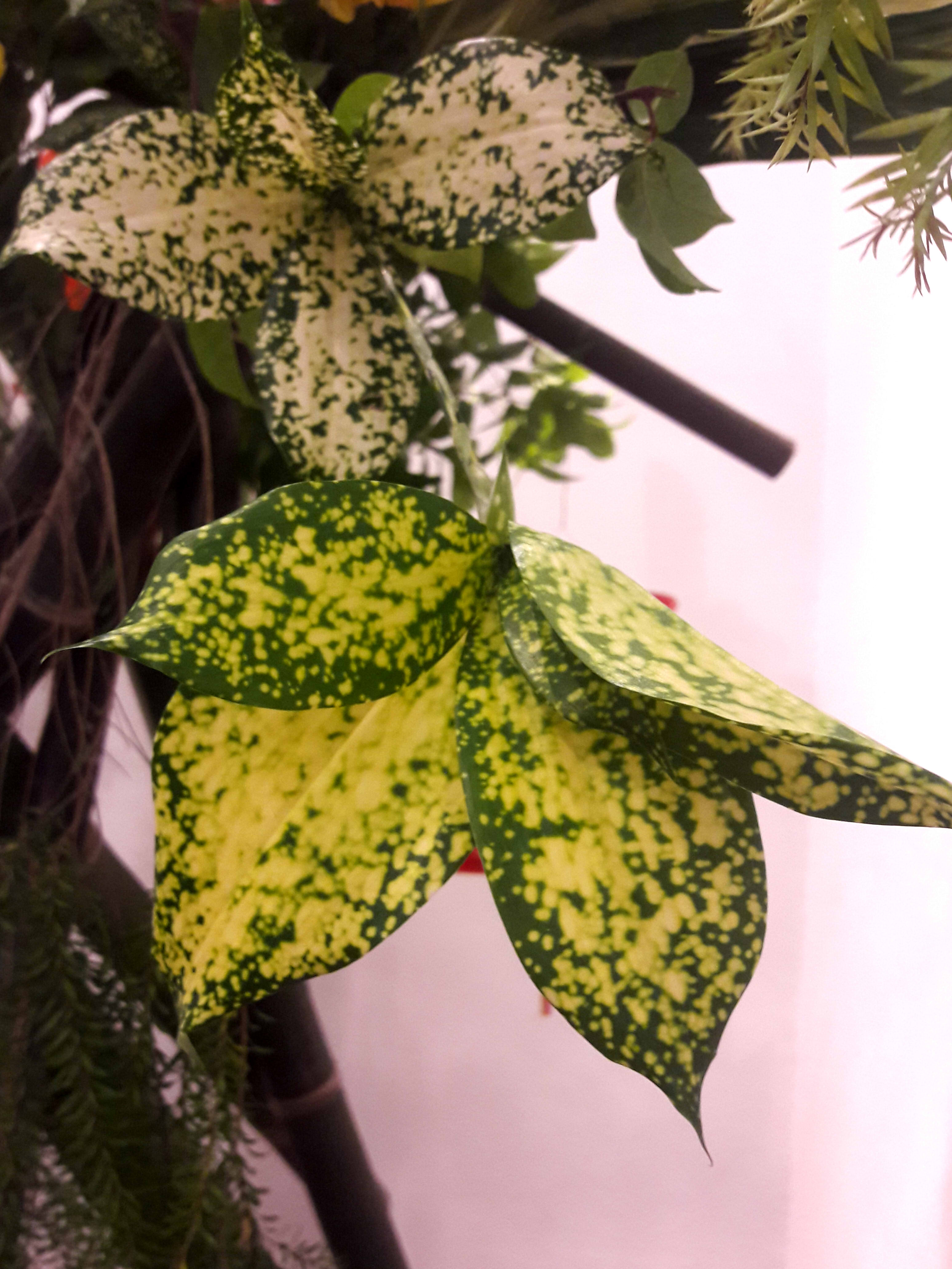
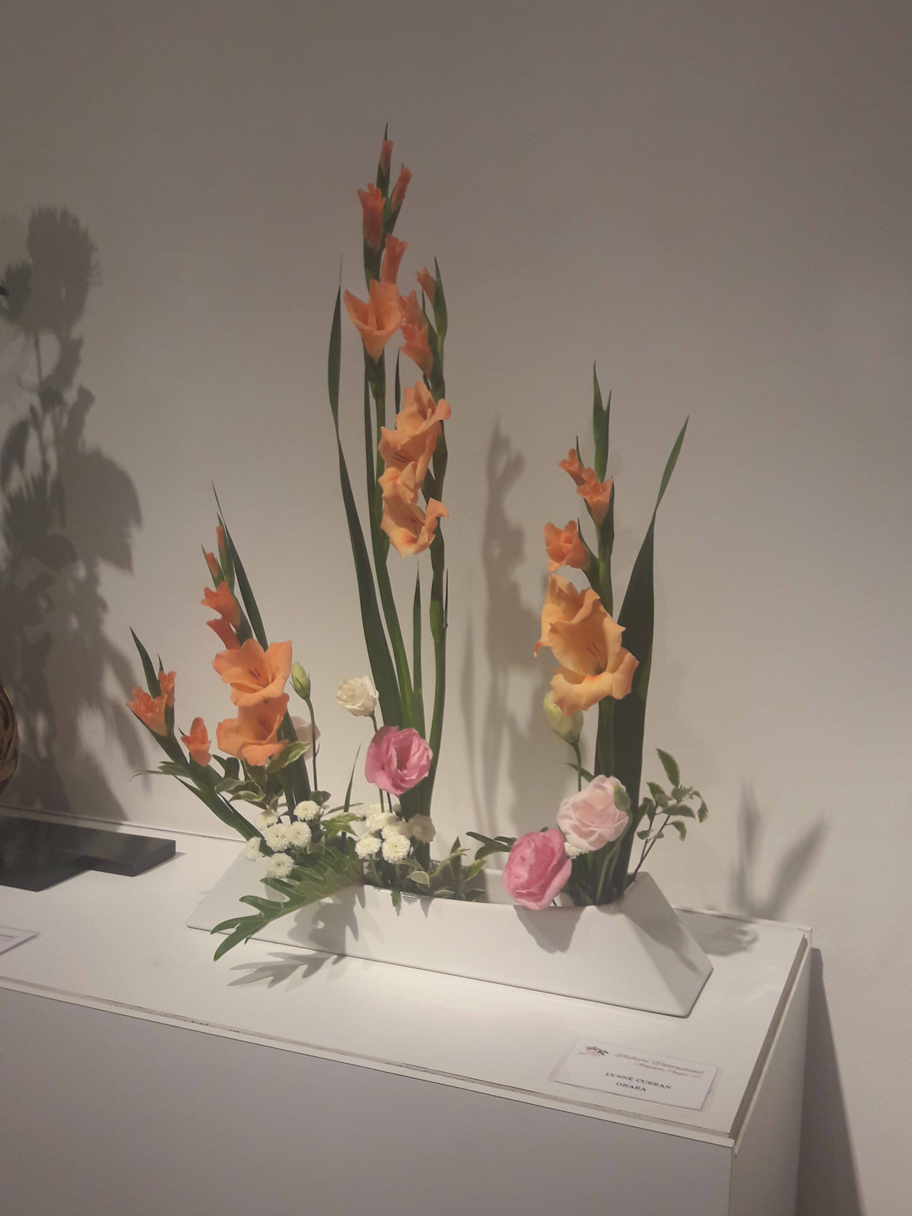
Ikebana A showcased vertical bars, made of bamboo and a pine wood frame, with orange bauhinias protruding from the flat plane. Greens were used to offset the orange flowers, and he trimmed the plants quite extensively to avoid cluttering.
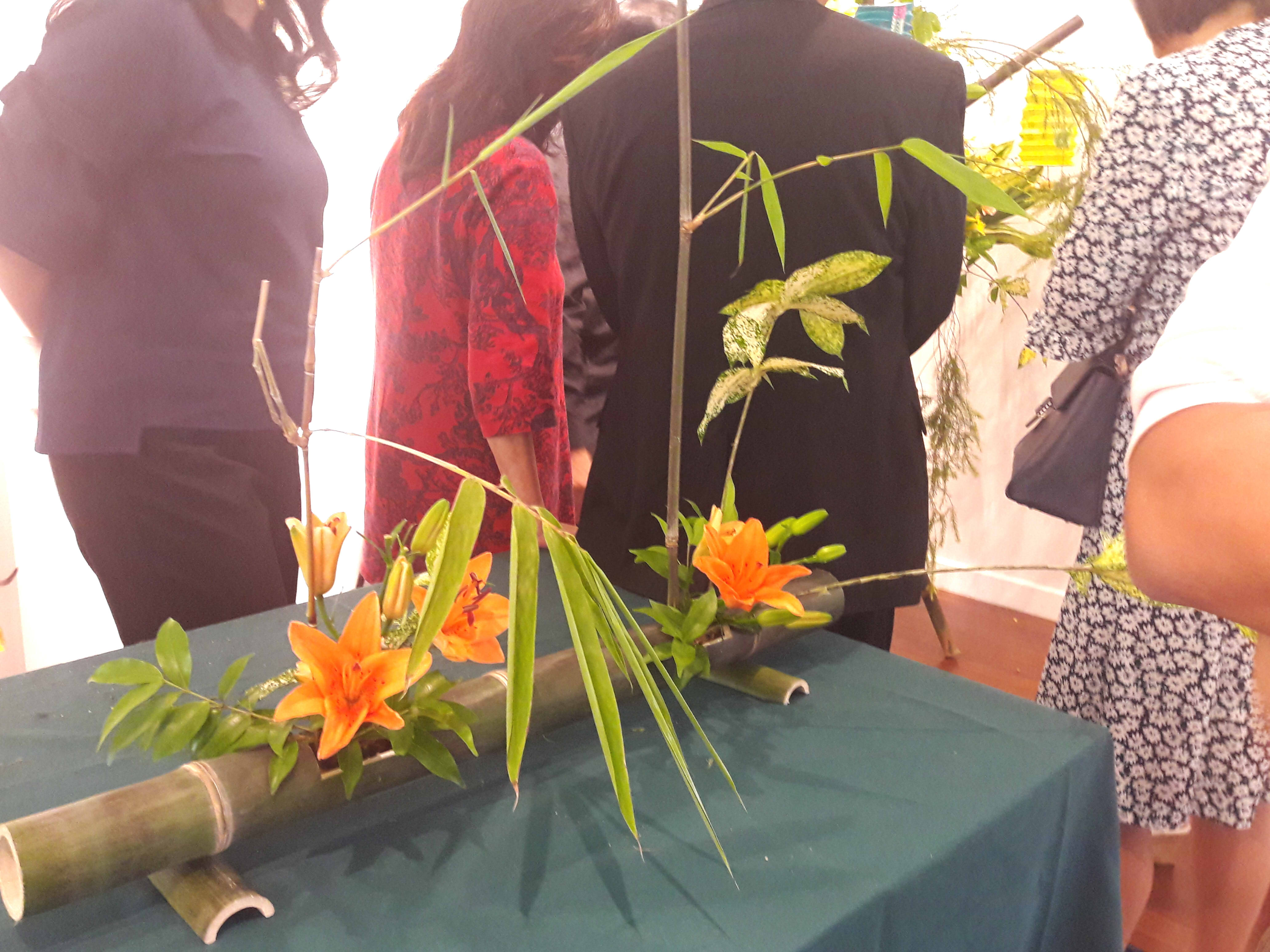
Ikebana B showcased a horizontal bamboo, with 2 holes cut out to place plant materials. I didn’t quite catch the flower name, but personally believe it to be the asiatic lily. Various plants which he didn’t name stretch upwards to create a perpendicular form. Adding sufficient plants will conceal the cut region, according to Chin.
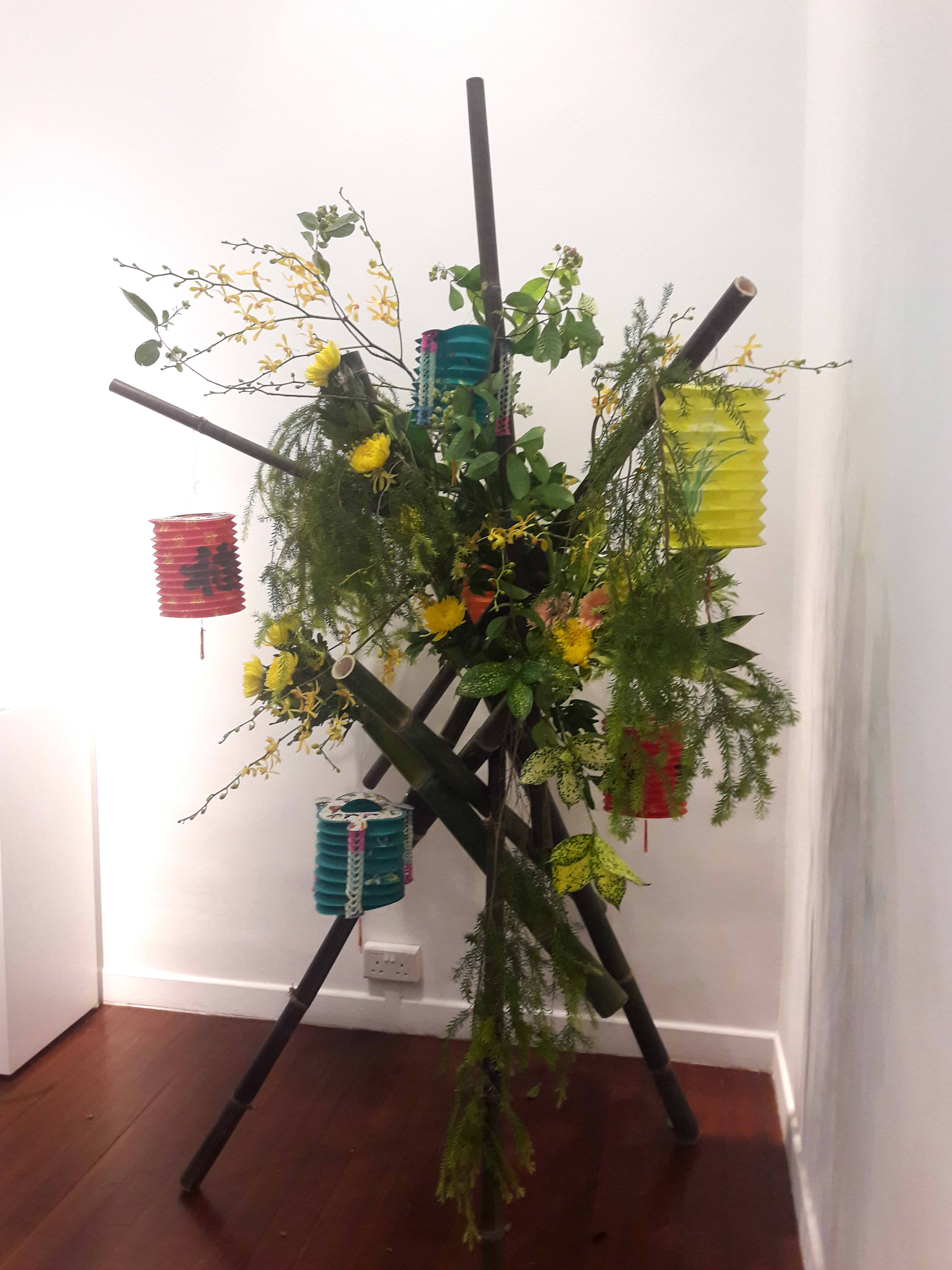
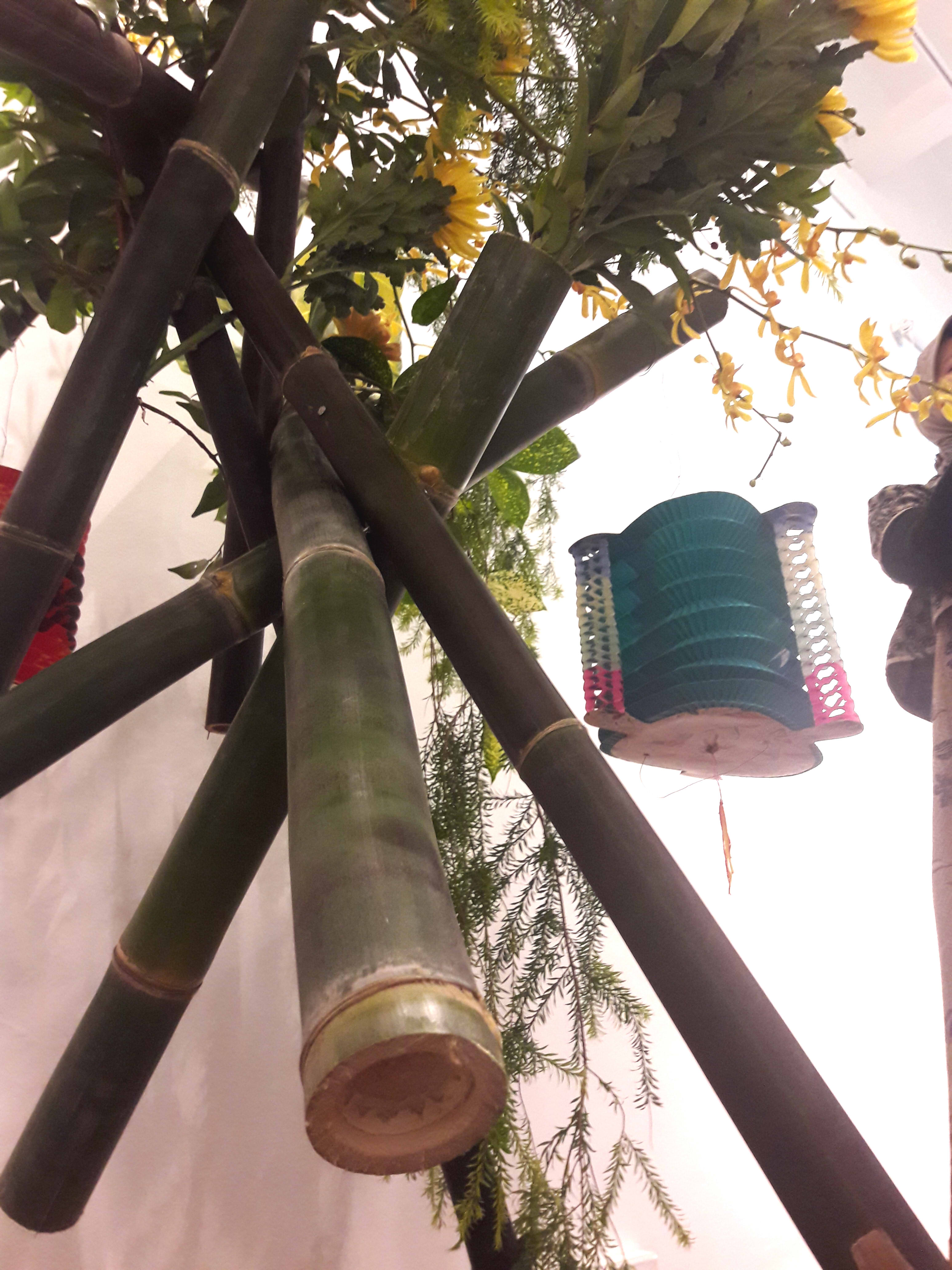
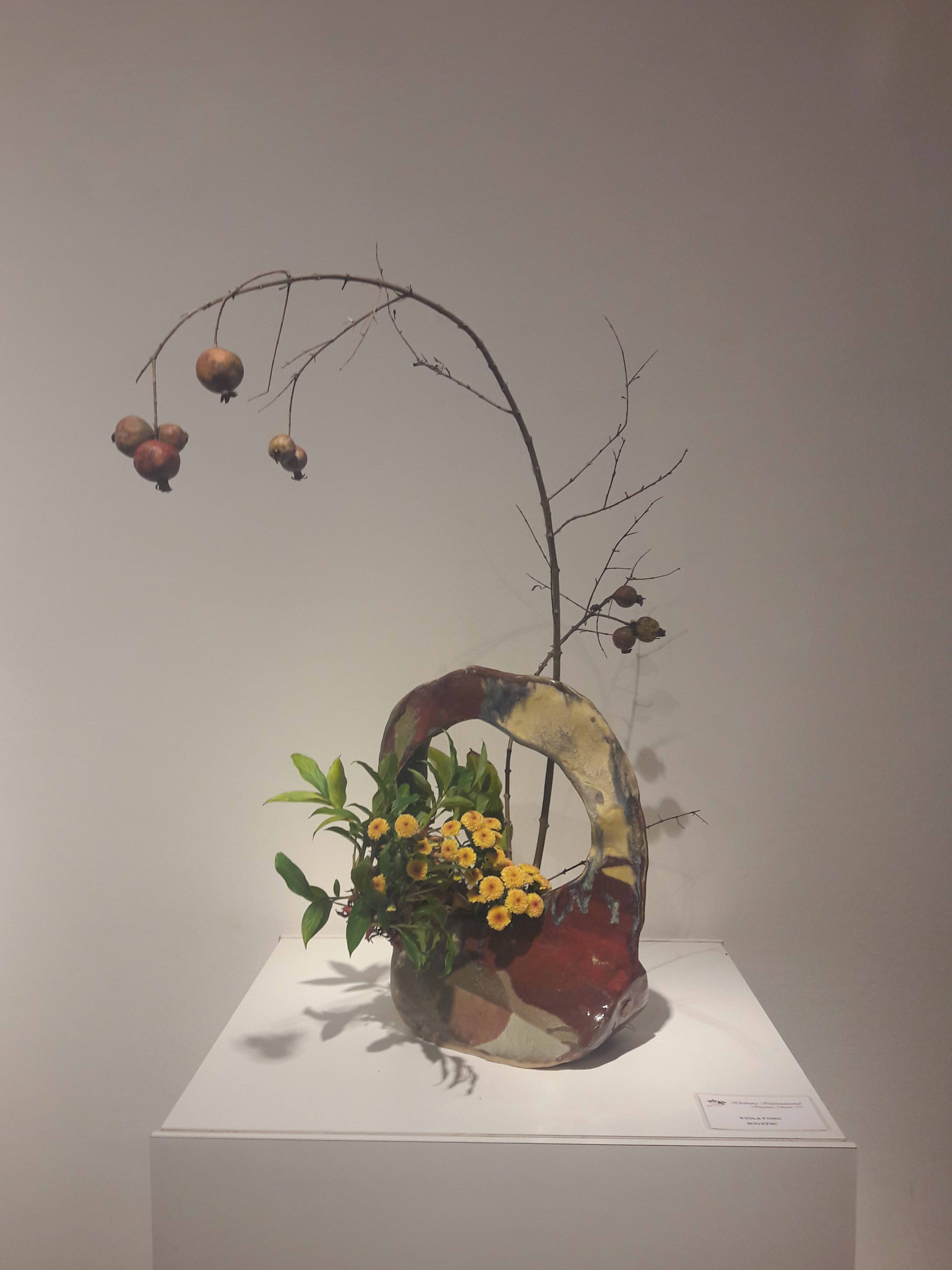
Ikebana C showcased a haphazard base of black bamboo, where he focused on threading stems and branches through naturally-formed cavities. Gerberas(?) and crysanthemums are used here, along with various local plants and weeds, forming a nucleus which extends in all directions. Some of the flowers are intentionally concealed to exude an air of mystery, and lanterns were added to show the Mid-Autumn Festival.
Throughout the demonstration, he gave numerous tips involving plant freshness, maintenance, and colour coordination. For example, that bamboo could be rejuvenated through soaking, and that rotting flowers could be saved by trimming. In light of autumn, he chose orange flowers, offset by yellows and pinks to evoke the earlier parts of the season.
Black bamboo. To show the season, he also added mid-autumn lanterns.
As an avid user, he also provided many details on bamboo. Different varieties of bamboo have different qualities, such as with the hardier black bamboo. In addition, bamboo can grow up to half a metre per day, as a versatile grass (yes, bamboo is a grass!). It also stores water easily, and is often so expansive that they cross each other at haphazard angles. He fondly recounted a tale of a guard attempting to accuse him of cutting bamboo in the forest. The punchline, of course, being that said guard could not tell where exactly the cutting had occurred.
Chin also commented extensively on the use of plants to suggest direction. “These are just basically finishing touches to give it more flow,” he explained, as he clipped branches with a resounding twang. “The main feature which is the flowers, then the rest flowing along the sides to give it more movement… to make the arrangement more lively,” he continued, framing the golden chrysanthemums with yet another wispy fern.
For the benefit of everyone, I have summarised the more inferential points mentioned in his soliloquies below:
Local procurement
Noting that many people believe ikebana to require exotic, foreign materials, he specifically worked with local flora, such as ixora, and nameless branches he randomly found along the way. The explanation given was that local materials can still provide beautiful forms to work with.
2. Curating materials
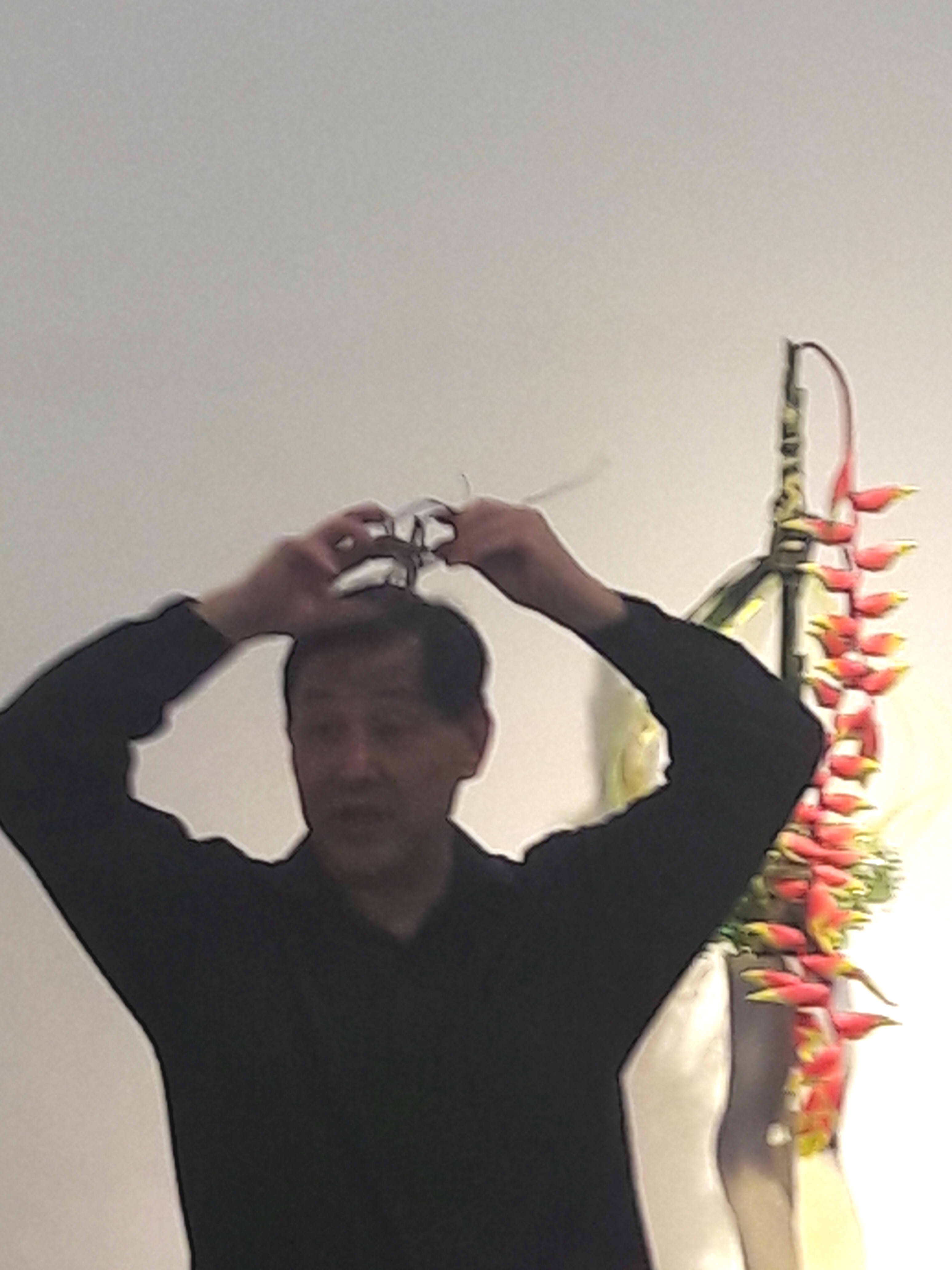
Often, one may find a branch plenty beautiful in its natural state, or end up trimming it far too much. The key, he said, was to focus on what you want from it. If you wanted to focus on the curve of the branch, you could even strip its leaves entirely, as he demonstrated for us. “Don’t feel uncomfortable with plucking off or cutting off!” he exclaimed, as he ripped leaves off a branch. He then proceeded to curl it.
Original
Final
3. Natural joining
Save for certain situations, he attached the materials with no additional assistance from fixatives like glue or rope. Branches were placed vertically, by sectioning the stem into 4 at the bottom to form a solid base; stems were twisted, to counter turning momentum; flowers were slotted into cavities, where they fit snugly.
4. Plant coordination
Even plants which may not seem to work together may come together surprisingly. He recommended keeping a stock of plants which one might wish to use and experimenting accordingly, than making assumptions based on prior knowledge. He also recommended picking colours in relation to each other and the season, as with the black of the bamboo offset by green, and hints of yellow and pink.
Lying abandoned in a side corridor, a vase of additional flowers he had prepared.
After his demonstration ended, there was a food reception and free tea from Premiers. The audience quickly dispersed to either grab the free food, or take photos of his completed works. I was the latter, before I decided that it made more sense to come back later once the crowd lost interest, heading over the tea section instead. A quick look at the menu revealed a nice variation of few teas, from classical Darjeeling to exotic Assam, quirky Chocolate to floral Chamomile.⁸ There was also a bizarre cold tea named Celebration, (which I never got to try due to limited stock, sadly), and the display was rather elegant.
It took a while to realise that the tea counter was to be visited AFTER the food, and thus I headed to the queue for food. Kueh of different colours were displayed, from the beloved rainbow to purples and greens, followed by typical catering trays filled with typical Chinese things like bee hoon and fishcakes. During this time, Ikebana A was also presented to Mrs. Shinoda.
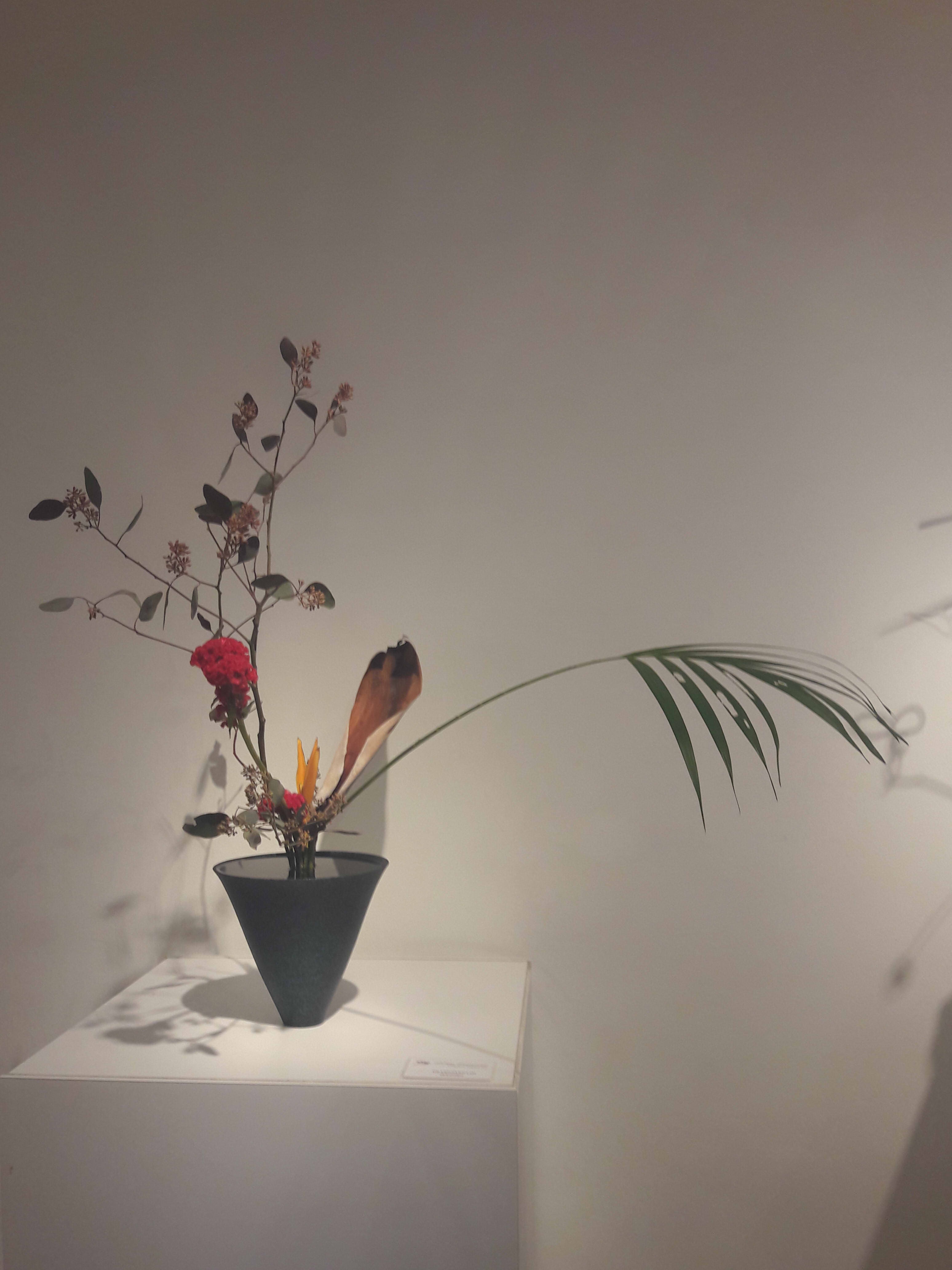
Further exploration revealed that there was, in fact, another room displaying even more ikebanas from various people. Compiled are photos of almost all displayed ikebanas, both in that room and out of.
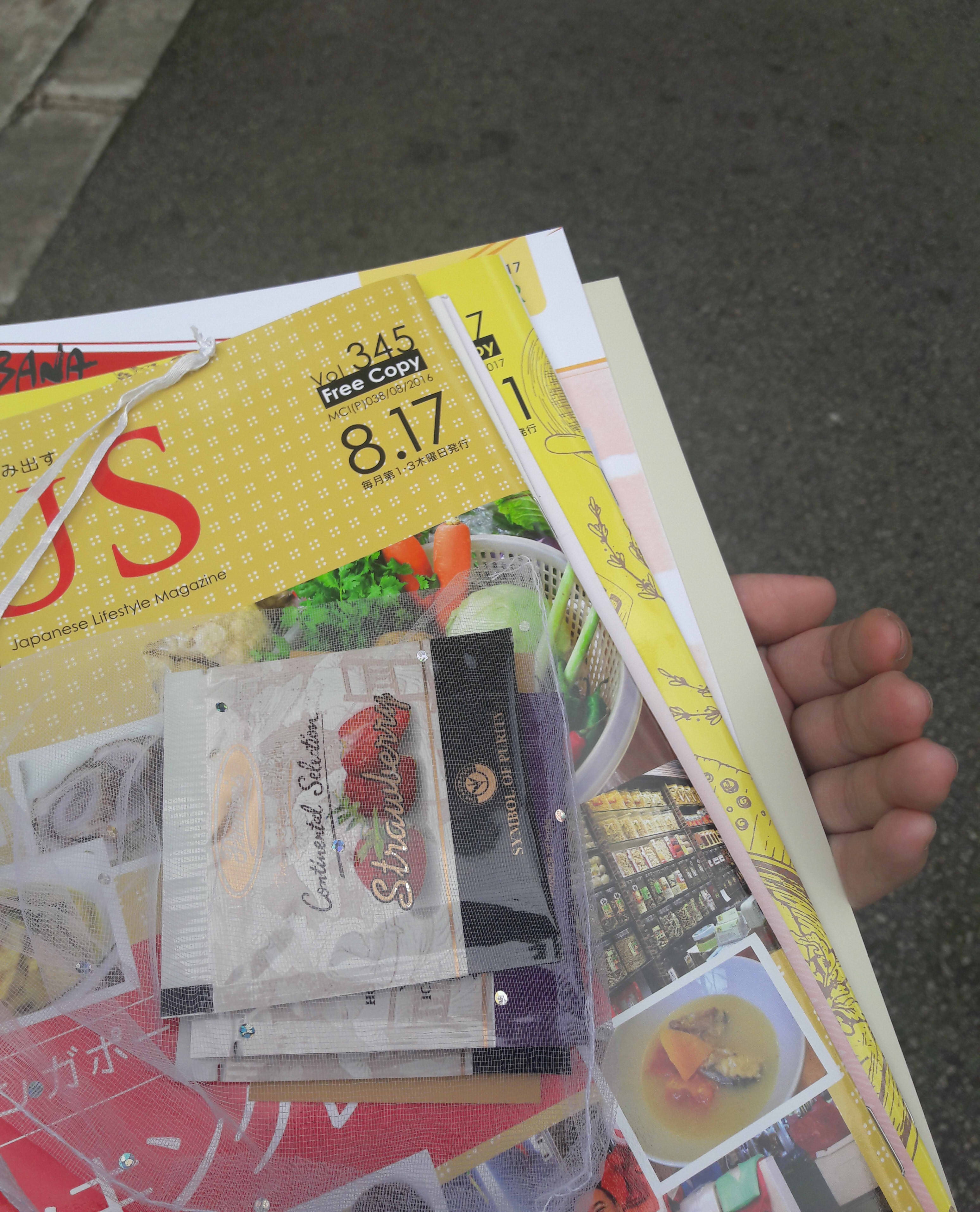
Even more wandering around revealed an eLibrary, though it was, unfortunately, off limits to the public. Also an office, but that’s not as interesting. With nothing much left to do, I absconded with about 7 different brochures and magazines (and sachets of tea).
In all fairness, it DID say it was free.
All in all, I’d say that I likely interpreted everything differently from the masses, who were more likely there to observe another’s techniques and adapt accordingly (I still have no idea what I was doing there, really). It was vaguely enlightening, nevertheless, to see the different techniques and forms which arose depending on the base and types of plants used. From stiff and tall to soft and wide, from those meant to be viewed only from the front to those which were 3-dimensional, complex coordination was done to bring out something as simple as prettiness.¹⁰
If my failure of an article has somehow spurred you to take a look, the exhibition is open to public and still ongoing until 5 October, from 10am to 6pm! You can find more details here. If it hasn’t, well, at least you kind of know what happened, right?
Personal comments which seemed inappropriate are here, labelled by numbers.
¹ I was mostly assuming there would be another NTU student there, but quickly came to the realisation that I had been abandoned by everyone else who had said they wanted to go. I was easily the youngest person there, even including J.W., so fair warning: you might feel awkward and out of place if you go alone.
² My relief knew no bounds when they avoided calling me “ma’am” like they did the others.
³ I would soon regret this, considering the average height of the people in the room versus mine.
⁴ Here, I will take the liberty of admitting that I did not listen particularly thoroughly so I’m not too sure on if they WERE the speakers and who said what.
⁵ haha geddit
⁶ I personally think the Chapter sounds like a secret society name.
⁷ It SOUNDED like vanilla, but I’m quite sure it wasn’t. So I have no idea. Maybe just water.
⁸ Personally, the bee hoon was subpar, but the fishcake(?) was superb. I will never reject free tea, but I was vaguely disappointed that there wasn’t Earl Grey, which is easily my favourite black tea. This was resolved by the gift bag they gave at the exit, though.
⁹ There were definitely some which were better than the others to me, though, but that’s likely just my personal taste. I particularly enjoyed those which involved wild careening to the left/right, than those which were more rigid with straight, vertical lines. Those which used artificial plants also fell into my general disregard, because of the waxy appearance and lack of natural blemishes which makes everything so much more interesting in my opinion.
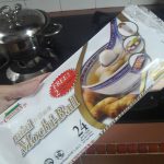
Mochi is associated with the moon because it’s round and white, and also because rabbits are thought to pound it on the moon
Sweet potatoes are offered because it’s the harvest season
Soumen is occasionally eaten because the strands represents the Milky Way
秋の七草 (aki no nanakusa) is a common saying to refer to 7 wild plants found in Autumn, as opposed to the 7 herbs of Spring
菊 Crysanthemums are an Autumn flower! (Only knew they represented the Imperial Throne, but not… this)
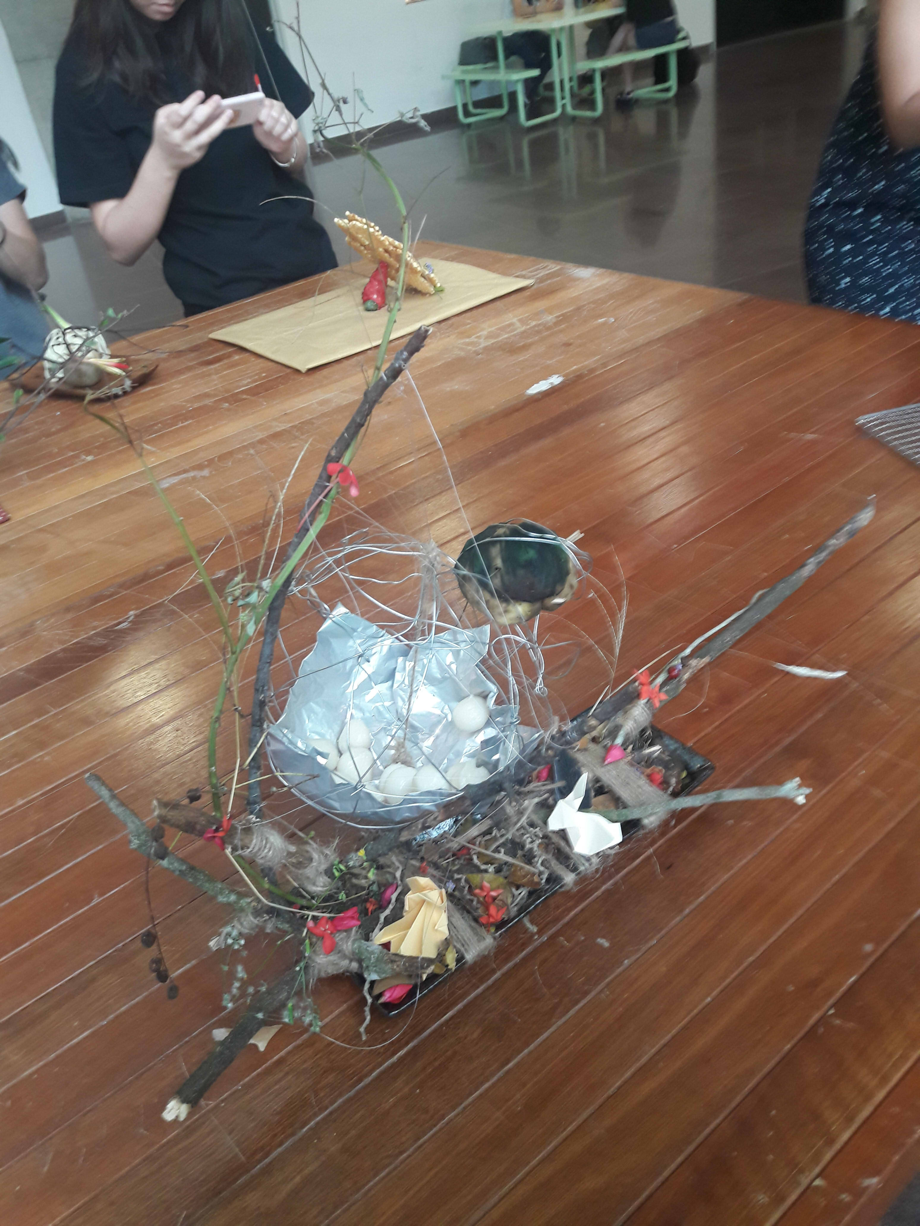
Firstly, I opted to go for Model 1 simply because I already had another idea in mind for Model 2 which wouldn’t fit well, and I couldn’t see myself changing what I felt Model 2 should become. Also, Model 3 was just not interesting to me. So Model 1 it was!
I decided to focus on o-tsukimi (お月見), the Japanese Mid-Autumn Festival, so that I could bring in food as opposed to just plant material. Overall, though, I wanted it to look like some sort of lantern/moon/boat thing, with a nice curve arching over and enclosing a rounded, glimmery circle.
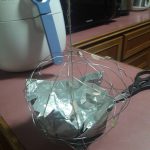
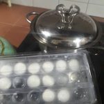
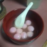
SPHERE: Mochi and Mochi Mochi (I still think it’s funny).
I wanted a giant mochi, but quickly realised there was no way that was happening. To compromise, I initially intended to have some sort of structure around the mochi to suggest some kind of extrapolation.
Like this thing.
As it went on, though, I realised a pun even more glorious than that of the yakimochi. mochi = to hold, mochi = rice cake, so it could be just be something to hold mochi, a mochi mochi. And thus, I did so.
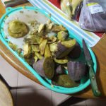
CONE: Sweet potato
I just couldn’t really think of any autumn foods which were naturally conical which wouldn’t look completely out of place, so I opted to just cut the sweet potato to shape. This took a little bit of cooking sense, because I forgot that it’s not really possible to cut raw sweet potatoes. I also had to cut it from 3 different sweet potatoes because sweet potatos just don’t grow big enough to have a single piece.
I then used toothpicks and satay sticks to help attach the pieces together and form the hole for the soumen piercing.
CYLINDER: Soumen
As aforementioned, soumen represents the Milky Way, important in stories with the moon. I’m mostly sure that’s just soba, though. In my defense, actual white noodles was kind of glaring in all the wrong ways, so I consciously decided to go with the duller but more natural-coloured soba.
$2 Daiso noodles
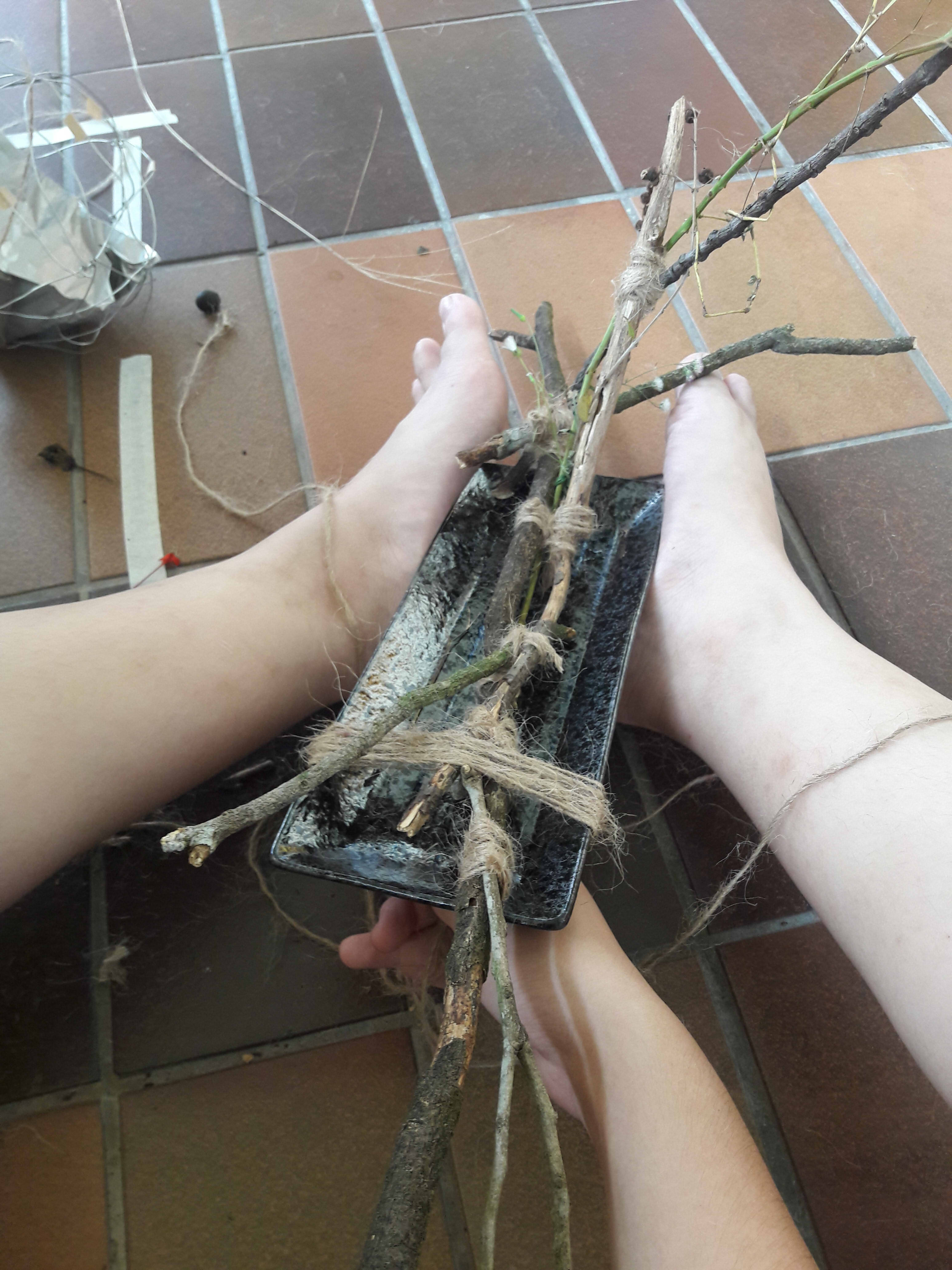
BASE
For the base, I was already envisioning a shallow, basin like, long and slim tray. Preferably with that one bunny-wheat-moon-mochi design.
I actually bought one, but the shape was… Unsatisfactory.
I just got a normal Japanese plate in the end.
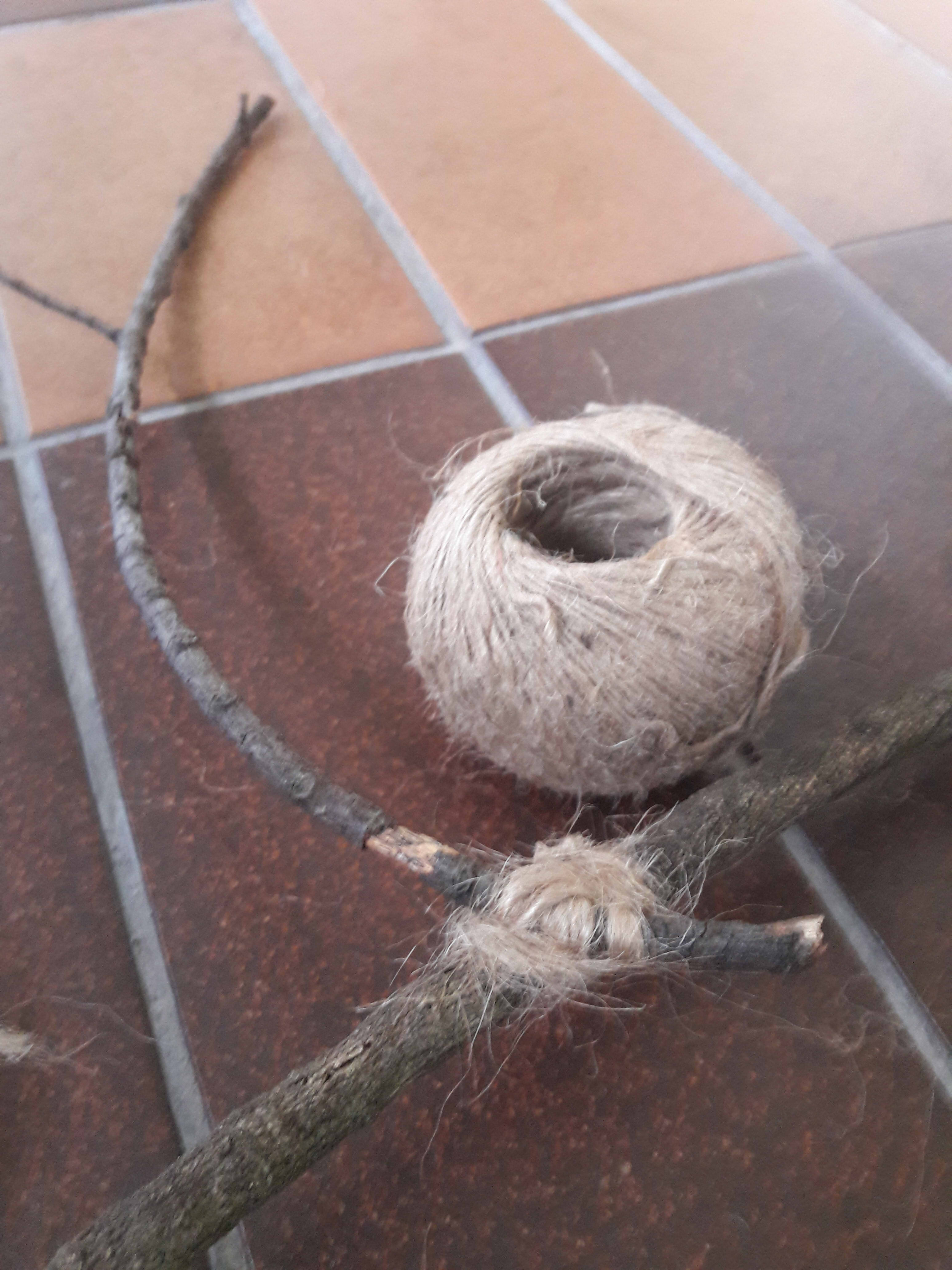
BRANCHES
I wanted to bend it into the arch! I really did! I borrowed my roommate’s hairdryer and everything!
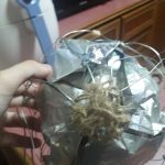
In the end, I decided that if I couldn’t bend it, I could only join branches together to give me the shape I needed. I’m not in possession of a hot glue gun or anything useful like that (and I wasn’t sure if it would make the structure look undesirably unnatural), so I opted to go with a more… Traditional method. (It’s fortunate that I spent 4 years learning this as a cadet.)
I used (very low-quality) coir, which is coconut fiber rope. I personally like coir more than cotton because of the colour and texture, and it worked better just because it blends in better. (That’s a diagonal lashing, by the way.)
I then used a whipping knot to lash the branch to the plate.
ALL THE OTHER PLANTS
As you can see above, it doesn’t look very nice, so I decided to just add a carpet of fallen leaves/flowers/etc to conceal it. Also because autumn is a lot about wilting plants all over the ground (crunching through leaves, perhaps?).
Aki no nanakusa clearly suggests something about autumn, which is that of a lack of flamboyant and prominent plants as opposed to wild weeds, so I went and did exactly that: I plucked fairly inconspicuous plants/fruits/flowers around Hall 2 and the SRC. I went for reds, oranges, browns, obviously. Also, some of those weeds which look vaguely like stalks of wheat.
Then I also just picked up a lot of dead leaves lying around.
When interlacing with the model, I didn’t use anything but natural forces such as gravity, and just wedging plants into cavities to hold them in place.
I considered folding paper crysanthemums, but decided against it since it didn’t really fit the idea of wild and minor plants.
…AND RABBITS
Also partially for the pun. kami = paper, kami = god, and therefore paper rabbits are mystically, holy, god.
To make the sphere look like it’s somewhat floating, I used fishing line. Also, the masking tape cordons off the re-appropriated public space, because my room didn’t have space.
To end things off, here’s a picture from while I was working outside my room.
I mostly thought of trying to vary the types of cylinders and cones I had (spheres… can’t really be varied, can they?), so I worked on trying to join different kinds, and also changing up the dominant. Also, I discovered that the inside of my cupboard works decently as a background (although the reflectiveness is a little difficult).
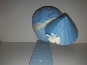
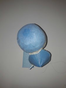
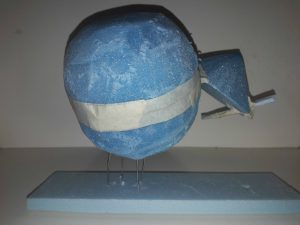
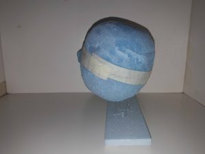
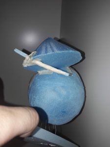
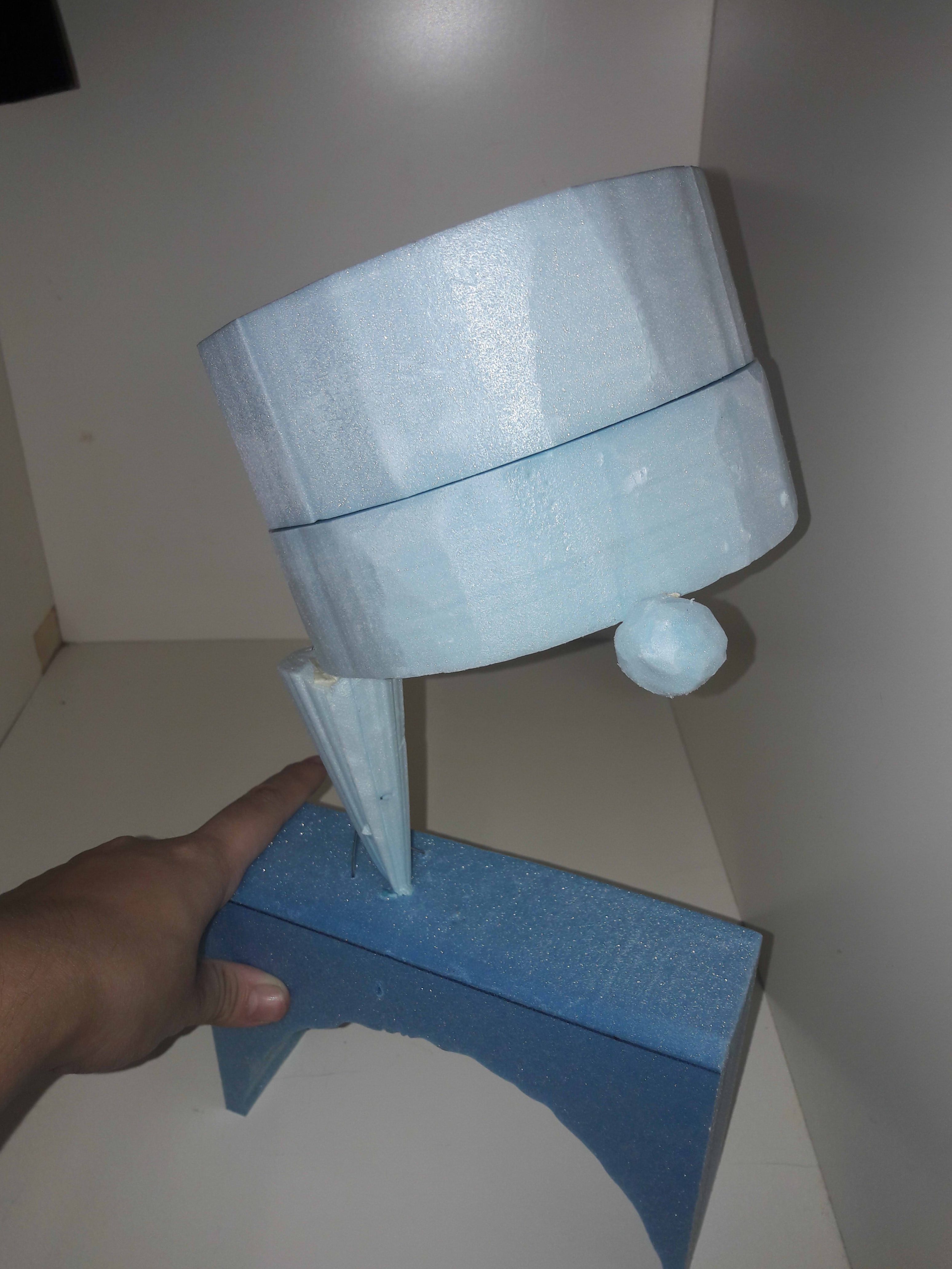
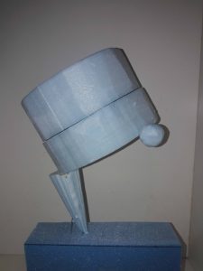
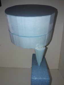
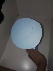
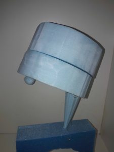
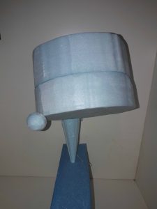
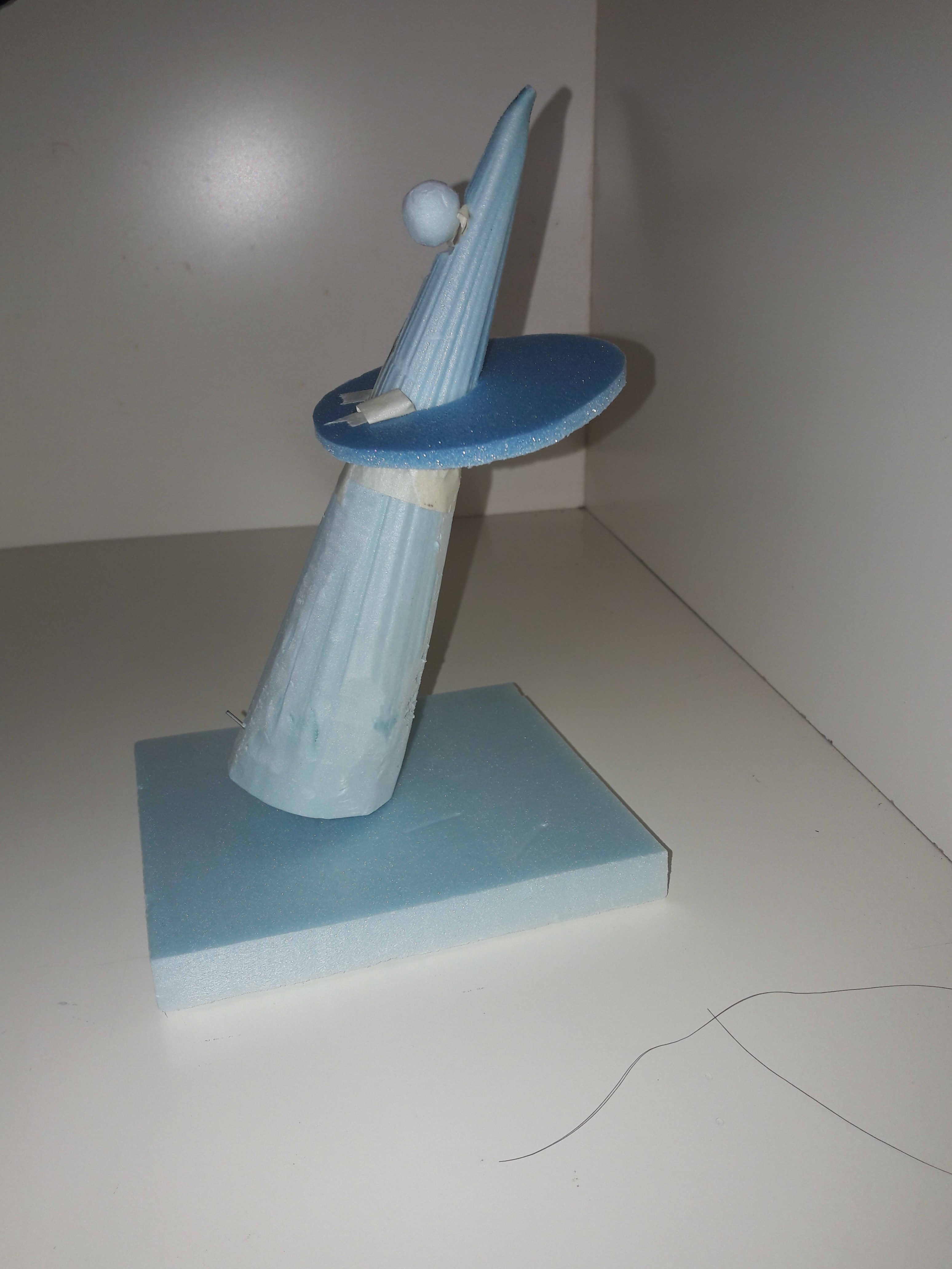
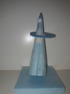
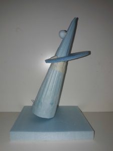
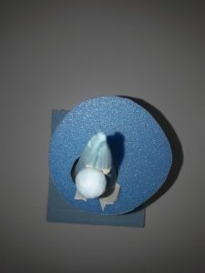
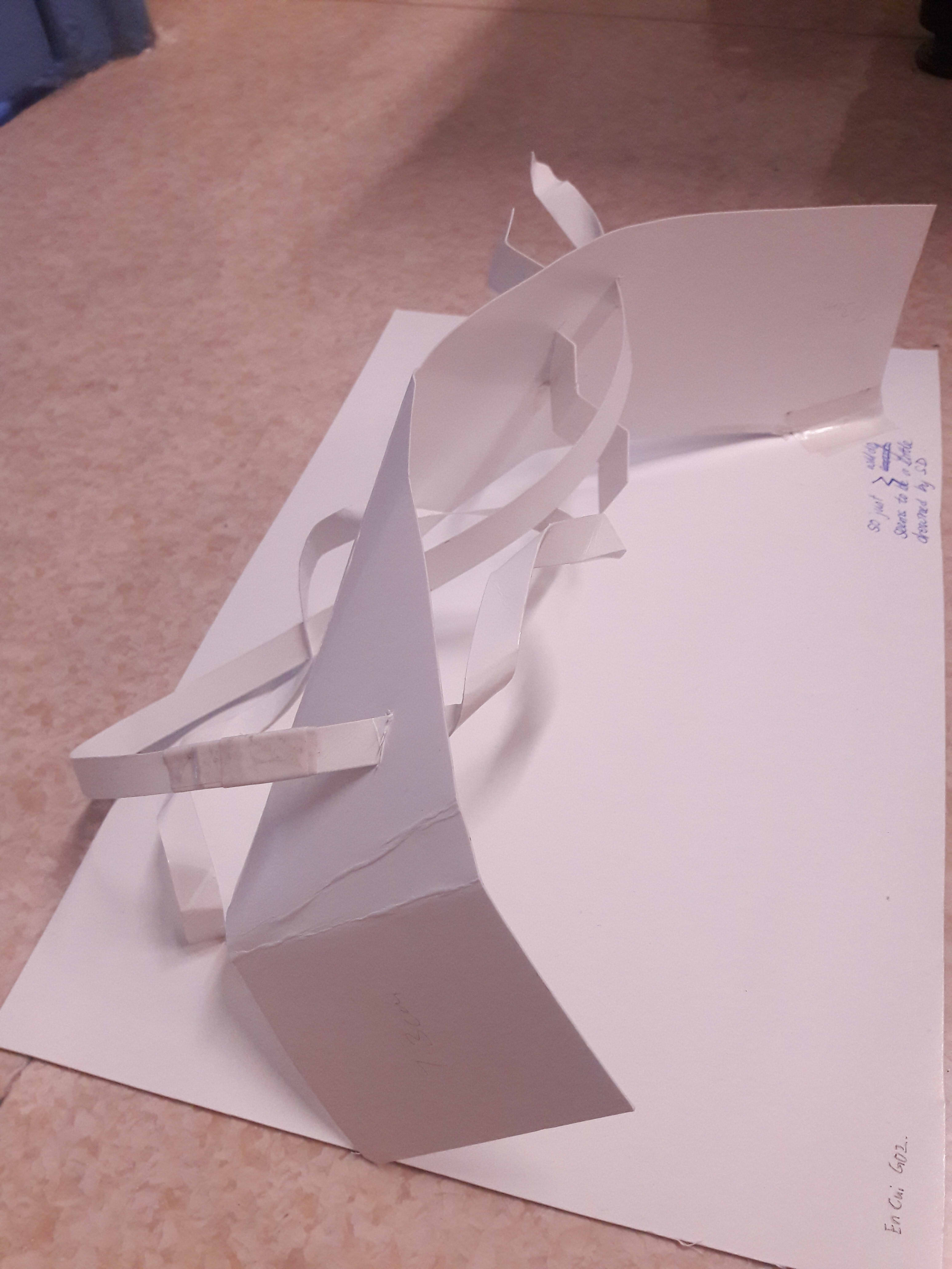
Model 1
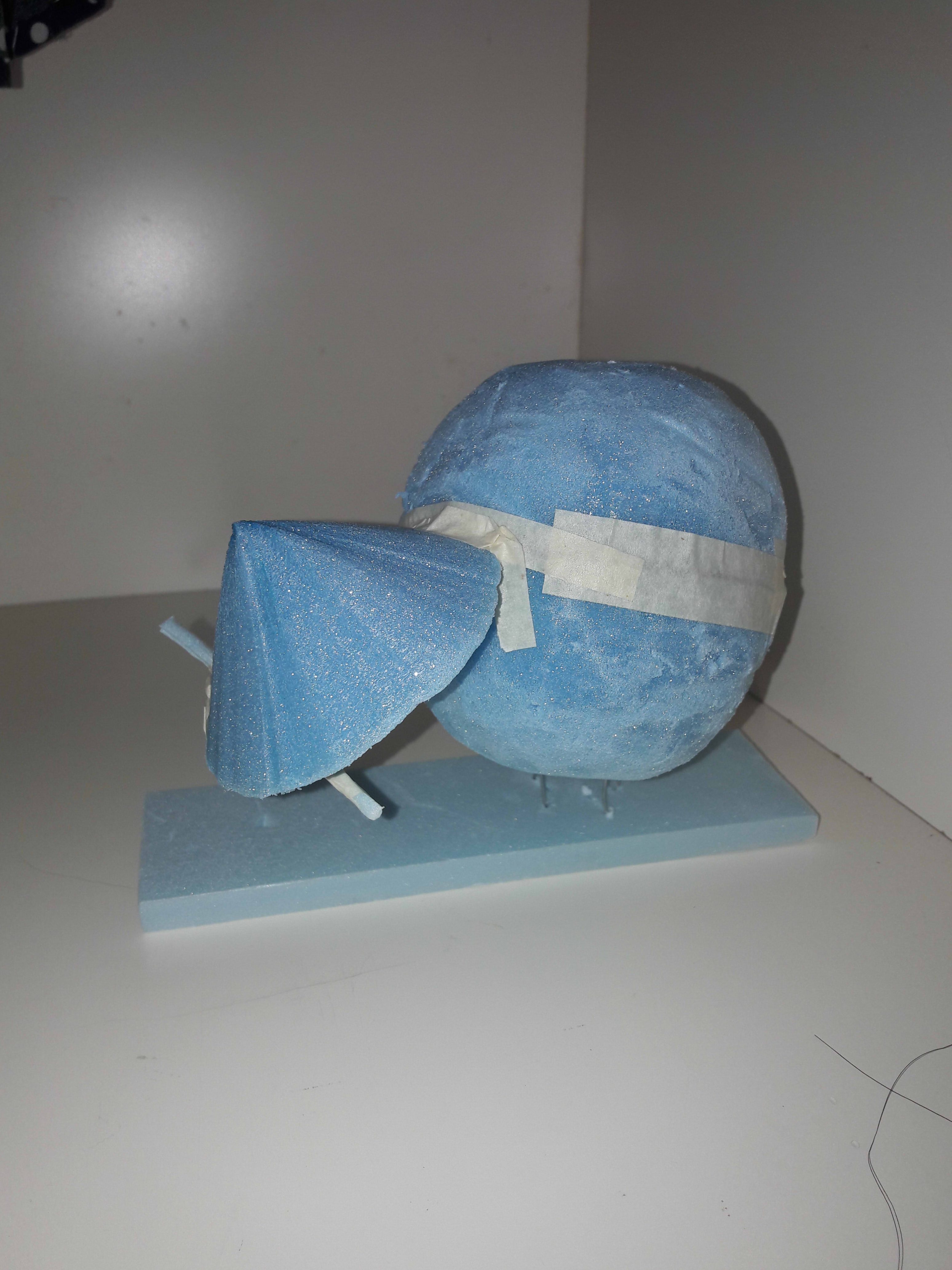
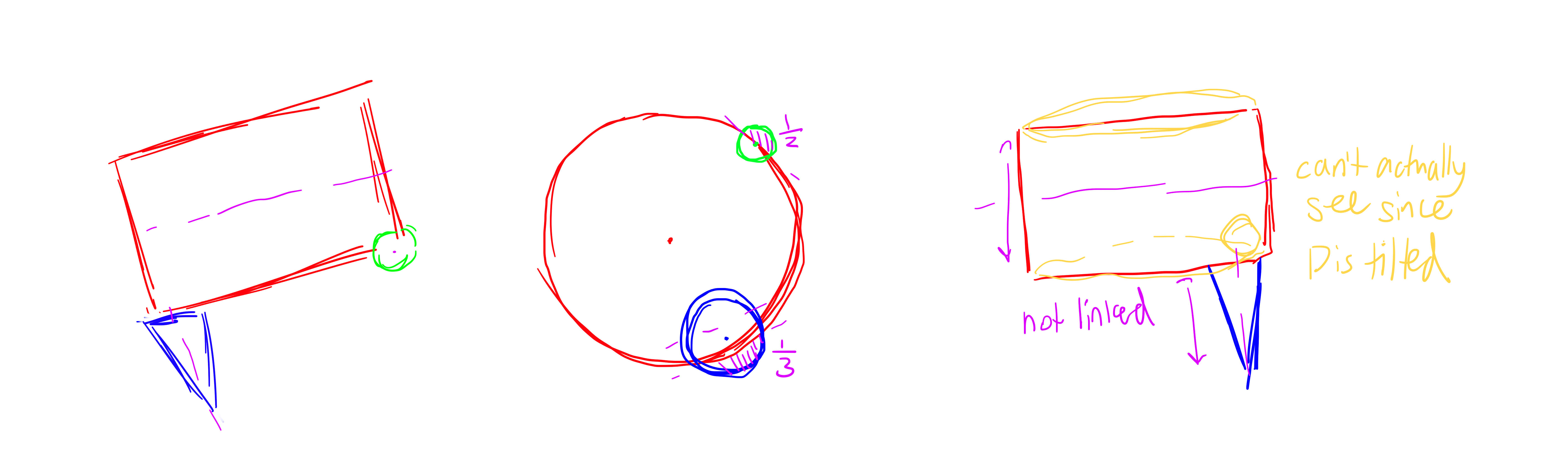
Dominant: Sphere
Subdominant: Cone (short and broad)
Subordinate: Cylinder (thin and long)
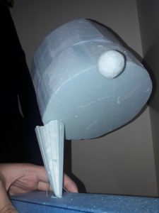
The main idea was the sphere being a huge dominant, so everything else just came in naturally. Initially I was thinking of the cylinder as the subdominant, but Cheryl suggested that it would be better to have a thinner and longer cone if I wanted it as the SO. And I kind of wanted to have the “mountain” cone to fit into the narrative I had in mind, so I upgraded it and downgraded the cylinder!
At first I had thought of having the sphere and cone supported by a long and slender cylinder, but after downgrading I figure it might not be good to give the SO too much power, so now the sphere is kind-of-but-not-really floating (this was a serendipitous discovery because I had no idea how to use the metal wire properly to secure everything, and ended up having extra lengths which became the “floating” region).
ALSO, I am proud to say that I consciously took actions to prevent similar lengths. You will find that the radius of the sphere and the base of the cone are NOT equal (because I trimmed the cone), nor the length of the cylinder and the radius of the sphere (because I extended it with masking tape). And that made 2 semicircles into 1 sphere to replace that 1 sphere which was stolen from me.
Main problem: In terms of hierarchy and visibility, not much. Maybe the sphere could be bigger since the SD is somewhat competitive, but that was the best I could have done with the available foam, honestly… Perhaps from one side the SO may or may not be seen, but it’s an acceptable tradeoff (in my opinion) to maintain the rule of third and hierarchy.
Material thoughts:
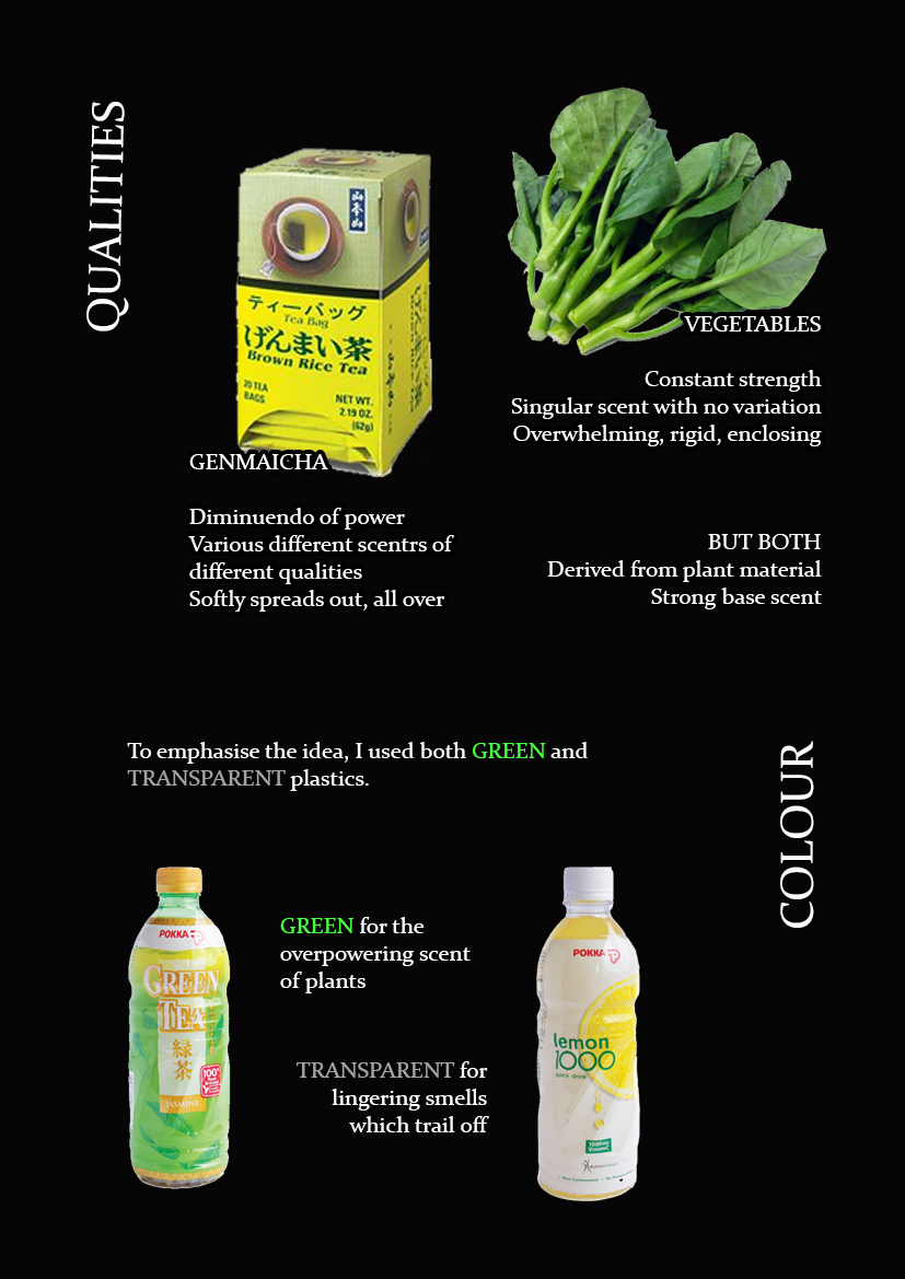
Sphere: A giant yakimochi!! Pun to show negative feelings
Cone: Mount Fuji-shaped taiyaki. A weird spinoff of the Carp Leaping Over Dragon’s Gate myth (Bream Leaping Over Mount Fuji?), representing hope :3 It used to be SO to bring across the idea of giant negativity vs minuscule positivity.
Cylinder: I have no idea…
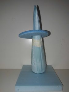
Model 2
Dominant: Cylinder (fat and chunky)
Subdominant: Cone (decent sized)
Subordinate: Sphere
I just wanted to try having a chunky cylinder, so the rest kind of fell into place naturally. Also, the idea of the dominant kind of being supported by the SD seemed fun, especially if the SD wasn’t even on its secure base, so I just… Tried it out? The SO positioning was mostly just gut feeling as to where I felt it looked good, but I looked at it only from 1 side so it wasn’t consistently effective from all angles in the end.
For this the cylinder actually reminded me of a book I read, The Particular Sadness of Lemon Cake. (This was before the seasons and Japanese and everything happened.) I was thinking along the lines of key types of food in the book (I wont go into detail to prevent spoilers).
Material thoughts:
Cylinder: The titular cake which changes everything. Bittersweet, hollow, begins the book
Cone: Junk food. Literally supports the protagonist in the middle of the book.
Sphere: Dupont’s cooking. Simple, pure. The salvation at the end of the book.
This was incredibly difficult to secure T_T I stuck the metal wire Cheryl gave us through the cone vertically (not the best material. it’s a little TOO malleable), then through half of the cylinder. As shown, the cylinder was formed by joining 2 cylinders, so I made a hook shape and hooked the wire through the upper half, and back through. Also, 2 wires supporting and maintaining the angle of the cone’s lean; same for the cylinder.
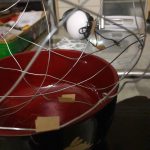
(Just for fun I also tried to use an arch for the base because ROMAN ART, but realised quickly that there was no point because the point of the arch is that it can support weight well, and therefore has nothing to do with maintaining the model.)
Main problem: … Actually, not much. Hierarchy remains constant, and elements remain visible from all angles. Perhaps it would be nice if there was less flat planes (caused by the gigantic cylinder, especially from top view).
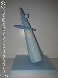
Model 3
Dominant: Cone (thin and tall)
Subdominant: Cylinder (Thin and wide)
Subordinate: Sphere
The main idea was just wanting a cone as the dominant; again, the rest fell into place then. I’m not a big fan of this model because it looks very… Normal, somehow. Like the feeling of “yeah, there’s the sense of imbalance and skewed lines, but it’s very contained”.
This was also easiest in terms of construction and support, I just used 1 metal wire through the vertical length of the cone (but it was already relatively stable).
Main problem: Consistency in angles. The tapering nature of the cone causes the hierarchy to shift (from top view); the broadness of the cylinder surface causes the SO to be concealed (from bottom view).
(EXTRA) After the Sept 15 class, discussing with my sister. It’s not really relevant, but I just wanted to show some of the early musings before the sudden mess of having to include branches, seasons, foods, flowers, etc. Most of the mentioned foods are 和菓子 wagashi, traditional Japanese confectioneries.
Unfortunately, my hamartia is lack of dexterity. I’m the kind of person who failed that one compulsory secondary school D&T module, and can’t come up with ways to actualise ideas, so… Knowing me, trying to make a giant toasted mochi will probably lead to either me losing a lot of money wasted on ingredients, an oven damaged beyond repair and/or a week’s worth of kitchen cleaning chores.


![[Project 3: Ego] Fangirling 2k17](https://oss.adm.ntu.edu.sg/a170027/wp-content/uploads/sites/1810/2017/10/koya-1.jpg)


![[Project 3: Mnemosyne] plaNarSticNet](https://oss.adm.ntu.edu.sg/a170027/wp-content/uploads/sites/1810/2017/10/cover.jpg)


![[Project 2: Forrest Gump] Despondency, Eternity, Anxiety, and Cats](https://oss.adm.ntu.edu.sg/a170027/wp-content/uploads/sites/1810/2017/10/20171017_000820.jpg)