SOCIAL PRACTICE ART
Davis explores the subject of social practice art in this article. Historically, it has ties to the revulsion associated with the traditional conception of art: of commodification, elitism and meaningless aesthetic. Rather than reflecting the problem, it is contended, art should solve it instead. This, however, compromises the definition of art. After all, such a conception blurs the lines between art and things like social activism, or everyday happenings.

What was striking to me was the distinction between living as form and forms of living. Admittedly, I understand that it highlights a difference in the order of derivation, but not what that precise difference is meant to be. Let me nevertheless make an attempt.
The connection of living and form is championed in Living as Form, a collection of essays by art critics and theorists. Of particular interest is that by Nato Thompson, a curator who celebrates the idea of Living as Form. He associates almost any “vague aesthetics of social uplift” with this, including even un-choreographed responses to Obama’s election. In the book, specifically, he identifies life as something which is
- Anti-representational, in being the subject itself than having intentionality towards it,
- Participatory, in allowing for interaction with participants,
- Situated in the “real” world, in having a spatial component than intangibility, and
- Operating in the political world, in having subjects and making impacts related to potentially political issues.
Form is further identified with the sensible qualities of an artwork, where this can include mediums like clay, or gatherings of people. We see, however, that form loses meaning in relation to its concept, where an absolute form can be “criticized, disintegrated, assembled”. Even forms of living, then, can be treated in such a manner.
The distinction, then, is that forms of living refers to styles which emphasise the sensible qualities of their artworks. Living then becomes something artificial, designed only for the sake of aesthetic and commodification. Living as form, on the other hand, emphasises a sort of sincerity. Where it directly relates to life, it is the concept which precedes, and naturally manifests a suitable form.
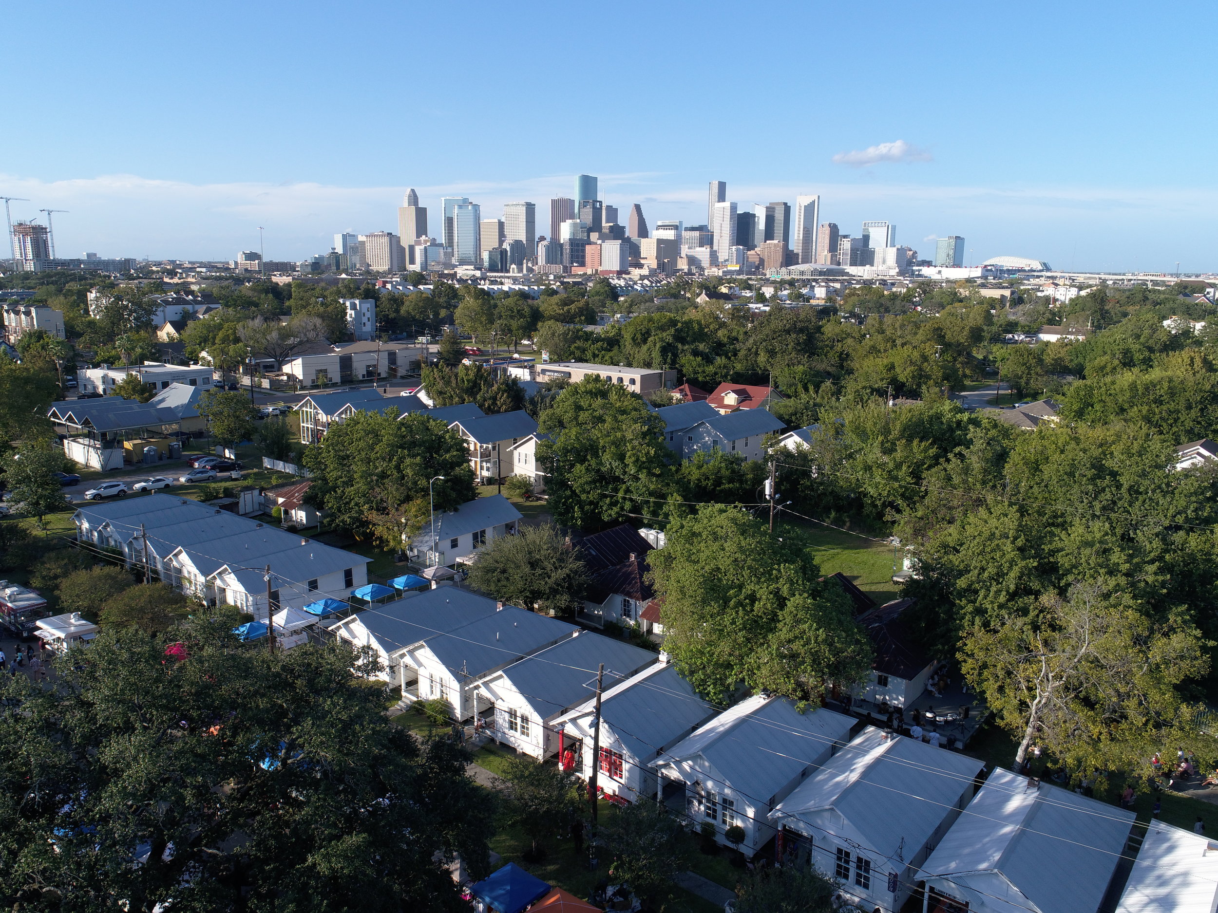
The article is meant to praise living as form, and of course has good reason to do so. After all, we are rapidly shifting away from a world which appreciates form, into one which appreciates concept more. Nevertheless, it may perhaps still be too hasty to reject form altogether. As stated in the article, form will nevertheless be necessary for even social practice artworks to survive in a capitalist world: the Bank of America likely doesn’t care about the concept behind Project Row Houses, as opposed to how good it looks for their reputation.
Another crucial point is that any regular person’s first contact with an artwork will likely center around the form, than the concept. This is because artworks which are mean to be “real” are situated in environments where they can have a proper impact, than places like museums (which emphasise their visual quality). The typical bystander, however, is unlikely to have awareness of the meaning of an artwork, or even if it is an artwork. It will be solely judged based on its form. On one hand, this could be good in that the artwork attains a sort of anonymity, in blending so well with its environment that it fulfills its objectives of meaningfulness without emphasis on aesthetic quality. On the other hand, it further complicates what it means to be art. Wouldn’t the bucket in my house then be art, in a way not unlike Morrison & Fukasawa’s conception of Super Normal? It’s anti-representational, it’s participatory, situated in the real world, and allows me to draw water, a very political issue. As implied in the article, is it really alright to distinguish art and not-art based on the initiator’s self-imposed status as an artist or not-artist?
Personally, I don’t believe there’s an answer, nor that it is particularly important. It’s a matter of semantic, and I highly doubt that any conceptual error here on the meaning of art would majorly impact the subsequent implications. Or it might. I’m uncertain.
DESIGNING FOR THE DIGITAL AGE
Design, as claimed here by Goodwin, is a craft. He further acknowledges the capacity for design to be an all-encompassing term, but nevertheless limits it to the “visualisation of concrete solutions”. Additionally, such design is limited by real world constraints, such as time and money.
In an attempt to further narrow the scope, he focuses specifically on digital design, and its aspects. Goal-directed design is championed here, where the concept is the starting point, and what drives the entire design. It is further supported by components:
- Principles, referring to general rules (which apply in most cases) for the design,
- Patterns, referring to repeated rules on what works (and doesn’t) in specific conditions,
- Process, referring to how the design is generated through things like research and modelling, and
- Practices, referring to how the project is efficiently managed.
Processes, as the book’s main focus, is elaborated on in great detail. In simple terms, the design must be justified by research into what people need and want, and how that translates into a particular form. This can include the use of personas and scenarios to test the design, or even actual usability testing. In any case, the design, as something to be used by others, cannot exist in isolation, based solely on the designer’s whims.
Personally, I’m fascinated by the implication of design as something universal. Obviously, analog design is comprehensible enough, but everything as design? It’s not impossible; plenty of people celebrate the bucket as a simple yet modest design. But what kind of implication would that have? Would that mean that Aristotle is right to say that everything has an innate purpose towards which it strives? And, if we accept this teleological stance, what does that mean for us, as beings which are designed? (This is probably the realm of Value Theory, and so I stop here.)
There’s something fascinating about the idea of principles and patterns as well. This is because they can change over time, depending on the norms of each era. It was once normal, for example, to type with a number pad. Now, hardly anyone is expected to press 44 444 8443377733. It became a principle that mobile phones use a keyboard, out of nothing but convention (and convenience, maybe?). This might mean that a kind of dictionary and/or archive must be held, to track present trends in what is acceptable and not.
OVERALL THOUGHTS ON BOTH, PERHAPS?
The separation of design and art in the second article is also somewhat concerning for people like us. What does it mean to major in Design Art, when the two don’t necessarily coincide?
This is also related to the first article, where most professors emphasise concept, and can accept an incomplete form. While on exchange, I discovered that 100%-design clusters often take design to mean that even the problem to be solved is raised by users, through interviews and surveys.


Here, however, much of our creative liberty is retained. Most projects are based off “what I want to do”. which sometimes (but not always) includes “what I think people need”. Note that it is about “what I think”, than “what I have ascertained”, too. Even so, most project presentations turn out fairly well, with no major obstructions to user experience.
Something that Shah said before also stands out here, where he suggested that we are not necessarily inferior to computer science students: while they have a better understanding of software and how to actualise a concept, we have a better understanding of the concept itself. In other words, we’re more likely to think of ideas, but less likely to be able to execute form. (Many exceptions exist, like Angela He. Either way, this is why collaborations between artists and engineers exist.)
Does this mean that the aspect of the artist, in fact, supports the aspect of the designer, in allowing us to ideate something relevant to the user? Or does this mean that we still have more that we can be doing, as designers, to eliminate even minor obstructions?
As always, I have no answers.
The readings, and their links:
- Davis, B. (2013). A Critique of Social Practice Art. In International Socialist Review, Issue #90. As found at https://isreview.org/issue/90/critique-social-practice-art
- Goodwin, K. (2009). Chapter 1: Goal-Directed Product and Service Design. In Goodwin, K. Designing for the Digital Age, pp. 2-13. As found at https://oss.adm.ntu.edu.sg/19s2-dm3010-tut-g01/wp-content/uploads/sites/9263/2020/01/CH01_Digital_Age_Goodwin-1.pdf
- Thompson, N. (2012). Living as Form. In Thompson, N. (ed). Socially Engaged Art From 1991-2011, pp. 16-33. As found at http://cp.art.cmu.edu/wp-content/uploads/2014/12/living-as-form.pdf
- Featured image from New Museum Store
- Sorry I submit late I overslept 🙁
![[W2PDaP] Assignment](https://oss.adm.ntu.edu.sg/a170027/wp-content/uploads/sites/1810/2020/01/10021443-Nato-Thompson-Living-as-Form-Front_1-825x510.jpg)
![[IfD] W1&2 Activity Recaps](https://oss.adm.ntu.edu.sg/a170027/wp-content/uploads/sites/1810/2020/01/20200120_132139-825x510.jpg)


![[PDaP] W2 Biennale & Night to Light Presentation](https://oss.adm.ntu.edu.sg/a170027/wp-content/uploads/sites/1810/2020/01/7b-825x510.jpg)


