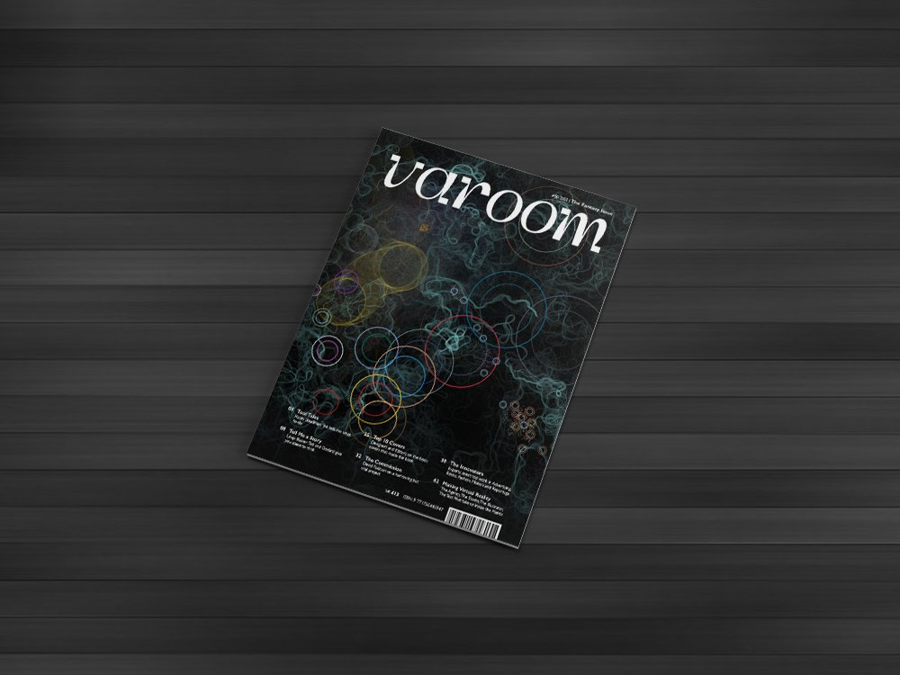
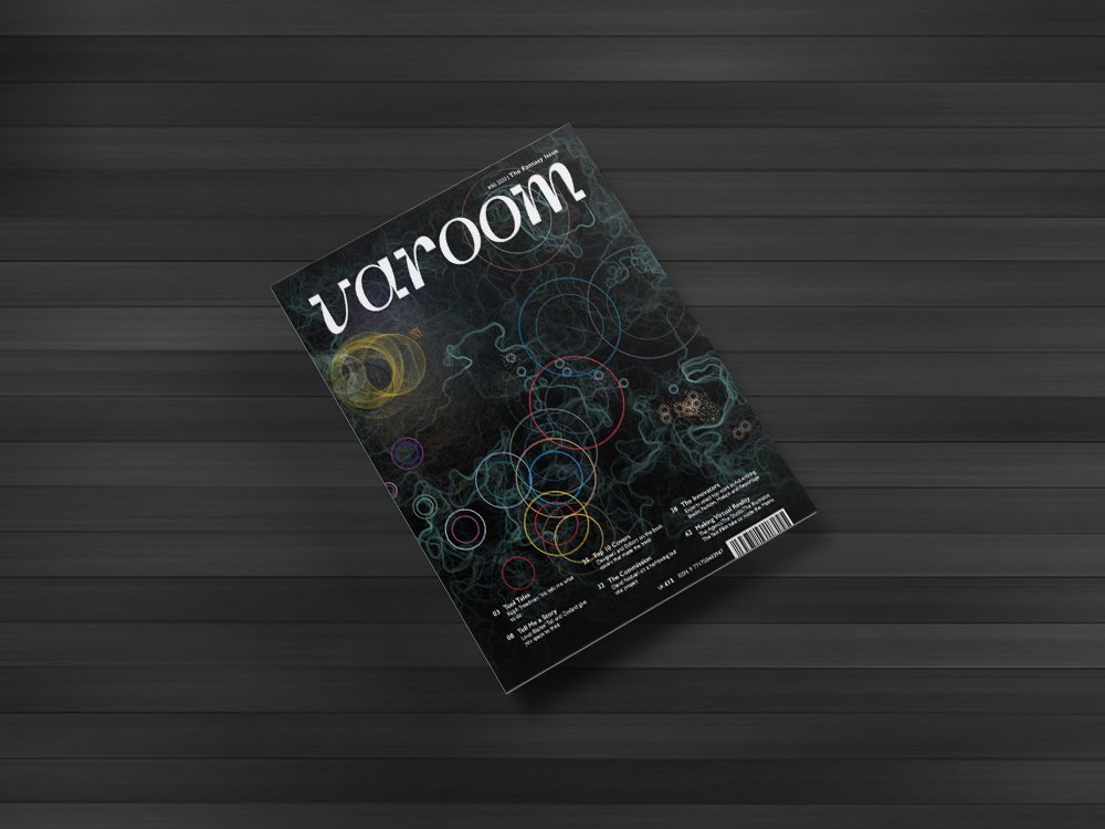
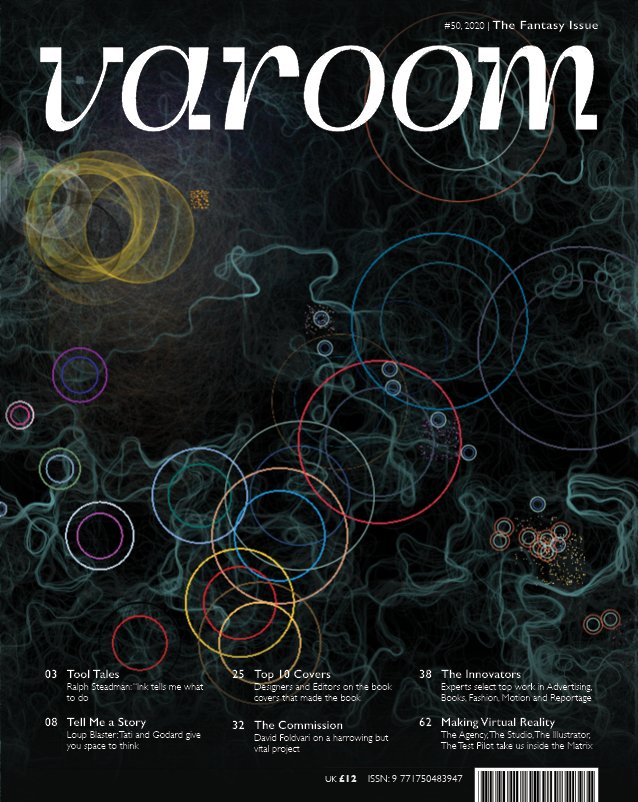
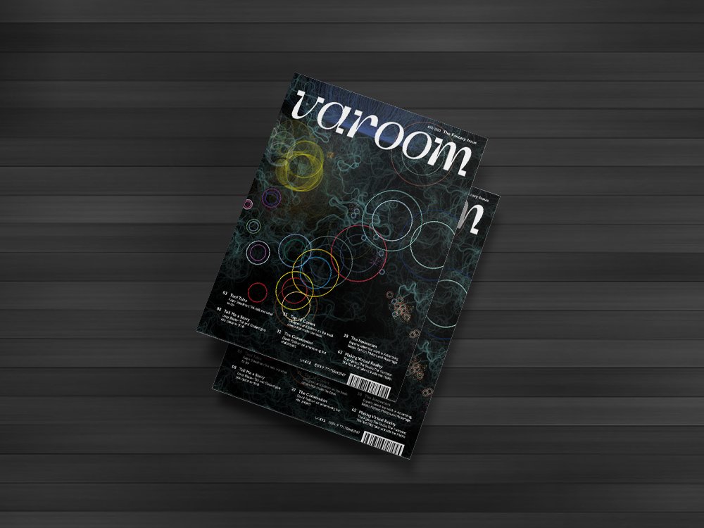
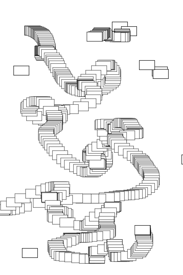
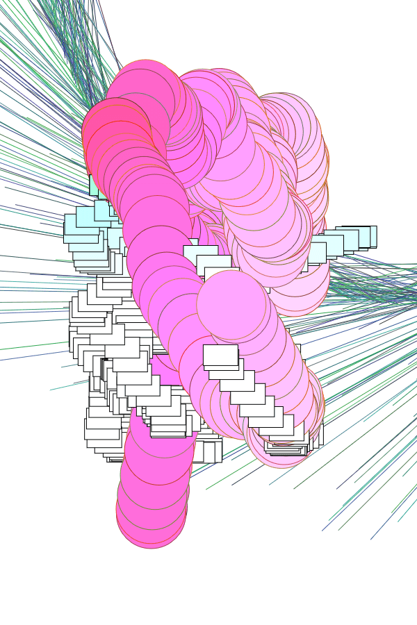
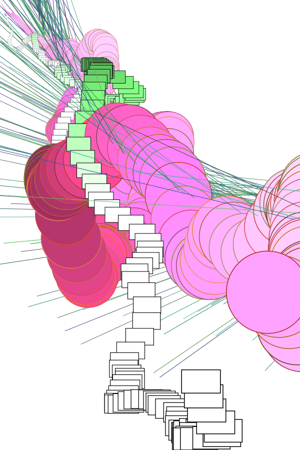
Last week, I came to class with multiple instances of code. The downside was that I genuinely had no idea how it would turn out, or any direction to guide me towards that end, so I figured that Lisa’s suggestion to incorporate data visualisation was a good idea.
Again, the theme of Fantasy is with respect to the fantasy of actualising impossibilities through technology, but I also used a more innocuous data set, in honour of something which is coming soon:
Yes, it’s a visualisation of theFinal Fantasy franchise.
PROCESS OF SETTING UP THE DATA
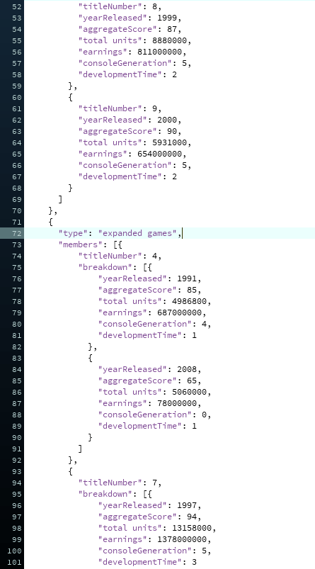
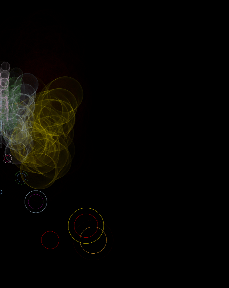
I have never touched data visualisation in my life, so I looked up tutorials by, once again, Coding Train. I decided against using real-time data, since it’s complicated, and there’re no API resources for the entire franchise (only FFXIV has a dedicated following). Instead, I created a JSON-based dataset; in total, there’s about 850++ lines of code.
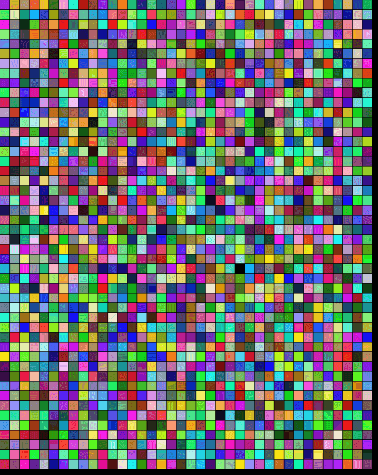
I ran some tests to ensure that the data could be accessed properly, as well, and properly incorporated into other codes:
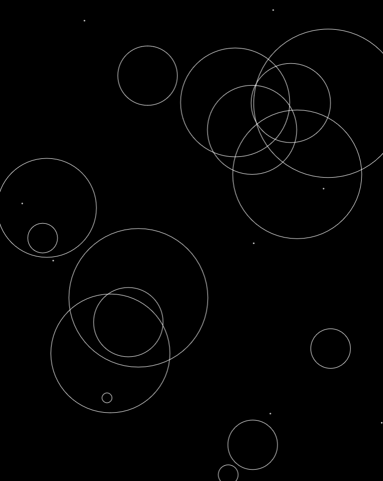
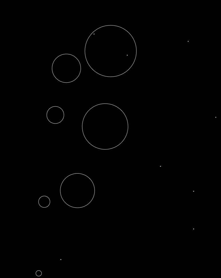
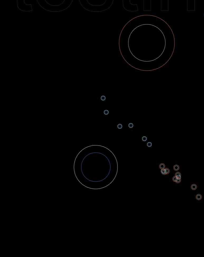
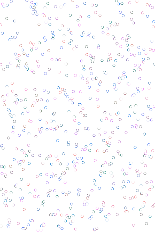
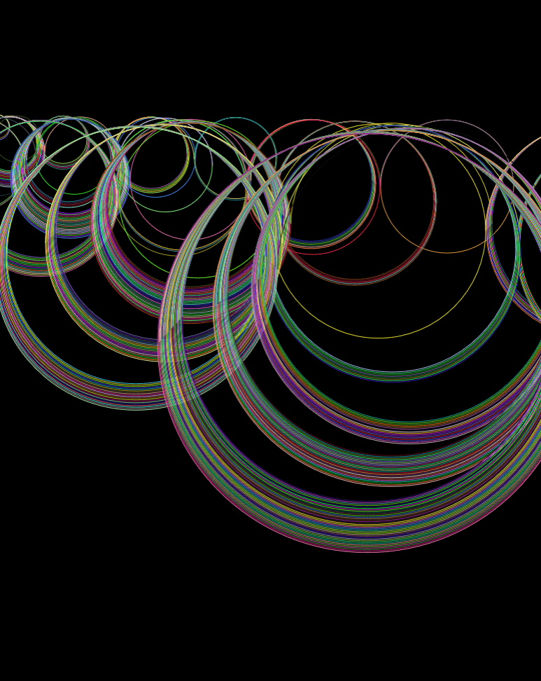
Random positioning, with ellipse sizes corresponding to the installment number.
Same as before, but width corresponds to year released
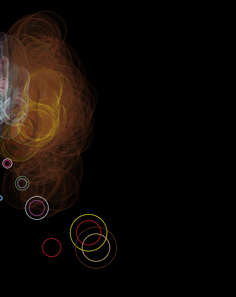
Combining flow field and ellipse codes
Location and size based on statistics, like yearReleased
With noise-based displacement (division)
With noise-based displacement (/10)
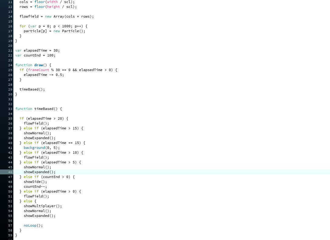
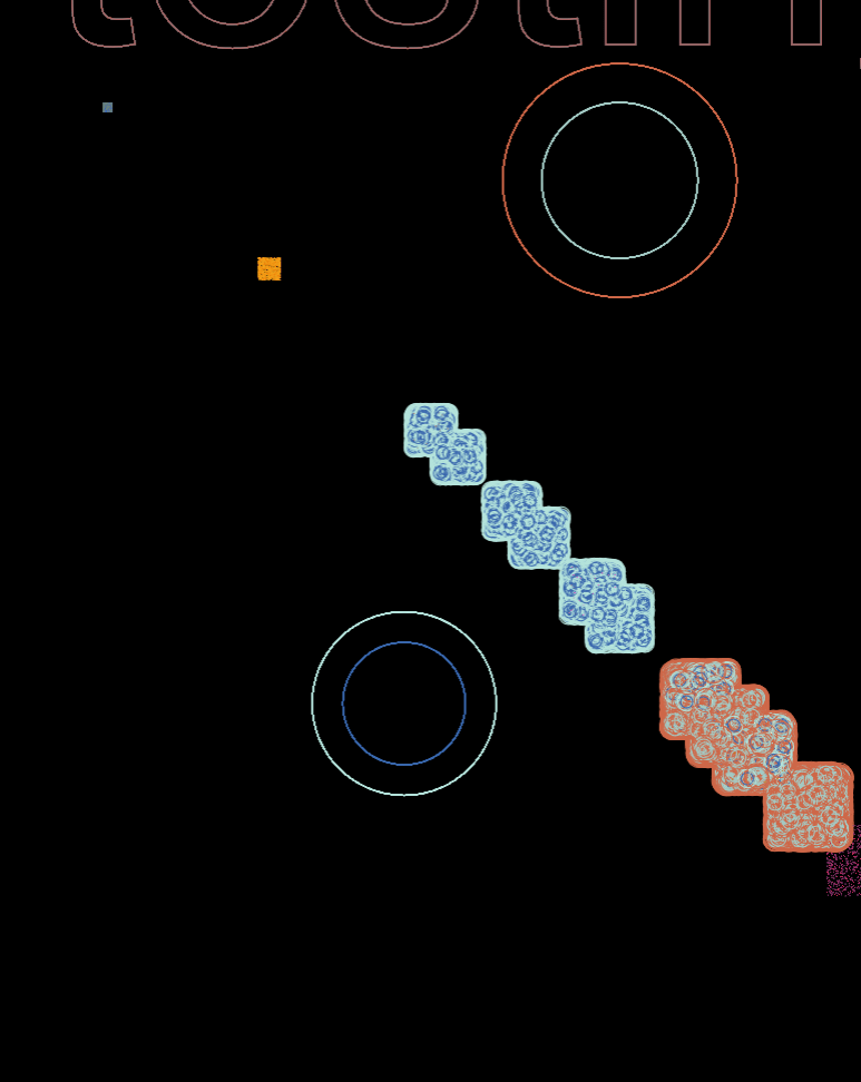
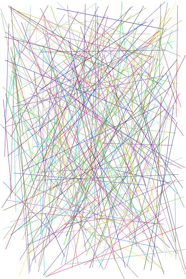
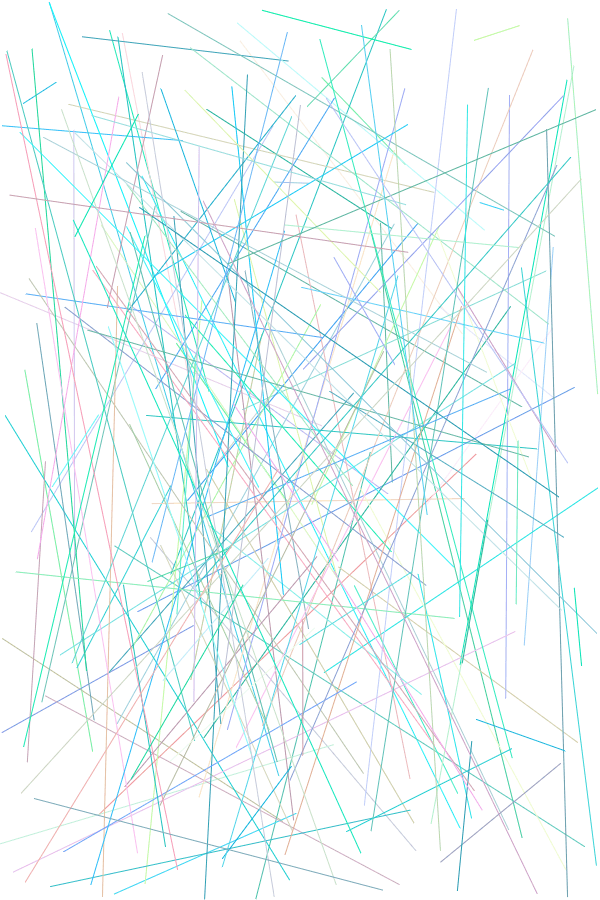
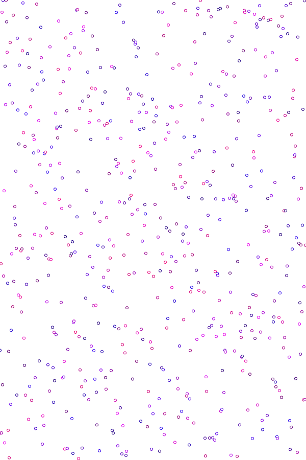
After which, I began testing different ways to combine data with visuals, and put them all together in a not-painful-to-look-at way:
testing high opacities
testing low opacities
opacities with increments based on totalUnits
opacities proportional to totalUnits
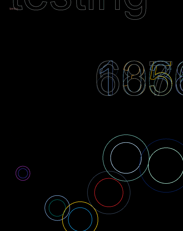
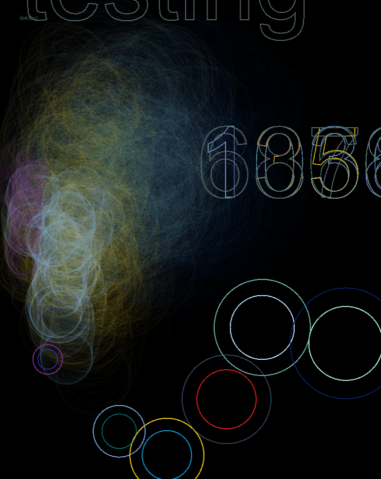
testing expanded games dataset
combining 1st and 2nd datasets
random positioning without loop
random positioning with loop
random positioning without scaling to 1987
trying different timings
trying different translate()
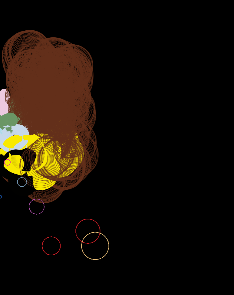
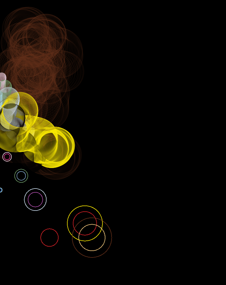
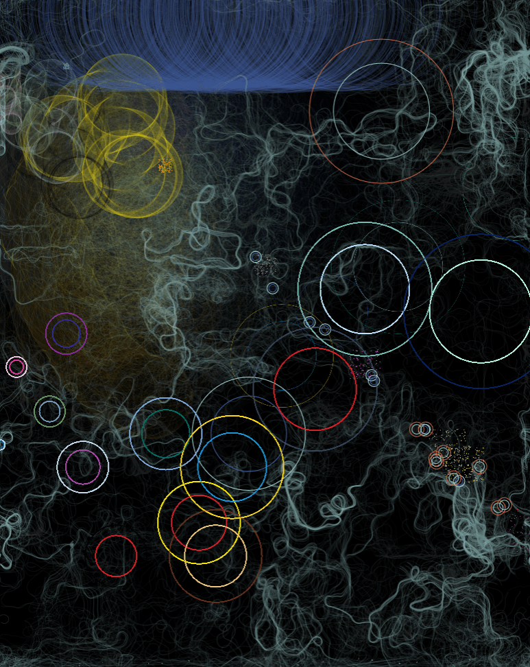
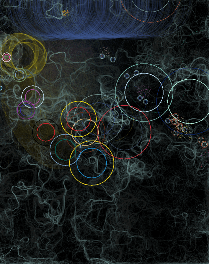
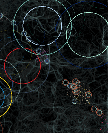
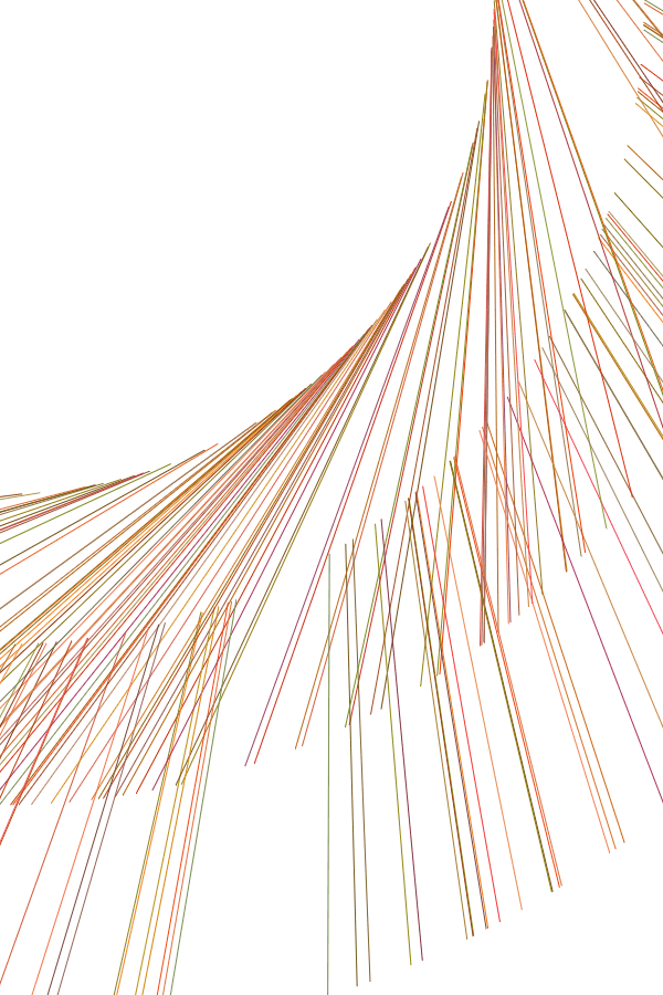
The details regarding which data set corresponds to what visuals are available on the page. Nevertheless, there’re some fun facts which are fun only if you understand Math and Final Fantasy, such as that a) patterns are easily observable once you know what drives it, and b) that outliers make for… Interesting visuals.
Main installments (the most prominent ellipses) are evenly spread out across the width, and in order, because it’s based on the year it was released
Specific positions of MMO expansions and side games are random, but nevertheless revolve around an static origin point
Everything in the top right is there because 1) it’s recent, and 2) it has outrageously bad reviews (i.e. original FF14 & the FF15 expansions)
Also, interestingly, a previously mentioned possible guiding philosophy was how basic elements come together to create complex forms. Due to that ellipses were used for practically everything, it surprisingly came to fruition as well.
As per the last post, I decided to work with generative illustrations. Where the theme is something like “the Fantasy of actualising impossibilities through technology”. And, of course, I don’t have pencil compositions, or even drafts of what I want. Here are the two main reasons why:
1. GENERATIVE STUFF JUST… DOESN’T GO WELL WITH PLANNING
As summarised by Spittel, there are two approaches to generative art: a) have no results, and let the computer generate as you play around, and b) have a very finalised idea, only allowing little randomisation.
I wanted to go for a mix of the two: keeping a vague idea of what I want the overall form to be like, while allowing the computer freedom to generate the exacts of what it turns out to be.
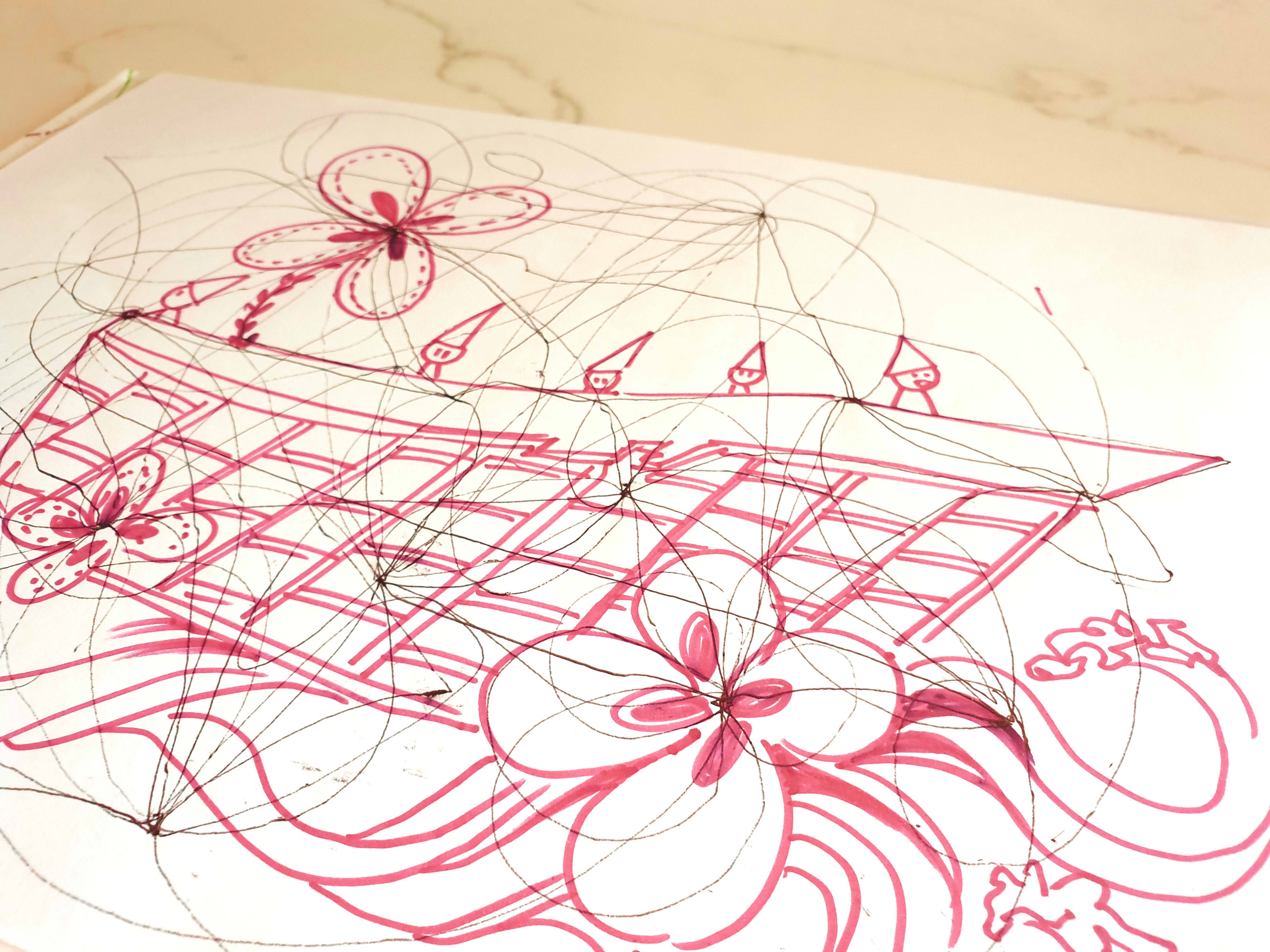
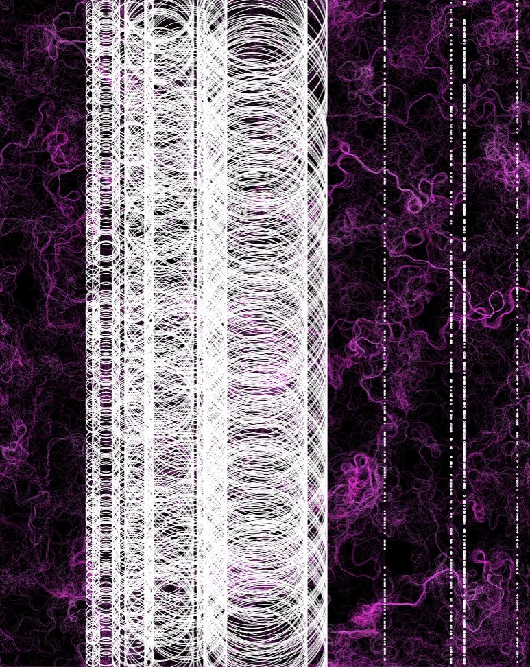
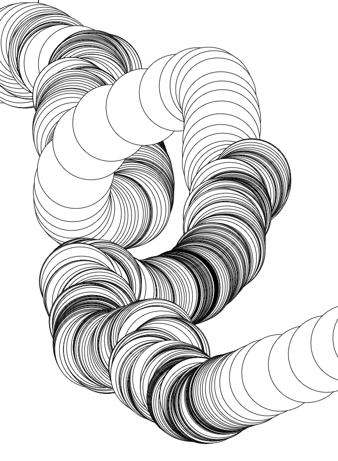
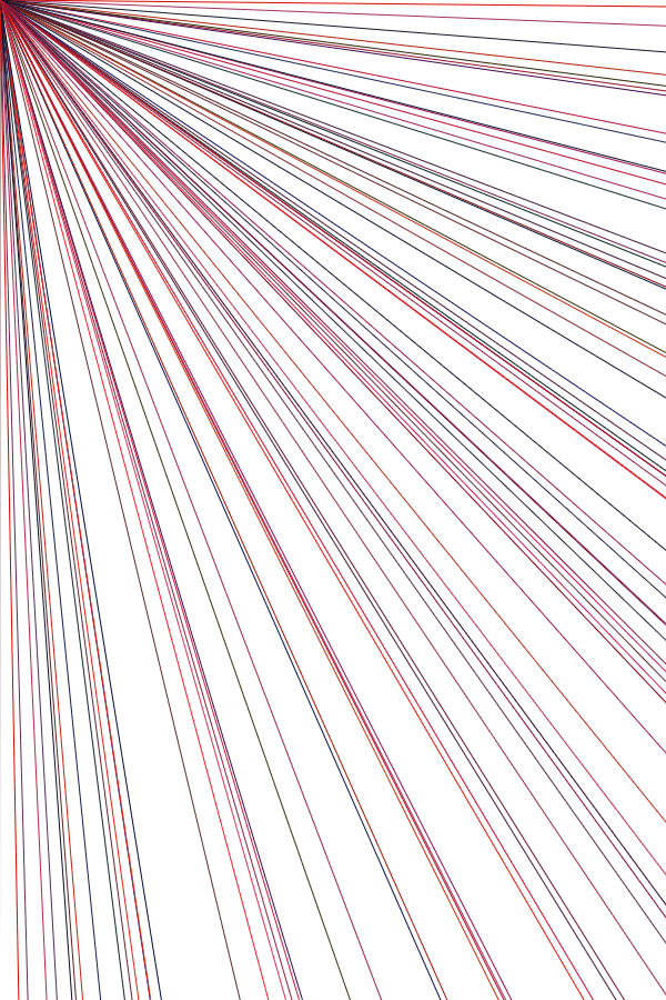
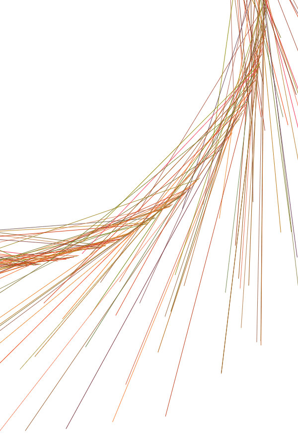
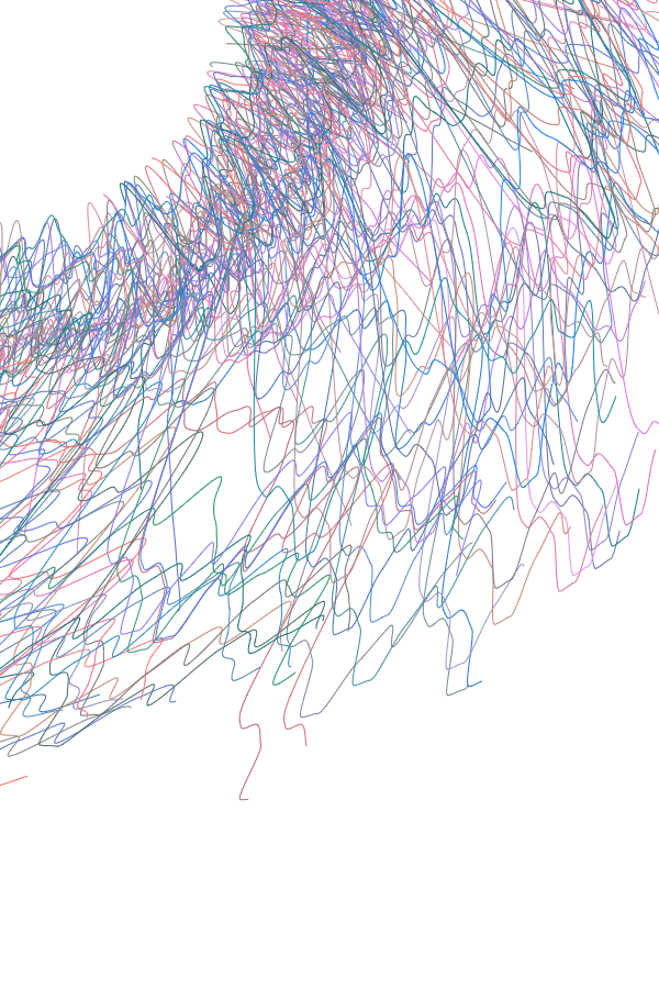
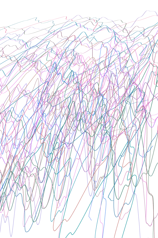
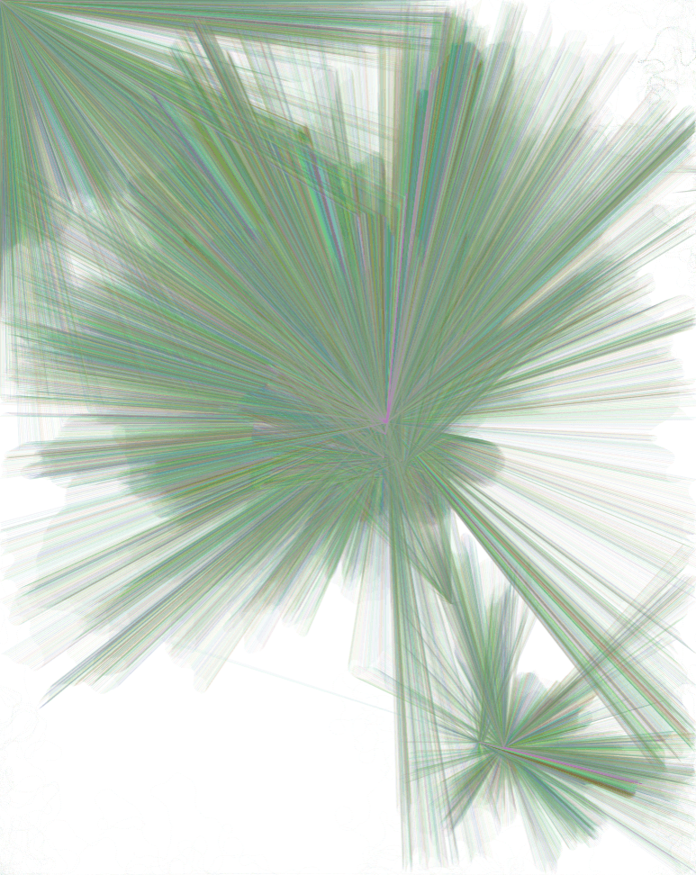
Automatic line makings, to get a gist for the overall form. As can be seen, it will likely involve many arcs, curves and loops, and a tall form which isn’t symmetrical.
But, intention probably won’t match up to action, because
2. IT REALLY DEPENDS ON MY PROGRAMMING ABILITY
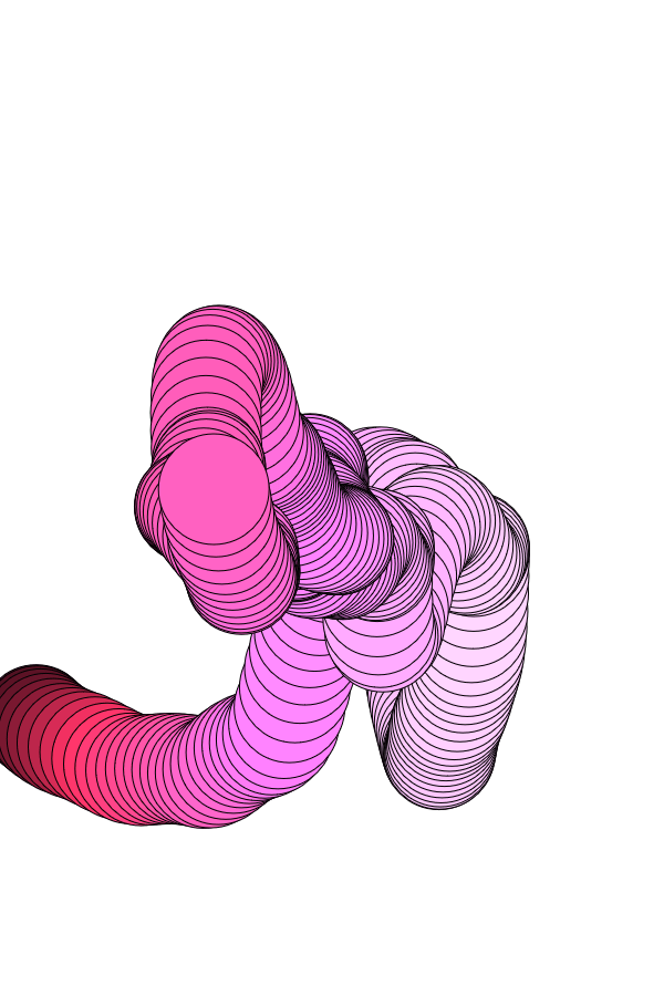
I can draw decently well, but coding full-fledged physics is……. While I wanted to aim for something like Shvembldr and/or Nick Taylor‘s emergent, organic forms, I’m not sure that it’s possible at my current level. The most I can do is probably to work with basic elements, like lines and circles, and randomise their colours, positions, and sizes.
As such, it seems unlikely that I can find a way to code the piece to be particularly close to whatever I would envision. Still, I’ll outlaw patterned works like cccbtt, where I think it’s too structured: the point is to show off how amazing technology is, which is more evident when more complex functions like sin() is involved.
SO, TO START OFF…
After looking into different scripting languages, I decided to go with P5.js.
Their tagline aptly summarises why: it has “the power of Processing times the reach of JavaScript”. In other words, it can achieve more than web-based Javascript alone, while being more accessible to creators and audiences, since it’s for web.
As I’ve said, I don’t have pencil sketches, because it depends on how fast I learn. Instead, I just experimented wildly with codes that I learned, using random() and noise() on parameters like the x-y coordinates, or scale().
Here are some things I learned (or refreshed, it’s been a while since I’ve touched Java/Script) during the spring break:
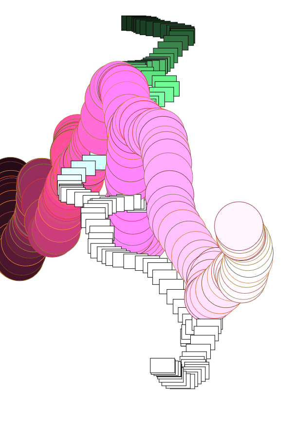
From there, I picked out elements I liked, and tried combining them, or messing around even more. Half of this were not intentional, just that I didn’t really do object-oriented programming, so, uh.
I guess my first “pencil composition” would thus be something like this:
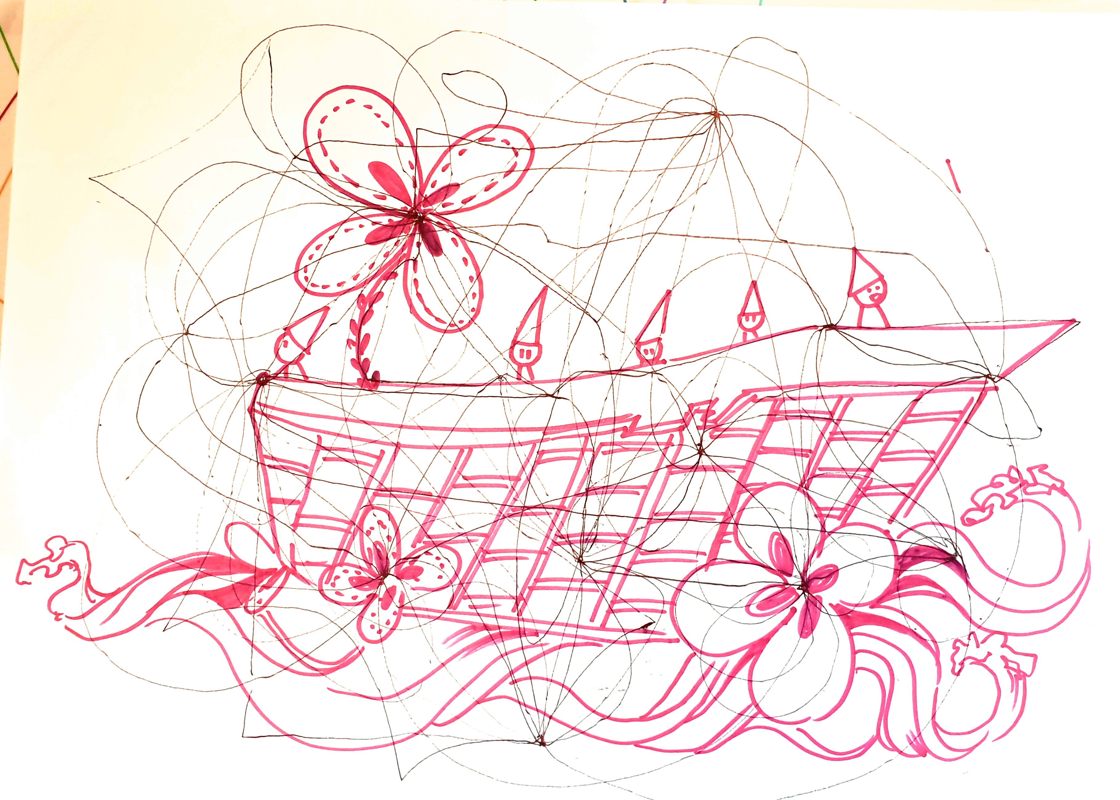
A SECOND “PENCIL” COMP
My second pencil composition tried to be more aware of the working style for generative pieces. Interestingly, there’s a sense in which coding is a “collage”, because you rarely write code from scratch: it’s usually about modifying other people’s codes to suit your needs.
As such, you’ll see that most of the practices here are based off codes that I grabbed elsewhere, like by The Coding Train:
The exercise involved 1) marking a few random points on the paper, and 2) joining the points with any desired lines. Part 3) involved handing the paper to someone else to interpret, as represented by the pink lines on mine.
During the exercise, I chose to use a continuous line. Interestingly, too, mine turned out quite… Excessive, compared to others’ more modest pieces which weren’t so overdrawn. Another interesting point is that whoever drew over mine had similar interpretations of “flowers” at the same places. (It’s also very adorable.)
It’s similarly intriguing that my interpretation for Part 3 tried to retain the original form of the piece by filling spaces in a similar style, than drawing over it. I didn’t expect everyone to work over, than with the piece. Perhaps that’s something to consider when doing Assignment 1, seeing as I can’t always try to preserve the original truth.
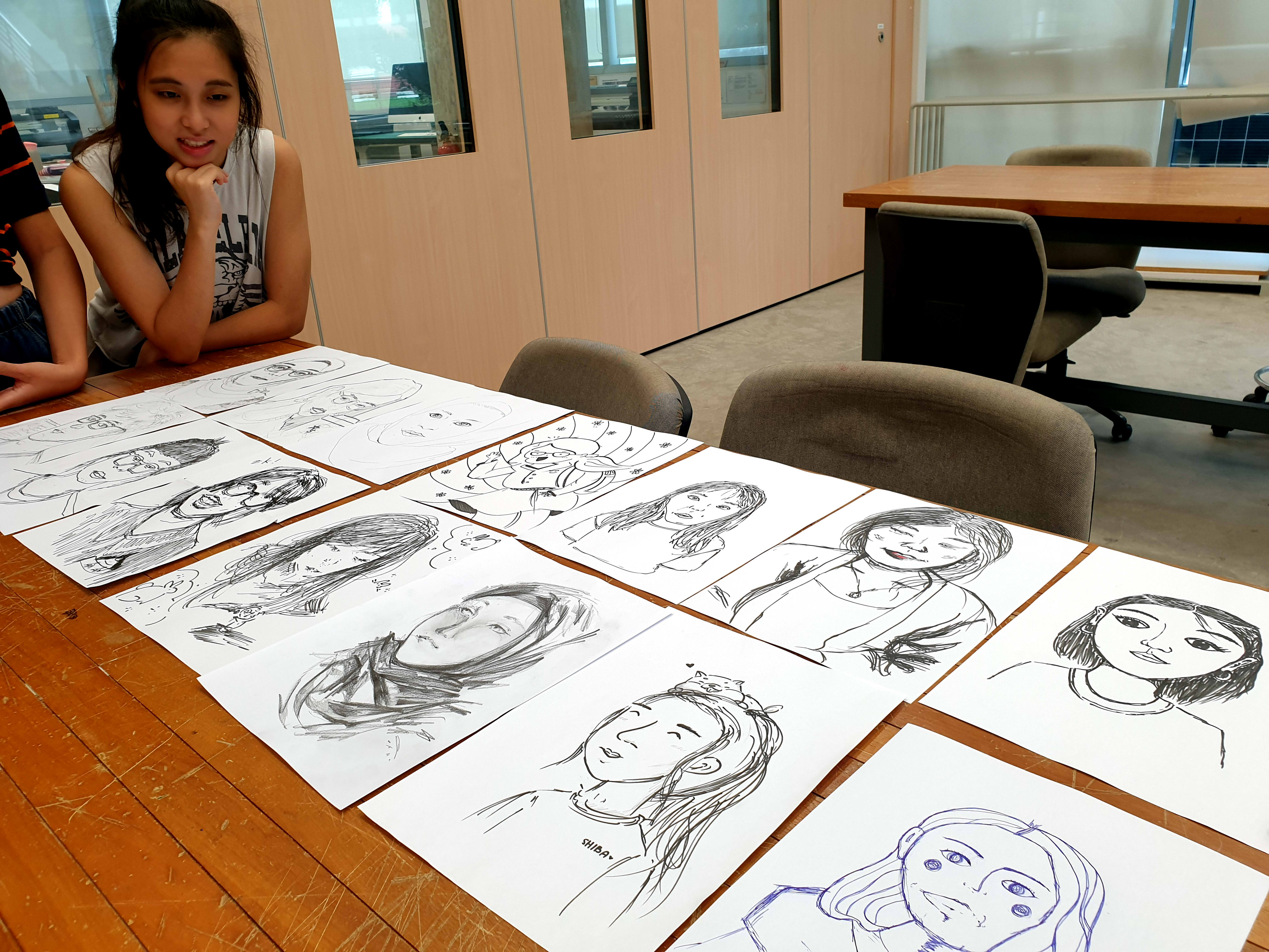
W2 BAUHAUS & PORTRAITURE
The first exercise involved playing with shapes, in a manner reminiscent of the Bauhaus style. It seems that the exercise becomes easier if you use a circle as your primary shape, versus other angular forms.
My solution to everything was to increase the Stroke thickness, to the extent that it covers up the original form (or at least, tries to). I did try other solutions, such as re-identifying the circle as a culmination of triangles, not unlike low-poly 3D, or marking the circle as “c’est triangle”.
Again, it is almost unfortunate how messy and heavy my piece is, compared to everyone else. Perhaps I’m missing a memo?
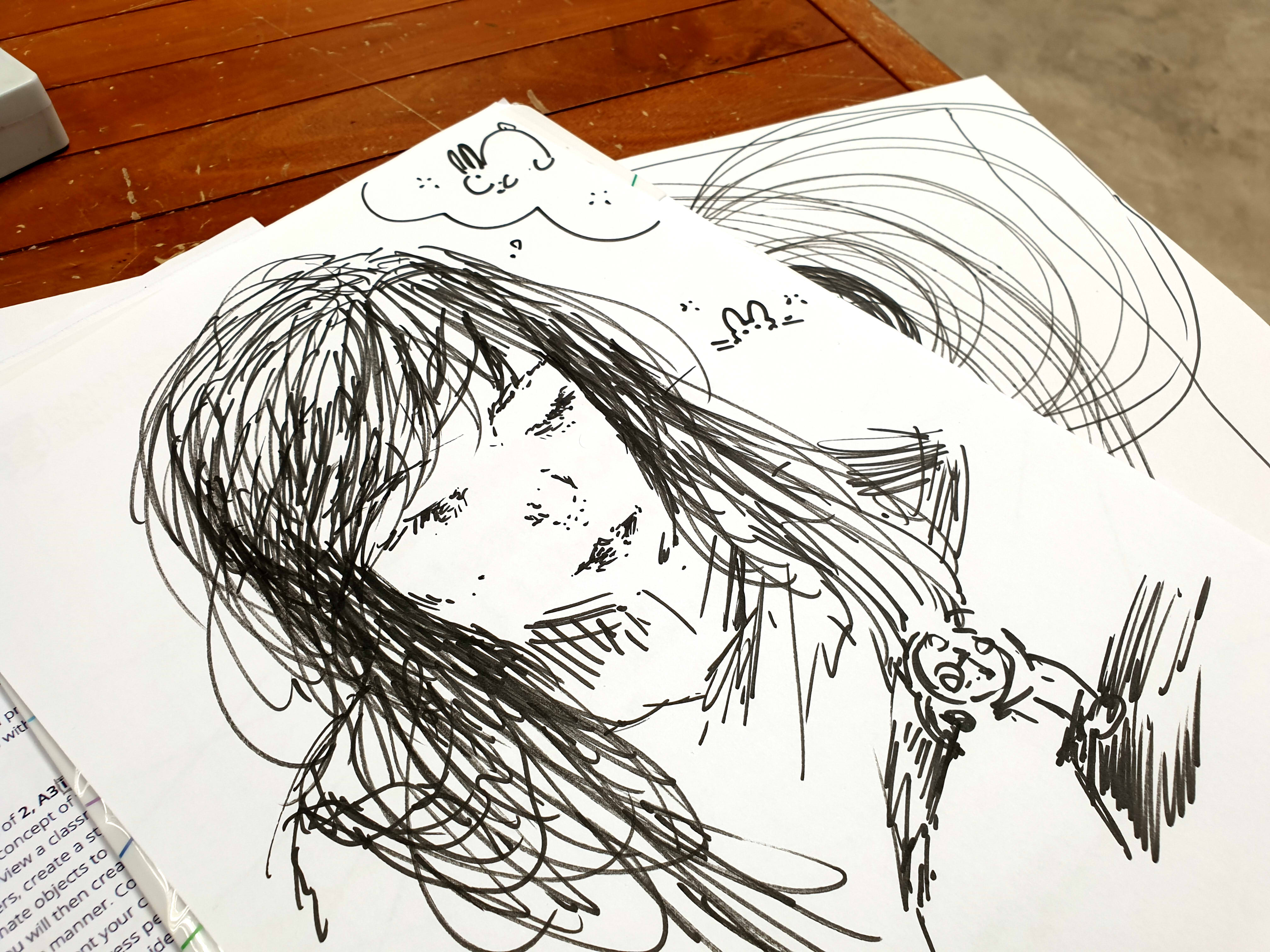
The second exercise involved depicting each other on paper, of which I only had a marker. Since I lack confidence in my ability to capture shapes accurately, I started from the hair, using it to frame the other shapes through negative space. Everyone else’s feels much more well-structured, as a result.
On another note, I’m very happy with how the rendition of me turned out, which feels oddly apt:
![[W10IfD] a final post for assignment 2](https://oss.adm.ntu.edu.sg/a170027/wp-content/uploads/sites/1810/2020/03/ifdimgfina3-638x510.jpg)


![[W9IfD] turning data into forms](https://oss.adm.ntu.edu.sg/a170027/wp-content/uploads/sites/1810/2020/03/ifdmockup01-1-825x510.jpg)


![[W7IfD] making pencil comps for a digital generation is, uh,](https://oss.adm.ntu.edu.sg/a170027/wp-content/uploads/sites/1810/2020/03/pencil1-638x510.jpg)


![[IfD] W1&2 Activity Recaps](https://oss.adm.ntu.edu.sg/a170027/wp-content/uploads/sites/1810/2020/01/20200120_132139-825x510.jpg)