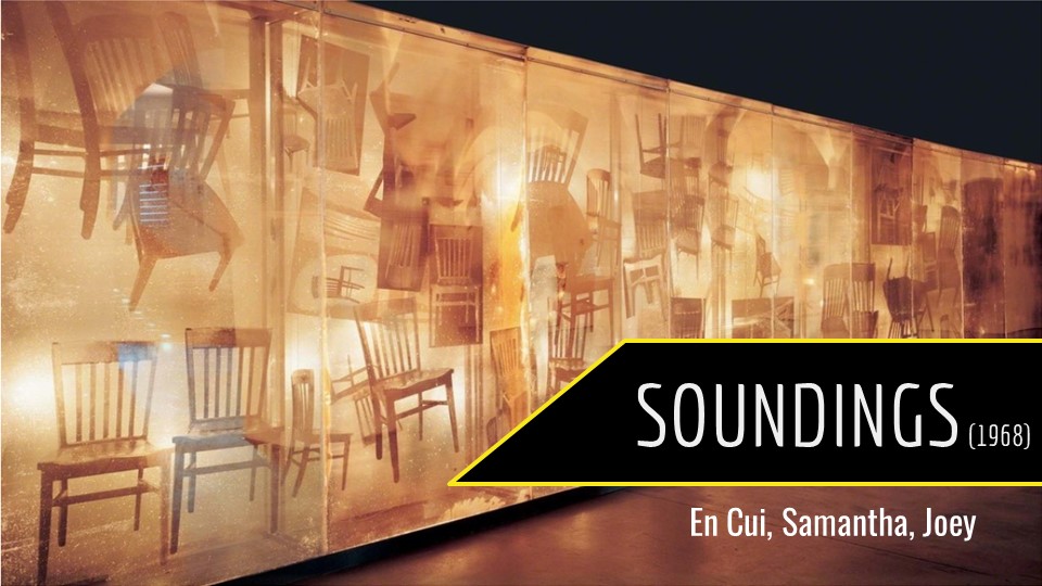
(by En Cui, Joey, Samantha)
En Cui – Introduction, Conclusion
Joey – Cybernetics in History
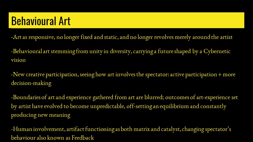
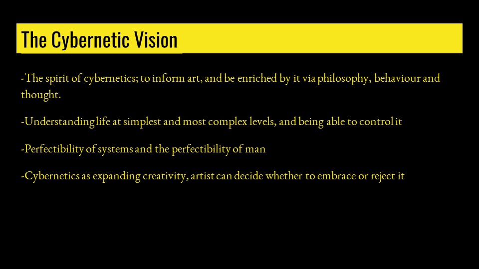
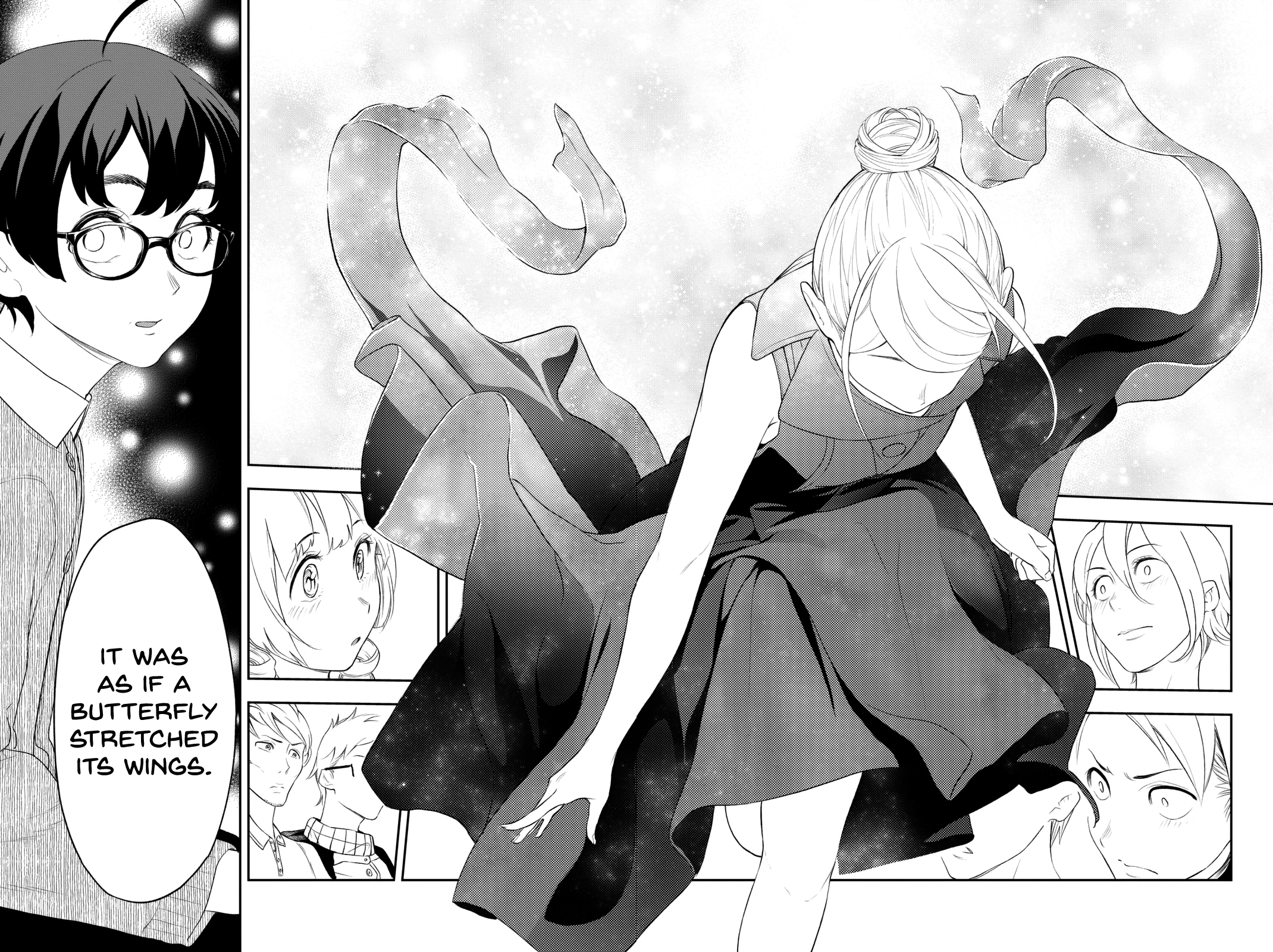
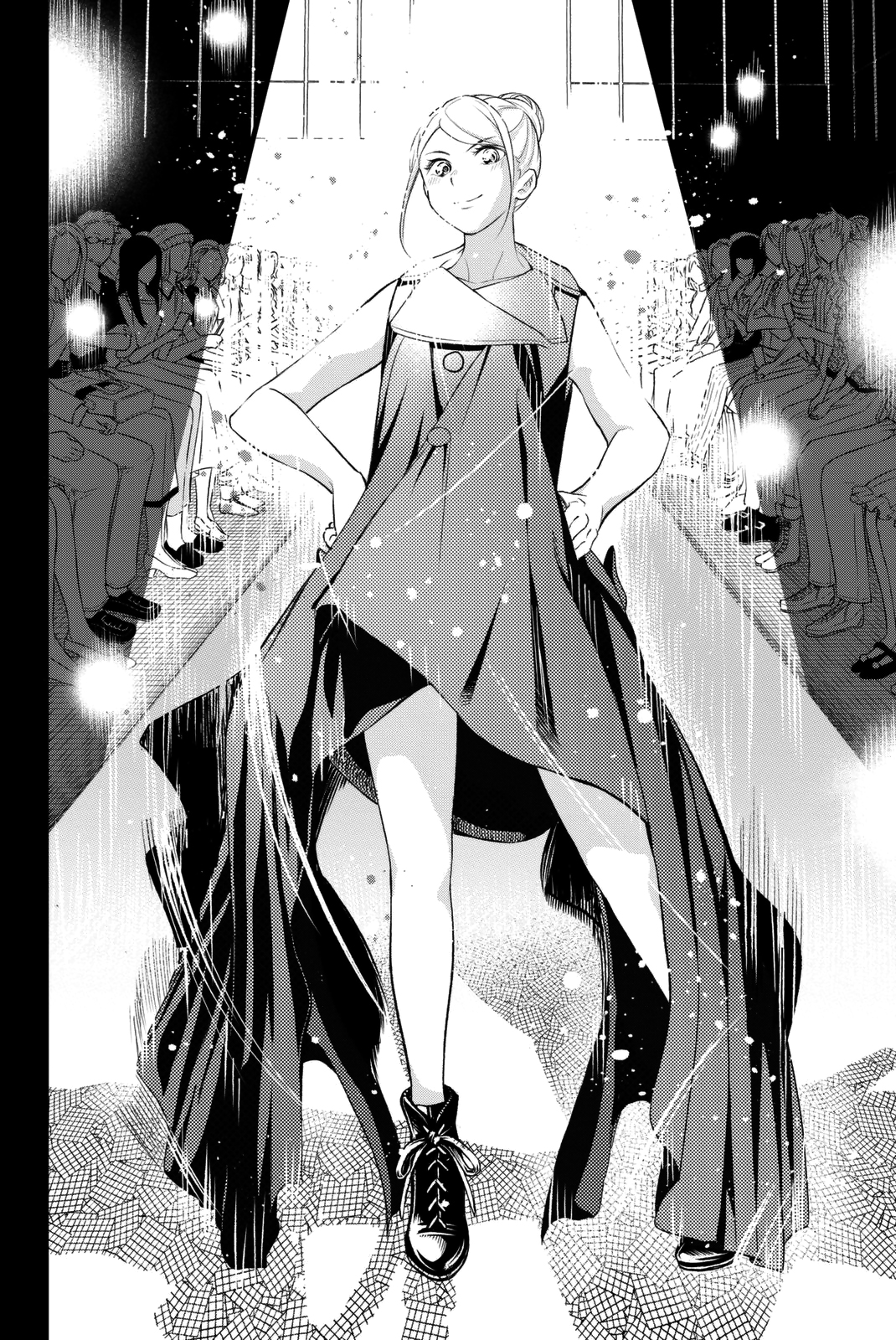
Samantha – Behavioural Art and the Cybernetic Vision
Everyone – Q&nA


(by En Cui, Joey, Samantha)
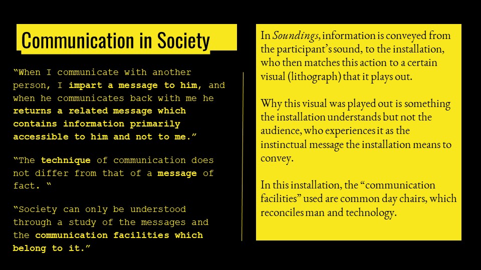
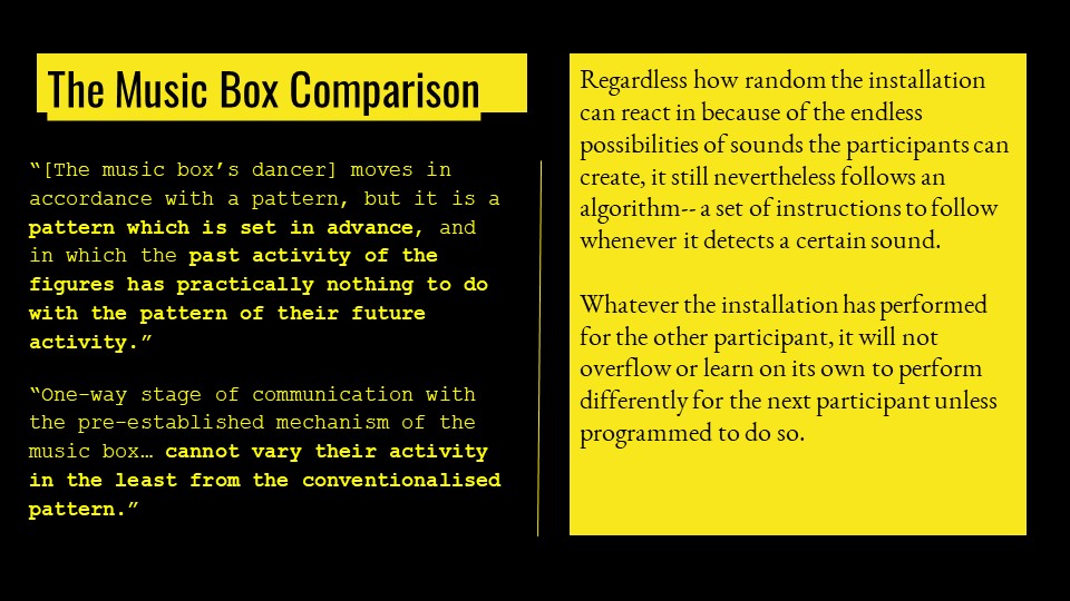
En Cui – Introduction, Conclusion
Joey – Cybernetics in History
Samantha – Behavioural Art and the Cybernetic Vision
Everyone – Q&nA
But, what if our clothes became more than a basic covering? Creates a dress code that acts as an extension of you and adapts to the environment on your behalf? That’s the question fashion designers are starting to toy with, be it in the pre-prototype, prototype, or ready for market phase. (Kimani, 2016)
As one of the most ambiguous and cross-disciplinary forms, fashion could be anything from a product, to a visual communication, to avant-garde, to a commodity, to a new form of self-expression. This uncertainty fascinates me immensely, and as such I will be choosing an artist who dabbles in interactive fashion: Lauren Bowker, founder of The Unseen.
(Images from here. Example of a way clothing might be traditionally interactive, through responding to your movements. Arguably, fashion is also interactive, as a whole, in that you get to choose, customise and coordinate whichever pieces you want to create different outfits, such that it involves both the “artist” and the active participant.)
Due to the convergence of disciplines, it is difficult to describe her, but here are the two main descriptors:
Combining her self-developed materials and her desire to accurately reflect the self would then lead to fashion pieces which provide visual feedback through said materials based on the collected data. For example, a jacket which turns from yellow to black through the use of a colour-change ink based on the pollution levels.
Examples of works:
Ponderings on Interactivity
Out of curiosity, I looked up existing essays from other classes, and was vaguely intrigued to see that many works somehow tended to… Look similar. It is not a phenomenon I can explain, but many of them have similar vibes, in terms of visual style.
(For example, the usage of colourful lights arranged in wide areas, or the emphasis on the organic form reflected in digitally-rendered interactive pieces.)
Which brings to mind a few questions:
1) Why are there so many similar traits among interactive art pieces?
The foremost answer is likely that we all happened to choose fairly similar pieces because our preconceived notions of interactive art tends to be of installments and sculptures. Also, that perhaps it’s harder to choose things which don’t have defined forms, like games.
Entropy, active participation, process than product. Though these factors create an infinite number of artworks, many similarities are retained.
In terms of input, humanity is ultimately fairly homogeneous. Physically, we all perceive the world in a fairly similar way. As such, interactive art can only use what humanity is capable of, such as visual or auditory sensors. Even if technology expands to be able to cover “thoughts”, it is difficult to cater to program a different reaction to every single input, where we need to place them within sets, like “anger” to comprise any emotion from rage to irritation.
In terms of means, interactive art pieces are often severely limited by available technology, where there are limits to what can be done in the field of interactive art. For example, it is only possible to generate a feedback loop based on physical factors, like motion or voice frequency. Even pieces which claim to “tune into psychological state” can only determine it by things like pulse rate. If we were able to, for example, devise a technology that can detect your political standing from your thoughts than through your words, there might be a larger scope for interactive art to work in.
In terms of output, it may be that interactive art is a fairly new concept. We have not yet explored the various ways in which it can be incorporated, where mediums such as LED lights are one of the most explored ways. The rise of new media also means the expanding of possible platforms, from a physical form, to a digital form, such that things like the internet can be used for art.
2) What is the difference between interactive art in new media and interactive everything else?
If we compare new media versus old media, the difference is evident (two-way versus one-way and thus lack of an immediate feedback loop).
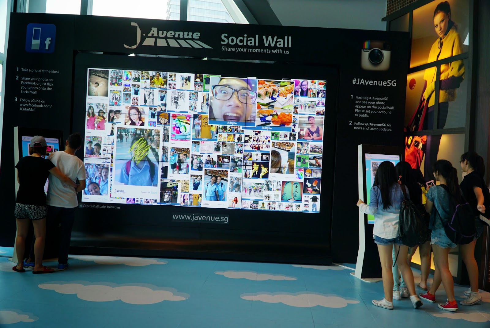
If we compare to things which can be interacted with, the difference is also evident. Just being able to perceive something (through sight, touch, etc) does not make it interactive art, which needs to involve an element of a fluid form shaped by your input. Think a wall at JCube, versus the photo wall at JCube.
The rest is unclear. Where is the line between “art” and “non-art” drawn? If we justify interactive art as having to involve the element of dynamically changing in response to feedback from the participant(s), would something like a lie detector be considered interactive art?
The only criteria I can come up with is “functionality” versus lack thereof, but it would be full of loopholes.
3) Where will interactive art go in the future and/or how do we integrate interactive art into society
Interactive art is, in a way, already integrated into society. Things like the elevator coming to you when you press a button, where the pressing indicates that you want an elevator (input leads to output) (albeit not very dynamic outputs).
The problem lies in that society is built to be homogeneous. The elevator may not come to you immediately, because it needs to cater to other people first. Or, the button might be too high to reach, or the elevator too small for you to enter. Currently, interactive art is also limited by said homogeneity, where technology has not reached a stage where we can create 100% individualised outputs for every single input.
I suppose the path forward for interactive art would thus involve 1) more time to delve into the subject, to explore more ways in which we can engage interactivity, and 2) further developments in technology as to be able to create even less homogeneity.
If both of these were to come, it would mean that we would be able to revolutionise society, from something which marginalises minorities, into something which can cater to everyone. It would not solve the issue that we still have to share physical resources though (you can’t just build an elevator per person), so interactive art may also be helpful in, at least, making better compromises such that everyone can be somewhat satisfied.
In Chinese, these two characters mean “origin” and “travel”. In Japanese, it can be read as “genkou”, not unlike the Japanese term for manuscript paper.
Though intentionally left vague, it is meant to embody a sense of undertaking a journey towards the beginning. The violin of the leifmotif, Journey, pushing the song ever forward; the full stop soaring towards the direction from which one begins writing. Surely, the circle of a true ending would break out of the grid, break free of order and structure.
The original idea was as follows:

This was a fairly doable project, where it required quite standard systems: generation, movement, collision, reset and end processes. There were also fairly few necessary elements: the player, the damages and the stage.

What I did not realise was that I have 1) no prior experience with programming, 2) an affinity for making extremely solid base systems, and 3) an affinity for catering to game quality of life systems. As a result,


If we assume quality playability, key issues which would have to be resolved are as follows:
Introduce initial damage, such that at the first moment of impact a certain percentage of damage is dealt, THEN for every subsequent moment spent in the zone, health values are drained
Fixing variables with millis() dependency which are currently using precisely calculated values than variables
Possible expansions would include the following:
Certainly, though, I’ve learnt that I do have glaringly obvious strengths and weaknesses. That I have good awareness of where and why problems could possibly occur (though whether or not I can deduce the solution is another matter), that I have sufficient sensibilities to include easily-overlooked elements which greatly improve gameplay experience, but that I lack awareness of how to create engaging and effective gameplay. That I am good at recognising what is “additional” and knowing what kind of temporary concessions to put to make it seem complete even when incomplete, but that I am lacking in allowing it to remain incomplete, such that it’s difficult to do anything too extensive.
There’s also the fact that programming goes far beyond just games played with computer inputs, which I felt I didn’t consciously realise, like Brendan’s webcam filter program, or Joey’s music visualiser. I’m not sure if I will venture into such areas, since I feel like I haven’t adequately explored game programming (e.g. meta game, animation for visuals, interaction with various kinds of unique objects). It was a good realisation, nevertheless.
From the chairs of our classrooms to the buses on the roads, there are many designs which have become “normal” to us through exposure. We do not question the design, nor where it originated. We instinctively reach for the folding desk arm on the right, and find it disquieting to feel nothing there. It is simply what it is.
“These are objects that make you smile, that demonstrate a high degree of functionality,” Franco Clivio, an artist enthralled by everyday objects, once claimed.
Objects from the Super Normal movement are no different. As observed by Silvana Annicchiarico, designs belonging in this movement are “defined by something that is not present. Or something it doesn’t have”. Where normality is recognised as a hallmark of superior design, the designer’s personal style must be eradicated, so as to prevent expression from overwhelming function. Instead, the design is to be defined by the culmination of human experiences, such that its usage becomes a naturally-developed process that is instinctive and unconscious.
A modern movement predicated on the philosophy of phenomology, Super Normal was only formally conceptualised in 2006 by Naoto Fukasawa and Jasper Morrison. Fukasawa aptly summarises the objective as “the continuation of a good relationship that has been around for a long time… than anticipating something new”. Where design often goes through a cycle of expansion and compression, Super Normal tends towards compression, in removing what is unnecessary to leave only what has been established by phenomena. Some may consider this a traditionalist approach which rejects innovation, though it may also be lauded for tackling modern problems of excess and chaos caused by a surplus of individualistic designs.
Regardless, this movement consequently encourages designers to be “less concerned with the visual aspects of an object’s character, and… anticipate the object’s likely impact on the atmosphere and how it will be to live with” (Morrison, 2006). As suggested by his words, the physical form should not be the priority, where it is but a consequent of how it should be engaged. This is in direct contrast to many design movements which boast unique visual styles, such as Memphis, which prides itself on its colourfulness and geometry. This does not, however, cause Super Normal to fall into a category of “soulless design”, as feared by Memphis advocates. The experiences of many provides the Super Normal design with a longstanding relationship, such that it has a soul derived from intimacy and recognition, to the extent that it has “become invisible” (Fukasawa, 2006). As such, it can be argued that Super Normal has a superior soul in having been formed by group phenomena, as opposed to the individual designer.
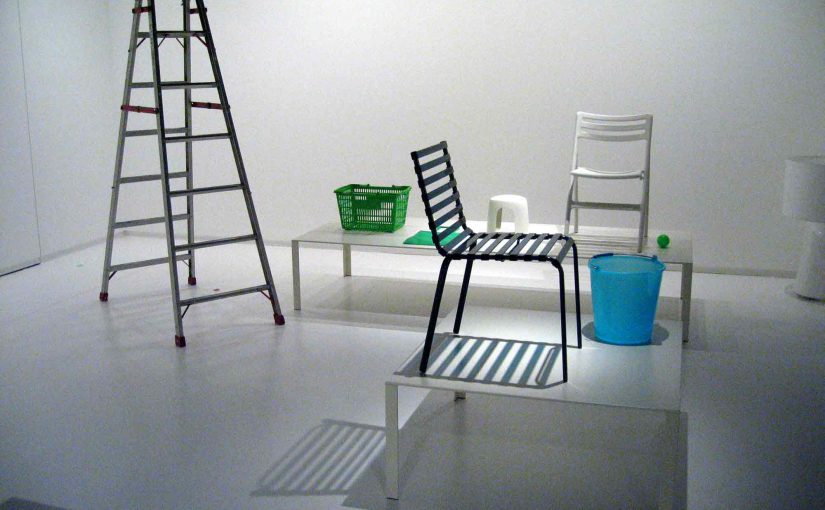
|
|
|
Despite its dependence on phenomena, one can still consider Super Normal as a “form follows function” design approach. This is because functionality is, in fact, derived from human experience. The pencil is shaped as it is because human experience has determined that such a form gives rise to the best way to hold a pencil. There is nothing which prevents said human experience from evolving, and giving rise to a new form with a better way of engaging the pencil. While Super Normal does not concern itself with shaping such new relationships, the movement emphasises effective existing relationships. If a new relationship becomes the norm, Super Normal would likely not reject it, and instead seek to preserve it.

It must be noted that, as a result of said functionality being dependent on human experience, Super Normal designs are fundamentally context sensitive. Many examples listed in this essay are not universal, and are ordinary only in certain contexts. For example, candles are unusual in Singapore, but not so in the Netherlands. Super Normal designs thus have a predetermined universe of discourse in which said designs are effective, and are otherwise ineffective.
With all this in mind, it would not be a stretch to claim that this movement existed in some form long before its formal inception.
Informal examples might include products which we often see in our everyday life, which have become so ordinary that we rarely question them, such as paperclips, egg cartons or sponges. Though subtle variations exist, from elephant-shaped paperclips to the inclusion of a hard layer on the sponge, it is often easy to use them effectively. This is simply because the form is often so universal that we will always intuitively know how to operate it. Certainly, too, these examples predate the formal naming of the movement.
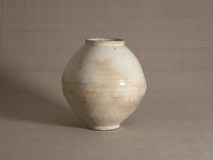
|
|
|
Elements of Super Normal are also vaguely suggested by other formal movements. Mingei (民芸), which means “arts of the people”, venerates everyday objects created by anonymous craftsmen for the purpose of functionality than beauty. Minimalism encourages the philosophy of “less is more”, through the reduction of objects to only the necessary elements. The difference, however, lies in what is ultimately considered superior design: Mingei considers superior design one which is touched by the craftsmen’s rustic simplicity; minimalism, one which is strictly functional and without embellishments. Super Normal endorses neither, where superior design is derived from the normalcy attained from human experience alone: rustic charm and functionality are only accepted if it is part of the universal norm.
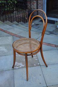
An even earlier influence might include the Industrial Revolution. Due to rising consumer demand and a change in manufacturing processes (from artisan-based to machinery-based), there was a rise in mass produced objects with uniform designs. These designs would have been created in a way that it could easily appeal to anyone, and efficiently enough to reach anyone as well. An example would be Thonet’s No. 14 chair, which is now so automatically associated with cafes that, even without a name or designer, it is intuitively known and universally accepted as the bistro chair. Though it is debatable if designers then actively saw normality as superior design (thus distinguishing it from Super Normal), they certainly championed normality as efficient and functional.
An apt summary might be as follows, that
Especially in the clutter of modernity, normalcy is essential to retaining our sanity. That we are all constantly engaging various different objects without suffering sensory overload suggests that Super Normal is unconsciously and inseparably integrated into our everyday lives. Perhaps it would be worthwhile, then, to appreciate these things, which discreetly support us daily without expecting any form of recognition.
(Word Count: 1159 words)
References
Image Sources