Principles of New Media

One of the most undeniable statements is that of these principles being “general tendencies” than “absolute laws”. Where our project has limited functionality (and/or may not require it), these principles do not always manifest entirely.

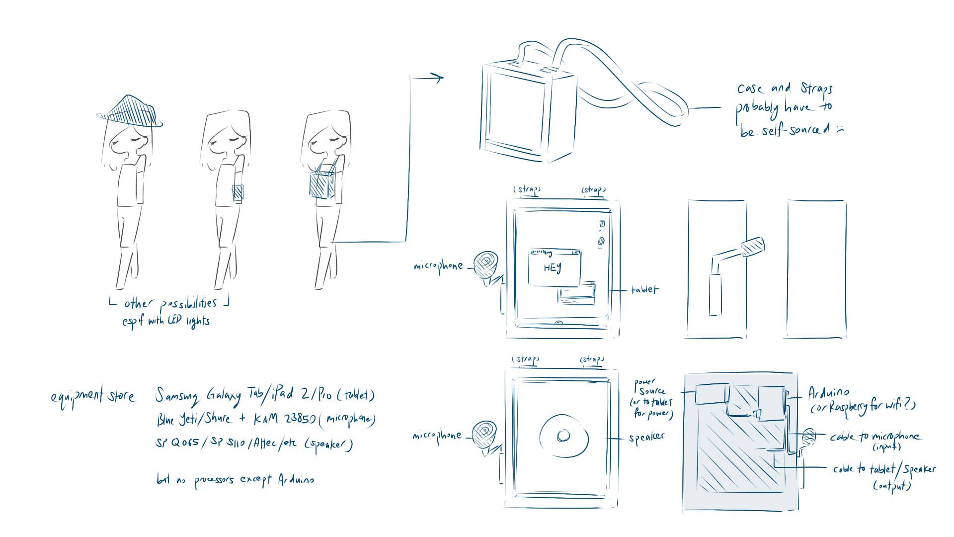
The use of a computerised system in itself mandates the numerical representation. This is seen most clearly in how serial printing is possible (and crucial!) to the project. Where the project relies on sound, the numerical values of amplitude (volume) and frequency (pitch) are necessary. Furthermore, the output of LED relies on a code which identifies colour thorugh numberical values, e.g. rgb(255, 255, 255).

As shown in the video, almost all of the inputs and outputs must be reduced to numbers, to allow for analysis and conversion.

This is also relevant to the book’s claim that factory-based standardisation is a reason for, and consequence of, the tendency towards discrete representation. Evidently, the same kind of sound inputs will lead to the same kind of light outputs. I think it raises an intriguing question, on if it is truly right that our project reduces the subjective human experience to something so objective.

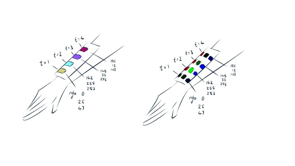
The book also addresses various ways in which modularity manifests, such as in the use of artificial intelligence and media access & organisation. Our system does indeed have a foundation based on modularity, in having separable output components like brightness, red, blue, green, time. However, this reading has made me wonder if this flexibility is something we ought to highlight. Currently, brightness and RGB values are all combined into a single LED pixel: Would it be better to separate said values into multiple pixels, such that colour shifts can be seen both individually and collectively? Or would it be better to keep them all in the same pixel, and only have the collective colour seen both as individual slices of time, or a collective temporal space?

Example. The left separates only by time, putting RGB all together. The right separates time and RGB, which may be more suited if red, blue and green were each correlated with different variables, like red = frequency, blue = musical pitch.

Automation is another segment which our project engages by default. The only necessitated action is that of providing input (creating noise, moving around to find noises): the algorithm does everything else, from receiving the input, converting it to numbers, associating it with other numbers, registering the time of capture, creating outputs. Unlike the previous principle, though, I see no means through which increased automation can improve our project.

Where our output resembles that of Pulse Index (2010), little seems necessary beyond the direct display of what was inputted (i.e. translation than extension) to transmit the message.

It is less clear if the principle of variability is sufficiently engaged. Our project obviously displays this, where the brightness and hues can vary based on the amplitude and frequency. This extent of display, however, still seems rather limited to me. After all, those alone are insufficient inputs and outputs to adequately represent the variances of a soundscape. The inclusion of timbre or directionally-based inputs and outputs might provide even more relevant variances to bring out the message clearer.

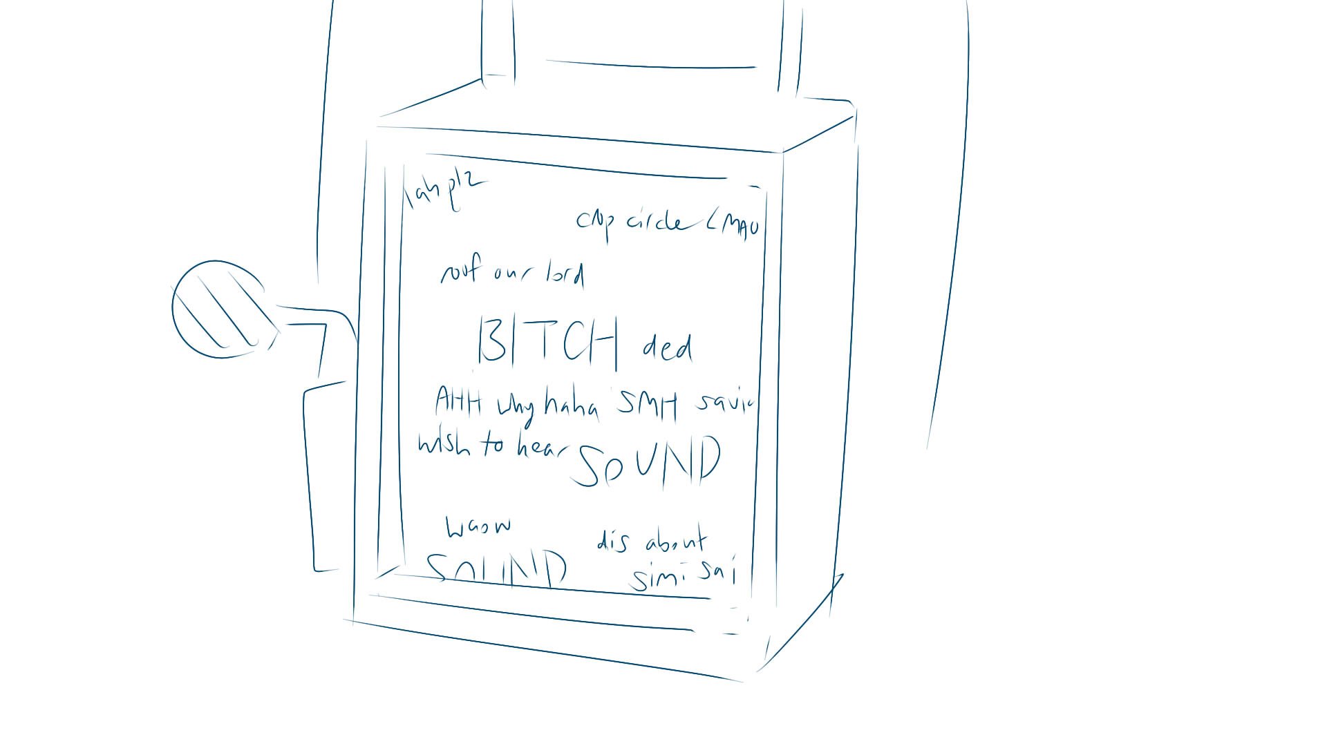
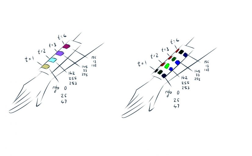
An example of variance of light as based on variance of sound.

Another interesting comment regards the customisation to user. While our project does regard the active user, a large portion regards the passive “users” (environment), such that variance is not tied only to the main participant. I wonder if this would be considered a negative point for variability in our case?

The last principle of transcoding is very debatable, in my opinion. Claiming that there are two layers, Manovich suggests that the computer layer and cultural layer influences each other in terms of systems of organisation. For example, our association of red with strength might lead us to code lower pitch = more strength = more red. The cultural layer is clear.

A conversion table for numbers to binary. The cultural layer is very clear: you can see how our human ideas of even / odd / multiples of 2 influence the foundations of the computer layer.

On a personal level, however, I’m confused about the computer layer. After all, humans made computers. If we built computers in a way comprehensible to us, wouldn’t the computer layer be but a somewhat specialised part of the cultural layer? The only defense I can really suggest for the computer layer is that it encourages a culture of efficiency, where the computer has much better syntax and organisation than us.

External Sources

[Midterm] im sorry we havent thought of a name

Where we are designed to see things from our own perspective, it may be difficult to perceive ourselves as nodes in an entire system. Our project aims to evoke an awareness of the interstice between the individual and collective perspective, particularly in terms of sound.

This wearable will thus allow the user to visualise the transforming soundscape around them (and by extension, their impact on said soundscape). This is done through the use of LEDs which change hue and brightness depending on the surrounding soundscape of both past and present, as picked up by a microphone.In doing so, the user will become aware of the gap between your sound as your own, versus as a part of an environment.

Incidentally, the form of the wearable is also meant to promote portability, such that users can freely roam to acquire different inputs.

More in-depth details can be found in our previous posts:

Here is a condensed summary:

The W5 prototype featured the actual shape of the project (as worn on the arm), while the W7 prototype featured the actual code of the project, as shown in the following videos:

Since then, we’ve made an array to store previous inputs, as per user feedback during the midterm presentation:

What are the changes you have made to your project since your initial sketches?

EC: I think the changes ultimately consists of message, and, by extension, form. (I work on a form follows function basis.)

Message, in that it was originally tackling the interstice between the viewer’s individual conversation and their collective environment’s conversations. The term “conversation” in itself forces two necessary conditions in the project’s manifestation: multiple participants and speech. The form would then have to represent these two aspects such that the participant can perceive the gap.

The reason for change mostly boil down to lack of engagement. There was an assumption that the viewer’s individual conversation is something they experience directly, where we only need to show the collective environment’s conversations. Consequently, the form was poorly suited to interactivity, where it only requires a passive collective. The individual may be part of the collective, but this nevertheless undermines the level of engagement you might feel, in lacking active participation.

Thus, the message changed, as mentioned above, to fit a form better suited for direct participation.

Liz: The shape that our project manifested itself have evolved many times, first being a sort of board for text to appear on, to a hat, to a glove, the main idea of it was still portability to sample as much inputs. Subsequently, the output for our project was also supposed to be sound to text, then sound to colour and a reaction round. However, we reduced it to become sound to colour, and finally evolved to ‘record’ the colour of various seconds/minutes in time to show the idea of interstices.

What are some users feedback you have incorporated into the reiteration of your project from the body-storming and mid-term user testing session?

EC: Previous changes made based on the body-storming session can be found here. (In essence, changing the form to be more effective, more welcoming, and more encouraging of shared than individual experiences.)

The most worrying and consistent feedback is on the clarity of the message. Everyone thus tried to solve this problem through suggesting various possible alternate messages and forms, like the individual versus their peers, or an interactive space, or roles in conversations. While they were all interesting, we decided to go with the aforementioned in that it best suits what we currently have, and our desire for a portable wearable which encourages moving around to gather environmental input.

Like users have mentioned, it would probably be more effective if there were more sensors and actuators, such that the effect can be more clearly visualised. We will definitely be working on that. (I also think that problem arises partially from that tests have been conducted in relatively controlled environments, such that the “collective” isn’t as evident. That may be a consideration for future tests.)

Another interesting idea which we plan to incorporate is a timeline of changes, which will again contribute to a clearer visualisation of the individual effect on the collective. It’s hard to visualise without some point of temporal comparison.

Liz: The meaning behind it is still very hard to grasp, since we did not record the gaps between sound in a very explicit manner, hence did not show the ‘gaps’ between one person’s sound from others/the background. But other than that I think the idea of using the work is quite straight forward.

Where do you think your interactive project will fall on the continuum of interactivity? Why do you think this is the most appropriate mode of interaction for your participants or audience?

EC: Maybe 75%? There are two main ways of interaction, emitting sound and moving about. Sound directly allows for individual input, while movement allows for the input of different environmental inputs. The third way is time, where a timeline of changes would create a more diverse output set. This, combined with that the code is such that it is difficult to replicate the exact same output, makes the piece pretty interactive. It loses marks in that it excludes sound quality and has limited outputs (i.e. only LED), such that the possible outputs are somewhat limited.

Liz: On a scale of one to ten, I believe a 7, because the project depends on person’s audio input to cause a change to the LEDs. The idea we are going for is to show the gaps between sound in the environment and the person themselves. So in order to do that one must interact to change it. The most appropriate mode of interaction in our case would be the use of sound for the audience.

Apart from responding to the user, does your interactive piece include elements where the content changes over the amount of time your user has been engaged?

EC: After the midterm presentation, yep! We decided that it’s necessary to provide points of comparison across time such that participants can properly visualise the impact of their sound. So, maybe something like, LED 1 = 3s ago, LED 2 = 2s ago, LED 3 = 1s ago, etc. It’s more a constant correlation than an increasing or decreasing functionality as time passes, though.

Liz: Yes it does, the idea is to have a record of the previous inputs for the audience to see the change of the ‘environment’ sound before and after you have interacted with it. So there might be gaps where no one ‘actively’ interacts with the work, but there will still be an output in the form of environmental noise.

Based the diagram above, which characteristics does your interactive project fall under? Explain why these characteristics can be used to describe your project.

EC: For classification, I think it falls under everything, but ultimately under that the user is responsible for all events? It’s up to the user as to what they want to be. For example, they could go to a quiet area and become the singularly valued collective voice. Or they could go to a noisy area and shut up, becoming unnecessary. Or, go to a noisy area and speak, becoming one of many. (Limited role is mostly entrenched in the fact that the possible inputs and outputs have already been predetermined.)

For characteristics, I would say it’s… an intuitive selection? It’s natural to make sound, and natural to notice there’s some kind of change. But also some element of the experience being monitored and used virtually and parallel world, since there’s a simultaneous experience between the LED display and the real world?

I’d say the structure is open, since the user is free to run around and get different arrays of inputs, although there’s some element of feedback about location (similar soundscapes will give you similar results).

Liz: forgot this question existed and will do it later

The Galaxy Reconfigured, otherwise known as I May Have Gone Over the Word Limit

Born in 1911, Marshall McLuhan was well-placed to comment on technological developments in a post-industrial, pre-digital revolution era.

A Summary of the Galaxy Reconfigured

The eponymous galaxy of The Galaxy Reconfigured refers to McLuhan’s Gutenberg Galaxy concept: a world in which new technologies reinvent the ways we think and perceive, through affecting our sense ratios. By sensing objective matters with our 5 senses, we form subjective thoughts and perceptions (as such, emotional interaction is seen as a byproduct of tangible interaction).

McLuhan elaborates further on the unveiling developments of mass media as the herald of an electronic age. Where society was previously constrained by single vision and Newton’s sleep, recent developments have triggered an awareness of simultaneity in perspective. In essence, there is a newfound appreciation for the collective consciousness as a subject and audience, than the individual point of view. This directly affects the arts through redirecting emphasis towards the impersonal audience experience than the personal artist opinion.

My Opinions

This reading resonates very much with me, since I’m studying philosophy and researching mythology. Thus I will respond as a student of both, and as a human.

Where my research is an experiment in crafting a false myth, I find his reference to the myth accurate: there is a tension between individuality and collectivism. It is extremely difficult, as an individual with unhinged desires and feelings, to successfully imagine myself as the consciousness of humanity. Creators today certainly still struggle to balance these: we cannot help but rely on our own experience, and we need to pander to audiences to avoid starving on a street.

A summary of my research project involving mythology. One of the hardest decisions was the inclusion of my bias towards feminism, transience and multiculturalism, which I still fear compromised how well it represents the society.
An example of a video game which poorly navigated the divide between individuality and the collective. While there was an attempt to appeal to a mass audience familiar with feelings of isolation and lack of direction, the excessive presence of the creators’ own opinions and interests distanced players from much of the narrative.

As a philosophy student, though, I find that McLuhan seems to give insufficient attention to the individual. Though he remains (admirably) fairly impartial, I feel that his comments are skewed towards holism. That is fundamentally at odds with how we perceive the world, where we consider ourselves individual agents than nodes in a system. This individuality is often demonstrated even today, such that I find it difficult to believe that we can ever fully embrace our existence as insignificant parts.

Was everyone else really as alive as she was? ..If the answer was yes, then the world, the social world, was unbearably complicated, with two billion voices, and everyone’s thoughts striving in equal importance and everyone’s claim on life as intense, and everyone thinking they were unique, when no one was. One could drown in irrelevance. But if the answer was no, then Briony was surrounded by machines, intelligent and pleasant enough on the outside, but lacking the bright and private inside feeling she had. This was sinister and lonely, as well as unlikely. For, though it offended her sense of order, she knew it was overwhelmingly probably that everyone else had thoughts like hers. (From Atonement, by Ian McEwan)

Objects from an exhibition on the Super Normal movement. This is an design movement which encourages the eradication of personality, to create intuitive products as defined by the culmination of human experience. However, are these truly lacking in personality? All these items must have been invented by certain personalities, who certainly had their own preconceptions. The perception that these are “nameless” objects comes only with our consumption.

Lastly, as a human of the modern era, I wonder how his comments will fare from now on. I personally feel that his claim about how technology affects perception is an unquestionable truth. If so, where is this current world heading? Might we see the resurgence of the individual as a backlash to the collective? Will the rise of technologies like VR/AR push us towards aural/tactile predominance? Are we stagnating in assuming that the visual should be our main form of information dissemination?

An example of an interactive design using sound to encourage people to throw trash. Personally, interactive art is a brilliant representation of that exploration of sense ratios and audience experience, where many artworks today experiment with various sense detectors and a reliance on the participant.

A final pertinent claim McLuhan made is the acute weakness of lacking experience. “A few decades hence it will be easy to describe the revolution in human perception that resulted from beholding the new mosaic mesh of the TV image,” he states. “Today, it is futile to discuss it all.” I think that we, too, can only wait and see how humanity transforms.

References

  • McLuhan, M. (1969). The Galaxy Reconfigured or the Plight of Mass Man in an Individualist Society. In The New Media Reader. (link).
  • Featured image (link)
  • Marshall McLuhan hyperlink (link)
  • Newtons Sleep hyperlink (link)
  • YIIK image (link)
  • Holism hyperlink (link)
  • Digital Narcissism hyperlink (link)
  • Atonement quote (link)
  • Super Normal image (link)
  • Critical Regionalism hyperlink (link)
  • Volkswagen Bin video (link)

Nature’s Breath: Arokhayasala, and its Relation to Interactivity

What a familiar smell, I think, as I drift towards its source. Pillars which arch inwards, unite over an unfilled space. Something about that emptiness beckons me to come hither.

Titled Nature’s Breath: Arokhayasala, this piece is heavily associated with ideas like death and illness. A Thai artist, Boonma himself stated that the purpose of this piece was “to cleanse and cure the mind in order to experience the condition of relaxation and mindfulness“. There is an evident relation to his affinity with spiritual healing and religion as a means of coping with his wife’s terminal illness.

Image from Wall Street Journal. Nature’s Breath: Arokhayasala, by Montien Boonma. 1995. Metal, herbs. 256 × 215 cm.

What I find most impressive is the use of scent as a form of interaction. There’s something intriguing (and also philosophical!) about the idea of interactivity which relies on a connection between extant knowledge and sensory cues. Through the act of breathing, one becomes conscious of a herbal aroma which evokes ideas of traditional healing, even before the artwork is seen.

Image from myself. Note the form, which curves inwards and appears dusted in earthly colours, evoking a sense of the natural. Additionally, the lungs in the center, a clear indicator of his interest in breath.

An interaction through visual cues is also evident, as with the lungs and the symmetrical dome, which resembles places of meditation. I am hesitant to suggest it resembles a stupa, simply because those are places not made to be entered, unlike this piece.

Regardless, I can see ways in which this piece might fail to engage its audience.

  1. Without context, an audience unfamiliar with Buddhism (or, at least, a basic understanding of Southeast Asia) might not find the form familiar, nor the scent appealing.
  2. The ordained inability to touch, to enter, creates a distance between the perceiving and the perceived, which is at odds with the sensory cues (which suggest intimacy).

In essence, awareness of your target audience is crucial to interactivity, as are rules which work in tandem with intuitive/inherent knowledge.

References

  • Buddhist Temples and Buildings. On Facts and Details. (link).
  • (Excerpt) In Search of Lost Time. (link).
  • Montien Boonma: Temple of the Mind. On National Gallery of Australia. (link).
  • Nature’s Breath: Arokhayasala. On Asia Society. (link).
  • Weight of History: The Collector’s Show. On ArtAsiaPacific. (link).