

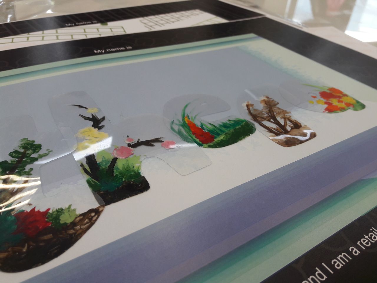
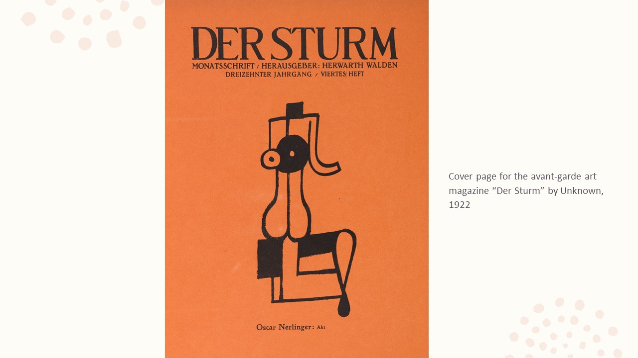
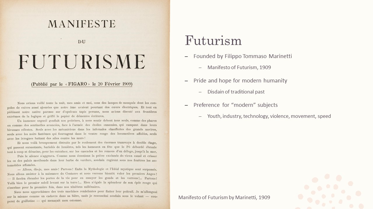
Note that all letters were pasted on in the printed version, but digital renditions have been uploaded for web viewing. Photos of the printed version can be found alongside the Final Explanation.
Research, Process and Final Explanation:
Note that all letters were pasted on in the printed version, but digital renditions have been uploaded for web viewing. Photos of the printed version can be found alongside the Final Explanation.
Research, Process and Final Explanation:
Preceded by | Succeeded by (FINAL)
I realised I didn’t particularly mention the typeface and colour choices during the presentation, and thus have indicated them clearly in here.
Overarching ideas/common themes:


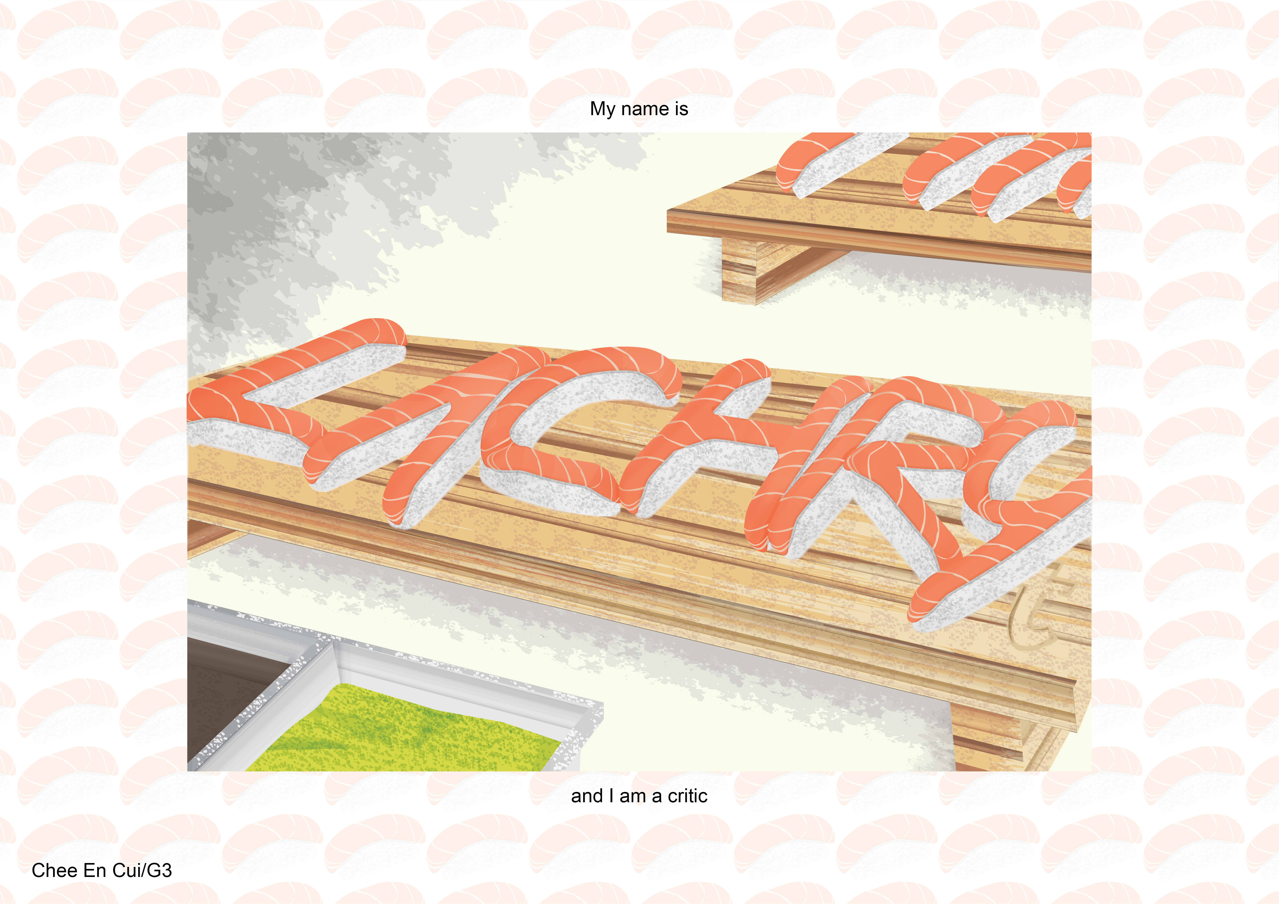
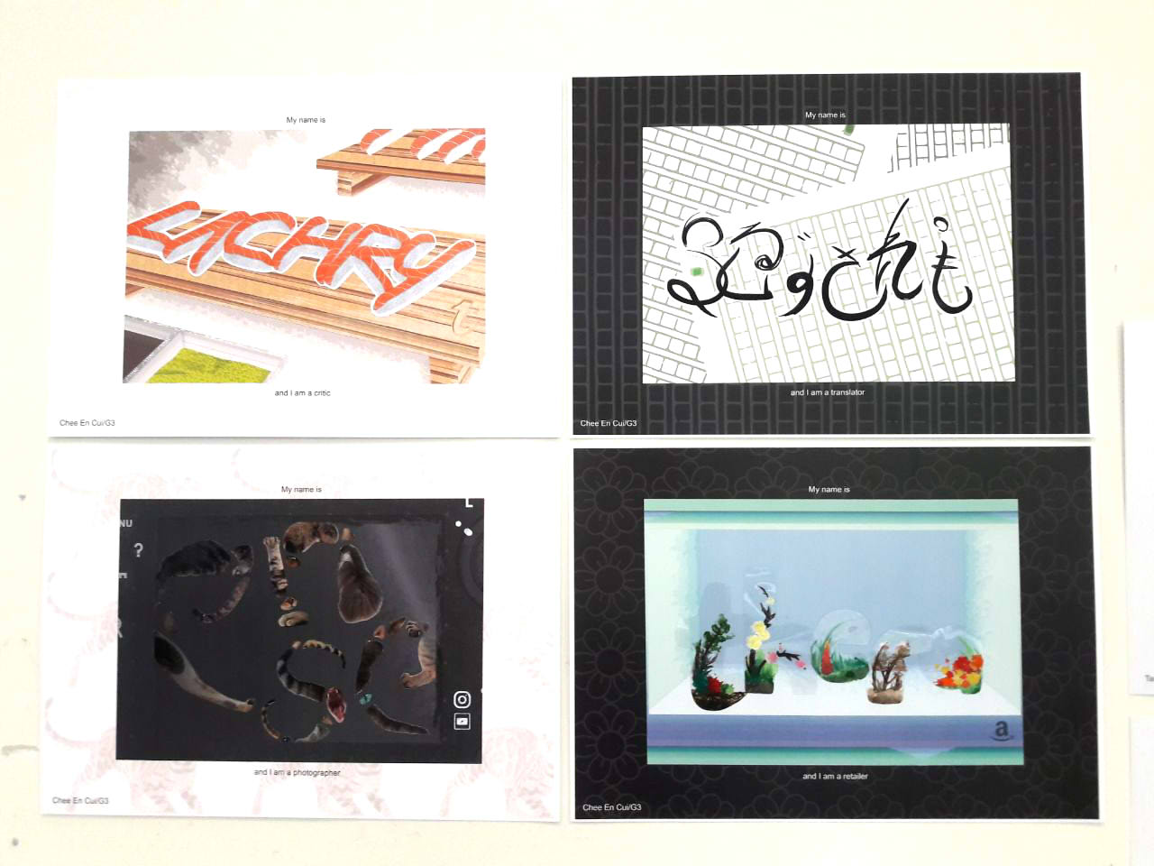
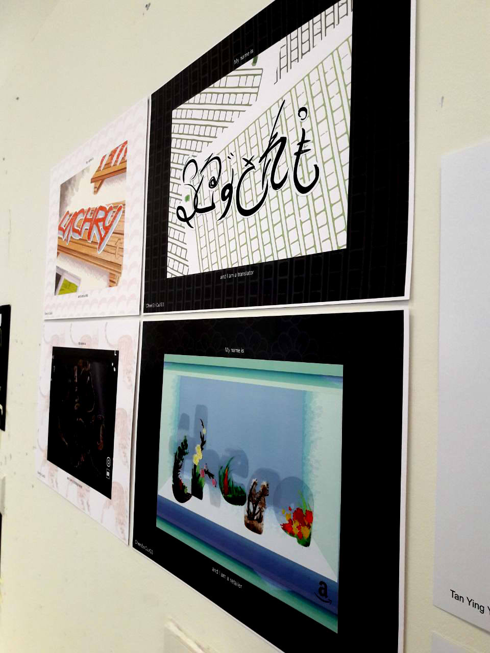
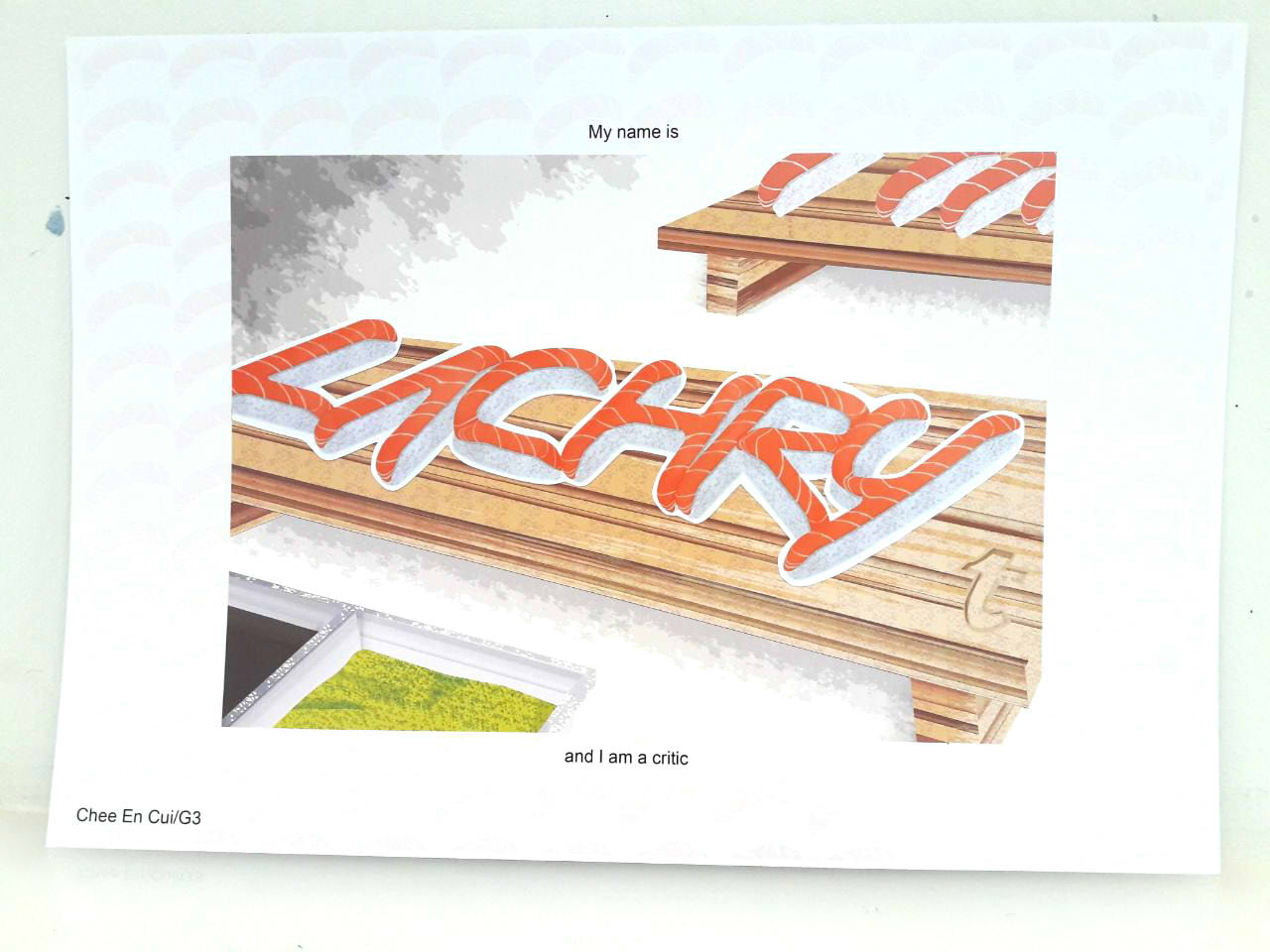
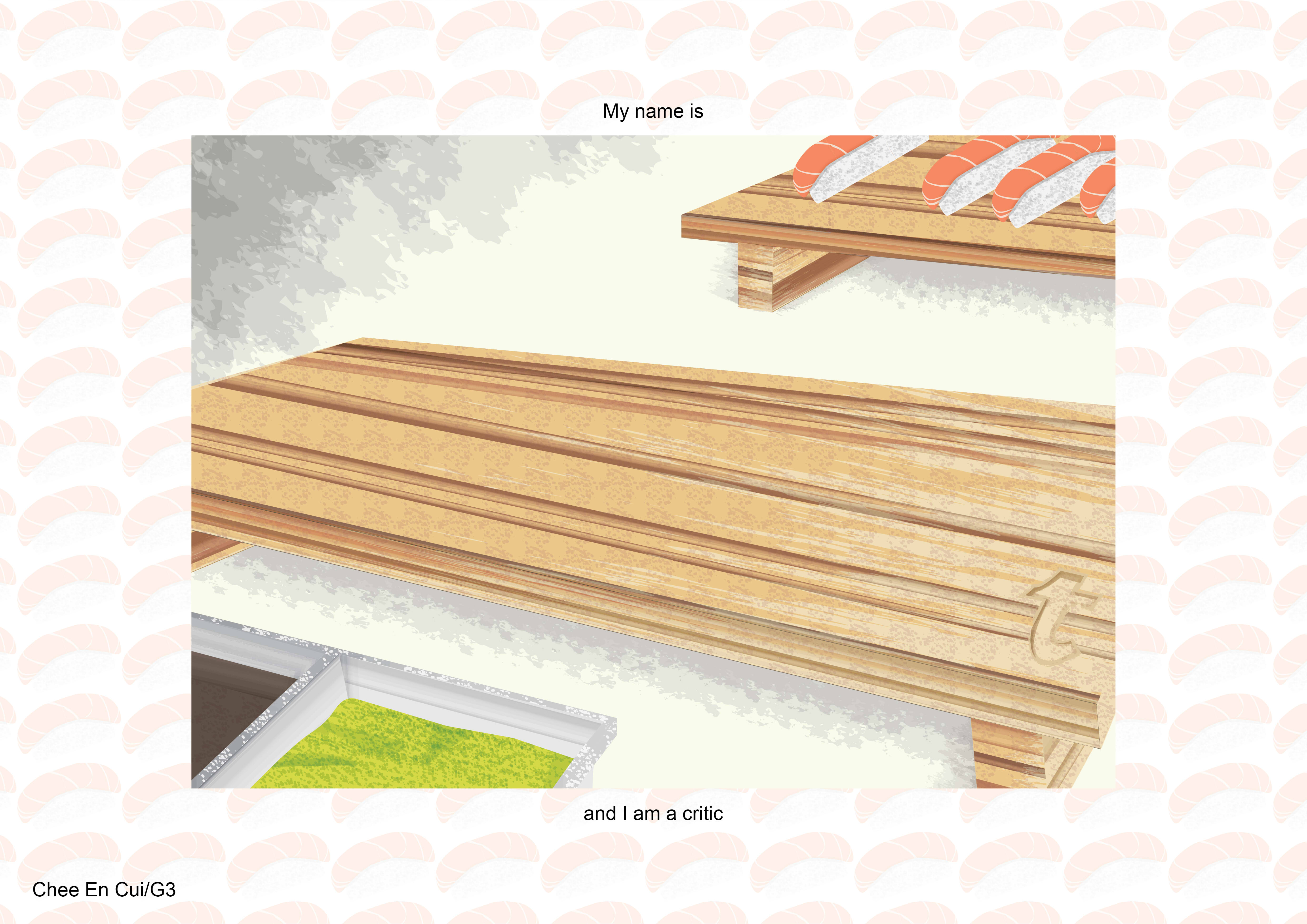
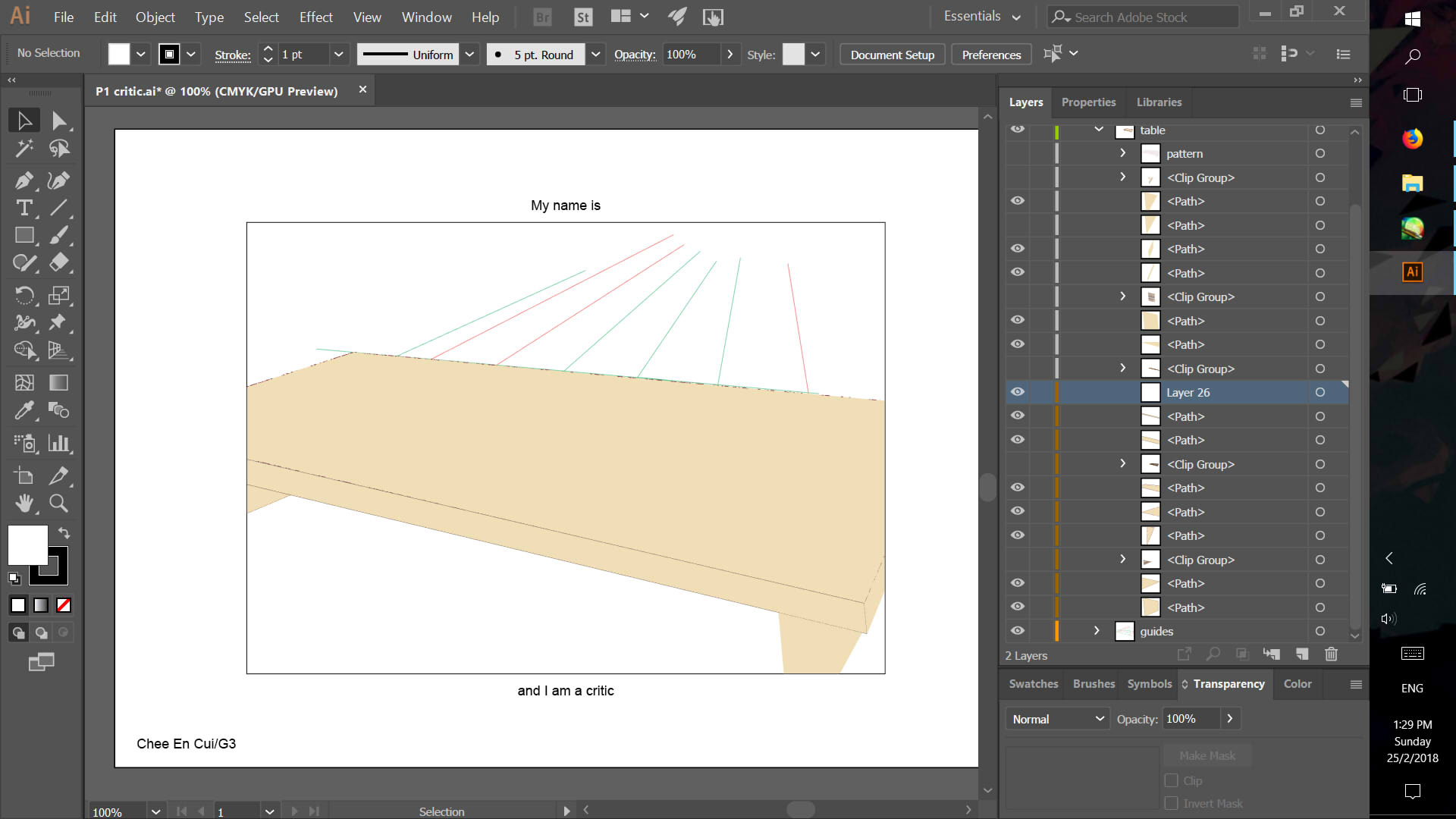
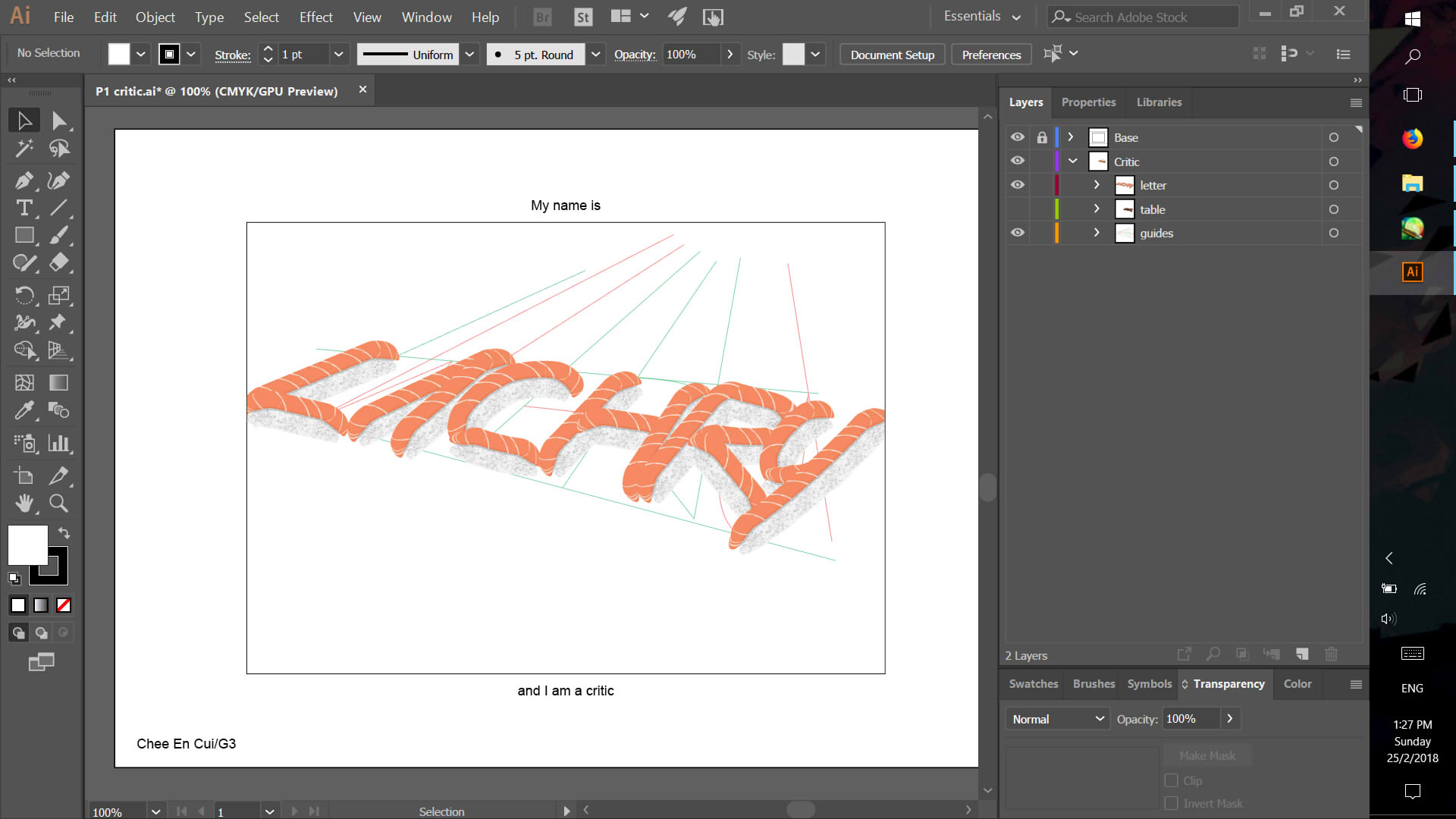
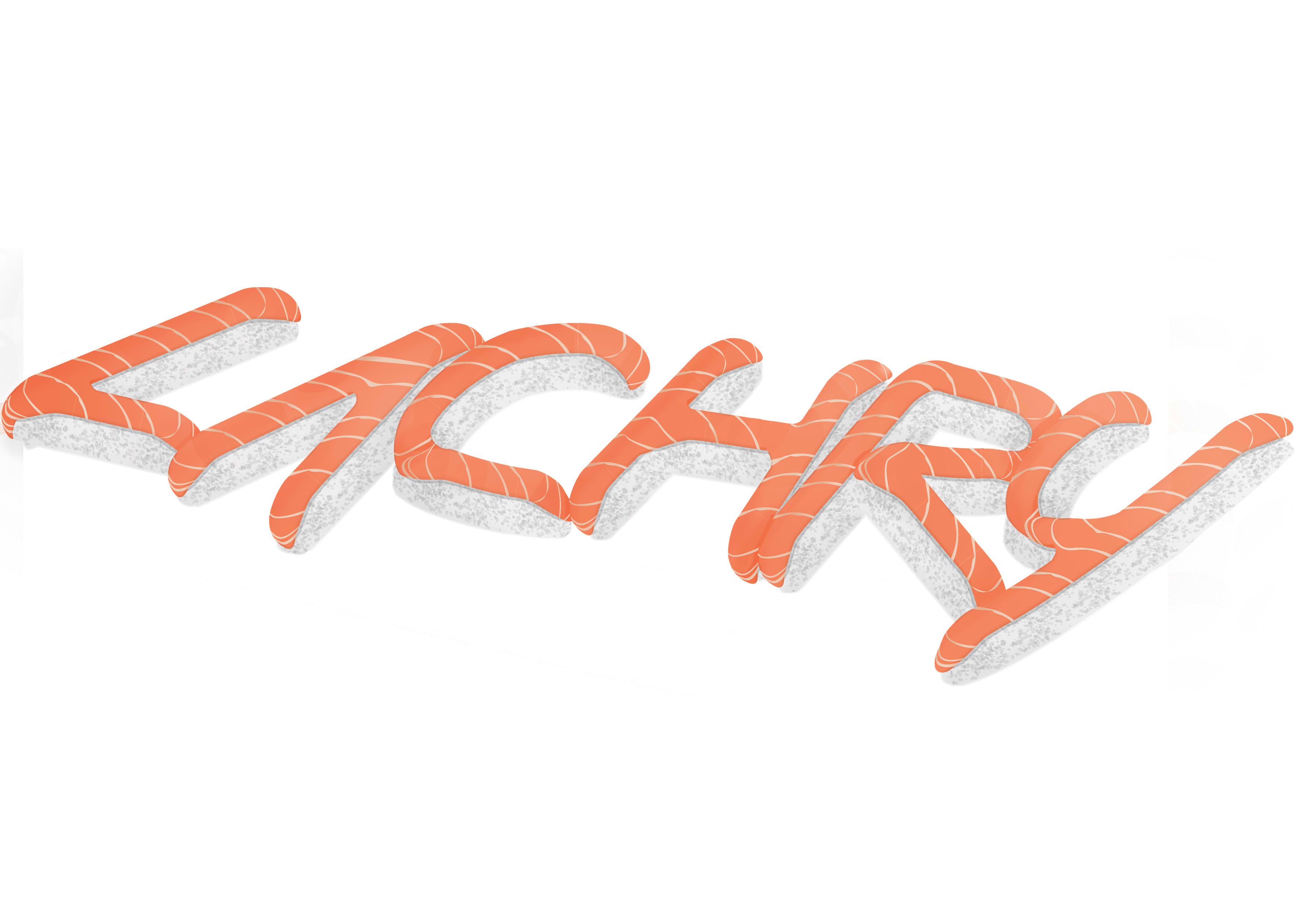
CRITIC

PHOTOGRAPHER


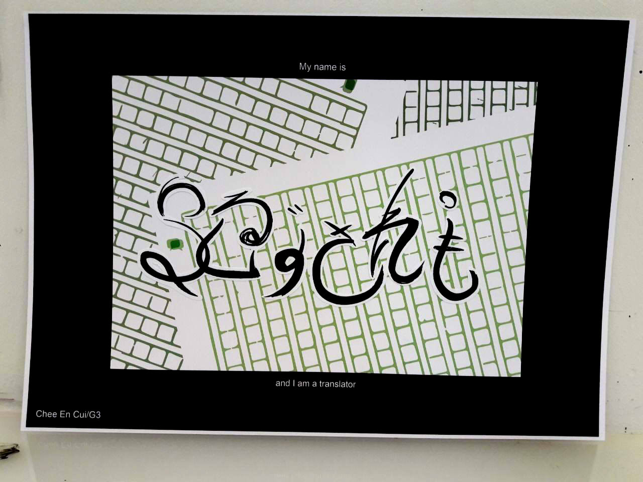
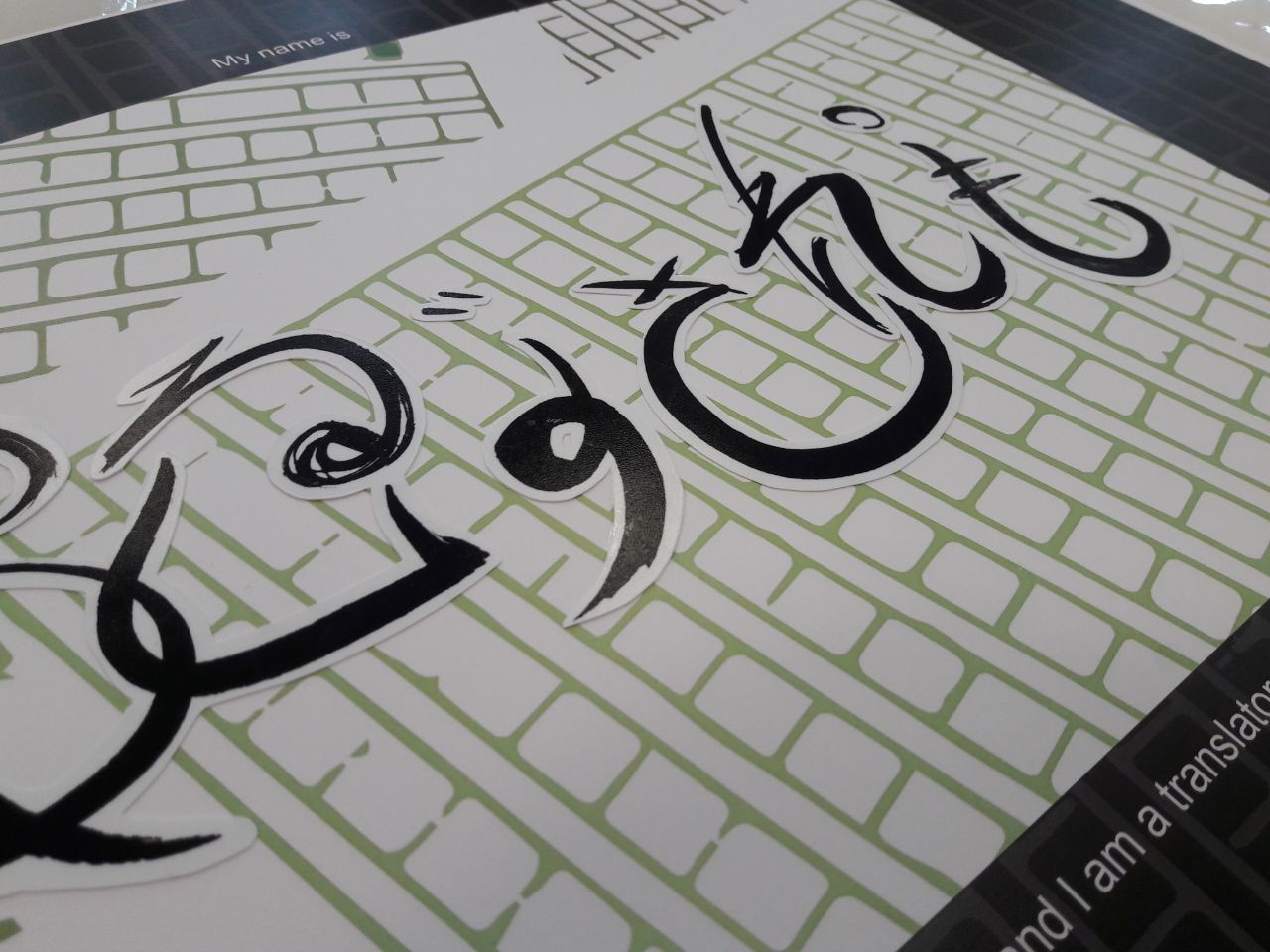
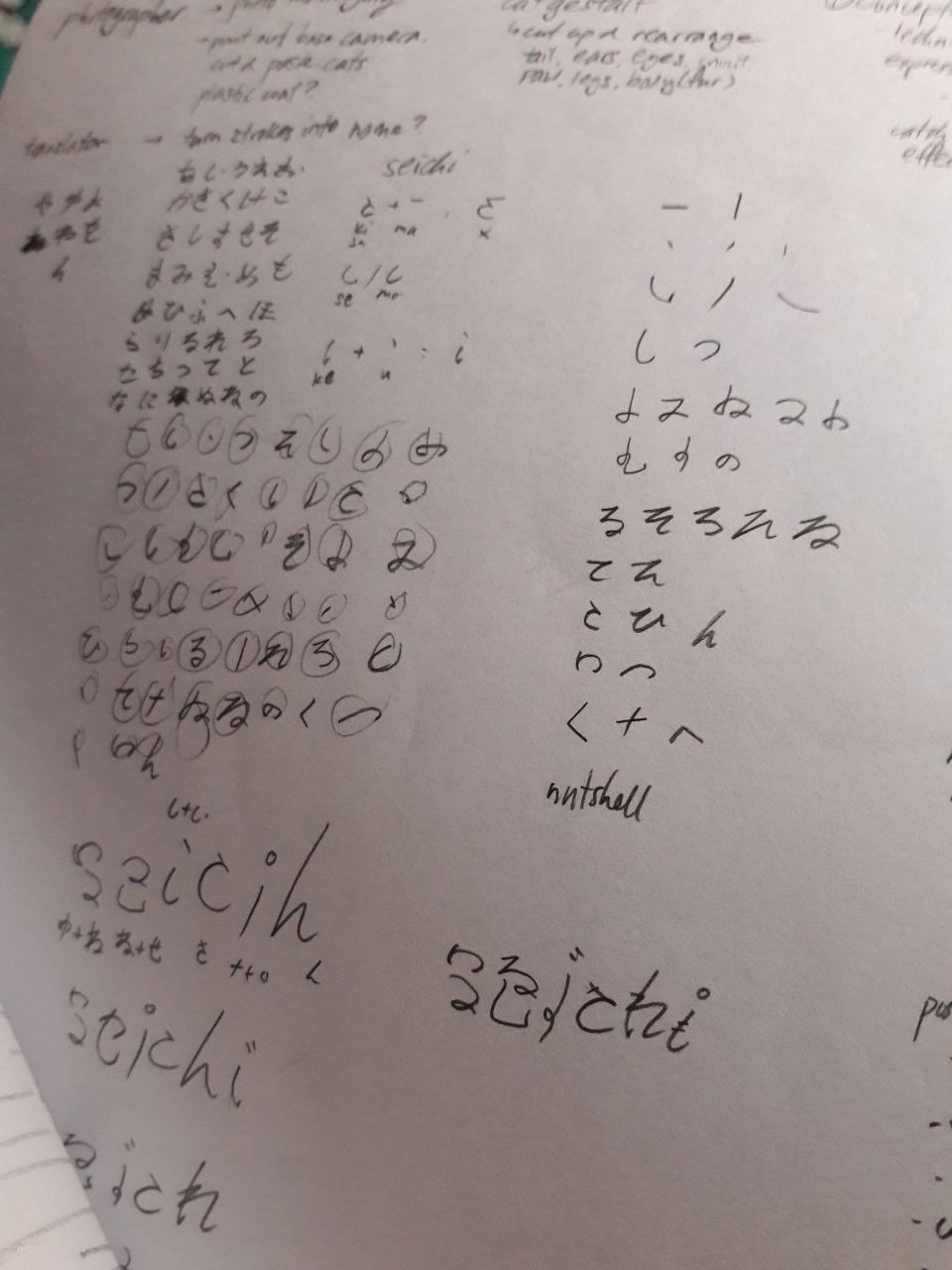
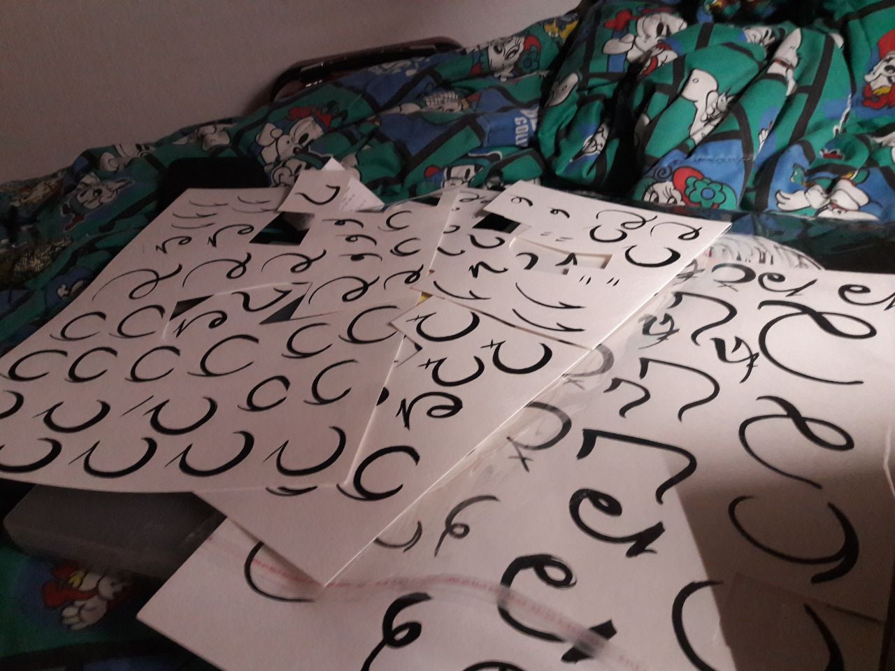
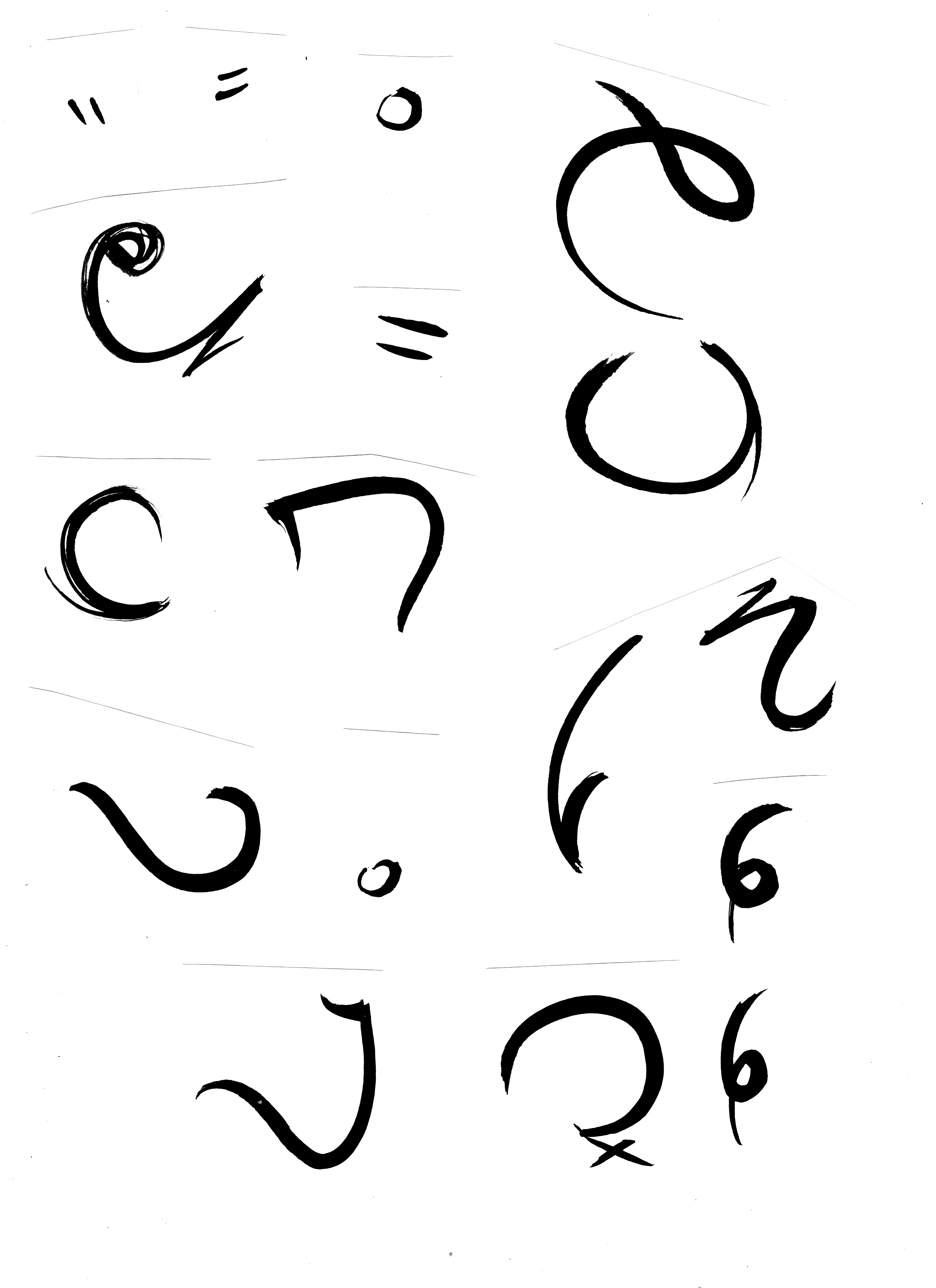
TRANSLATOR

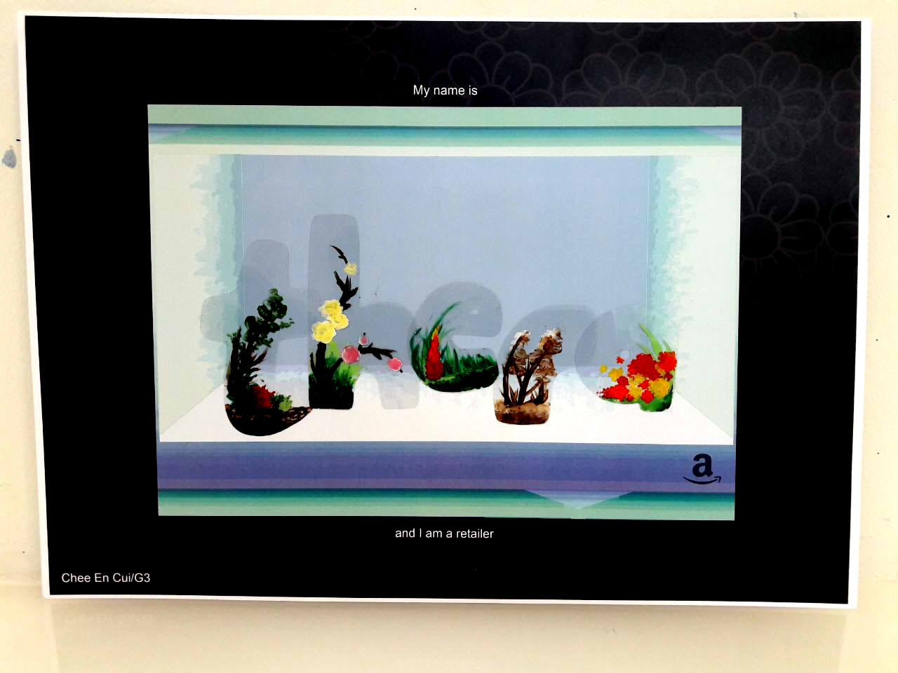
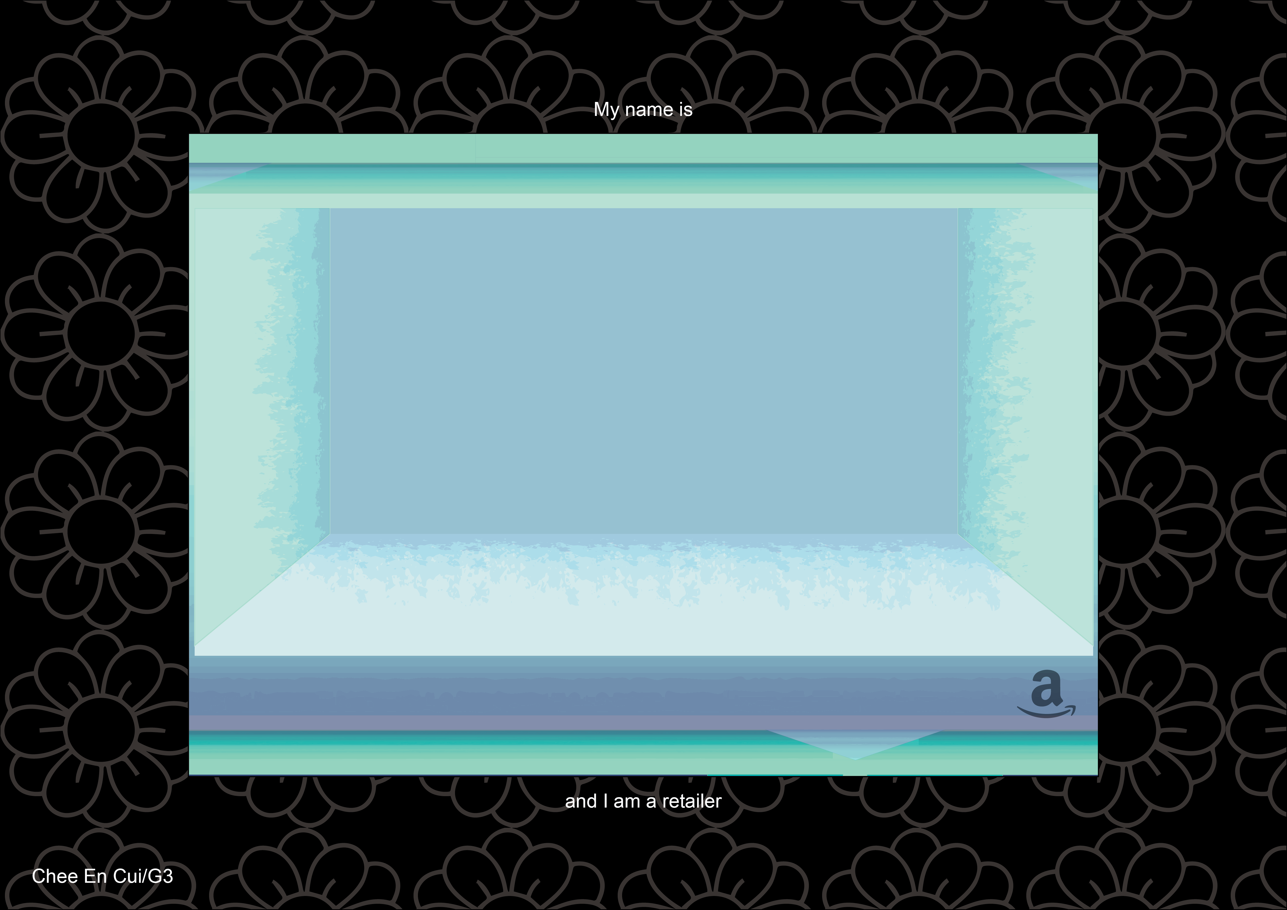
RETAILER

What I stated during the presentation was that the difficulty was really in using Illustrator, as aforementioned and suggested, particularly in relation to the brush creating (it took me a while to understand joining and separating shapes too). For me, too, the difficulty always lies in making the product match the overarching concept I have in mind, which is a necessity for me lest I end up with too wide a scope and a lack of direction. Certainly, though, what I HAVE taken away is that it’s always good to experiment nevertheless, and to avoid creating the “final” product too early lest it’s subject to changes when you think of something better.
Do It With Others—The name says it all. To give due credit, DIWO is essentially the overarching theme guiding our lesson objectives. It makes sense: with a title like Experimental Interaction, it’s certainly most important to focus on, you guessed it! Interaction, especially those experimental in nature, which is what DIWO is really all about.
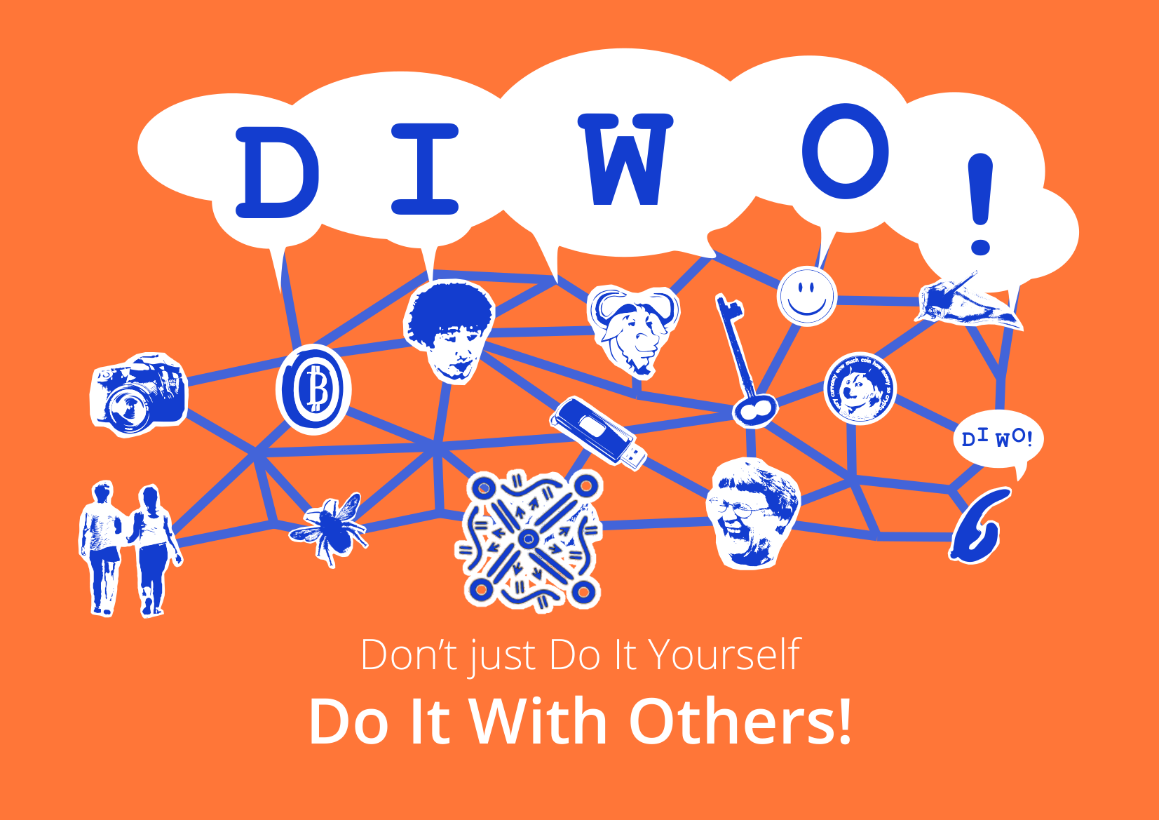
Furtherfield, an art community, is the proponent of this collaborative approach. It is in itself a revolutionary organisation heavily concerned with “collaboration and experimentation”, contrasting traditional perspectives of the artist as an individual, of art as the product than the process1. While still maintaining a physical gallery in Finsbury Park, London, Furtherfield also makes full use of online platforms and technology.
Many of its projects fall into the social practice art category2, including DIWO, which focuses on engaging “with social issues while reshaping art and wider culture through shared critical approaches and shared perspectives” (Catlow & Garrett, 2007). Simply put, it’s about working together to create something great, perhaps even greater than if we all worked individually to make our own individual things.

As aforementioned, the importance of different people coming together to create something, is in the myriad of ideas which can be derived from a database larger than your own head3.
On a more logistical level, it might even simply just be that there are some things you can literally only do with others, like creating a gigantic cross across multiple screens.
As established by Randall Packer before, too, this form of creation will definitely require “negotiation”. This was also reiterated during the lecture, where Marc Garrett remarked that individuality should be kept, but also challenged4. Furtherfield’s own projects are certainly no exception. VoiceOver Finsbury Park, for example, relies on the willingness of the participant to give up a degree of privacy, so as to benefit the future of London5.

One of the most unique things about the DIWO approach, though, is that much of it is heavily based around technology, and experimentation with it. Blockchain6, as mentioned by Garrett in the lecture, is an example, where the algorithms of the decentralised database allows for mechanised security.
To end off, a key feature of DIWO is merely that “the process is as important as the outcome”8. Perhaps even more so, in that the artwork is often not the end result, but the process through which it is made. Sometimes, the artist is nothing more than an engineer who creates the platform, while the actions of the audience is the art itself.

Due to the word count, I’ve placed footnotes on everything which had supplementary, interesting information. Additionally, references are also listed where appropriate.
1 From Furtherfield’s About Us page (link). It is also stated that, apart from various indie movements in Britain, their main inspiration was that of the open source structure.
2 Previously mentioned in my post on Open Source. As I’ve mentioned before, ‘social interaction is often an important way to express those messages [of social activism]’.
3 Previously mentioned in my post on the Telematic Embrace. The significance is that ‘the panel discussion involves 60 participants from over 30 countries answering in real time, bringing a myriad of opinions, shaped by each individual’s experiences in their various cultures, to the table’, a prime example of how collaborative work can lead to a much more interesting result.
4 From Marc Garrett’s DIWO Lecture (link), 00:14:25 to 00:14:32.
5 From a review on the Museum of London. VoiceOver Finsbury Park is described as a “hyper-local social radio project, allowing instant, open conversation between people who live in the same building”. The objective is to improve the quality of life in the city through creating connections between people who may have otherwise shunned each other.
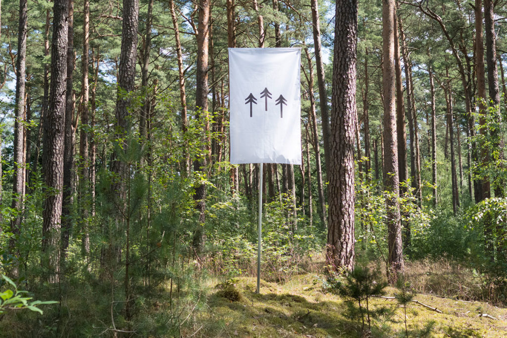
6 Blockchains are defined as “a decentralised database cryptographically secured by a network of computers” (00:32:27 of Garrett’s lecture). Furtherfield, being an organisation interested in the use of technology in conjunction with art, works a fair bit with them, such as in their Blockchain Imaginaries Spring Editorial. While blockchains started out as a form of mathematical technology for things like secure finance, they have increasingly become a medium through which artworks can be produced, especially artworks associated with automation, such as terra0 (detailed below).
7 Terra0 is an example of an artwork powered by a blockchain system. How it functions is that the forest, in a sense, governs itself through the use of algorithms (i.e. decentralised autonomous organisation). Key themes involve “ownership, personhood and autonomy” (Ueberschlag, 2016)
8 Quoted in Packer’s article on Open Source Studio, but originally from Marc Garrett. As mentioned at the start, a prominent idea in the modern style of “experimentation”, subverting traditional notions of the product as the art. Interestingly, we learn in another class that this is an idea which is closely associated with modern graphic design too, where the concept is more important than the product.
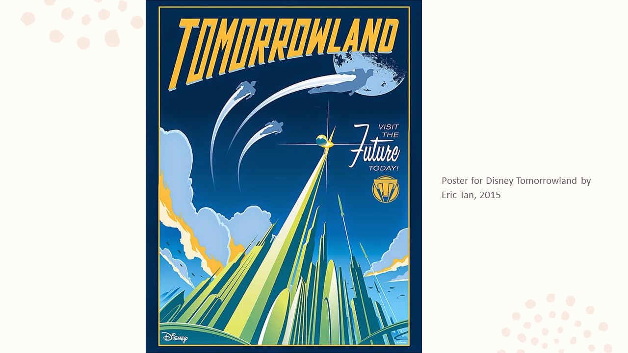
Featured image courtesy of Packer’s recording of the DIWO Lecture.
Preceded by | Succeeded by (to be published)
Previously, I established the brainstorming behind the main concept, and the selection of jobs and names. This post focuses more on compositional process, edits after consultations, etc.
Note that as of this point I’ve yet to particularly finish compositions, in that I prefer to work on and finalise a draft before actually embarking on creating the final piece. This, unfortunately, means that I’m very susceptible to changes which MUST be made to the final piece for it to look alright, even if it SUPPOSED to look alright according to the draft. Said final changes, if any, will be updated in a separate post.
I sent Shirley the sketches from previously, along with a few new ones. These were the general ideas I had in mind, though:


All in all, the conclusion was mostly to avoid forcefully warping objects into certain shapes, and to add more dynamism through avoiding straight lines, if possible.
I attempted to have a clearer composition by using Illustrator to make vector sketches.


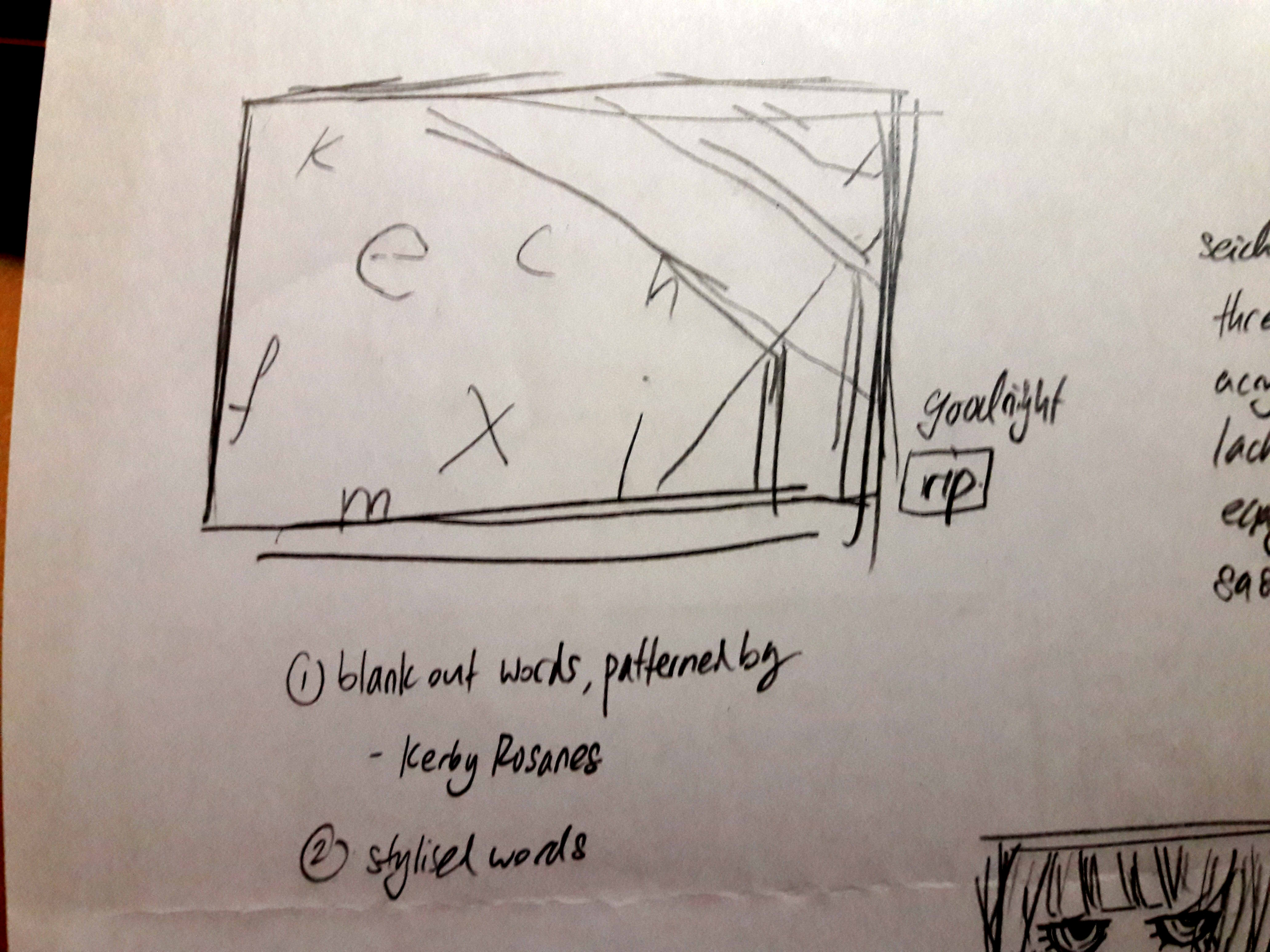
Other than that, I also established the Translator font by doing as Shirley suggested:
(insert picture when I actually have it)
I didn’t bother to try to make it look like actual characters, as opposed to a clear amalgamation of preexisting Japanese strokes.
Email Suggestion
Shirley mentioned to Google to see what already exists, which I realised I didn’t even think of.
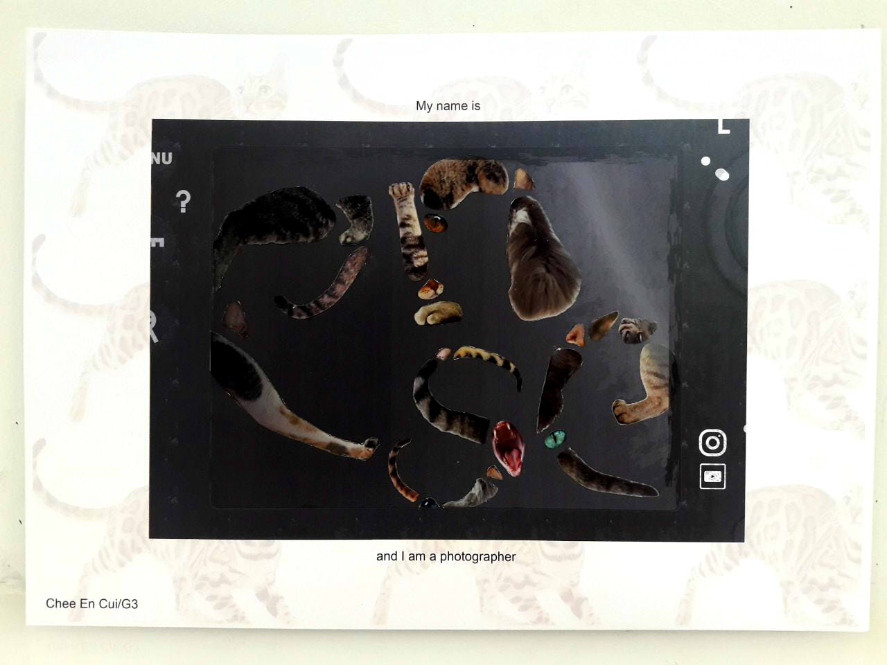
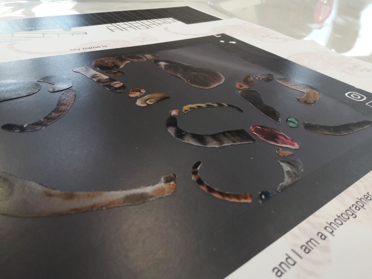
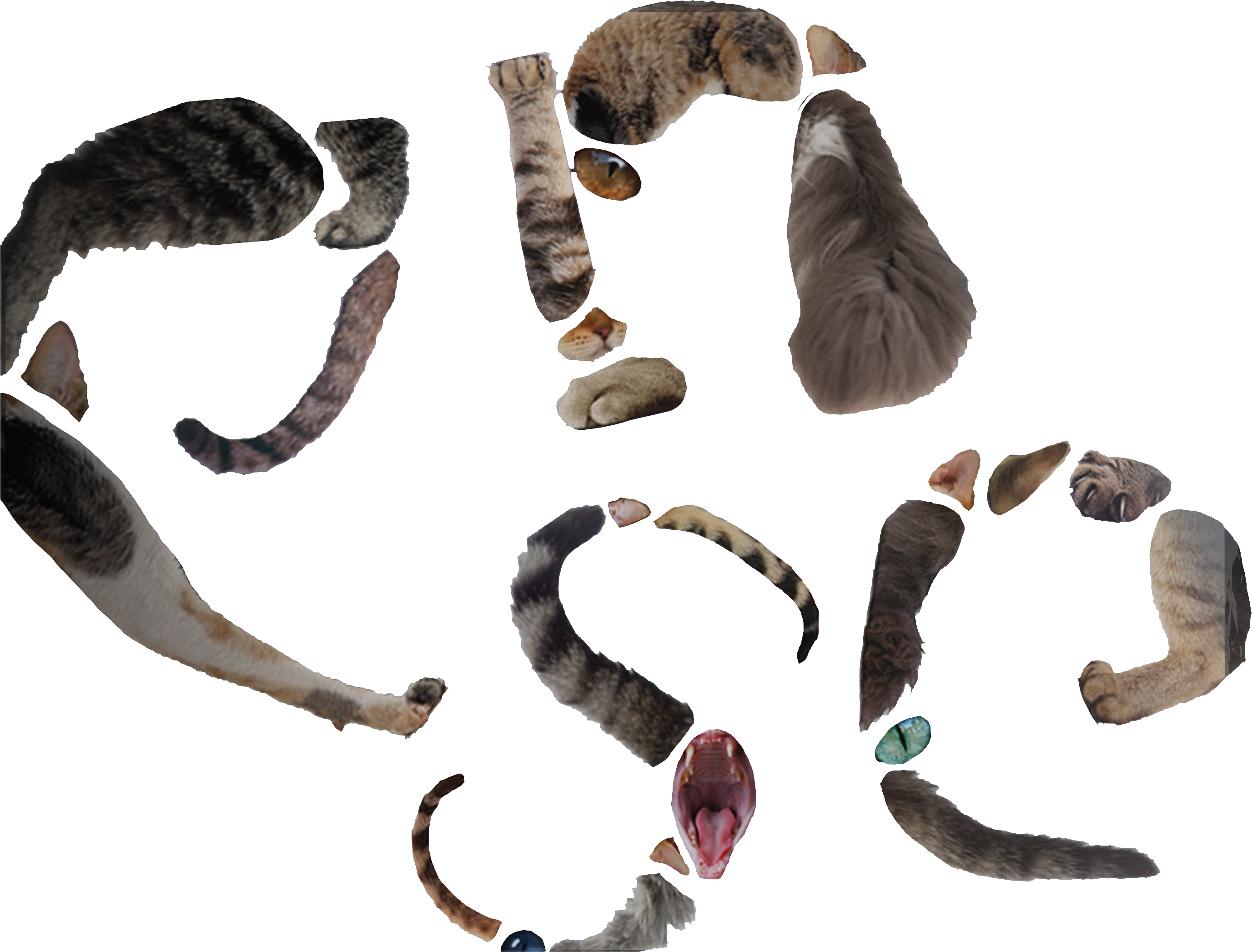
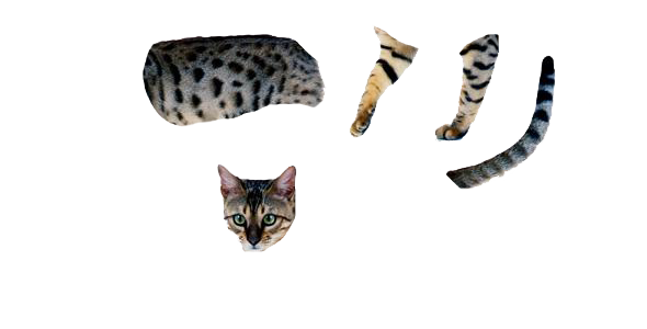
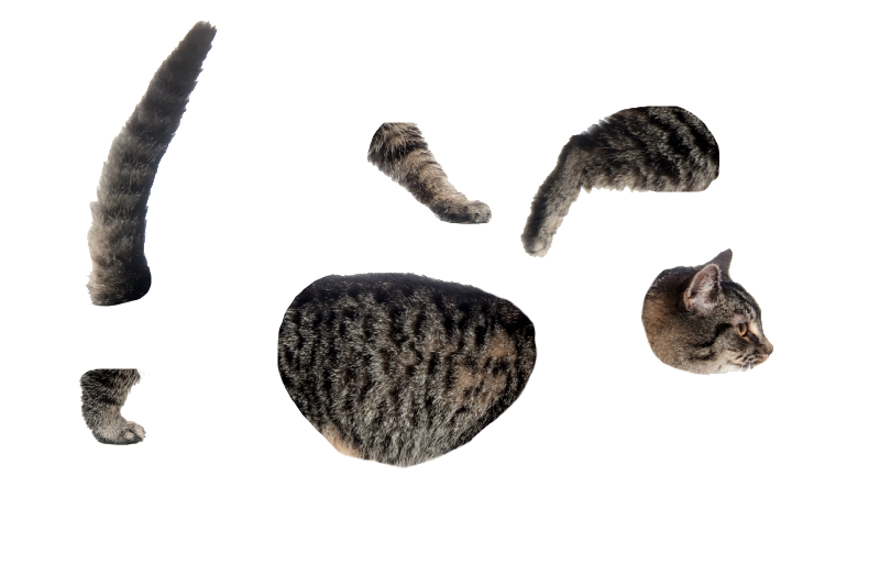
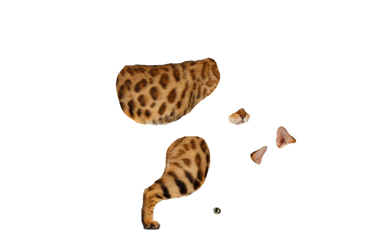
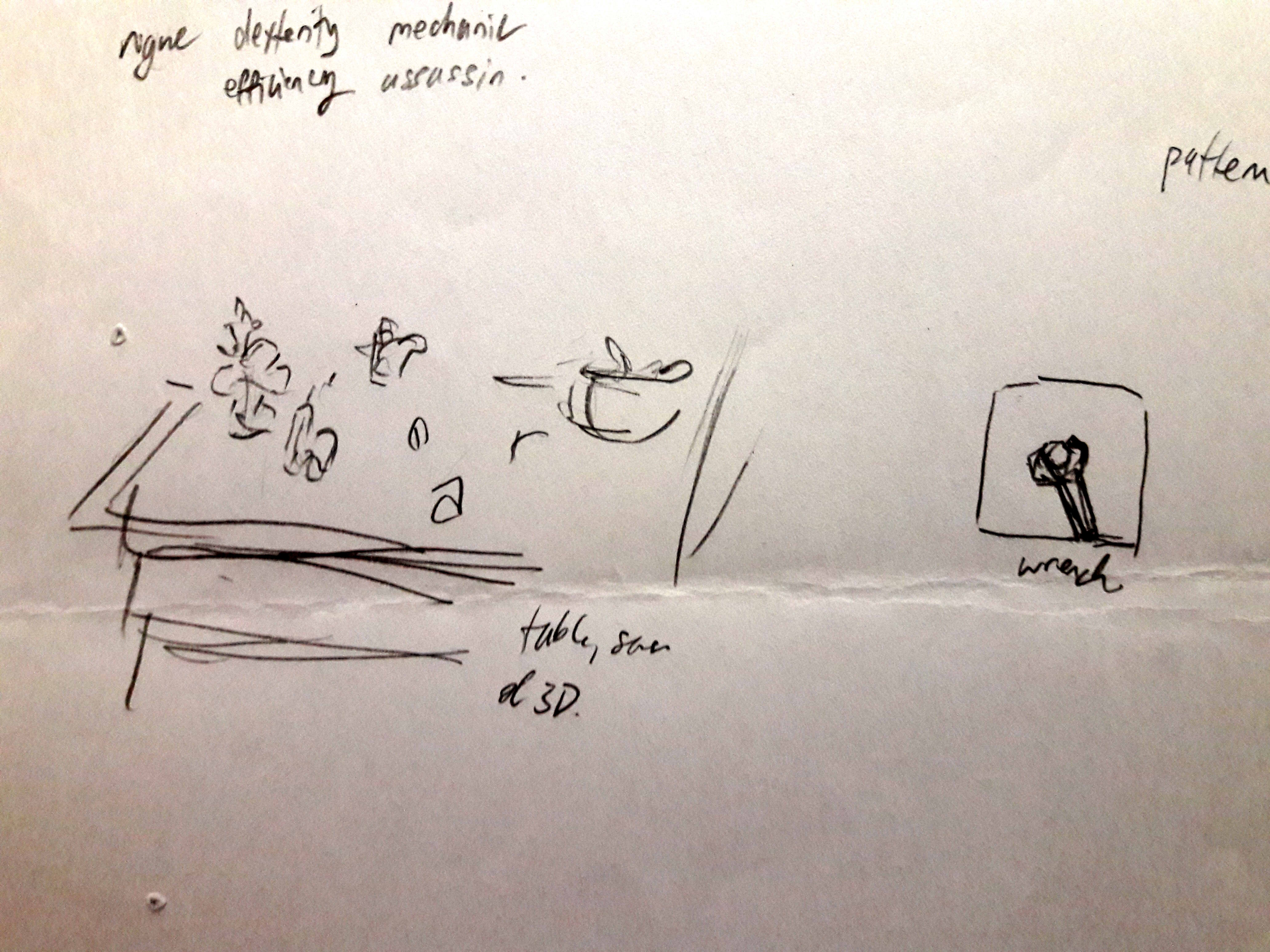
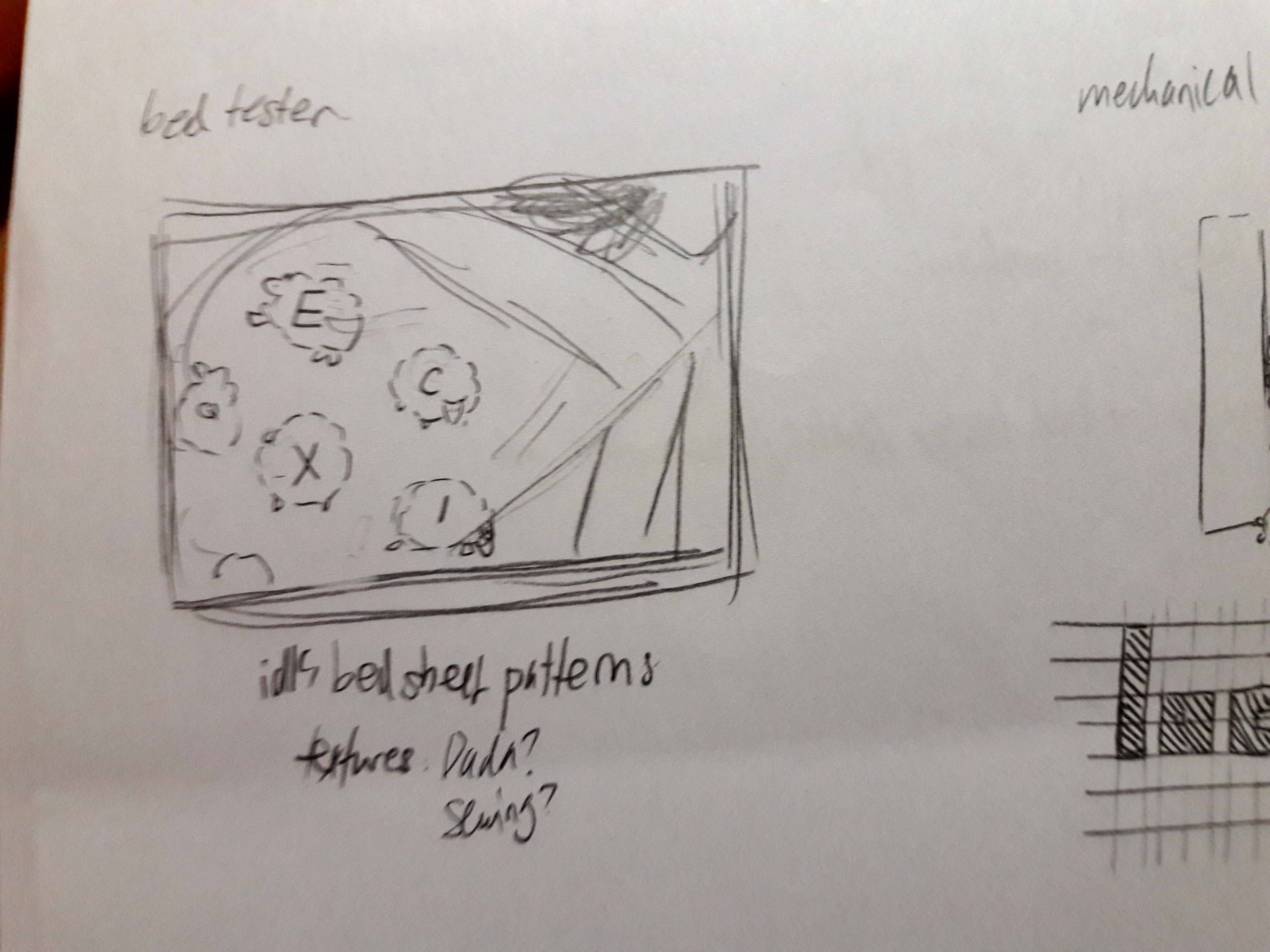
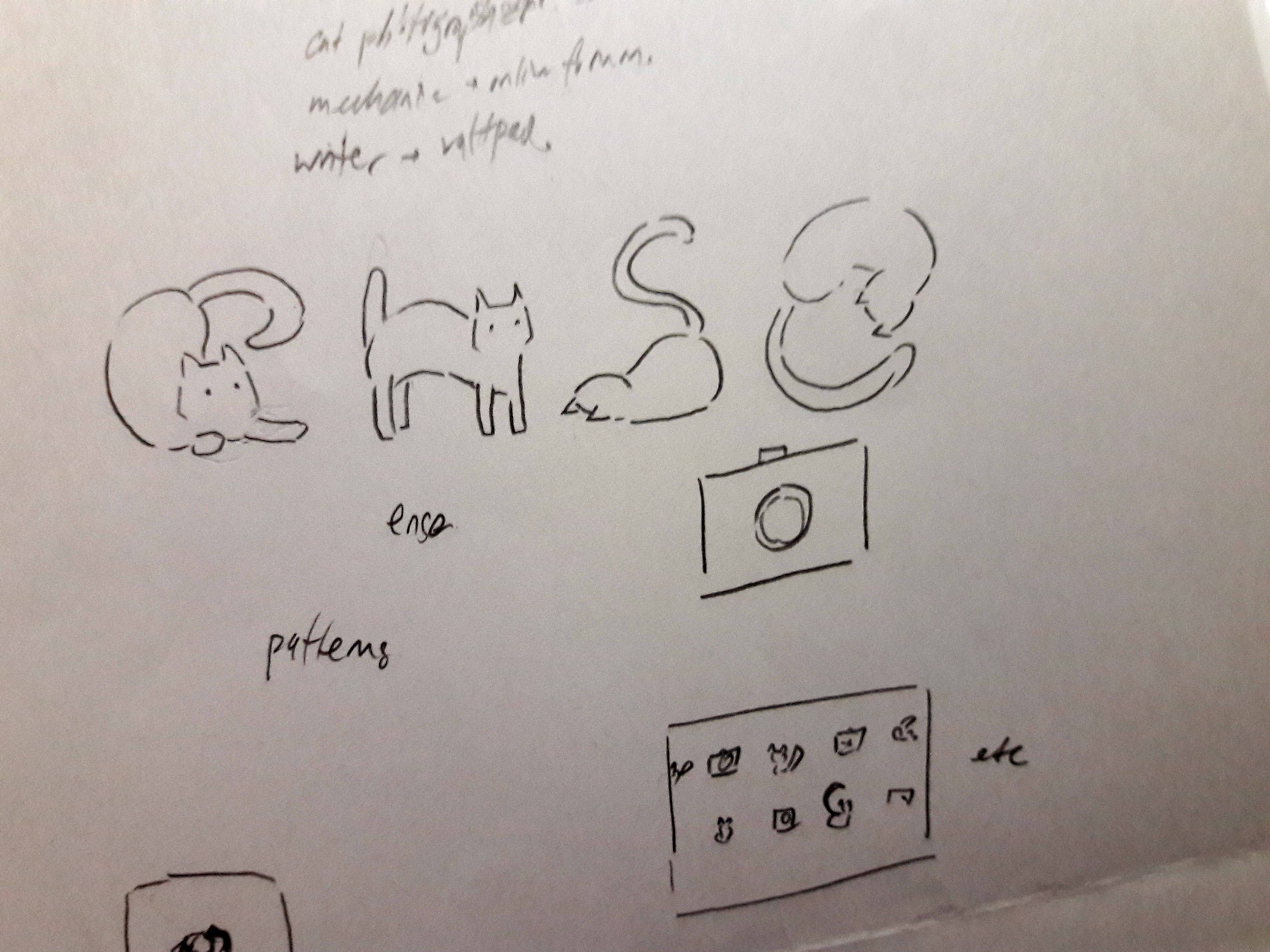
1. Cat Photographer

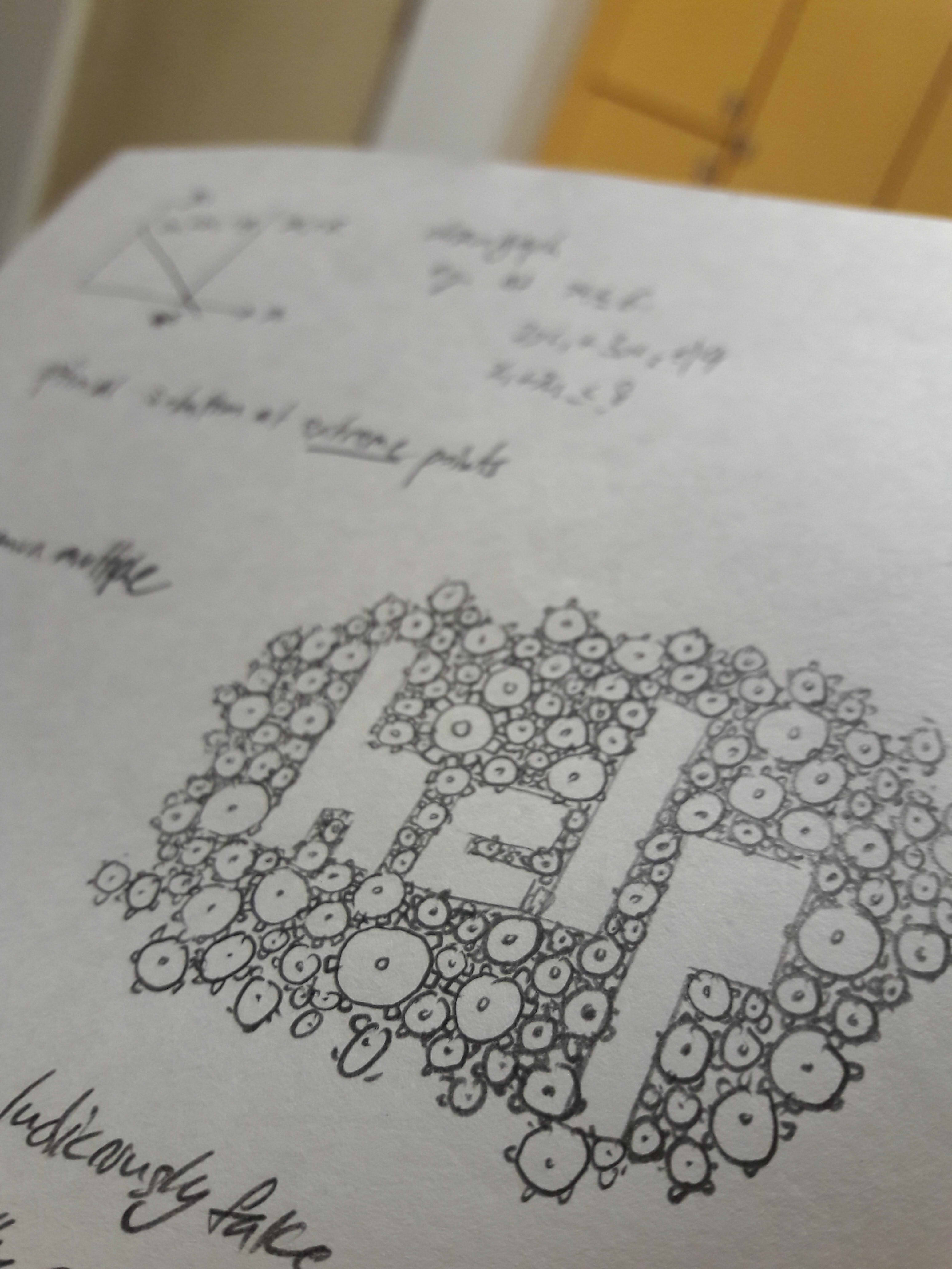
The key image is cats, so I searched for cat typography.


Of all of them, my current typeface resembles the first and second most closely, that of the collaging of many cats to form the letters. Looking at it makes me finally understand what Shirley meant by cat gestalt, and what she meant when asking what I’d do to cover the gaps during consultation (which I didn’t understand at the time, but now I think it meant that she thought I would be putting a lot of small cats together?)
On the bright side, the misunderstanding means that, yes, it’s not a mainstream idea currently in use, probably because who would even want to cut up cats?
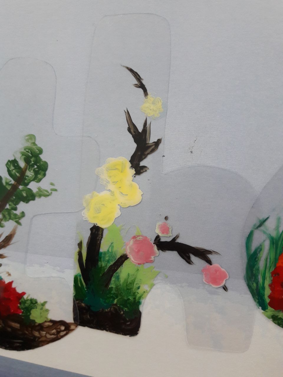
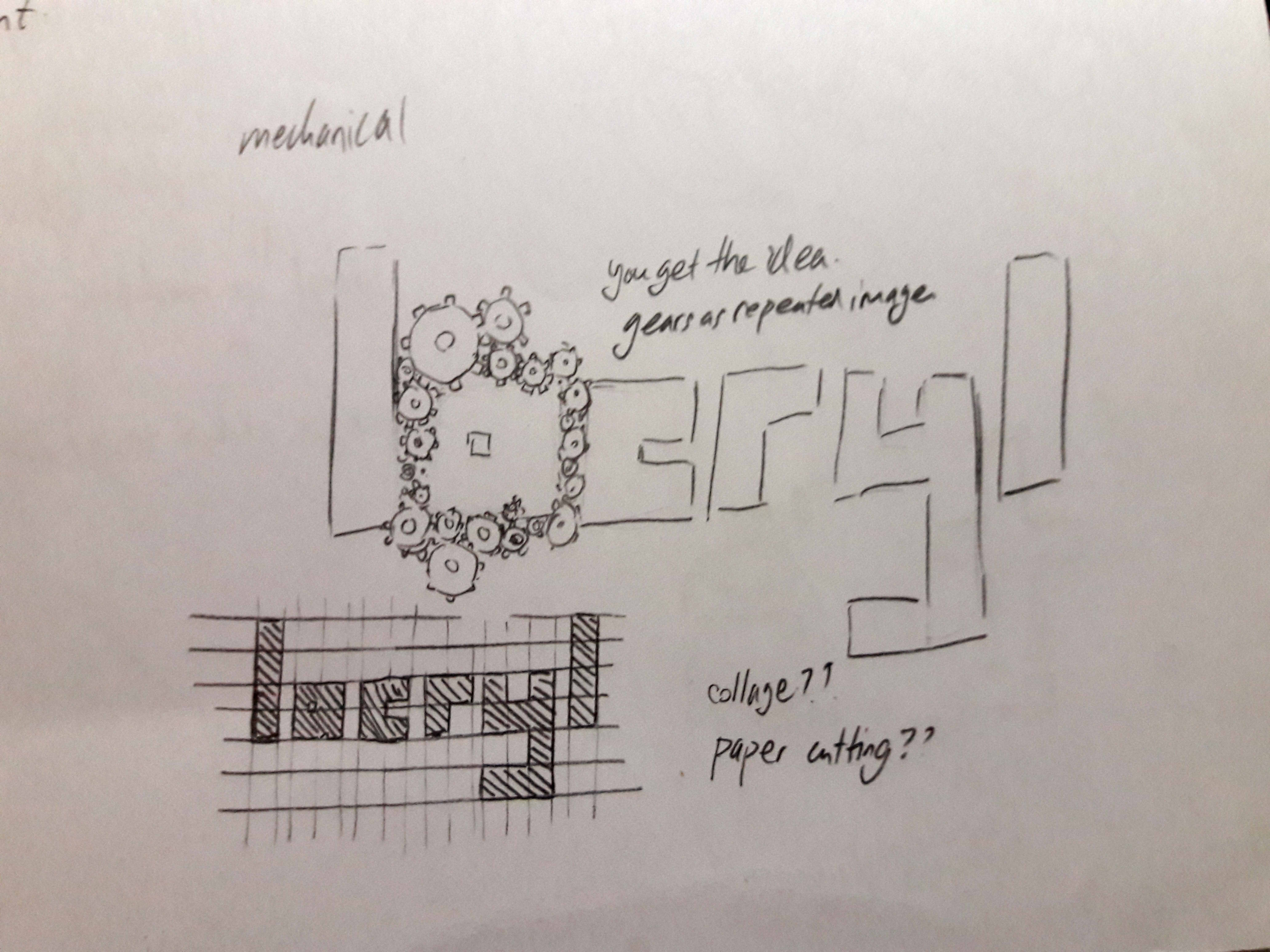
2. Japanese/English Translator


It seems to be a rather common idea to edit Japanese strokes into English words… I’m unsure if it’s considered too similar due to that, but I’m inclined to believe it’s alright, simply because most typefaces seem to be attempting to convince viewers that they are legitimate characters, while I’m merely dissecting and reassembling without attempting to make it convincing.
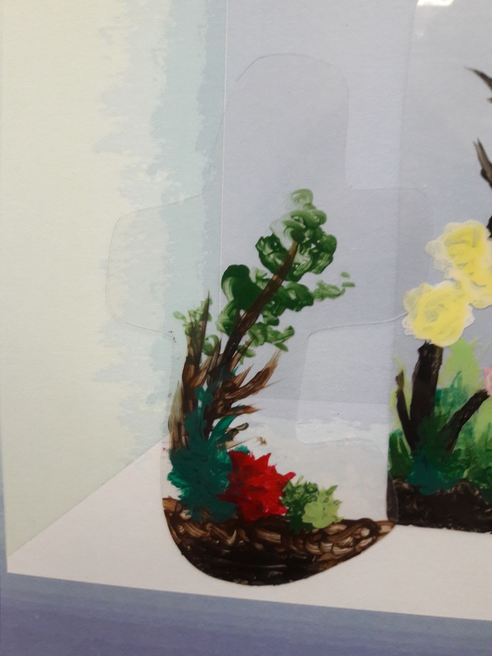
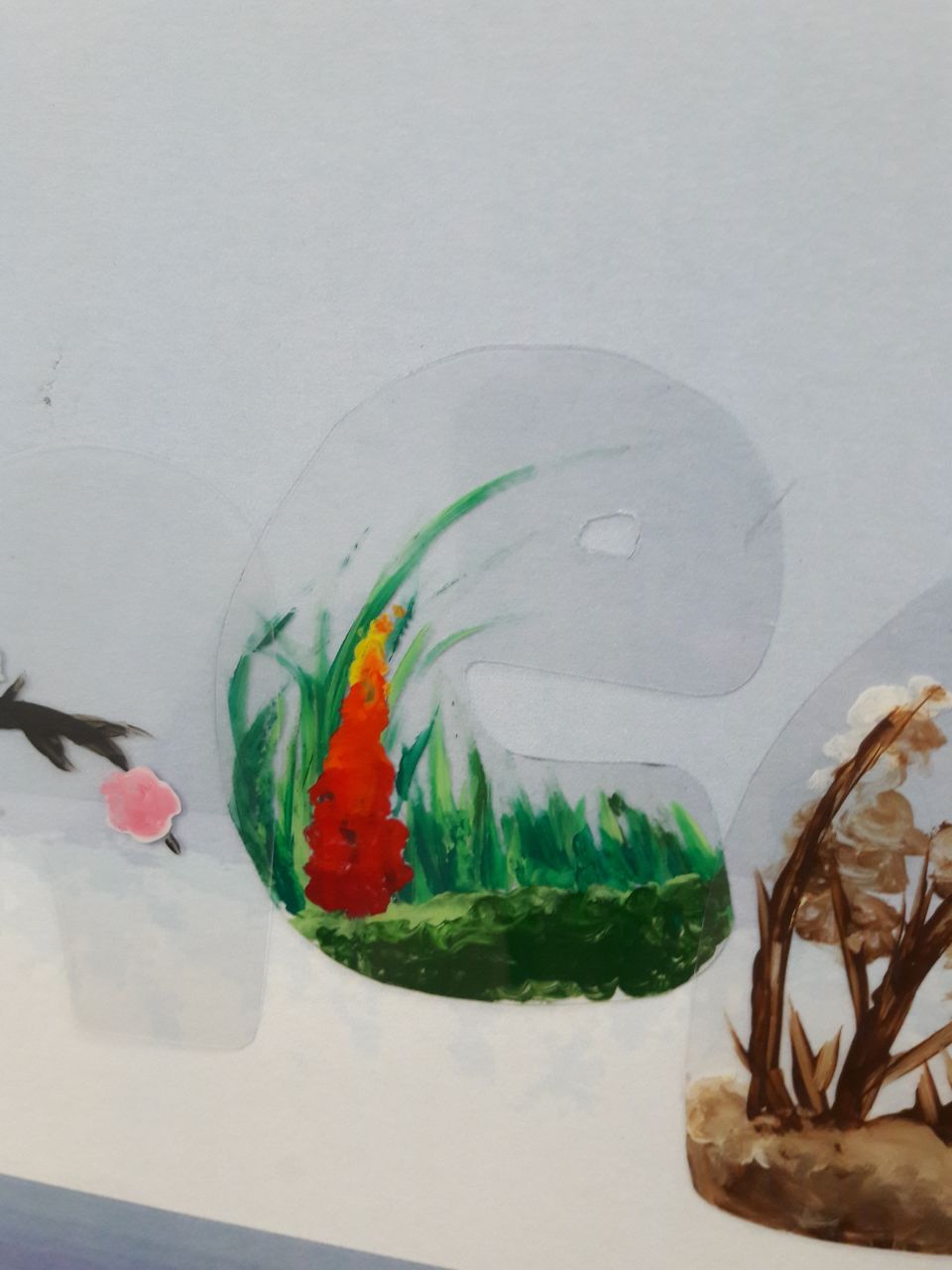
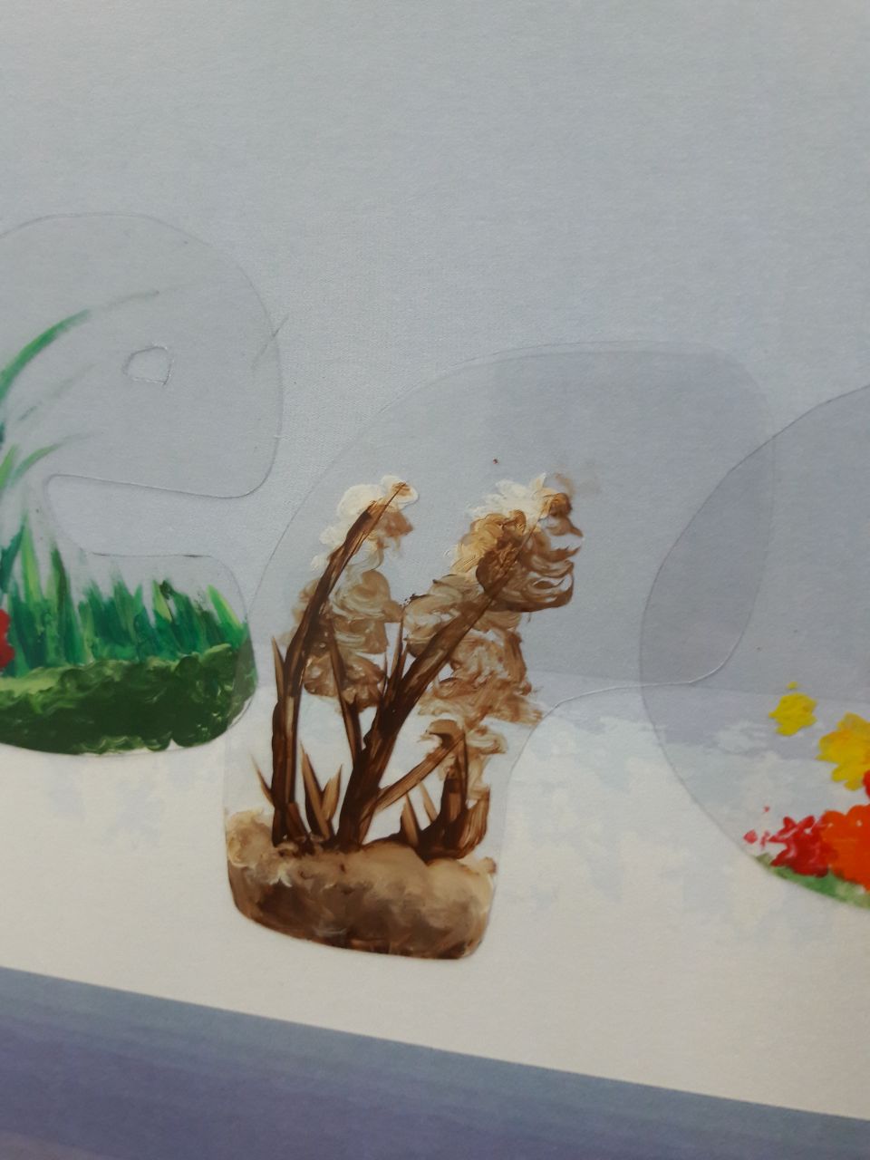
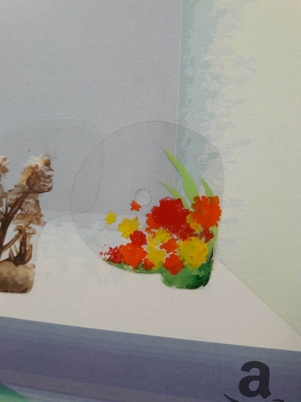
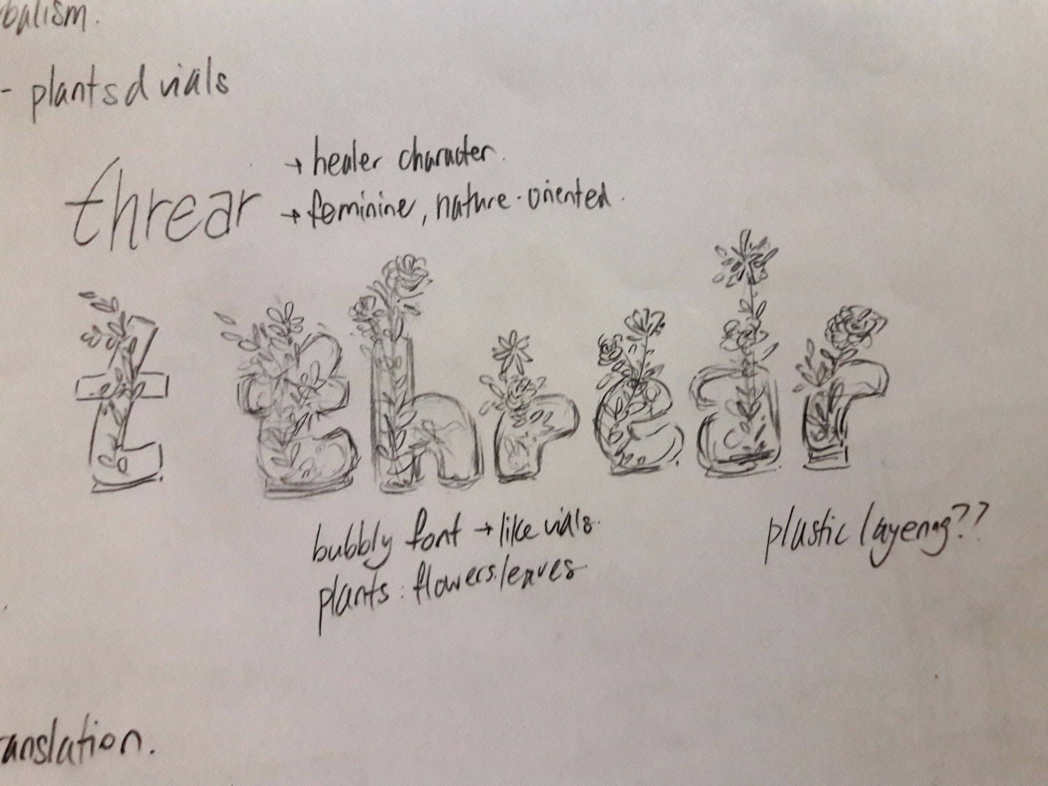
3. Terrarium Retailer


At some point we must all remember that if we were clever enough to come up with something entirely unique, we wouldn’t need to be in school. Mine is really rather similar to the 2nd one, apart from the direction (plants grow upwards than sideways), font (bubbly than straight cut) and colours (mix of other colours than just green).
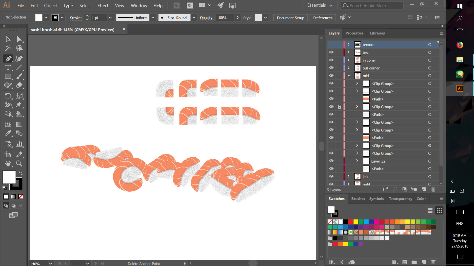
4. Sushi Blogger


I have tried Googling “sushi illustrator brush” to no result, so…? Seeing the 2nd composition reminded me that I hadn’t thought of a suitable background, though, so I considered a sushi plate.

I raised the following questions:


The ideation and drafts seems alright, so the conclusion from here on out is to actually get to making the final pieces, and any necessary edits, since it’s very possible that it may not actually look good in the end even if it ought to as per the drafts.
One of the things I enjoy about these projects is that we are given multiple compositions: this means there is room to create patterns and links between the compositions. Four is also always a good number to work with, simply because many ideas are associated with four elements (Mendel’s law, temperaments, classical elements, etc.) Additionally, this means it’s easy to associate certain elements with one composition, then create contrast with the other.
Below are certain ways I’ve tried to approach the project, especially where I tend to get very easily confused by myself. Even if I’ve come up with something I like to re-evaluate it repeatedly and try to think of better alternatives.
(EVENTUALLY SELF-REJECTED) IDEA 1: CHOOSING JOBS BEFORE NAMES
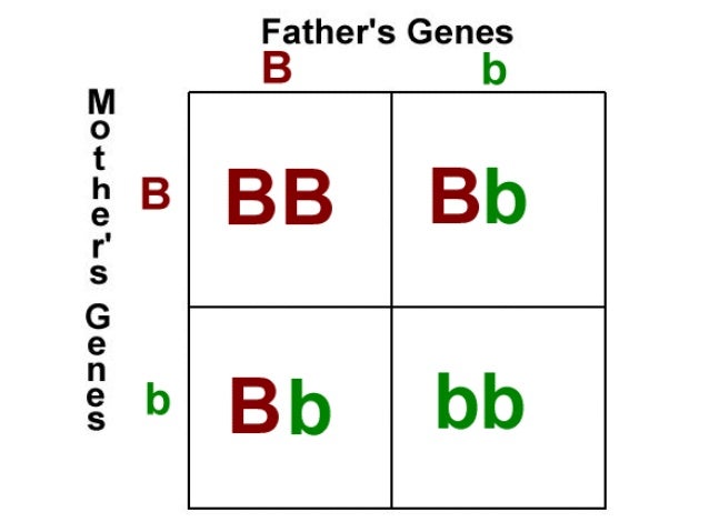
I initially considered using a Punnett Square model to define two pairs of binary opposites, forming 4 resulting jobs.This would allow me to work with a variety of styles, as well as provide clear visual differences between the compositions. For example, this list:
As such, it might end up with something which looks like this:
| NATURE | TECHNOLOGY | |
| HIGH INCOME | Biologist | Programmer |
| LOW INCOME | Farmer | Plumber |
However, I had difficulty trying to come up with 2 pairs that could work with each other, especially where some of these pairs did not have very clear visual differences. Also, it doesn’t really provide any kind of overarching idea except for that of that diversity of jobs.
IDEA 2: CHOOSING NAMES BEFORE JOBS
Choosing jobs wasn’t going too well, so I opted to try to choose names first instead. Here’s a list of the initial thoughts:
The notion of online names stood out simply because Shirley suggested to have more quirky jobs, and it seemed like there’d be more “associated images” which I could use to make it easier for others to understand. (Also, it’s easier to change the names if I want, because online names can be anything!)
IDEA 2.1: ONLINE HANDLES
Here’s some online handles I’ve used before in different situations, to relate to the ideas of 1. the rise of jobs pertaining to the internet, and 2.the ability of a single person to take on various different personas through the net.
Idea 2.2 involves the usage of ONLY game online handles, possibly to reinforce the idea of an alternate irreality? Which may reduce the difficulty in that many games, like MMORPGS, tend to have a job/class system which I could reference.

It would certainly reduce my ability to showcase ACTUAL jobs which are online, though, and visually it might be a little challenging.
IDEA 3: JUST DESIGN FIRST AND SEE HOW IT GOES
As the name suggests. I draft typefaces or compositions in my free time (or when I’m bored), and try to fit it to a concept which works.


CONCLUSION
To mix Idea 2.1 and Idea 3. While I WILL use names I’ve used before, I WON’T use the names in conjunction with the function they ACTUALLY served. I try to fit the typefaces I sketched to jobs which could work online.
The theme is that of the online world, namely that of the inconsequentiality of online identity, alongside the versatility of the digital.
Names are interchangeable, unworldly and simultaneous: I could change the names easily with no consequence simply because it is a fake name, I can name myself whatever I so wish because it’s not real anyway. I can even have multiple names, all associated with different things, all at once because I am allowed to have multiple existences.
And yet at the same time this is a rising platform on which one finds employment, one which provides many opportunities, as presented by the various implied jobs: they are all jobs which can exist both in analog and digital form, and which would easily be mistaken as analog if not for the bizarre names, the subtle hints pointing to its online nature.
Here’s a general finalised list. May be subject to changes.
Sometimes you think your hand is pretty normal, and everyone has to p̶͇̠̟̯͇̪̲̭̩̩̬͒̃͒̾ͯ̏͑͛̒̓̓ͯ́̓͒̀̌̚͝R̡̨̈̎̍̉̿̄̋͊̈̊̓̎ͩͨ͏̢̩̳̺͓͖̮̯̝̥̺̻̤͔̩͇ͅƠ̵̜̟̜̺̹̰̝͎͎̖̟̝̤̹̱̂̂̿͂̎ͪ͂͐͐͂̈́V̧̫̞̩̼̱̪̞͖̼̭̮̹͎̙͖̲͖̀ͩ̓̉͆͂ͩͪ́ͧ̈́͒̾̀ͅĘ̸̴̡̢̣͉̥͚͉͑ͬ̀̍̎ͬͮ̆ͤ̒͆ͣ̈̇̌̒̂̓ ̵̸͍̖̠̲̹͈̪̥͎͓͙̄̂̋͆͋̓̏͂͋̃̿ͫͅŸ͛̃́͗ͬ̅҉̨̨̨͕̬̟̼̤̞̩̩̼͡ͅO̵̗͎̱̜͚̗̥̩̹̻̖͎̝̻̗͇͉̗͓ͮ͆ͪ̅̒̄̏̑̀͊̍̓ͯ̄́̉͜͠U̴̵̝̺̠̺̩̭̣̬ͪ̓ͪ̒̍̀͊̋͌̑ͫ͑̃ͦ̄̇̚ ̨͍̞̭̬͇̺̬̞̟̫̟̖̦̥̟̝̹̒͑̽̎̽ͪͯ̎͐͑̌͂̀ͫ̀̑ͦ̚͝W̡̍͐ͨͧ̓͌́͑̇ͮ̎̈̑͢͝͏̙̬̙̥̙͉͎̟̺͎̩̮̞̥̗̬͈̣Ŗ̨͙̱͈͍̥͍̗̪̗̥̻̞͕̲̠̪͙̈̓̐̅̓̃͒̂̚͟͝͞O̢̤̯̮̫͚̥̊̎̈̈ͥͭ̑ͅͅN̳̫͔̪̦̓̏̈̋̊̚͘͝G̎̌ͨ̍̂͑ͫ͏̗͙̳̯͍̣̟̤̰̘̼͙̘͓͉


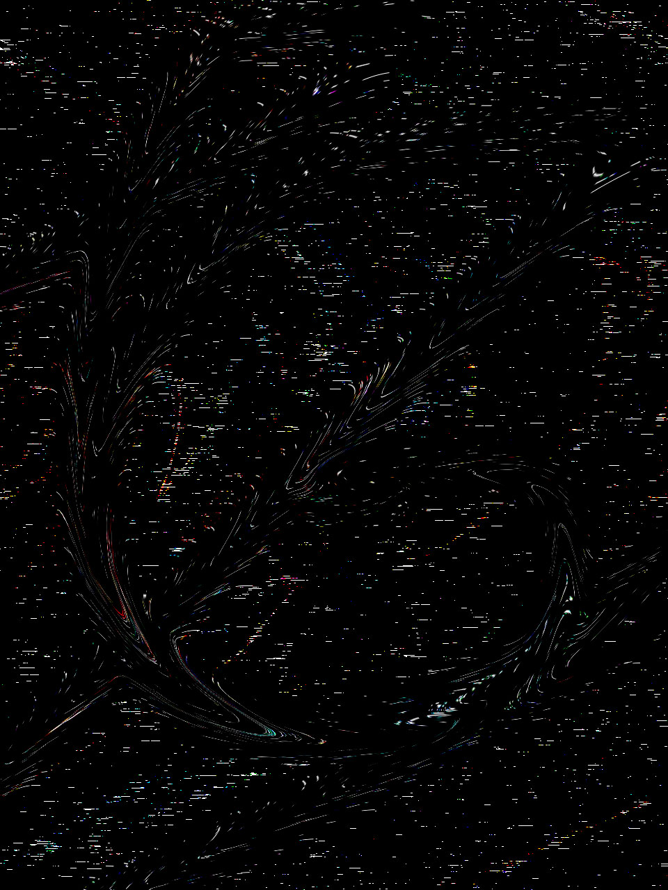
It’s so b̢̋̈́̽̏ͯ͒ͤ̂i̒̎͆ͣ͂ͧ̍͂̈́͏҉̷z̸̢͗̿̎͗a̛ͩ̅ͣ͟r͌͌ͦ̈́r̅͂ͦͯ̽͏̷̢ȅ̡ͫ̇ͤͮ͡ how a few simple effects can change the original image so extensively: a hand turned into an outline of a hand, then into waves, and then into just dots and dashes. It’s the stuff of animation, really.
The truth is malleable: this is a statement brazenly declared by Jenny Holzer’s work, Please Change Beliefs. In this artwork, Holzer provides a list of truisms on a website, where anyone may access and modify as many truisms as they’d like to. These edited truisms are then permanently added to an online database, creating an extensive list of various versions from various individuals.
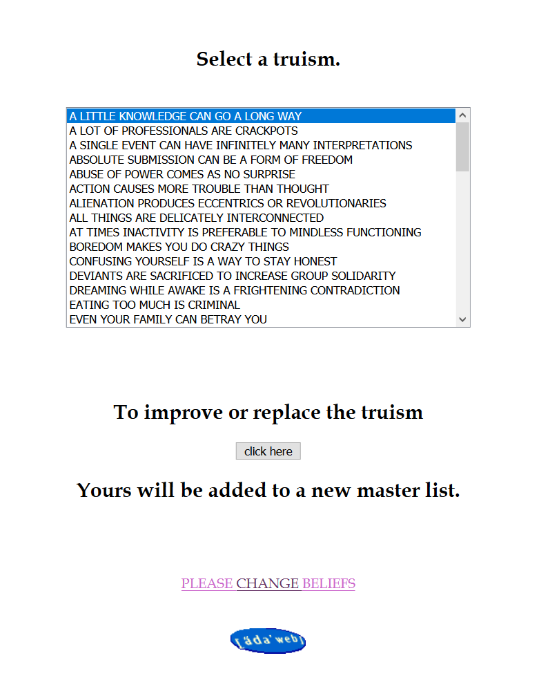
That anyone can change these absolute truths is a testament to the power each individual holds, especially in an online world where their words can reach far and wide. Like in the artwork, we all have the freedom to type whatever we like on various mediums like social medias and blogs. Case in point: Trump’s claims that global warming is a scam by the Chinese (which some people apparently do believe).
At the time, it draws attention to the overwhelming nature of innumerable truths floating around the internet. How do we determine what is true and what isn’t, in a space which can be simultaneously trustworthy and untrustworthy? On one end can be proper advice from certified professionals, another, scams by internet trolls, and yet there is no way to distinguish nor ascertain the truth. While Wikipedia is mostly reliable, it’s easy to see why we’re told not to use it when internet vandals often mess it up.
Even in this artwork, we can see the influence of those who don’t take it seriously.

Despite the possibility of being played with, we cannot forget that there will be people who legitimately contribute properly, a reminder that the internet is not all about lies and untrue truths.
Featured image from the Please Change Beliefs online database.


Sorry forgot to upload earlier 🙁
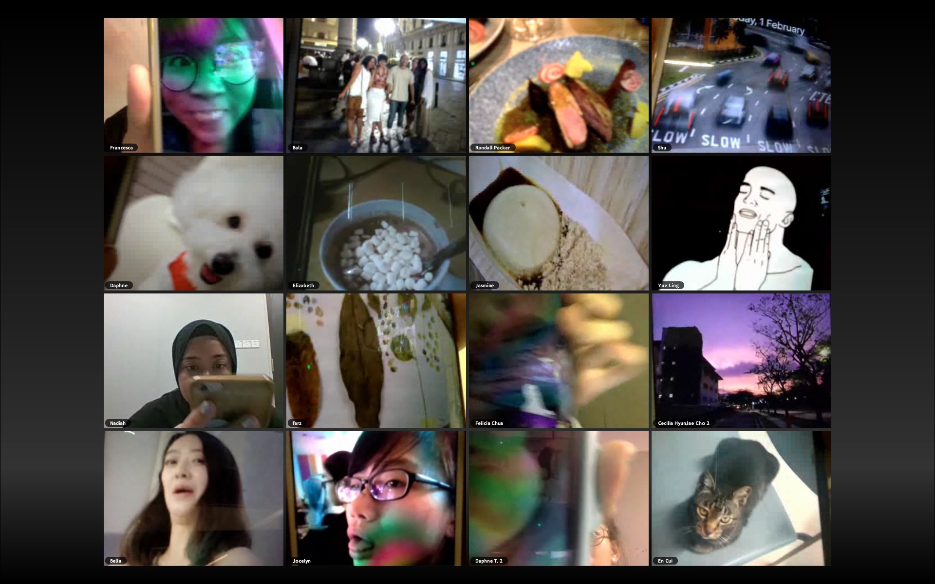
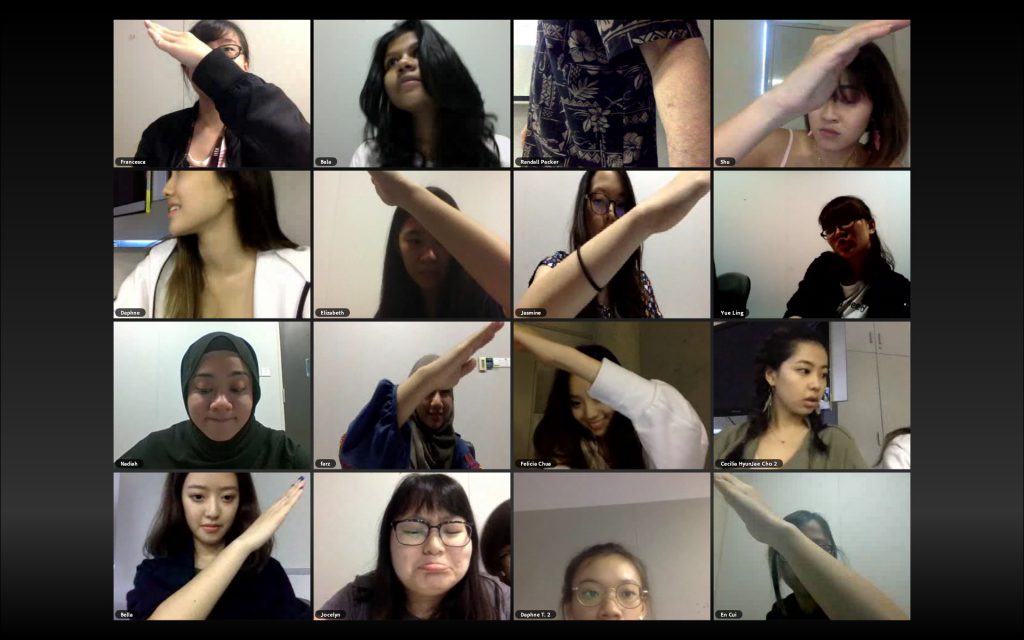
The keyword Randall Packer emphasised upon was “negotiation”: our adjacent positions on Adobe Connect made it important to collude with each other in order to achieve the various tasks assigned to us. It takes a while to reach that conclusion, especially where negotiation often connotes the act of “discussing” to reach a consensus, which did not quite happen (as opposed to natural adjustment on everyone’s parts).

Nevertheless, it was a pertinent point to bring up. It’s easy enough to “negotiate” because these are trivial enough that we can autopilot to fit each other, but days will come when we’ll have to “move aside” and make changes even if we don’t want to. Or even force others to, if it’s not something we can budge on.
It’s almost disconcerting, regardless, that this is something which is unique to this specific way of framing the spaces we inhabit.
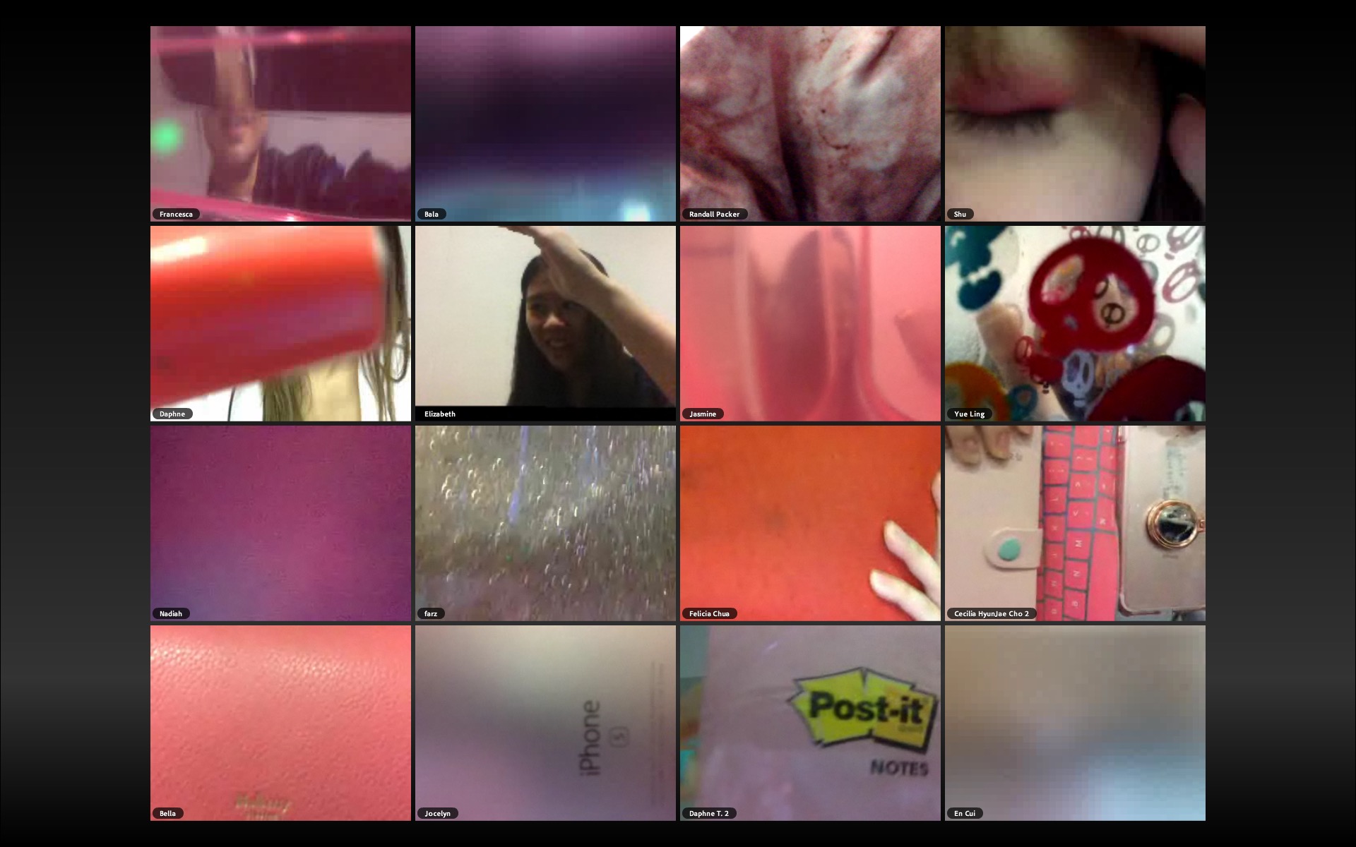
For example, holding up something pink in real life would not work because we can still see everything else around us. On the other hand, the nature of the small scale frame makes it possible to make the pink the only existence in our space. Imagine 16 people holding up pink objects in real life, versus here. Surely, the pink becomes more overwhelming in this third space we all share together, because it becomes all of reality.
On a somewhat unrelated note, the layout of screens triggered a distant memory of a video I had watched before, and so I’ve finally re-found it.
This 2016 video shows a debate chaired by Professor Michael Sanders on the topic of national borders. In an interesting twist, however, the panel discussion involves 60 participants from over 30 countries answering in real time, bringing a myriad of opinions, shaped by each individual’s experiences in their various cultures, to the table.
(BBC appears to have a running series of these kinds of debates, which can be found here.)
Featured image courtesy of Randall Packer.