Previously, I established the brainstorming behind the main concept, and the selection of jobs and names. This post focuses more on compositional process, edits after consultations, etc.
Note that as of this point I’ve yet to particularly finish compositions, in that I prefer to work on and finalise a draft before actually embarking on creating the final piece. This, unfortunately, means that I’m very susceptible to changes which MUST be made to the final piece for it to look alright, even if it SUPPOSED to look alright according to the draft. Said final changes, if any, will be updated in a separate post.
Consultation 1 (via email)
I sent Shirley the sketches from previously, along with a few new ones. These were the general ideas I had in mind, though:
Photographer. Shirley mentioned not to force the shape of cats into the letters.
Translator. It was vaguely boring, but nothing particularly seemed wrong with the composition to me. Shirley suggested dissecting Japanese characters and turning it into a typeface. She also suggested a vertical placement to suggest the Asian association (though not recommended in general!)
Retailer. I had a few doubts as to composition due to the boxy, orderly form of the online shop, but pushed them aside in favour of the letters first. Shirley suggested having the terrariums slightly rotated than head-on, and to actually find out what terrariums look like (since they looked like vases).
Blogger. I had literally no idea, and thus attempted to modify food into shapes. Shirley mentioned not to “force” objects into certain shapes though, and thus I revamped the entire design.
All in all, the conclusion was mostly to avoid forcefully warping objects into certain shapes, and to add more dynamism through avoiding straight lines, if possible.
Consultation 2
I attempted to have a clearer composition by using Illustrator to make vector sketches.
Photographer. The idea still remains the same, but the typeface was incomplete and thus not shown. The idea I had in mind, though, was that of dissecting and reassembling cats to make letters.
Translator. With the previously mentioned genkouyoushi in mind, I attempted to figure out how to work the composition to have the name in focus while still in the genkouyoushi format. Shirley, however, suggested that it wasn’t necessary to have the words in the paper, but rather have the paper as a background texture.
Retailer. The idea remains the same, but with the letters slightly rotated here and there. I also established that I would likely paint it since digital painting is unavailable to me, and vector is still too new for me to effectively work anything.
Blogger. As can clearly be seen, I really had no idea, and tried focusing on the nature of blogging as something wordy (by putting in common words used in blog posts) and that of the plate and cutlery to imply “consumption”. When I mentioned my lack of ideas, Shirley suggested reducing the scope of food to get a clearer image, and thus I narrowed it down to sushi on a whim.
Other than that, I also established the Translator font by doing as Shirley suggested:
Dissecting Japanese strokes (specifically, hiragana), then
Mixing them together to form the letters
(insert picture when I actually have it)
I didn’t bother to try to make it look like actual characters, as opposed to a clear amalgamation of preexisting Japanese strokes.
Email Suggestion
Shirley mentioned to Google to see what already exists, which I realised I didn’t even think of.
1. Cat Photographer
The font I had established in the meantime. This was done by downloading many, many cat photos, using the Lasso tool to take out various parts like the legs, ears, paws, mouths, eyes, etc, then pasting them together. I mainly used tails and legs for direction, with smaller parts used as per appropriate to fill spaces based on their shapes.
The key image is cats, so I searched for cat typography.
Cats are collaged to form the alphabet.
Many cats together form the shape of the letters.
Cat-related images form the letters: I think it’s really cool.
A sort of very extensive serif defines parts of the cat, and negative spaces to change the shape.
Of all of them, my current typeface resembles the first and second most closely, that of the collaging of many cats to form the letters. Looking at it makes me finally understand what Shirley meant by cat gestalt, and what she meant when asking what I’d do to cover the gaps during consultation (which I didn’t understand at the time, but now I think it meant that she thought I would be putting a lot of small cats together?)
On the bright side, the misunderstanding means that, yes, it’s not a mainstream idea currently in use, probably because who would even want to cut up cats?
2. Japanese/English Translator
Nothing much occurred other than practices with brush and ink to test what consistency would be good. I particularly enjoy when the brush separates on swirls to form multiple lines, and when it runs out of ink when finishing the stroke.
Attempts to write out were not very effective. Also, I highly doubt modern genkouyoushi can handle ink without bleeding, so the consensus is to create each stroke separately (on hot-pressed watercolour paper for good measure), then scan them in.
Based off the Japanese hiragana to look like actual Japanese characters, when they actually aren’t.
Similarly, based off katakana (another Japanese script) for a similar effect.
Not sure what exactly to call it, but it’s based off… Essentially, the Japanese equivalent of the Chinese bopomofo.
This directly uses Japanese katakana as is, just with a few rotations or flips as per necessary.
It seems to be a rather common idea to edit Japanese strokes into English words… I’m unsure if it’s considered too similar due to that, but I’m inclined to believe it’s alright, simply because most typefaces seem to be attempting to convince viewers that they are legitimate characters, while I’m merely dissecting and reassembling without attempting to make it convincing.
3. Terrarium Retailer
Since then, I attempted to make the actual picture, but while watercolour translucency is effective for the terrarium, its severe dilution makes the colours somewhat dull. Also, I’m out of practice.
Actual letters in the terrarium.
Terrarium shaped as letters, the plants growing on it.
Trees in the terrarium curving to form letters.
Plants forming the letters within their “terrarium”.
At some point we must all remember that if we were clever enough to come up with something entirely unique, we wouldn’t need to be in school. Mine is really rather similar to the 2nd one, apart from the direction (plants grow upwards than sideways), font (bubbly than straight cut) and colours (mix of other colours than just green).
4. Sushi Blogger
After the consultation, I decided to try making a sushi art brush in Illustrator, of which this is the prototype (lacking details or whatsoever). In the middle left is the tileset for the brush, while the middle features my attempts to use the brush together with different fonts. In the top left corner is the rice texture brush I attempted to make, which does not seem particularly effective.
To be more precise, it’s maki. Curves are defined by sliced maki, straight lines by makis lined up, and diagonals by chopsticks.
Rice grains form the letters, with some topping for the added effect.
The typeface takes after traditional Japanese calligraphy styles.
Words curve to form contours, while being confined in their area.
I have tried Googling “sushi illustrator brush” to no result, so…? Seeing the 2nd composition reminded me that I hadn’t thought of a suitable background, though, so I considered a sushi plate.
In Illustrator I might envision this as a top-down perspective, with the plate implied through its patterns and textures. However, this made me realise the fatal problem of perspective: the sushi would be lying sideways on the plate if the rice were visible… Also, if it were straight on like the 2nd reference, it would be somewhat lacking in dynamism.
Consultation 3
I raised the following questions:
The composition of the Photographer
I felt it was not focused enough due to the background
In response to the concern, Shirley suggested trying another layout which would similarly suggest a camera.
For example, rather than the lens, using the camera display screen.
The composition of the Blogger, in terms of the perspective
A top down perspective would mean that the sushi is technically lying on its side, an improper placement…
Shirley mentioned the possibility of making swatches for the rice and salmon texture than a brush, and adding perspective to the plate instead
The composition of the Retailer, which was somewhat too rigid
The initial idea involved boxes and boxes in straight lines to match the online shop format, which was somewhat boring
She suggested putting the terrariums together in a bundle, than separating them. It’s amazing how such obvious things don’t always come to mind!
The medium of the Retailer, of which I couldn’t quite decide what would work well
In accordance with the terrarium texture, I attempted painting directly on the plastic as an alternative. Between the dull watercolour on paper and the simplistic acrylic on plastic, she showed a preference for the plastic, and gave crucial suggestions on the gluing process.
The technicalities of Illustrator, where the different custom brush options was really confusing me and Google was not helpful enough
The technicalities of printing, regarding bleed area
The ideation and drafts seems alright, so the conclusion from here on out is to actually get to making the final pieces, and any necessary edits, since it’s very possible that it may not actually look good in the end even if it ought to as per the drafts.
EDIT: Please note that there’s too much process and research for me to properly consolidate in one post, and thus I’ve included a Precede and Succeed system: click on the link to go to the post which comes before or after this one, respectively. The final full list will be put in the Gallery post too.
Here are some of the styles I’ve looked at which seem rather unique to me! It involves both 2D (typography and otherwise) and 3D.
夜と炉. Framed watercolour painting + sequins & jewellery. I enjoy how it provides a 3-dimensional aspect, where such fashion accessories accentuate the girlish, delicate colours. It also goes to show how important framing can be, where the dull frame really brings it out!
May Ann Licudine. Acrylic painting on wood + washi tape and resin layering. It depends on how you use it, but I would say that, in general, washi tape is useful for creating patterns (unless you use it as a strip, in which case it’s good for forming patterned lines). Resin is a good choice for depth creation, but is unwieldy in that it’s rather expensive, and requires extensive safety protocols.
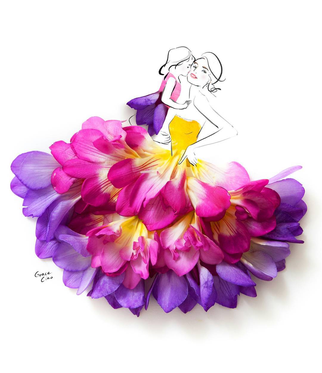
Grace Ciao. Ink/paint with flower petals. I feel that the petals provide vibrancy and soft, organic curves, creating a good counterpart to crisp lines. The only problem may be the freshness of the petals.
Cans Seurat (Chris Jordan). Composite of 106,000 aluminium cans. While the idea of sprawling canvas made from small objects is not new (e.g. Myra by Macrus Harvey) and probably not feasible for this project (in that it’s only A4 sized and thus the effect won’t be as clear), it’s interesting nevertheless, especially where the object used is clearly sending a message, and where it’s also using pointilism effectively.
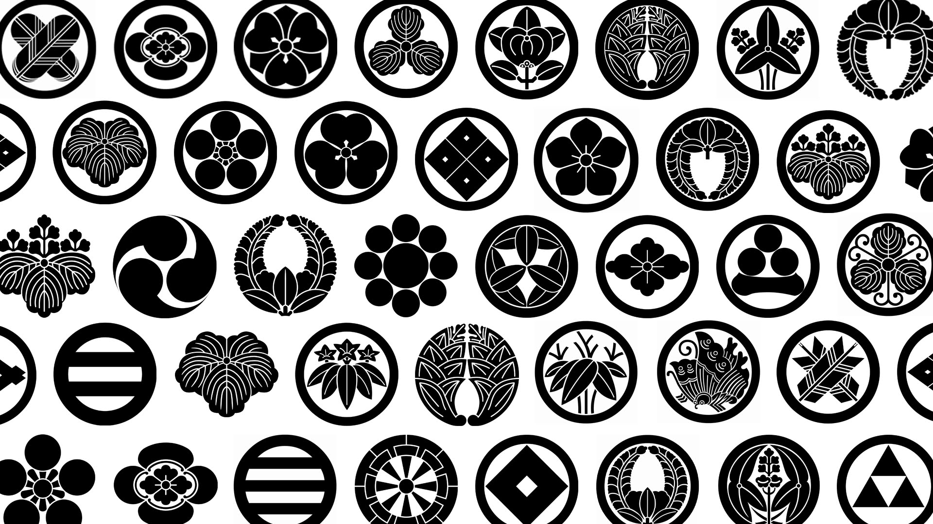
Not particularly unconventional, but the distinct qualities is good to reference. Japanese traditional seals (紋 mon). What’s interesting to note is how it’s made to look like a logo through a circular frame (whether actually there or implied). Due to its nature of being a stamped seal, it also makes use of negative spaces to define form too. I also think it’s interesting that it’s easily identifiable as “Japanese” simply thorugh the use of appropriate images, like local plants, flowers and symmetry. (from オモロテレビ on Youtube)
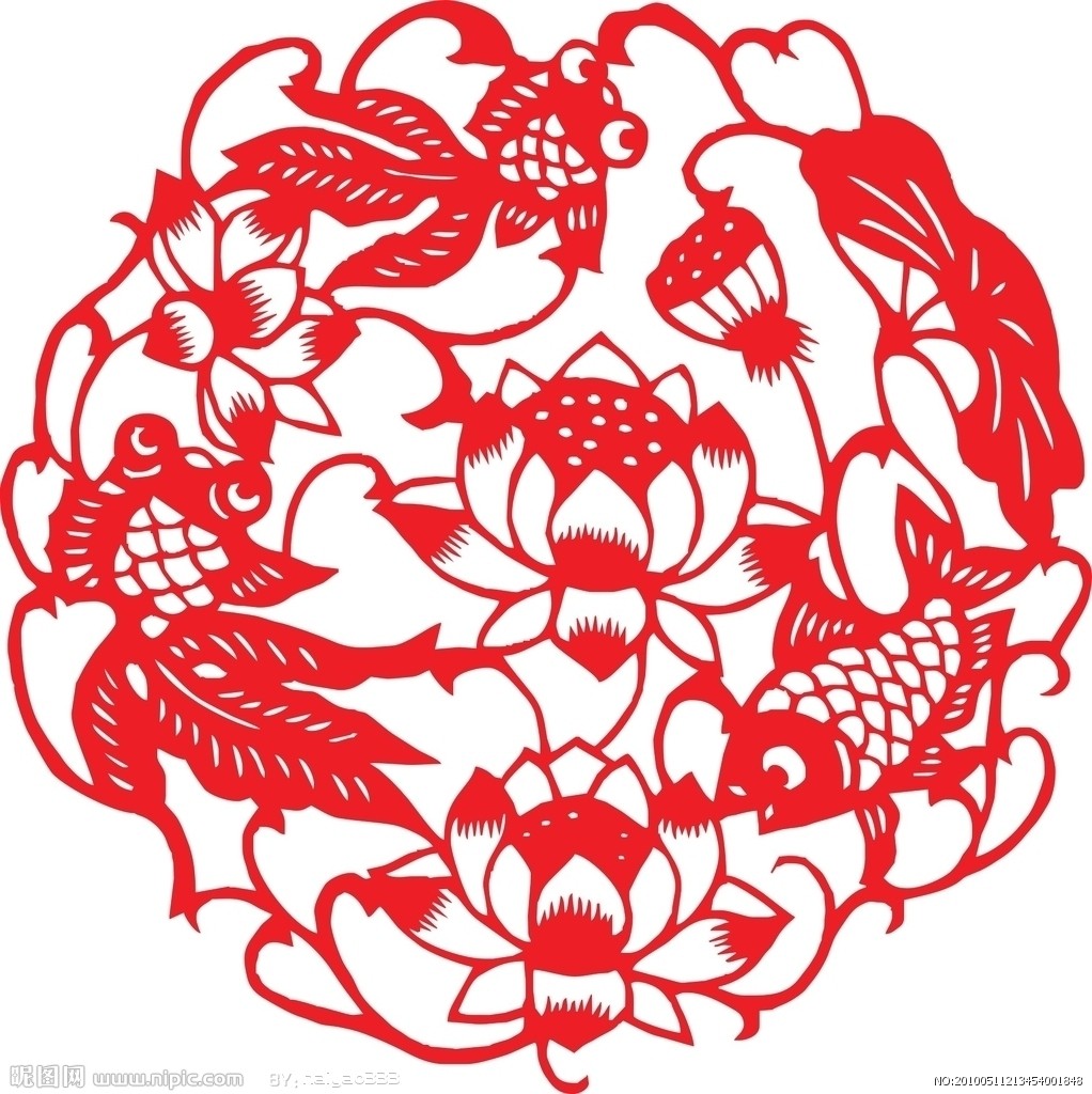
Also somewhat not unconventional, but I find the distinct style good to reference. Traditional Chinese papercutting. Like Japanese seals, the nature of papercutting leads this style to use negative space to define form. What’s unique to me, though, is the use of positive/negative space to define highlights and shadows, as seen by the fish scales and lotus petals. It’s also good to note that Chinese 剪纸 (jianzhi) is easily distinguished from German scherenschnitte just through colour and the use of images associated with the Chinese. (from haiyao333 on Nipic)
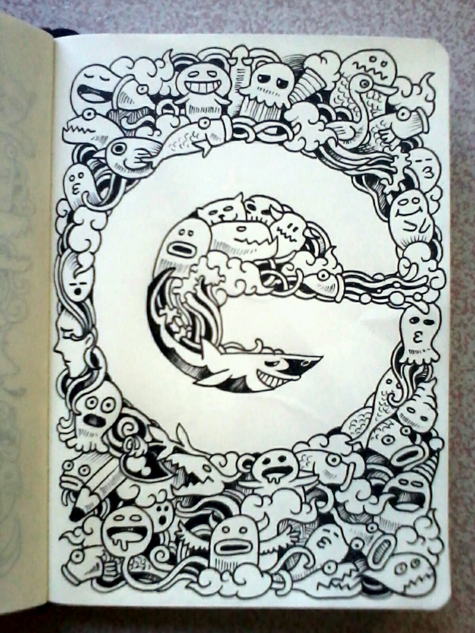
Kerby Rosanes. He often defines his letters by filling in the space around it.
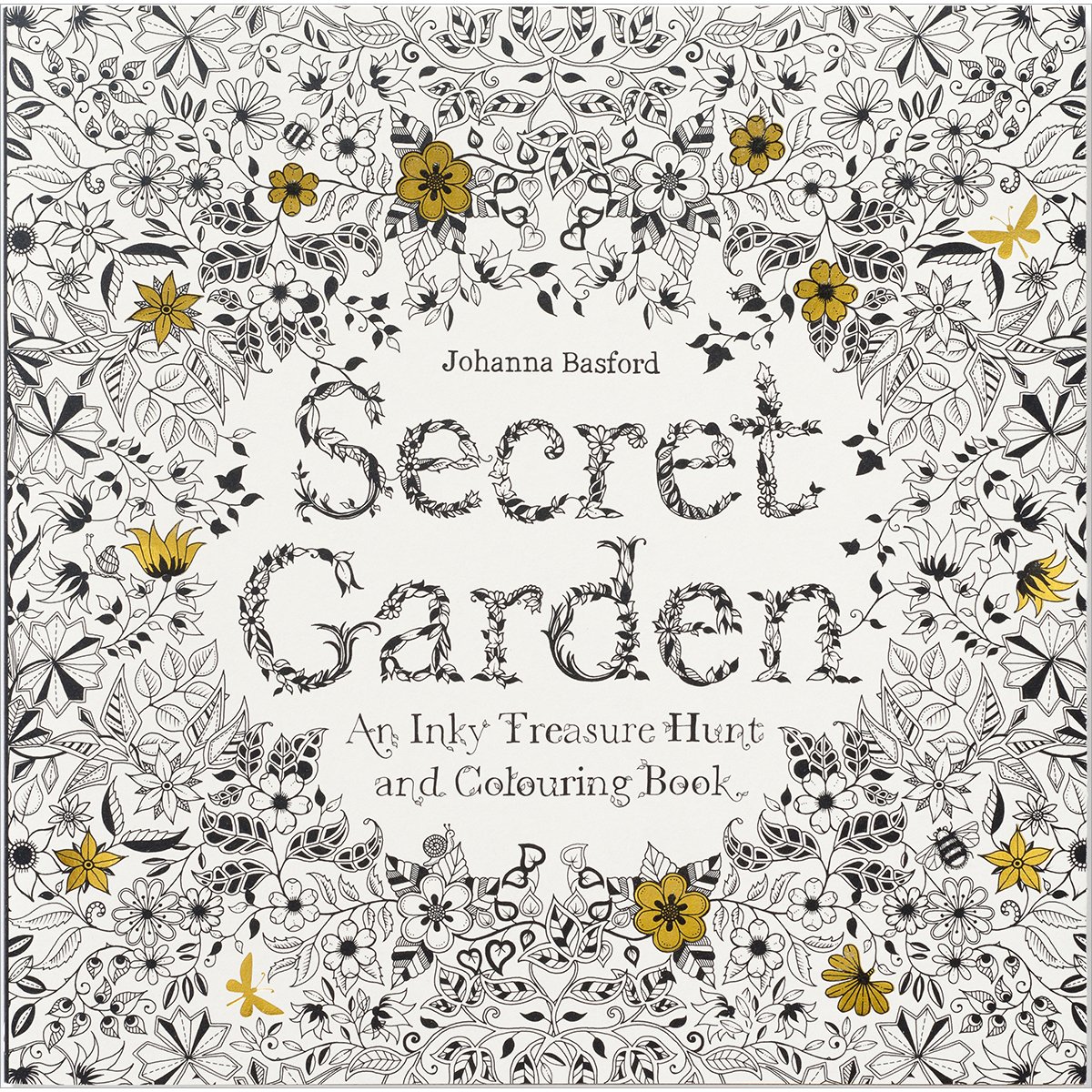
Adult colouring books (by Johanna Basford). Tends to have typefaces based on the theme of the book, which may be useful to consider when it comes to depicting the job visually.
My process is constantly updating and becoming convoluted, so I’ll leave it in a separate post.
(Here’s also a little snippet of some research I did on Russian Constructivism, which didn’t quite fit anywhere, but it seemed like such a pity to just delete it.)
Russian Constructivism (1913-1940)
Using art for social purposes, e.g. communication (posters), architecture
Mostly, but not entirely, apathetic (unless said emotion is beneficial to the purpose of the work)
Initially only applied to 3-dimensional objects, but later expanded to 2-dimensional
A suspicious amount of Constructivist work is “scientific” in nature, likely due to the rise of modernism and science/technology (post-Industrial Revolution), as well as the Russians attempting to express/present their society as a progressive society
A suspicious amount of Constructivist work is propagandic in nature, likely due to the 1917 Bolshevik Revolution leading to a need to endorse the new government, where Constructivism was a convenient means of spreading propaganda
Keywords to describe visual qualities of Constructivism:
Geometrical/Orderly
Experimental/Abstract
Apathetic/Objective
Modern
Gustav Klutsis (mostly photographer): Dabbled with Soviet propaganda. Note the recognisable shape of the “microphone” shown just by a cone, with lines of sight converging. Red was very closely linekd to communism, and thus featured heavily in many Soviet works.
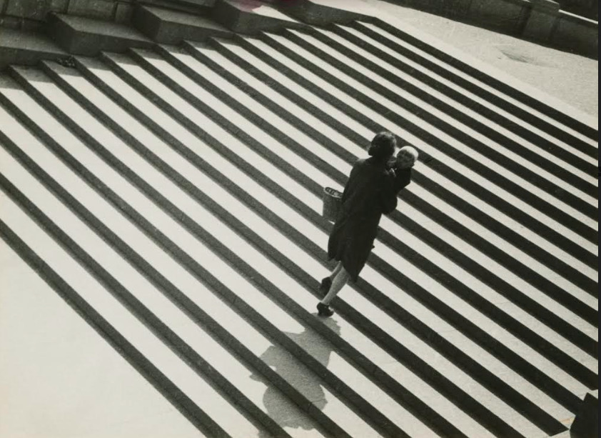
Alexander Rodchenko (multimedia): A preference for works intimate with the person (social engagement). Note the rigidity of the geometrical steps, giving emphasis to the lone figure.
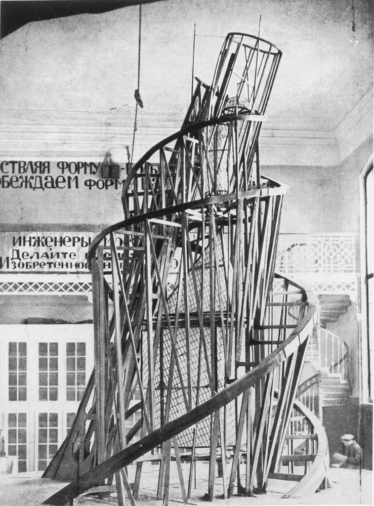
Vladimir Tatlin (mostly architect): Very patriotic; even this Tatlin’s Tower was meant to showcase the grandeur of an advancing society (particularly through the use of steel). Note the defined yet exquisite form, a spiralling tower of simple lines.