@projectsociallife

With Cecelia, Jocelyn, Nadiah and Shu, Project Social Life (name as suggested by Shu’s mother) was carried out on 14 April.

Something like this, maybe.

OVERALL

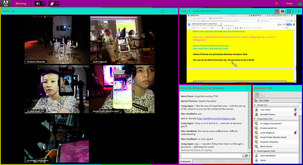
Password: projectsociallife. Video may be subject to later revisions.

The overarching idea is of surrendering control of yourself to others. I’ll link to Shu, who, in my opinion, effectively wrote the most concise description possible.

Viewers are encouraged to send in suggestions in response to the question of “what should we do next?”. These answers would then be compiled, with 2 options being put into a poll on Instagram: viewers would then vote which option they’d like to see. After 10 minutes, the results would be taken, and the winning option carried out.

The Blast Theory style of mixing technology and physicality was employed, as was a common theme in their works, that of control and interdependence. Like A Machine to See With, there is an element of control by the external; like Can You See Me Now, there is an element of dependence on the online community. On a personal level, too, I felt that it resembles an Annie Abrahams work, in the setting of clear protocols without too much limitation on the possible inputs, leading to an outcome which may vary wildly.

PROCESS

The original idea had the same concept, but was more like this: Two teams allowing each others’ Instagram followers to control each other. While we would come up with each other’s options, viewers would vote on which option they wanted. Perhaps we would even throw dares at each other, which we’d have to complete.

Various other iterations of this concept went about, until we realised it was too convoluted, and that it didn’t particularly matter if we split up or not, or let each other’s viewers control us as opposed to our own. Additionally, it would be quite limiting if we came up with the questions and options on our own, leaving viewers to only decide the outcome.

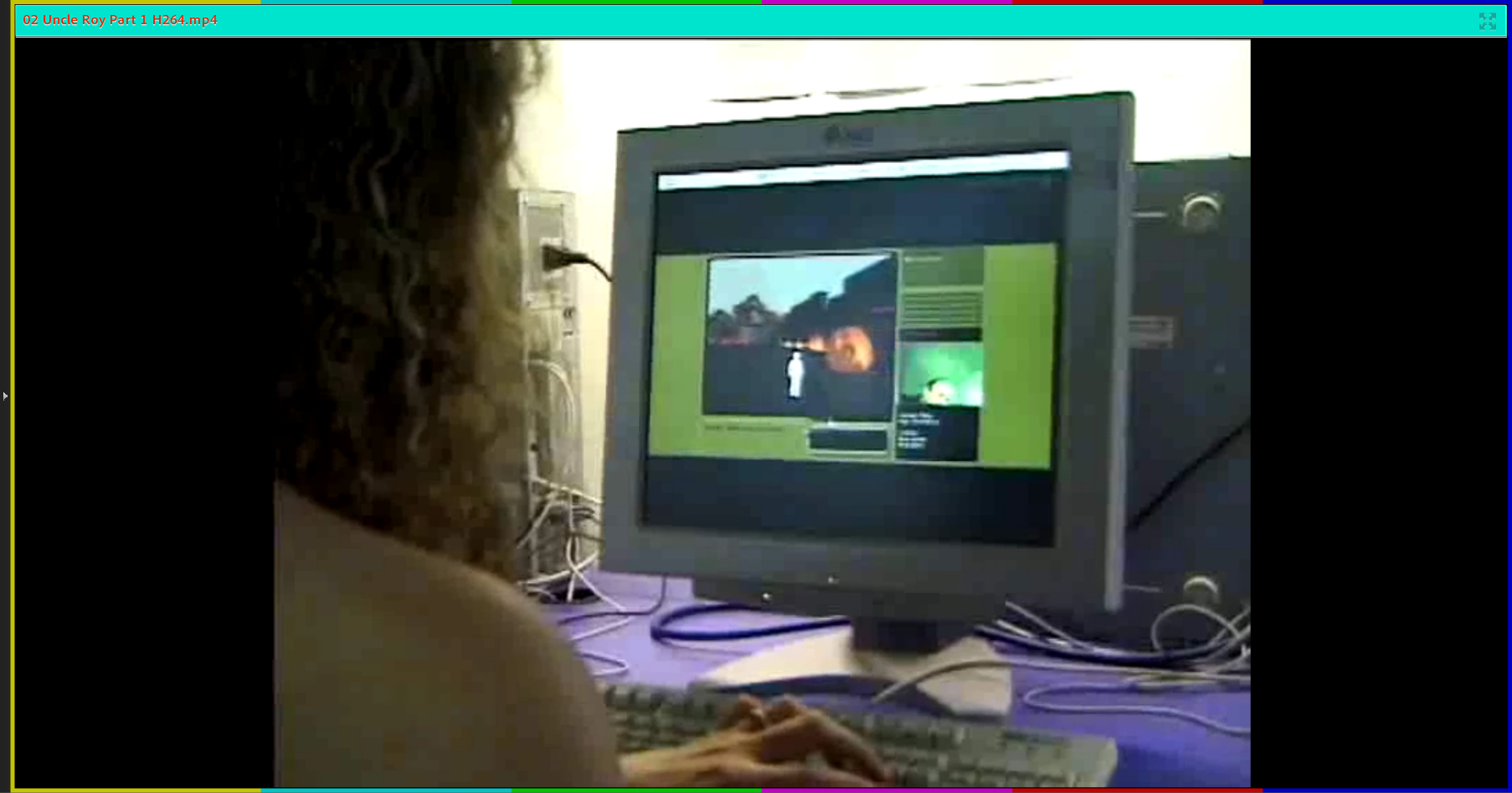
Consequently, we made it better by relinquishing even more. The physical location and everything we did was entirely random, solely dependent on what voters in the third space wanted. No one in the first space particularly batted an eye at us, though, so unexpected elements mostly came from suggestions.

Since we were no longer splitting up, we essentially just took turns posting on Instagram, and executed orders together. On a personal level, it was difficult to know if someone else was already posting what needed to be posted, so I anticipated that we’d need B-roll shots (or at least just landscape-oriented footage, since everyone else was taking portrait-oriented shots for Instagram), and delegated myself to that.

The trailer, done by Shu, thanks Shu!, consequently featured a mix of the footage we had:

  1. B-roll shots (ex)
  2. Instagram story screen recordings (ex)
  3. Instagram direct message/feed screenshots (ex)
  4. Post-production interviews (as seen in trailer)
  5. Aaaand a lot of special effects and glitches

Stylistically, it drew reference from Carla Gannis (in terms of illogicality) and xxxtraprincess (girlishness).

POSSIBLE IMPROVEMENTS & REFLECTIONS

All in all, it was a surprisingly tame experience. Although we had to do various things we usually didn’t do, such as going to the arcade, there was nothing particularly intense. Personally, I feel that this might have been a result of improperly set protocols.

  • We actively chose which options to present
    • e.g. “go to a museum”, as opposed to “climb a tree”
    • By avoiding putting wackier suggestions up, it limited the amount of wildness
  • Options were often linked together
    • e.g. “go to town” / “go to Boon Lay”, as opposed to “go to town” / “dance”
    • By establishing a “common ground” between options, it limited the amount of unpredictability
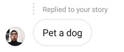
  • Assumptions were made on the context-sensitivity
    • e.g. not putting up “pet a dog” if we were in a location where dogs were unlikely to be found
    • By avoiding what we thought impossible, it limited the notion of being forcefully controlled
  • Only major decisions were decided by viewers
    • e.g. heading to locations, doing certain things
    • By not letting viewers control every single detail, we still retained freedom

In a sense, we weren’t supposed to enjoy ourselves, but did anyway, because we still retained a rather large degree of control. For example, it would have been interesting to see us have to execute an order even if it’s difficult or humiliating. (It’s not impossible to be told to pet a dog while on the train. Just alight, get out, and run around till you find a dog. Painful, but possible.)

Alternatively, it would have been interesting to see us being utterly controlled, not just in terms of being told where to go, but also every single detail. This might seem masochistic, but what if we couldn’t even do anything unless we were instructed to? If no instructions come in, we’d have to just stand there, staring at our phone, until someone says something. If we’re not told to, we can’t ever wipe our sweat, or rub our eyes, or breathe.

Of course, this didn’t happen, which is an interesting phenomenon.

Even when told to control someone else, we form assumptions as to what degree of control we can have. No incredibly specific suggestions came in, nor illegal suggestions. Even when we thought we had relinquished control of ourselves, we ourselves assumed a degree of freedom. We went to the washroom without being told to, PLAYED at the arcade though we were only told to GO to the arcade, etc. And no one questioned our freedom to do that.

e.g. we went to buy Stretchy Cheese Toast, without being told to.

In any case, though, I still think that we were able to bring out that idea of being controlled, where the artists become the puppets of the community, although only when the suggestions didn’t clash with our natural instinct to protect ourselves. In fact, the blatantly obvious protective measures make an interesting statement on self-preservation and assumed freedom as well.

(On a related note, I am compelled to recommend On Liberty as a good read on the relationship between authority and liberty.)

Zine Designing Process (with supporting Research)

EDIT (17/4, 1100h): Added peer comments.

(Final posting found here.)

On the last episode, we investigated a government coverup in a place where everyone had disappeared. This episode, we draft up a report for higher management, with extremely consistent assistance from Shirley.

… Or so was the underlying idea. Upon beginning the creative process for the zine, I contemplated 2 directions in which it could go:

  1. A conspiracy report on a mysterious, unexplained disappearance
    • Drawing upon the aesthetic approach I took for the Project 2A slides
    • Either a) a broad overview of all investigated portions (spray painting, trash, etc),
    • or b) an in-depth analysis of a certain portion (e.g. spray painting only)
  2. A post-apocalypse journal on the landscape of after the end
    • Drawing upon the idea of exploring a dead world
https://vignette.wikia.nocookie.net/life-is-strange-w/images/8/87/Diario_de_Max_-_Corrompido.png/revision/latest?cb=20160114234600&path-prefix=es
From Life is Strange (2015 game), the journal of the protagonist. If I had gone with the idea of the end of the world, it might have looked something like this, with many illustrations, perhaps a few photos pasted in.

Eventually, though, I settled for the conspiracy report, considering that it would be more aligned to Part A, and that I had a clearer idea of how it would look.

After which, I considered two report styles: a typewritten report style, or a journalistic report style.

http://www.mischievouspeeps.com/wp-content/uploads/2012/03/FBI_02-resized.jpg
From an FBI report. I found the many layers of stamps, blackouts and annotations rather appealing to look at, especially when put against the neatness of the typewritten report. However, it was limited in terms of colour palette, and the orderliness of the fundamental structure.
https://jostwald.files.wordpress.com/2012/10/notesexamplenotepaper0011.jpg
No suitable reference exists, but the general idea of hastily taking notes while on the move. Scribbling down notes, taking instant photos and making quick, short comments. (I would later learn that this is, in essence, a sort of messy scrapbooking.)

Eventually, I settled on the journalistic report, owing to more flexibility in terms of more dynamic compositions.

CONTENT

First, I established the flow of the zine through determining the content. At this point I had yet to decide whether to have broader or deeper content, and thus went for broadness first, assigning each 2-page spread (folio?) a specific content. The flow would then be as followed:

  • Remains: implication that people were there, but are currently missing
  • Corresponds to slide 9 of Part A
  • Images of bikes and trash

  • Obscuration: implication that something is being concealed
  • Corresponds to slides 13-14
  • Images of fences, barriers, etc.
  • Symbols: implication that there is an undecipherable secret message
  • Corresponds to slide 11
  • Images of spray painted symbols and numbers


For the first draft, I designed based around the many photographs I had, opting not to use many hand-drawn elements to emphasise the notion of “quickly taking notes” with photography than sketches. The second draft onwards mostly includes minor edits to make it look more realistic, as well as complete upheavals of design for certain pages.

COVER

For the front and back cover, I was uncertain of what to do, and thus tried to think of it in terms of associated images. Thus, I considered the character 目, for the following reasons:

  • As a Chinese character, it links back to the Chinese name of Xilin
  • As a word related to “eye”, it evokes the eye of the Illuminati (conspiracy)
  • As a character with “bars”, it resembles the many fences of obscuration
  • As a character with three “windows”, each window corresponds to a folio of information
I was also curious as to the notion of having an image carry over from the front page to the back page.

Shirley’s suggestions:

  • Remove design elements which cannot be immediately understood without explanation

Thus, I shelved that character. After settling on the conspiracy report idea, I decided to go for a certain look, that of the brown case file folder.

However, I wasn’t quite sure WHAT to do with the kraft paper texture, until Shirley suggested to mimic the case file. When I expressed concern over that it would look too rigid, she suggested to just have it as a background, while keeping the title in the foreground and distinct from it.


For some reason, the above designs instantly evoke an idea of the report, and thus I made sure to include key defining elements.

The title on the folder, the table cells, the brown textured background, and the stamps. (I lowered the opacity on the background text to emphasise the foreground.) With the background and foreground distinct from each other, there’s more opportunity for dynamism. I did try to get the stamps to interact with the title, though, in an attempt to show a certain level of depth.

REMAINS

In this page, I was uncertain what to do, and thus opted to focus on creating suitable spaces for text through proper positioning of images. Consequently, I tried to have balance by putting the images diagonally opposite such that it wouldn’t be too image-heavy on any particular side. To incorporate the element of haphazardly pasting photographs in, I skewed the images as well.

Shirley’s suggestions:

  • Insert a map (I decided this would be the best place to, and thus proceeded to do so)
  • Have an introduction than jump straight into content
While digitalising, I cut the edges rather rigidly with the Polygonal Lasso Tool to mimic scissors cutting. It also did not originally come with masking tape, which was added as an afterthought (and to provide some level of depth).

Shirley’s suggestions:

  • Reduce opacity of masking tape, to appear translucent than opaque
  • Too much vertical height of text without sufficient counteracting horizontal pull
  • Lack of visual hierarchy
  • Use drop caps to indicate the beginning of text

The images still appeared extremely unreal due to its flatness. Thus, I printed it out and slightly marred the papers by crumpling and folding them. For some, I tore the images slightly, or made a dog ear. Then, I scanned them back in.

In black and white due to being a test run (and saving ink). I also added in a proper map and annotations, where the map is meant to look hand-drawn. I also tried changing the ink colour to resemble handwriting. To try and counter the vertical pull/hierarchy issue, I shifted the milk carton and map to provide more space, to increase the font size, and make the textbox horizontally wider. Shirley also suggested actively having a colour palette (e.g. triadic), and some minor edits as to text hierarchy and drop caps.

Shirley’s suggestions:

  • Have a conscious colour palette (e.g. triadic, owing to the yellow bike/can, blue milk carton cap, and perhaps red text)
  • Only use drop caps for the first beginning
  • Have varied fonts for dynamism (e.g. typewritten font for the map or annotations, font weight)
  • Improve the map (logos to indicate MRT stations, reduce font size)
Final. In line with the change to a typewritten font, I changed the map to a digitalised map than the previous handdrawn version (the vectorised arrows, too). I also altered font weight for the hierarchy.

OBSCURATION

In this page, I considered a grid system, which would resemble the bars of a chain-link fence. At the same time, this would be helpful in limiting the amount of text while providing many spaces for images.

I felt that it would make for an interesting image, the lines of the fences against the lines of the grid system

Shirley had no comments for this, and thus I went ahead with it.

Upon digitalising, however, it turned out to be too neat, owing to the orderliness of the grid as opposed to the less rigid layouts of the other pages.

Shirley’s suggestions:

  • Change the design altogether, to something with a less orderly design
As such, it became a corkboard, which is typically messy. Initially, I had the text on InDesign-rendered white squares, but it was too neat, thus I printed, corrupted, and scanned them back in. I also added drop shadows to provide some sense of depth.

While I was concerned about the colours in this page, Shirley assuaged my doubts in pointing out a seemingly high level of green, accented by subtle reds, and the brown corkboard. I decided that it was important to try changing the text colour, regardless.

Final. Other than being complementary, I find that the green and red helps to differentiate what is “crucial” and what isn’t, where red is often an accent while green depicts the main subject.

SYMBOLS

In lacking a substantial design idea, I followed the first spread’s idea of haphazardly putting images to reduce space. I considered the use of negative space, where I would have a scatter brush of graffiti as the border, leaving negative space as the text box.

An example.

Shirley’s suggestions:

  • Use a concrete background instead for the texture
However, this structure simply did not work due to too much text space available even with an overload of images. Also, the structure was too similar to the first spread, which makes it rather boring.

Shirley’s suggestions:

  • Full-page image with 1 column of text on the side
(Additional graffiti in black and white as I printed and crumpled and rescanned) It worked a lot better in terms of limiting text space while remaining aesthetically pleasing due to the rule of third. I also tried to have a sense of depth by having slight perspective.

Shirley had no comments for this specific page, but in line with her comments on colour, I figured to actively consider the colours on this page. The graffiti I have only comes in white and blue, and the concrete is grey.

Final. In the end, it remains blue, the only colour with hue.

BACK COVER

I was uncertain as to what to do with the back, considering that there is typically nothing on the back of a report. Using my imagination, then, I figured that it was not improbable that one might put additional notes on the back, to be read after reading the report. As such, I attempted that.

It did come off somewhat awkward, though.

Shirley’s suggestions:

  • Place the content on a post-it note instead
Final.

PEER COMMENTS

Some of the more common comments:

  • More high-res images
    • wasn’t sure if it was high res enough, so good to know
  • More plays on visual hierarchy, esp. on 2nd and 3rd spreads, e.g. by putting titles/more info
    • While I’m unsure if it’s wise to add unnecessary information, point is taken :’)
  • More sketches, doodles, annotations
    • no tablet so a bit hard but good to know :’)
  • Last spread not as interesting, not consistent design
    • In hindsight, agree. Perhaps it might have been useful to let the spray painted images splay over the edges of the background image such that it looks less like a properly designed page as opposed to many scattered images placed over a properly formatted page.
  • (varying opinions, some said it was good but a few said) font choice was slightly kiddish than strict
    • Not sure what to make of this personally
  • Consistency between cover pages and inside content, e.g. paper clips, post-its, folder tabs, etc
    • Another good point in hindsight :’)
  • More exaggerated narration, like Geronimo Stilton
    • Which I have… Never read but point taken :’)

OVERALL

All in all, it’s amazing how many issues seem so obvious in hindsight, but went completely undetected by me. To me, the most interesting part was that of trying to “collage” successfully: unlike illustrations, it’s difficult to control the proportions, perspective, colours. This made it somewhat difficult to me, in that I had to find ways to make the images work in my favour. While I picked by gut feeling, it seems that somehow my instincts managed to choose images with consistent colour palettes, surprisingly, which made things slightly easier.

I also felt like I learned a lot about graphic design just through experimentation and Shirley’s remarks, from text hierarchy to style consistency to variety (listening in on other peoples’ consultations was also surprisingly helpful!). I’d like to thank Shirley for being so helpful throughout the entire project. Thanks Shirley for being so helpful throughout the entire project!

3 years ago, I mused that, someday, A Level History would cover the rise of the Internet as a full-fledged topic. It’s an important historical event, after all. There’d be so many possible subtopics, and all the Gen Z kids would love it. Still waiting though.

Social Broadcasting: An Unfinished Communications Revolution. This is the theme of the symposium, and a phrase saturated with meaning. As quoted by Packer,

Gene Youngblood signals the need for “a communications revolution… an alternative social world” that decentralises the experience of the live broadcast through the creative work of collaborative communities’. (link)

And yet, this complete upheaval of the way we communicate is still “unfinished”. The symposium thus explores this notion of networked communication as a way to open the way to that new world order.

To understand how the social broadcast is revolutionary, we must first understand the live broadcast. Loosely, it is defined as media which is broadcast without a significant delay. The most primitive forms of broadcast would include one-way transmissions, such as with television. However, as Chatzichristodolou (note: will be referred to as Maria X for convenience) states in her keynote, there is another definition of “liveness”, that of something which is “infinitely open to interaction, transformation and connection”. This is a concept which has led the broadcast onto a completely new path, continuously reshaping the “broadcast” into something much more communal, allowing for communication between, than merely to, people.

Screenshot from Maria Chatzichristodoulou’s keynote.

As suggested above, Maria X, who spoke on the first day, provided a clear view of key definitions. A “performance scholar”, she also spoke at length on the historical context of networked art, and how that works together with internationalism. From Paik’s Global Groove, we see a statement on his envisioned future of the “phenomenal effect” of globalised dissemination. From Satellite Arts we see the “possibilities and limitations of new technologies… to create and augment a new context and environment” (Maria X, 2018). It is interesting to see that many of these artists work in groups, since networked art necessitates interaction with other humans.

Picking up after the keynote, Annie Abrahams expanded on this idea of the need for accompaniment, with the debut of Online Ensemble – Entanglement Training. As the name suggests, the performance was an ensemble, one which can only work with a group, one supported by the natural disadvantage of being unable to synchronise digitally.

Screenshot from Online Ensemble. Voices state numbers dispassionately at random intervals, and all of them show something white near them. By nature of being a culmination of different people, the message becomes an aggregation of inputs, than a single person’s.

In response to a remark that it was difficult to work together, Abrahams mentioned that one can be “not in the same time and same place, but can still play together… in this entanglement of people and machines”. This is rather in line with an earlier remark that “her artworks primarily tackle “communication and the difficulty with communicating at all”.

Screenshot from Online Ensemble. Together, the performers speak and place objects, at seemingly random intervals, with no seeming connection whatsoever.

It is evident that synchronisation is not particularly crucial since the artwork is essentially an improvised performance. The randomness of non-vetted phrases is important: phrases like “don’t ask for the truth if you can’t handle it”, “I’m sorry babe, I’m afraid I can’t do that”, “suddenly we become scared to change something” have no meaning on their own, only what we interpret on our own. As aptly put by Dixon, it is very much a fluxus work, where direction is not as important as non or omni-direction.

http://www.lasalle.edu.sg/wp-content/uploads/about_presidentswelcome_professor-steve-dixon-358x430.jpg
From LASALLE College of the Arts. Image of Steve Dixon, the current President, who gave the opening statement for the second day.

Dixon further elaborates on the nature of modern forms of art which come with new technologies on the second day. As previously asserted by Paik, the relationship between art and new technology is as old as art itself, from the Egyptians’ pyramids to satellite art. Relating the story of Henry Thoreau, who could not understand the purpose of the phone, Dixon explains that “although man talks to accomplish something, unawares, he soon begins to talk, simply, to talk”. It is rarely about whether there is a purpose, as to that it has come into existence, forming new relationships and new ways of thinking. Consequently, modern art emerges as a form of exploration into these “new processes in communicational processes”.

Another example he gives is that of Blast Theory, neatly tying into a quaint introduction for Matt Adams, its founder. Delving into the intricacies of simultaneously existing in reality and irreality, Blast Theory works with the idea of connecting people remotely, and the possibilities which come with that idea. It is perhaps even this which gives the theme of the day, of Networking the Real & the Fictional. In fact, it is almost a pity that Adams was not able to execute an interactive work with the audience on the spot, which may have brought the point across even more pertinently by nature of its interactivity, as opposed to speaking at length on past works and the intentions behind them.

Screenshot of Matt Adams’ presentation on Blast Theory.


Regardless, the various works presented are interesting, showcasing what was then a brand new style of (mostly) game-based interaction based on an augmented reality of sorts. Uncle Roy All Around You, for example, asks questions without providing a frame, making it uncertain as to if it is something out of the game or in the game. Neither can work without the other, and yet the boundaries between “reality” and this second “reality but also not really” are blurred, creating a super reality. Many games nowadays attempt, in some way or another, to replicate that crossing of reality and the digital world.

As later addressed in the Q&A, the works are also curiously tied in with the idea of control. As stated by Packer, it is often about making people acutely aware of their given or taken control, such as in Kidnap (1998). “It shapes our lives that the media has control over us,” Packer suggested, and I am not inclined to disagree. For example, as previously studied in class, we see that it is often not about acting in the capacity of a president, than acting as a president. The media has a lot of control over the narrative, and can even affect crucial national decisions.

Screenshot from igaies. While the xxxtraprincesses read while being in the same space, Sifuentes is too there in the same space but in a different perspective. And yet, at the same time, Constantini is in Mexico performing another piece altogether at the same time.

The symposium ends off with the debut of igaies (intimate glitches across internet errors), a strangely neat summary of the topics of the previous days. Personally, it is fascinating that it is pronounced as “gaze”, perhaps leaving it as a statement on its online nature (iGaies), on the connection formed by eye contact (gaze).

Jon Cates and collaborators are currently developing a series of multifarious and differentiated performance works that coalesce into what Cates refers to as igaies (intimate glitches across internet errors) – small miraculous mistakes, moments of beautiful brokenness – all fused together as a single improvisatory, real-time sensory overload of noise, blood, hashtags, fetishism, sexuality, memes, and #cutestuff. (link)

As implied by the above quote, the key idea is of glitches. Even on a more “real” perspective, though, simultaneous perspectives and/or performances hint at some sort of “glitch”, where there logically shouldn’t be an overlap to allow proper focus on the appropriate artworks. These “multifarious” artworks even appear to clash, from the girlish xxxtraprincesses to the gory leeches. Despite this, it makes a strange sort of sense. Constantini brings to the table his works on petri dishes, the image of bacteria tying in with Sifuentes’ leeches. Cates drops a beat while Constantini’s electronic sound pervades the scene. The xxxtraprincesses bring to the table a tale of revolution, all while embracing internet culture. Memes, hashtags, digital avatars all find a place here, and Nacif herself identifies as a gURL, stating that she finds this typo-ed term to “have a multiplicity and simultaneity” which gIRL does not. Sifuentes, too, brings a tale of revolution, but gorier, in the form of exsanguination, defined as “a process of mourning and cleansing with leeches being ritualistically applied to his body” on the Third Space Network.

Screenshot from igaies. While Holloway performs on sexuality and objectification, Constantini has a strangely relevant drawing.

Something I was particularly struck by was the vibrancy of the chatroom, too. There could be the simplicity of one word reactions to which you’re obviously not meant to respond, to drawn out interpretations which can begin conversations on its own, to added insight on the artworks being presented. (See below for audience links which I spotted on Day 3.)

Abrahams said something to the same effect:

Sometimes I even think that the chatroom is more important than what is actually happening between the performers. Both complete each other. And I also try to have some people in the chatroom who know what it is all about, so they can mediate between people and create a live/nice atmosphere.

While I am uncertain as to if she said “nice” or “live”, I prefer to think of it as both. Niceness creates a welcoming community which connects the audience to each other; liveness brings forth the connection between the audience and the artist(s). Overall, though, it is beyond doubt that the medium truly brings out the theme: I could hardly imagine these artworks being presented traditionally. Though I believe that there are ways in which the symposium could have stretched the social broadcast medium even more to communicate even better, it is certainly remarkable, considering that the revolution has yet to be finished.


Featured image from Adams’ presentation video on Uncle Roy All Around You.