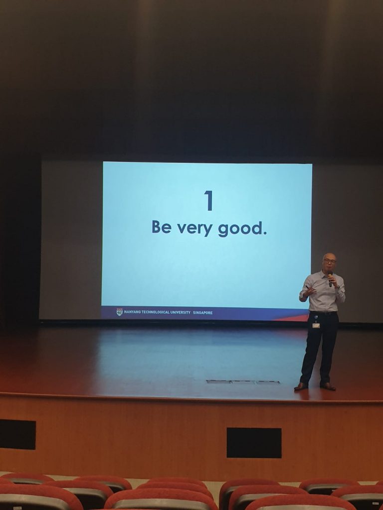
*inserts a very typical project management picture from here*
Here’s a short summary to get us all on the same page.
Chapter 2 introduces us to aspects of project management. It first establishes a difference between goals and objectives, where goals are shared across all projects while objectives are unique to each project. The chapter also claims that all projects have 6 goals to manage, with 5 phases and 6 activities during the process.
Chapter 5 further delves into project planning. This covers the necessities of planning, the iterative process of planning, fishbone-sque breaking down of tasks, and so on. It also goes into 6 objectives of the project work plan, and details regarding each objective, as well as how to document said plan.
THINGS WHICH I’M INTRIGUED BY
The 6th goal is incredibly interesting to me, of “meeting everyone’s expectations”. It’s surprising to see that the human relationships between you, the clients and the employees is as important as it is. That’s also one of my weakest points, in balancing my happiness, with the happiness of others. Unfortunately, the book can’t give much information, since this is a very situational goal, but it’s still good to take note.
The only solution is probably practice. I’m very sorry in advance to every person who will have to put up with me.
The project manager’s obligation to fulfill other responsibilities is also concerning, especially in small projects, and especially where they’re expected to be generalists. After all, the way companies usually work is that you start as a specialist in a discipline anyway, such as “Junior Graphic Designer”. No one gets directly promoted to a more generalist role like Visual Design Executive. In other words, you need both depth and breadth.
The only solution, probably, is to “be good”.
how to get job, wow! i can’t believe!! it was so simple all along!!
NOT VERY IMPORTANT THINGS WHICH NEVERTHELESS MAKE ME SALTY
Something which really gets to me is the artificial division of goals into 6 categories. This is because I feel that many of the goals can be subsumed under a similar header, such as “To reach the end within the established limitations”. This would easily cover budget, time, and safety, where these are limitations which must be adhered to. It’s not a major issue, since it IS important to eventually expand on these different aspects, but it’s just conceptually annoying for me.
Something which also gets to me is their definition of efficiency. That, again, is probably a linguistic difference: when I was taught (the equivalent of basics of) project management in my extracurricular activities, efficiency was lauded over effectiveness, where effectiveness was about being successful, but efficiency was about being successful with minimal resources. I guess it’s not a major issue either.
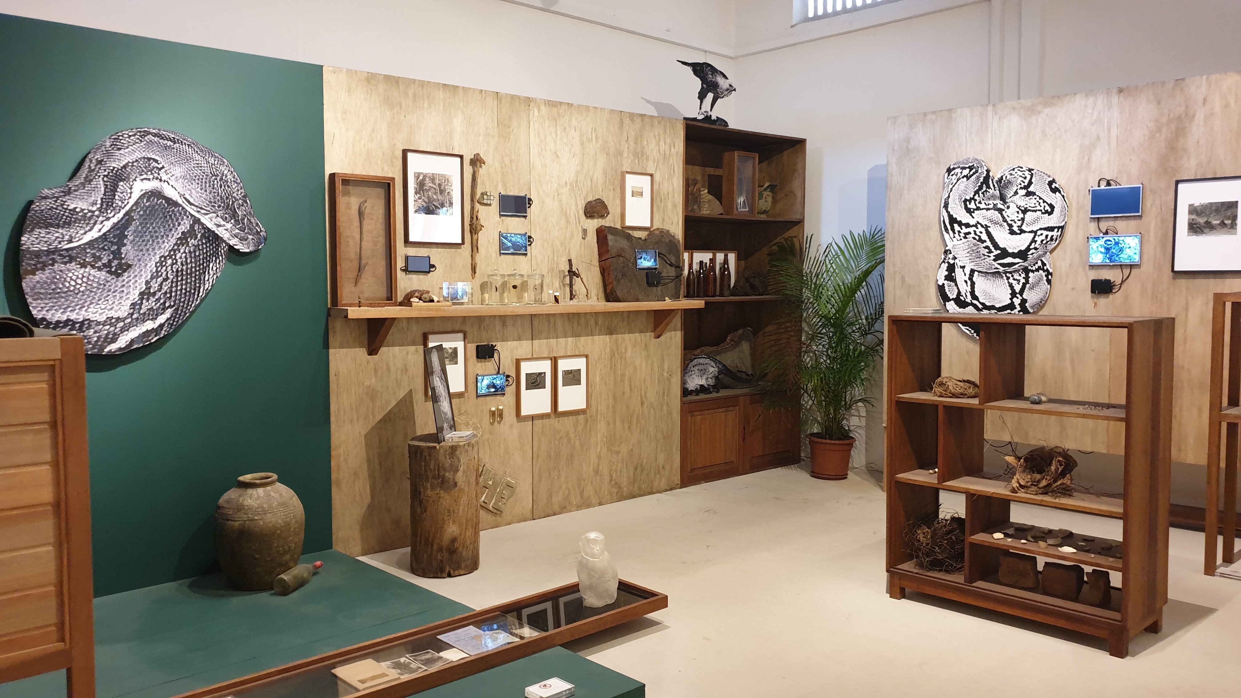
A lot of the artworks were “interesting”, “cool”, and “pretty”, such as Sokchanlina’s Letter to the Sea. That’s about it, though.
I’m very sorry for being uncultured trash, but in my defence, most of it felt like creative documentations, without even a desire to drive people to act upon the tackled issues. All we really do is watch, and lavish praise unto it, without even needing to care too much about how nature is being eroded, or how communities are marginalised, et cetera.
Robert Zhao Renhui’s Queen’s Own Hill and its Environs
Zen Tang’s Escape Velocity
Lim Sokchanlina’s A Good Event in Tokyo
I think that’s alright, where life would be tiring if everyone was constantly trying to make you think (and feel) the way they do, anyway. A side note is that something like a pop-up museum at the train platform would be pretty cool. After all, that would be an easy way to “be seen”, since little engagement but “looking” is needed. It’d really change the way people treat mundane moments like transit, too.
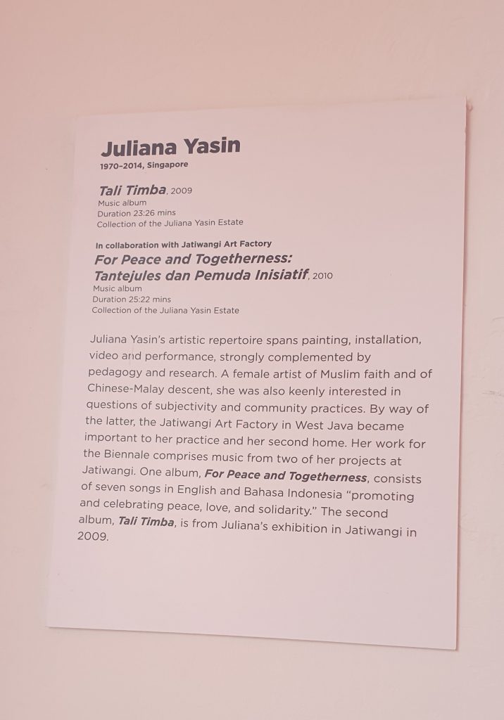
JULIANA YASIN
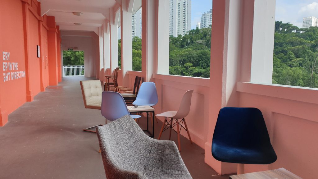
In any case, because of that, I found, may she rest in peace, Juliana Yasin’s work more intriguing. What she presented was Tali Timba (2009) and For Peace and Togetherness: Tantejules dan Pemuda Inisiatif (2010). (link)
Unlike the rest, her work was an entire experience which seemed made for the space it occupied. You can barely tell that it’s an artwork, where it just seems to be a sitting area along an aisle (not even within the gallery!), with background music not unlike the kind you’d hear at a casual hangout in the nighttime.
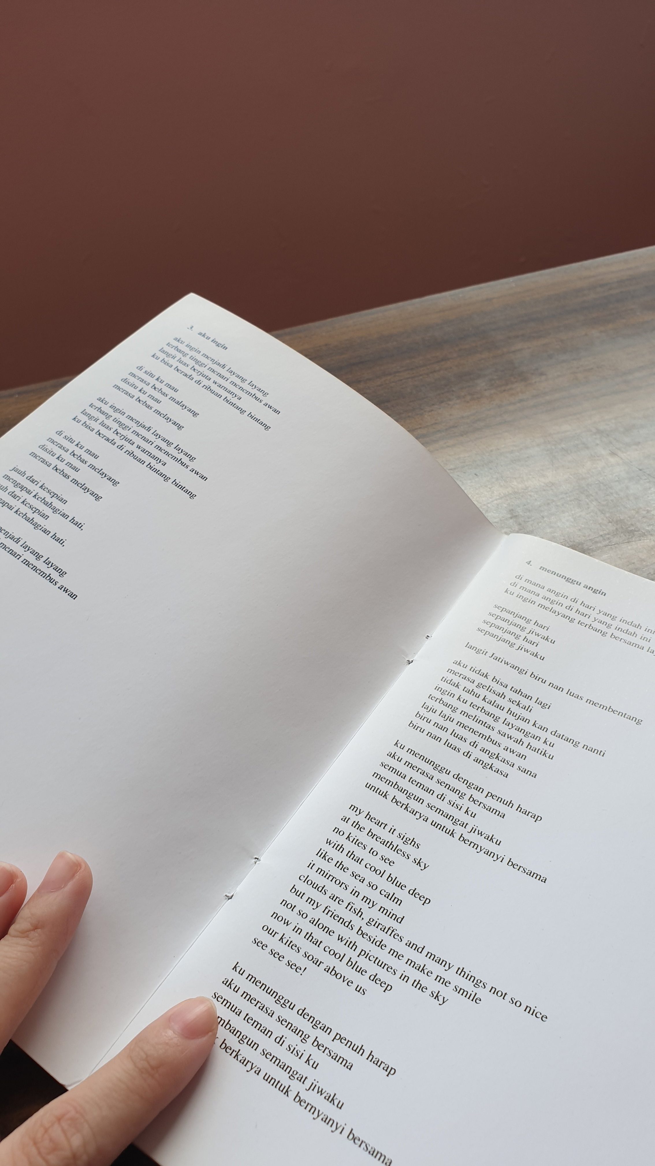
You only really realise that it’s the music which is the artwork when you read the wall plaque. It’s also supported by the lyrics booklet on each tablet, held down by a stone. I think that’s a plus point: most works demand your full attention, in forcing you to watch it, or interact with it, so on. This work, however, encourages you to just sit back and relax, with the music as a background accompaniment, than something to pay attention to specifically. For example, I ended up sitting and chatting with Dan Ning & Ying Hui about things that were totally not relevant to the artwork at all.
It’s nevertheless still easy to feel the vibes coming from the music, which is quite low-key and country, the kind of thing you hear on the streets from a random busker. That’s enough to get the intended ideas of peace and harmony across, especially when matched with the pretty pink of the corridor, and the view (which is, admittedly, not very good, since the wall is too tall to see much.)
Knowing the context also helps, where her artwork was created in relation to the Jatiwangi Art Festival. Said festival is about celebrating “contemporary art as created within everyday life”, making her music a homage to the less-urbanised life of those living in Jatiwangi. As a result, some of the lyrics are in Bahasa Indonesia, catering to the ethnic Malay population.
It might thus have benefitted from being presented at the nearby cafe and/or ice cream place instead. When we went there, there were many people chilling and drawing. Surely, there would have been a greater audience there, than where it was located, in a place where people wouldn’t really stop.
ABOUT MY FYP
Thinking about this and Celine’s Spatial Composition 13, it may be the case that I’m subconsciously leaning towards an FYP which “supports the exhibition”, than an FYP which “demands attention”. After all, a lot of the entire FYP exhibition is about presenting what each student cares about, which forces the audience to become invested in everything. As such, I might want to make something which reduces the information overload, than add to it.
I think that’s something I care about: filling the spaces which need to be filled. But that’s also hard, because I’m still pretty selfish: if FYP is about showing what each student cares about, I’m very sorry to say that I may or may not care more about having my own space, than working with gaps in others’ spaces.
Also, something like that would require a lot of coordination: I’d need to see what everyone is doing, and observe what kinds of issues people usually run into at FYP exhibitions, to try to make a solution.
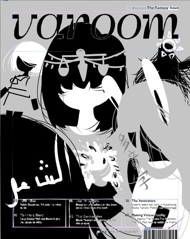
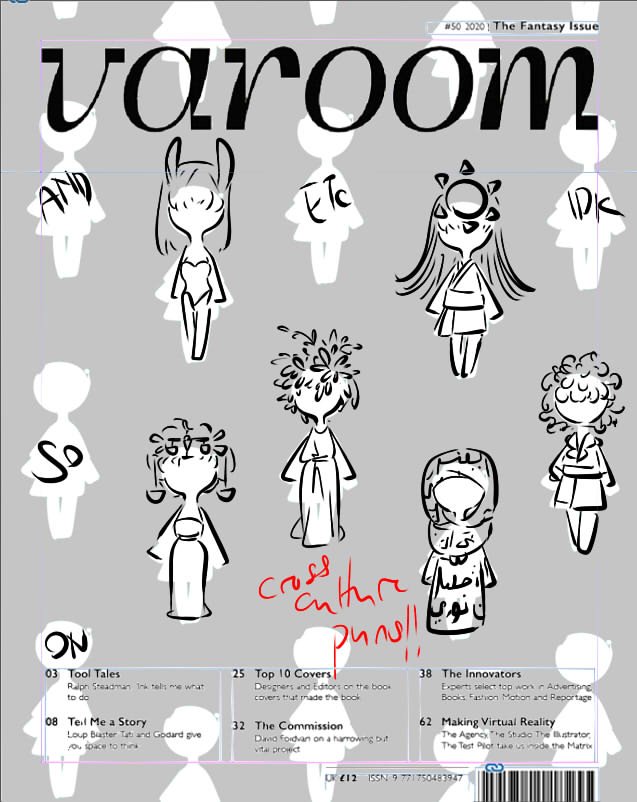
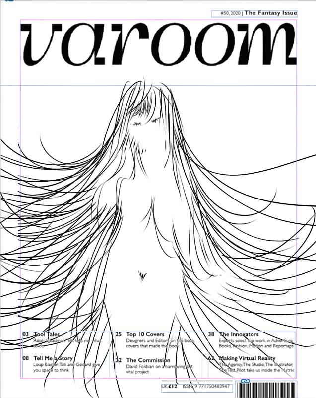
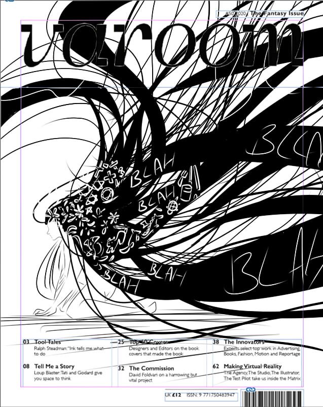
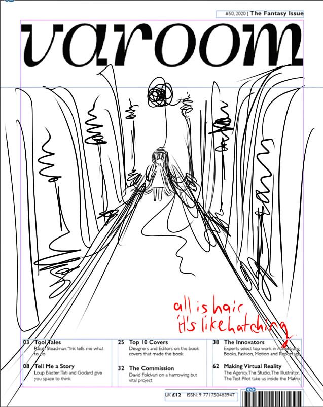
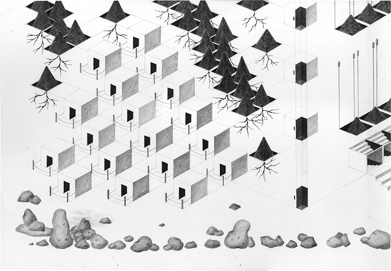
I took a slightly different approach, starting with concepts than visuals, since my forte is in critical analysis. Here are examples of the numerous false starts I had when I tried to subvert my typical way of project development:
After which, I tried to take into consideration what is required of a cover illustration for Varoom.
It must be something accessible, where Varoom isn’t meant to be a culture- and/or country-exclusive magazine,
It should provide critical new insights into the discipline of illustration, where that’s what the magazine is about,
It shouldn’t be focused on a specific topic or subject, where it’s a cover image, not an article-based image
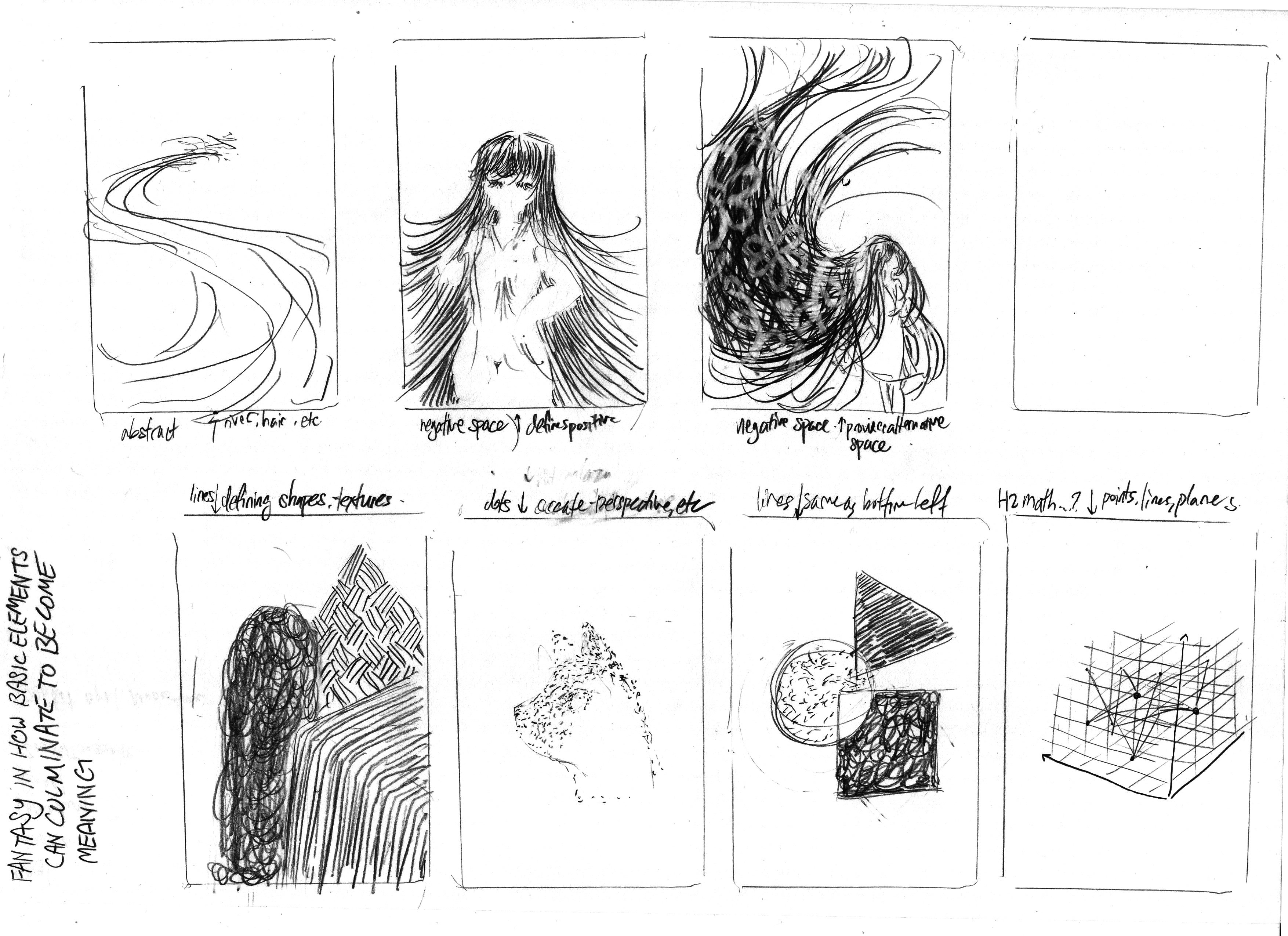
Since I chose the topic of Fantasy, I thought about what Fantasy would mean to all illustrators. Where fantasy refers to the “imagining of impossibilities”, the conclusions I came up with were these:
Fantasy in how basic elements come together to create complex forms
In other words, how dots, lines, and planes come together to create illustrations which look like more than the sum of its parts
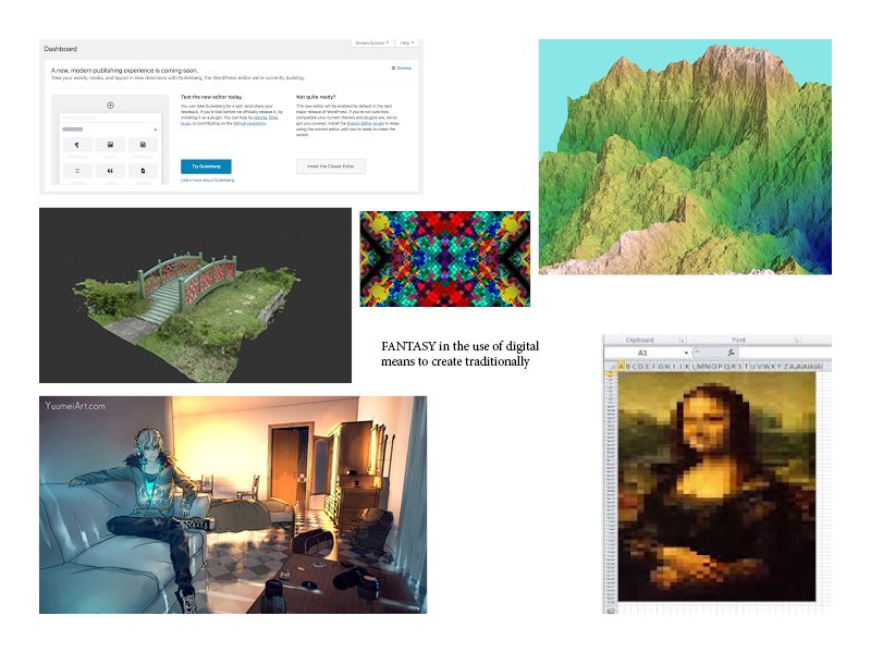
Fantasy in how impossible forms can be created through new technologies and means
In other words, how computer-based generation can create illustrations which would be tedious and/or impossible by hand
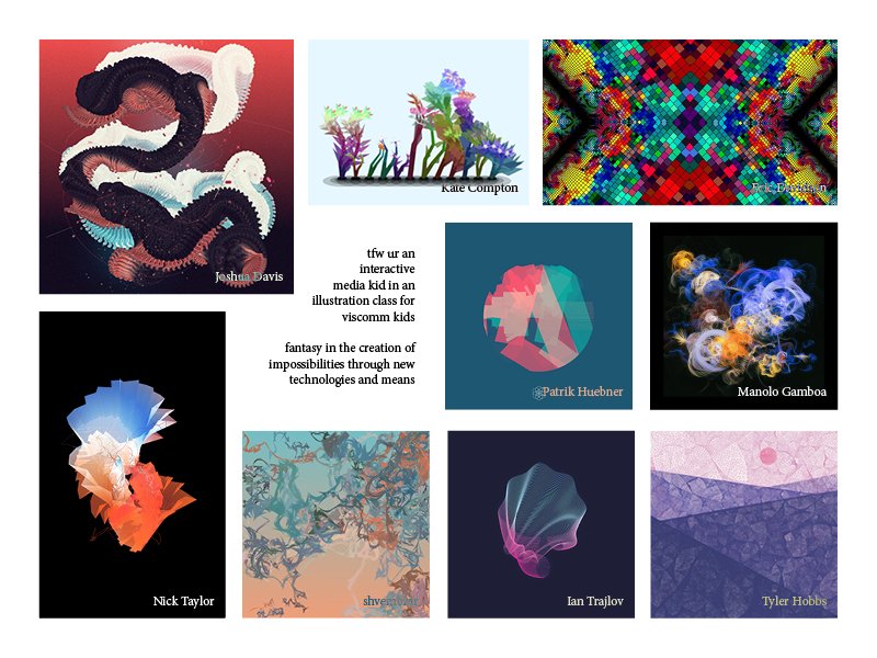
While I sketched thumbnails for both, I fully intend to go for the latter. This is because the former may be an insight into illustration, but it’s nothing new: we’ve long established the benefits of those basic elements. Computer generation, on the other hand, is definitely something new to the industry, and thus provides a fresher insight.
A list of examples for the former
For the former, featuring things like negative space, hatching, etc
A list of examples for the latter
For the latter, featuring things like pixel art, generative art, etc
Based on that, Lisa also suggested the works of Joshua Davis, a generative illustrator. So, here’s my finalised moodboard:
I note that it may be difficult to do pencil compositions for a generative illustration. After all, the point of generative illustration is that it’s randomised. For now, I’ll look more into generating illustrations: depending on what I leave to the computer to randomise, there may be things which remain constant, which can be presented in a pencil composition.
Alternatively, it may even be more worthwhile to create a prototype directly in code.
A magazine published by the Association of Illustrators (AOI), it was likely named after Roy Lichtenstein’s 1963 pop art painting. And, of course, its contents regard the field of illustration.
Typically, a magazine revolves around a selected theme, such as Empathy or Muse. It is then made of articles which consist of an illustrator’s discourse on that subject, accompanied by their illustrative works. Articles are thus often about illustrations and illustrators, of which has some convergence to the theme.
The first type of article regards the style of a single illustrator. Articles of this kind do not address a single work, as opposed to the thoughts of the illustrator. As such, it would focus more on the illustrator’s approach to illustration as a whole, than to each individual piece.
An example is Wei Shao and her insights on urban spaces in Issue 40 (Fantasy). While a seemingly realistic topic, it is her illustrations which bring out the fantastical nature of this subject, where the use of exaggeration, geometry and repetition bring out the surreality of our current urban organisations. In fact, her opinions on this topic are often reflected in all of her works.
As found at https://theaoi.com/varoom/varoom-bottom-blocks/article-excerpt-wei-shao-one-space-eaten-by-another-space/
A similar, but slightly different type of article is that which follows the process of a single work. Unlike the previously-stated type, this kind of article allows more insight into the making of a highly-detailed piece, than into the general workings of an illustrator.
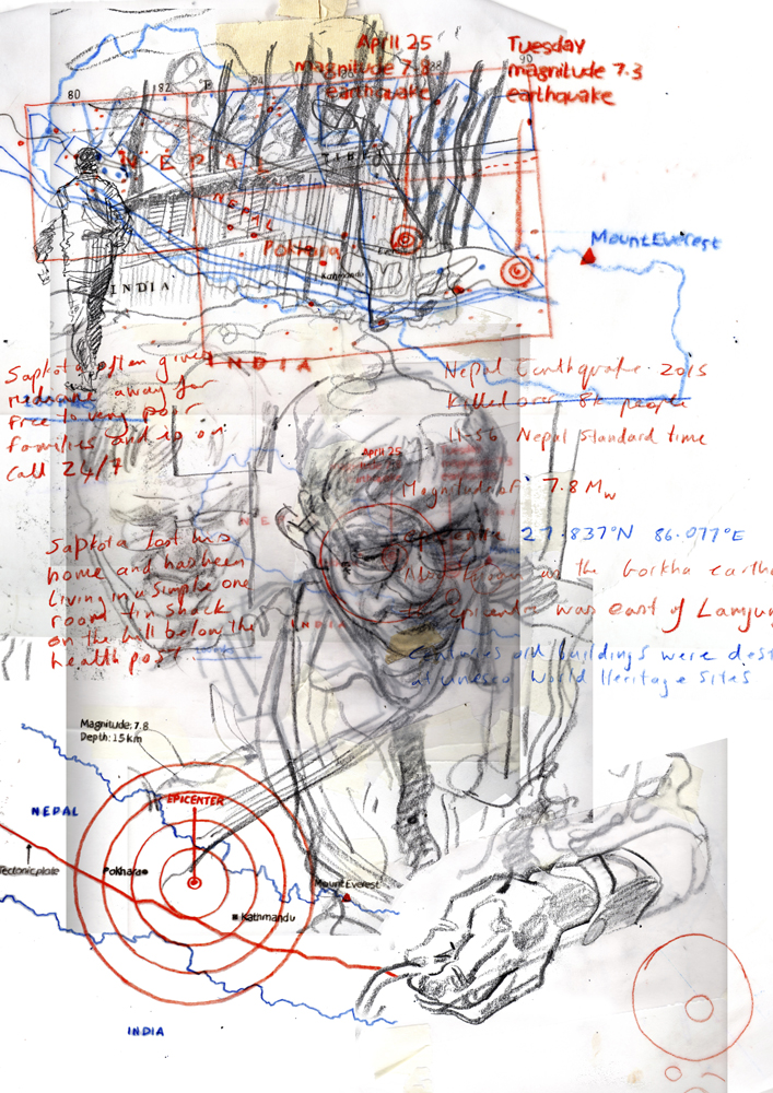
Reportage: After the Earthquake, for example, discusses Reflections, a project by Harry Morgan. It was intended as a way to raise awareness of the Nepali earthquake situation, with its link to the theme of Issue 33, Collaborators, being encompassed in its cross-media and cross-persons medium. The article thus focuses on the this project and the processes behind it, than Harry Morgan’s personal style.
A drawing by Harry Morgan, in Nepal, about Nepal. As found at http://www.cathdonaldson.co.uk/blog/cross-media-collaboration-reflections-25416
It is my opinion that the target audience is anyone with an interest in images and the process behind it. Varoom themselves seem to have a similar opinion, but expand on it more, by claiming to be “for creators, commissioners and lovers of great image-making”. In other words, creators who seek inspiration for their own works, commissioners looking for existing creators and/or ideas on what to commission, and lovers who’d just like to know more.
What I find most inspiring is how thematically-relevant the articles stay. Often, themes are designed to be as broad and inclusive as possible, so as to attract a wide range of contributors. As a result, however, the links between the theme and contributions tend to be weak at best, and superficial at worst. This isn’t the case for Varoom, where the editor’s efforts are evident: even words aren’t really needed, to see the link between each illustration and the theme. I admire that very much.
The takeaway, too, is to make something which is self-explanatory, such that even the form alone is enough to identify the theme.
EDITORIAL ILLUSTRATIONS
What do you find inspiring?
What medium/s do they use? (Traditional, Digital, Mixed)
How do they creatively interpret the text for the article?
I follow a lot of illustrators, but none of them do editorial illustrations, surprisingly! After some reflection, I felt like the reason why was because the illustrators I follow tend to have personal styles and subjects which they enjoy illustrating, which doesn’t always match with the requirement of “commercialisation”. For example, loputyn has certain symbols she constantly employs, such as nude girls, in pursuit of the theme of “unity”, which could hardly be used as an editorial illustration.
As found at https://qz.com/quartzy/1728767/why-editorial-illustrations-look-so-similar-these-days/
Also, I think the “flat illustration” style is nice in its own way, since it’s clean, professional, minimal, and about everything that a client would want. But it’s somewhat overused, to the extent that it looks somewhat boring. So, here’s a list which actively avoids that.
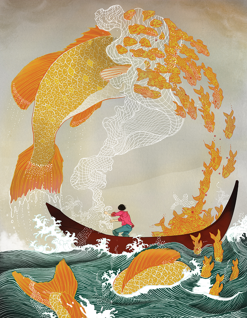
His style reminded me of litarnes, whom I’m already a fan of. What I adore is the use of linework as texture, which also helps to maintain a simple colour palette. For example, that the small fishes are exclusively the same hue of orangey-yellow, with the reddish-orange lineart providing sufficient support to negate the need for shading. (His apparent fondness for Asia-related styles and images is also something I can get behind.)
Something which may or may not be a weakness is how the illustration is composed such that it can stand alone. I appreciate the piece far more for its technical beauty, than for its relevance to the article. In fact, the link isn’t quite clear until I know what the article is about: only now do I comprehend that the illustration depicts how large-scale fishing can have negative effects on the environment. At the same time, it’s a nice way of depicting a message without being too direct about it, allowing for some creative and fantastical elements.
It seems that Chin tends to draft in pencil, before scanning it in and working in Photoshop and Illustrator concurrently. A cleaner version might be done in Illustrator with the Pen tool, then ported over to Photoshop to “soften” the image. For example, the shape of the boat might be done in Illustrator, with a tool, but the colouring in Photoshop, by hand.
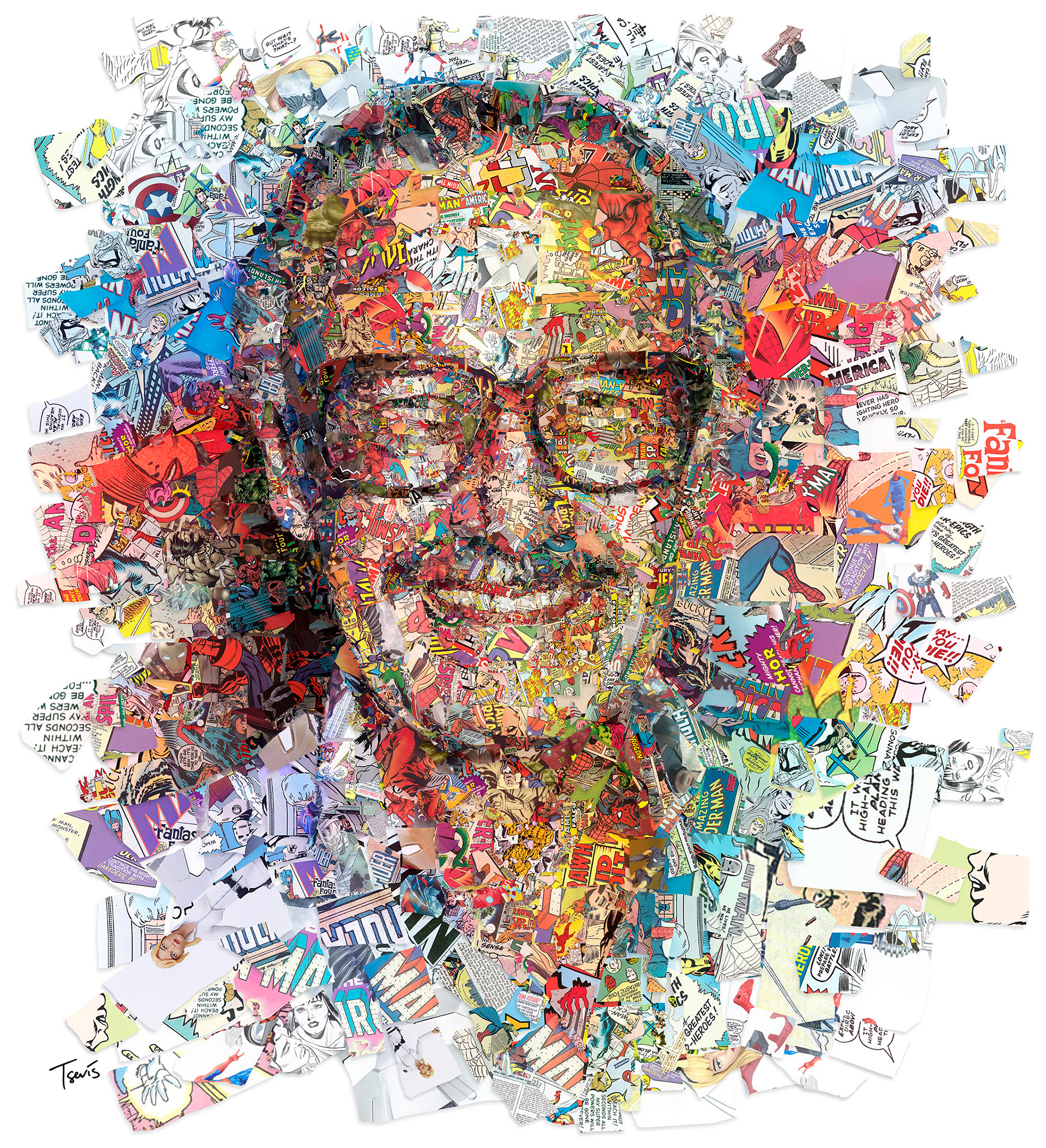
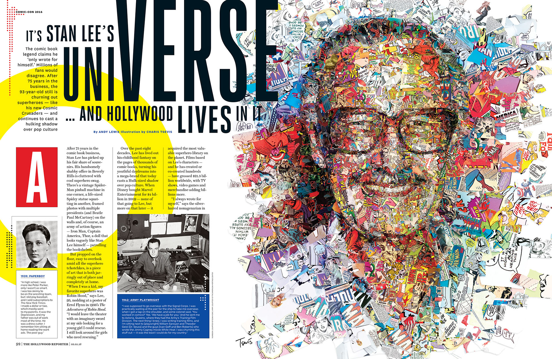
For an article on Stan Lee by the Hollywood Reporter. As found at https://tsevis.com/editorial-illustration-2016-2017
What I enjoy most about Tsevis’ works is that the link to the text is always immediately evident. This, of course, is because his editorial illustrations always depict the subject directly: in the above example, he presents Stan Lee’s portrait, which is something that the audience can recognise easily. He thus easily bypasses the possibility of an illustration being too complex to understand, through simplicity.
Even so, his works can be distinguished from photography in that the colours and building blocks of his compositions always add another layer of meaning. He composes Stan Lee’s face out of clips from comic books, and uses vibrant colours as an representation of Stan’s bright personality; for someone like Obama, he uses statistical numbers, and the dichotomy of blue (Democrat) and red (Republican).
I’m also fairly sure that he does these digitally, where he was inspired by things like ASCII & pixel art. Still, it would probably be possible (but tedious) for it to be analog.
For an article on Stan Lee by the Hollywood Reporter. As found at https://tsevis.com/editorial-illustration-2016-2017
(Also, it’s wonderful to see how the illustration blends into the article itself, where the article similarly uses the triadic colour scheme.)
Allegedly, for an article in The Lawyer, titled “The Learning Verve”. As found at https://www.nickyackland-snow.com/editorial
Another collage-type style, where Snow disassembles and reassembles different parts of different images. This is also admirable to me, where drawn illustration can be somewhat easier: you can control every aspect, from the forms to the colours. For collages, you have to painstakingly find some existing thing which can be repurposed.
At the same time, it combines the merits of photography and illustration. In the above example, the use of technical drawings and photographs make the piece surreal yet professional. This is also supported by the muted colour palettes favoured by Snow. As a result, we see how most of his editorial clients tend to be from magazines for adults, about fairly serious and/or retro topics. There’s an obvious target audience going on here.
This is another case of something which can be done through analog means, but I again think he does it digitally. It would be difficult to get the cleanliness he does, otherwise.
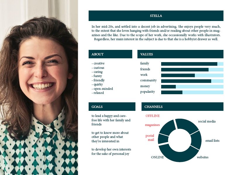
USER PERSONA
Probably, something like this. In other words, someone who is curious about other people, and loves to read about their thoughts and experiences. Also supported if it’s someone who already has exposure to the field of illustration, whether in their workplace, or as a hobbyist themself.
Featured Image is from Yuko Shimizu for an article on nightmares, who I totally did not talk about, but I also admire her work, just more of her illustration than editorial illustration specifically
I wrote this as my thought process and guidelines while making the 1st prototype, which has a video as found here:
So I figured, I might as well post it.
JUST TETRIS
Literally, just the base game. I’m following this tutorial, though I’m unsure if I need to make any adjustments to prepare for implementing the effects and audience. For example, if I should already change the algorithm to select 3, then 1 from those 3 effects.
Things to consider, on if it should be excluded or included:
Very basics, like T-Spin, if the falling speed increases when Down key is pressed
Inclusion of a getOutOfJailFree thing. Start with 3x usage. If J key is pressed, clear the bottom 4 rows. This should be an anti-frustration feature, especially for new players who might be easily caught by new effects. You can acquire more usages through extreme luck.
If there should be a Next queue, and a Hold ability.
No transitions after certain number of lines cleared: most likely, the combination of effects will cause too much suffering, and I’ll need to put more anti-frustration things.
Example of anti-frustration feature in Tetris Effect, where ZONE slows down the gameplay. As found at https://ag.hyperxgaming.com/article/6695/how-to-get-a-decahexatris-in-tetris-effect
DIFFERENT EFFECTS
While the Player plays Tetris normally, different effects will manifest at certain intervals. I haven’t decided the exact timing, but it might be something like this. I assume that the Algorithm has 0 delay, and that there is an audience. If there is no audience, we can just assume that the Algorithm takes the role of the audience, just with 100% randomised selection rate.
(TIME): (PLAYER) / (ALGORITHM) / (AUDIENCE)
10 seconds: Normal Play / Nothing / Nothing
20 seconds: Normal Play / 3 Selected / Audience Voting
10 seconds: Normal Play / 1 Implemented / Nothing
20 seconds: Normal Play / 3 Selected / Audience Voting
And, so on, until the Player dies
The turnover rate might be too slow, so we’ll see how it goes.
A PROPER ALGORITHM
I decided against having a max limit of co-existing effects, since 1) that’d be annoying to make, you’d have to decide how to dispel effects, e.g. after 10 turns, or based on the number of effects currently present. 2) It’d help to increase the difficulty as more and more effects appear, plus the intended algorithm (as shown below) is supposed to be quite lenient.
I’ll try to avoid 100% RNG, since it might make the game too easy or difficult if you happen to get certain effects by luck. So, I’ll use a weighted percentage, based on an effect’s “type” and “last appearance”.
Types can be divided into Variables and Booleans, where some things are either on a scale, or present/absent. For example, fallingSpeedOfBlock is a variable, while reverseControls is a boolean. There’s a third category, which is just Specials, which includes things which shouldn’t be subsumed under either of the suggested two categories.
Last Appearance refers to the last time an effect was manifested. I considered a new category like Potency, but decided against it since the impact of an effect can’t really be judged easily (e.g. maybe Garbage might benefit/disadvantage based on circumstance).
Variables
The maximum chance of reappearing decreases with each increment. At the maximum/minimum value of the variable, the possibility of increase/decrease is capped at 0%. For example,
when fallingSpeed = 1.0, up to 100% chance of fallingSpeedUp & 100% fallingSpeedDown appearing (of original chance value),
when fallingSpeed = 1.2, up to 60% & 140%
when fallingSpeed = 1.4 up to 30% & 170%,
when fallingSpeed = 1.6 up to 0% & 200%,
Possible variables would thus include these:
fallingSpeedUp / fallingSpeedDown
stageWidthUp / stageWidthDown
stageHeightUp /stageHeightDown
Booleans
The chance of appearance is constant, and will never fall to 0%. If same effect appears again, it simply switches the boolean value, such that the effect is undone if it’s already manifested.
Possible booleans would thus include these:
reverseControls
reverseStage
onlyLPieces, or onlyTPieces
AutoRotate (i.e. no manual rotate)
Constants
Things with a constant rate of appearance, and no on/off state. I have almost nothing right now though. Maybe under New Asset Based (see below).
onlyLPieces: similar to the boolean type above, but only for 10 rounds. May be slightly less painful than the boolean, so I might do this instead.
In fact, about any of the booleans can be shifted here, on the premise of “it lasts for 10 turns”. But I wouldn’t really want players to waste brain energy calculating when something runs out.
Specials
Usually, things with a constant rate of appearance, and things which may not affect gameplay too significantly. In other words, bonuses and Easter Eggs. The two here are New Asset Based, but I think I should add them anyway (or the first one, at least).
getOutOfJailFree: you can clear bottom 4 rows without penalty, by pressing the J key. Likely, a low chance of manifestation (like 2%), and should already be available at the start.
Skins: literally no effect, it just changes what the interface looks like. Probably also a low chance, more for player/audience entertainment, to make them feel pretty lucky! Maybe like 3 different themes, including the default theme.
Yeet me off the mortal coil
A special category for things I’ve considered. It’s either too painful for anything to bear, or it might be hard to implement since it involves additional things than just changing values in the system.
New Asset Based
An example of New Asset Based functions, where you have to code the garbage specially, than just change a variable value. As found at https://www.youtube.com/watch?v=3w91x6S-tI8
garbageAbove / garbageBelow: introduces garbage to the level, either below the existing stage or falling from above (Constant)
newBlocks: introduces new types of blocks, such as 9×9 (Boolean)
changeVisibility: darkness except around falling piece, or zoomed onto falling piece, such that you can’t see the rest of the level (Boolean)
sideGravityUp: blocks float instead of fall now, including the original set of blocks, which will fly up into a new position (Boolean)
sideGravityLeft: blocks are pulled towards left, which doesn’t involve the original set, but all new blocks, upon being placed, will be pulled to the left (if possible) (Boolean)
Death Is Preferable
AutoMovement: can’t translate left and right manually, which would be absolute suffering, especially at high speeds, since you need to wait for the system to move it to your preferred location, and by that time you might already be dead
onlyMoveRight: similar to above, but you can only move blocks rightwards. Also, an easy way for immediate death.
noRotationAtAll: again, easy death.
AUDIENCE INVOLVEMENT
The easier part would include changing the algorithm, such that it selects 3 effects than 1, then presents them. After which, the audience can choose 1 out of 3. I haven’t decided if the rate of appearance should be affect if an effect appears, but isn’t chosen.
The harder part would include bringing the audience in.
The Player selects “I’m a Player”. The system makes a room, and auto-assigns a Room Code. The Player plays as usual, with the algorithm doing the work.
If there is no Audience, the algorithm just continues selecting as per normal. (In other words, the Room Code is only used if the Player wants to share it with potential Audience.)
If there is Audience, but no Audience Votes, the algorithm just selects 1 out of 3 with 100% random rate.
If there is Audience and Audience Votes, the algorithm selects the effect with most votes. If there’s a tie, the algorithm selects with 100% random rate.
Example of how Jackbox allows the audience to join. As found at https://www.reddit.com/r/gaming/comments/919rgd/our_room_code_for_fakin_it_from_jackbox_party/
That also means that, on the Audience side, adjustments must also be made:
The Audience selects “I’m Just Watching”. The system requests the Room Code, which the Audience must input to enter the correct room.
The Audience gets to see the Player’s board. They also get to see what 3 effects are up for selection, and can pick within the Audience Voting time.
They select 1 choice. Once selected, they can still change their choice until the Audience Voting time is over. (Whether they can see the current number of votes per effect is unknown, but this might be interesting, since it might make the audience try to persuade each other to change their votes)
After Audience Voting time, the effect is implemented. The next Audience Voting time begins, with a new set of effects.
Things which I haven’t decided:
If there should be a maximum audience limit
If there should be a lobby where anyone can join any room (i.e. may have to provide private rooms as well)
How much time to allocate (e.g. 30 seconds for audience voting, 5 seconds for Player to see what effect was attributed before it’s activated)
If the Room Code should be just shown on the player’s screen (a little awkward for solo players, but useful for screensharing, e.g. like Jackbox)
How to make it work for mobile & computer (most likely, I won’t implement playing on mobile, but it seems likely that audience would use their phone than a computer)
Alternatively, I may consider other ways of implementing the audience, such as Twitch Chat (a la Dead Cells). For now, I’m intending to try out Mirror, the substitute for the recently-deprecated Unity NetworkManager component.
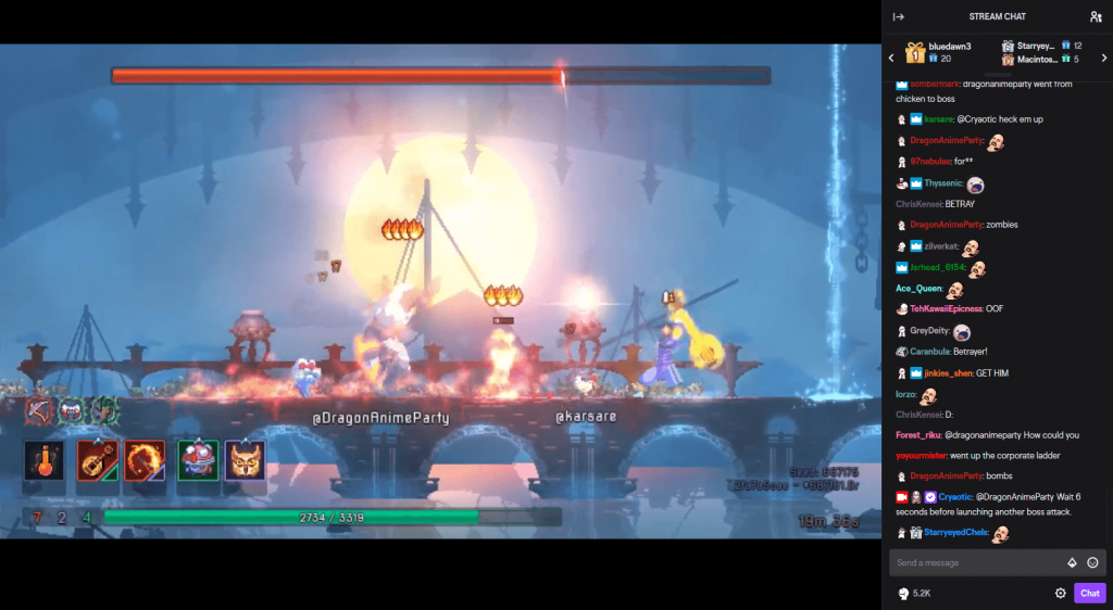
From Cryaotic’s stream on 14th Feb. Yes, I watched it, like, right before class.
AFTER CLASS
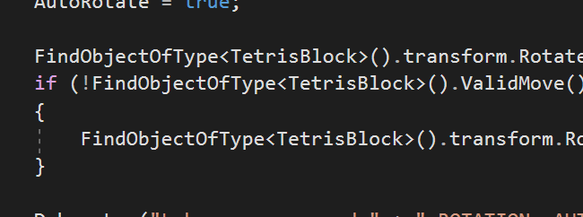
I’ve been recommended to use a single script for everything, which is the fairest judgment possible, because the cross-references between scripts right now are too… Much.
I desire to never see FindObjectOfType again
So I shall work on that, and attempt to implement the Next queue in the meantime. Also, to attempt to create an algorithm that selects the effects, than selection based on key presses.
The animated GIFs are too big, but here’re links for Gwen and I! (Please. They’re necessary.)
Me
Gwen P1
Gwen P2
Gwen P3
PROCESS: COLLECTING DATA
The initial point was an interview with Gwen. We hardly knew each other, and thus asked a few questions each via Telegram. Other than that starting point, we also took various free time opportunities in class to converse, getting a general sense of our various opinions. This included, for example, thoughts on things like religion and philosophy, as well as hobbies and reasons for it.
Part of the initial conversation.
Based on the results, I identified key words, and compared traits against myself. The conclusion was as such (Gwen / Me):
Social / Independent
Emotional / Practical
Country / City
Efficient / Analytical (? based on our working styles, where she seemed much more put-together)
3rd Personal / 1st Personal (in terms of how I perceive us, since I see myself from within myself, while I see Gwen from her outside)
This translated into the following decisions, where I believed these to most aptly display our differences:
Outdoor / Indoor
Open / Closed
Natural / Constructed
Painted / Modelled
Curved / Cubic
Nevertheless, there were many points where we aligned, such as our perspective on self-actualisation, and our varied interests. As such, I also considered the use of Perspective than Orthographic, to represent that 3-dimensionality. Also, for our portraits to Seamlessly Intersect, such that the portraits (and us!) can be connected without any issues.
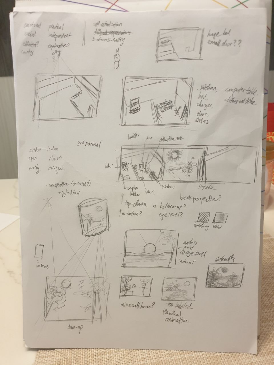
I also checked out relevant images to whatever Gwen had mentioned in our talks, in an attempt to acquire a moodboard of sorts. These images were also set to greyscale, to avoid colour bias due to the limitations of the assignment prompt. Here’re the images:
East Coast Park, where Gwen enjoys her time off, because it’s peaceful. https://www.nparks.gov.sg/gardens-parks-and-nature/parks-and-nature-reserves/east-coast-park
A diorama process, where Gwen is fond of watching “things come together”. https://www.youtube.com/watch?v=MYJzMUFeE20
Hertfordshire, where Gwen intends to have her exchange due to her fondness of the countryside. https://www.telegraph.co.uk/travel/comment/hertfordshire-county-underrated/sss
PROCESS: CREATING THINGS
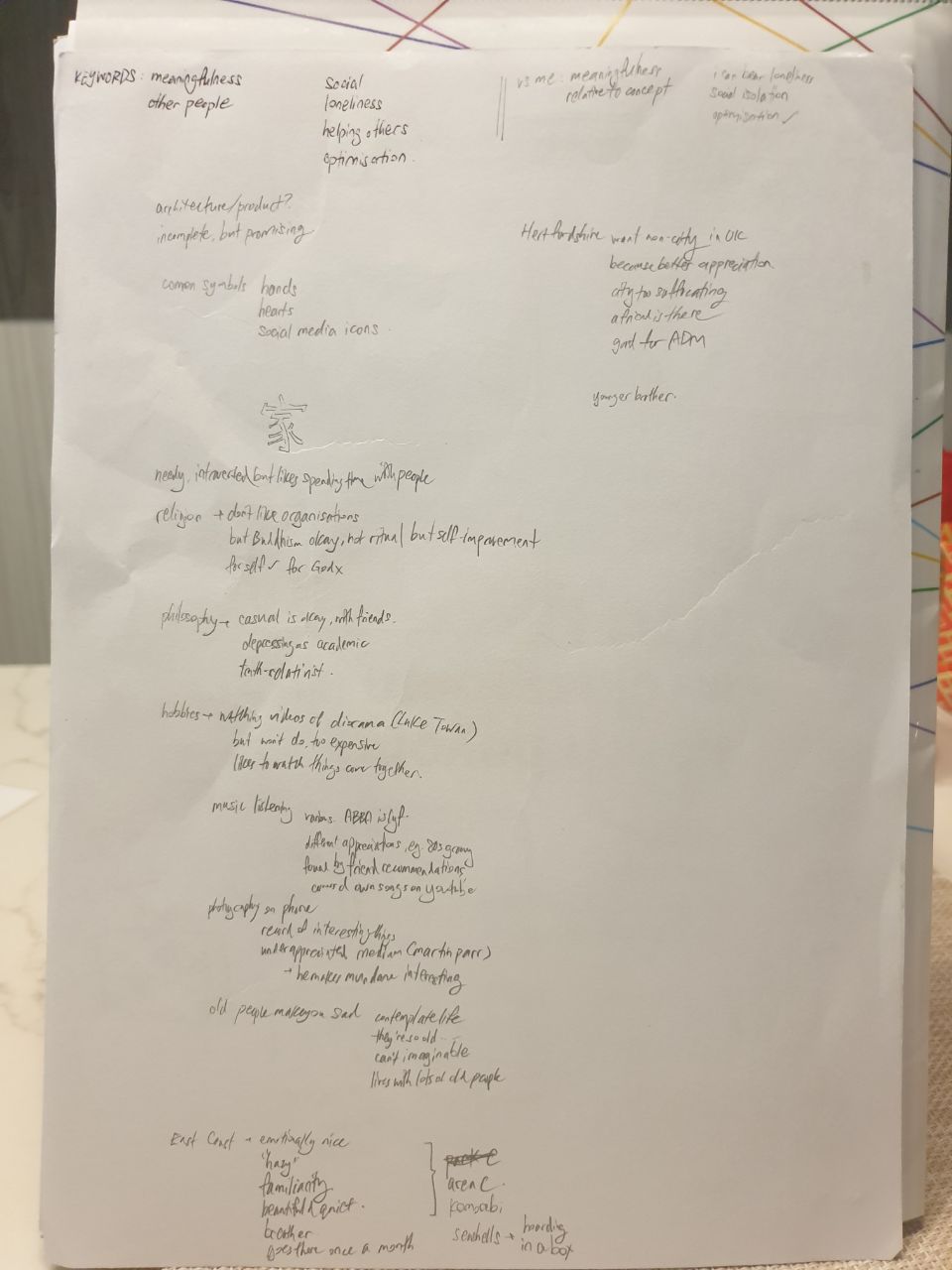
As my approach doesn’t quite look at specific events or items, I surmised that it would be best to rely on emotion evoked through a scene, than symbolic objects. This, as would later be affirmed in class critiques, made it difficult to create an illustrative piece that was concise in its meaning. Here are some samples of the earliest compositions, which look like shoddy attempts at still life drawing:
A starting page, with keyword identifications
Attempts at landscape scenes
More attempts, and gradual delve into current form
Sketches for Gwen
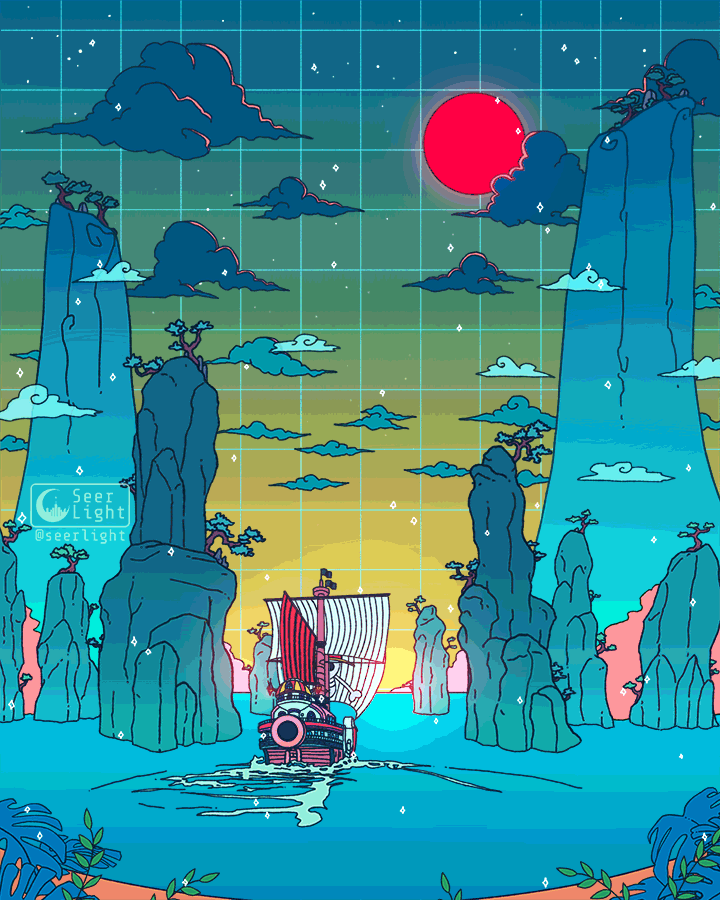
Consequently, I looked for ways in which other illustrators display “spaces”, while still being distinctive and clear. While I looked at avarietyofsources, my primary inspiration was Ronald Kuang / SeerLight, who often uses geometrical shapes and gentle colours to depict locations.
By SeerLight, an example of the milk carton shape used to suggest a building. As found at https://www.deviantart.com/seerlight/art/Cyberpunk-Milk-755347124.Also by SeerLight. Subtle animations are also a trademark of his. As found at https://www.deviantart.com/seerlight/art/To-the-next-adventure-815132728
Thus, I decided that the best way to represent our distinctive traits was to use a contrast of Organic / Geometric shapes. This way, the very form of the elements is an indicator of our characters. Additionally, this means that, when using animation, I can use the same shape to represent various different items, retaining a proper focal point without cluttering the composition.
PROCESS 2
I did mine, of the geometric, in Blender, where orthographic drawing from scratch is not my strong suite. It is made of cubes, cubes, and only cubes, a call to my comparative rigidity and practicality. After which, I traced it on Illustrator.
A later version, where I began to consider the use of scale to indicate significance of objects, and removed various things which weren’t necessarily “important”.
I considered a plate, but ditched it for a tray, since the circular shape would never work. (Also why there is no spoon.)
The biggest object is the bed (of course!), followed by the computer, and then the cutlery. It’s a representation of my 3 priorities: sleep, Internet, and food. I placed the door as a counter to the struggle for dominance: unlike those 3, the door is verily small, an indicator of just how much I hate to go out. The animation is much simpler compared to Gwen’s, but feels oddly apt: Much of it is just repetition without significant changes, just like much of my everyday life as I hide out at home.
The line-only draft.
Gwen’s features curves, curves, and only curves. Since she appeared to be someone rather emotional, and almost spiritual, I placed many of the things she enjoys seeing, such as the sun, plants, waters (the sea), and the bowl (for plants, but also for fish sometimes). When I mentioned this to her, however, she hastily said that she only enjoys watching, as she’s terrible with keeping things alive. Consequently, I added the eyeball, a manifestation of her gaze. I’m blessed that all of these use the circle as a base shape. Thus, the animation can encompass all, by having the circle change from being that of a “bowl”, to that of the “sun”, and the “eyeball”.
With base colours, until I remembered.
All in all, I’m surprised that the lack of colour wasn’t a major problem. Nevertheless, the sun on Gwen’s portrait is tragically misaligned, probably because I failed to set the origin point properly. It’s only my second time using Adobe Animate, oof. Also, I feel like the eyeball might not have come across very cleanly: in hindsight, it might have been better to have it centralised than facing the side, where it’s rather difficult to identify what it’s supposed to be.
Perhaps the approach I took wasn’t necessarily the best, either, since I focused on the dichotomies between both of us, than seeing Gwen for who she is. While it helped in the eventual creation of the Organic / Geometric division, it might be worthwhile to try seeing others as they are, than as compared to me.
Much of social practice art critique is directed towards how it nevertheless supports capitalism, than actively helping the community. So, being curious, I looked for an example from post-war, Soviet-controlled Central Eastern Europe! (It doesn’t have anything to do with capitalism though.)
Something to take note is that the works of Krzysztof Wodiczko is often described as socially-engaged, socially-intervening and socially-minded. However, the specific term “social practice” almost never comes up, likely because it’s a relatively new term. As such, his work may not compare to things like Rick Lowes’ Project Row Houses or Marjetica Potrč’s Dry Toilet, which specifically involves designing objects for contextual use.
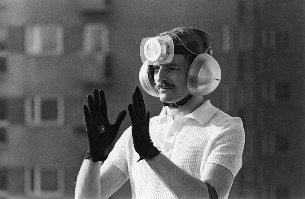
PERSONAL INSTRUMENT (1969)
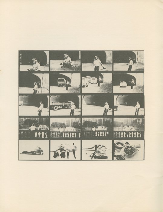
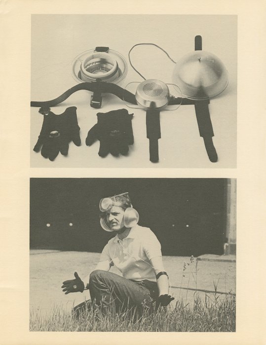
As found at https://science70.tumblr.com/post/184811068364/krzysztof-wodiczko-personal-instrument-1969
This artwork is one of the first interactive wearables to target the issue of freedom in an oppressive state. At that time, the artist, Krzysztof Wodiczko, was inspired by Vladmir Mayakovsky‘s claim that “the streets [are] our brushes, the squares our palettes”. In other words, art relies on the surroundings, and is not a purely isolated piece. At that time, too, Poland was under an authoritarian communist regime, wracked by lack of freedom, poverty and poor living conditions. Harsh treatment, detention and executions were hardly uncommon: One could not speak out against the government for fear of terrible repercussions. At best, they could submerge their hidden messages within a veil of unmeaningful speech.
(Images as found at https://artmuseum.pl/en/performans/archiwum/2519/127280.)
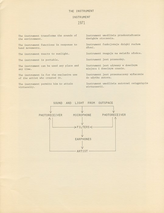
Consequently, the interactive wearable aimed to present a state of “listening selectively” while remaining voiceless, where the only available freedom was what one chose to filter in or out. Equipped with photoreceivers and a microphone, the wearable was thus capable of modifying the received sounds, in relation to hand gestures by the wearer. As stated by the artist himself, too, it was designed as an “appliance” with “expressly defined function”, in such a way that it could act as a potential solution to the social problem of political voicelessness.
ITS RELATION TO SOCIAL PRACTICE ART
Where the intention involves the betterment of society in the face of a social and political issue, Personal Instrument has the makings of social practice art. Despite that, there are many ways in which it does not qualify.
For one, it was built for “the exclusive use of the artist who created it”. Though Wodiczko said, in hindsight, that “the whole Polish society should have been equipped with a device of this kind”, it simply never happened. This has the impact of that it honestly didn’t help society at all. For two, it still tends towards representing the issue, than solving it. I highly doubt that being able to modify surrounding sounds with your hands has much implication on improving the problem of political freedom. Again, little impact on improving society.
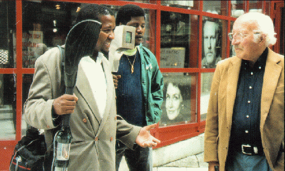
Alien Staff (1992-present), a later work by the same artist. It was designed to provide immigrants with a tool to share their experiences, and has multiple iterations due to its popularity in the West. As found at https://ablersite.org/2010/10/11/alien-staff-its-virtual-its-prosthetic/
There are hints of that it is simply an unrefined first foray, especially when compared to later works (like above). Nevertheless, I don’t think that it is simply a problem of poor design conception. This is because there were severe design limitations. For example, that he built this anti-state piece during his tenure at a state-operated organisation. Or, that he was exiled from Poland soon after by the government, without any justification given. Simply put, it’s hardly ideal to be advertising anti-government art in a context of large governmental control. While many of his later works have multiple iterations to improve the design, too, Personal Instrument likely couldn’t get that same treatment due to 1) the sensitivity of the content for the government, and 2) that Poland is no longer under an authoritarian regime anyway.
From this, perhaps it could be said that a supportive environment is ironically needed as well. Not only must there be an existing social problem, the society must be able to accept critical views of that problem. Some of his later works, for example, had a greater impact in terms of visibility, where it could be openly paraded around to make rich people uncomfortable:
Homeless Vehicle (1987-9), as paraded by a homeless man on the streets of New York. The work is not only a representation of the problem, it also acts as a real shelter in which a homeless person can stay. As found at https://culture.pl/en/work/homeless-vehicle-krzysztof-wodiczko
As mentioned above, Wodiczko’s works are still “not about solving individual problems, but about bringing out, exposing, manifesting the social needs which they respond to” (Musielak, 2015). Instead, he subscribes to is something known as Interrogative Design, or Scandalising Functionalism. These terms refer to a form of functional design which is scandalous by its very existence, because the problem it’s addressing should never have existed at all. While this contradicts the requirement of social practice art to solve the problem than show it, it does raise a pertinent issue: that any artistic solution still wouldn’t be able to solve the key cause of the problem. As shown in the previous article, for example, Project Row Houses is an ideal which can’t accommodate the true scale of the housing issue. Similarly, building more Homeless Vehicles doesn’t change the fact that the system itself is generating homelessness.
In which case, perhaps social practice art doesn’t need to answer a problem. Instead, it might merely need to provoke revolution, in rousing sufficient feelings to bring about change which stops the problem at its source.
REFERENCES
Davis, B. (2013). A Critique of Social Practice Art. In International Socialist Review, Issue #90. As found at https://isreview.org/issue/90/critique-social-practice-art
Galliera, I. (2017). Socially Engaged Art After Socialism: Art and Civil Society in Central and Eastern Europe (Book Review). As found at https://artmargins.com/shaping-democratic-notions/
Krzysztof Wodiczko. For Culture.pl. As found at https://culture.pl/en/artist/krzysztof-wodiczko
Krzysztof Wodiczko – Personal Instrument (1969). For Muzeum Sztuki Nowoczesnej. As found at https://artmuseum.pl/en/performans/archiwum/2519?read=all
Sheets, H. M. (2020). A Monument Man Gives Memorials New Stories to Tell. For The New York Times. As found at https://www.nytimes.com/2020/01/23/arts/design/Krzysztof-Wodiczko.html
![[W7PDaP] on the assigned reading](https://oss.adm.ntu.edu.sg/a170027/wp-content/uploads/sites/1810/2020/02/PMP-Certification-825x463.jpg)
![[W6PDaP] maybe i have a thing for chairs](https://oss.adm.ntu.edu.sg/a170027/wp-content/uploads/sites/1810/2020/02/20200220_160816-825x510.jpg)


![[W6IfD] Thumbnails, and a Mood™](https://oss.adm.ntu.edu.sg/a170027/wp-content/uploads/sites/1810/2020/02/moodboard-final-800x510.jpg)


![[W6IE] i have, like, nothing. i tried](https://oss.adm.ntu.edu.sg/a170027/wp-content/uploads/sites/1810/2020/02/lamp-825x510.jpg)
![[W5IfD] Varoom & Editorial Researches](https://oss.adm.ntu.edu.sg/a170027/wp-content/uploads/sites/1810/2020/02/bostonia_nightmare-825x510.jpg)

![[W5GD] A Really Rough Prototype, and About Ten Different Thoughts Behind It](https://oss.adm.ntu.edu.sg/a170027/wp-content/uploads/sites/1810/2020/02/Screenshot-82-825x510.png)


![[W4IfD] Assignment 1 Process & Final](https://oss.adm.ntu.edu.sg/a170027/wp-content/uploads/sites/1810/2020/02/finaaaa-0222-776x510.jpg)


![[W4GD] hi this is a tedris talk](https://oss.adm.ntu.edu.sg/a170027/wp-content/uploads/sites/1810/2020/02/Screenshot_2020-02-07-hello-and-thanks-4-coming-2-my-tedris-talk-825x510.png)
![[W4IE] Midterm Ideation](https://oss.adm.ntu.edu.sg/a170027/wp-content/uploads/sites/1810/2020/02/200204-1-825x510.jpg)
![[W4PDaP] Social(ism) Practice Art, but there’s no socialism only oppression](https://oss.adm.ntu.edu.sg/a170027/wp-content/uploads/sites/1810/2020/02/merlin_167548860_6543ca56-5a52-497c-bfe0-b472b873380b-superJumbo-825x510.jpg)
