I was totally ready for the presentation on Thu 23/11/2017! I really was! All I needed to do was to check in with Mr Bharat, who hadn’t replied me since Thu 9/11/2017, during which I discovered that the location was not available…
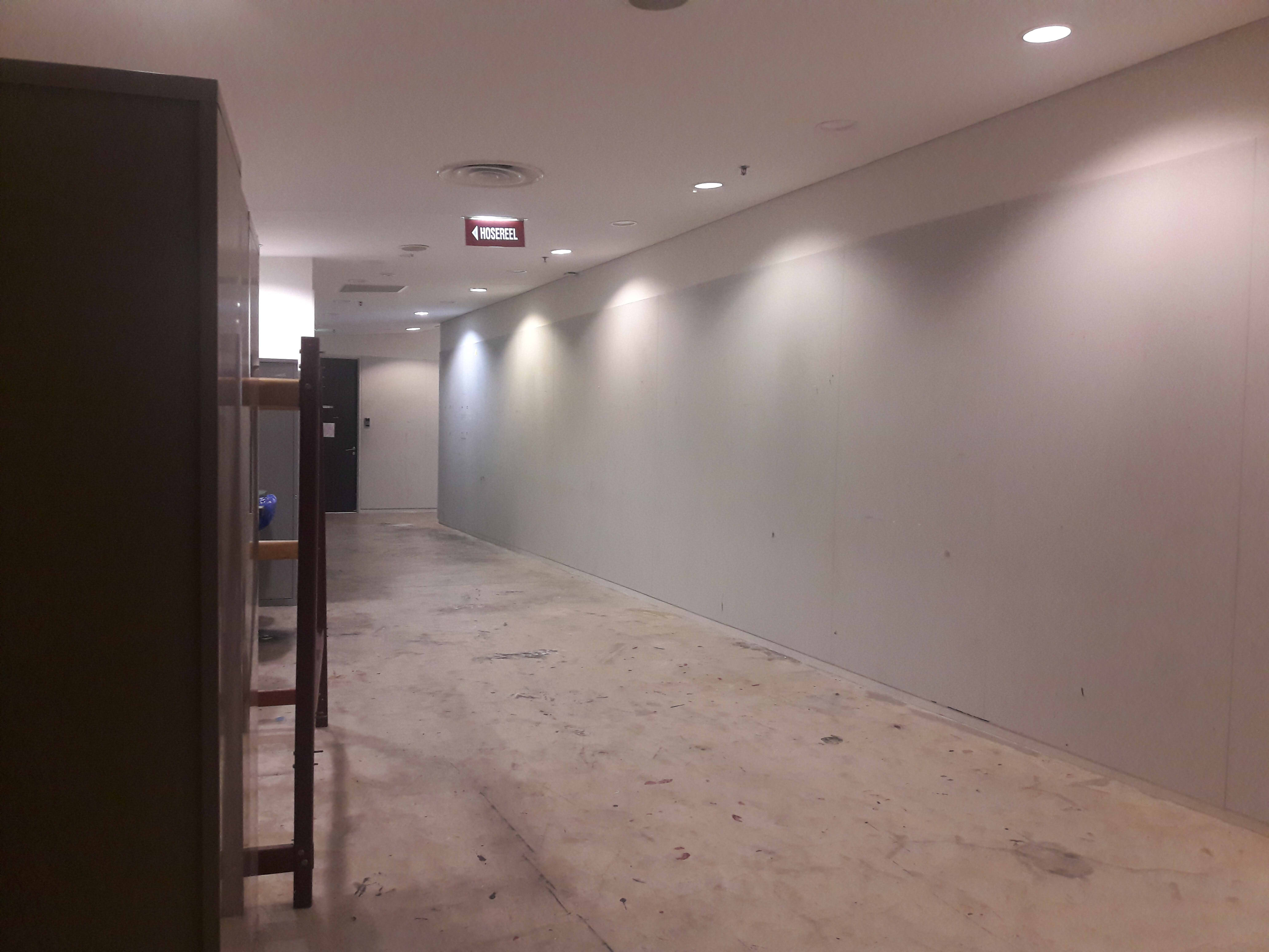
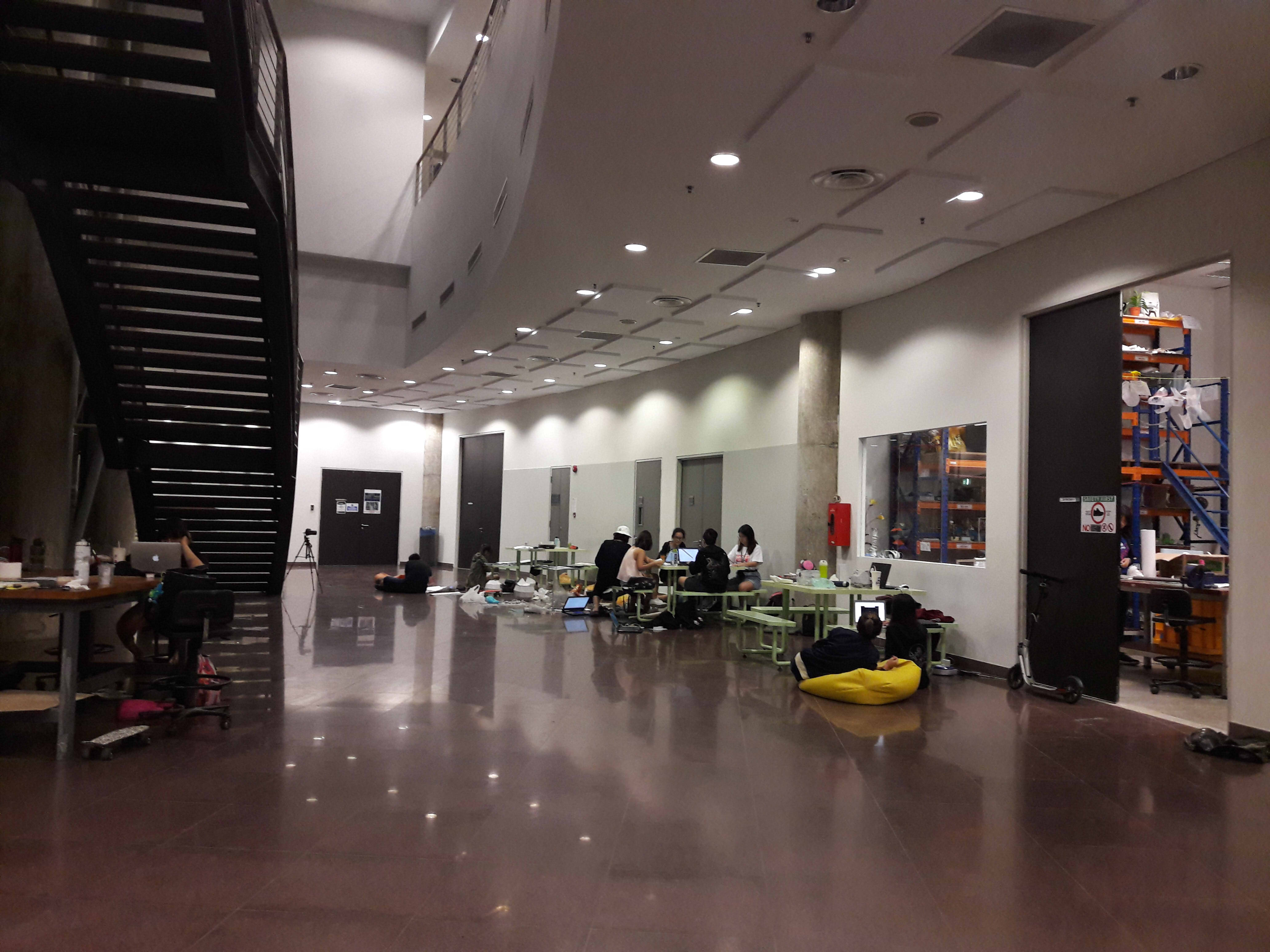
… Hence, I instantly asked Lei to suggest another location, and she suggested the space outside the Foundation 2D Room, somewhere I obviously had better luck with. (Note that from here on out, it becomes more process-based, since a lot of the documentation is on the improvised setup.)
She also mentioned that I would probably need to change my object due to the smaller width of the corridor, and so again I had to go back to the basic requirements and re-evaluate my setup based on the things which I needed which were site-specific.
Now that I couldn’t use the site-specific benches, I needed to re-evaluate my subject, a material object which is
identical in spatial form,
unmovable,
in close proximity to each other, and
able to be interacted with
and now, additionally, also fairly thin and small, since the throw distance was very short and I still needed space for people to interact with the objects.
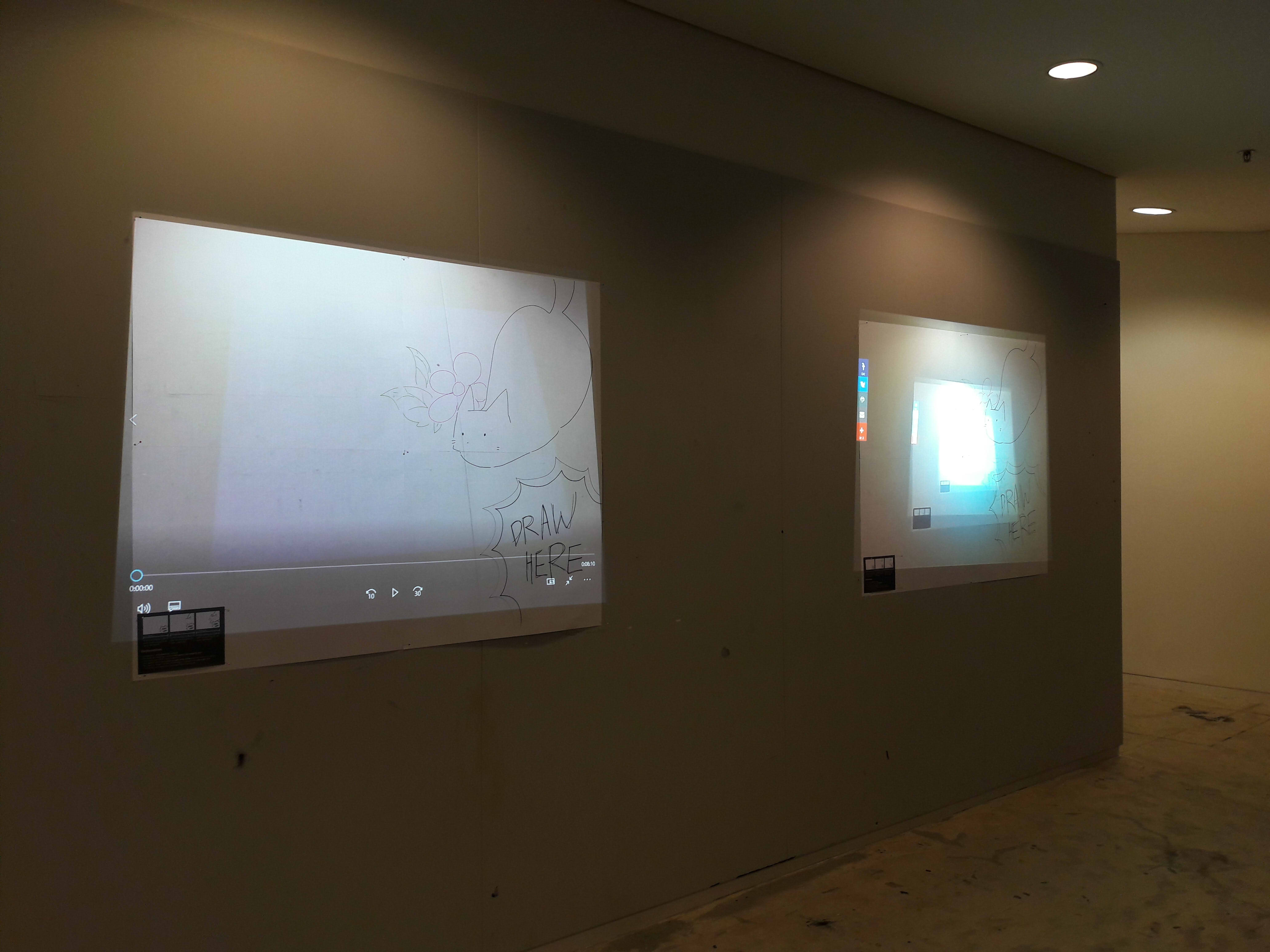
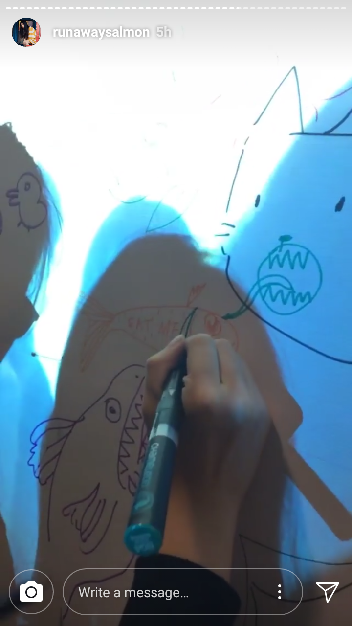
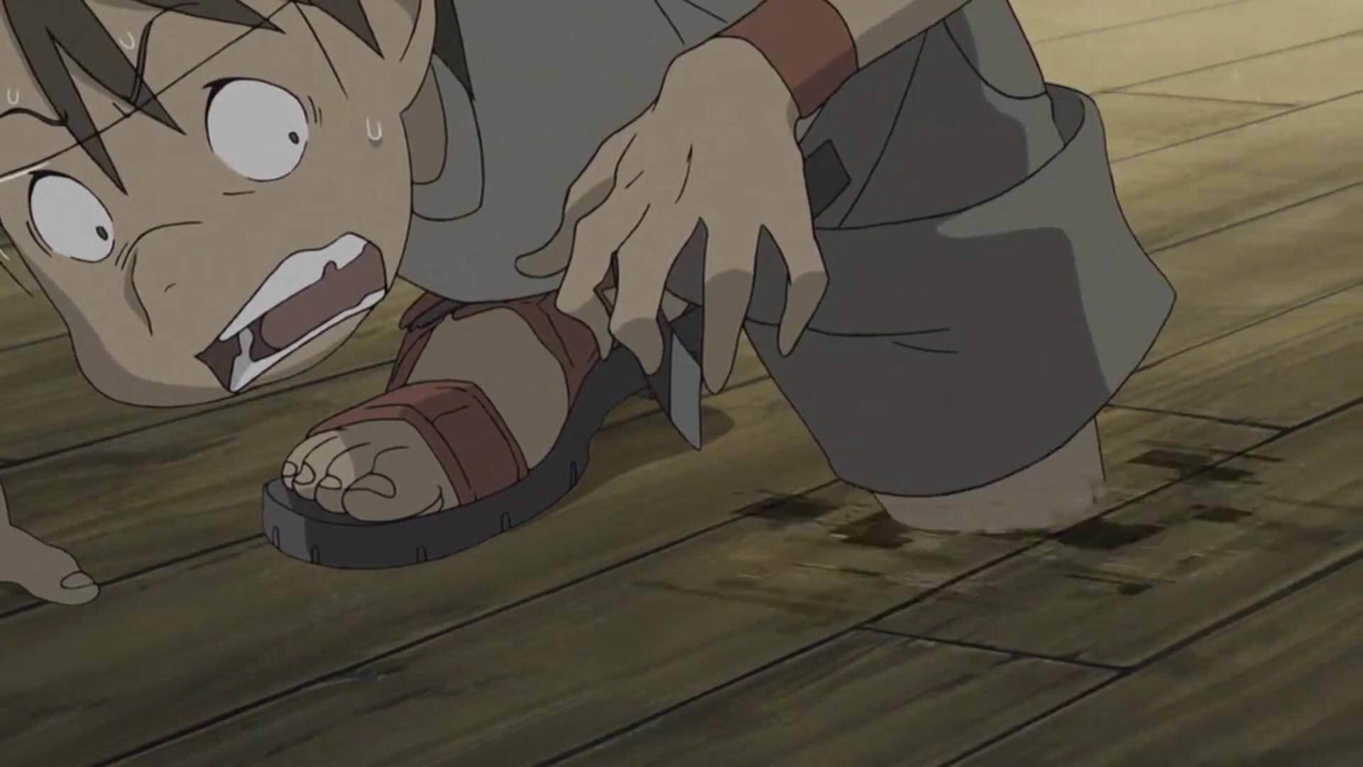
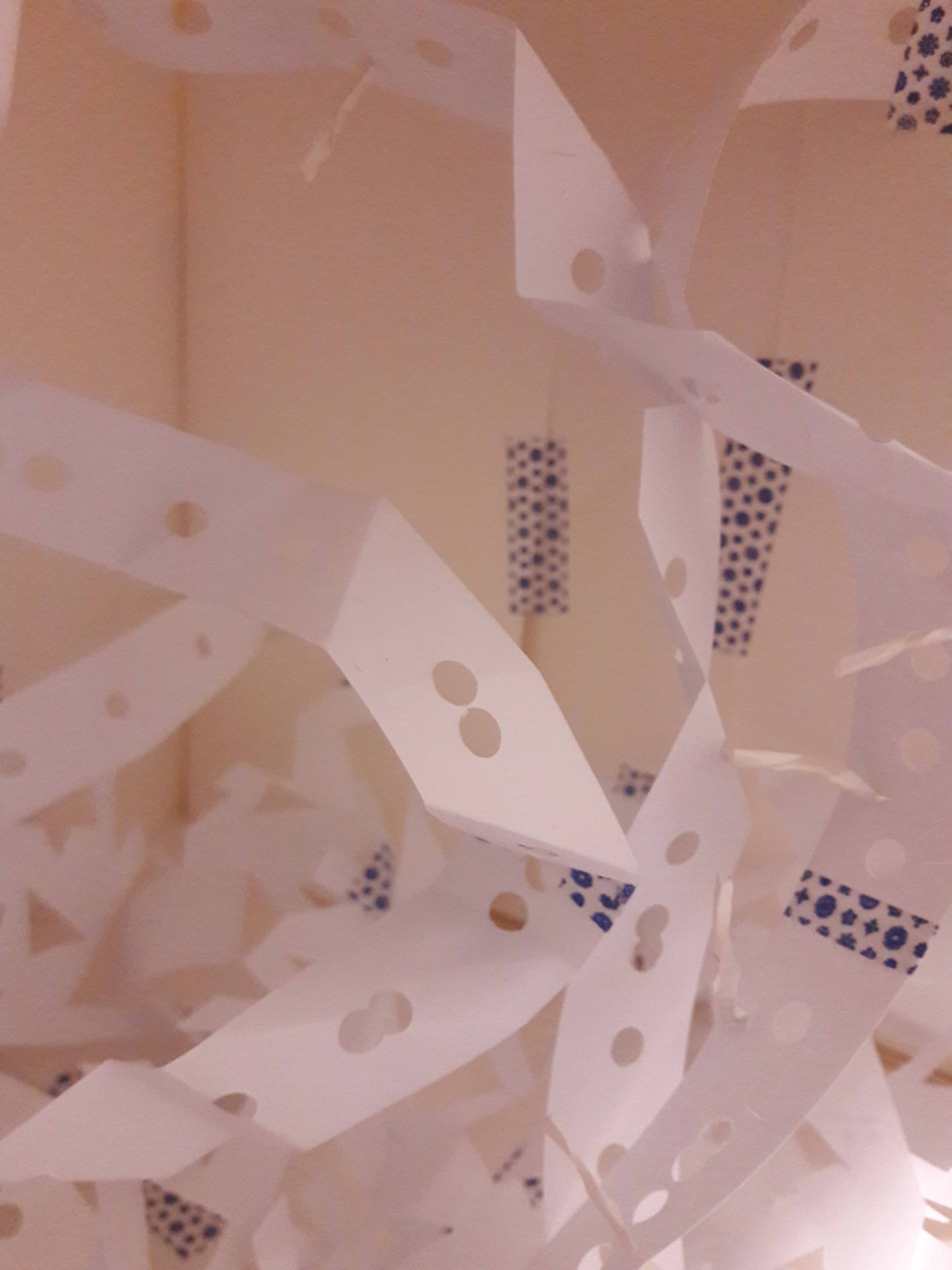
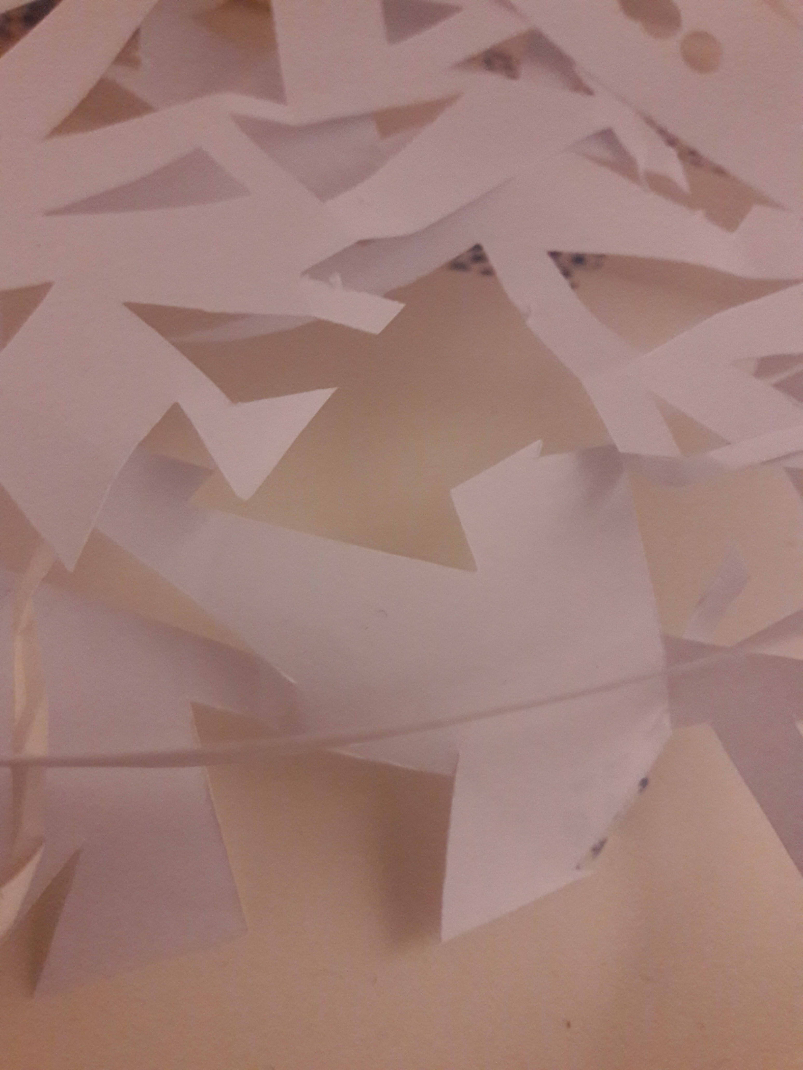
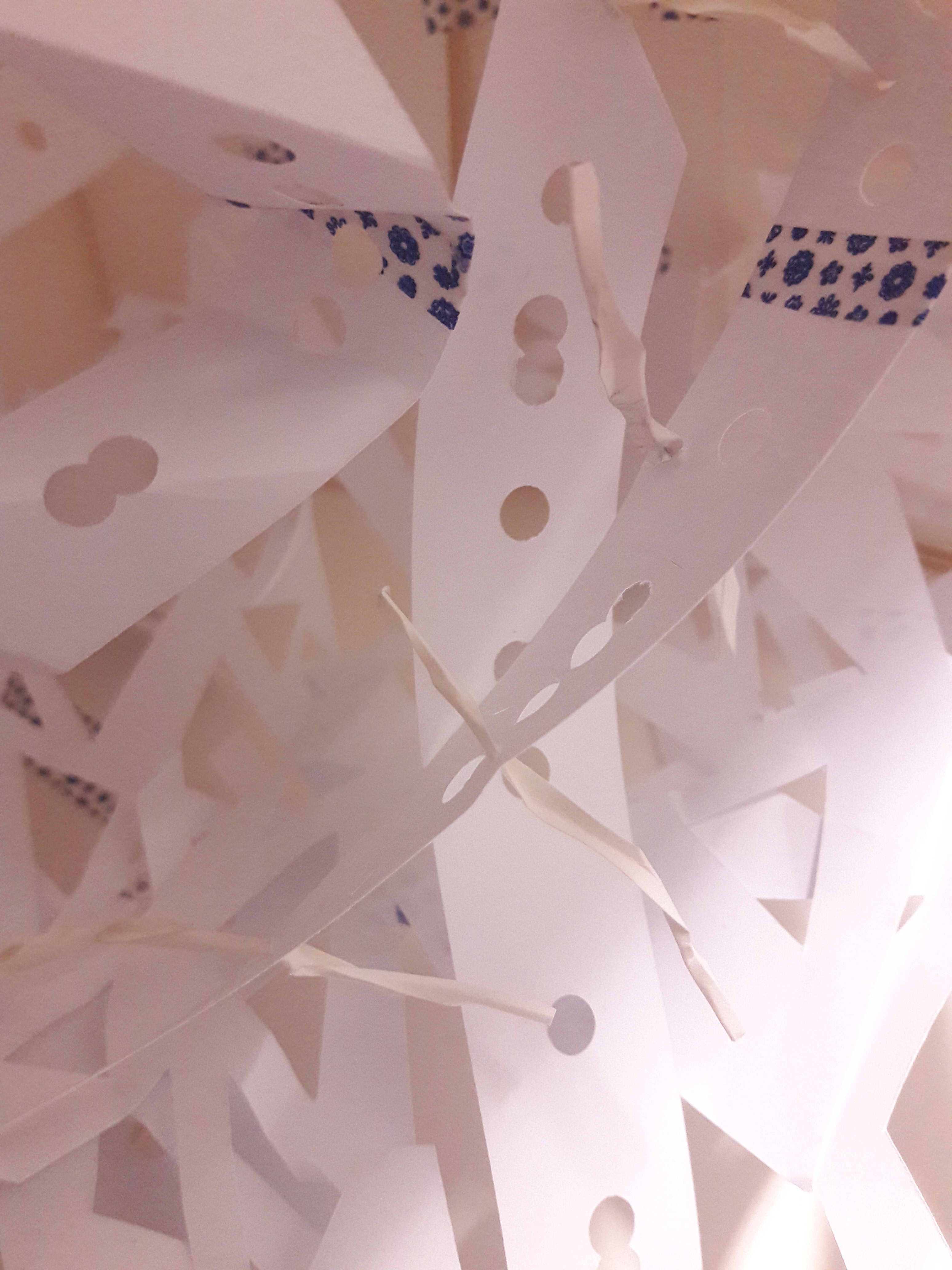
There weren’t any site-specific objects I could use, so I decided that I would need to make the object on my own. The layout practically begged for something to pinned to the wall, and when you talk interactive, why not paper to be drawn on? It’s not exactly unmoving, but I could at least have the 10 minute video show how the paper got there, showing its temporal part of not always having been there, as opposed to the current present which shows that it IS there. Also, it’s thin enough to fit the narrow corridor. The downsides are that it doesn’t have the same effect as the basement foyer’s benches, in that it’s not something which is permanently there, and already has some form of established identity, but at least it was suited to the area.
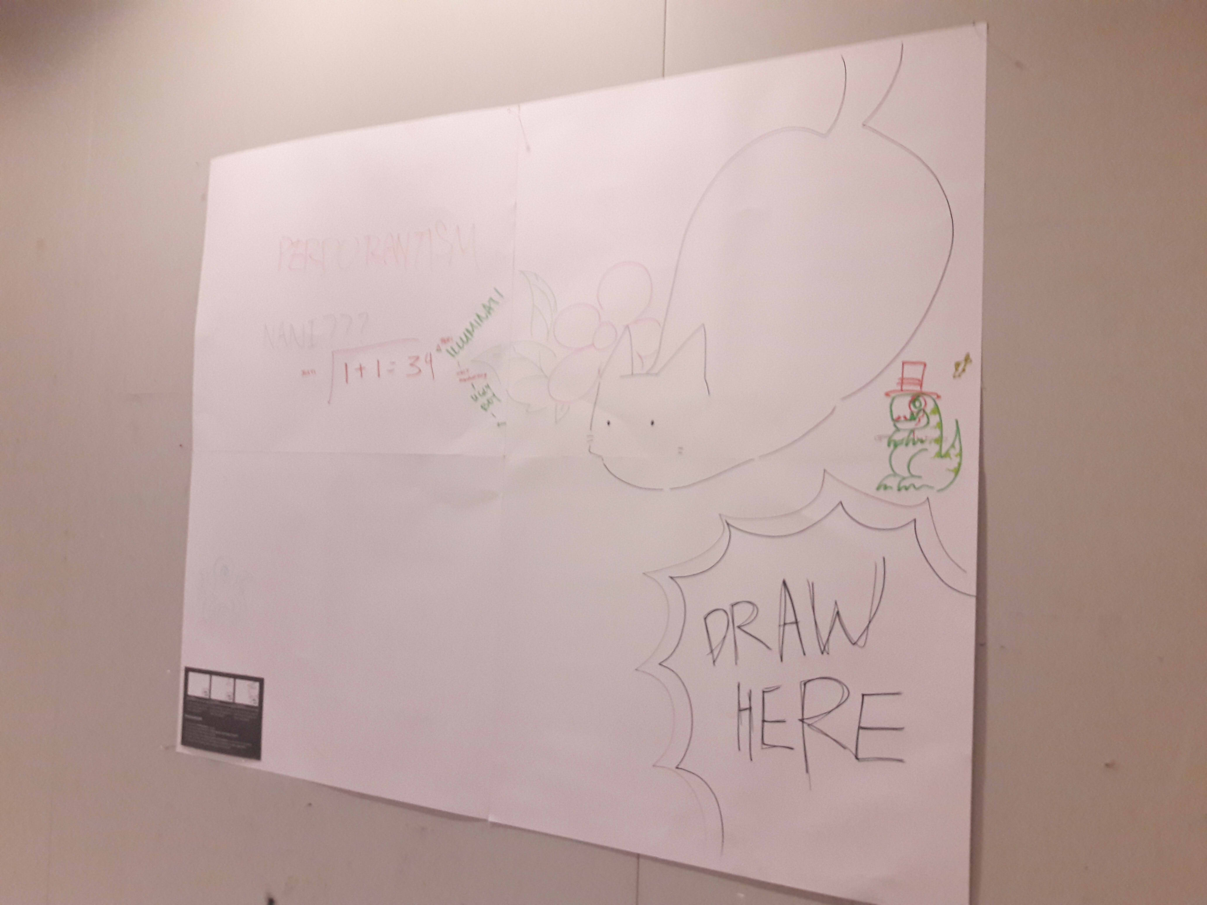
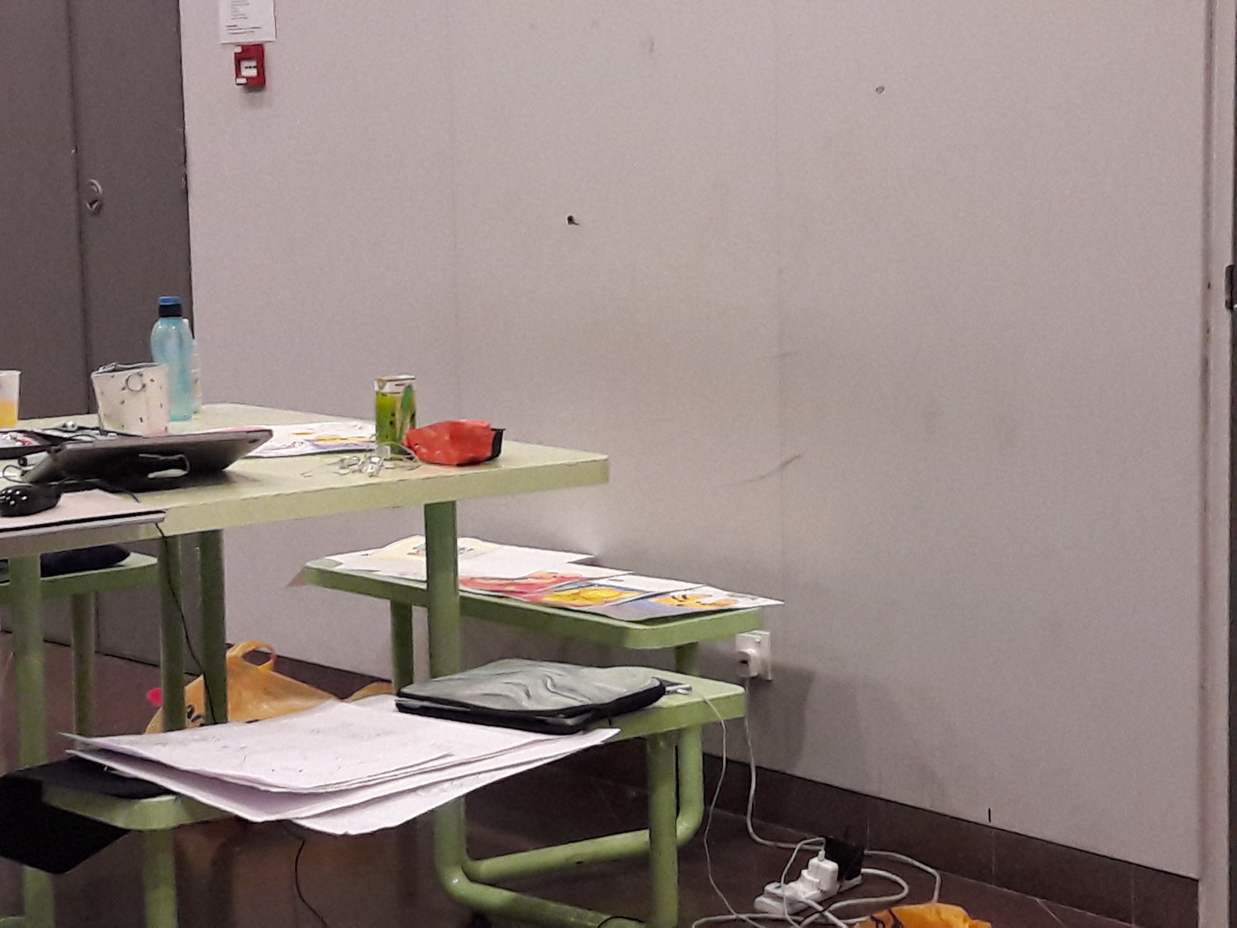
Material objects: I wasn’t sure how small the projection size would be, so I waited till I could test it out before deciding that, yes, it was safe to join 4 pieces of paper together to make a large piece. Hence, I joined 4 20″ by 25″ papers together. This was especially because I was afraid that there wouldn’t be enough space to cater to around 20 people simultaneously interacting with the papers. Also, in light of previous feedback that I might not always make sense, I added a little placard with information for people who might actually care to know more.
I brought along my Chameleon marker set so that people could experience the disjunct of the projection versus the material form through modifying the paper themselves. Also, it served as a good way of explaining with props.
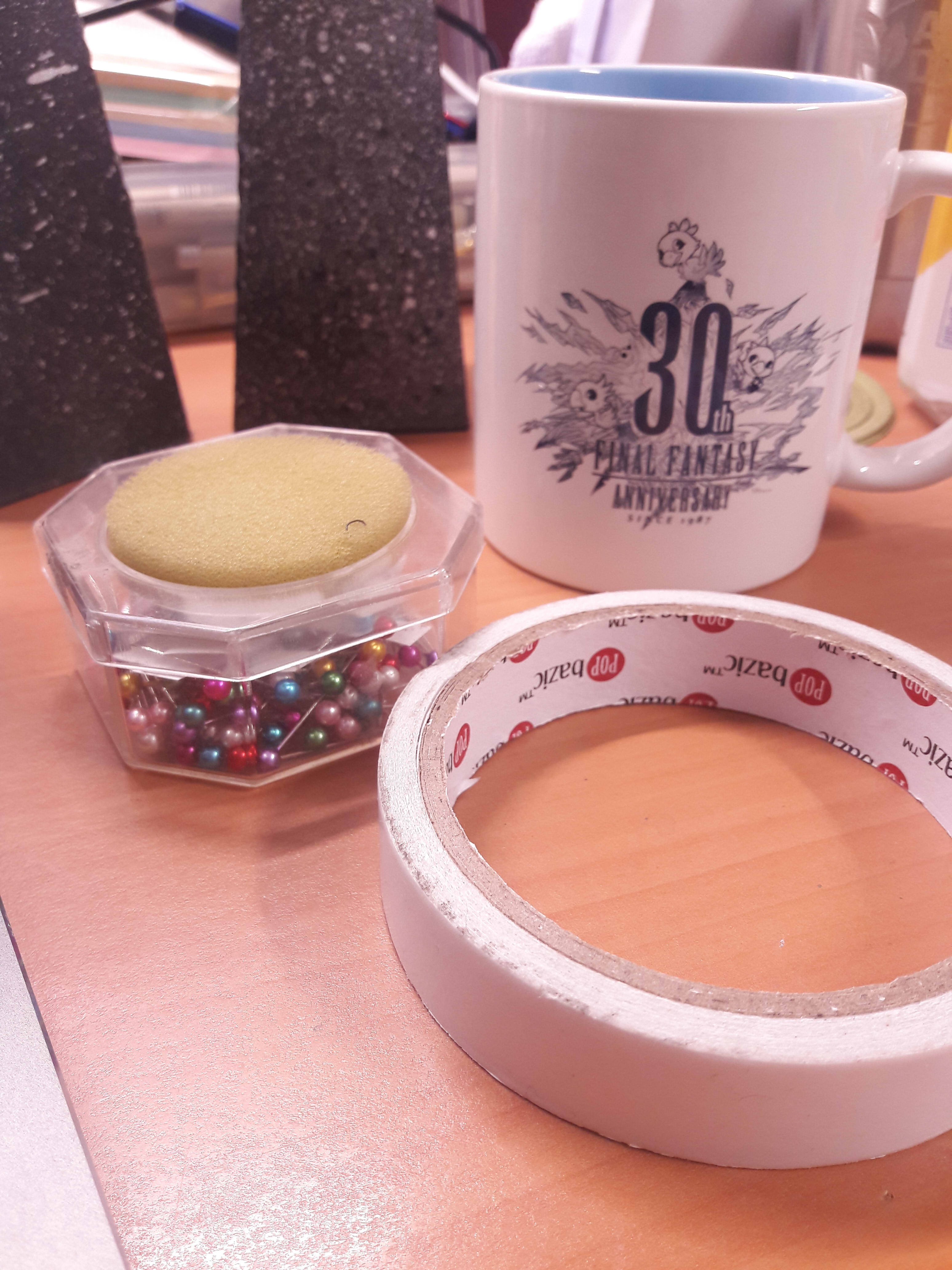
Also, I used straight dressmaking pins and double-sided tape to hold up the papers.
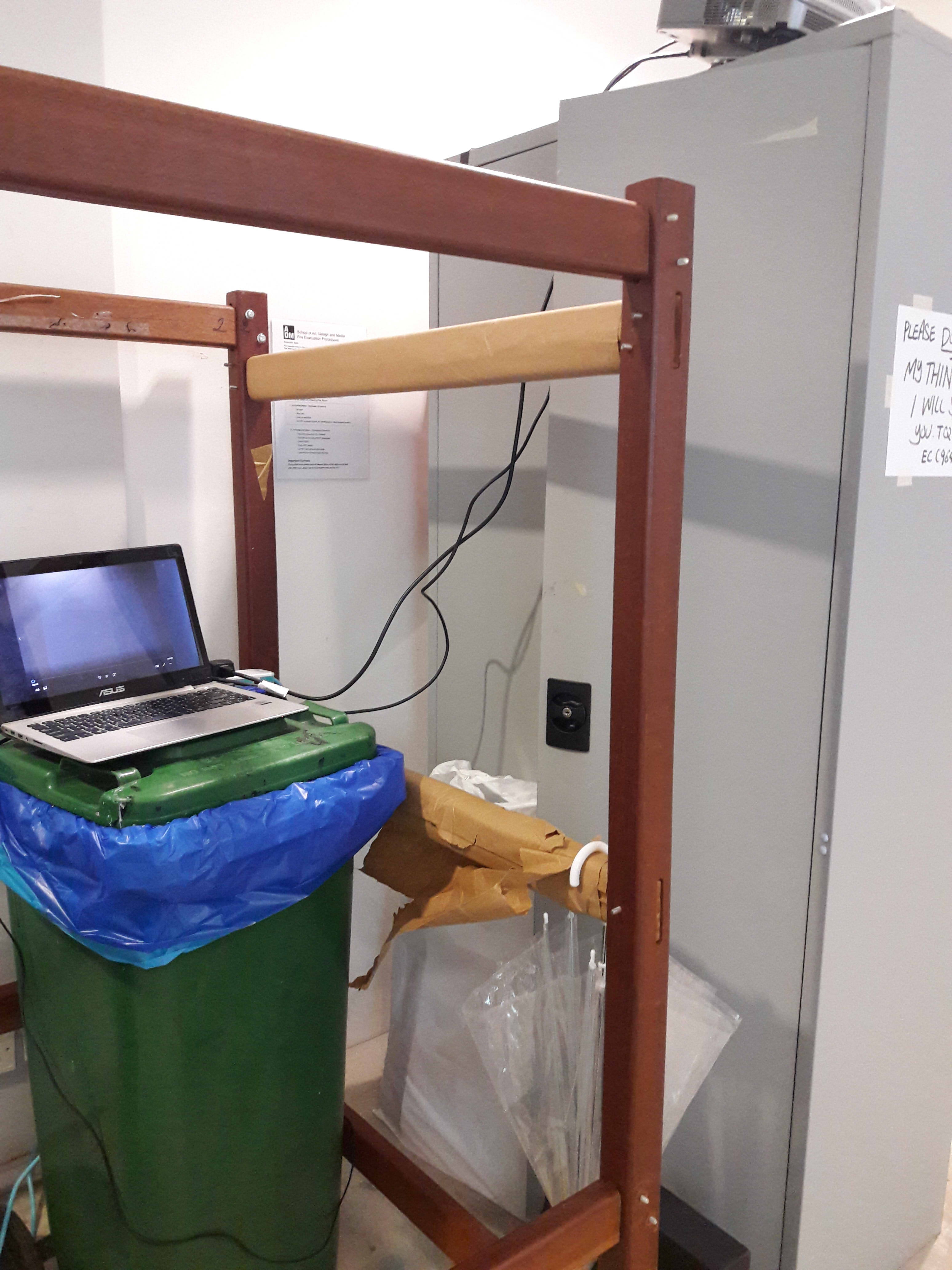
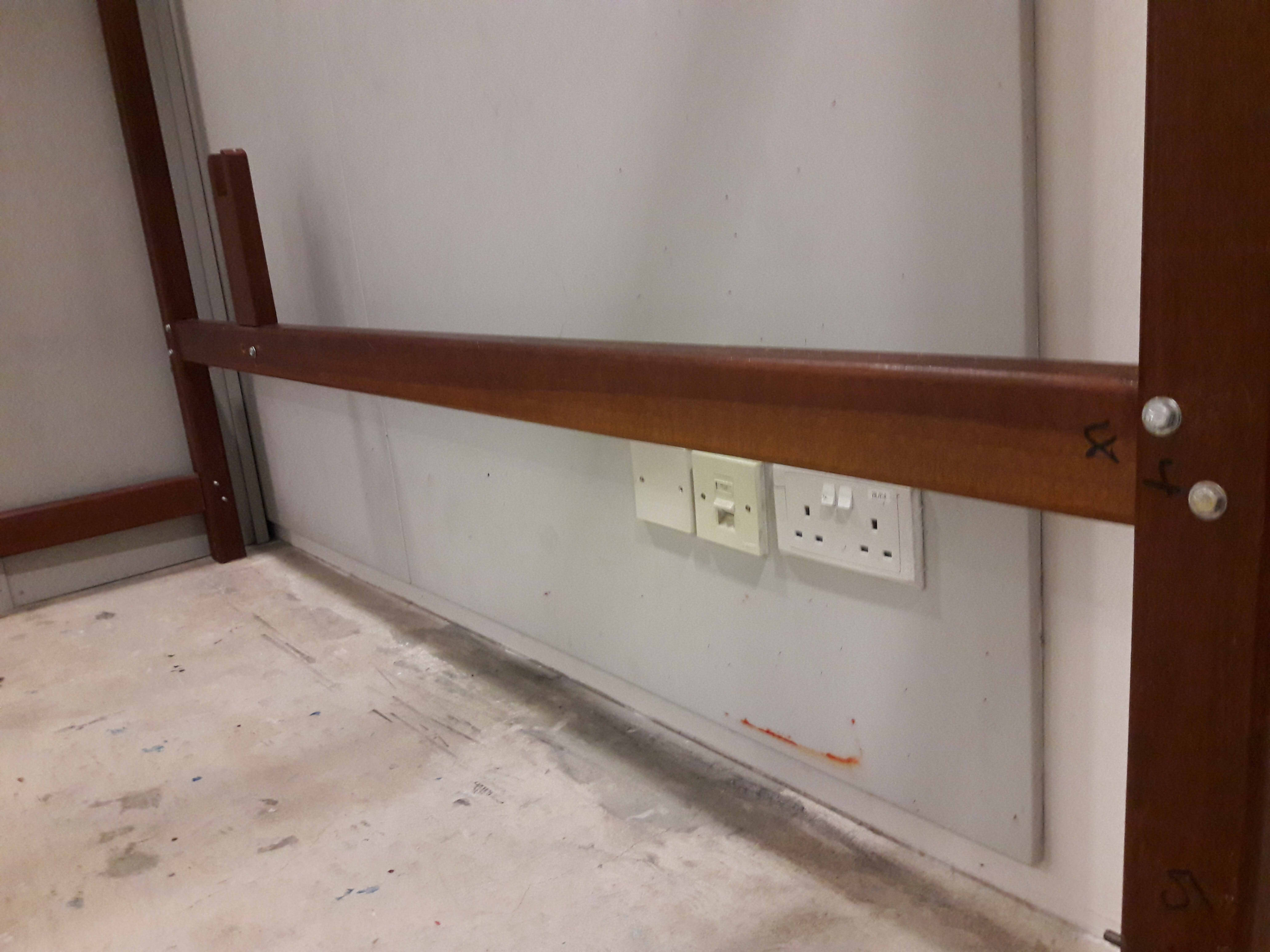
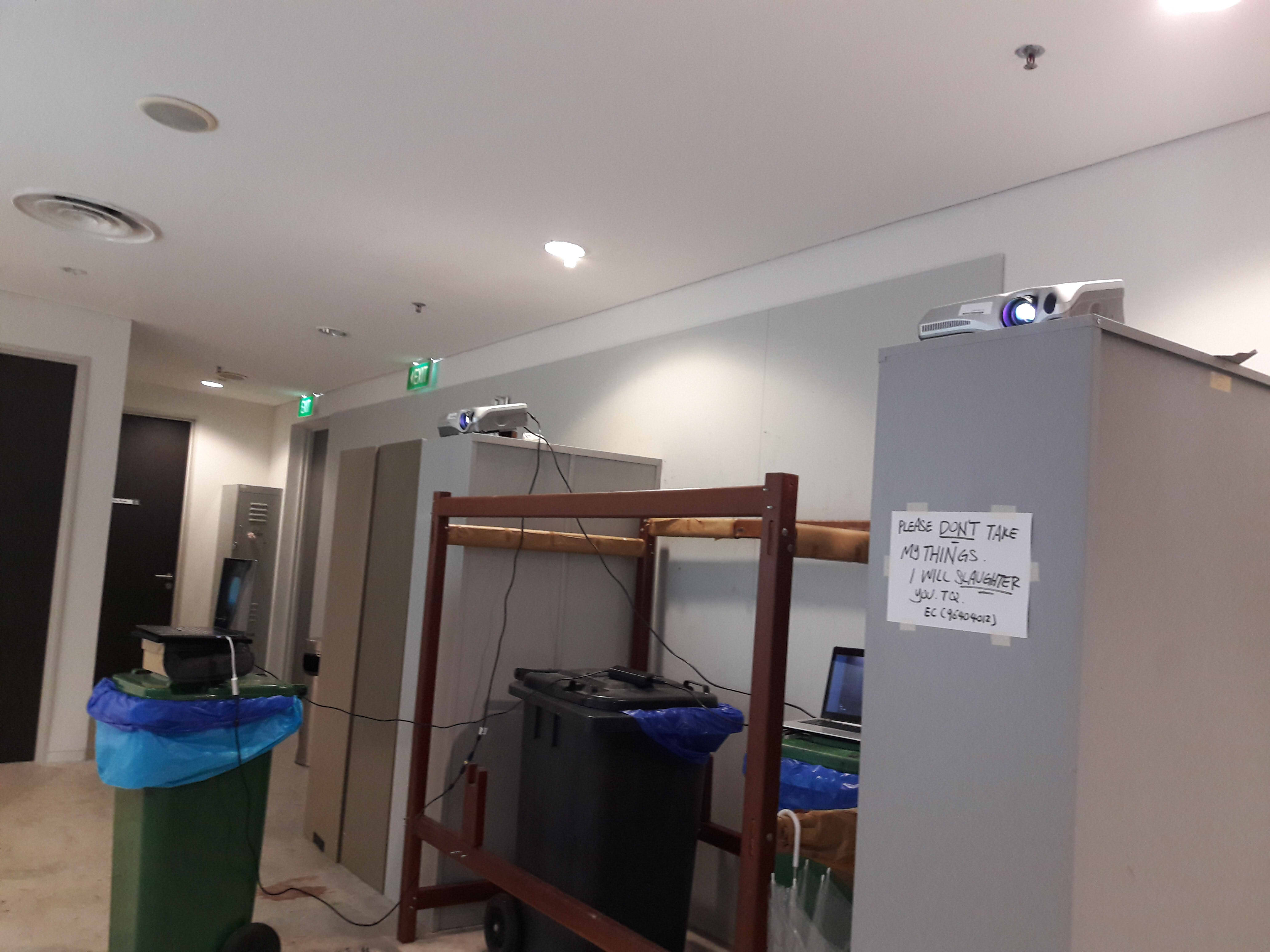
A tall place to place the projectors: Lei suggested on top of the metal cupboards, and it did look rather apt, hence I went with it. I DID have to manually hoist and adjust the cupboards, though.
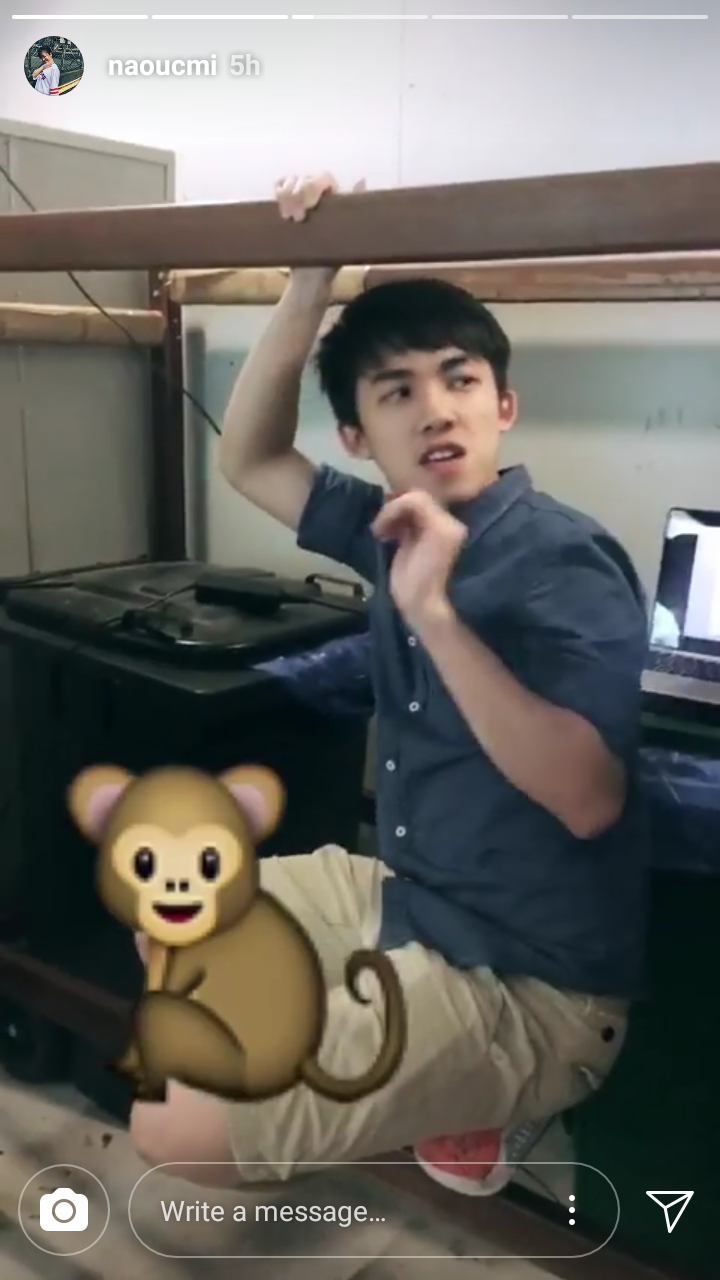
Something to elevate the laptops: I had been planning to covertly borrow chairs from the Foundation 2D/4D room, but quickly realised there was no need to since there were 3 conveniently placed trash bins which worked perfectly well as elevation. The bed frame also conveniently served as a sort of monkey bar so that I could actually reach the top of the metal cupboards to place the projectors, which is typically impossible for my height..
Sockets: Luckily, there were 2 well-placed sockets. Just to be on the safe side, though, I brought my extension cord, a good choice where it turned out the projector power cords were too short without it.
The final setup turned out surprisingly well, likely because of the small scale of the space such that it was much easier to deal with.
If I had better resources, I would have liked the video to span from the putting up of the paper, all the way to the present, rather than cutting off abruptly once my camera couldn’t record anymore (i.e. a live transmission running about 2 hours behind real time, not that I would know how to set that up).
In the end, it was surprisingly not as hard as I thought it would be to change location, which I think was mostly because I had already stated the main criteria I needed rather than specific objects, such that I could figure out what I could replace it with easily. (Also, Lei’s advice was incredibly helpful where I was at a loss on where to even start looking.)
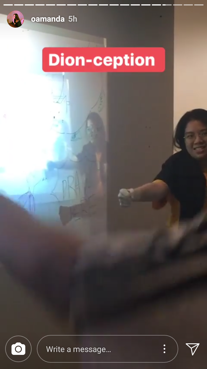
In the interest of time, I also ditched any plans to actually teach properly, and went with the fastest crash course I could, so I mostly feel like everyone didn’t really understand the metaphysical concepts I was trying to portray. But I suppose it’s alright because I do feel like I did what I could with the available time and resources, and it looks like everyone had fun:
(Also, a lot of shadow puppeteering happened)
Also thanks Ryan and Lei for helping me carry all my equipment T_T Especially Ryan for helping me reach the projectors, push the metal cupboard back, and carry my 2 projectors and DSLR camera set back to Hall 2 Block 6 Level 2, i.e. a route with many, many, many stairs.
I decided to switch up and get out of my comfort zone by working with live, 3-dimensional, interactive things than what I’m comfortable with (read: drawing, animation, painting, etc), and it’s been a real eye opener. Mostly because my soul is broken.
Since I had been steadily and extensively working on my original plan until it had to be drastically changed 1 day before the presentation, I’ll attach both the original plan (here, in Part 1) and last-minute improvised plan (in Part 2). As this project was more trial and error process-based in terms of setup, there’ll be less summarised points as opposed to talk on the setup process.
General
For me, I have a difficult time working with anything that’s 3-dimensional in nature simply because I have difficulty noticing or controlling problems (i.e. anything technical, physical, etc). For the sake of learning, though, I decided to at least have a go, so rather than an emphasis on laborious handiwork like animation, I’d have a simpler subject, but with a more complex setup process (see more in my post on the Blue Sail, which was sort of what I was trying to emulate).
The difficulty is elevated by that the available spaces in ADM tend not to be exhibition areas specially catered for presentations, and as such I’d have to improvise greatly, and the setup would vary rather wildly depending on where I choose.
Concept
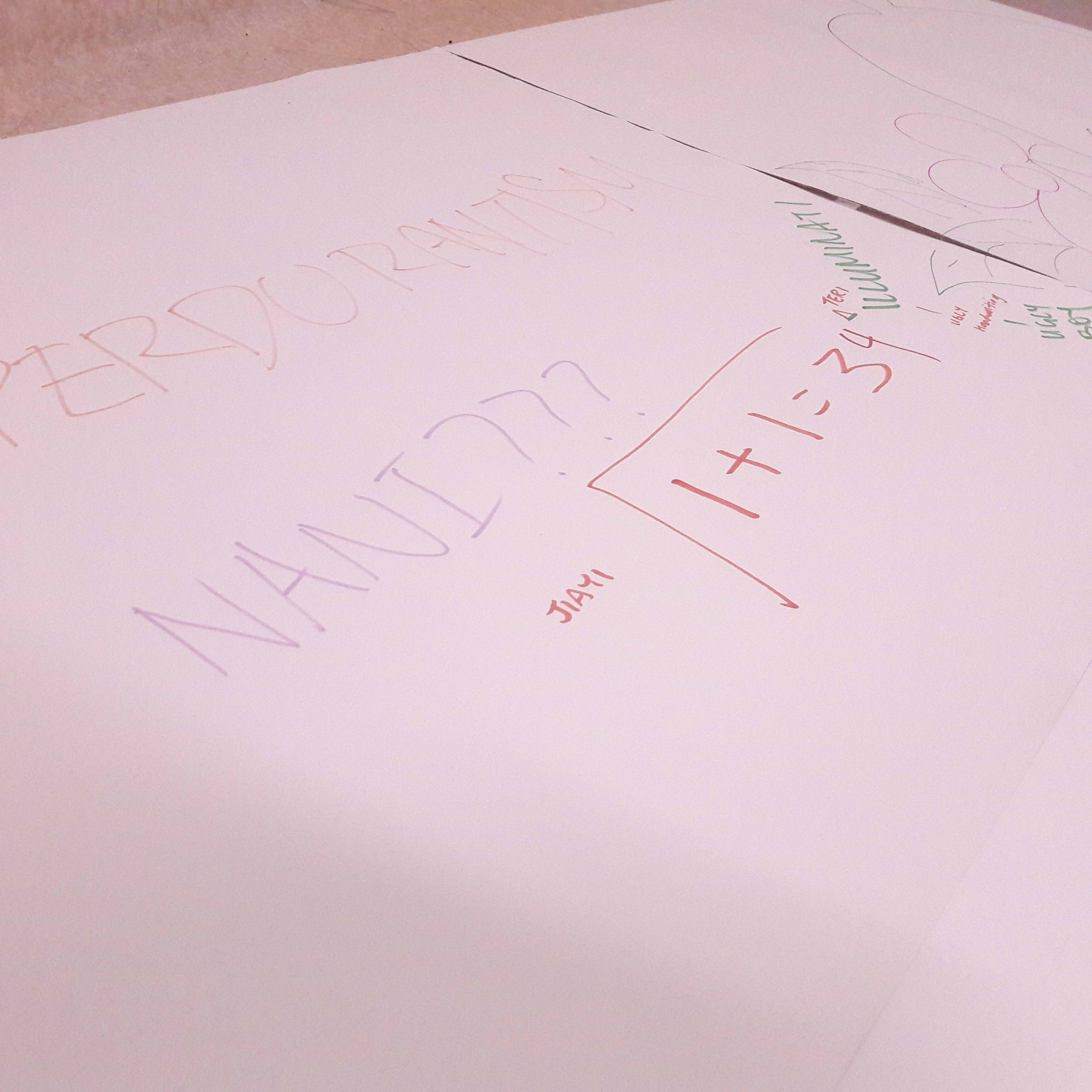
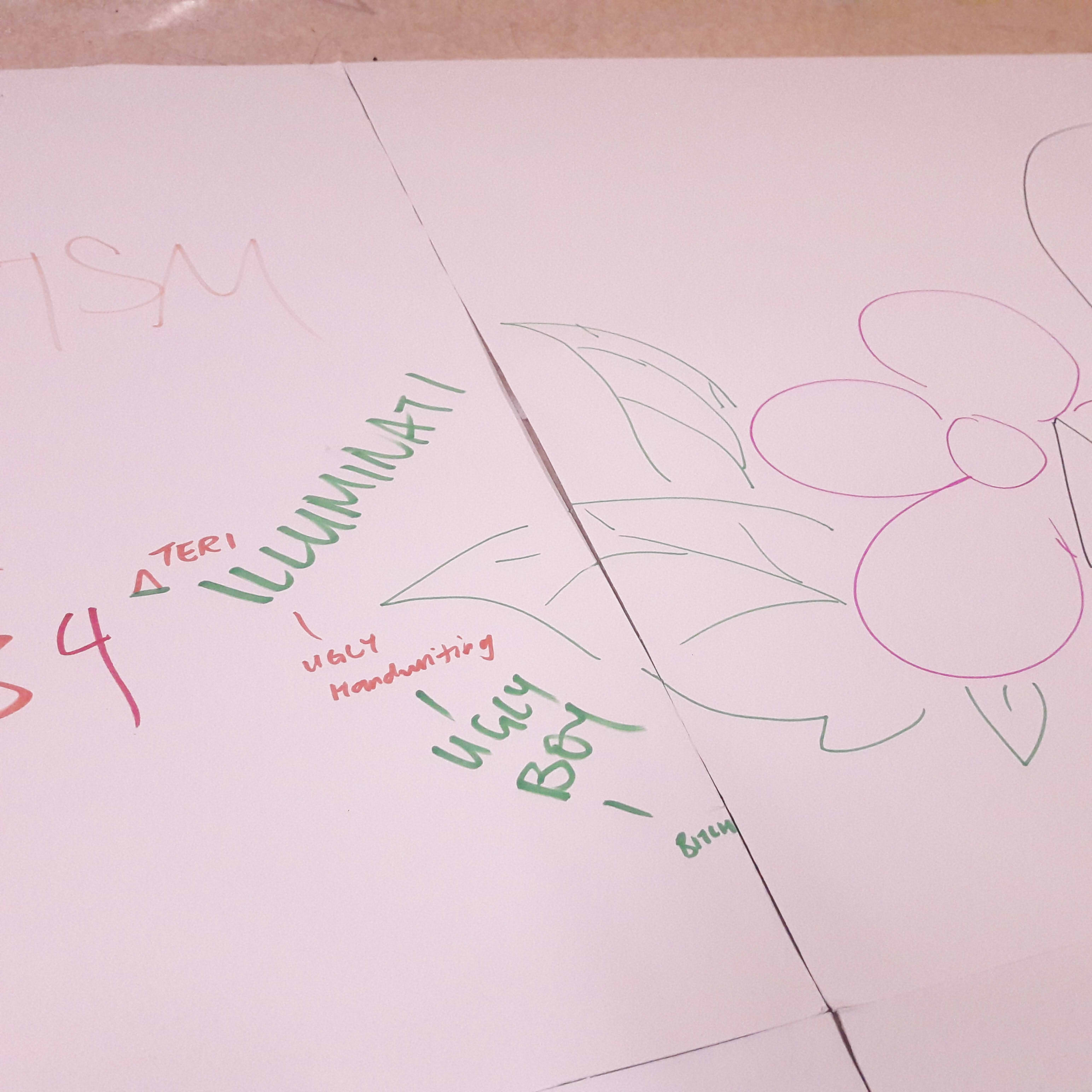
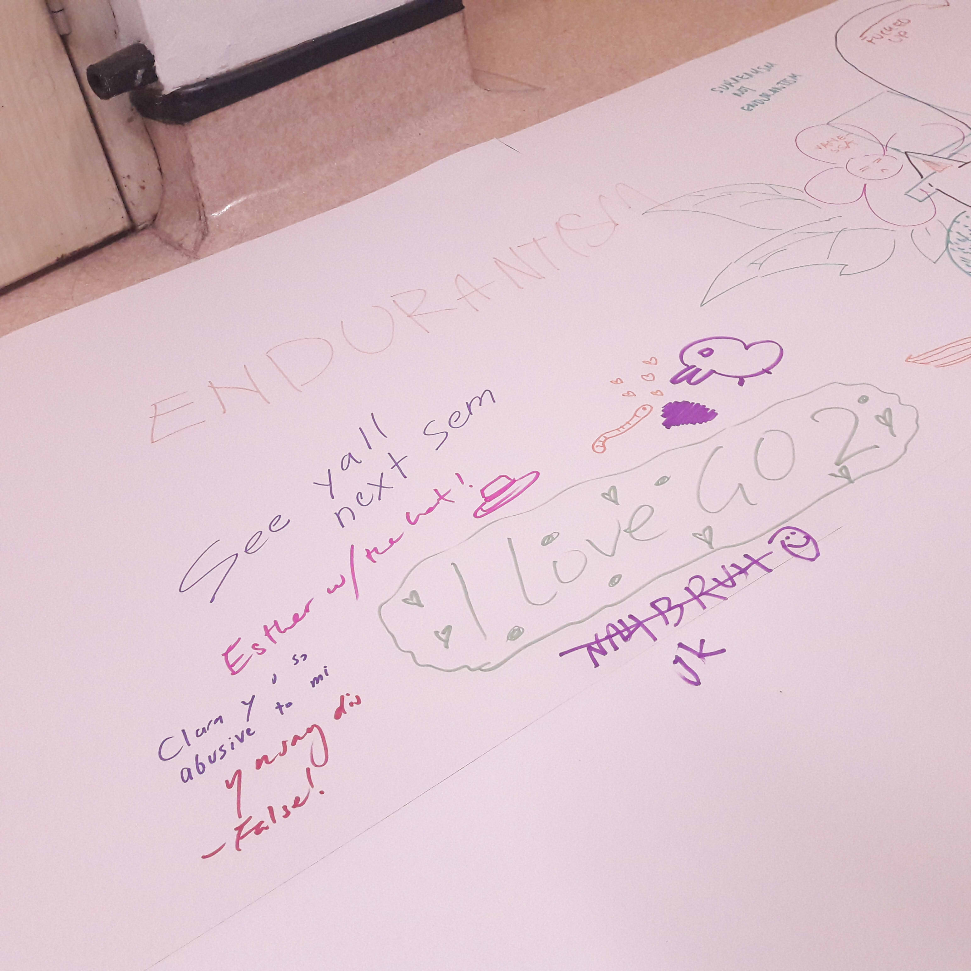
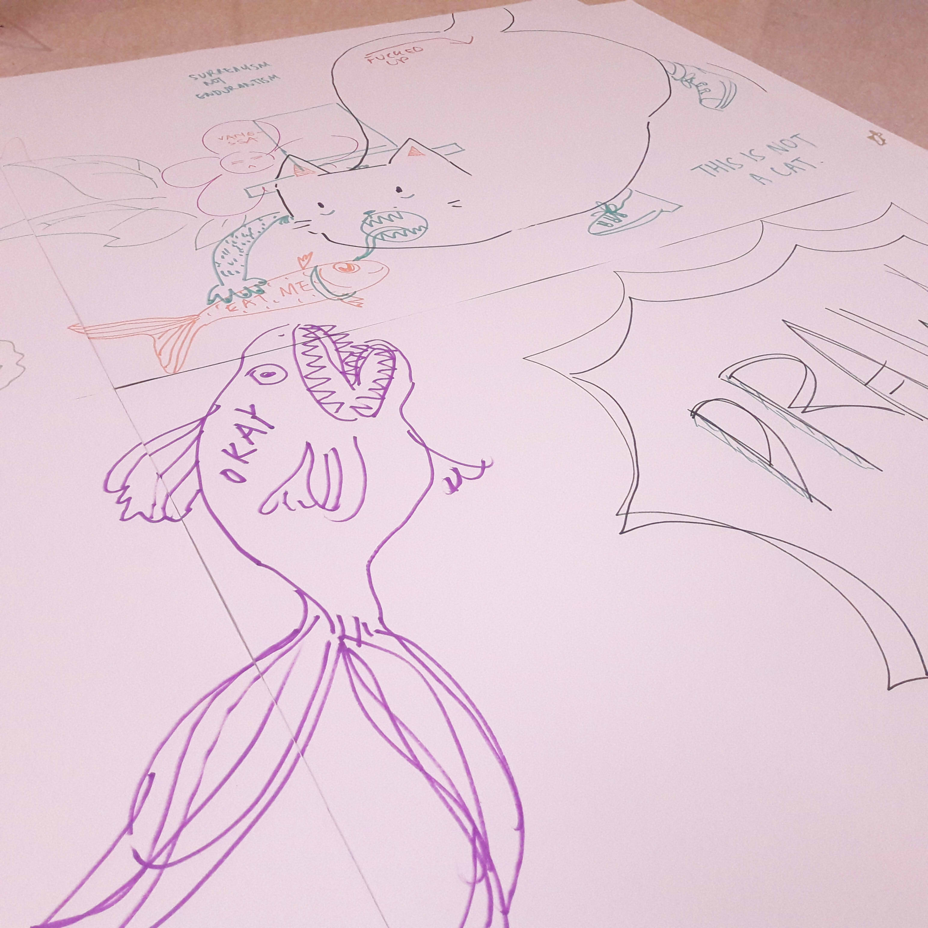
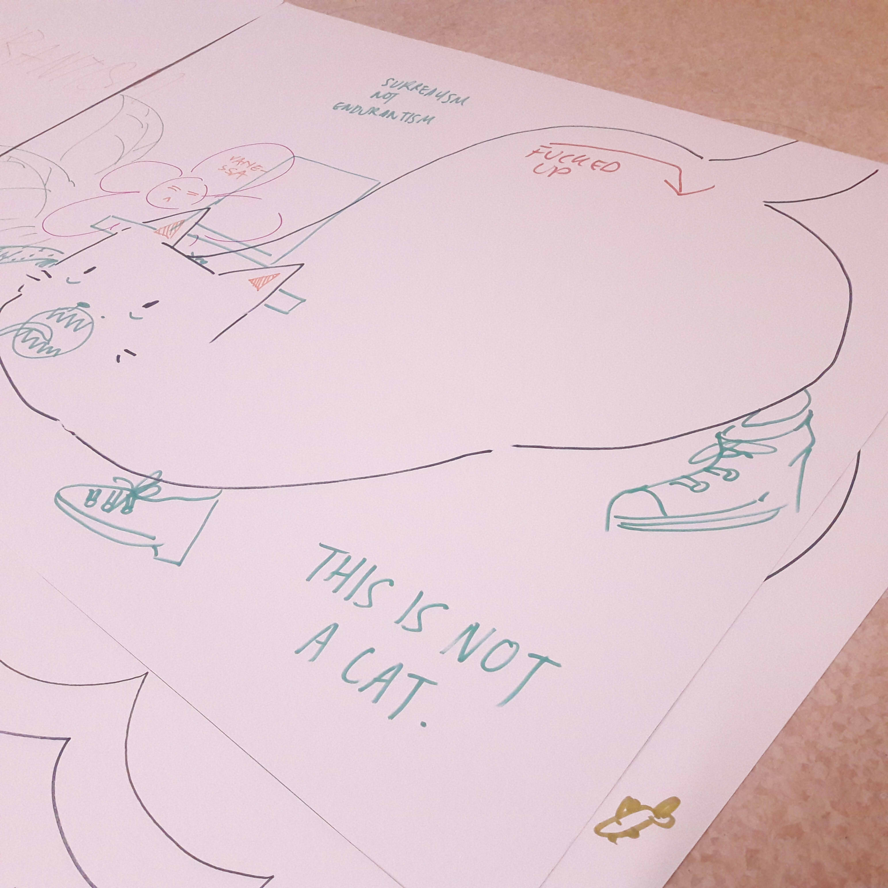
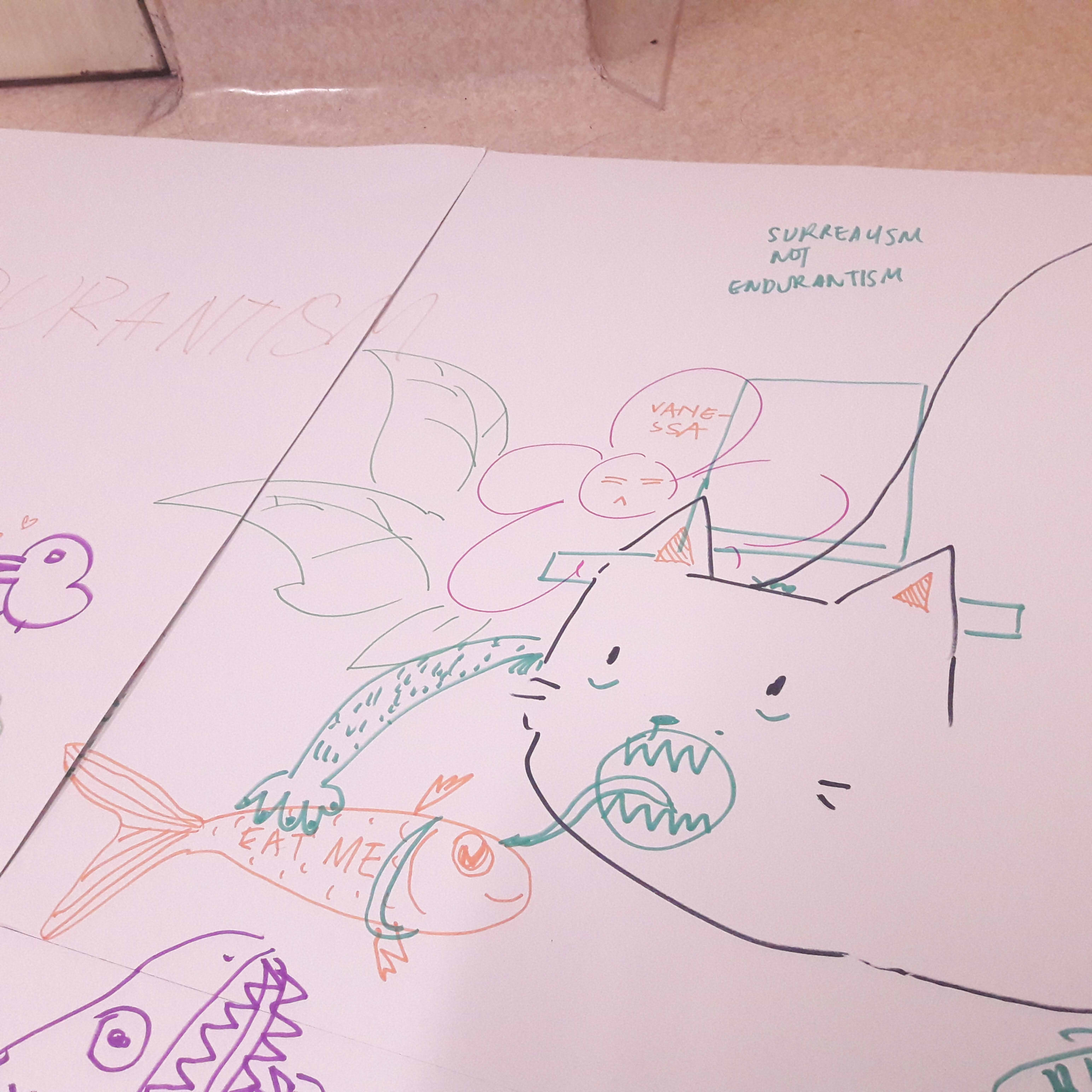
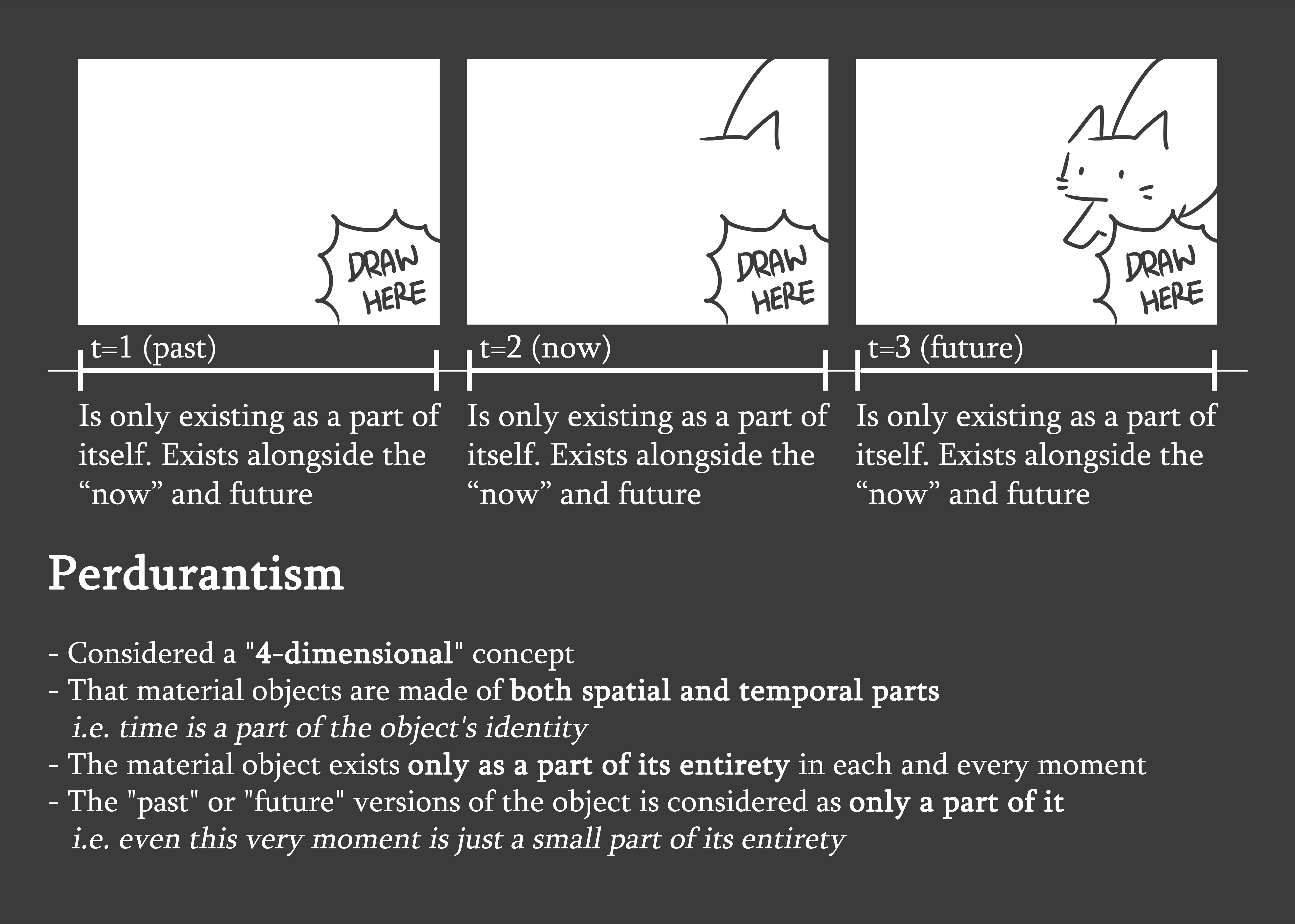
My concept was based around the philosophical antipodes of endurantism and perdurantism. It’s a relatively new concept to me as well, but to sum it up (I also made little placards of this to put up):
I originally considered having an opinion which leans towards either, but realised that
It doesn’t really matter, because no matter which way you perceive reality the tangible outcome is still the same
I can’t make a stand since both make sense to me equally: in a way it’s true that only the world in this very moment in time exists at any point of time, but in a way the world also tends to be a culmination of what happened in the past, now, and what will be
Hence, I decided to just try and present it as best as I could, and let people just learn about it, form opinions on their own if they want to. In fear that I wouldn’t be able to explain properly, or that people wouldn’t get it, though, I made little placards of sorts so people could read it on their own, or maybe better understand through images than me talking.
Here’s some references which I looked at to actually understand anything.
The idea of a 3-dimensional object instantly came to mind, where the concept already revolves around metaphysics and the material world (I will use the word “chair” to describe this object, since it was the first thing that came to mind for me).
To try to create a tangible difference where there was no tangible difference, however, was difficult. The general gist was to use different mediums to bring across the idea, and these were some things I considered to show the idea of temporal parts, and how the chair is interacted with across time, giving it an identity beyond what is currently seen, or the idea of the static, singular moment that the chair exists within.
Stop-motion photography (the temporal parts forming the chair’s identity, albeit in a less flowing form)
Timelapse videos (the temporal parts forming the chair’s identity)
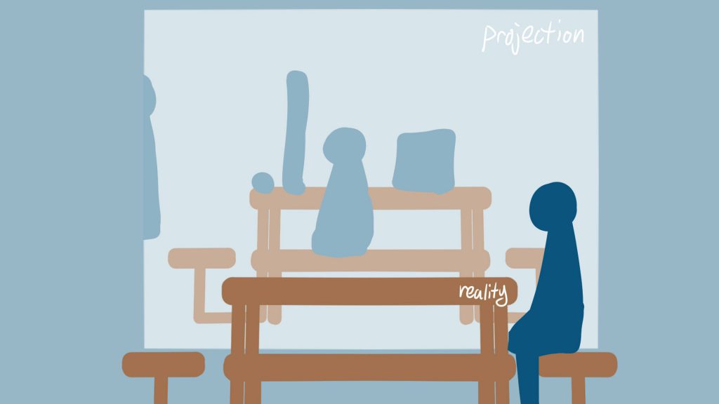
Livestream (I will refer to it as “live transmission” from here onwards, since I realised there’s a difference) (the exact present as is seen right now. the downside is that the static nature of the present can’t be viewed well, where the continuous movement of the transmission suggests temporal parts as well)
Just photography (static, singular moment. the downside is that it won’t be exactly the present, so it deviates somewhat from the idea that only “now” exists)
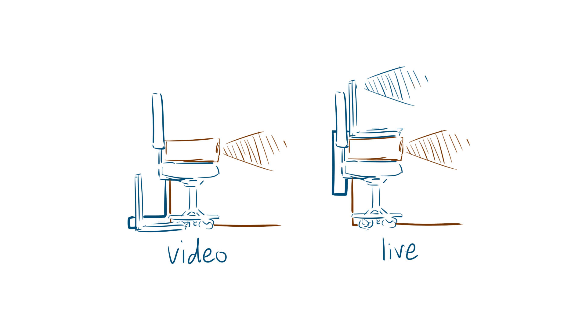
Video
Live transmission
I eventually decided on a video and live transmission, where the video would show another part of the chair’s identity through edited time, where one can see that the chair before them is only a part of what it is, has been, and will be. The live transmission, on the other hand, would show the entirety of the chair’s identity through real time, where it only exists as it is right now, in that very moment.
I also decided to go with a 4 by 3 aspect ratio such that it would focus more on the object than its surroundings.
standard 4:3
widescreen
Also, here’s a test of the live transmission. I decided to use fullscreenmirror.com because I couldn’t full screen the inbuilt camera for Windows 10, though it comes with the downside of having a social media sharing toolbar which can’t be disabled. (I also later learned that the school-loaned projector has an option to flip the display, so mirroring won’t be an issue!)
The mirror option, such that it didn’t invert back and forth.
Object & Location
Next, I considered the object in relation to location. Since I had originally envisioned a chair, I went out looking for identical chairs in close proximity to each other in ADM. The general idea, though, was that the object just needed to be something people could interact with, to make it more interesting, and also such that the object could be “modified” across time as people fiddled with it. Preferably, though, it would have to be something immovable, so that the projection and object would still align properly.
I eventually decided on the Basement Foyer (outside the Foundation 3D room), because I noticed the benches there fit the aforementioned criteria. Also, it has a thriving nightlife, where ADM freshmen doing their homework tend to gather there, which gave the benches a special, time-based identity part.
The location
Said bench, along with ADM freshmen doing homework at 9pm
I also took a test video, and quickly discovered my SD card was too inferior to take videos longer than 12 minutes. Lei suggested to just cut it to 10 minutes, which was probably a good idea since it was more than enough to get the idea across. Here’s a sample from 9pm during final project hell week, also edited to 4:3 aspect ratio.
Technical Issue Problem-Solving
Luckily, I had enough common sense to notice that my laptop required some form of adaptor to fit the cable. Also, I checked the projector specifications from the school’s equipment store, and discovered it only serves VGA, and no HDMI: as such, I was adequately prepared to look around for ways to counter that, eventually settling on:
Using an old home laptop which has a VGA socket
Buying a Type-C USB to VGA adaptor for my laptop
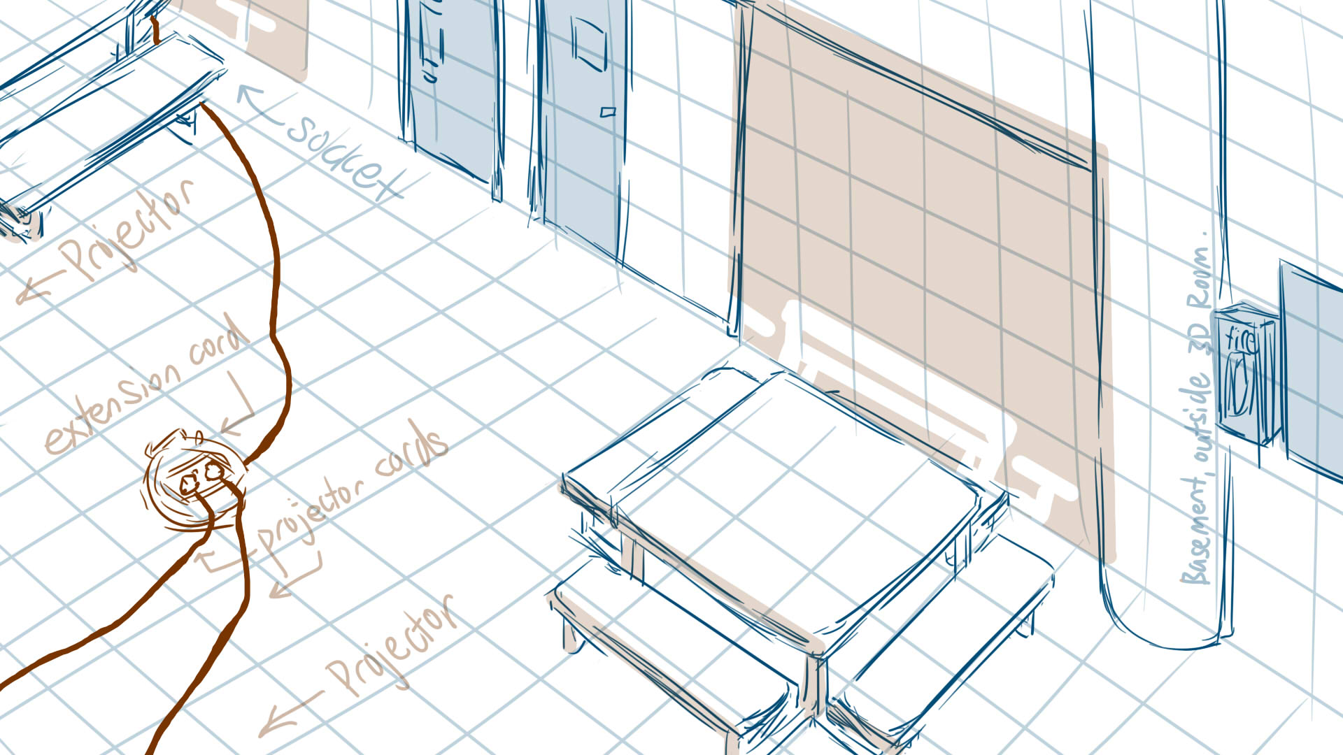
Since my installation involved digital projections, I also looked out for sockets. It’s rather startling to know that there’s only 2 sockets in this entire area.
Lei suggested that I should elevate the projector to prevent a cast shadow, meaning I would have to have the power cord span the foyer width, from this socket to the staircase.
Consequently, I drew up a sketch of the setup. It might seem like all I really need are 2 laptops and 2 projectors, but the drawing really helped me to realise that I would need a lot more accessories to address more technical and spatial problems:
The dry run also assisted in realising that
The VGA cables were too short to allow me to use the laptop webcam (placed in front of the bench) while connecting it to the projector (up on the staircase). I resolved it by 1. asking the school equipment store if they had longer ones (they didn’t), 2. purchasing a VGA to VGA connector, such that I could join 2 cables together.
I needed something to prop up the projector such that it would shine downwards rather than straight forward onto the ceiling. I resolved it by wedging random things like my wallet underneath.
I needed something to elevate the laptop webcam more, since it was too low initially. I resolved it by borrowing a chair and stacking random things underneath.
And with all the problems solved, I was ready for the day itself! Or so it seems….
I’ve been thinking this since the project was first announced, but wasn’t sure whether to post about it or not since I can’t find a tangible connection. (I decided to just do it, though, because, well, why not?)
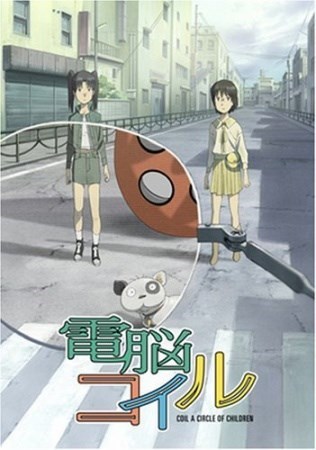
The idea of cities and voids reminds me of a particular anime I once watched, 電脳コイル (“Electric Brain Coil”), a show about augmented reality, which is reflected particularly in the infrastructure of the city. It revolves around children who explore the city, particularly its forgotten spaces, finding all kinds of voids resulting from disjuncts between actual and virtual reality.
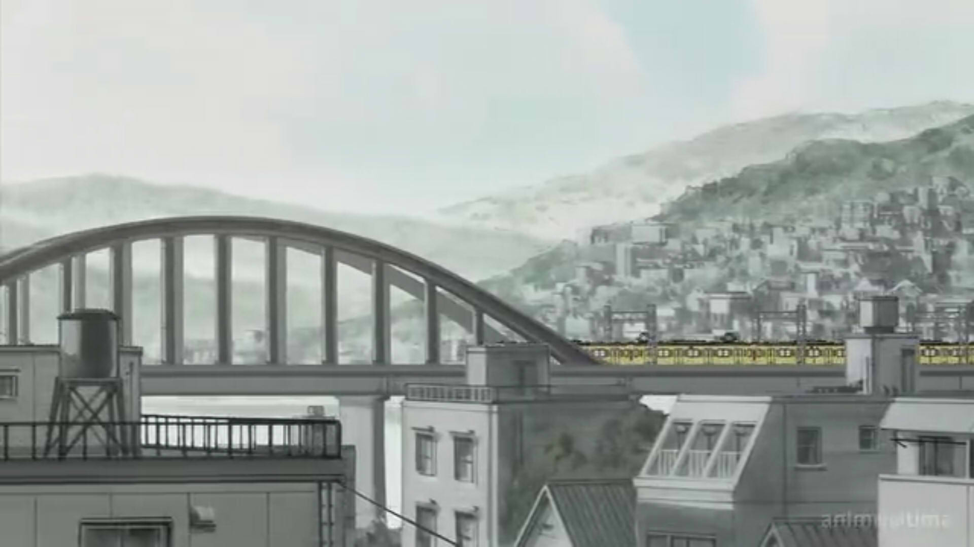
It takes place in Daikoku City, a test site for AR technology. There are plenty of forgotten spaces in the city despite most of it being developed land.
There’s a lot on the idea of spaces, namely that of the real versus virtual space, giving rise to version mismatches, virtual spaces which exist outside of reality, et cetera.
Episode 1, in Daikoku City.
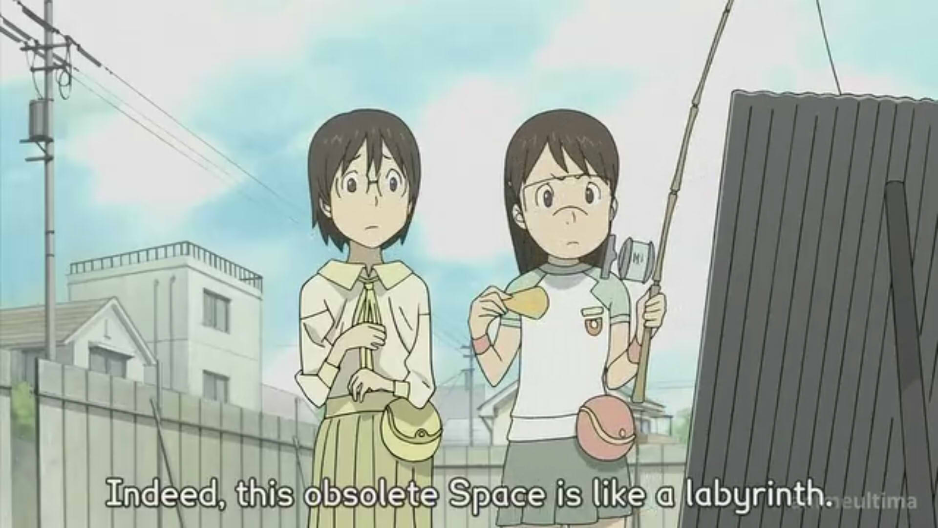
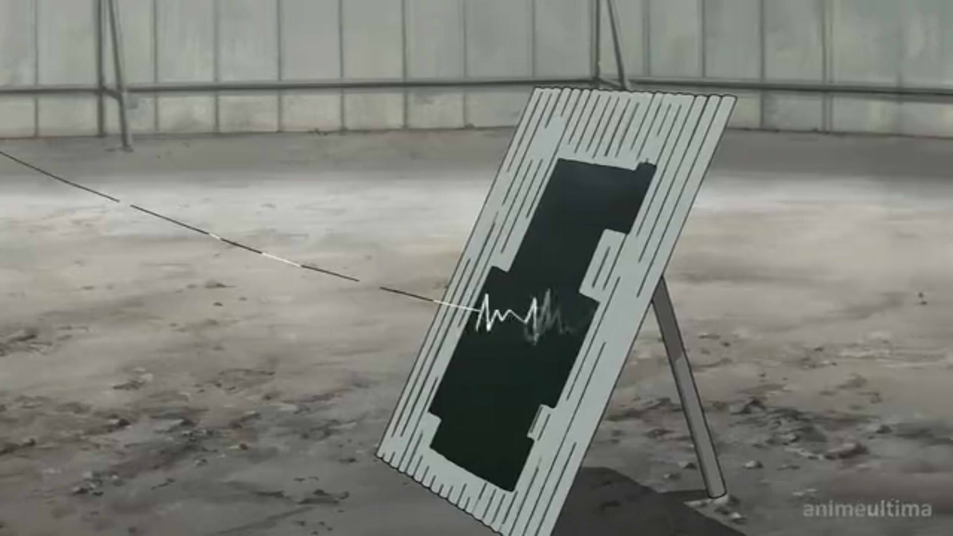
Fumie (the girl on the right) has opened a hole into obsolete space.
Obsolete space refers to parts of the cyberspace which are “corrupted” and needs to be reformatted.
As such, the space is full of contradictions and hardly resembles the real world.
… In other words, this is an unsubtle advertisement. It’s a good show. I promise. Please watch it and love it, it’s extremely underrated.
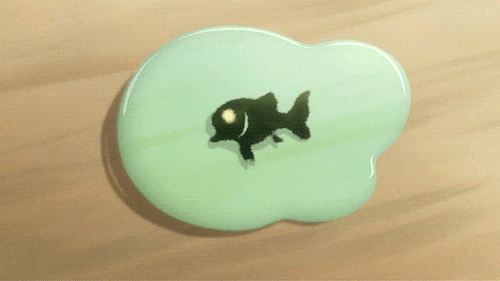
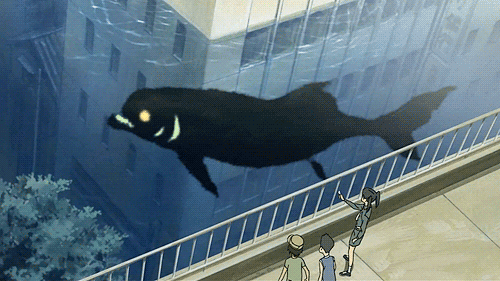
Although it revolves more around the theme of “distance”, shown through that of the jarring inability of actual and virtual reality to co-exist properly, and that of the dangers and loopholes of augmented reality, I thought the way it presented the interaction of Daikoku’s real infrastructure versus its cyberspace was really interesting. For example, here is an organism which exists only within the virtual world, interacting with the city’s virtual infrastructure.
“Illegal” is a name for these black creatures, as they are virtual organisms which naturally live in obsolete spaces and cannot survive well in the “real” world.Here you see the window broken: however, it is only the virtual version of the window which is destroyed, than the real, physical window.It’s still possible to breathe as the water and the fish are part of the virtual world than the real one. Meaning, if one were to remove their glasses, they would see only the buildings and people.
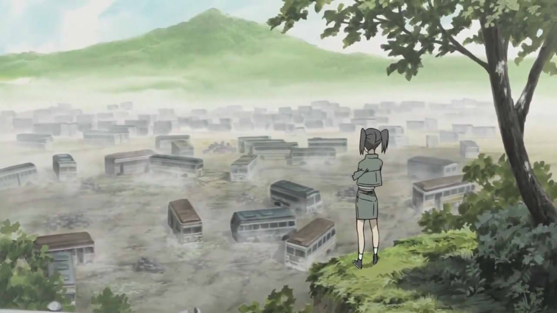
Especially how it brings attention to “voids”, in terms of obsolete or outdated cyberspaces. For example, outside of updated spaces like traffic junctions, it also presents the children exploring spaces like abandoned buildings, bus graveyards, etc.
Episode 5, a bus graveyard.
VR glasses show the bus to be intact,
however plain sight reveals it is not, showing the disjunct between outdated VR information and reality.
I don’t particularly know how to relate this to the actual project, but I just felt a strong connection between the two. It might be interesting for future projects though, the idea of juxtaposing what you see with your own eyes, versus what you CAN see with supplementary items like VR glasses, or digital projections, or layering to create illusions of more than what there really is (gestalt?). Especially because we’re in an age of technology, where these kinds of virtual issues are really on the rise, and useful to add a whole new dimension of interactivity (or visual quality).
A gentle breeze sweeps across the iridescent water, clear but for the occasional trout darting to the surface, and diving again as a small hand reaches to touch. A mother’s hand pulls the pouting child back from his precarious position, leaning over the edge. Under arched bridges of swaying wind chimes, the small gondola skims the water, leaving ripples in its wake. Leaves rustle as the wind blows again, the excitable child skipping off the boat as it reaches the docks of the town square, the prudent mother carefully stepping onto the elevated stone pavement as she hurries after the running child. It’s a happy celebration, but still one to be treated with reverence than wild merriment, and she chides the child to calm him down as she catches hold of his hand, leading him to the fountain around which the townspeople have gathered.
My music background is dubious, but I like composing, singing and harmonising, so I decided to remix it. It was too plain, so I added chords. The ending note didn’t seem to be an ending note, so I replaced it to make a cadence. I couldn’t quite synthesise the rustle sound, so I generated Brownian noise to replace it. It sounded too harsh, so I added airy vocals with legato. There wasn’t enough bass and the synthesiser’s bass was horrible, so I added vocals again. It’s a lot gentler than the original which juxtaposes harsh sounds against the softness of the resonating glockenspiel, but well.
I also like descriptive writing, so that’s the short passage I wrote upon hearing the sound, and Cheryl’s comment that it sounded like a festival. The remixed version is somewhat melancholic too, a precursor to a short passage about the world beneath the water, which reveals a darker side of the city of dreams: that those who are unloved by god are left there to work endlessly in drudgery, supporting the happy world above, where the beloved are unaware of, and unconcerned about their plight. That’s to link with the 2nd sound, which was eventually used for our final model, but you can see more about that sound over at Vanessa and Clara’s OSS posts!
The featured image is basically what I was imagining with the sound. Less green and more cyan, though. Also, here’s the original sound, which is a lot harsher sounding and fast paced.
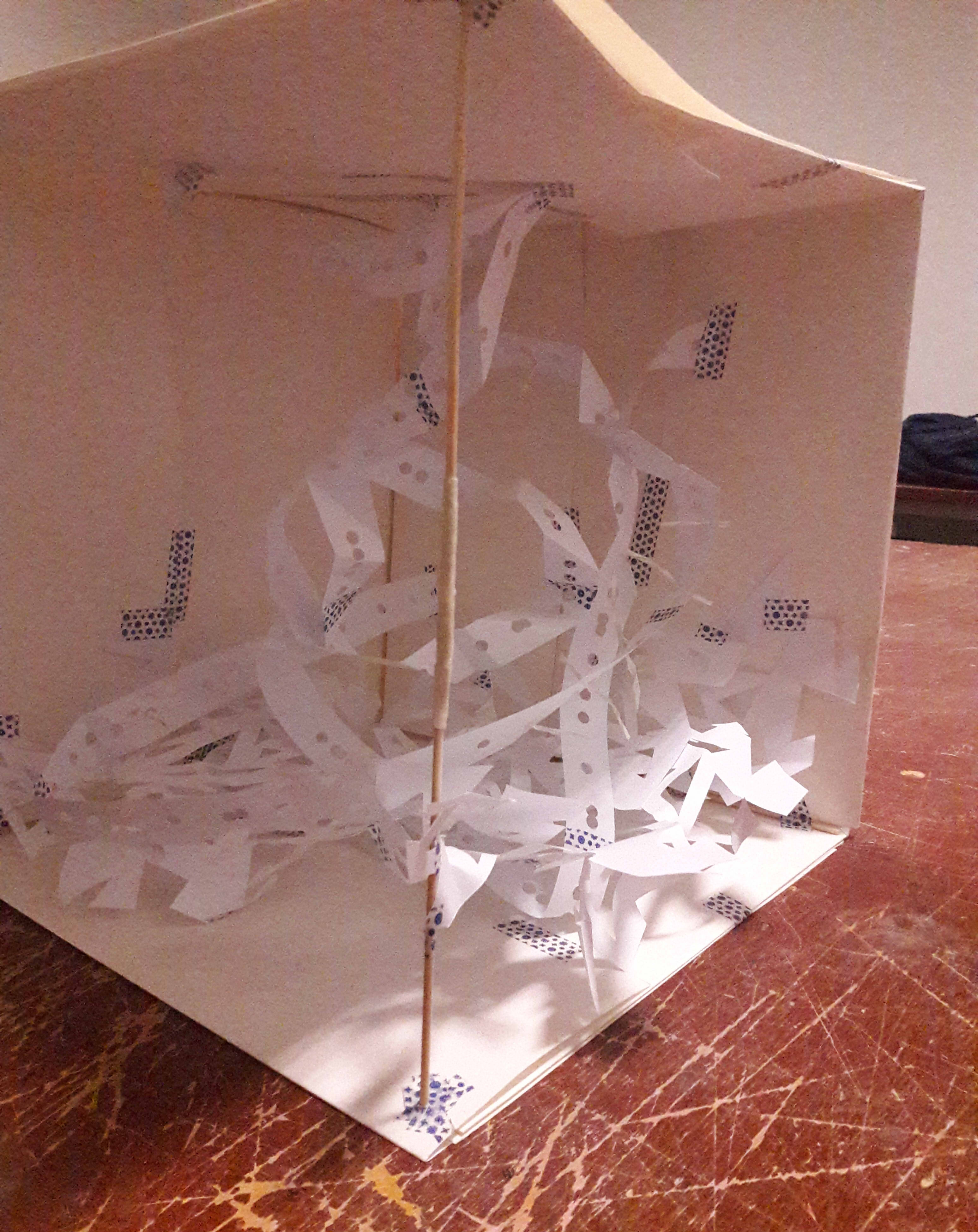
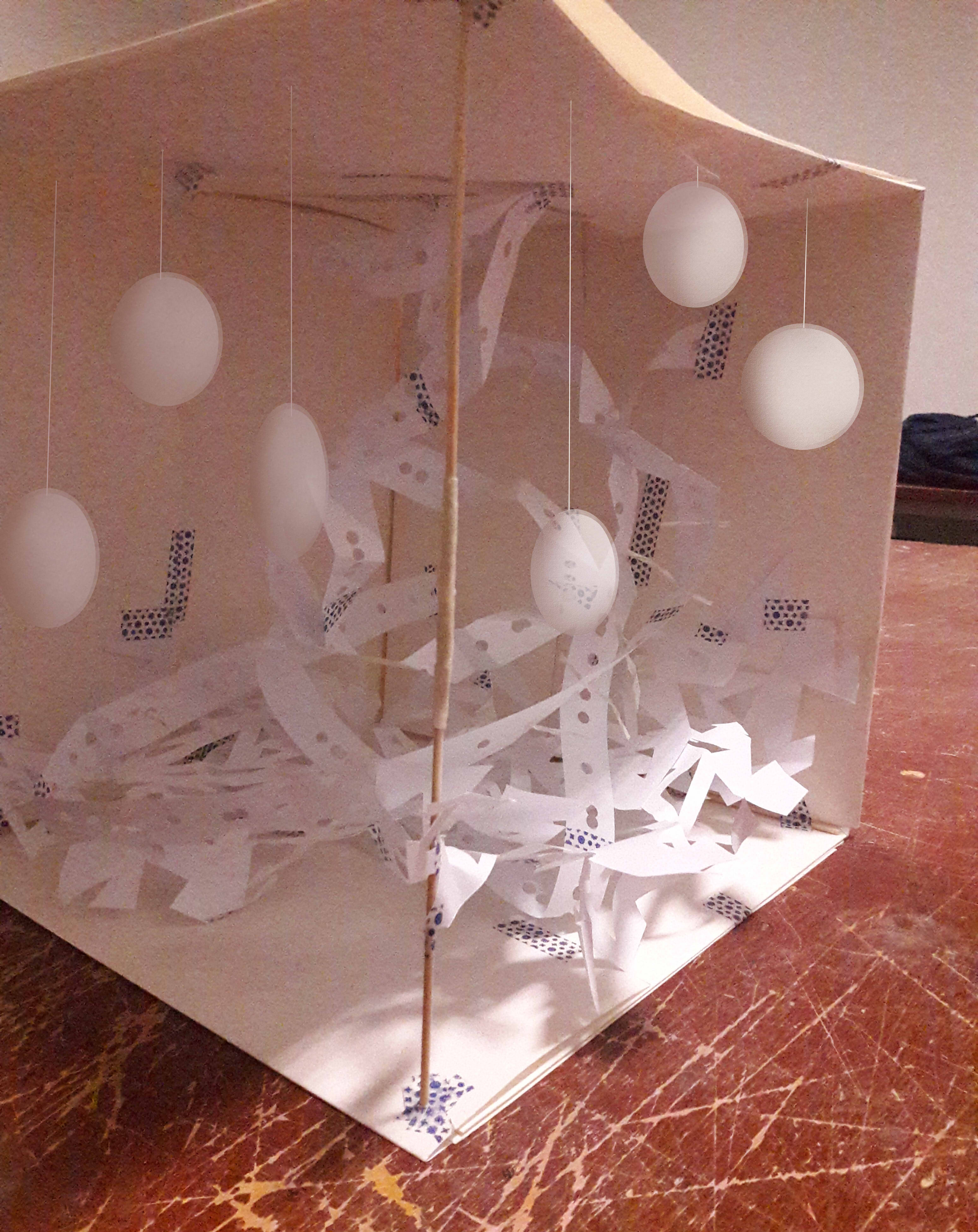
I opted to work with paper, mostly because I happened to already have a pre-built box made of cartridge paper, and didn’t know what to do with it because it had been made on a whim at 3am under the influence of insomnia.
There was also the element of softness and elegance I felt the paper brought through, regardless, especially where it works well with warm lighting since it’s somewhat yellowed. (I also used washi tape which created a similarly soft feel to me).
Rustling
Scraping
Chiming
I didn’t particularly observe the soundwave forms, instead opting to look more at how each sound “felt” to me, in terms of things like pitch, rhythm and timbre.
Scraping: Pitch is relatively low, but not the lowest I could possibly imagine, so it’s still above ground. I find that its timbre is rather rough, and as such I cut out triangles. Nevertheless, the sound is “flat” in a lack of inflections, and it has a smooth flow, such that I opted to make it a flat plane, and the triangles still give it a sense of unity in being a geometrically perfect shape.
Rustling: The sound has a directional flow, one that isn’t straight as opposed to curving. It also feels slender and has a diminuendo, so I made it into strips which flow from top to bottom. The sound itself is somewhat jagged, though, so I made it broken planes. It’s also a compilation of many of the same sounds, which sounds like falling beads, so I hole-punched many circles on the strips to indicate that.
Chiming: The sounds come in 2 groups of 3, which pierce the rustling. It’s a relatively high pitch, so I positioned above the ground.
I find that the glockenspiel chiming sound is tragically lacking, and it might have been nicer if it had been hovering (pardon the poor Photoshop):
If I could remake it again, perhaps I would consider the following materials to evoke each sound more:
Scraping: Balsa wood, a light-coloured one. Preferably with some woodbending involved to create a slight curve as per the slight taper of the scrape, though overall still flat.
Rustling: Beads, a lot of them glued together to form the strips which flow
Chiming: Something metallic and spherical, I’m not quite sure what, since it would be better if it was also somewhat soft with fading edges.
In this project, I want to try a medium that I was entirely uncomfortable with, namely: anything that belongs in the 3-dimensional world. I’m alright with drawing, I’m alright with animation, but I’m not alright with things that materialise in the physical world. I’m the kind of person who has trouble making things because I don’t account for a lot of things. Considering that I’ve already played around with animation, I thought I’d like to work with something with a 3-dimensional form just to push my boundaries.
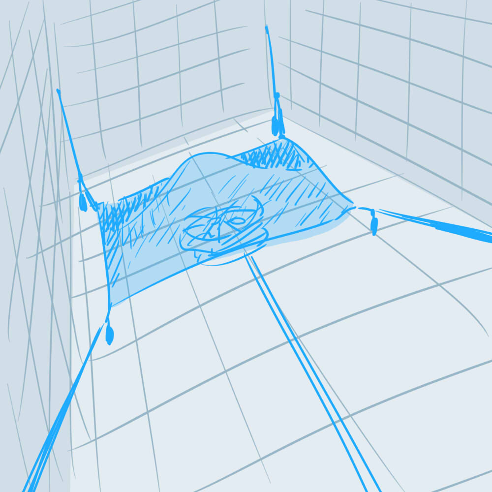
What I aimed for was something relatively simple in appearance, where the focus would be on the setup. When I thought that, I instantly thought of an exhibit I once saw in an exhibition, What is Not Visible is Not Invisible. I speak of Blue Sail (1965) by Hans Haacke. I don’t remember the exact meaning behind it, but I remember being amazed that such a simple-looking exhibit could be intended to draw out something so abstract.
The issue is then how to set it up properly. Indeed, it’s simple to look at: a mere floating blue chiffon with a fan underneath it. However, it’s evident that quite a bit of thought had to be put into the layout, to make the chiffon appear to hover gracefully without being completely blown away by the fan. So I shall attempt to study how it was set up!
The materials were, apparently: fishing weights, thread, chiffon and an oscillating fan.
I also referenced a senior who happened to draw a setup of the installation in trying to visualise it. While the weights were missing in her diagram, which would have heavily compromised the threads’ ability to keep the chiffon in place when the wind was blowing, it DID help me to envision how the threads were placed such that the sail forms a concavity.
Incidentally, I suppose Blue Sail somewhat qualifies as a time-based project, in that the space constantly moves as the fan moves, giving you the idea of a space that is constantly present and constantly shifting.
This is the place I’d like to use. Especially for my work, I envision that a lot of electricity will be involved, and a lot of setup which shouldn’t disrupt the overall image, such as power cords. I haven’t quite figured out how to keep it neatly safe and unobtrusive since my location has a severe lack of sockets in the area where I’m actually installing, such that I’ll have to set down an extension cord. Unlike Blue Sail, too, it’s not in a place made for exhibitions, so it’s not very well-equipped for my installation, and I’ll have to do what I can. Based on Blue Sail, though, it might be worth a try to tape down the cords such that it runs smoothly along the ground. I have nothing that will hover particularly, so that’s unlikely to be an issue.
It’s a good thing that I’m keeping mine simple, though, since the setup itself is really difficult for me in that I have difficulty envisioning 3-dimensional objects in detail, and I’ll probably need to focus a lot more on that.
Was everyone else really as alive as she was?… If the answer was yes, then the world, the social world, was unbearably complicated, with two billion voices, and everyone’s thoughts striving in equal importance and everyone’s claim on life as intense, and everyone thinking they were unique, when no one was. One could drown in irrelevance. (Atonement, by Ian McEwan)
It’s frightening to think that I am a unique individual, seeing as the world is so large that, all things considered, we eventually become この星の無数の塵の一つ, “one of the innumerable specks of dust on this star“. I find it so frightening that I can’t bring myself to treat myself as special. And yet, despite all that, I find that humans are so infinitely unlimited, that I can’t possibly describe myself, or anyone else, with mere words. How can I capture the essence of myself through 12 panels?
And thus, the compositions became a bizarre blur of those thoughts, of humanity’s struggles with their existences, where I am a part of that humanity, yet looking at it from a distance.
The final layout
And a scanned in version, for proper documentation.
First, I will mention those which are common points across all compositions.
Mediums
Self: Sakura Mat Water Colors (18-col)
World: Rhomlon eyeshadow with Daler Rowney Gum Arabic Solution
Result: Daler Rowney Gouache (12-col)
Subject
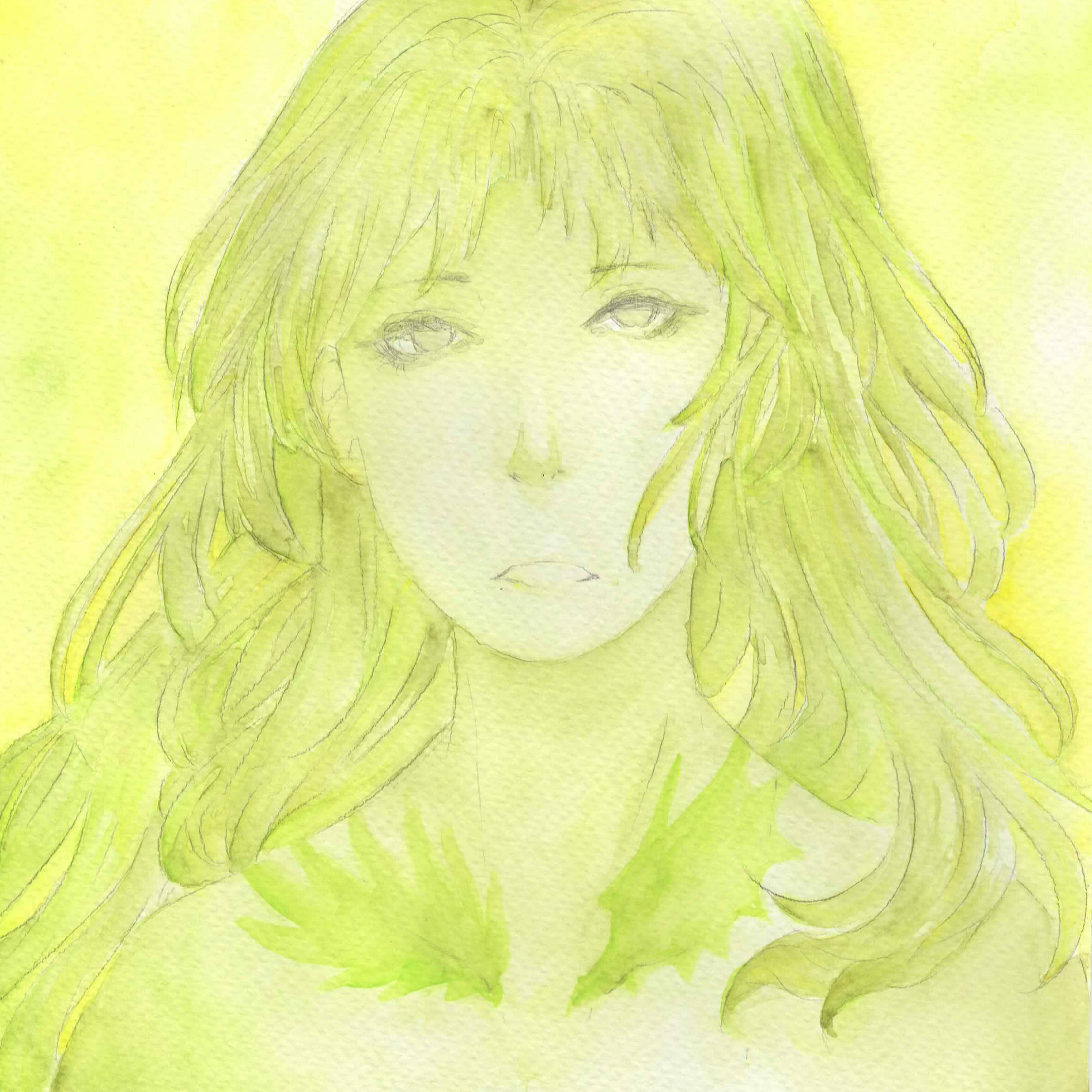
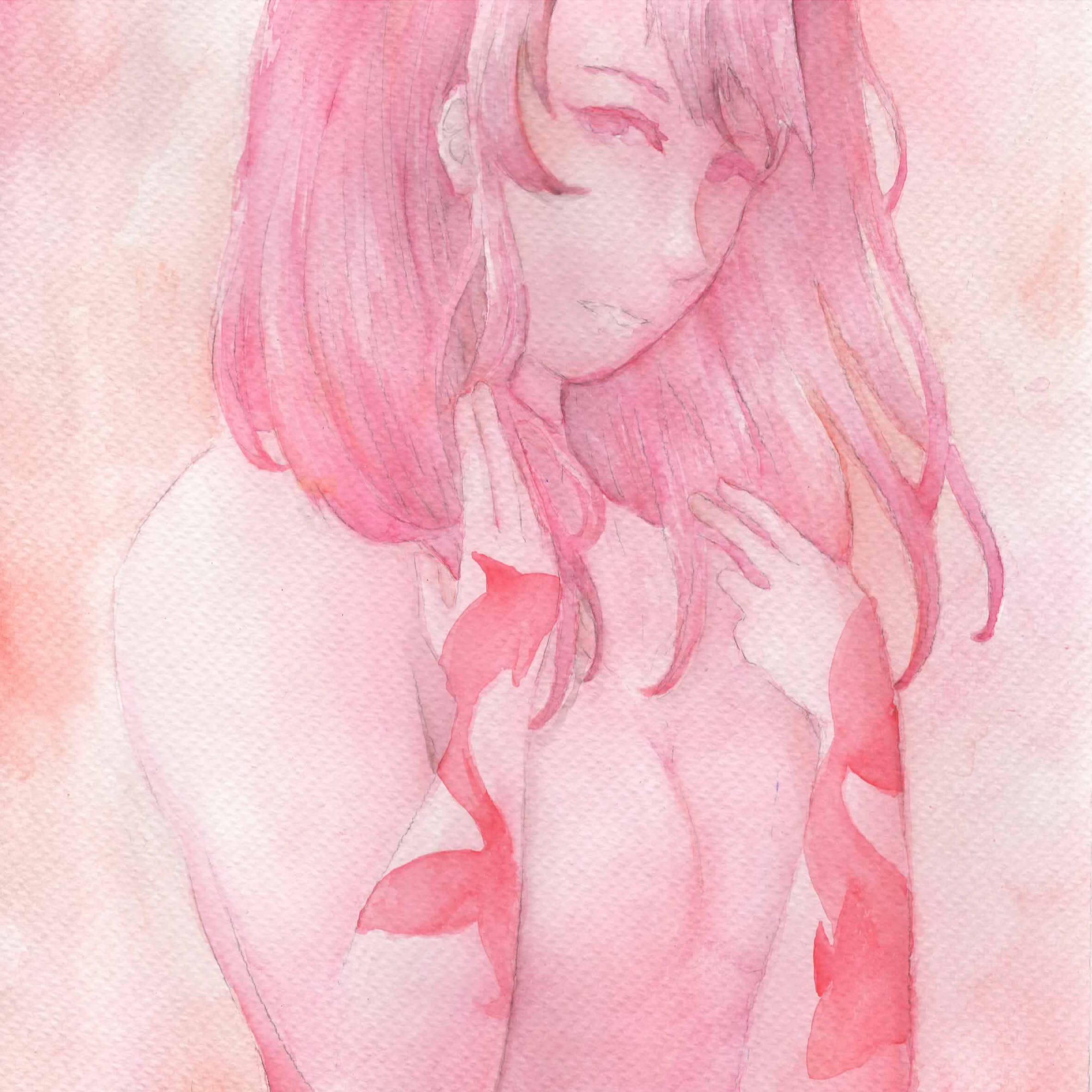
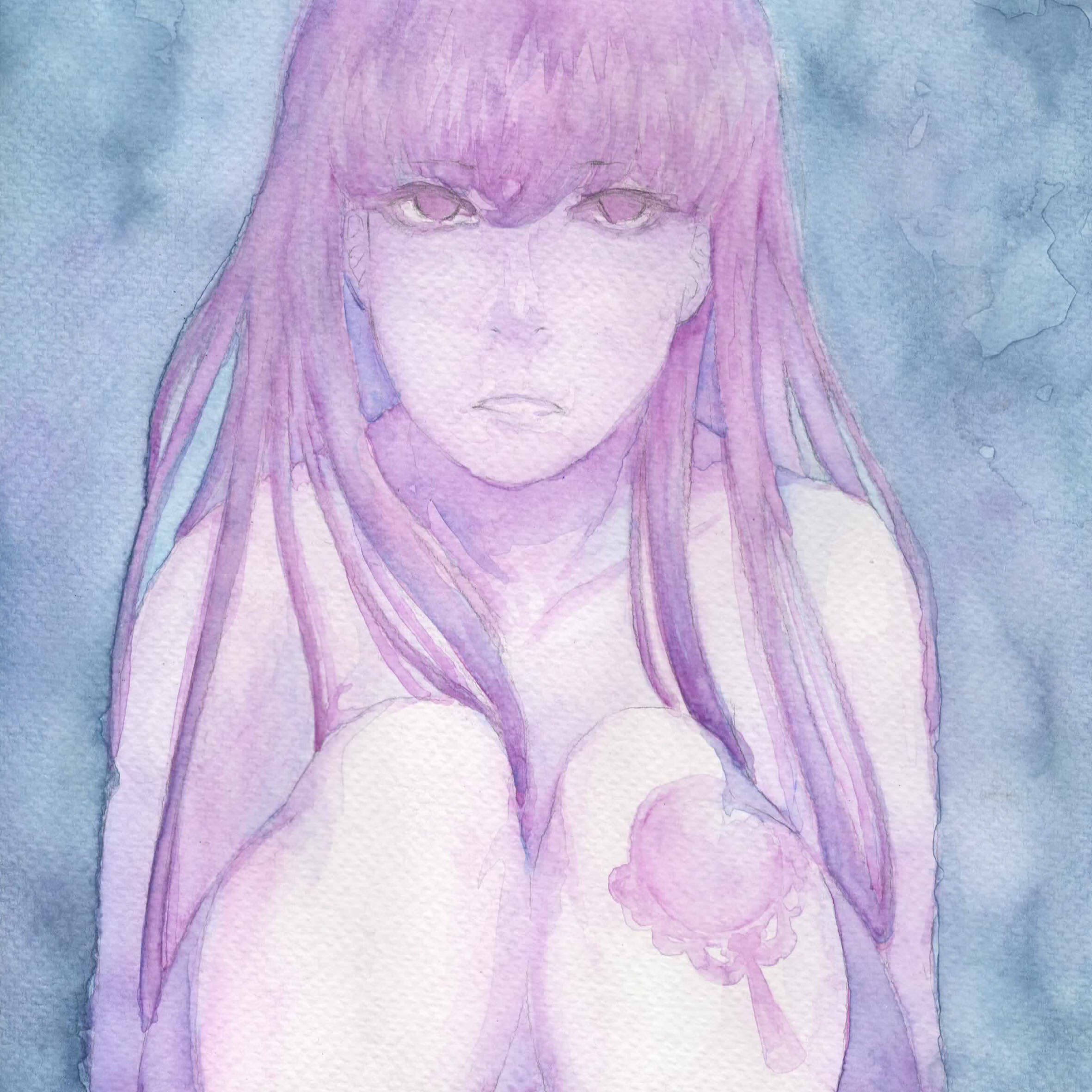
Self: A facade of an arbitrary girl, with a symbolic tattoo pertaining to the represented quality. The presentation of the facade represents intimacy, though the generic appearance pertains to the universality of those qualities. They are also all nude to suggest intimacy, and also purity of form.
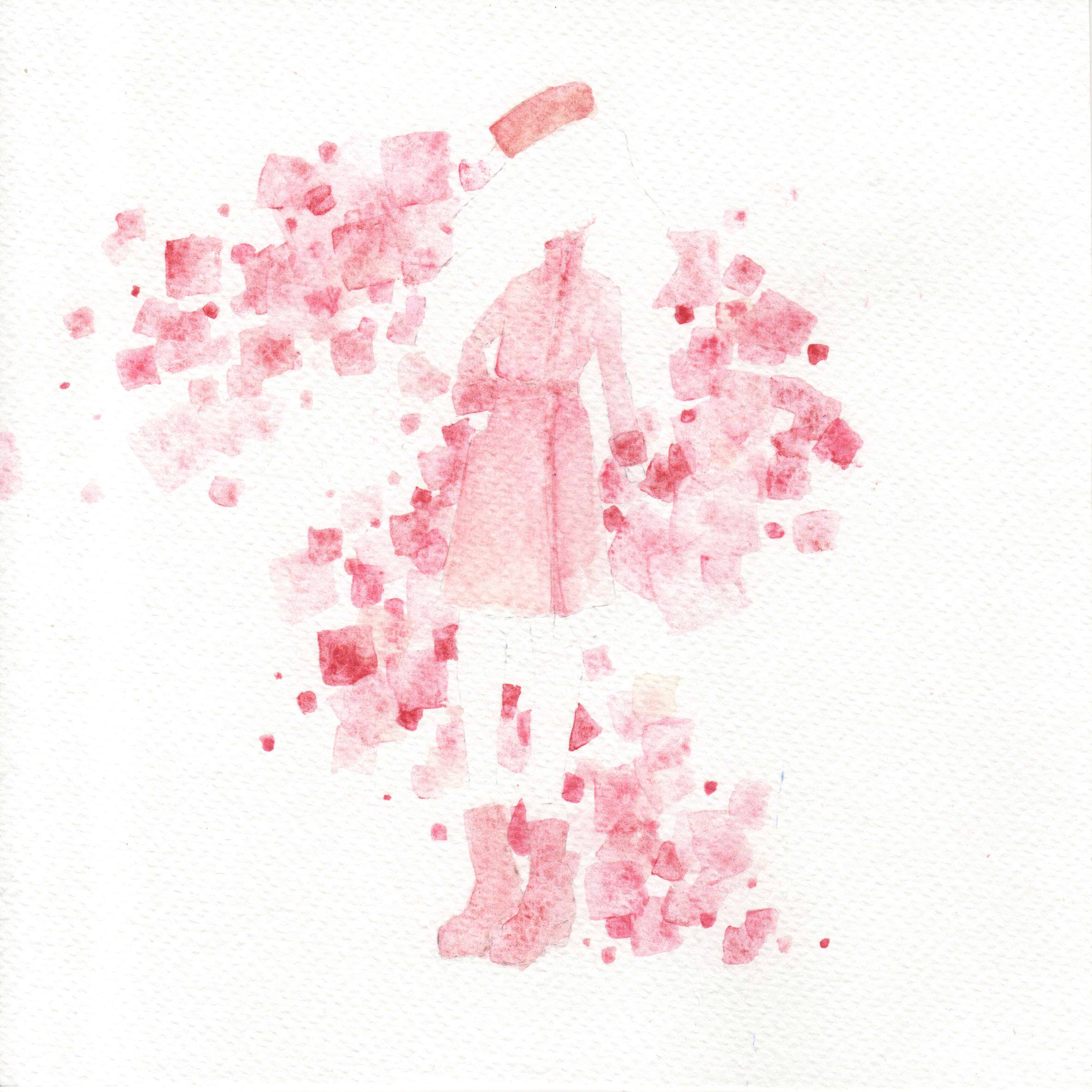
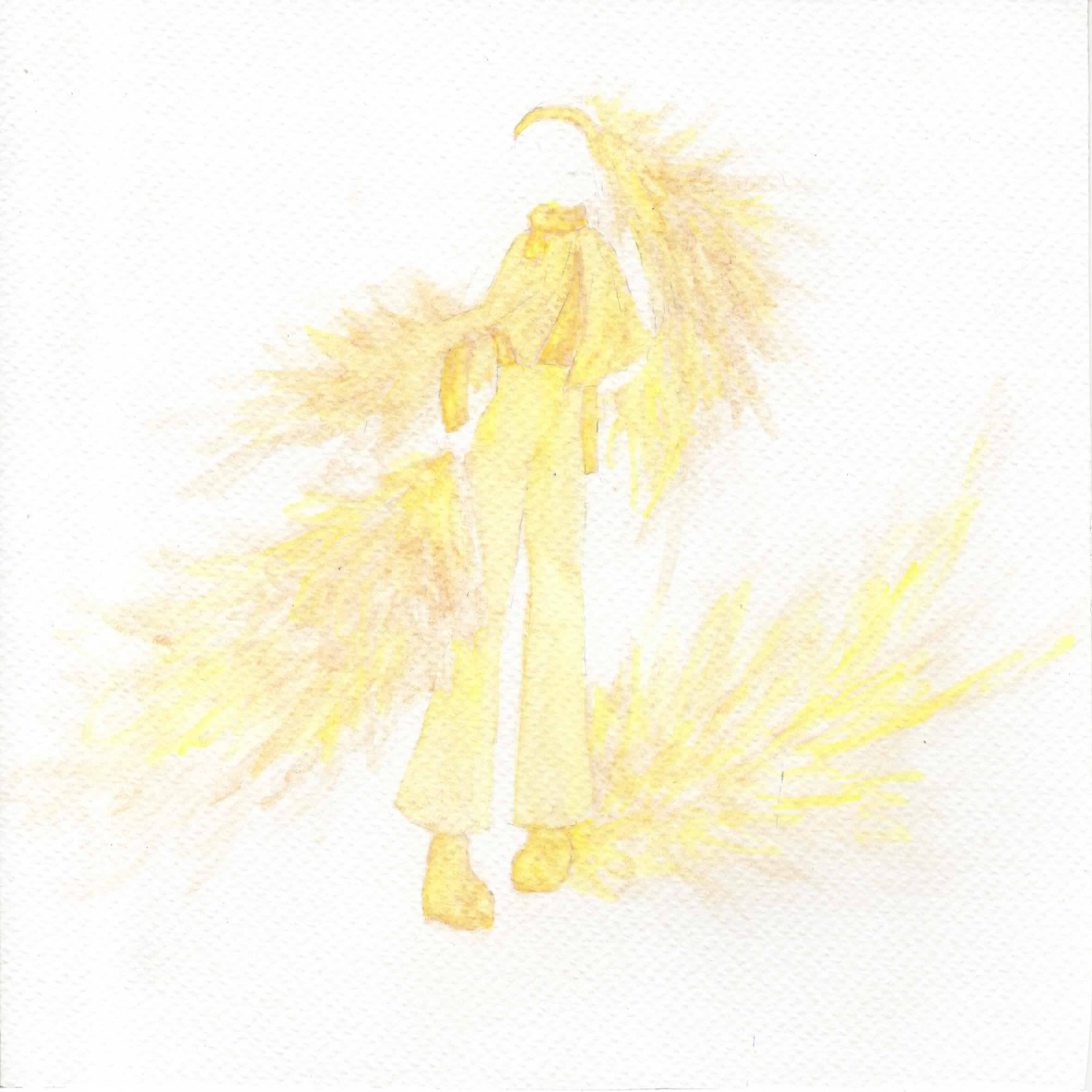
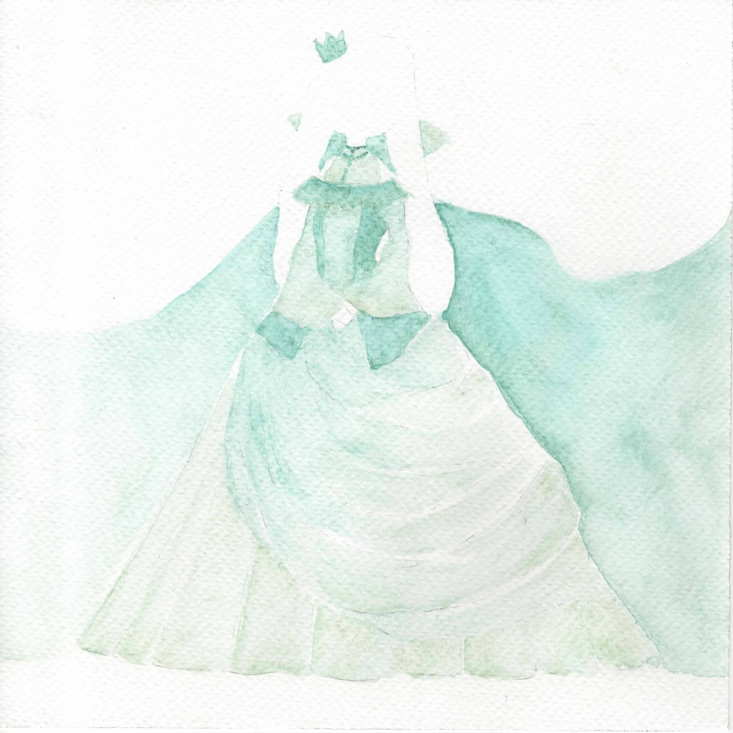
World: Self-designed clothes. The person is implied but not seen, where the focus is the clothes, and together with the makeup pigments, it’s to imply the idea of having to “wear” something, that will cloud one’s self.
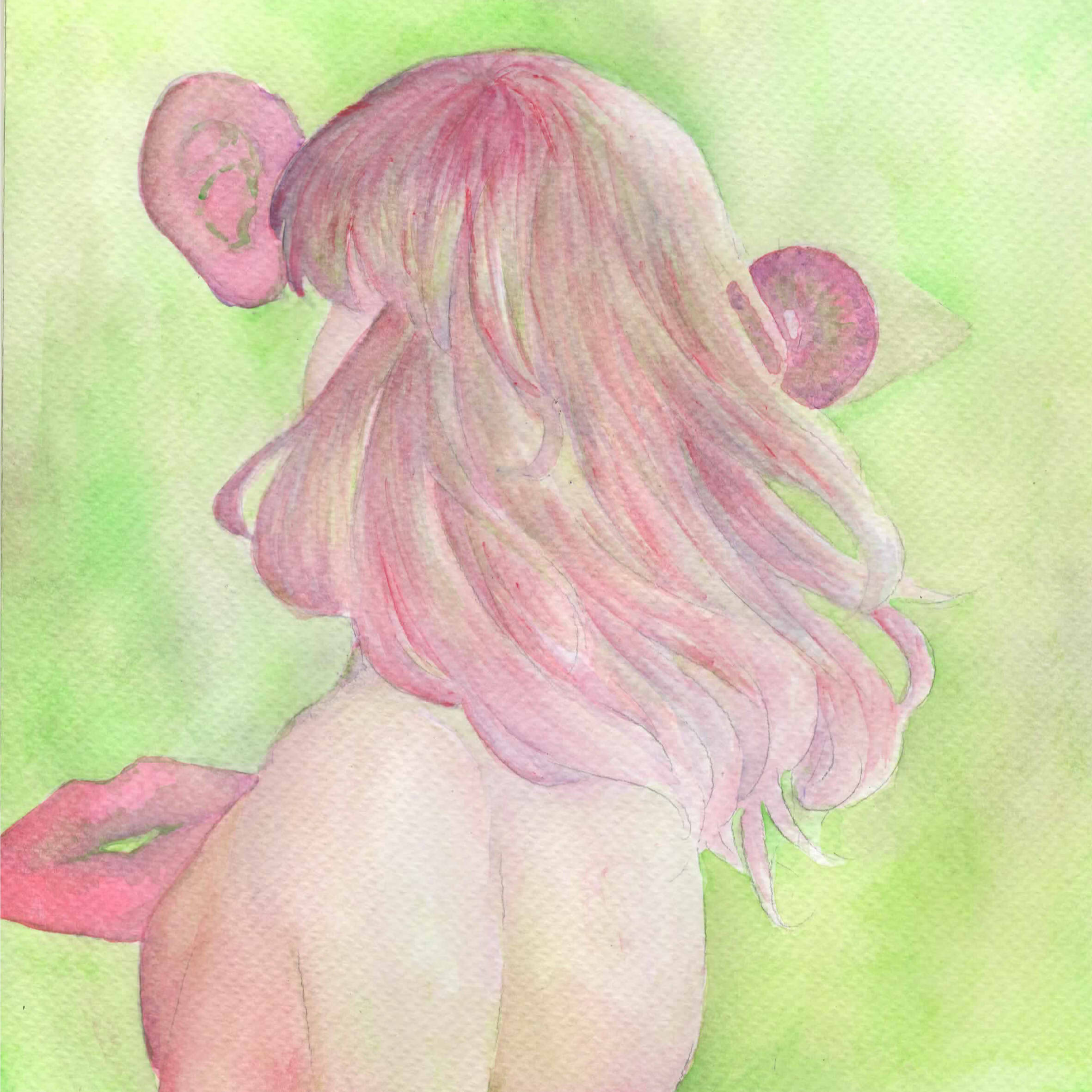
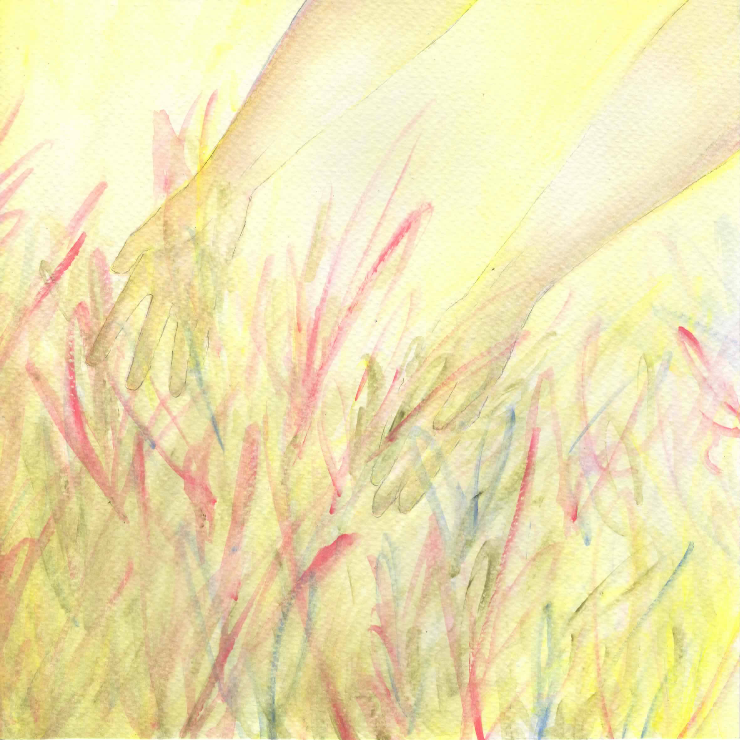
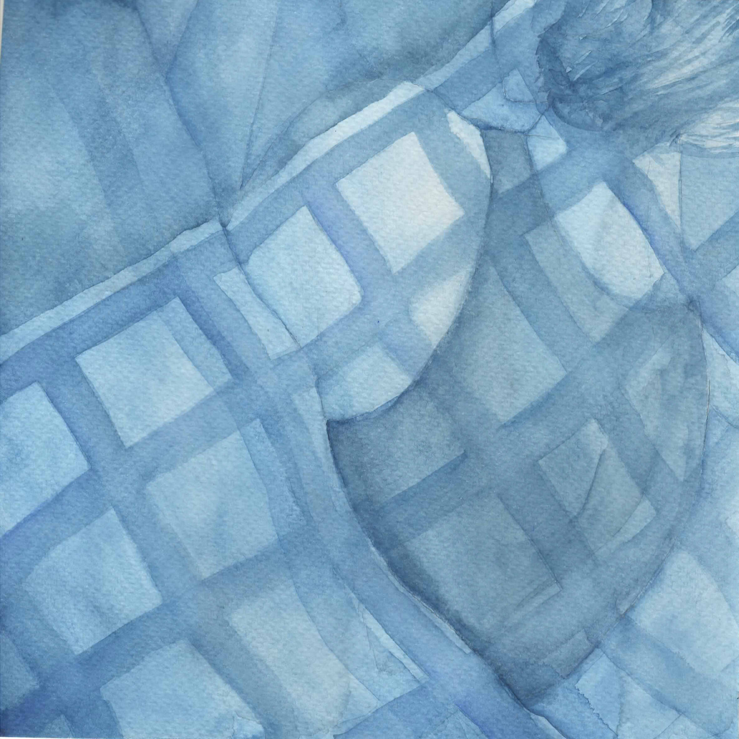
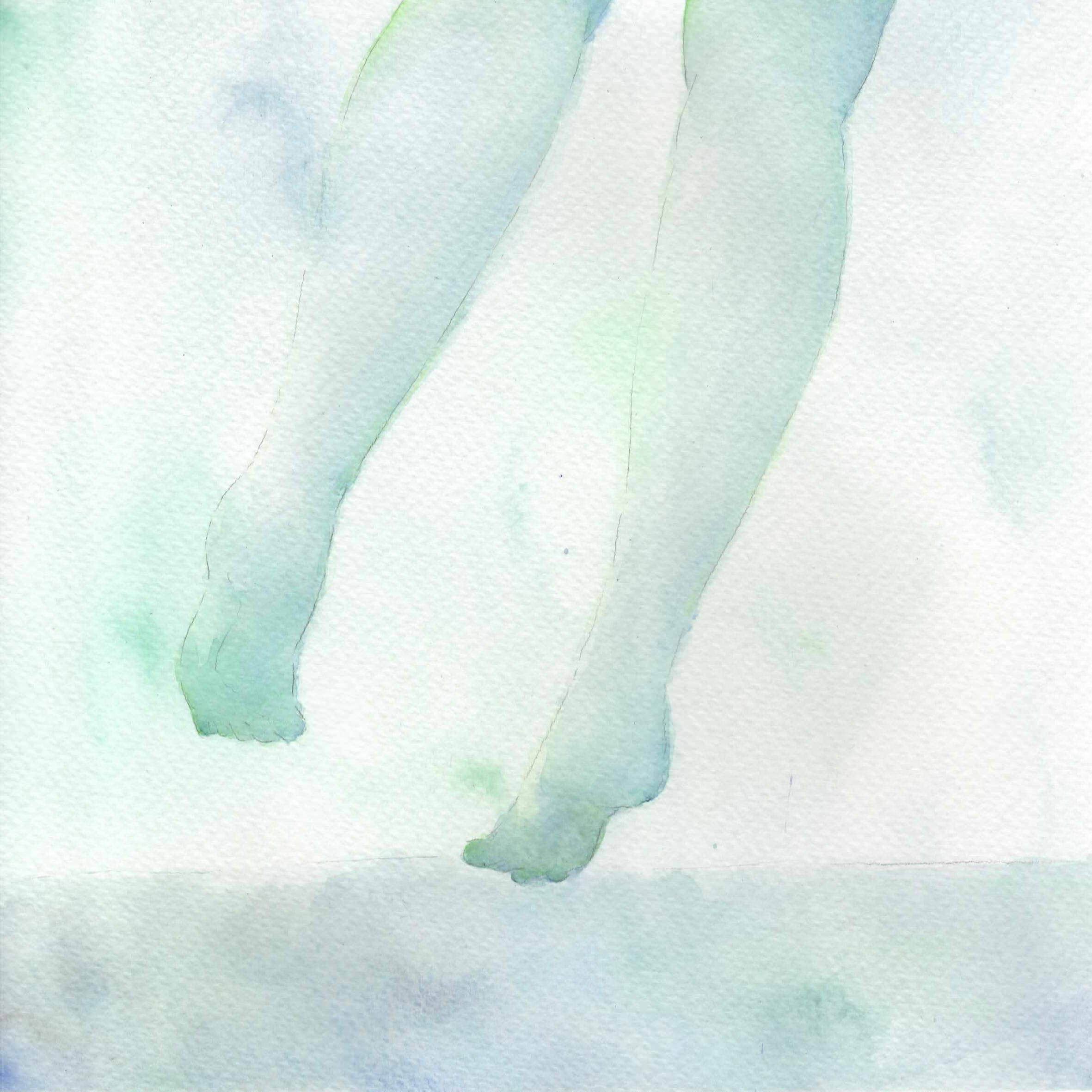
Result: Varies, but again features a specific body part, same as with the location of each tattoo. the facade is also never seen as opposed to the Self, suggesting some form of distance.
Colour Harmony
Self: Analogous with only 2 colours, to suggest the natural state without the discord of complementary hues nor the dullness of monochromatic harmony.
World: Monochromatic to suggest rigidity in absolutism
Result: Varies depending on how well the self and world integrate
In deciding the subjects, I drew up a chart with keywords for each panel, and worked towards that keyword. In choosing my colours, I originally abided by the 4 temperaments. While I didn’t follow it strictly in the end, it was still rather useful in providing me with a general gist and starting baseline of colours.
Sanguine (Red): Associated with extroversion and social behaviour.
The keywords were Cynicism and Conformity. Once you become aware of the true nature of humanity, it’s easy to be disgusted, and want to live separate from them. People’s words drip with falsity and it is difficult to interact with other people, knowing that under the facade of calm they recoil with disdain at you. Nevertheless, in this world where it is mandated to act like you’re alright, there is no option but to suppress yourself and laugh stupidly, act dumber than you actually are.
Yellow-Green & Yellow: I initially wanted green to directly oppose extroverted red since I’m extremely unable to relate to that, but decided that yellow-green was better at suggesting disgust than a more refreshing green. Yellow acts as the accent colour.
Tattoo: Wings, one angelic and one demonic, on the collarbone. The presence of both good and evil is to represent the idea of skepticism, that there is no moral absolutism. It’s not quite the head portion, which was the intended place (for communication and intelligence), but the clavicle represents difficulty in flexibility.
Red: Red is the colour associated with the sanguine, mostly because sanguine=blood but also because red is associated with energy. Simultaneously, red is a strong colour which relates to the idea of conformity, especially with the monochromatic colour scheme.
Clothes: The original idea I had was that of a “uniform”, and after some designs I decided on a more military design (just for aesthetic). After a consultation, though, there was an unanimous agreement that it was plain, and so I reworked it to include more rectangular shapes for a geometric feel, and by extension that of a somewhat rigid shape.
Red, Yellow-Green & Violet: The initial idea was red and green to show the direct contrast, but as mentioned before I shifted it over to yellow-green, and thus Joy suggested to create a split-complementary instead. The general idea is that of the inability to fully fuse with the red, where I scatter in complementary hues of introversion.
Subject: The hair and sensory organs. The hair is flouncing cheerily, alongside the eye, ear and mouth, representations of communication. That the facade is not seen while those organs are floating randomly is a suggestion that this is unnatural to me, however.
Choleric (Yellow): Associated with restlessness and hyperactivity.
The keywords were Seriousness and Efficiency. In a fast-paced world of cruel productivity, those who are serious are bound to exhaust themselves. Many a time have I found myself in a position where people who don’t care don’t bother to do anything, and those who know what must be done end up crying alone as they work endlessly, because there is no other option open to them but to keep going at the cost of their own happiness.
Red & Orange: In this context, red represents resolution in terms of being committed to what you have to do. Orange acts as the accent colour.
Tattoo: Sharks on the hands. The shark is often associated with determination and power, and by extension that of honing in on what you have to do. The hands are often associated with work.
Yellow: It was initially an ochre colour, though I had to use watercolour to shift the hue back to yellow since it was beginning to tend towards yellow-orange. The yellow represents energy once more, to bring across the idea of speed and efficiency.
Clothes: Like with aforementioned consult, it was rather plain and I did the same process to upgrade it. I began with the general idea of sharp ruffles (example), and eventually ended up with sharp, multi-directional scribbles. I felt that the sharp angularity in general would bring across a somewhat sleek feel to the clothes to suggest the idea of speed.
Yellow, Red & Blue: It was initially a split complementary of yellow, red-violet and blue-violet, but after Sanguine shifted to being a split complementary, I shifted this to a triadic colour scheme. This is due to that I find that those who work restlessly are likely scattered and all over the place, more messed up as compared to those who are struggling to be what they are not (a more direct contrast), and as such there should be more tension in Choleric than Sanguine. Yellow dominates to show that of being dominated by Efficiency, with red and blue to suggest confusion in that tiredness.
Subject: Hands reaching out to random scribbles. I went with scribbles to suggest the idea of chaos, and the hands being open to that is to imply the idea of giving in to just handling all of those problems.
Melancholic (Black): Associated with sadness and introversion.
The keywords were Sensitivity and Uncaring. Joy advised me to shift from Black to another colour to avoid monochrome harmony, so I went with violet to create an overall double complementary. For those of sensitive natures, we find that even the slightest brush of shoulders without an apology is something painful, a symbol of rejection. And yet, it must take a certain level of ego to feel that you deserve more, when you are such an unimportant creature, and these thoughts which flow into each other turn you into a creature which dives deep in and hides from everything.
Blue & Green: Melancholy colours associated with sensitivity. Green acts as the accent.
Tattoo: Flowers on the back. The flower is associated with delicacy, linking with that of sensitivity. The back is often associated with burdens.
Violet: Less about the colour’s meaning itself than its relative position to blue. Meant to represent just the slightest prod in a different direction.
Clothes: In line with the idea of an uncaring world, I went with the idea of bindings. A corset, heels, choker, constricting lines… Overall, it ended with many lines pulling harshly, and also providing shape (conveniently).
Blue: It’s monochromatic to represent how even that slightest prod causes one to retreat into oneself. Again, blue is a melancholy colour, now even devoid of green.
Subject: A person lying in bed. It’s more a personal experience thing, but whenever I’m having a bad time I lie in bed for hours on end doing nothing but thinking negatively and ignoring everything and everyone.
Phlegmatic (Green): Associated with peace and tranquility.
The keywords were Introspection and Diversity. You can think all you want, feel that you are being forced to conform, or made to work excessively, or despised by everyone, but in the end, you must realise that all that doesn’t matter. The world is too wide, too expansive, that you are but a mere speck, insignificant. There’s no reason for you to fight against that truth. There’s no reason to try to keep forcing your way, and rejecting the world is just being difficult and hipster, and tiring. It’s easier to forget everything, and just be resigned to that existence.
Violet & Blue: Colours of mystery, spirituality. It brings across the ideas of introspection in being colours of independence and wisdom. Blue is the accent.
Tattoo: Mirror on the leg. The mirror links to the idea of reflection, and represents looking into oneself. The leg is often associated with the ability to move.
Green: Represents nature and the natural state, as well as being a calming and fresh colour.
Clothes: The overarching idea was a foreign, regal dress of a wide long skirt. It represents that of the foreign and unknown, suggesting that the world is a wide place.
Green & Blue: An analogous harmony to represent a Self and World that can finally come together harmoniously. As a result, too, blue is featured from the World, and Green from the self, where these are natural and calming colours.
Subject: Legs walking on water. The legs represent moving forward, much unlike the stationary nature of the Melancholic, with the water representing clarity as well.
Finally, I always arrange the 4 rows as such, since my personal policy as to how to deal with my existence followed that sequence. I tried to entirely change and failed, I tried to distract myself and failed, I tried to end it all and failed, and now I’m here, resigned and just accepting, because I’ve realised there’s little meaning to denying this existence.
Extra process documentations
In terms of artist references, I thought I’d divide it up more comprehensively based on what I referred from them.
Style: For the 1st column (the facades and tattoos), I went with Mayumi Konno, in her emphasis on the female facade together with “something else”, like flowers, hands, etc. For the 2nd, I went with Koyamori‘s style of using blank space for the human form. For the last… I didn’t really follow anyone. In fact, all of them are my own styles, adapted from other artists.
Technique: My ultimate guide in watercolouring has always been Fish, who taught me everything from paper to brushes to granulation to washes. Basically, for the past few years I’ve studied watercolour through her posts, which is why I can at least decently paint. Also, I learned how to make paints from Yue!
Colour harmony: A lot of my favourites use analogous for shading each object, then complementary hues to contrast objects, so it was hard. I think Koyamori is a relatively good reference though, for using a smaller palette. Halfway through the project, too, I found Eppao who is pretty helpful in terms of monochrome and positive/negative spaces. Unfortunately, I tend towards less vibrancy, as well as more blending than solid forms, so I deviated rather heavily, but the colours were nevertheless nice.
Also, I have some experience with watercolour and making paints, but not so much with gouache. Initially I wanted to try oil paints to contrast water and oil, but had to give it up after I realised that it was drastically different from watercolour, generally difficult to handle in terms of lack of drying speed and lack of translucency, impossible to be kept in cakes like watercolours (and thus I would need tubes), and I couldn’t determine if they were well-mixed since I rarely set eyes on oil paints.
Oil paint experimentation with eyeshadow and linseed oil. As a complete newbie, I falsely assumed it would work like watercolour and dry quickly. Its opacity also threw me off guard, and it also took me a while to realise that oil paints don’t work with water, because, well, it’s OIL.
I don’t have a video of me making the watercolour with gum arabic, but here’s an older video of the first time I did it (I added too much binder, unfortunately, but learned from the experience). It’s basically the same as with linseed oil, just that you don’t need turpentine or the like to dilute it.
I also learned the hard way that there’s little need to tint watercolour since dilution with water would already make it a lighter colour. I did, however, end up mixing a lot of paints to create shades, and in-betweens like red-orange, blue-green, or various hues of violet.
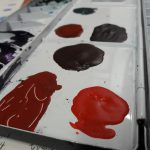
This is my palette. As a consequence of experimental colour mixing, I ended up running out of space. The colours were tested on the borders of the paper I used which was outside the frame of the pieces. I’ve attached each individually in my visual journal since it’s a little difficult to upload them.
Overall comments were that it needed to have more shading to fully bring out details, which I suppose, yes, is a very common problem with me, especially where I cut corners once I’ve determined it’s sufficient to avoid spending more time than necessary. No matter how much I layer it never quite seems to darken well, especially with brighter colours like yellow.
Before looking at particular pieces, I thought I would research a little on the philosophy of time-space.
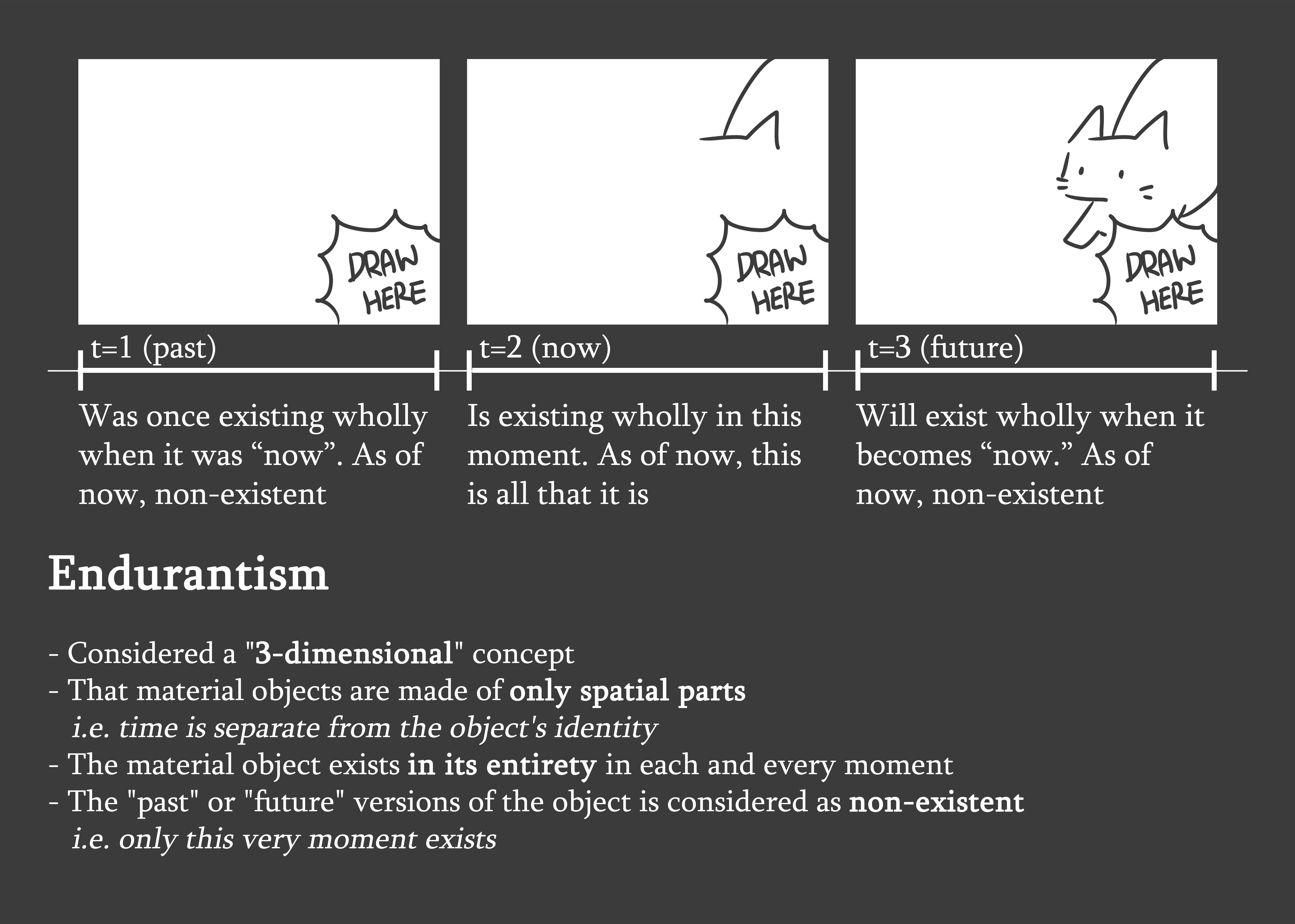
There’s Endurantism versus Perdurantism, contrasting philosophies as to the nature of objects. While Endurantists believe that existences are merely 3-dimensional objects which happen to be present at every point of time, Perdurantists believe that existences are 4-dimensional series of temporal parts, meaning that its presence at other points of time also defines it as an object. (tldr: whether to consider the state of the object in different times part of its identity; spatial and/or temporal parts)
There’s also Presentism versus Non-Presentism (narrowing to Eternalism), relating directly to the nature of time. Presentists believe that only the present can conceivably exist, where the past and present are just terms to describe the present that is not currently in existence. Eternalists, however, believe that all points of time are equally real, and as such the world progressively gets larger as more and more points of time are added on with the flow of time. (tldr: time is constant, versus an ever increasing immaterial)
There’s also Gunky Time, which is basically the idea that time can be subdivided again and again to create smaller portions of time.
I personally think the two contrasting concepts are very fascinating. Do we consider time as part of the identity of an object, or separate? Does the world expand as time flows and creates more “present”s, or does the world stagnate in only a moment where all previous and future moments don’t exist? If I can find a way to give shape to these ideas, I’d like to try presenting a contrast between the two for Project 4.
Now, to actual works!
Let’s start off with a nice article on Measured Time.
Form: Series of 4 hour livestreams of a man sitting and smiling unendingly, with minimal noise and a few minor events occurring here and there
Context: Not much you need to know, but that he’s an artist who is interesting in remaining open to the “limitless possibilities of a moment”, as reflected in his works, especially in a fast-paced world where business is commonplace
Content: The uncomfortable, unbearable impossibility of experiencing uncurated, focused and measured time
Slow Television
Subject: Ordinary events in its complete length (e.g. moving trains, firewood burning)
Form: Live coverage lasting hours and hours, of ordinary moving objects with the typical associated sounds, images, etc.
Context: Also nothing much? Except perhaps that it is in a fast-paced society which pays little attention to such ordinary events.
Content: The tranquility of progressive mundanity
This is an article I found rather intriguing, where it emphasises on the nature of measured time. This time can be either unbearable or tolerable based on the lack of or presence of narrative (progression), citing Sitting and Smiling and Slow TV. The nature of measured time as opposed to typical edited time makes “real” time seem rather slow-moving, bringing importance to the details of each moment without going slow-motion while still having an overarching concept (tending towards Perdurantism and Eternalism, maybe). However, when not coupled with the knowledge that there will be some eventual outcome, it becomes “one moment stretched for four hours”, especially where we are accustomed to happening and fast-paced existences, and incredibly excruciating.
I get Cloud and Barrett to level 99 in the first reactor on FFVII
Subject: Cloud and Barrett running around a map fighting enemies
Form: Series of 3 to 4 hour livestreams of two characters running around grinding, with voice over commentary by the streamer
Context: As with many video games, it’s possible to grind to level up, but incredibly difficult and tedious to do so on low-levelled enemies which give little to no experience when you need a lot to level up at higher levels.
Content: Inherently meaningless life given meaning by oneself
A related example which comes to mind is the aforementioned. The above video is only a clip of the final segment, but he was allegedly streaming for almost 2 years. It leans towards Slow TV more in that there’s an eventual goal, and CirclMastr’s comments along the way provide some form of identity to each moment. But it does have the tedium of Sitting and Smiling in that, ultimately, there is no point, though I thought the meaning behind his actions was rather astute, as he stated here.
The Nature of Time, Ever Passing: I found it relatively uninteresting, but thought the most interesting one mentioned was that of Fischer and Weiss’ work.
https://www.youtube.com/watch?v=aKrzNYpFuao
The Way Things Go (1987)
Subject: Various materials influencing each other in a logical sequence
Form: Art film of a warehouse
Context: NA
Content: Causality leading to the natural flow of time
I enjoy this purely because of the strong theme of causality, but in the context of time I would say it’s a nice look into measured time once more, where various objects act in actual time and no emphasis is placed on any one object through edited time, like the natural flow of time as things go.
Some interesting stuff I’ve seen related to time are as follows:
Life is Strange: A game about a photography student who discovers she has the ability to rewind time, with her actions having consequences in the form of butterfly effects. It’s not particularly relevant in that it’s more about identity and choice than time in itself, but it’s interesting nevertheless.
Half Minute Hero: A game where you have to save the world in 30 seconds. It’s an incredibly fast-paced game as a result! (I’m just a fan of Cryaotic, but I also just think that this playthrough kind of shows that high pace pretty well because Pewdiepie freaks out easily)
Standstill Girl: Like Life is Strange, also not particularly focused on time as opposed to the theme of limbo and general existential crises, but stopped time happened to feature prominently by extension. (Also, I just thought it was a really good game.)
What’s fascinating about the proposal template is that it’s encouraging meaning before form in asking you to mention what you want to convey rather than how you will, while I tend to think of the two simultaneously. In the spirit of learning, too, I’d like to try things I’m uncomfortable with (i.e. live action, photography, 3D, interactive media) rather than what I’m comfortable with (i.e. animation, drawing). It’s boring to do what you know you can do, isn’t it?
Some random ideas which I considered. I’d like to try something quiet, slow and flowing this time (but not with the dramatic, excessive slowness of slow-motion), so measured time seems to be a good choice here.
![[FDN4D Project 4] Part 2: Hello Darkness My Old Friend](https://oss.adm.ntu.edu.sg/a170027/wp-content/uploads/sites/1810/2017/11/cover2.jpg)


![[FDN4D Project 4] Part 1: Before the Storm](https://oss.adm.ntu.edu.sg/a170027/wp-content/uploads/sites/1810/2017/11/cover1.jpg)


![[City of Voids] Daikoku City](https://oss.adm.ntu.edu.sg/a170027/wp-content/uploads/sites/1810/2017/11/dennou.png)


![[City of Voids] Individual Moodbox](https://oss.adm.ntu.edu.sg/a170027/wp-content/uploads/sites/1810/2017/11/venice.jpg)
![[FDN4D Project 4] Installation Setup Test Study](https://oss.adm.ntu.edu.sg/a170027/wp-content/uploads/sites/1810/2017/11/blue-sail-1.jpg)


![[Project 3: Ego]](https://oss.adm.ntu.edu.sg/a170027/wp-content/uploads/sites/1810/2017/11/idek.jpg)


