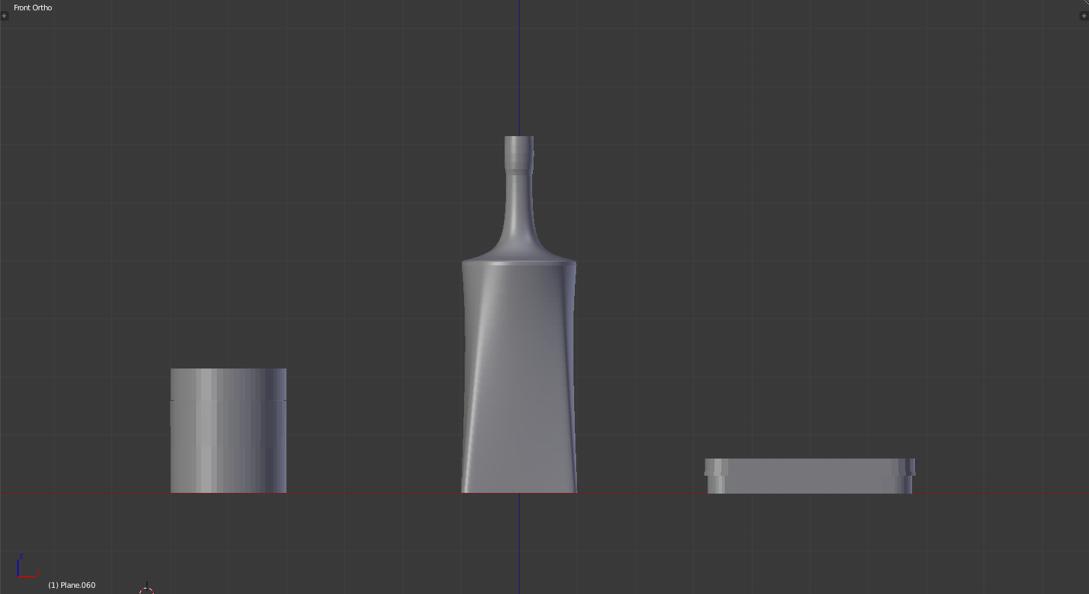
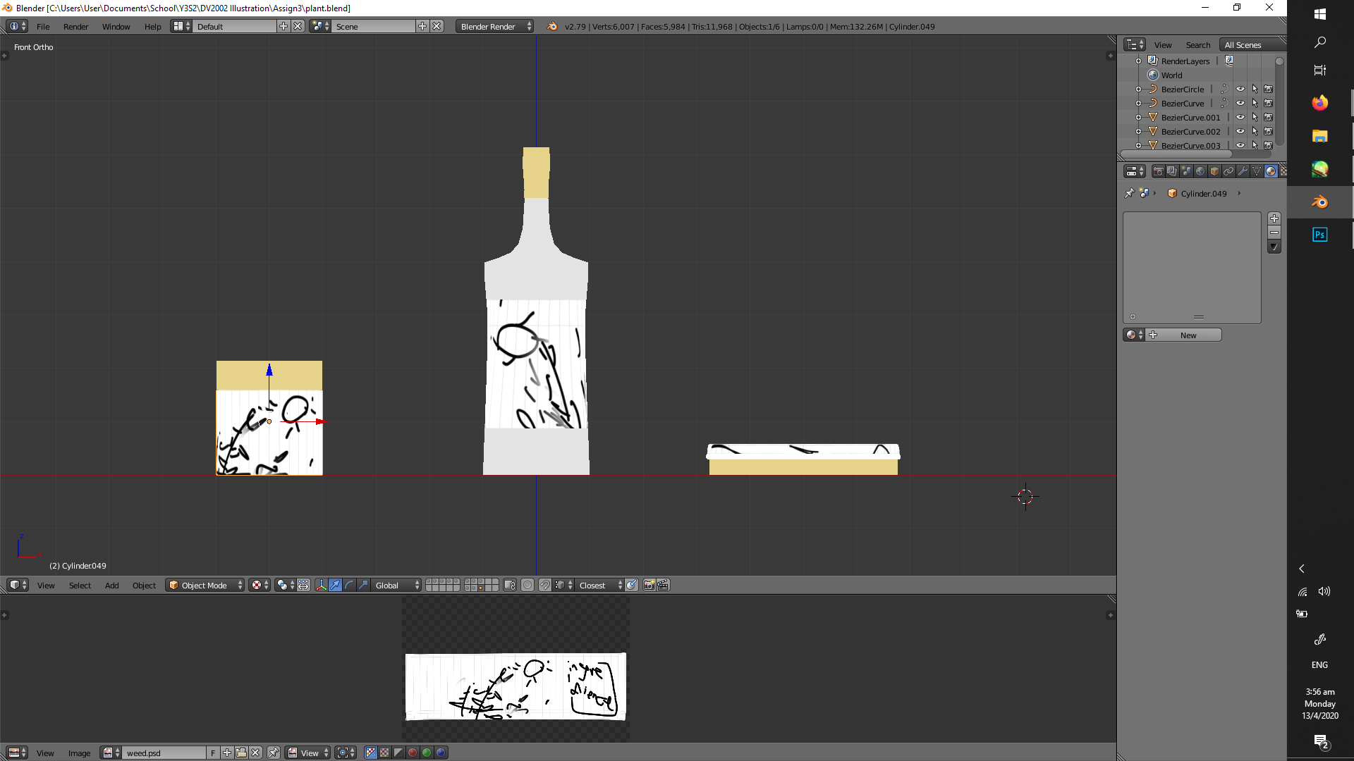
and thus, I’m using 3D models as a base again. I’d like to thank past me for having the foresight to teach myself this skill.
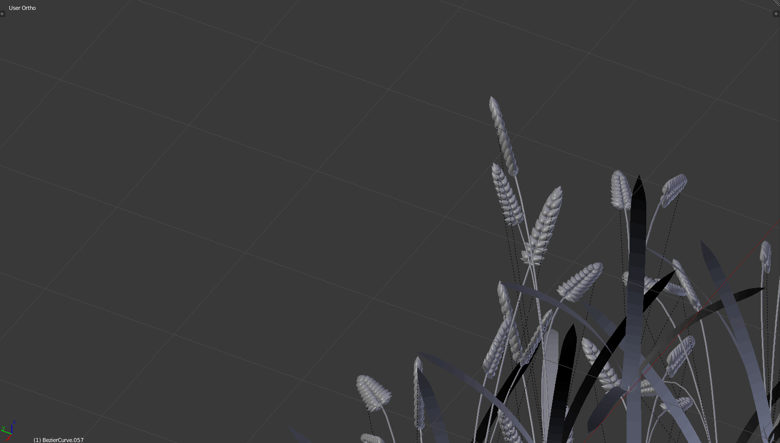
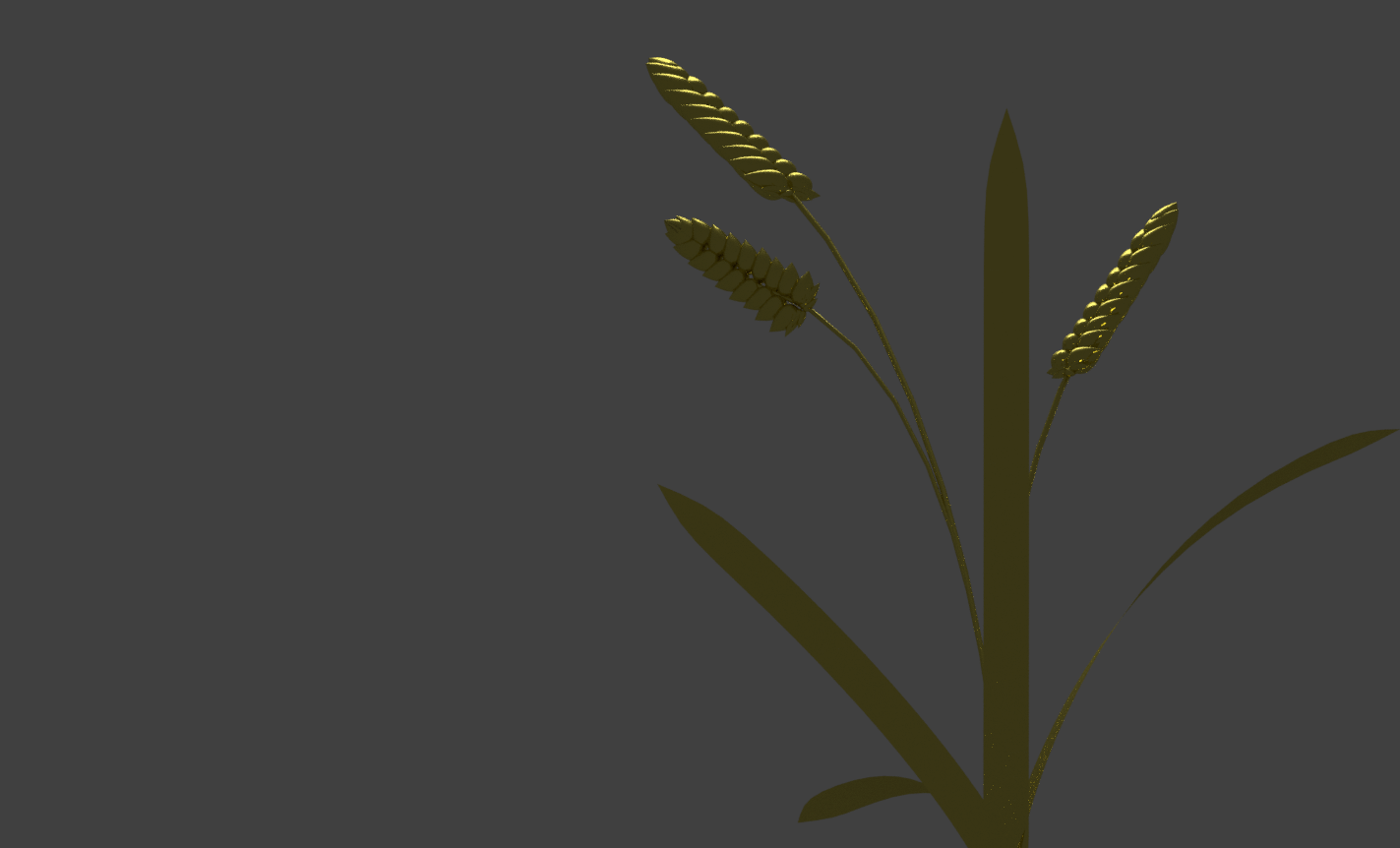
grain!
grain from a bottom view!
many grain from a bottom view!
not grain!
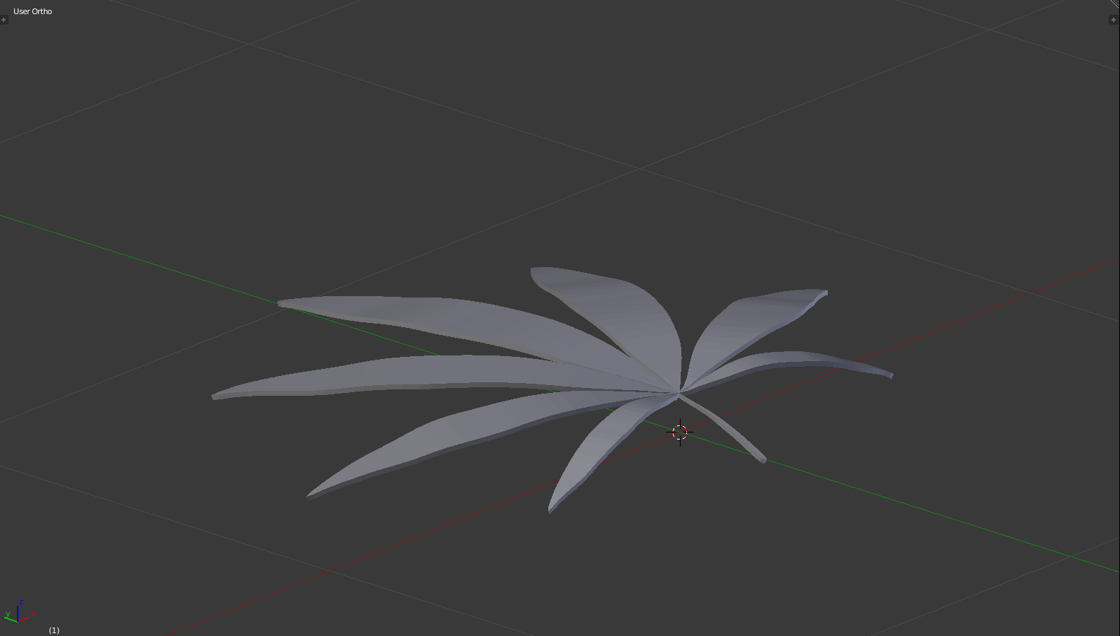
weed plant!
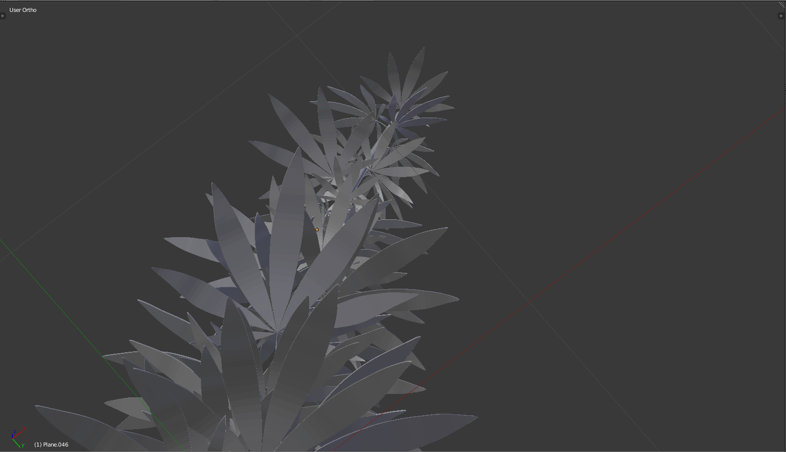
many weed plant!
I also happen to find that free mockups are kind of… difficult.. to work with, because the sizing never turns out right (and the lag is atrocious), so I tried making models and unwrapping the textures myself. Also, this means I get more control over what shapes and sizes the labels are.
(Regardless, I may resort to free mockups eventually, where this is incredibly excessive.)
making models; i aim for variety of form, where life would be too boring otherwise
testing if the illustration will manifest properly on the models; i’ve previously made adjustments, where certain elements are too left/right to be seen on the front face
also checking if it’s alright from different angles; for example, the side of the bottle is woefully empty
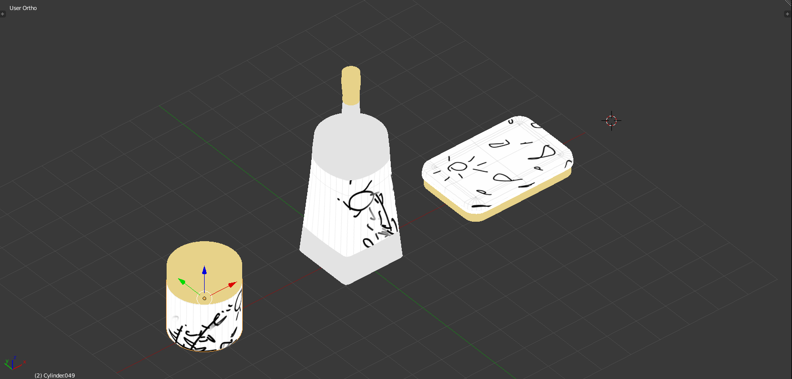
testing composition with the previous models
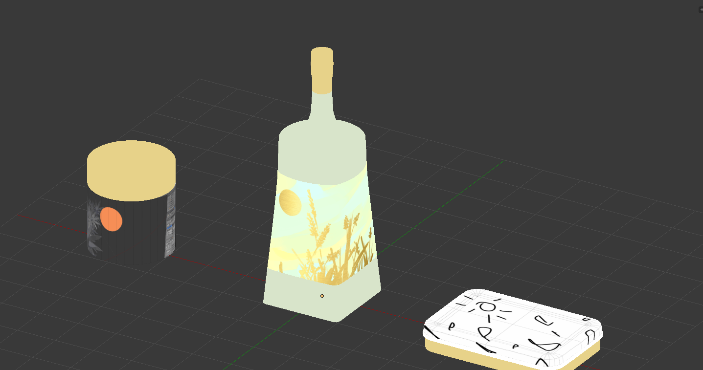
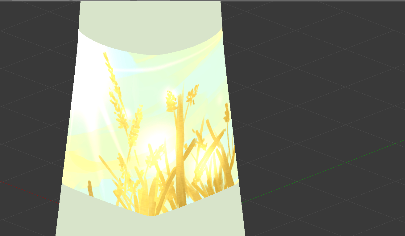
Based on recommendations by Lisa, I tried out using gold material, and glow effects. I’m leaning towards gold, though, where I’m too rusty (no pun intended) at drawing, so it’s too sketchy, impressionistic and painterly to be appropriate.
glow effect in SAI, of which i like the depth implied by colour, but doesn’t feel vibrant enough. and, my style is too painterly
metallic overlay, which feels rather nice, though a little flat. i don’t know how to actually render it, though, so i’ll fake it by using a clipping mask.
I don’t want to lose the shading of the painterly approach nor the radiance of the metallic approach, so maybe a mixture of both, hail clipping masks!
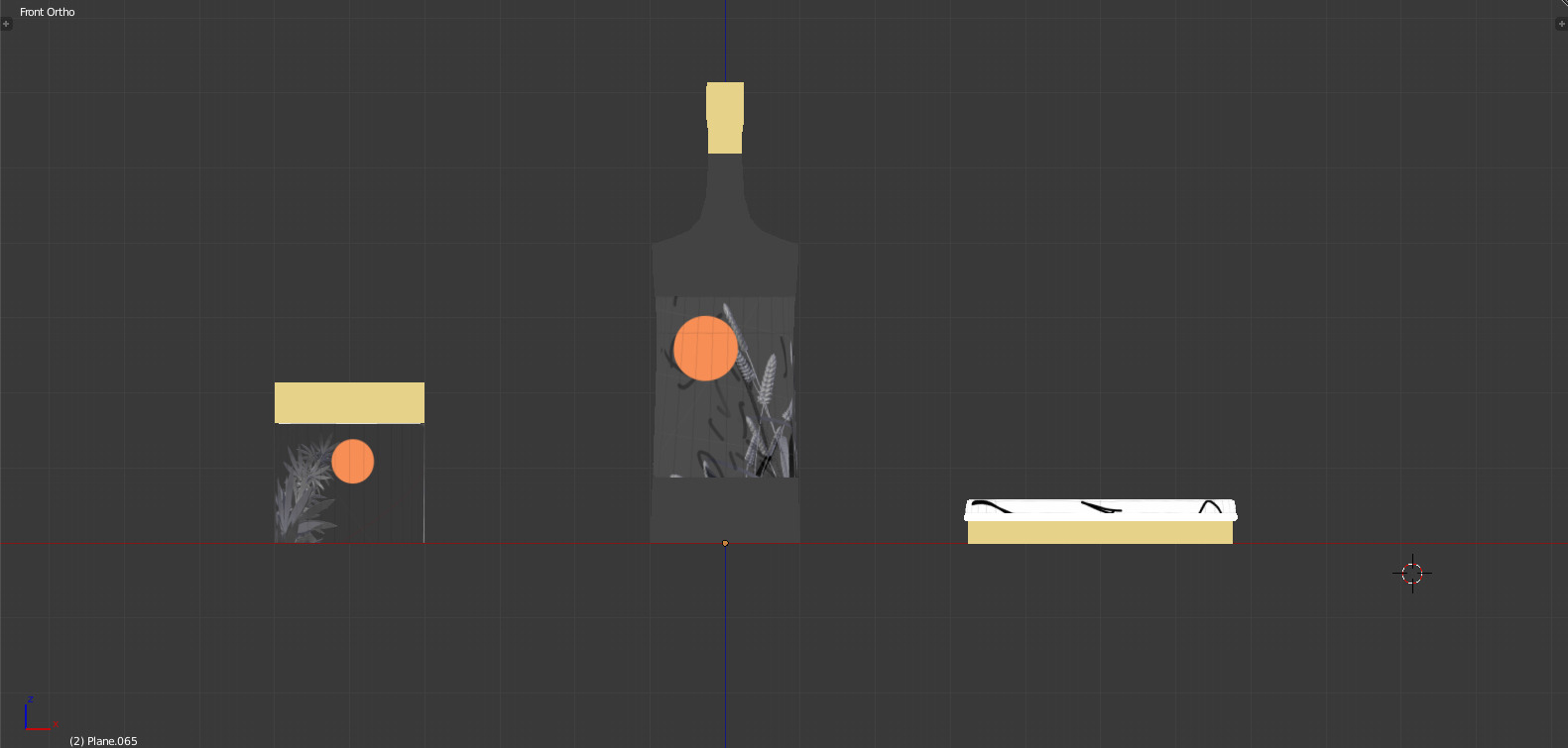
the previous versions feel too soft without enough warmth, so i think i need to increase the saturation? i feel like i need to do something more to the background
even less blue, even more orange
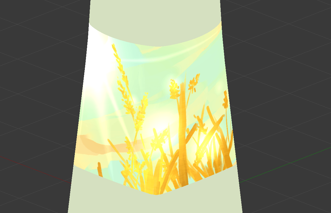
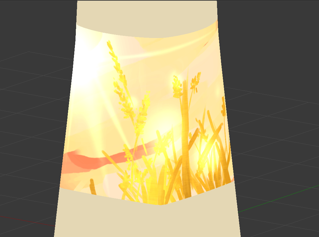
From here on out, what I’ll do is to 1) make an extensible background, 2) make the plants properly (see image directly below). Then the rest is just arranging the composition well, overlaying the metals and shadings, and adding any flavour text. Also, I need to deal with my 4th composition.
Rather than painting based on the 3D model, as I did in the previous examples, I realise that I can directly take the 3D model, use Magic Wand to pick out the shape, and overlay whatever colours and metals I want on it. This will allow me to avoid my lazy linework.
I briefly considered a direct render, but my models aren’t detailed enough to work well (and, i’m bad at lighting), so it’s in my best interests to use its silhouette. Also, semi-realism just feels wrong
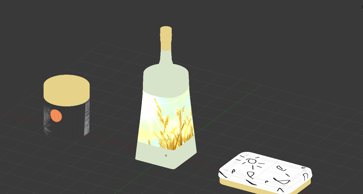
Considerations for a gift box, the 4th composition holding it all
Bright illustrations in a dark world; that kind of contrast would surely be heart-wrenching. In Memory of Sun is the overarching theme, with a tagline which may or may not be the sun is dead, time to smoke weed, get drunk, and die.
The illustrations would thus, obviously (?), be for things like 1. weed packages, 2. alcohol bottles, and 3. self-immolation kits. Parts of a gift hamper for the anniversary of the sun’s death, for you to go out with style! At your own discretion, than hypothermia or oxygen deprivation!
Establishing the tone
One of the things I used to get started was experimenting with the colours, through a 10 minute digital painting exercise. What I’ve concluded is that I think the first works best, where the warm, analogous colours are much better at providing a sense of harmony and softness.
In other words, if you’re already living in a dark world, I feel like the first would make you feel most crushed. After all, your environment already serves as a high contrast to the illustration: there’s no need to actively incorporate it into the image.
User personas
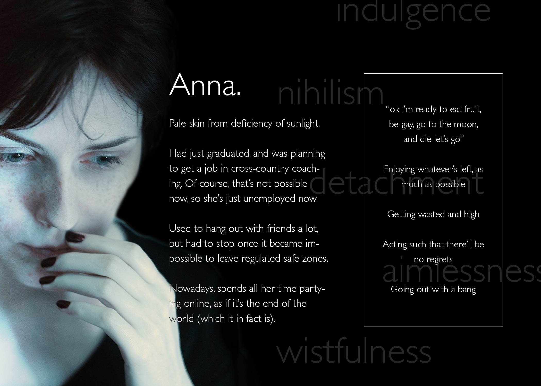
Here are user personas to express what I mean. Incidentally, I’ve realised that things like trait spectrums are useless for my understanding, so I’ve neglected that entirely. Instead, I focused on “how the death of the sun has affected them” (Ironically, I’m seeing a lot of Anna-like behaviour amongst NTU students right now.)
This means that I can go all out on creating a memorial of the sun which is fully focused on its wistful past glory, its overwhelming yet gentle radiance:
Not all of these include sun, just the feeling of wistfulness amidst desolation
Two drafts for illustrations
To get visual continuity, I considered what Lisa mentioned in class, about extensibility. As such, I looked into similarities and differences between each item, to get an idea of what I can differentiate or not. For me, this similar factor was the fact that they’re all derived from organic plant matter:
This is exacerbated by that plants rely heavily on the sun for sustenance, so it ties in pretty nicely, that these products of the sun will similarly go extinct.
As also implied above, I did some research into the relevant forms.
For the 3 items, I learned a surprising amount about variations in weed and alcohol package shapes. I actively tried to choose 3 shapes which would be markedly different, i.e. a rectangular than cylindrical alcohol bottle, and a stout than elongated weed container.
For the plants, I searched up how they grow; it may or may not be evident that I have a much clearer idea of the forms of grain, than the forms of weed. I struggled a little with tinder, since tinder is an umbrella term which can consist anything from tree bark and fibers, to dry leaves and seeds. Thus, I picked whatever would be the most visually intriguing / easiest to fit into the extensible template.
The first draft
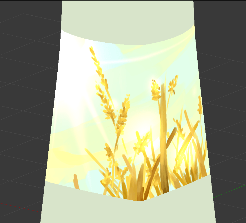
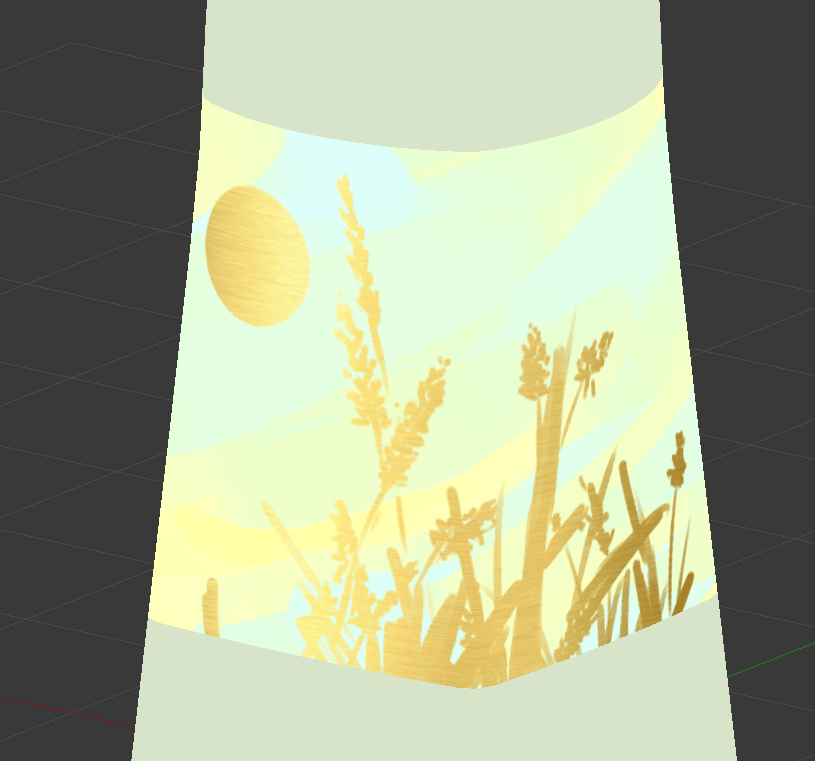
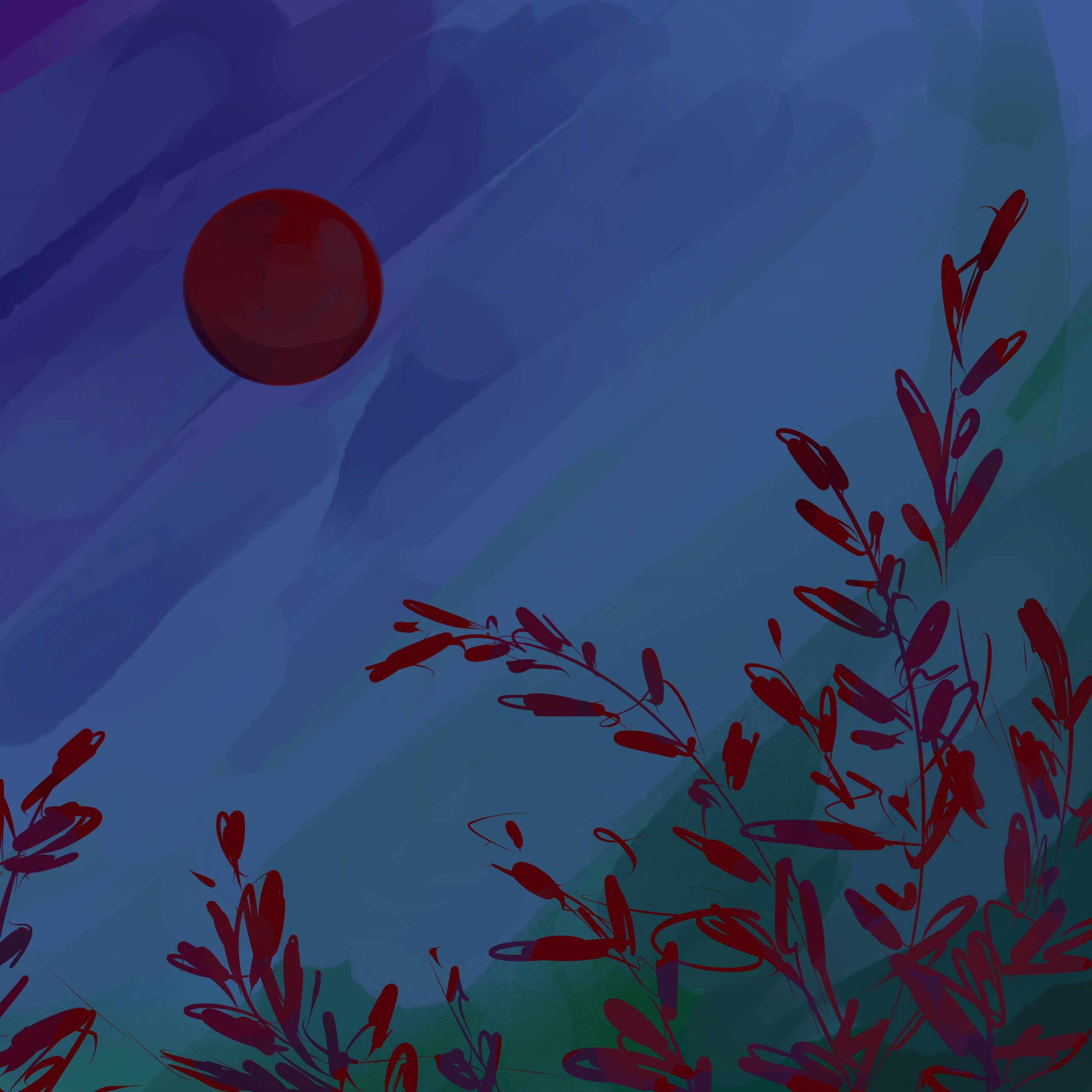
This one is basically of scenes of the relevant plants with the sun. While my initial thought was of just a scene, I later considered a down-up perspective, since it conveys the idea of growing “towards the sun”, than just a side view.
It’s easy to apply to grains and cannabis. It’s a little harder to apply to tinder, where I don’t think it’s apt to include the entire tree: after all, trees are visually dense, and has multiple components like wood and leaves, all of which can have different meanings.
As such, I tried focusing only on dried leaves, as can be seen:
The weakness of this, in my opinion, is that the sun takes a very minor role in the composition. It’s kind of like how the sun is used as a contrast to the main object in stereotypicalAsian–styledillustrations. Which is a style I do enjoy, but which may not be apt, where the sun should probably be the focus.
Ways to keep this composition while emphasising the role of the sun might be things like a) dyeing everything in orange hues, b) increasing lens flare, or even just c) exaggerating the size of the sun.
The second draft
This one tries to tackle the issue of the first draft, where the sun becomes a focal point. I notice that depictions which properly capture the sun’s radiance often focuses on negative space, such that the sun itself is empty space: instead, it’s the presence of darkness around it which makes it shine.
The plants are thus used only to fill surrounding space, and honestly I was thinking of tamago kake gohan when I made this:
What I don’t like about this version, though, is that it doesn’t make use of the forms of the plants. That works for tinder, where wood is flat anyway, but it feels sad to not see stalks of grain, or cannabis extending towards the sky. That makes it kind of boring.
The biggest issue
In both cases, I think the biggest problem is that I don’t really know how to render the sun’s radiance. After all, that kind of asymmetrical glare seems easier to capture in photography, or a painterly style? And, without it, I don’t think I could get the kind of brilliance and softness that I want?
The closest I’m seeing is something like this, but even this feels kind of, too clean.
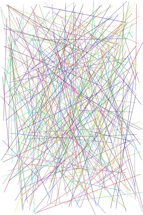
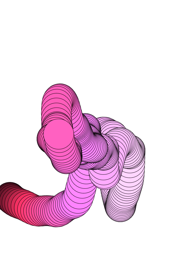
Last week, I came to class with multiple instances of code. The downside was that I genuinely had no idea how it would turn out, or any direction to guide me towards that end, so I figured that Lisa’s suggestion to incorporate data visualisation was a good idea.
Again, the theme of Fantasy is with respect to the fantasy of actualising impossibilities through technology, but I also used a more innocuous data set, in honour of something which is coming soon:
Yes, it’s a visualisation of theFinal Fantasy franchise.
PROCESS OF SETTING UP THE DATA
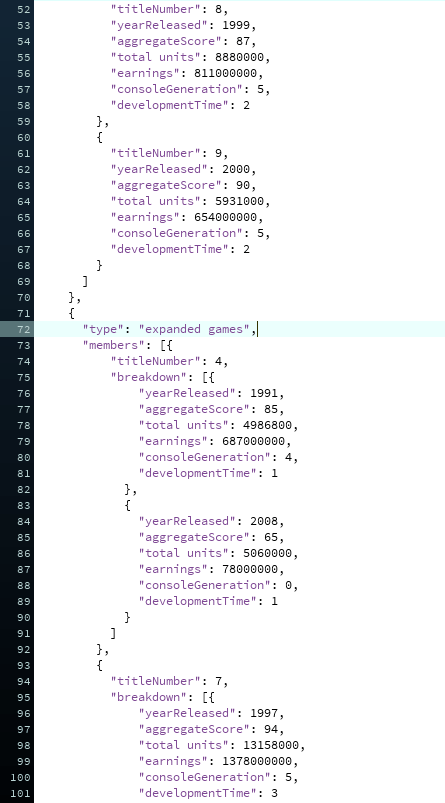
I have never touched data visualisation in my life, so I looked up tutorials by, once again, Coding Train. I decided against using real-time data, since it’s complicated, and there’re no API resources for the entire franchise (only FFXIV has a dedicated following). Instead, I created a JSON-based dataset; in total, there’s about 850++ lines of code.
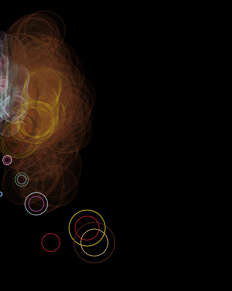
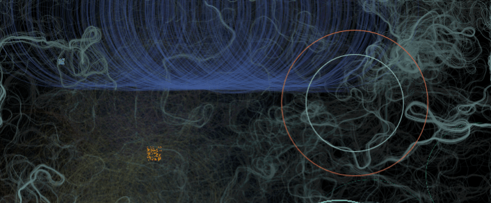
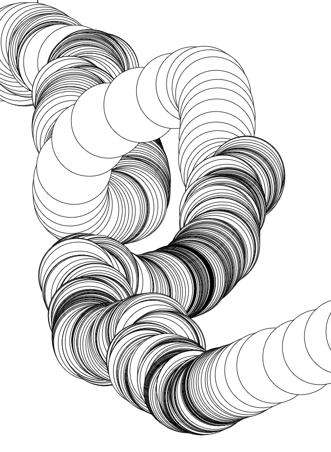
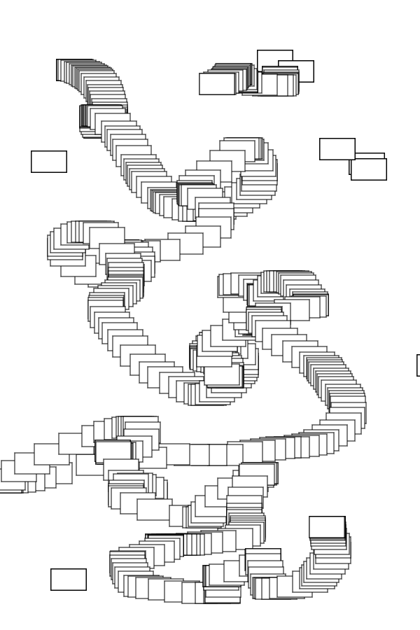
I ran some tests to ensure that the data could be accessed properly, as well, and properly incorporated into other codes:
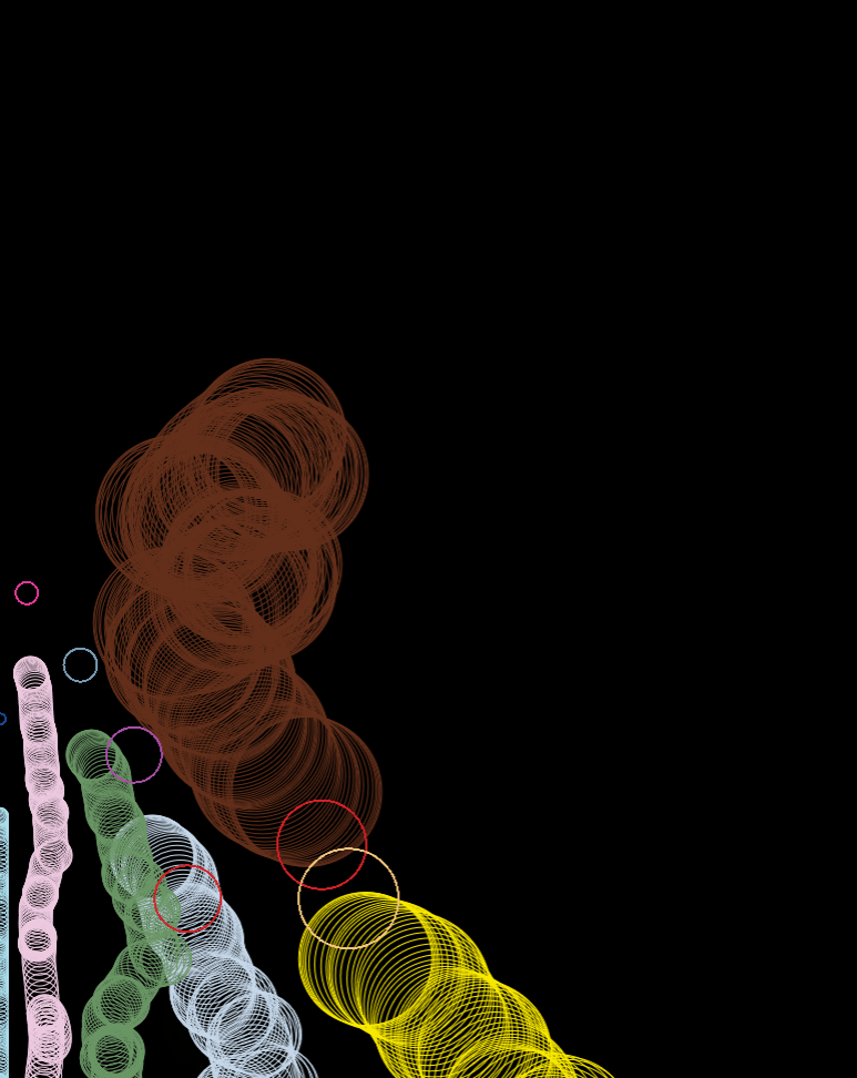
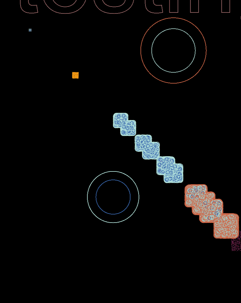
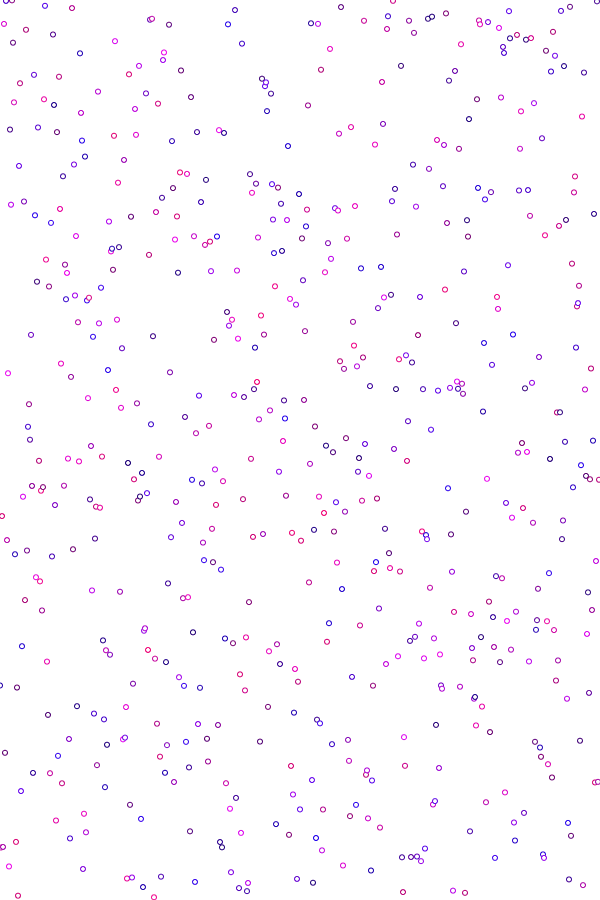
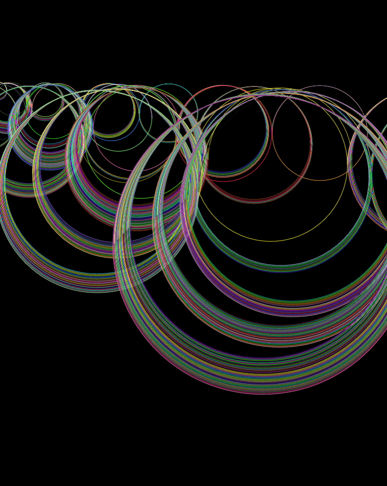
Random positioning, with ellipse sizes corresponding to the installment number.
Same as before, but width corresponds to year released
Combining flow field and ellipse codes
Location and size based on statistics, like yearReleased
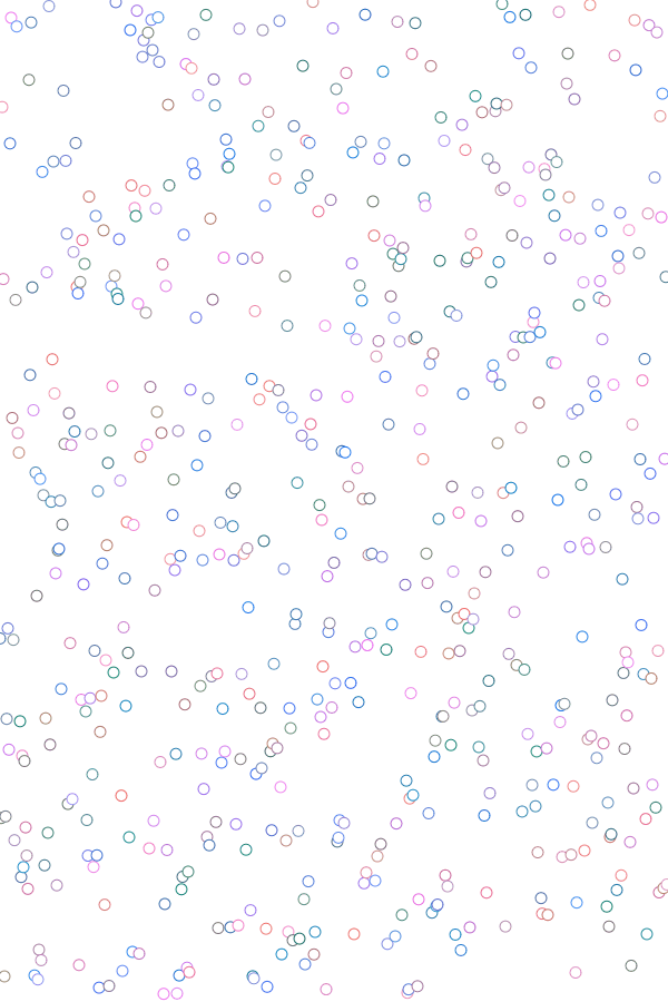
With noise-based displacement (division)
With noise-based displacement (/10)
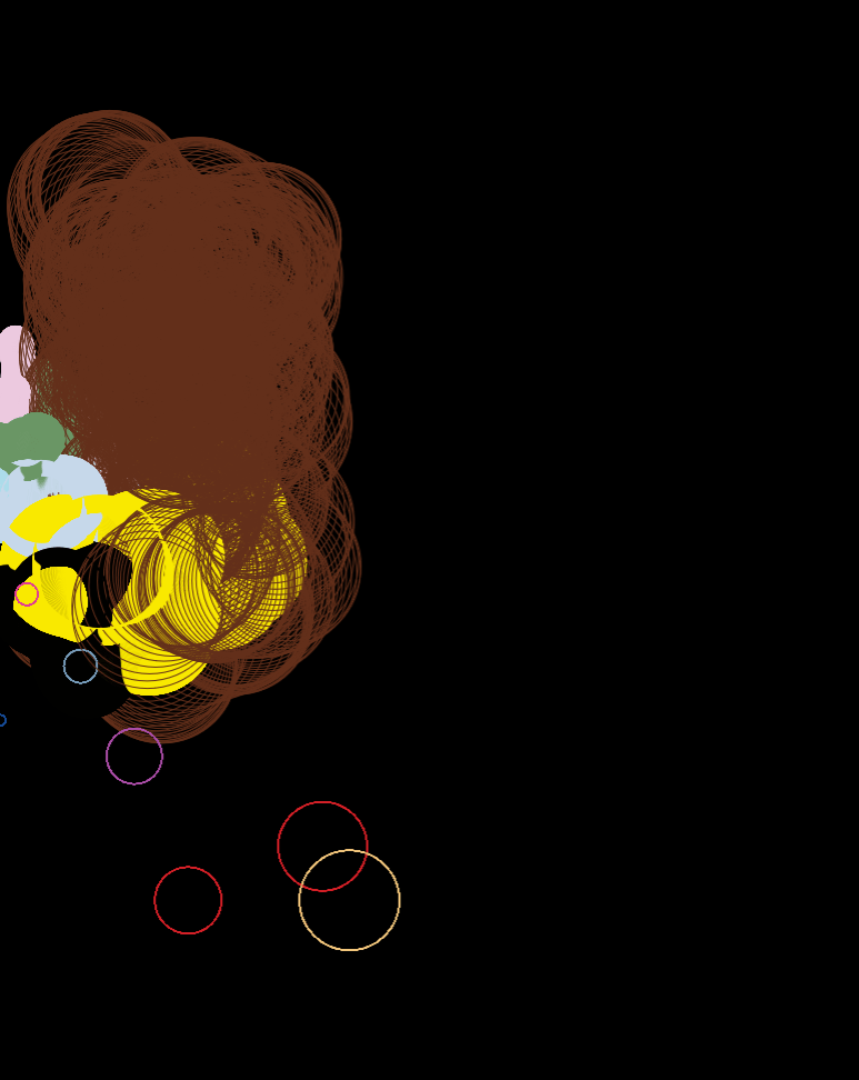
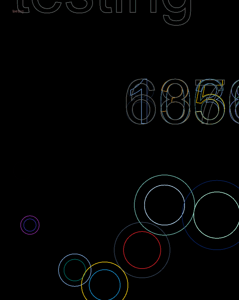
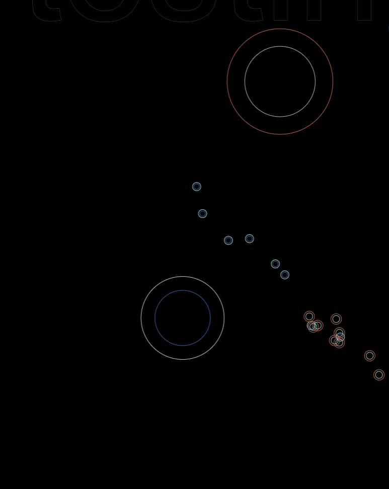
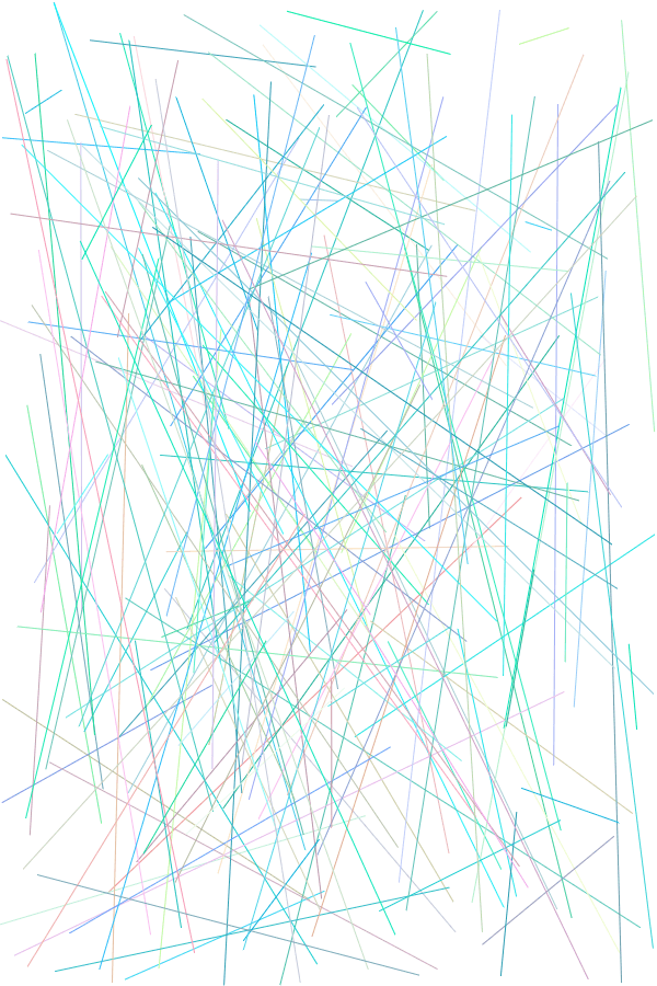
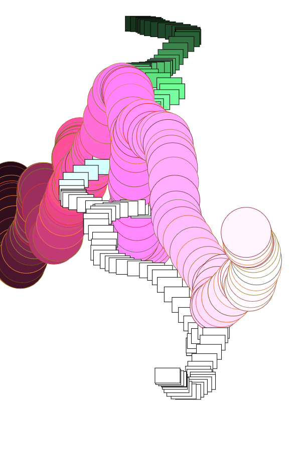
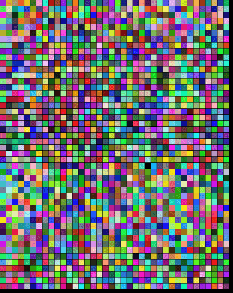
After which, I began testing different ways to combine data with visuals, and put them all together in a not-painful-to-look-at way:
testing high opacities
testing low opacities
opacities with increments based on totalUnits
opacities proportional to totalUnits
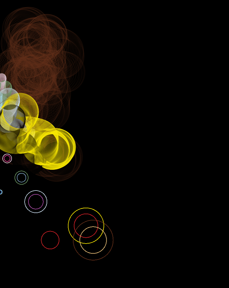
testing expanded games dataset
combining 1st and 2nd datasets
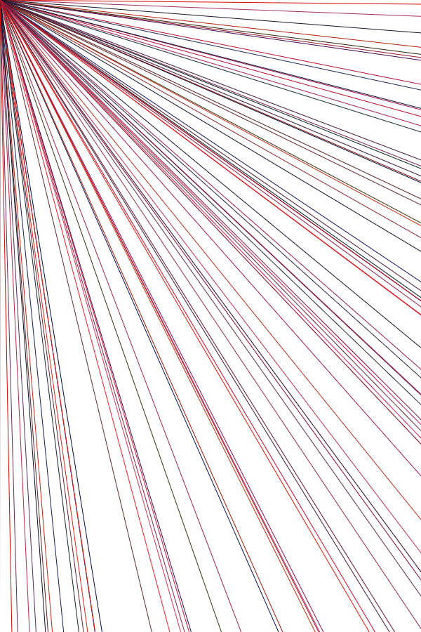
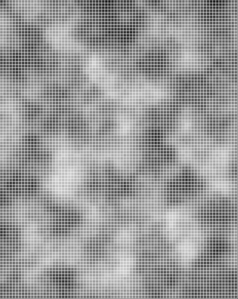
random positioning without loop
random positioning with loop
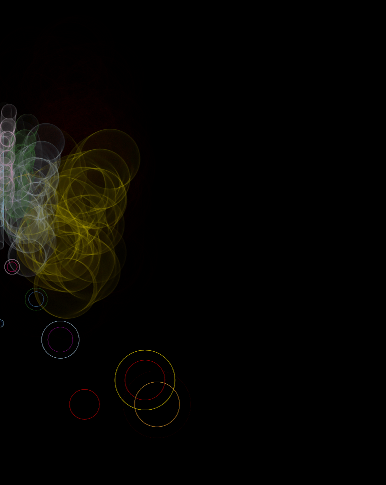
random positioning without scaling to 1987
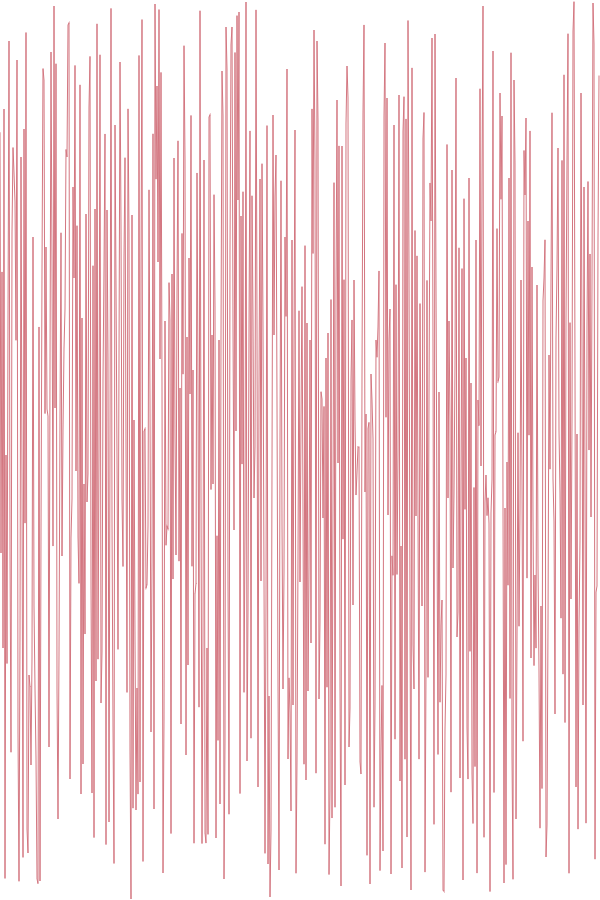
trying different timings
trying different translate()
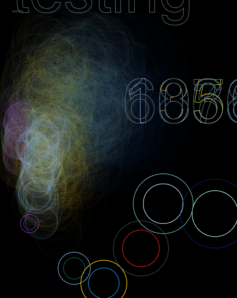
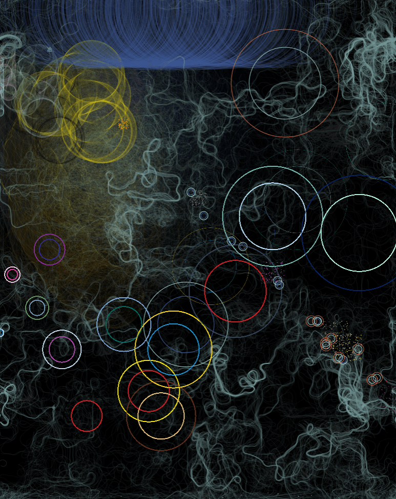
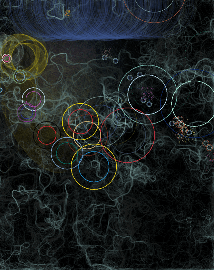
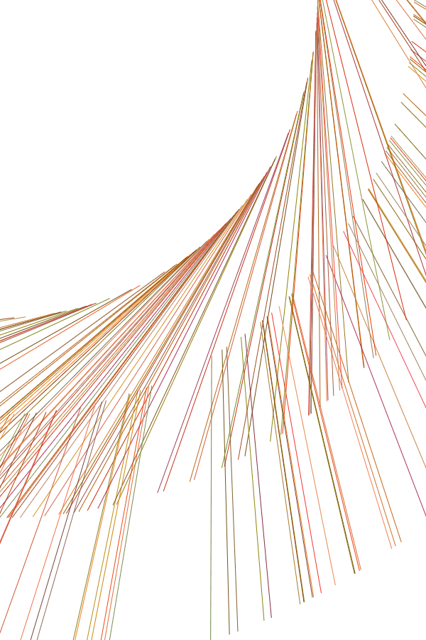
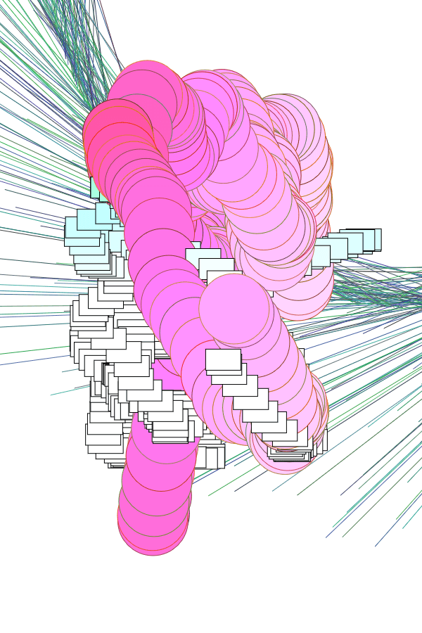
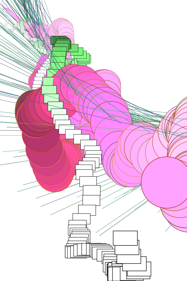
The details regarding which data set corresponds to what visuals are available on the page. Nevertheless, there’re some fun facts which are fun only if you understand Math and Final Fantasy, such as that a) patterns are easily observable once you know what drives it, and b) that outliers make for… Interesting visuals.
Main installments (the most prominent ellipses) are evenly spread out across the width, and in order, because it’s based on the year it was released
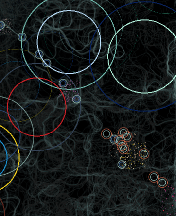
Specific positions of MMO expansions and side games are random, but nevertheless revolve around an static origin point
Everything in the top right is there because 1) it’s recent, and 2) it has outrageously bad reviews (i.e. original FF14 & the FF15 expansions)
Also, interestingly, a previously mentioned possible guiding philosophy was how basic elements come together to create complex forms. Due to that ellipses were used for practically everything, it surprisingly came to fruition as well.
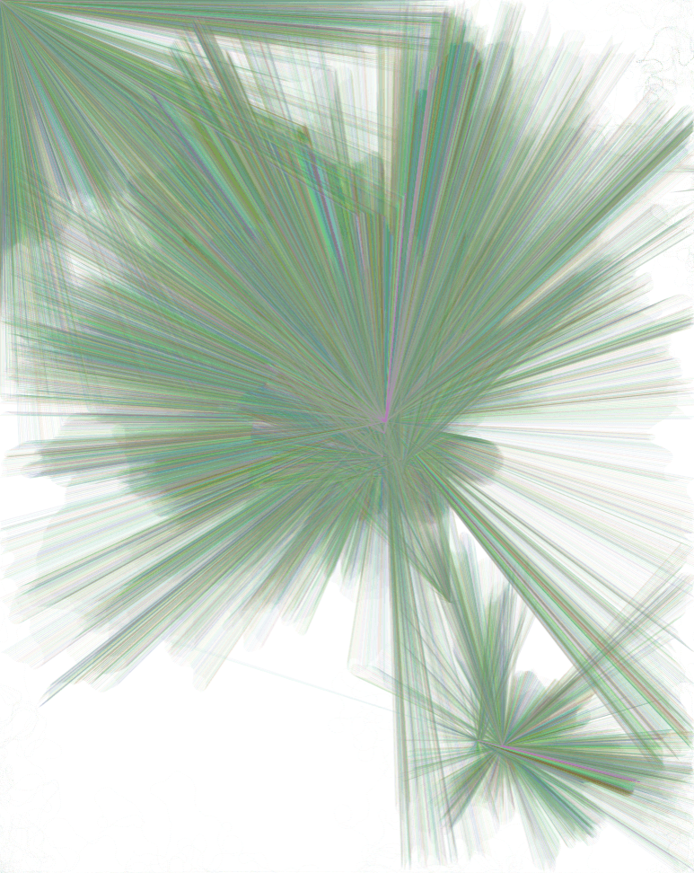
As per the last post, I decided to work with generative illustrations. Where the theme is something like “the Fantasy of actualising impossibilities through technology”. And, of course, I don’t have pencil compositions, or even drafts of what I want. Here are the two main reasons why:
1. GENERATIVE STUFF JUST… DOESN’T GO WELL WITH PLANNING
As summarised by Spittel, there are two approaches to generative art: a) have no results, and let the computer generate as you play around, and b) have a very finalised idea, only allowing little randomisation.
I wanted to go for a mix of the two: keeping a vague idea of what I want the overall form to be like, while allowing the computer freedom to generate the exacts of what it turns out to be.
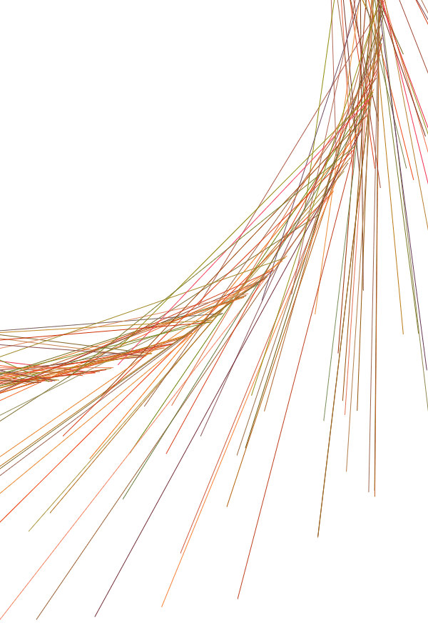
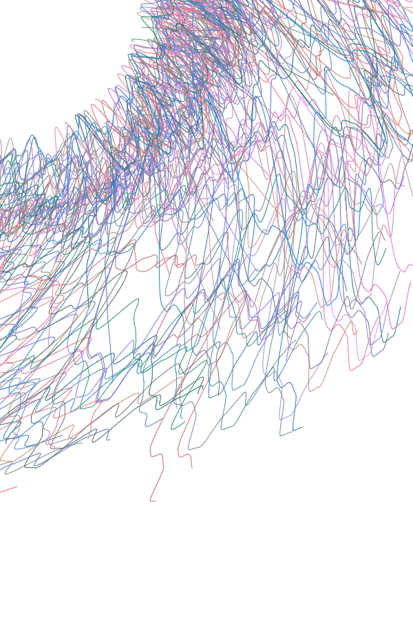
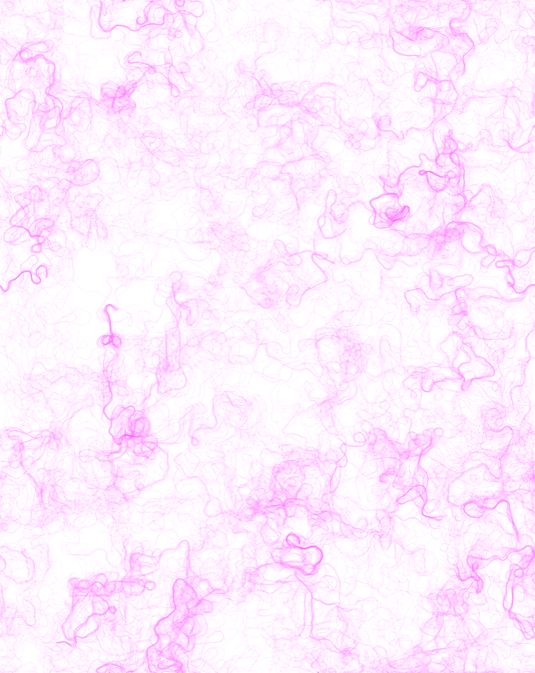
Automatic line makings, to get a gist for the overall form. As can be seen, it will likely involve many arcs, curves and loops, and a tall form which isn’t symmetrical.
But, intention probably won’t match up to action, because
2. IT REALLY DEPENDS ON MY PROGRAMMING ABILITY
I can draw decently well, but coding full-fledged physics is……. While I wanted to aim for something like Shvembldr and/or Nick Taylor‘s emergent, organic forms, I’m not sure that it’s possible at my current level. The most I can do is probably to work with basic elements, like lines and circles, and randomise their colours, positions, and sizes.
As such, it seems unlikely that I can find a way to code the piece to be particularly close to whatever I would envision. Still, I’ll outlaw patterned works like cccbtt, where I think it’s too structured: the point is to show off how amazing technology is, which is more evident when more complex functions like sin() is involved.
SO, TO START OFF…
After looking into different scripting languages, I decided to go with P5.js.
Their tagline aptly summarises why: it has “the power of Processing times the reach of JavaScript”. In other words, it can achieve more than web-based Javascript alone, while being more accessible to creators and audiences, since it’s for web.
As I’ve said, I don’t have pencil sketches, because it depends on how fast I learn. Instead, I just experimented wildly with codes that I learned, using random() and noise() on parameters like the x-y coordinates, or scale().
Here are some things I learned (or refreshed, it’s been a while since I’ve touched Java/Script) during the spring break:
From there, I picked out elements I liked, and tried combining them, or messing around even more. Half of this were not intentional, just that I didn’t really do object-oriented programming, so, uh.
I guess my first “pencil composition” would thus be something like this:
A SECOND “PENCIL” COMP
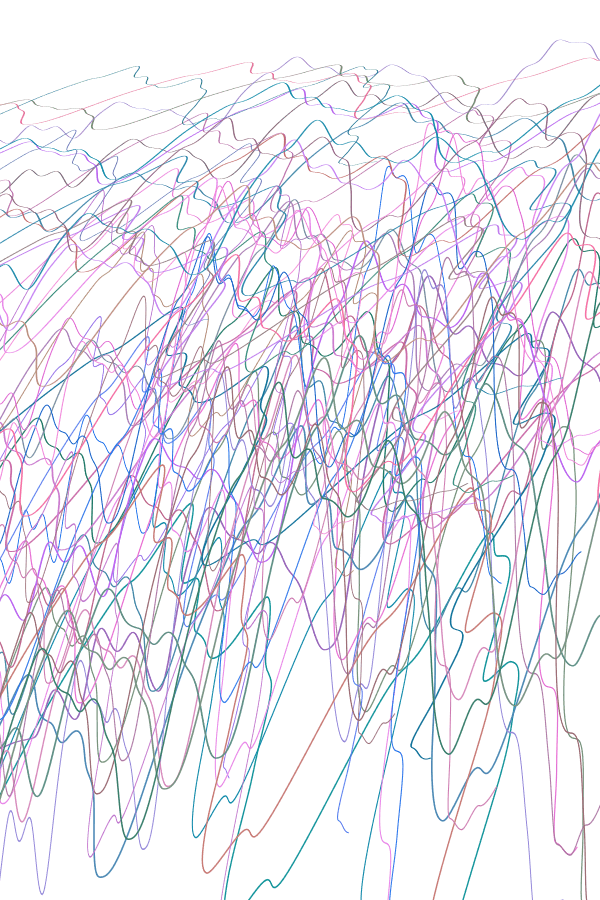
My second pencil composition tried to be more aware of the working style for generative pieces. Interestingly, there’s a sense in which coding is a “collage”, because you rarely write code from scratch: it’s usually about modifying other people’s codes to suit your needs.
As such, you’ll see that most of the practices here are based off codes that I grabbed elsewhere, like by The Coding Train:
I took a slightly different approach, starting with concepts than visuals, since my forte is in critical analysis. Here are examples of the numerous false starts I had when I tried to subvert my typical way of project development:
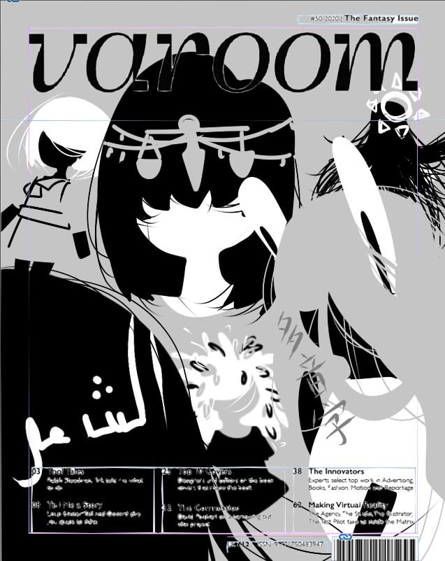
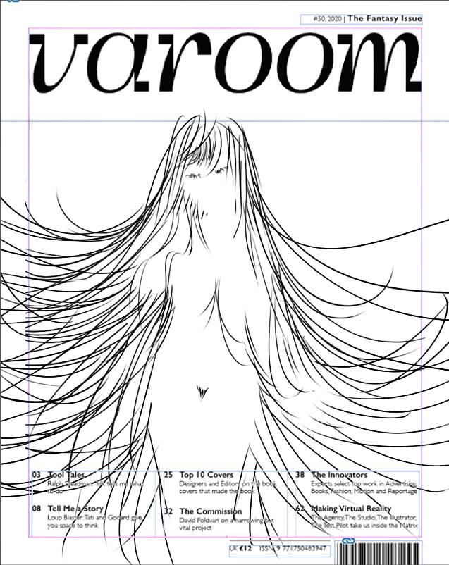
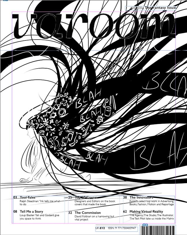
After which, I tried to take into consideration what is required of a cover illustration for Varoom.
It must be something accessible, where Varoom isn’t meant to be a culture- and/or country-exclusive magazine,
It should provide critical new insights into the discipline of illustration, where that’s what the magazine is about,
It shouldn’t be focused on a specific topic or subject, where it’s a cover image, not an article-based image
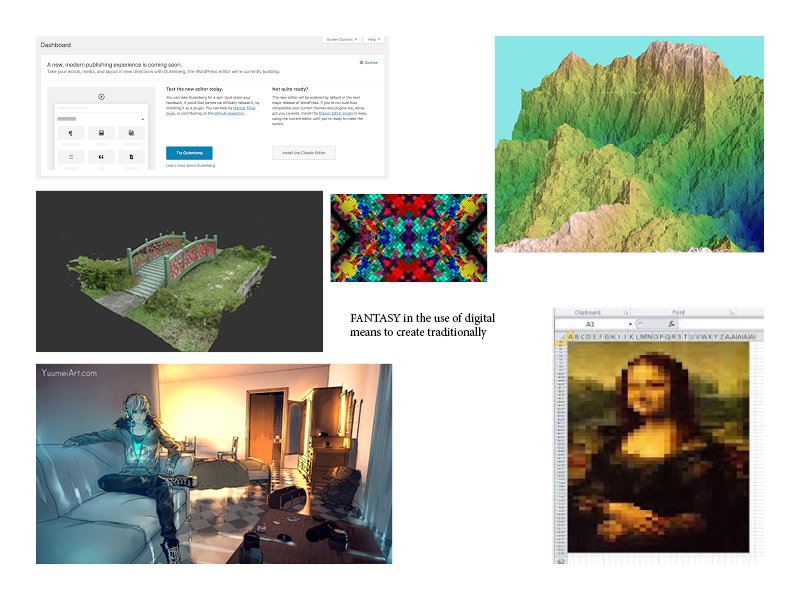
Since I chose the topic of Fantasy, I thought about what Fantasy would mean to all illustrators. Where fantasy refers to the “imagining of impossibilities”, the conclusions I came up with were these:
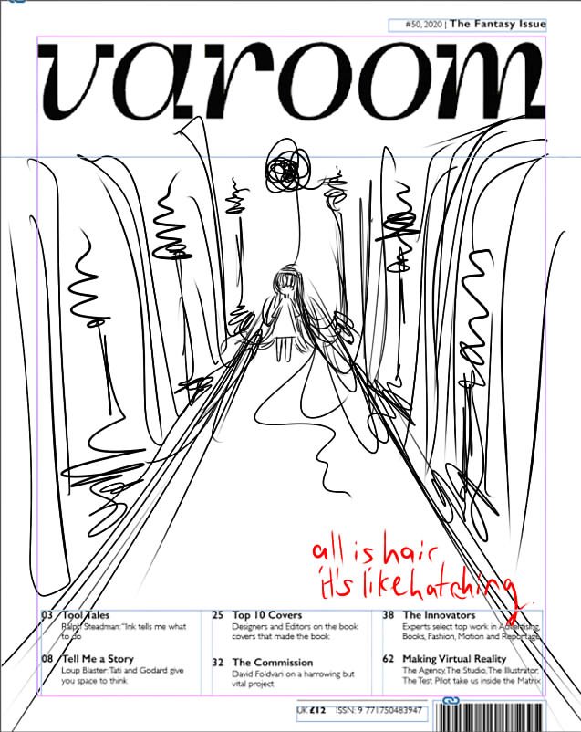
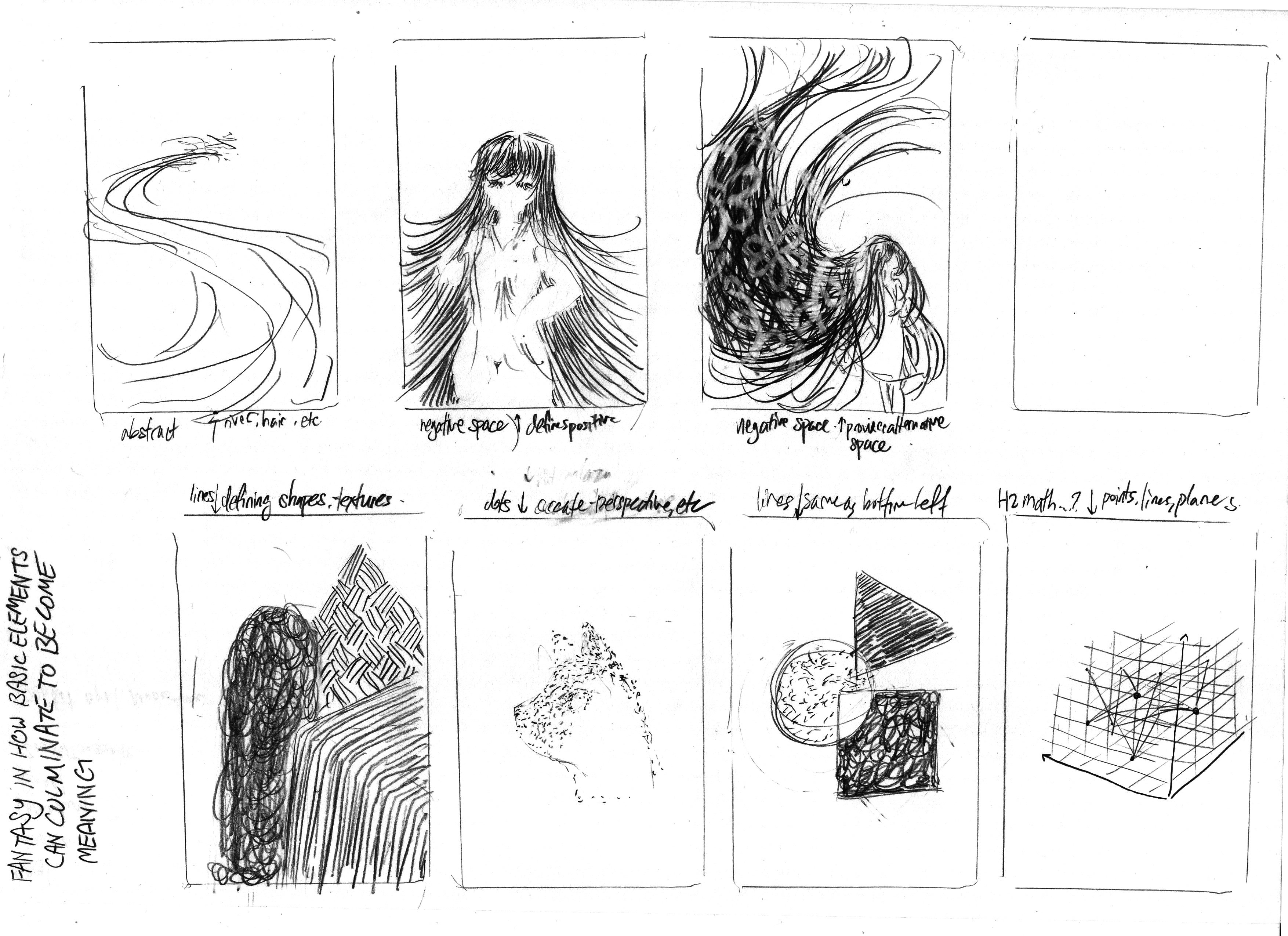
Fantasy in how basic elements come together to create complex forms
In other words, how dots, lines, and planes come together to create illustrations which look like more than the sum of its parts
Fantasy in how impossible forms can be created through new technologies and means
In other words, how computer-based generation can create illustrations which would be tedious and/or impossible by hand
While I sketched thumbnails for both, I fully intend to go for the latter. This is because the former may be an insight into illustration, but it’s nothing new: we’ve long established the benefits of those basic elements. Computer generation, on the other hand, is definitely something new to the industry, and thus provides a fresher insight.
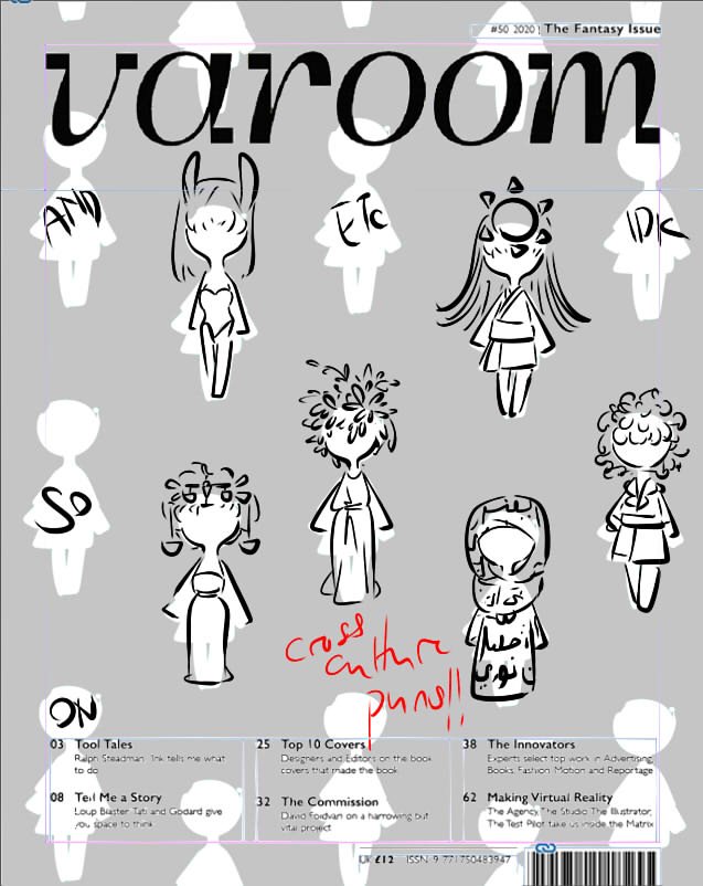
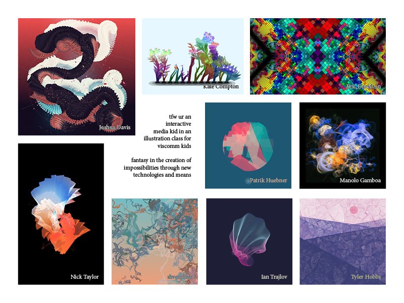
A list of examples for the former
For the former, featuring things like negative space, hatching, etc
A list of examples for the latter
For the latter, featuring things like pixel art, generative art, etc
Based on that, Lisa also suggested the works of Joshua Davis, a generative illustrator. So, here’s my finalised moodboard:
I note that it may be difficult to do pencil compositions for a generative illustration. After all, the point of generative illustration is that it’s randomised. For now, I’ll look more into generating illustrations: depending on what I leave to the computer to randomise, there may be things which remain constant, which can be presented in a pencil composition.
Alternatively, it may even be more worthwhile to create a prototype directly in code.
The animated GIFs are too big, but here’re links for Gwen and I! (Please. They’re necessary.)
Me
Gwen P1
Gwen P2
Gwen P3
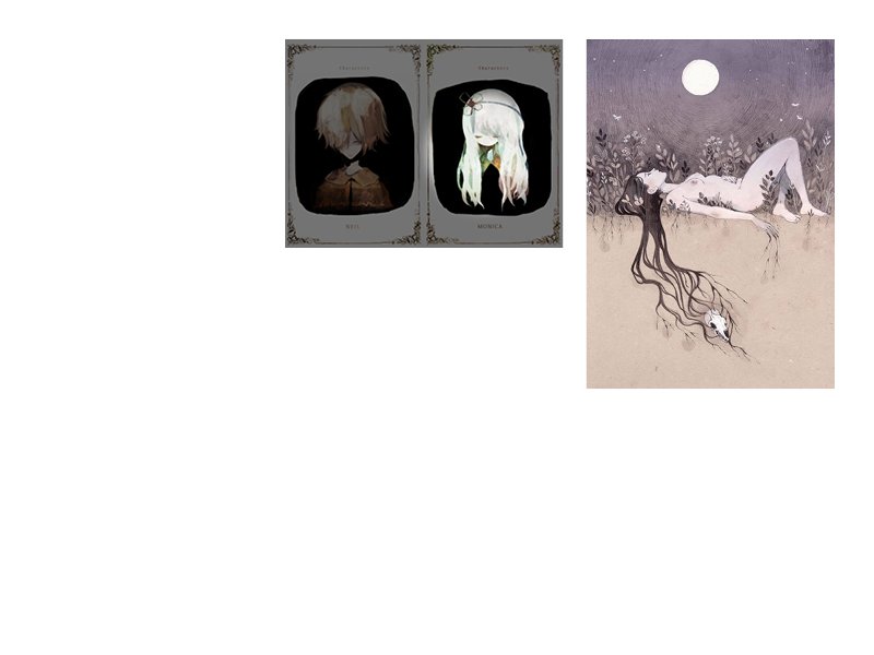
PROCESS: COLLECTING DATA
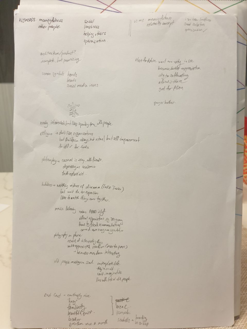
The initial point was an interview with Gwen. We hardly knew each other, and thus asked a few questions each via Telegram. Other than that starting point, we also took various free time opportunities in class to converse, getting a general sense of our various opinions. This included, for example, thoughts on things like religion and philosophy, as well as hobbies and reasons for it.
Part of the initial conversation.
Based on the results, I identified key words, and compared traits against myself. The conclusion was as such (Gwen / Me):
Social / Independent
Emotional / Practical
Country / City
Efficient / Analytical (? based on our working styles, where she seemed much more put-together)
3rd Personal / 1st Personal (in terms of how I perceive us, since I see myself from within myself, while I see Gwen from her outside)
This translated into the following decisions, where I believed these to most aptly display our differences:
Outdoor / Indoor
Open / Closed
Natural / Constructed
Painted / Modelled
Curved / Cubic
Nevertheless, there were many points where we aligned, such as our perspective on self-actualisation, and our varied interests. As such, I also considered the use of Perspective than Orthographic, to represent that 3-dimensionality. Also, for our portraits to Seamlessly Intersect, such that the portraits (and us!) can be connected without any issues.
I also checked out relevant images to whatever Gwen had mentioned in our talks, in an attempt to acquire a moodboard of sorts. These images were also set to greyscale, to avoid colour bias due to the limitations of the assignment prompt. Here’re the images:
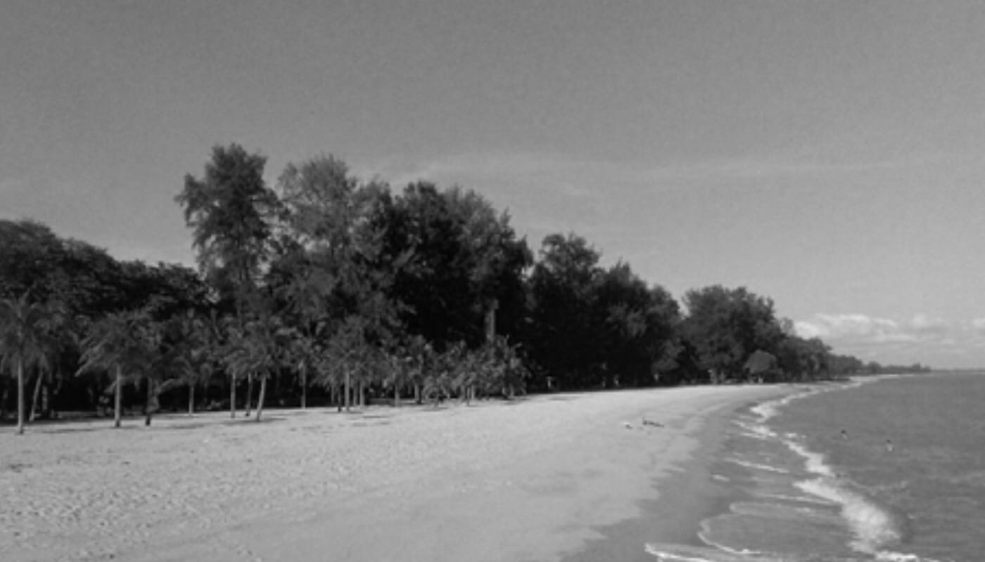
East Coast Park, where Gwen enjoys her time off, because it’s peaceful. https://www.nparks.gov.sg/gardens-parks-and-nature/parks-and-nature-reserves/east-coast-park
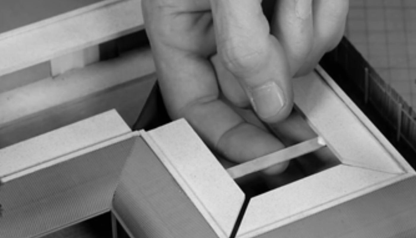
A diorama process, where Gwen is fond of watching “things come together”. https://www.youtube.com/watch?v=MYJzMUFeE20
Hertfordshire, where Gwen intends to have her exchange due to her fondness of the countryside. https://www.telegraph.co.uk/travel/comment/hertfordshire-county-underrated/sss
PROCESS: CREATING THINGS
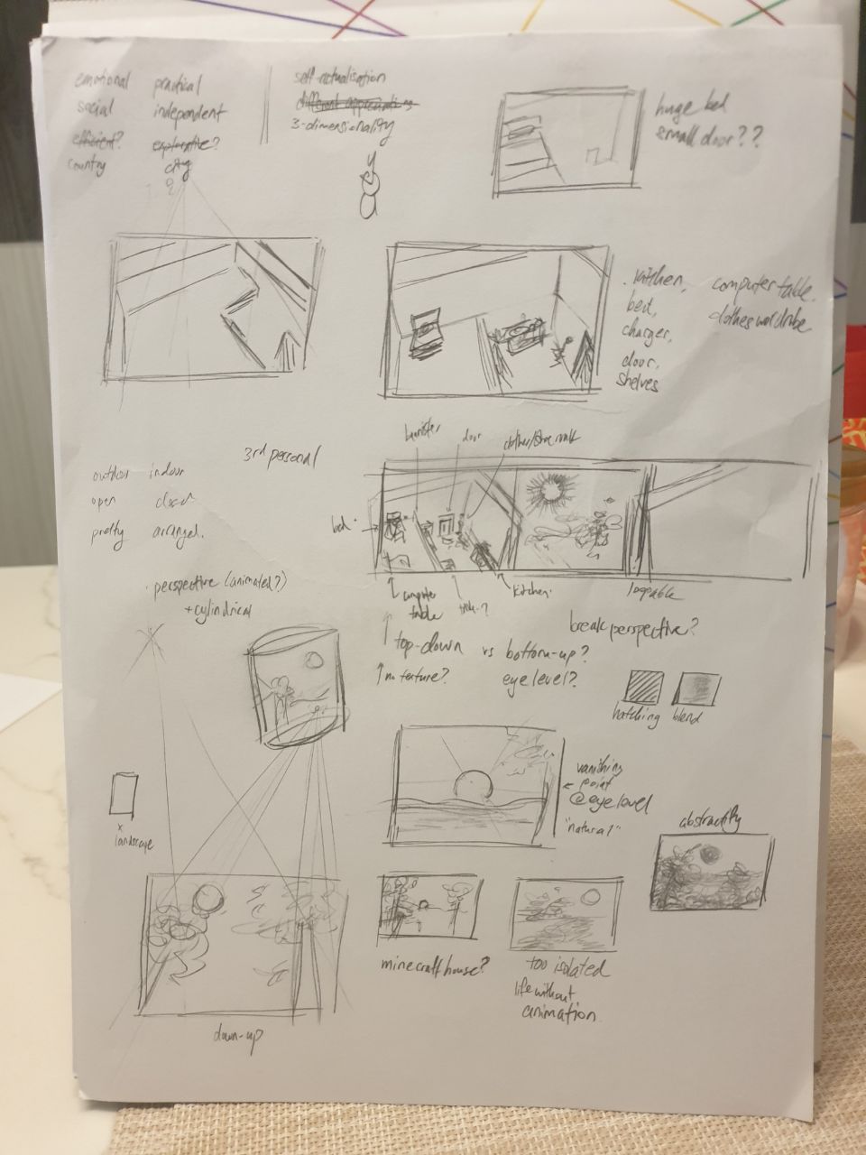
As my approach doesn’t quite look at specific events or items, I surmised that it would be best to rely on emotion evoked through a scene, than symbolic objects. This, as would later be affirmed in class critiques, made it difficult to create an illustrative piece that was concise in its meaning. Here are some samples of the earliest compositions, which look like shoddy attempts at still life drawing:
A starting page, with keyword identifications
Attempts at landscape scenes
More attempts, and gradual delve into current form
Sketches for Gwen
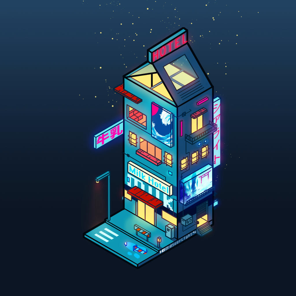
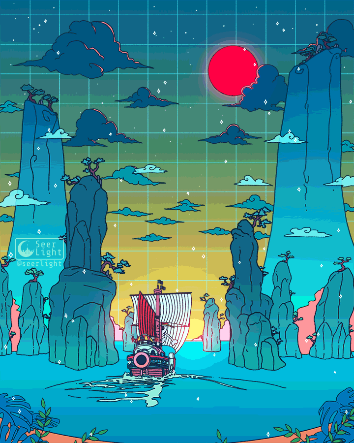
Consequently, I looked for ways in which other illustrators display “spaces”, while still being distinctive and clear. While I looked at avarietyofsources, my primary inspiration was Ronald Kuang / SeerLight, who often uses geometrical shapes and gentle colours to depict locations.
By SeerLight, an example of the milk carton shape used to suggest a building. As found at https://www.deviantart.com/seerlight/art/Cyberpunk-Milk-755347124.Also by SeerLight. Subtle animations are also a trademark of his. As found at https://www.deviantart.com/seerlight/art/To-the-next-adventure-815132728
Thus, I decided that the best way to represent our distinctive traits was to use a contrast of Organic / Geometric shapes. This way, the very form of the elements is an indicator of our characters. Additionally, this means that, when using animation, I can use the same shape to represent various different items, retaining a proper focal point without cluttering the composition.
PROCESS 2
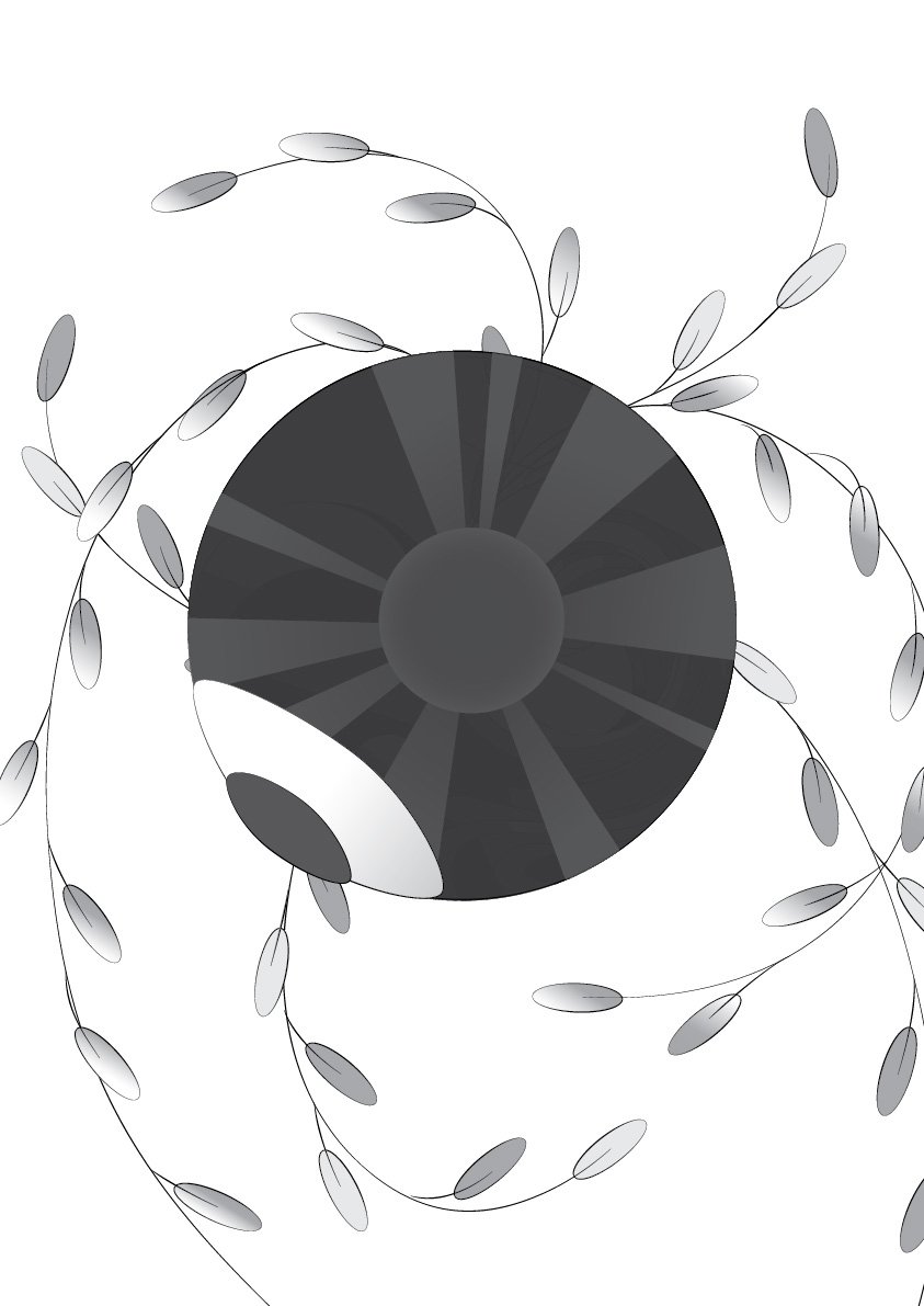
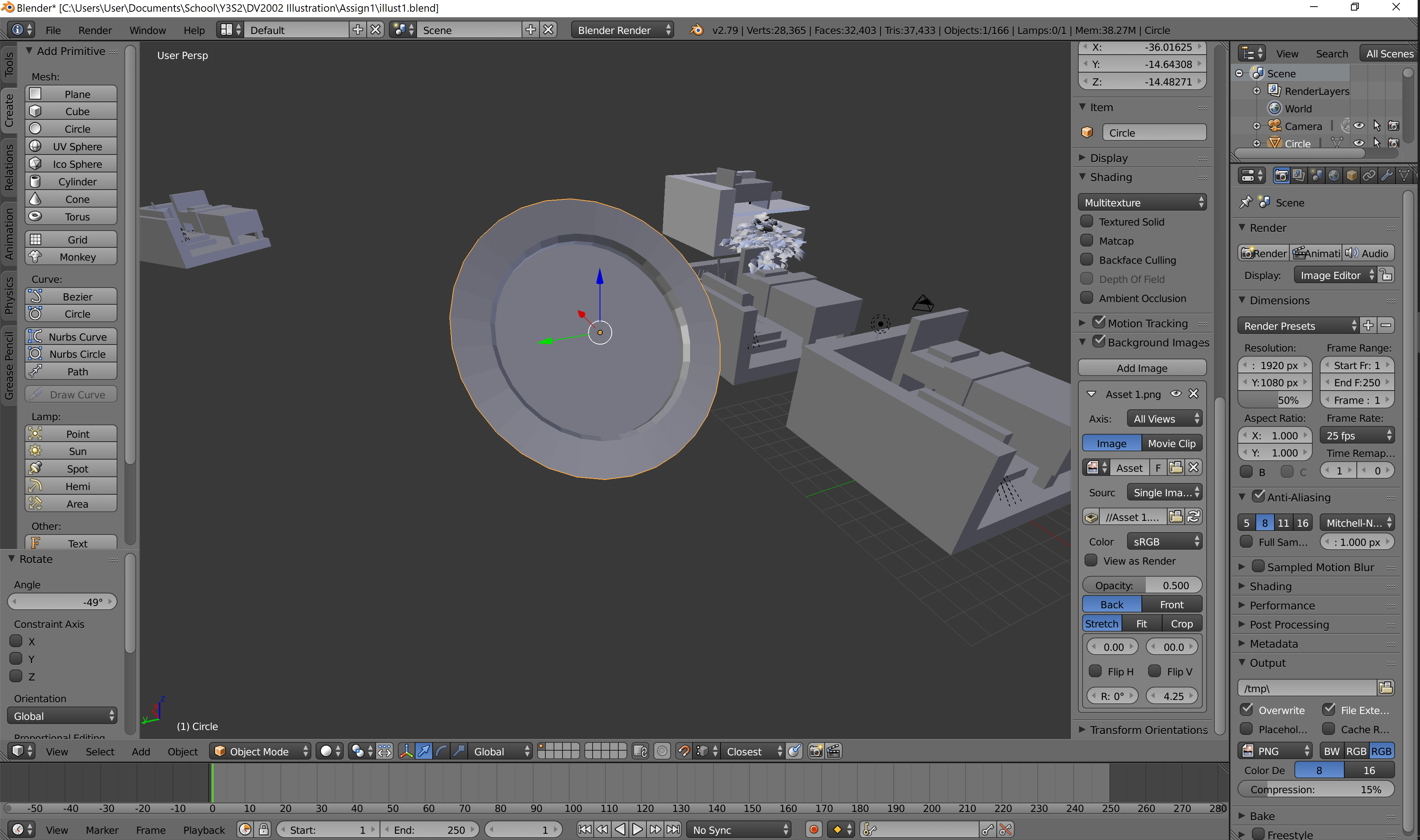
I did mine, of the geometric, in Blender, where orthographic drawing from scratch is not my strong suite. It is made of cubes, cubes, and only cubes, a call to my comparative rigidity and practicality. After which, I traced it on Illustrator.
A later version, where I began to consider the use of scale to indicate significance of objects, and removed various things which weren’t necessarily “important”.
I considered a plate, but ditched it for a tray, since the circular shape would never work. (Also why there is no spoon.)
The biggest object is the bed (of course!), followed by the computer, and then the cutlery. It’s a representation of my 3 priorities: sleep, Internet, and food. I placed the door as a counter to the struggle for dominance: unlike those 3, the door is verily small, an indicator of just how much I hate to go out. The animation is much simpler compared to Gwen’s, but feels oddly apt: Much of it is just repetition without significant changes, just like much of my everyday life as I hide out at home.
The line-only draft.
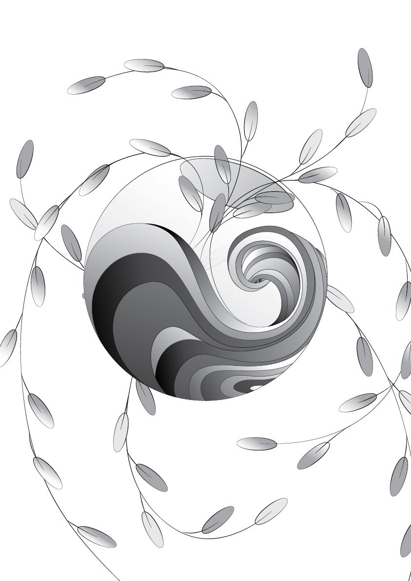
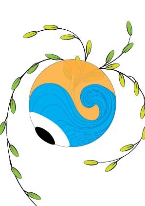
Gwen’s features curves, curves, and only curves. Since she appeared to be someone rather emotional, and almost spiritual, I placed many of the things she enjoys seeing, such as the sun, plants, waters (the sea), and the bowl (for plants, but also for fish sometimes). When I mentioned this to her, however, she hastily said that she only enjoys watching, as she’s terrible with keeping things alive. Consequently, I added the eyeball, a manifestation of her gaze. I’m blessed that all of these use the circle as a base shape. Thus, the animation can encompass all, by having the circle change from being that of a “bowl”, to that of the “sun”, and the “eyeball”.
With base colours, until I remembered.
All in all, I’m surprised that the lack of colour wasn’t a major problem. Nevertheless, the sun on Gwen’s portrait is tragically misaligned, probably because I failed to set the origin point properly. It’s only my second time using Adobe Animate, oof. Also, I feel like the eyeball might not have come across very cleanly: in hindsight, it might have been better to have it centralised than facing the side, where it’s rather difficult to identify what it’s supposed to be.
Perhaps the approach I took wasn’t necessarily the best, either, since I focused on the dichotomies between both of us, than seeing Gwen for who she is. While it helped in the eventual creation of the Organic / Geometric division, it might be worthwhile to try seeing others as they are, than as compared to me.
![[W12IfD] i cannot visualise to save my life,](https://oss.adm.ntu.edu.sg/a170027/wp-content/uploads/sites/1810/2020/04/Screenshot-178-1-825x510.png)


![[W11IfD] creating a starting point](https://oss.adm.ntu.edu.sg/a170027/wp-content/uploads/sites/1810/2020/04/moodboard-2-825x510.jpg)


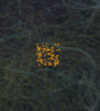
![[W9IfD] turning data into forms](https://oss.adm.ntu.edu.sg/a170027/wp-content/uploads/sites/1810/2020/03/ifdmockup01-1-825x510.jpg)


![[W7IfD] making pencil comps for a digital generation is, uh,](https://oss.adm.ntu.edu.sg/a170027/wp-content/uploads/sites/1810/2020/03/pencil1-638x510.jpg)


![[W6IfD] Thumbnails, and a Mood™](https://oss.adm.ntu.edu.sg/a170027/wp-content/uploads/sites/1810/2020/02/moodboard-final-800x510.jpg)


![[W4IfD] Assignment 1 Process & Final](https://oss.adm.ntu.edu.sg/a170027/wp-content/uploads/sites/1810/2020/02/finaaaa-0222-776x510.jpg)


