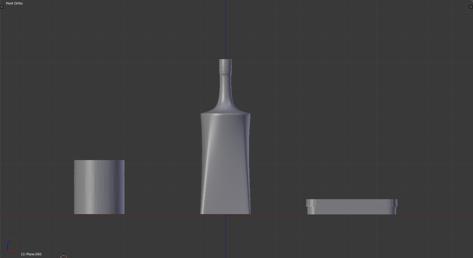
and thus, I’m using 3D models as a base again. I’d like to thank past me for having the foresight to teach myself this skill.
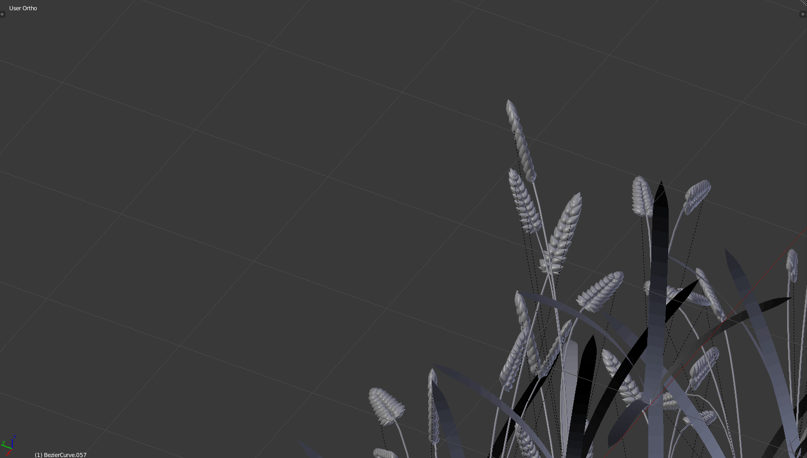
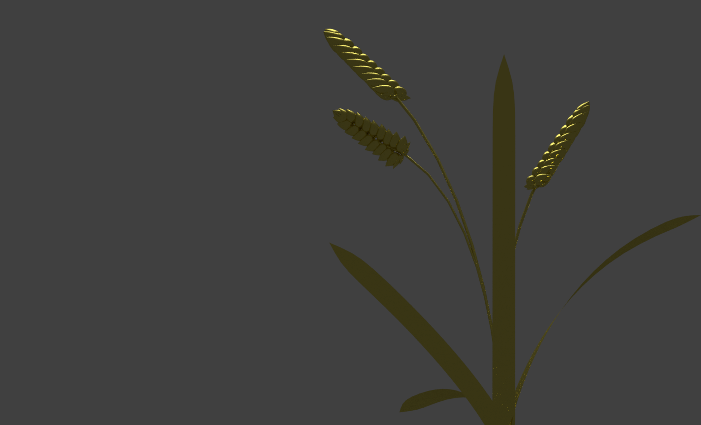
grain!
grain from a bottom view!
many grain from a bottom view!
not grain!
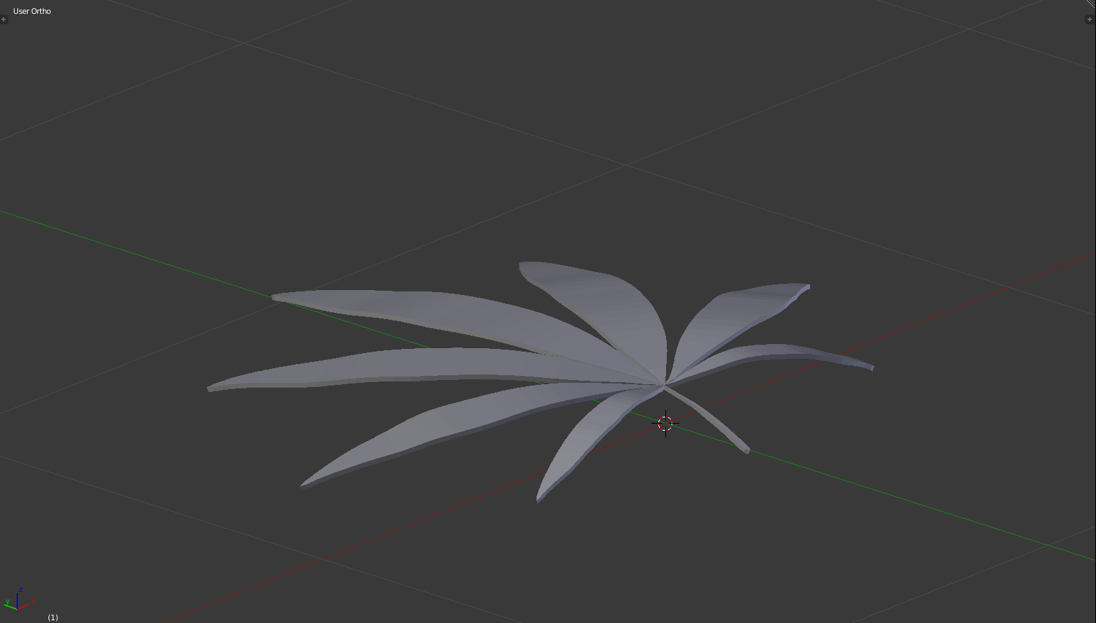
weed plant!
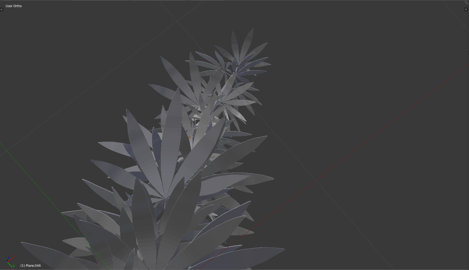
many weed plant!
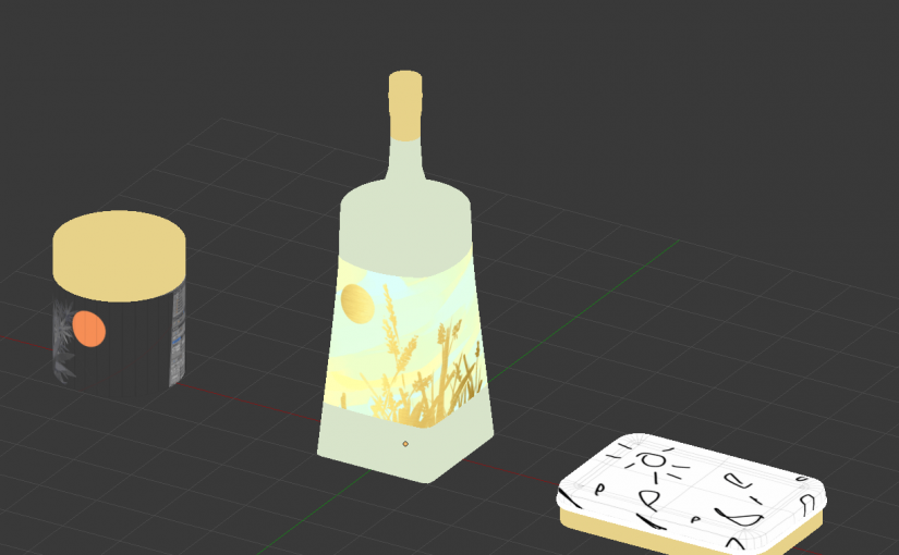
I also happen to find that free mockups are kind of… difficult.. to work with, because the sizing never turns out right (and the lag is atrocious), so I tried making models and unwrapping the textures myself. Also, this means I get more control over what shapes and sizes the labels are.
(Regardless, I may resort to free mockups eventually, where this is incredibly excessive.)
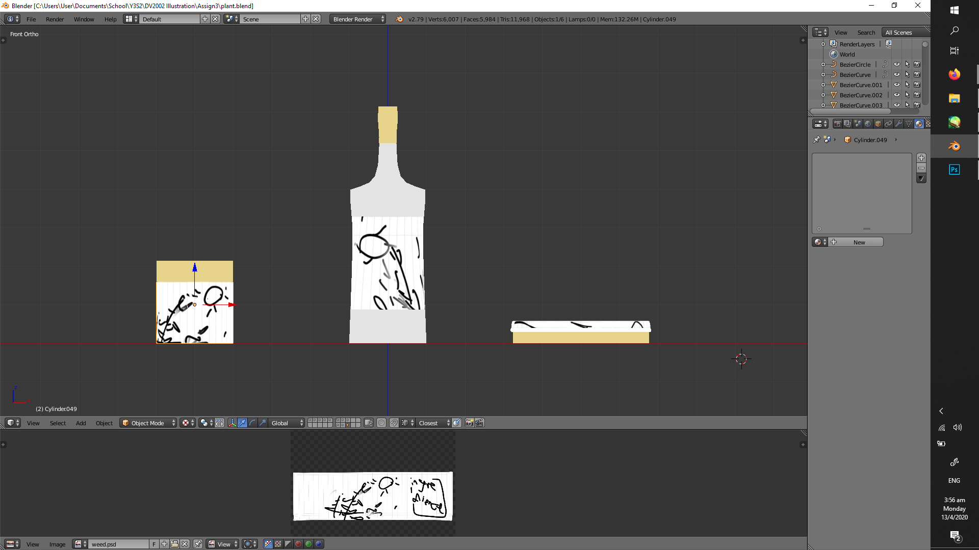
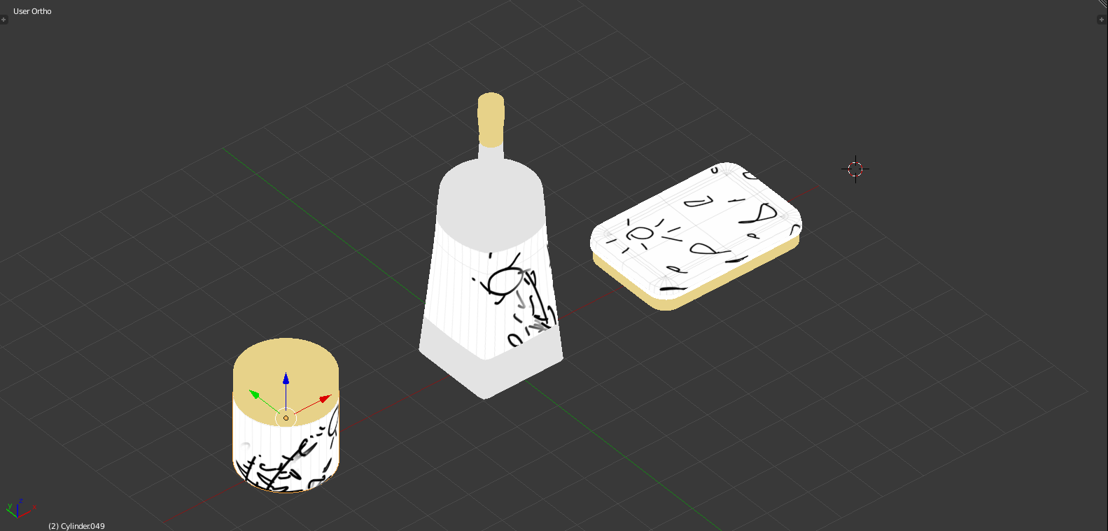
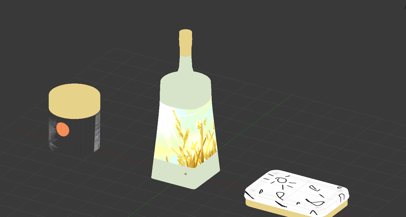
making models; i aim for variety of form, where life would be too boring otherwise
testing if the illustration will manifest properly on the models; i’ve previously made adjustments, where certain elements are too left/right to be seen on the front face
also checking if it’s alright from different angles; for example, the side of the bottle is woefully empty
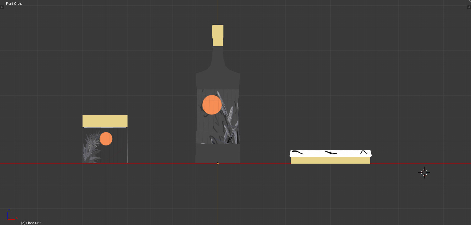
testing composition with the previous models
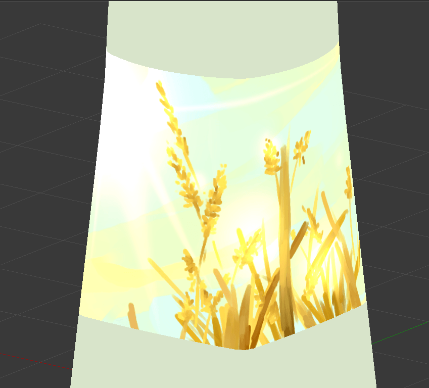
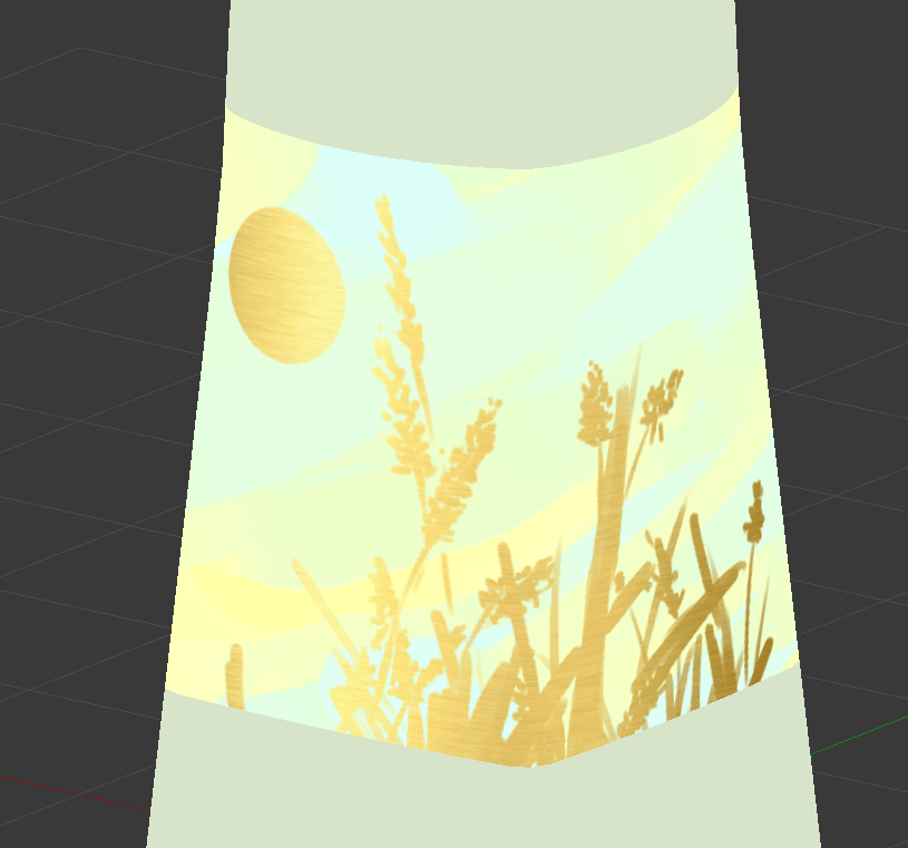
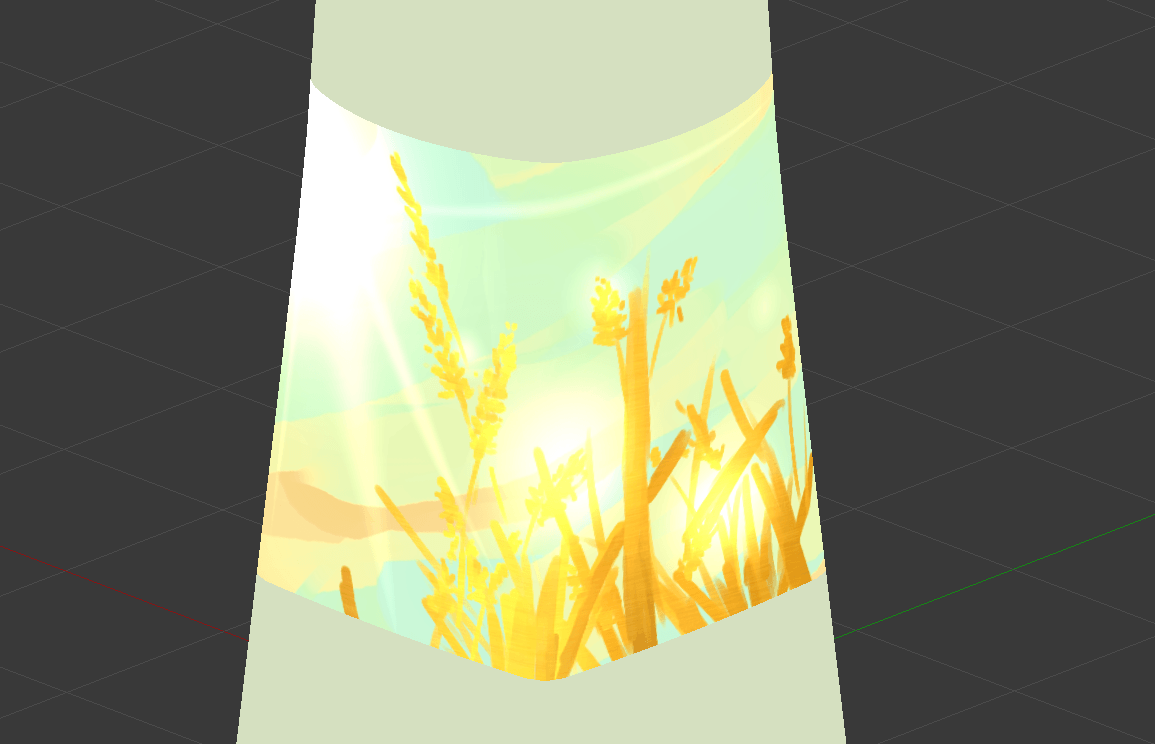
Based on recommendations by Lisa, I tried out using gold material, and glow effects. I’m leaning towards gold, though, where I’m too rusty (no pun intended) at drawing, so it’s too sketchy, impressionistic and painterly to be appropriate.
glow effect in SAI, of which i like the depth implied by colour, but doesn’t feel vibrant enough. and, my style is too painterly
metallic overlay, which feels rather nice, though a little flat. i don’t know how to actually render it, though, so i’ll fake it by using a clipping mask.
I don’t want to lose the shading of the painterly approach nor the radiance of the metallic approach, so maybe a mixture of both, hail clipping masks!
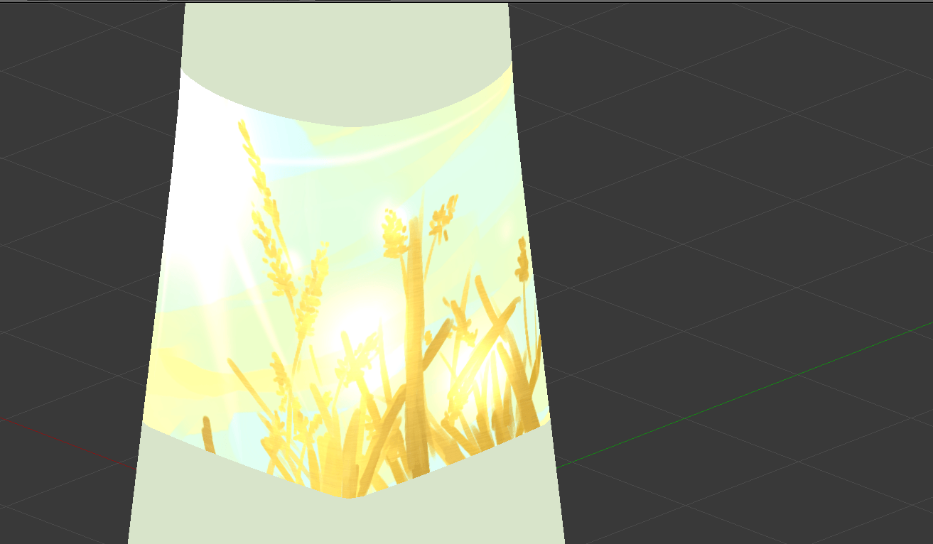
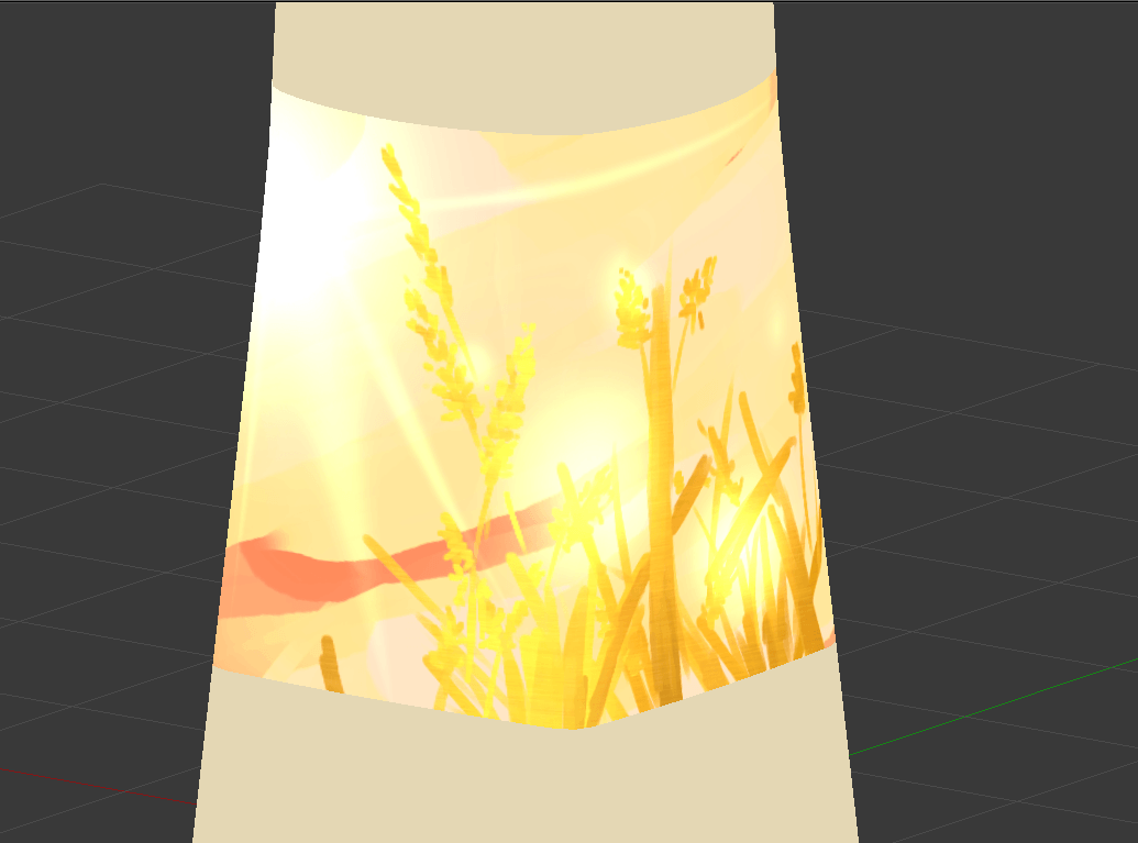
the previous versions feel too soft without enough warmth, so i think i need to increase the saturation? i feel like i need to do something more to the background
even less blue, even more orange
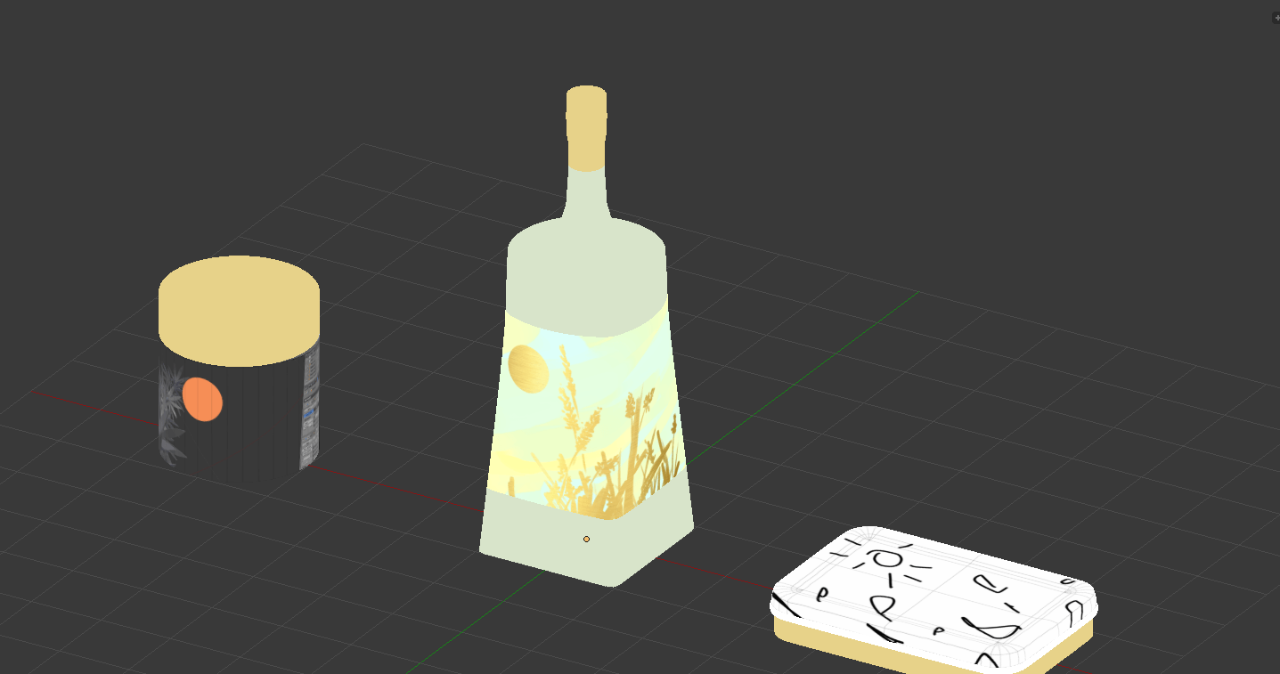
From here on out, what I’ll do is to 1) make an extensible background, 2) make the plants properly (see image directly below). Then the rest is just arranging the composition well, overlaying the metals and shadings, and adding any flavour text. Also, I need to deal with my 4th composition.
Rather than painting based on the 3D model, as I did in the previous examples, I realise that I can directly take the 3D model, use Magic Wand to pick out the shape, and overlay whatever colours and metals I want on it. This will allow me to avoid my lazy linework.
I briefly considered a direct render, but my models aren’t detailed enough to work well (and, i’m bad at lighting), so it’s in my best interests to use its silhouette. Also, semi-realism just feels wrong
Considerations for a gift box, the 4th composition holding it all