Author: EC Chee
a local peanut (◡‿◡ )
Personal Voice in Design
As a design student, the issue of art versus design never fails to manifest in every classroom. The typical claim is something like this: art is something less practical, more sublime; design is something more useful, more tangible. These kinds of dichotomies essentially point to a single idea: that art is inherently more self-centered than design.
More often than not, design and art collide in a way which makes that difference highly uncomfortable. After all, designers often have artistic tendencies. But design is also about catering to others, not yourself, and I’ve heard a lot of my classmates lamenting the inevitability of entering a workforce which doesn’t care about “their voice”.
It took me a long time to understand that such a concern, while legitimate, isn’t as disastrous as it may seem. Here’s my reasoning.
Selfishness and self-centeredness aren’t the same
I’ve been careful to state that art is inherently more self-centered, than more selfish. That’s because there is a substantial difference between the two. Selfishness is about being preoccupied with oneself in a way that may be detrimental to others. That’s certainly frowned upon in a design environment, where the experience of the audience is crucial. But it’s also not exactly welcome in an art scene, where an art piece which can’t resonate with its audience isn’t particularly powerful.
Self-centeredness, on the other hand, doesn’t include that necessity of being detrimental. As long as your personal voice doesn’t clash with whatever is required of the design, it’s entirely possible to harmonize the two in a way which supports your personal voice, while satisfying the requirements. For example, the game NieR:Automata (2017) heavily features its creator’s style of doom, gloom and despair. Even so, it’s been extremely successful, where people have enjoyed it very much. Designing something which the audience enjoys doesn’t need to conflict with designing something you enjoy.
I’d also like to mention two points which support the above statement:
1. You are inevitably connected to others
Unless you somehow live in a third-personal view, any and all of your actions will inevitably center on yourself. And that’s okay! Self-centeredness doesn’t mean that you concern yourself only with your wants and needs. After all, the self necessarily exists in relation to the outside world, like your friends and family, or certain issues.
As such, even if you don’t actively think about it, your concepts of what will work and what won’t is based on your knowledge of what’s going on around you. I’ve had plenty of classmates who didn’t need user tests to have a decent design, just because they were already able to anticipate issues that users might face. I’ve also had plenty of friends who’re extremely interested in the environment, and only make designs related to such a topic. By living in a first-personal view of an interconnected world, you’re already self-centered without being selfish.
2. Other people aren’t actively trying to deny you your individuality
This is easy to forget when there’s the constant assumption that the world’s out to break you and turn you into a mindless cog of capitalism, but the fact is this: most of your eventual clients, employers, coworkers, are going to be regular people. Even if they might be a little clumsy or confused, they’re highly unlikely to be actively trying to suppress you. I myself went for a design internship, and found that, really, no one had an issue with my preference for elegant styles. On the rare occasions that they did, they tried to help me find a compromise behind my style and what was needed, than completely shutting me down.
And that makes sense. Without each designer’s individual take, designs would be pretty homogenous. Even if there’s some kind of guideline to adhere to, I highly doubt that such lack of innovation would be universally welcome. Simply put, it’s highly unlikely that people are cruel enough to deny you your self-expression.
What does this mean for design, then?
While I’ve stated that being self-centered doesn’t mean you’re selfish, it doesn’t mean that the two are mutually exclusive. I would think that living without getting involved with other people and issues would certainly cause your self-centered existence to truly revolve nothing but yourself, and by extension, become selfishness.
But, really. Even as someone who tends towards extreme reclusion, I’ve never succeeded in isolating myself so perfectly that my work is completely incomprehensible to everyone else. And even I enjoy learning more about my gaming friends, my siblings, politics, philosophy, whatnot.
To end off, I don’t know how much this helps you, but I think you shouldn’t worry too much. There’s nothing wrong with your personal voice, and no one’s out to deny you of it.
[IDS] Assignment 3 Submission
Resume / Namecard / Cover Letter (must be logged in)
![[Creative Industry Report] ZUN & 東方Project](https://oss.adm.ntu.edu.sg/a170027/wp-content/uploads/sites/1810/2020/09/Screenshot_2020-09-17-Touhou-8-Imperishable-Night-Perfect-Lunatic-1cc-No-Miss-No-Bomb-No-Failed-Last-Spells32-825x510.jpg)
[Creative Industry Report] ZUN & 東方Project
A one-man show, ZUN has had only one project to date: the 東方Project (touhou) video game franchise. This may seem unremarkable, if it weren’t for that 1) this project has lasted 25 years, and 2) is still performing extremely well.

What I admire most is ZUN’s commitment to the doujin mindset. Though similar to indie (self-publishing), doujin is a broader term which encompasses the idea of “if you like it, then make it”, be it original or fan content. Combined with his interest in creating games “that only I can create”, this explains his style of doing everything himself, where he taught himself everything from programming to music composition. As someone living in a society which emphasises “efficiency” and “quality” by outsourcing work, it’s admirable to see the prioritisation of “self-expression” and “do-it-yourself”. That he is able to collaborate where necessary (as evidenced by action game collaborations with Twilight Frontier) also suggests that this doesn’t stem from a stubborn desire to do things his own way, further accentuating its notability.

This mindset also extends into liberal rules for fans, where ZUN allows freedom of creation. Unhindered by copyright concerns, the bulk of the Touhou franchise is thus supported by fan-made works, from music remixes and illustrations to manga and entire games. That is also incredibly admirable to me, where ZUN is unbothered by the idea of that Touhou is not strictly his, or that his fans might make “better” works than him, or that he’s losing potential revenue from not setting strong limitations. All he cares about is that he “just want[s] to make”. As someone who can be quite possessive of what I make, and someone who is prone to inferiority complexes, I greatly admire this self-assured approach to creating, and hope to someday internalise it.

(Quotes from ZUN as found in this article.)
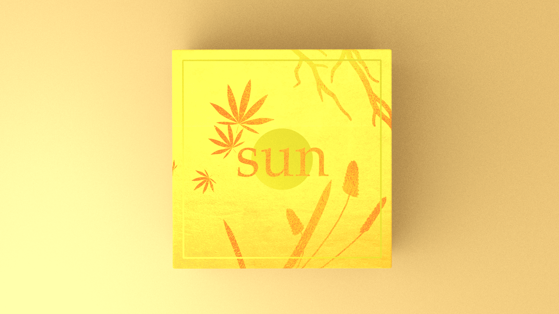
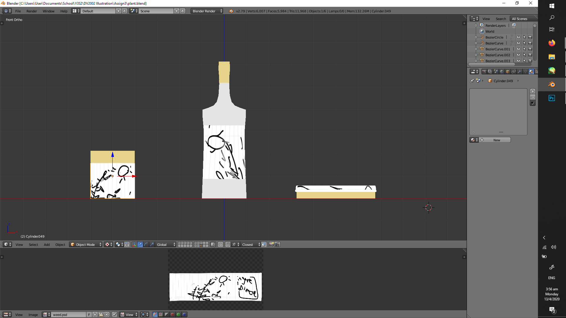
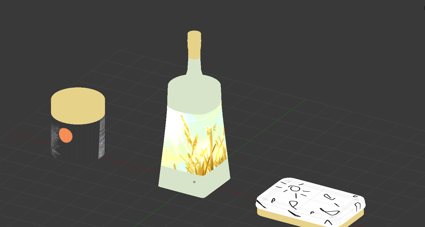
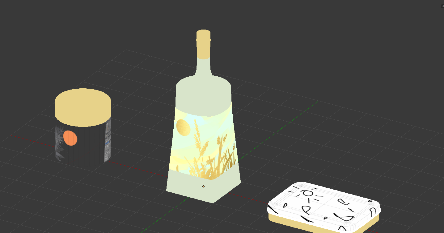
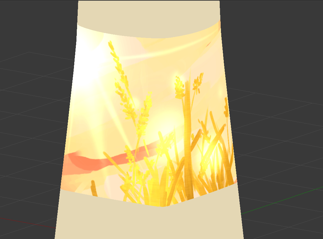
![[W13IfD] Final, and a little more process](https://oss.adm.ntu.edu.sg/a170027/wp-content/uploads/sites/1810/2020/04/render02-min-825x510.png)
[W13IfD] Final, and a little more process
FINAL APPLIED ILLUSTRATIONS

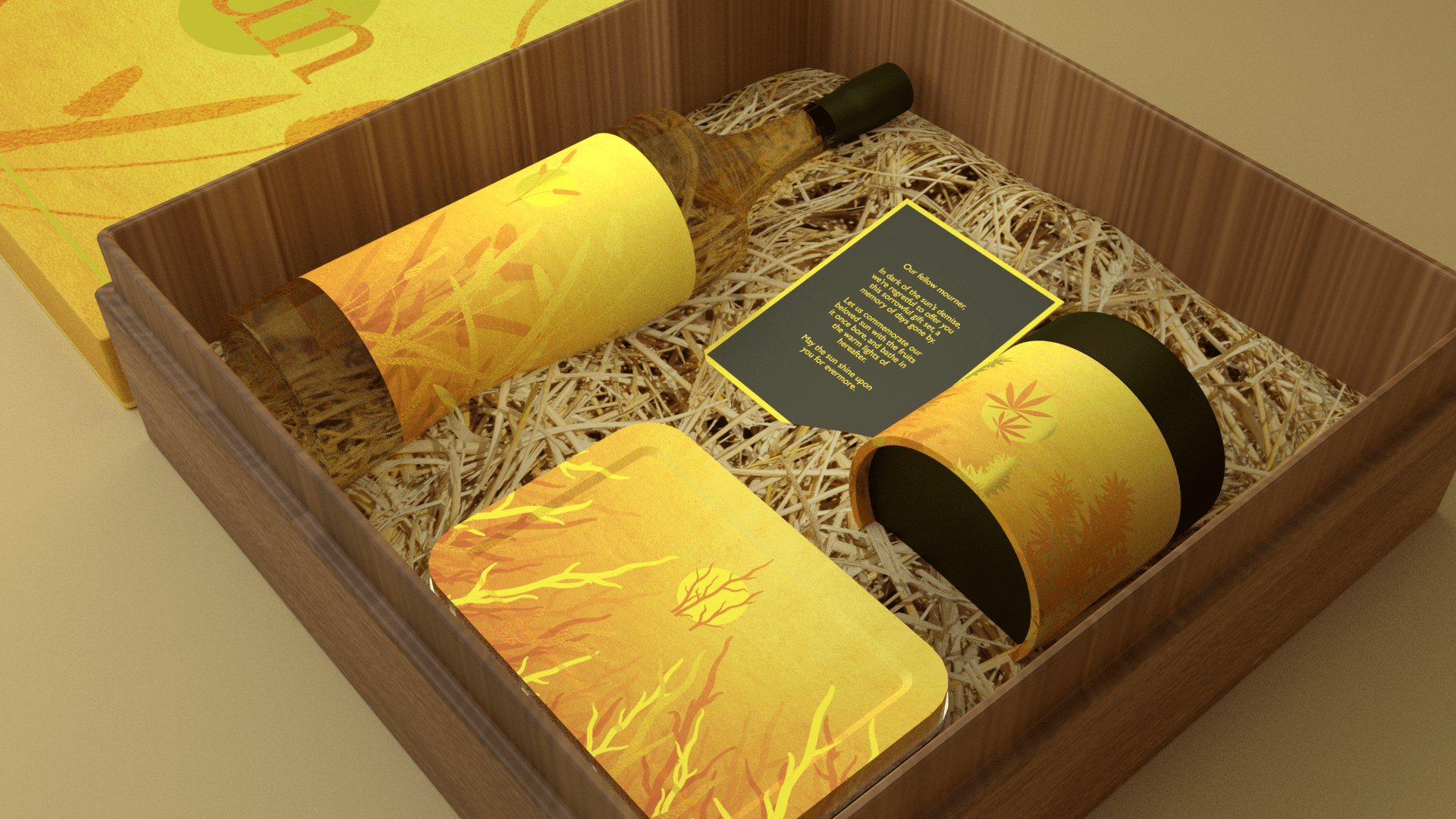


A low-fi turnaround to get a sense of the gold, where proper rendering takes insane amounts of time which I won’t bother with:
A LITTLE SUMMARY TO REFRESH
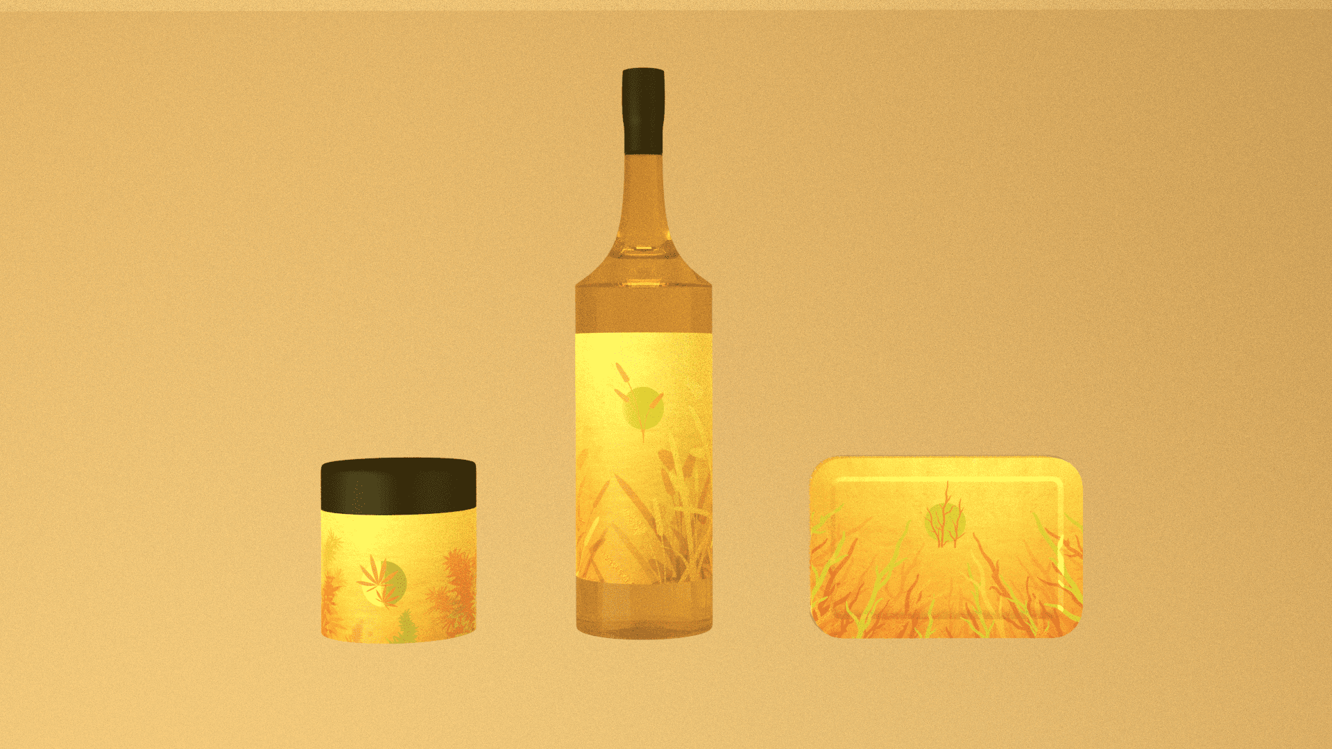
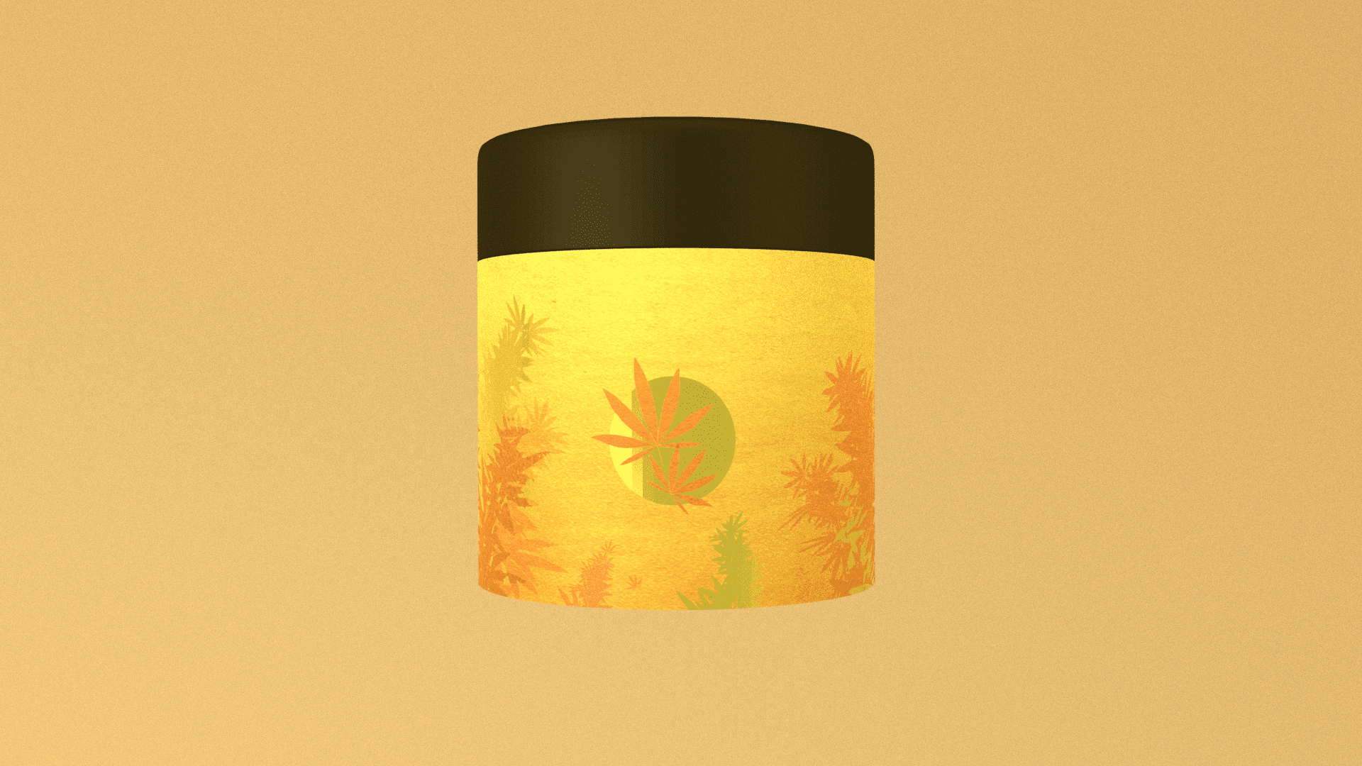
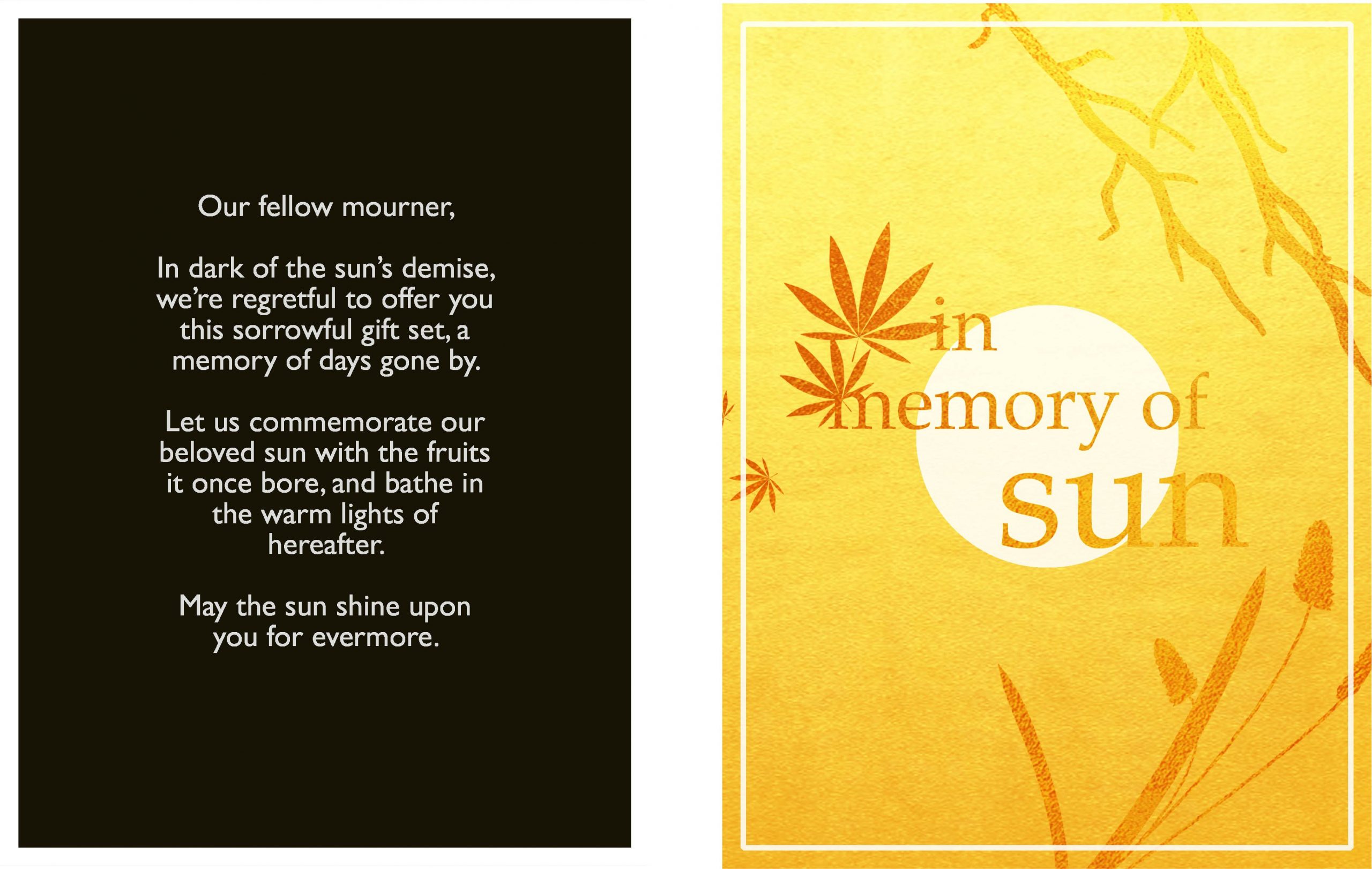
In Memory of Sun, otherwise known as the sun is dead, time to drink, smoke weed, and die. To mourn the sun, a wistful gift box of commemoration.
Have some alcohol decorated with the forlorn memory of when we used to have fermented grain mash; weed, with the plaintive memory of when cannabis still grew; immolation kit, with the distant memory of when tinder was abundant.
A LITTLE MORE PROCESS
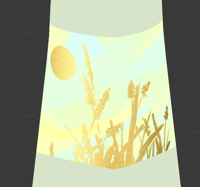
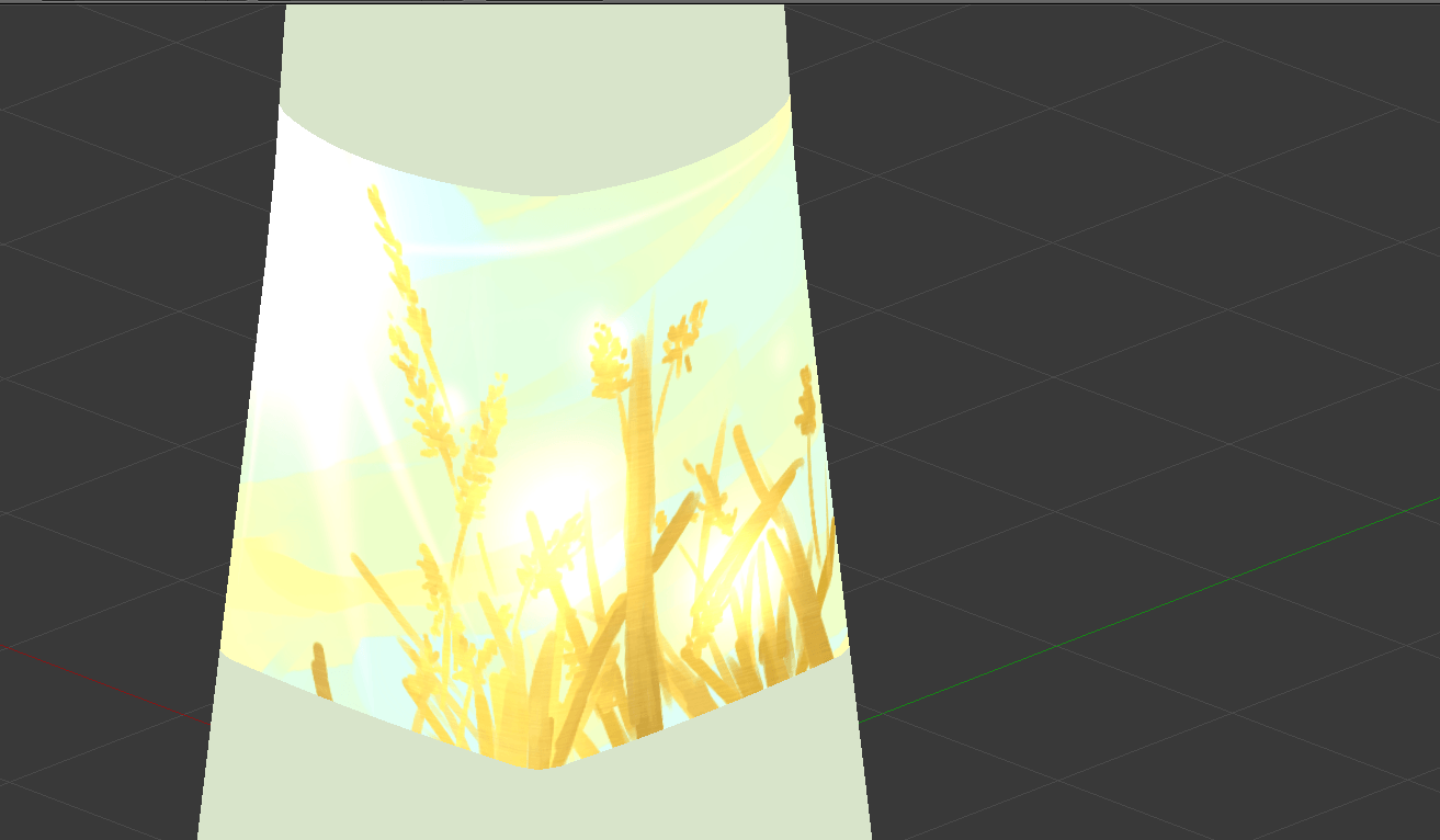
Following from previous week, I tried to use free mockups. As suspected, though, it was really hard, where mockups are flat images (which have really weird texture breaking for non-flat surfaces. Also, they don’t have 360° to show off the entire illustration. So, original models it is!
White means transparent, which means gold is overlaid:


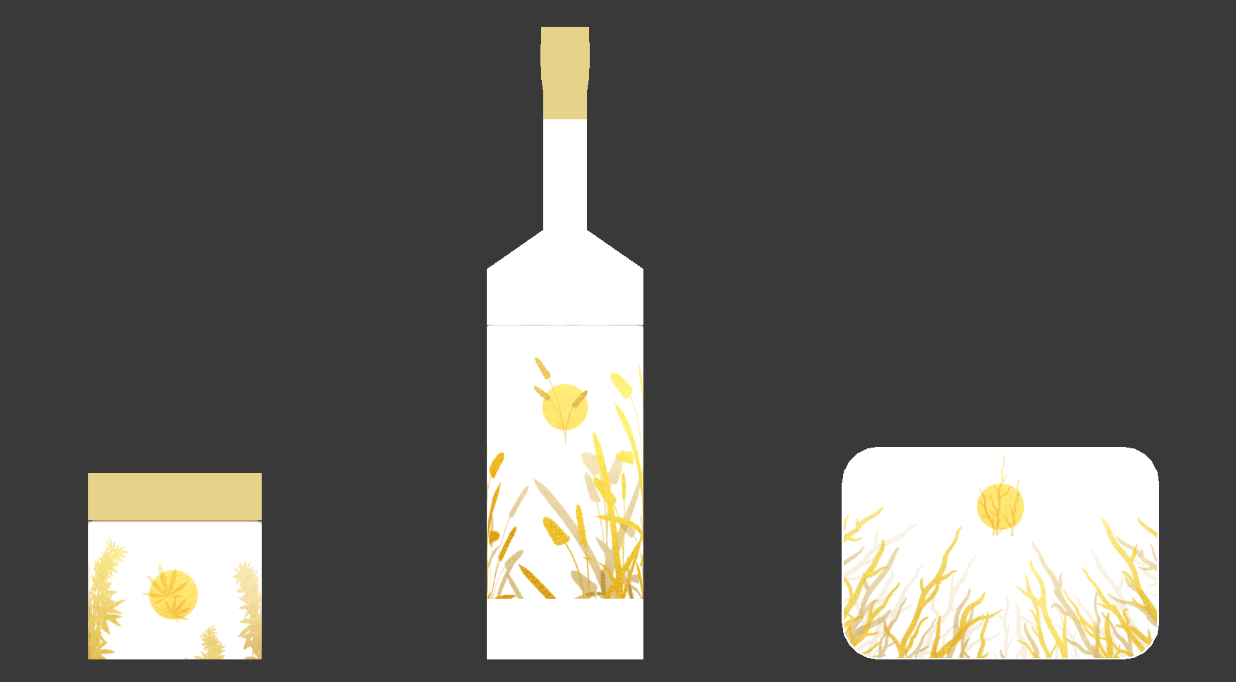

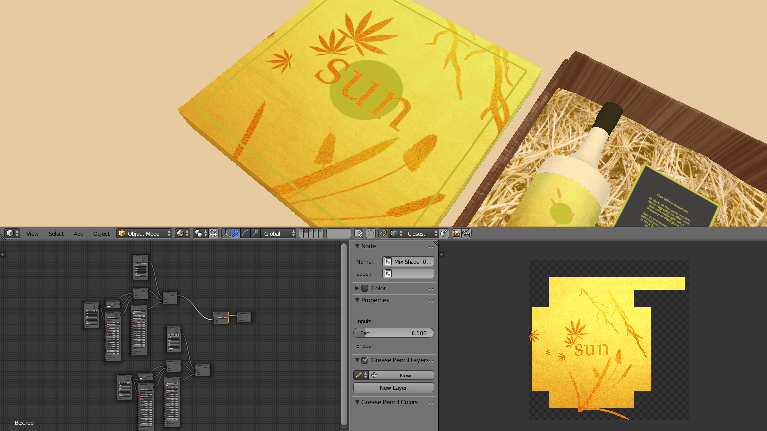
Incidentally, each piece is just a collage of, like, 3 models, of which I grabbed different angles for a pretense of variety, then magic wand.


Something I’d have liked to do, but eventually deemed pretty not-important-enough, is seamless illustration for the cylindrical ones.
![[GD] Dev Log, alternatively known as the suffering of a century. also, an endings guide](https://oss.adm.ntu.edu.sg/a170027/wp-content/uploads/sites/1810/2020/04/Screenshot-203-825x510.png)
[GD] Dev Log, alternatively known as the suffering of a century. also, an endings guide
You can click to scroll to the endings guide, and of course it has spoilers
Week 13
- Recompiled entire project, and when I say recompile, I mean make a brand new project and slowly drag in things from the old project while trying to avoid compile errors, because my old project became unsalvageable from the mess
- Created .yarn dialogue files… Many of them…
- Included Destroy and Instantiate of GameObjects to change out dialogue files… Because I didn’t know how to… Replace the dialogue files via script directly…
- Provided hints on surroundings, what to expect, what might be needed, etc
- Provided pathway to some endings through dialogue
- Projected my paranoia 2k20 of what people want to say to me
- Connected Yarn Spinner to gameplay
- Created command to destroy bugs once they’re done (assumes a certain sequence, but no one has been able to sequence break yet, so shouldn’t lead to any game breaking?)
- Derived player jump capabilities, and a hidden counter for a certain ending from Yarn Spinner dialogue progressions, with bugs and NPCs respectively
- Removed namespaces. Not very significant, but significant to me, because that was really troublesome.
- Connected the ending scenes to the game scene
- Created a click-based mechanism for a certain segment, looks very like you could break the game, but by some miracle it doesn’t happen
- Aesthetic things
- Included some sounds and music
- Touched up sprites slightly, made a few new sprites
- Adjusted sizes and fonts of dialogue and UI things
- Adjusted difficulty again, in terms of difficult of platforming (i.e. easier)
- Gave up on certain bugs lmao, visually annoying but theoretically harmless, and tragically appropriate
Week 12
- Added Yarn Spinner for dialogue management
- Recompiled entire project to fit Yarn Spinner systems, which includes… Everything…. Bugs, portals, resetting, endings… Basically, it was like redoing the entire project from scratch, and trying to copy-paste whatever I thought could be reused
- Fixed the levels a bit more, again for less frustration, less sequence-breaking
- Fixed the “R” prompt, where it previously didn’t cover all the space it should have
- Created the 3 endings, and no spoilers, but it included new systems of input, new animations, new option-based dialogues, new variables….
Week 11
- Finished the remaining level designs for Forest & Field
- Adjusted levels slightly for slightly less frustration and slightly more sequence-breaking nullification
- Fixed bugs related to getting stuck in between platforms; you can now only pass through platforms which are 1 unit in height
- Added Debug.Log, which shows the current state of your jumping abilities
- Added error message which activates when attempting to use a function which hasn’t been unlocked
- Adjusted “R” prompt; now also plays an error message, and returns you to a “last checkpoint” than “last accessed portal”
Week 10
- Fixed dialogue and dialogue trigger issues; it now collides properly, disappears properly, and plays properly
- Removed unnecessary portals and added “R” prompt; whenever you press it, you are returned to the last portal you came through
- Added levels for Field
- Switched levels to tile sets from sprites
- Added preliminary sprites for interactive items
- Added a cheat code, just for fun; if you figure it out, you get the debug controls
Week 09
- Created basics of game, from player to dialogue
- Allowed for variations in jumping capabilities through key pressing, in anticipation of allowing it to occur through bug fixing
Things I Should Have Done But Never Got To Doing
- The bugs auto-going into your inventory than having to pick up, as long as you’re close enough
- Animations, to drive home the difference between the player as a literally square while everyone else is animated
- Allowing dialogue progression with Z key than left mouse
- Sizing, where the UI goes bonkers when it’s not full-screen
How to get different endings
There are 3 endings in total, corresponding to 3 potential responses to bugginess (i.e. being insufficient, flawed).
ENDING A: MY ETERNITY
Ending A is triggered by a hidden counter, countSadness. This is alluded to by Tomato, who mentions the flute as an indicator of your negative feelings. You can increase or decrease the counter through dialogues with NPCs, though there’s no fixed pattern as to who increases/decreases it. In fact, it might be possible for someone to decrease it, then later increase it for you.

As a general guide, whether it increases, decreases, or has no impact, depends on what the NPC tells you (i.e. if they’re supportive, degrading, or neutral).
The meaning of this ending is to give up; resorting to self-harm when you’re faced with bugs and insufficiency. My Eternity of falling to shame, self-degradation, suffering and tears.
(The next two endings actually need a map reference, so)


ENDING B: VILLAGE LIFE
Ending B is triggered by collecting all 7 ordinary bugs, and speaking to Daisy. In other words, the default ending which you’d probably aim for from the start. Most bugs are fairly easy to access, with some areas being significantly harder, or straight up impossible if you try to sequence break. Some NPCs will thus advise you not to do certain things yet, or the like.


The meaning of this ending is to face your problems; if you’re plagued by bugs and insufficiency, work to get rid of them. A Village Life that you’ve rightfully earned, with acceptance by everyone else.
Ending C: ASCENSION
Ending C is triggered by reaching the top of the Axis, which necessitates that you collect the gold bugs (it is narrowly possible to do without Midair Control+, but the rest are crucial). A sort of secret ending, where only Clover and Crysanthemum allude to this possibility. Basically, why fix bugs when you can just become a bug yourself? And, maybe eat(?) your friends while you’re at it.


The meaning of this ending is to rise above and manipulate instead; use your bugs and insufficiency to your advantage, and break away from the norm. Ascension to a higher plane of existence, beyond the ordinary.
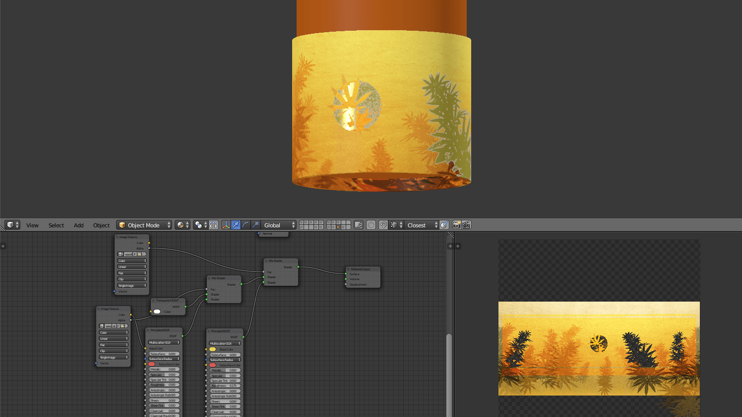
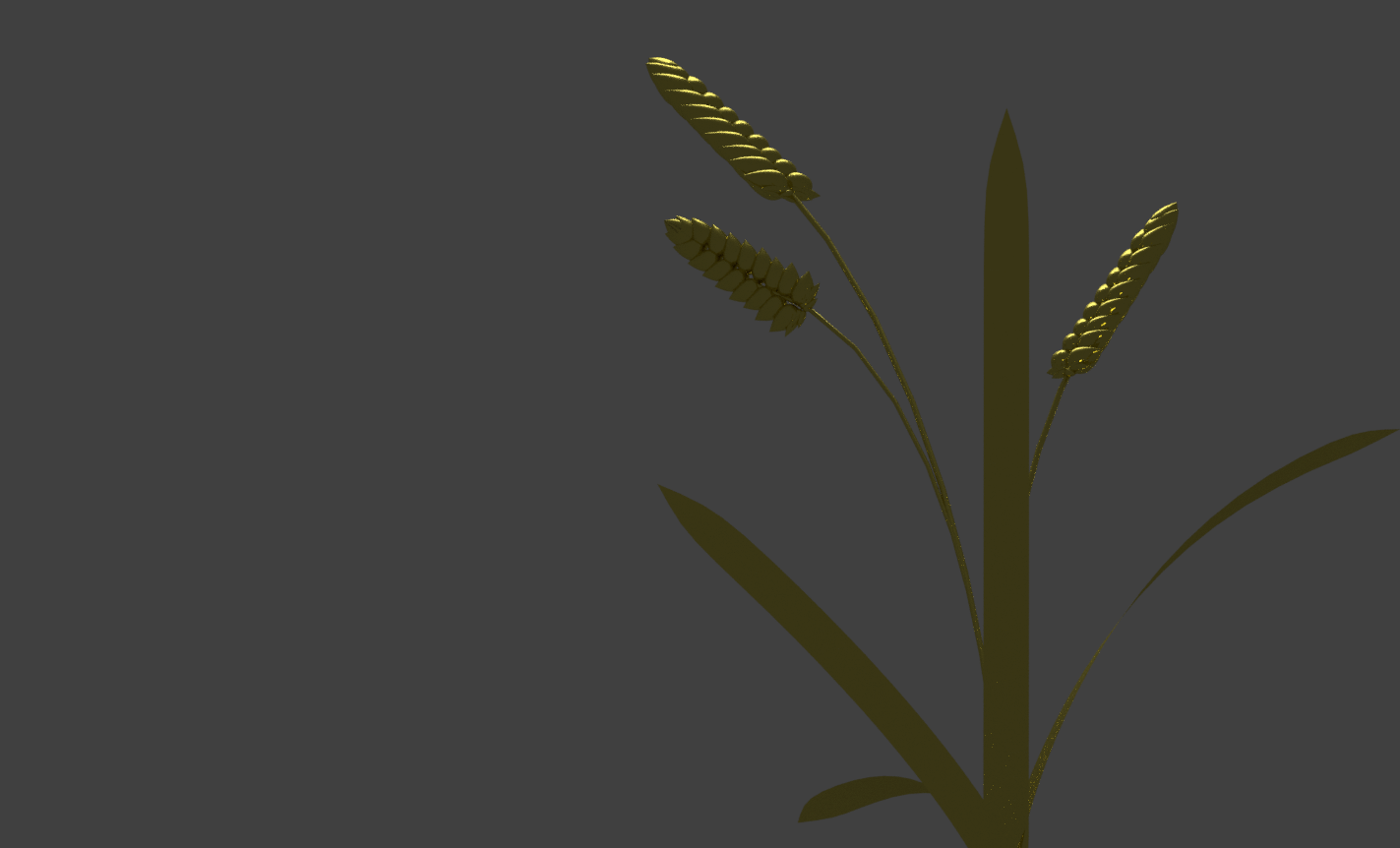
![[W12IfD] i cannot visualise to save my life,](https://oss.adm.ntu.edu.sg/a170027/wp-content/uploads/sites/1810/2020/04/Screenshot-178-1-825x510.png)
[W12IfD] i cannot visualise to save my life,
and thus, I’m using 3D models as a base again. I’d like to thank past me for having the foresight to teach myself this skill.


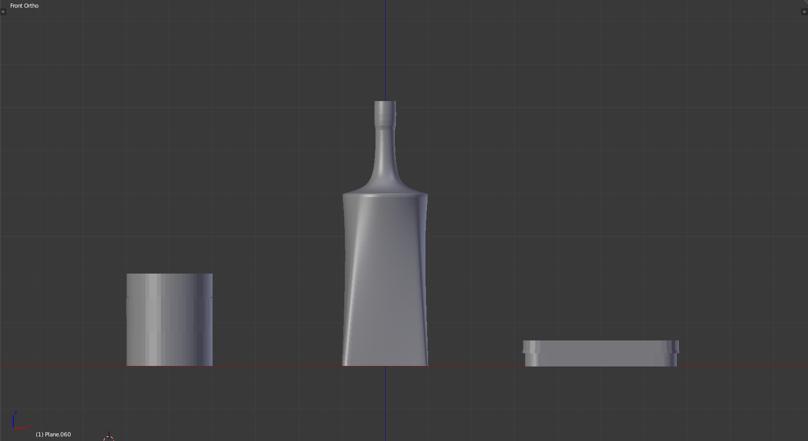
I also happen to find that free mockups are kind of… difficult.. to work with, because the sizing never turns out right (and the lag is atrocious), so I tried making models and unwrapping the textures myself. Also, this means I get more control over what shapes and sizes the labels are.
(Regardless, I may resort to free mockups eventually, where this is incredibly excessive.)
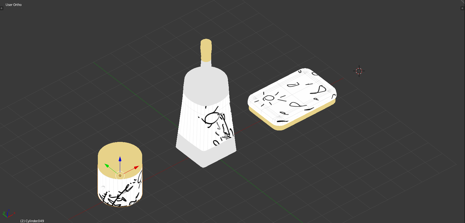
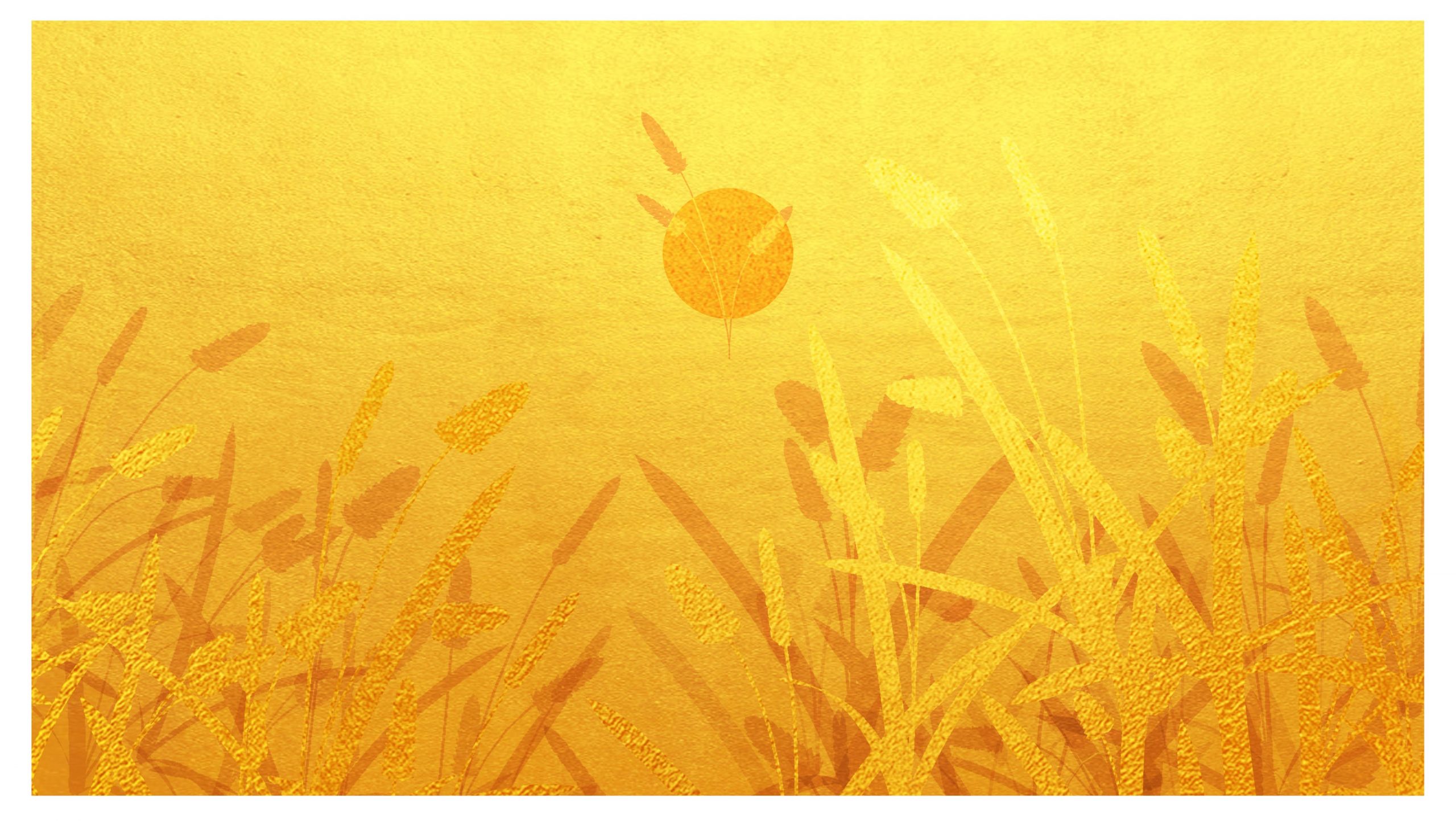
Based on recommendations by Lisa, I tried out using gold material, and glow effects. I’m leaning towards gold, though, where I’m too rusty (no pun intended) at drawing, so it’s too sketchy, impressionistic and painterly to be appropriate.
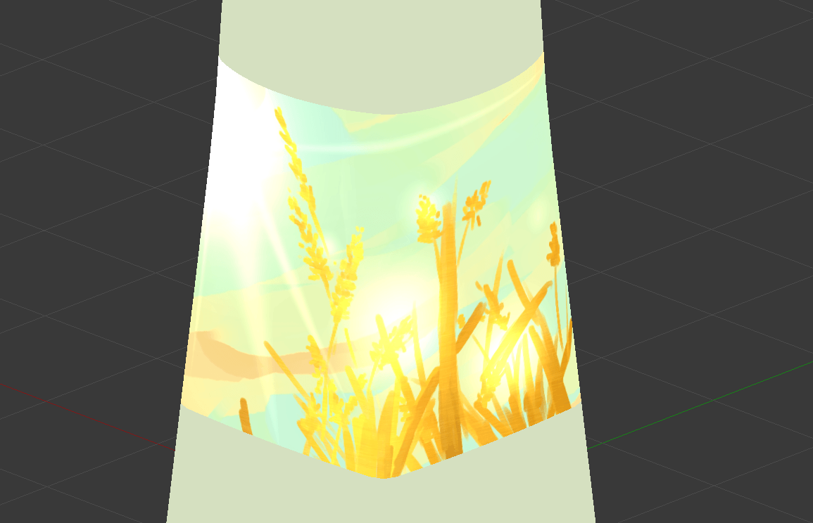
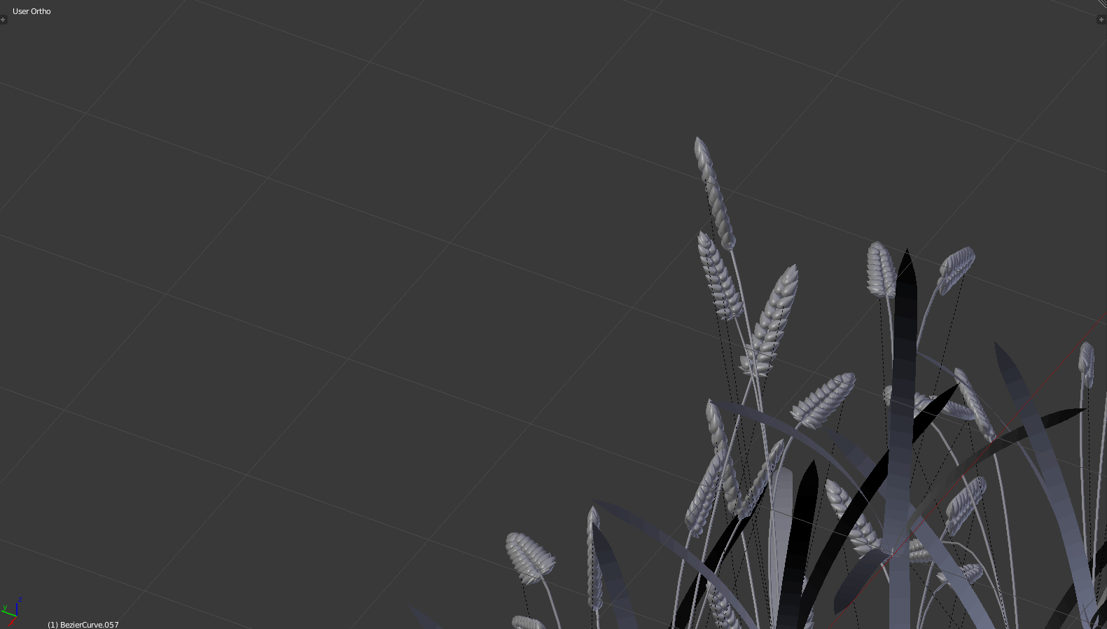
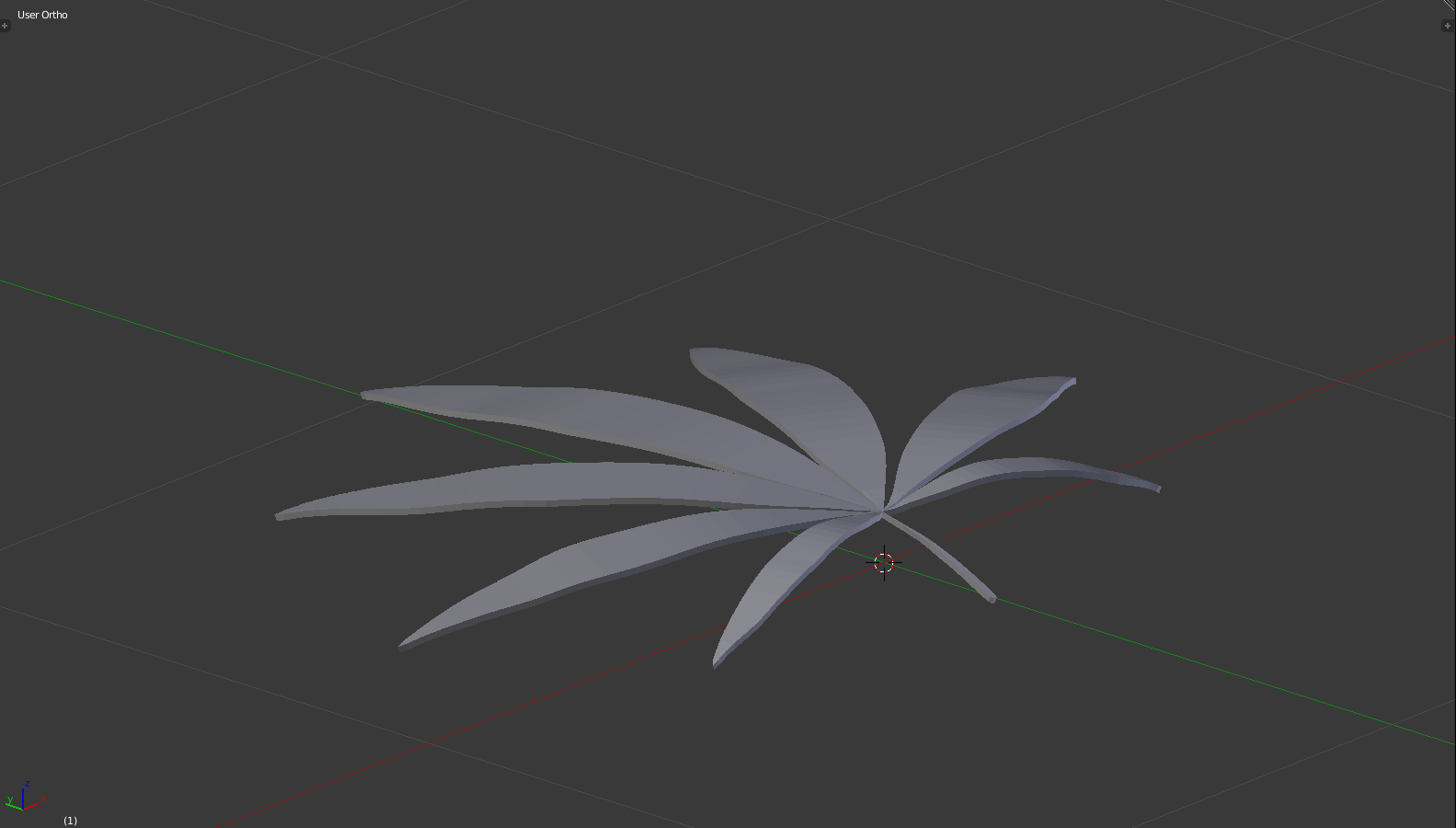
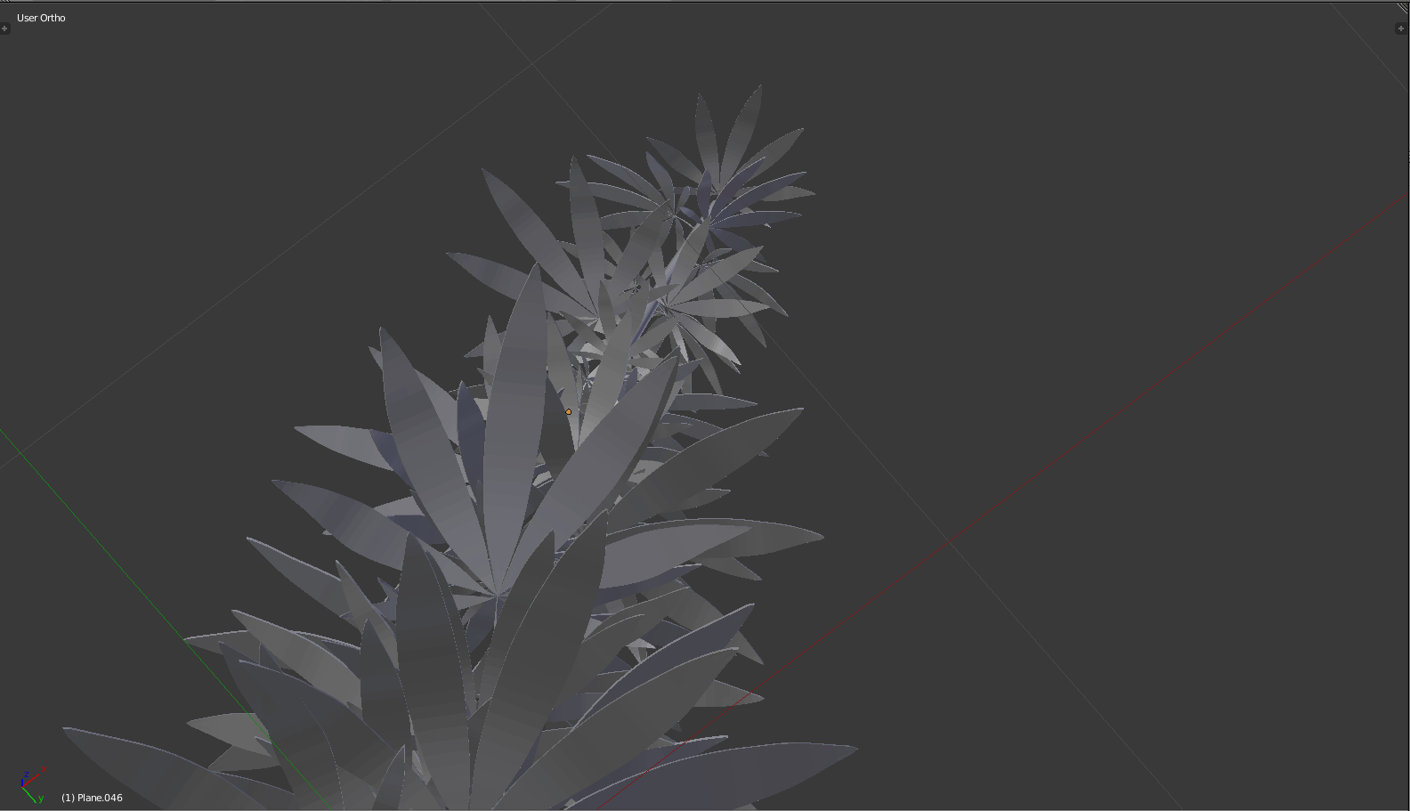
From here on out, what I’ll do is to 1) make an extensible background, 2) make the plants properly (see image directly below). Then the rest is just arranging the composition well, overlaying the metals and shadings, and adding any flavour text. Also, I need to deal with my 4th composition.


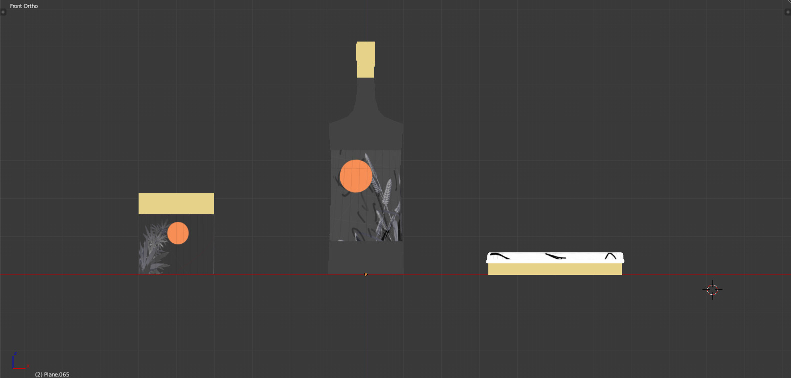
![[W11IfD] creating a starting point](https://oss.adm.ntu.edu.sg/a170027/wp-content/uploads/sites/1810/2020/04/moodboard-2-825x510.jpg)
[W11IfD] creating a starting point
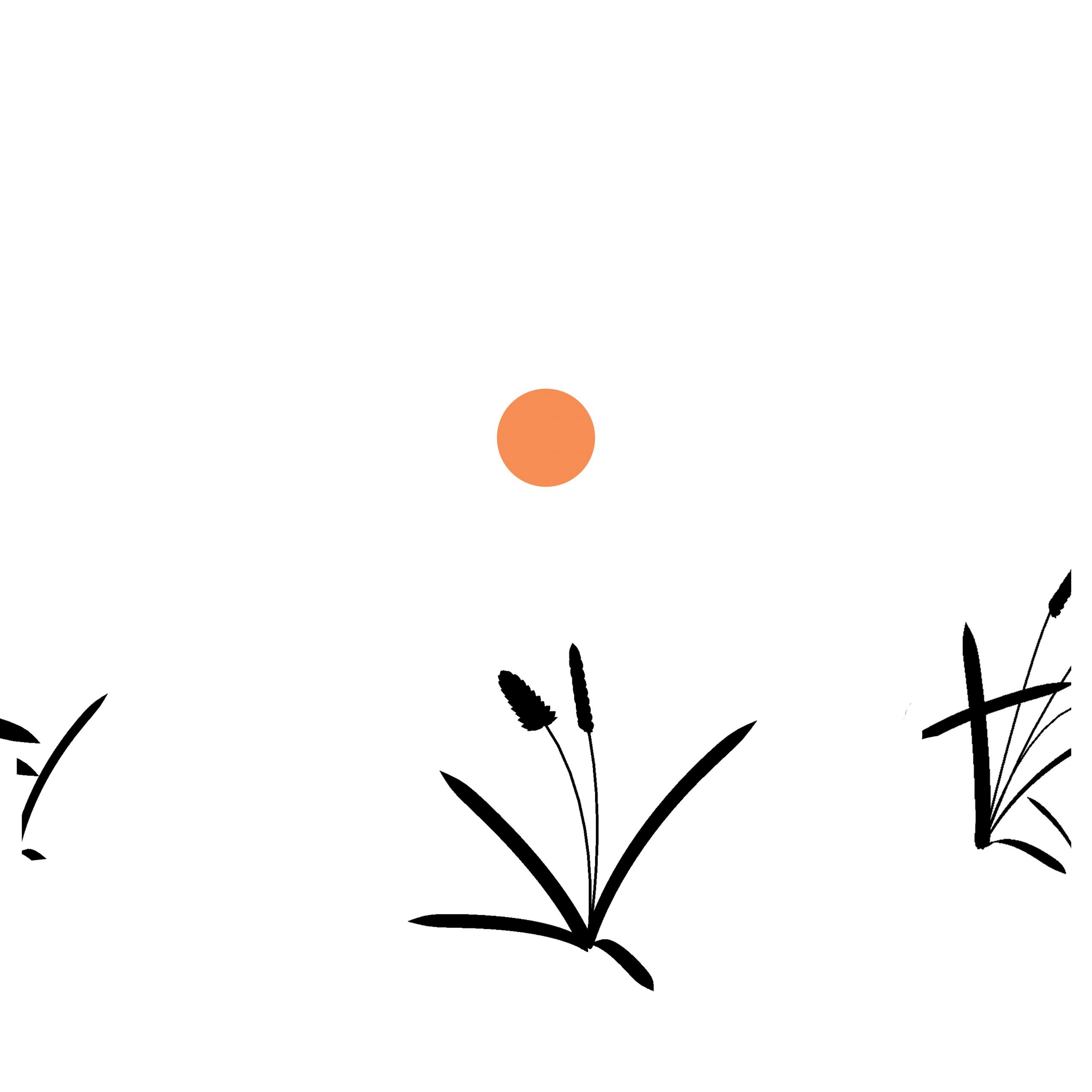
Bright illustrations in a dark world; that kind of contrast would surely be heart-wrenching. In Memory of Sun is the overarching theme, with a tagline which may or may not be the sun is dead, time to smoke weed, get drunk, and die.

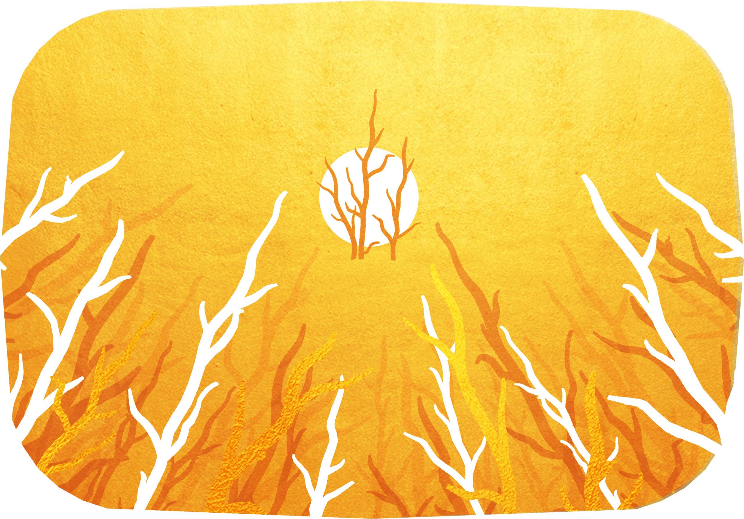
The illustrations would thus, obviously (?), be for things like 1. weed packages, 2. alcohol bottles, and 3. self-immolation kits. Parts of a gift hamper for the anniversary of the sun’s death, for you to go out with style! At your own discretion, than hypothermia or oxygen deprivation!
Establishing the tone
One of the things I used to get started was experimenting with the colours, through a 10 minute digital painting exercise. What I’ve concluded is that I think the first works best, where the warm, analogous colours are much better at providing a sense of harmony and softness.

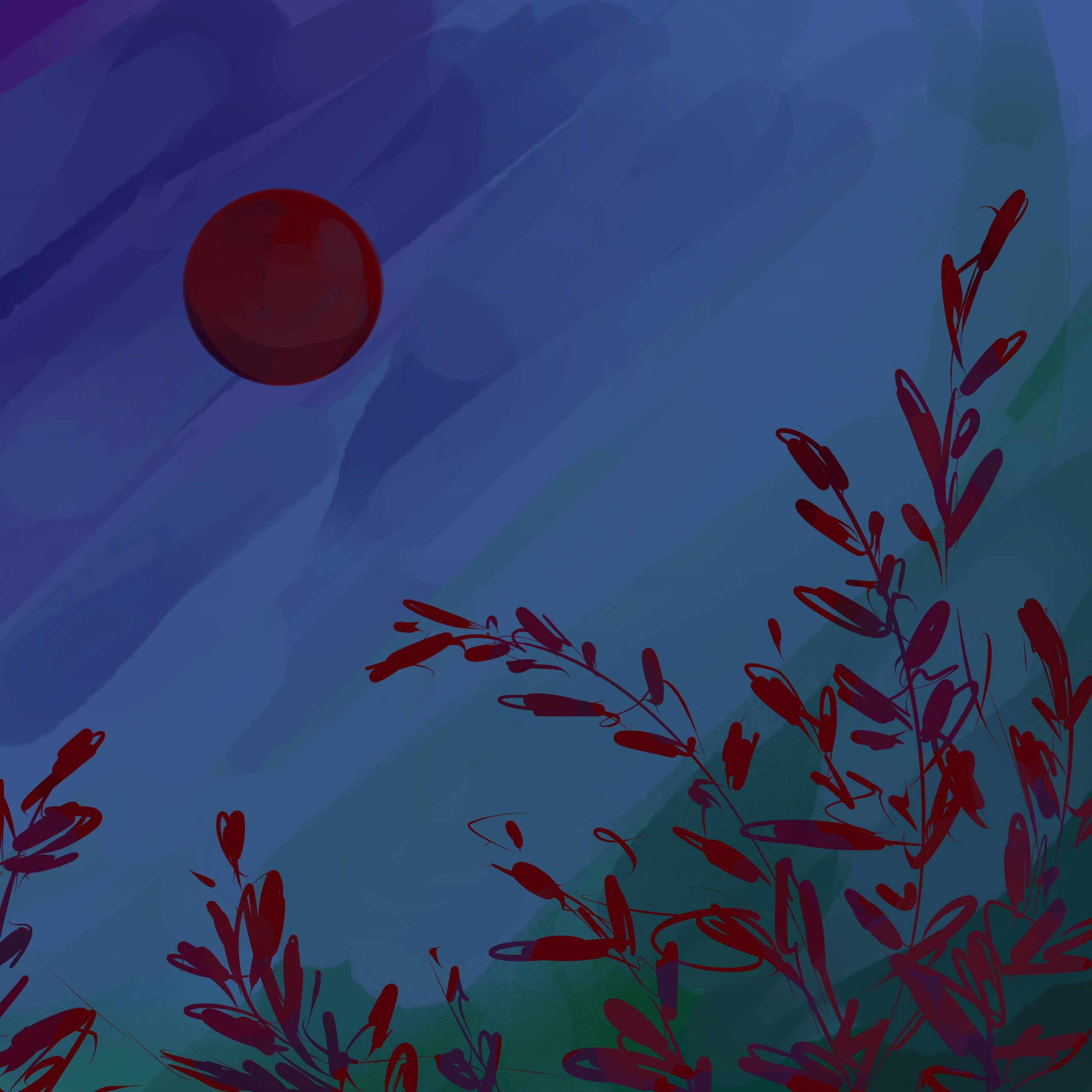

In other words, if you’re already living in a dark world, I feel like the first would make you feel most crushed. After all, your environment already serves as a high contrast to the illustration: there’s no need to actively incorporate it into the image.
User personas
Here are user personas to express what I mean. Incidentally, I’ve realised that things like trait spectrums are useless for my understanding, so I’ve neglected that entirely. Instead, I focused on “how the death of the sun has affected them” (Ironically, I’m seeing a lot of Anna-like behaviour amongst NTU students right now.)
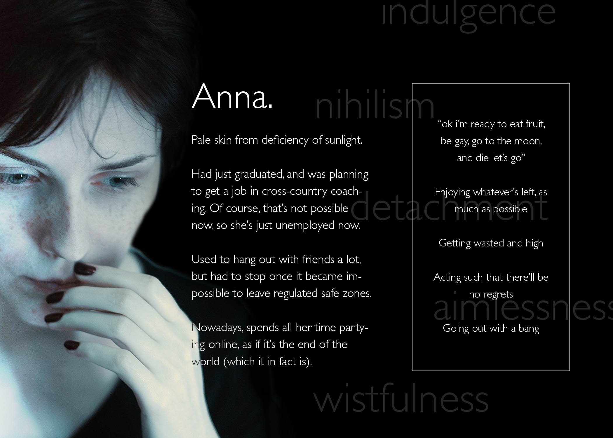

This means that I can go all out on creating a memorial of the sun which is fully focused on its wistful past glory, its overwhelming yet gentle radiance:

Two drafts for illustrations
To get visual continuity, I considered what Lisa mentioned in class, about extensibility. As such, I looked into similarities and differences between each item, to get an idea of what I can differentiate or not. For me, this similar factor was the fact that they’re all derived from organic plant matter:

This is exacerbated by that plants rely heavily on the sun for sustenance, so it ties in pretty nicely, that these products of the sun will similarly go extinct.
As also implied above, I did some research into the relevant forms.
For the 3 items, I learned a surprising amount about variations in weed and alcohol package shapes. I actively tried to choose 3 shapes which would be markedly different, i.e. a rectangular than cylindrical alcohol bottle, and a stout than elongated weed container.
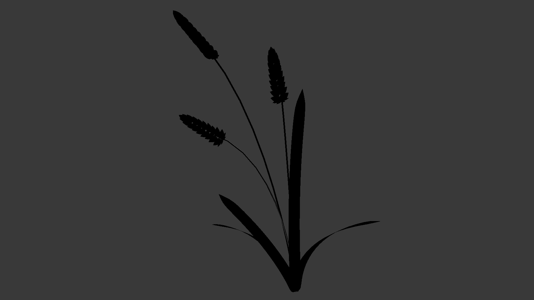
For the plants, I searched up how they grow; it may or may not be evident that I have a much clearer idea of the forms of grain, than the forms of weed. I struggled a little with tinder, since tinder is an umbrella term which can consist anything from tree bark and fibers, to dry leaves and seeds. Thus, I picked whatever would be the most visually intriguing / easiest to fit into the extensible template.
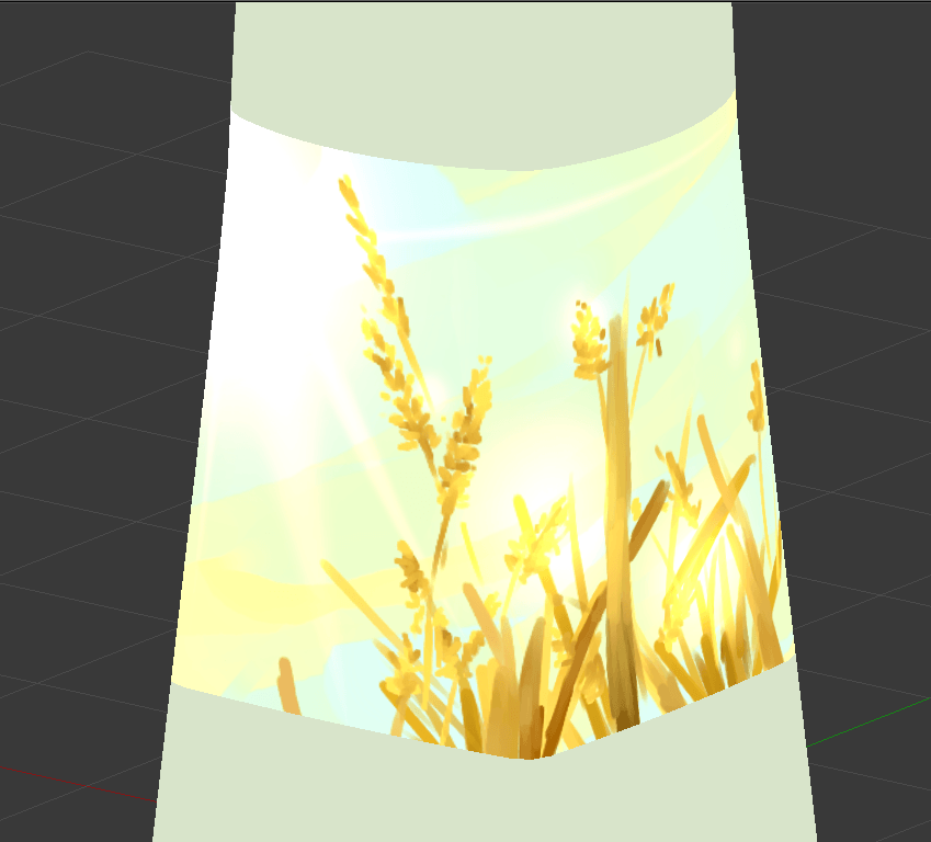
The first draft
This one is basically of scenes of the relevant plants with the sun. While my initial thought was of just a scene, I later considered a down-up perspective, since it conveys the idea of growing “towards the sun”, than just a side view.
It’s easy to apply to grains and cannabis. It’s a little harder to apply to tinder, where I don’t think it’s apt to include the entire tree: after all, trees are visually dense, and has multiple components like wood and leaves, all of which can have different meanings.
As such, I tried focusing only on dried leaves, as can be seen:

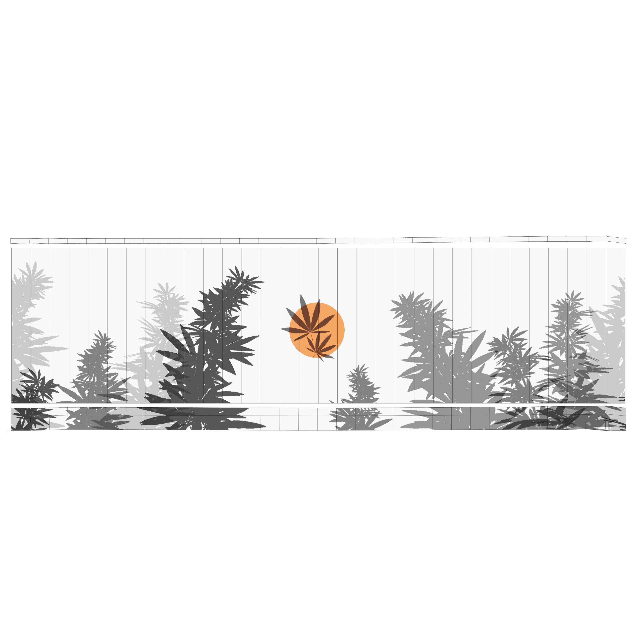
The weakness of this, in my opinion, is that the sun takes a very minor role in the composition. It’s kind of like how the sun is used as a contrast to the main object in stereotypical Asian–styled illustrations. Which is a style I do enjoy, but which may not be apt, where the sun should probably be the focus.
Ways to keep this composition while emphasising the role of the sun might be things like a) dyeing everything in orange hues, b) increasing lens flare, or even just c) exaggerating the size of the sun.
The second draft
This one tries to tackle the issue of the first draft, where the sun becomes a focal point. I notice that depictions which properly capture the sun’s radiance often focuses on negative space, such that the sun itself is empty space: instead, it’s the presence of darkness around it which makes it shine.
The plants are thus used only to fill surrounding space, and honestly I was thinking of tamago kake gohan when I made this:

What I don’t like about this version, though, is that it doesn’t make use of the forms of the plants. That works for tinder, where wood is flat anyway, but it feels sad to not see stalks of grain, or cannabis extending towards the sky. That makes it kind of boring.
The biggest issue
In both cases, I think the biggest problem is that I don’t really know how to render the sun’s radiance. After all, that kind of asymmetrical glare seems easier to capture in photography, or a painterly style? And, without it, I don’t think I could get the kind of brilliance and softness that I want?
The closest I’m seeing is something like this, but even this feels kind of, too clean.
Some stuff i used
![[W11IE] well, it’s week 12.](https://oss.adm.ntu.edu.sg/a170027/wp-content/uploads/sites/1810/2020/04/200331-4-825x510.jpg)
[W11IE] well, it’s week 12.
Other than the fact that I’m facing crippling mental issues, I can’t find a way to make my midterm concept adequately translate into a final piece. It’s impossible to make even a preliminary prototype, and, it’s already week 12, meaning it’s far too late to start from scratch.
In other words, I have nothing of substance.
I’ll just spend my remaining time looking at something which I thought of, after hearing Bryan and Merlin’s comments in week 11. The gist of what they said was that whatever I previously had wasn’t interactive and thus wasn’t particularly interesting, and that it was too convoluted to be viable even as a proto-proto-prototype, but the idea of an overlay on reality is interesting, especially if there’s a distinction between real-life graphics and not. (similar to what Prof. Elke showed previously)
Don’t ask me how I came to this conclusion, but yeah, my conclusion was to try out chat integration into live streaming.

My midterm concept was about entering another person’s perspective, where you get to view the combination of their inner and outer world, i.e. their thoughts and what they’re perceiving. So, this is like a really weird offshoot which may or may not be related, since you can type out what you’re thinking. Where those words get applied to the live stream, it’s like seeing your inner thoughts overlaid onto the perceived world.
Seems like it would work pretty well with all of us being stuck at home, anyway.
I’m aware that what you type doesn’t necessarily correspond to what you actually think, and I’m also aware that I will never be able to reach a particularly high level of ability to conjure items. I’m also aware that I don’t know enough about Python, the relevant programming language which works for this stuff, to do much.
Basically, I’m going in blind, and just taking this time to learn something interesting, because I know I can’t come up with anything substantial for the final assignment. For convenience’s sake I’ll start from Twitch, which already has a strong support for this kind of thing. I’ll shift to Youtube for the sake of accessibility, if and only if it turns out that Youtube does have that same level of support. Here’s what I’ll have to do:
- Make a list of at least 5 keywords (and synonyms/related words),
- Get some images related to those words,
- Learn how to use the relevant softwares, to
- Tie it into a stream,
- Create image overlays onto a live stream,
- Make them activate when certain chat commands are given
- Work with any possible bugs, like spam and/or multiple simultaneous commands
- That’s about it, really? The final presentation will just be something like everyone tuning in to the same live stream, and typing in chat, probably.
An example of me learning how to do this with StreamLabs OBS (thanks, tutorial).
An example of me learning how to do this solely in chat with chatbots (thanks, Fossabot):
other relevant things
A potential list of keywords:
- [Keyword]: [related terms which will cause the same effect]
- Food: hungry, hunger, lunch, dinner, breakfast, eaten, eat, ate, snack, rice, chicken, tidbit, tidbits, etc.
- Sleep: sleepy, sleeping, bed, tired, exhausted, insomnia, nap, pillow, blanket, sofa, couch, night, moon, stars, dark
- Covid19: covid, coronavirus, pandemic, lockdown, stay at home, inside, home, school, online, blackboard, oss, microsoft teams
A potential list of relevant softwares:
- StreamLabs Emote Wall
- Custom Commands
- Store Redemption
- Chatbot (legacy and too advanced for me, so maybe an open-source bot)
- In=built keyword finding doesn’t exist but some suggestions exist
other not-so-relevant things
(Images of the things I previously did, of which I will probably no longer be using. So long, and thanks for all the fish.)


![[W10PDaP] on the adm gallery](https://oss.adm.ntu.edu.sg/a170027/wp-content/uploads/sites/1810/2020/03/20200319_134450-1-825x510.jpg)
[W10PDaP] on the adm gallery
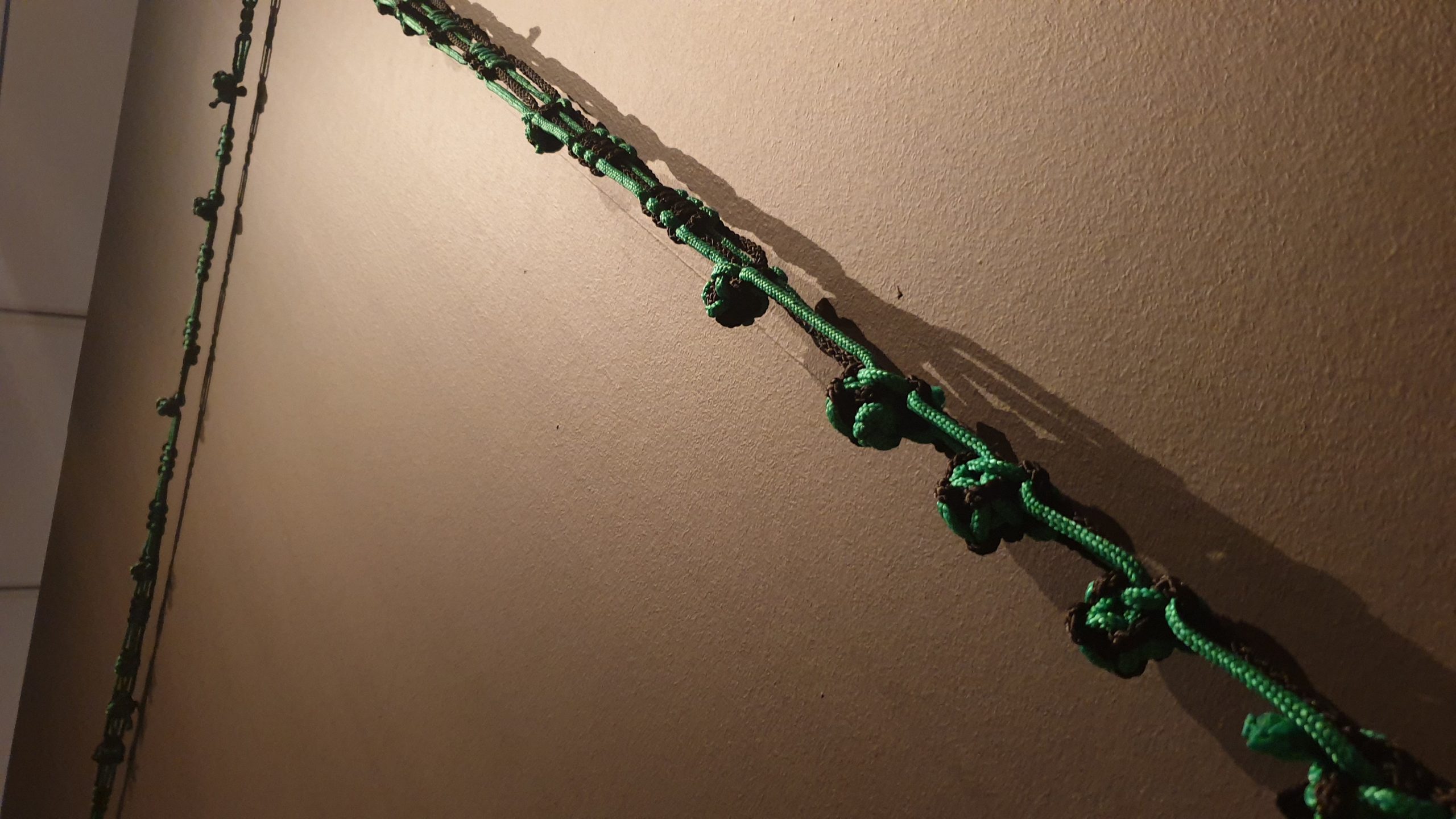
The most evident and most flattering component of the exhibition, in my opinion, is the visual continuity. You have lines of text running across the walls, lines of rope trailing across the rooms, lines of wires scattered all around.
ON THE MACRO LEVEL
As I’ve mentioned before, I think it’s quite evident that the overall Singapore Biennale theme is intentionally designed to be broad and vague, such that practically any artwork can justifiably fit within it. So, I won’t bother going into depth on how it fits the theme: besides, the time and/or movement-based link between “future of islands” and “every step in the right direction” is pretty clear.
Tomorrow Is An Island, as inland, a sin land is an artist-led project that speculates on the future of islands, deep time, the fate of ‘crisis’ as a frame of our predictions and conceptions of future time, and the exchanges between bodies and cities. The title deploys a sequence of anagrams that rescrambles with each new phrase, suggesting that the ways in which the next moment could retain recognizable components of the present but to disruptive effect. (link)
Nevertheless, the existence of the secondary theme distinguishes this exhibition from that of Gillman Barracks. This secondary theme of “Tomorrow Is An Island, as inland, a sinland”, is exemplified by two characteristics.
Firstly, the artists are all of “islands”. In this context, the two islands are Singapore and Switzerland. While a bit of a stretch, it’s justifiable when considering how small both are in comparison to nations like China or the United States.
Secondly, many of the works focus on systems, sequences, the like, as exampled by the shifting anagrams. The “visual continuity of lines” play into this. All the works also play with this in various forms, be it the shadows cast onto the floor, the shifting sediments, the flow of sounds and videos, so on.

Of course, this consolidated theme is possible only because of the small size of the exhibition. A bigger exhibition would inevitably have to resort to a generalised theme, to be able to cover everything.
ON THE MICRO LEVEL
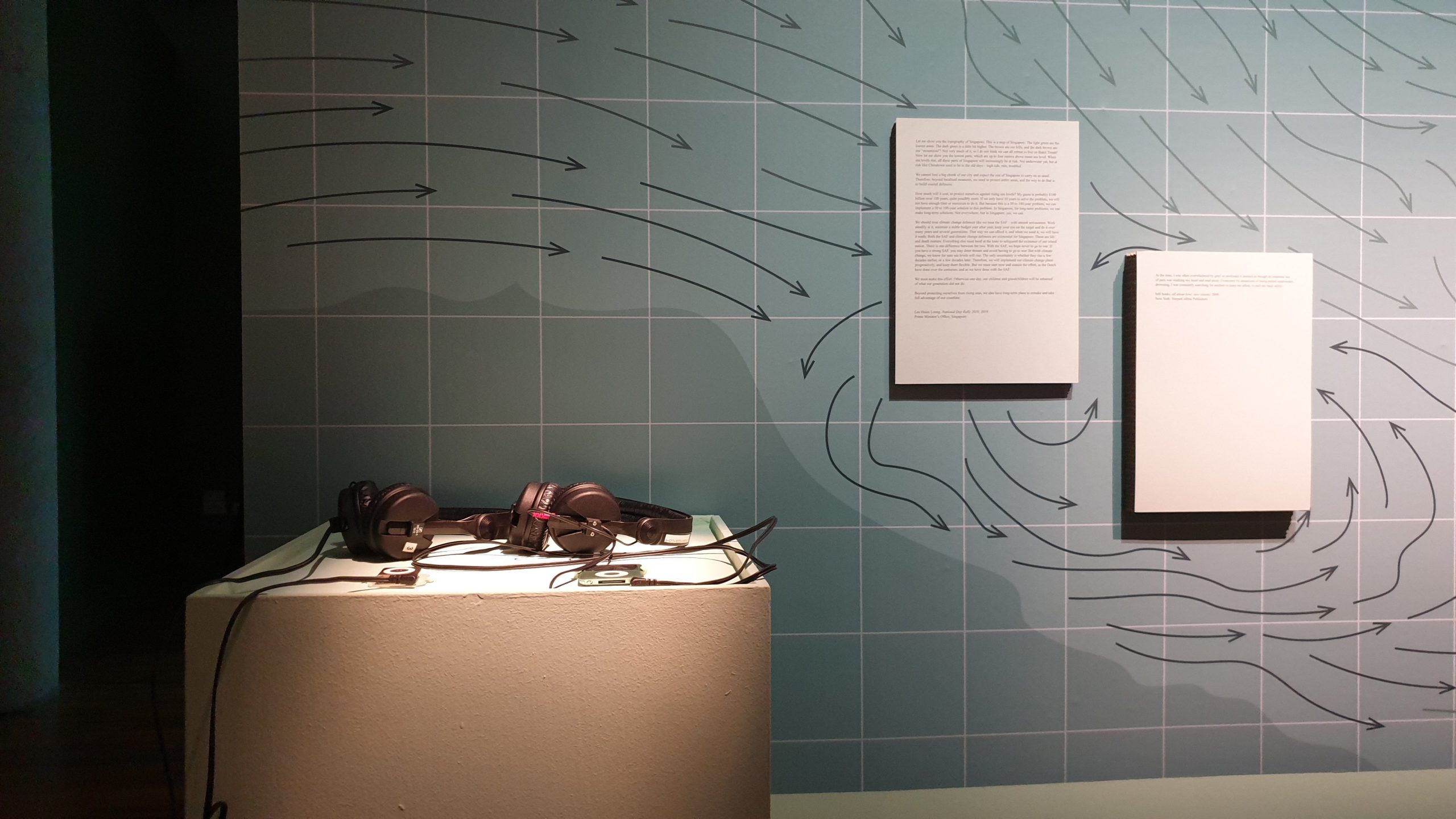
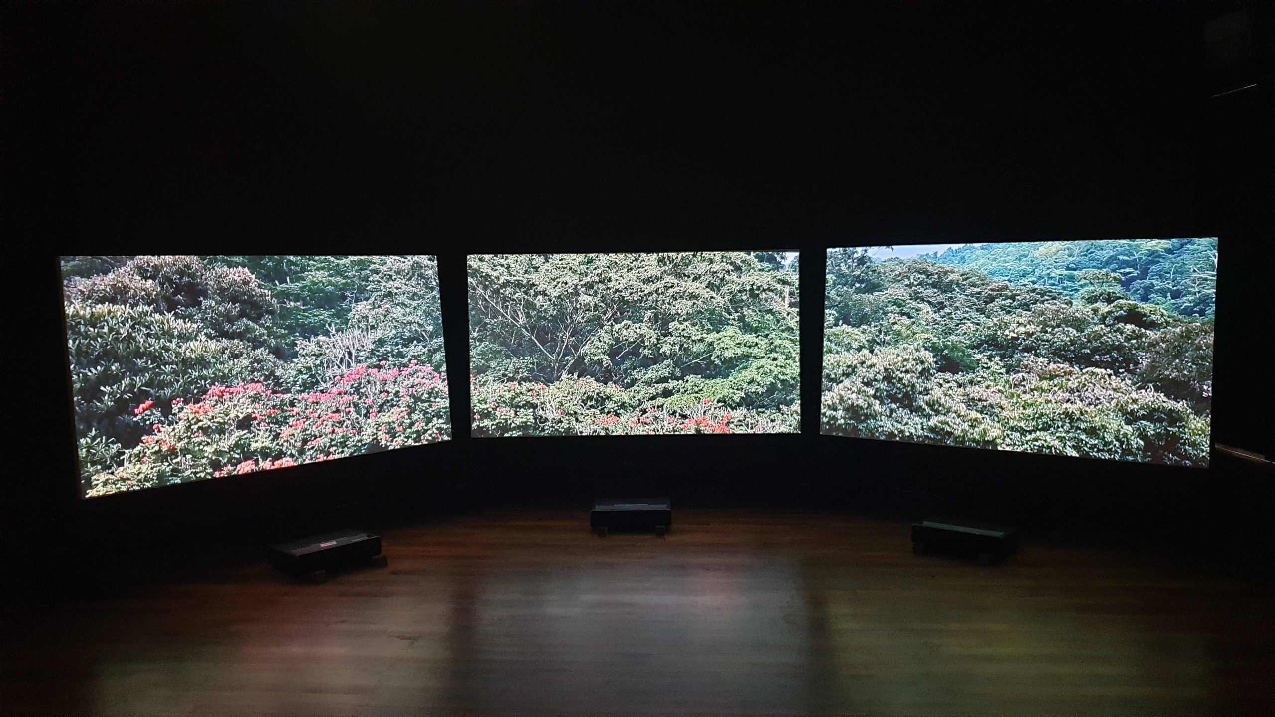
The most eye-catching work, for me, was Forest Tales and Emerald Fictions by Monica Ursina Jäger.
![]()
An artist-in-residence with NTU, her presented work focuses on the “shifting topography of Singapore and Southern Malaysia”. Consequently, much of it involves urban infrastructure and natural scenery. Here’re videos: the first has the accompanying audio (from headphones), and the second, details close up:
Regardless, its attractiveness is due very much to the curation, where this work is complete and isolated. The leftmost area feels lacking, where I was there for the opening night, and thus can’t disassociate the “absence of the performance” from an “absence in the space”. The first area is slightly awkward, where it seems to contain “everything which doesn’t fit in the other rooms”.
As such, the singular space provided to this work stands out, where it feels intimate: there’s a seating area, the screens don’t feel overwhelmingly magnificent, the space is dark. Also, the setup is interesting, where it’s not even screens, and the throw distance is exceedingly small:

For me, the biggest takeaway is probably on how limited resources can actually be a boon. After all, it’s easier to consolidate with a smaller pool, and easier to know what you can’t do. At the same time, however, one must be aware of where they ought to allocate resources, such as in building walls and shelves, than trying outright to aim for complete minimisation.