Preceded by | Succeeded by (FINAL)
I realised I didn’t particularly mention the typeface and colour choices during the presentation, and thus have indicated them clearly in here.
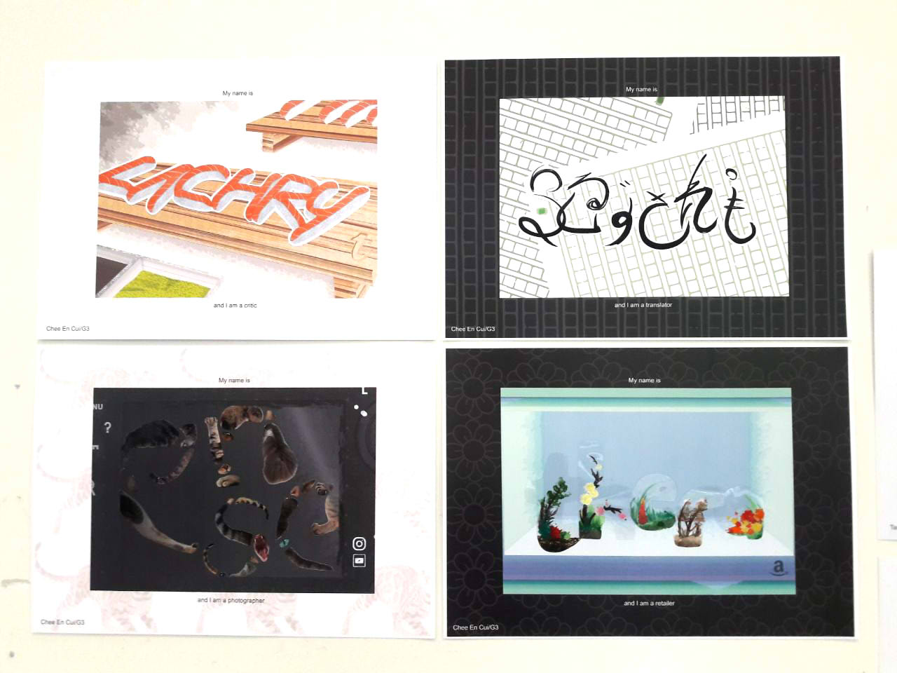
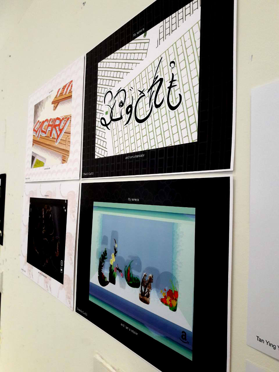
Overarching ideas/common themes:
- Jobs can work both digitally and analogously
- To depict the versatility of the digital
- Jobs are non-descriptive
- Only the “base” job, and the specification is hinted through the composition
- Names are of invented online handles
- To depict the temperamental nature of the online identity
- Backgrounds are vector drawings
- To present differentiation between the digital world and the “real” you
- To provide flatness, to avoid standing out
- Foreground letters are pasted on
- To present differentiation between the digital world and the “real” you
- To draw focus through layering
- Logo(s) present in each composition
- To show online nature of each job
- To show what kind of online website it might be associated with
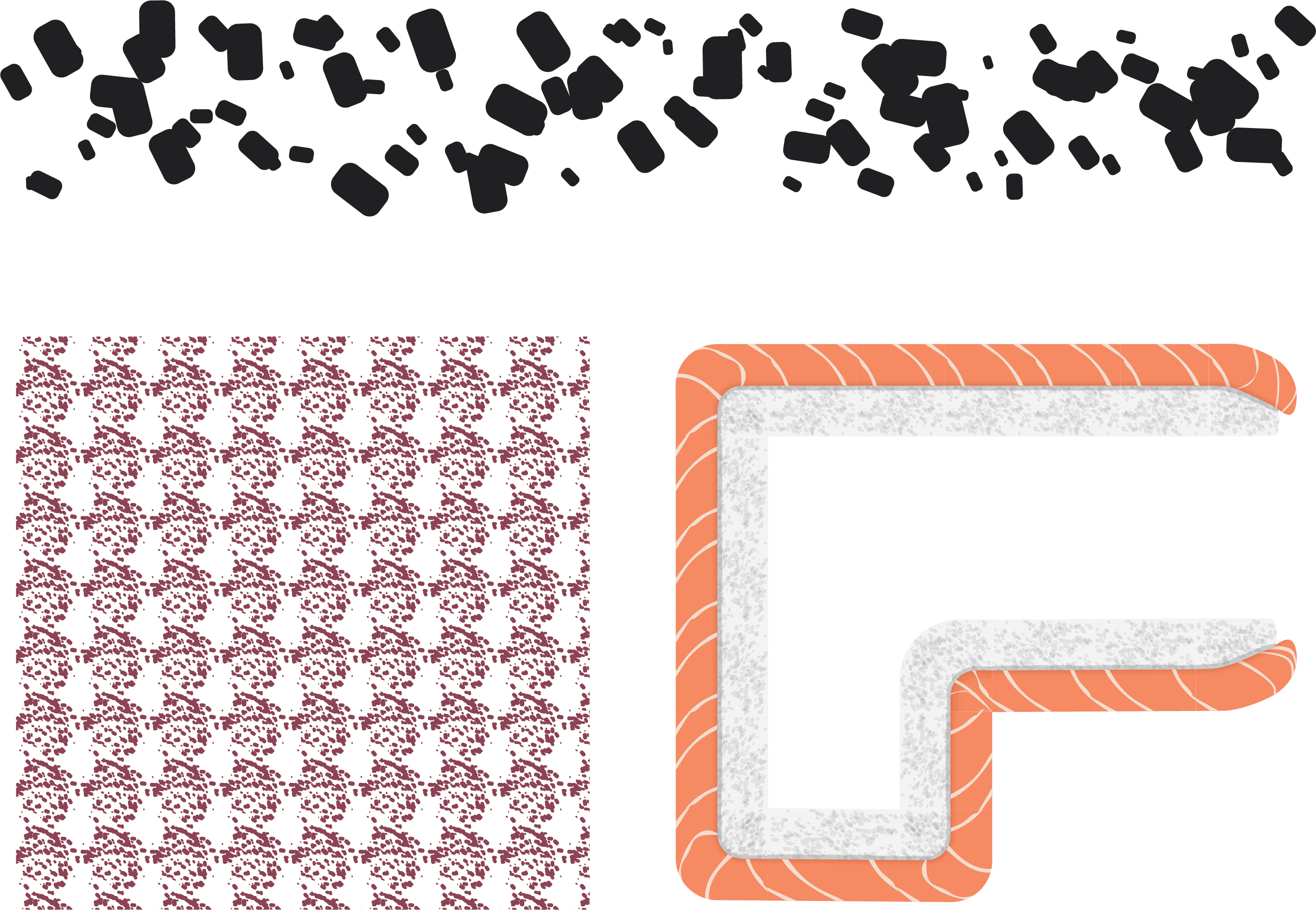
- Borders have colour and pattern
- Either black or white to contrast image, e.g. if composition is too light-coloured, use black background to offset
- Patterns related to each composition for visual quality than just plain colour


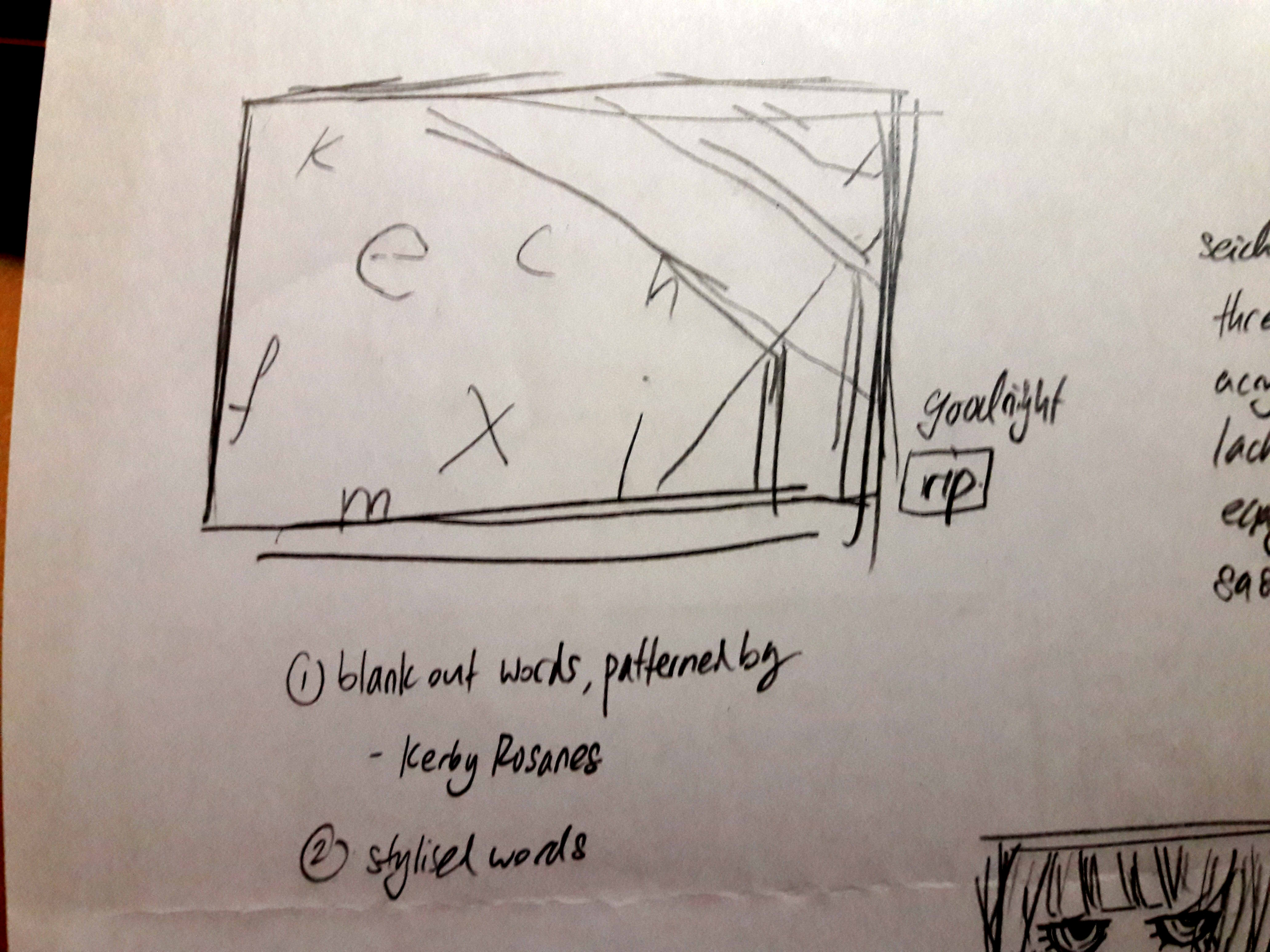
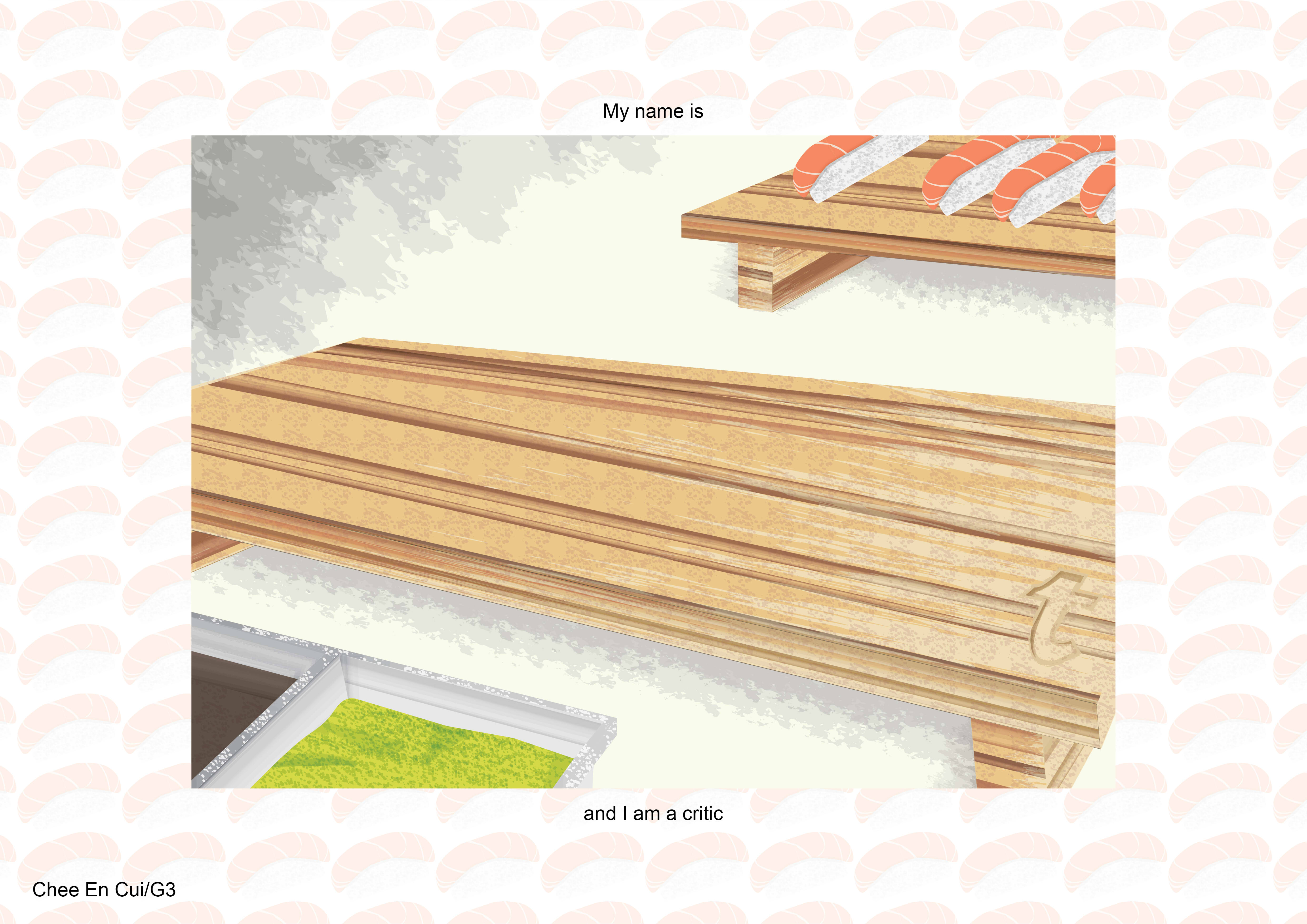
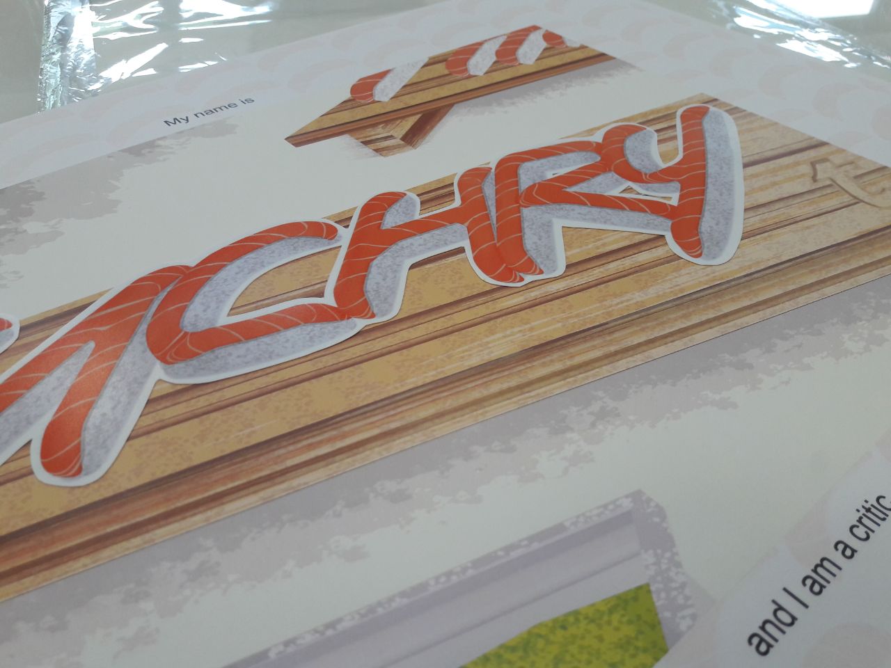
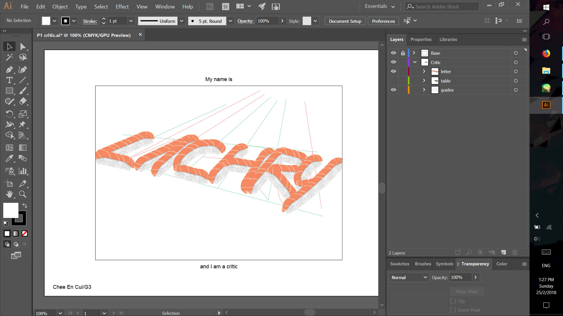
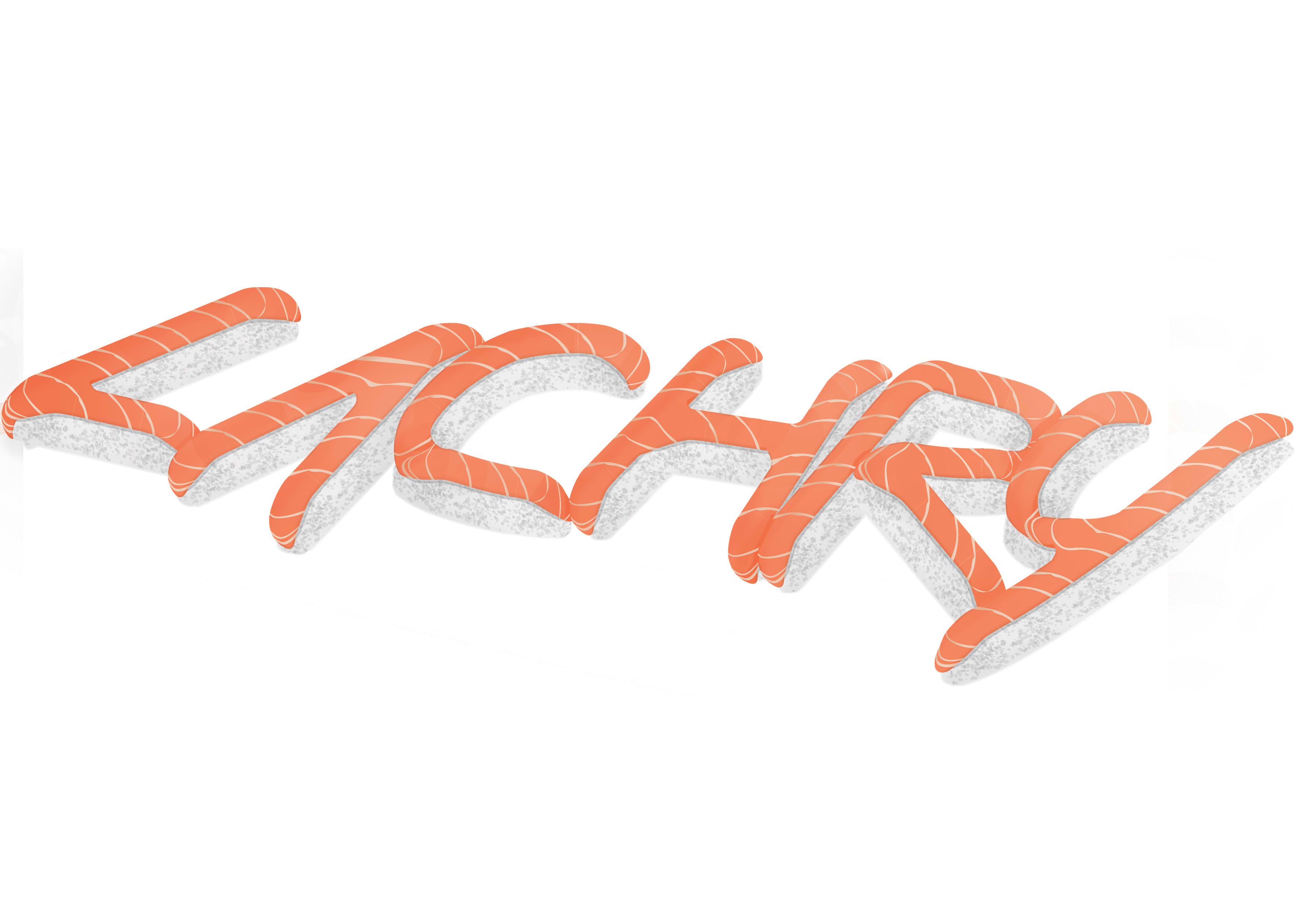
CRITIC
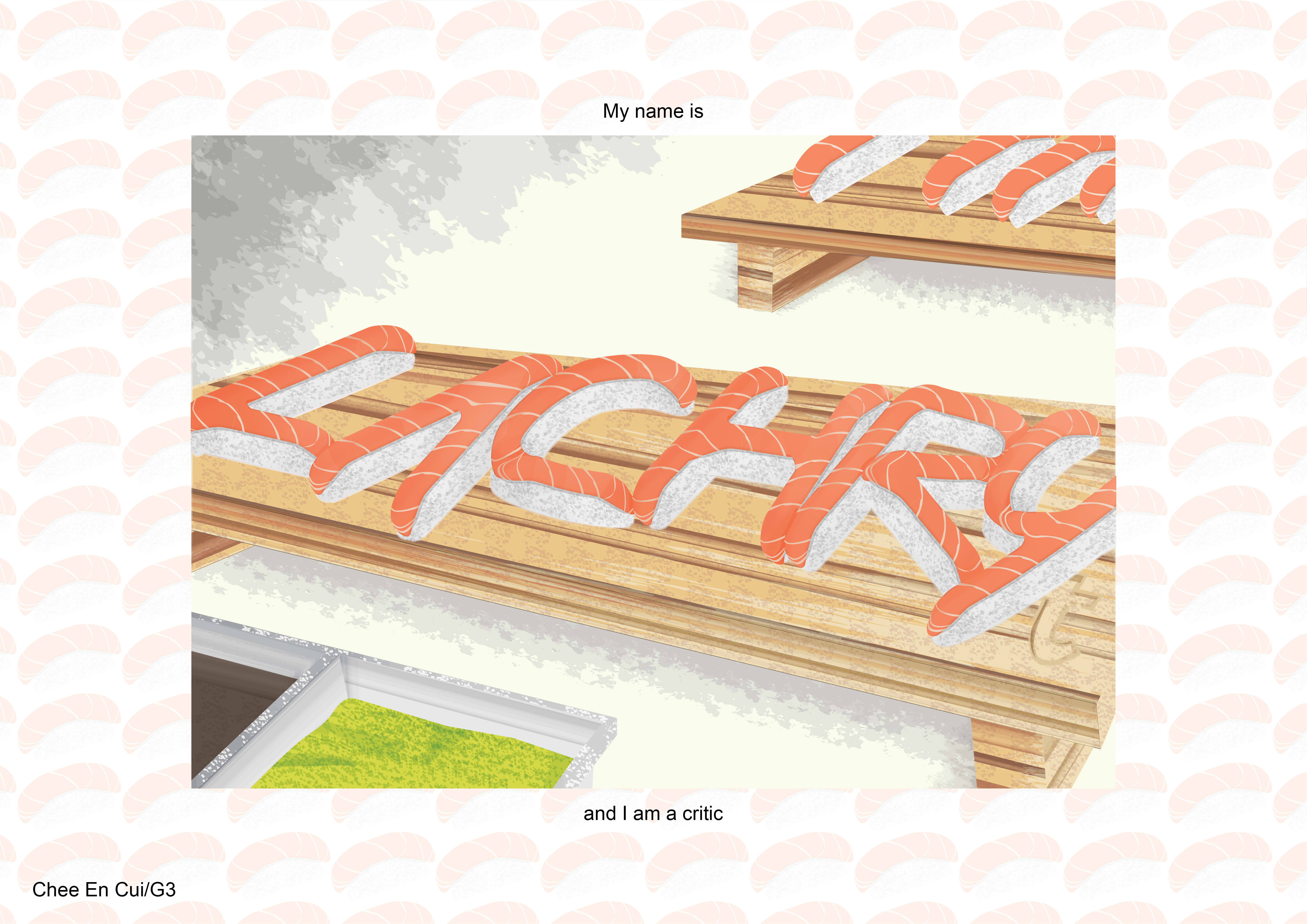
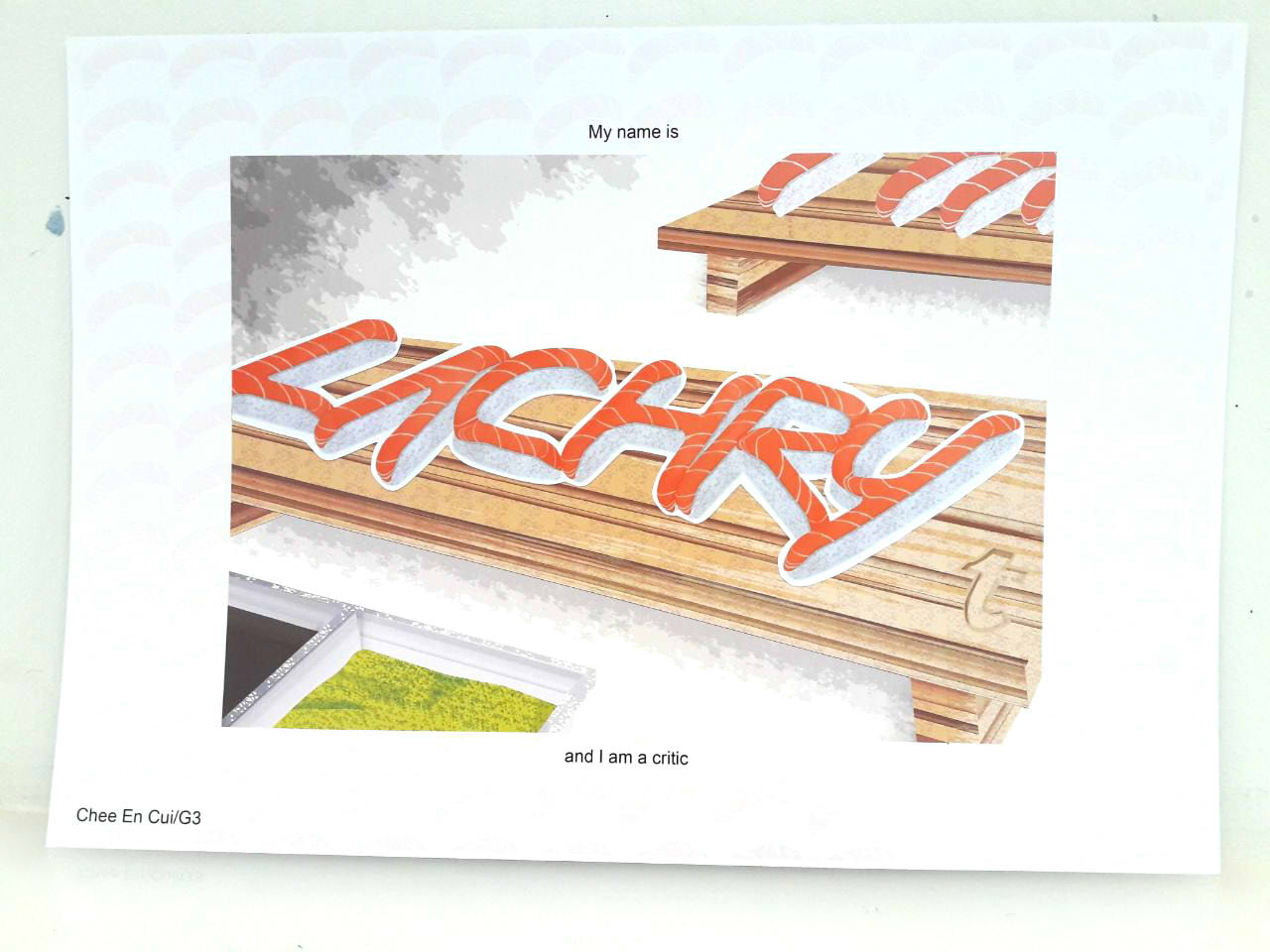
- Of sushi
- Tumblr logo (implication of food blogging)
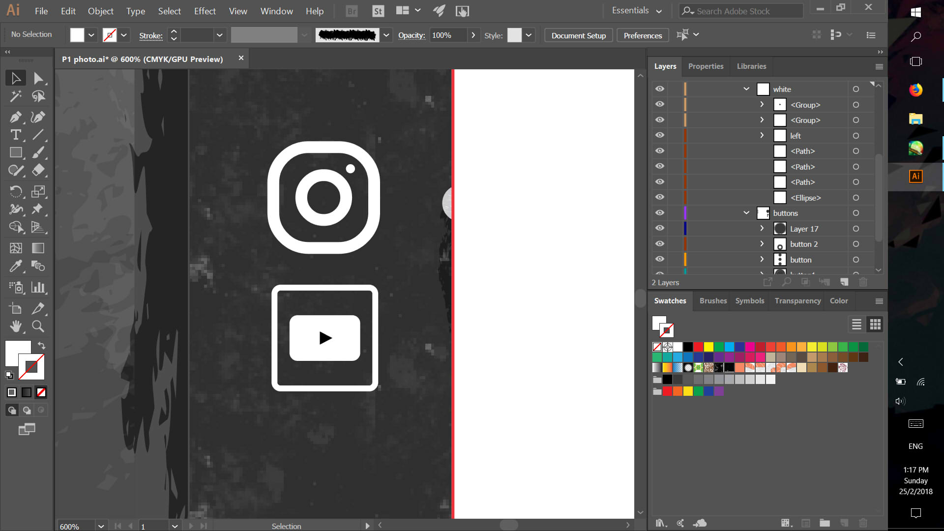
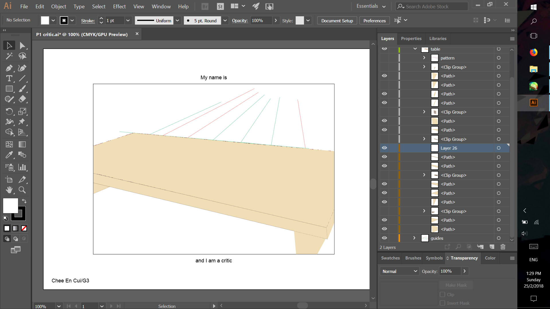
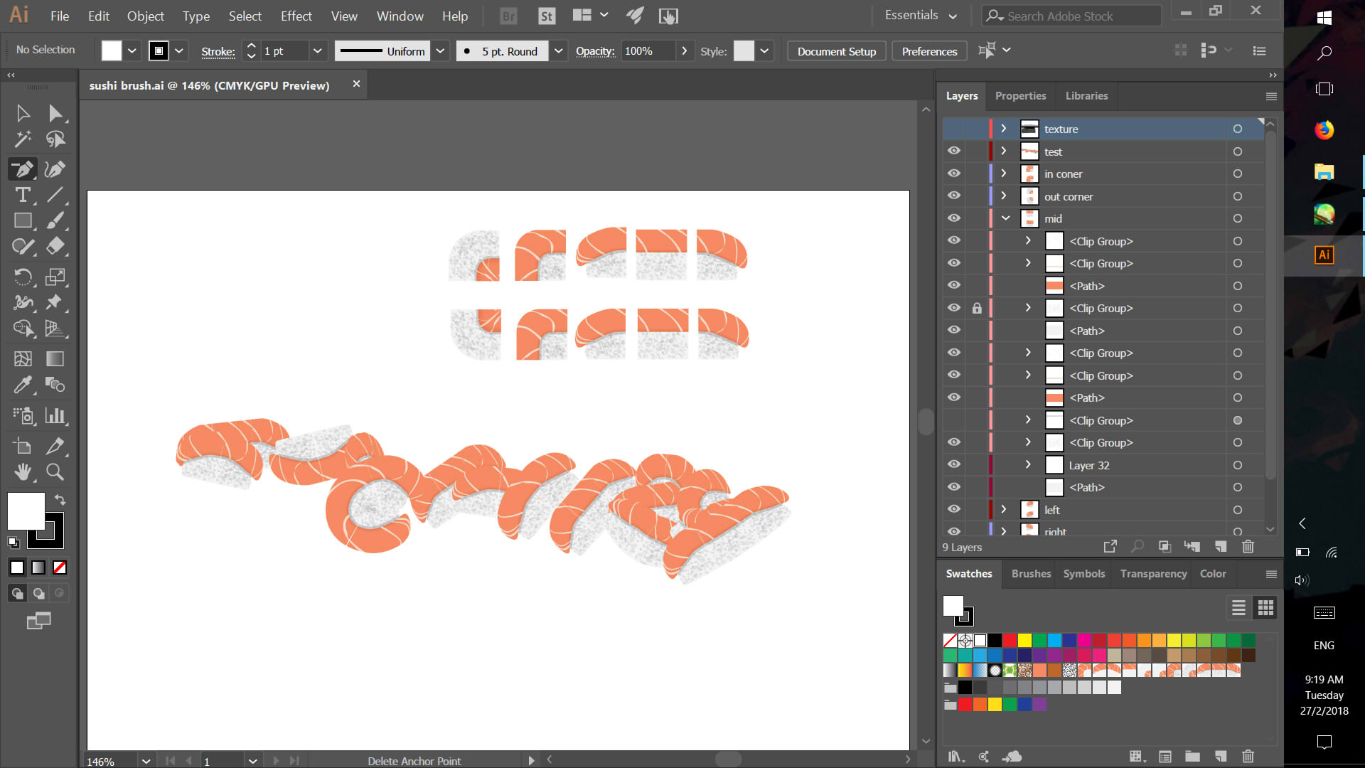
- Experiment with Illustrator pattern brush
- Edited in Photoshop to fix perspective and lighting issues which could not be resolved with the sushi brush
- No particular typeset choice as opposed to looking reasonably like a normal piece of raw salmon (hence the curves along the corners than straight cuts)
- Neutral colours matching typical wooden sushi table, and orange with white for contrast and pattern. Green wasabi to accent slightly.

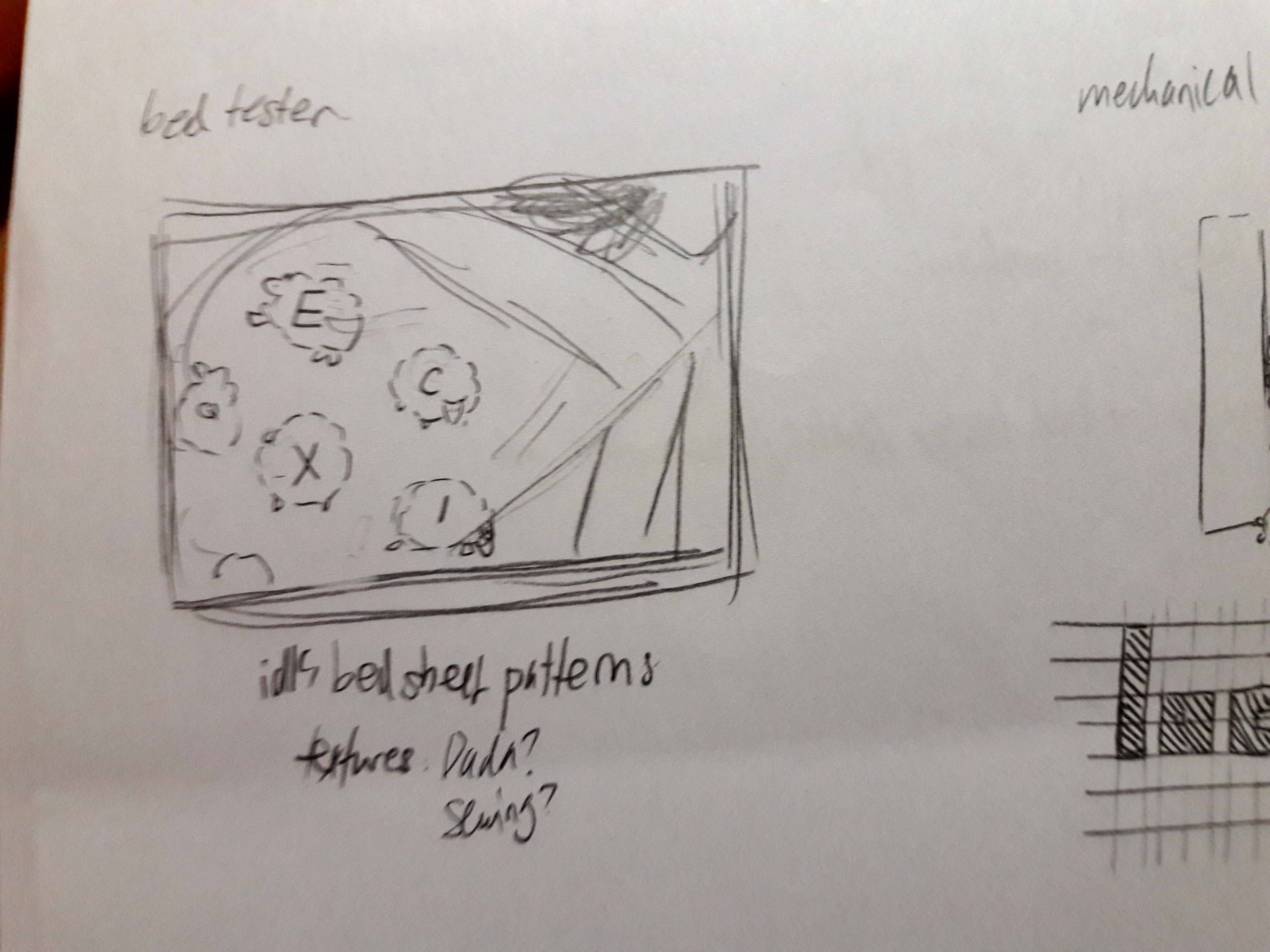
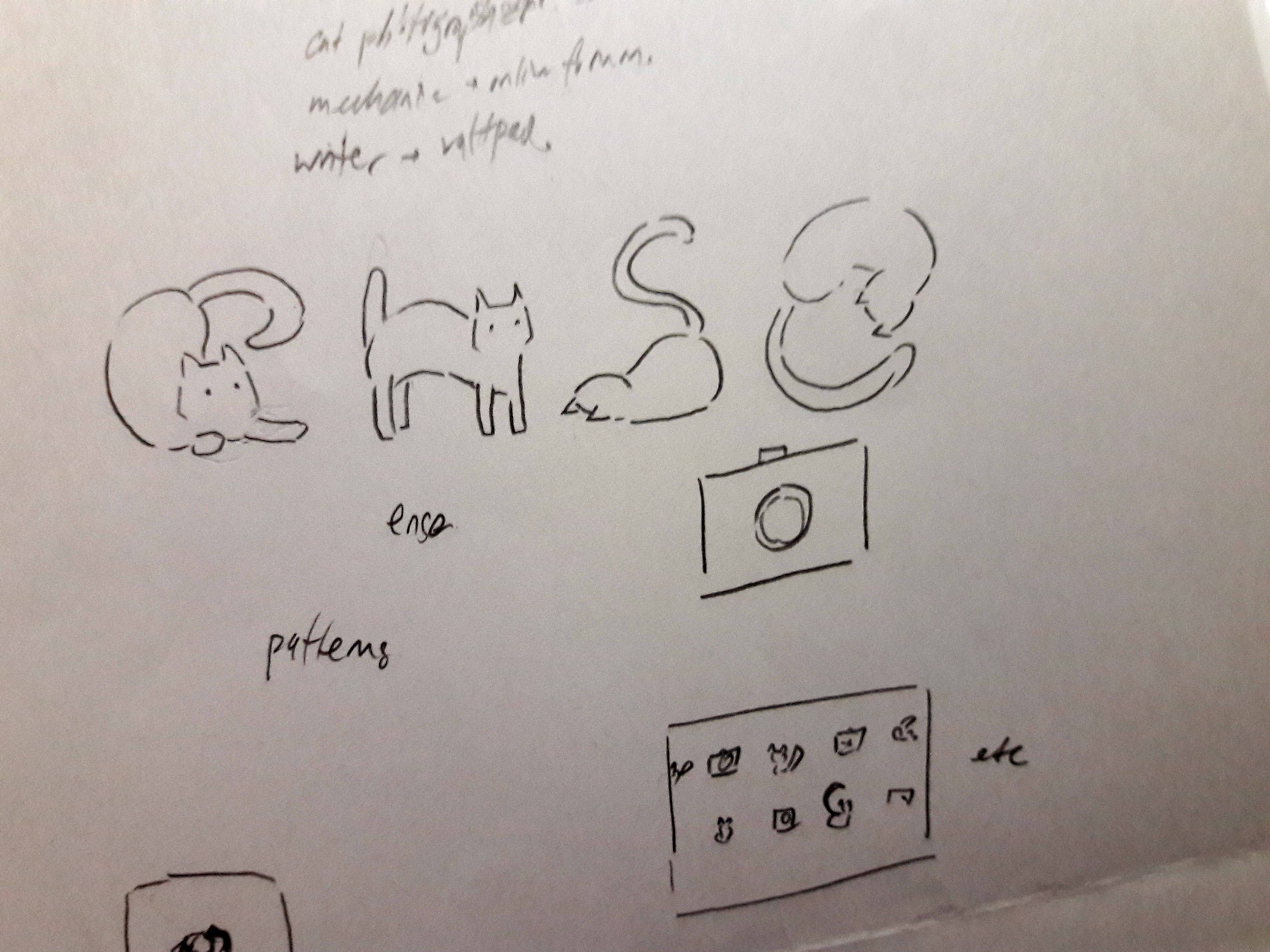
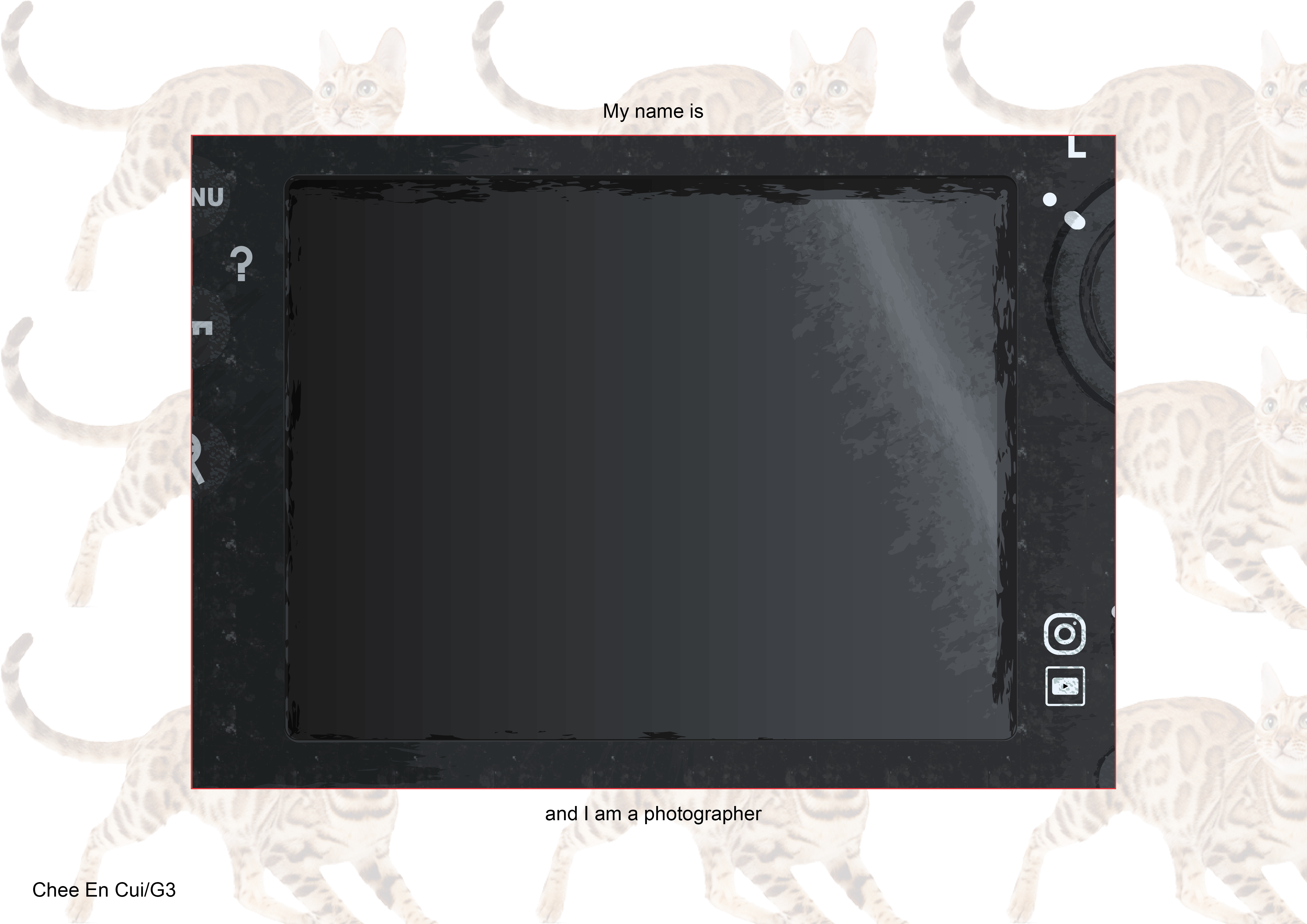
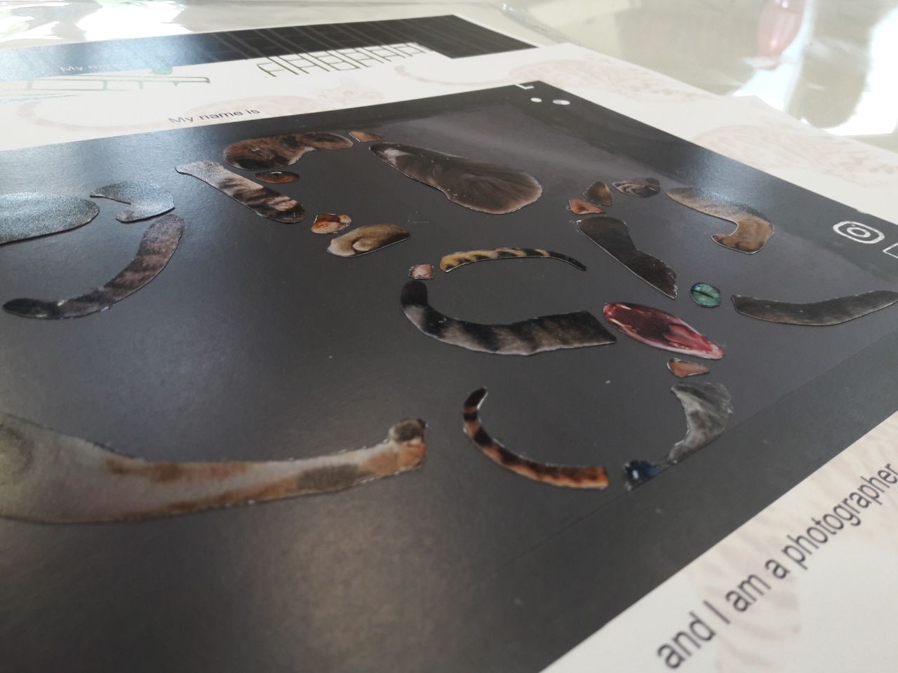
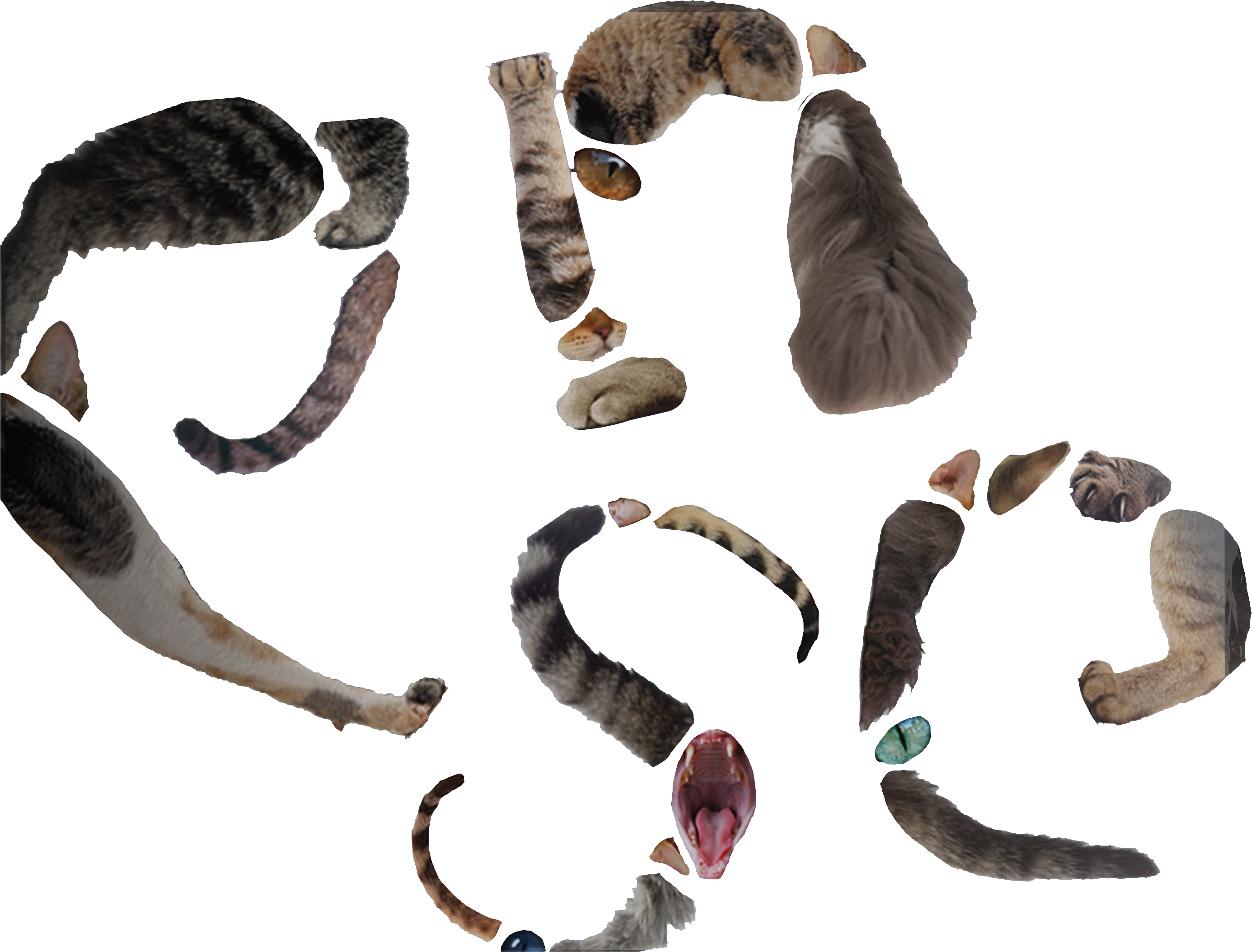
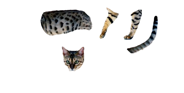
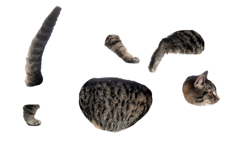
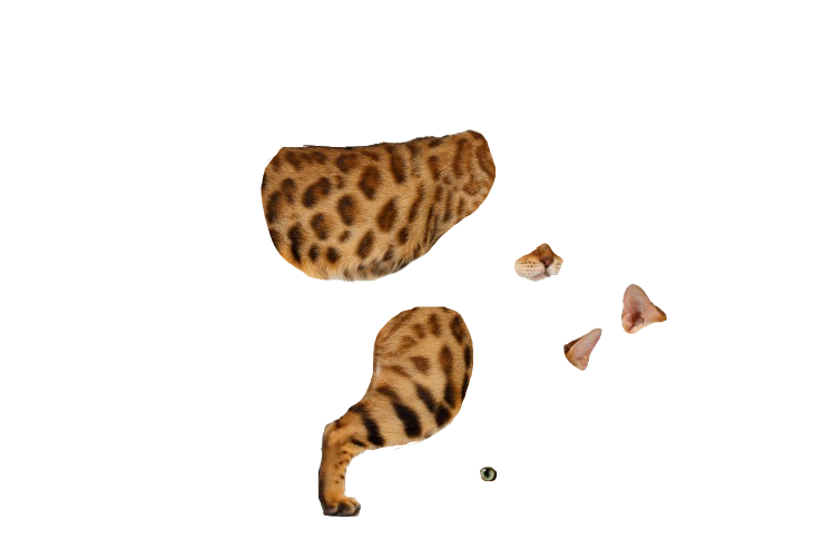
PHOTOGRAPHER

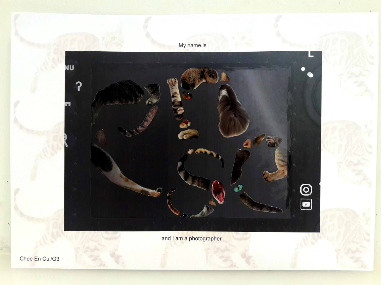
- Of cats
- Instagram/Youtube logo (implication of online sharing)
- Collaging with use of gestalt
- Dissection of pictures of cats into parts, then collaging together
- No particular typeset choice as opposed to fixing the parts together in a comprehensive manner, where tails/legs define direction while eyes/paws/etc cover up small gaps
- Cats of various shades of brown to avoid too high or low contrast (light-coloured/black cats), avoiding too much focus to any one part of the typeset


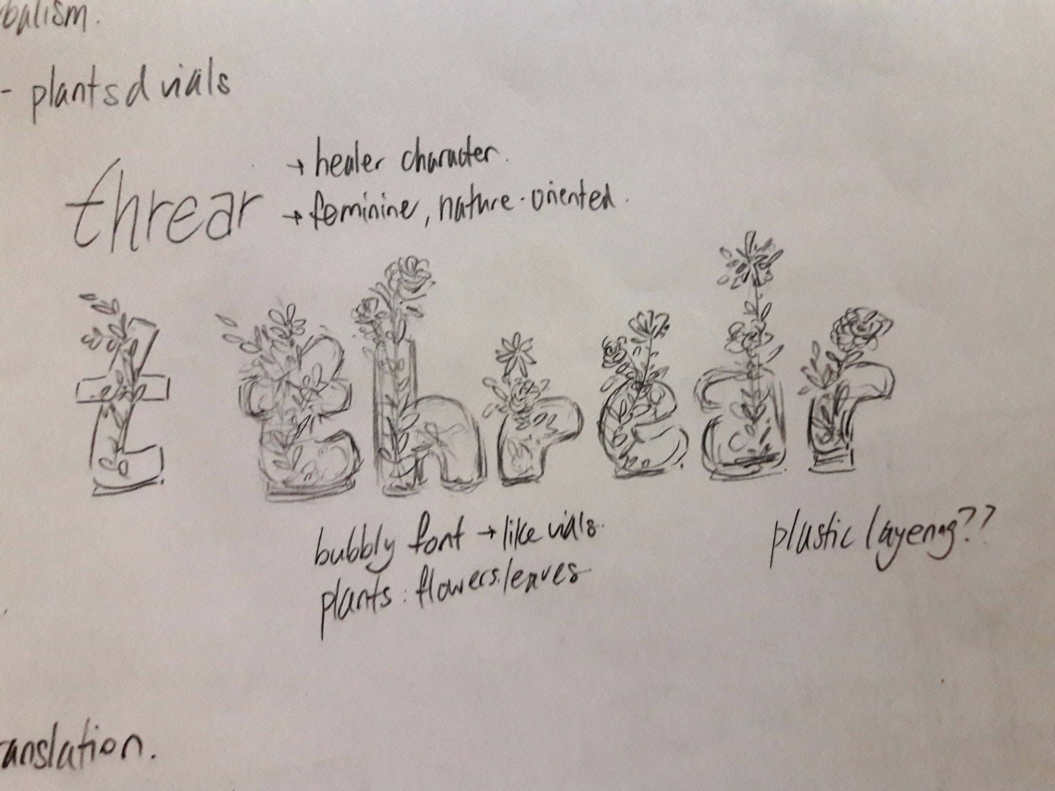
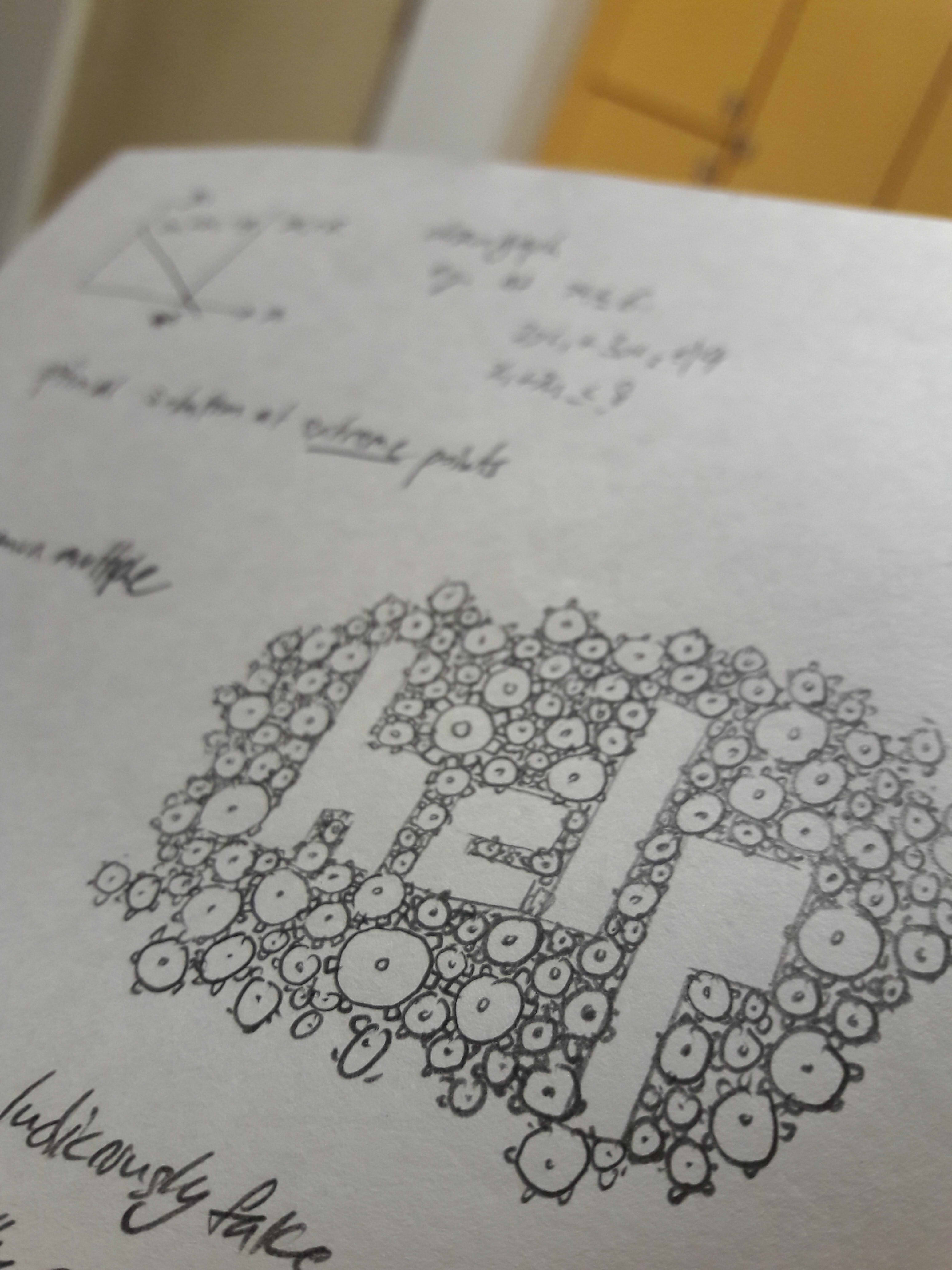
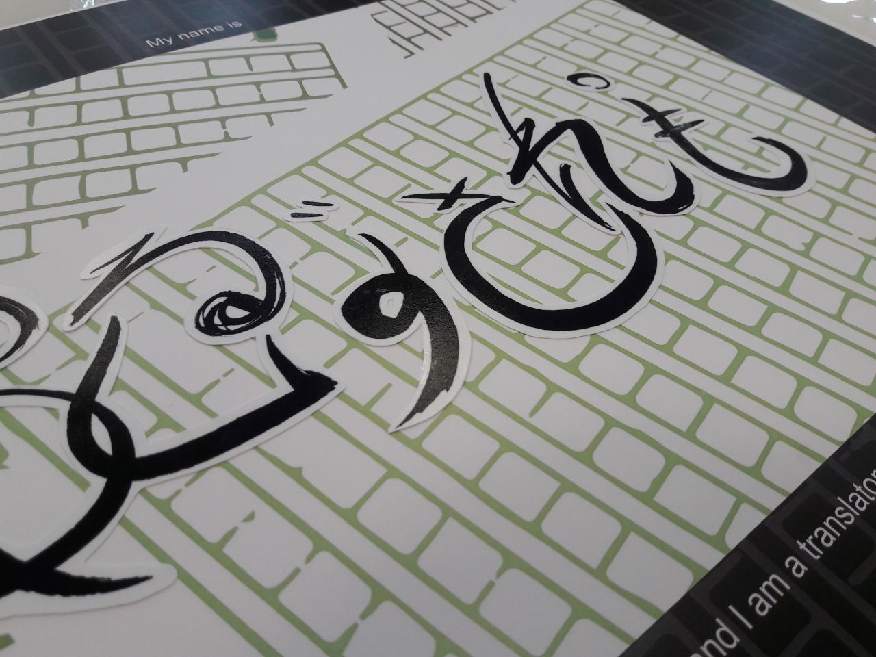
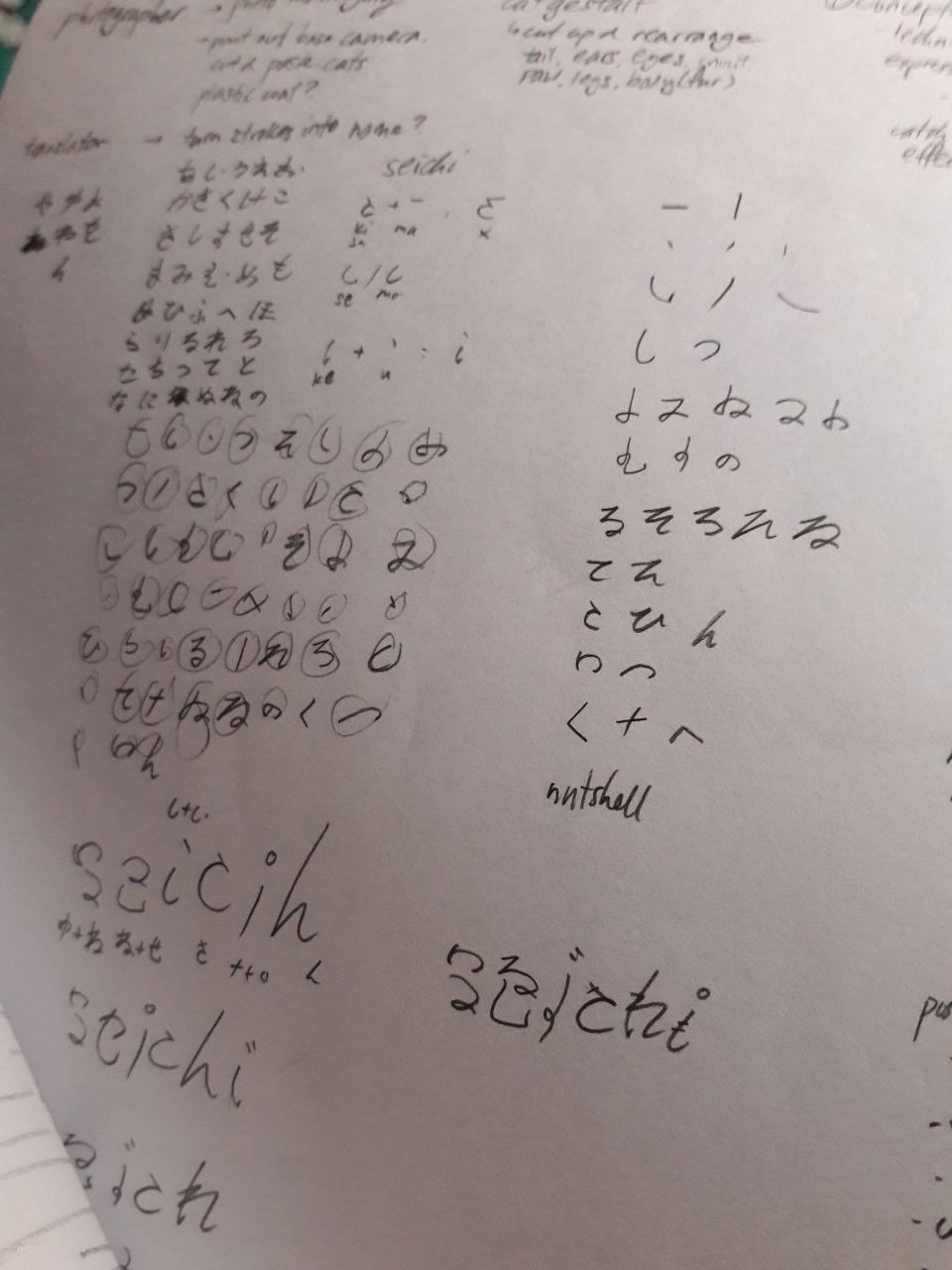
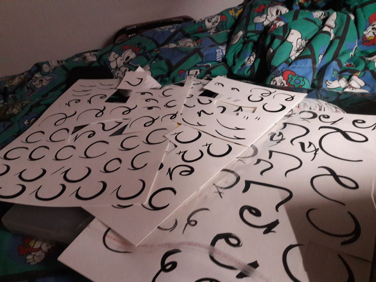
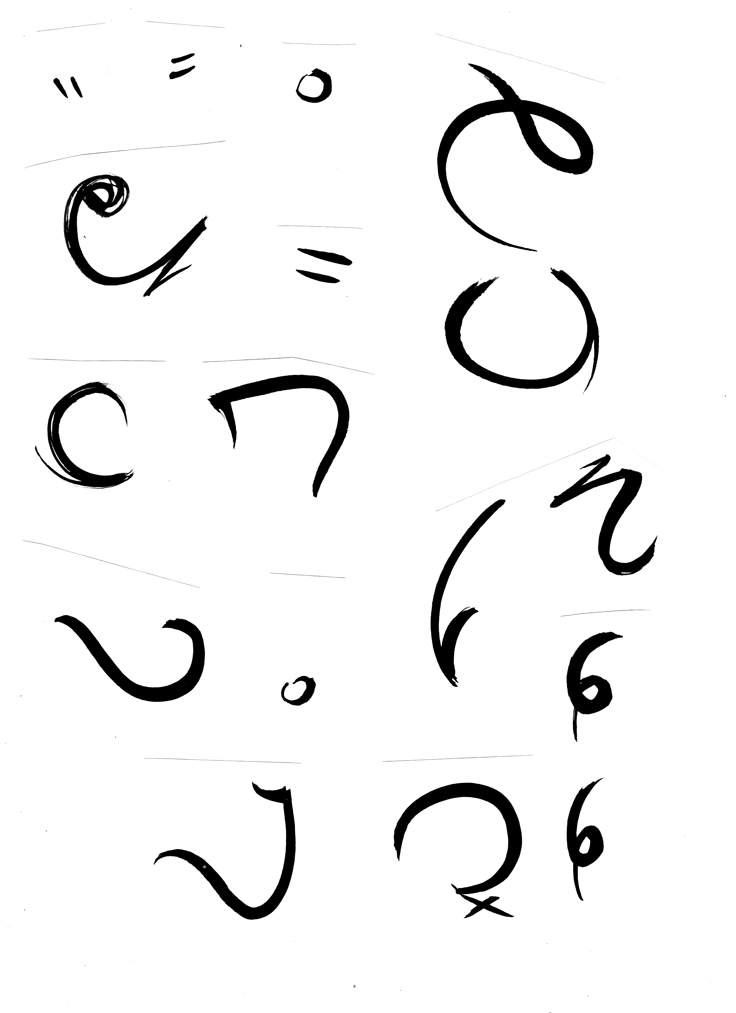
TRANSLATOR
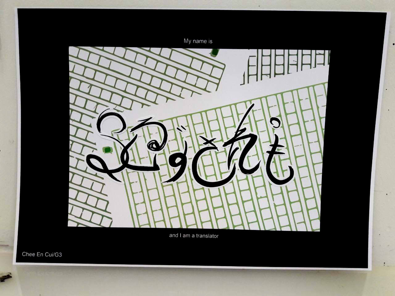
- Of Japanese/English
- Self-designed logo (referenced from, implication of online translation services)
- Painting with brush and ink
- Dissection of hiragana into parts, then mixing together to form English letters
- “Painted” calligraphic-styled font to evoke Asian brush strokes
- Black strokes to emulate calligraphic style

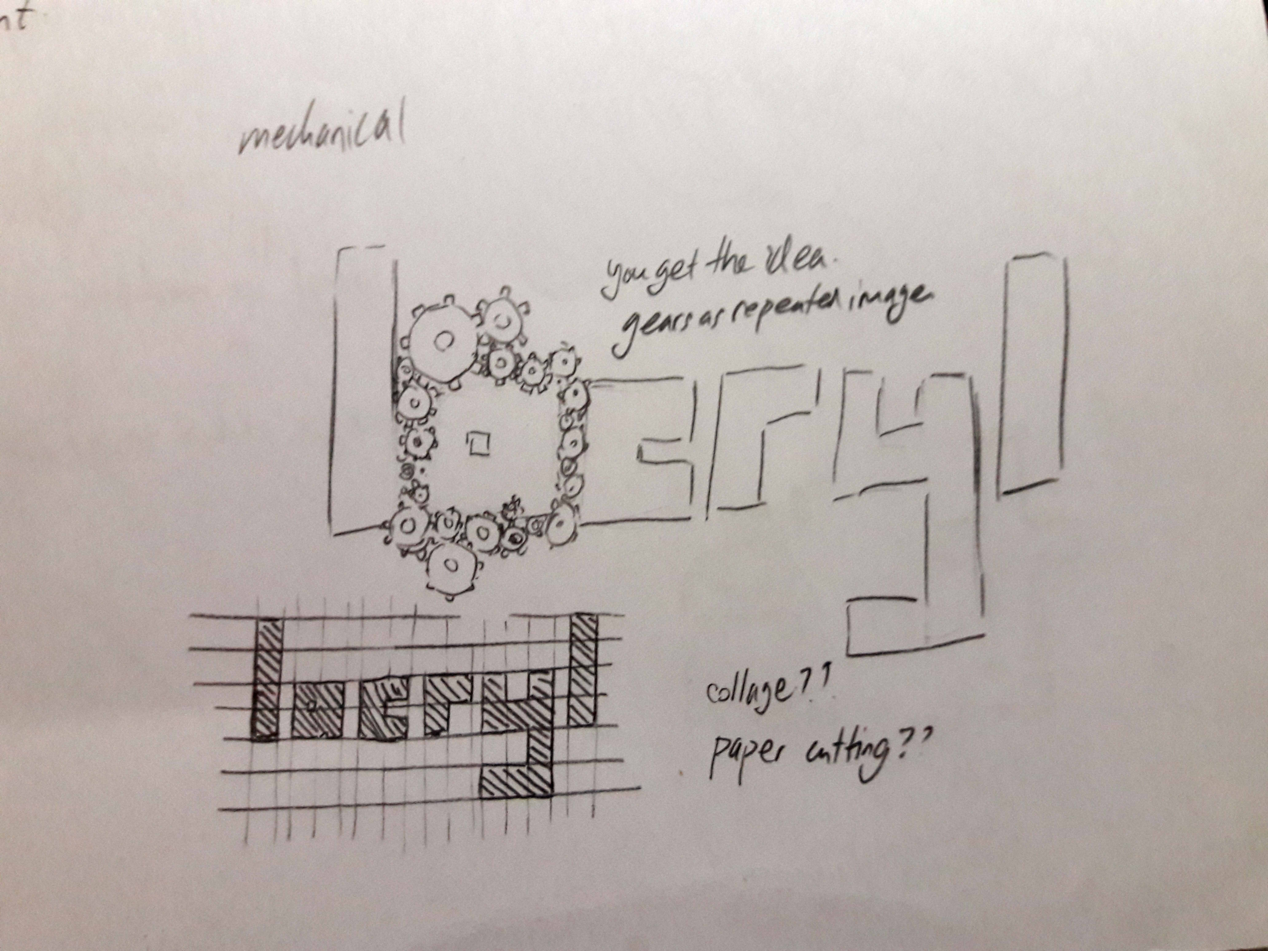
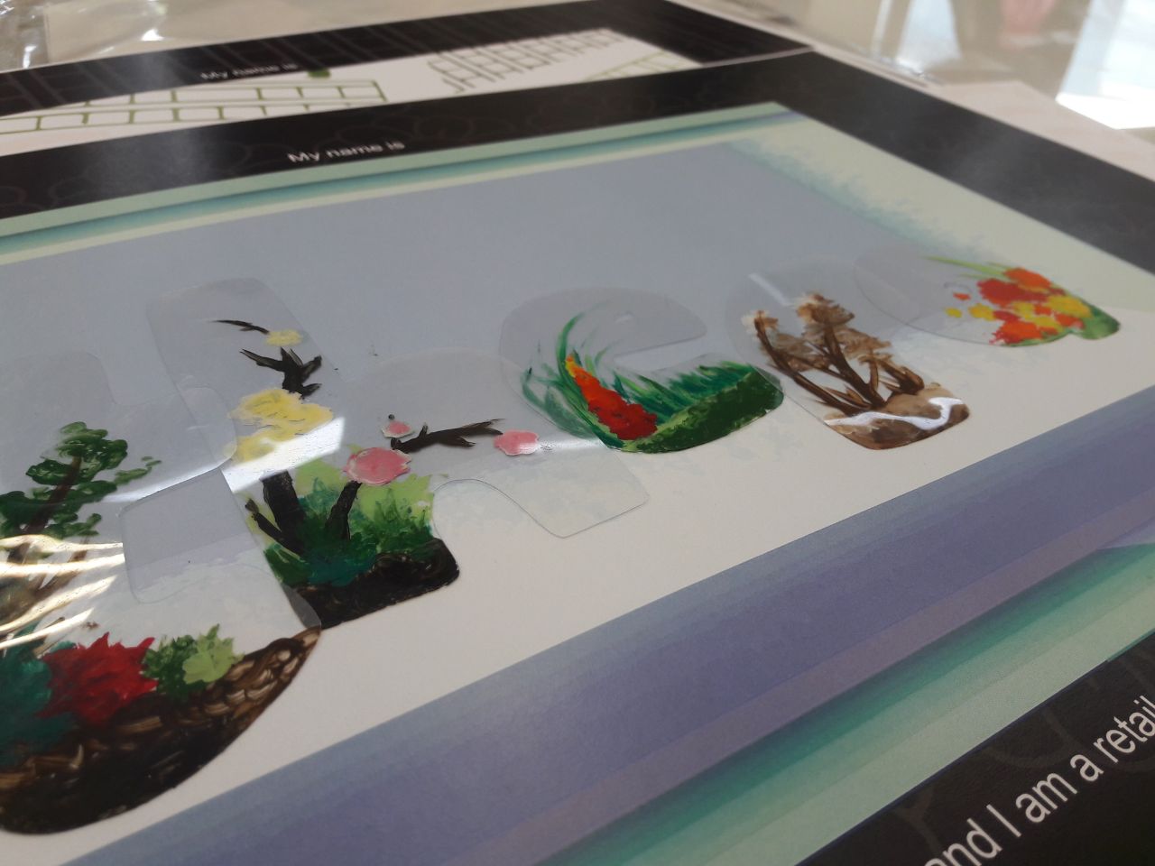
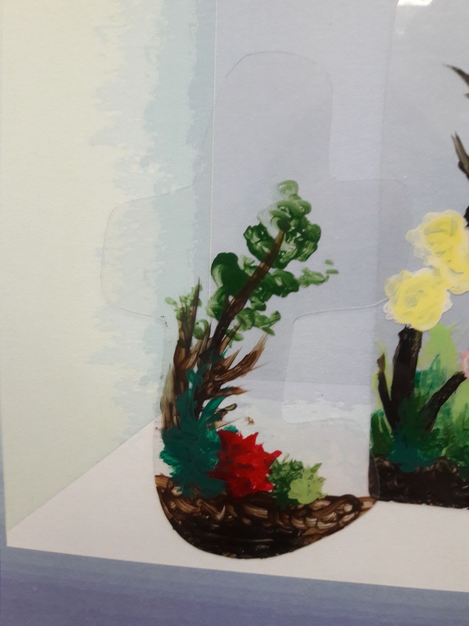
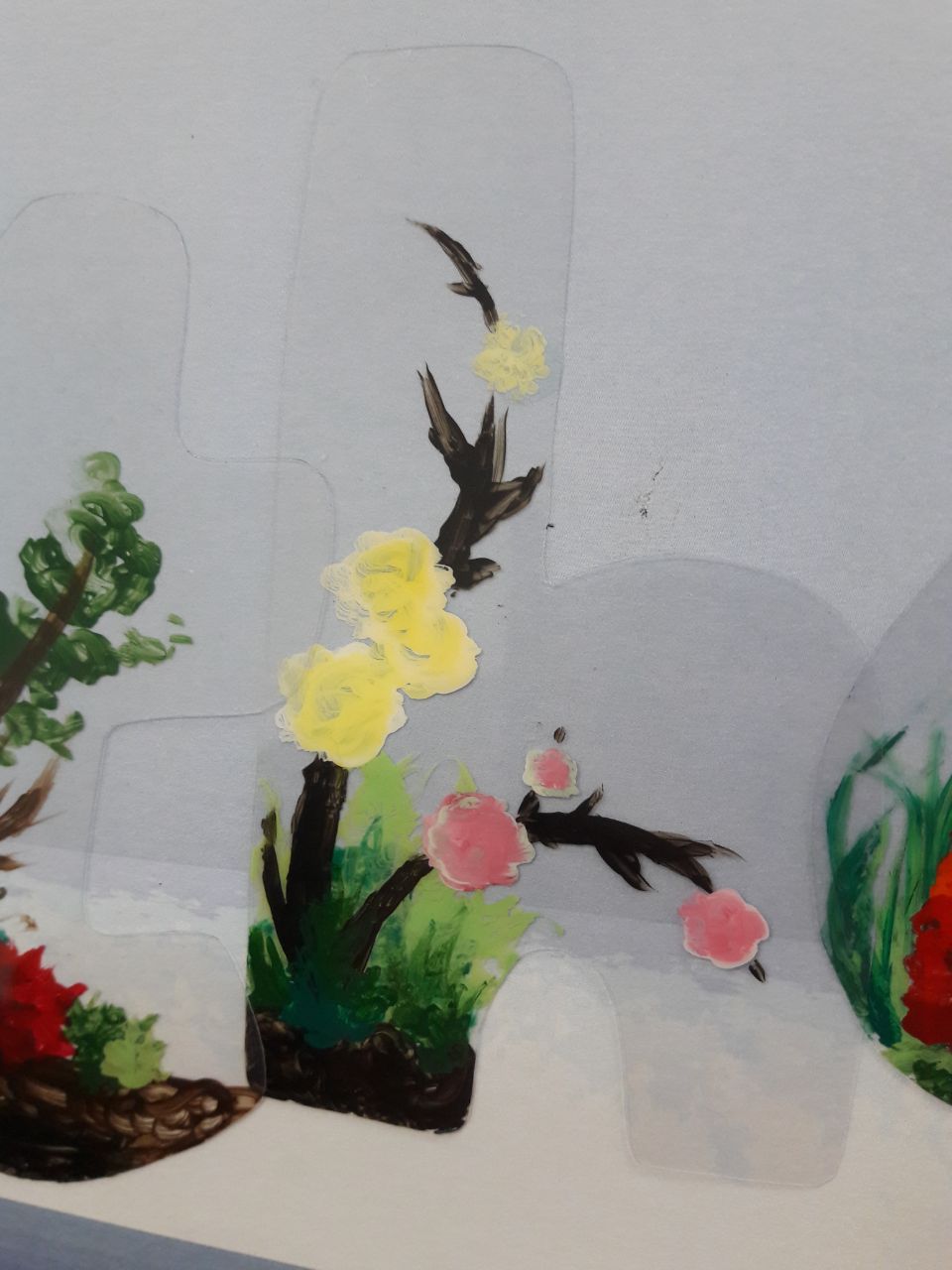
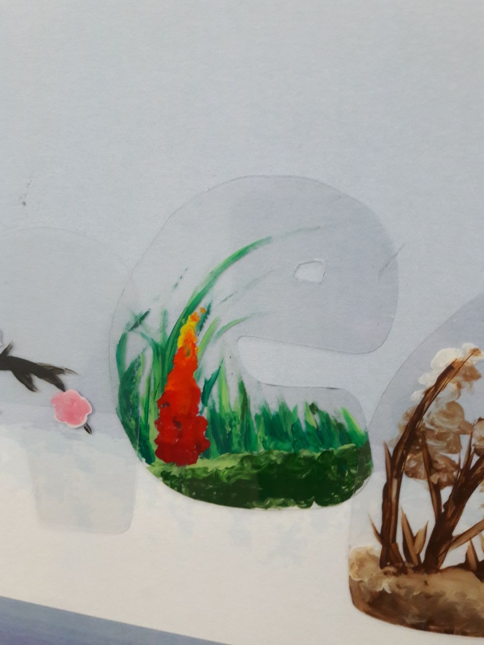
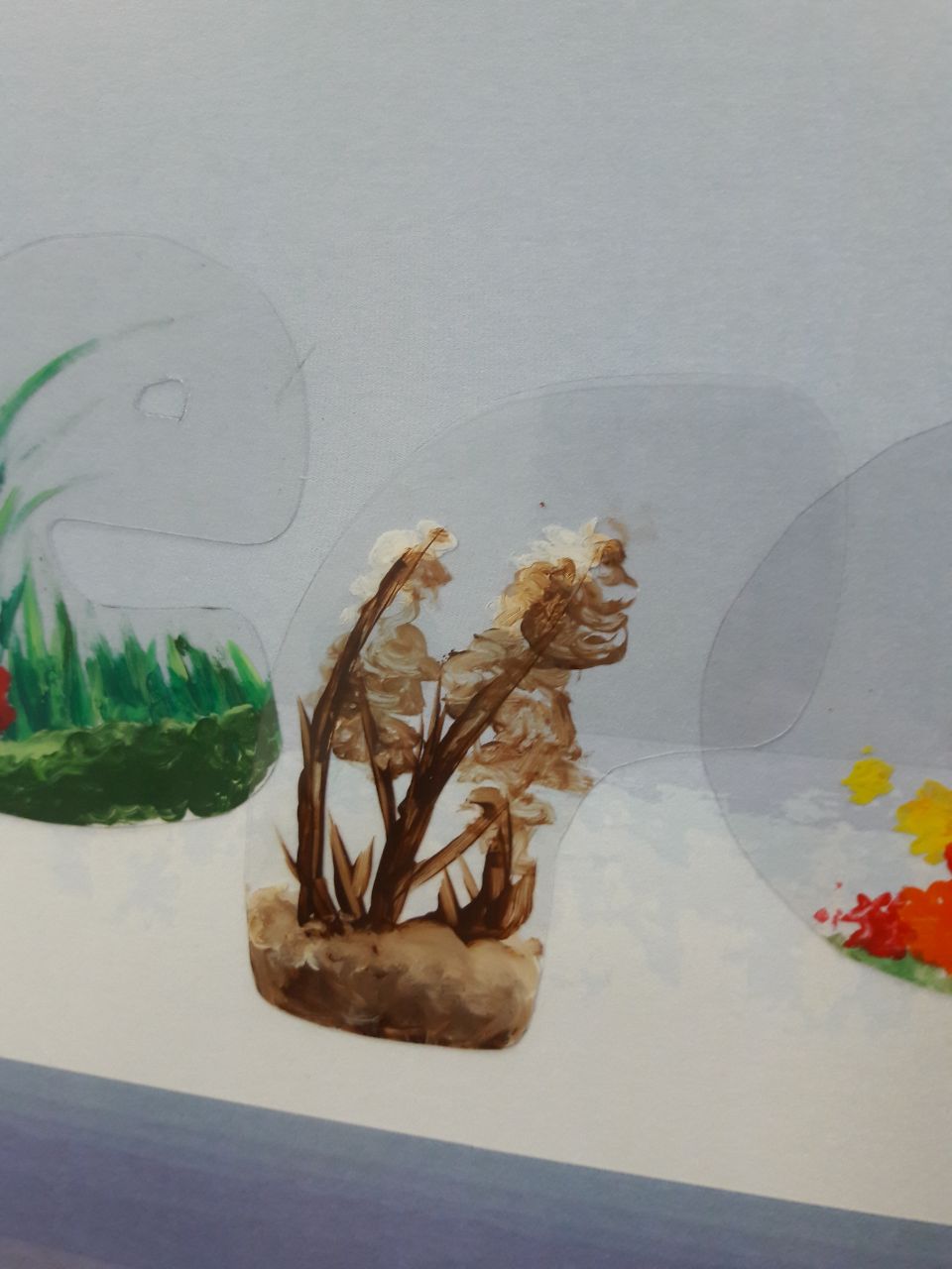
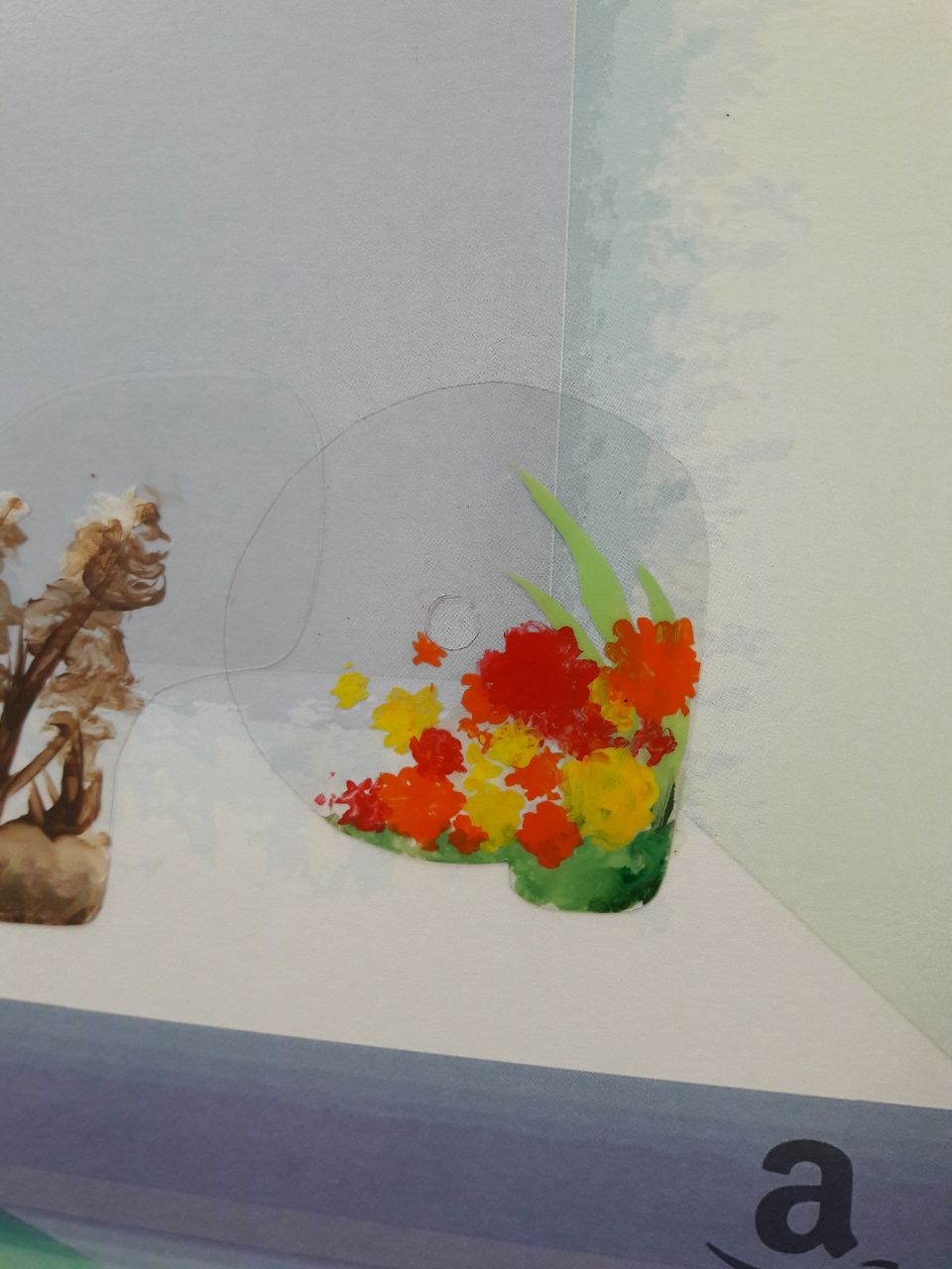
RETAILER

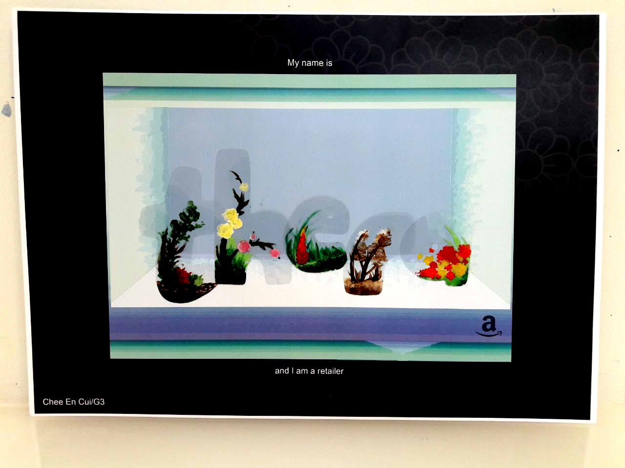
- Of terrariums
- Amazon logo (implication of online selling)
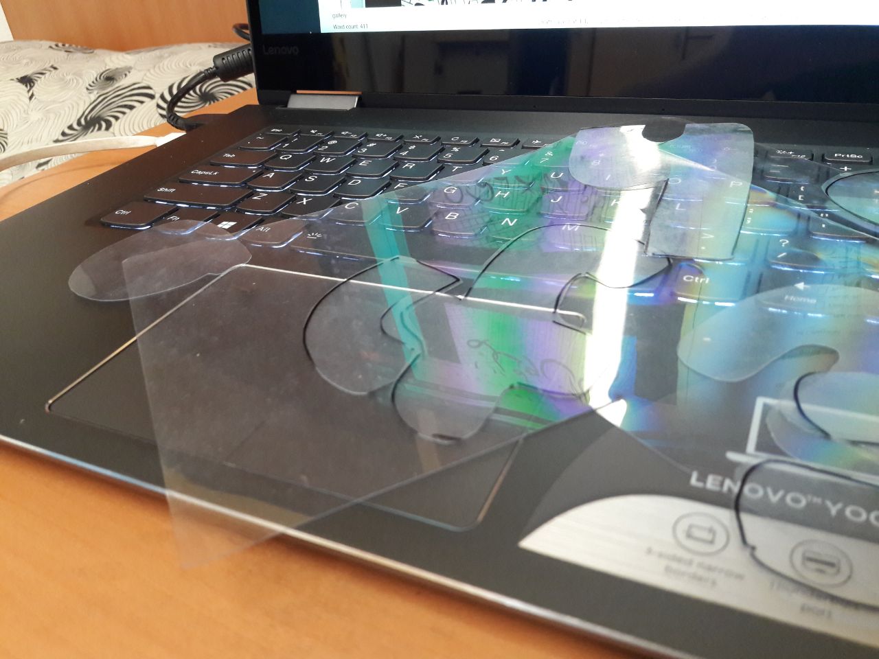
- Acrylic on cut plastic
- Shaping of terrarium with plastic, display of terrarium through plastic
- Convex “bubble” font to resemble terrarium’s curved surfaces
- Browns and greens with red-orange-yellow to resemble terrariums’ trees/plants and flowers

What I stated during the presentation was that the difficulty was really in using Illustrator, as aforementioned and suggested, particularly in relation to the brush creating (it took me a while to understand joining and separating shapes too). For me, too, the difficulty always lies in making the product match the overarching concept I have in mind, which is a necessity for me lest I end up with too wide a scope and a lack of direction. Certainly, though, what I HAVE taken away is that it’s always good to experiment nevertheless, and to avoid creating the “final” product too early lest it’s subject to changes when you think of something better.